|
| Group |
Round |
C/R |
Comment |
Date |
Image |
| 4 |
Oct 20 |
Reply |
Yeah! |
Oct 29th |
| 4 |
Oct 20 |
Reply |
Very convincing Bill. I'd forgotten about Content Aware Fill. Thanks. |
Oct 29th |
| 4 |
Oct 20 |
Reply |
Wow! |
Oct 22nd |
| 4 |
Oct 20 |
Reply |
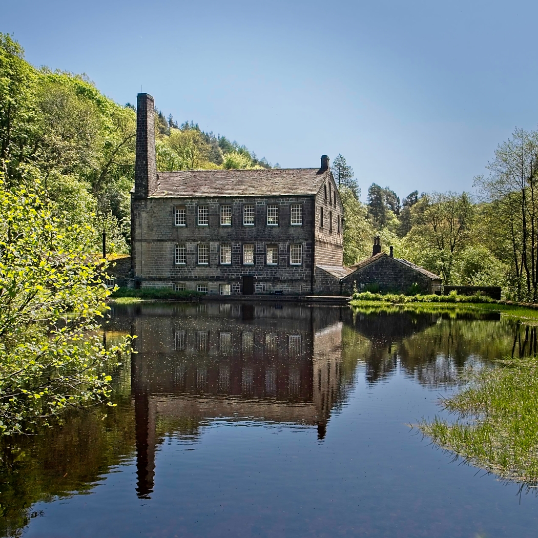
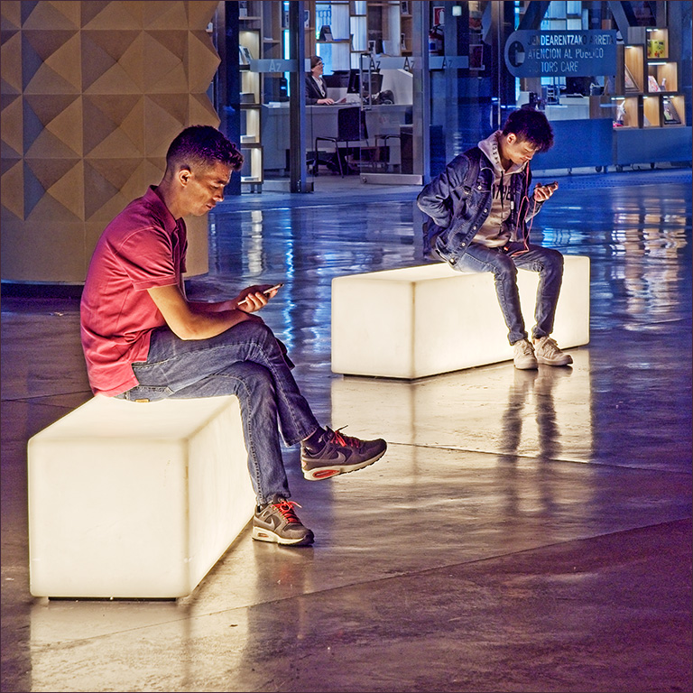
Joe, I tried to get rid of the reflections but whatever I did just looked false. I guess if I were to do some VERY careful cloning I might be able to eliminate them, but I decided that there were other things in life to do first!
I'm not sure what promotion you are talking about. I did get elected to Vice Chairman of my camera club (Stokesley Photographic Society) but I didn't think I'd mentioned it! |
Oct 15th |
| 4 |
Oct 20 |
Reply |
Joe, I started using ON1 RAW instead of Photoshop when I bought a new camera that my old version of PS would not open. I have an aversion to renting the software which you now have to do with PS, and you can buy ON1 outright. it's a bit like a combination of LR and PS and has come on in leaps and bounds in the last couple of years. It takes a bit of learning to start with, but now I really like it. |
Oct 14th |
| 4 |
Oct 20 |
Reply |
Hi Vella. Hope you recover quickly. |
Oct 14th |
| 4 |
Oct 20 |
Reply |
My memory suggests they could be 12 inches across the points, or maybe even more. They were certainly the biggest and fattest I have ever seen. |
Oct 14th |
| 4 |
Oct 20 |
Reply |
Thanks Witta. Being in a Study Group is really great. You get really useful comments to help refine an image. |
Oct 11th |
| 4 |
Oct 20 |
Comment |
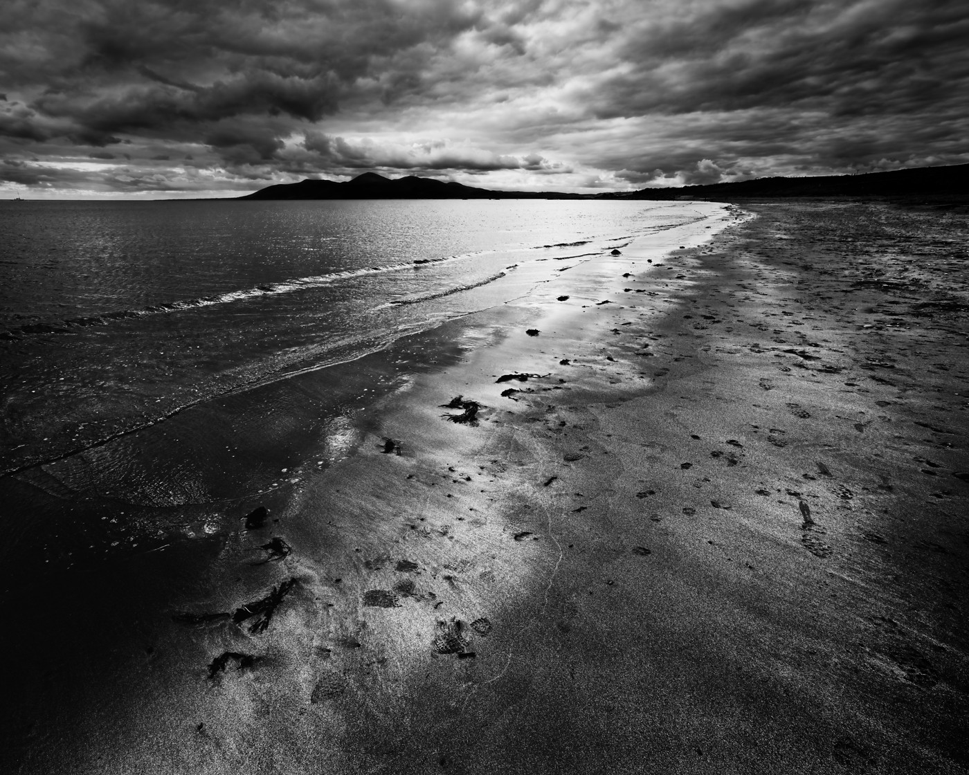
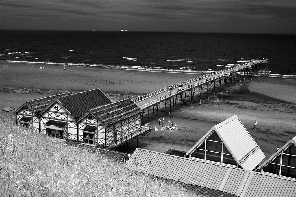
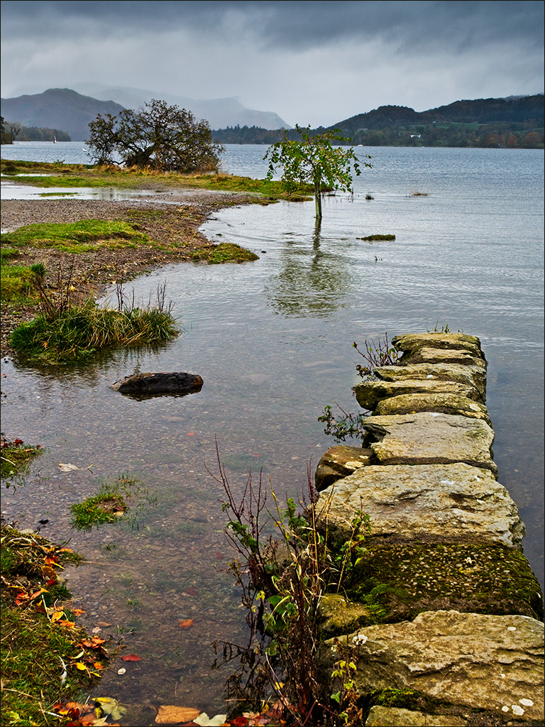
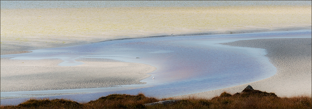
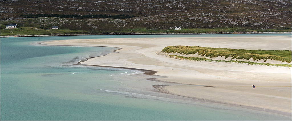
Erik, I go along with Isaac's comments. The colour is amazing. With the dark tones in the foreground the detail in the beach is not very apparent, and if you were to lighten it to bring out the detail it would take attention away from the tree and clouds. Would you therefore consider cropping about a third of the beach off the bottom? I think it would make the tree more dominant in the composition. I also tried Shadows/Highlights in PS and added Cuves to restore contrast. |
Oct 8th |
 |
| 4 |
Oct 20 |
Comment |
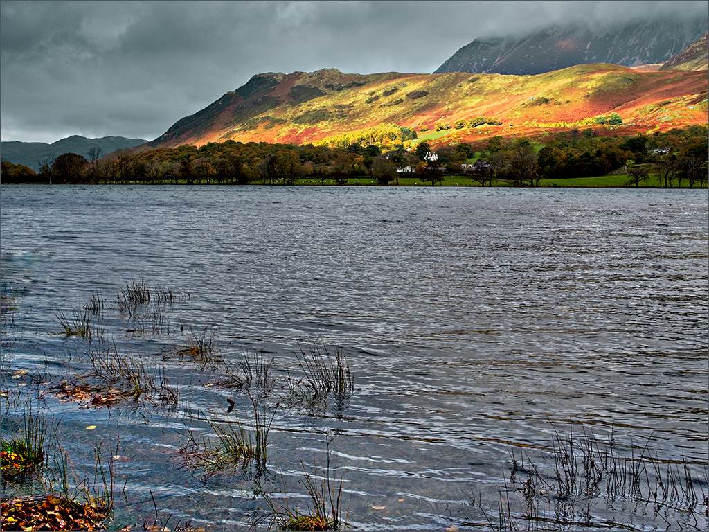
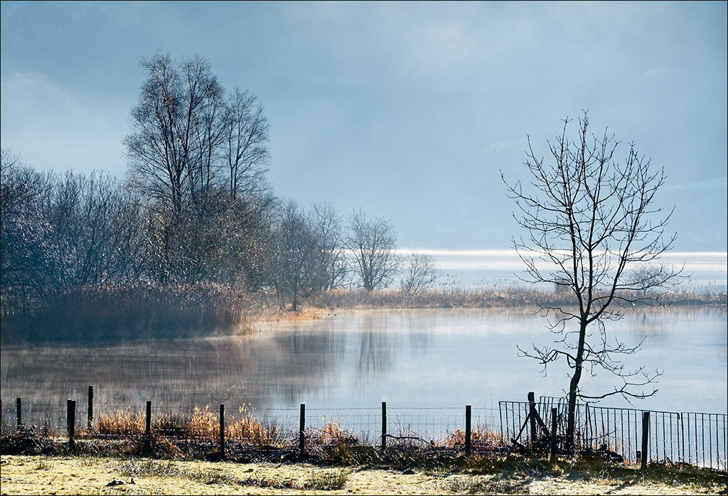
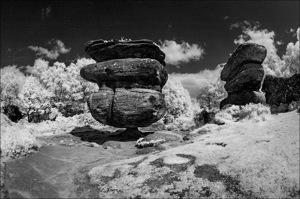
Vella, your image clearly illustrates the classic U-shaped valley that is formed by glacier action. The image is very sharp and clean all the way from foreground to background, and the composition is satisfying. The sky is fine so your efforts have worked well. Haloes can be a real problem sometimes and I find that the best thing to do is to go back though the processing steps to find which one has had the greatest effect. Then I try to mask that effect from the appropriate edges using a soft edged brush. I find ON1 RAW good for that - you can turn individual effects and local adjustments off and on quite easily. Do you use ON1 as a plugin to PS or have you got it as a stand-alone installation? |
Oct 8th |
| 4 |
Oct 20 |
Comment |
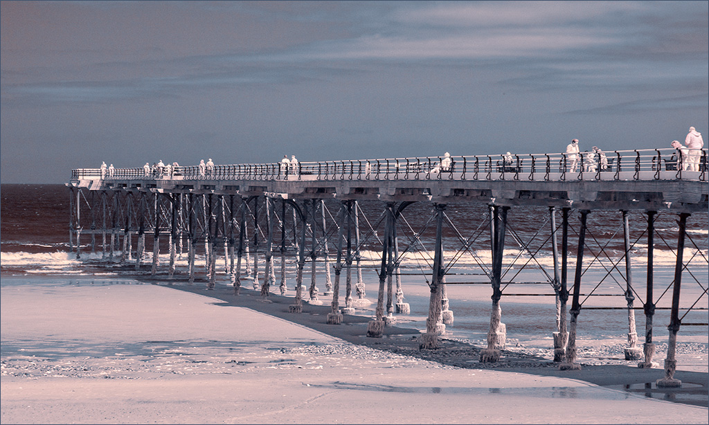
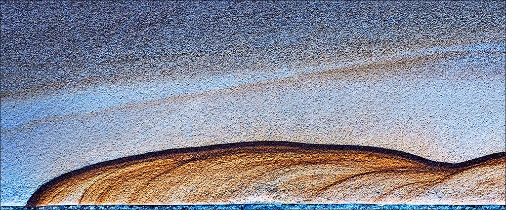
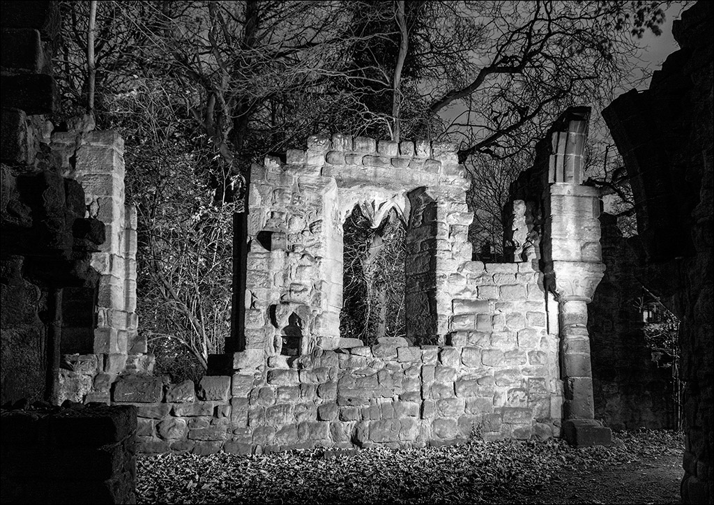
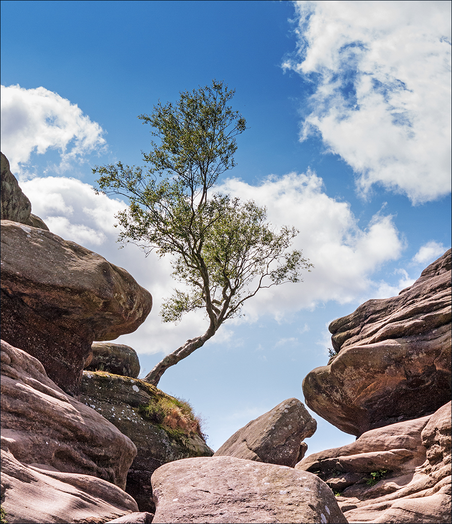
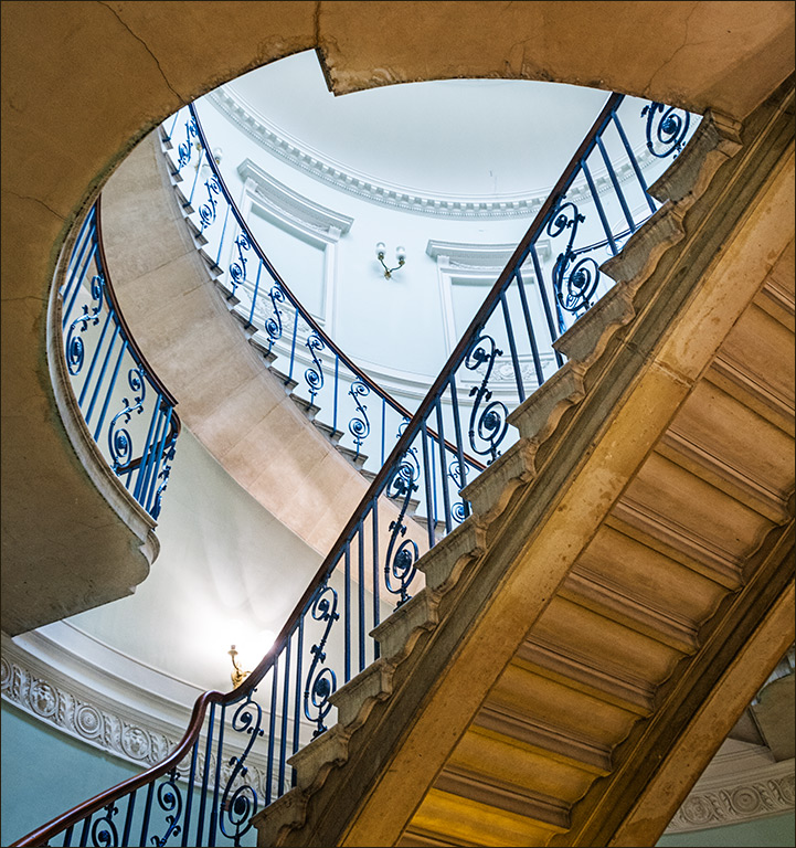
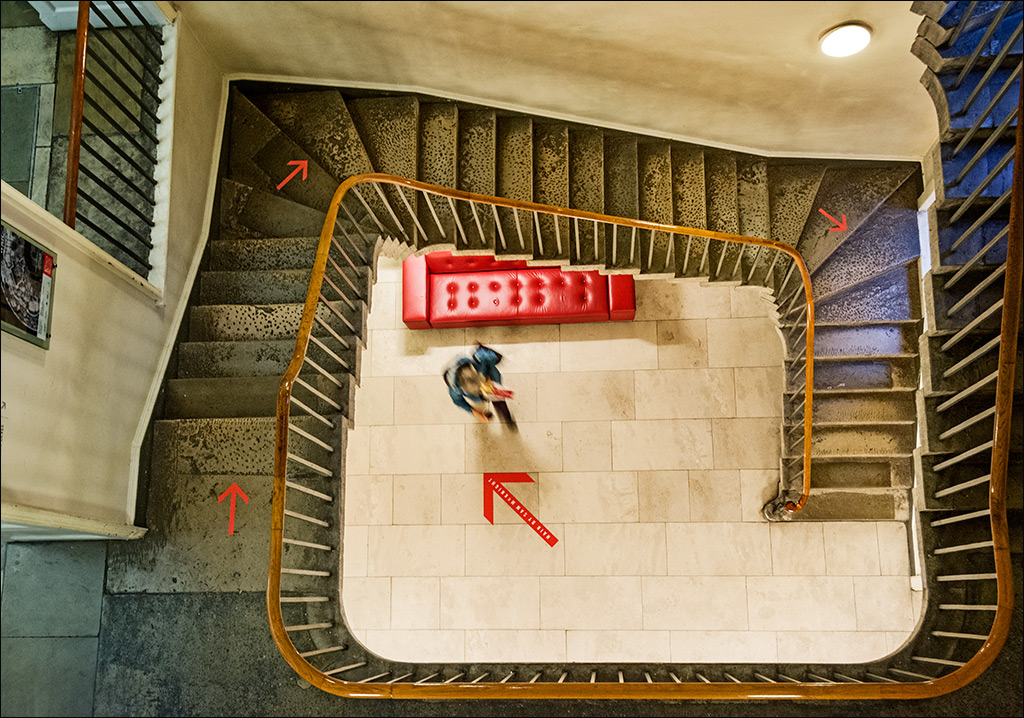
Bill your shot has an almost vertiginous feel - looking up vertically has a very similar effect to looking down vertically. It is very sharp and you have captured the full range of tones. Unlike Isaac, I would have preferred the composition to be either exactly symmetrical or strongly on the diagonaal. |
Oct 8th |
| 4 |
Oct 20 |
Comment |
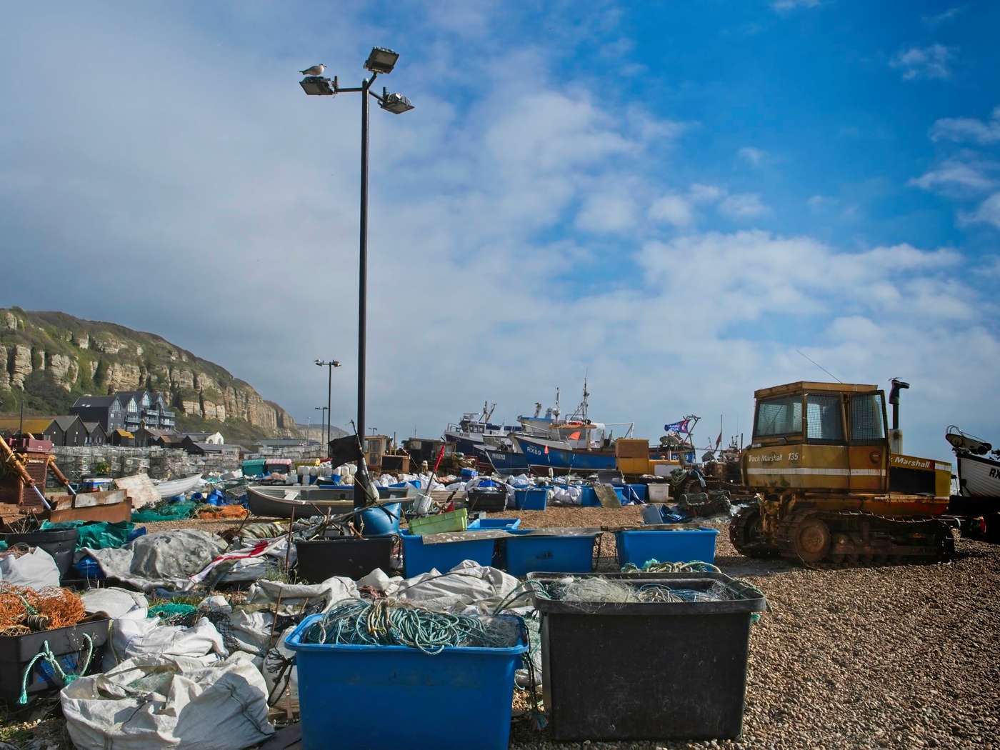
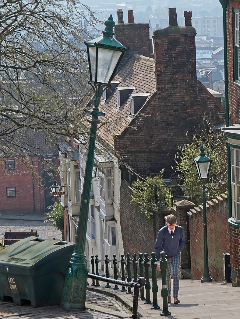
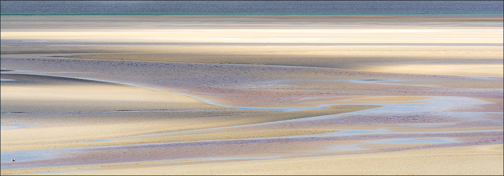
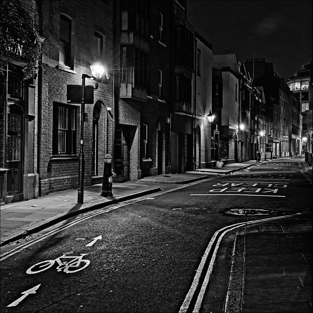
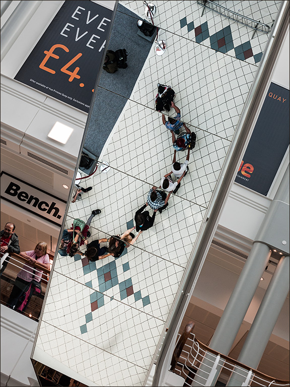
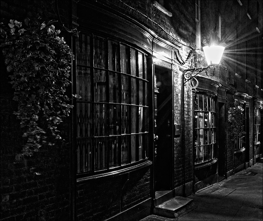
An interesting documentary type of image, this tells a human story and yet keeps the person anonymous. The colours of the stones on the beach are typical of many stony beaches, colours which are enhanced when under the water. I think it might have been more interesting if you had asked the lady's permission and photographed her hands sorting through the pebbles. |
Oct 8th |
| 4 |
Oct 20 |
Comment |
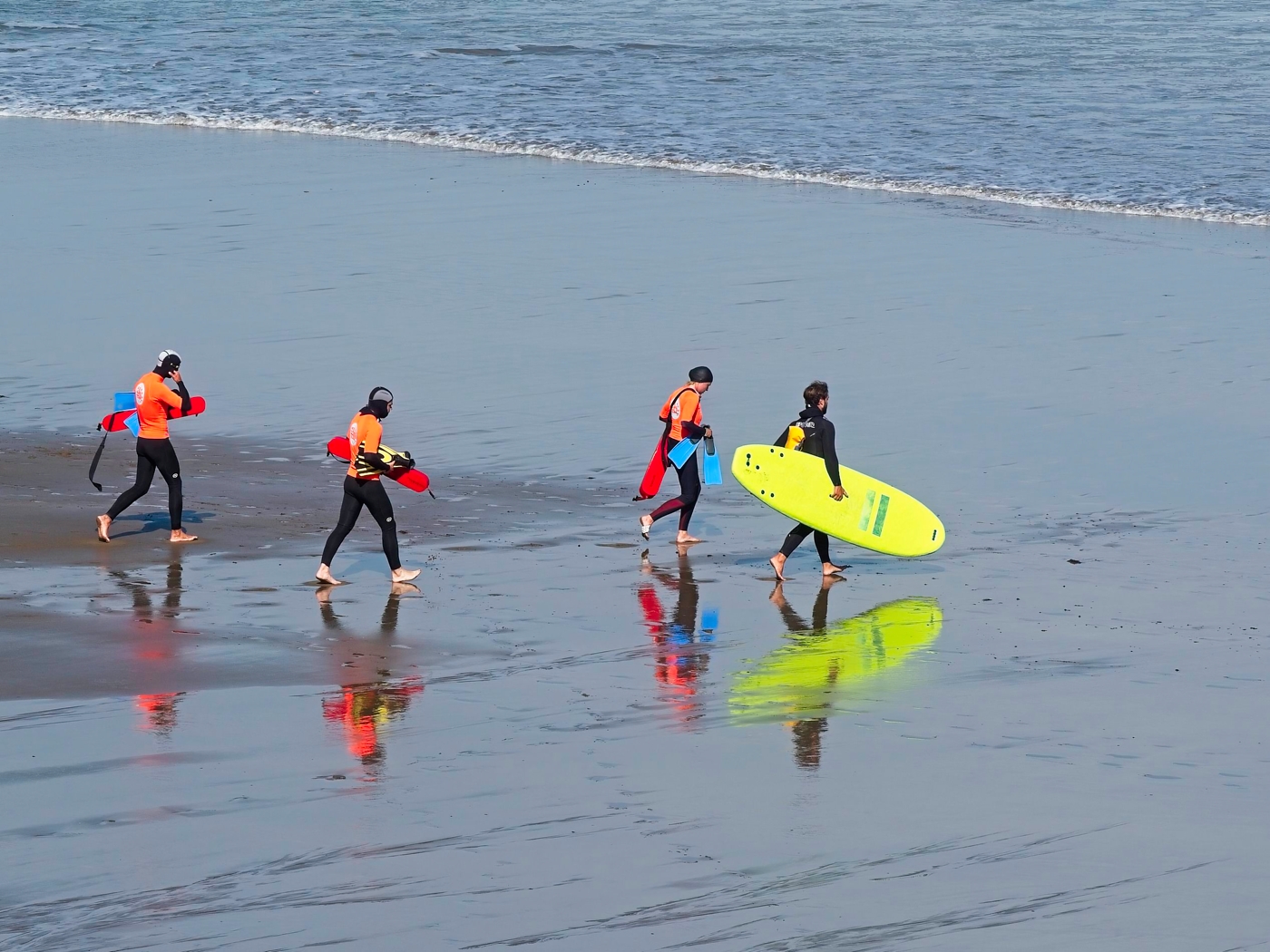
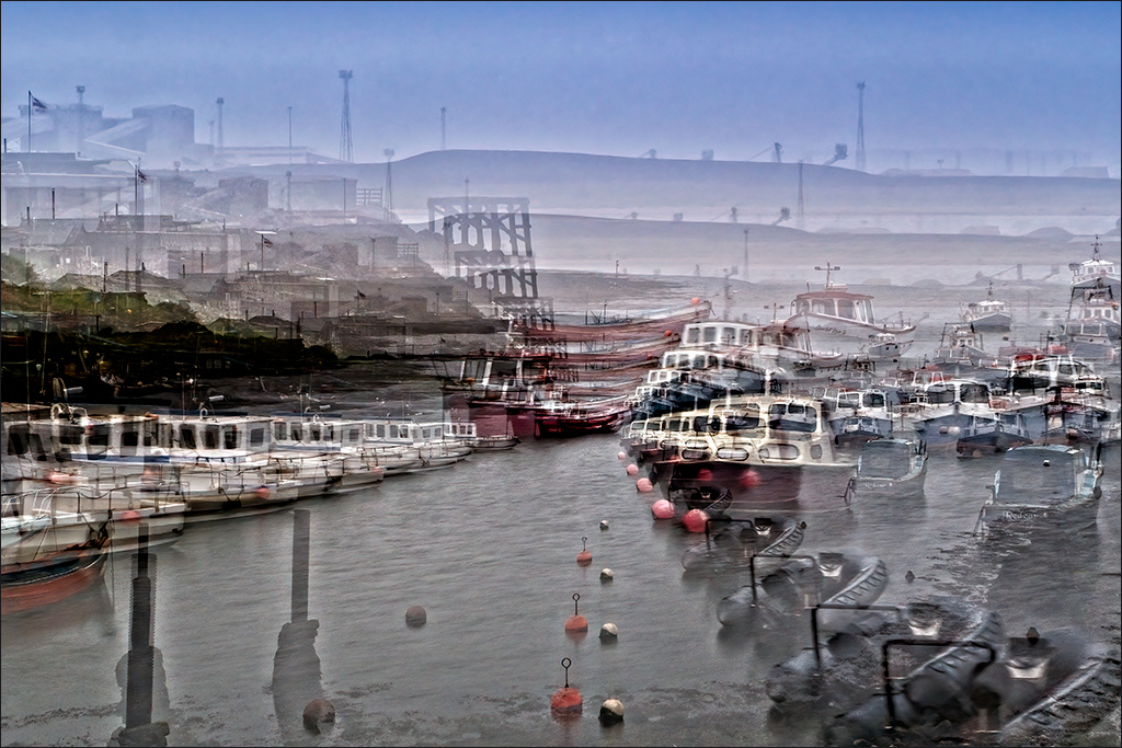
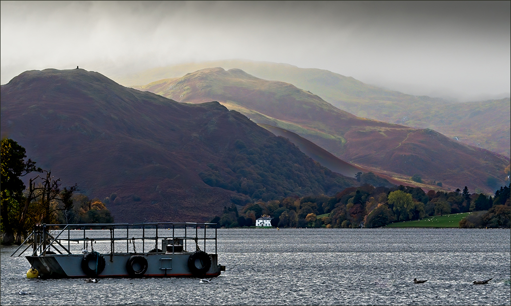
I remember this well. I too took lots of pictures of these sea-stars. They were in a pool in the undercut of a huge rock, after the tide had gone out. Looking back over my own shots, I realise that quite a lot were left clinging to the rock above the low water-line. I have never seen such big ones and so many. I also never realised they could have such a wide range of colours. Nice tight shot Joe, sharp and full of detail. It brings back many memories. Nice coffee in the coffee shop too!
|
Oct 8th |
5 comments - 8 replies for Group 4
|
| 77 |
Oct 20 |
Comment |
Denise, I love a good monochrome and I like the detail in this shot. Like Stephen, I would like to see more contrast, but just to confuse you (!) I have an alternative suggestion. Make a copy layer in PS and apply Shadows/Highlights at the default setting (in my old version of PS that is Shadows 36, Highlights 0). I find it is best not to mess with the Hlts adjustment as that can introduce haloes. Then add a Curves layer and bring back the contrast with an S-shaped curve, pulling down the shadows but leaving the highlights as they are. The Sh/Hlts adjustment brings up the detail in the shadows but makes them too light. The Curves layer darkens them again but still retains the detail. Check the improvement against the original layer. |
Oct 11th |
| 77 |
Oct 20 |
Comment |
Witta, I love it apart from one small thing. Thr back of the girl's dress is very bright with no detail. Can bring back some of the original locally at low opacity? It wouldn't need much.
I've got Topaz Studio 2 - maybe I should take a nother look at it. |
Oct 11th |
2 comments - 0 replies for Group 77
|
7 comments - 8 replies Total
|