|
| Group |
Round |
C/R |
Comment |
Date |
Image |
| 4 |
Jul 20 |
Reply |
That sounds like an interesting challenge! Could be better than a drone shot! LOL |
Jul 31st |
| 4 |
Jul 20 |
Reply |
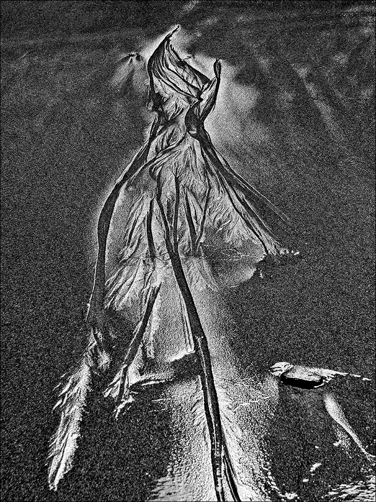
No problem, Erik. Feel free to play with it. I guess I just misunderstood your comment. Thanks to all the comments, I can much see much more than just sand patterns. It is interesting to see all the different takes on this image. |
Jul 20th |
| 4 |
Jul 20 |
Reply |
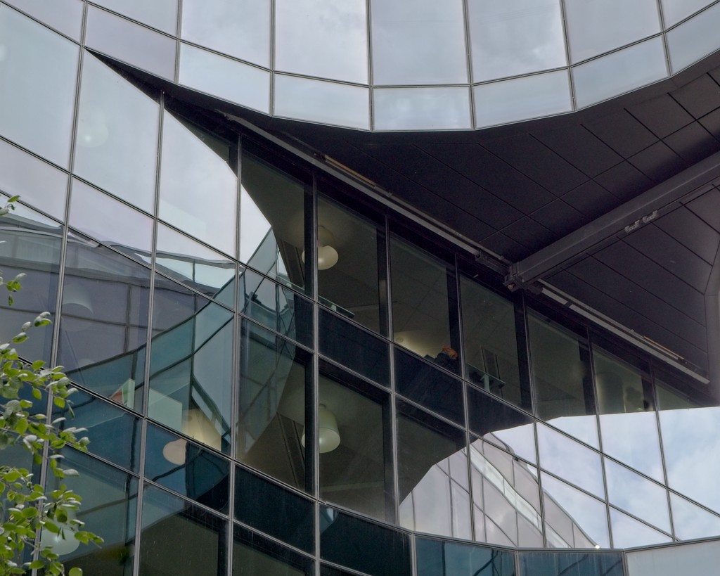
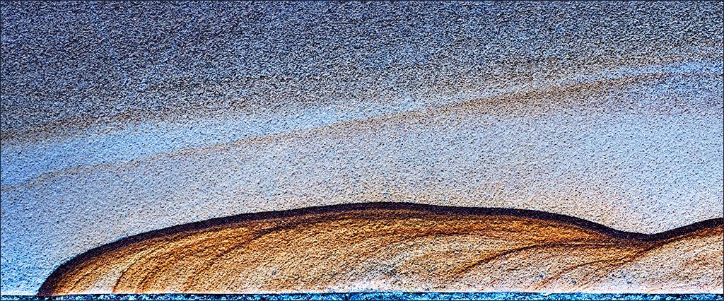
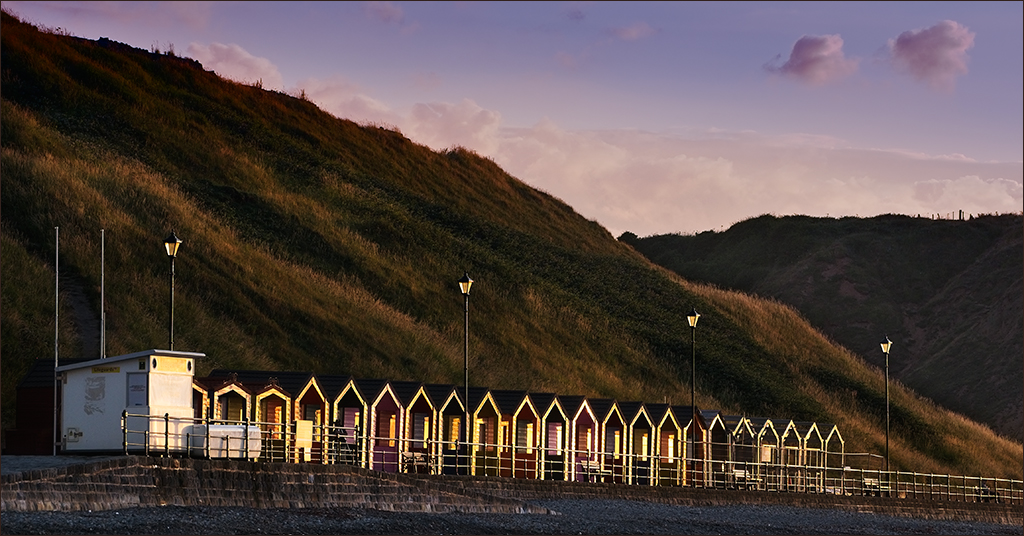
Erik, it is not noise. It is the granular texture of the sand on the beach, so I wouldn't want to eliminate it. Thanks for your other advice. |
Jul 18th |
| 4 |
Jul 20 |
Reply |
Stick with what you prefer, Vella. We all have different opinions. That's what makes these forums so interesting. |
Jul 15th |
| 4 |
Jul 20 |
Reply |
A seamless bit of rebuiling. Very nice! |
Jul 11th |
| 4 |
Jul 20 |
Comment |
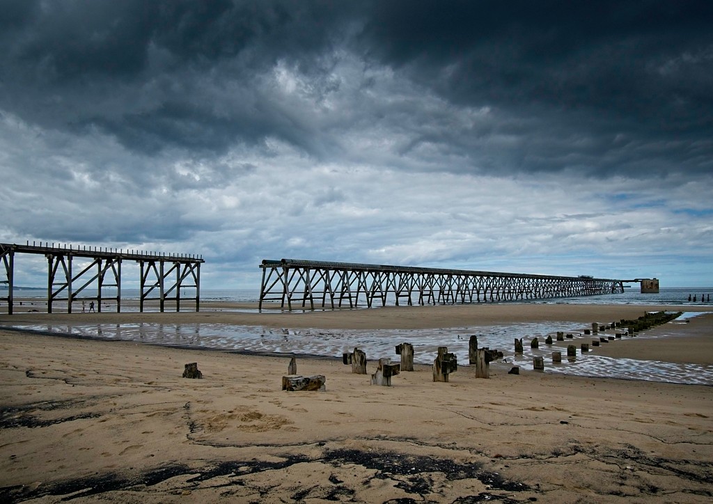
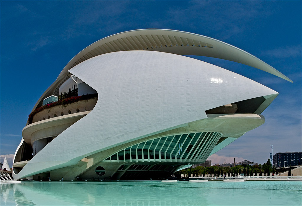
I'm quite happy with the composition. The rocks on the left form a good lead-in to the fort which appears to be an imposing building. The expanse of sea to the right emphasises the isolation of the fort, showing that it stands as the main defence against attack from the sea. The letterbox crop keeps the attention where it needs to be, and the sky is subdued but still threatening. The long exposure has smoothed out the waves leaving the viewer to enjoy the sweep of the rocks and the solidity of the fort. Glad you took out the yellow jetski. |
Jul 9th |
| 4 |
Jul 20 |
Comment |
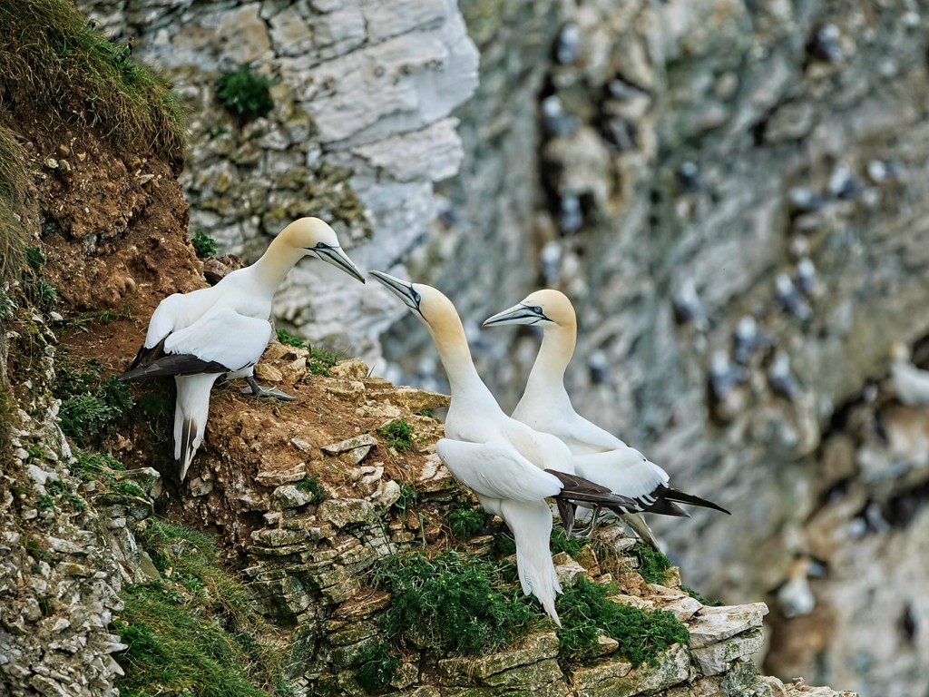
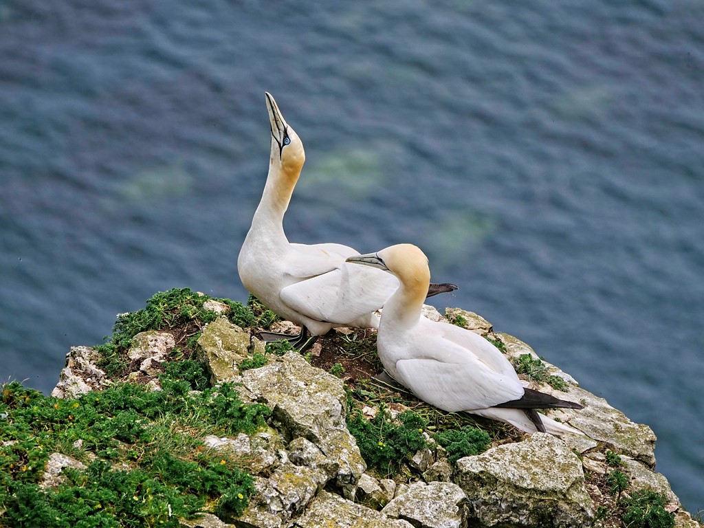
What a remarkable picture. It certainly does tell a story. With all those birds to photograph you must have been very busy. I'm not surprised you needed to take a break. |
Jul 9th |
| 4 |
Jul 20 |
Comment |
I forgot to add that it was our wedding anniversary that day! |
Jul 9th |
| 4 |
Jul 20 |
Comment |
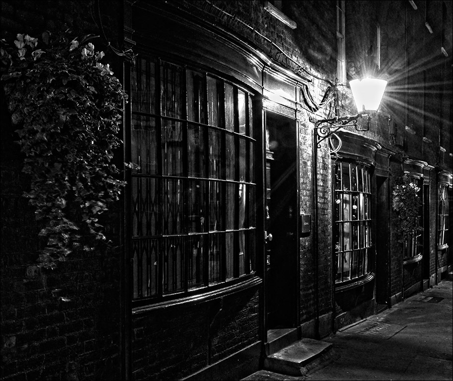
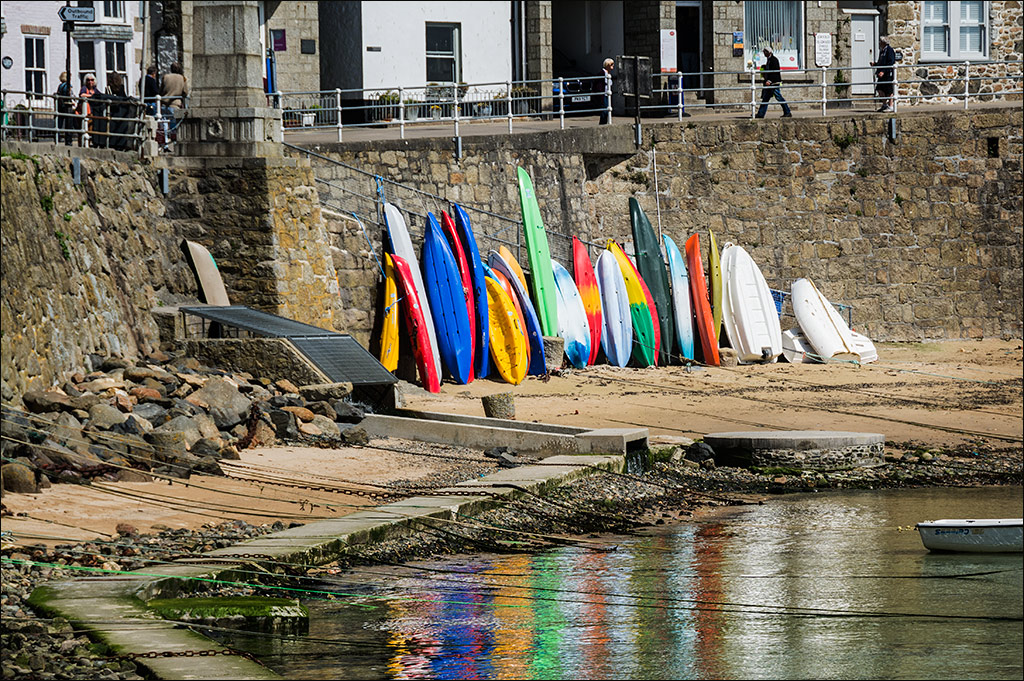
Hi Vella. I nearly laughed out loud when I saw this because I recognised it straight away. It is in the lovely village of Mousehole on the south coast of Cornwall. Paula and I were there in May 2017 and I took several shots almost the same as this scene. Your image conveys exactly the feeling of a typical seaside holiday village in southern England. I think Joe has a good point, that maybe you could crop a bit off the left hand side. The sailing boat in the bottom right acts as a strong visual point of interest, with the colourful canoes and boats in the background. The name is pronounced "Mouzel" and not as you might think, "Mouse-Hole." I have attached one of my images of the scene for interest. |
Jul 9th |
 |
| 4 |
Jul 20 |
Comment |
Great idea Bill, and nicely done. The overall blue tone does give a feeling of moonlight. For me, however, the moon is so large as to be unreal and this takes away the scary feeling. I think a smaller, more realistically sized moon would be more frightening and give that cold feeling up the back of the neck. I like the idea of an orange light in one window, and agree with Larry that it needs to be an upstairs window. |
Jul 9th |
| 4 |
Jul 20 |
Comment |
Having problems with getting the right image to show. Hopefully this is it! |
Jul 9th |
 |
| 4 |
Jul 20 |
Comment |
Isaac, you can find some amazing acts in the most unlikely places! A nice piece of travel photography, and you have to take what is there, regardless of background. I am with Joe in that I am disappointed that the lady on the right has her right elbow cut off. I wondered if this could be repaired in Photoshop so I had a try. The attached image is the result of about 20 minutes work. More work to do, but it shouldn't be too much. Also, I agree with Vella that the top could be cropped to concentrate the attention on the main subject. |
Jul 9th |
| 4 |
Jul 20 |
Comment |
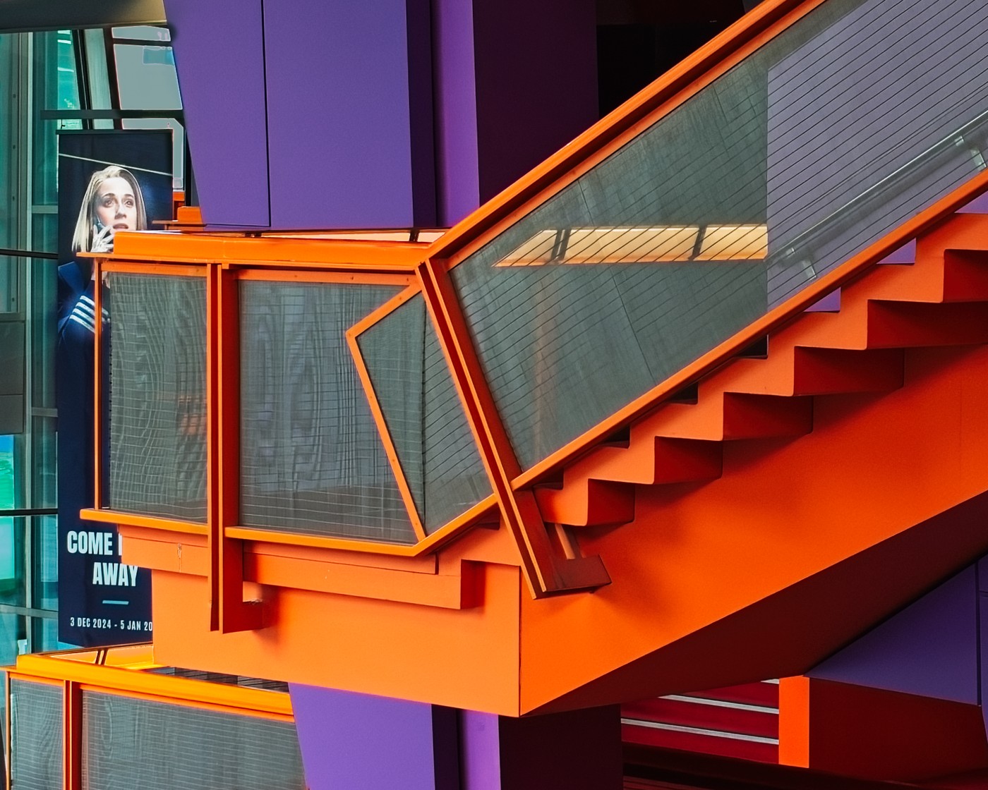
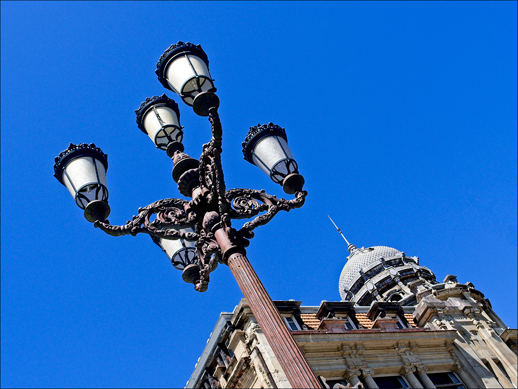
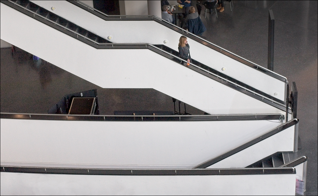
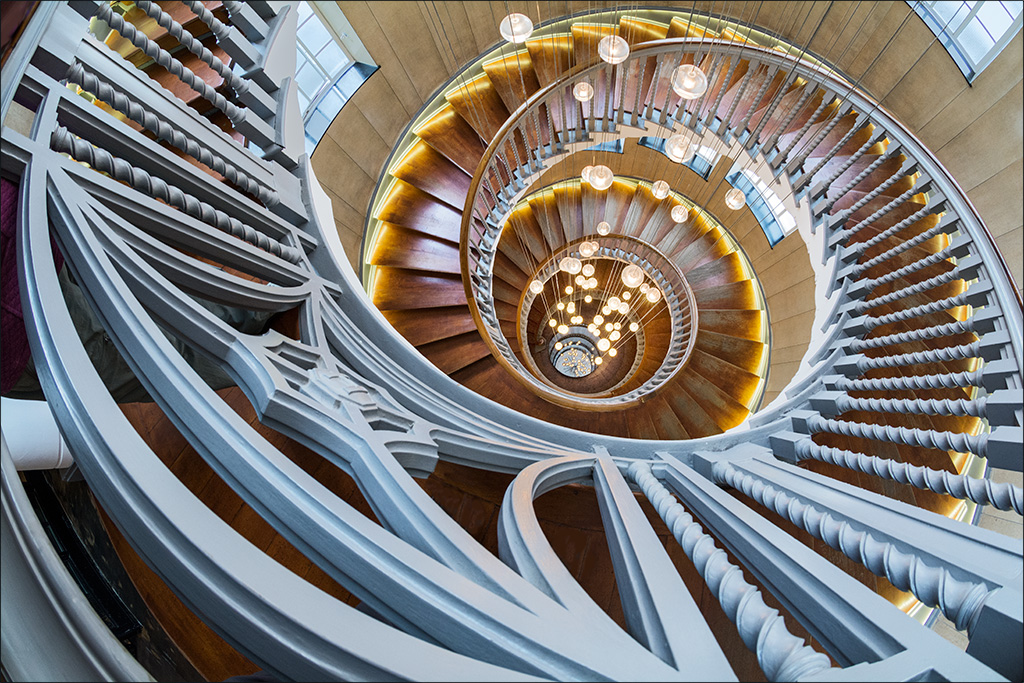
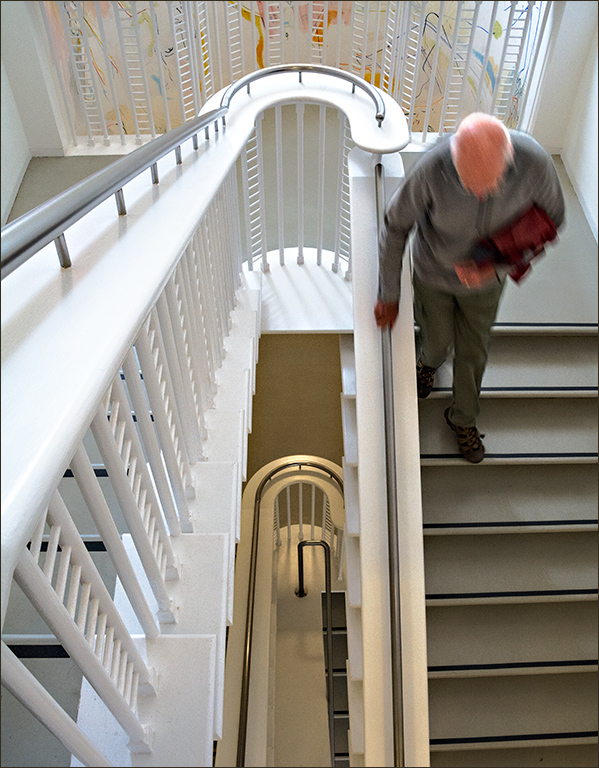
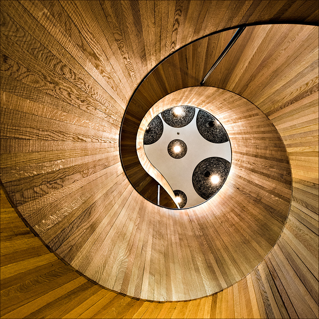
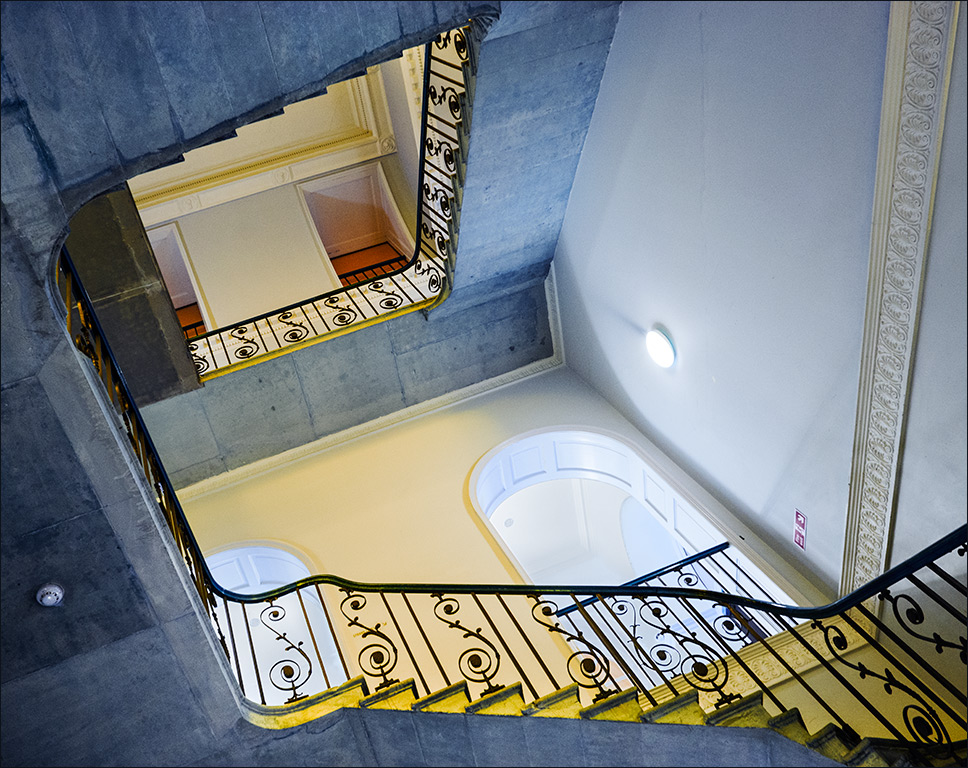
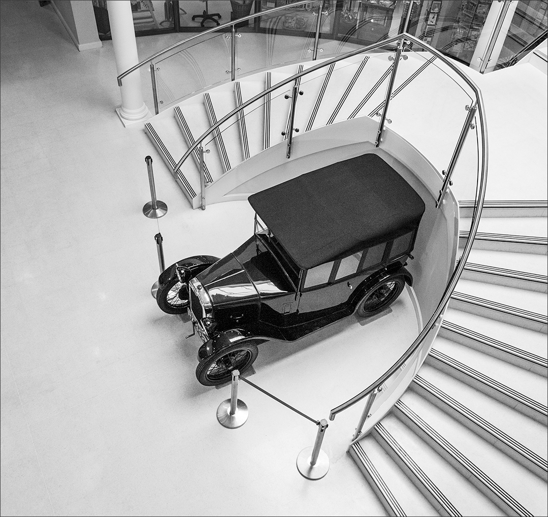
Joe, I am jealous that you travelled all the way over from the west coast of the USA to Barcelona and found this, whereas I travelled by train from the UK a much shorter distance and missed it! Only joking really. It is a staircase that is crying out to be photographed. I would like to have seen more of the staircase to the right without sacrificing the image content at the left, but that would mean a wider angle lens or moving to the left to get a better viewpoint, neither of which may have been possible. Very good quality for ISO 8000. |
Jul 9th |
| 4 |
Jul 20 |
Reply |
Dr Staircase is stunned that he missed this one on his visit to Barcelona! |
Jul 9th |
| 4 |
Jul 20 |
Reply |
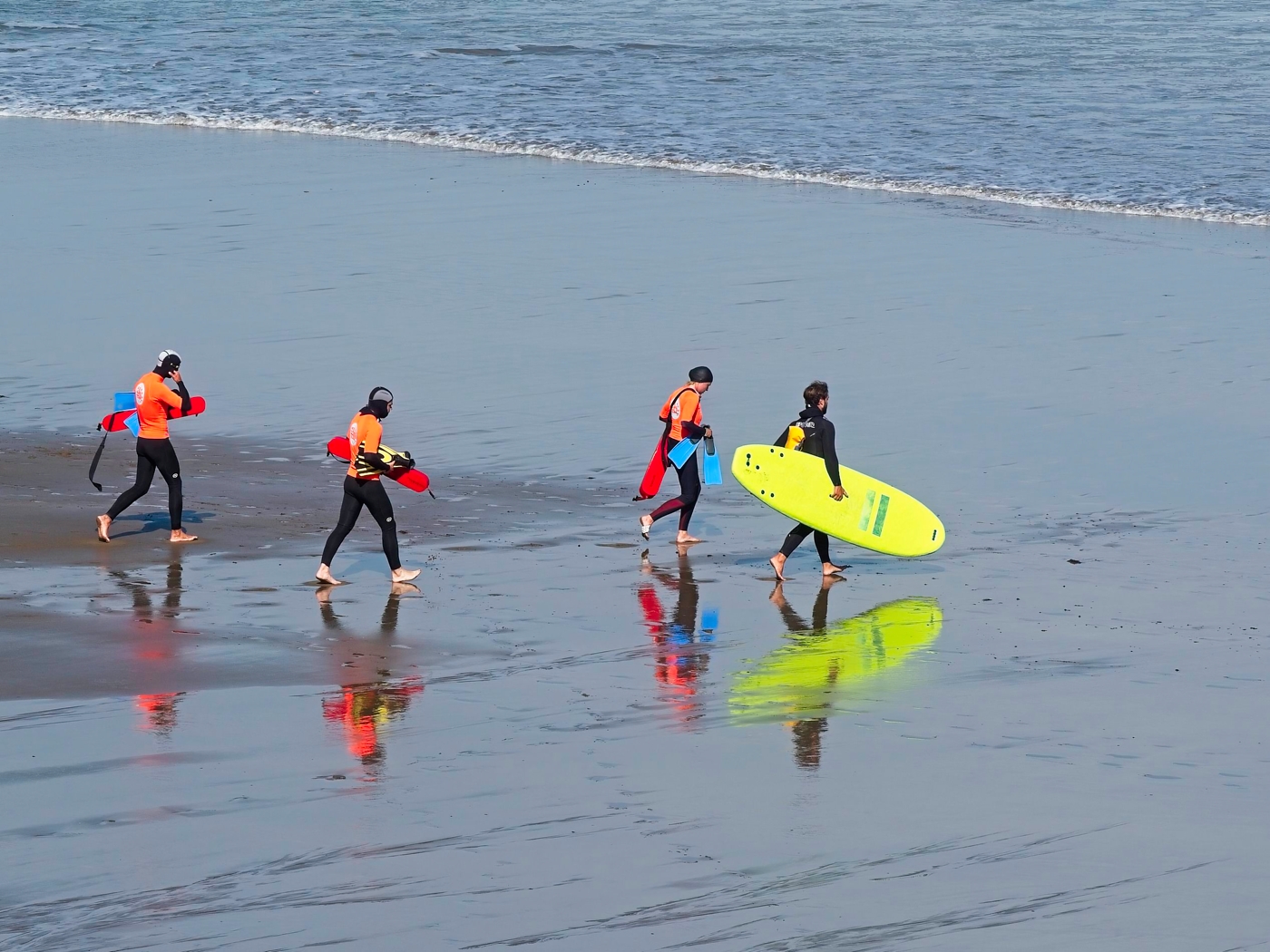
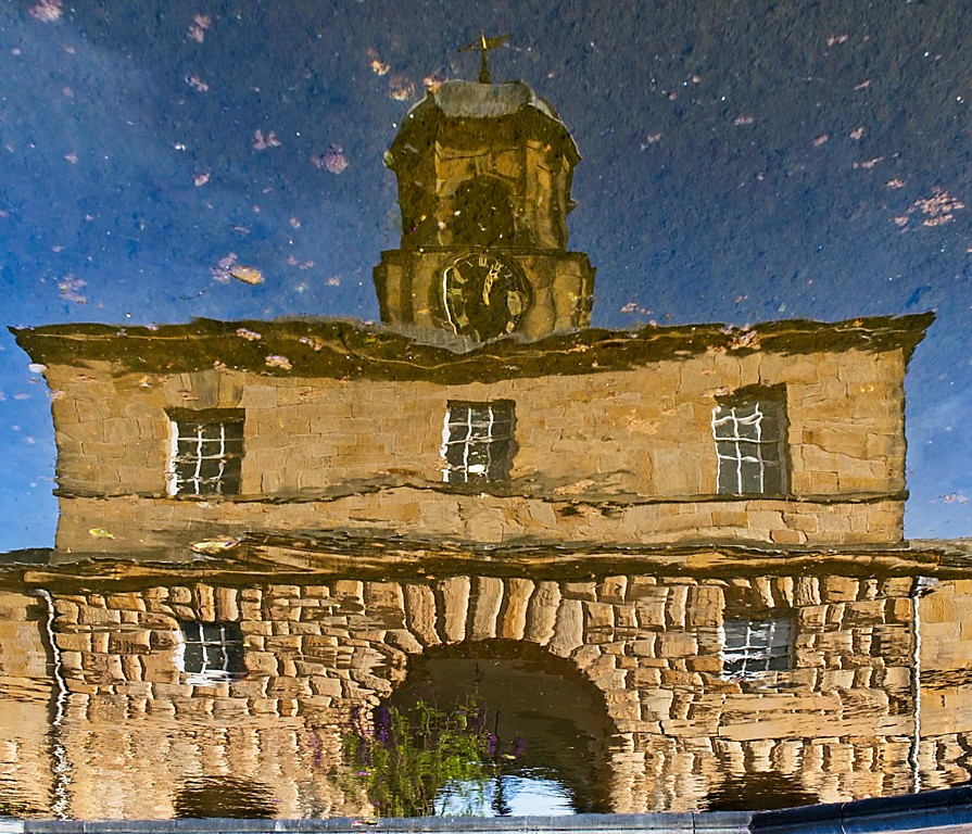
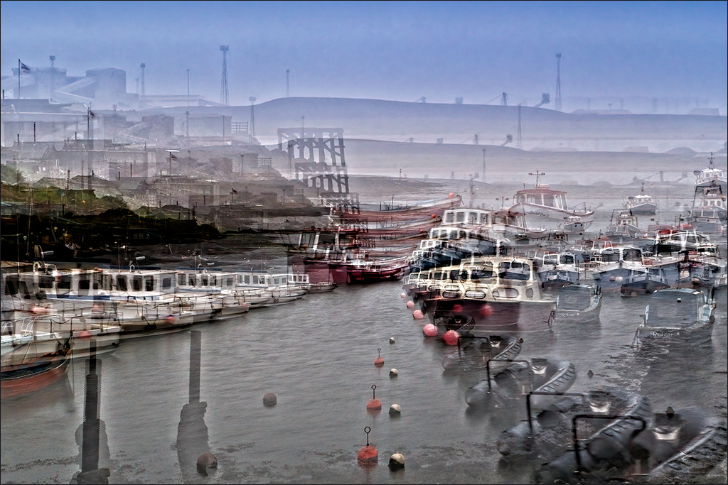
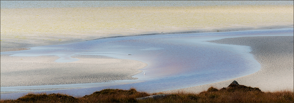
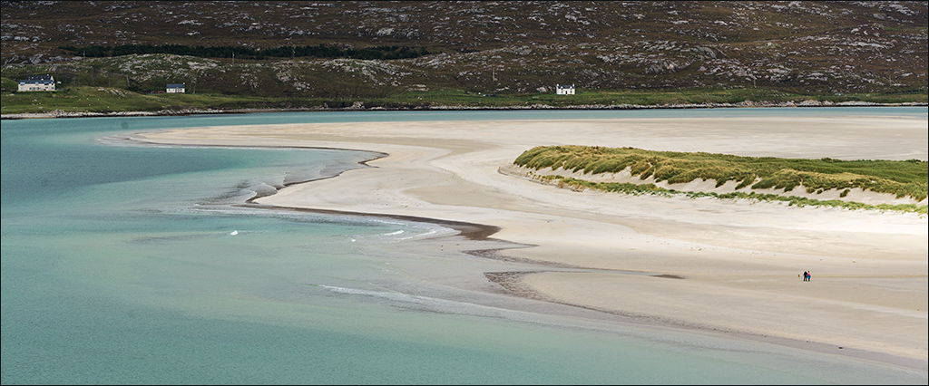
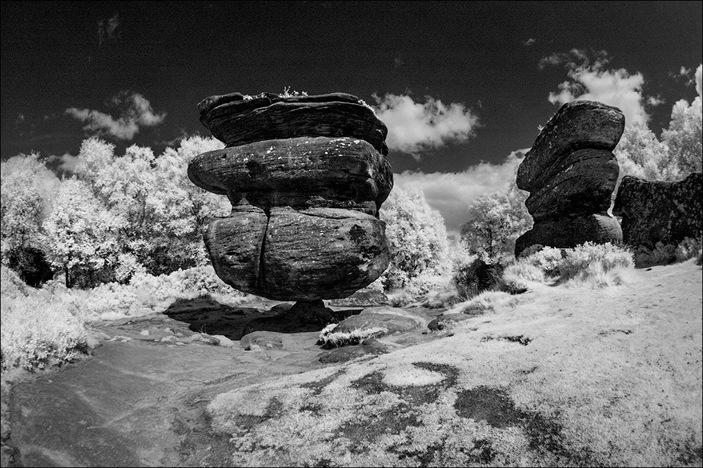
It is strange and quite amusing what different people see in images. I just saw this as an interesting pattern of water flow in sand, largely because I was conditioned by simply walking along the beach and partly also by my engineering background. Plus of course the fact that other sand patterns were also in my field of view. By seeing it isolated and not having been there, the viewer is not pre-conditioned and is much more open to seeing alternative images. Whew! I'm really out of my depth now! |
Jul 9th |
8 comments - 7 replies for Group 4
|
| 73 |
Jul 20 |
Reply |
Hi Debbie. Personally, I would take it out completely cropping as close as possible to the edge of the stonework. However, it's very much an artistic choice. My philosophy is that if an image works for you, then keep it that way. If you see an improvement is possible, then change it. Other people might feel that the bridge needs to be there to provide a more complete composition. The great thing about these forums is that you get plenty of good opinions, and we all respect each others opinions, whether or not we agree with them. Keep putting in great shots like this! |
Jul 14th |
| 73 |
Jul 20 |
Comment |
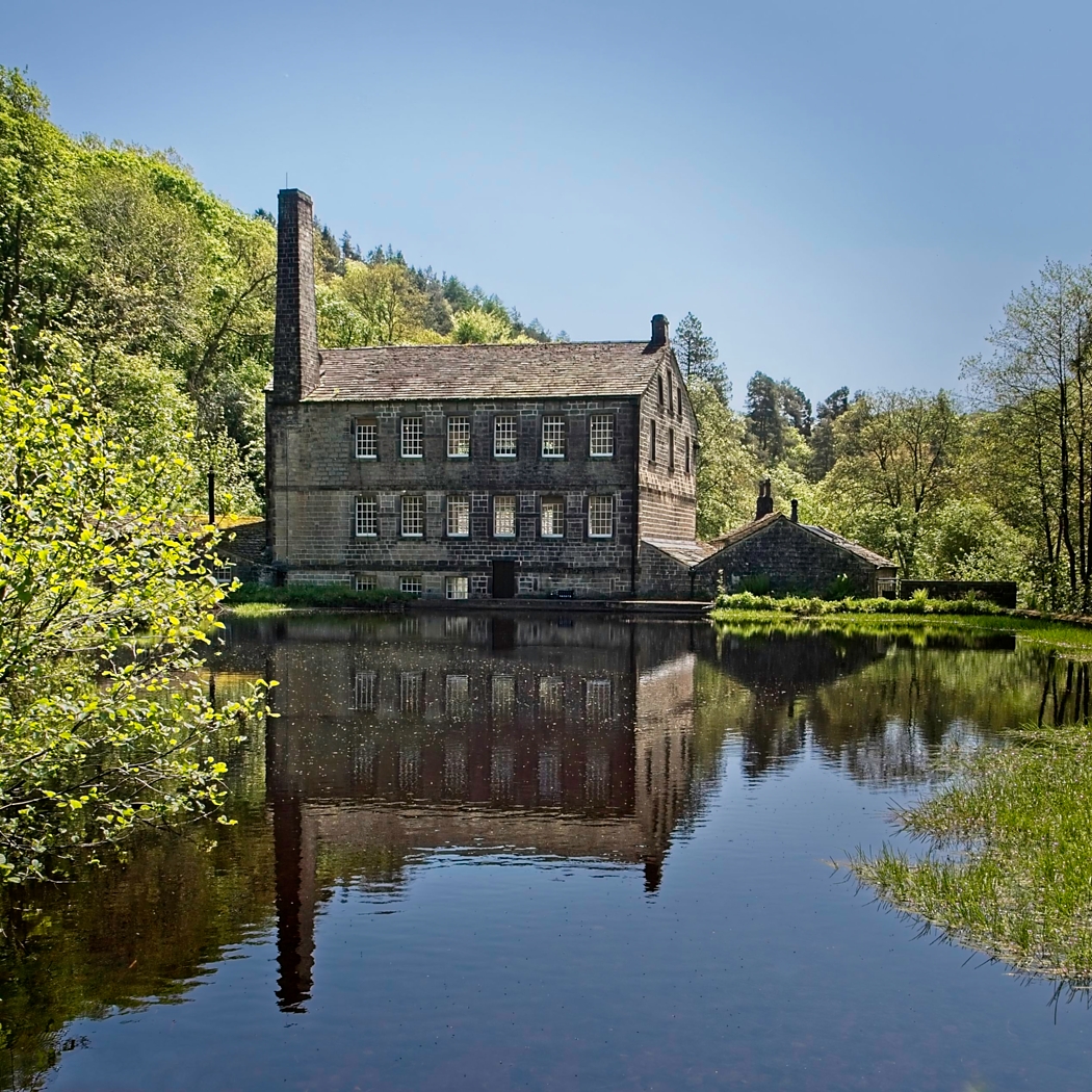
Debbie, when I saw the image I thought at first it was taken in southern France. The mill building looks typical of that area. I like the scene and if I had been there I, like you, would have wanted to get rid of that tree branch. However, on reflection, I think it contributes to the feeling of peace and quiet that we associate with scenes like this. I think the bridge on the right pulls the eye away from the mill building and could easily be cropped out. The bridge looks sufficiently interesting that it could be the subject of a separate image, perhaps from a different viewpoint if possible. It looks like there are many possibilities in this location. Wish I could get there! |
Jul 13th |
1 comment - 1 reply for Group 73
|
| 77 |
Jul 20 |
Comment |
Hi Witta. Great subject and lots of interesting interpretations! I wouldn't crop the image as I think the house needs the space around it to help with the lonely abandoned feel. Have you considered a light sepia tone to give the impression of an old photogrpah? Also, maybe you could add a random white vignette to create a faded look so common with old prints. Just a thought. |
Jul 13th |
1 comment - 0 replies for Group 77
|
| 87 |
Jul 20 |
Comment |
Jennifer, I love this image. Superb. Like Chan, I would prefer the subject to be off centre, but I appreciate that with a grab shot you don't have time to think about the finer points of composition. It is still a great shot. As for titles, there is a saying that a picture is worth a thousand words. A title is only a few words, two in this case. So the contribution of the title is two in a thousand, or 0.2 percent! Whatever the title, it's the picture that matters. |
Jul 15th |
1 comment - 0 replies for Group 87
|
11 comments - 8 replies Total
|