|
| Group |
Round |
C/R |
Comment |
Date |
Image |
| 4 |
Jan 20 |
Reply |
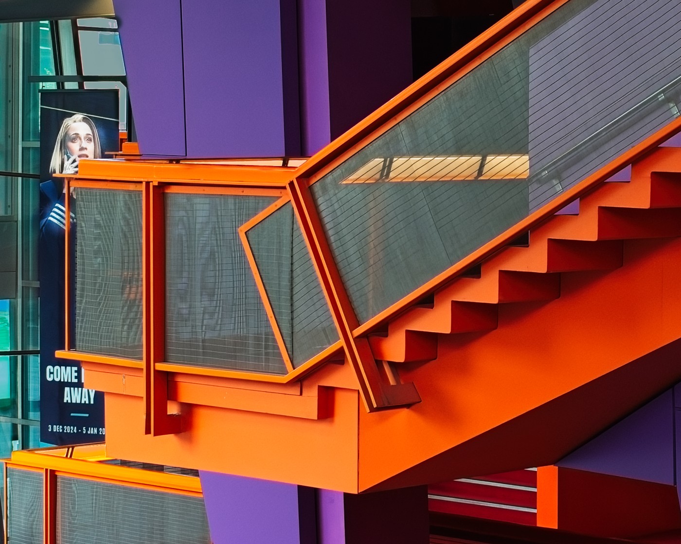
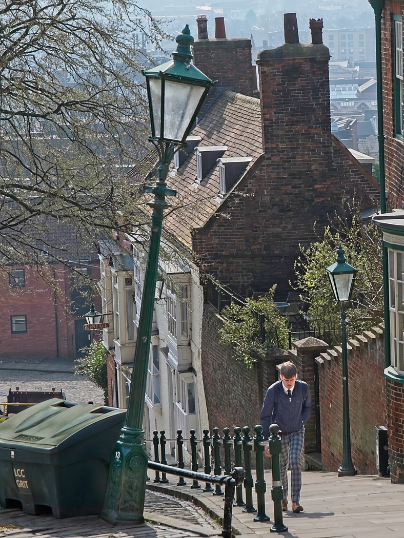
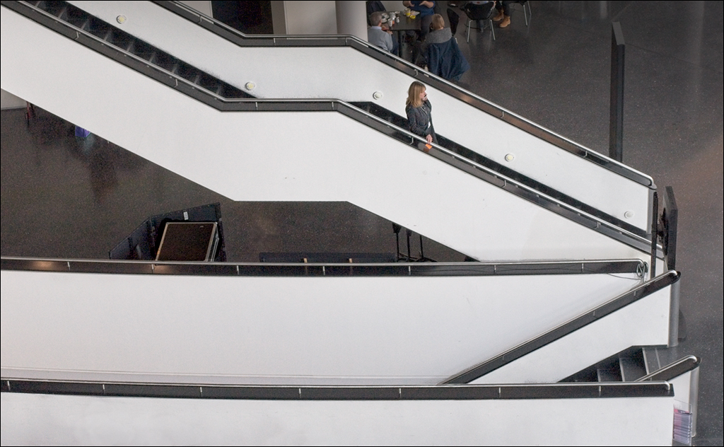
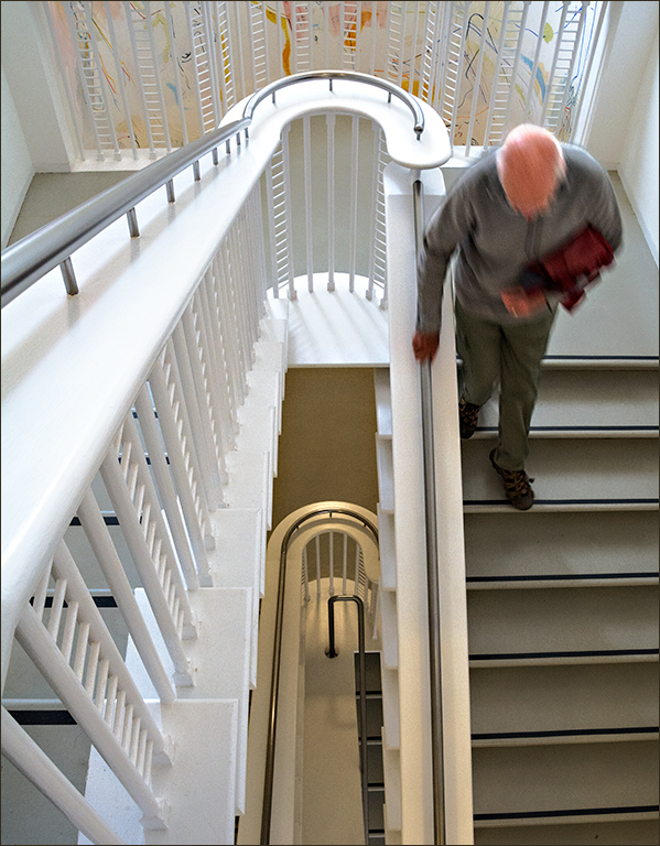
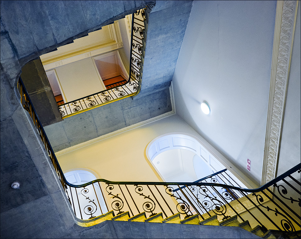
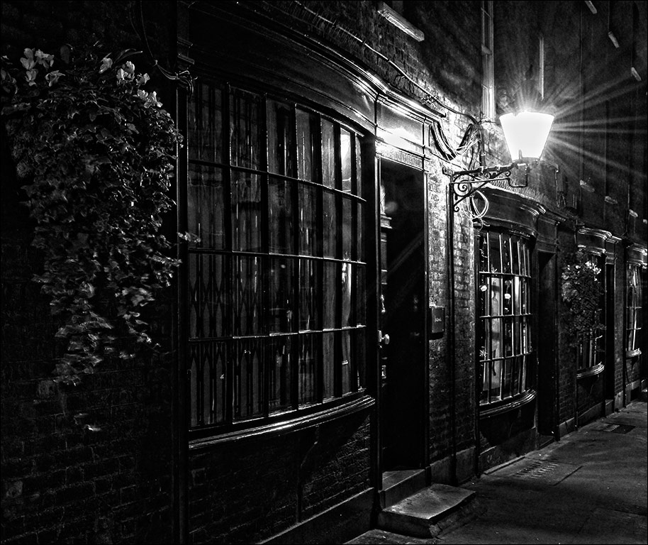
Joe, it was pure luck that she was just the right height and on the near side of the stair. There were people going up and down all the time, but most of the time there was more than one in the shot, and I just wanted a single person. I would hhave preferred there to be no people in the background but that was part of the coffee shop and they weren't going anywhere! |
Jan 7th |
| 4 |
Jan 20 |
Reply |
Probably just as well. you'd have burned out the highlights... |
Jan 4th |
| 4 |
Jan 20 |
Comment |
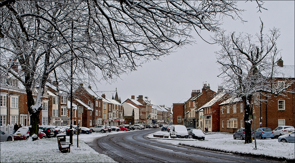
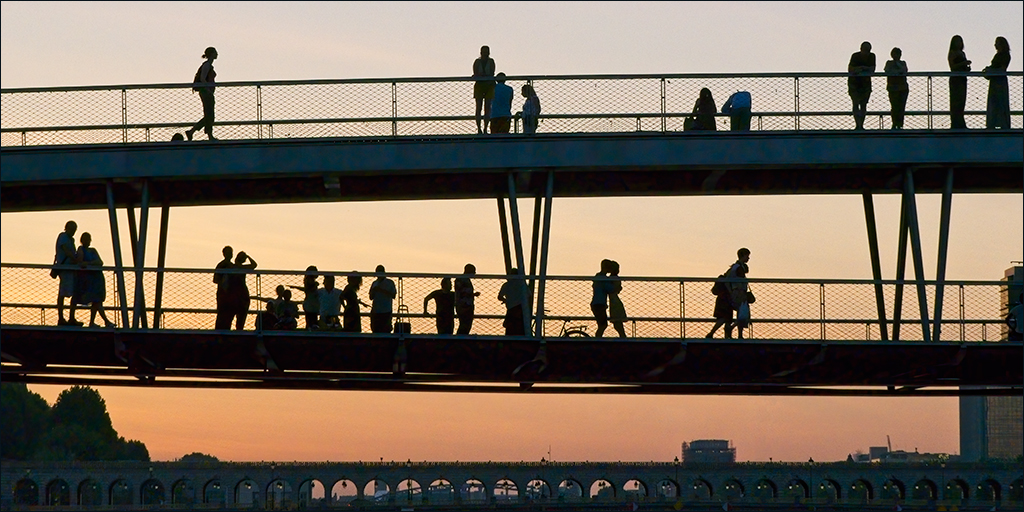
Ian, I presume you mean West Kirby, not Wet Kirby!!! Excellent record of the parade. It is not easy doing this sort of thing because you have to be in the right place at every opportunity, and you have to get it right. Stephen's crop does bring you closer to the marchers, but I think it is too tight at the top. I would be happy with just a small crop off the bottom. |
Jan 4th |
| 4 |
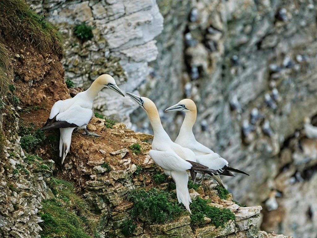
Jan 20 |
Comment |
Well caught action, Erik. Exposure and focus are just right. Tracking flying birds and holding focus is not as easy as it looks - I've tried it a few times without much success. From a pictorial point of view, I like Isaac's version, but of course that would not be acceptable for a Nature image. |
Jan 4th |
| 4 |
Jan 20 |
Comment |
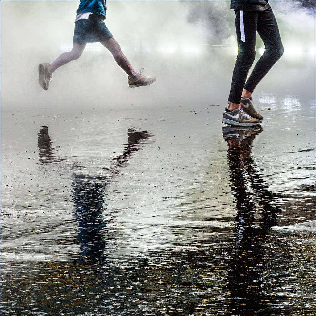
You caught the action well, Thomas. The expressions on the faces of the two ladies show great determination. The motion blur adds to the drama. |
Jan 4th |
| 4 |
Jan 20 |
Comment |
Black & white was a very good choice. The power and the drama of the image can be brought out well in b/w. You have done a great job in bringing out the detail in the smoke and steam so that it stands out well from the sky. I just wonder if you have gone far enough with the overall contrast and darkening of the sky. I took it into Photoshop, added some contrast overall and darkened the sky a bit. Then I merged to a new layer and applied the Shadows/Highlights adjustment at the defult setting. Then I darkened it overall to restore the tonal levels. |
Jan 4th |
 |
| 4 |
Jan 20 |
Comment |
An interesting and amusing still life, Isaac. I like the idea, although it would have been nicer if you had photographed some fire of your own. |
Jan 4th |
| 4 |
Jan 20 |
Comment |
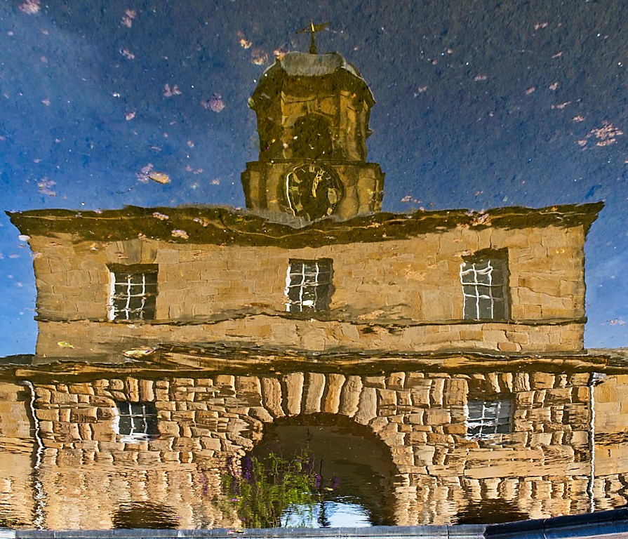
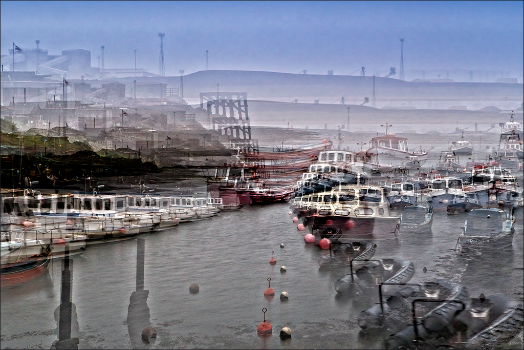
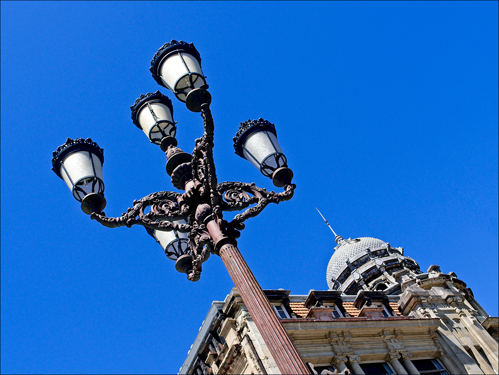
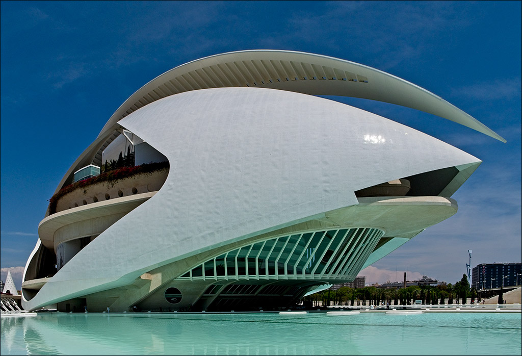
Well done Joe! Having quite recently been to Barcelona and NOT seen this scene, I am greatly in awe of your vision. The symmetry of the image works very well and, after exploring the foreground archway and surrounding structure, the eye travels nicely through the two arches to the Sagrada Familia. The distotion of the main building throgh the first arch tells us we are looking at a reflection and helps in understanding the image. |
Jan 4th |
6 comments - 2 replies for Group 4
|
| 7 |
Jan 20 |
Comment |
It is always difficult to get snow to look white without burning out. If you want to show any detail at all then you must have the snow slightly less than pure white. That then makes it light grey. The trick is in judging just how far to go in order to retain detail and not have the snow looking un-naturally grey. I agree with Tony that the snow in the colour originaal looks more natural. You could lighten the snow in the mono version with a Levels adjutment layer in Photoshop simply by pulling the centre slider a little to the left. This will not affect the white point so will not burn out any highlights. As for the gates, could you have just opened one slightly for the picture, and then closed it again afterwards? |
Jan 16th |
1 comment - 0 replies for Group 7
|
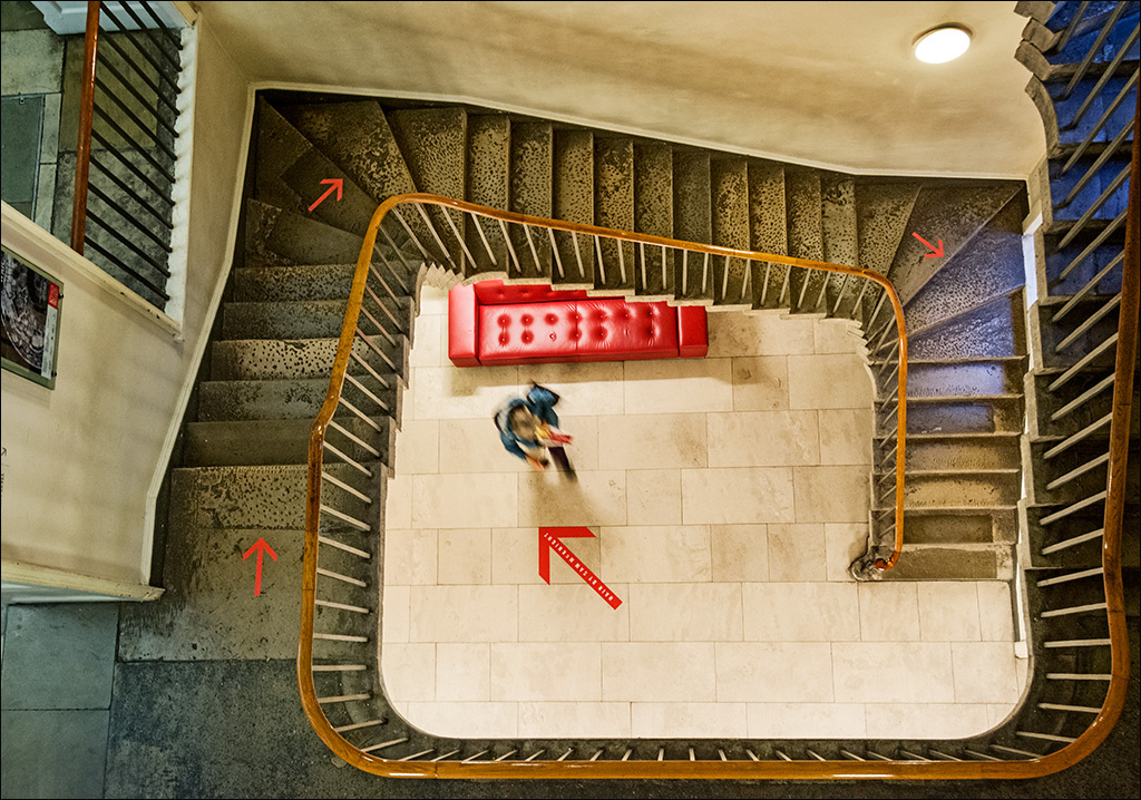
| 11 |
Jan 20 |
Comment |
I like the image as it is. The empty bench is a starting point for the eye to appreciate, and then to go round the end and down the stairs to what....? It is the mystery of what is beyond that holds the attention. If you must put something there, please NOT a camera bag. That would spoil the mystery and intrigue of the image. |
Jan 16th |
1 comment - 0 replies for Group 11
|
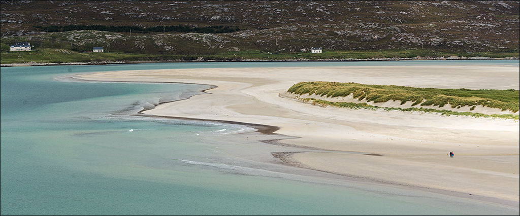
| 50 |
Jan 20 |
Comment |
Lorna, I would be happy with the image as it is. However, if you do feel the need to remove some of the right hand space, then I think you should also take some off the top and bottom to keep the panoramic aspect ratio about the same. |
Jan 16th |
1 comment - 0 replies for Group 50
|
| 74 |
Jan 20 |
Comment |
Bill, Tuscany is one of my favourite locations and you have found a nice composition. The foreground is a bit drk but there is a nice simple way in Photoshop to rectify this. First of all, duplicate the image layer so you have a new layer to work on. Next, go to the menu at the top and select Image>Adjustments>Shadows/Highlights. Accept the default setting of Shadows 35 and Highlights 0 and all the other defaults. This will restore a surprising amount of detail in the dark foreground. You may then want to darken the image slightly using a Curves or Levels adjustment layer. Compare the result with the original simply by switching off the modified layer and the Curves or Levels adjustment layer. One word of warning. Don't be tempted to mess with the Highlights slider in the Shads/Hlts adjustment as this usually introduces haloes. |
Jan 16th |
1 comment - 0 replies for Group 74
|
10 comments - 2 replies Total
|