|
| Group |
Round |
C/R |
Comment |
Date |
Image |
| 1 |
Aug 19 |
Comment |
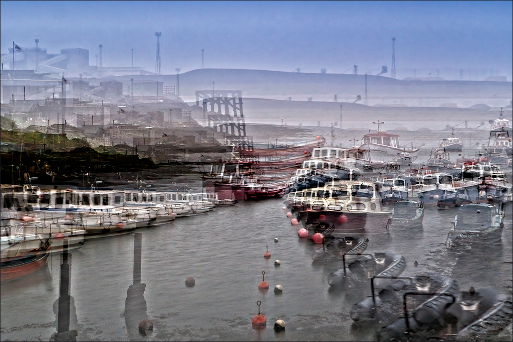
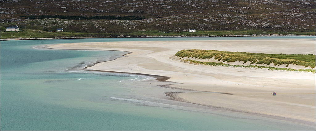
Great light and an excellent leading line into the image. I wouldn't have been concerned about the disturbance in the water where you took out the power boat if you hadn't mentioned it. It just looks like a patch being ruffled by the wind. My only suggestion would be to lighten the man in the far boat so that he stands out more. |
Aug 9th |
1 comment - 0 replies for Group 1
|
| 3 |
Aug 19 |
Reply |
If only indeed! I have lots of 'if only' images. |
Aug 11th |
| 3 |
Aug 19 |
Comment |
This is the sort of picture I would be tempted to take. I do like the reference to the 3 bears. I agree with Marion that iy would be better with the whole shadow of the chair on the right. I would also crop out the large triangular part of the shadow on the left. That dark triangle dominates and pulls the eye away from the chairs. It' great that you got the railing exactly parallel with the horizon and just below it. |
Aug 9th |
1 comment - 1 reply for Group 3
|
| 4 |
Aug 19 |
Reply |
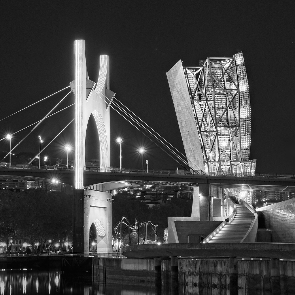
Ian, I certainly would have investigated but I was on a cruise boat and had only a minute or two to grab some shots before we went under the bridge. |
Aug 21st |
| 4 |
Aug 19 |
Reply |
Alison, I had a quick look at this and straightened up the white building by using the Warp tool in Photoshop. (Edit>Transform>Warp in PS CS6). Just pull the 'mesh' gently in the appropriate direction. It distorts the image slightly but not enough to be noticed. |
Aug 21st |
 |
| 4 |
Aug 19 |
Reply |
Robert 'Mouseman' Thompson lived and worked in the village of Kilburn, about 25 miles from where I live. He died in 1955. There are several examples of his work in our parish church. |
Aug 21st |
| 4 |
Aug 19 |
Reply |
I think the straight-on view is the best possible for this subject. It has great impact as a 'tunnel of infinity' which draws you in to be transported to another dimension! |
Aug 21st |
| 4 |
Aug 19 |
Reply |
I noticed the couple kissing when I was doing the processing. But heck, it's Paris! Vive l'amour!! |
Aug 21st |
| 4 |
Aug 19 |
Reply |
Ian, thanks for your nice comments. The approacches to the bridge from the banks were lost in the shadows so I didn't bother looking, but I imagine that there were steps up on each side. |
Aug 21st |
| 4 |
Aug 19 |
Reply |
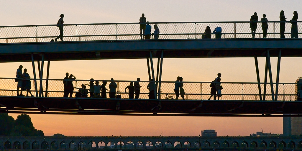
Isaac, that was the case with us. On that evening cruise through Paris we were allowed to sit on the top ceck but told NOT to stand up. The boat's wheelhouse/bridge was retracted to give clearance. |
Aug 14th |
| 4 |
Aug 19 |
Reply |
Joe, I thought it might be boring but it turned out to be very relaxing, although that first night was the best from a photographic point of view. |
Aug 13th |
| 4 |
Aug 19 |
Reply |
Good suggestion. |
Aug 13th |
| 4 |
Aug 19 |
Reply |
Hi Alison, I love your musical notes interpretation. It's always interesting to know how other people see ones pictures. |
Aug 11th |
| 4 |
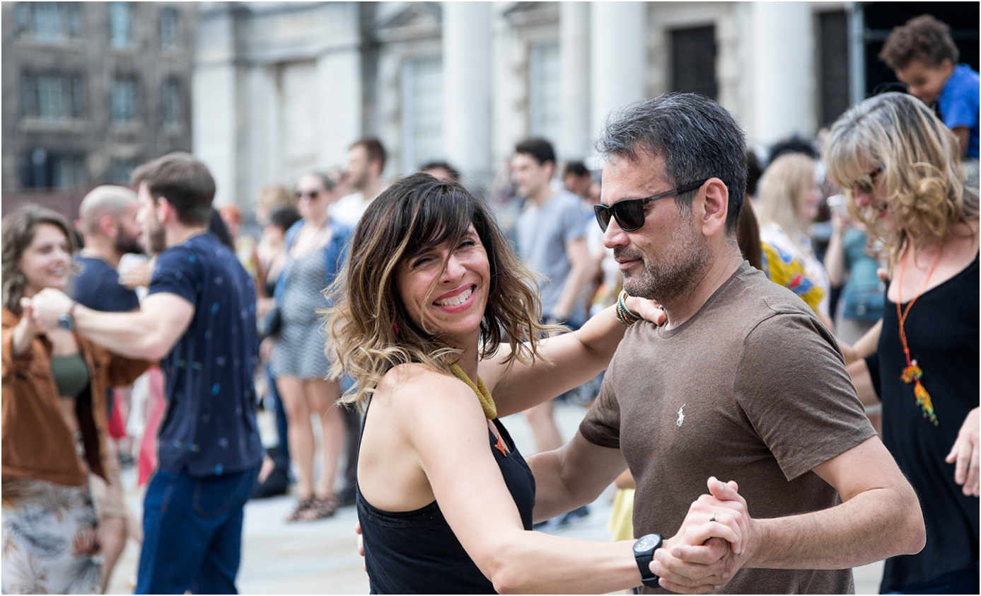
Aug 19 |
Comment |
It is definitely 'The Decisive Moment' and you have isolated the couple nicely by the use of a wide aperture. I think Erik's elimination of the hand at the RHS nicely removes a distraction. Straightening the white building in the background has also worked well, but I am puzzled as to why the white building is leaning but the dark one behind it is straight up.
Congratulations on having the image accepted for next year's advertising. |
Aug 9th |
| 4 |
Aug 19 |
Comment |
A very interesting and moving story Erik. In this picture, as well as the main character (the bugler) there are other people to look at and study. There is the man with his hand on his heart, clearly moved by the occasion, and the young man in front of him with his hands together, looking solemn and thoughtful. There is also the Vet's grand-daughter saluting and the young man beside her holding the small child. All are caught in a few moments of their own thoughts as TAPS is being played. This is definitely an image to keep. |
Aug 8th |
| 4 |
Aug 19 |
Comment |
Thomas, this is an excellent action shot caught at exactly the right moment. The rider and horse are sharp against the out of focus background of trees. Your cloning of the trees on the left has been well done - I could not see any evidence of cloning. The image seems a little dark on my monitor and I wonder if you might try the Shadows/Highlights adjustment in Photoshop to brighten it up. I find this can be quite useful sometimes, followed by a Curves layer to restore contrast. |
Aug 8th |
| 4 |
Aug 19 |
Comment |
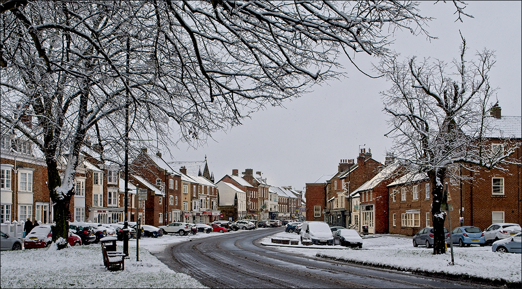
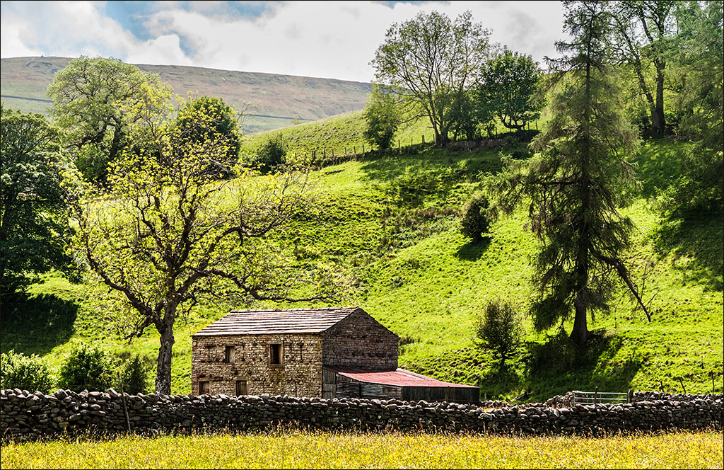
This takes me back. I was there in September 1997 at dawn and got some nice shots. The place must be in a time warp because it doesn't look any different, although I imagine the trees and foliage have grown. You found a really good viewpoint Bill and framed the barn well with the trees to hold in the sides and the shadows to add interest to the foreground. Also, you have managed to keep it sharp from front to back. I sympathise over the score of 10 in the PSA International. I've had similar results in other internationals with what I felt were good landscapes. Some judges only ever want to see people. |
Aug 8th |
| 4 |
Aug 19 |
Comment |
Super shot and good choice of shutter speed to show the action of hammer and flying chips. It is well exposed and there is no clutter to detract from the subject. That's a huge piece of marble he is working on, but some of the ones shown in your supporting shots are truly enormous - wouldn't quite fit in my living room!!! |
Aug 8th |
| 4 |
Aug 19 |
Comment |
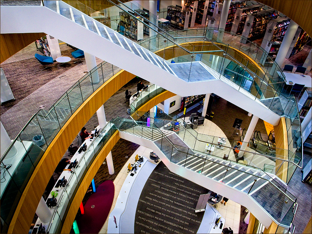
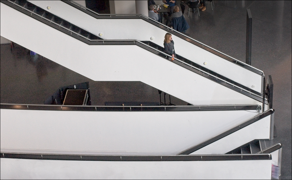
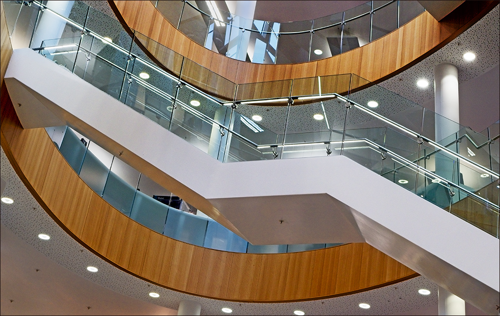
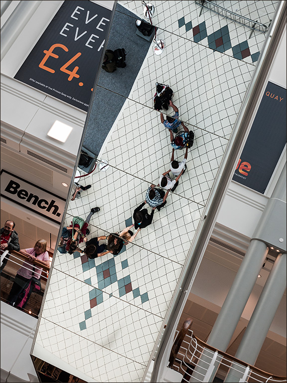
Joe, this is the sort of picture I would have taken if I had been there. The long line of the escalator and the hoop-like structure takes the viewer into the image and away up almost to infinity. It is good that you have held the roof line all the way up without obscuring the top at the end. There is, however, a rather disturbing aspect caused probably by wide-angle distortion. Looking closely you can see that the near steps slope to the right but the mid-ground and far steps slope to the left, causing a conflict in the viewer's mind. I can appreciate that there is very little time in this situation after getting on the escalator to see the picture, raise the camera, focus and get the shot, before being carried too far and the opportunity is gone. Consequently, I wondered if the distortion could be easily corrected in Photoshop. I used Edit>Transform>Distort and pulled the bottom left handle down, and the top left handle up. It took a little bit of experimentation but I think I got it about right. |
Aug 8th |
 |
6 comments - 10 replies for Group 4
|
| 7 |
Aug 19 |
Reply |
Thanks Tony. Glad you like it. |
Aug 16th |
| 7 |
Aug 19 |
Comment |
I like Tom's suggestion to open up the shadows. There's an old trick that still works well if you have Photoshop. Go to the Shadows/Highlights adjustment and apply the default setting (Shad 35/Hlts 0) and then use a Curves adjustment layer to restore contrast. You may prefer to put the Curves layer in Luminosity blend mode to avoid affecting the colours too much. |
Aug 15th |
 |
| 7 |
Aug 19 |
Reply |
Thanks Rich |
Aug 15th |
| 7 |
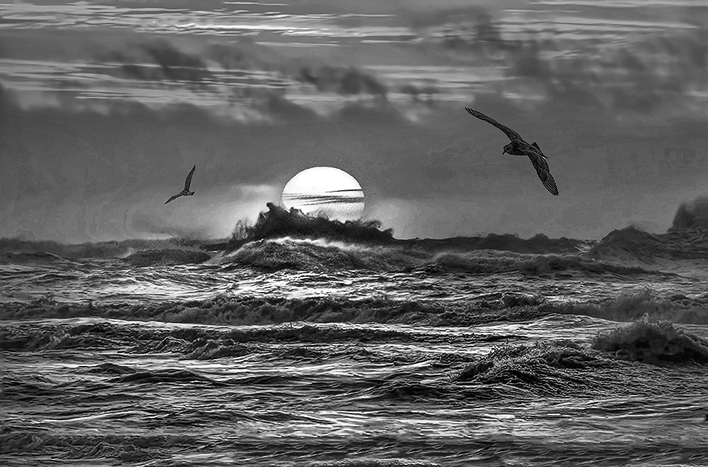
Aug 19 |
Comment |
Tony, your direct shot into the setting sun is very dramatic, especially with that breaking wave bursting upwards. I think this image would make a very dramatic monochrome. I used a b/w layer in Photoshop to pull down the red and boost the yellow response from the top of the sun downwards (using a narrow gradient on the mask), and then a second b/w layer to pull down the red response on the sky to stop it blowing out. Finally I made a freehand selection of the sun and highlighted waves, featherd it well and used a Curves layer to boost the contrast to bring up the highlights. Hope you like it. |
Aug 9th |
 |
2 comments - 2 replies for Group 7
|
| 16 |
Aug 19 |
Comment |
Joan, your composition is excellent with the reeds coming in from the right taking you straight to the kayaker. I think it would be even stronger if you were to crop out much of the sky, and also take out some of the plain water in the foreground so that the base of the reeds gets close the bottom right corner. I would also push up the contrast and darken the sky a little. |
Aug 9th |
1 comment - 0 replies for Group 16
|
| 26 |
Aug 19 |
Comment |
I love it! My only suggestion would be to tone down the trees top right a little to reduce brightness and bring out more detail. |
Aug 9th |
1 comment - 0 replies for Group 26
|
| 43 |
Aug 19 |
Reply |
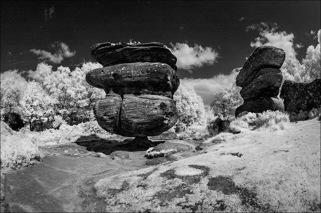
Mark, I agree about contrast being tricky with b/w infra red, especially when you have such a vivid bright tree as you have here. You could try in the Shadows/Highlights adjustment in Photoshop (default setting Shad 35/Hlts 0) and then use a Curves layer to restore contrast. |
Aug 10th |
| 43 |
Aug 19 |
Comment |
Mark, the difference between the shaded angular church and the bright rounded tree creates an attractive visual contrast. I think you could add drama to the scene with some extra contrast. It is a pity that you have just clipped the roof at the left edge. |
Aug 9th |
1 comment - 1 reply for Group 43
|
| 58 |
Aug 19 |
Reply |
Thanks for the welcome. Nice group! |
Aug 13th |
| 58 |
Aug 19 |
Comment |
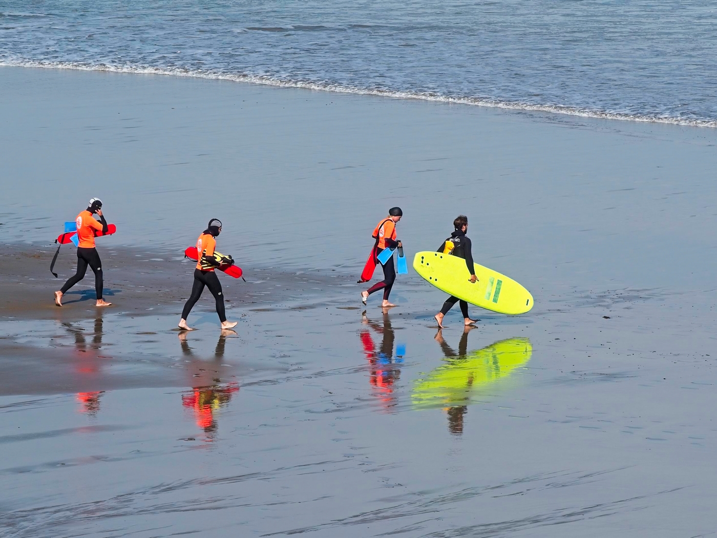
The contrast is very high between the dark tops of the foreground figures and the brightly lit sea in the background. I tried a trick that I have used many times - I took it into Photoshop and applied the Shadows/Highlights adjustment at the default setting (Shads 35/Hlts 0), then I used a Curves layer to darken it down. This reduces the contrast range and also makes the colours richer. |
Aug 12th |
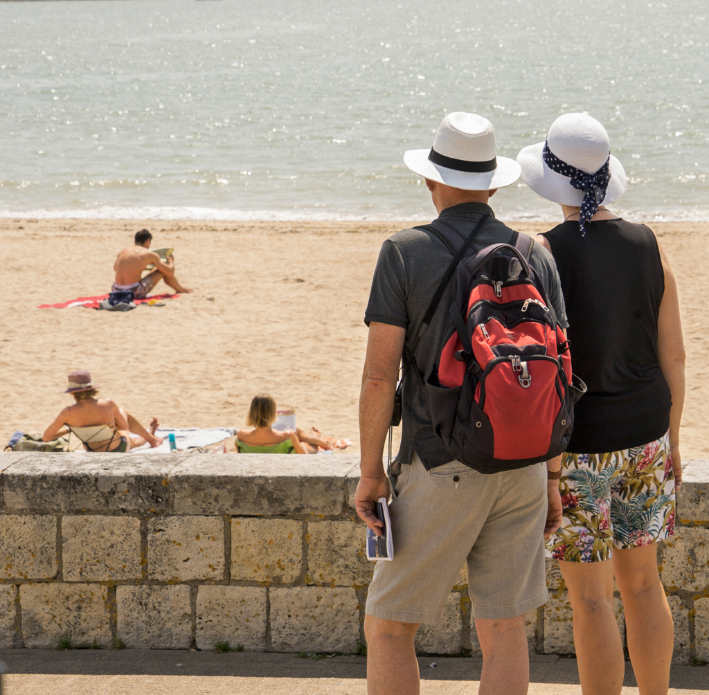 |
| 58 |
Aug 19 |
Comment |
Great candid shot. The poor girl looks like she has never seen a $20 bill before. I like Isaac's crop. |
Aug 12th |
| 58 |
Aug 19 |
Comment |
A nice group of seven girls watching cricket and one looking thoroughly bored. There's always one isn't there. I think it is a pity that you you were not able to find a viewpoint that showed us something of the cricket match in the background. |
Aug 12th |
| 58 |
Aug 19 |
Comment |
Dan, but for the red mailbox and the notice on the fence, this could have been taken in an English village. The image just exudes peace and tranquility. |
Aug 12th |
| 58 |
Aug 19 |
Comment |
Hassan, the man, the bicycle and the tree make a really nice composition. My immediate thought was to crop in a little closer to make the man more clearly the main subject in the frame. I took it into Photoshop and cropped it. Then, before posting my version I scrolled on down to see Isaac's comments and would you believe, my crop was almost exactly the same as Isaac's! |
Aug 12th |
| 58 |
Aug 19 |
Comment |
Nice idea Isaac and well caught. Getting the angle of her head to match the angle of the little girl in the picture really makes the image. |
Aug 12th |
6 comments - 1 reply for Group 58
|
19 comments - 15 replies Total
|