|
| Group |
Round |
C/R |
Comment |
Date |
Image |
| 4 |
Jul 19 |
Reply |
Recharging points! Now there's a thought! |
Jul 15th |
| 4 |
Jul 19 |
Comment |
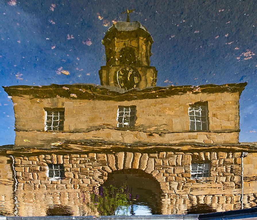
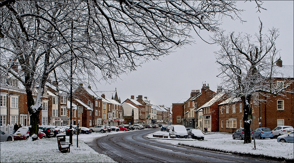
Bill, I did punch up the contrast. Guilty as charged! |
Jul 12th |
| 4 |
Jul 19 |
Reply |
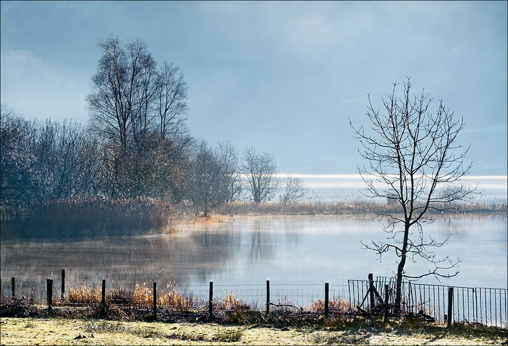
The colour you see on your monitor depends on several factors. Your browser has to be colour managed - I use Firefox which is, but many others are not. Web sites usually work in sRGB so if you post something in Adobe RGB or any other colour space it may not show properly. And of course it depends on whether your monitor is properly calibrated or not, and the calibration being up to date. My monitor is calibrated and is up to date, and the snow looks brown to me. I copied the image into Photoshop and took a spot reading of the snow. The colours came up at R 205, G 188, B 160, showing that the snow is brown in the web image. How it got like that I can't say. |
Jul 12th |
| 4 |
Jul 19 |
Reply |
Don't forget that you are talking Centigrade, Ian, whereas Isaac is talking Fahrenheit! Minus 30 F is minus 34.4 C. Minus 3 C is +26.6 F. |
Jul 11th |
| 4 |
Jul 19 |
Comment |
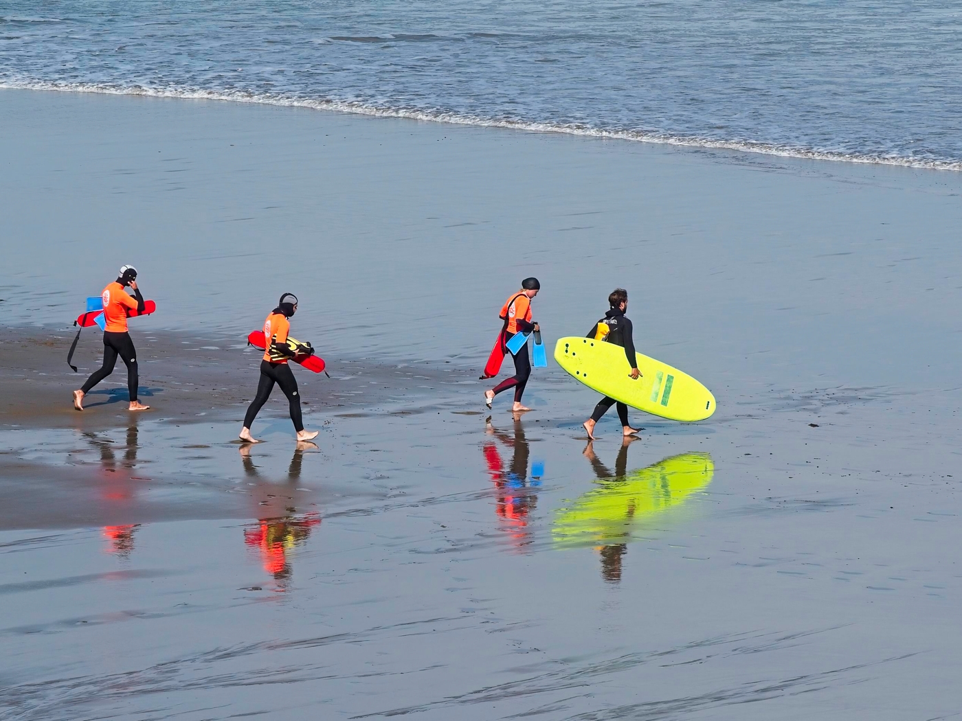
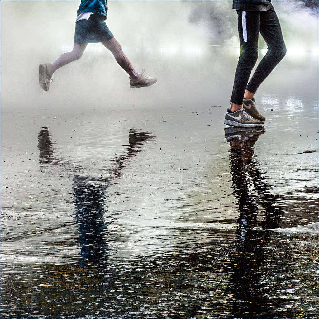
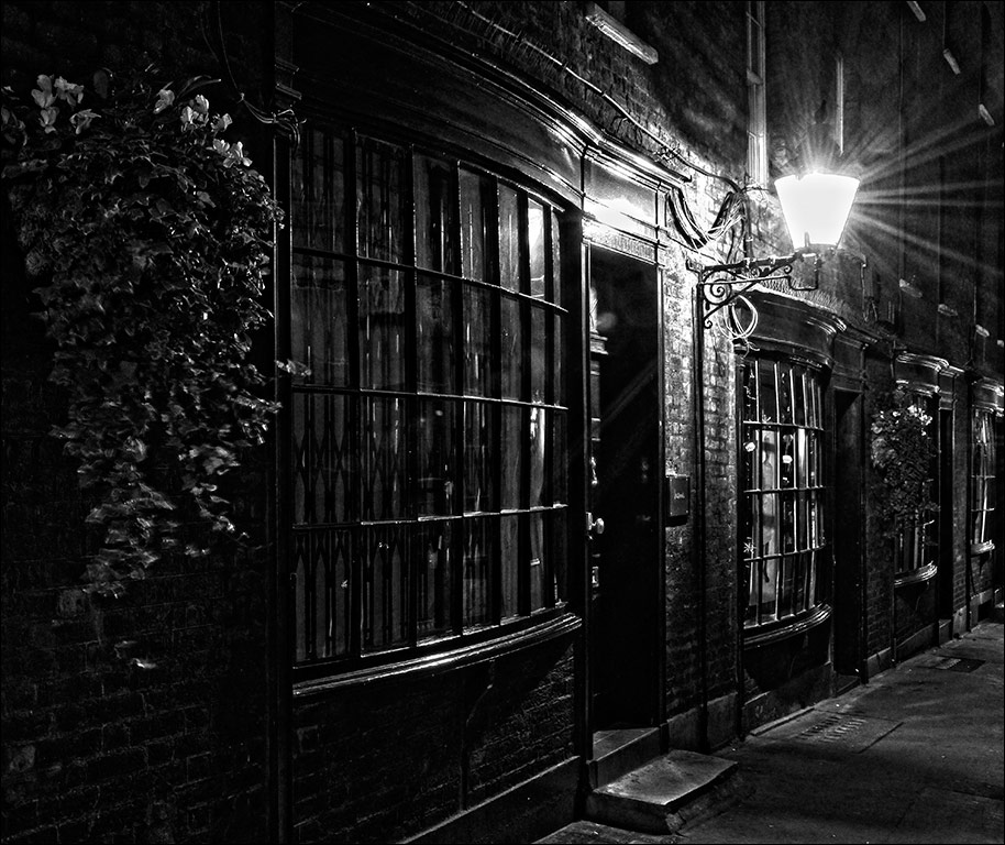
Thomas, this is a superb action shot with everything sharp where it should be, even the drops of water coming off the surfboard. I rather like the line of foam under the man which exactly follows his shape. I would like to see the man stand out more from the background so I used a Hue/Saturation layer in Photoshop, selected the red channel and increased the saturation and lightness. I also levelled the horizon. |
Jul 8th |
 |
| 4 |
Jul 19 |
Reply |
Ian, in my book you can use as much artistic/poetic licence as you like. You TAKE a photograph and then you MAKE a picture. What you do between the taking and the making is up to your interpretation and what you want to present. |
Jul 8th |
| 4 |
Jul 19 |
Reply |
Do you think evolution will eventually produce a new human with long flexible thumbs, hunched backs and bent necks - "homo iphonicus" perhaps? |
Jul 7th |
| 4 |
Jul 19 |
Reply |
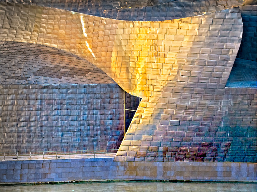
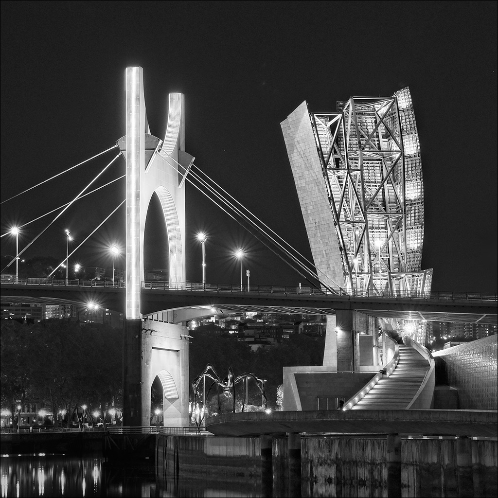
Yes Joe. I have a huge number of shots, both day and night that I still need to sort through! THere is also a Gehry hotel in a small town way out in the country. I've got some shots of that too. I could bore the Group stiff with Gehry shots, but I'll be good and only use a few in the coming months! |
Jul 7th |
| 4 |
Jul 19 |
Comment |
You have caught the action well under difficult conditions. The very bright flame would affect the exposure so your choice of +.33 compensation has paid off. At this resolution there is no sign of any noise from the use of a high ISO, and everything is sharp. The lighting creates a very warm tone which goes well with the theme of fire and brimstone (although brimstone, ie sulphur, actually burne with a blue flame but we'll ignore that - artistic licence!). Would it be a good idea to tone down the rather bright light at the left hand edge? |
Jul 7th |
| 4 |
Jul 19 |
Comment |
What a great piece of action in the natural world! It's an excellent capture, and that must have been really frustrating to have your card fill up at the critical moment. My only comment is that the image has come up a little dull and shows the right hand end of the histogram at 200, nowhere near a white point of 255 - probably something to do with converting to jpg and putting it on the website. A minor tweak in Photoshop restores the imapact. |
Jul 7th |
| 4 |
Jul 19 |
Comment |
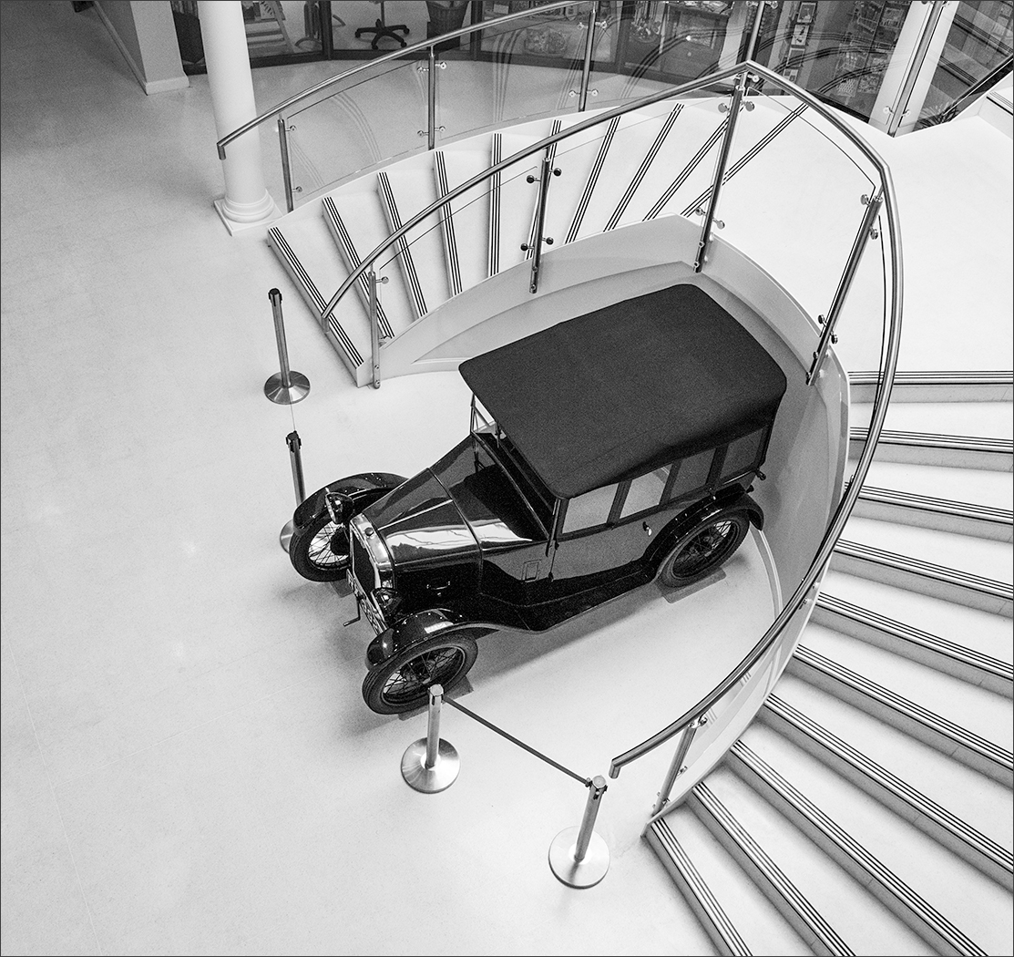
Nice piece of work, Bill. Even though you were using an artsy-fartsy background, it's a classic Buchanan image of a classic car. I agree with Rick that you don't need a shadow under it. |
Jul 7th |
| 4 |
Jul 19 |
Comment |
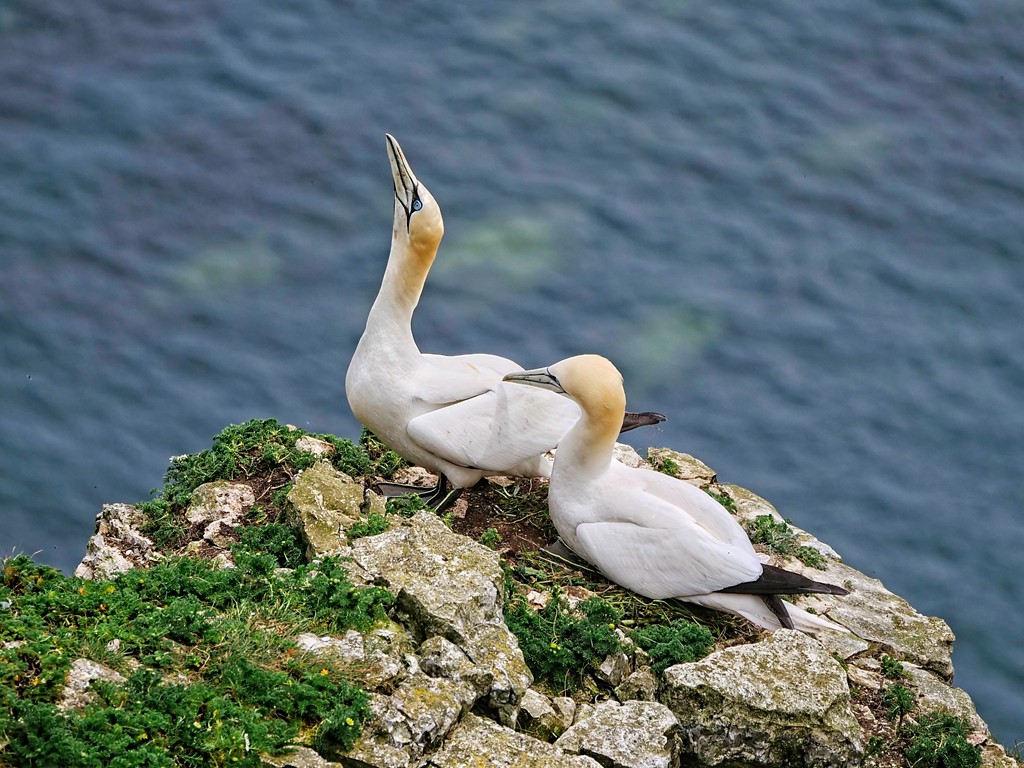
That's usually my sort of luck, Isaac! I didn't understand your title until I read the notes, as my attention was taken by the lovely textures in the snow and by the orange tent in the foreground. The Northern Lights do appear to have changed the colour of the sky and there is a gentle glow appearing behind the trees but, as you say, it's very subtle. |
Jul 7th |
| 4 |
Jul 19 |
Comment |
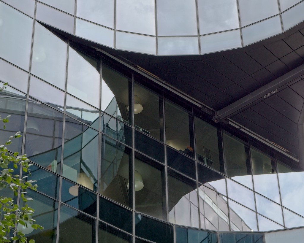
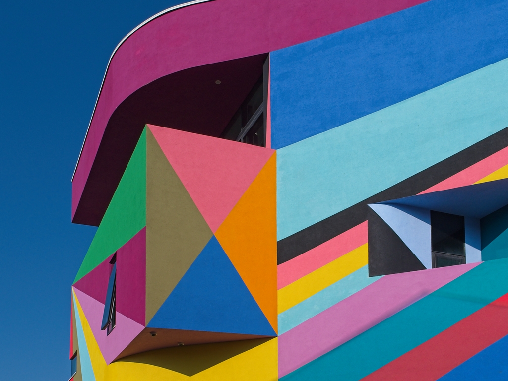
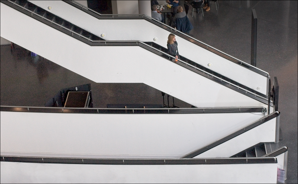
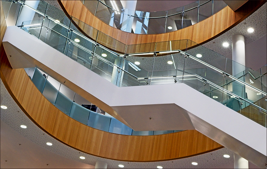
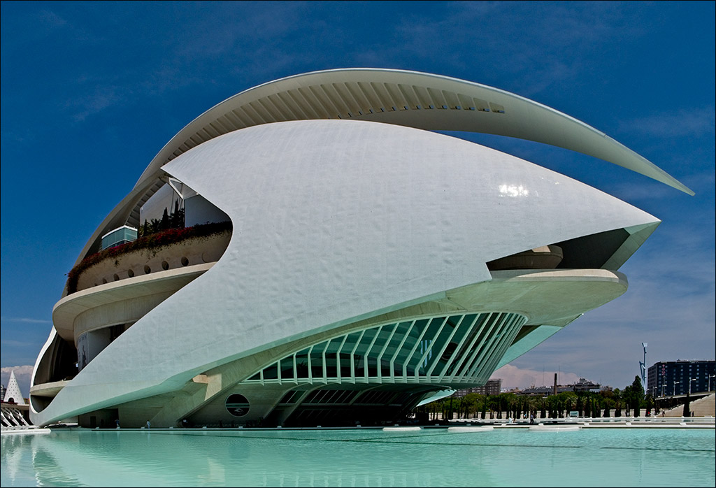
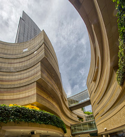
Joe I think this is a super image. I really like it as it is. The interacting curves of the two buildings lead the eye beautifully through the image. Personnally, I would not even try to straighten it up, as I like it as it is. However, I did try the Perspective control in Photoshop (Edit>Transform>Perspective) and pulled the top corner handles out and the bottom corner handles in so that the centre handles stayed on the original edges of the image. Then I cropped to eliminate the white space. However, in my view this loses too much of the original. I think the original image works because it is quirky. If you try to make it more 'correct' it loses some of its interest. |
Jul 7th |
 |
7 comments - 6 replies for Group 4
|
7 comments - 6 replies Total
|