|
| Group |
Round |
C/R |
Comment |
Date |
Image |
| 4 |
May 19 |
Reply |
Hi Erik. Paula and I can probably mke it. Can you email me the dates you will be in London? |
May 19th |
| 4 |
May 19 |
Reply |
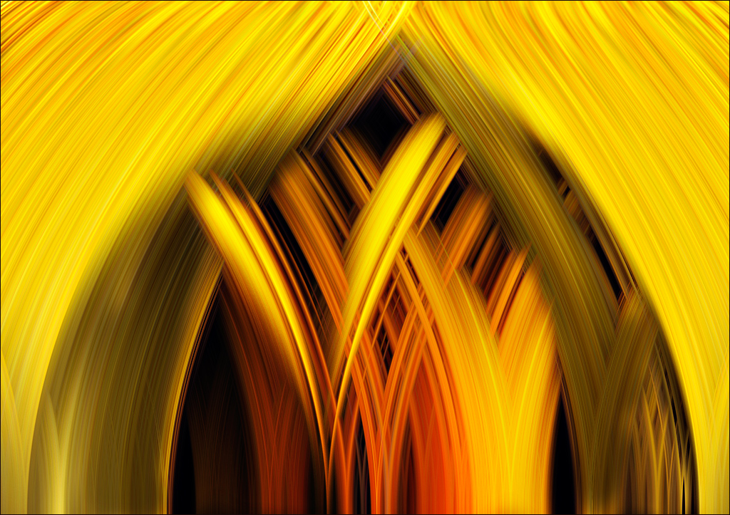
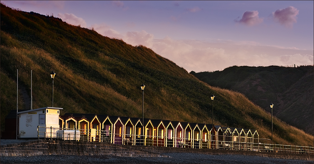
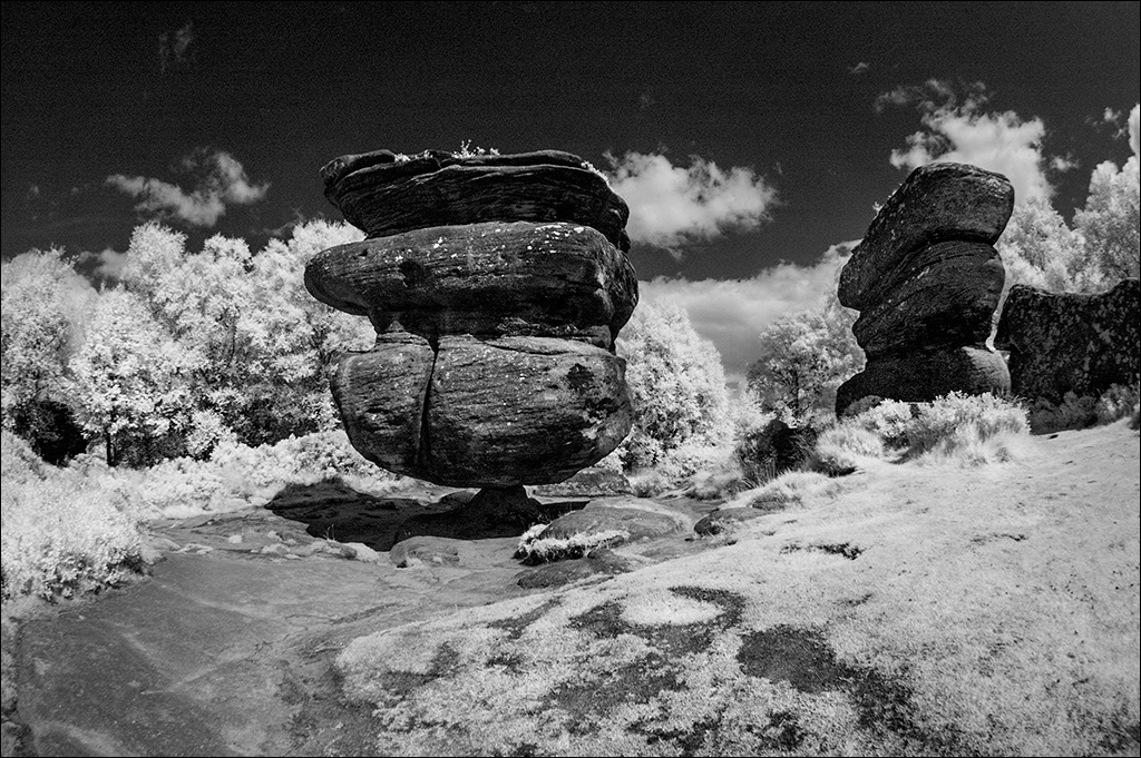
Isaac, I prefer the warmer tones of the original in the storm. |
May 18th |
| 4 |
May 19 |
Reply |
Thanks Erik. I'll tone down that hot spot and get rid of the square box. |
May 11th |
| 4 |
May 19 |
Reply |
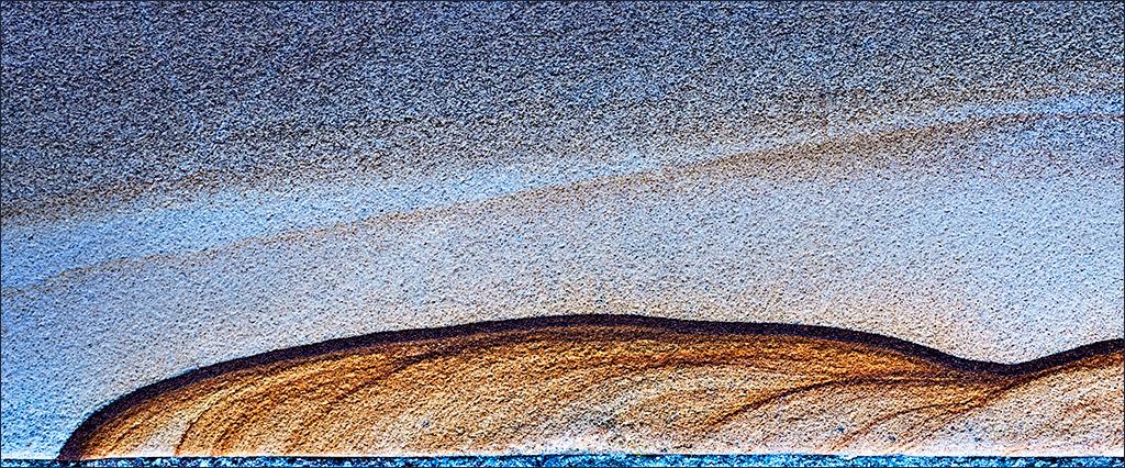
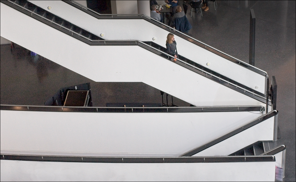
Isaac, I think your adjustment does make the image appear better. I suspect you are right about the light at the blue hour so Erik's image may be a better representation of the truth, but yours appears better to the eye. It's a bit like taking photographs under incandescent light. At the time of taking the photo, the human brain makes the correction for the yellow light and perceives the colours as they should be, but the uncorrected photo shows the truth and is very yellow. When looking at the uncorrected photo afterwards, the brain sees the yellow cast and perceives this as incorrect. |
May 10th |
| 4 |
May 19 |
Comment |
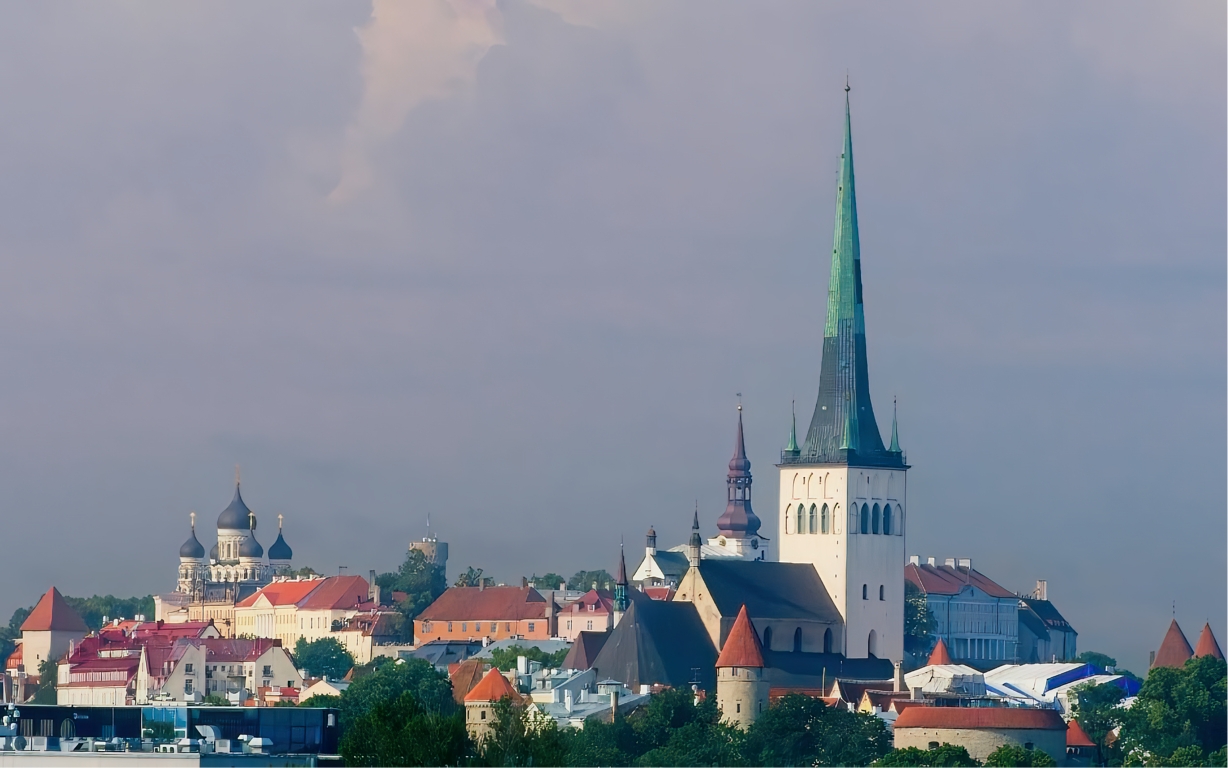
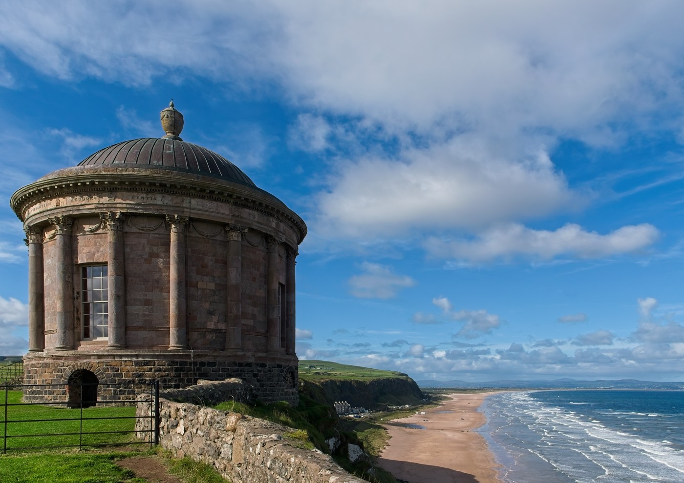
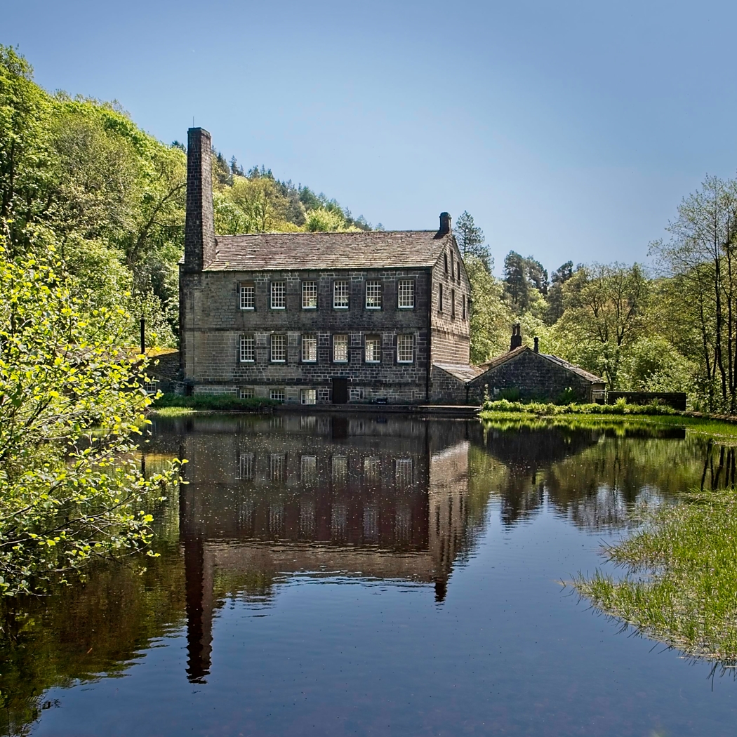
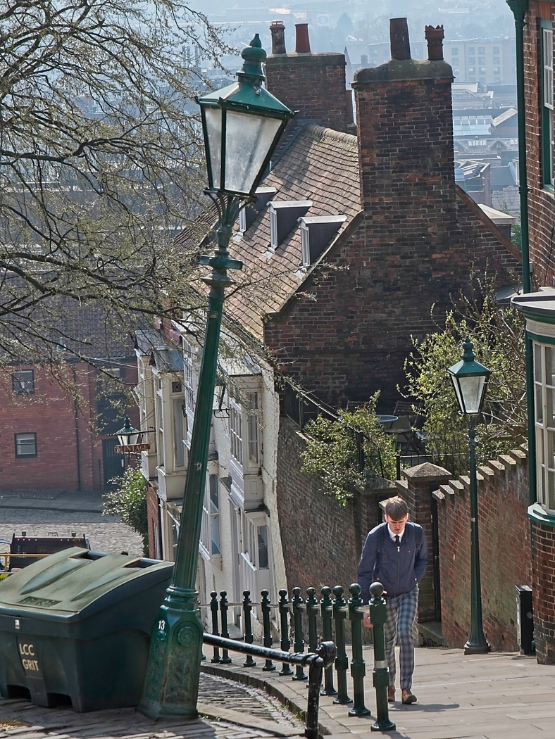
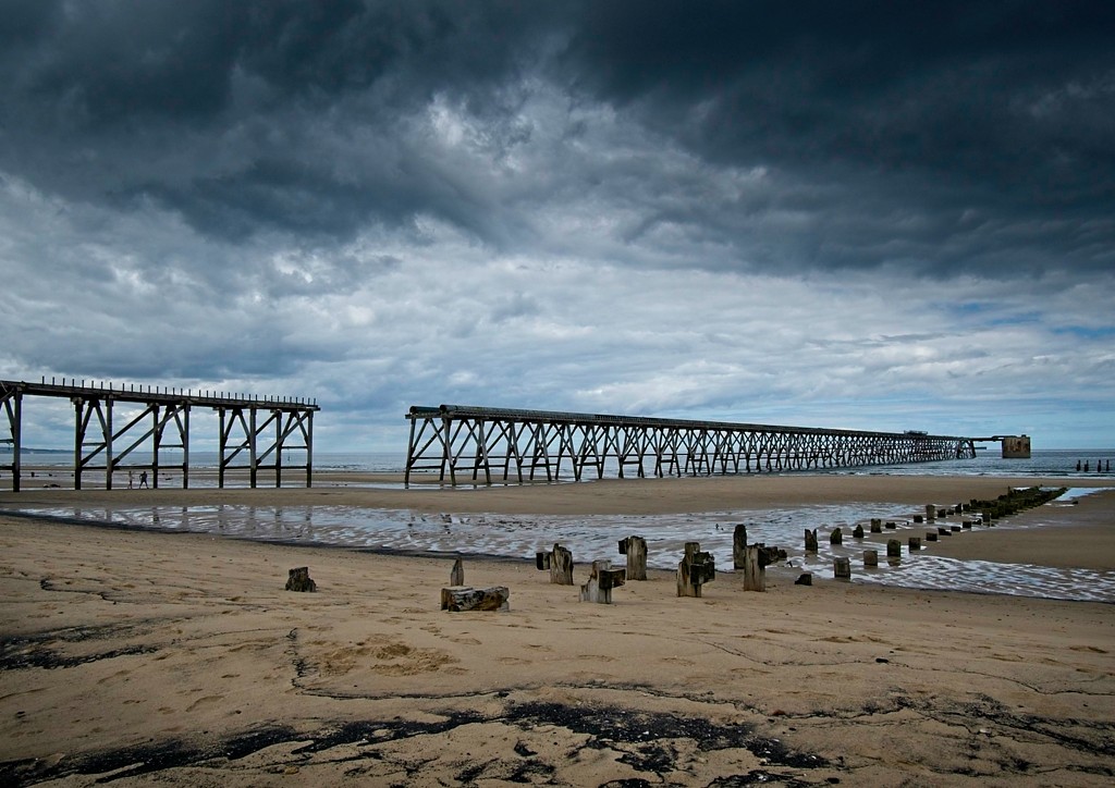
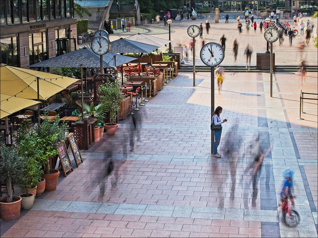
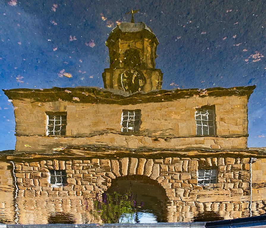
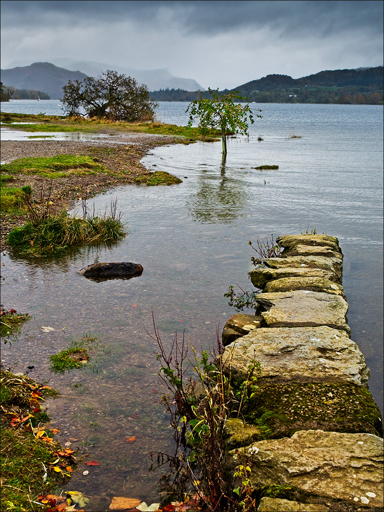
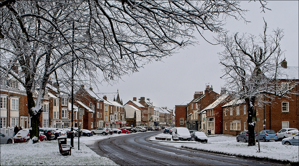
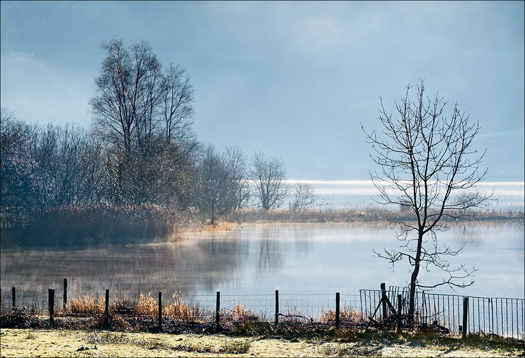
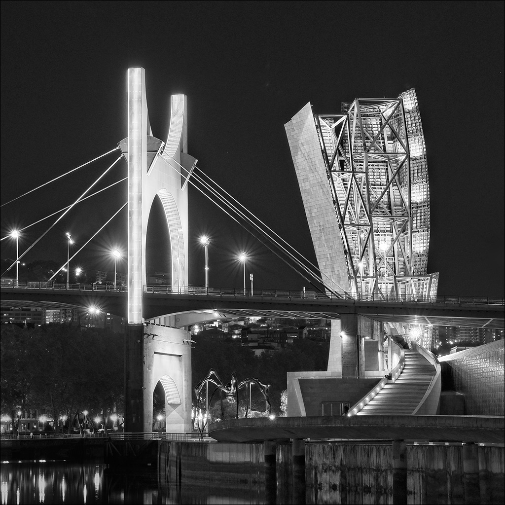
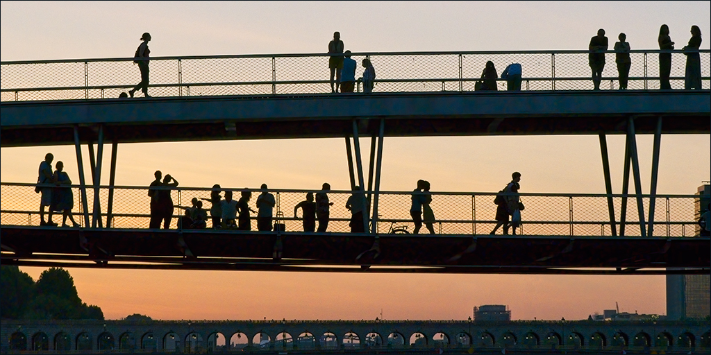
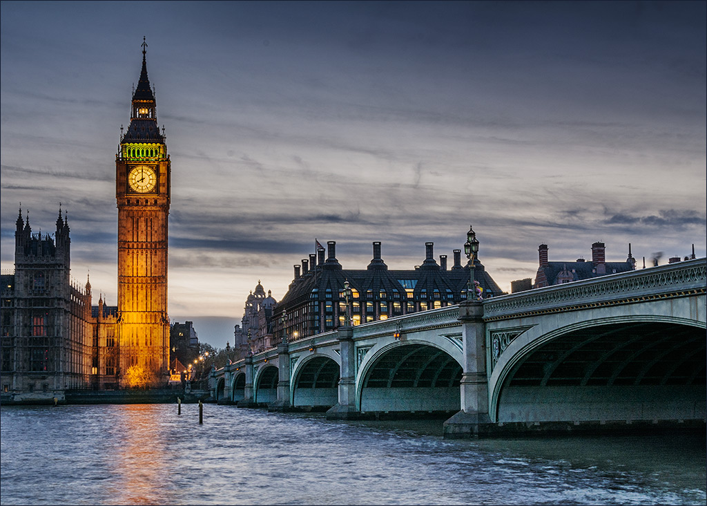
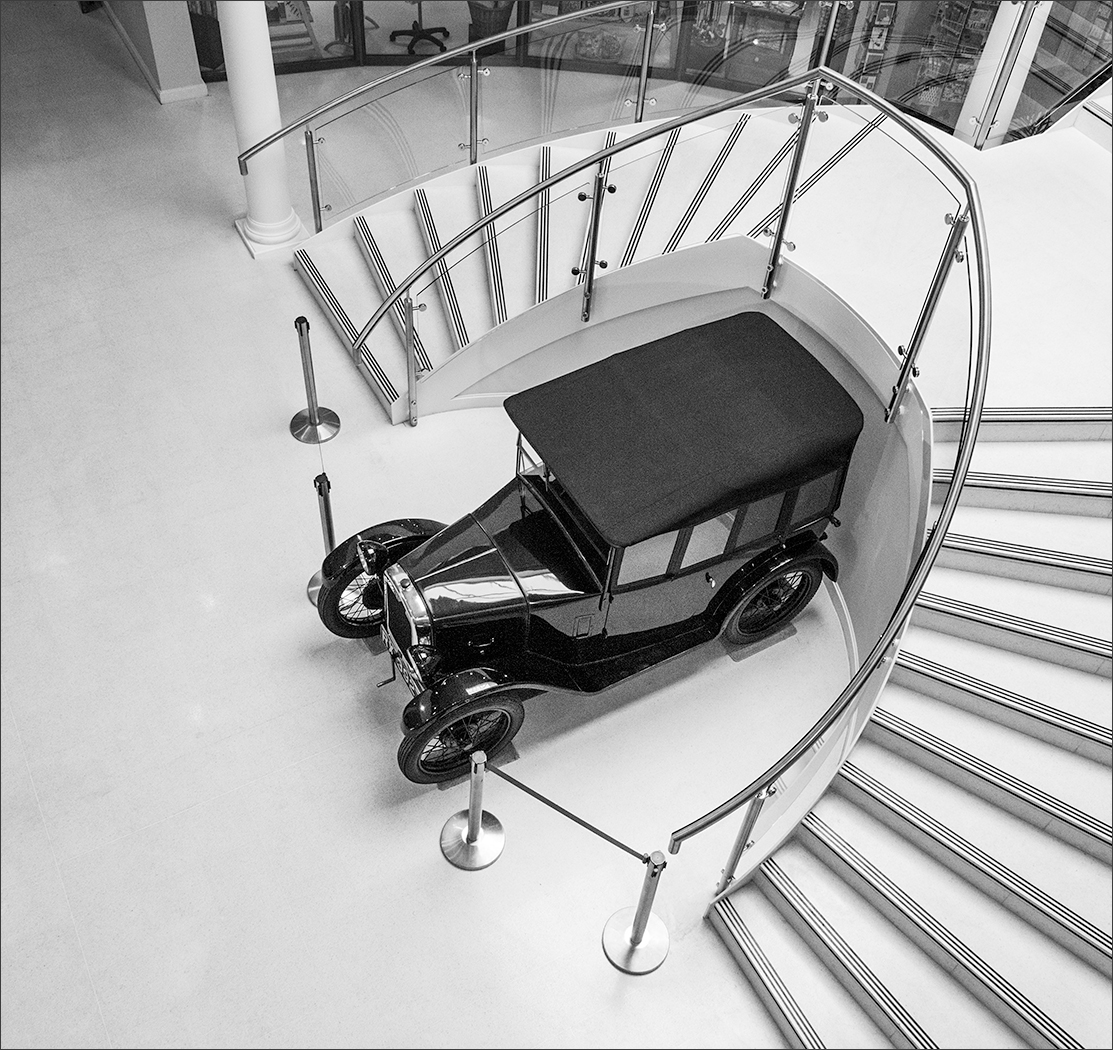
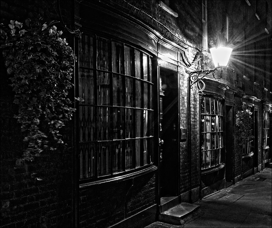
This image is clear, sharp and has great impact. The visual focus is the tower and its reflection which are well placed in the centre of the image. Although this breaks the 'rule of thirds', in this case it is the best composition. The clear light, the cloudless sky and the perfect reflection tell me that this is a very cold morning. However, I think the tower is not quite vertical in the image. A small image rotation in Photoshop would cure that. |
May 10th |
| 4 |
May 19 |
Comment |
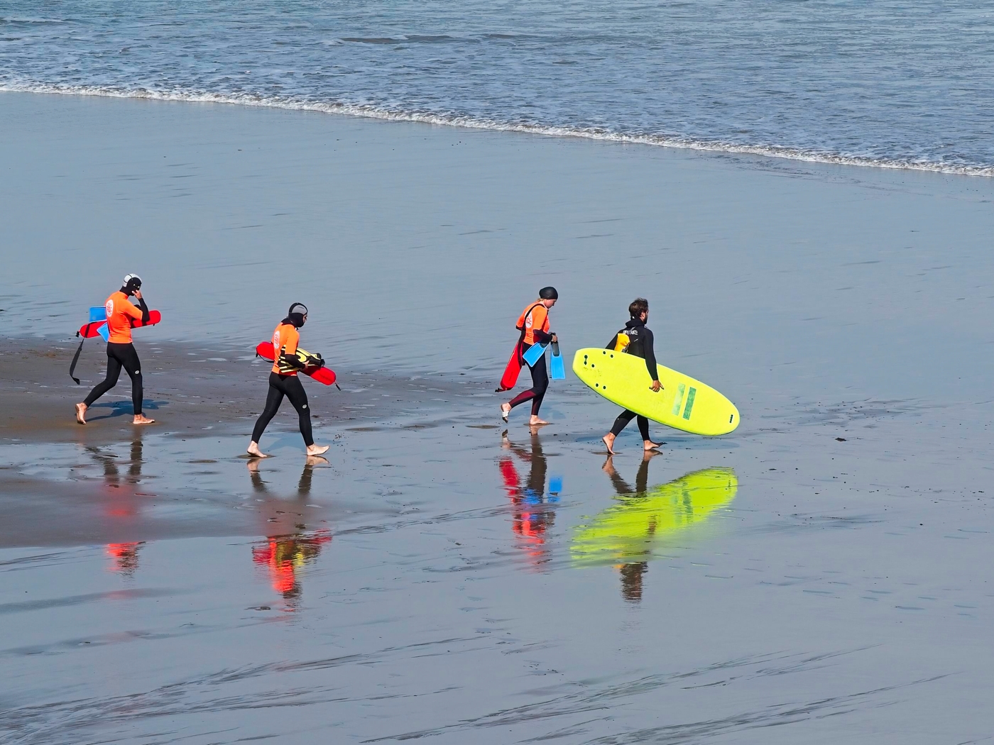
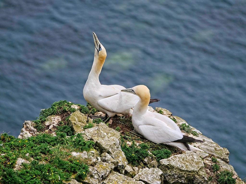
Superb image Bill. THe exposure is spot on for the white swan, allowing all the feather details to be seen without making it look dull or muddy. Did you talk to it nicely to get it to pose so beautifully??? Like Isaac, I like the fluffed up feathers caused by the wind. Unlike Isaac, I prefer the original crop because I love the soft blue and brown colours in the background water. |
May 10th |
| 4 |
May 19 |
Comment |
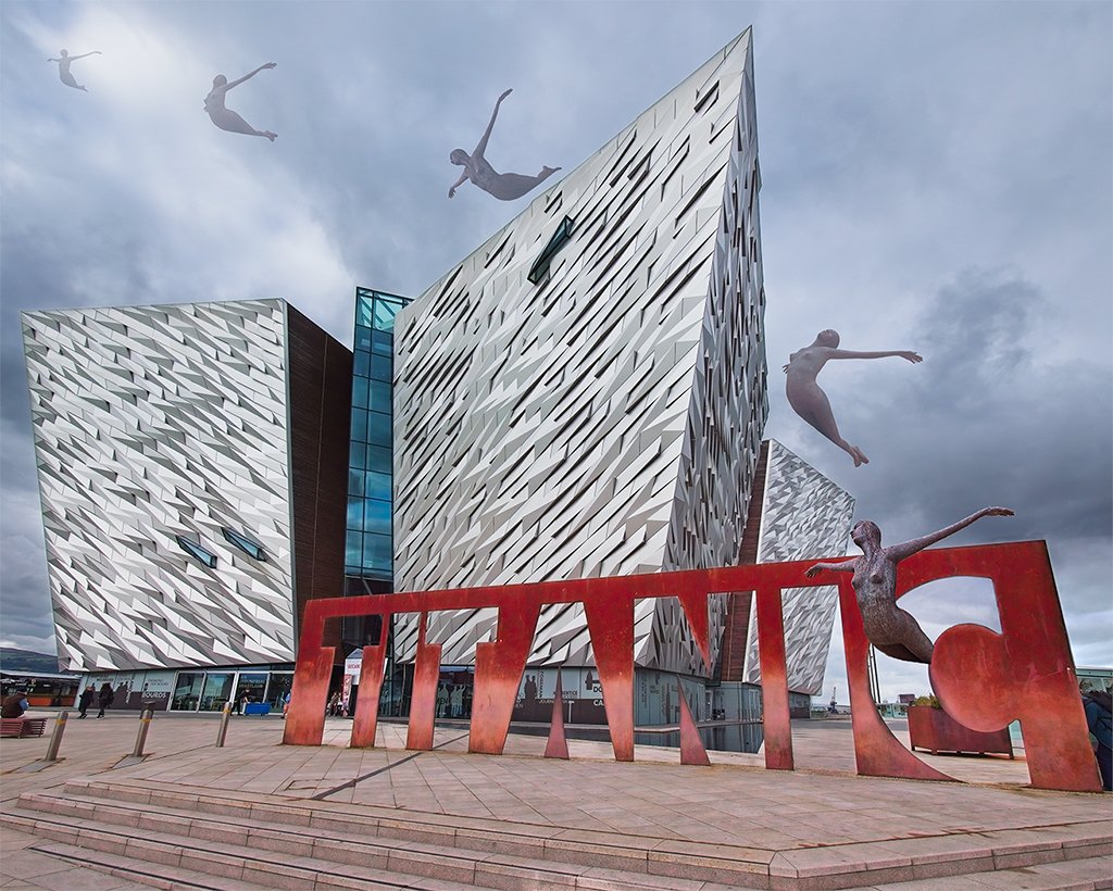
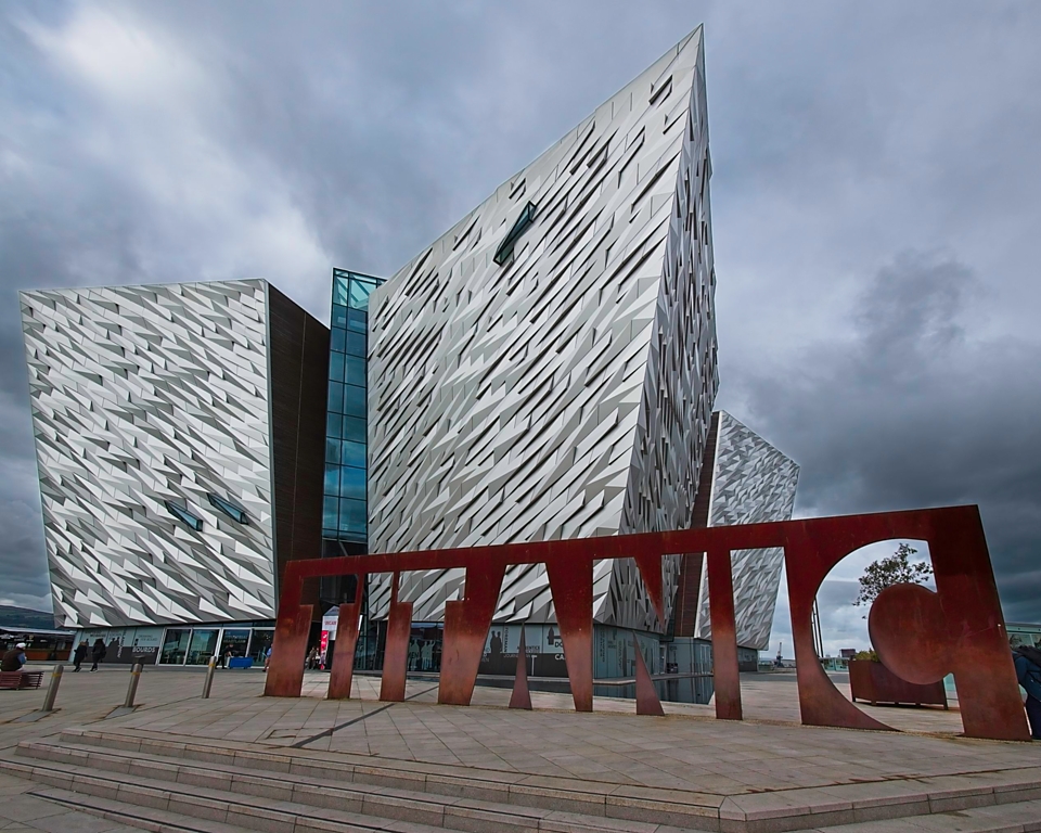
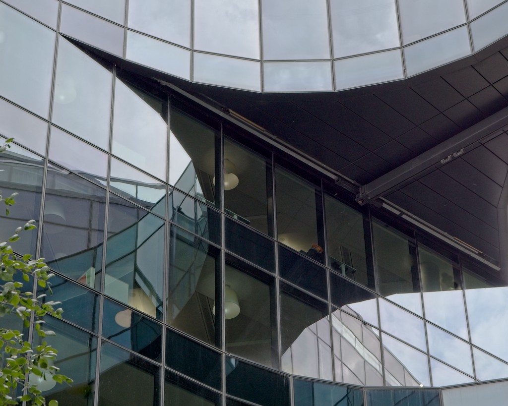
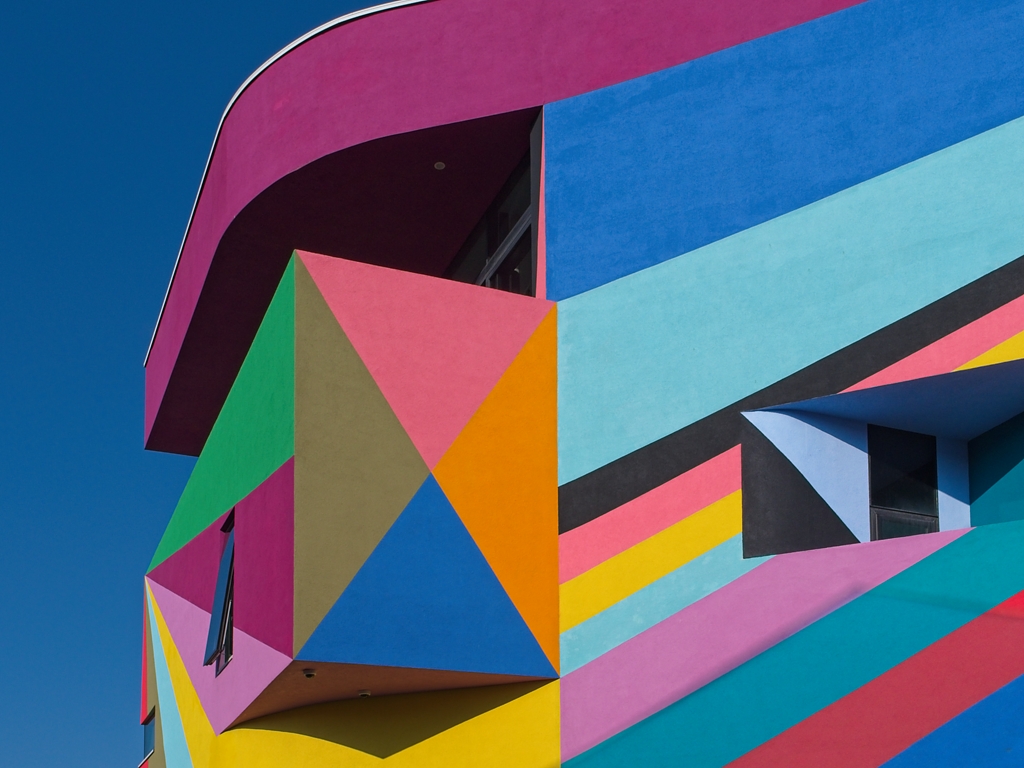
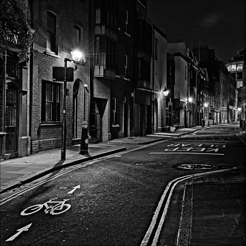
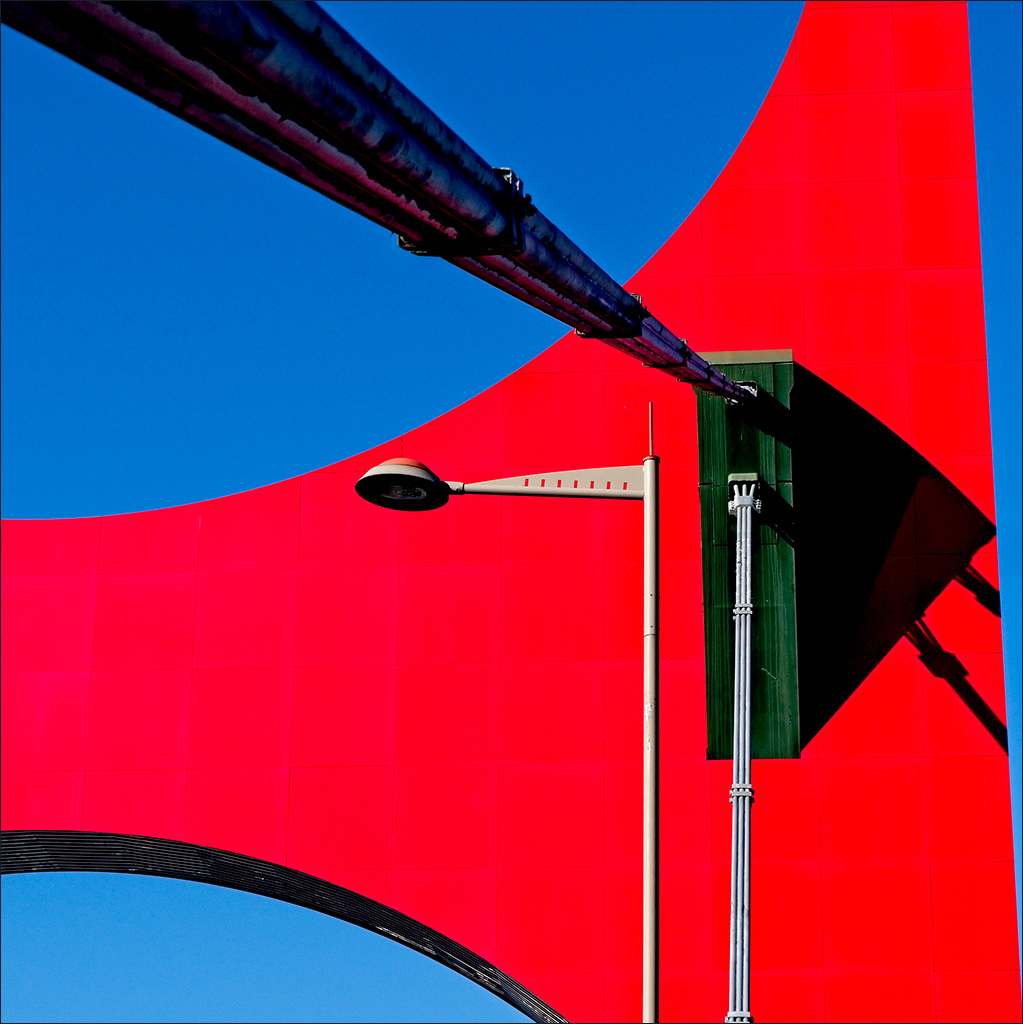
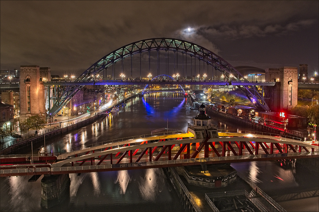
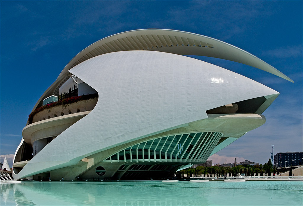
Ian, you always seem to get to the right places at the right time! The image is a great tribute and at the same time it is a very strong picture in its own right. The simple but strong colour palette of red and blue creates huge impact and of course, the building is impressive too. I have only one sugestion, and that is if you partly correct the perspective in Photshop, you can eliminate that little bit of structure that intrudes at the left hand edge. (This is not the same as cloning it out as that would not be right for a documentary image). I don't think it is necessary to correct the verticals fully as you might lose too much at the sides. |
May 6th |
 |
| 4 |
May 19 |
Comment |
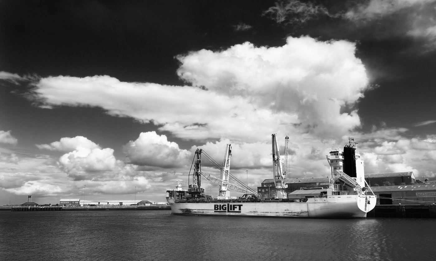
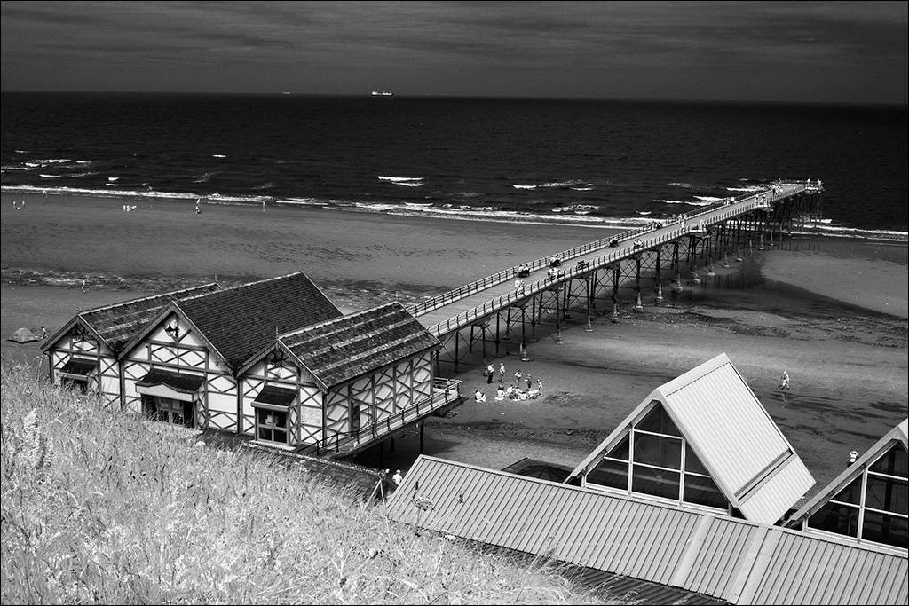
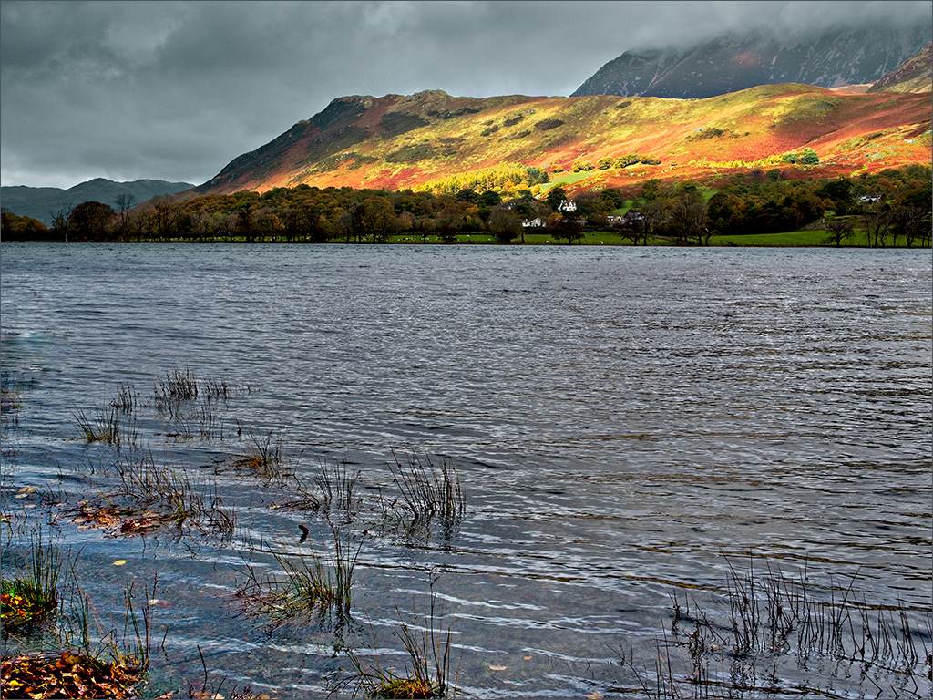
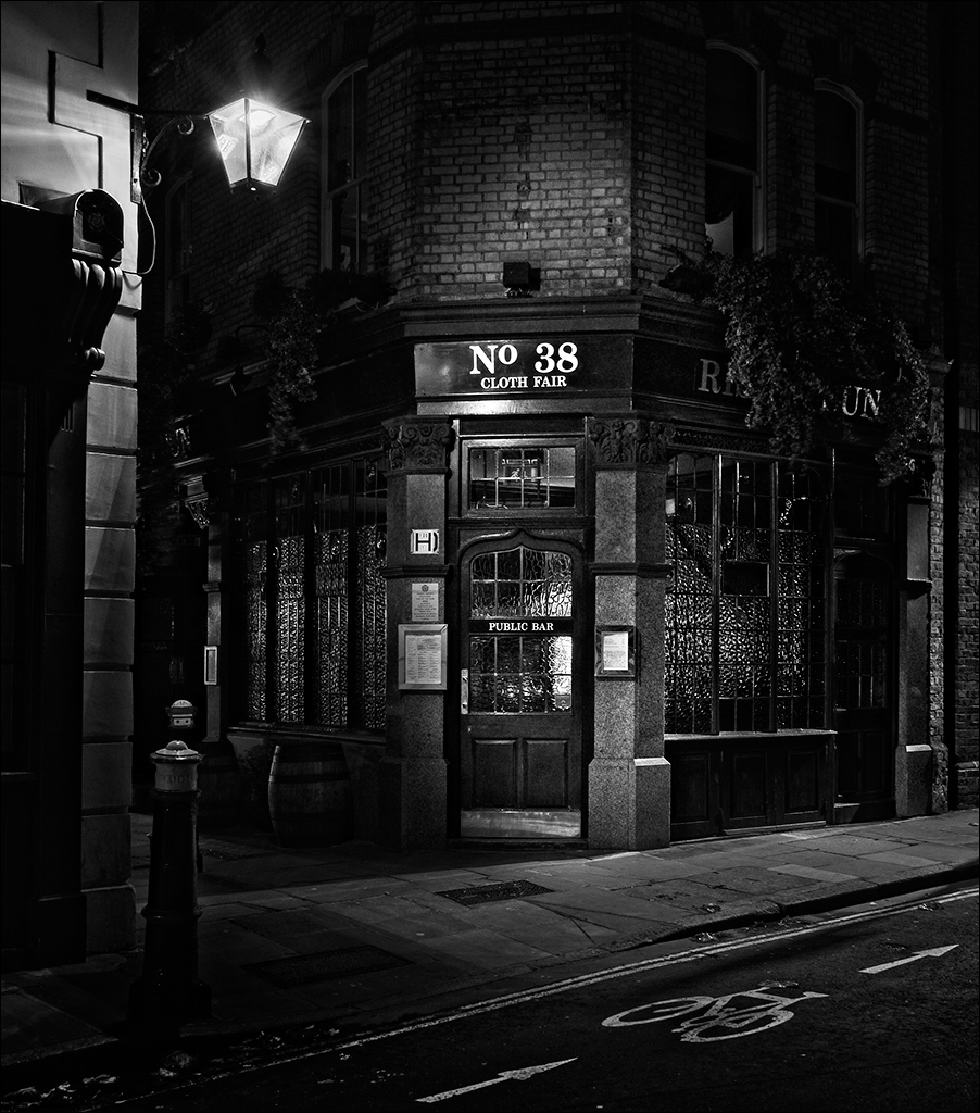
It's a lovely sunset and I like the panoramic effect of the letter-box crop. The clouds are good and have an interesting X-pattern in the sky (contrails I guess). The water reflections are good too. The white boats look like there might be a slight cyan cast in the image and I wonder if this could be taken out with a Color Balance adjustment on Photoshop. |
May 6th |
| 4 |
May 19 |
Comment |
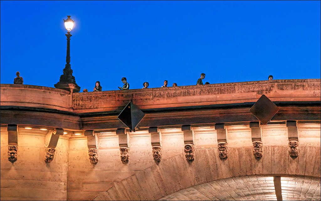
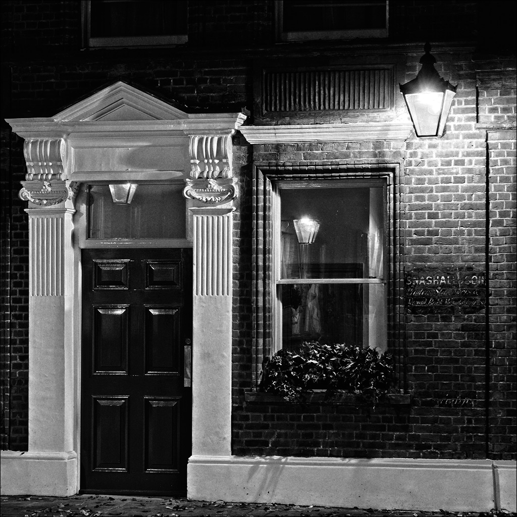
You have an eye for this sort of detail. How many of us would be looking at the big picture and missing this sort of thing? The picture is simple and colourful, and I like the rough texture of the red wall. I do feel I would like to see up to the top of the window though. |
May 6th |
| 4 |
May 19 |
Comment |
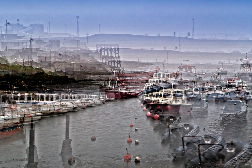
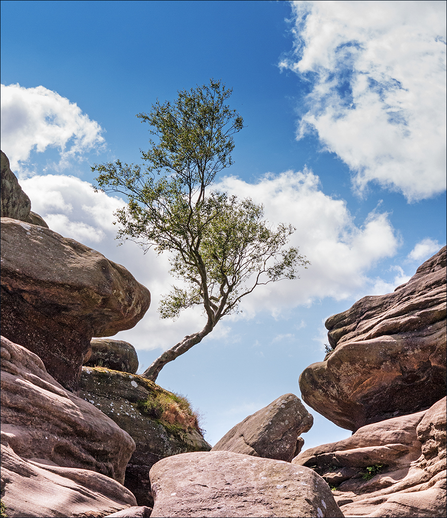
It's often a good idea to look round occasionally. THis is a classic example, because you have captured a superb image. Well done too for thinking on your feet in the changed circumstances and changing your camera settings. Combining 3 images has worked very nicely, and what is really interesting is that you can see the glowing white-hot spots in the cloud where the lightning is coming from. There is a curious dark streak in the centre of the cloud formation which may be an artifact or may be a natural phenomenon, but it looks a bit odd. I think there is a slight cyan cast in the darker areas. I tried a Color Balance layer in Photoshop and set the Shadows to +9 in the red/cyan slider, and then put the layer into Color blend mode so as not to affect the luminosity. |
May 3rd |
 |
6 comments - 4 replies for Group 4
|
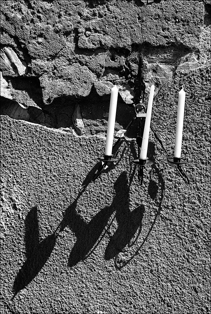
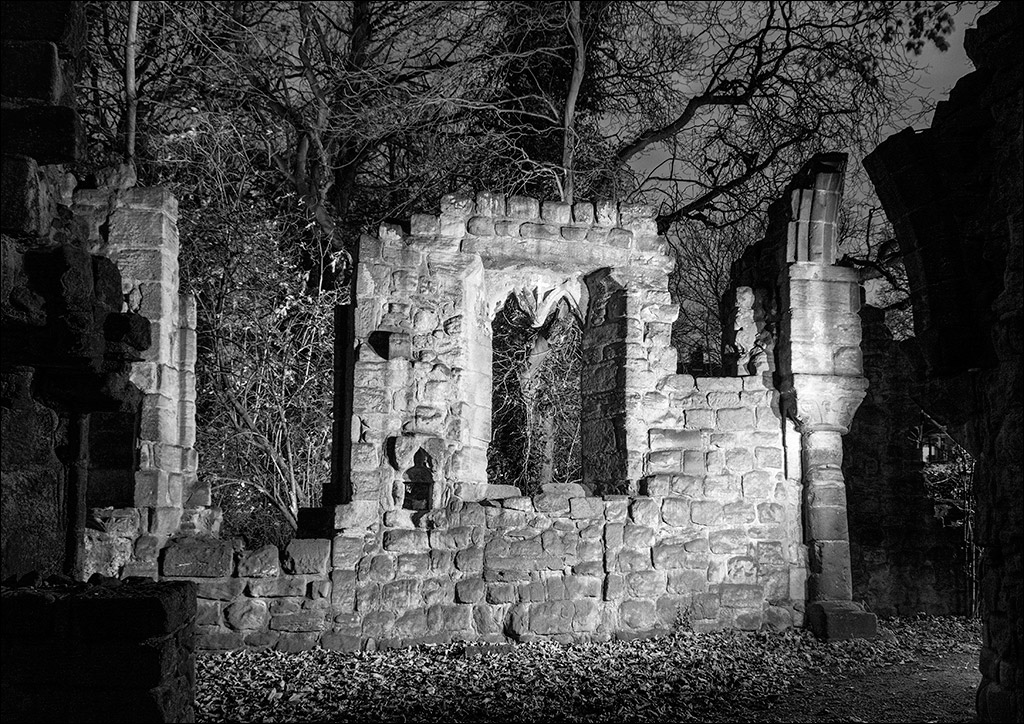
| 31 |
May 19 |
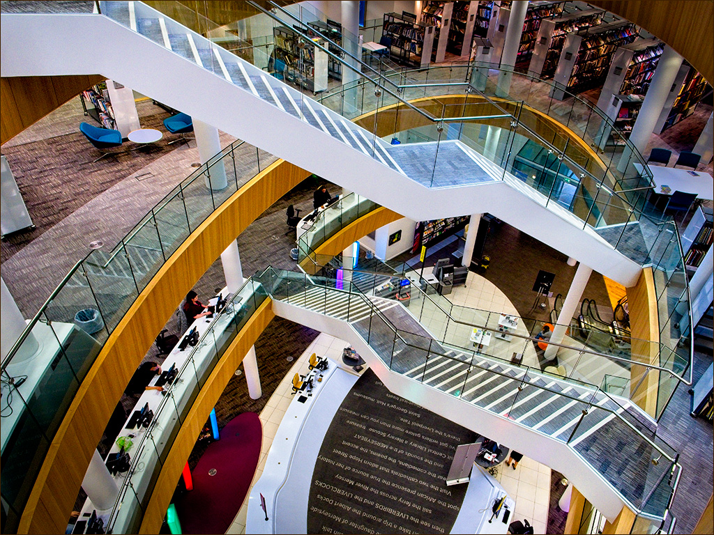
Comment |
The black & white rendering and the low-key tonal range of the image, along with the careful composition create a very sombre, reflective mood which perfectly matches the occasion.
Congratulations Ian on being added to Liverpool City Council's list. |
May 10th |
1 comment - 0 replies for Group 31
|
7 comments - 4 replies Total
|