|
| Group |
Round |
C/R |
Comment |
Date |
Image |
| 2 |
Sep 18 |
Comment |
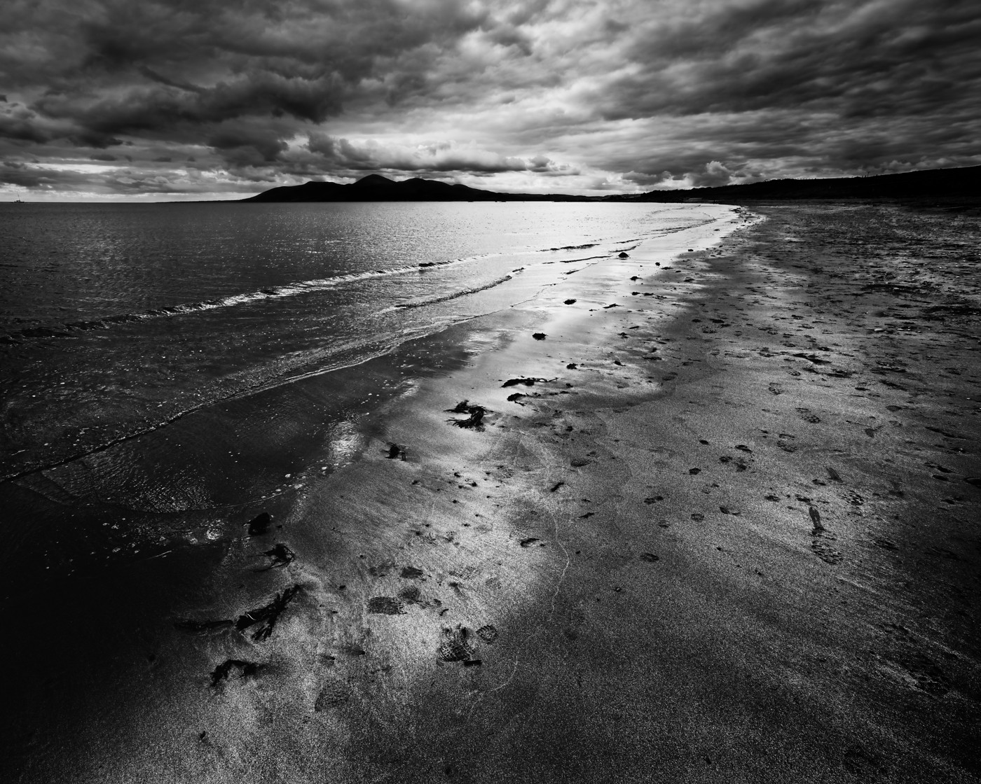
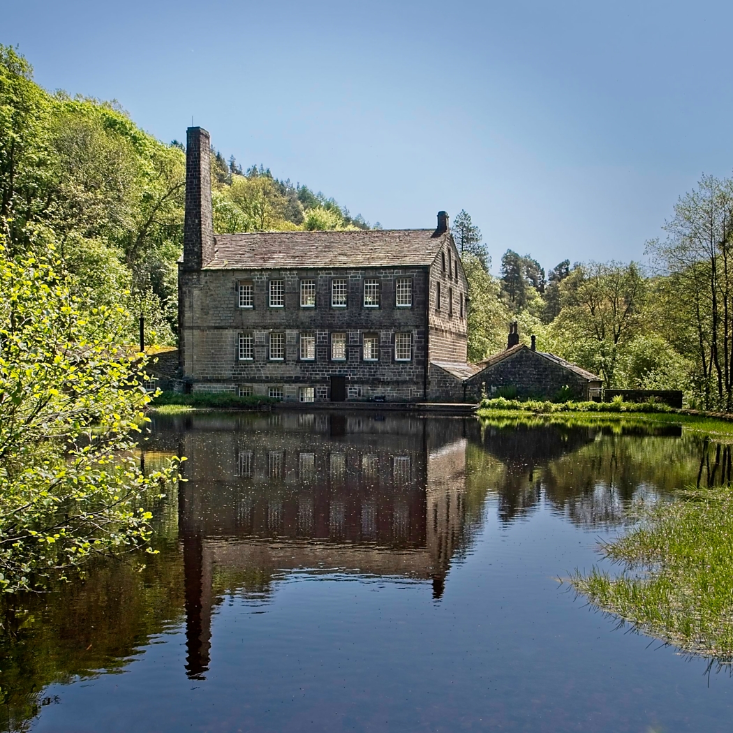
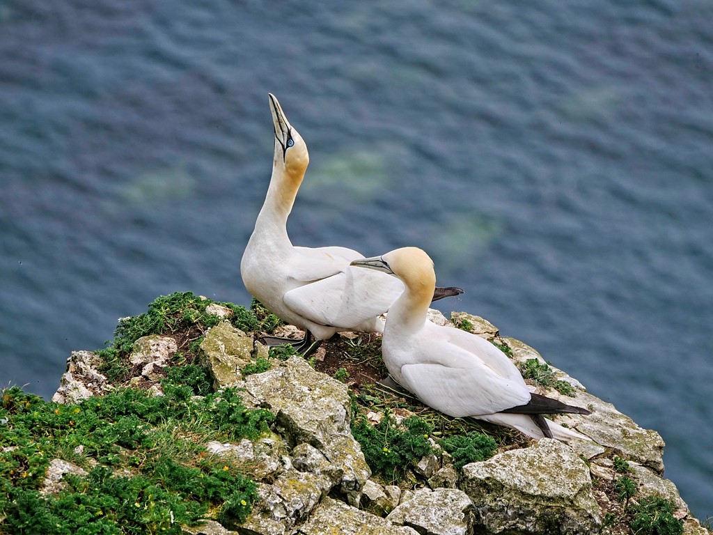
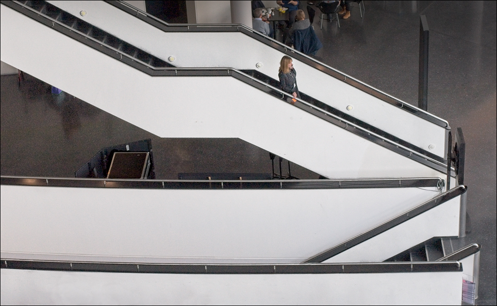
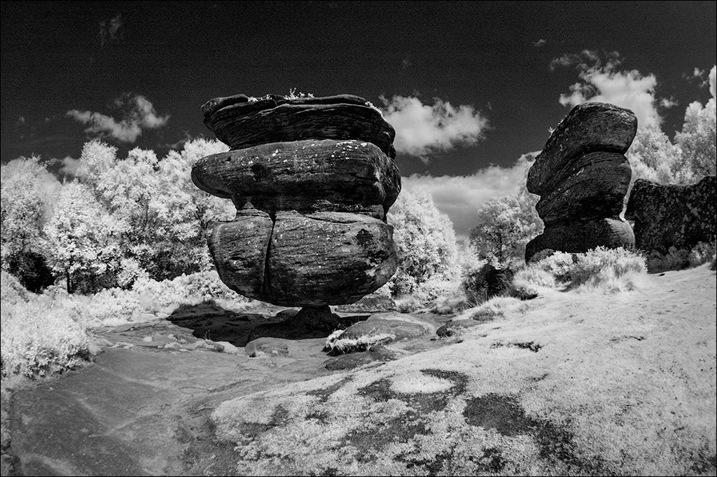
I love the simplicity of this image and I also love the space above the subject. This space brings out the sense of loneliness that makes the image so strong. I would not change anything. |
Sep 20th |
1 comment - 0 replies for Group 2
|
| 4 |
Sep 18 |
Comment |
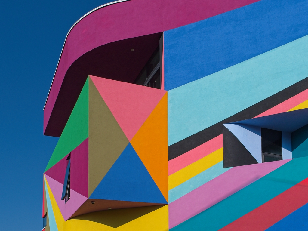
Congratulations Bill on geting the HM.
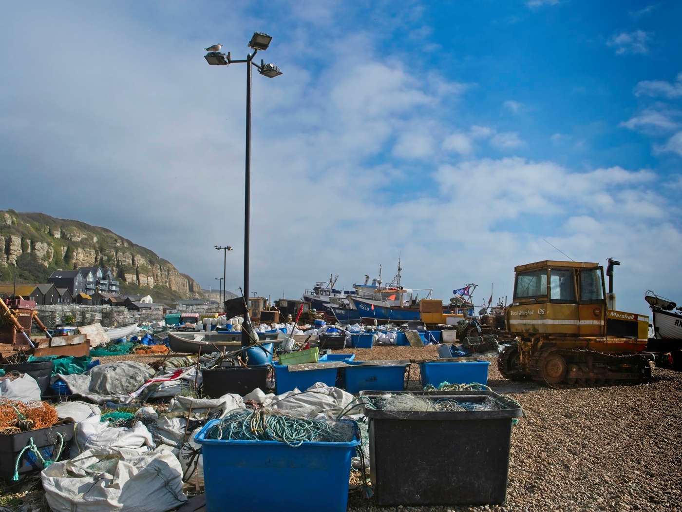
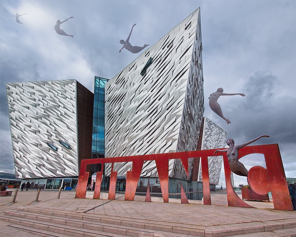
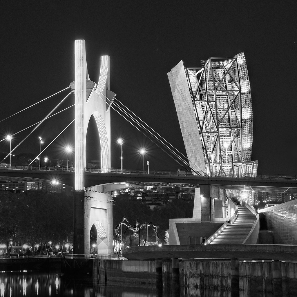
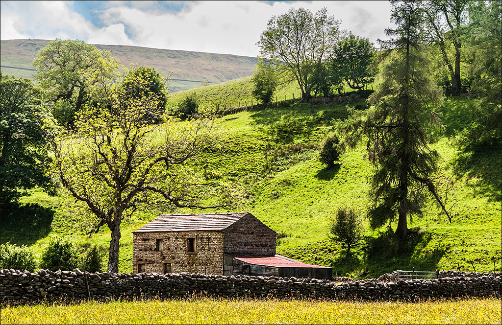
On this image I love the colour and the converging lines leading up to the building in the background. The colour has great impact and the path invites the viewer into the picture, to walk along and explore the art work. The image has very good depth of field. A very small aperture I presume? |
Sep 19th |
| 4 |
Sep 18 |
Reply |
David, I feel the same way as you. I feel I have a great group of personal friends. |
Sep 18th |
| 4 |
Sep 18 |
Reply |
Can't top that! :) |
Sep 7th |
| 4 |
Sep 18 |
Reply |
Hi David. Both your posted image at the top of this page, and your revised version lower down are impressive changes from the original image. I think I prefer the colour of your initial post and the composition of your revised version but, hey, you can't please everyone all of the time (to quote a notable past US President)! The best thing is to go with the one that pleases you. |
Sep 6th |
| 4 |
Sep 18 |
Reply |
That was more or less what I was thinking Isaac. |
Sep 5th |
| 4 |
Sep 18 |
Reply |
You did well to bring out the colour and contrast. |
Sep 5th |
| 4 |
Sep 18 |
Comment |
What a great opportunity to be able to work in a setting like this and with one of the current masters in photography. When I first opened the image I thought it was a bit sinister, and having read your explanation I can see that it was intended to be. Excellent shot, but I agree with Barbara about the child minding aspect!! |
Sep 4th |
| 4 |
Sep 18 |
Comment |
A great shot, Erik. It is pin sharp where it needs to be and the background is well out of focus, but detailed enough to remain interesting. |
Sep 4th |
| 4 |
Sep 18 |
Comment |
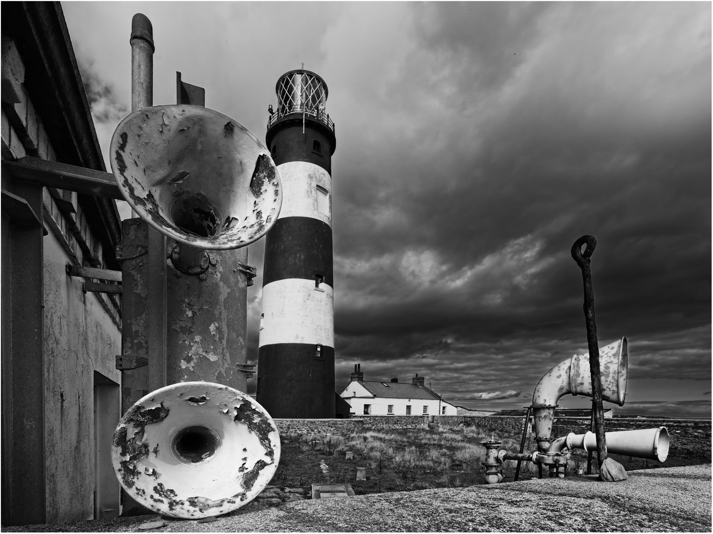
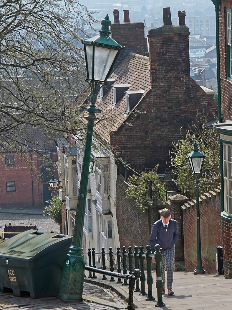
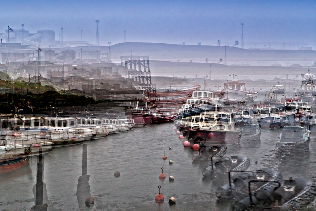
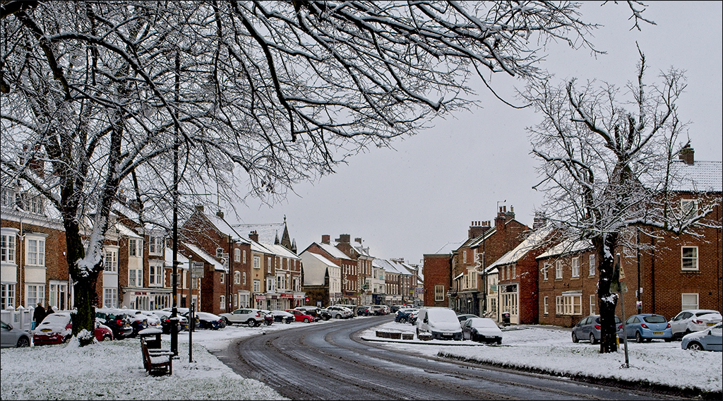
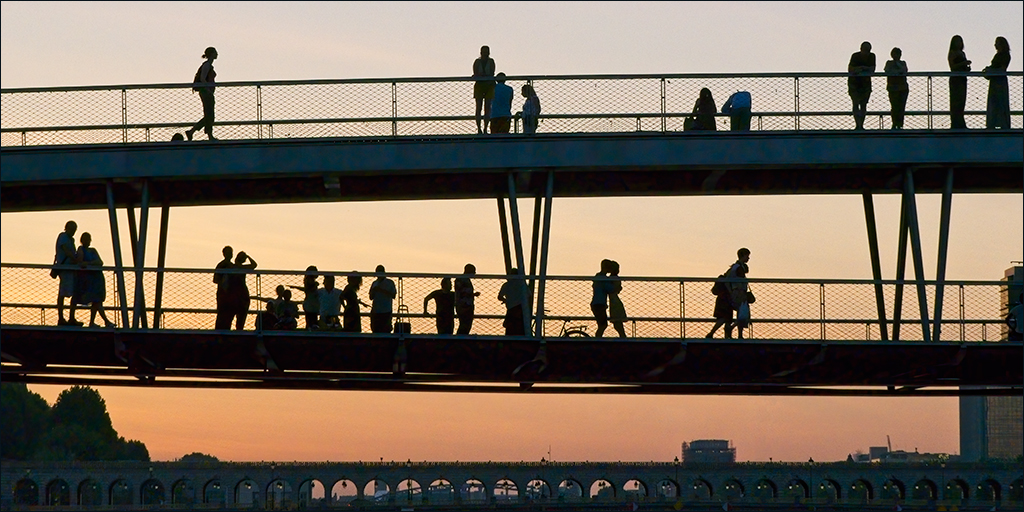
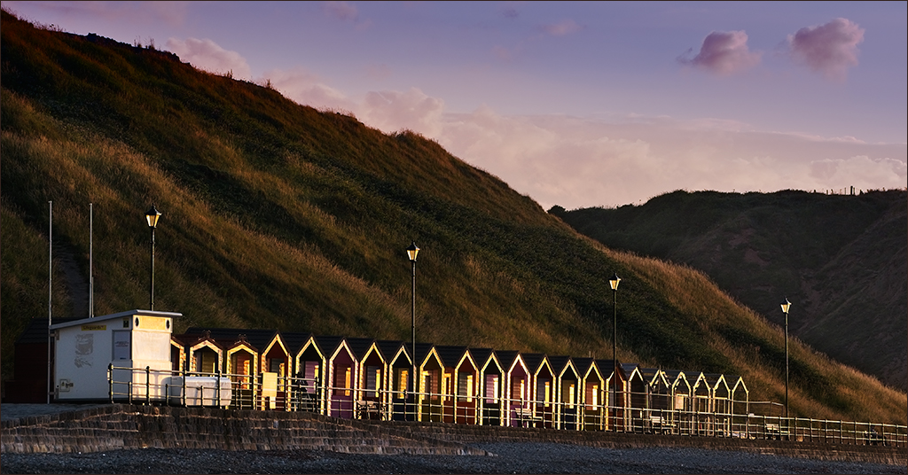
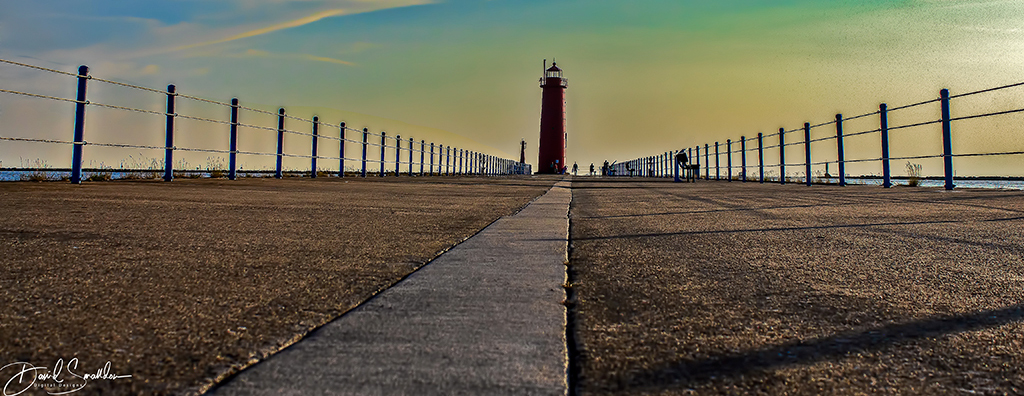
It's a great shot, David. I do like the low shooting position which has emphasised the perspective lines (path, fencing) leading to the lighthouse. As for the people in silhouette by the lighthouse, I think they are just right and add just enough detail to fill the gap between the base of the lighthouse and the right hand fence. The low light is lovely and the fence shadows add interest. The object that breaks the nice line of the right hand fence is a bit intrusive. It would be a difficult task to try to clone that out completely, but you could try cloning out the bit that sticks above the fence line. The sky has come up very well (I am a fan of Image>Adjust>Shadows/Highlights too), but it does occupy over half the image area. I would consider taking out some of the sky to rebalance the composition to put the emphasis on the leading lines of path and fence.
I too have been to Muskegon, many years ago when I visited a company in that area. I flew into and out of Muskegon County International Airport! One runway and two departure gates. The check-in clerk also drove the tractor pulling the luggage trailer, helped load the luggage and then came to the gate to supervise boarding! |
Sep 4th |
 |
| 4 |
Sep 18 |
Comment |
This is a fun picture that you just have to take! It is nicely composed with the tree shadow leading you into the frame and up to the other tree with the bikes. The line of bikes also connects with other parts of the main shadow, so bringing a feeling of completeness to the composition. I would try to clone out the two bike wheel bits half way up the right hand edge, though it might be difficult because of the shadow. David's suggestion of cropping might be an easier solution. |
Sep 4th |
| 4 |
Sep 18 |
Comment |
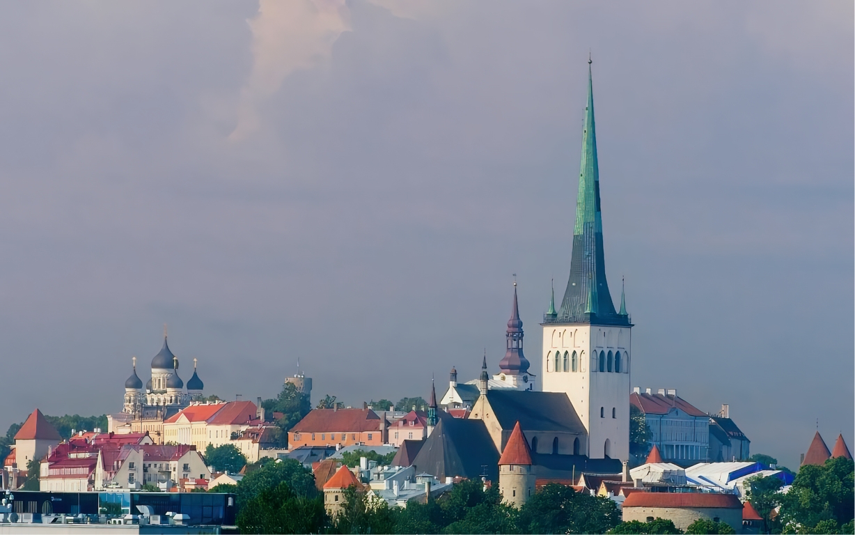
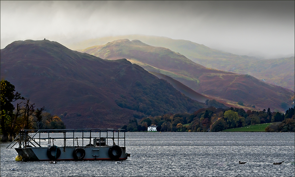
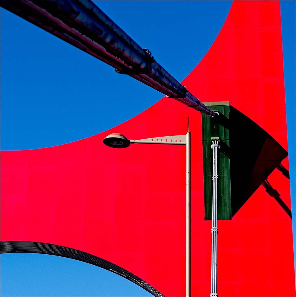
Great close-up wide-angle shot which makes the boat absolutely dominate the image. It is a good illustration of the use of perspective to make a fairly small object (the boat) stand out and appear very much larger than a much bigger background object (the castle). The colour combination is also very pleasing and creates a restful atmosphere. I think the image might be leaning very slightly to the left. Maybe rotate it a little to the right. |
Sep 4th |
| 4 |
Sep 18 |
Reply |
It is always interesting to see a different interpretation of one's own image. Thanks David, I do like what you have done. |
Sep 4th |
6 comments - 6 replies for Group 4
|
7 comments - 6 replies Total
|