|
| Group |
Round |
C/R |
Comment |
Date |
Image |
| 2 |
May 18 |
Comment |
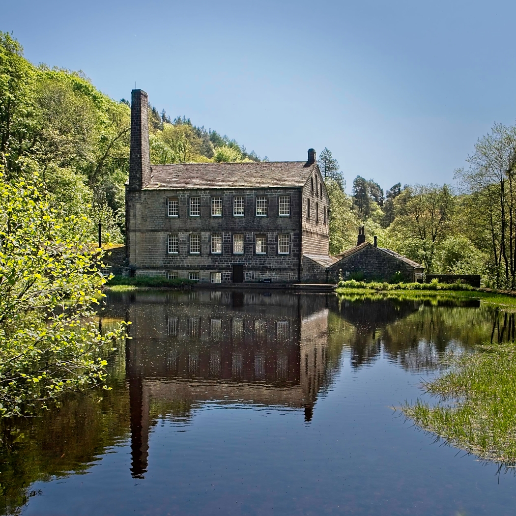
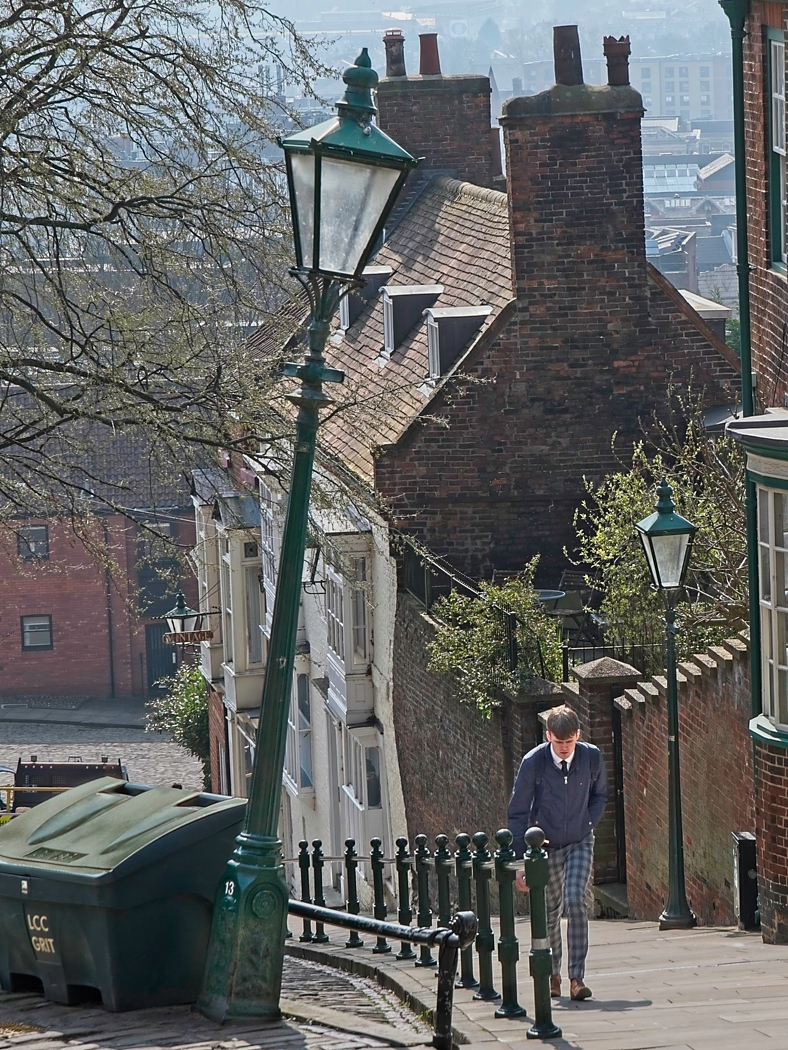
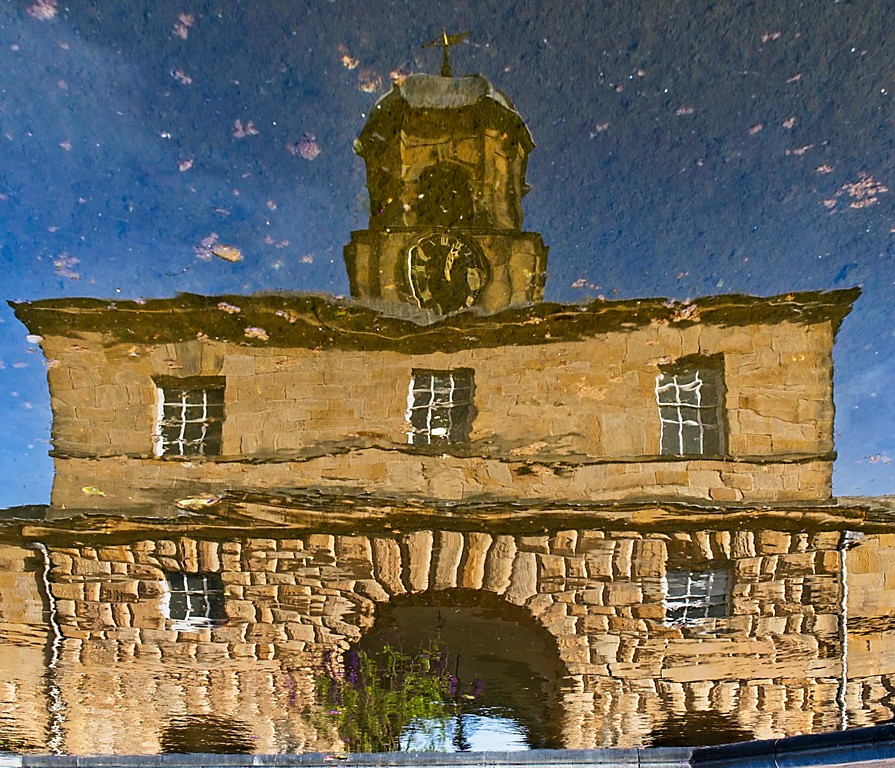
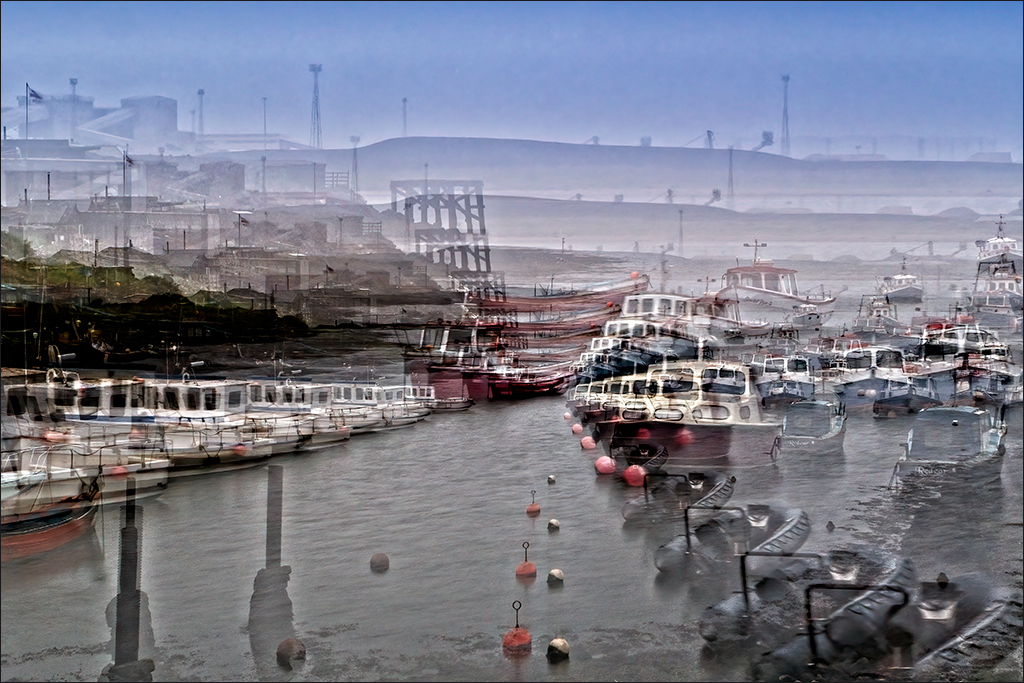
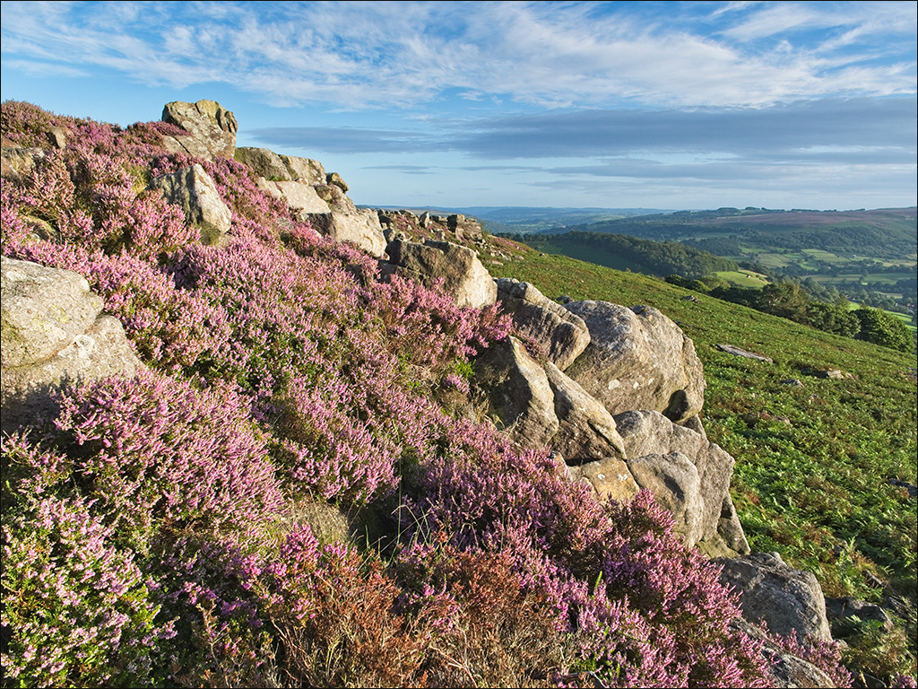
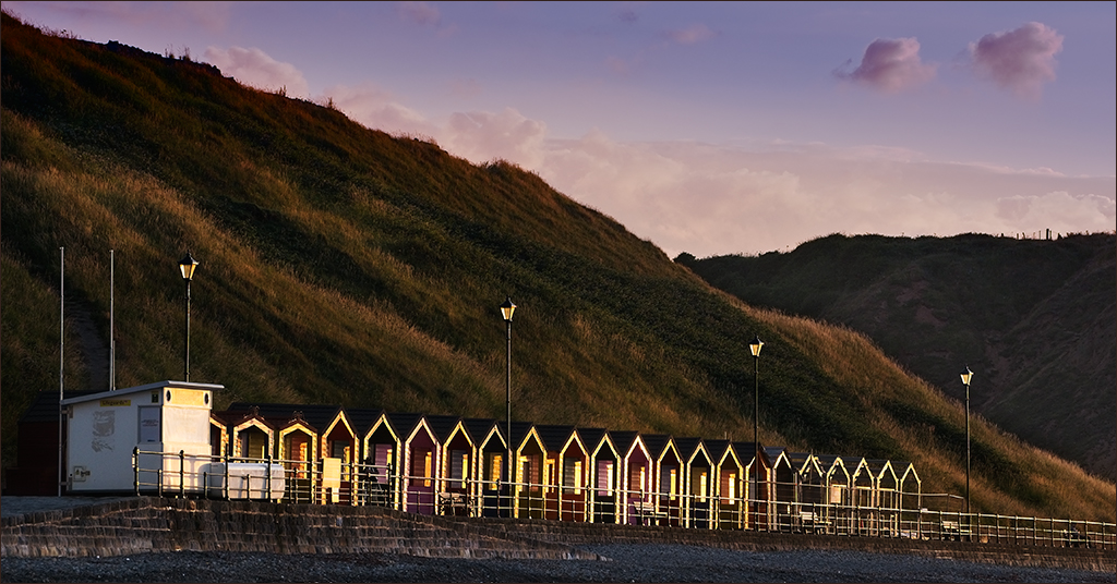
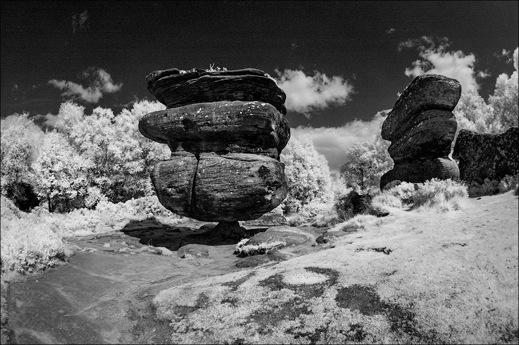
Just a further thought, Gary. Print this image on a good quality textured art paper, or possibly a smooth fine art paper, and you'll have something to hang on your wall. I think that maybe a small crop off the bottom would be good - just enough to take out the two small dark bits at the bottom right corner. |
May 24th |
| 2 |
May 18 |
Comment |
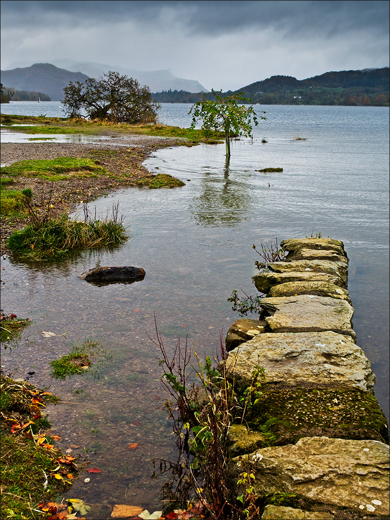
Hi Gary, I am Guy from Group 04. I think this is absolutely brilliant! I love the overall softness which gives a wonderful dreamy feel to the image. The sepia toned mono is also perfect. Many years ago I took a deliberately out of focus slide because I enjoyed the abstract blobs of colour it produced. I tried it in a club competition and the judge just rubbished it, but I still liked it. Moral of the story is, listen to other opinions and respect them, but you don't have to agree if you don't want to! It would be a boring world if we all had the same likes and dislikes! |
May 23rd |
2 comments - 0 replies for Group 2
|
| 4 |
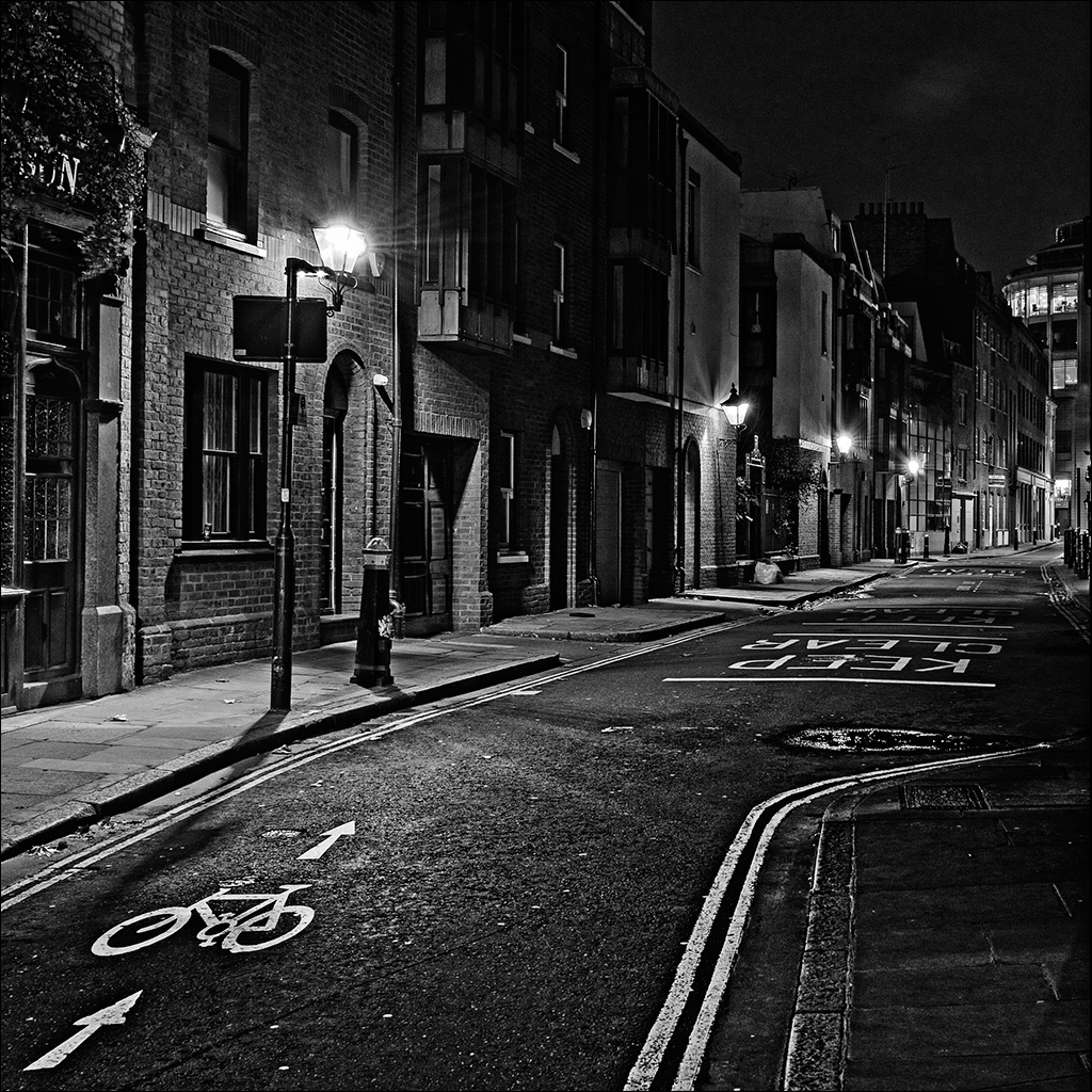
May 18 |
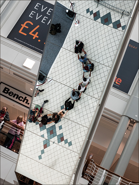
Reply |
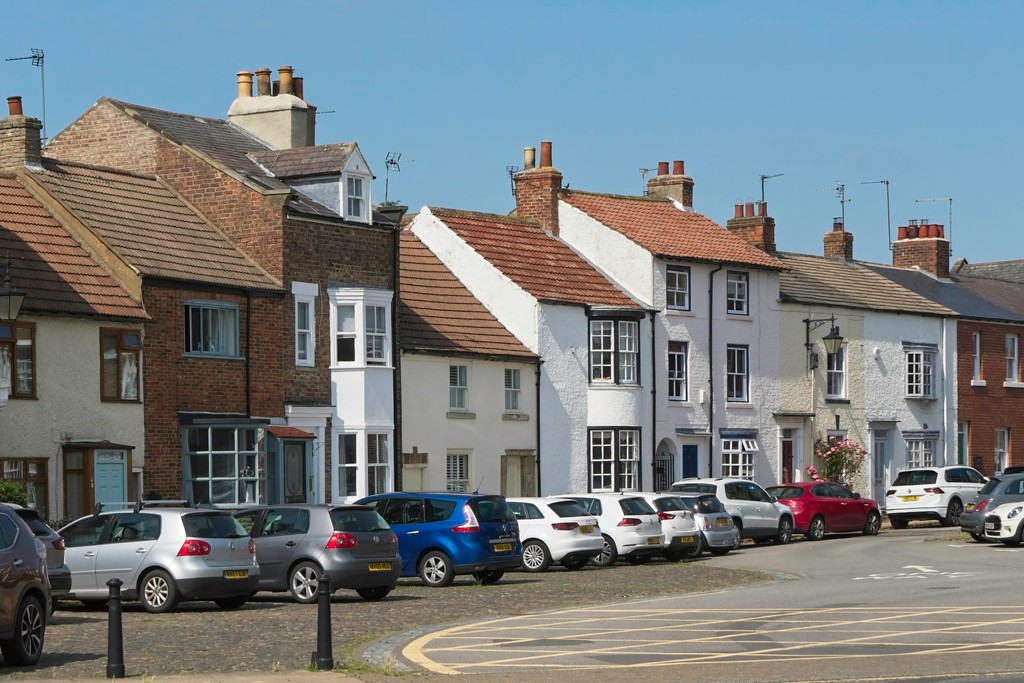
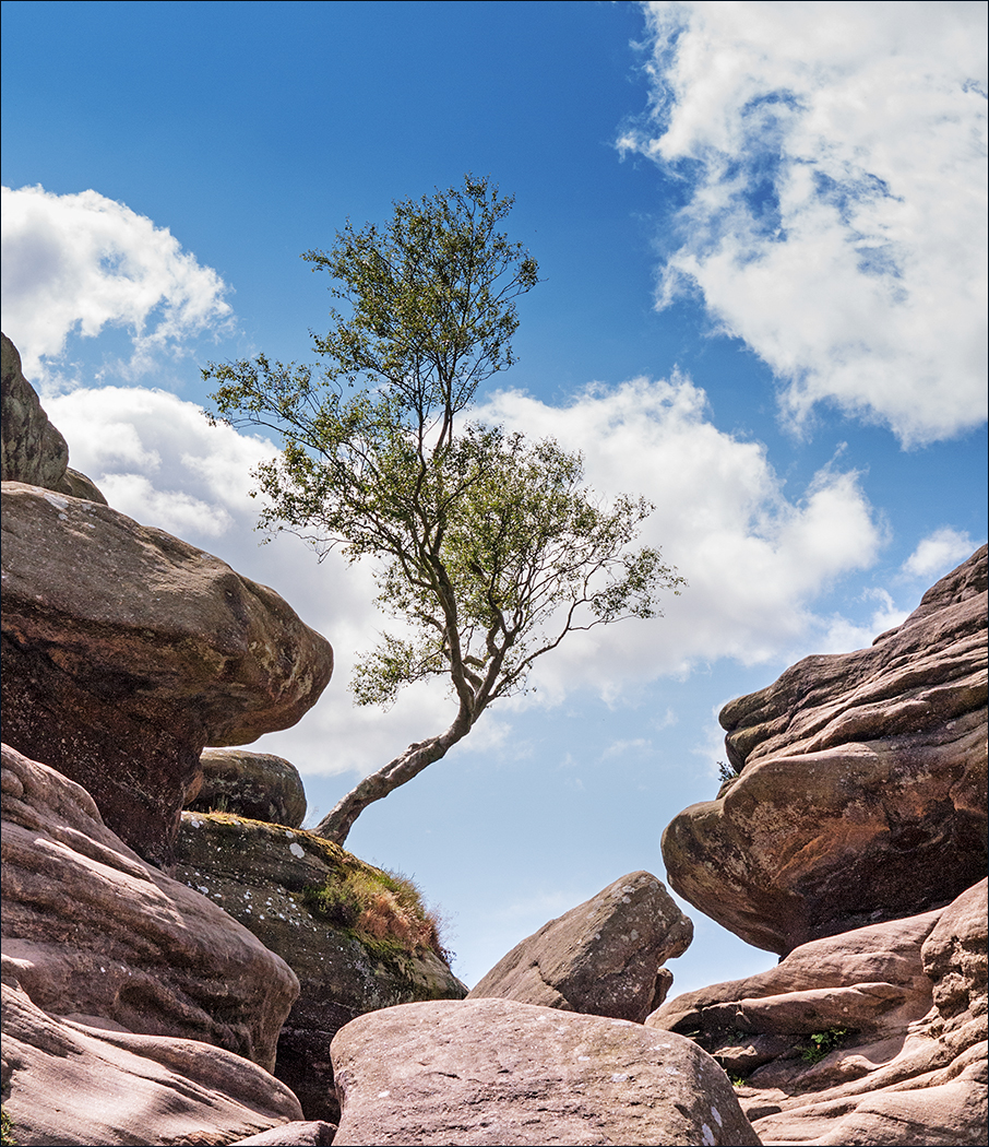
Hi Erik. It's always good to get other people's opinions and that's what's great about our group. I like your interpretation of the image although I feel that it makes the composition very tight. When I took (and then processed) the shot I composed it carefully to avoid other distractions (of which there were several) while at the same time trying to include enough of the surroundings to provide context. I think it ends up with personal opinion as to which you prefer. |
May 24th |
| 4 |
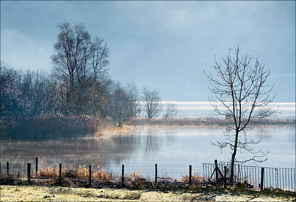
May 18 |
Reply |
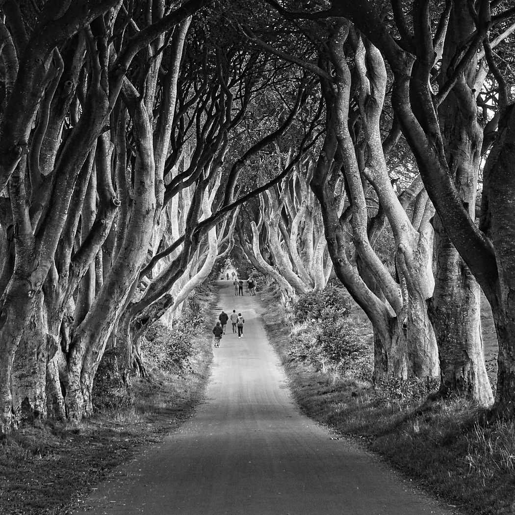
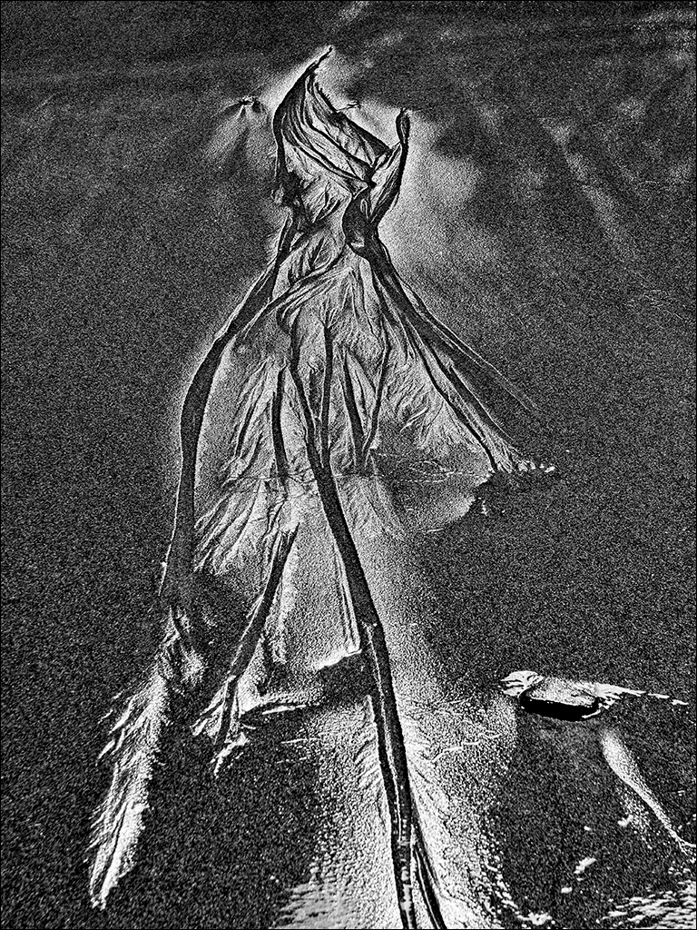
It made me think of one of those haunted forest scenes that crops up in some children's stories. The tree looks like it's about to move and grab you if you get too close! |
May 23rd |
| 4 |
May 18 |
Reply |
Very generous of you Ian. Look forward to seeing both you and the exhibition. |
May 10th |
| 4 |
May 18 |
Comment |
I think this is a stunning presentation of this character. It works very well indeed on the pure white background. I just don't understand how she supports those large extented eyebrows!
Many congratulations on being asked to put on an exhibition. I hope to be able to see it when Paula and I come to Hoylake PS in October (hopefully we'll get there this time). |
May 10th |
| 4 |
May 18 |
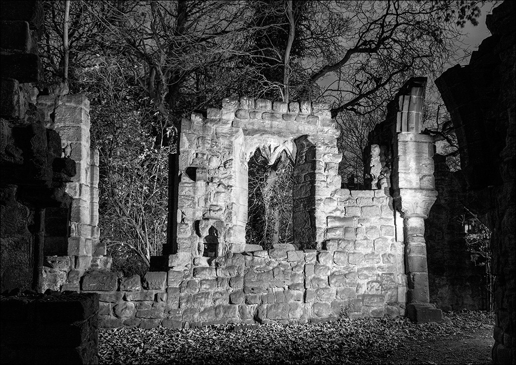
Comment |
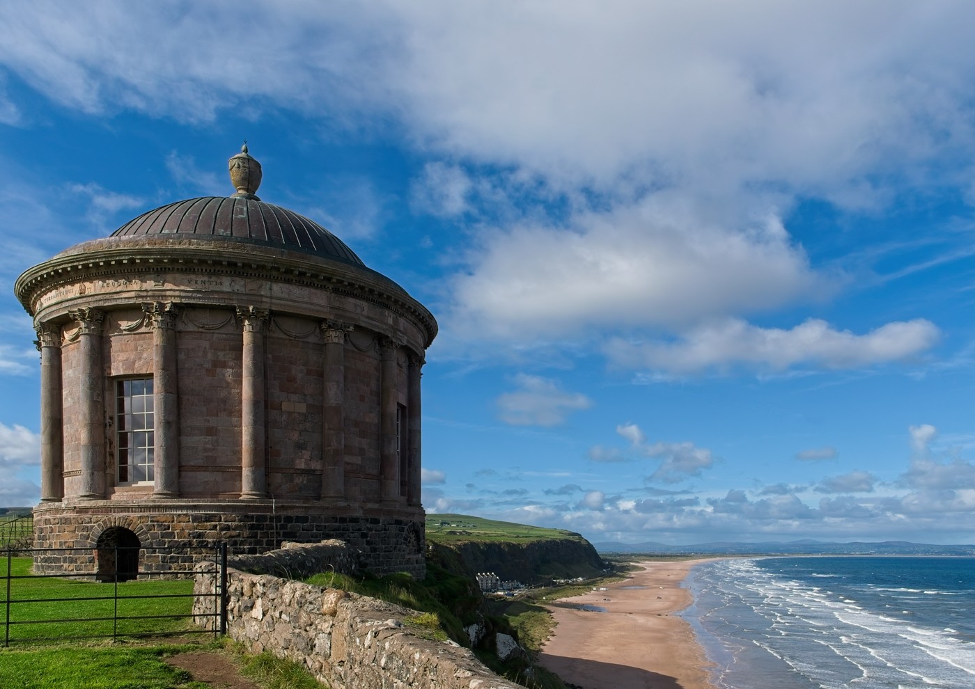
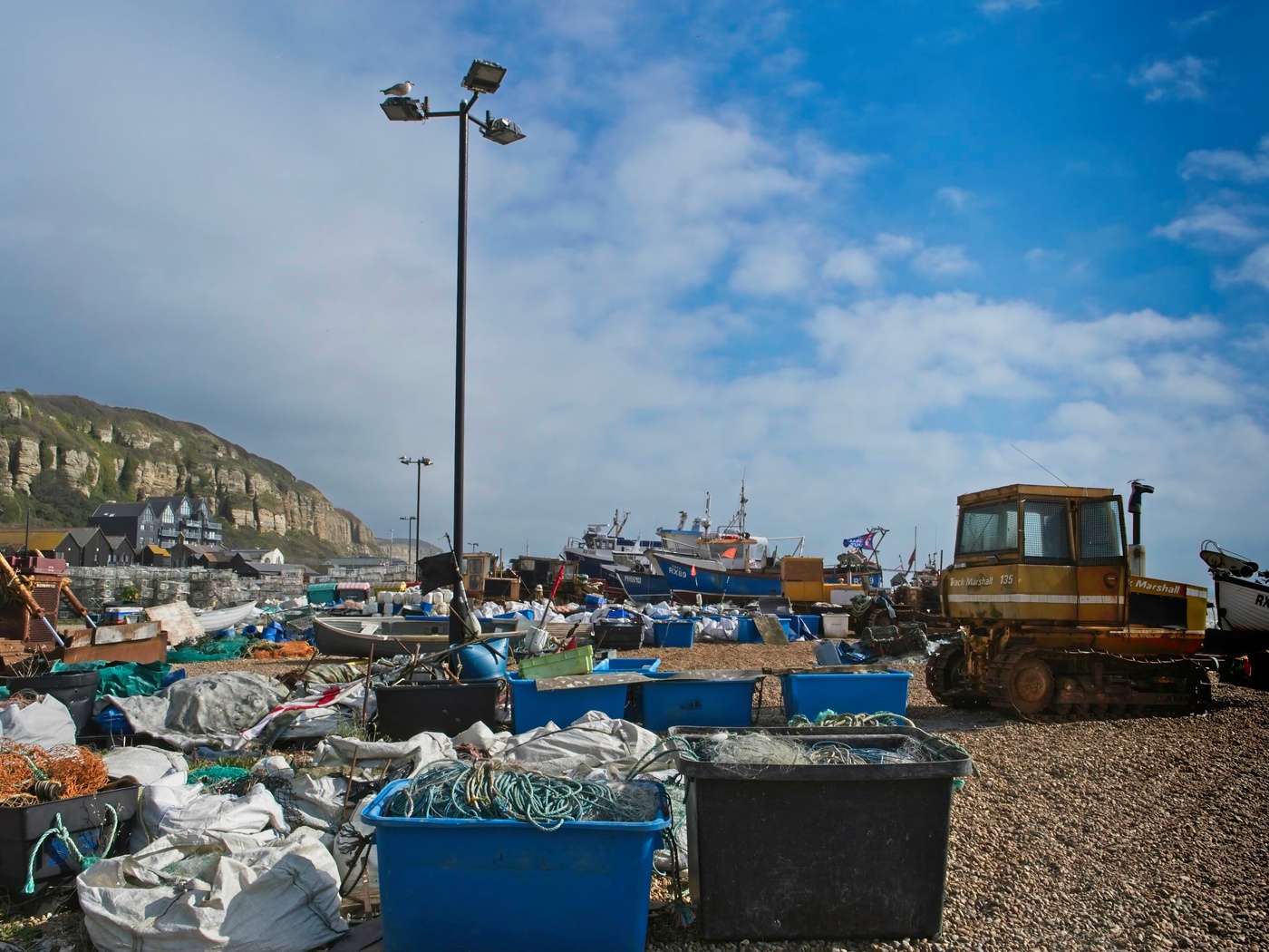
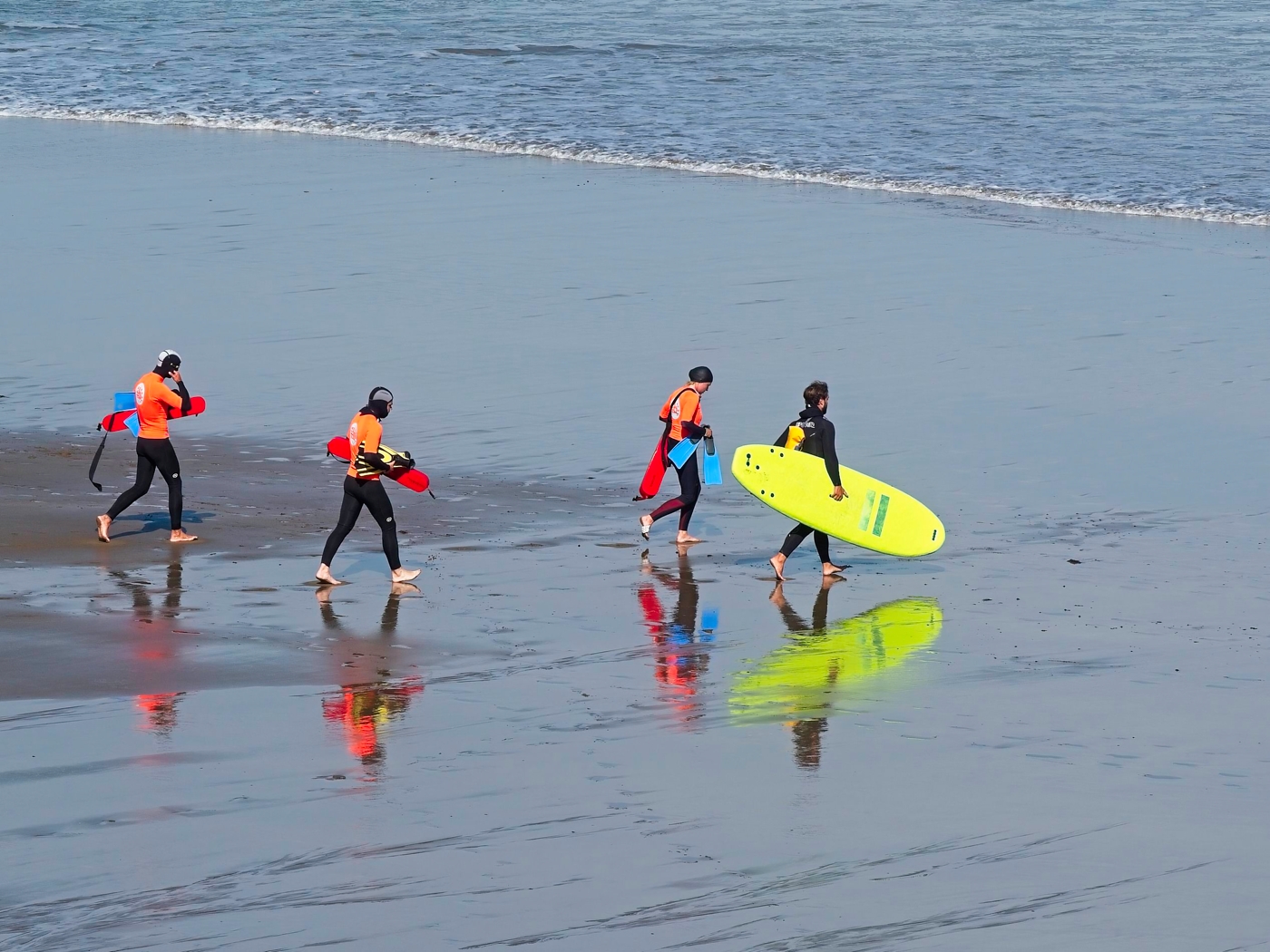
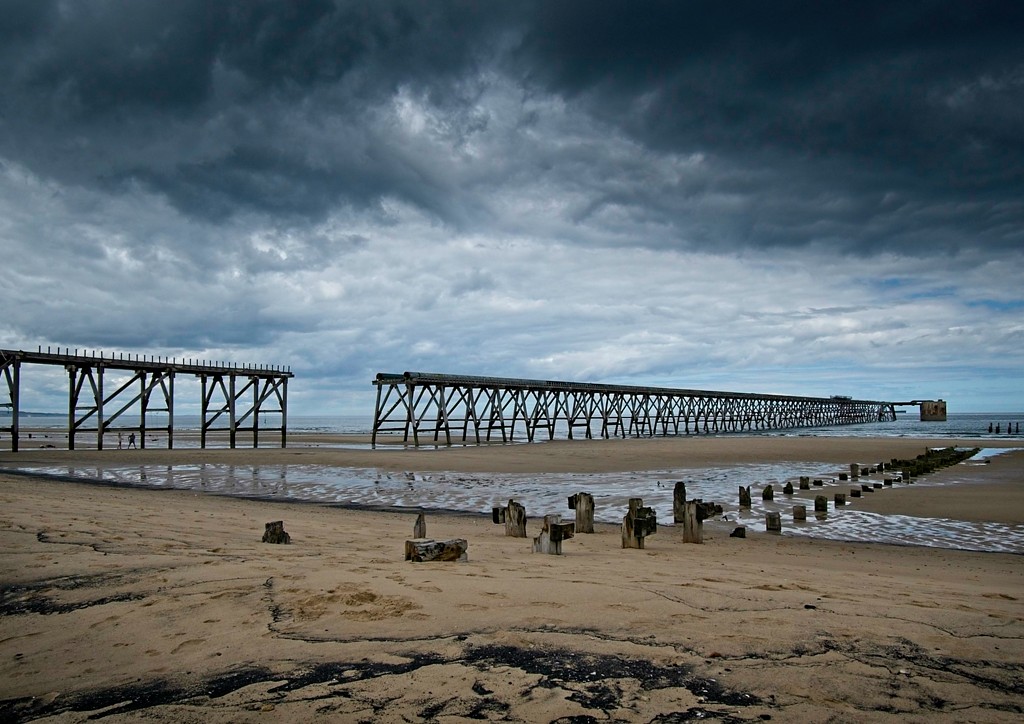
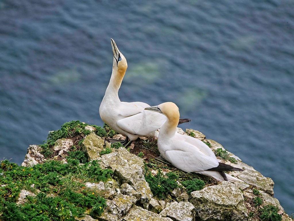
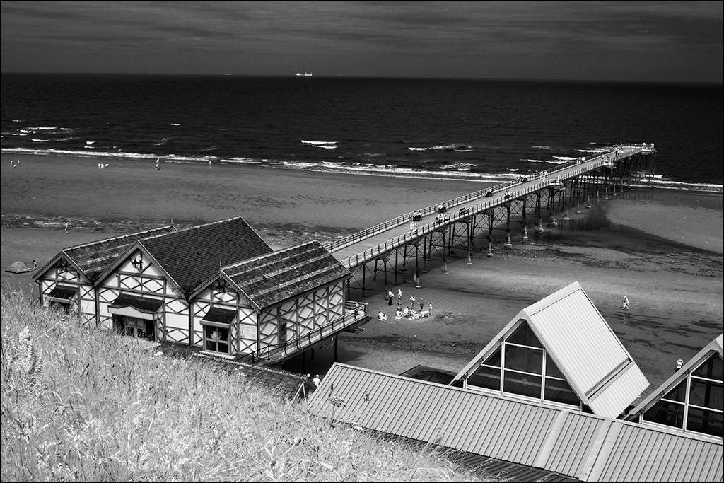
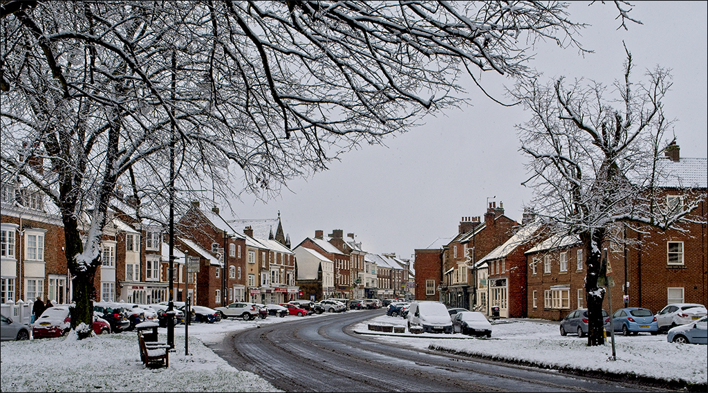
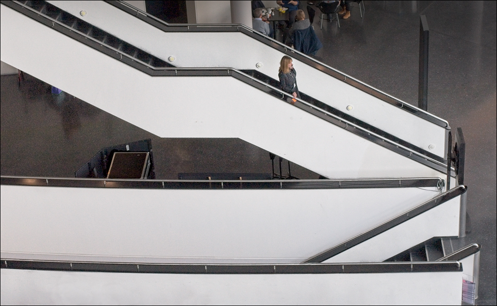
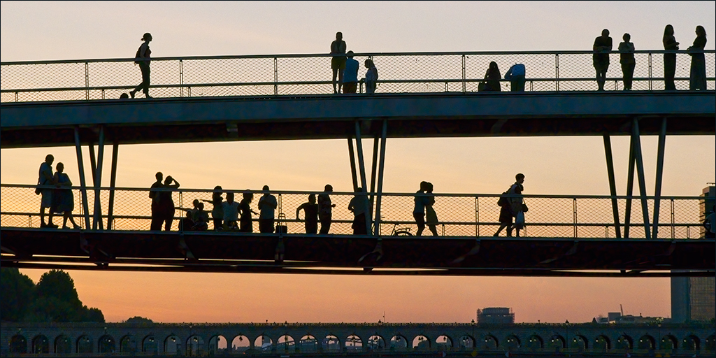
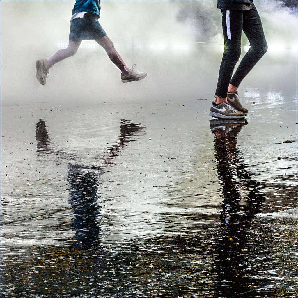
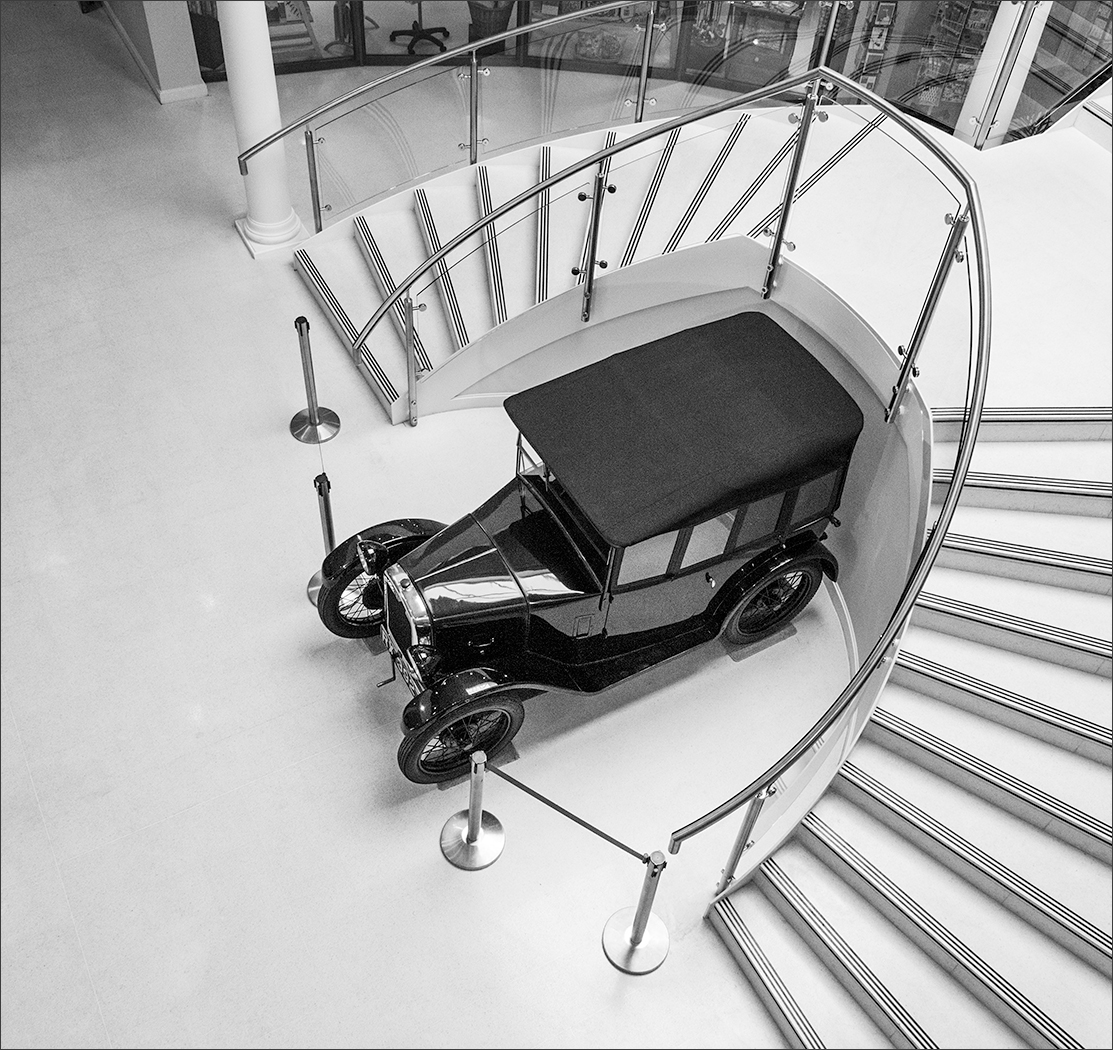
I'm sure that I would have spent at least 20 minutes taking photos in this location. As well as the overall shot, there must be many close-up and macro shots of the rust on the bus to be enjoyed. However you photograph it, there does not appear to be any way you can avoid having some ropes in front of the bus, and I think Joe's work with the Healing Brush has made it easier to look at. I think the Bridge Out sign is an integral part of the story and so needs to be included.
I share David's concern about the double imaging of the ropes at the left. Could this be ghosting from hand held multiple images used in the HDR process? What a wonderful location though. |
May 10th |
| 4 |
May 18 |
Comment |
David, you have turned a straight portrait into something that (in my view anyway) fits clearly into the category of pop-art. I also agree with you that just following the tutorial exactly is not really creative on your part. There's no doubt that you have produced an image which no one can ignore. |
May 10th |
| 4 |
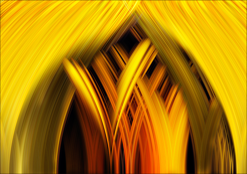
May 18 |
Comment |
Looks like a good picture to start with and it is fun to try a few filter effects. This filter seems to go well with the subject and has created an almost spooky effect. I can start to see animal faces in the two rock arches, as if they are beginning to metamorphose out of the rock. (That's my big word for the month!) It's interesting that the filter makes the wood look very similar to the rock. |
May 10th |
| 4 |
May 18 |
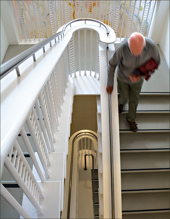
Comment |
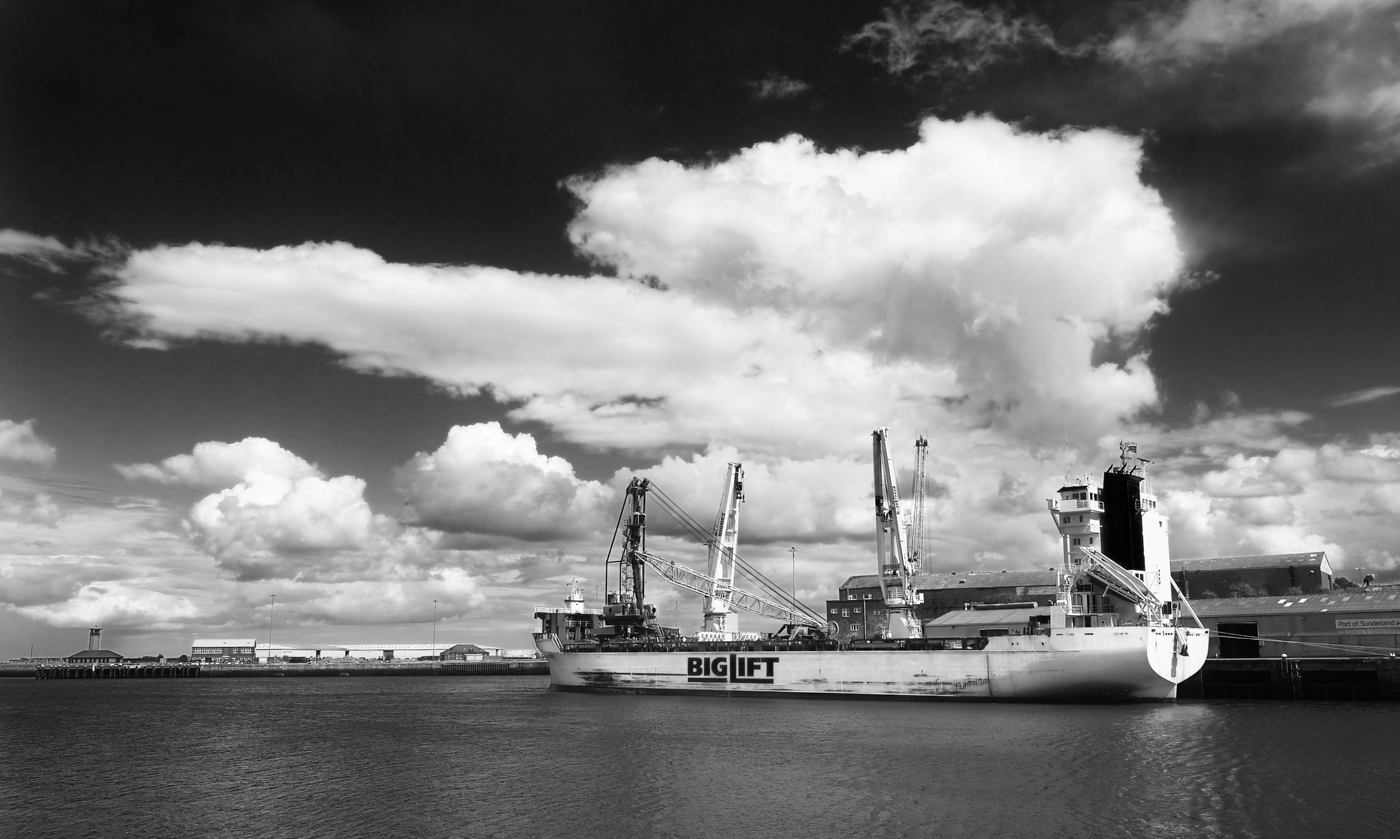
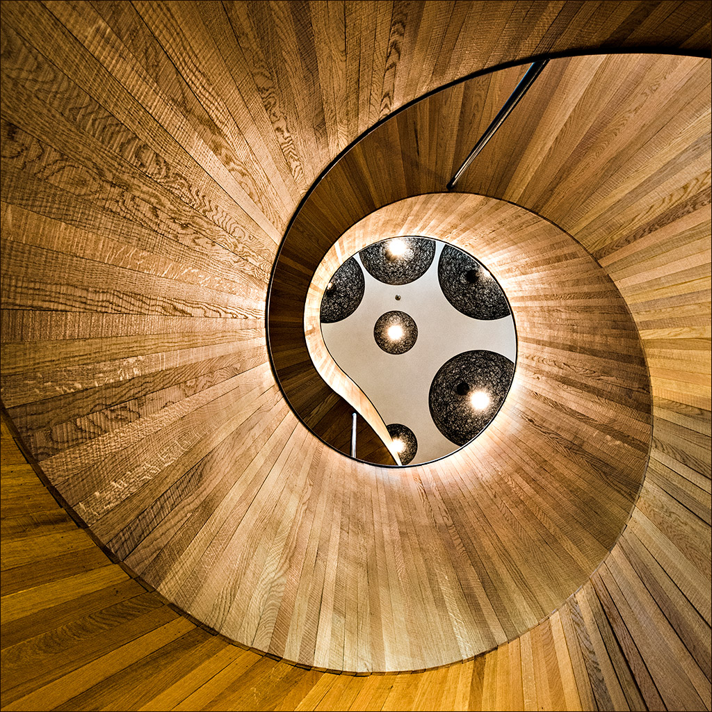
I must say that I had a slight problem with this at first in trying to get the perspective right. Having taken a second look after a few days, it has suddenly clicked into place! The image seems to have come about by a combination of good observation, quick thinking and excellent timing. Well done, especially as it was shot from a boat. |
May 10th |
| 4 |
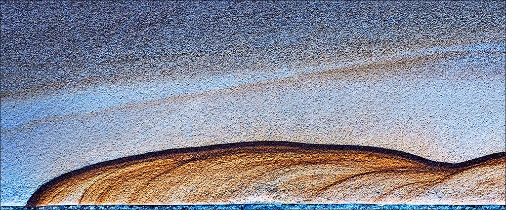
May 18 |
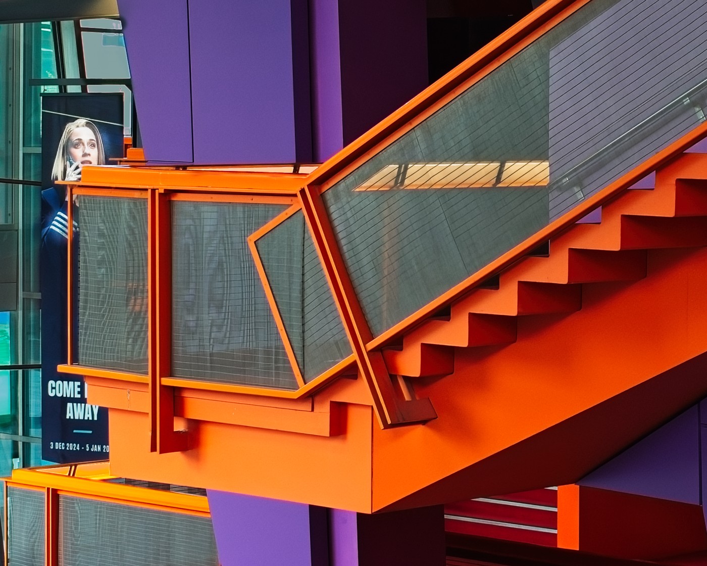
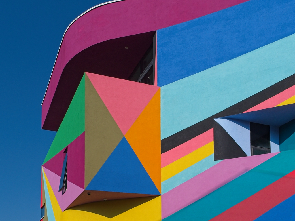
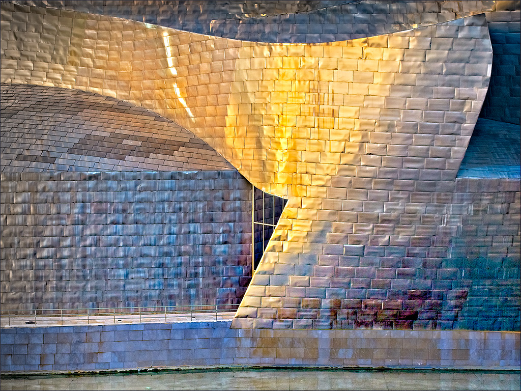
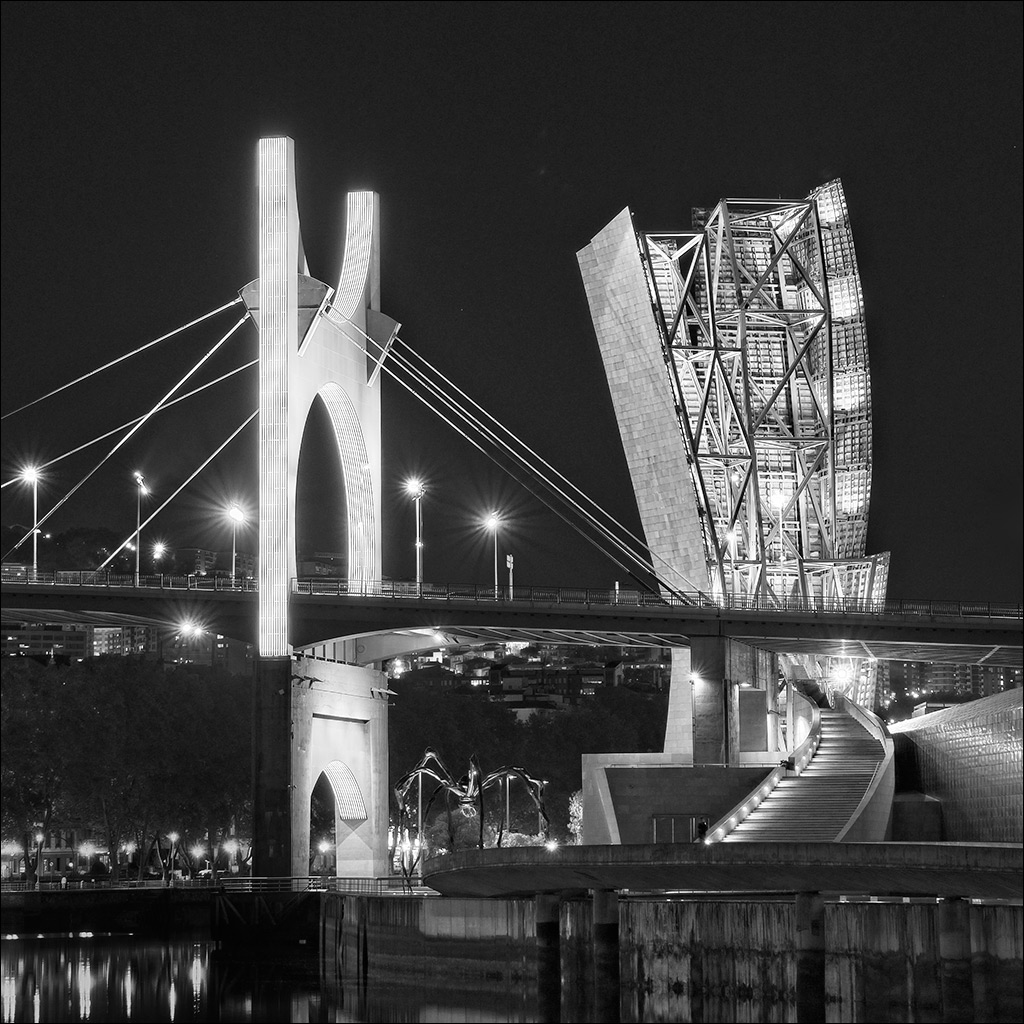
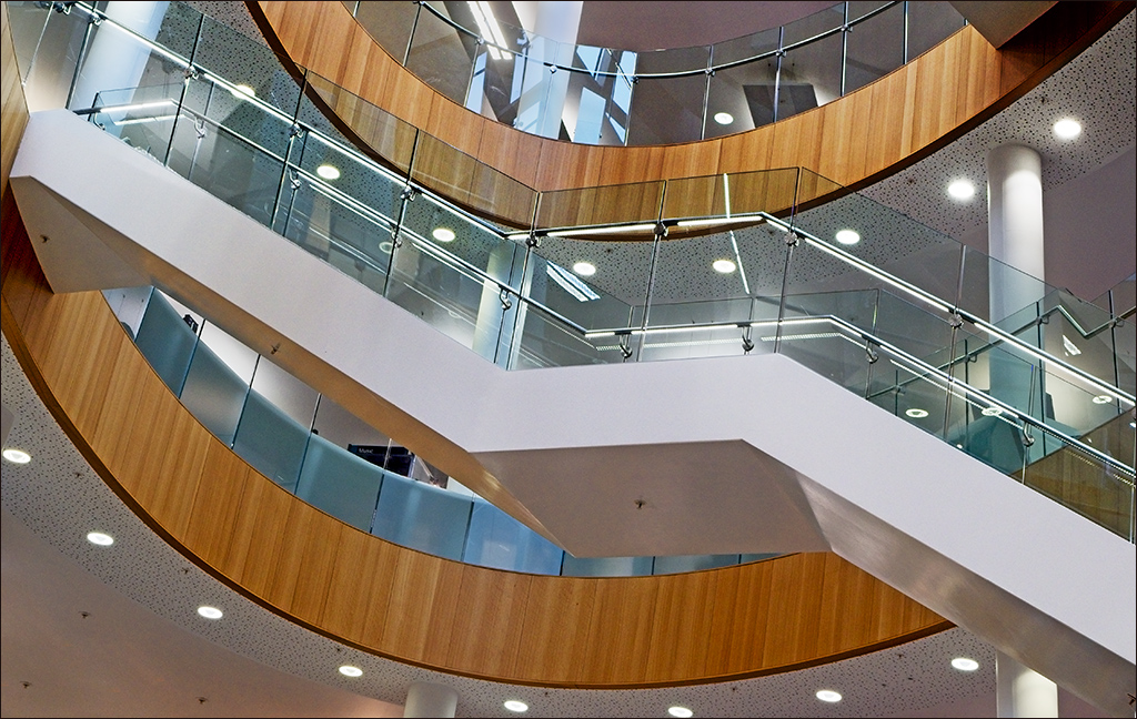
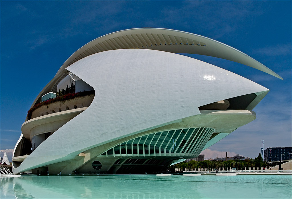
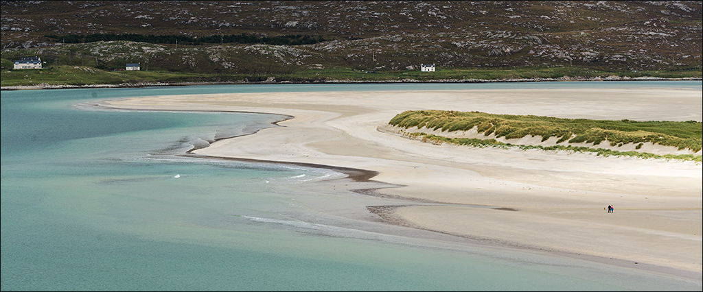
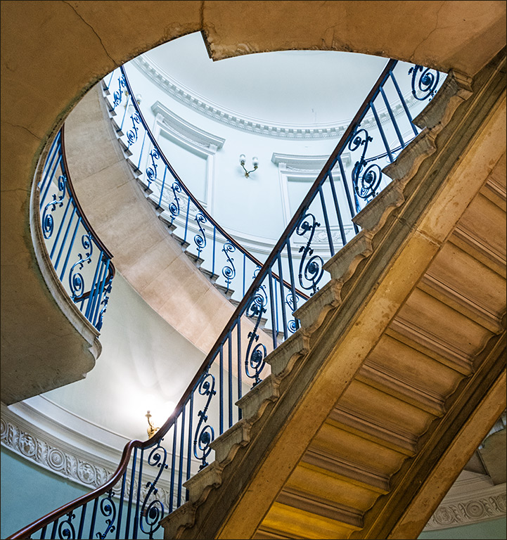
Comment |
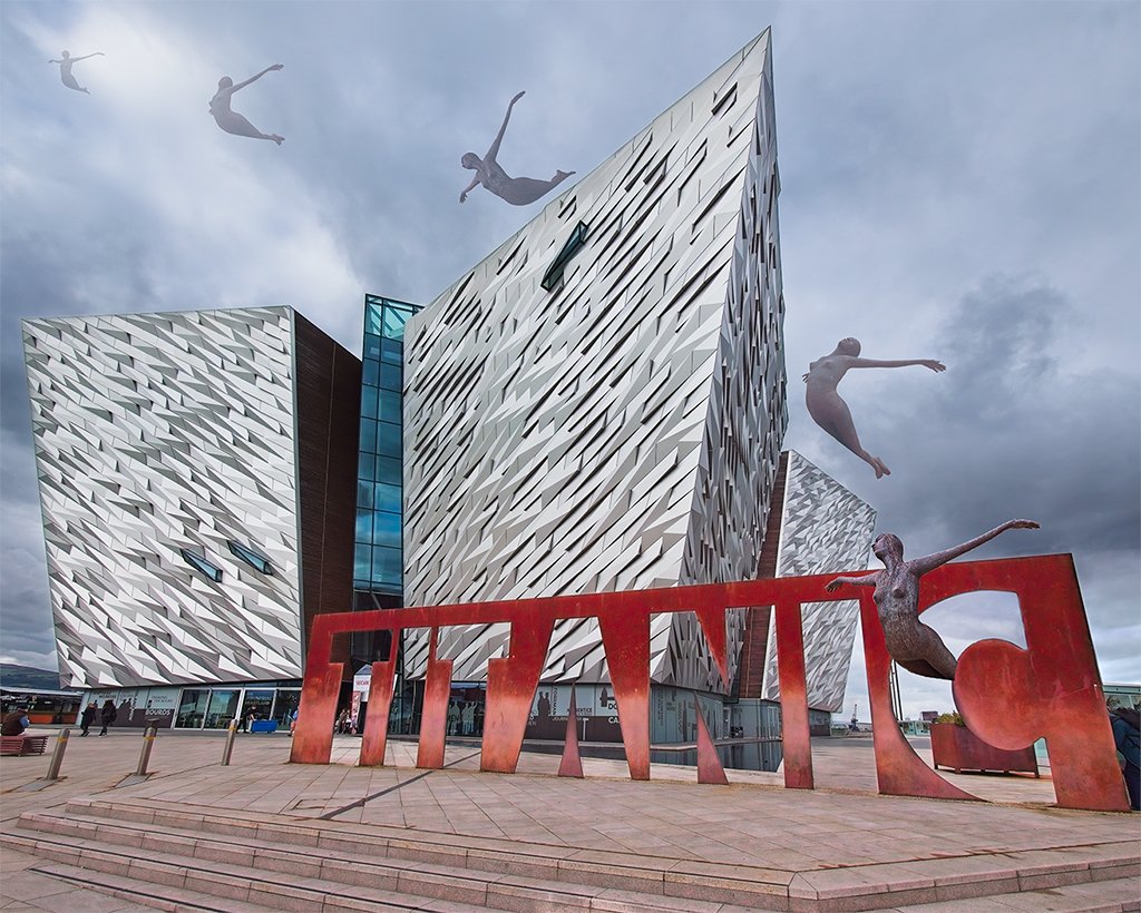
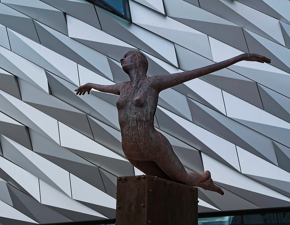
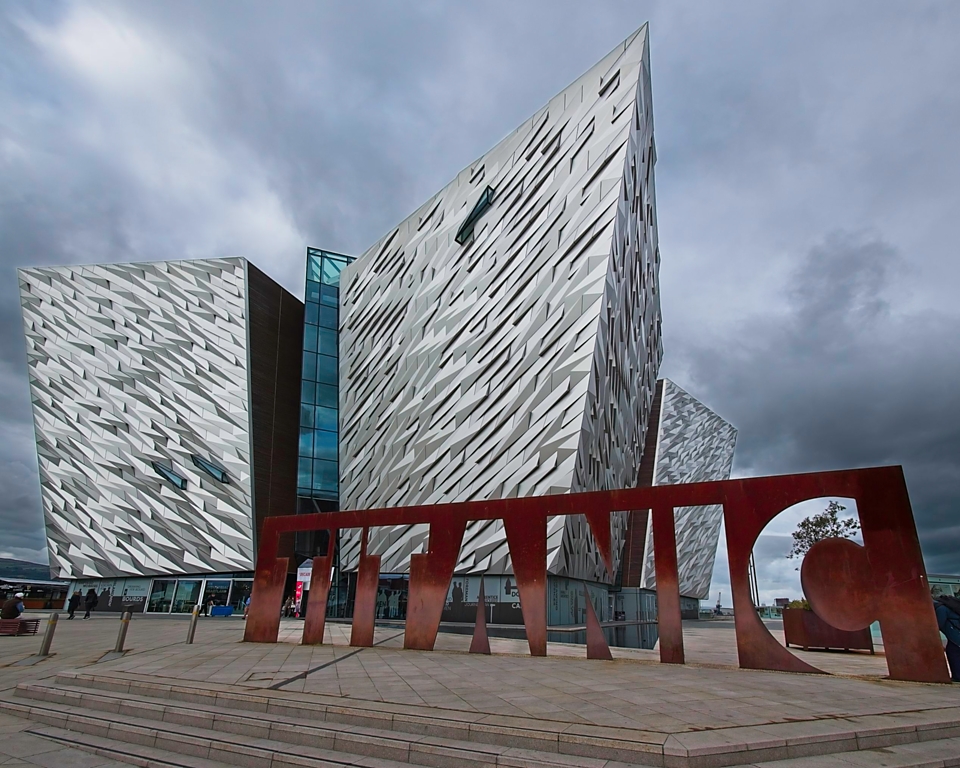
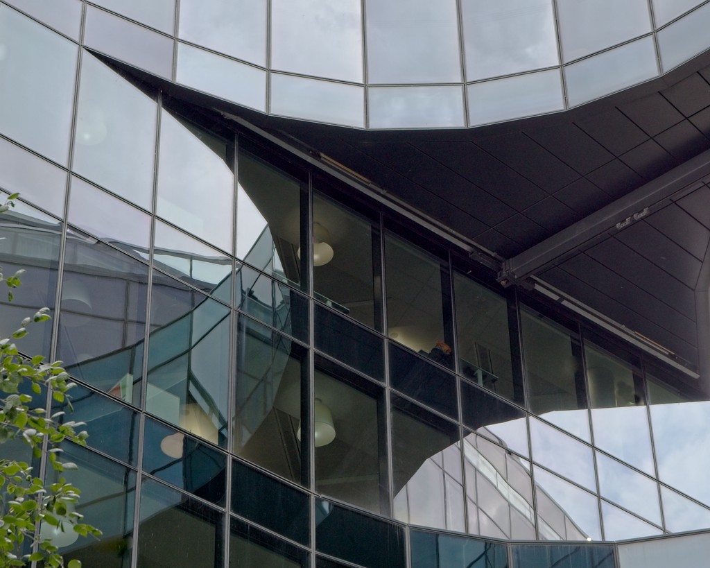
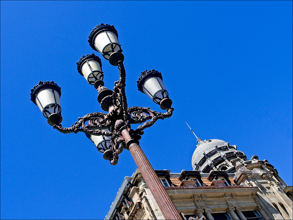
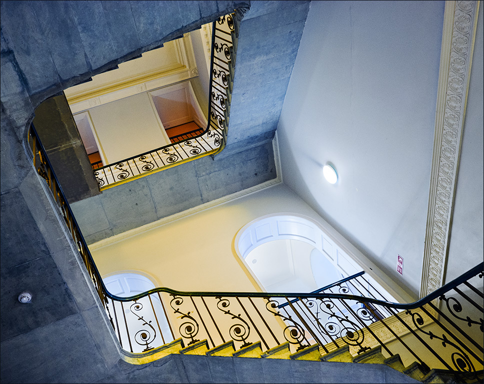
What a wonderful building to photoraph! Has it got a nice staircase inside??? Seriously, I think you have done a nice job here with the viewpoint creating the exagerated perspective. The image is simple, clean and sharp. Personally, although I really do like mono, I think the colour version is better here. I love the subtle golden tints in the panels on the building, and the way they match with the gentle golden light in the clouds. |
May 10th |
| 4 |
May 18 |
Reply |
We're full of surprises! |
May 9th |
6 comments - 4 replies for Group 4
|
| 5 |
May 18 |
Comment |
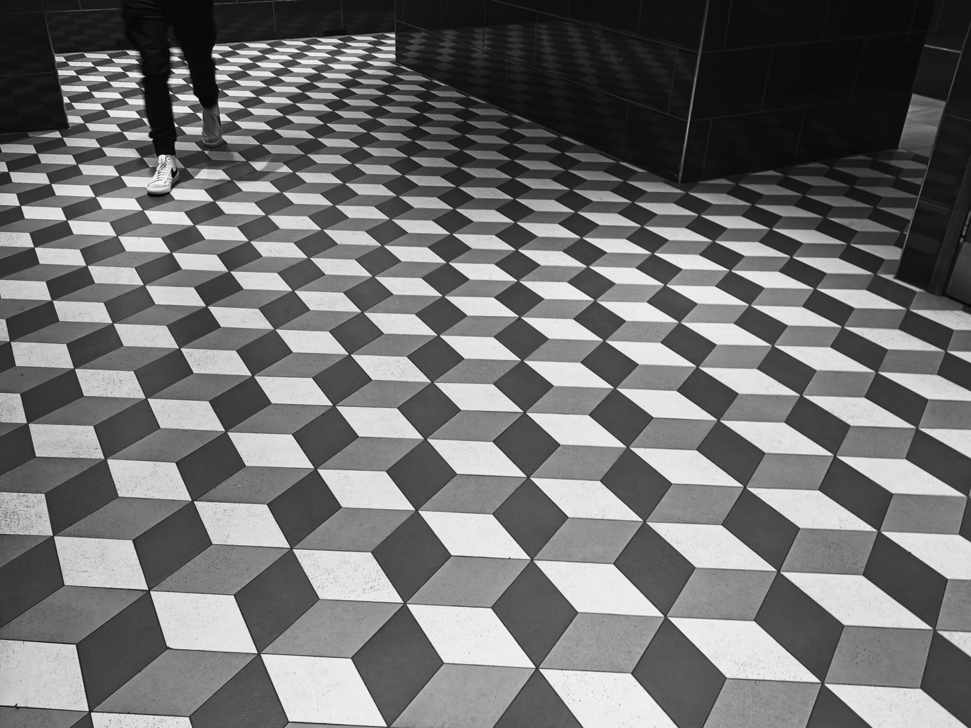
Hi Barbara - I love the Escher effect of not knowing whether you are inside or outsde the box. |
May 23rd |
1 comment - 0 replies for Group 5
|
9 comments - 4 replies Total
|