|
| Group |
Round |
C/R |
Comment |
Date |
Image |
| 4 |
Sep 17 |
Reply |
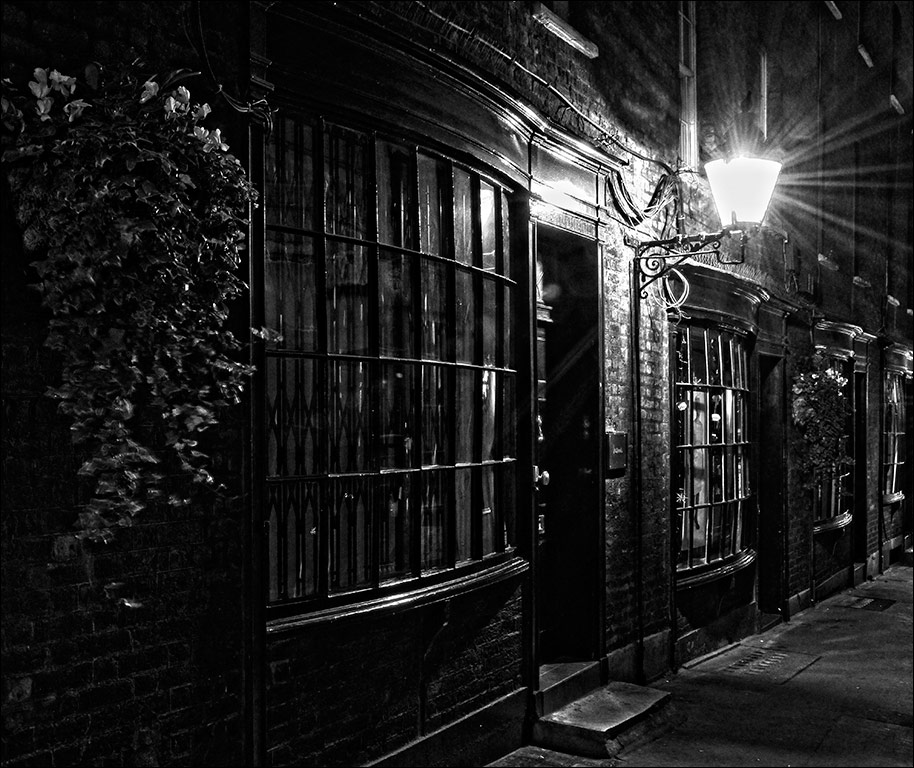
Hi Bill. No I didn't use a polariser because I don't have one for my little Lumix. I took two cameras that day. One was my Infra Red Nikon D70, and the other was the Lumix GF1. I was intending to concentrate on infra red with the D70 so I just took the Lumix as a 'snapshot' backup, but as it turned out I had as much fun with the Lumix as I did with the Nikon. Thanks for all the comments and adjustments from everyone. |
Sep 25th |
| 4 |
Sep 17 |
Reply |
Great news, Isaac. I just feel sorry for all those folks whose homes were destroyed. |
Sep 12th |
| 4 |
Sep 17 |
Comment |
Erik, I don't know how the recent storms have affected you, but are you OK? |
Sep 12th |
| 4 |
Sep 17 |
Comment |
Isaac, I don't know how the recent storms have affected you, but are you OK? |
Sep 12th |
| 4 |
Sep 17 |
Comment |
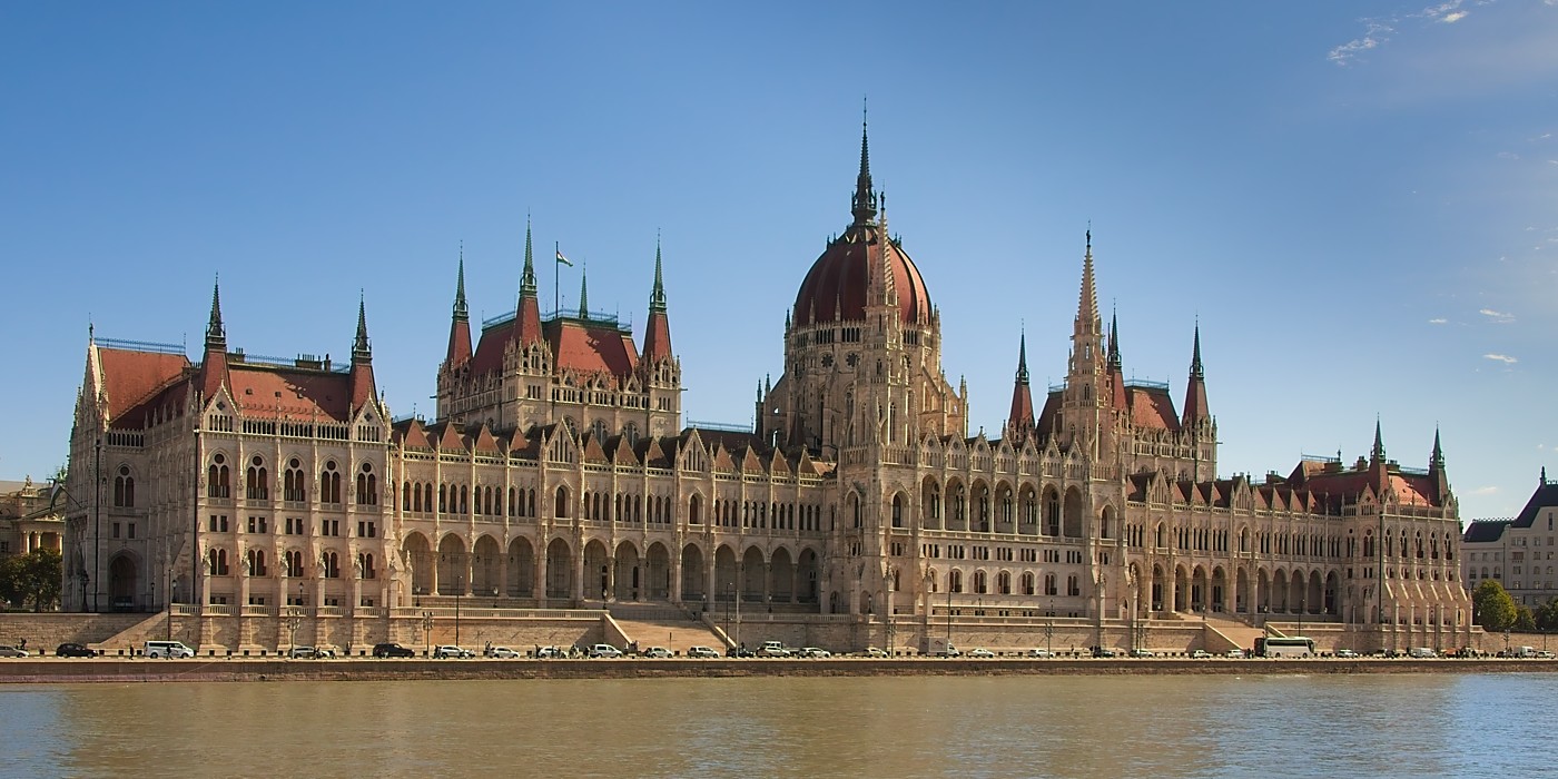
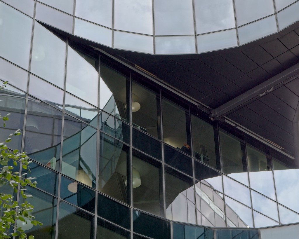
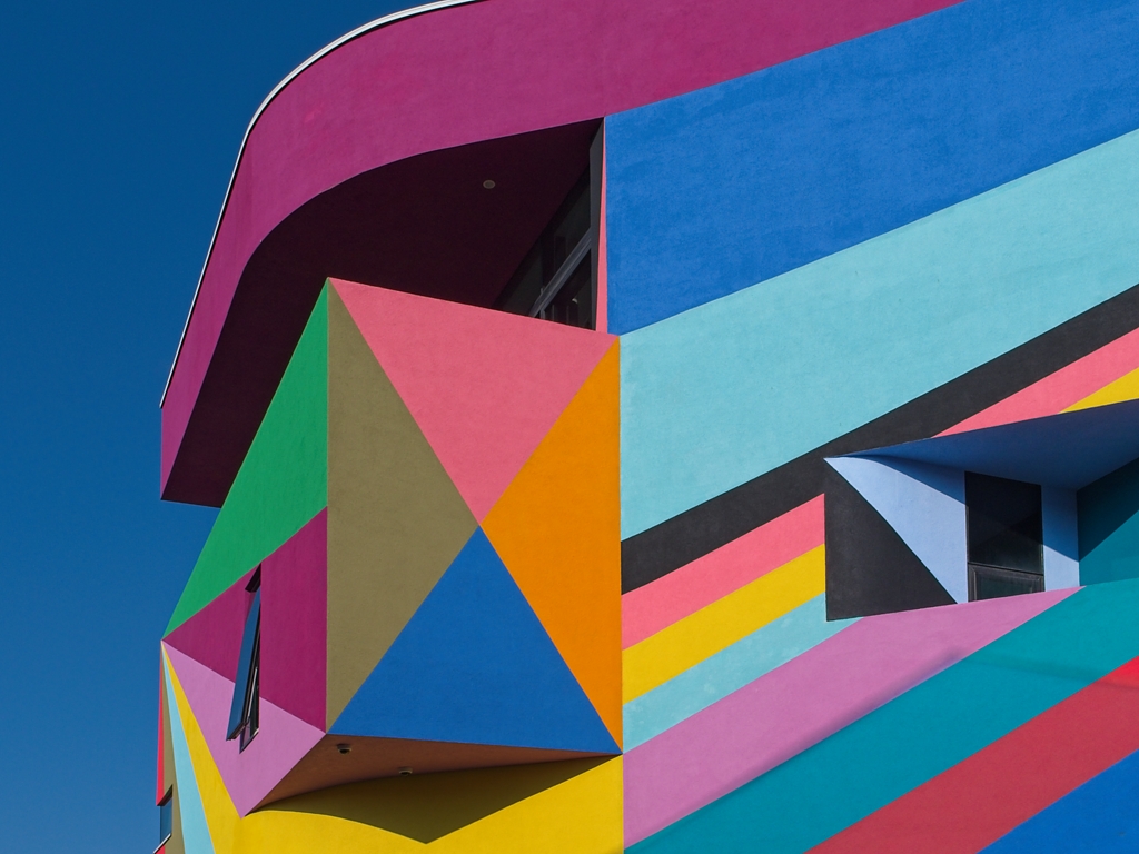
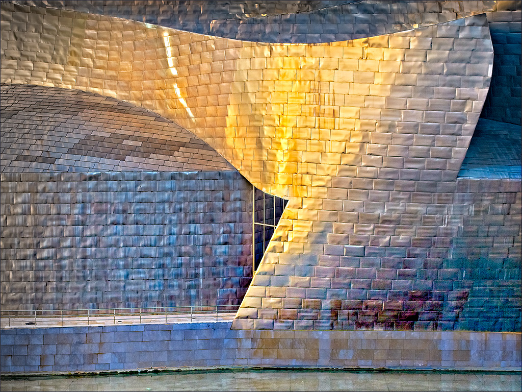
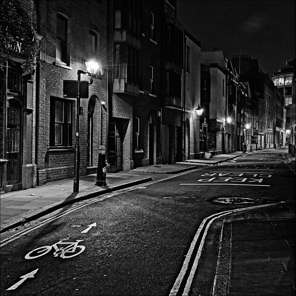
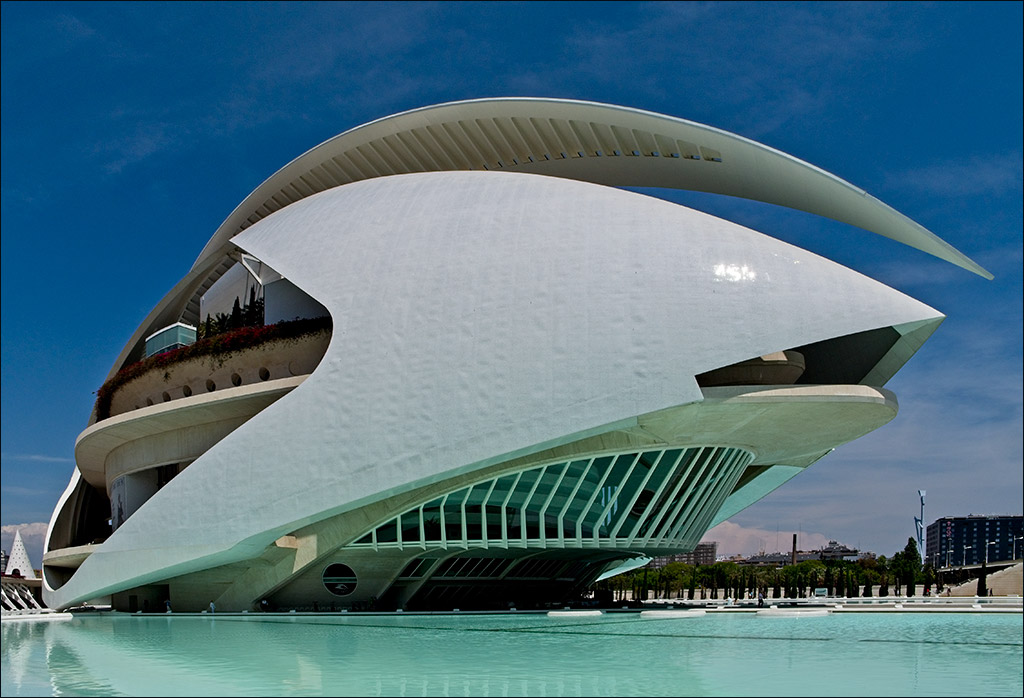
I like your composition here with the very dominant shape of the Art Museum overpowering the rest of the buildings. The pointed tower of the Library looks like a little gnome cowering in fear on the right (you need to be on the right pills). I think, though, that the tonal balance needs some adjustment. I took this into Photoshop and made a number of small selective adjustments: brighten the Art Museum, brighten the foreground street, darken the sky and the patch of light towards the back of the street, plus one of two minor tweaks. I like Joe's crop. Wish I'd thought of that! |
Sep 12th |
 |
| 4 |
Sep 17 |
Reply |
Well that would be 24 C, so yes that would be plenty hot enough! But we are about 53 degrees north so that's pretty good. The main thing was that it wasn't raining, which is quite possible in England! |
Sep 12th |
| 4 |
Sep 17 |
Comment |
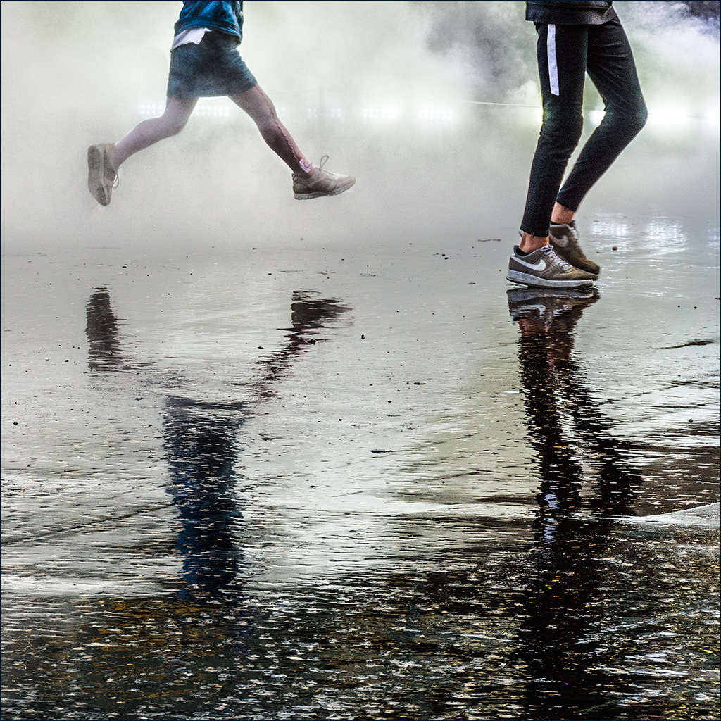
It's an action shot caught just at the right moment showing the excitement and a touch of apprehension on the girls' faces. Their hair flying out to the side shows the motion and the shot does bring out that 'all the fun of the fair' feeling. The composition is good too with the main subject placed off centre and that pink structure going off to the top right corner somehow adds a dynamic strength to the image. The yellow sign at the top left can be easily toned down (Select Color Range followed by Hue/Saturation to reduce saturation and darken it a bit). I would also perk up the Twister sign which I think is an important part of the image, and you could finish off with a very gentle vignette. |
Sep 5th |
 |
| 4 |
Sep 17 |
Comment |
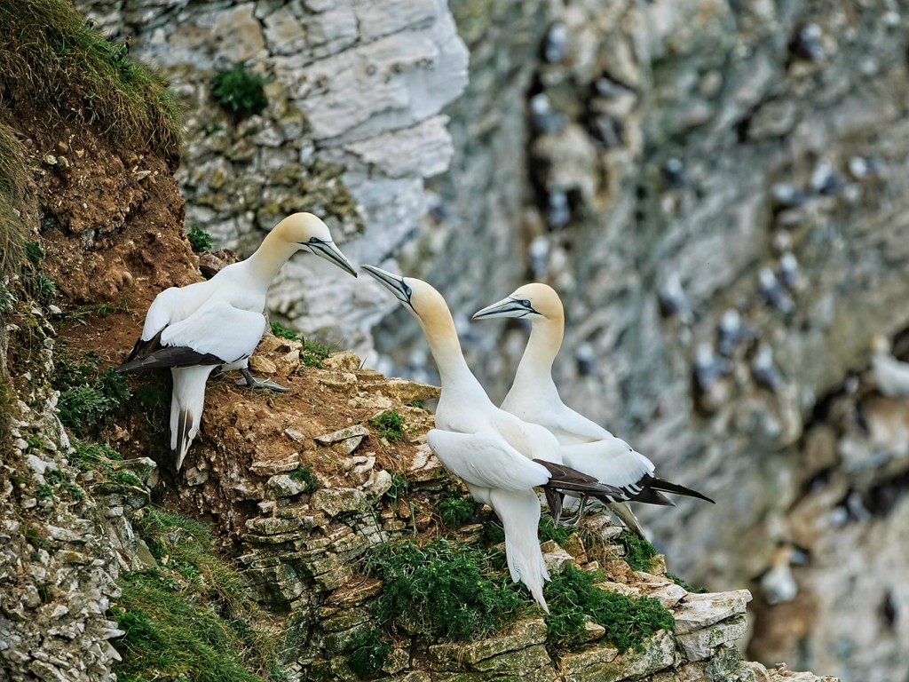
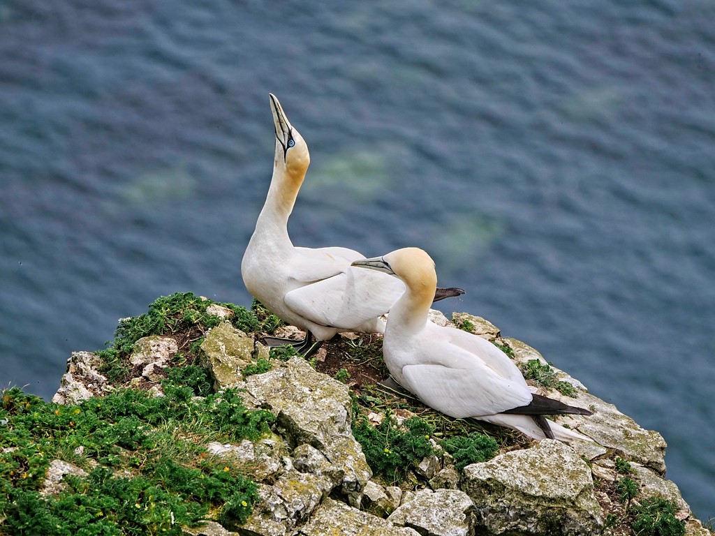
It's a great shot of this bit of domestic activity. The action is concentrated in the movement of the chick lunging towards mother, demanding to be fed, and the composition is supported by the two chicks at the left, leaning in anticipation towards mother with a sort of 'don't forget us' in their eyes. Mother almost looks like she would appreciate a break from domestic duties! You have caught the mood and action beautifully. I am just a bit concerned that it is a bit dull on the web presentation. The specular highlights come in at about 210 on the histogram instead of about 250. |
Sep 5th |
| 4 |
Sep 17 |
Comment |
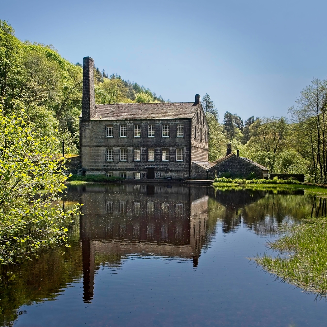
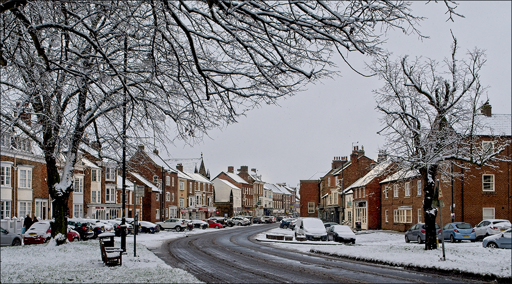
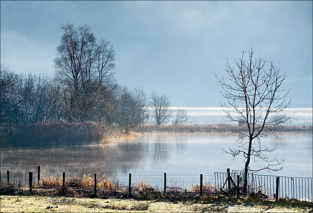
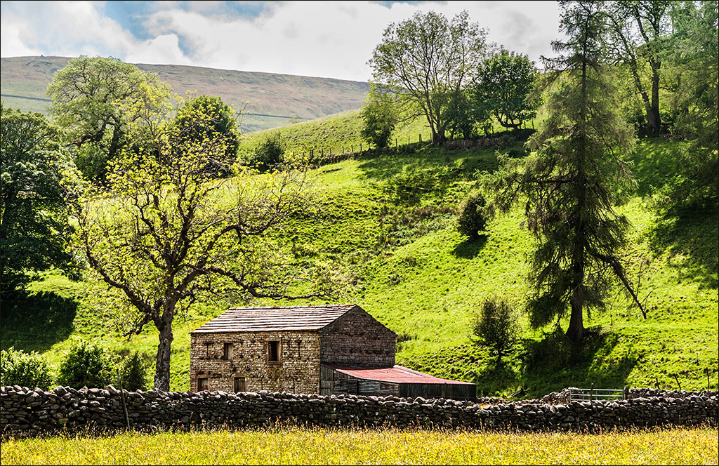
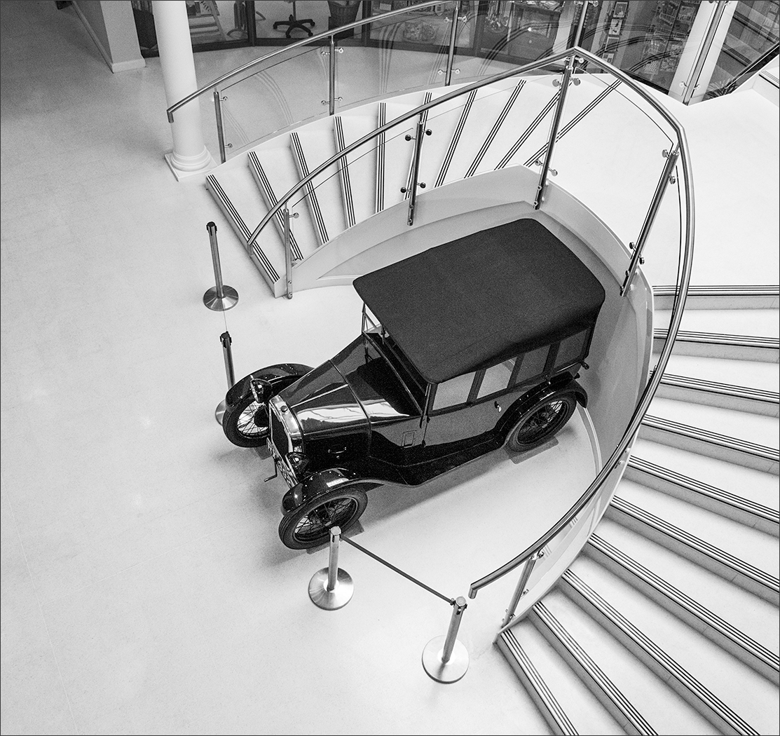
It would certainly make a good calendar picture. The image gives off an air of peace and tranquillity and is just right to calm the feelings when starting a new day or coming home after a busy day at the office. It is sharp and clean and your work to eliminate the picnic tables, people and car is undetectable. Judging by the length of the shadow under the tree, this was taken in the middle part of the day when the light is harsh, so your control of the tonal range is excellent with detail in the whites and no blocked up blacks. On a purely personal note, I don't think I would have added the birds. |
Sep 5th |
| 4 |
Sep 17 |
Comment |
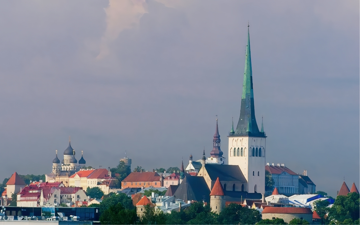
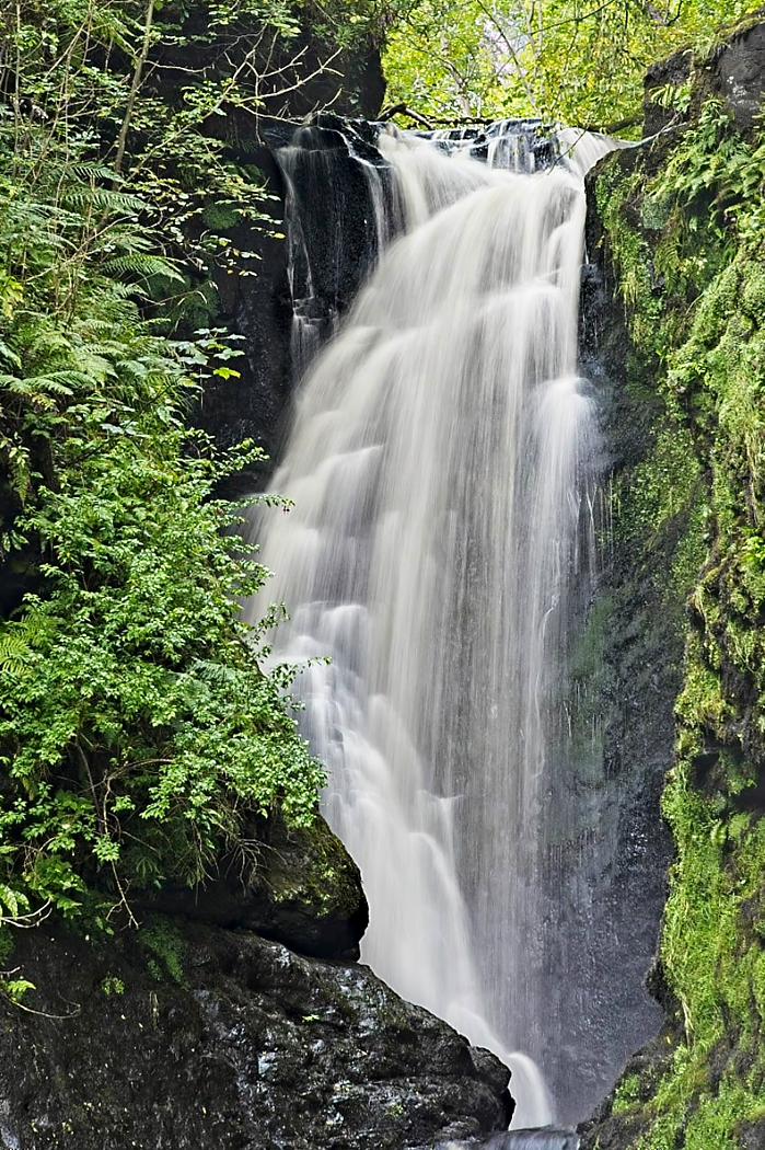
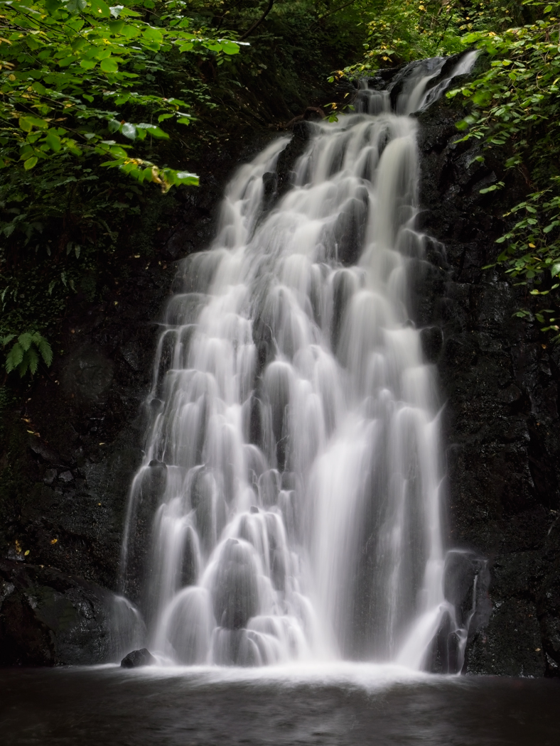
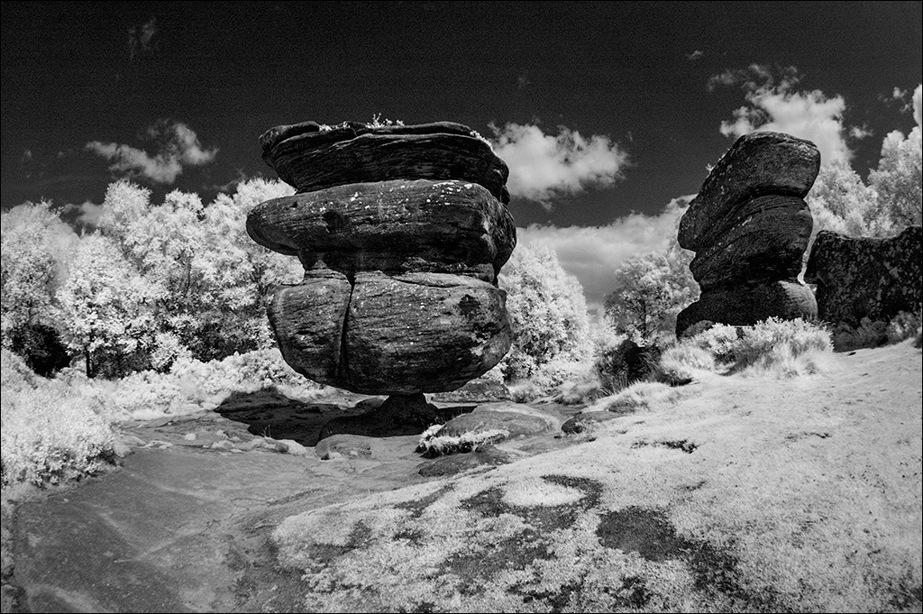
I think this is an excellent shot. The long exposure has produced very nice flow lines in the foreground water and an impressive column of spray. Most importantly, there is tonal variation in otherwise formless spray so interest is retained. The clouds are almost too strong and compete for attention, but to crop them out would be to lose the top of the spray column. |
Sep 5th |
| 4 |
Sep 17 |
Comment |
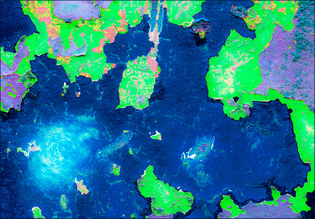
Good to see an HDR image that doesn't look overworked. The colours on the boat are wonderful and I hope you took a few close-ups of the peeling paint. The composition is interesting as although the boat fills the image from left to right, we can also see a good view of its overall setting in the landscape. My only concern is that the wooden building is very bright and competes for attention. I tried 'Select Color Range' on the building and then used a Hue/Saturation layer to tone it down a little. |
Sep 5th |
 |
8 comments - 3 replies for Group 4
|
8 comments - 3 replies Total
|