|
| Group |
Round |
C/R |
Comment |
Date |
Image |
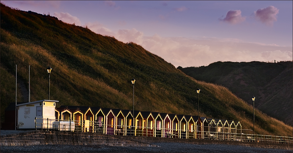
| 4 |
Feb 17 |
Comment |
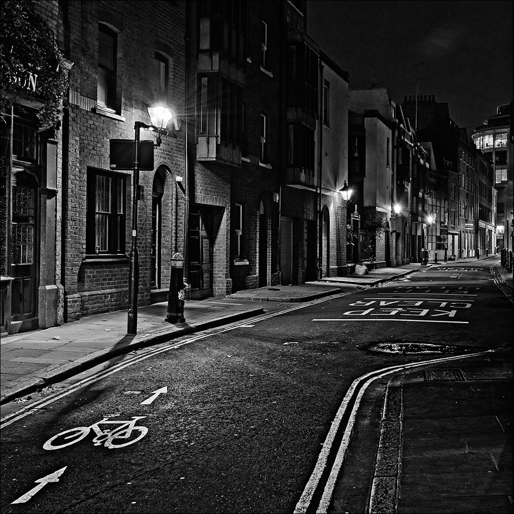
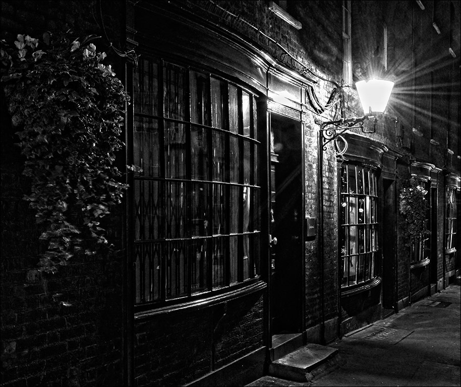
Hi Bill
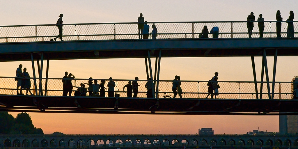
It was a very quiet part of London. No sign of any party goers, or anyone else, apart from the occasional car. |
Feb 21st |
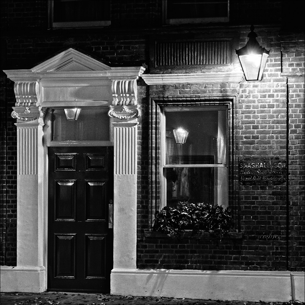
| 4 |
Feb 17 |
Reply |
Hi Joe. I didn't create the star effect deliberately. It was just the way things turned out. I'm not a fan either but I don't worry about it if it's just a function of the optics. (High contrast and small aperture). |
Feb 17th |
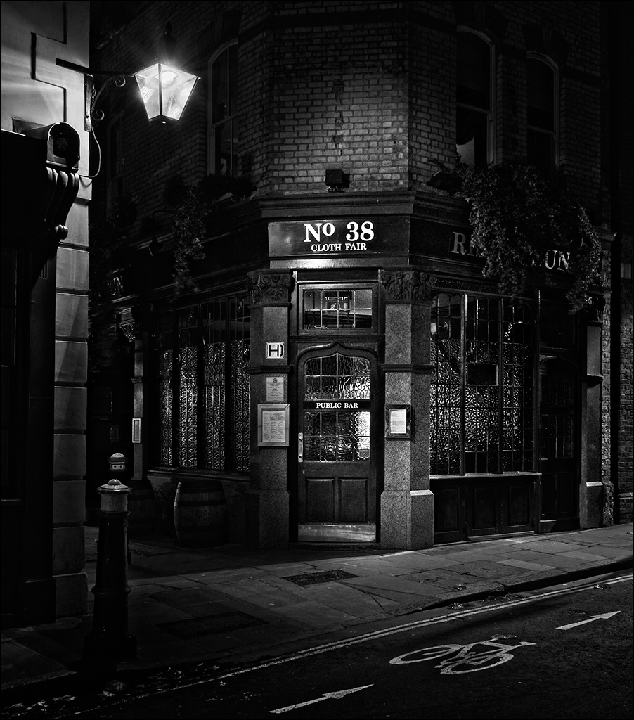
| 4 |
Feb 17 |
Comment |
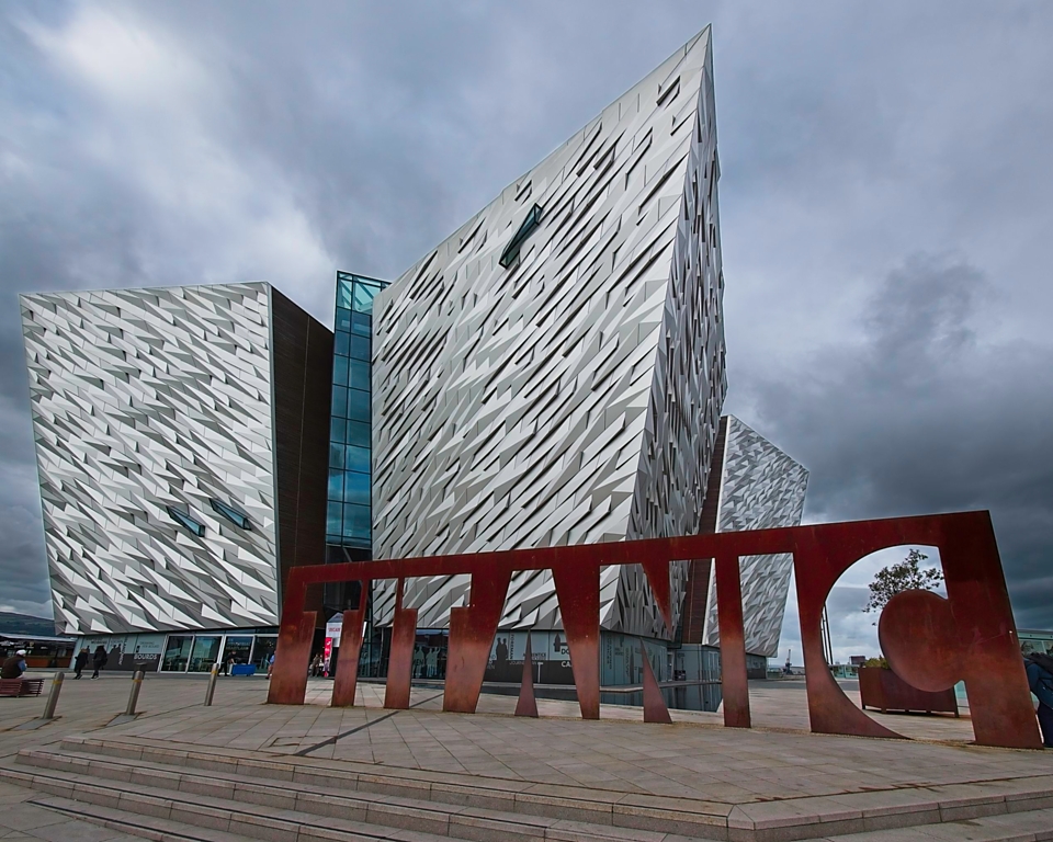
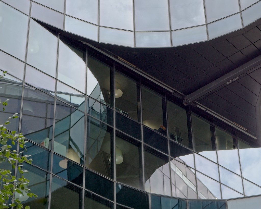
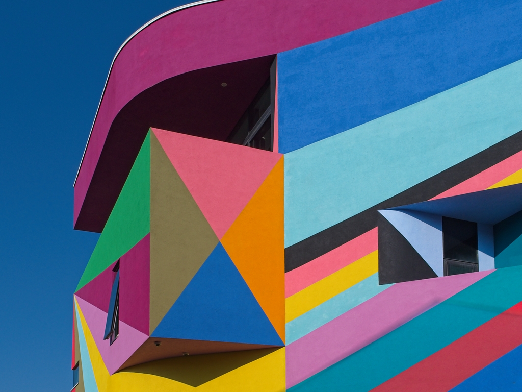
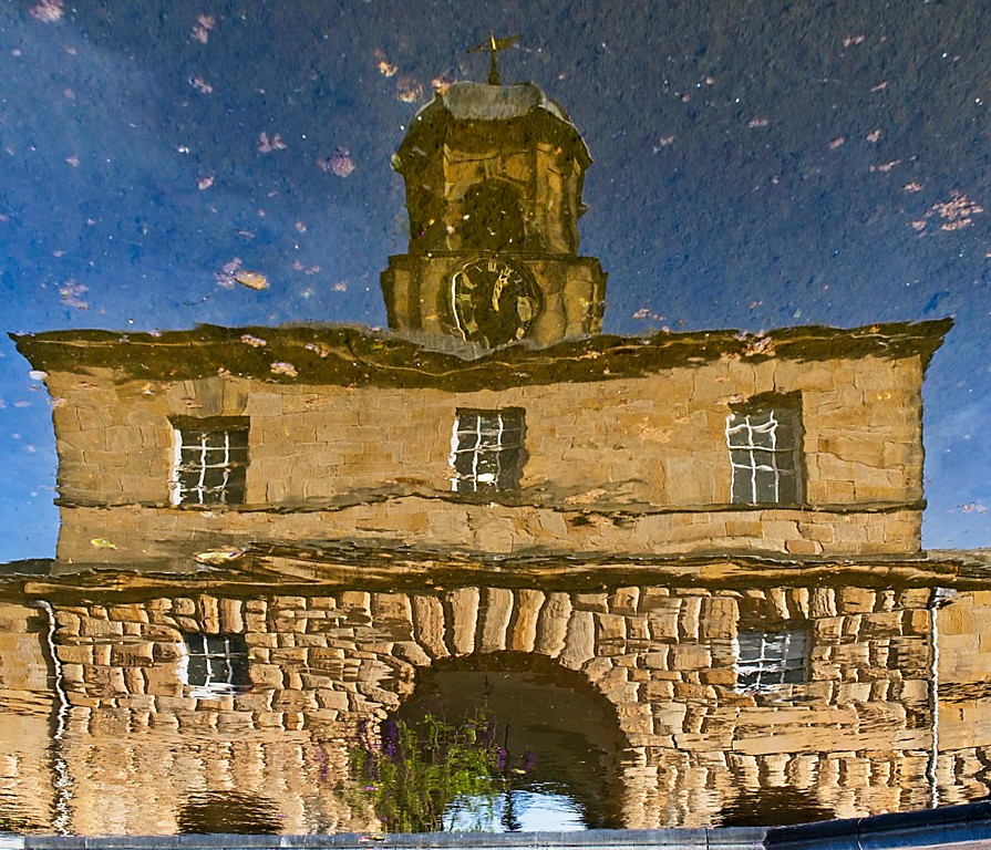
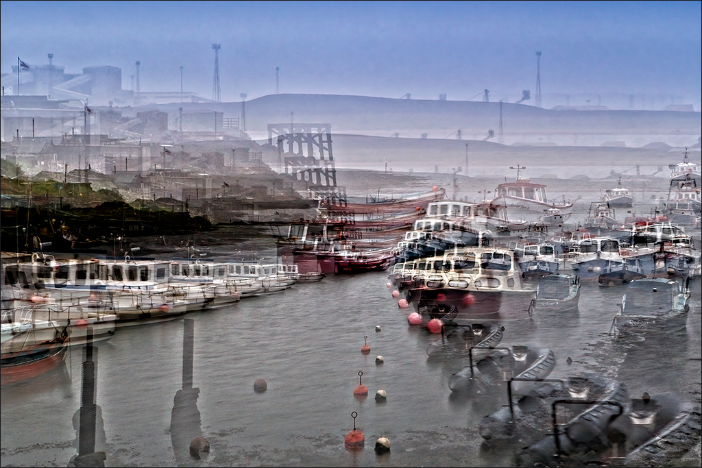
I do enjoy reflections in modern glass buildings. The distortion and double image of the same thing both add interest, and the colours work perfectly together. I was not really concerned about the building on the left until I read your notes. Once you had mentioned it, I started to feel it was a little intrusive so I tried my own solution. I used the Scale tool to squash the image height about 15 percent and then used the Distort tool to pull the bottom left corner out to the left a little. I then cropped to remove all the building. Surprisingly, the added distortion does not seem to be obvious. |
Feb 13th |
 |
| 4 |
Feb 17 |
Comment |
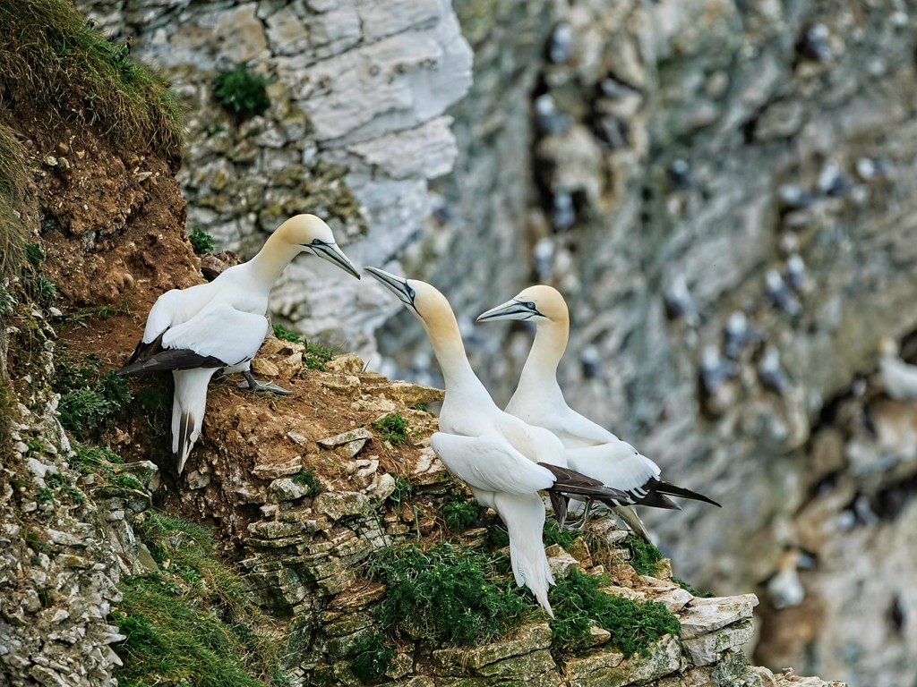
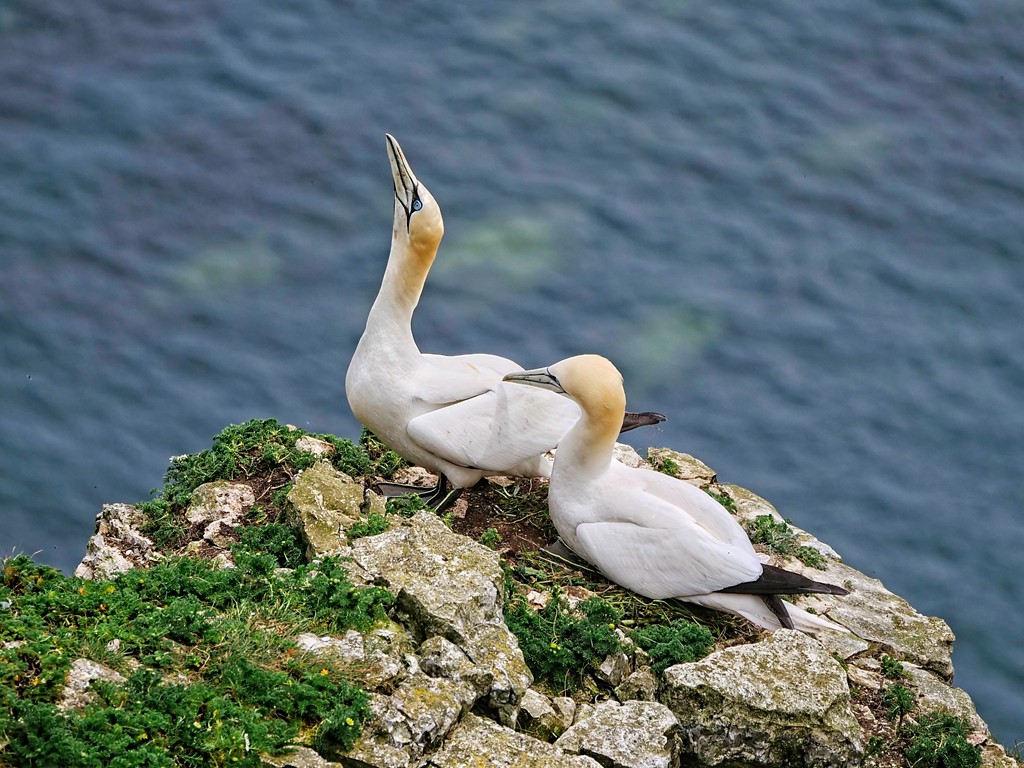
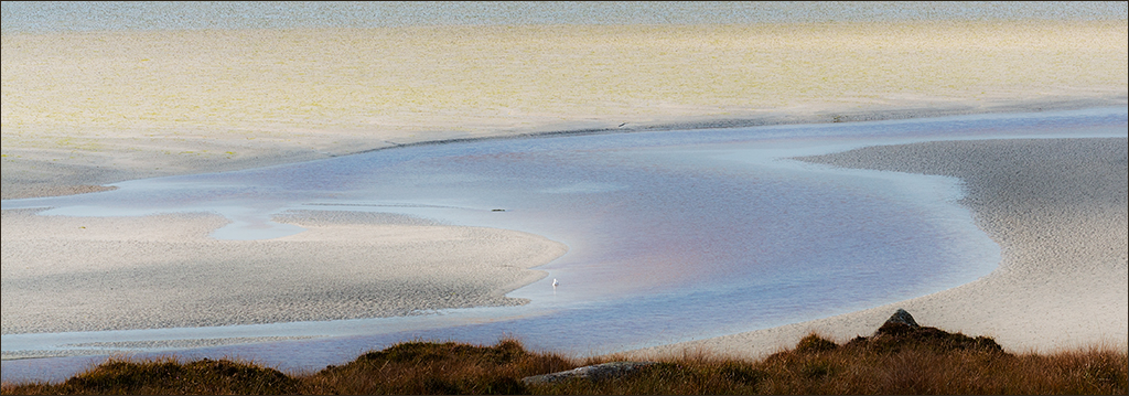
That is one very big stretch for water! The curve of the body and neck dominate the composition very nicely, with the foliage completing the setting. Exposure on the white plumage is exactly right with detail showing but still looking white without blowing out. It is a pity that there is a dead stick just overlapping the neck at one point, but there's not a lot you can do about that. |
Feb 13th |
| 4 |
Feb 17 |
Comment |
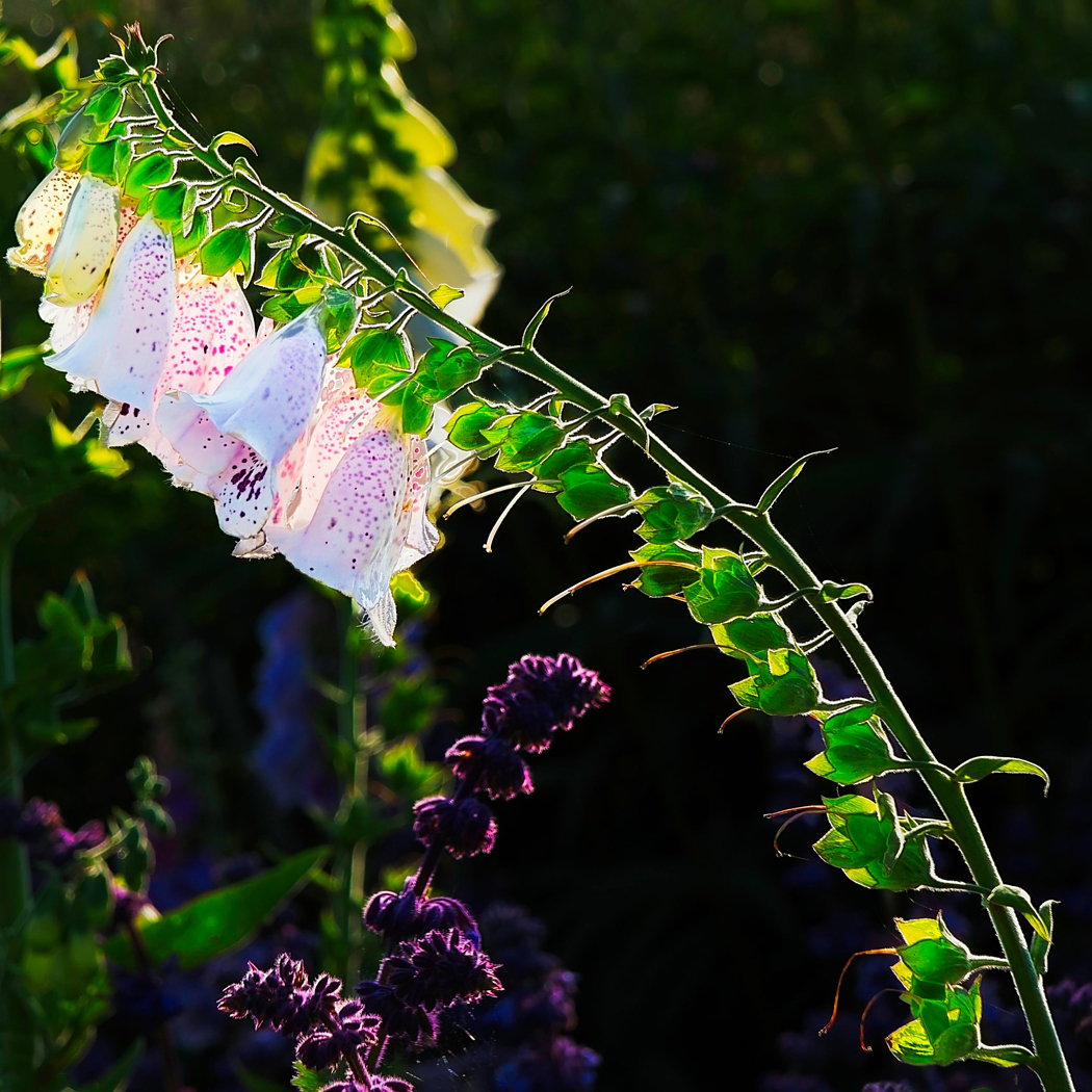
Bill, this is really good. It is sharp all the way from front to back - very difficult in a close-up like this. My immediate thought is the same as Isaac's. Did you do focus stacking? The background is soft and the colour is complementary. The white vignette is just right. |
Feb 13th |
| 4 |
Feb 17 |
Comment |
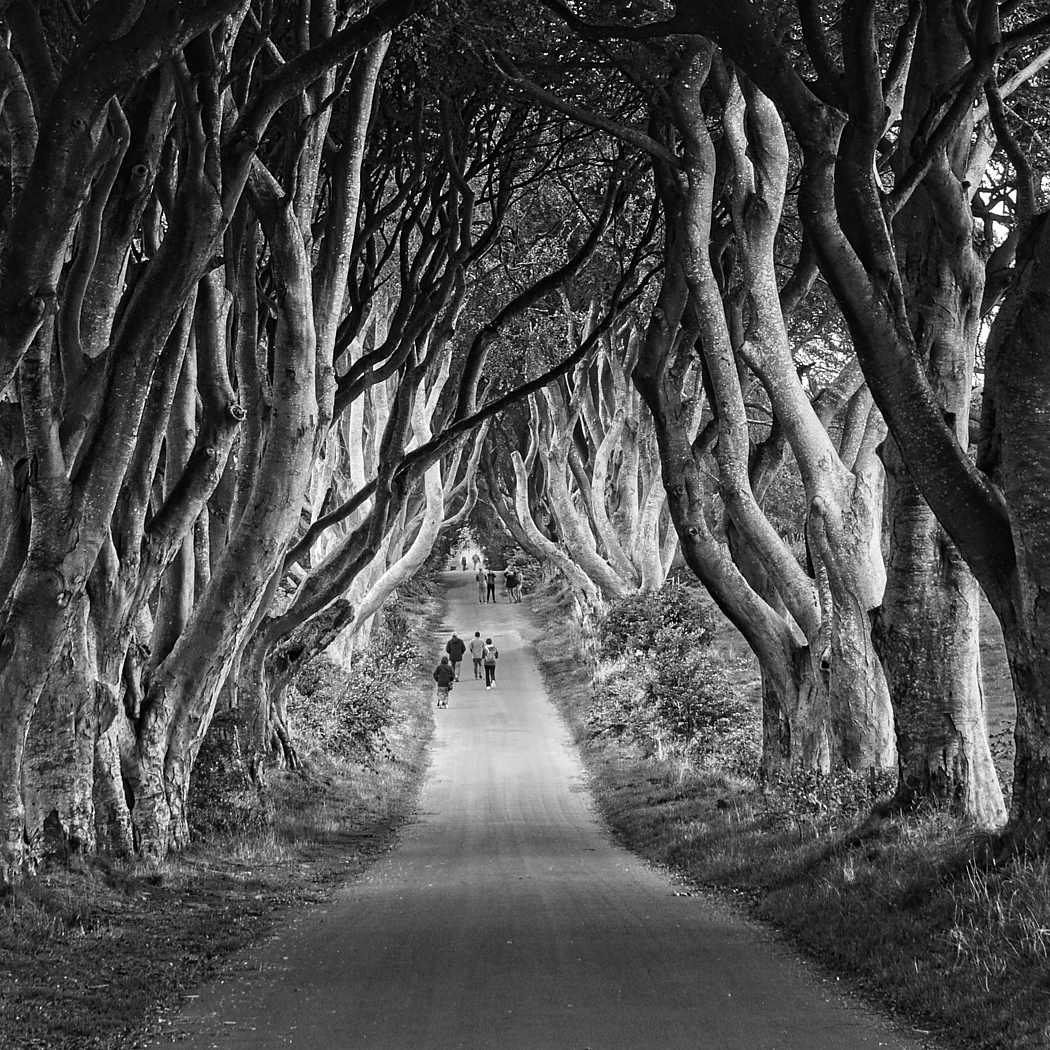
I do like a good black & white, and this one fits that perffectly. The composition is satisfying with the tree trunks sweeping up from lower left in a graceful curve to top right and there is a really nice tonal range to give the image impact. There is great foreground detail and interest and the subdued background still has enough detail to be interesting without being cluttered. I'm not surprised you made a couple of big prints. |
Feb 13th |
| 4 |
Feb 17 |
Comment |
It's a very intimate image of the chick being fed by the parent. It is very sharp and the details of the plumage are very clear. I'm not familiar with the location or the birds, but there does seem to be a slight yellow cast on the image. I tried a slight colour balance adjustment and a small increase in contrast. I also took Erik's suggestion and took out the white stem in the foreground, but I didn't try flipping it back again!! |
Feb 13th |
 |
| 4 |
Feb 17 |
Reply |
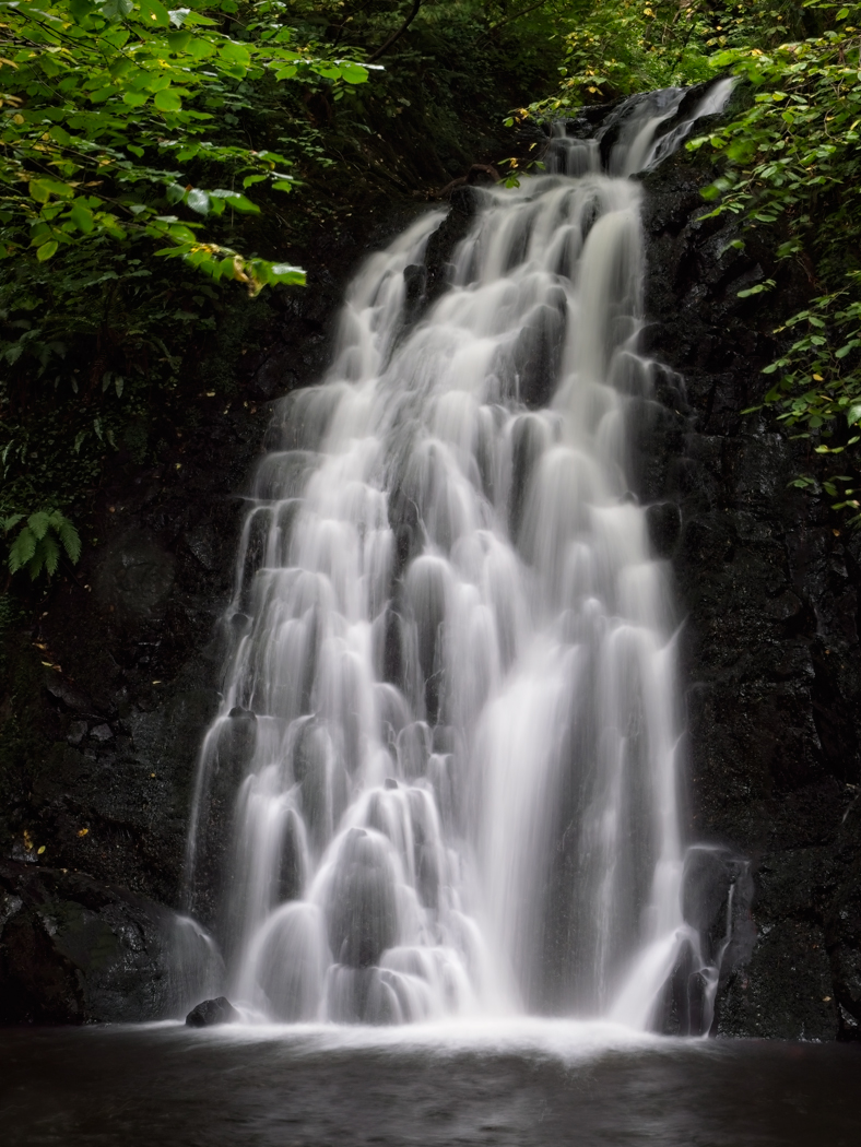
Hi Erik. Thanks for the nice comments. No I didn't try 45 seconds as it would only have been half a stop increase. My first shot was 30 sec at f/16 with ISO 200. After checking the histogram I did 30 sec at f/16 and ISO 400 (ie this one), and then I tried 66 sec at f/16 and ISO 400, followed by 30 sec at f/11 and ISO 400, and finished with 30 sec at f/13 and ISO 250. By the time I had finished it was time to pack up and move on to the next location. |
Feb 13th |
| 4 |
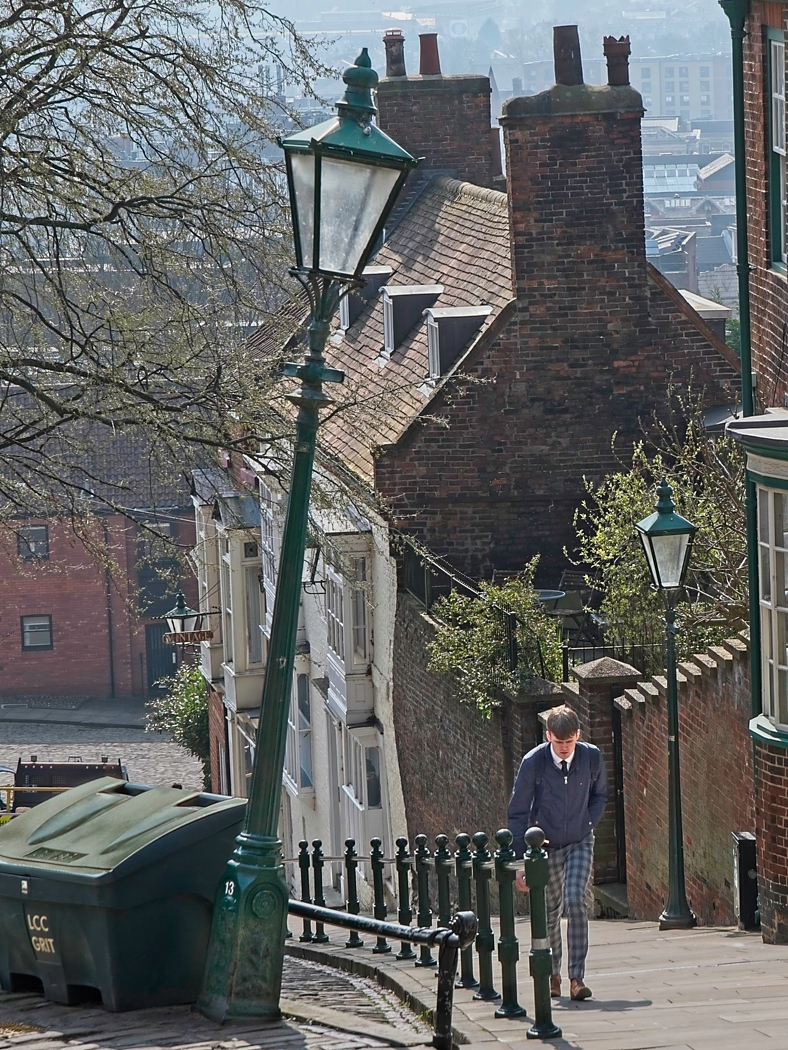
Feb 17 |
Comment |
This looks like a good example of candid street photography with these two ladies captured in an earnest discussion. The lady on the right is emphasising a point but the lady on the left looks like she is not fully convinced. The whites have been well recorded and look white without losing any detail. The blue fringe that Isaac mentions may be chromatic aberration. It is most commonly seen as red/green fringeing in high contrast areas at the left and right extremes of an image. It is possible that blue/yellow fringes can occur in high contrast areas at the top and bottom. I believe it is something to do with the colour layout of the digital sensor and can be corrected in the RAW converter. |
Feb 12th |
7 comments - 2 replies for Group 4
|
7 comments - 2 replies Total
|