|
| Group |
Round |
C/R |
Comment |
Date |
Image |
| 3 |
Jan 25 |
Reply |
Andres, Thanks a lot for your comments! |
Jan 21st |
| 3 |
Jan 25 |
Reply |
Thanks for your kind comments, Robert! |
Jan 21st |
| 3 |
Jan 25 |
Reply |
Thanks, Mary Ann, for your comments and suggestion! |
Jan 21st |
| 3 |
Jan 25 |
Reply |
Joan, Thanks for your comments and suggestion! |
Jan 21st |
| 3 |
Jan 25 |
Reply |
Thanks, Ruth, for your comments!
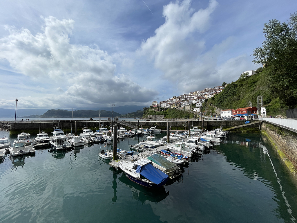
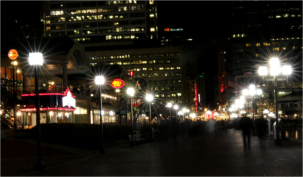
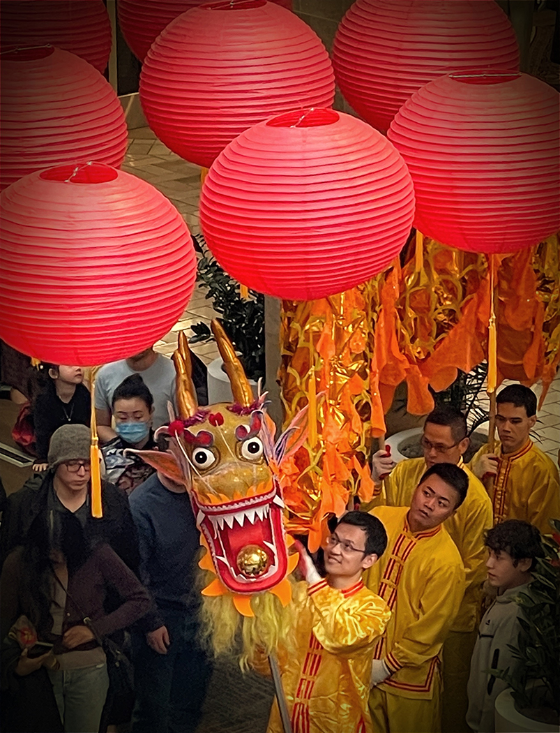
We visited Taj Mahal before sunrise, and the pollution in Agra made the faint scene. We were also advised not to bring tripod, or bag to avoid security checks that could delay the whole group. It's quite an experience to visit a well known place! |
Jan 21st |
| 3 |
Jan 25 |
Reply |
Thanks for your comments,Michael!
- For camera used, I had a tendency to save all images that I like in one folder per trip, and processed them using Windows tools or apps. Sometimes, I could not find the Exif data in my final image either.
- I agree that the monochrome could be a good option. I visited Taj Mahal before sunrise and the light was not great either due to the pollution in Agra.
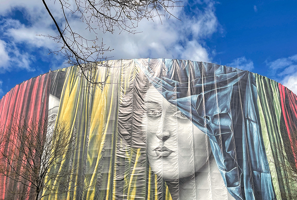
- The tower on the left is another minaret of the mausoleum. I might crop too tight on the left. Thanks for pointing it out. |
Jan 21st |
| 3 |
Jan 25 |
Reply |
Hi Lance,
Thanks for visiting our group and for your kind comments. |
Jan 21st |
| 3 |
Jan 25 |
Comment |
Hi Mary Ann,
You have captured the moon with good results. The moon is quite sharp, and it also includes craters on the surface.
The foreground is a bit dark, and I think that It's quite a challenge to balance the exposure between the moon and the foreground. I'd prefer to see a high tree or a building on the State Island road for a more visible foreground.
Since you stayed there to watch the sunset, I wonder whether you had any shots during the blue hour when the sky has a richer color? |
Jan 21st |
| 3 |
Jan 25 |
Comment |
Hi Joan,
The angle you captured George Washington Bridge and the little red lighthouse is impactful! It gives the viewer a sense of scale how enormous the bridge is. The red color of the lighthouse has a visual appealing to the scene.
I also appreciated the story you shared. It drives me to think beyond capturing the regular photos and to get more storytelling images. Nice image! |
Jan 20th |
| 3 |
Jan 25 |
Comment |
Hi Ruth,
Wow! You have keen eyes for details, and you are good at noticing small but important things that other people might not notice.
In this image, your post processing has turned a normal photo into an artwork. The angle of your shot emphasized the winding roots and the conversion in B&W are well done! I especially like some fallen leaves between those roots. Excellent image! |
Jan 16th |
| 3 |
Jan 25 |
Comment |
Hi Robert,
You have captured a nice portrait of the doe. She seemed to pose for your shot by looking straight into your camera, her ears pricked up, and her body was framed by some leaves.
Your crop, the removal of the white grass on her body, and your post processing makes the doe stand out from the background.
I'd prefer to darken a bit more the vertical white branch on top of the doe's ear since it draws the viewer's eyes there. Beautiful portrait! |
Jan 16th |
| 3 |
Jan 25 |
Comment |
Hi Michael,
The abandoned shop with graffiti is a storytelling image. It creates viewers' engagement with your accompanying story. Thanks for sharing it! With a series of images captured in this location, you can use them in a photography portfolio or social documentary of the Salton Sea.
For the context of the image "Requiem", the composition and the color version work well to me. My question is: Why are the colors so vibrant like new paint, although the incident happened over 20 or 40 years ago? I'd prefer to tone down the colors a bit to create more impact to the abandoned location. |
Jan 16th |
| 3 |
Jan 25 |
Comment |
Hi Andres,
So sorry for having a cracked glass at your sliding door. I admire you for taking a negative situation and shift it to an art work. The patterns of the crack are beautiful and the composition of each one of the 4 versions has its own unique look. You can save them for your future use in creativity. I did buy the cracked patterns online in the past for my creative photography.
In my personal opinion, the Original and Original 3 fit the "abstract" definition since the subjects are not identified. As this image was captured by your 24-104 mm lens, it would be categorized as a close-up shot since the macro lens would achieve at least a 1:1 magnification. Nice shot! |
Jan 7th |
6 comments - 7 replies for Group 3
|
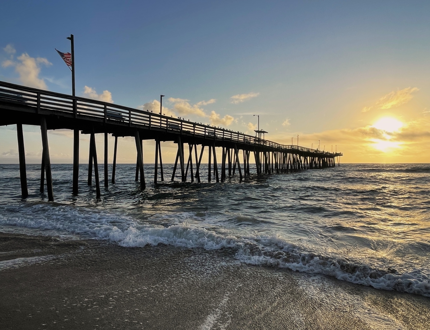
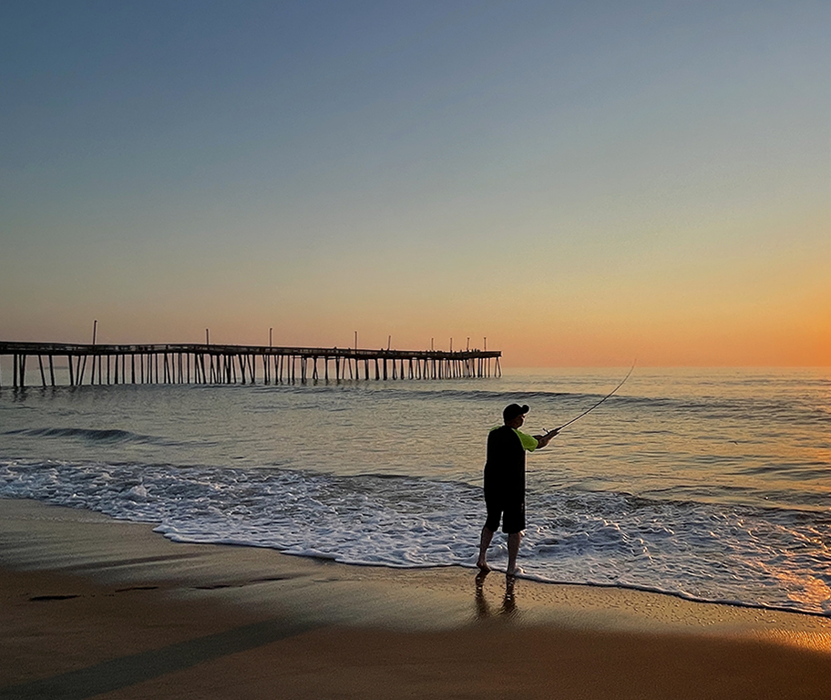
| 86 |
Jan 25 |
Comment |
Hi Wayne,
Your image of Pacific pier is intriguing since the angle of your shot makes it different than the norm. The red color of the horizon, the drama clouds and the golden water emphasized the pier more.
I'd prefer to crop tighter from the top to reduce the empty sky on the top right area and to make the composition stronger, and to have a bit of separation between the pier and the water line. |
Jan 15th |
| 86 |
Jan 25 |
Comment |
Hi Jack,
The clouds are interesting, and the converging lines of the vines that lead the viewer's eyes to the further distance work well.
The inclined plane of the scene is a bit of discomfort at first view, but I think that the tilting helps to see more what exists at a greater distance. Nice shot! |
Jan 15th |
| 86 |
Jan 25 |
Comment |
Hi Ruth,
The trees without leaves indicate winter, and the blue sky with white clouds gives the viewer the calmness, peace, and tranquility.
Since the trees are dominant in the foreground, I'd prefer to see more movements of clouds to make them more stand out from the sky. |
Jan 15th |
| 86 |
Jan 25 |
Comment |
Hi Susan,
You have captured a nice scene of the Morgan library. The lighting is well lit and beautiful with all indoor details. The angle of your shot that includes a big open book in a large glass case draws the viewer's attention to the scene.
I'd prefer leave the glass case as it is since it is preserved that way for public display. Well done! |
Jan 7th |
| 86 |
Jan 25 |
Comment |
Hi Steven,
The composition of your image is beautiful! The well-lit barrels in the center with converging lines on both sides create a depth to your image. The wooden beams on the top give the viewer a vintage feeling of the place.
I'd prefer to lighten a bit the barrels on the right of the frame to show more of their details. Nice shot! |
Jan 7th |
| 86 |
Jan 25 |
Reply |
Thanks for your comments,Steven!
My responses are:
- Excluding the blue wall,the image will be a flat one and it won't look good. See my responses to Jack above.
- There were times when customers sitting to sip coffee on the table but their modern clothes and their carried bags totally changed the scene (in a bad way). I prefer this scene without customers more.
- I appreciated your edits. Please see my responses to Susan above. |
Jan 7th |
| 86 |
Jan 25 |
Reply |
Thanks for your comments, Susan! There were another table and chair that overlapped the base and leg of the chair, so I decided to crop them out. In addition, I am interested in the Indian design on the wall, especially the lacy curtains on the top more. To me, the image ratio would be disproportioned (too long) if the table base and the leg of the table were included. Do you agree? |
Jan 7th |
| 86 |
Jan 25 |
Reply |
Thanks for your comments, Jack! I purposely included the blue wall to create a 3D effect. |
Jan 7th |
5 comments - 3 replies for Group 86
|
11 comments - 10 replies Total
|