|
| Group |
Round |
C/R |
Comment |
Date |
Image |
| 3 |
Sep 24 |
Reply |
Thanks everyone for your comments! |
Sep 27th |
| 3 |
Sep 24 |
Comment |
Hi Joan,
The square crop makes the bird stand out. You have done am amazing job in post processing! The blue tint also makes it like a pastel painting. Nicely done! |
Sep 27th |
| 3 |
Sep 24 |
Comment |
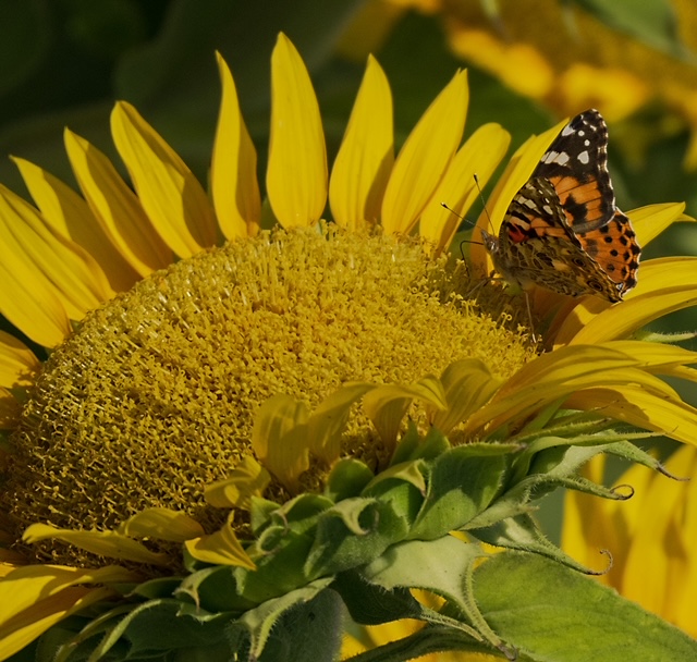
Hi Mary Ann,
Your crop has removed all the unwanted elements in the frame to give the viewer a better focus on your subject.
Since the butterfly is hanging upside down and the colors of its wings are similar to the sunflower, I'd suggest to rotate the image to give it another visual appearance. I am not sure if you agree with this approach. |
Sep 27th |
 |
| 3 |
Sep 24 |
Comment |
Hi Ruth,
The scene is so beautiful with mountains covered by snow, pine trees, and the lake. The time of your shot gives nice colors that are pleasing to the eyes. Your photo is also well composed with the kayaks enhance the enjoyment of outings.
It's a nice shot, and I don't have any suggestion for improvement.
My question is: Do the Colorado mountains still have snow in June? |
Sep 27th |
| 3 |
Sep 24 |
Comment |
Hi Robert,
The compositional technique of your shot works very well. The diagonal lines guide the viewer's eyes to the specific point of interest. The corner of the building also gives the 3D view of the architecture.
I agree with the others that increasing more contrast in the sky would enhance the sky color more. Nice shot! |
Sep 27th |
| 3 |
Sep 24 |
Comment |
Hi Michael,
Nice macro shot with your new camera! The bokeh background makes the dandelion stand out. I likes the way you captured different stages of the dandelion: the bulb and the white, fluffy flower head that are ready to disperse by the winds.
I'd prefer to remove the 2nd bulb in the background on the left side that could compete with the one in the foreground.
Congrats to your published photos "Vietnam from North to South"! The photo "The Artist's Hand" is incredibly powerful and evokes emotion to the viewers. |
Sep 27th |
| 3 |
Sep 24 |
Comment |
Hi Andres,
The conversion to B&W works well, and it adds more drama to the skeleton tree. At first, I also think that smoothing the water would make the scene more peaceful, but I found that the incoming waves in different layers will match more with the skeleton tree and create more impact to the scene. Nice shot! |
Sep 27th |
6 comments - 1 reply for Group 3
|
| 86 |
Sep 24 |
Comment |
Hi Susan,
I can understand your excitement to see the fall leaves when you normally don't see them in FL. I live in East Coast, when I traveled to Houston last Fall, I missed so much the colorful fall leaves.
In this image, it looks like you had the maple leaves which have lobed, saw-toothed, jagged edges, and they are more beautiful than the other leaves. The reflection of the building on the car is the mixture of nature and urban life.
I'd prefer to crop tighter the bottom of the image to eliminate your hands and phone in the reflection. |
Sep 28th |
| 86 |
Sep 24 |
Reply |
Thanks everyone for your comments. |
Sep 28th |
| 86 |
Sep 24 |
Comment |
Hi Ruth,
I like your composition by making the sky two-thirds of the frame to emphasize it, and the Baptist church one third of the frame. In this photo, even the church is in small scale, its tall cross is clearly visible from a distance.
My only suggestion is to enhance colors a bit more |
Sep 27th |
| 86 |
Sep 24 |
Comment |
Hi Jack,
Your image is intriguing, especially it shows a different view of Cambodia! The angle you shot, the colors, the different shapes, and the reflection make me stop to study it more. The camera tilt works for me since the Pub Street sign defines the angle of your shot.
I'd prefer to crop tighter on the right side (close to the motorbike) to eliminate the dark lower corner, and to clone out the 2 white parts of snow flake designs on the top middle of the frame. |
Sep 25th |
| 86 |
Sep 24 |
Comment |
Hi Wayne,
The striking contrast between the blue modern tower and the red roof of the traditional temple makes this image stand out from the norm. The exposure of the image is well done at the blue hour. For the composition, I'd prefer to see a bit of separation between the tower and the eave of the temple roof (since it's overlapped in this image), and remove the blue triangle on the right side. The image is sharp and beautiful! |
Sep 16th |
| 86 |
Sep 24 |
Comment |
Hi Steven,
You have captured a great abstract image of the glass reflection. The composition you presented in diagonal lines and in square crop work very well. The image is tack sharp and well done! It amazes me because the glass reflection does not produce any glare at all. I don't have any suggestion for improvement. |
Sep 15th |
5 comments - 1 reply for Group 86
|
11 comments - 2 replies Total
|