|
| Group |
Round |
C/R |
Comment |
Date |
Image |
| 3 |
Jun 24 |
Reply |
Wow! Super! I really like this crop! |
Jun 27th |
| 3 |
Jun 24 |
Reply |
So sorry for what happened, Ruth! I will try sugar-coating my comments. Um-hum�� |
Jun 27th |
| 3 |
Jun 24 |
Reply |
Hi Michael,
Speaking up is the right thing to do, and it opens to more effective communication. For many years since I joined PSA Study Groups, I never gave out any comments such as "ugly, disapprove" to someone's images and I will never do that because I am aware that everyone has some bias, and everyday bigotry is unfortunately common.
Fair enough, you ought to "practice what you preach" too. I remember that in December 2023, your strong words to my image were: you felt disappointed, it was poorly composed, you suggested me to select a different image, and you even attempted a perspective fix! I did not take your comments personally because I think you missed the whole point that I intentionally captured the tall building from up close and bottom up (and millions of photographers have done the same way as I did). |
Jun 27th |
| 3 |
Jun 24 |
Comment |
Hi Joan,
It's a good idea to digitize your old slides with a flatbed scanner. To me, I like the crop of the final image which has stronger visual perspective in graphic arts than the original one. It creates a great impact to the viewers' eyes.
I'd suggest to adjust the color of the sky and around the edges of the frame a bit more since the blue does not look natural. You motivated me to digitize my old negative films. Thanks for sharing! |
Jun 21st |
| 3 |
Jun 24 |
Comment |
Hi Mary Ann,
It's great to have a chance to practice and refine your skills in milky way photography, especially at your friend's family ranch! I like the way the tree was well illuminated and its color & shape make it look eerie in the dark sky. The lone tree with the stream of light leading to it, marks as an additional subject in your composition and adds more interest and drama.
Your post processing in the second version with the entire sky lit up with stars and you also got some captures of the Milky Way is a nice shot! I don't have any suggestion for improvement. Thanks for sharing your fun and exciting astrophotography!
|
Jun 21st |
| 3 |
Jun 24 |
Reply |
I appreciate your comments, Joan! |
Jun 20th |
| 3 |
Jun 24 |
Reply |
Thanks, Andres, for your comments! |
Jun 20th |
| 3 |
Jun 24 |
Reply |
Thanks for your comments, Mary Ann! |
Jun 20th |
| 3 |
Jun 24 |
Reply |
Thanks, Ruth, for your suggestion to slightly crop on the top. I will do it if I use this image again. |
Jun 20th |
| 3 |
Jun 24 |
Reply |
Thanks, Bev, for visiting our group and for providing me your comments. |
Jun 20th |
| 3 |
Jun 24 |
Reply |
Thanks, Michael! I agree that it's a bit tight on both sides. There are some distracting elements around him, so I crop them out. |
Jun 20th |
| 3 |
Jun 24 |
Comment |
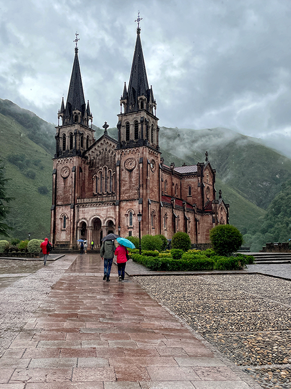
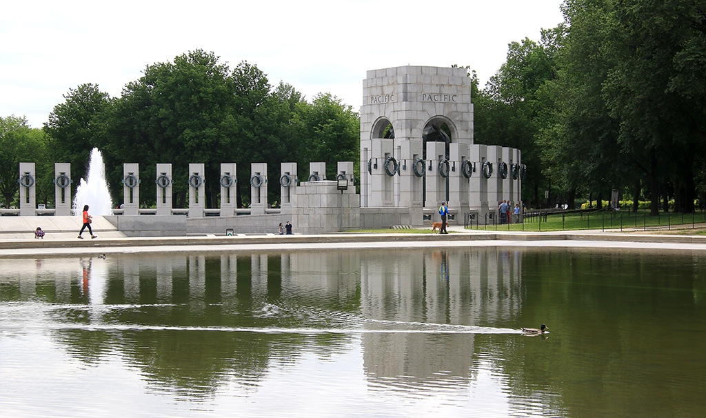
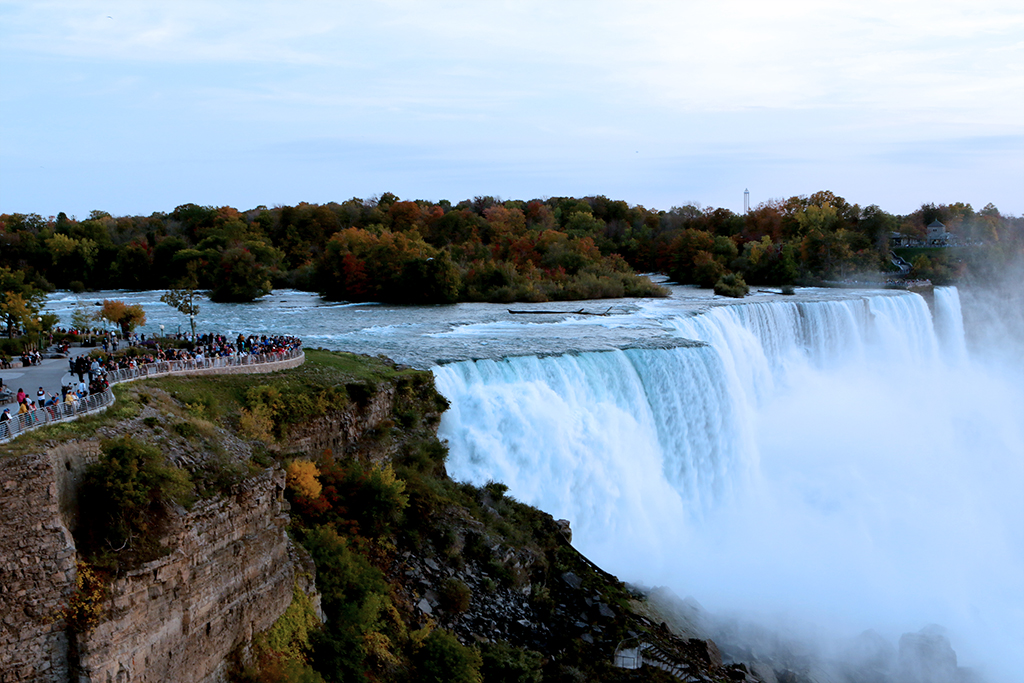
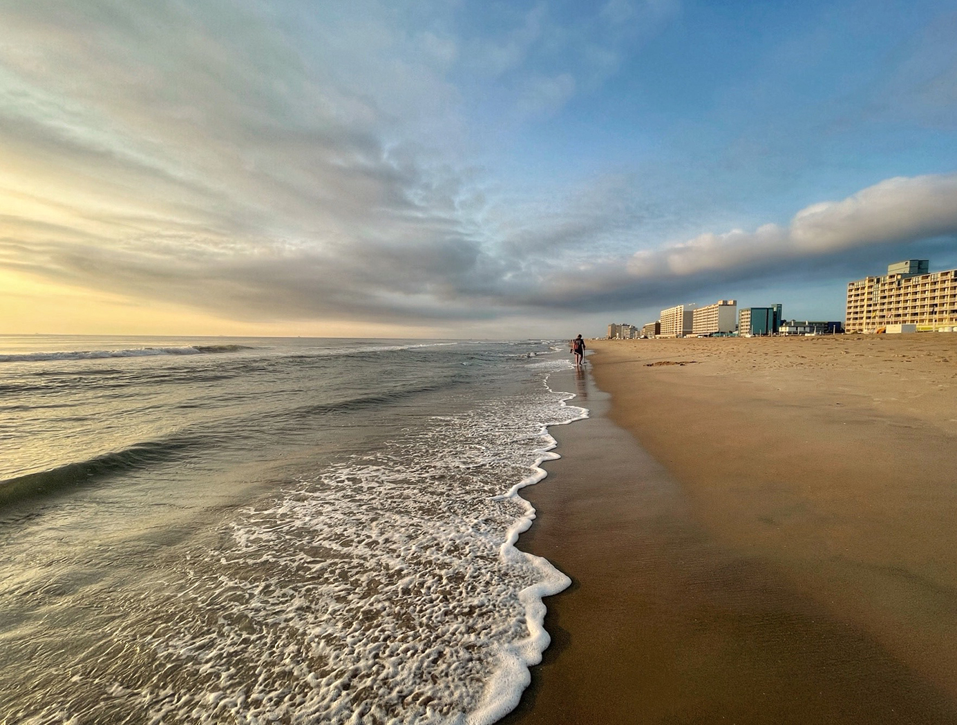
Hi Ruth,
You should be proud to have visited so many beautiful places! The angle you shot from an overlook presents the scene in different layers and colors of hills, land, and water. The photographer in red jacket is a big plus as he adds a hint of human presence and gives a sense of perspective and scale to the scene.
One minor suggestion is to remove something in dark colors at the lower right corner. Thanks for sharing your nice shot! |
Jun 15th |
| 3 |
Jun 24 |
Comment |
Hi Robert,
The sunset makes the waterfront houses and the water reflection more beautiful! You have Ä‘one a great job in post processing to bring back the details of the houses and the trees.
I'd prefer to crop half of the water reflection to make the viewers' eyes focus more on the beautiful sky and the houses. I especially like the big house on the left that is like on an island and it creates a 3D image. Nice shot! |
Jun 15th |
| 3 |
Jun 24 |
Reply |
Hi Michael,
Please excuse me if I offended you. I did not mean to do so. I want you to understand that as we are in the Study Groups (not in the art exhibition), my intention is to point out what works best for me and what my suggestion for improvement is. As the image maker, you can agree or disagree with my suggestion. A lot of time, I did not see the flaws of my image until others pointed out, and I truly appreciate the efforts they took to share their thoughts with me.
I do not agree when you said that I "frequently praise an image only to then immediately negate that praise by inserting a statement of personal preference." That's not true! I can give you an example of Joan's image "Zabriskie Point" last month, her final image is so beautiful and I did say that "I don't have any suggestion for improvement." I did the same to you several times too when your images are flawless. For your image this month, I did not say that the "string" that runs through the boy's face is distracting at all! I know that nothing you can do in a PJ image and in that shot, but I just point out what I see,as an image's viewer,in my comments.
Thanks for sharing your feedback with me. It's difficult to evaluate people' images (as you might know that one person in our group decided to withdraw for that reason), and since you're unwilling to accept my suggestion for improvement, from this point forwards, I won't provide you any criticism to your images. |
Jun 15th |
| 3 |
Jun 24 |
Comment |
Hi Michael,
Your image is a candid image of a normal life in India. The way you frame the eyes of the boy on a bus with the window half-opened works well. The diagonal shot makes it a dynamic one. There is a shadow of a long string running from the boy's head down to his face that makes like a red scar that I wish it were not there!
The image is sharp and the crop is well done. Thanks for sharing your image.
|
Jun 15th |
| 3 |
Jun 24 |
Comment |
Hi Andres,
Great capture of the waterbucks! They both look at your camera and their poses are very nice with a bit of space to separate their faces and bodies. Their furs are beautiful that have some parts in lighter color and make them stand out from the similar color background.
As Michael mentioned that one antler is close to the edge of the top frame but I am OK with that. I'd prefer not to expand the top area since it also expand the white sky, which could be distracting.
Have you considered to crop their faces in square format? The image is sharp and beautiful. Thanks for sharing! |
Jun 15th |
6 comments - 10 replies for Group 3
|
| 86 |
Jun 24 |
Comment |
Hi Pat,
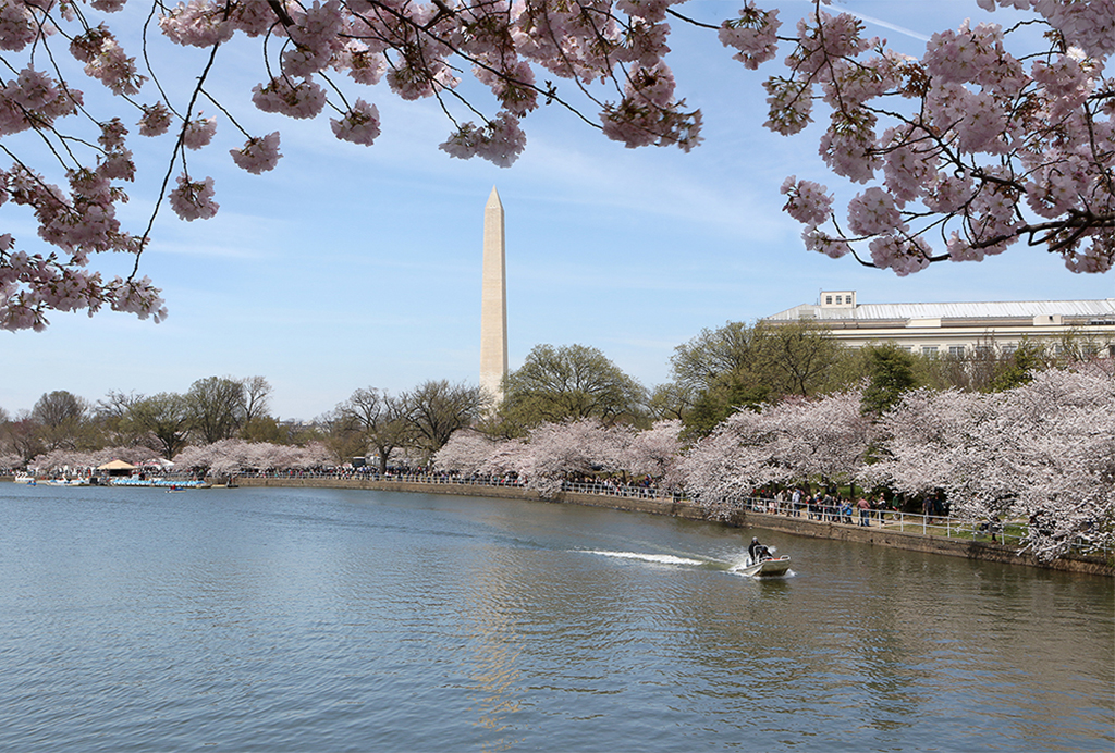
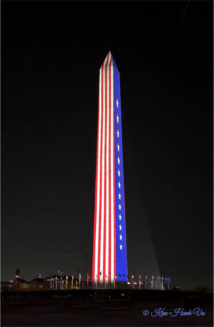
The gnarled tree trunk with all the details is very interesting. Per your description, this tree was found at the entrance of the lighthouse in Miami, it reminded me of the old Japanese cherry blossom trees around the Tidal Basin in Washington DC that become twisted and rough due to age and exposure to harsh weather.
For this image, the B&W conversion does emphasize the details of the gnarled trunk. I'd prefer to reduce the brightness of the vignette a bit. Another suggestion is to replace the background to come up with your creative scene around it. Thanks for sharing! |
Jun 23rd |
| 86 |
Jun 24 |
Comment |
Hi Jack,
This spider web is quite big and the morning dews still linger in there like the diamonds on the women's necklace. The background seems to be the roses' bushes with the red flowers here and there make it interesting.
I'd not recommend to crop the top part since the whole spider web looks beautiful in its own right. I'd prefer to darken the sky a bit to make the web more visible. I am curious to know whether you found the art maker (spider)? Thanks for sharing your shot! |
Jun 23rd |
| 86 |
Jun 24 |
Reply |
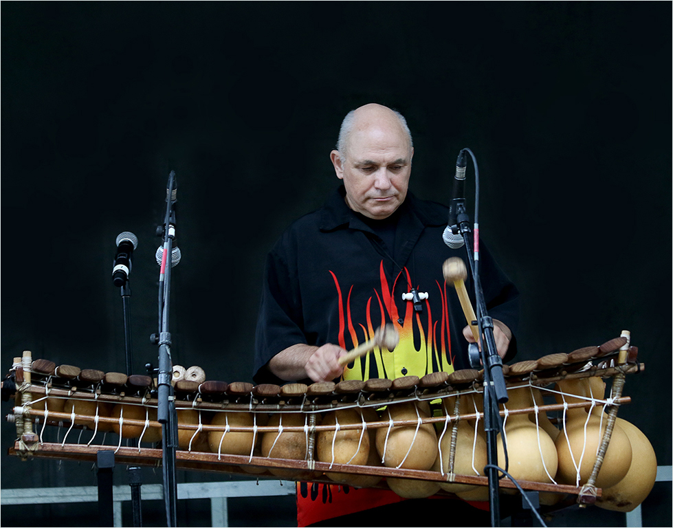
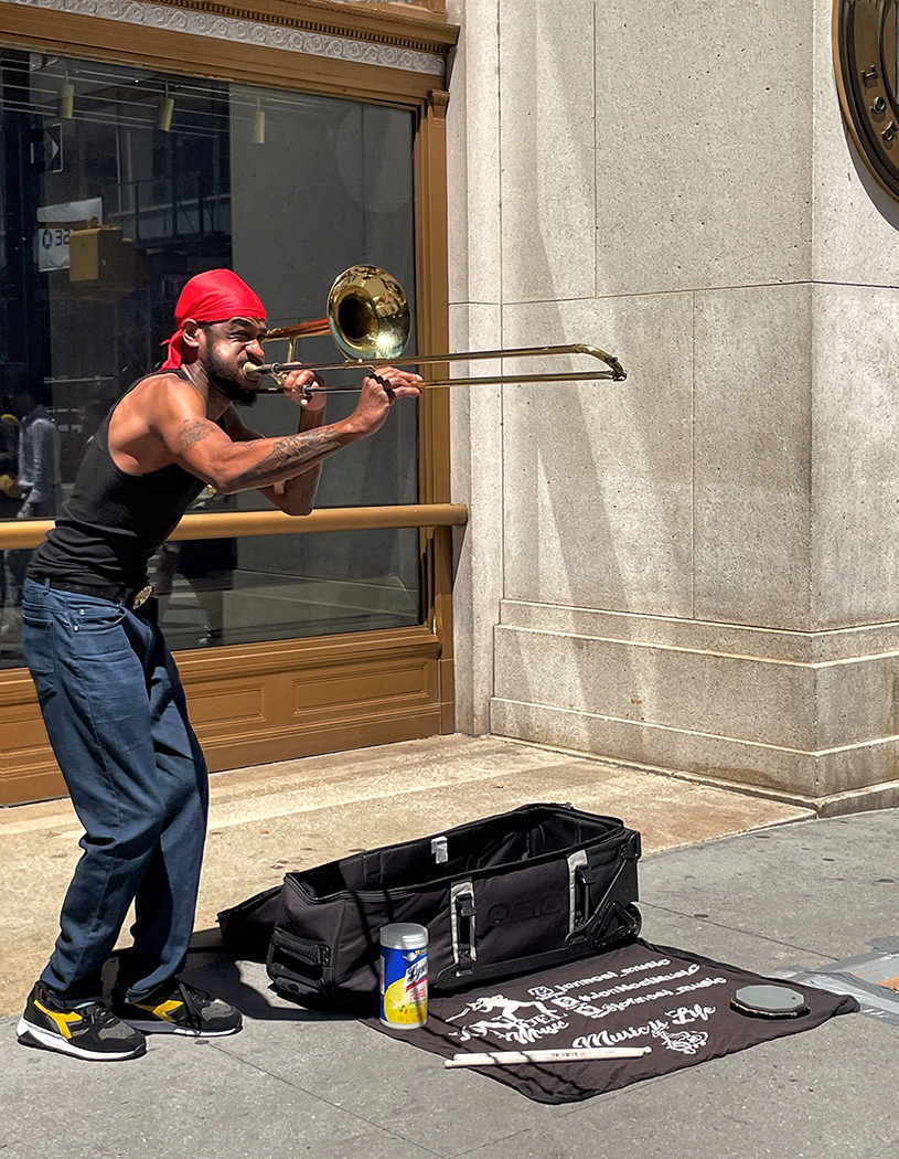
Thanks for your comments, Jack! It's interesting that I used this image as one of 15 images for my portfolio project in my local camera club, and going through 2 rounds of commenters with 4 people (the portfolio is a fun project, and it's not a competition and does not have awards), noone pointed out the blur background goes into the musician's clothes to me (until Steve did it). They did comments on the background of other images.
I really appreciate everybody's comments when they pointed out the flaws of my images that I might not see it. |
Jun 23rd |
| 86 |
Jun 24 |
Reply |
Thanks for your comments, Ruth! |
Jun 23rd |
| 86 |
Jun 24 |
Reply |
Thanks for your comments, Susan! The original has a lot of people in the background and is distracting. Let me see if I can find the original image to share with you since I always saved the final image in another folder. |
Jun 23rd |
| 86 |
Jun 24 |
Reply |
Thanks, Steven! You have keen eyes, and I agree that the blur goes into the musician's clothes (that I did not notice it). I created another layer and applied Gaussian Blur in PS. I will research to do the blur using depth map. Thanks for providing me the link! |
Jun 23rd |
| 86 |
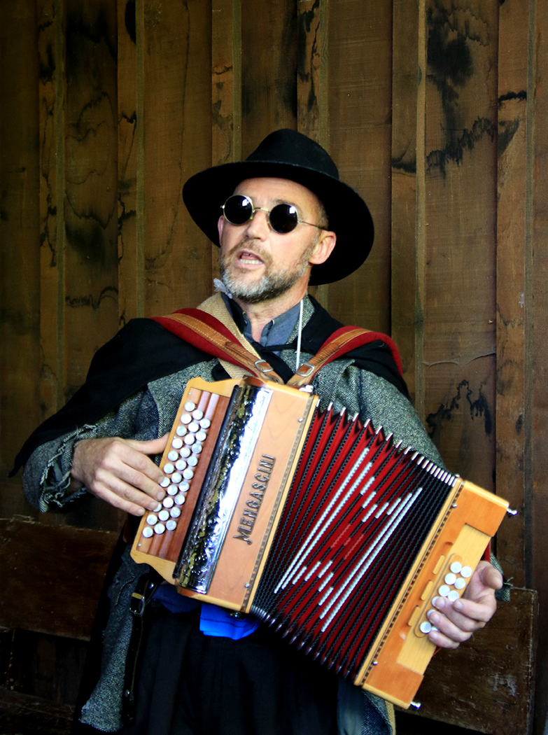
Jun 24 |
Comment |
Hi Steven,
Nice portrait shot, Steven! You have mastered your iphone camera with all of your experiments (infrared, wide angle, telephoto)!
With the DSLR camera, I love to shoot portrait with the telephoto lens because it will smooth the skin (especially for female portrait). With the iphone, the portrait mode is available that focuses on the subject and blurs the background, providing more depth. It allows to replace background in Edit too.
Your portrait image this month is tack sharp and the indoor lighting is great. I don't have any suggestion for improvement. I am just curious to know whether you have taken any shots with portrait mode in iphone for comparison between its different modes? Thanks for sharing your nice shot! |
Jun 22nd |
| 86 |
Jun 24 |
Comment |
Hi Ruth,
I am glad that you and your family are safe after the two tornadoes. Your image also marks a positive attitude to document the damage. While the falling trees in the foreground mark a chaotic tornado damage, the beautiful sunset in the distance does convey a sense of hope.
I agree with Jack that cropping out the ceiling would render your image a beautiful artpiece. Be positive, Ruth, and thanks for sharing your image! |
Jun 22nd |
| 86 |
Jun 24 |
Comment |
Hi Wayne,
Your image is interesting! The blue of sky, mountains, and snow gives me the feeling that it was captured from the window of an airplane rather than from the ship. Although the snow in the foreground should be in white color, but somehow the light turns the whole scene as an abstract image with different layers and give a pleasing feeling to the viewers.
I only have one minor suggestion to remove a small bright spot at around the 1/3 of the left edge. Nice shot! |
Jun 22nd |
| 86 |
Jun 24 |
Comment |
Hi Susan,
Your image of the prickly pear is sharp and stands out from the blue sky. The original image has the 6th fruit and the plant is in diagonal line seem to balance well. Nevertheless, both the original and the crop are good images.
I did not know that the prickly pear is edible until I read your description that it is a fruit. Thanks for sharing! |
Jun 21st |
6 comments - 4 replies for Group 86
|
12 comments - 14 replies Total
|