|
| Group |
Round |
C/R |
Comment |
Date |
Image |
| 3 |
Aug 23 |
Comment |
Hi Robert,
Welcome to group 3! You have captured a beautiful scene of Acadia National Park. The water reflection extends the beauty of the scene above and is quite clear that the under water rocks are also visible. The rocks above water serve as a leading line that guide my eyes going from the foreground to the mountains in the distance.
I'd prefer to crop tighter from the top to avoid the static scene with the water line split the scene into two equal parts. Nice shot! |
Aug 21st |
| 3 |
Aug 23 |
Reply |
Thanks Mary Ann and Ruth for your comments and suggestion. I have thought about the crop you suggested but for some reasons, I like to see the trees with lacy branches on the top right corner that softens the entire scene. |
Aug 18th |
| 3 |
Aug 23 |
Reply |
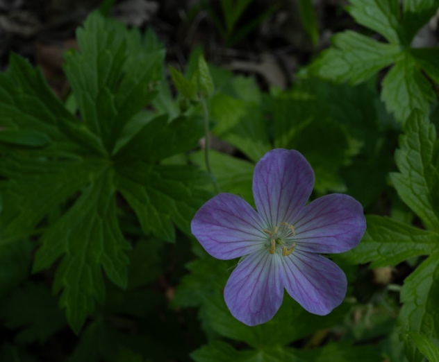
Hi LuAnn,
I do like your B&W conversion and also the way you put the flower off center. I use the original version to offer my suggestion because the big leaf was cropped off in your B&W version.
|
Aug 18th |
| 3 |
Aug 23 |
Comment |
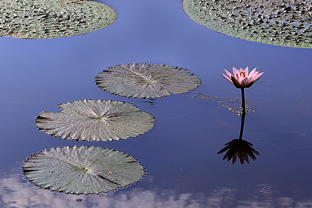
Hi LuAnn,
Your post processing and conversion to B&W did make the flower stand out, especially for this kind of geranium which is a very subtle flower with light purple color.
Your composition works very well to eliminate the distracting elements in the background and also puts the main subject off center.
When I look at your original image, I found that the leaf at the bottom of the image has more details than the top one. I'd prefer to rotate the image before cropping to include that leaf instead. I used the original image to offer my suggestion. Please let me know what you think. |
Aug 11th |
 |
| 3 |
Aug 23 |
Comment |
Hi Mary Ann,
Your image is a story-telling image! I can see that it consists of 2 small houses in that frame with house #10 and #12. I like the differences between the door frames and the window frames of those houses. I just wish that the cat was more visible at the window, but his presence there did make the scene more pleasant. Nice shot! |
Aug 11th |
| 3 |
Aug 23 |
Comment |
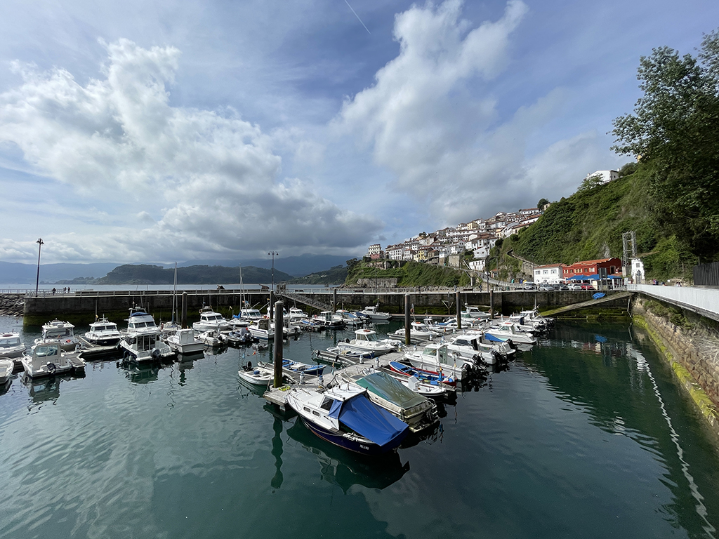
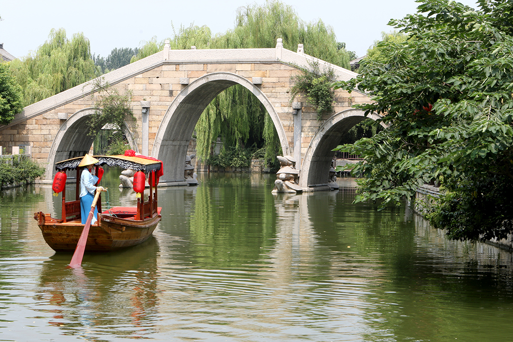
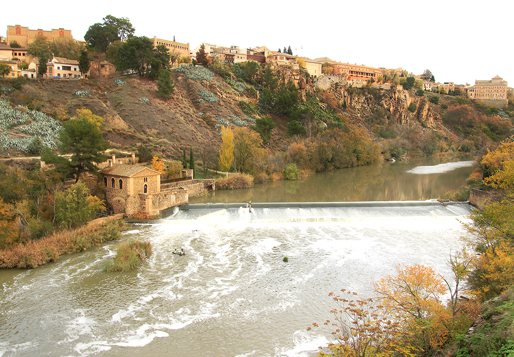
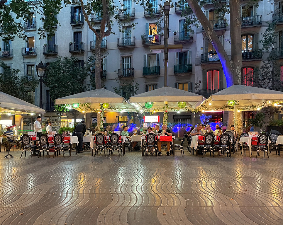
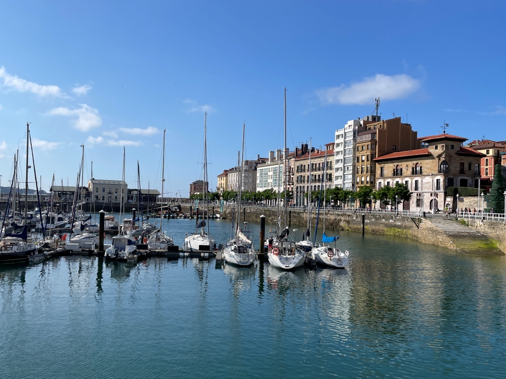
Hi Michael,
You have captured a beautiful image! The buildings are in different colors and the river is so clear that mirrors exactly the scene above. The boat at the right corner and a lot of people sitting at tables under the white umbrellas make the scene more interesting.
The flipping vertically created a fun scene with the roofs and windows are not in straight lines and standard forms. It seems like the building Cssa Battló created by Antoni Gaudi in Barcelona,Spain. In my personal opinion, I'd prefer to crop tighter the water at the bottom of the image (probably half of it) to create a more intriguing image. Reason: I think that the viewers do not expect to see the same scenes twice. You are very creative! Thanks for sharing your technique. |
Aug 11th |
| 3 |
Aug 23 |
Comment |
Hi Ruth,
I think that the tundra flowers are tiny and are not spread out over a large area, they are not quite visible at first sight in this image. In addition, the big rocks in the foreground are dominant and seem like the main subject.
I can see some of the snow still linger at the bottom of the hills, and I guess that your early visit at this place does not have much flowers as you expected. Thanks for sharing! |
Aug 8th |
| 3 |
Aug 23 |
Comment |
Hi Joan,
The shape of the skeleton tree is interesting, and it stands out more among the hills of yellow mustard. The teo diagonal lines of the hill make the image more dynamic and beautiful!
I'd prefer to darken the sky a bit more rather than replacing it with the dark cloudy sky since it did not match with the bright scene of the mustard in the foreground and the mountain in the distance seems to be lost. Nice shot! |
Aug 7th |
6 comments - 2 replies for Group 3
|
| 86 |
Aug 23 |
Comment |
Hi Wayne,
Welcome to group 86! The light in Arctic is beautiful with the mix of yellow, purple, and orange on the sky. I guess that the image was captured before sunset. It also reminded me of the purple sky I experienced in Alaska. The composition works well with the focus on the islands and the sky.
I agree with other comments that the blue snow seems a bit too strong in this scene, and some of the details have been lost. Although the snow can pick up a color cast from surrounding light, I'd prefer to lighten the islands a bit more to make it more natural. Thanks for sharing! |
Aug 21st |
| 86 |
Aug 23 |
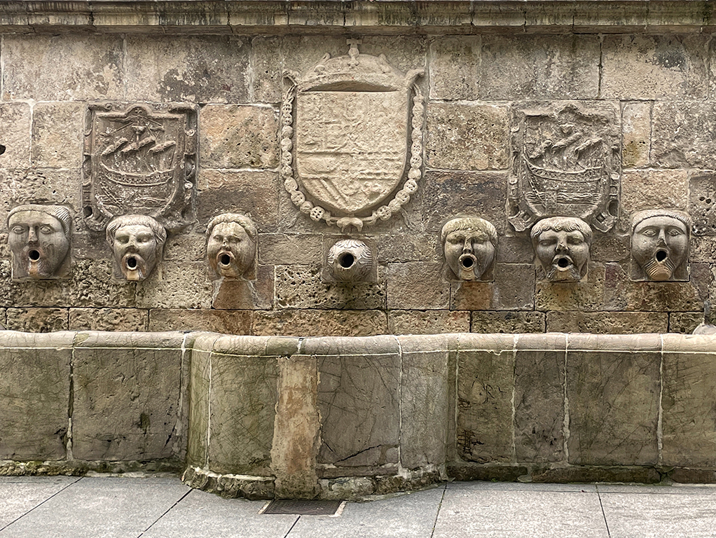
Reply |
Thanks, Ruth! Yes, I would love to see those fountains with the water turned on, and the wet walls below those heads indicated that. I don't know whether they have scheduled to turn on or not. |
Aug 21st |
| 86 |
Aug 23 |
Reply |
Thanks, Jack for your responses. When I looked at your image, I assumed that it was taken in Cambodia or Vietnam since you presented several images captured at those places in previous months. I was surprised that it was taken in Cuba because people normally presented the antique cars and/or people were smoking cigars in Cuba, rather than bicycles. I have not visited Cuba, and it's an interesting thing for me to know more about people's lives there. |
Aug 21st |
| 86 |
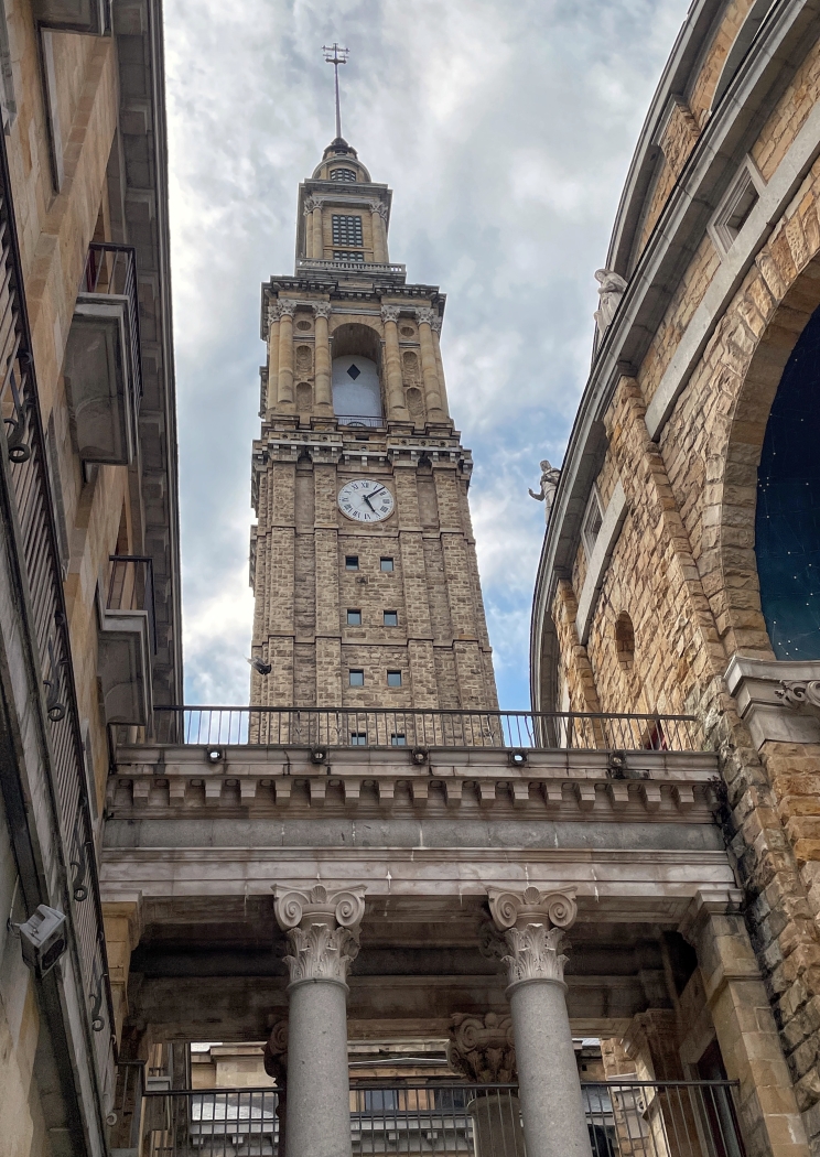
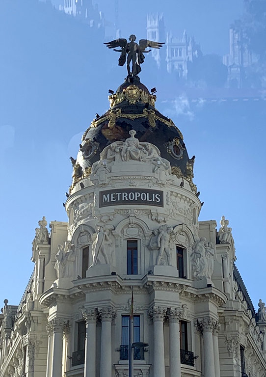
Aug 23 |
Comment |
Hi Gene,
You have captured a nice reflection of the historic building. The light on the reflection glass seems to be better than the building itself, which brings out a beautiful sky and all the details of the building. I agree with Jack's comments that the scene in the middle of the street is quite busy.
In my personal opinion, I'd prefer to focus mainly on the reflection and less on the real subject to give some hints and imagination to the viewers. With two equal subjects, my eyes go back and forth between them. I also wish that the clock tower on the reflection was more visible. Thanks for sharing your image! |
Aug 14th |
| 86 |
Aug 23 |
Comment |
Hi Ruth,
The title of your image is so cute and it makes me think of a peekaboo baby game. Yes, I see you, Buttercup! Is it a coincidence that the cat is in the "Lone Star Sweet" box?
Pat's question also makes me curious and I also google to find out what kind of product Lone Star Sweet is. Is it the box for signature Texas sweet onions, produced by Rio Fresh?
For this image, the face of the cat is barely seen through the handle of the box that has a clear tape running through. A tighter crop from the top and bottom could help the viewers to see Buttercup at first look. I like it! |
Aug 12th |
| 86 |
Aug 23 |
Comment |
Hi Pat,
You have found an interesting place in this hotel for your photos! Since this hotel is a historic site, this room is also a special place for display. I agree with Jack that what makes it special is the ladder, and it could have been there forever.
You have done a nice job by removing the sofa arm from the foreground. I'd prefer to darken the books in the center as Steven suggested, if possible. For the composition, I'd prefer to leave it as is: the globe, the ladder because they are a part of the display. |
Aug 12th |
| 86 |
Aug 23 |
Comment |
Hi Jack,
The composition with the crop works well in this image. I am a bit confused about the story you want to convey. Is the house with a blue fresh paint under repairment (that the repairman needs to use the wheelbarrow and a ladder, and the bicycles need to put on the street/outside of the walkway)?
I'd prefer to have some additional elements to know more about the intent of your image. Where is the image captured? Why did the bicycles interest you? |
Aug 11th |
| 86 |
Aug 23 |
Comment |
Hi Steven,
The rim light around the stamens makes the flower beautiful! The orange and yellow colors also stand out under a nice light. I like the way you captured the close-up of those 6 stamens at a low angle against the dark background. It looks like the performance of a synchronized swimming team.
I do wish that the petals of the flowers would open up a bit more to make the stamens in a greater display. Nice capture! |
Aug 11th |
| 86 |
Aug 23 |
Reply |
Thanks,Steven for your comments! |
Aug 11th |
| 86 |
Aug 23 |
Reply |
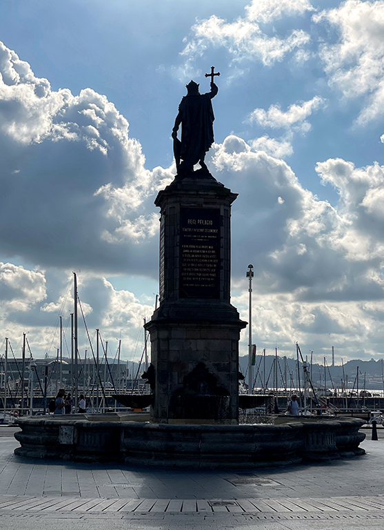
Hi Steven,
I hope that you don't get upset! I truly appreciate your thoughts and the details you shared with me about areas where I can improve. For the image "Regi Pelagio statue" last month, I did follow your suggestion to convert it to B&W before submitting to the international exhibition in Spain and it was juried in. Thanks! |
Aug 11th |
| 86 |
Aug 23 |
Reply |
Thanks, Jack for your comments! When I submitted this image, I envisioned that Steven would recommend me to convert it to B&W (LOL!). Since it does not have constrasting colors to make it stand out in monochrome, I'd prefer to keep it in color to show the texture of the stone. |
Aug 7th |
6 comments - 5 replies for Group 86
|
12 comments - 7 replies Total
|