|
| Group |
Round |
C/R |
Comment |
Date |
Image |
| 3 |
Jun 22 |
Reply |
Hi Tom,
Thank you so much for visiting our group and for your feedback on my image. I hope you may be able to revisit our group in the future. |
Jun 25th |
| 3 |
Jun 22 |
Comment |
Hi LuAnn,
I comment on others' images based on the interpreted facts of their presented images. I will let them know what I prefer, offer suggestions or ideas for their future photos, if I can. They are the image makers, they will decide what works best for them.
|
Jun 23rd |
| 3 |
Jun 22 |
Reply |
Thanks LuAnn for your understanding and support. |
Jun 20th |
| 3 |
Jun 22 |
Reply |
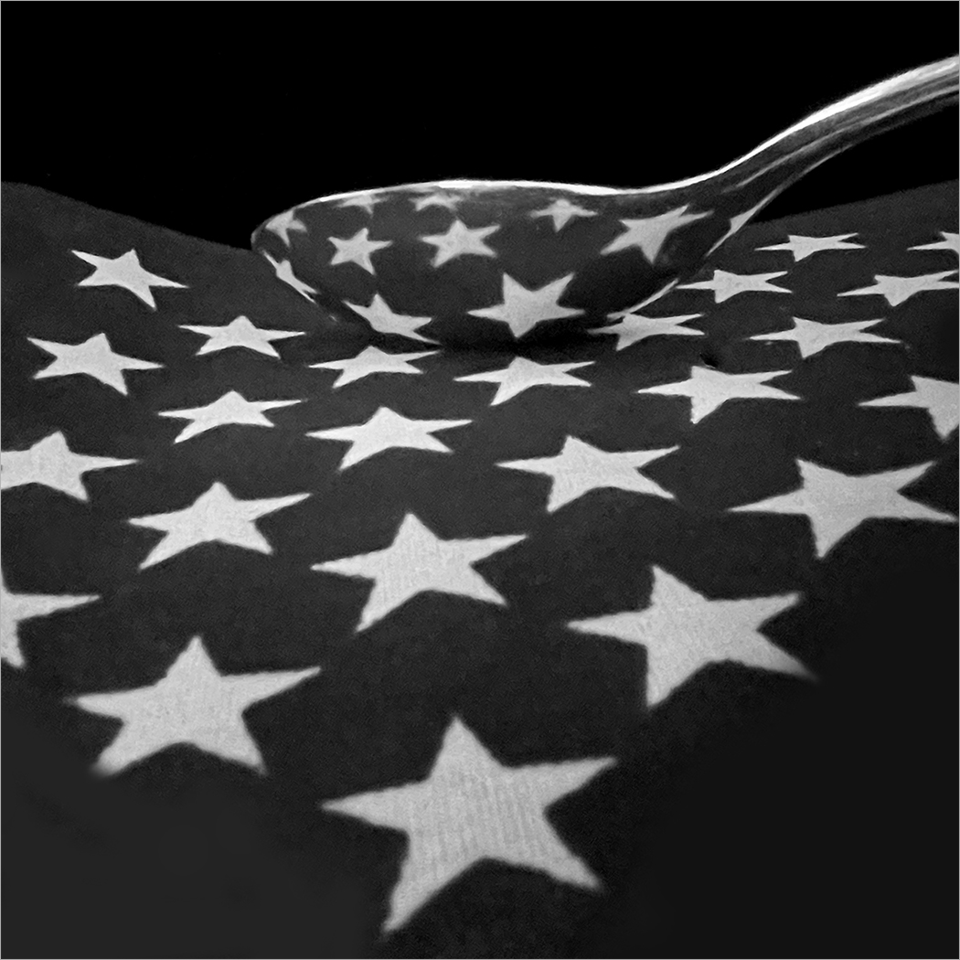
Mary Ann,
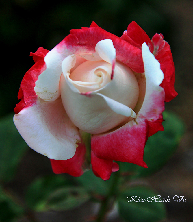
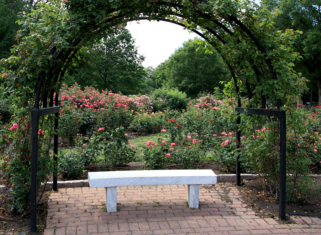
The diagonal lines work well for me. I am just curious to know your intention when you use them. Actually, those diagonal lines might be different than the norm and help the rose stand out more. It gives me the impression that it's windy in the back and you were able to capture a sharp and beautiful rose. � |
Jun 20th |
| 3 |
Jun 22 |
Reply |
I love it with the light is on! So beautiful! |
Jun 19th |
| 3 |
Jun 22 |
Reply |
Thanks LuAnn for your comments! |
Jun 19th |
| 3 |
Jun 22 |
Reply |
Hi Bev,
Thanks for visiting our group and for your comments. |
Jun 19th |
| 3 |
Jun 22 |
Reply |
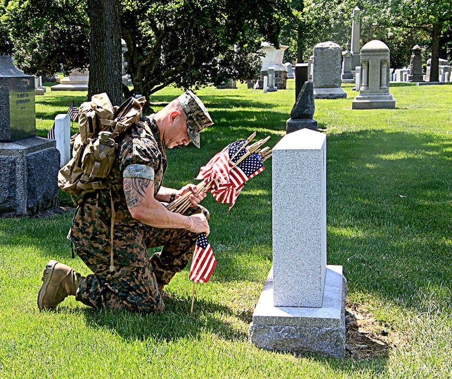
Hi John,
Thank you and your dad for your service. My father also served in the military when I grew up. I understand the sacrifices that a family makes when a family member is serving your country.
May this world someday be at peace and may all who serve return to their families safe and sound. |
Jun 19th |
| 3 |
Jun 22 |
Reply |
Hi John,
I'd prefer not to crop at the base. |
Jun 18th |
| 3 |
Jun 22 |
Reply |
Hi Bev,
Thanks for visiting our group and for your comments. |
Jun 18th |
| 3 |
Jun 22 |
Reply |
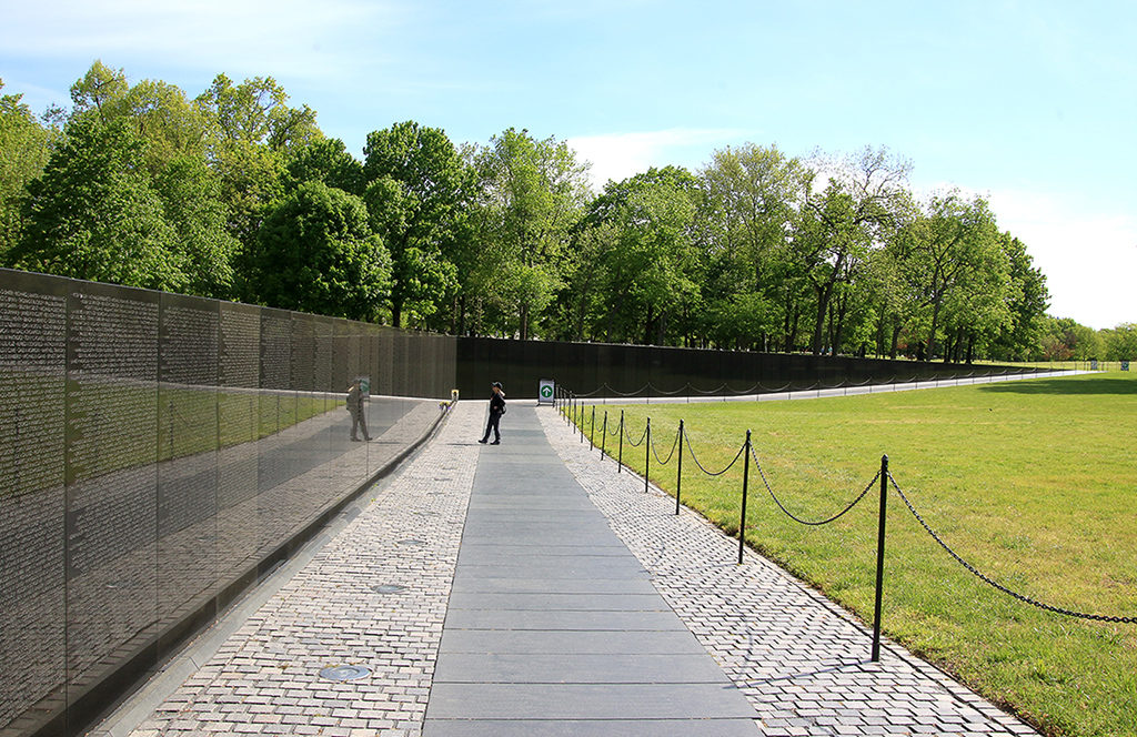
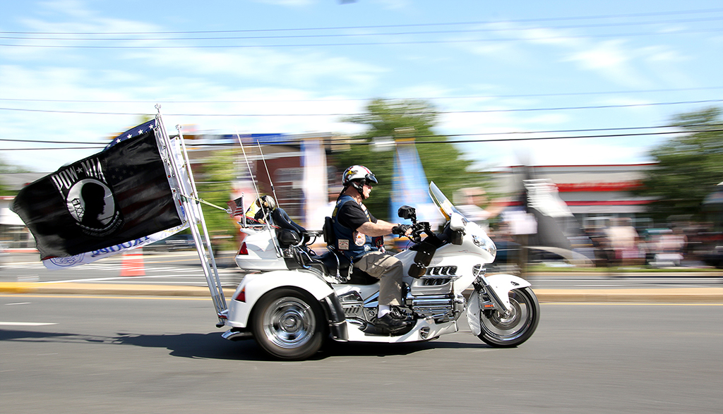
Thanks for your comments, Michael! Regarding your suggestion to blur the background, I might think differently that the tombstones clearly seen around the marine adds more impact to the scene. |
Jun 18th |
| 3 |
Jun 22 |
Comment |
Hi John,
Welcome aboard! I like the angle you captured this lighthouse that included the palm trees around. I can see your process of self improvement throughout the 3 versions above. Hats off to you!
Your third version is beautiful because the lighthouse is sharp and the sky color did enhance the entire scene. I'd prefer to remove the palm tree branches in the middle of the top frame because they are not clearly seen. Since you have replaced the sky in post processing, I'd also suggest to turn on the light of the lighthouse to add more impact to it. |
Jun 18th |
| 3 |
Jun 22 |
Reply |
Thanks, Mary Ann for your conments! |
Jun 18th |
| 3 |
Jun 22 |
Reply |
Thanks, Ruth for your comments! |
Jun 18th |
| 3 |
Jun 22 |
Reply |
Thanks, John for your comments! I agree with you that a slight crop on the right might help. |
Jun 18th |
| 3 |
Jun 22 |
Reply |
Thanks John for your comments. You brought out a good point of not showing the name on the tombstone. I try to remember it on capturing similar pictures.
In my personal opinion, I don't want to remove the tombstone at the back of the marine. Although it might help the overall photo, I feel that the tombstone is somebody's eternal home that cannot be changed. It's a tragic beauty that sets the mood for sorrowful of the cemetary scene.
|
Jun 18th |
| 3 |
Jun 22 |
Comment |
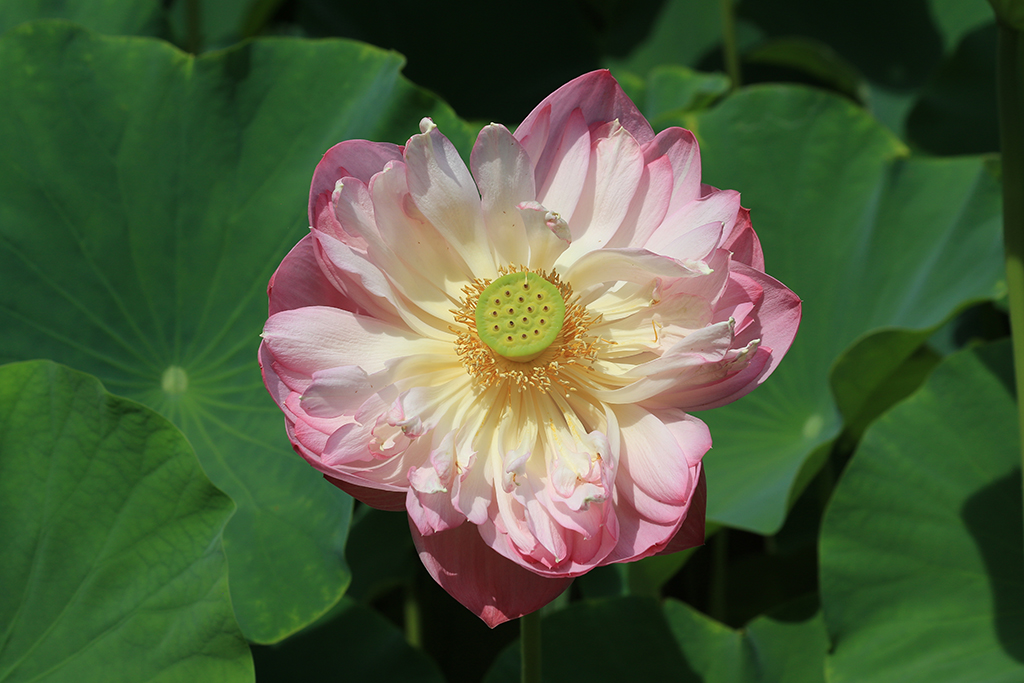
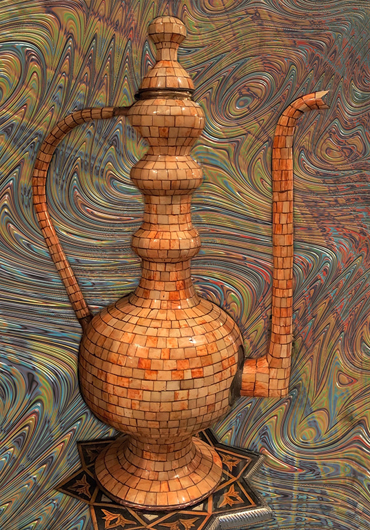
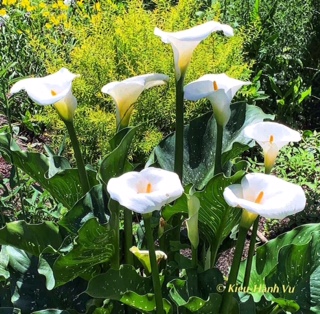
Hi Mary Ann,
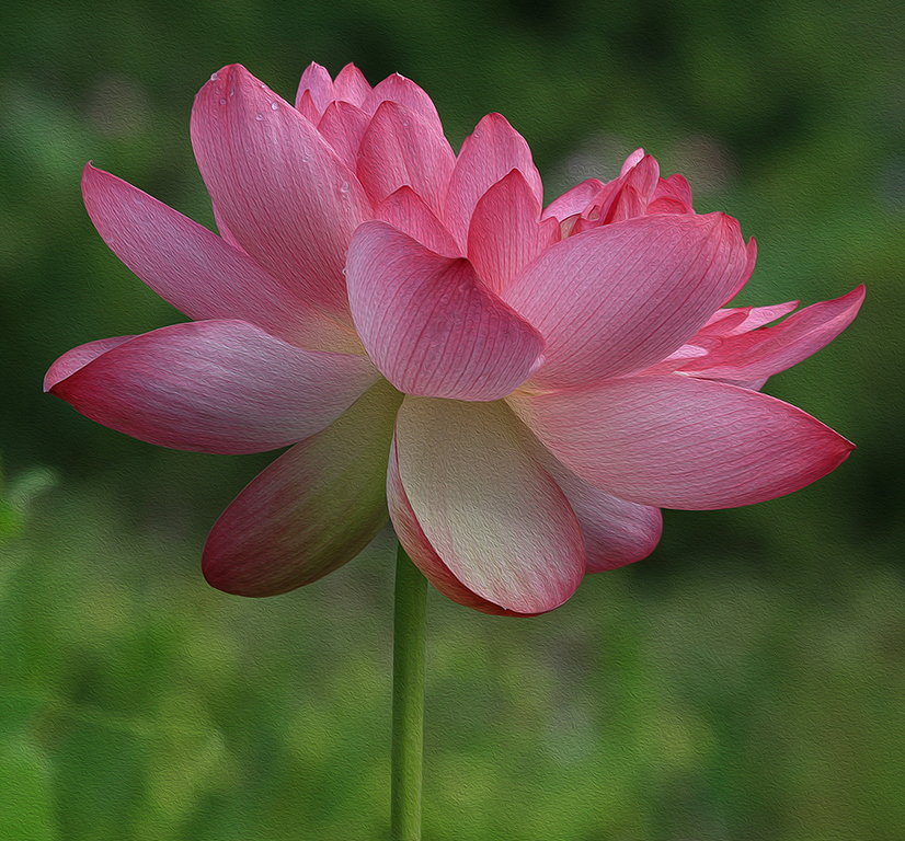
You have captured a beautiful rose. It's very sharp, the lighting is nice, and the orange color looks best.
Both LuAnn's edited version and your 3rd edited version are beautiful because the background is clean without distraction, and draws the viewers' eyes to the rose. LuAnn's version looks like a painting, yours looks like in natural environment. For your 3rd edited version, I'd prefer to crop it on the right side to a square format to eliminate the empty space.
My question is: why do you want to choose the background with diagonal lines in your 3rd edited version?
|
Jun 18th |
| 3 |
Jun 22 |
Comment |
Hi Ruth,
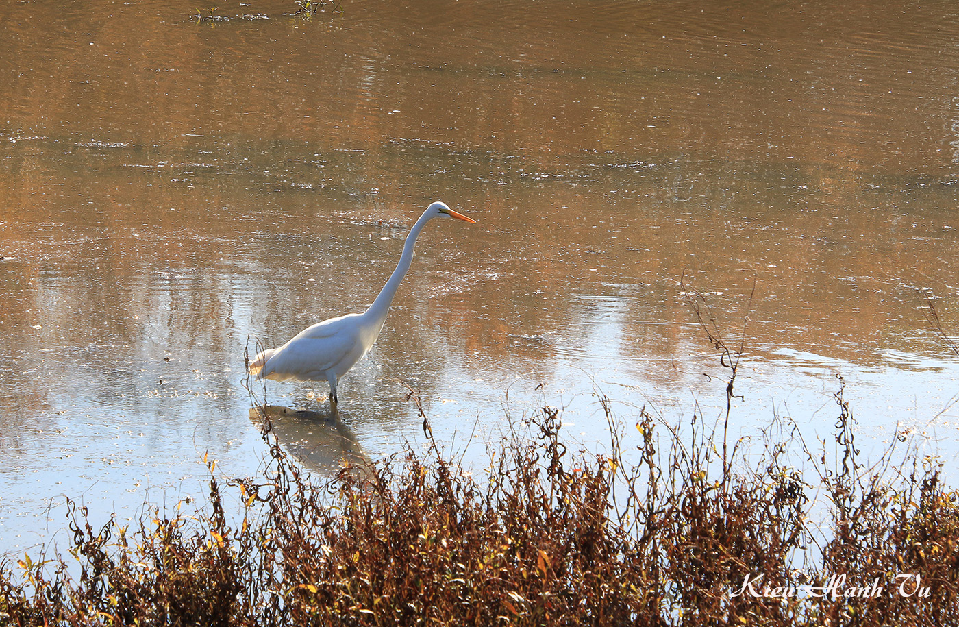
The expression of the woman's face shows that she enjoys so much the connection with the birds. The lady in red shirt stands out from the scene and the birds in flight are quite sharp. Although the bird on the far left is a bit different than the others because its feet are not seen but I'd prefer to leave it in because its flight adds a diversity to the scene. In addition, the blue roof of the dock (below that bird) is beautiful there. You might consider cropping behind the woman on the right only to make the composition stronger. |
Jun 13th |
| 3 |
Jun 22 |
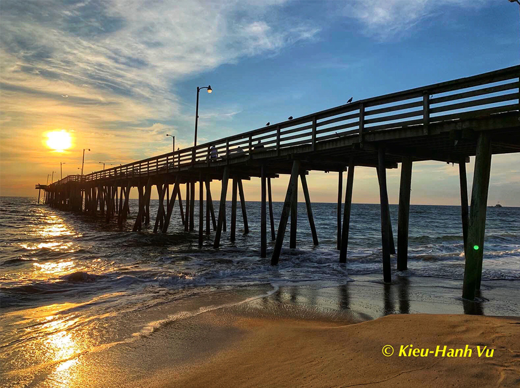
Comment |
Hi Michael,
The sunset clouds are so beautiful, especially with the water reflection. Your edited version looks more natural, but the first version does not bother me at all. It only gives me the sense that it was captured close to the sunset time.
In my personal opinion, I'd prefer to see the boats in the open marina rather than in the garage. Although the dark garage makes the sunset more beautiful, but I feel that the steel structure conflicts with the nature scenery.
|
Jun 11th |
| 3 |
Jun 22 |
Comment |
Hi John,
Your image is intriguing! Recently, one person in my local camera club presented his project on the art of building with similar images that fascinated me.
In this image, the colors and texture of the switchboard and the cables in different directions created a strong vision impact. I'd prefer to darken the cables at the foreground center a bit more since the light is brighter there. I'd also prefer to crop tighter from the top (just above the white bar) and on the right (right after the 2 holes below the 2 red cables) to make the composition stronger. |
Jun 6th |
| 3 |
Jun 22 |
Comment |
Hi LuAnn,
I was torn between those 2 images because I cannot decide which to choose, and so I feel split. I like the blue water and the mystic feeling of the foggy scene in the original, but I'd prefer to ilighten the man's face a bit. In the edited version, the whole scene is sharper and brighter but I feel that the bright scene in the foreground conflicts with the foggy background. Both images are beautiful, so it's up to each person's preference.
I'd prefer to crop tighter on the left and close to the rock to give a sense that there are more space on the right for the small boat to move into. |
Jun 6th |
7 comments - 14 replies for Group 3
|
| 86 |
Jun 22 |
Reply |
Hi Bev,
Thanks for visiting our group and for your comments. |
Jun 20th |
| 86 |
Jun 22 |
Reply |
Thanks Ruth, Jack, Gene, and Bob for your comments. |
Jun 20th |
| 86 |
Jun 22 |
Reply |
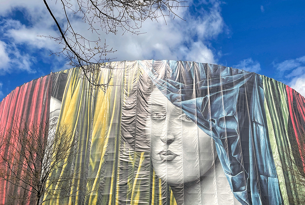
Thanks Belinda for your comments and for providing the website link.
I'd want to add to my description above that the draped curtains are also a part of the painting that the artist created, not the real curtains. |
Jun 20th |
| 86 |
Jun 22 |
Comment |
Hi Pat,
Your creativity has transformed dramatucally this scene. It brought out an eerie feeling. The clouds contain the yellow ones, the same as the grass from the middle ground, and the row of flags on the left are much darker than the ones on the right.
You have achieved to turn the daylight scene into the evening scene, but the post processing has created more distraction in this image. Don't be discouraged! Keep your creativity going. |
Jun 20th |
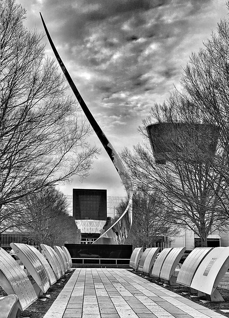
| 86 |
Jun 22 |
Comment |
Hi Jack,
Your image puzzles my mind! It's an abstract artpiece because it does not represent something we usually see in reality. The left vertical part looks like the piano keys, but the 3 vertical lines from the right seem to bend over to the opposite side.
Since it's an abstract, I'd prefer NOT to correct the perspective so that you can leave the imagination to the viewers. The B&W color works well in this case. I'd suggest to brighten the top right part where the 3 lines crossed a bit.
|
Jun 20th |
| 86 |
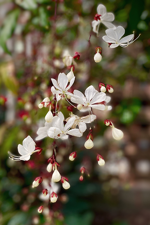
Jun 22 |
Comment |
Hi Ruth,
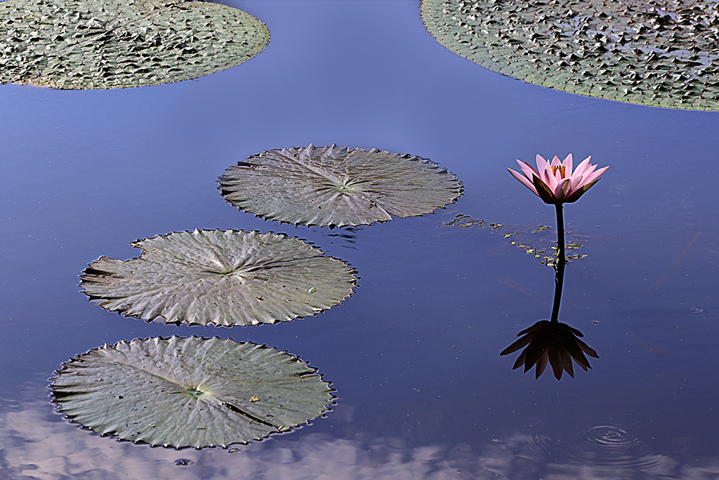
You have captured a beautiful marigold flower. This flower has multiple-layer petals, its color is beautiful, and stans out from the background. |
Jun 20th |
| 86 |
Jun 22 |
Comment |
Hi Belinda,
At first, I thought that they look like a clump of ginkgo leaves. The green color, the details, and the shapes of the maple tree seeds are beautiful. I'd prefer to see the edges of the seeds and its stem are more in focus so that they stand out from the white background.
|
Jun 20th |
| 86 |
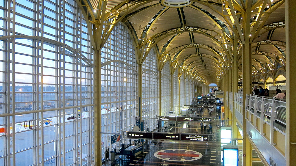
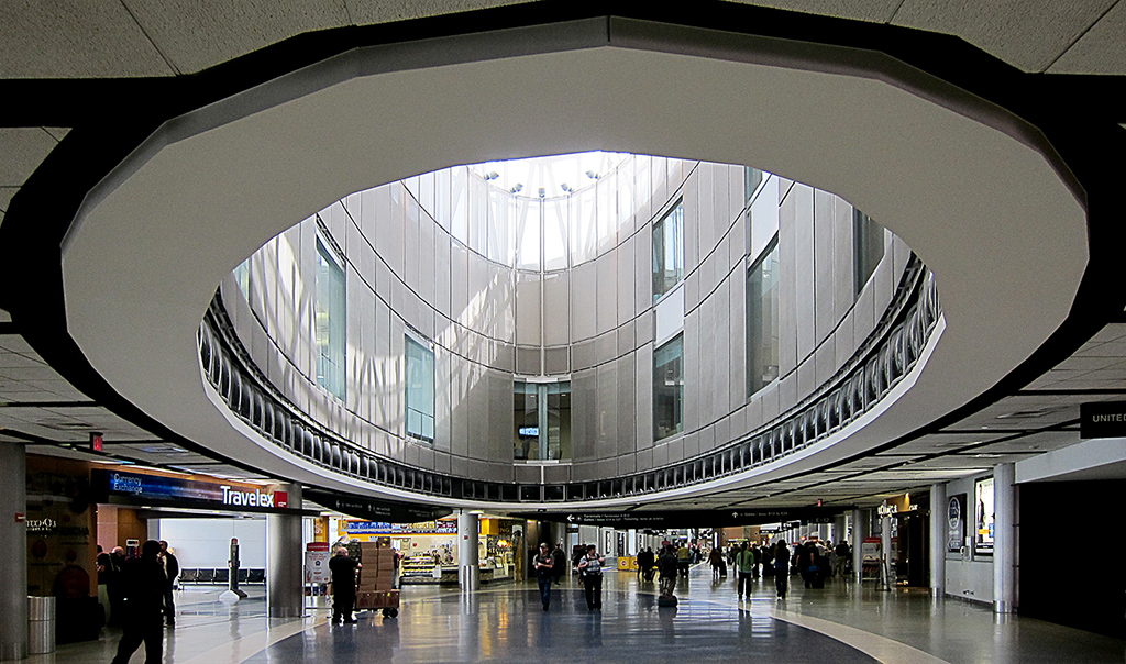
Jun 22 |
Comment |
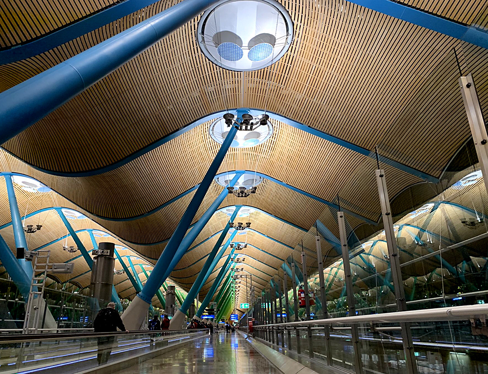
Hi Gene,
It's an intriguing image! The angle you shot of the CDG airport in Paris makes it like an UFO face The grey ceiling like its big head, with the signs F31 and F30 like its tiny eyes, and the white objects in the middle look like its nose and mouth.
The composition at right center is great and the image is quite sharp. The lines that form the ceiling are nice. I'd prefer that the shadows on the red carpet are not there since it renders the scene so busy. |
Jun 20th |
| 86 |
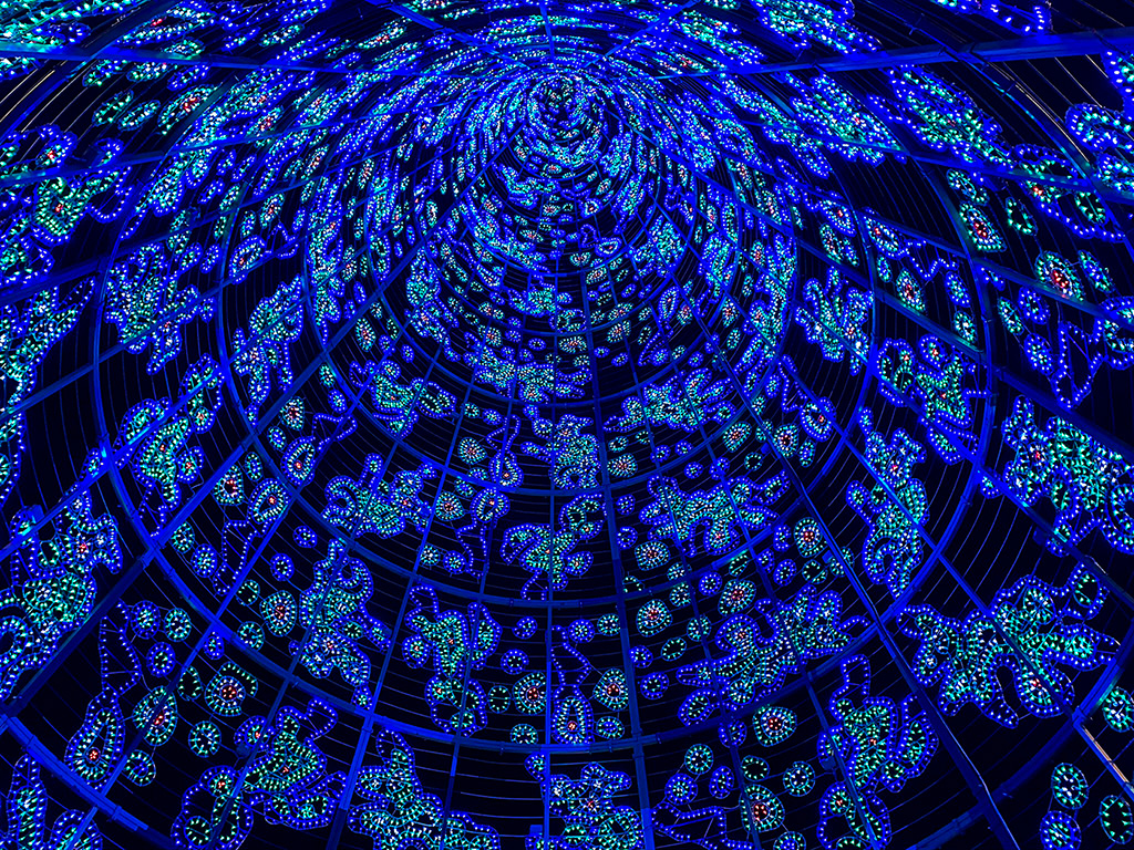
Jun 22 |
Comment |
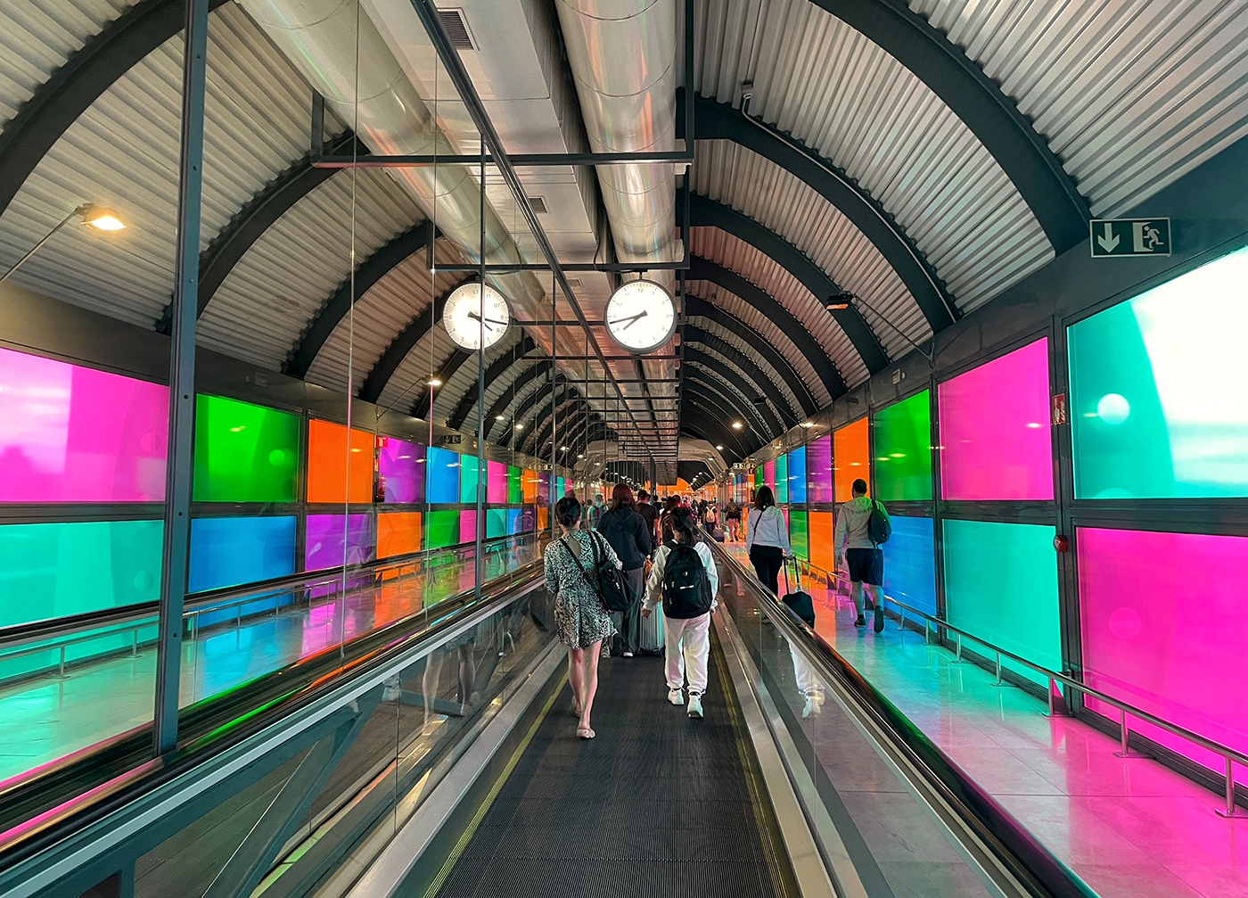
Hi Bob,
I really like the way you experiment with new things of mobile phone. The sidewalk you captured has become something like a bridge-tunnel. It has a painterly effect to the scene. It seems similar to the zoom blur spiral effect when we twist the ring of the lens while shooting in SLR.
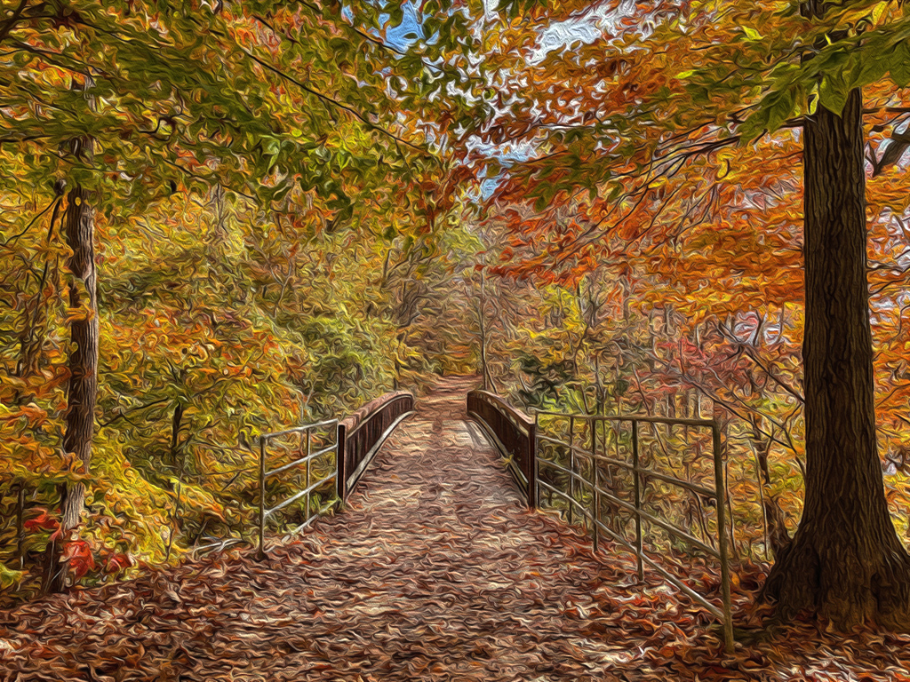
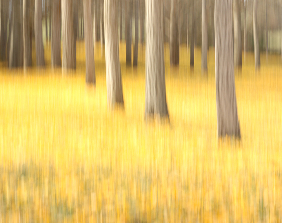
In this image, the foreground seems a bit brighter than the background that stop my eyes there. I don't know whether you can increase the speed a bit to make the subject at the end of the sidewalk more visible. I'd want to see more of your creativity. Thanks for sharing your work with new app! |
Jun 19th |
6 comments - 3 replies for Group 86
|
13 comments - 17 replies Total
|