|
| Group |
Round |
C/R |
Comment |
Date |
Image |
| 3 |
Feb 22 |
Comment |
Wow! It's very nice! I love it! |
Feb 24th |
| 3 |
Feb 22 |
Comment |
The Painted Ladies of San Francisco are beautiful! The colorful Victorian-style houses stand out from the background with modern skyscapes. This is an iconic image that attracts many tourists.
In this image, there is a group of visitors' heads in the bottom of the image that are distracting. I like LuAnn's edits that have removed them.
I visited SF several times in the past and remember that those house colors were bright and vivid. I am not sure whether the bright colors have changed with time since they are not quite bright now. I'd prefer to enhance the colors of those painted ladies a bit more, and I'd prefer to eliminate one tall building on the top left that is not quite visible. |
Feb 16th |
| 3 |
Feb 22 |
Comment |
Hi Ruth,
It's an intriguing image ! I like the patterns of the sand on the bottom right corner and I think that the conversion to B&W helps emphasize them more. The image flipping to create two swirls look natural to me. Well done! |
Feb 15th |
| 3 |
Feb 22 |
Reply |
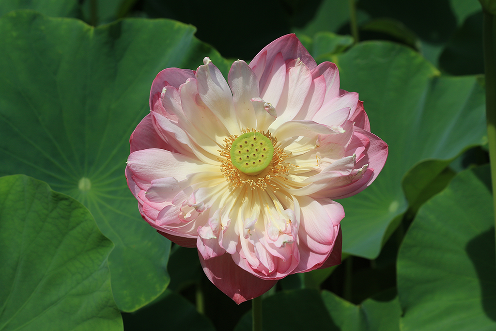
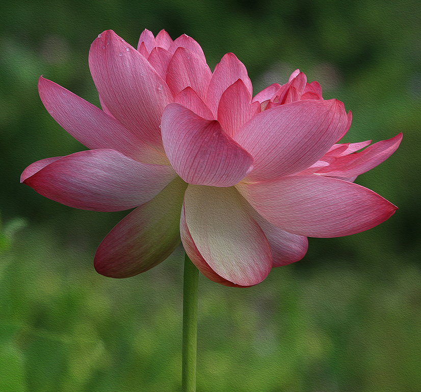
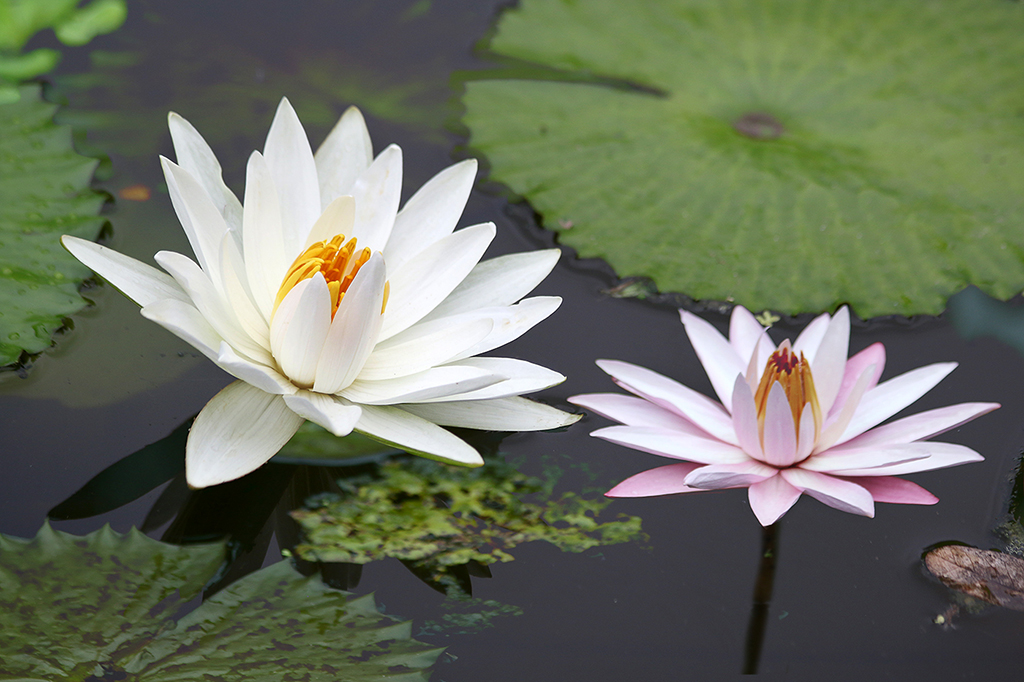
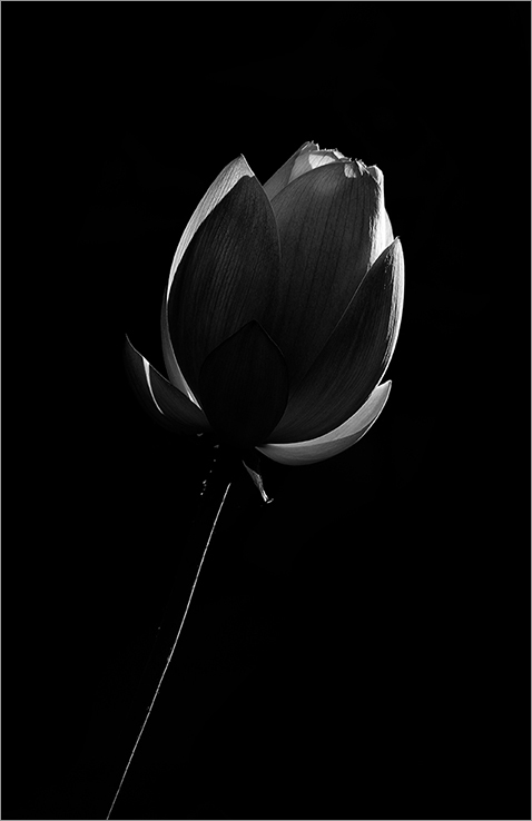
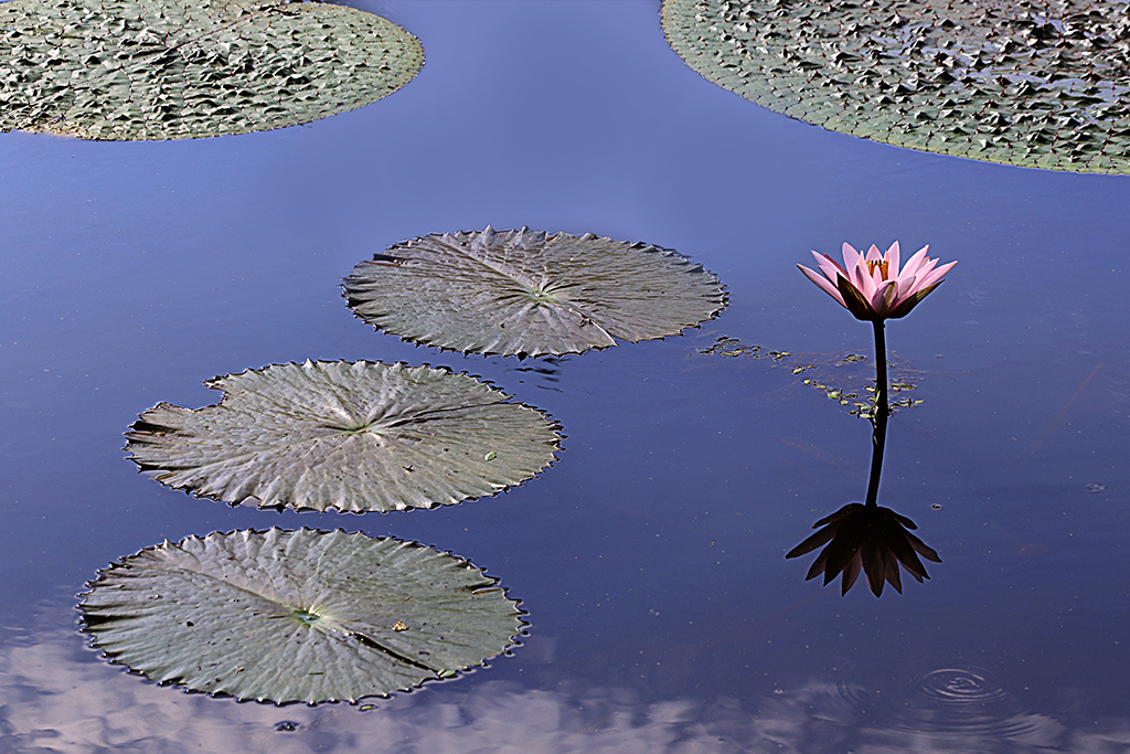
Hi Mary Ann and Ruth,
Thanks for your comments. It's a lotus, but it has round petals and looks different than the normal lotus. |
Feb 15th |
| 3 |
Feb 22 |
Reply |
Thanks Michael for your edits! I love it! |
Feb 15th |
| 3 |
Feb 22 |
Comment |
Hi Michael,
Thanks for sharing the story of the scene. It's sad to learn about the former whale processing.
For this image, I am very impressed with the results from Topaz DeNoise and Gigapixel processing. The image is tack sharp and beautiful!
I agree with Mary Ann that the color of white buildings need to bring down a bit. I like the patterns of the water in the front that lead my eyes to the buildings. I'd prefer to crop more the clouds on the top. |
Feb 15th |
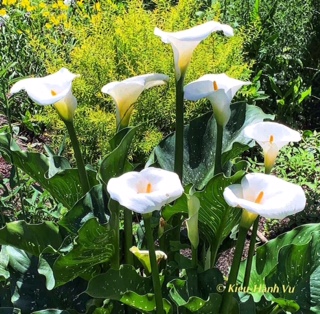
| 3 |
Feb 22 |
Comment |
Hi LuAnn,
The white mushroom and its dark spots are interesting. It's nicely captured at the eye level. The Impressionist post processing has rendered the background as a painting.
I'd prefer to crop a bit tighter on the left side to make the image more balanced since there is not much there. |
Feb 15th |
| 3 |
Feb 22 |
Comment |
Lisa,
Great shot! The conversion to B&W works very well. It emphasizes the people in the front and makes it stand out from the snowy background. The inclusion of the art design on the right helps the viewers to learn more about the location. Beautiful image! I have no suggestion for improvement.
When I just saw this image, I thought that it's from the winter Olympics in Beijing. I do hope to see your images from Beijing soon. |
Feb 6th |
6 comments - 2 replies for Group 3
|
| 86 |
Feb 22 |
Reply |
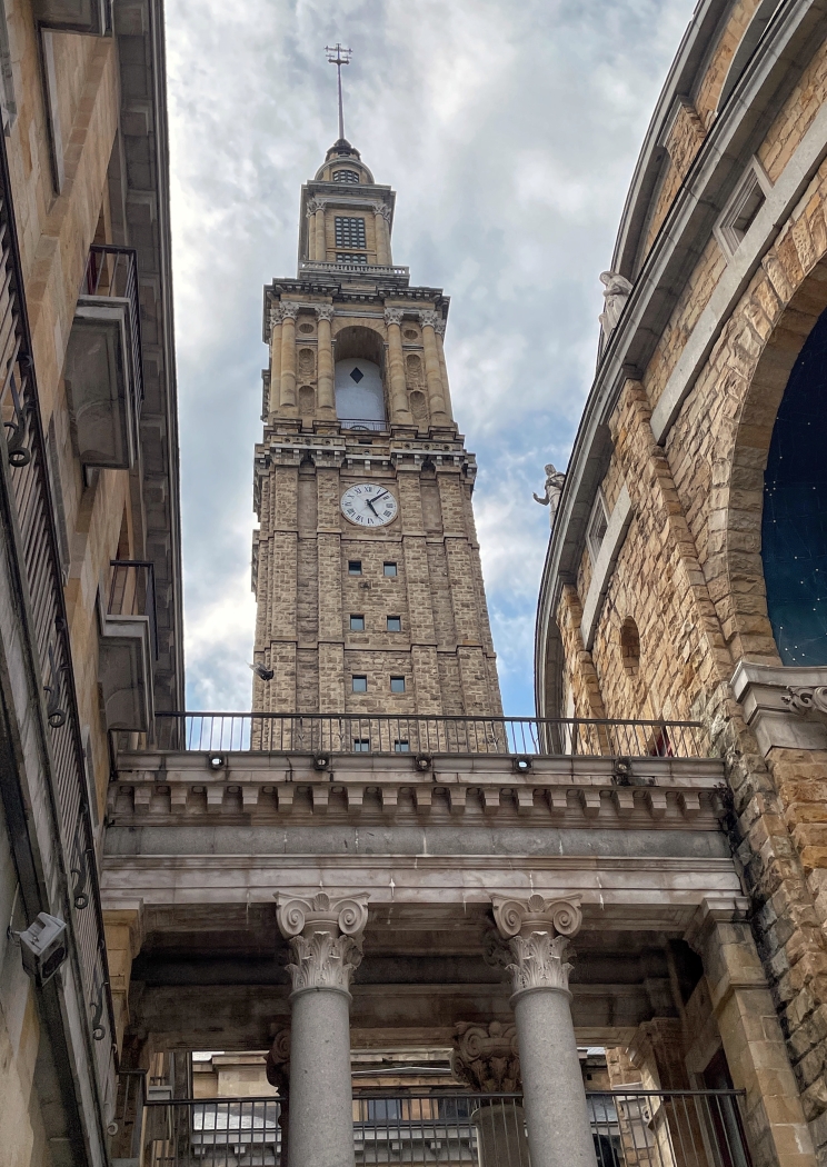
Thanks Bob for your comments and for your edits. In your version, I think that the columns on both sides are not quite straight yet. Although I like UFO-style lamp on the top, your tighter crop makes it look cleaner now.
Thanks everyone for your input. |
Feb 21st |
| 86 |
Feb 22 |
Reply |
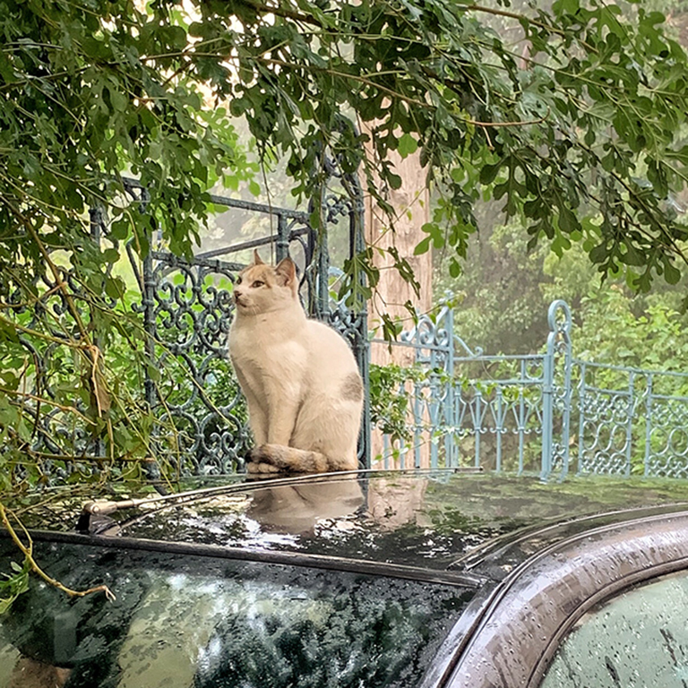
Thanks Bob for your info on your iphone 13 pro. Its 77mm-equivalent telephoto lens is so great! At first, I thought that you used an add-on phone lens kit to capture the image in a far distance and through the wired fence. Hope to see more of your amazing pictures. |
Feb 17th |
| 86 |
Feb 22 |
Reply |
Thanks Gene for your edits and your comments. |
Feb 17th |
| 86 |
Feb 22 |
Reply |
Thanks Stephen for visiting our group and for your comments.
I agree with you that sometimes the perspective correction does not work well. In this case, when I straighten the image, the blue triangle on the right almost disappears. I might need to crop tighter the top part and eliminate the lamp but the UFO-style lamp is interesting to me. In addition, the passenger seems to be shorten and fatter. LOL!
I also remember the perspective correction does not work well with Belinda's image last March since the stair landings look a bit strange. |
Feb 17th |
| 86 |
Feb 22 |
Reply |
Hi Belinda,
Now reading your comments, I realized that the image labeled "original" on the right is actually the one I already corrected the perspective using Snapseed. The one in the middle is the original one that was shot with wide angle lens that has issues with perspective. Thanks for your comments.
|
Feb 16th |
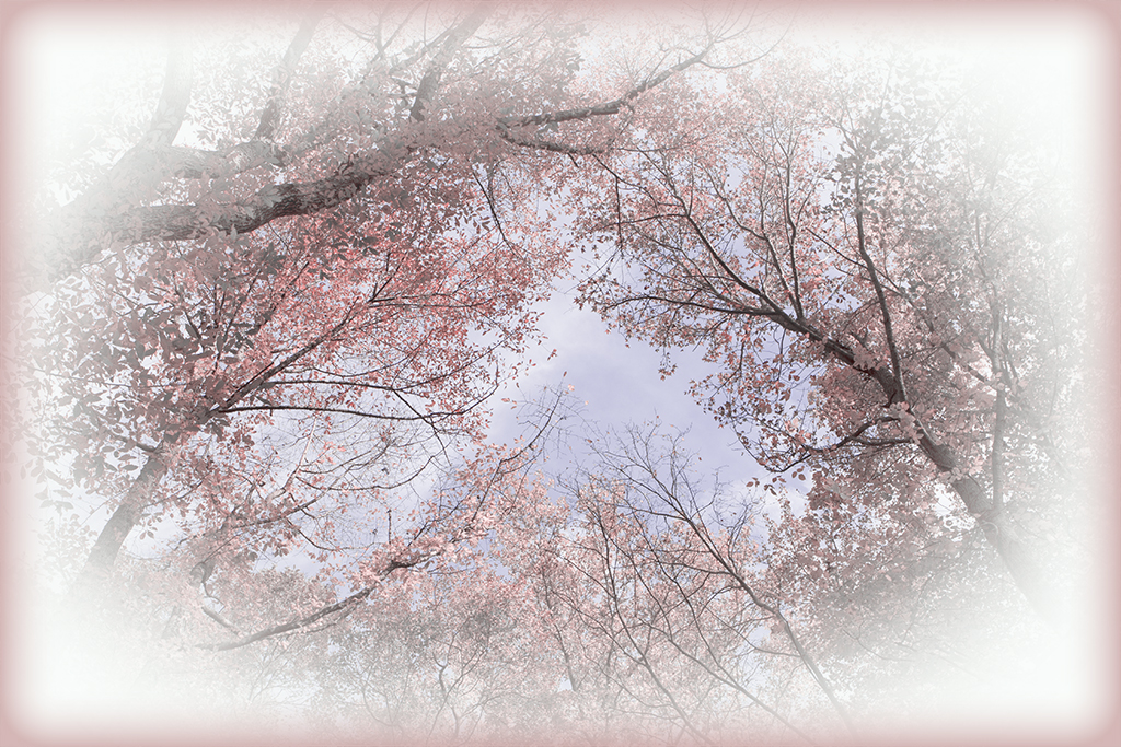
| 86 |
Feb 22 |
Comment |
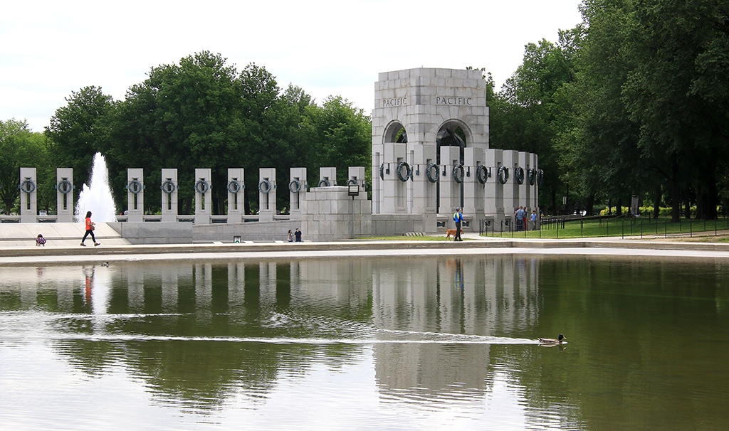
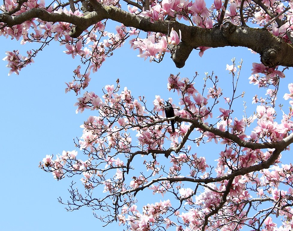
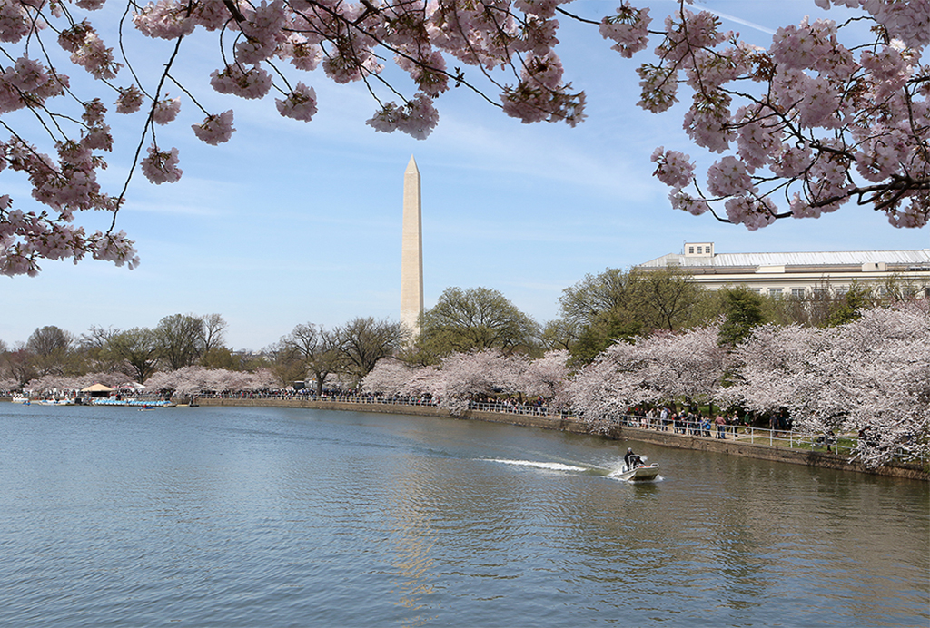
Your image reminds me of the cherry blossom trees surrounding the Tidal basin here in Washington DC that I did not have a chance to visit in the last 2 years due to Covid.
In this image, the 2 trees (cherry blossom trees?) are in peak bloom, and their flowers in light pink color stand out from the green lawn in the foreground and the dark trees in the background. I wish there would be another tree on the left to balance the scene. The light seems a bit harsh on that day that makes the top of the trees overexposed. I'd prefer to darken the top of the trees a bit more. |
Feb 16th |
| 86 |
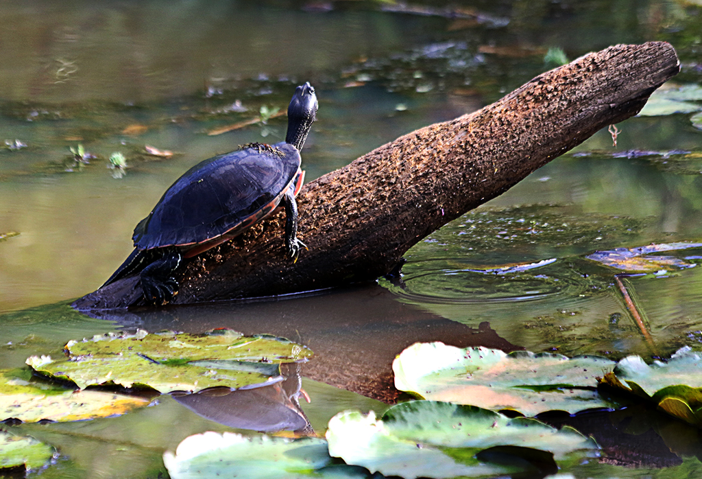
Feb 22 |
Comment |
Hi Jack,
It's interesting to discover a daisy and its shadows on the log in the vast scene. Since the log is dominant, I'd prefer to crop tighter to make the main subject (flower) stronger.
My question is: Why are there 2 shadows of the flower on the log? |
Feb 16th |
| 86 |
Feb 22 |
Comment |
Hi Gene,
Nice shot! I like the 2nd and 3rd chairs that are not aligned properly. The scene gives a hint that some people just sat there and left before the snowstorm. The conversion to B&W works well. It emphasizes the detsils of the snow and the black iron chairs. Well done? |
Feb 16th |
| 86 |
Feb 22 |
Comment |
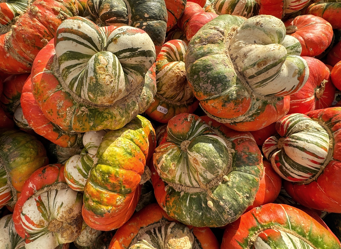
Belinda,
The red colors of those pears (?) are so beautiful and make them look delicious. The wavy bowl also created interesting shadows. The softness of the overall image gives it a soft pastel look and it works for me.
I'd prefer to tone down the white spots of light reflection on the fruits a bit more. I also think that transforming this image into a digital painting would be a very nice work you can enjoy to hang it on your kitchen wall. |
Feb 16th |
| 86 |
Feb 22 |
Reply |
Thanks, Jack! When I straighten the image using the Perspective tool, I feel that the distance is shorter (i.e. the depth of field is narrower), and the triangle on the top right seems to vanish. |
Feb 6th |
| 86 |
Feb 22 |
Comment |
Hi Bob,
The pose of the eagle is different than the norm. Your image makes me smile to think about the Asian teacher in the old times (who always look so conservative and difficult) with his hands at his back, working back and forth in the classroom. LOL!
It's great that you were able to capture it from your telephoto lens of your smart phone! I'd prefer to enhance the color saturation a bit more.
Is your telephoto lens the new Leica Core77 ? |
Feb 6th |
5 comments - 6 replies for Group 86
|
11 comments - 8 replies Total
|