|
| Group |
Round |
C/R |
Comment |
Date |
Image |
| 3 |
Nov 21 |
Reply |
Thanks everyone for your comments. Happy Thanksgiving! |
Nov 22nd |
| 3 |
Nov 21 |
Reply |
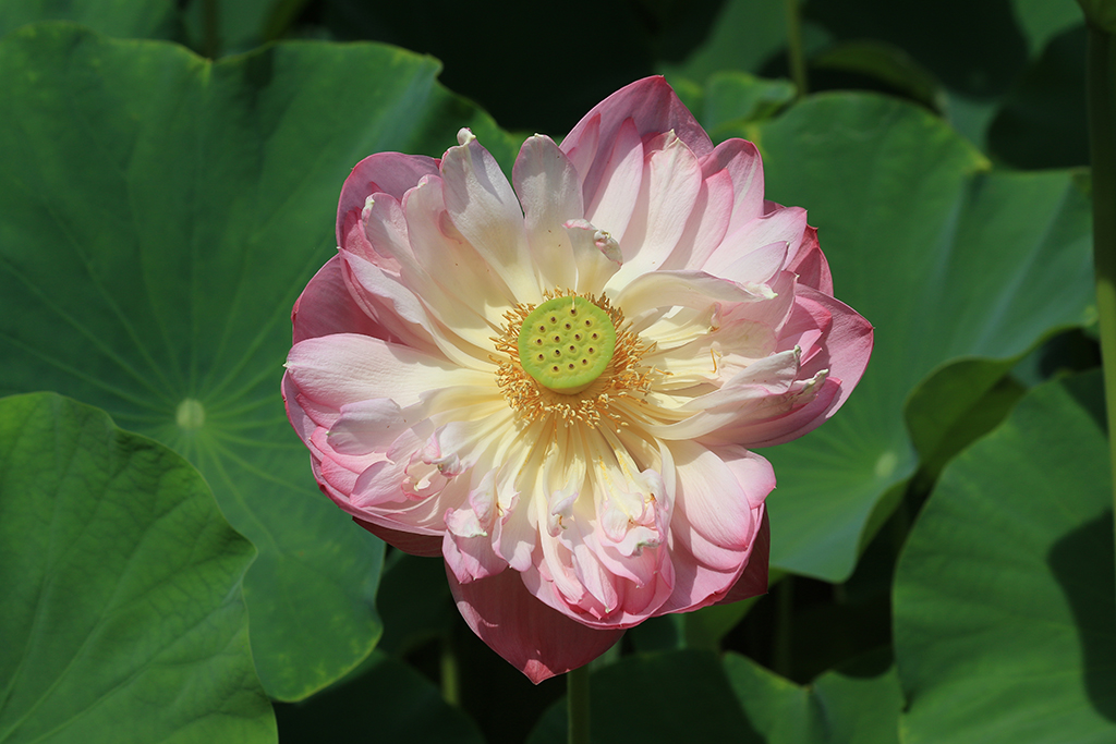
Hi LuAnn, My point of view and my comments are based on the facts of what I found in the presented images. After all, we all have different perspectives. As a maker of your image, you can decide to shift focus towards other people's suggestions or gravitate away from it based on your own beliefs. |
Nov 14th |
| 3 |
Nov 21 |
Comment |
Hi LuAnn, I am very impressed of your stiil life project in the last few months, and you inspired me to try to do so.
In this image, the light setting (soft box, black foams) and your post processing (focus stacking, Helicon focus) have not given a perfect still life apple yet. I agree with Michael that the light has created some dark traces on the right hand side of the apple that make it look dented and not quite a fresh fruit. I also found one yellow spot on the top left of the apple, and the 3 leaves on the left have either a hole, a dark spot or torn that need to be fixed in post processing. I'd prefer to have only one leaf attached to the apple stem rather than many leaves in the background. I appreciate your sharing of technique, and I'd want to see more of your still life images.
|
Nov 14th |
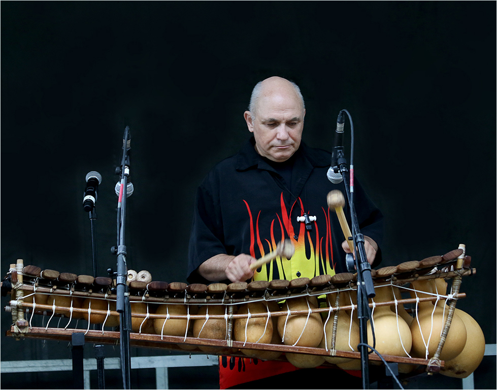
| 3 |
Nov 21 |
Reply |
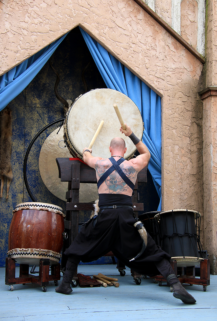
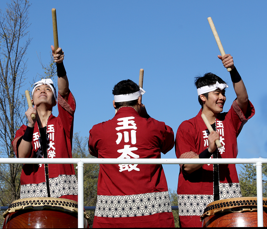
Thanks LuAnn for your edits! I appreciate you showing me another version of it. I don't use Lightroom and I usually keep the adjustment in Photoshop to a minimum, if needed. I feel that your version has darkened the surrounding borders more than mine. I am not sure whether your version has addressed Randolph's comments that he'd want to see more details of the dark pant legs of the drummer. It's quite a challenge since there are a lot of dark elements in the foreground. |
Nov 11th |
| 3 |
Nov 21 |
Comment |
Mary Ann, I am sure that you had a lot of fun to remotely set up the shots with your friend in Montana. It seems like a real time virtual photography course.
In my personal opinion, the two original images are beautiful and they work well together. I'd prefer to turn the numbers of the watch 45 degrees clockwise and to move the vase to the side a bit more to make the scene more appealing. Nice creative idea! I'd want to see more of your creativity. |
Nov 11th |
| 3 |
Nov 21 |
Reply |
Randolph, I am sorry for having mistaken your wife as a man in my comments to your image above. |
Nov 10th |
| 3 |
Nov 21 |
Reply |
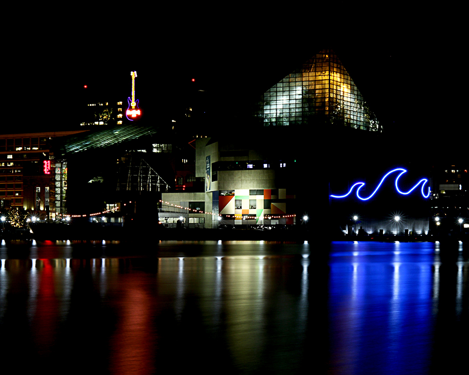
Hi Michael,
I love your edited color version that eliminated all the distractions and added nice starbursts to the right.
However, in my opinion, the pyramid structure serves as the main entrance to the Louvre museum, and it marks the landmark of Paris. Without the museum in the background, I totally lost the feeling of the Louvre pyramid architecture. |
Nov 10th |
| 3 |
Nov 21 |
Comment |
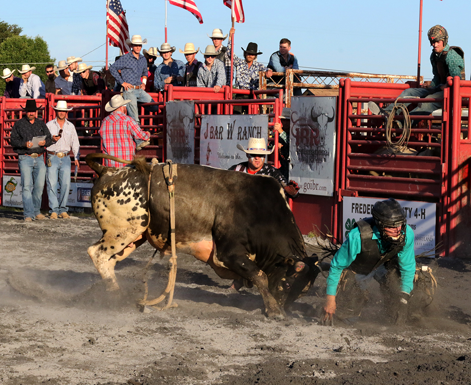
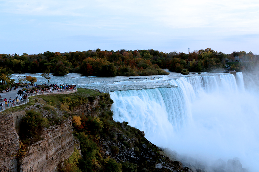
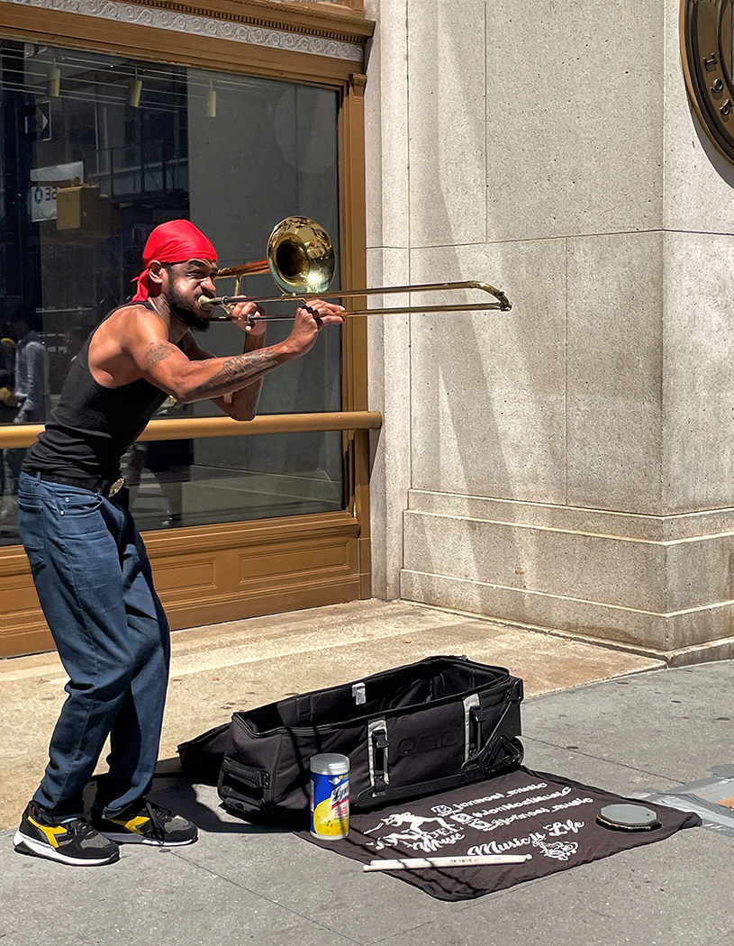
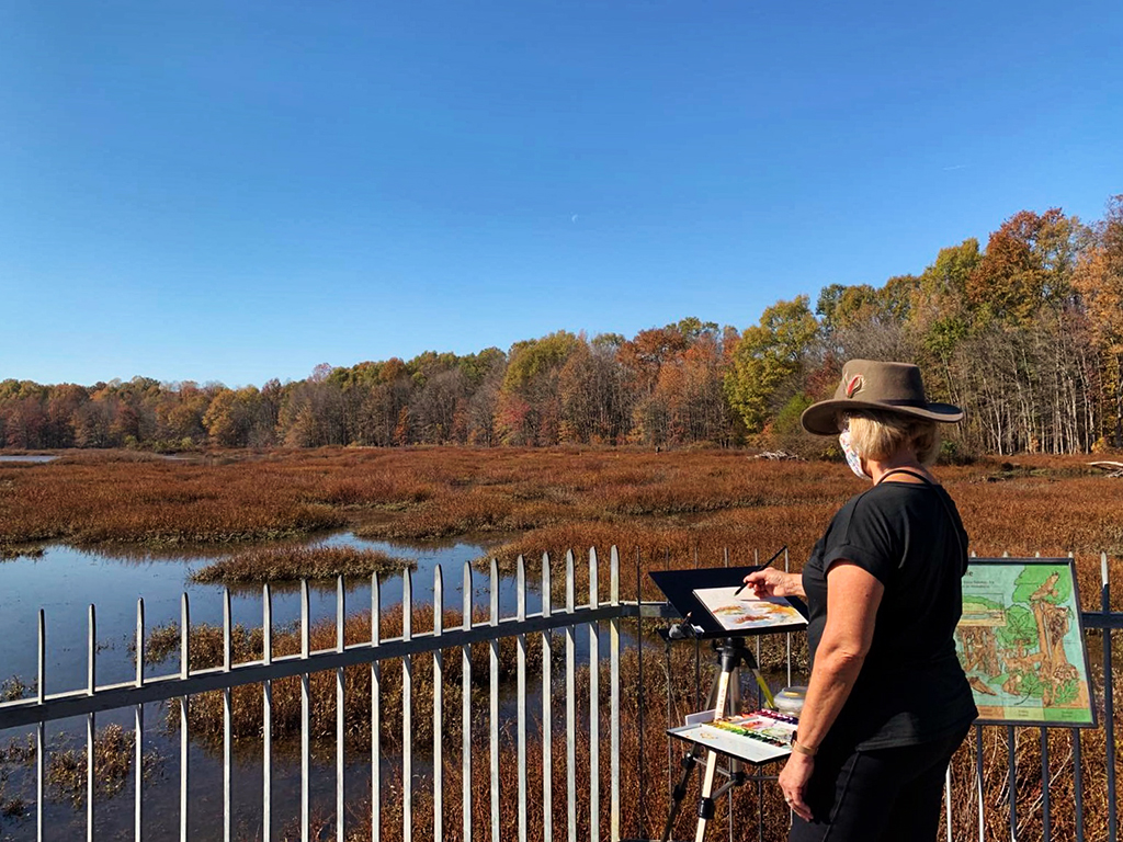
Randolph, You are good at taking candid photos and this image works very well! I myself also love to capture the people's lives, either at work or at play.
In this image, the colors look natural and blend well together (although the man is in his blue outfit and blue shoes but wearing red hat!). The scene is beautiful with the flowers in fall season, and this gentleman is so focused on his camera, which tells the story.
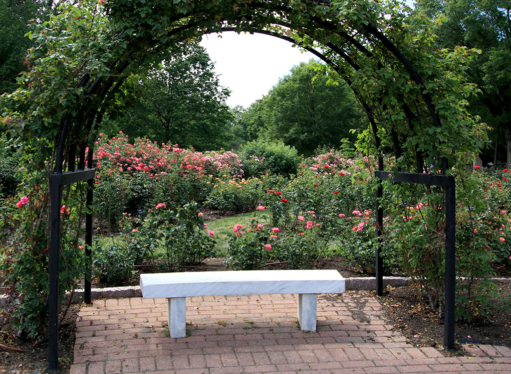
I'd prefer to crop tighter on the right side (just after the flowers behind this man's back) since the dark area in the background does not help much for the image. Nice candid image! |
Nov 5th |
| 3 |
Nov 21 |
Comment |
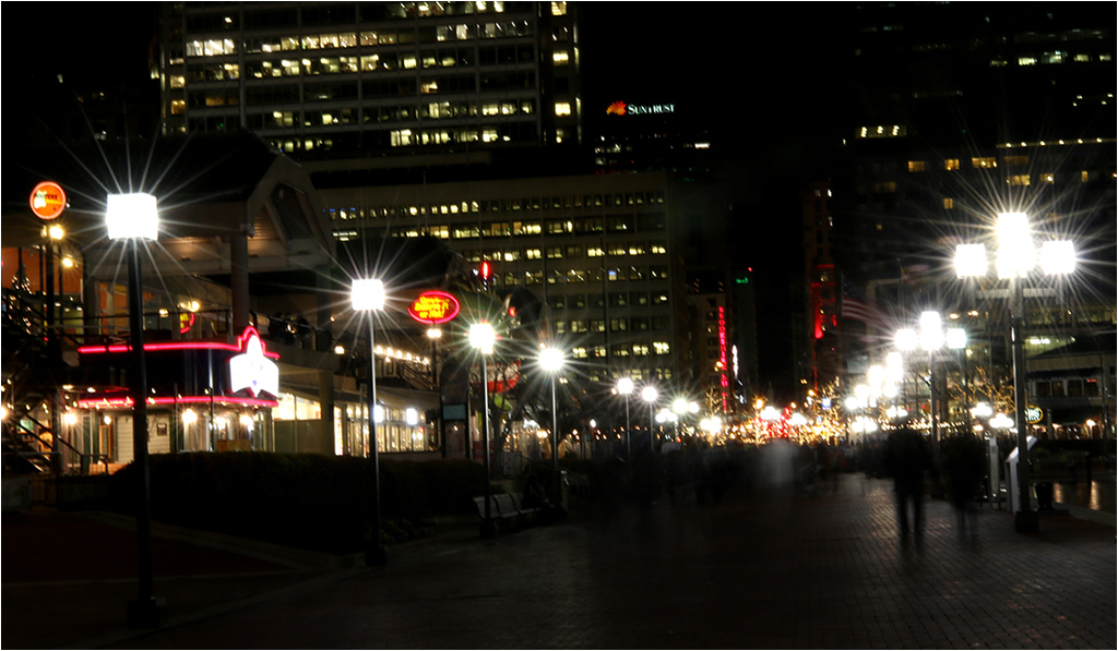
Lisa, It's a beautiful night shot of the pyramid at the Louvre museum! Your post processing and the conversion to B&W work well that created a crispy sharp glass & metal structure, illuminated the Louvre in the background as well as the starbursts of the small aperture setting (F/22).
I like the angle you shot with a triangle corner on the floor that looks like an extended reflection of the pyramid. I'd prefer to darken the long reflection of the light from the Louvre's window a bit more because it's a bit distracting. I also wish to see the top of the Louvre in full. Overall, it's a nice shot, and I really like it! |
Nov 5th |
| 3 |
Nov 21 |
Reply |
Very nice, Michael! I wonder why you decided to desaturate only the blue mountains? |
Nov 5th |
| 3 |
Nov 21 |
Comment |
Ruth, You've made an excellent choice to come back to this scene the following morning. A lot of impact was added to the scene when you captured it after a snow day. The drama clouds hanging on top of the blue mountains, the sand dunes covered by snow, the river, and trees in fall color in the foreground that add different layers and colors to the nature scene. I wish I could be there!
The composition is great, and you were able to handle the light setting quite well in this tricky situation with a lot of contrasting ones.
I'd prefer to see more details of the snow that covered the sand dunes. The dodge processing is a bit overdone there. |
Nov 5th |
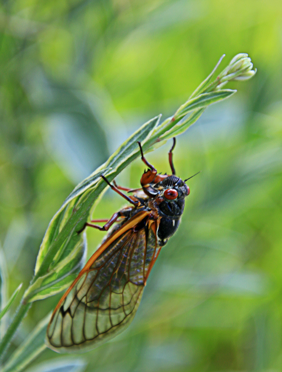
| 3 |
Nov 21 |
Comment |
Wow! It's a beautiful shot! The spider is sharp, and the web glittered with the morning dew is a big plus to this image. You are able to capture the clean background without any distraction. Your post processing is excellent to reduce the shining area on the low right corner.
Your square crop works well to make the viewers focus on the subject (spider). I also like your original one that shows the vast spider's web. It's very well done! |
Nov 3rd |
6 comments - 6 replies for Group 3
|
| 86 |
Nov 21 |
Reply |
Thanks Ruth for your comments.
Happy Thanksgiving to everyone! |
Nov 22nd |
| 86 |
Nov 21 |
Comment |
This shot of broken pavement and worn paint is interesting! You can use it as a texture background for your future images.
The leaves in a diagonal line work well. I'd prefer to rearrange with some bigger leaves to create more impact to the subject. |
Nov 11th |
| 86 |
Nov 21 |
Comment |
The caterpillar has interesting colors, spikes, patterns on its body. I hope that it will become a beautiful moth or butterfly.
I'd prefer to sharpen it a bit more and to remove some spots in the background. Nice collection of your living yard art! |
Nov 11th |
| 86 |
Nov 21 |
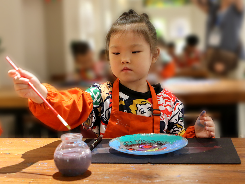
Comment |
You have done a nice job to combine the two images. The final image looks natural with the curvy lines of pumpkin that guide the viewers' eyes going from the foreground to the background. The boy with the orange T shirt and hat are a big plus.
I'd prefer to lighten the boy's face a bit more since his eyes are covered by the shadow of his hat. He seems to have a face painting too.
Although you have cloned the letter on the boy's hat, I found that the Nike logo (the Nike Swoosh) on the boy's T shirt and short are in reverse.
|
Nov 11th |
| 86 |
Nov 21 |
Reply |
Thanks everyone for your comments. I agree with Gene that there are some spots on the reflection that need to be removed. |
Nov 10th |
| 86 |
Nov 21 |
Comment |
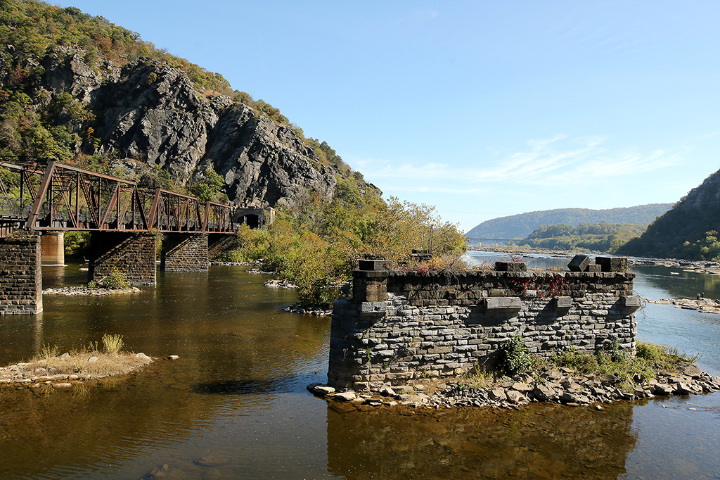
The place you visited, via the image you captured, is so different than the landscape image I have ever seen. The colors and formation of the rocks are beautiful! The composition with the diagonal line of the rocks, and it's in 2/3 of the frame clearly emphasizes the main subject.
I'd prefer to darken the blue sky that peek out of the white clouds a bit more since the white clouds seem to overpower there. It's a beautiful scene! |
Nov 6th |
| 86 |
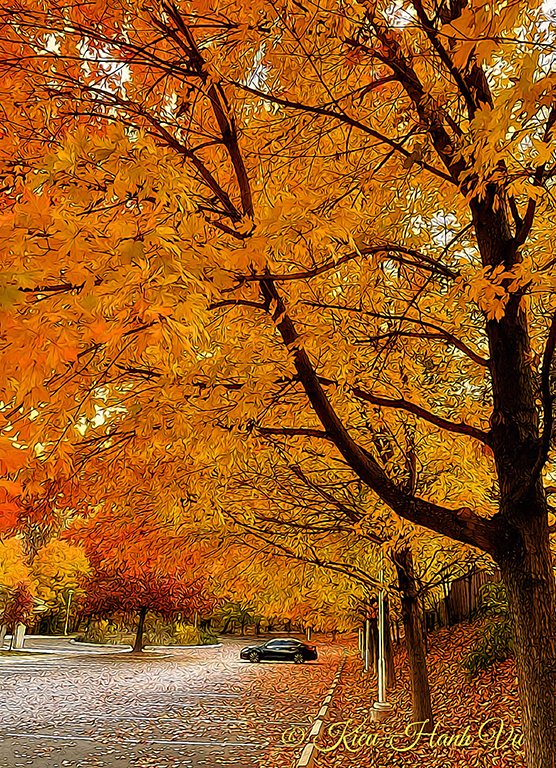
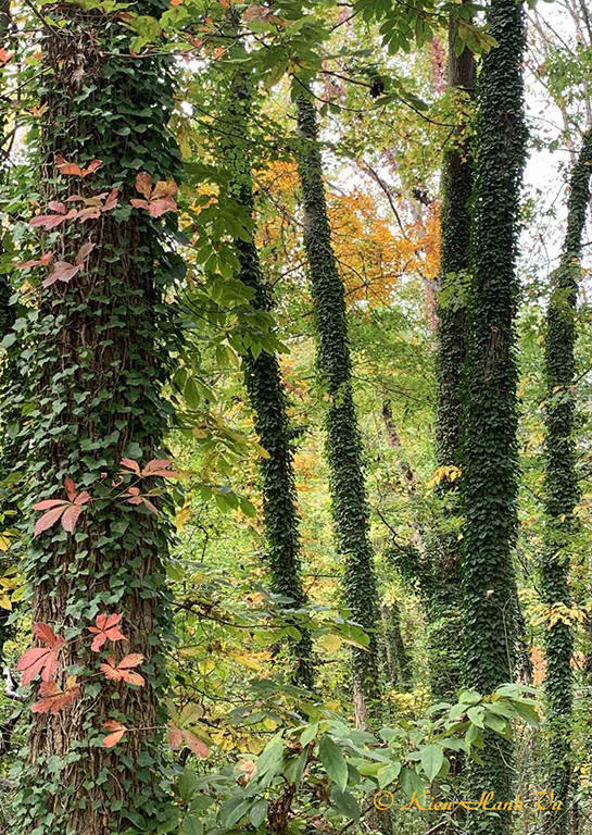
Nov 21 |
Comment |
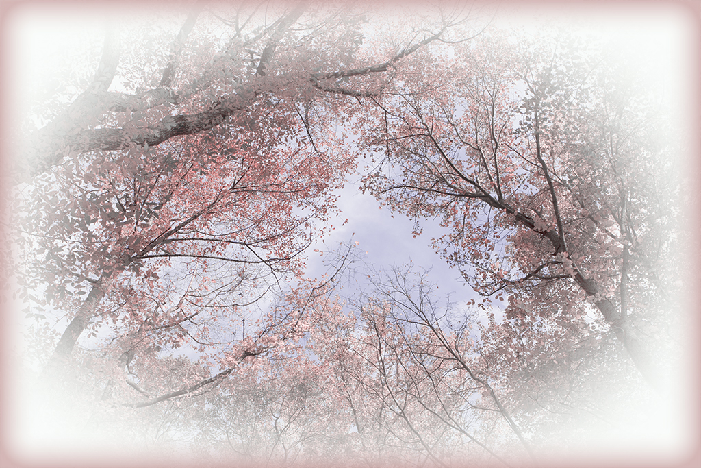
The trees intertwined with each other like it was created by the kaleidoscope. You have chosen the beautiful angle to capture this scene. Most parts of the leaves are behind the branches, but few of them (near the center) are on the front that help break the monotonous of the scene. The image seems busy but it works well with the beautiful fall color and the enhancement of the backlit light. Nice image! |
Nov 6th |
5 comments - 2 replies for Group 86
|
11 comments - 8 replies Total
|