|
| Group |
Round |
C/R |
Comment |
Date |
Image |
| 3 |
Dec 20 |
Reply |
Michael, I don't use Lightroom so I don't know how to correct the B&W using it. Usually, there are several ways to convert into B&W in each software, and you can experiment it to see which one looks best after the conversion. Your image needs a little punch in tonality to make the black color darker and the white whiter.
You can download the free version of Nik Silver Efex to try out before buying it. This plug-in software is well known in the software market for B&W conversion. |
Dec 18th |
| 3 |
Dec 20 |
Comment |
I like your idea to experiment a new way of presenting your image in this split screen. At first, I also thought that the couple on the street are the same ones in the frames of the shop.
For this image, it does not work well as intended because the lighting of the street is not adequate, especially the lady's face is in the shadows. Since the screen is split in halves with two different subjects, it does not tell the story well. |
Dec 12th |
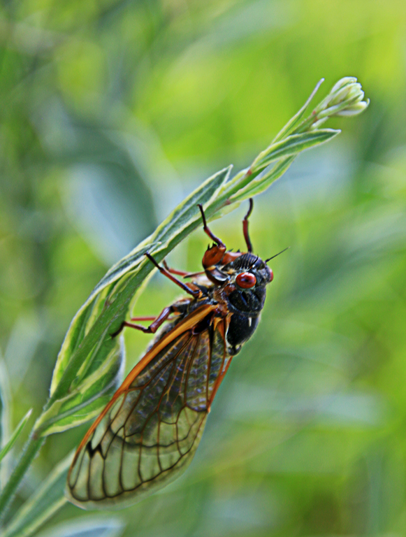
| 3 |
Dec 20 |
Comment |
Although the branches in the background seem busy, the eagle is in the nice area with better light for your photo. Since the foreground is out of focus and a bit distracting, I'd prefer the square crop as Michael did to make the blurry foreground as vignette of your image |
Dec 12th |
| 3 |
Dec 20 |
Comment |
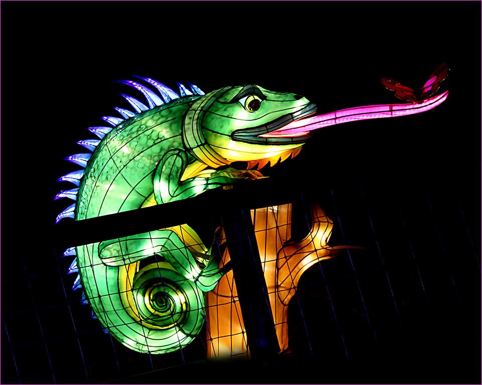
This image of the iguana is beautiful with all the details of its narrow spines running down its back. This animal is quite different than the ones I saw in the zoo with its orange beard. Its appearance looks like a mini dinausour and it's a bit scary to me but I know that iguana has now become a popular pet.
I'd prefer to darken the background a bit to make the iguana more stand out. |
Dec 10th |
| 3 |
Dec 20 |
Comment |
It's interesting that you were able to capture the zigzag line of that mini island before it was covered by the tide.
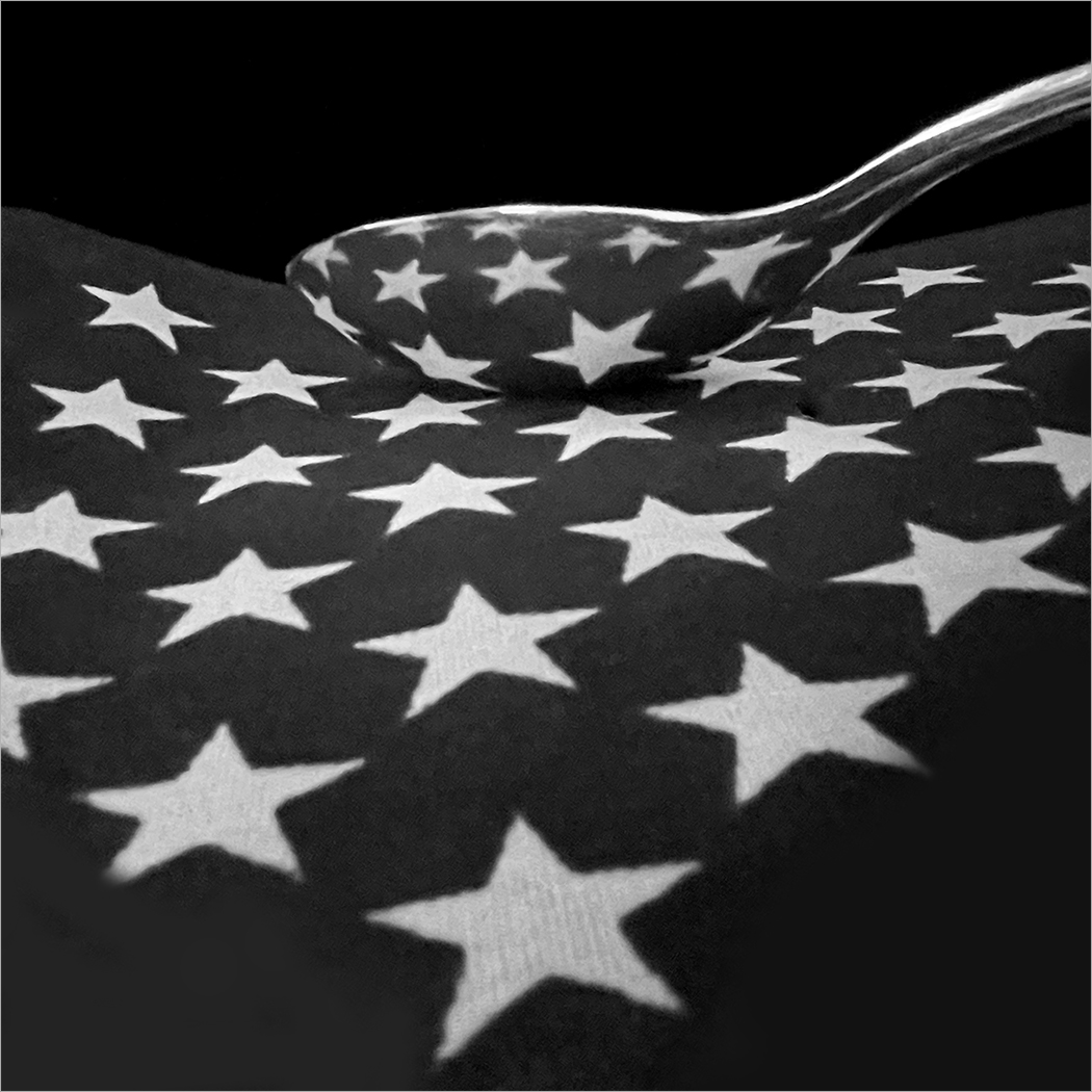
I think that the conversion to B&W does not work well in this image. I'd expect to be drawn to lines, shapes, or details whenever the color is turned off. For this landscape image, since it was shot at a distance, those zigzag lines are not clearly seen from that angle. In addition, the B&W colors are not strong enough, and it leads more to gray color. |
Dec 10th |
| 3 |
Dec 20 |
Comment |
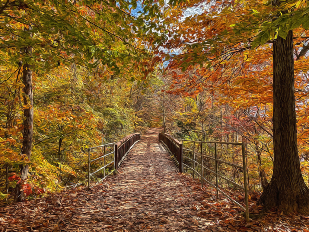
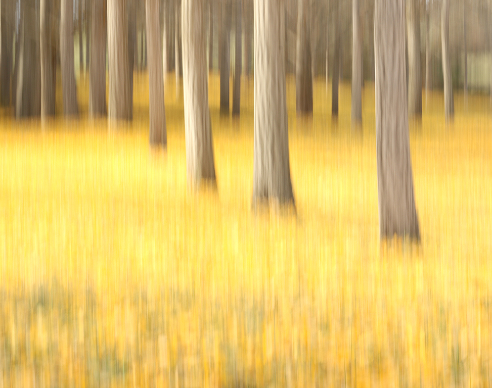
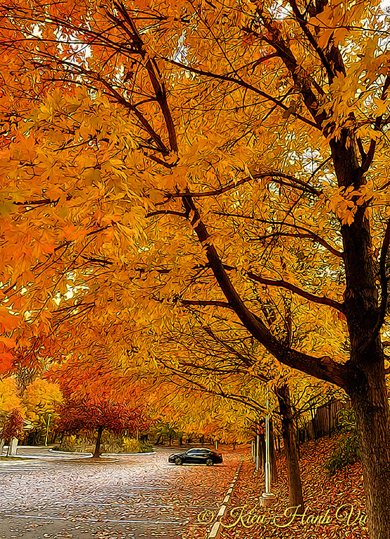
The aspen trail is so beautiful, and I wish that I could visit it in the future. You have done a nice job in post processing that makes the autumn color more attractive. I also like the position of the hiker in this image, where he is at the entrance of the winding trail.
Regarding the hiker's shirt, I think that the green color is a bit too bright that could hold the viewers' eyes there instead of leading them to the trail. I'd prefer to tone down the color a bit, instead of replacing his shirt's color as Michael suggested. I saw a lot of photos that the photographer purposely included people in red outfit.
|
Dec 8th |
| 3 |
Dec 20 |
Reply |
Thanks everyone for your comments and your suggestion.
Among the 3 new versions from LuAnn and Michael, I like this square crop and the saturation adjustment of Michael's 1st version the most. Thanks, Michael! |
Dec 8th |
| 3 |
Dec 20 |
Comment |
The cardinal is beautiful! The image is very sharp with all the details of its feathers can be clearly seen. The diagonal position of the branch makes the image more dynamic.
I'd prefer to lighten the background a bit. At first, I thought that the image was captured at night but in your description, the shot was at noon instead. |
Dec 8th |
6 comments - 2 replies for Group 3
|
| 4 |
Dec 20 |
Comment |
Wow! This photo is fantastic in many ways. The vectors and the colors created by the software are just right (not too much, not too few) to convert a normal selfie into an art piece. You have done an excellent editing job!
|
Dec 18th |
1 comment - 0 replies for Group 4
|
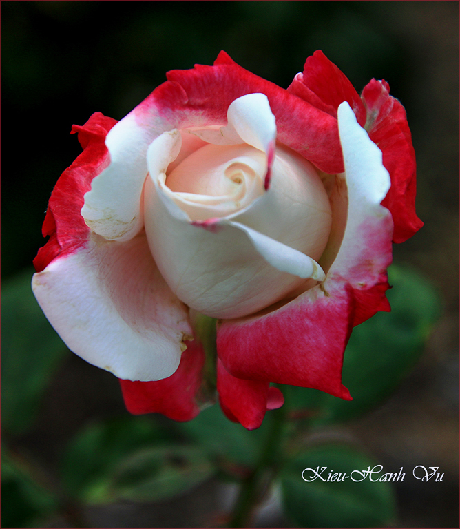
| 86 |
Dec 20 |
Comment |
The rose is sharp, and the colors are beautiful. The snow adds more impact to the image. I agree with the others that space on the left is needed to see the petal In full. |
Dec 14th |
| 86 |
Dec 20 |
Reply |
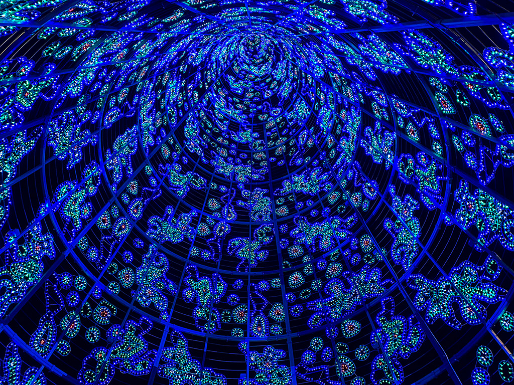
Thanks everyone for your comments! This Christmas tree is about 114 feet high, and its design is also changing every year.
Merry Christmas to you all! |
Dec 12th |
| 86 |
Dec 20 |
Comment |
The portrait of your great grandchild is beautiful! You have captured this image at a sweet moment with the baby looking up and the hands crossed.
I don't think that Noir in Snapseed will work for this image. As described by Google that supports Snapseed, use Noir to create moody, cinematic black and white images with darkroom-inspired toning and wash effects.
I don't have any suggestion for improvement in this image. I also like the other versions that Belinda and Marilyn did.
Merry Christmas to you and your family! |
Dec 12th |
| 86 |
Dec 20 |
Comment |
The lighting of the sunrise is beautiful. I also like the composition of your image with the rocks in diagonal line that lead my eyes to the pine trees on the top right corner.
Since the color of the cloudy sky is beautiful and contrasting with the rocks, I'd prefer to see the calm sea without waves in between, and I believe that you also captured those moments during that time.
|
Dec 12th |
| 86 |
Dec 20 |
Comment |
Very creative and well thought of using a leather to create a natural moon! I really love it! Your post processing is also well done!
My question is: Did you want to create a dynamic image by not including the whole moon (it was trimmed off a bit) and leaving less space from the top of the image than the bottom of it? |
Dec 12th |
| 86 |
Dec 20 |
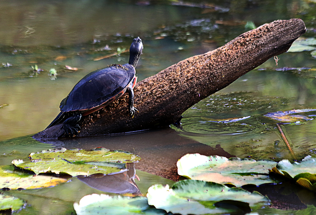
Comment |
You have created a strong impact image by composing it. Just chosen a very specific composition (the turtle) for the nature preserve scene, thus you have created a more complete photograph.
The blending of color saturation works well and looks natural. Nicely done!
If you can change it in post processing, I'd prefer to have a space between the head of the turtle and the scene.
|
Dec 12th |
5 comments - 1 reply for Group 86
|
12 comments - 3 replies Total
|