|
| Group |
Round |
C/R |
Comment |
Date |
Image |
| 3 |
Nov 20 |
Comment |
Thanks everyone for your comments. I agree that the sky needs some more work.
Thanks LuAnn for trying to replace the sky for my image. I think that it does not look quite natural because of the halo around the leaves.
I also tried to clone some branches to cover the white sky but it was not successful either. |
Nov 29th |
| 3 |
Nov 20 |
Comment |
The lighting of the Mario Cuomo bridge is so beautiful, especially with the water reflection. I never visited it but the news say that on occasion, it is lit with colors to commemorate important or impactful moments such as 9/11.
For this image, I agree with Michael that having the reflection of the bridge supports on the right side would balance the scene more. |
Nov 12th |
| 3 |
Nov 20 |
Comment |
The composition is great! I like the details of the suspension cables starting from the left side that lead the viewer's eyes to the city with skyscrapers on the right. The conversion to B&W with more details of the bridge in the revised version is excellent! |
Nov 12th |
| 3 |
Nov 20 |
Comment |
The conversion to B&W works well. The ruins at the low right corner give the viewers a sense of the scale of the canyon. I'd prefer to darken those ruins a bit more since they were overpowered by the dark streaks of the rock above them. |
Nov 11th |
| 3 |
Nov 20 |
Comment |
The original flower looks like a group of flamingo birds. I agree with others that the black background makes the flower stand out. I'd prefer to work with the original image since the flower is at its peak and its shape looks more beautiful |
Nov 11th |
| 3 |
Nov 20 |
Comment |
Welcome to our group, Michael! I think that the color version works better since we have a chance to know more about the traditional clothes of local people. Your crop works well, but I'd prefer to keep the background of the original 1. The final version still has some flaws at the edges of his headpiece.
My question is: Why did you give the title of this image "Man with broom" then you cropped off his broom? |
Nov 9th |
| 3 |
Nov 20 |
Comment |
I love the different colors of autumn leaves in this image. Usually, the red color is the strongest one but the details, the shape, and the diagonal position of the yellow leaf made it stand out.
I'd prefer to dodge the right hand side of the yellow leaf a tad because of the dark shadow on it. |
Nov 9th |
7 comments - 0 replies for Group 3
|
| 86 |
Nov 20 |
Reply |
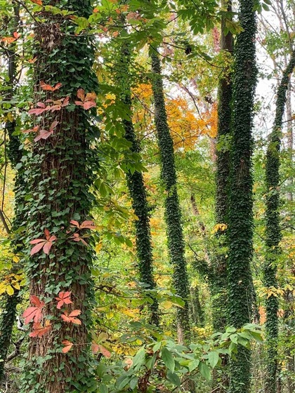
Thanks everyone for your comments.
Ruth, The scene looks nice with the colorful ivy leaves, but I did not dare to walk past that area because I am afraid that they could be poisonous.
The National Arboretum is in Washington DC. |
Nov 13th |
| 86 |
Nov 20 |
Comment |
You have done an amazing job by transforming a regular flower to an interesting one! The image now has a new look, new textured background, and new color. I'd prefer to crop the top part equally to the bottom area to make the image more balanced. |
Nov 13th |
| 86 |
Nov 20 |
Comment |
Very creative image! Without your description, I can never imagine that the final image is taken from a screw. I found that the circle is not quite sharp, and there are some white stripes that are a bit distracting. |
Nov 12th |
| 86 |
Nov 20 |
Comment |
The color and the details of the thistle are beautiful. The position of the bee is also nice. I agree with Marilyn that the bee needs to be sharpened a bit more. |
Nov 12th |
| 86 |
Nov 20 |
Comment |
The Mextures background and the zoom effect have created more impact to the image. I feel that the flower arrangement is not well balanced since there is a gap on the top right corner (missing one flower?) and 2 white flower stems on the right side seem to be longer than the others. |
Nov 12th |
| 86 |
Nov 20 |
Comment |
Very creative image! I like the idea of embedding the woman's headshot into the stopwatch. I'd prefer to see her face not being cropped too tight (such as to see a bit of her shoulders), and I'd prefer to see her not looking down. |
Nov 12th |
| 86 |
Nov 20 |
Comment |
Dear Phill,
Thanks for your comments. I did not change much since the scene with the trees all covered by ivy leaves made them like embossed ones.
In Snapseed, I used Looks > Accentuate. Included is my original image. |
Nov 6th |
 |
6 comments - 1 reply for Group 86
|
13 comments - 1 reply Total
|