|
| Group |
Round |
C/R |
Comment |
Date |
Image |
| 11 |
Jan 17 |
Comment |
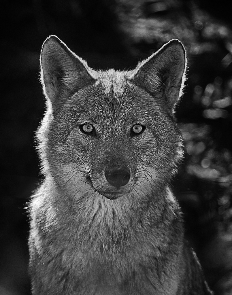
I definitely prefer B&w version. Very nice subject and great angle, and dof. Well done.
The only improvement I can see is darkening a bit very white background but I see Tom had done this already.
|
Jan 16th |
| 11 |
Jan 17 |
Comment |
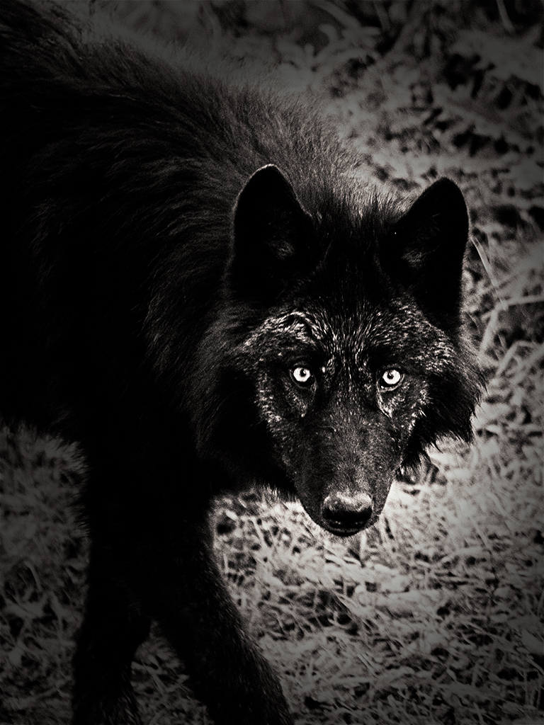
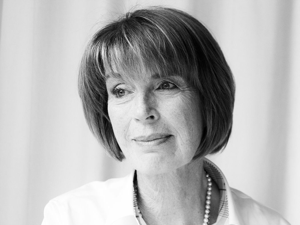
Great portrait.
I like pose of your model and all details which you were able to retrieve in post.
I am not sure about toning To me it does not fit well with portrait but for others it is nice surprise.. I would prefer classic b&w
|
Jan 16th |
| 11 |
Jan 17 |
Comment |
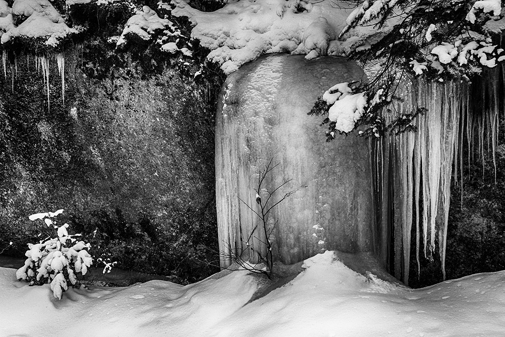
Dave,
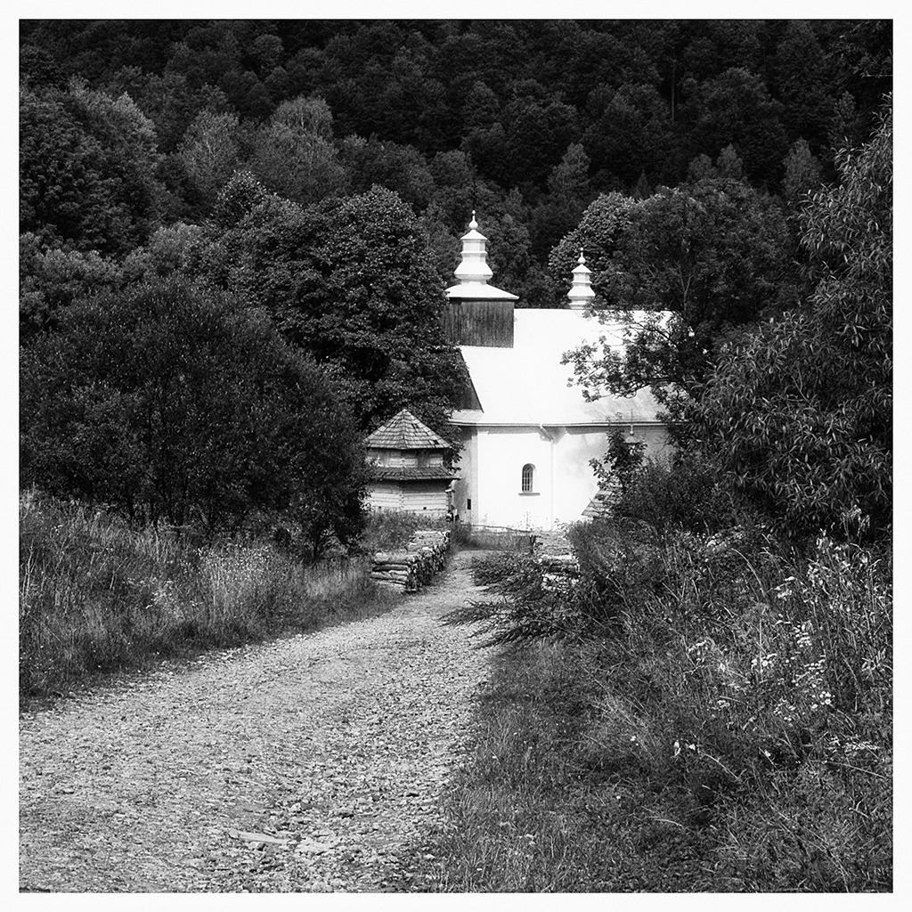
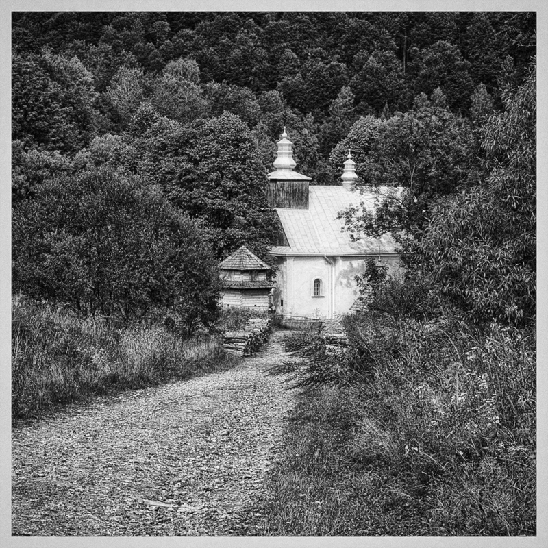
I like this scene very much but I know that edges of the crop are always difficult. I would clean edges and dominant spots in bushes and try few more crops just to find the best.
There is some nice symmetry in the branches sticking out in opposite direction, so I made a crop to capitalize on these. |
Jan 16th |
 |
| 11 |
Jan 17 |
Comment |
WOW Tom, I agree with everyone |
Jan 16th |
| 11 |
Jan 17 |
Comment |
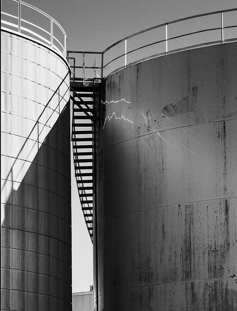
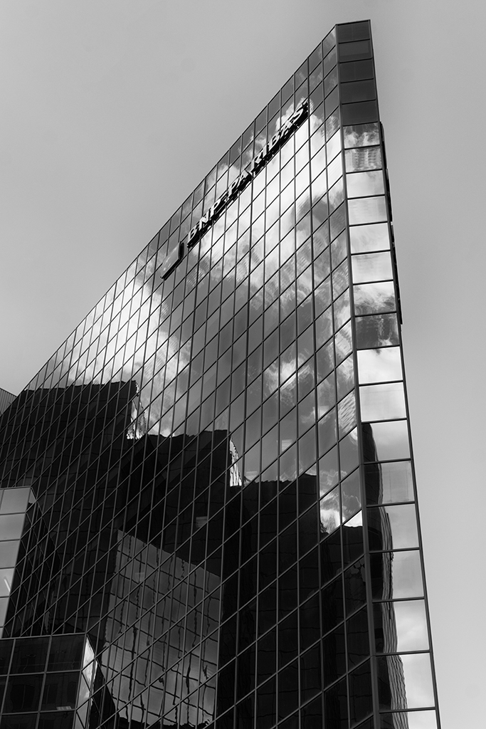
I like your b&w version very much. Postprocessing was excellent and light become much more interesting.Lines are well organized in your composition.
I like also Tom’s version but there is a bit different feel to it. It is more realistic and less moody.
|
Jan 16th |
| 11 |
Jan 17 |
Reply |
Thank you Allen and Dave.
I could not find the original image anymore.]I used single HDR toning on color image(using NIK HDR) and lower opacity of the layer to 50%.
Then I converted image to b&w using pushprocess preset( NIK SilverEfex )
what do you think? |
Jan 14th |
 |
5 comments - 1 reply for Group 11
|
5 comments - 1 reply Total
|