|
| Group |
Round |
C/R |
Comment |
Date |
Image |
| 1 |
Nov 17 |
Reply |
I didn't take it that way. The idea had grown from something else. The video did now give me some ideas that I might or might not do in the future. He did other things with the letters that I had never thought of before. It was a good video. I have seen at least one other of his and it was also good. Thanks for mentioning it.
|
Nov 21st |
| 1 |
Nov 17 |
Reply |
I can guarantee that I wasn't influenced by Youtube for this. I think the idea was generated from a scavenger hunt that our club had downtown a few years ago. We were supposed to do the alphabet from things that we saw. It wasn't necessarily from letters on signs but I did end up with some from signs. The video was interesting. I might have to try something else one of these days. |
Nov 21st |
| 1 |
Nov 17 |
Comment |
The woman does add a good element to the great sunset. She helps give more interest and a resting place for the viewer's eye. Did you try moving back and forth to place her in different positions to the sunset? |
Nov 18th |
| 1 |
Nov 17 |
Comment |
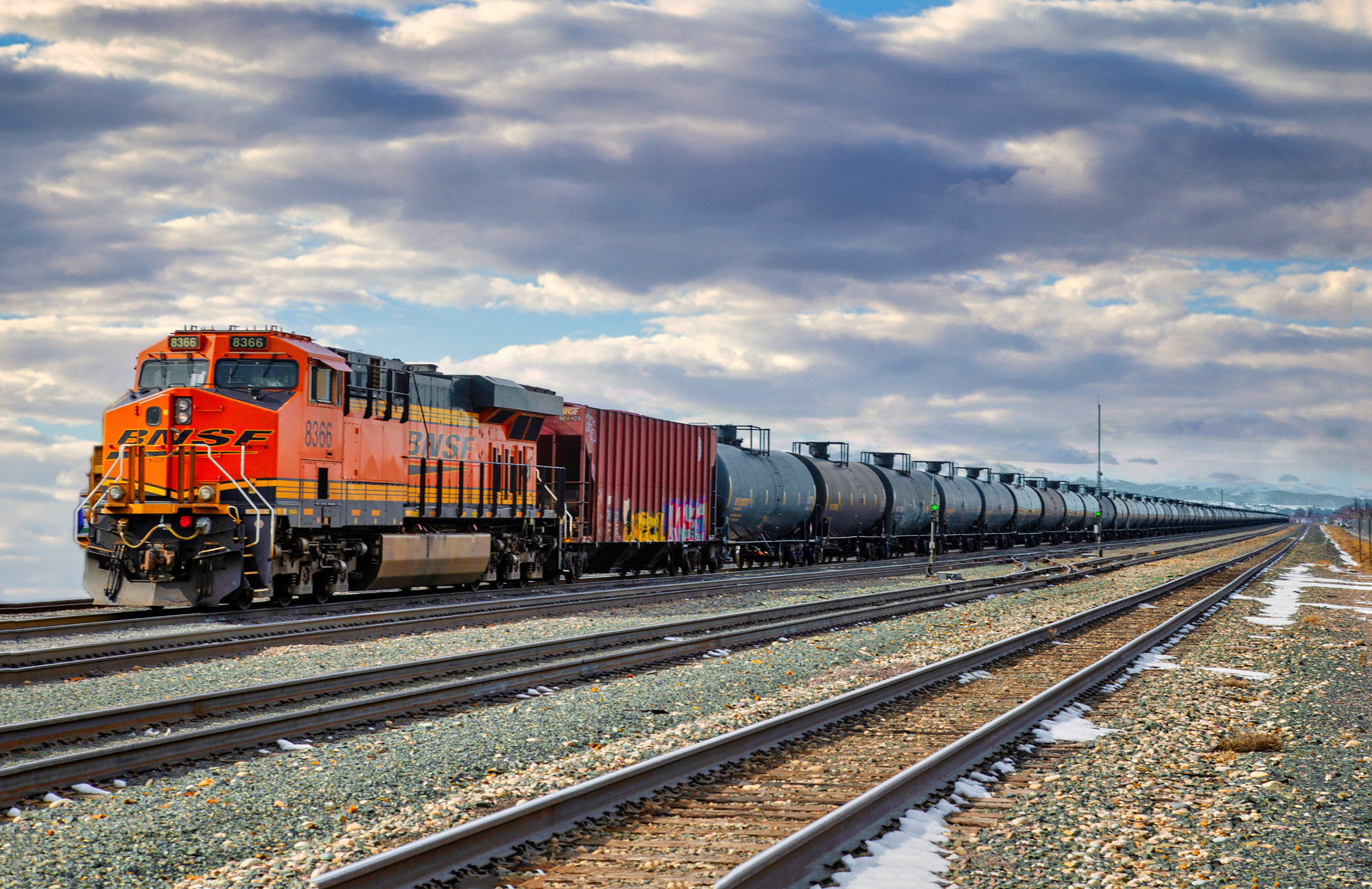
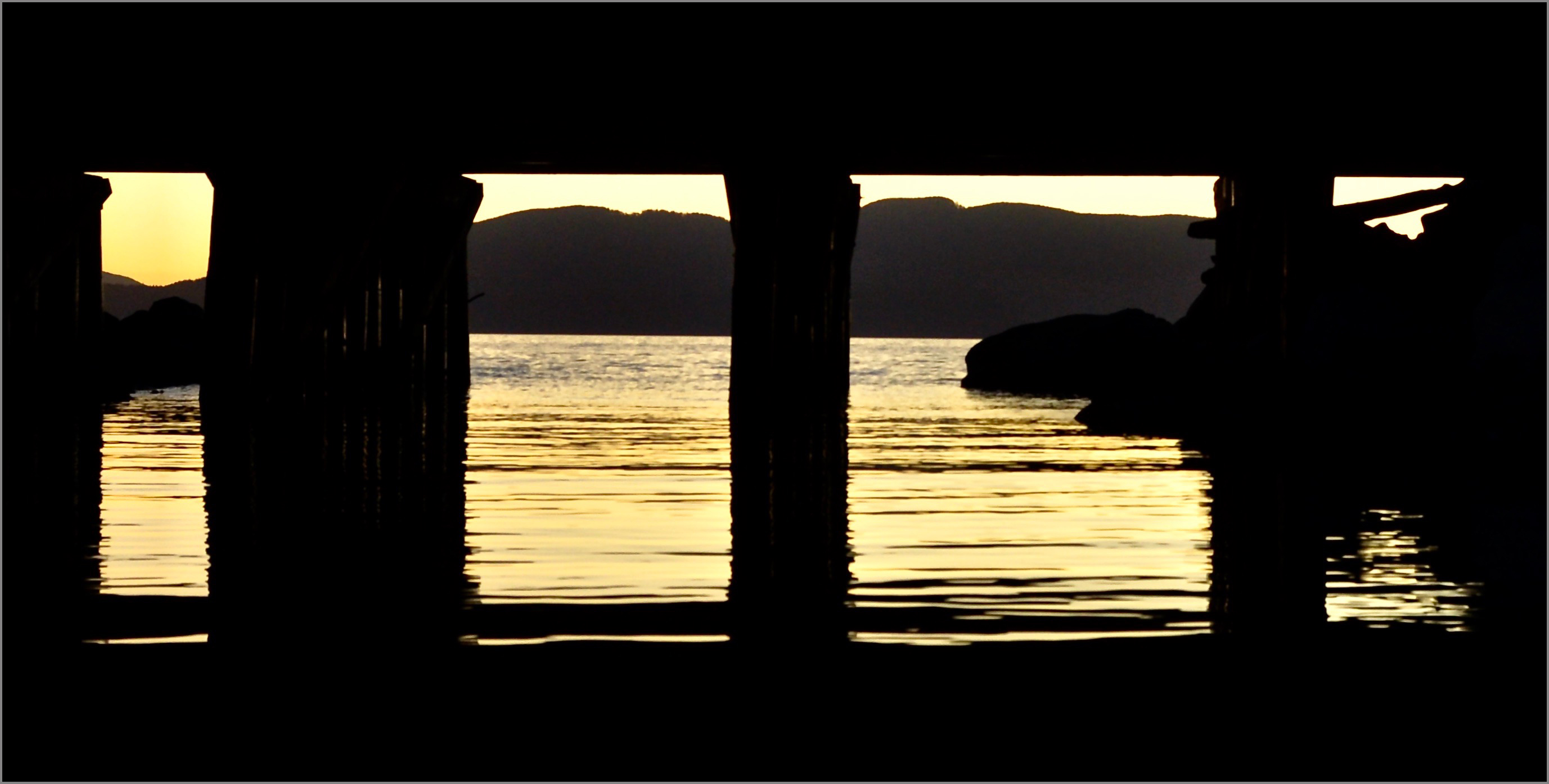
You did a good job keeping everything sharp with the slow shutter speed while you were floating. It is an interesting subject.
The black background on the website really didn't do you any favors. With this much back areas around your border, you might add a thin gray stroke to identify the edge of your image. This is also a good idea if it might be projected.
That aside, when I first looked at this, I saw several images and while using an HDR program might have given you more detail in the shadow areas without affecting the more visible areas. You might also have tried cropping off the rail cars at the top and just using the reflection to let the viewer know what this was. This could also be cropped even more so it would be a panorama of quadriptychs. |
Nov 18th |
 |
| 1 |
Nov 17 |
Comment |
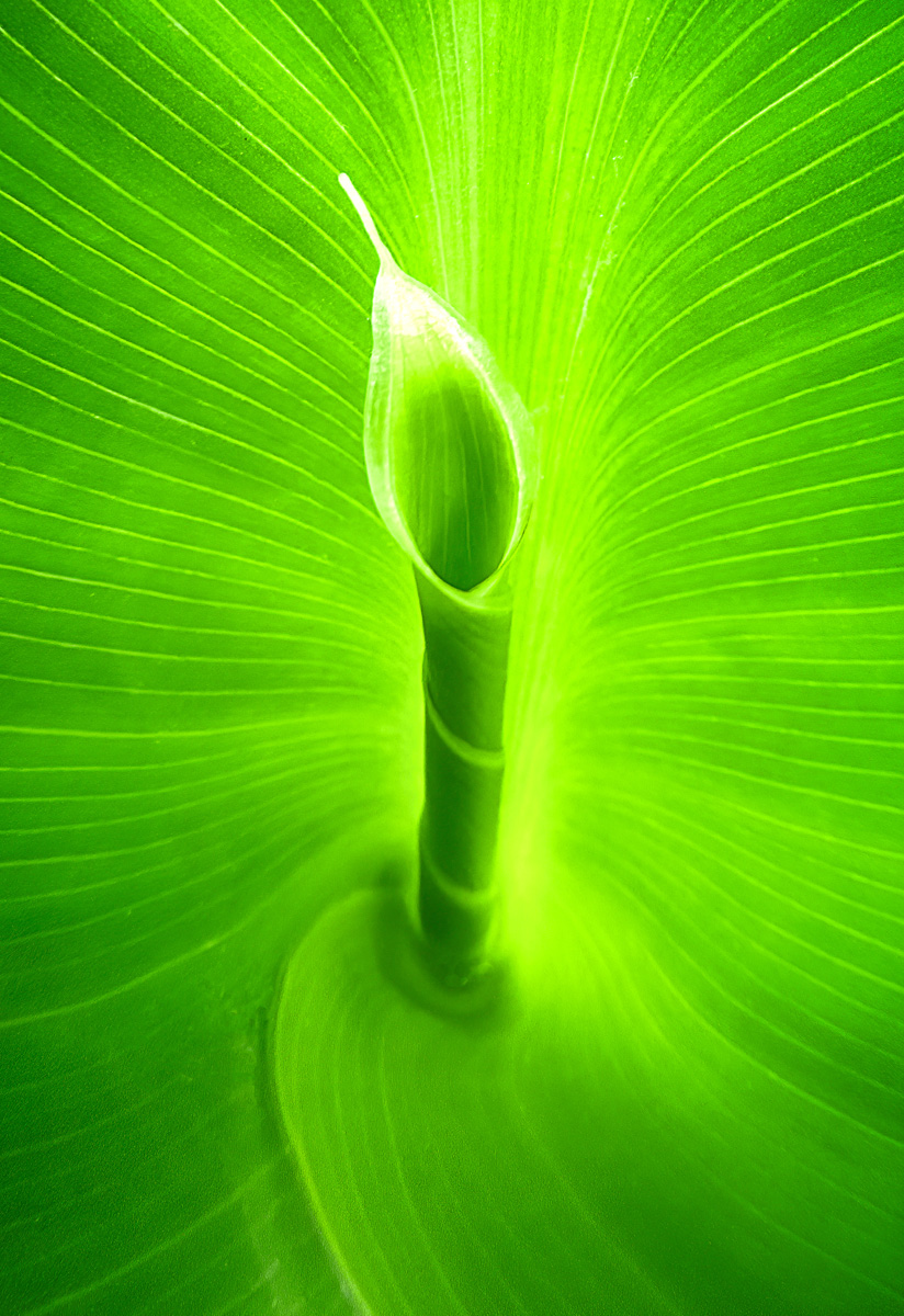
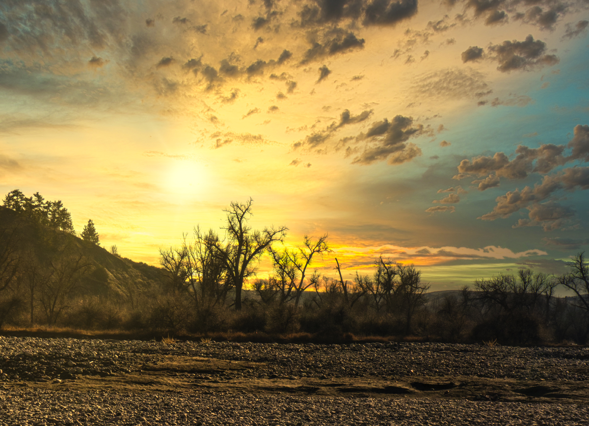
You do have quite a view from your deck. It looks like it could be very relaxing to just sit there and enjoy the view. I might have increased the contrast a bit or added a even more of an infrared look with glowing foliage. |
Nov 18th |
 |
| 1 |
Nov 17 |
Comment |
Interesting subject and the black and white works well for you. I would like to see the roots stand out better from the background. Softening might help but you could also try Neal's treatment and darken the area behind the tree. I might also try to clone out all the bright sky peaking through the trees. |
Nov 18th |
| 1 |
Nov 17 |
Comment |
I do like the unusual point of view. I think that you did a good job on this. If possible, I might have liked to see a little more of upper levels to give more of a perspective of your subject being a staircase. If you did set your camera against the wall for this, you might also have tried moving a little away so none of the upper steps were in view. |
Nov 18th |
| 1 |
Nov 17 |
Comment |
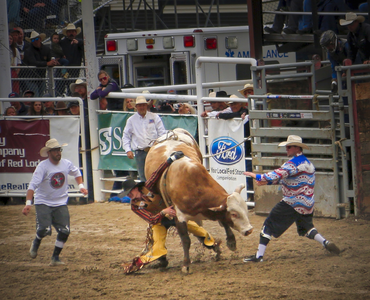
I think that the darkened background does set off your subject well. The cluttered background is always a problem at a rodeo. I was thinking at first that you might have left a little more room for the sheep to move into but the position of the "sheepboy" is well placed in the composition. You might have used a little faster shutter speed so the front leg would have been sharp. Great timing and image. |
Nov 18th |
| 1 |
Nov 17 |
Reply |
Thanks Mark. It is fun to try the entire alphabet from one position or parking lot. I could have been more careful with my spacing on this one. It was better than looking for a Denny's sign. |
Nov 12th |
| 1 |
Nov 17 |
Reply |
I mainly did each letter, or set of letters, along with sizing them, adding a stroke, and when I was done, I copied them as a new layer on the background. Looking at it now, I could have done a little better with the spacing. |
Nov 9th |
| 1 |
Nov 17 |
Reply |
It was not Dennys I have done that when I needed to do my name for something. :)
|
Nov 8th |
| 1 |
Nov 17 |
Reply |
I have tried doing just the alphabet from just a busy street intersection and I was surprised how many of the letters I found without moving away from the intersection. I haven't tried a collage like this with the results before. I couldn't believe it when I saw the two "N"s positioned in just the right spot. |
Nov 8th |
6 comments - 6 replies for Group 1
|
6 comments - 6 replies Total
|