|
| Group |
Round |
C/R |
Comment |
Date |
Image |
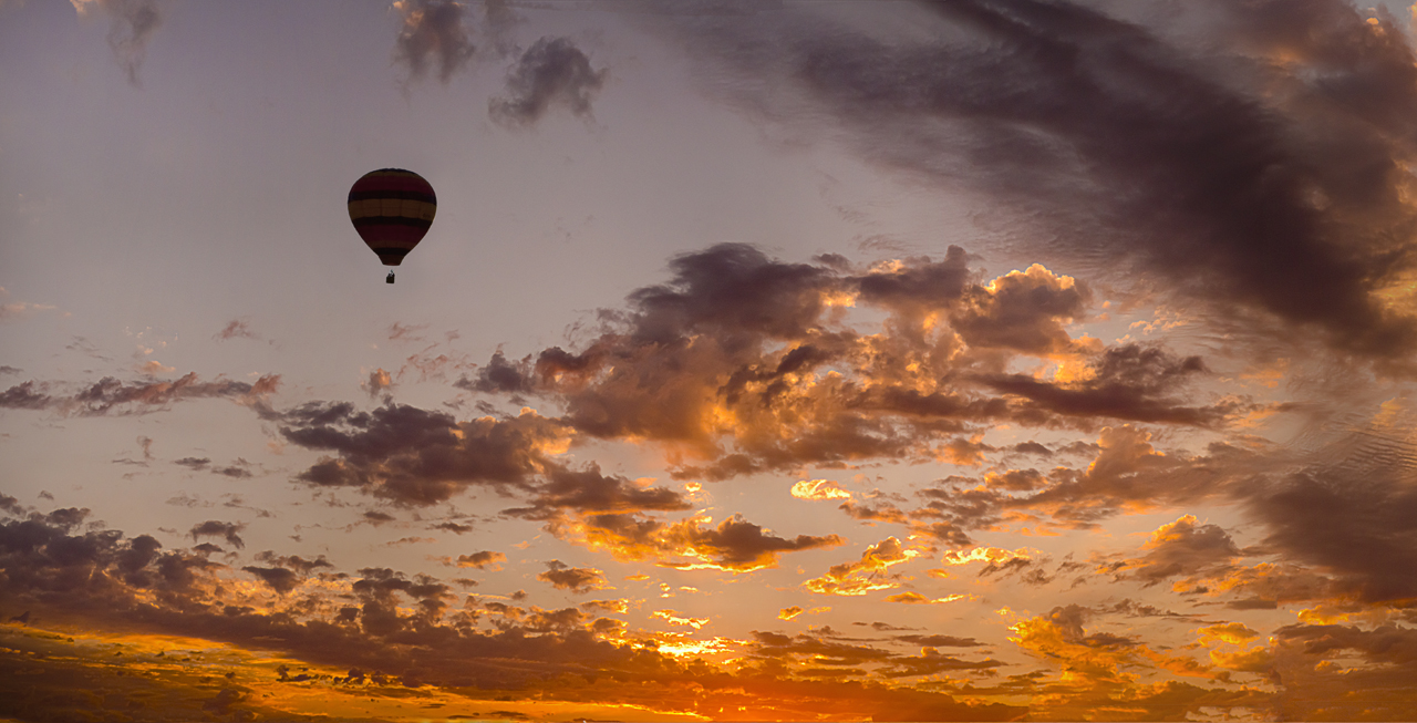
| 1 |
Apr 17 |
Comment |
I really like what you have come up with. The effects are perfect. At first, I wondered about the one going out of the frame at the top but I think it adds a little tension with it's position compared to the others. I might crop of the portion of the canoe showing on the left side. |
Apr 24th |
| 1 |
Apr 17 |
Comment |
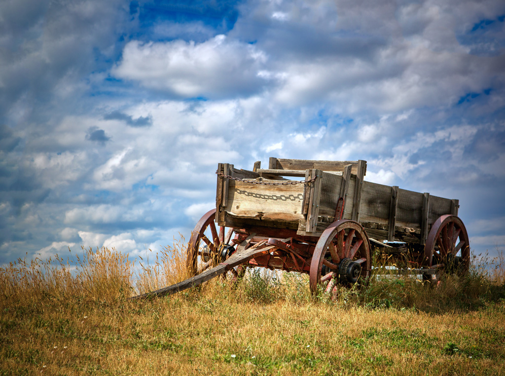
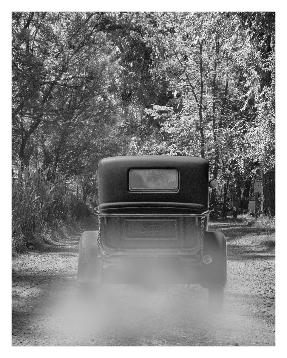
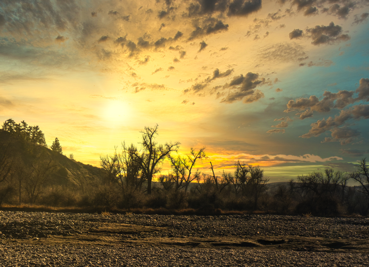
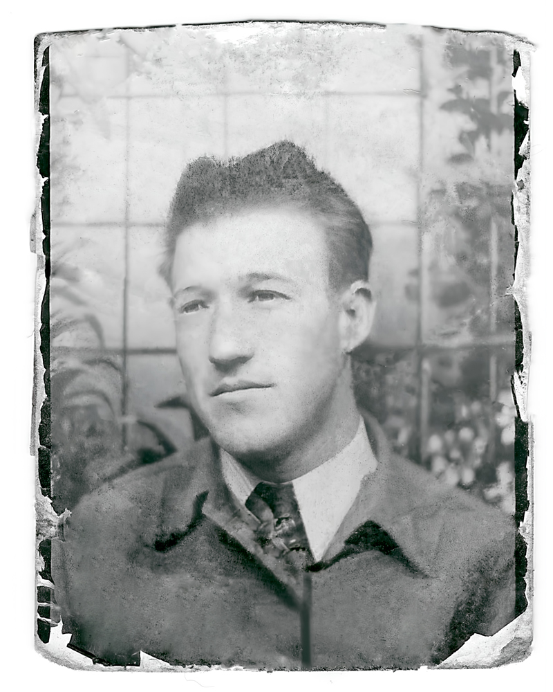
Like I told you in emails to you, I know exactly where this was taken since I would drive past it on my nightly trips for 15 years. I doubt that it is the final resting place. I have seen several vehicles parked in the same spot for a while and then they disappear.
The rusted areas and the paint compliment each other well. Since you told me you were there for a few days, you might have tried to get this at a different time beside high noon. You could have gotten some nice golden light later in the day even though you couldn't wait until sunset if you wanted to keep some light on the front of the car.
|
Apr 24th |
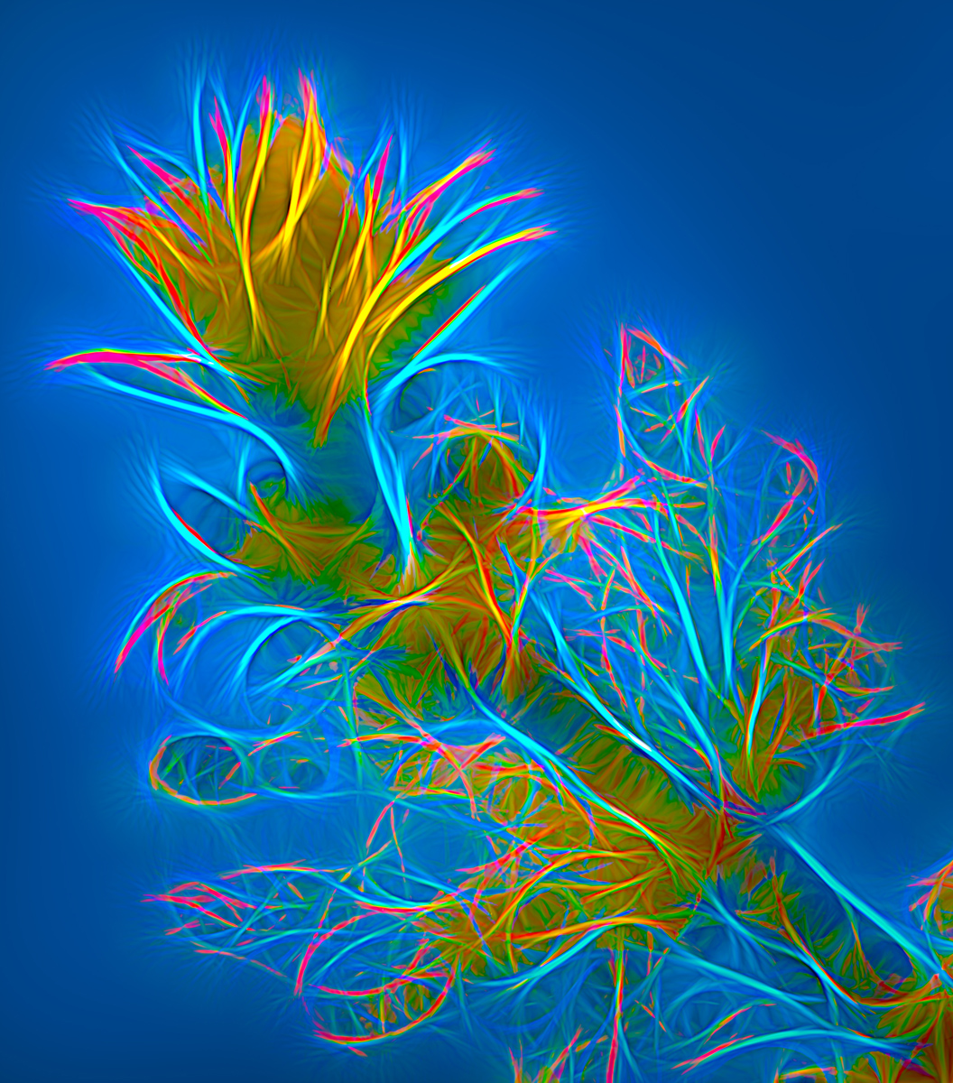
| 1 |
Apr 17 |
Comment |
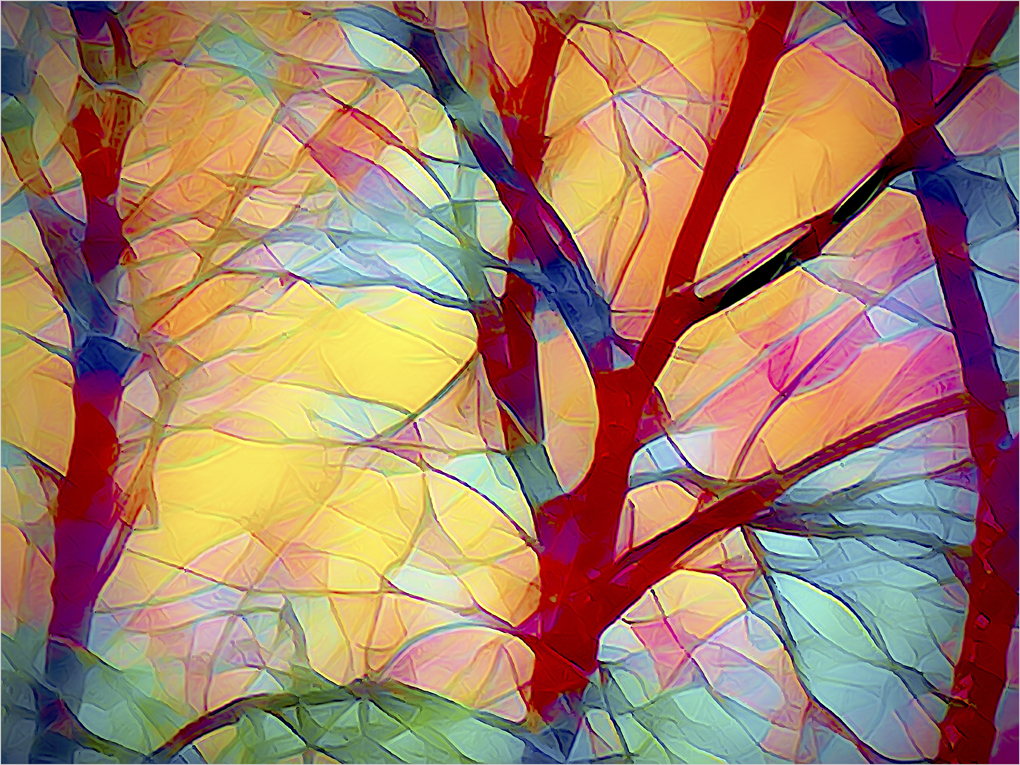
I do like the texture that you have applied but I am not sure if it works real well with this image. I would like to see more definition and sharpness in the trees. You don't say much about what you were trying to do with this or what you did to achieve it.
I try to avoid looking at the comments that have already been made and I forgot what I had said before. |
Apr 24th |
| 1 |
Apr 17 |
Comment |
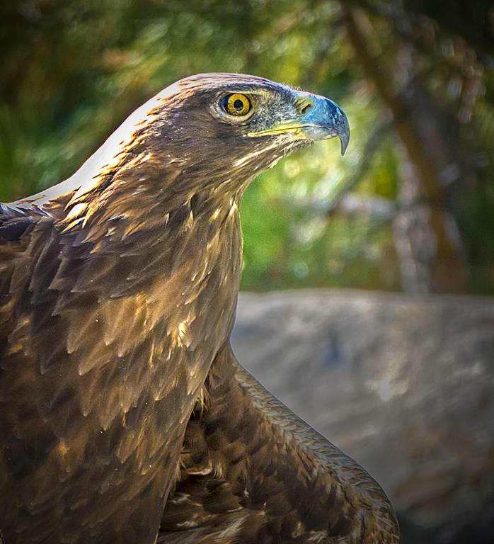
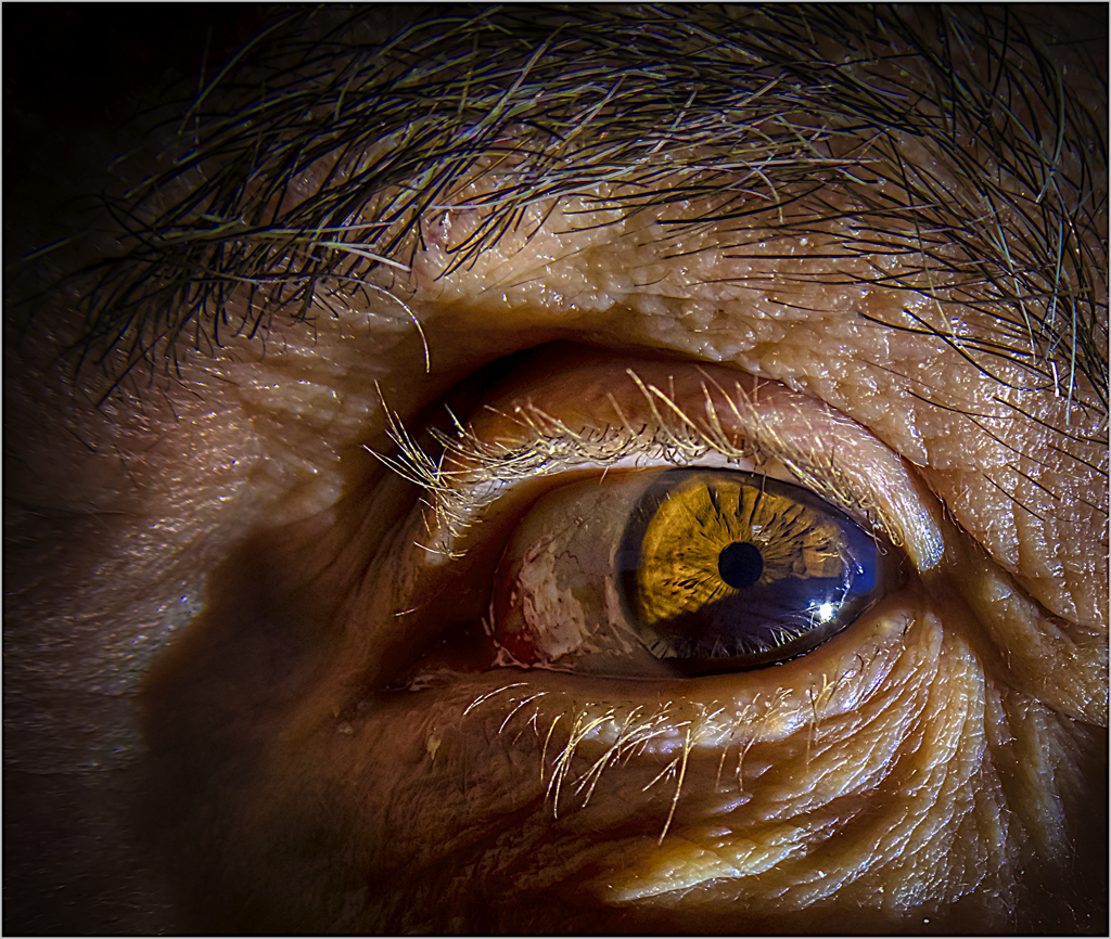
I really like this image. The back lighting while still retaining good detail in the shadow area of the face is great. I don't know if this really speaks "homeless" to me. It is a great character study. I would like to see a little more room for him to look into. |
Apr 24th |
 |
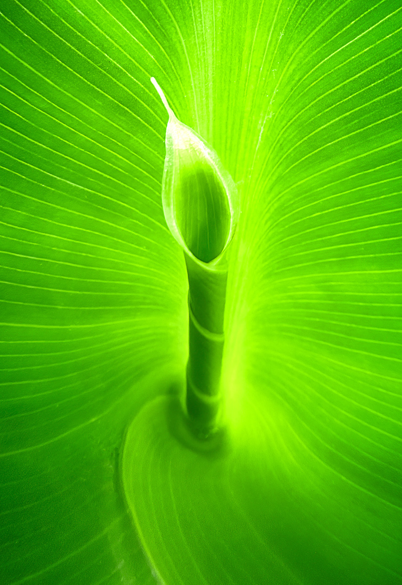
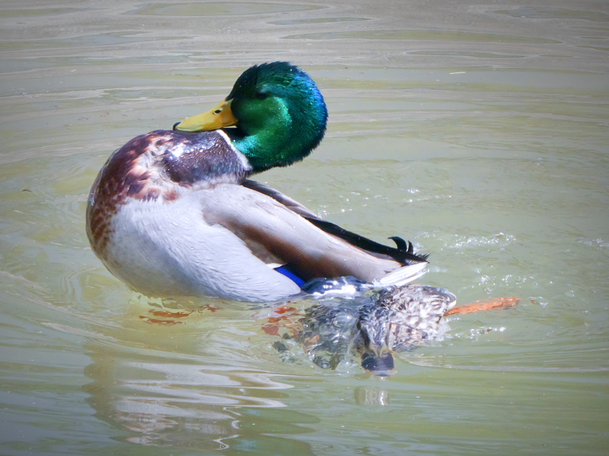
| 1 |
Apr 17 |
Comment |
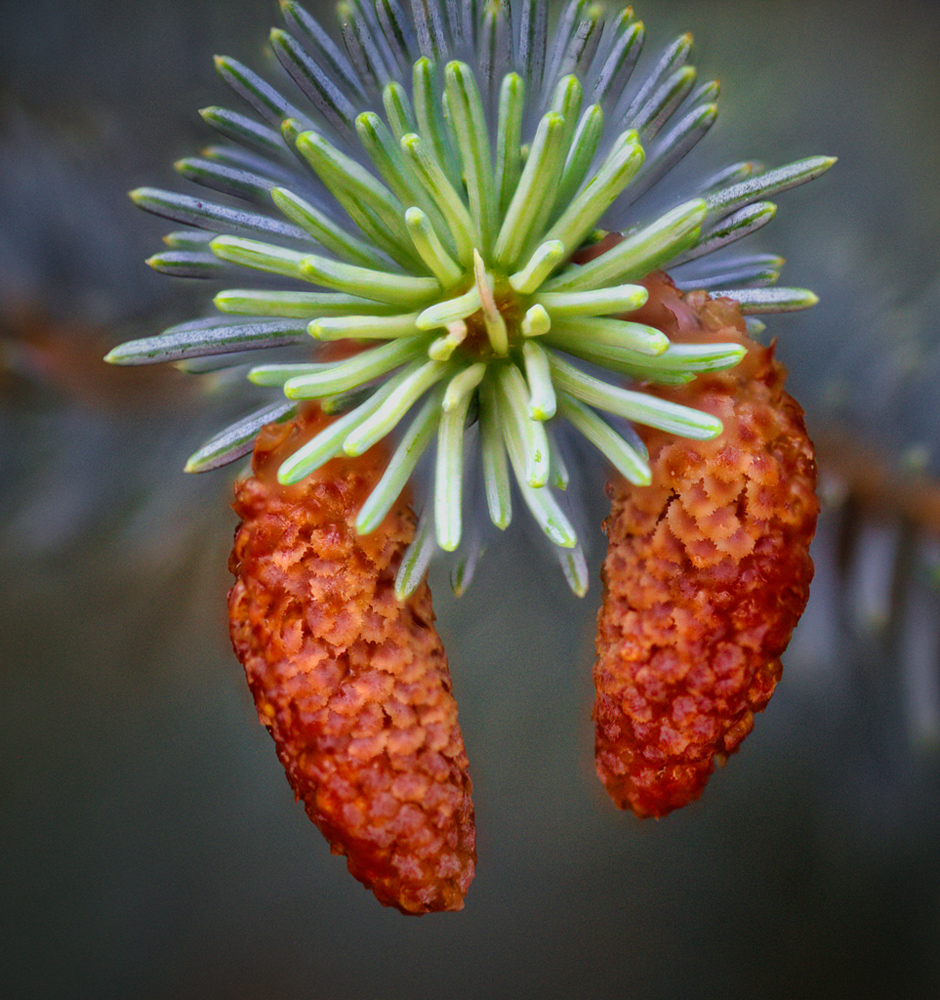
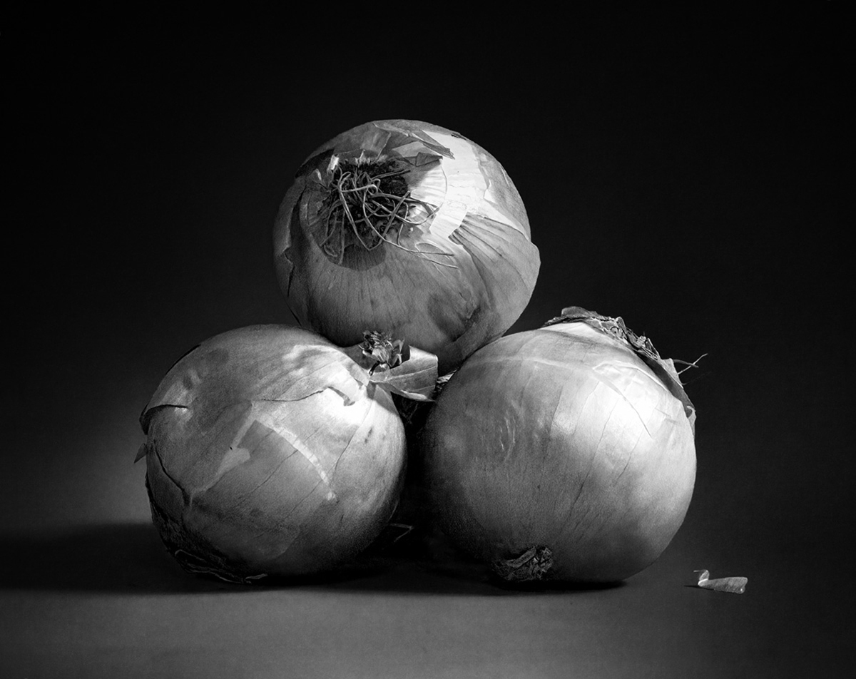
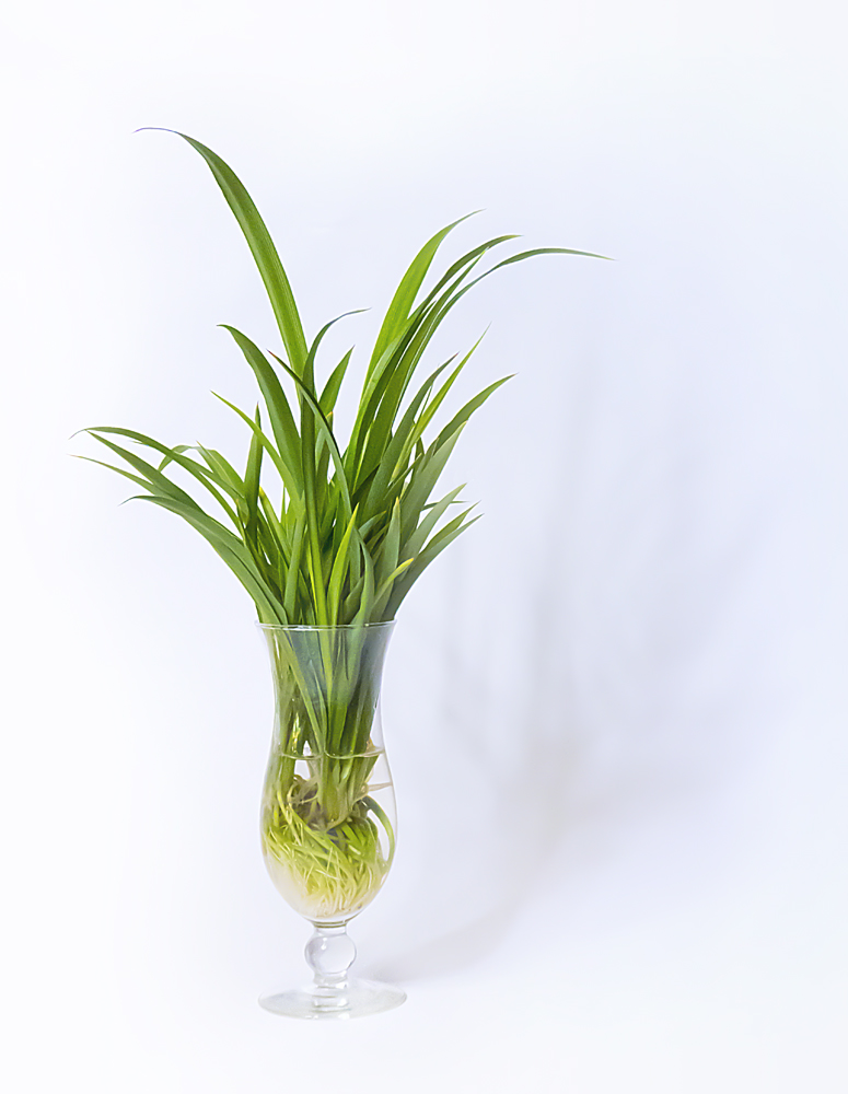
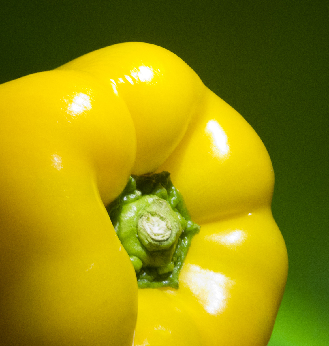
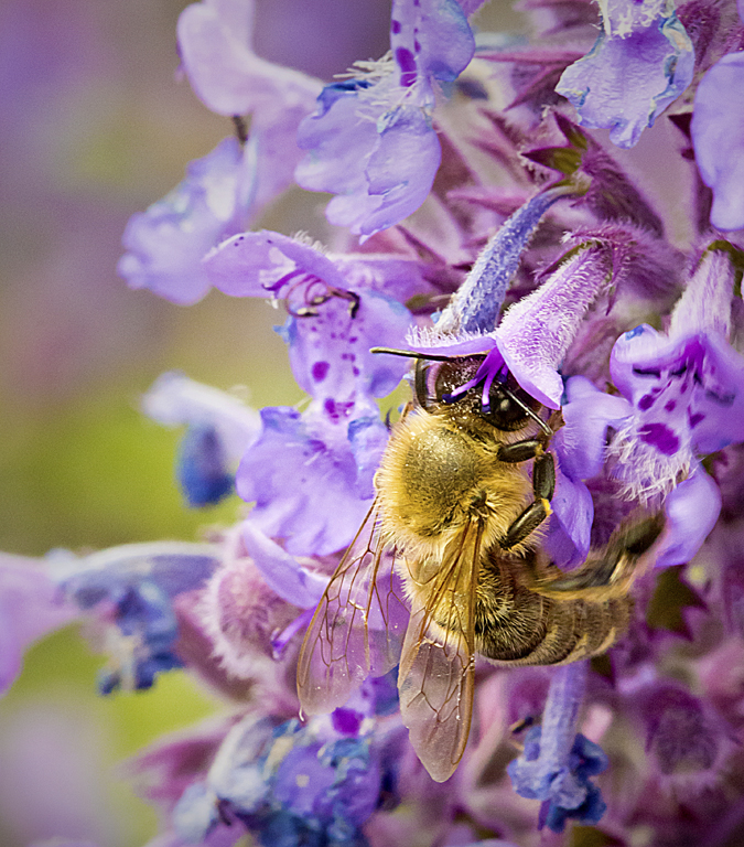
Very nice rose. It seems like I always end up with a rose that has some spots where it is starting to decay. I might have gone done a little more to try to increase the exposure with something like Levels or Curves. I notice that your aperture was set at f/7.1. You might have tried stopping down a stop or two to get more depth of field so the entire bloom would have been sharp. Something I like to do is spray some drops on flowers to make them even more dramatic. |
Apr 24th |
 |
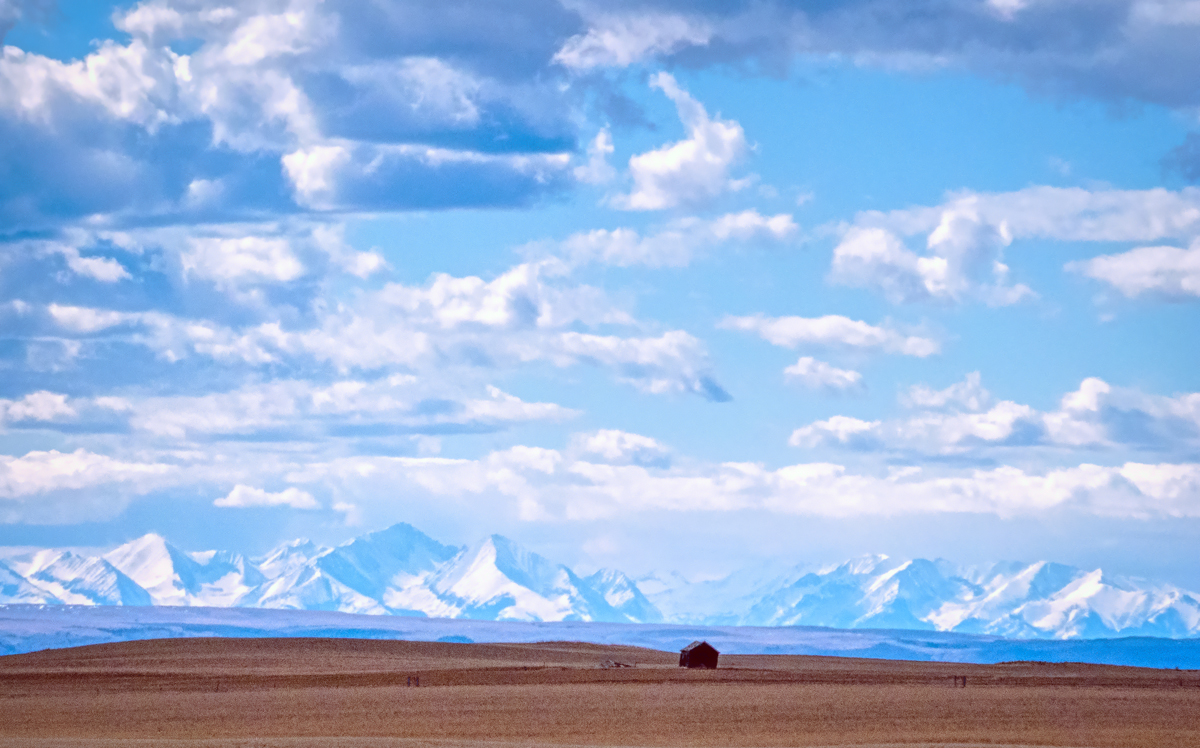
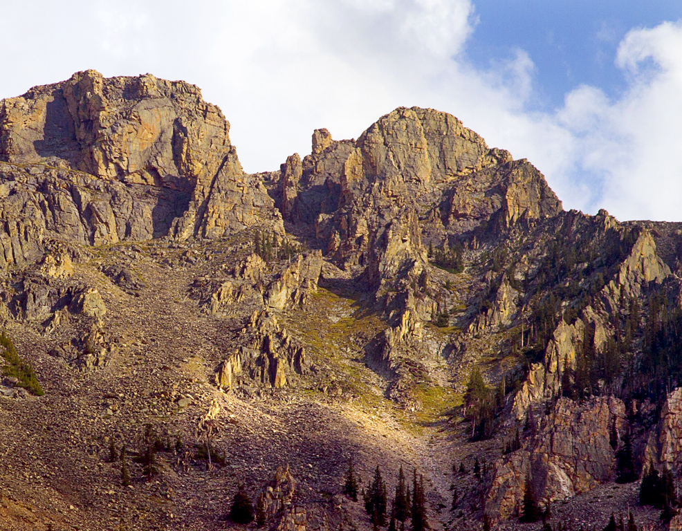
| 1 |
Apr 17 |
Comment |
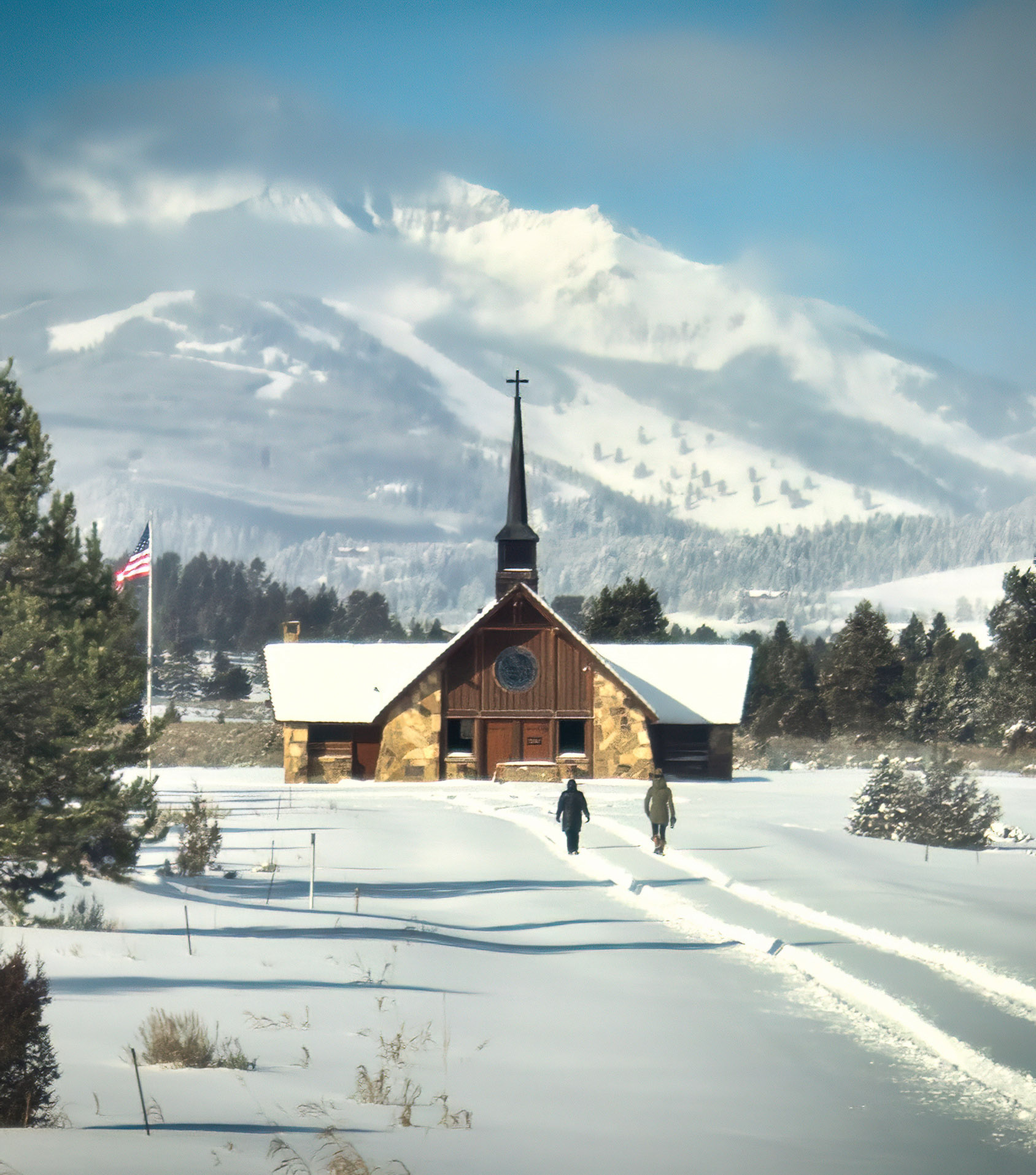
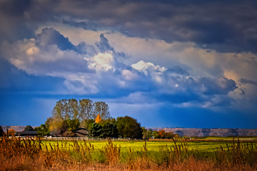
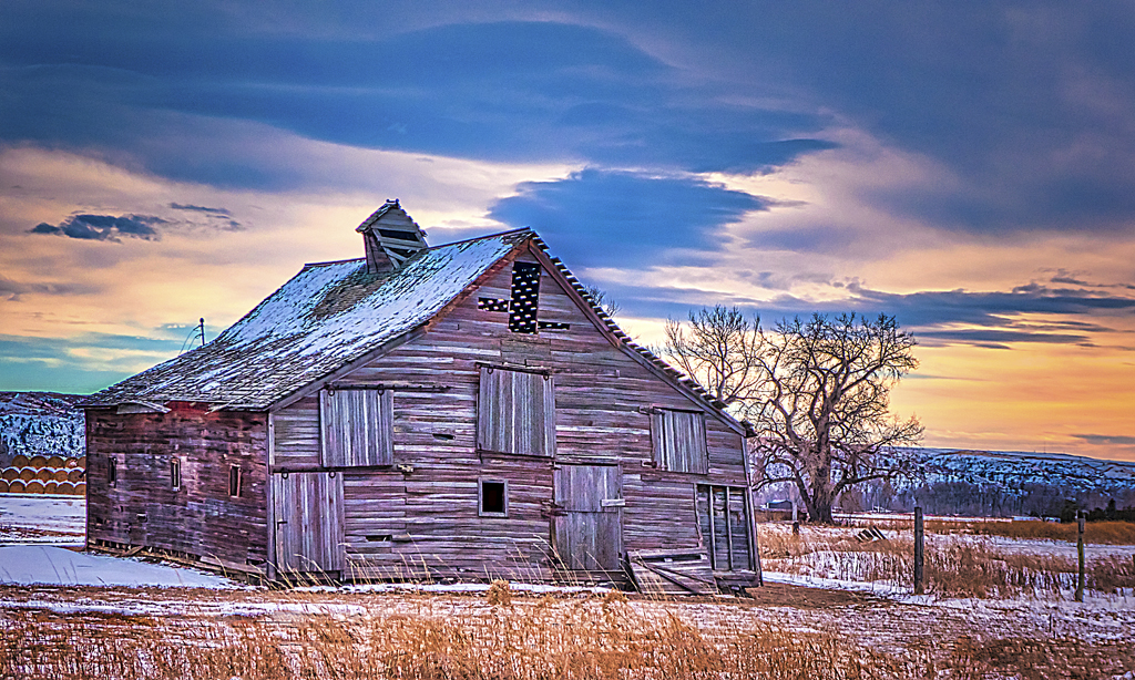
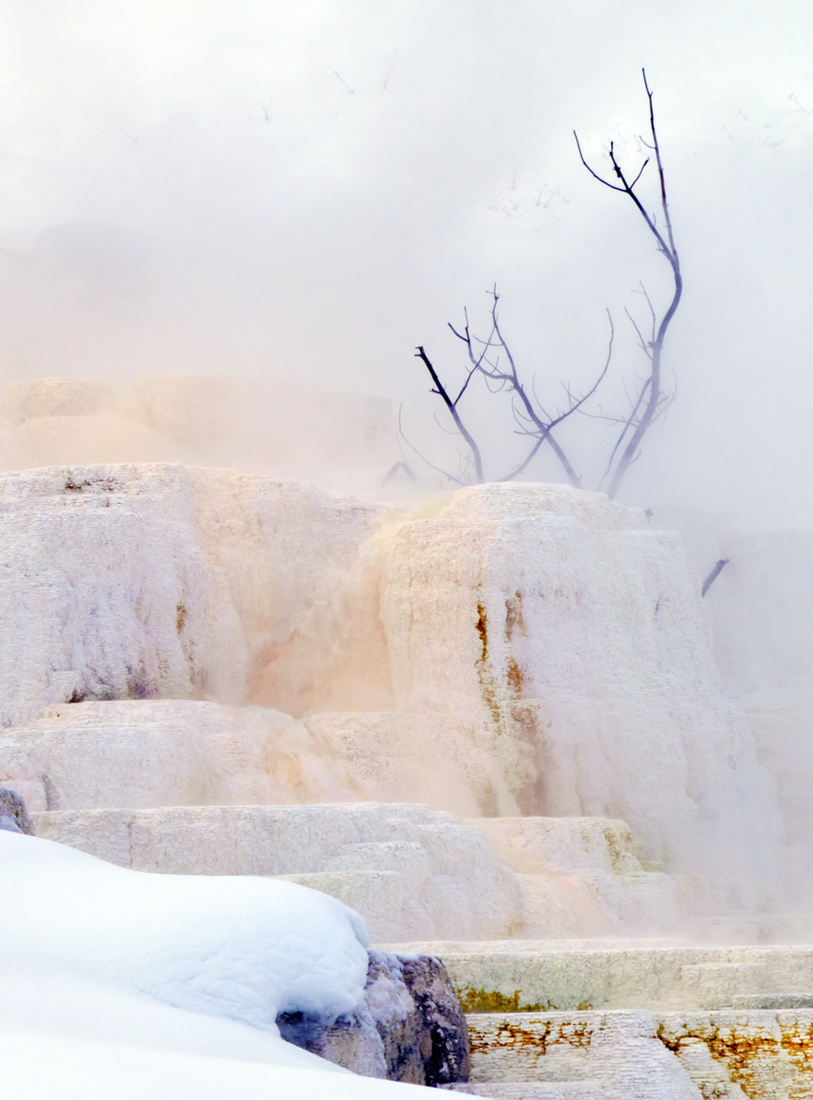
I have always liked old buildings. I think the warm color of the foreground and the building go well with the cool colors of the mountain. I do think I might have cropped off the foreground at the bottom to make this more of a square image. I don't think you need it to show the depth. It does seem that you have done some burning in on the mountain. It doesn't seem to blend in well on the right and down the tree on the left. |
Apr 24th |
| 1 |
Apr 17 |
Reply |
There probably is a slight vignette added. I usually do one that isn't really noticeable. I have an action set up that will add a mask to a vignetted copy and I can control the vignette on the mask. |
Apr 17th |
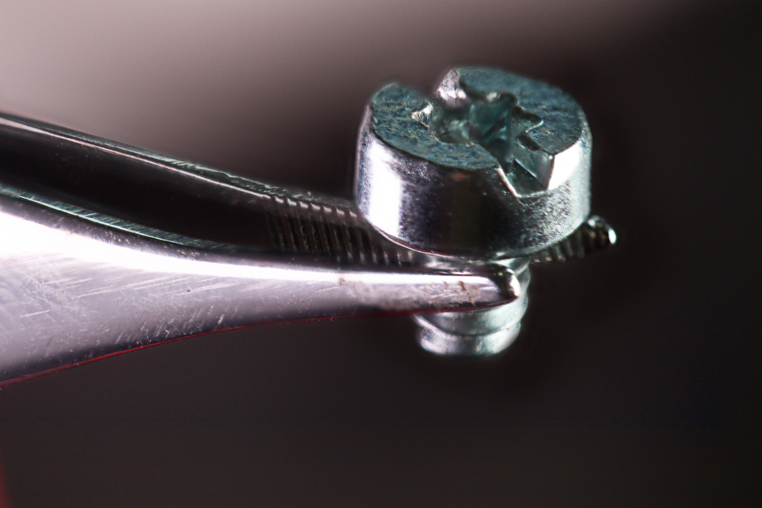
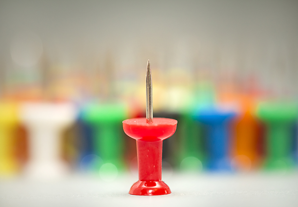
| 1 |
Apr 17 |
Reply |
The main tack is perpendicular or at least within 1/2 of a degree. I don't think that the background tacks were all on the straight line so that could make it look like it is leaning a little to the right. |
Apr 17th |
| 1 |
Apr 17 |
Reply |
There probably is a little vignette. I usually do add one but try to keep it unnoticeable. I have an action set up so it creates a layer mask on a vignetted copy and I can adjust the look of the vignette. |
Apr 17th |
| 1 |
Apr 17 |
Reply |
Actually this was at f/45.0 1/640 second ISO 3200. The lens was 70-200mm with the doubler it was zoomed to essentially 280mm. |
Apr 17th |
| 1 |
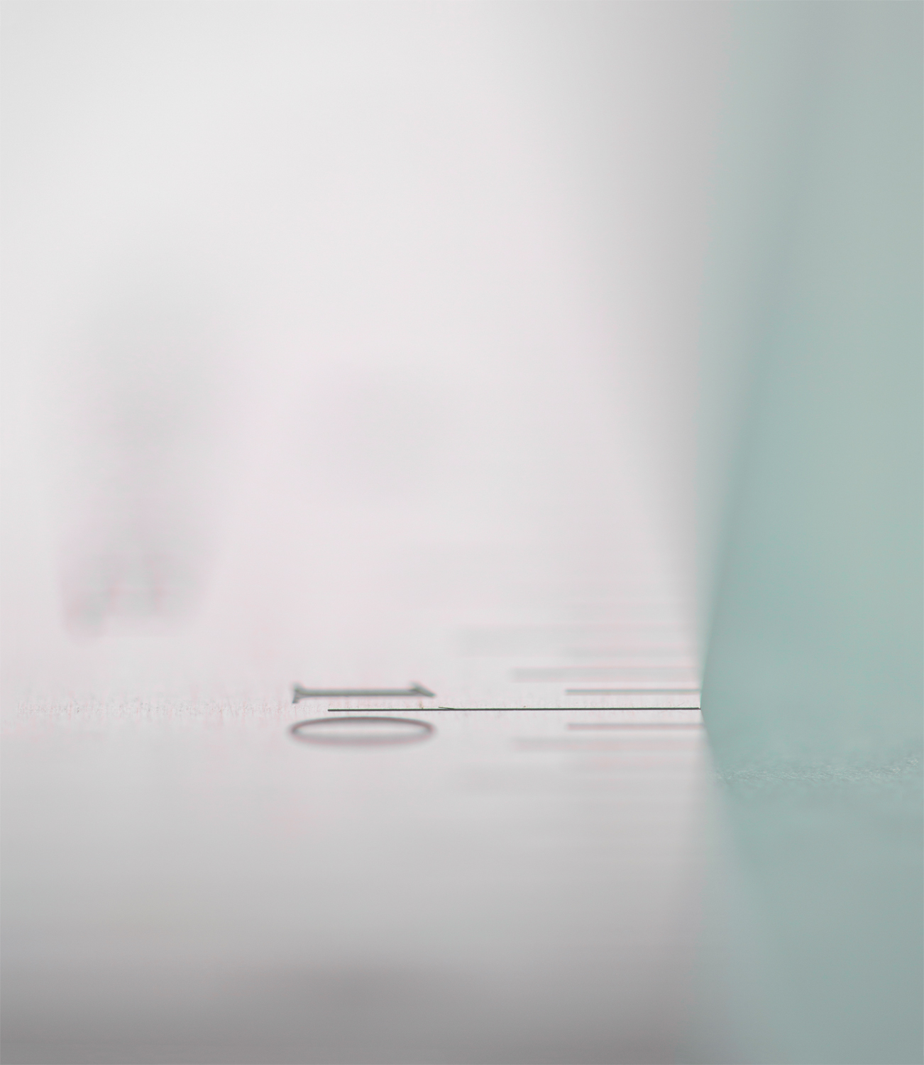
Apr 17 |
Reply |
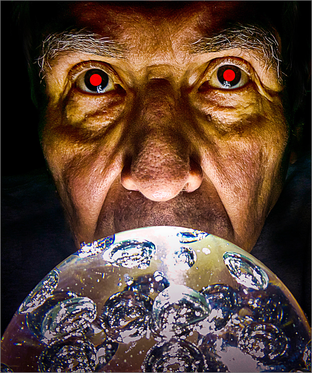
That might be something to consider, if I want to get my fingers pricked up again. I could possibly try it on a mirror with a black background.
|
Apr 11th |
6 comments - 5 replies for Group 1
|
6 comments - 5 replies Total
|