|
| Group |
Round |
C/R |
Comment |
Date |
Image |
| 25 |
Aug 21 |
Comment |
Very nice image! |
Aug 20th |
1 comment - 0 replies for Group 25
|
| 39 |
Aug 21 |
Comment |
Fine image |
Aug 20th |
1 comment - 0 replies for Group 39
|
| 47 |
Aug 21 |
Comment |
Very nice image, especially with some of the sky cropped as in alternative Stuart suggested. |
Aug 24th |
| 47 |
Aug 21 |
Comment |
Very nice and interesting image and with tonal varieties that help us see Monochrome possibilities. |
Aug 24th |
2 comments - 0 replies for Group 47
|
| 64 |
Aug 21 |
Reply |
This version works much better in my opinions. |
Aug 12th |
| 64 |
Aug 21 |
Comment |
I see the story and your attempt to tell it in unique way. However, the leaves seem more like "eye floaters" without much definition and so I think something is lost. Perhaps Stan hit on it by indicating a need to have more distinctive shapes in all the leaves. Tonally, the image works and it look cold and windy. |
Aug 12th |
| 64 |
Aug 21 |
Comment |
I like the image of the race car, but do not care for the heavily contrasting white streaks in the background. I think those need to be toned down. In the color version my focus on the car is not distracting, where in the monochrome version, those white streaks are distracting to my eyes. |
Aug 12th |
| 64 |
Aug 21 |
Comment |
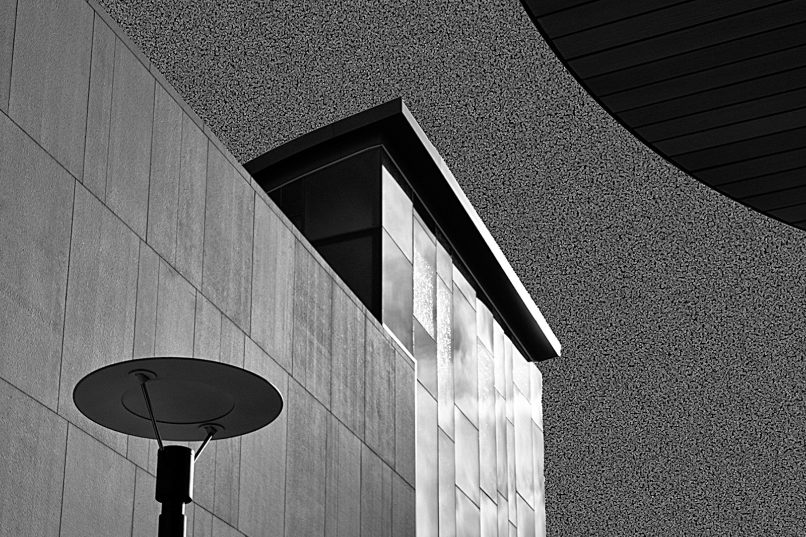
I like the interesting use of the pointillism in lieu of tones for the sky. At first, I wasn't sure about it. I like the image how it becomes of study of lines and curves even if it does keystone which is unusual for me. I thought, I would play with perspective to see what removing the keystone would be like just for comparison. It definitely changes the space relationships and not necessarily for the better. |
Aug 12th |
 |
| 64 |
Aug 21 |
Comment |
Stan, I like the image. The composition looks great and I wouldn't crop out part of the falls if it were mine. There is significant contrast and structure in the image in all the foliage which works on its own, but I wonder, if a slower shutter speed to give a softer look to the falls might enhance the contrast and distinction form the foliage and add to the "bridal" story. I like how the people are positioned and captured in the scene for supporting a story that is different from that of the falls without people in it. |
Aug 12th |
| 64 |
Aug 21 |
Comment |
Jerry, I think your black and white version is nicely done. The color version doesn't work as well for me as some of these types of images do so you selecting black and white and sharing it with us is a good choice. I agree that the leading lines of the base are important, just as you have described yourself. Until the scratches were mentioned, I didn't really notice them and, frankly, they are just another element of the rusting and decaying rail car so, that fit with the story and I see no reason to do anything with them. |
Aug 12th |
| 64 |
Aug 21 |
Comment |
Very nice detail, pose, composition and story. The tonality works well with nothing blown out or lost in shadows. The depth of field selected provides for a nice clear focus on the subject. |
Aug 12th |
| 64 |
Aug 21 |
Reply |
Thanks, Stan. I spent a week back in 2015 photographing the North Shore. I believe This is somewhere between Two Harbors and Silver Bay. Memory is not exact. I started in Superior, WI capturing water falls and others sights after driving up from my home in Milwaukee and stayed overnight in Duluth and then Staying a couple of nights in Silver Bay and then in Grand Portage a couple of days before heading back south. |
Aug 11th |
| 64 |
Aug 21 |
Reply |
Thanks, Stuart. Regarding the spots, I am not sure, it is too long ago that I took the image, but it was rainy and windy...but, not sure of the origin. |
Aug 7th |
6 comments - 3 replies for Group 64
|
10 comments - 3 replies Total
|