|
| Group |
Round |
C/R |
Comment |
Date |
Image |
| 9 |
Apr 20 |
Comment |
|
Apr 17th |
| 9 |
Apr 20 |
Comment |
My take is all the suggestions might be for images being submitted for exhibition or competition. However control of Highlights and overall tonality of the shadows with such a nice composition and pose can create a nice artful image. I like it with some adjustments and think it is quite nice. |
Apr 17th |
2 comments - 0 replies for Group 9
|
| 25 |
Apr 20 |
Comment |
Beautiful image with nice tone and balance between the foreground water and the enbankment and shops. Lovely and very nice prevention. |
Apr 18th |
| 25 |
Apr 20 |
Reply |
Nice image. I like your second post best with less rock and richer sky. Stay safe. Say hi to Phil. |
Apr 18th |
1 comment - 1 reply for Group 25
|
| 35 |
Apr 20 |
Reply |
Very nice IR image. I think darkening the foreground was the correct thing to do. I think the slightly left of center tree leaves a little hot, but not a big deal. It is overall a very nice image. |
Apr 18th |
0 comments - 1 reply for Group 35
|
| 39 |
Apr 20 |
Comment |
I like the impressionistic quality of the image and the wonderful tonal range and soft lighting. While I want to see the top of the tree in the reflection, I find the foreground grasses a little distracting. Beautiful image. |
Apr 18th |
1 comment - 0 replies for Group 39
|
| 40 |
Apr 20 |
Comment |
Andrew, you image captures the grand expansiveness of this magnificent building. It truly pops of the page and makes me feel present at this place. Let offer these suggestions. I think it would have been nicer to have a little more room on the left almost equaling the right side. I use Lightroom primarily for lens and perspective adjustment. For me, it is extremely close, but the distortion is noticeable and with some adjustment could make the horizontal base a little truer and the verticals toward the center a little straighter. |
Apr 8th |
1 comment - 0 replies for Group 40
|
| 50 |
Apr 20 |
Comment |
Well done. I like what you did. If I had any comment at all in the way of change, it to add a little more curve adjustment. Really nice regardless. |
Apr 18th |
1 comment - 0 replies for Group 50
|
| 52 |
Apr 20 |
Reply |
Beats me what it is. Thanks |
Apr 16th |
| 52 |
Apr 20 |
Comment |
Mike, as always a dandy. I think the processing you did after the exception capture is very nice. My only nit, is I like the color harmony and light in the original better then the final, but that is just a matter of taste. In the original I really like the backlight effect on the feathers that make it even more translucent compared to the final which is pinker within the edge feathers. Nice job. |
Apr 14th |
| 52 |
Apr 20 |
Comment |
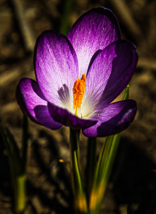
Judith, I like the focus on the flower, color harmony, and depth of field is nice. I agree with Pamela about focus stacking being a way to get the image sharp, but it also has to do with the lens being used and overall focus length compared to aperture. I often get good results with smaller aperture, macro and with a fully extended zoom to blur the background. I actually find some softness a good think for artistic effect...but that is an aside thought. I really feel your image can be helped some in the way, Mike suggests, however, I think he went too far in darkening the background, but it gets the idea. The crop though makes sense. Your final image has too much negative space that doesn't, in my opinion, enhance the flower. I have some thoughts with an example. Using Lightroom, I crop, and do a bunch of selective dodging and burnin and then when I opened up some of the light on the flower. It was very hard to share with such a small image my visual feedback....I think you could have posted a bigger image..., but, here it is. |
Apr 14th |
 |
| 52 |
Apr 20 |
Comment |
Tom, This is a nice alternative to the original image with wonderful color. I have to agree with Mike that it might over sharpened, but that doesn't bother me particularly. Within the features, it looks super. But the fish and beak doesn't work for me as much. I think what you might be trying to adjust for is that the fish doesn't seem to be sharp enough while the head of the bird is very focused. I argue with myself sometimes about cropping to get detail I want only to find it takes excessive work to get something sharp that was not enough in focus. Thus, in my opinion, the original works much better for me, plus in my opinion is more interesting. |
Apr 14th |
| 52 |
Apr 20 |
Comment |
Lisa, I like your comment about nature. I also like the color of the bark of the tree. However, that is about where I have to step back and I really need to share with you one of the first things I learned in the the Professional Photography course I took at New York Institute of photography years ago. In Lesson One - Eye of the Photographer, the first think I learned was (1) A Good Photograh has a clear subject, (2) A Good Photograph focuses attention on the subject, and (3) a Good Photography Simplifies. In short have clear and simple subject that the eye is drawn to and minimize clutter. My instructor hounded me into submission on that subject and while I still get too much in an image sometime especially if I am telling an expansive story, it is still the cardinal rule of photography. Successful photographs also allow the viewer to be led into the image and find the subject even if it is the entire scene. My instructor told me repeatedly don't let the viewer have to figure it out; help him or her find it. This is true for all genres of photography even abstracts.
Thus, I think how you compose this tree must keep that in mind. |
Apr 14th |
| 52 |
Apr 20 |
Comment |
There is a dramatic sense of motion, Pamela, that I like a lot in how you captured these creatures. I like the image for its composition, sharpness, tones and color of the nettles, but find the blue a bit too intense for my taste. |
Apr 14th |
| 52 |
Apr 20 |
Comment |
Sharon, you image has wonderful painterly feel. Depth of field is very nice and over all dynamic range is quite good. I classic HDR look but not overdone. I agree with the need to tone down the bush on the left of the frame. You crop choice is interesting and quite nice as an alternative. With that said, I actually like the original with the rocks in the foreground works very nicely for me, although cropping off the top of the frame is an enhancer. |
Apr 14th |
6 comments - 1 reply for Group 52
|
| 64 |
Apr 20 |
Reply |
Jerry, I sent an email to all members to see this a perspective of Horseshoe Bend that not commonly seen. |
Apr 26th |
| 64 |
Apr 20 |
Reply |
Smile! |
Apr 10th |
| 64 |
Apr 20 |
Reply |
Stuart, that is a nice alternative...a picture within a picture. I like both this suggestion and my original mono. It is always nice to get more than one image from an image capture. |
Apr 10th |
| 64 |
Apr 20 |
Comment |
Stan, I like the image. It is sharp, balanced contrast and pleasing amount of light on the eye to draw me in.
I will take the bait and say, that in my opinion, the very fact that there are such distinctive and contrasting patterns on this very colorful wood duck, is perhaps the reason it works so nicely in monochrome and I would guess it is driven by the quality and angle of the light. That is the most important reason why a monochrome conversion works. For me it is almost always about the quality and angle of the light and the relationship it has as it plays out on tones, patterns and how the light works on the color. Sometimes, it does work and sometimes it doesn't. Your background with the duck also helps a lot to make it pop.
In the case of the sandhill, I actually think lightening the background could work a little bit or some selective adjustments to the bird's right wing underside so that it sets off more from the background will make that image pop more. However, it almost works for me as is for there is fairly good separation from the background. |
Apr 10th |
| 64 |
Apr 20 |
Comment |
Abhijeet, this is a wonderful image with a lot of impact for me. Wow, as I follow your work, I find you are really becoming very, very good at light source management to create effects. Well done. In this one, I would not change anything unless you were seeking a different emotive effect. Again, well done. |
Apr 10th |
| 64 |
Apr 20 |
Reply |
Stan, who is Don Charbonnet. I couldn't find him on the internet. What is his speciality and why did you refer to him. |
Apr 10th |
| 64 |
Apr 20 |
Reply |
Stuart, thanks for the resource you mention of Gary Freidman. I will become more familiar with his work, videos and seminars. I don't do flash very often and I looks like he will be a good resource for learning that during this current lockdown situation. |
Apr 10th |
| 64 |
Apr 20 |
Comment |
I like your image considerably. The composition and position of the bird is very interesting and the textures of the bird are quite nice. The original color is quite nice although the background could be darkened some. However, I wonder, why you darkened the background as much as you did. I actually found the dark background in this case distracting. I believe lightening it a little would work and still give you the the natural separation you already garnered with the depth of field selected. Perhaps, one of the reasons I think that is that the beak of the bird becomes lost, in my eye's viewing, with the background in the mono version. It is a case where to much dark sometimes doesn't work for me as much for some subjects. |
Apr 10th |
| 64 |
Apr 20 |
Reply |
I saw the webinar and interestingly enough have done that with some my bird photography in the past but got a lot of further tips from her. It was an excellent hour long presentation. Unfortunately, in this case, the greater amount of contrast absolutely doesn't work for me. I don't think it needs to become such intense and grainy to tell the story. One of the enhancing elements of the scene is the lower right balcony of one of the houses where a woman is hanging out or bringing in laundry is lost and become muddy. |
Apr 10th |
| 64 |
Apr 20 |
Reply |
I was watching a webinar yesterday on high key image making and this is a case where I think trying to convert it after the fact in post doesn't work very well, in my opinion. I was more of a fan of just darkening the right side exterior and lightening the two men a little as more of way to draw our eye to the chess players. |
Apr 10th |
| 64 |
Apr 20 |
Comment |
I like the idea for the story and the overall focus of the chess players. The exposure looks good and the depth of field works. I think darkening very slightly the exterior area to the right might be an improvement, because my eye gets drawn that way a little bit. I also think lightening the two men a touch will help draw my eye to them and then crop as discussion has shown in later variations to the end of their table. I like the space between the man waiting on the right and the edge of the frame in the original so the cropped versions in that respect doesn't work as well for me. |
Apr 10th |
| 64 |
Apr 20 |
Comment |
Wow! Thanks for the fine image and excellent information about how you captured the scene so nicely. My only desire would be to see the river at the bottom. I just love the rain and effect of the light. |
Apr 9th |
| 64 |
Apr 20 |
Comment |
Don, I like the image. I believe I see a lot of detail, with shadows, in my opinion, sufficiently open and I like the patterns, tonality, contrast. My only comment is I am not sure of what am looking at. Does that make a difference, perhaps it doesn't and yet the tonal elements, texture and pattern with such knowledge would help me understand. Furthermore, how did you do it? As described your tool was the camera with the exif data you offer. My question is, how did you do, what was the situation, the lighting, what is it and where is it, did you use post processing, as I suspect, and so what was used or is that what you got with your camera? I want to learn more and understand especially if you did all of this with camera. |
Apr 9th |
| 64 |
Apr 20 |
Reply |
Thanks for your thoughts. |
Apr 9th |
| 64 |
Apr 20 |
Reply |
The original out of camera RAW was pretty flat given the quality of the light on this overcast with intermittent rain. My artistic choice was to significantly punch up the color. The Monochrome version actually is a little closer to the original in terms of sky and clouds although a very much different image. |
Apr 9th |
| 64 |
Apr 20 |
Reply |
That is always a challenge, I find, when striving for a higher key look. I didn't care for the more contrasting, but it is one of the options I created. |
Apr 9th |
| 64 |
Apr 20 |
Reply |
It is certainly an option for a more contrasty look. I just want bit higher key. |
Apr 9th |
6 comments - 11 replies for Group 64
|
| 66 |
Apr 20 |
Comment |
Wonderful! I really like your tonality and composition. |
Apr 18th |
1 comment - 0 replies for Group 66
|
| 80 |
Apr 20 |
Comment |
I like the image, Ed. The tonal range and content is pleasing and I have wonderful sense of place and feel for the scene with the inclusion of all the elements within the image.
BTW, I think Victor's comment gives you interesting two-for-one option to crop out the area below the foreground table top. That is an interesting option, perhaps. |
Apr 20th |
1 comment - 0 replies for Group 80
|
| 82 |
Apr 20 |
Comment |
Very neat moment. Well seen and captured. What a wonderful contrast of image elements for a fine story. |
Apr 20th |
1 comment - 0 replies for Group 82
|
21 comments - 14 replies Total
|


