|
| Group |
Round |
C/R |
Comment |
Date |
Image |
| 4 |
Feb 20 |
Comment |
Very nice image. The red pick-up truck balances the image wonderfully as a nice enhance element. |
Feb 17th |
1 comment - 0 replies for Group 4
|
| 5 |
Feb 20 |
Comment |
Powerful image, Barbara. Well conceived and executed. |
Feb 17th |
1 comment - 0 replies for Group 5
|
| 6 |
Feb 20 |
Comment |
Stuart, I like your subject. My only comment is that if the background was blurred more, it would make those flowers pop out a lot more. |
Feb 17th |
1 comment - 0 replies for Group 6
|
| 7 |
Feb 20 |
Comment |
Wonderful image. I find it so nicely composed and sharp. |
Feb 17th |
1 comment - 0 replies for Group 7
|
| 11 |
Feb 20 |
Comment |
Nicely done. I agree with the adjustment of the midtowns to get a little more detail of the persons at the desk. |
Feb 17th |
1 comment - 0 replies for Group 11
|
| 31 |
Feb 20 |
Comment |
Wonderful tonality and composition. |
Feb 17th |
1 comment - 0 replies for Group 31
|
| 52 |
Feb 20 |
Reply |
I may check it out. Thanks. |
Feb 18th |
| 52 |
Feb 20 |
Comment |
Thanks, everyone for your comments much appreciated. |
Feb 18th |
| 52 |
Feb 20 |
Comment |
I like the image very much, Mike. Well done capture and the edit is nice. My only nit is the pinkish red halo on one of the bird's legs. |
Feb 16th |
| 52 |
Feb 20 |
Comment |
I like the image, Judith. I feel you have captured it well in the original and I see the detail of the snow on the pod and the depth of field and tonality works. You primary image presented for review, though, seems to have lost something in the crop. For me, it is too tight. I suggest a different drop and add some tonal control to the background to balance the light and darks so that they compliment and not compete with your subject to the point of distraction. I would show you what I am thinking, but it was hard to edit the very some file 1024 x 768 file. Our size limitation in the Study Groups makes some visual examples hard to achieve and present. |
Feb 16th |
| 52 |
Feb 20 |
Comment |
Well captured, Tom. The color details in the fish are splendid! The overal color harmony and sharpness of the image, I believe, are excellent. The water motion adds a really nice dynamism to the image. I like the bit of reflection that adds context. The crop works for me, but you could experiment depending on your original get the mouth and fish out of the center. Very nice image. |
Feb 15th |
| 52 |
Feb 20 |
Comment |
Lisa, you have a lovely image here. I like the composition and unique angle of view and perspective. The color and noise is managed well. Butterflies are challenging. I can argue that the closest wing is out of focus and thus should be totally sharp or I can argue it is moving and making the creature seem more dynamic. However, I like as it is. |
Feb 13th |
| 52 |
Feb 20 |
Comment |
Pamela, you have shared a fine view for us to enjoy and feel the story of winter. I would love to this in all the seasons. What a variety we would see. The water is lovely with excellent exposure and speed. The composition is beautiful and very natural. Your white is really well achieved. Excellent image. |
Feb 13th |
| 52 |
Feb 20 |
Comment |
Sharon, I believe this image truly lovely. You captured the moment with very nice light exposed very well and fine depth of field and excellent color harmony. The bird looks natural and I believe changing color and look is less natural. In my opinion it is just how it needs to be. |
Feb 13th |
7 comments - 1 reply for Group 52
|
| 64 |
Feb 20 |
Comment |
Jerry, I like the scene and your alternate image enhances all that I felt regarding the contrast and tone of the house in relationship to the tree. That is nicely done. I believe, similar to Stan, that the composition doesn't quite work for me. The house needs more space from the edge of the frame on the right. |
Feb 10th |
| 64 |
Feb 20 |
Comment |
Stuart, I think lighting and tone is fine along with clarity and sharpness of the subject. That is well done. However, I find the composition (angularity, tilt of lines in relation to the tilt of the head) unsettling. I have looked at the image quite bit and still just can't quite get past feeling like I have to tilt my head to appreciate the model and that is disconcerting. Just not my personal taste. |
Feb 10th |
| 64 |
Feb 20 |
Comment |
Ahbijeet, I like your image for the story. Tonality works for me. I will echo what Stan says, I think these birds if cropped differently will make the image stronger. I believe cropping a tiny bit on the right and a lot on the left will enhance how we see a relate to the duel. |
Feb 10th |
| 64 |
Feb 20 |
Comment |
Stan, this is cool. I looks like a vintage piece. The only thought is the processing choice to give it the vintage look doesn't quite follow the modern feel of the sculpture. But, that is a very, very minor thought. For me, it is a well done presentation of your vision. |
Feb 10th |
| 64 |
Feb 20 |
Comment |
Jerry, I am of the same opinion as Stan, that the original and the mono don't seem to be the same image. Nonetheless, I really like the monochrome version. I like the overall tonality and depth of field for the image is clear and sharp throughout. I agree a bit more contrast could enhance it (for me, in the middle ground of the scene) and I also see a slight halo on the edges of the Buttes that, I think, that are a distraction. Overall, a very nice scene. |
Feb 10th |
| 64 |
Feb 20 |
Comment |
Don, I like the subject and also like how you chose to frame it. I think the only thing that doesn't quite work for me is the tones in the trees and their edges which, for me, are a bit distracting. Tonal separation of some form, might be the solution.
BTW, using a Powershot, when in the able hands of a photographic artist can just as effectively get the job done. While the more advance camera (i.e., serious camera as you say) might give you more tools, it is how you use what you have that shows capabilities. Well done. |
Feb 10th |
| 64 |
Feb 20 |
Comment |
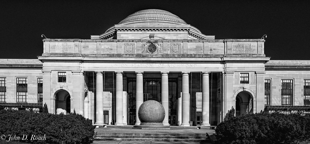
While I still like the out of camera jpeg as defined in the description, I decided to take the RAW image and tweak in a different direction it with DxO Nik Silver Efex Pro and Lightroom. I removed the hot spot on the globe and selected adjustments to tone down the white some and make the building stand out from the background even more. Thanks, everyone, for the thoughts you have shared. |
Feb 10th |
 |
7 comments - 0 replies for Group 64
|
20 comments - 1 reply Total
|


