|
| Group |
Round |
C/R |
Comment |
Date |
Image |
| 52 |
Jan 20 |
Comment |
Excellent. The angle of view, behavior, light, color harmony are wonderful. I can offer no suggestions. Well done. |
Jan 15th |
| 52 |
Jan 20 |
Comment |
Judith, I applaud your effort. However, the cloning action left artifacts that distract from the story. The foreground bird definitely is proving some really nice behavior and is well worth the capture, however, it works in a different composition and when you can isolate the bird and his side kick better from the rest. The comments of other are on target. The background is the culprit here because there is no way to make very compelling crop and clean out distractions. Sharon's suggestions are right on target. Keep at, do many successive frames, shift angle of view and create even shallower depth of field in order to begin to see alternatives that will work when you have the chance next time. |
Jan 15th |
| 52 |
Jan 20 |
Comment |
Wonderful image, Tom. The composition, color, tone, moment of capture, depth of field, sharpness and overall presentation is very nice. I agree with the lightening the one leg a little. Fine job. |
Jan 15th |
| 52 |
Jan 20 |
Reply |
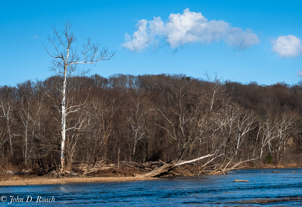
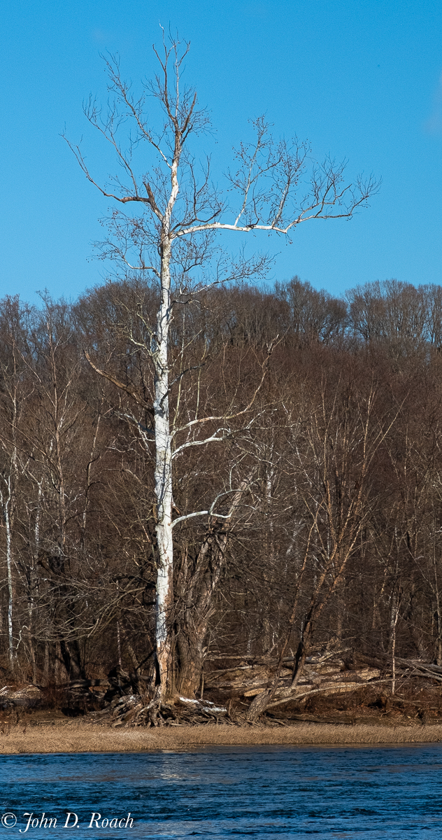
The birch tree is the star. Thanks for noticing that because of your eye and interest in photographing birch trees. |
Jan 15th |
| 52 |
Jan 20 |
Comment |
Lisa, your image has wonderful color harmony and is sharp. I agree a vertical or square or some other aspect ration other than landscape will enhance the viewing experience tell the story. These types of image, while very pretty, tend to be more compelling if the aspect ratio can focus how the viewer looks at the scene and focuses in on what will excite the viewer. Sometimes too much scene without layers of elements within the scene can lead my eye to wonder what it is I should be looking at. I am often challenged in landscape of how to make it more than a pretty scene and for it to be compelling and interesting. Your vertical version helps me to see more succinctly and then I feel like I am led through the image very nice. |
Jan 15th |
| 52 |
Jan 20 |
Comment |
Pamela, welcome to our study group. I think you have a very strong story and composition with your image submission. The depth of field, color harmony, focus and overall tonality of the subjects is wonderful. I find the background while having a nice bokeh, a bit too bright for my tastes. Toning that that down would enhance the image greatly. Perhaps using a masking process or do selective burning to keep that background from being a distraction. |
Jan 15th |
| 52 |
Jan 20 |
Comment |
That look much better. Printing it will tell the entire story about if it works. |
Jan 12th |
| 52 |
Jan 20 |
Comment |
Sharon, the depth of field, composition and perspective is excellent. I really like the foreground, mid section for tonal quality, texture and overall balance, I think the image starts to have issues as my eye moves to and beyond the brightest tree on the left where there is convergence. It seems to be too bright and the sky and trees do not blend well. If you can do some selective toning you might be able to get back some structure and darken what is too bright.
As a side note, I have found that good color is not always needed to create a quality monochrome. In my opinion it is much more about shadows, quality, contrast, structure and angle of light. Sometimes that can be the case in a so so color image that will turn into a dramatic Monochrome.
In any case, your image is wonderful if that distant portion is enhanced.
|
Jan 11th |
| 52 |
Jan 20 |
Reply |
|
Jan 10th |
 |
| 52 |
Jan 20 |
Reply |
Thanks for your thoughts, Mike. My vision was less about the water, but here is one with all the water I caught in the original frame. It works, but, in my opinion, I am not sure the added water makes much difference, if the focus on the trees along the river bank. I did several images which were more about the river and the rocks that are plentiful on the James River. That is for another series. |
Jan 10th |
| 52 |
Jan 20 |
Reply |
Pamela, thanks. Attached see a version just of the main tree. |
Jan 10th |
 |
7 comments - 4 replies for Group 52
|
| 64 |
Jan 20 |
Comment |
I just asked to satisfy my general curiosity. I like what I have. I am glad you have found something that works well for you. |
Jan 31st |
| 64 |
Jan 20 |
Reply |
Interesting. |
Jan 31st |
| 64 |
Jan 20 |
Comment |
Jerry, interesting comment. I use Apple iPhone with plans to change anytime soon give it is synced with all my Apple devices. However, as you are user of Google Smart Phone, how do you control DOF?
Can you zoom effectively in changing light without getting too much noise? Can you do birds in flight or Waterfalls and control light with filters? |
Jan 30th |
| 64 |
Jan 20 |
Reply |
I was going for a simple look and liked there being no other distractions. Here is another view point. |
Jan 19th |
 |
| 64 |
Jan 20 |
Reply |
Interesting, Stuart. Perhaps, this one would have worked better, cropped even more photographed in a different perspective. I like the minimalist nature, the curve, the clean lines. I think other things would be a distraction. |
Jan 19th |
 |
| 64 |
Jan 20 |
Reply |
If Stan did use Liquefy, he did it masterfully. A few times several years ago I used the liquify filter in Photoshop but sure would know how to create such a great architecture with it. Aside, from this humorous discussion, I wanted to say, how well, I think Stan controlled highlights. That was done very well. |
Jan 17th |
| 64 |
Jan 20 |
Reply |
I had to laugh again when I stopped by today....can't see anything happy about a gator. |
Jan 17th |
| 64 |
Jan 20 |
Comment |
Jerry, I like the image composition that leads my eye up through the large number of King Penquin Chicks. There is an interesting feel with the chicks backlit as they are, yet, my eye wants to see just a little more. Perhaps you could see what opening up the shadows might do. Mind me, not much, just a tad. Jerry Funk's idea about cropping the top some has merit, I think for an alternative view point since the top 10% of the image doesn't add anything to your story. Your depth of field is very, very nice and your image makes me so much want to get over my cold and grab a ticket to fly to this far away place and see the birds. With that in mind, I guess you accomplished your goal to grab my interest. |
Jan 10th |
| 64 |
Jan 20 |
Comment |
Wonderful image, Ahbijeet. The tone, texture and composition is very good. I see the bird in the grass as an interesting enhancing element. However, the irregular oblong white thing (what is it?) in the bottom right quadrant is distracting. Because my eye gets pulled there, I suggest removing it or toning it down. |
Jan 10th |
| 64 |
Jan 20 |
Comment |
Excellent tone and control of the highlights. I am not a big fan of this architect's structures, however, you presented it well, especially if we consider architecture fitting into its environment. Then, I think Jerry is on target! |
Jan 9th |
| 64 |
Jan 20 |
Comment |
This is a beautiful study. If your goal is to get me to roam around in the swirl, you achieved it. Only in Monochrome can this be achieved, I think. Nicely done. |
Jan 9th |
| 64 |
Jan 20 |
Comment |
Excellent in all regards. |
Jan 9th |
| 64 |
Jan 20 |
Reply |
Thanks. The clouds were such wisps that I felt if I did anything to the sky based on the jpeg Fuji "R" B&W Film Simulation choice which accentuates contrast it would look funky. |
Jan 9th |
| 64 |
Jan 20 |
Reply |
Thanks...will have carry enhancing elements with me. I liked its striking simplicity. |
Jan 9th |
| 64 |
Jan 20 |
Reply |
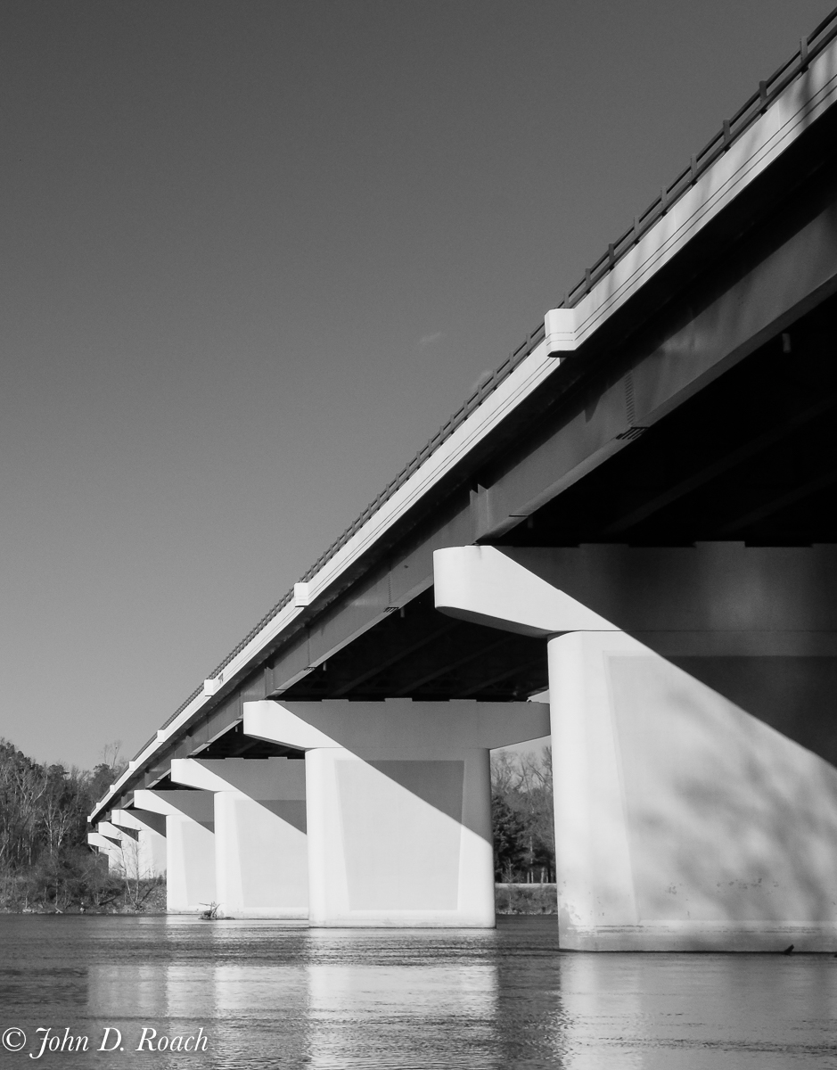
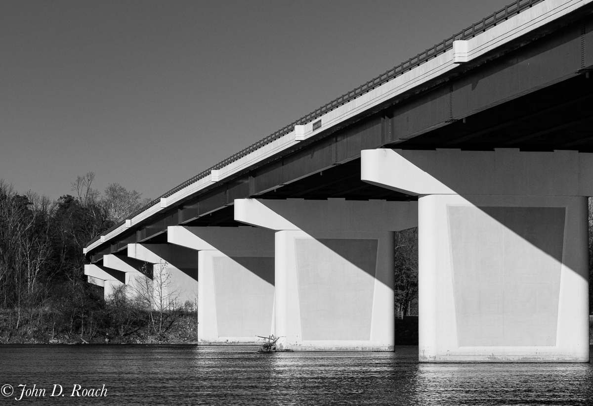
Interesting! There is little detail in this well honed concrete. The histogram is not pushed and burning would taint the beauty of the very white concrete. |
Jan 9th |
| 64 |
Jan 20 |
Comment |
I am glad to see so much discussion. I don't have a lot to say except my initial reaction which was prompted by what my instructor at a Photography School taught me, "Never allow dappled shadows in a portrait." Having done a fair amount of senior pictures, I believe that true based on what clients want to see. Nonetheless, I find the image pleasing. It depends solely on the intent of the image. |
Jan 9th |
8 comments - 8 replies for Group 64
|
15 comments - 12 replies Total
|


