|
| Group |
Round |
C/R |
Comment |
Date |
Image |
| 4 |
Oct 19 |
Comment |
Very nice image. |
Oct 24th |
1 comment - 0 replies for Group 4
|
| 6 |
Oct 19 |
Reply |
This revised image is very, very nice! |
Oct 24th |
0 comments - 1 reply for Group 6
|
| 11 |
Oct 19 |
Comment |
Very nice image. I was taken by it and led into the frame immediately. |
Oct 24th |
1 comment - 0 replies for Group 11
|
| 19 |
Oct 19 |
Reply |
Nicely done composition and conversion. |
Oct 24th |
0 comments - 1 reply for Group 19
|
| 20 |
Oct 19 |
Comment |
Very nice. |
Oct 24th |
1 comment - 0 replies for Group 20
|
| 22 |
Oct 19 |
Comment |
Very nice image. It works either way for me; lights on or off. |
Oct 24th |
1 comment - 0 replies for Group 22
|
| 25 |
Oct 19 |
Comment |
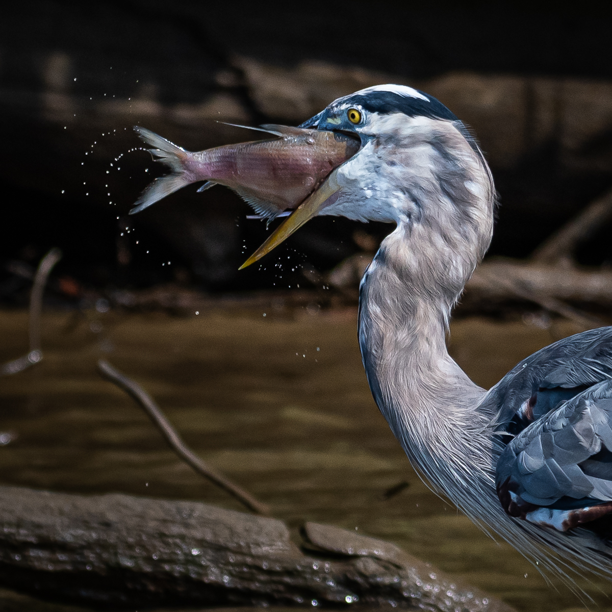
Quite nice! The exposure and detail is excellent. |
Oct 24th |
1 comment - 0 replies for Group 25
|
| 26 |
Oct 19 |
Reply |
I like both orientations. Very nice image. |
Oct 24th |
0 comments - 1 reply for Group 26
|
| 32 |
Oct 19 |
Reply |
Nice alternative to already nicely converted image. |
Oct 24th |
0 comments - 1 reply for Group 32
|
| 35 |
Oct 19 |
Comment |
Sharon, the tonality, detail and quality of exposure is wonderful. I agree about the tree and rock converging a little too much. I noted a spec of dust, I think, in the upper right quadrant. |
Oct 24th |
1 comment - 0 replies for Group 35
|
| 36 |
Oct 19 |
Comment |
Very nice image. Adjusting perspective will make the image very, very nice. |
Oct 24th |
1 comment - 0 replies for Group 36
|
| 39 |
Oct 19 |
Comment |
Very nice composition and mode. Adjusting curve and contrast a little bit, I think, will enhance the image. It has a lot wonderful detail that might be opened up some doing that. |
Oct 24th |
| 39 |
Oct 19 |
Comment |
Very nice, Jerry. I really like your creativity in this one. |
Oct 24th |
2 comments - 0 replies for Group 39
|
| 42 |
Oct 19 |
Comment |
Quite nice! |
Oct 24th |
1 comment - 0 replies for Group 42
|
| 46 |
Oct 19 |
Comment |
Very nice scene and nicely processed HDR. |
Oct 24th |
1 comment - 0 replies for Group 46
|
| 49 |
Oct 19 |
Comment |
Very nice image, Tom. |
Oct 24th |
1 comment - 0 replies for Group 49
|
| 50 |
Oct 19 |
Comment |
Well done. I think the image is nicely cropped and the tonality works for me. As in many monochrome conversions, the variations are numerous, so alternative tones and structures work, too. |
Oct 24th |
1 comment - 0 replies for Group 50
|
| 51 |
Oct 19 |
Comment |
Fun image! |
Oct 24th |
1 comment - 0 replies for Group 51
|
| 52 |
Oct 19 |
Comment |
Mike, Nicely composed and executed crop. I vote for monochrome silhouette because you can, it will enhance the visual experience and the current background compared to the animal doesn't seem in harmony and the background seem to be very bright. |
Oct 13th |
| 52 |
Oct 19 |
Comment |
Judith, Lisa and Sharon have good suggestions. I think the only thing I would add is to crop some of the right side, perhaps past the vertical crack going up to the stop of the frame. I find my eye wonders way from the subject into to this empty space perhaps due to the leading line cracks in the mud path. |
Oct 13th |
| 52 |
Oct 19 |
Comment |
Tom, it is a lovely image. I think Sharon and Lisa has a point regarding the water and how it relates to the bird to get good separation and minimize distraction. I think reducing luminosity and softening the top part of the frame water might help some. |
Oct 13th |
| 52 |
Oct 19 |
Comment |
Lisa, I like your image. It appears to be sharp and the work you did on image is quite nice. However, I like the original better. The negative space in your edited version doesn't quite work for me. The color harmony in the original is much better, in my opinion. |
Oct 13th |
| 52 |
Oct 19 |
Comment |
Carol, I will not add to much to what Sharon has offered. I think she is right on target. While I like the composition, the harshness of the light impacts color and tone. I do wonder about the ISO and what was your shutter speed and your aperture. |
Oct 13th |
| 52 |
Oct 19 |
Comment |
Sharon,
First, I offer my congratulation for the fine IR article as well as the recognition you received for your support of PSA.
Second, I love your image including the haze. I feel like I am there and looks real. The color harmony, tonality, depth of field, framing and the way my eyes are led throughout the scene is magnificent. |
Oct 13th |
| 52 |
Oct 19 |
Reply |
Lisa, indeed there is another image within the image to focus the story. It does seem even more intense. I am happy with the color...it seems pretty natural to me. I did in the crop open up on the shadow some on the close up crop around the eye. |
Oct 7th |
 |
6 comments - 1 reply for Group 52
|
| 59 |
Oct 19 |
Comment |
Very nice! |
Oct 24th |
1 comment - 0 replies for Group 59
|
| 60 |
Oct 19 |
Reply |
I like your choice of flower and the overall color, tone and sharpness as well as depth of field. I think I like the crop suggested by Angie. That helps to bring my eye right to the heart of your image. |
Oct 24th |
0 comments - 1 reply for Group 60
|
| 63 |
Oct 19 |
Comment |
Nice subject and detail. I agree with the halo comments. |
Oct 24th |
1 comment - 0 replies for Group 63
|
| 64 |
Oct 19 |
Comment |
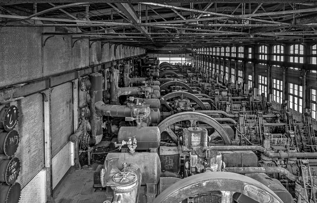
Jerry, I like your image for overall story, industrial muscle, history, tonality, depth of field. I think though the image can be enhanced with some lens correction, distortion and crop adjustments to tell the story without any distractions. I offer some visual feedback which subdues, but doesn't eliminate the ceiling and straightens and levels walls and ceiling lines so that my eyes goes all the way to the far end with out distraction. I do a slight tonal adjustment to aid in that. I hope you don't mind the offering. |
Oct 13th |
 |
| 64 |
Oct 19 |
Comment |
Wonderful image, Stuart! The story is wonderful and timely. This is a fine photojournalistic piece. I agree with Jerry's comment about toning down the light at the far end of the scene. My only nit is I feel the focus could be sharper in the foreground. I think the sign and all the folks should be clearly in focus, I tend to feel, that you focus goes to the man facing us in the rear and then extends pretty sharp through the rest of the frame. I'd rather see all the people sharp as well as the Brexitometer board. |
Oct 13th |
| 64 |
Oct 19 |
Comment |
Ahbijeet, well done. I like your presentation and feel you enhanced well as you described the calf. I like this a lot. |
Oct 13th |
| 64 |
Oct 19 |
Comment |
Stan, I like the image in all regards (tonality, panoramic impact, depth, symmetry, and story). My only immediate reaction was that I felt it was a need for some lens correction. |
Oct 13th |
| 64 |
Oct 19 |
Comment |
I like the composition and concept. However, Jerry, I am sorry to say that I like the original color so much better for composition, sense of depth, contrast and overall appeal. The monochrome version seems to be flat and doesn't satisfy my eye for contrast and the need for separation of the myriad elements within the scene. |
Oct 13th |
| 64 |
Oct 19 |
Comment |
I like your image, Don. I don't think a stroke or border or frame its needed. This would be awesome on metal without a frame...just the subject and the power of the black background. Well done! |
Oct 13th |
| 64 |
Oct 19 |
Reply |
Don, I like your comment about the sky. I perhaps wrestled with that and decided I want to not add more contrast so that it was not competing with the skyline which is what needs to be strong for this as a print. |
Oct 13th |
| 64 |
Oct 19 |
Reply |
Stan, it is definitely a good alternative image to crop out the building on the left. |
Oct 8th |
| 64 |
Oct 19 |
Comment |
Jerry, it was hand held on the Ellis Island to Statue of Liberty ferry and I didn't put the shutter speed down since it was an HDR image. However, the three exposures at f14 were 1/850, 1/420s, 1/210s. You and Stan offer a reasonable alternative to have the building on the left removed but, I wanted a more panoramic view and thought it balanced the image nicely. However, it is a very good alternate consideration and I will certainly put that in the package of possible prints. |
Oct 8th |
7 comments - 2 replies for Group 64
|
| 73 |
Oct 19 |
Comment |
Wonderful image. I like image and color. I think the image, if cropped at the top, will really be grand. |
Oct 24th |
1 comment - 0 replies for Group 73
|
| 76 |
Oct 19 |
Comment |
Lovely....I am so glad I visited the study groups to see this image. |
Oct 24th |
1 comment - 0 replies for Group 76
|
| 79 |
Oct 19 |
Comment |
Lovely pose, composition and color harmony. I think the monochrome version is also quite nice. |
Oct 24th |
1 comment - 0 replies for Group 79
|
| 87 |
Oct 19 |
Comment |
Very nice! |
Oct 24th |
1 comment - 0 replies for Group 87
|
| 88 |
Oct 19 |
Comment |
Exquisite. |
Oct 24th |
1 comment - 0 replies for Group 88
|
| 91 |
Oct 19 |
Comment |
Very nice |
Oct 24th |
1 comment - 0 replies for Group 91
|
| 92 |
Oct 19 |
Comment |
I like how you saw and captured this street scene. |
Oct 24th |
1 comment - 0 replies for Group 92
|
36 comments - 8 replies Total
|


