|
| Group |
Round |
C/R |
Comment |
Date |
Image |
| 6 |
Feb 19 |
Comment |
Stuart, cool image. I will stop by more often and your work here in addition to the fine images you put in DD SG #64 (Monochrome). This one would go well there too. |
Feb 12th |
1 comment - 0 replies for Group 6
|
| 52 |
Feb 19 |
Comment |
Presets and filters are not cheating! They are alternatives that offer artistic possibilities, as your example offered. Thanks for that idea. |
Feb 23rd |
| 52 |
Feb 19 |
Reply |
Thanks for the comment. Glad I could see it and respond before I go out of country until the 27th. |
Feb 17th |
| 52 |
Feb 19 |
Comment |
This is a wonderful high key image and I think the sharpness of the bird, exposure and overall BIF capture is excellent with fine separation from the background.
I do think, though, Mike that the hint of fence or whatever is a distraction for me and I think it adds nothing to the image. In my opinion, you don't need that environmental element. I don't believe it enhances the image. Take that out and you have a definite winner. Now with that said, I am sure there are many who might feel otherwise as you might also. You need to follow your artistic sense. Well done. |
Feb 14th |
| 52 |
Feb 19 |
Comment |
Lovely light and color. I hesitate to say that the main focus area of the orchid lost some sharpness in your final rendering. Let me explain that I don't mean sharpness is an absolute and may not be needed, but what is causing a slightly unsettling blur, is that the artistic effect your seek, well that is ok, but for me, the overall softness is quite nice, but now the processing or cropping has caused the center of the flower to look blurred vs. softened. To me there is a difference. It can be sharp yet soft but if something is a little askew, it can start to look blurred due to a number of process factors. I wonder if that is a result of the crop and resolution got impacted. When I am faced with the desire to crop like you did, I try to use selective clarity and sharpening to offset any resolution lose due to the crop. |
Feb 14th |
| 52 |
Feb 19 |
Comment |
Excellent image, Tom. It is wonderful and well captured, composed and exposed with a way of being presented and processed that makes everything clear and sharp and believable. I expect that the story here is quite unique for an image capture and yet so truly the realities of everyday life in the wild. Might fine. Run with this one in any way you want and I am sure you will be rewarded. |
Feb 14th |
| 52 |
Feb 19 |
Comment |
First, Lisa, I can't tell you about Photoshop...it is not my go too product for tonal editing and I don't do layer texts much except for a few editing adjustments I can't do in Lightroom....kind of not my interest.
Now to your image, I like it a lot. It has a wonderful story and is a lovely winters cape. I think the exposure and white balance is a little askew, though. Mike is correct, I believe in how it adjusted it to get the whites whiter in his way doesn't the job nicely. In Photoshop with adjustment layers you should be able to do that if not in the original Camera Raw processing where you can adjust for exposure, white balance, highlights, etc. You didn't offer any setting information so I can tell you what might have caused that. Normally, given that I shut a lot in aperture priority, I will increase exposure compensation to get the snow brighter and whiter. |
Feb 14th |
| 52 |
Feb 19 |
Comment |
Lovely scene. I like the quality of the light in the original compared to the posted edited version. Some opening up of shadows, perhaps a slight exposure adjustment along with a slight curve and then that original image pops. The one you processed just doesn't effect me as well. I feel the final version you presented to us looks processed and the smooth silky and languid feel of the water gets lost. I also think the lighting balance shifted and became far more contrasty. I try to avoid beyond f/16 or f18 now does because it helps avoid any refraction and retain a certain smooth yet sharp effect. |
Feb 14th |
| 52 |
Feb 19 |
Comment |
Excellent image. I have no comment other then wow and so nicely done with wonderful light. The eyes got my attention immediately, too. |
Feb 14th |
| 52 |
Feb 19 |
Reply |
Indeed, Dialogue keeps us on our toes! |
Feb 10th |
| 52 |
Feb 19 |
Reply |
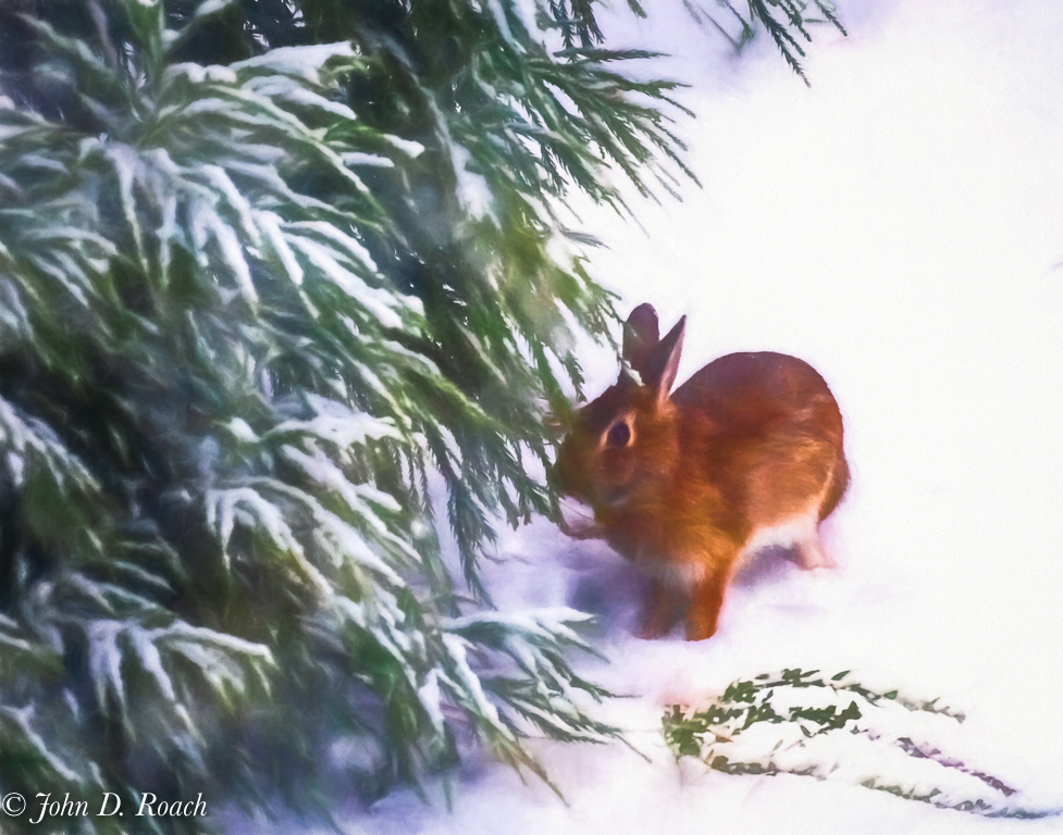
Alternate image file processed in Lightroom only. |
Feb 8th |
 |
| 52 |
Feb 19 |
Reply |
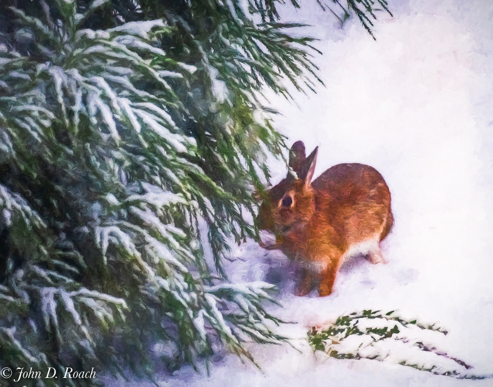
Degas style using Topaz Impressions |
Feb 8th |
 |
| 52 |
Feb 19 |
Reply |
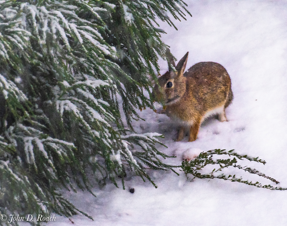
Carol, I used Lightroom as my primary and I use ON1, Skylum and a lot of various plug ins of those and others. Regarding Photoshop, I have taken many classes and tutorials and I can add your suggestion as another to take a look at sometime (but, since it is never my primary edit tool, I quickly forget how use most things. I only remember if its a specific task that I do often for certain effects or edits that I can not do in other software. I only use it on select things, but it is not my "go to" product for most of what I do.
Putting the lens against glass on the cold snowy day would have fogged the glass on the lens and, unfortunately or fortunately, I was actually photographing the birds at the bird feeder so I needed to be able to move the lens around. It was just a lucky chance to see the bunny for that short moment in time and get a few snaps of it.
I think you suggestion of watercolor makes me think, I should process this in Topaz Impressions, which I use a lot and see what comes of it. There I can create painterly effects, watercolor or pastels or numerous others. Also, I have another image that was about 3 clicks later with little difference which was better quality. I am attaching a watercolor variation, a Degas style variation and the alternate below. Possibilities evolved with a little more work at this end. Thanks for the comments. It prompted me to relook at options. Watercolor using Topaz Impressions, first... |
Feb 8th |
 |
7 comments - 5 replies for Group 52
|
| 64 |
Feb 19 |
Reply |
Thanks for commenting and suggestion. |
Feb 23rd |
| 64 |
Feb 19 |
Reply |
Good idea about darkening some the foreground. Thanks. |
Feb 17th |
| 64 |
Feb 19 |
Reply |
Part of the reason was the trip tried to get to some of the iconic locations, but was mainly focused on wildlife which had lots of time for. I hope to go back some day. |
Feb 11th |
| 64 |
Feb 19 |
Reply |
Cool...glad we saw this perspective. If I had more time in Yellowstone, I would have perhaps studied this more. While it was a photography group, we had 45 minutes at the main thermals and it took me a long time just to figure out how to get a point of view without all the distractions like you mention above, etc. I say, well done. |
Feb 11th |
| 64 |
Feb 19 |
Reply |
Thanks, Stan. You saw the story and almost Gulliver's Travel aspect here! Thanks for the suggestion about simplifying the background. Perhaps I was over complicating it to suggest what was beyond. I don't pretend this an image for PSA Judging but rather a story (indeed, I never have that in mind) that is kind of artsy, childlike, macabre in form. BTW, while I will see if I can do an alternative with more black background, I do think have that hint of something in the background helps to make it appear other worldly in size, which was my intent. The original image was pretty bright on the left side, so I had darkened to get it toned down to just a little light at the edge. |
Feb 11th |
| 64 |
Feb 19 |
Comment |
Jerry, I like the story. However, it cries out show me more. I want to see detail. It seems too muddy and dark for my tastes. However, I can see folks that might like it because it lends a certain mystery to the waiting story. |
Feb 11th |
| 64 |
Feb 19 |
Comment |
Stuart, I like your image for the contrasting story elements. This has a wonderful story, is nice and sharp with good depth of field and tonal quality. It reminds of a trip I took where I ran into some bikers and some older folks at a hotel out west in the USA. I think, technically, this image needs to be straightened. The slanting roofs and leaning walls bother my eye a little, so I find that distracting. Perhaps some perspective adjustment might minimize that. I get a kick out of the monochrome chrome with the color of the old lady and the bikers which is quite nice. That is the one I think would be a good alternative that folks might enjoy more then the other two. |
Feb 11th |
| 64 |
Feb 19 |
Comment |
Abhijeet, I like your image. I agree with Jerry that it is a little flat. It is not because of the clouds but rather the depth of field become fuzzier at the center along the back rim of the water the land beyond. I think a little more contrast there would enhance the image. I also believe that Stan brings good idea to the table about the tones in the bottoms of the boats being open up some. Stuarts comment about the haze filter makes sense in that center area and perhaps if only done a slight amount in the clouds. All these thoughts are more about minute changes then big wholesale efforts to give it more pop. Don't loose the tranquility in the image in the process. |
Feb 11th |
| 64 |
Feb 19 |
Comment |
I like both images, Jerry. I find the contrast between lake and the color of thermal effects more compelling in the color version. In the monochrome, it become all about the lines with an interesting abstract quality to the image which makes me have to look at it awhile before I realize what it is. I like it how you created the effect and presented in a vertical format. |
Feb 11th |
| 64 |
Feb 19 |
Comment |
Interesting image. Technically it is strong in terms of tonal range and your mono conversion. I just wish I could see eyes. There are some hot spots along the zipper and a white spot in the upper right corner that might be removed to enhance the image. In the final analysis, if we saw eyes in some way, I think there would be a strong story. |
Feb 11th |
| 64 |
Feb 19 |
Comment |
Stan, I like the story and how your have composed the image. The story though is a lot strong, I think, in the original color version with the lighting and sky so dramatic. I feel it is lost in the monochrome version that I think doesn't handle the dynamic range quite as well. At the base of the building in the monochrome version, a little left of center, the brightness of the image is almost distracting, but less so in color. That color version is really compelling.
However, it is pretty cool image in monochrome either way and I would love to see these for real structures sometime, but my current travel plans include far more of Europe and South America and Asia is further down on the list at this juncture. Thanks for sharing and giving us your interesting perspective. |
Feb 11th |
| 64 |
Feb 19 |
Reply |
Stuart, I am wondering. Do you think the entire purpose of the Study Groups is to focus on images that folks might want to enter in a PSA Exhibition or a High Profile "Best of the Best" Camera Club Competition? Can we not create quality images for other purposes and find out if they work?
I think, it works to some extent as a pictorial image with even a bit of theme and childlike humor with photojournalistic perspective in that it promotes some that humor about the place and what folks might find by visiting the museum. I can see it in an article about the museum.
Nonetheless, I learned that I could have captured the image at a different angle perhaps to remove some things that folks feel are distractions (I tried to get at the best angle I thought of at the time) and thus made it more appealing and then control the less desirable distractions. For me the shadows are not a distraction, but rather an enhancing element. What is wrong with some shadows?
But why no comment about the story? I think it tells a story with nice tonal range in monochrome. Perhaps, I am wrong.
|
Feb 10th |
| 64 |
Feb 19 |
Reply |
Certainly not a tripod! You made me laugh. They are very large wires ready to be spliced to another giant electrical receptacle located behind the three prong plug that is in view. For me, the shadows which I had no control of, offered interesting counterpoint to the display. Also, in my opinion, the slight light on the left side just offers us a hint of more beyond this gigantic electrical display. |
Feb 10th |
6 comments - 7 replies for Group 64
|
14 comments - 12 replies Total
|


