|
| Group |
Round |
C/R |
Comment |
Date |
Image |
| 52 |
Nov 18 |
Comment |
Mike, just awesome. Your post processing captured the tonal adjustments needed to make this a truly compelling image. The composition, story, light reflections, color harmony, sharpness and clarity and the way your opened up the shadows gives me an image that I can just keeping looking at and discovery more about. That is a keeper. |
Nov 11th |
| 52 |
Nov 18 |
Comment |
Excellent, Judith. This is a nicely done monochrome conversion. The tonality of blacks to white is very good with no detail lost. Here is a case where you get two images for one...a fine color and a fine monochrome image. Well done. |
Nov 11th |
| 52 |
Nov 18 |
Comment |
Very, very appealing image, Tom. I like it as presented and with Lisa's suggestion to minimize that blur a little (darken slightly maybe) which probably only becomes something that comes into play because it completes with the copyright only after Lisa brought it to our attention. I am not sure I would have noticed it without that. |
Nov 11th |
| 52 |
Nov 18 |
Comment |
Lisa, this image's composition and subject is wonderful. The color is quite nice as is the depth of field. It does seem to need some tonal enhancement is that I feel it sits rather flat. I suggest adding a tone curve to it along with some clarity and luminosity. Mike is going in the right direction, also because the story is wonderful without the sky and top areas of the frame you presented. The story is the brook, trees and flowers which need to pop out and grab the viewer. |
Nov 11th |
| 52 |
Nov 18 |
Comment |
Carol, you create a very nice composition and truly compelling visual experience and Tom has offered some suggestions with an image which I think take this image to the next level. While I find slider numbers can be so variable depending on ones software, monitors, tastes, etc., what Tom suggests get the detail out of the image that you want and minimizes the chance of the area in the lower right corner being uncomfortable to the viewer. My eye really likes what he did. When I first opened your image, I said "wow...really nice" but then my eyes were distracted by the brightness on that area of sand. This can be a winner. |
Nov 11th |
| 52 |
Nov 18 |
Comment |
Sharon, it is a wonderfully crafted image. The only enhancement I think that you might want to consider is what Tom suggested in adjusting the tone some since your OP seems a bit flat. I think the center areas need more contract the darkening of the storm clouds and horizon line will enhance the image. Otherwise the depth of field, color harmony and visual impact of this pano creation is very good. |
Nov 11th |
| 52 |
Nov 18 |
Reply |
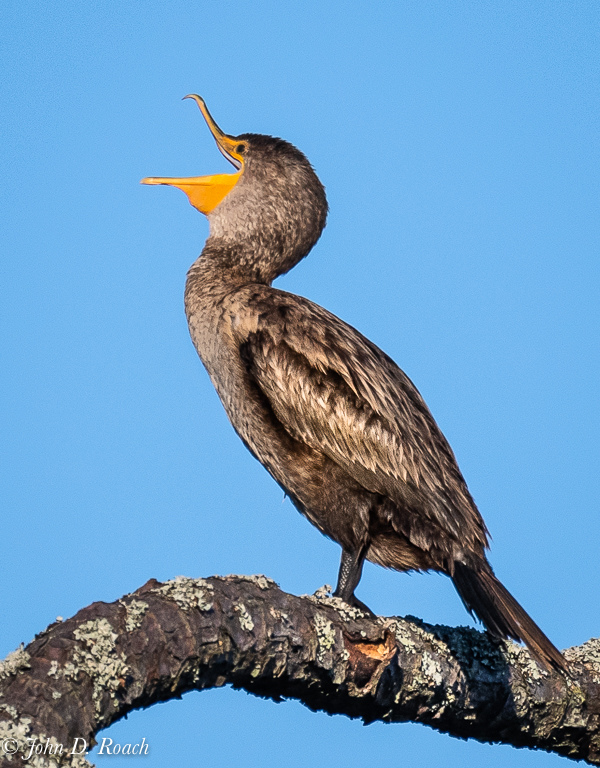
Lisa, thanks for leading off the dialogue on this image. The copy that I posted was a quick road trip version which I have now, at the leisure of being home and also with your thought in mind, taken another look at. I agree that the sky was perhaps a little too saturated and I also come to believe that I could even crop the bird a bit more and get rid of the distracting portion the broken branch. Here is an alternative view of this fellow.
BTW for some humor, I have a sequence of the morning constitution. It is pretty humorous, but not something one wold general post.
Anyway, everyone, take another look of this bird and its behavior. |
Nov 8th |
 |
6 comments - 1 reply for Group 52
|
| 64 |
Nov 18 |
Comment |
And, Stephen, I might add, how the creator of the image wants it to finally be seen. |
Nov 25th |
| 64 |
Nov 18 |
Reply |
I found this on the Internet: The fracture pattern that forms at the cooling surface will tend to be propagated down the lava as it cools, forming long, geometric columns. Thus, as lava cools to form basalt, it may crack in a hexagonal (or other) shape and form columns. ... Water can play a role in the formation of columnar jointing in lava flows. |
Nov 25th |
| 64 |
Nov 18 |
Comment |
Wonderful image, Jerry. The story and mood is well presented in the monochrome conversion. I think, as already mentioned that a slight counter-clockwise rotation will enhance the image. The branches on the left top and the one shooting off by itself from the left are distracting and so removal might help and then I got to thinking that to the story is the top portion of the image really needed. I might not be a bad thing to drop down just past the lowest of those branches and the image would still be very compelling. |
Nov 11th |
| 64 |
Nov 18 |
Comment |
Very nice image, Stuart. I find it well presented in monochrome. I think the top of the owl's head could be a little sharper and my preference would be to see the owl a tad brighter to add to some greater dynamic separation between the tree and the bird. Really nice. |
Nov 11th |
| 64 |
Nov 18 |
Comment |
Abhijeet, this is a nice image that is well executed for the shutter speed. There is a fine composition and the layering in the image adds a lot of interest for telling the story. The tonality and sense of weather and environment is compelling. My only concern is that the foreground animals and person are barely perceptible. Perhaps some darkening and/or contrast might help to bring out the detail in that area of the image to help the viewer see them as truly enhancing elements. |
Nov 11th |
| 64 |
Nov 18 |
Comment |
Stan, this image is wonderful. The composition, presentation, tonal array is very nice. If there is anything to consider is to reduce the highlights in the water at the bottom left. Very fine image. |
Nov 11th |
| 64 |
Nov 18 |
Comment |
Jerry,
It is an interesting capture with your Google Pixel Phone. For me, it doesn't have enough of the background fascinating stair stepping rocks to give the scene context and even more interest. I think a different crop would be nicer that showed more of those elements from the original scene in your monochrome conversion.
I took your original image into Lightroom and tried to see if I could do something with it and found that the resolution was so minimized that I could do nothing with it to show you what I had in mind. The only thing more that I can say is that the contrast and clarity adjustments, while probably necessary seem to be more then my eye wants to adapt to. |
Nov 11th |
| 64 |
Nov 18 |
Comment |
Don, I believe this is an interesting industrial image with old mechanical elements and the repeating pipe with deteriorated insulation. The scene gives me a feel for such an environment, which having spent a lot of working career in plant environments evokes memories of similar convoluted messes of pipes of equipment. For that, I appreciate the image. It is a fine subject for monochrome.
I think though the extreme contrast of what seems to my eye to be nearly blown out whites with little or no detail to dark areas seems a little too harsh in extremes. I think, having a little less contrast and reducing highlights might help here to tell the story. |
Nov 11th |
| 64 |
Nov 18 |
Reply |
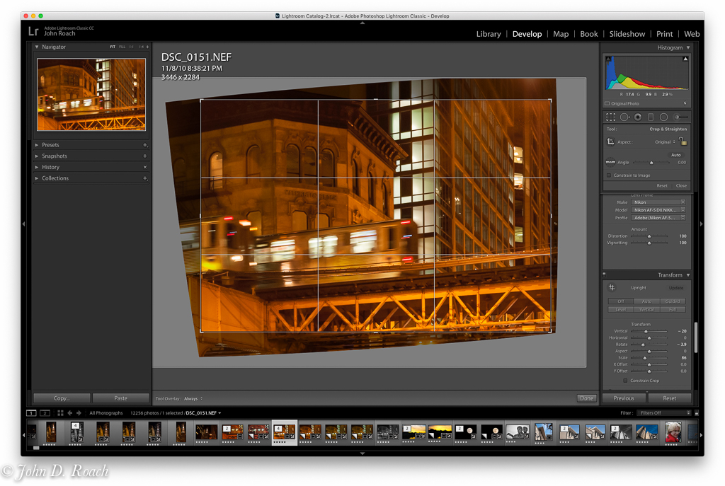
I did the perspective and lens correction in Lightroom a long time ago (around 8 years ago) and know that it was challenging for many reasons. In fact as you can see by the attached I had a odd white balance results as well as tilted angle of view which I ended up editing in the final color and the monochrome version.
The attached will give you some clue about my original angle of view and the "warp" correction (see the sliders in the LR Tranform module on the right) to get the angle I wanted in the final version with the buildings straight. It is a point of view (POV) and definitely how I wanted to present it. I think it does challenge folks on how to view a complicated intimate detail within a city. |
Nov 10th |
 |
7 comments - 2 replies for Group 64
|
13 comments - 3 replies Total
|


