|
| Group |
Round |
C/R |
Comment |
Date |
Image |
| 52 |
Mar 18 |
Comment |
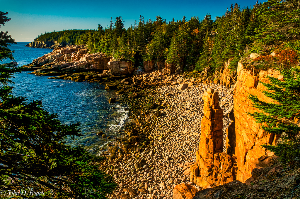
Thanks for the comments. The color harmony, in my opinion, is pretty accurate. Regarding the left horizon, that is not the easiest to tame. A polarizer was used and variation images were captured. I am posting a rework which might have some improvements in some areas created using Aurora HDR 2018 and Lightroom to meld three 1 stop apart images and then do both global and a lot of selective dehiring, contrast, gradient tool, curves, highlights, shadow, etc. adjustments on the composite image after some work in Aurora. I have no particular preference overall, leaning perhaps to the original in some areas, they both work for me, but perhaps the horizon is a little better even though it started to look forced. However, I think that area is naturally bright and to attempt to make in a sense of uniform tone horizontally starts to look artificial. I hesitated a lot to open shadows, since there were so many, but gave it try. Tough scene to appeal to all. |
Mar 17th |
 |
| 52 |
Mar 18 |
Comment |
Splendid, Mike. I can offer no suggestions. I like the sharpness on the bird's face, eyes and body with the rest of the image having a subtle softness and higher key treatment in line with the winter snow theme of the story of this bird. It works wonderfully well. |
Mar 14th |
| 52 |
Mar 18 |
Comment |
Wonderful image. I have to agree cropping a little off the left will bring focus in all the right areas and reduce the left side being a distraction as it is for me. |
Mar 14th |
| 52 |
Mar 18 |
Comment |
Well done. It has wonderful color, composition, clarity, tonality and sharpness. I have no suggestions. It works very nicely as is. |
Mar 14th |
| 52 |
Mar 18 |
Comment |
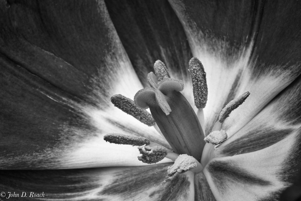
Lisa, it is very nice image and crop an up close and personal perspective of this bird. I think the eyes if lightened a tad might work a little better in monochrome. I am wondering what happened with your post of the monochrome version that the image seems so pixelated. That doesn't seem to exist that way in the color version. What did you use for the conversion to monochrome? |
Mar 14th |
| 52 |
Mar 18 |
Comment |
Carol, very nice composition and image capture. The birds will pop out more if the background clutter is darkened some as Mike has offered in his burn and vignette comments and visual feedback. |
Mar 14th |
| 52 |
Mar 18 |
Comment |
Sharon, you image how wonderful color harmony and composition. I like it very much. My first reaction to the flower is that it is missing detail that might be achieved through reducing the highlights a tad and doing some selective contrast and/or clarity adjustment to pull some detail out. |
Mar 14th |
7 comments - 0 replies for Group 52
|
| 64 |
Mar 18 |
Comment |
Jerry, that comment on Jerry F's interesting image made me recall a comment from our evaluator of monochrome submissions last night at The Camera Club of Richmond. He said many successful images are the ones we want to keep studying day after day to see new things at each new look. |
Mar 15th |
| 64 |
Mar 18 |
Reply |
Jerry, I guess I am alone, and that is ok with me in preferring the softer and less contrasty version. Thanks for your thoughts. |
Mar 15th |
| 64 |
Mar 18 |
Comment |
Stuart, I must disagree! If that were the case why would someone pre-visualize a color scene in Monochrome. That is why my first Monochrome iteration works so well for me and the alternative as I revisit it doesn't work as effectively for me. Both the color and the higher key mono stand alone on their own merit. |
Mar 14th |
| 64 |
Mar 18 |
Comment |
I like the image, Jerry, for it's story. That works for me. I personally think the man and umbrella on the right is an enhancing element that gives me a greater sense of the environment. My only thought is that I wish I could see a little more of the fire without it being cropped off a the top. |
Mar 14th |
| 64 |
Mar 18 |
Comment |
I like your image a lot Stuart. It seems clear and sharp both in the original and the sepia version. The one exception is only in the sepia version around the cockpit of the bomber, there is a little less detail then in the original. As a rule, I don't care for that dark of a sepia look, but it works in my opinion. |
Mar 14th |
| 64 |
Mar 18 |
Comment |
Ajbijeet, I like the composition. The grain is very distracting to me and doesn't add in this case, in my opinion, to the story. The radial highlights at the edges of the travelers and elephant that cause the halo effect is similarly distracting. |
Mar 14th |
| 64 |
Mar 18 |
Comment |
Beautiful monochrome image, Stan. The tonal range and presentation is bold and firm. Think you did an excellent job. |
Mar 14th |
| 64 |
Mar 18 |
Comment |
The image is wonderful. I like the contrast, tonal range and clarity. It is interesting how we all see images. For me, the bottom seems superfluous and I want to focus on the irregularities tying to the bold elements at the top. I am in the camp to crop off some of the bottom help focus in on that interplay within the scene. |
Mar 14th |
| 64 |
Mar 18 |
Comment |
Wonderful image with gritty industrial ruins story. It all works for me. The brighter areas work especially for me for it gives me a feel for the light in this abandoned plant. |
Mar 14th |
| 64 |
Mar 18 |
Comment |
Jerry, interesting take and a very good alternative. I do wonder if I had not shown the original how the reaction to the higher key approach would be. I often tend toward less or very controlled contrasting black as a matter of taste (but, of course, not always). Here is an alternative moving on what your thought are some. In this case, I used Tonality CK and adjusted an adaptive exposure preset's contrast and clarity and some other adjustments soon forgotten. |
Mar 8th |
 |
10 comments - 1 reply for Group 64
|
17 comments - 1 reply Total
|


