|
| Group |
Round |
C/R |
Comment |
Date |
Image |
| 52 |
Feb 18 |
Reply |
Tom, thank you. My very point in how the original is presented is that if the sky was uniform from left to right, it would be fake. The color from morning strong light on the left which is not at all blue to a graduated deeper blue on the right. |
Feb 20th |
| 52 |
Feb 18 |
Comment |
Sharon, I am glad you see what I see about the color overall. But, that is a good recommendation about the sky. However, the LR, Aurora or Luminar gradient tools were not sufficient for this scene and tend to make it look artificial. I will give ON1 whirl since I didn't try that and it is often quite good. When I revisit this image, I will see what comes of it. Thanks, again. The only other alternative I have considered, but then it goes beyond my comfort zone in the manipulation arena would be to see what I could with layer masks and luminosity masks in Photoshop. I have never gotten the hang of them. Often there is a point where I just want to leave well enough alone. Thanks for your overall thoughts and suggestion. |
Feb 14th |
| 52 |
Feb 18 |
Comment |
Mike, you inspire us. Wonderful image and we can learn from how you take them in "manual" vs. aperture or shutter priorities. The color harmony, composition, focus, sharpness and clarity is just exquisite.
Wonderful article. Congrats and I will study it more. Manual does work with practice. Unfortunately I don't do it enough and stick to aperture or shutter priority depending on the situation with auto ISO. This year I will go down on the James River and the many bird sanctuaries around my area and see if I can practice manual. Thanks for the suggestions. BTW, I had marvelous visions doubt the lady in your article...that made my day! |
Feb 9th |
| 52 |
Feb 18 |
Comment |
Judith, I like the story. Your color harmony, exposure and sharp focus is quite nice. My suggestion would be to crop the image such that you bring the plants into the both right spot within the rule of thirds grid, thus cropping both top, bottom and right to remove elements of the brick that do not add to the story. Nice image. |
Feb 9th |
| 52 |
Feb 18 |
Comment |
Tom, Excellent image and story. I can only offer a suggestion in line with Mike's the color harmony has, it seems, a slight yellowing. The composition, depth of field, exposure, etc. is wonderful, though. |
Feb 9th |
| 52 |
Feb 18 |
Comment |
Lisa, the composition and story is wonderful. I think, the image is soft and might even not be as well focused as desired. The prey is lacking detail. I am troubled by the noise (color noise) in the image and given your ISO, wonder if it is a result of post processing efforts. I think the shutter speed should have been higher since birds are always moving a fair amount and even 1/640 might not be enough to grab that motion. Now with that said, the birds eye is sharp so that must of been the focus point or your post work which seems a bit much on the eye just makes it very prominent to me as the viewer. It seems in relation to the rest of the bird a little bit over processed.
Regarding the lens inquiry. Wide angle is best for landscapes (on cropped sensor any where from 11 to 50mm. I use on full frame, 20 or 24mm. There are instances when 70mm and above works for intimate landscapes or compressing the scene, but landscape requires wider views usually. If you are doing wildlife, the new Sigma or Tamron 150-600mm seem to have decent reviews. They should work well with your Canon. I use a Nikon 200-500mm which is exquisite for it has a fixed aperture of f5.6 throughout the zoom range and is sharp as a tack at 500mm. |
Feb 9th |
| 52 |
Feb 18 |
Comment |
Carol, this is well done. I like everything about it. Nice water, clarity, sharpness and depth of field along with tonal range. The only thing I might offer, if it were my way to present, is to add a very slight vignette to draw more focus on the water fall and target the viewers eyes. Again, well done. |
Feb 9th |
| 52 |
Feb 18 |
Comment |
Wonderful image, Sharon. I have nothing to offer except to say to you, use it for your pleasure, print, and exhibition for it work. I think the composition, story, exposure, tonality, depth of field, focus and color harmony is spot on. Well done. |
Feb 9th |
| 52 |
Feb 18 |
Comment |
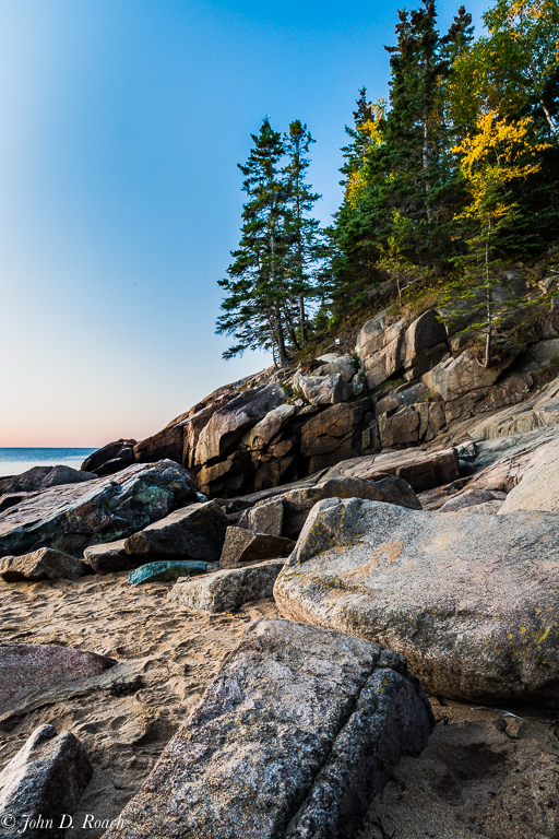
To all who have commented, thanks. I am waiting for my car to be done being serviced at the dealer and did a very quick (it would need more work) adjustment of a virtual copy of the original center exposure of the HDR bracket set. As you can see the tonality, color in the rocks, and other elements of challenge in the image are there. What I believe is given the broad dynamic range of the scene at sunrise begs for HDR so that it can do the blending verses my attempting to force it through global and selective adjustments in just one normal exposure which still could not do justice to the scene. Here is that "down and dirty" quick edit using Lightroom. |
Feb 9th |
 |
| 52 |
Feb 18 |
Reply |
And, Yet, Judith it was my intent to punch up the colors and extract color detail which I could see when the first light hit the rocks, although, the camera did not see so much so intense. The HDR allowed me to do that which I did purposefully. |
Feb 7th |
| 52 |
Feb 18 |
Reply |
It was taken at Sandy Beach, Acadia, National Park in Maine. Thanks for your thoughts. |
Feb 7th |
| 52 |
Feb 18 |
Reply |
Mike, thanks for the comments. I like Aurora for all the reasons that perhaps you comment about. I like the added punch and seek it for artistic effect. If I had taken the middle exposure and processed, it I would have used Lightroom to start and then taken it into Aurora or Luminar to get the same punch. If I want a nice effect, but a bit more subdued or traditional look, I would use Nik Viveza after Lightroom or just process in Lightroom or Photoshop. I will be a bit bold and say when someone tells me to reduce the pop, I now increase the pop (Smile). All humor aside, I am tending more and more toward non-traditional photographic image making in almost all of my artistic expression. I finding over the past 5 years that more and more folks accept that, albeit, it is probably Not so of exhibition judges which I eschew a lot. |
Feb 7th |
8 comments - 4 replies for Group 52
|
| 64 |
Feb 18 |
Reply |
Stuart, I like! This is simpler and so effective. |
Feb 25th |
| 64 |
Feb 18 |
Comment |
Stan, I actually am not bothered by depth of field or less important elements being slightly out of focus. I follow some fine (far better then I) flower photographers use selective focus a lot to actuate element within a blossom. That is sort of my intent here because I really needed to keep the background at now more detail then originally captured without a lot of post work which I avoid as much as possible. Thanks for your thoughts that go into the memory locker for consideration as I do more of this type of work. |
Feb 11th |
| 64 |
Feb 18 |
Comment |
Jerry, very cool capture and I am a sucker for Owl images. I have to say the mismatch of the catch light skews the overall impact upon examination, but upon my initial viewing I thought the perspective was very nice. I vote, cool....very cool image. |
Feb 9th |
| 64 |
Feb 18 |
Comment |
Stuart, compositionally this image works for the story you are telling with it. Tonality seems pretty flat on my monitor. It perhaps, could use a little more contrast. What I think detracts from the story is that the interaction between the two women that we see probably making eye contact with each other is the lack of sharpness so for me it doesn't become very obvious. Sharpness and more contrast might make that story come alive more.
With that said, you have posted an image which falls into the area of street photography that I struggle with. For me, this scene has a lot of busy elements as often occurs in street scenes. Thus, it doesn't work overall for me. In the reading I am doing on monochromatic street photography, it is about focusing clearly on a subject within all the clutter so that it pops out and tells a wall defined story and sense of place and time. Good luck in that adventure. I have only dabble in it a little. |
Feb 9th |
| 64 |
Feb 18 |
Comment |
Ahbijeet, I like your image of the bird and like the tonality and composition. It would have been nice to not have the branches running across the front of the bird, but for wildlife, that is not always possible. I think, though, your image seems over sharpened. I can even see a slight radial halo on some edges on my monitor. I am wondering if reducing sharpening and doing some selective clarity adjustments on the body of the bird might enhance this image. |
Feb 9th |
| 64 |
Feb 18 |
Comment |
Jerry, this is a wonderful image full of tonality, patterns and flowing lines. For me it is abstract in nature and shows how powerful nature is to show off wonderful lines and contrasting patterns. Very nice image. I think given the wonderful PP tools available that you can create varying monochromatic tonal images of the exact same framed details. I use Nik Silver Efex and Tonality CK and often create multiple monochrome variations.
I have to agree that the limitations we have in size make it harder for us to see. It often annoys me a lot. However, not all groups are so limiting. I belong to a group (Nikonians.org) where we can even post RAW images for critical discussion. A couple of the camera clubs I have been involved with allow 2100 x 2100 pixels large (over 1 megabit) files for projected images. That is driven by size capabilities of the projectors. On the Internet here at PSA, in a study group, it seems ridiculous to keep the "old" 1024 x 768 under 1 mb criteria. It makes quite hard to make visual suggestions using certain PP features some that small of a jpeg has a lot of compression related limitations. |
Feb 9th |
| 64 |
Feb 18 |
Comment |
Don, I like the image composition, tonality and the story. The clouds seem to be so dark and want to wonder if that is how it was or a result of the exposure or a post processing done. You didn't mention how you created the monochrome. What it in camera or through some post processing technique? could you share more detail doubt how you did the image so I can understand more what you were trying to achieve and then comment with knowledge. From my perspective the blacks are bit too intense in the clouds, but that is more a matter of taste. The ground and the hay bales are just wonderful as is most of the sky for me. A very Nice image. |
Feb 9th |
| 64 |
Feb 18 |
Comment |
Stan, the tonality in this image for monochrome presentation is quite nice. It shows off this distinguished architecture. Exposure and overall sharpness and clarity is quite nice, too, I think. I find the composition excellent in term of how the buildings relate to each other. Obviously, I have no idea what movement you might have had to shift one way or the other, but, that fountain flow upward distracts for me being so prominent in the foreground even though the fountain pool and base gives a nice foreground element. Unfortunately, my eye want to see behind it and gets stymied at the flow. Regardless, I think you have a fine mono image. |
Feb 9th |
| 64 |
Feb 18 |
Reply |
I had hoped hand held moment to get it sharper through and through at f7.1, but I knew it would be tough. Nonetheless, I like the softness less sharp focus in some areas because I got the detail where I wanted it most. Thanks for the comments and thoughts. |
Feb 7th |
| 64 |
Feb 18 |
Reply |
Interesting thoughts. I might use them for some future re-visiting of the image or to the gardens to see such a blossom again. Thanks. |
Feb 7th |
| 64 |
Feb 18 |
Reply |
Good comment about the polarizer. I didn't have it with me. Thanks for your perspective and suggestion. |
Feb 7th |
| 64 |
Feb 18 |
Reply |
And yet, Original #2 absolutely doesn't appeal to me...it is too busy for my taste and I wanted to capture the curiousness of the blossom and less the environment it grew in. Thanks for the comments...much appreciate. |
Feb 7th |
7 comments - 5 replies for Group 64
|
15 comments - 9 replies Total
|


