|
| Group |
Round |
C/R |
Comment |
Date |
Image |
| 52 |
Jan 18 |
Comment |
Thanks for the comments, to all. |
Jan 26th |
| 52 |
Jan 18 |
Comment |
Mike, it is a wonderful image. The story, color harmony, sharpness and clarity, composition and depth of field is super. Well done. I can't offer any suggestions. |
Jan 9th |
| 52 |
Jan 18 |
Comment |
I see in this group as well as in another that I facility reference to the PSA rules and how an image can be presented for PSA competition or exhibition. I don't care for that even thought I like the study groups. I get really crazed about the PSA rules. I think we create images for ourselves and many other reasons that go far beyond the tight bias of PSA rules. Ok, enough said. I do though really like this image because it has so much potential that so many non-PSA viewers thrill in. Nature is beautiful in so many ways and this image captures a very unique moment that can be enhanced as you see fit or left along. My only suggestion, is clean up the water. Get rid of all that other "stuff" so we can focus on the story! It is cool. |
Jan 9th |
| 52 |
Jan 18 |
Comment |
Well done, Tom. It is a fine image. I think it is a ripe candidate for monochrome as another option to consider. The story, tone, color, sharpness and focus is really fine. |
Jan 9th |
| 52 |
Jan 18 |
Comment |
Lisa, a first class image. I like it a lot. Well done and congratulations. I can offer nothing for you to do to improve it. |
Jan 9th |
| 52 |
Jan 18 |
Reply |
Wonderful place. I am going to do a week long workshop with Jim Clark who works out of the field station at Chincoteague. I am going in October 2018. I have followed Jim for years on Facebook and discovered via Road Scholar the perfectly priced photo workshop with early morning and late evening photography in this wonderful area. Jim is world class. My wife went with girl friends in August and thought it was great, but was overrun with mosquitoes. She captured a cool image of course of horses with a bird on one the horse with her iPhone that I enhanced in Lightroom, printed and framed it for her. |
Jan 9th |
| 52 |
Jan 18 |
Comment |
Carol, you have a wonderful composition with a lot feeling in the landscape story it offers the viewer. I agree with Mikes tonal considerations. They fall in line with what I would do. I agree with your take on the foreground so would change how you framed it. The color harmony is very nice and with a little added punch, it pops out and sings winter and natures beauty. |
Jan 9th |
| 52 |
Jan 18 |
Comment |
Sharon, I can offer no suggestion for improvement. You have it. As a PSA member that has little interest in PSA competitions and exhibitions, I can't speak to that. I only do a few non-PSA competitions. But, I can speak that if you solo exhibit it as I do, or exhibits with groups in large print, or include it in your portfolio or choose to include it in any stock photography if so inclined for others to discern various acquisition or purchase interest, it will get attention. I think it is that good. |
Jan 9th |
| 52 |
Jan 18 |
Reply |
Mike, as you can see in the original that is how I framed it so the top is what it is. Your comment about the highlights is taken. I find that depending on the brightness of one or other my monitors it is a little intense and could tone it down. However, it blindly bright when I saw it and hesitate to subdue to much. I don't submit work for competition much, I do it for myself, solo exhibits in other venues and online interest so I probably will keep it like it is and perhaps in after some time revisit it and see if that intensity still should be address. Thanks for the comments. |
Jan 9th |
| 52 |
Jan 18 |
Reply |
Carol, thanks for your thoughts they are always valued, however, I think the trees on the left offer a necessary counter point to the brighter area. If omitted then the image would be just this intense light with limited environmental relationship, I think. |
Jan 9th |
7 comments - 3 replies for Group 52
|
| 64 |
Jan 18 |
Comment |
Thanks for all the comments, to all. |
Jan 26th |
| 64 |
Jan 18 |
Reply |
Jerry, those are very fine comments. I have found that making adjustments can take a lot of time no matter what product is used. I may be evaluating DxO later this year, so thanks for the tip. |
Jan 23rd |
| 64 |
Jan 18 |
Comment |
I lived in a condo for about six years and space was a premium so finding space for framed images is no small matter what the size became a challenge plaid that I'm now in a larger home again. Thanks for the info. |
Jan 10th |
| 64 |
Jan 18 |
Reply |
Jerry, thanks for chiming in. I found the same, that in large print, it works well. I can print up to 13x19 and then mat and frame it. Each variation I created was so much more interesting in big print. I have even printed on metal both mono and color images for print exhibits
When I lived in Milwaukee I was a member of Coalition of Photographic Arts, https://copamilwaukee.com, and my experience over the course of 6 years really helped me to change how I see photography. I participated in some juried shows, but mostly we just exhibited in many different venues large prints.
BTW, I am proud to see that one of my photographic art pieces (color IR image of at a local lagoon) is still on the home page banner even 6 months after permanently moving aways from Milwaukee and not renewing my membership given I could not participate remotely.
There is a big challenge for folks to purchase large prints (both space, attitude and breaking away from the notion that photography is not a true art form. I of course believe it is a wonderful art form. I think in talking to some fine art pros they are continually challenged by this and frequently have to resort to other ways of earning money (stock, workshops, teaching online...often very long arduous hours). There are exceptions when a pro fine art photographer garners a fine corporate base that appreciates large print photo art. |
Jan 10th |
| 64 |
Jan 18 |
Reply |
Jerry,
It appears to still be available right now. I went to the DxO home page, http://www.dxo.com/us, clicked on the box on the left side of the home page about DxO getting the asset Nik from Google and found this statement:
"We at DxO are very proud to add the Nik Collection to our renowned photo editing solutions. Our teams are actively working to release a new Collection in mid-2018.
-
If you would like to be notified when we release a new Nik Collection, or if you'd like us to send you a link to download the current collection for free, please enter your email address here:" |
Jan 10th |
| 64 |
Jan 18 |
Comment |
Jerry, tonal range is quite nice, the black to white is quite nice. I don't find the circle of confusion all that distracting although one might thing it good to darken slightly the one on the right as the image is viewed. The subject, seems to me, to need to be more in focus. There is enough out of focus to make it distracting to the that which is in focus. |
Jan 9th |
| 64 |
Jan 18 |
Comment |
Stuart, I like this gritty image. It is a good example of how one can take a drab color image and tell a new story with a lot of character. Well done. |
Jan 9th |
| 64 |
Jan 18 |
Reply |
I finally re-did the visual feedback correctly and you can see what I tried to do with perspective adjustment. Sorry for the delay and incorrect posting. As I said, I used Lightroom to the best I could rather quickly to show you what I was thinking about. |
Jan 9th |
| 64 |
Jan 18 |
Comment |
Ahbijeet, the birds need room to fly as other have said and the background has I think to much grain and should be smoother. For me, it might have worked at that focal length by capturing less of the birds and leaving room on the right. The story, I think is great, it just begs for more room for us to see it and imagine how it unfolds. |
Jan 9th |
| 64 |
Jan 18 |
Comment |
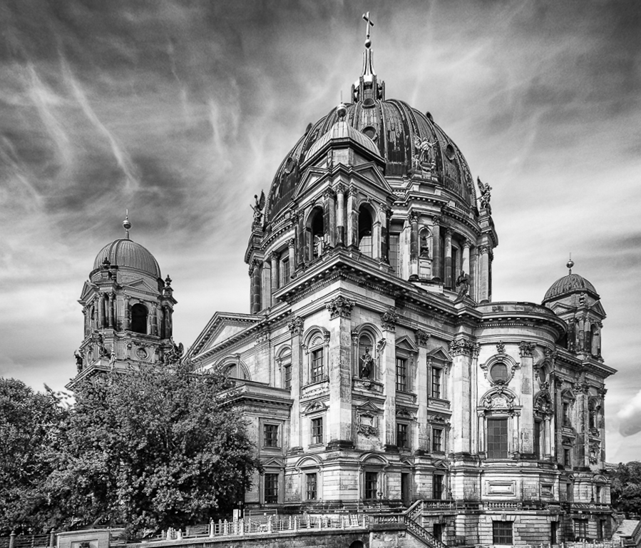
Stan, I too am not clear about what you mean by PDT. Please advise. For me this image is exquisite for tone, texture, sky, story, depth of field, sharpness and detail. It is grand in all those areas. I do think that the perspective is an issue and I find it distracting because my eye and post processing sense want to fine it more straight up and down, and level. I took a stab (mind you not as good of one as I would like) to make some perspective adjustments. I truly need to know the scene better and what is up or down on the ground. I also would have like a little more room at the top. I used in my attempt to do some Perpective adjustment Lightroom with a lot of distortion, vertical, horizontal and rotation adjustments back and forth. This is a tough one in this regard.
That said, your image albeit my preference about perspective is a very fine mono of that cathedral. |
Jan 9th |
 |
| 64 |
Jan 18 |
Comment |
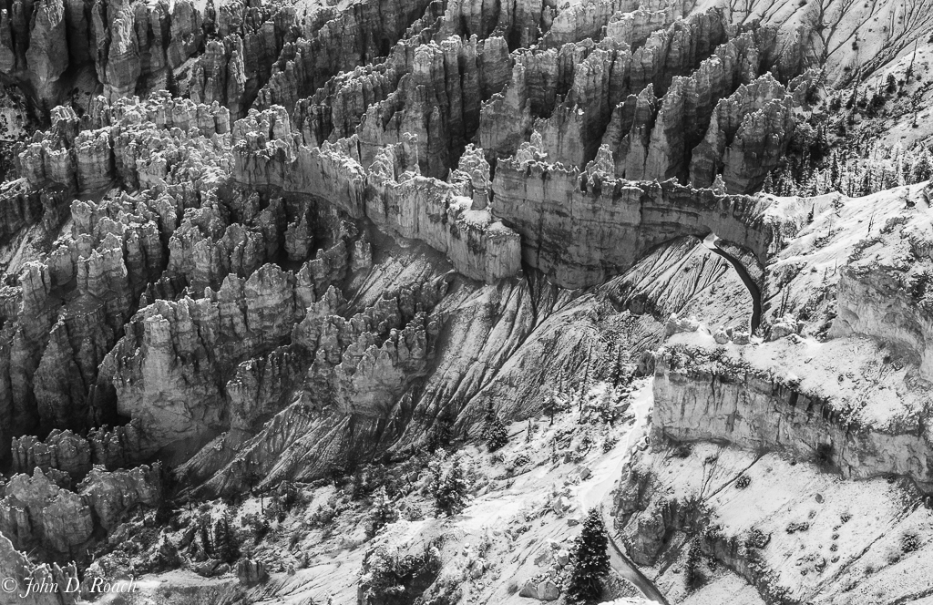
Jerry, you created a wonderful natural abstract full of textures and patterns that was meant to be displayed in monochrome. It almost leans to minimalist in nature. The subject is the full range of curves, lines and tone shifts.
The original color harmony is splendid and works well as a documentary presentation of what you saw at the moment of capture in color. I like it.
But, you took it to another level with well controlled tones depicted in the black and white version. |
Jan 9th |
| 64 |
Jan 18 |
Comment |
Jerry, this is a gritty story and like how you have presented it. I think there many ways that such a scene will work. In this case, the tones are old film like and I do like the irregular unleveled look that is just right for this scene. Your depth of field is very good and I like how it speaks to every detail, every line in the scene. It provides an interesting point of view for the viewer. Well done. |
Jan 9th |
| 64 |
Jan 18 |
Reply |
Presets are a great starting point, but rarely can do the job without further tonal adjustments as well as bringing it back into Photoshop or Lightroom (my preferred tool) to make even more adjustments. Then come back to the image weeks later and reconsider alternatives or changes, etc.. |
Jan 9th |
| 64 |
Jan 18 |
Reply |
Stan, As I have mentioned in past discussions, I am in this study group with absolutely no interest in judge's "sudden impact" opinions of an image.
Rather I care about the thoughts of our group who have time to study an image and appreciate or challenge the nuances that exist within it!
Jerry and Stan, for me, landscape photography is much more about have time to understand what the photographer sees and how he or she presents it. I think high quality landscapes want us...even urges us...to study the scene and not give quick responses. Quality art must be enjoyed and not quickly judged in my opinion and that is what I strive for why sometimes, I struggle with the whole competition aspect that many seek in Photography.
I do appreciate the comments here, though, and that is why I submitted it and indeed, I have created alternatives that slice out part of the image and they have been successful at my solo exhibits and shows with non-PSA groups. For reasons you probably can ascertain, I am not a big fan of most judging competitions. That aside, I just keep coming back to this first framing of the scene because it tells quite a story to me, I think, from bottom of frame to the top of the frame and side to side that image must be wandered about in. The nuances of light and shadow near and far were sublime that day and so very hard to translate.
Here is one of those that I think represents a more focused or intimate detail--I call it Bryce Canyon Trail. It has a well defined subject while the broad landscape is "the subject" in its entirety. I do prefer the color version, but like to some extent the tonal changes in this image that makes the scene more overcast and stormy looking. I often seek a different feel beyond the original capture whether scene in color or black and white. |
Jan 9th |
 |
8 comments - 6 replies for Group 64
|
15 comments - 9 replies Total
|


