|
| Group |
Round |
C/R |
Comment |
Date |
Image |
| 52 |
Nov 17 |
Comment |
Thanks, perhaps processing. Not sure if it might be due to dehazing, clarity, sharpening or combination of all. Thanks for the info. If I were to print it, which is unlikely, that would be an issue. |
Nov 21st |
| 52 |
Nov 17 |
Reply |
Judith. That blue was never manipulated. It is the color of the sky as the camera captured it except for tone curve. I guess (smile) sky is bluer in Virginia.....ok, I should shut my mouth...but it was a blue sky. Cropping the water is a nice alternative. The problem that I have with cropping is that I frame a scene a certain way and was taught avoid (although I do crop from time to time) cropping when ever possible. Next time I will walk and water get closer...oh, my, I am being silly. Thanks for the feedback. It is so hard to find the right balance in framing a scene that suits everyone. But, I do learn that people see different ways quite often then I do. |
Nov 17th |
| 52 |
Nov 17 |
Comment |
Mike, cool image. I think Carol and Lisa have identified and said my thoughts pretty well. In my opinion some subduing of the background would enhance the image the most. |
Nov 11th |
| 52 |
Nov 17 |
Comment |
Judith, I like the idea of you are trying to present. My thoughts though are there is not enough detail in the leave and my eye is tugged over to the competing black and bright background areas for want of that detail. I believe it has a lot to do with focus, depth of field and angle of image capture for the lost of that detail. |
Nov 11th |
| 52 |
Nov 17 |
Comment |
Tom, fine image that is so please to view. I think you captured the scene well for overall tonality but might have had a little less of what I perceive as defraction due to the f/19.9. f/13 would have done nicely and given you a little sharper look, I think. I believe the clouds are very realistic with excellent color tone. The foreground could be brighter, I think and the intermediate hills could be lightened a little with selective shadow removal or dodging. Overall, nicely done. |
Nov 11th |
| 52 |
Nov 17 |
Comment |
Carol, you created a lovely image of this raptor. I like how you focused on the bird and the tonality of the bird. I think some darkening of the background would enhance the image. Well done! |
Nov 11th |
| 52 |
Nov 17 |
Comment |
I am in the camp that vivid is very good! But, then I am challenged as being over the top more then some others. That is my artistic taste and where I like to be. I use Fuji Vivid Picture Control in my Fuji Cameras a lot for a final out of the camera JPEG. They create very vivid and vibrance looks. I like Aurora HDR and I get very vibrance and vivid looks. I am not in the camp of less is better. Thus, I love the original! Print it on metal and hang it! The only thing regarding the final submission that you did that gave you a nice "alternate" image for compositional viewing that I concur with as an "alternative" is the branches removal. However, if it were my image, I would not remove them, since I believe in that kind of framing especially against the type of sky you captured. I think the image as originally presented is breath taking and the keeper. |
Nov 11th |
6 comments - 1 reply for Group 52
|
| 64 |
Nov 17 |
Reply |
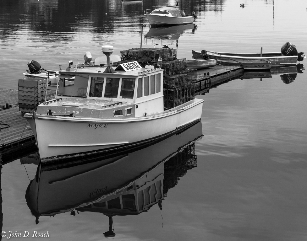
Stuart, I don't think I will do more with this. The blur effect was a very quick for discussion image manipulation only...hardly a final effect. I agree it was hardly that appealing, I was just trying to effect the notion of what I would want to do with DOF. I am not one to use such effects in post often, but they never really really look real unless the light works the particular preset. In the end, I still have a vision that is different, namely the original. I just want to give the idea and make the point that the only really way to do it would be in camera with DOF change to fade the background. It's an interesting discussion, but not worth, in my opinion, doing more with, other then learning as always about options. In the end, I doubt this image will do more then be perhaps sometime in a gallery exhibit and definitely is slated for hanging as part of a nautical guest bedroom theme in our home, but in the original color version. |
Nov 24th |
| 64 |
Nov 17 |
Reply |
Of course, with a little creative manipulation using ON1 Effects and a blur preset, that can almost be created. Here is another alternate view with the crop, blurring of the background and still maintain an aspect ratio for a standard mat and frame opportunity. It sort of works, I think, but I still have mixed feeling about it. |
Nov 24th |
 |
| 64 |
Nov 17 |
Reply |
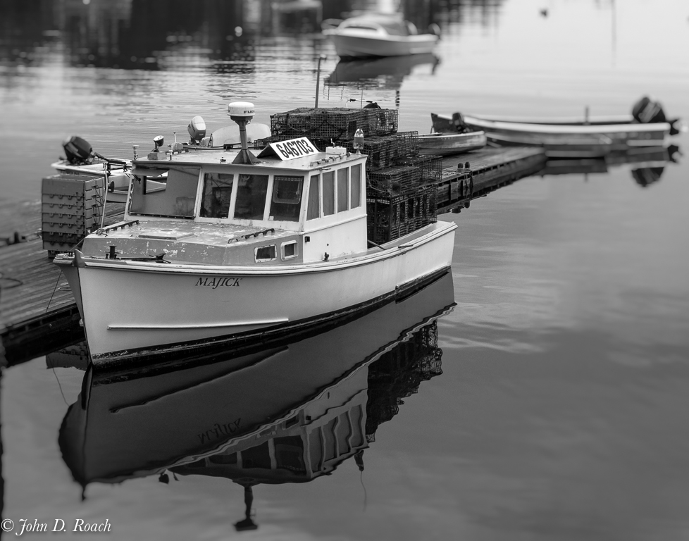
Well, this morning, after seeing all the comments in, I decided to crop, but given my need to always maintain a image as much as possible at regular printable aspect ratio, here is an alternate with that attempt. The original is planned for a 11x14 presentation of print before mat and frame. Here it is in the same aspect ratio with the suggested crops of this discussion. Here I find there are reflective elements and depth of field concerns that just don't work for me. I think with focus "just on" the boat, it would be better to blur more the immediate background to enhance such a focus and minimize the environmental elements so that they are just suggested as opposed to being obvious. In the original image, the background was part of the environmental experience or story. However, cropping has a merit, but it would be better to have made the image capture with a wider open aperture such as f4 or f5.6 to get a little blur. Interesting study, I think. |
Nov 24th |
 |
| 64 |
Nov 17 |
Reply |
By the way, I disagree with notion of creating images to get acceptance by a judge or only for personal interest or record for others as you may be implying. I see photography as far more then that. It is a an art form and as subject to very subjective viewing by both the image creator as well as his or her audience. I see our Study Groups as a way to exercise how we see and learn from others how they see. |
Nov 14th |
| 64 |
Nov 17 |
Reply |
Stuart, I have noticed from time to time the reference to what Judges think in the dialogues here. Frankly, Judges can be biased in many ways and if your commentary is aligned with how a judge would look at the image sort of defeats, I think, our Study Group learning process where we are the reviewers. I think we all are learning how to see this art and explain what we perceive works or doesn't work in an image So, I hope our comments are our thoughts and not what we think some "judge" might or might think. Perhaps that is the fundamental issue I have with PSA exhibitions is the judging process which, I think frequently lacks vision. Sorry, references to Judges is sore topic for me. And, I have been one on a few occasions and always felt my way of seeing a bit askew to some of the other Judges way of seeing. I am still finding my way on that topic. I feel we can have opinions, but being judge and jury is tough and we must tread with care when making references to that process. Just my musings on that subject. I hope you take no offense. I come to each of my Study Groups with a strong desire to learn how the members of our study group "see", not some hypothetical judge's way of seeing. |
Nov 14th |
| 64 |
Nov 17 |
Reply |
It is interesting how we see and present. I suspect that the title might effect the way the scene is viewed. While the boat is the centerpiece of the scene I think placing it in its environment was important for my vision, so cropping would create a different image. That is ok, but just wasn't what I was feeling at the time of framing and final processing. I suspect titling it "Boat in the Harbor" or something of that nature might be more fitting for what I was visualizing. Thanks for the thoughts, it keeps me pondering. |
Nov 14th |
| 64 |
Nov 17 |
Comment |
Jerry, I like the idea of seeking a view of the texture of the elephant. The best part of the image is around the eyes. That is dramatic and quite effective. The tone is nice of the animal although, the shadow left of the tusk, could be opened up I think. I also believe that the background competes for my eye's attention. In fact, above the tusk the elephant tusk almost blends to the background a little to much, since the white tone is so similar and almost fades to the background. Perhaps darkening the background a little might help as well as reducing the highlights on the elephant between the tusk and eyes. |
Nov 14th |
| 64 |
Nov 17 |
Comment |
Stuart, I think I understand the story and like the concept. My eye though is distracted by the rain drops and trying to discern what is in the story. I really think this would be so much better with nice crisp detail from front to back to get a feel for the scene and place. BTW, when I looked at this image as a small image where resolution is less of an issue given size of image, seemed sharp and impactful. Thus, maybe the image resolution is not effective at a larger size for some reason. I find that puzzling. Thus I like it better on my iPhone. How about that for an about face in image impact. |
Nov 14th |
| 64 |
Nov 17 |
Comment |
Abhijeet, The tone is nice and I like the story (vast horizon and boat beginning a journey? perhaps). However, I think this is a case where a longer lens was necessary because my eyes are looking to figure out what is in the detail of the boat, what is on the land to the right of the boat. You say minimalist and yet there is a lot for my eye to try to figure out. I think minimalist should be quite focused and discernable. In my opinion this is not the best way to present the boat in its environment and truly is not suited for the way you describe presenting it. In the end, I appauld the idea thought, because I think it forces us to think about ways of seeing. |
Nov 14th |
| 64 |
Nov 17 |
Comment |
Don, I like the angle of view and the dramatic feel. I think, though, that opening up the shadows on the underside the bridge a little and toning down the sky a tad might make the image still sing with dramatic scene without it seeming to be a bit "too much" contrast in the clouds such that they almost don't seem real. |
Nov 14th |
| 64 |
Nov 17 |
Comment |
Stan, I believe you created a very nice monochromatic image. The detail in the building are excellent, the perspective and distortion of lens is not noticeable with very nice straight lines and interesting angle of view. My only feedback its that in my opinion the people seem to dark. Perhaps some selective lighting at the base of the building around the people might help make them seem more a part of the scene. |
Nov 14th |
5 comments - 6 replies for Group 64
|
11 comments - 7 replies Total
|


