|
| Group |
Round |
C/R |
Comment |
Date |
Image |
| 52 |
Apr 17 |
Reply |
Yes, Lisa, I had the same problem initially. Which surprised me given how well the low light performance of the Nikon D500 is, but it is often the quality of light and not necessarily the brightness. Harsh light even in lower noise can create some sort of pixel aberrations as I like to call it. This time around, I got the right Noise reduction combination, I think. |
Apr 10th |
| 52 |
Apr 17 |
Reply |
By the way, Mike, I met "stiff" not "strident". I don't know what I was thinking when I typed that, perhaps because it was late Sunday evening. |
Apr 10th |
| 52 |
Apr 17 |
Comment |
Beautiful image. It is lovely in color harmony, bokeh, and tonal range. I would say nothing more other then I think Lisa might be on to something. Another f stop might have brought the soft leaves more into focus. Some leaves are nicely in focus and some are less so. But, to be honest, my eye was glued on to the bird and so it was only after reading Lisa's comment that I began to wonder what the angle was that got some leaves in focus, the bird very much in focus through and through, and then some leaves out of focus. An alternative thought of mine was that there might have been some breeze, but that 1/4000s should have handled that, so it must be focus. It is a really nice image, regardless. |
Apr 10th |
| 52 |
Apr 17 |
Comment |
Judith, such a nice image. I really like it. Nonetheless, I struggle with bright portions vs. shaded portions that often can't be avoided in nature. Some flower photographers I have trained with suggest avoiding that. That is why they prefer open shade or overcast days. I can't at times avoid it and sun can be so wonderful, yet it can be a source of distraction. In this case you present, it exemplifies the very reason, I think, that is suggested by flower photographers to avoid that brightness. The bright area can pull my eyes away from the wonderful detail inside the flower. My eye sort of bounces back and forth, but eventually the details of the center of the blossom win out, because I am taken to them by will. Avoiding the brightness or find ways to subdue it with reflectors or in post will help minimize that effect as a distraction so the eye doesn't fight for where to look. |
Apr 10th |
| 52 |
Apr 17 |
Comment |
I think this is a dandy, Tom! A terrific portrait. |
Apr 10th |
| 52 |
Apr 17 |
Comment |
I like your image a lot, Lisa. Tonality is prefect for the scene as you describe it. I think cropping the right edge to remove the branches of the farthest tree and the next tree with the dark area left of its base is a very good idea. The crop Mike suggests gets at what I find is distracting. I can go either way regarding the foreground, but like your original post best. Bottom line, for my taste, you nailed the B&W effect! It is nice, though, to see options. That is why this is art. |
Apr 10th |
| 52 |
Apr 17 |
Comment |
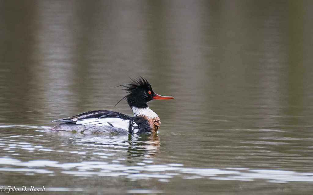
I think you have a find image, Carol. it is almost spot on excellent. The only thing that gets my attention is the brightness close to the birds body. I have to offer as suggestion, a little less obvious vignette, but darken slightly the background in all areas. I find the bright almost a glow like effect immediately close behind the bird in all areas a bit distracting. A nice uniformed feathered with only very slight darkening might achieve the separate and subdue the bright area I am talking about. I think some folks using layer masking for that. I do not not use that and would work on it other ways with Lightroom and ON1. An alternative is to think about how and you exposed the subject. Did you use evaluative or matrix vs. spot metering and could you gotten the original image a bit more uniform tonally across the image with focus still very much on a nice exposed bird. |
Apr 10th |
| 52 |
Apr 17 |
Comment |
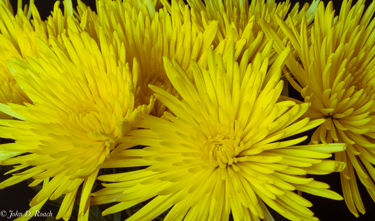
Wonderful image. I think you composition, color, tonality is very good. My only thought, as I reacted to the image upon opening it up and seeing it on my computer, is did you look a little detail on the edge in the whites of the flower petals. Beyond, that, I can only say....I really like it and think it could make a pleasing print. |
Apr 10th |
| 52 |
Apr 17 |
Reply |
Mike, I went back and cropped the image some more in a manner that I thought I might find more pleasing. As I discovered the first time around, it made the grain from noise a little more pronounced, but I attempted to clean that up in Lightroom after some selective brush (shadow, exposure, clarity, saturation and dehazing) to keep some clarity in the duck. This makes the bird a little bigger by cropping and hopefully acceptable tonality and give the bird room to move and a sense of movement overall. |
Apr 10th |
 |
| 52 |
Apr 17 |
Comment |
Mike, the crop is a good idea albeit, perhaps less centered and not as severe, would be my preference. However, leveling the bird at center of the frame has made it look stationary and even a bit strident (not unlike a mounted duck). It seems to have lost a certain liveliness and motion. I was actually more concerned with the tonality of the image and the bird. Nonetheless, I appreciate the alternative viewpoint. |
Apr 9th |
7 comments - 3 replies for Group 52
|
| 64 |
Apr 17 |
Comment |
Very well done, Jerry. I like your image a lot I was in Tetons and Yellowstone last fall (late September and early October). What majesty in the landscape! Your image presents that world well. I find everything about your image wonderful. I know Stuart is speaking about Judges, but you are artist and if you like it, I say go with it. What Judges like, while important for I have been a Judge, is not the same as what is self satisfying, attracts an audience, and even sells. This is a dramatic, action packed image. I have seen scenes like this and I think you captured its essence wonderfully. Your clouds and sky are luminous and compliment the landscape quite nicely. Indeed a fine story. If I had one thing I might want to see a little different is upon up shadows just a tiny bit in a couple of places, but that is just a matter of taste and vision. Again, splendid image. |
Apr 10th |
| 64 |
Apr 17 |
Comment |
The first moment I saw this image, I like it a lot. I think it would show very well on metallic paper or aluminum media for print with a satin finish. It's luminosity is wonderful. The story is Grand! |
Apr 10th |
| 64 |
Apr 17 |
Comment |
I like the image. It is dramatic and full of action telling us a wonderful story of challenge. Overall, though, I think it could be brighter. To my eyes, the trees and vegetation on the land in the background is a bit "muddy" and lacks detail. A slight amount of shadow opening might be an option to consider. I would have enjoyed seeing the scene and like how you share it with us. I think Stuart nailed it in his evaluation of the other elements of compositions. Again, nice job. |
Apr 10th |
| 64 |
Apr 17 |
Comment |
Wonderful image. I like your explanation and the challenge to control the light. My only thoughts are (1) that during post you might consider opening up some of the very dark areas in the trees and rocks, selectively, to provide just a hint more of detail; as well as (2) remove whatever the white "think" up the hill from the Lighthouse that got my attention. Well done! |
Apr 10th |
| 64 |
Apr 17 |
Comment |
Liz, I looked at the specs of the camera again and was impressed that it is f2.8 through the full range of the zoom. I like your image and that is saying something for me, since I tend not to like depressed looking subjects. I think you captured its essence well and your image suggests a story of many things moved on the rails as well even a rider like what we call "hobos" here in the US.
I like the tonal range in your image, the overall sharpness and detail as well as the composition. I think, if it where my image, I would do some selective contrast, clarity and sharpening of the flat boards in the foreground to pull out a little more detail. Overall, a fine mono image. |
Apr 10th |
| 64 |
Apr 17 |
Comment |
I believe this is a wonderful image in many ways. Good use of monochrome with some reservations in my opinion. The composition is very nice. While I do a lot in camera as well as post RAW image conversion to B&W, I am not sure that a butterfly, unless done in a higher key that reveals more detail, works for me all that much.
Perhaps, I would feel a little different if the vignette was less pronounced and it was a little brighter. I think, especially on the upper left side of the butterfly wing it fades right into black and the edge is lost and so there could be more separation to set it apart from the background. |
Apr 10th |
| 64 |
Apr 17 |
Reply |
Don, I am glad the image makes you think. It sure does for me. I often try to pre-visualize a scene even if in wonderful color as possible in black and white. One of my instructors taught us to "see in black and white" and shoot it with that in mind. I try often to do that. I tend not to consider an image an either/or option, but rather an alternative way of seeing. At times, I end up like the monochromatic tonalities better because color can sometimes "get in the way". Sometimes the color doesn't work as well in establishing a "feeling" for the subject or scene. I offer below the color and I think in this case the monochromatic expresses more emotion or at least a different emotion. |
Apr 8th |
 |
6 comments - 1 reply for Group 64
|
13 comments - 4 replies Total
|


