|
| Group |
Round |
C/R |
Comment |
Date |
Image |
| 52 |
Mar 17 |
Reply |
Sometimes, we think we can! I have seen photographers in pretty dangerous places. At my age, I take it bit more carefully...don't want broken bones or cold. I get the humor though! |
Mar 23rd |
| 52 |
Mar 17 |
Reply |
Congrats, Judith. Awesome! |
Mar 23rd |
| 52 |
Mar 17 |
Reply |
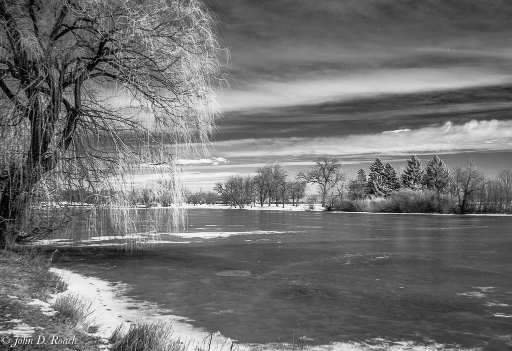
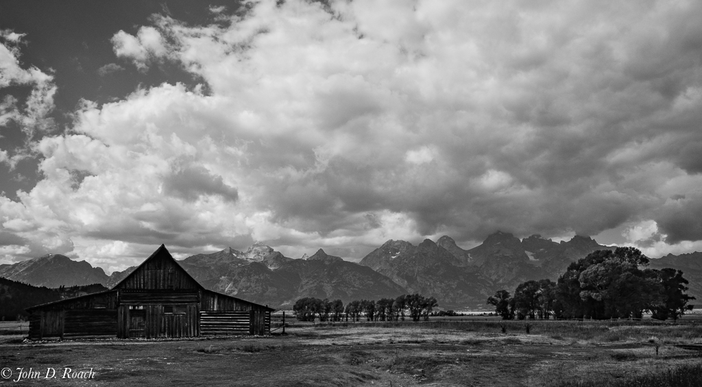
Ice and now covered lagoon with danger signs are all around not to go into the water especially due to the idea which was pretty thin...I was next to one of the signs when I captured this image. The area is mostly in shade. |
Mar 23rd |
| 52 |
Mar 17 |
Comment |
Thanks, Lisa, Carol and Sharon for chiming in on my "oh, by the way" musings. I was glad to get some perspectives from our group as I facilitate another group. And, It appears that the new monochrome group that I have just had the opportunity to become the administrator is off to a good start. BTW, We have one opening for a monochromatic enthusiast.
Thanks for the comment Carol.....yesterday we concluded a pretty heavy late winter snow storm and I went out to the same spot and got some more images with snow. I tried to keep some of the thoughts mentioned here as I captured the images, but seem stuck in my one view point. We will see when I upload to Lightroom my images today. I hope to create a portfolio of seasonal variations of that scene at some point. |
Mar 15th |
| 52 |
Mar 17 |
Reply |
Sharon, I agree about the negative space issue. I actually think that might be what is effecting the comments about point of interest not being strong. If I had the far shore higher as in the monochrome version and others I have done over time at the same location then the opposite shore demonstrates itself more forcefully. In all those situations that horizon line was higher. I actually think I have always felt the downside of the image was the excess negative space and the far shore being to low in the frame. Albeit, we keep learning....thanks kindly for the nice comments about the monochrome example. |
Mar 10th |
| 52 |
Mar 17 |
Comment |
I tend to disagree with everyone about the point of interest, but that is ok...no right or wrong in image creation unless it is blatantly bad. I think the trees with the light is a cool point of interest. We all have our perspective, but I learn how different folks see and that is good and I keep it in mind during each subsequent situation where these type of points may come to mind. I often wonder what folks look for, why and more and more I see it varies a lot. Thanks for the comments they are always helpful.
BTW, I am noticing something that is starting to seem like a skewing of objectivity in reviews. I sort of wonder if there is a way for reviews to be done without subsequent reviewers knowing what prior opinions are. I know when I was in another group for a long time, one of the members had the same feeling. It seems that seeing other folks comments tends to influence both positively and negatively the feedback being offered of all subsequent reviewers where discussion gets channelled sort of one or two particular ways. Then suddenly there is no further discussion on all the possible elements both creative and technical within the image. I ask this of our group since I am taking over as an administrator of another DD Group (MONO DD SG #64) and we have had a side bar email conversation on that topic. That is one benefits of the PID DSG groups (I am in one of those, where a reviewer is not influenced by other members of the study group comments and only later after all the reviews can there be further discussion. If folks comment further after all the reviews are posted there can be email discussion where everyone is copied and each can chime in. Thoughts? Of course the downside of that in those groups is getting folks to carry on further dialogue at all. As secretary of the the one group I am in that follows that model, I have to sort of force further discussion by initiating it on each persons image. Sort of two edge sword. Anyway, I welcome any thoughts. Sharon, you might have the most to offer in that area. |
Mar 10th |
| 52 |
Mar 17 |
Comment |
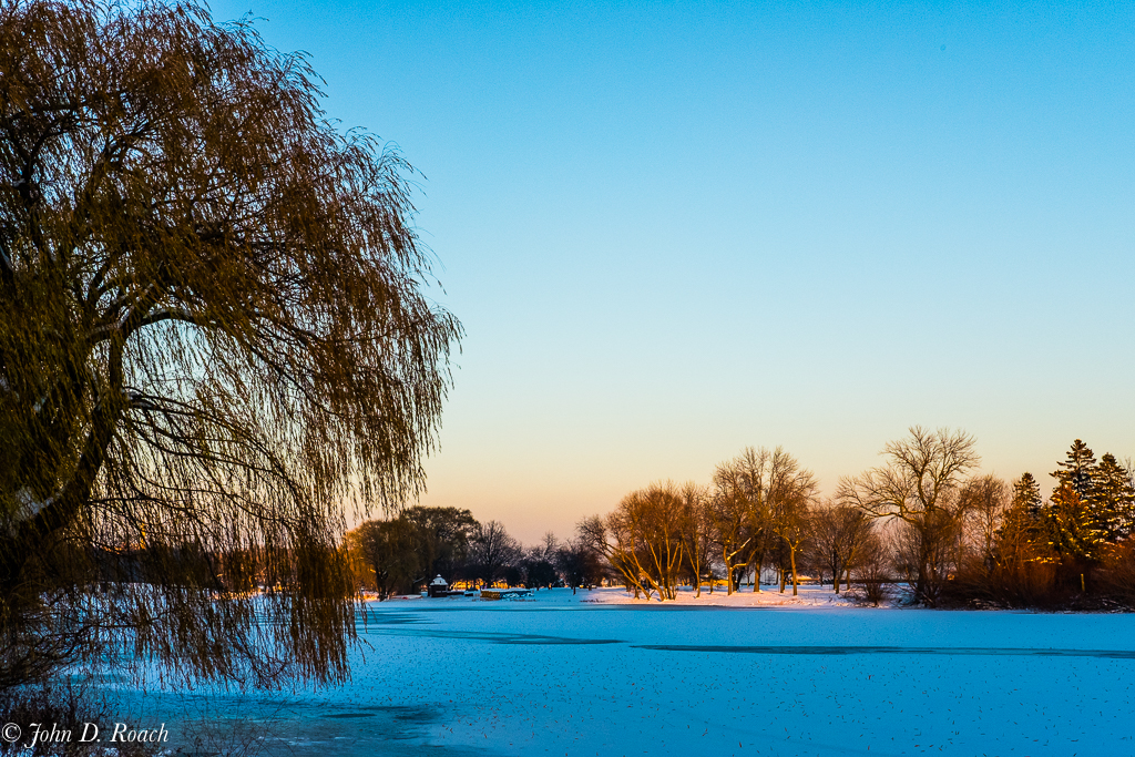
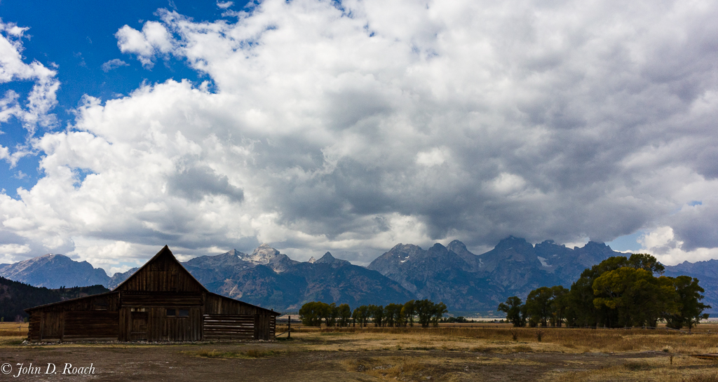
Thanks for noting, Mike, that I forgot to include camera lens and focal length. I used the fixed 35mm f2 prime lens on the Fuji X-Pro2. This Fuji X-Series rangefinder style camera which has a cropped sensor and as such the Focal length was 53mm for 35mm equivalent. Regarding the scene, it is not a house in the background. Rather it is a round concession stand for summer paddle boat rental which was intentionally included in this rendering of this scene. I have captured this scene at approximately the same spot at the lagoon often over the last several years. Of the 50 seasonal scenes renderings, albeit each slightly different, for the most part range in approximate (35mm equivalent) focal lengths between 30 and 50mm in order to keep the same context of view. The infrared mono capture of last January might offer below has a slightly different perspective (angle of view and focal length) that accomplishes something of what you suggest. Of course nature whimsy changes some of the scene. The original scene framing was cropped about 9.5%. Thus, similar scene framing with only the angle and horizon lines adjusted differently. The camera used was Nikon D90 590nm IR with 18-200mm at 22 (DX cropped sensor, thus 33mm equivalency for 35mm camera). Comments welcome. |
Mar 10th |
 |
| 52 |
Mar 17 |
Comment |
Judith, this is a lovely image with nice color harmony and suitable for the objective depth of field. It is a technique that is so hard to do. I have tried it only a couple of times with success. Tony Sweet (http://tonysweet.com/folios/) does this so well. See his flower images at his website.
I think you have gotten nice selective focus on the foreground flowers you selected and I like the the idea. My comments are that I think (1) it is important to get more of the flowers in the foreground in focus. In my opinion there is only one full flower and it has little distracting blur at its left (that could be toned down...the blur is ok, but it has some white that draws the eye away from the adjacent crocus. The next two crocuses are only partially seen (more of them would be better, I think). Then the rest of the image has a nice pleasing fade away, but (2) if the view faded further into the field of flowers with a lower and slightly wider angle of view and with more distance blur it might work better to fully harmonize the overall composition.
With all that said, I like the effort and think these type of images create great artistic opportunities for seeing flowers in new ways.
BTW, if you do not already know about her, also see the work of Kathleen Clemons (http://kathleenclemonsphotography.com) who does wonderful flower photography.
I have taken classes with both Tony and also Kathleen and while I still have a hard time getting it right, I learned a lot which with spring means more opportunity to practice photography of fields of flowers. |
Mar 9th |
| 52 |
Mar 17 |
Comment |
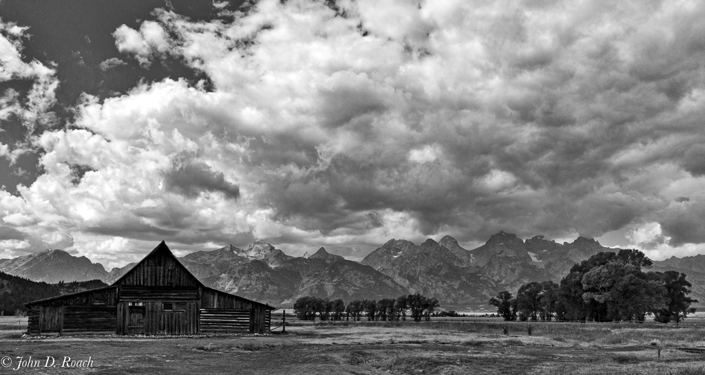
Mike....excellent, excellent. I love the composition, color harmony, depth, clarity and sharpness. My only suggestion for alternative look is to open up the shadow just a little so that my eye takes that easy leaps to the lovely snow covered mountain in the distance. |
Mar 8th |
| 52 |
Mar 17 |
Comment |
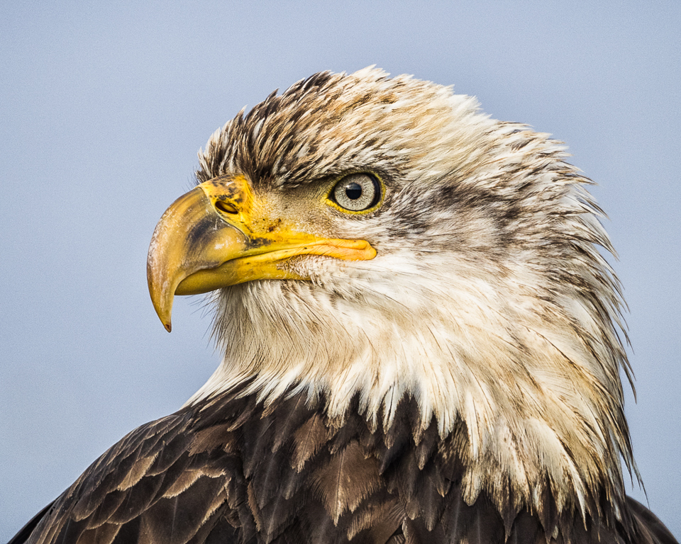
Tom, wonderful image in all regards. Color, composition, grouping of birds, story, tone, depth, reflections, clarity and sharpness abound. Cropping as a square is awesome. It cuts agains the grain. I have been doing it more and more and it shows so well in art exhibits. Beautiful job. |
Mar 8th |
| 52 |
Mar 17 |
Comment |
Carol, that is an interesting statement about the WB. I shot both jpeg fine and RAW at times especially with my Fuji camera. The Fuji RAW was really flat and needed a lot of adjustment in Lightroom or with Iridient Developer (a RAW engine that works nicely with X-Trans Fuji Sensors) to garner all the data. The JPEG was Fuji Vivid and in my minds eye it was pretty faithful to the scene which had a pronounced blue cast in the abundance of shade and marked blue sky. I did show using Auto WB (5200K) and not open shade, but in these newer cameras I rarely shoot anything but Auto since the rendering is so nice. I have attached an edit via LR of the RAW image and pushed the WB to over 6100K. While I like it as an alternative, I still really like the jpeg rendering. In both cases I think we still have a blue cast to the snow (shade and bright blue sky). Unfortunately in the alternate rendering shown here the sky lost some punch which the vivid picture control offered. I guess, we could continue to debate this. As I do more artful stuff I have begun to pay less attention to WB because I firmly believe there are myriad ways of seeing. But, we could all take a vote. Original post vs. the alternative offered here or some other alternative. Thanks for getting me to think about it.
Lastly, why is stronger point of interest important to you. A landscape stands as it is and actually in this case, since it is all about the light, I think the patch of light is what captures my eye as I wander the scene. I am just curious about how folks view images that are more about the overall scene and less about a specific focus point.
Thanks again for the insights. |
Mar 8th |
 |
| 52 |
Mar 17 |
Comment |
Sharon, I do like your image a lot. However, I want to like it even more. Somehow that background almost seems too stark for me...must be my aging eyes or it might be that by contast I want to see more detail from neck down into the body skimming the water. I am not sure. Maybe it is some selective sharpening along the neck and and bring out more detail in the top darker part of the body. Regardless of my musings here, it is a very nice image. I love the motion, the composition and the way the bird seems to be looking right at me. |
Mar 8th |
| 52 |
Mar 17 |
Comment |
Lovely image, Carol. You did great! I have only two suggestions. I think it could use a little more clarity and sharpness on the features just above and to the right of the eye and some curve adjustment to give the bird a little more pop. I may have done a couple of things, too. I just love your image want thought I could share enhance even more. |
Mar 8th |
 |
| 52 |
Mar 17 |
Comment |
Lisa, I am assuming you mean extension "tubes"; correct. I have some but have never gotten the hang of them. I rather have good light and go for very close and stopped down exposure and focus using a macro lens or a long lens as close as I can get within the focus range.
I have to echo Sharon and Carol. I don't quite get the high ISO and the high negative EV. I believe the image is too noisy and isn't sharp enough in many areas both center and at the edges. It is my opinion this type of image of a flower is best created with really good sharpness, clarity, luminosity and depth of field through and through. The composition is fine. The light is just not there, in my opinion.
Due to the tonality associated with the darker center and the level of noise it is hard to be comfortable with the color, too. However, that might be my eyes today...they are a bit tired.
Lastly, for really nice enhanced presentation, I recommend no spots. I see a lot of spots (pollen, etc.) that become obvious close up that I suggest be cloned or spot removed out of the image. |
Mar 8th |
10 comments - 4 replies for Group 52
|
| 64 |
Mar 17 |
Reply |
Liz, I am glad you shared this with us. I think this information about the grain you added is a good example (for all of us) of how important it is to share as much information about "How we create our images" when we post our descriptions so that we as reviewers can have all the facts. I actually, reviewed the image with a bit of that question in mind. I do the same often but since the in camera features vary from camera to camera, I do it in post. Thanks for the clarification and I hope that offers some information for all of us. Very good. While I don't need another camera, I will have to check that one out sometime to see what the in camera functions are like. Very cool. |
Mar 22nd |
| 64 |
Mar 17 |
Reply |
Stan,
I am confused by your reply to my review of Don's image. Please clarify. |
Mar 13th |
| 64 |
Mar 17 |
Reply |
3. Attached is the RAW Color version converted to Mono in Tonality. |
Mar 8th |
 |
| 64 |
Mar 17 |
Reply |
2. Attached is an edited RAW Color Version. |
Mar 8th |
 |
| 64 |
Mar 17 |
Comment |
Hi, everyone. I like the first few comments here as a way for me to revisit this image form 5 months ago. Thanks for the feedback.
Don, Stan and Stuart, I agree that it would be nice to get a little less black in the trees, but it is very hard to do without making the image garish. I think this is a case where the out of camera JPEG (I had shot both RAW and JPEG Fine) was a bit underexposed, since I was trying to manage the highlights in aperture priority with -0.7 EV. Given less data to work with in the JPEG it became hard to open up the blacks. I also think this is a case where I messed with the image way too much trying to dehaze the image which then adds black back even though I did it selectively as well as globally. Attached you will find three version as a relook at the out of camera monochrome jpeg adjusted anew and an edited RAW Color version in LR and finally a third version wherein I created an alternative Mono from the Color RAW using MacPhun Tonality CK. I still have some haze but overall the tone quality both in the jpeg Mono and RAW created Mono is far better then my first iteration, I think. I welcome thoughts.
BTW, I while familiar with Zone System theory, I franking pay little attention to it. Rather I follow my instincts. I am a bit of the opinion that the Ansel's system evolved as an explanation of how he followed his visual instincts.
1. Attached is new edit of the mono jpeg. |
Mar 8th |
 |
| 64 |
Mar 17 |
Comment |
I like the story very much, the tonality for its gritty quality. I think the focus is clearly about the train driver, cab and behind him. Thus the foreground elements are pretty soft and thus a bit distracting for that. I see this in the original, too, when we see more of the train's boiler housing. If the focus had been closer to the center or a bit right of center, it might, have been sharper through and through. That said, it is a very cool image and your crop makes a lot of sense and works. I like the image. |
Mar 8th |
| 64 |
Mar 17 |
Comment |
I like the concept of the image and the basic composition. The image resolution got my attention immediately and, in my opinion, is lacking in a lot of detail thus making everything seem a little muddy and flat. Could that be to noise reduction efforts?
Regarding the boatman's pole, Don's comment makes sense. I however, think cloning it out so it doesn't meet the top border would look unrealistic, since I have always been so aware of how long those poles are and it would look too short. It might have been more effective to handle the scene by framing in camera using a slightly smaller focal length or if cropped in post processing to reduce the crop some. |
Mar 8th |
| 64 |
Mar 17 |
Comment |
Your image is wonderful. The composition, clarity, sharpness, and symmetry are fine. I think during post work you garnered nice tonality and your lens correction was wonderful to get those lines straight. Well done.
I see what Stuart means and perhaps you will need to take a trip back, Stan (smile). However, I tend not to want to suggest alternative viewpoints, since I don't know the constraints that make it possible or impossible to get a slightly different viewpoint or perspective. In fact, I sort of like the "hint of more" with the rear dome, but then that is just me.
So well done, Stan...lovely image and well presented! |
Mar 8th |
| 64 |
Mar 17 |
Comment |
I believe you have an interesting subject with a pleasant reflection. I like the composition and manner of presentation.
It seems, I believe, that at ISO 125 your out of camera jpeg set to monochrome is a bit noisy and that surprises me very much given the quality of today's digital cameras. However, I not opposed to it, since often the grainy characteristics of film is a look many of us strive for at times with our digital images. This is a case I think even with a jpeg, where you have less data to work with, some de-noise adjustment in post processing could remove some of the grain.
What was your focal length? Was this zoomed in quite a bit. Was this the Leica you described in your bio?
I think your horizon line could be adjusted in post work to get it level and then you might need to do some lens correction to ensure the towers are still straight, if necessary.
Finally, while it is a matter of taste and what your vision of the scene is, some opening up of the shadows in the left foreground would allow the viewers eye to travel through the image more fluidly. |
Mar 8th |
| 64 |
Mar 17 |
Comment |
In my opinion, you have created a simple and straight forward minimalist image. I think it is a fine example of elements of design with nice textures and a certain tension created by your choice of orientation. Additionally, I think, you have achieved very nice tonal harmony, clarity and sharpness through the display of the bridge and your background is well selected and presented so that our focus on the bridge elements which allows us to see the texture in the main bridge truss. I liked your image from the first moment I saw it. |
Mar 8th |
6 comments - 4 replies for Group 64
|
16 comments - 8 replies Total
|


