|
| Group |
Round |
C/R |
Comment |
Date |
Image |
| 95 |
Dec 23 |
Reply |
Oh gosh, I did mean to say parallel!!!! So sorry! Foobar, my bad. |
Dec 23rd |
| 95 |
Dec 23 |
Reply |
Oh, I like that grey background! |
Dec 23rd |
| 95 |
Dec 23 |
Reply |
I like what you did with the background; I might suggest a reduction in overall BACKGROUND clarity to soften those white lines. Just the background. |
Dec 23rd |
| 95 |
Dec 23 |
Reply |
I usually request three at a time; that's the limit. I always feel like I have plenty of time to watch them. Just be aware that it takes a week or two to receive them because Sharon is very busy. |
Dec 23rd |
| 95 |
Dec 23 |
Comment |
I wanted to wish all of you Happy Holidays! May 2024 be filled with Photographic Opportunities for each of you! I'm glad to be part of this DD group.
|
Dec 23rd |
| 95 |
Dec 23 |
Reply |
Thank you! |
Dec 23rd |
| 95 |
Dec 23 |
Reply |
Thank you! |
Dec 23rd |
| 95 |
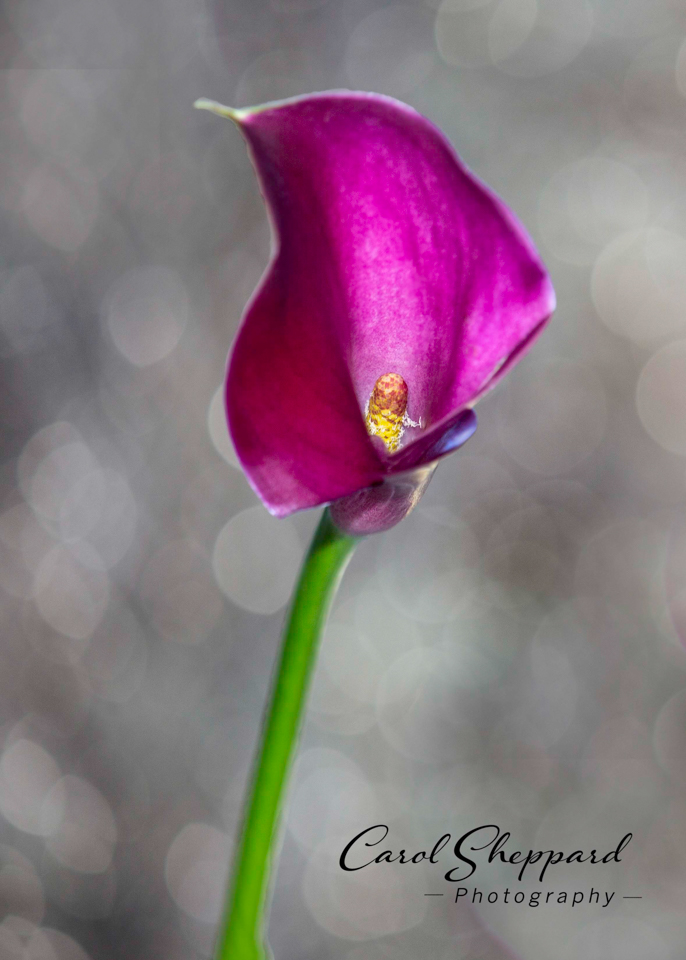
Dec 23 |
Reply |
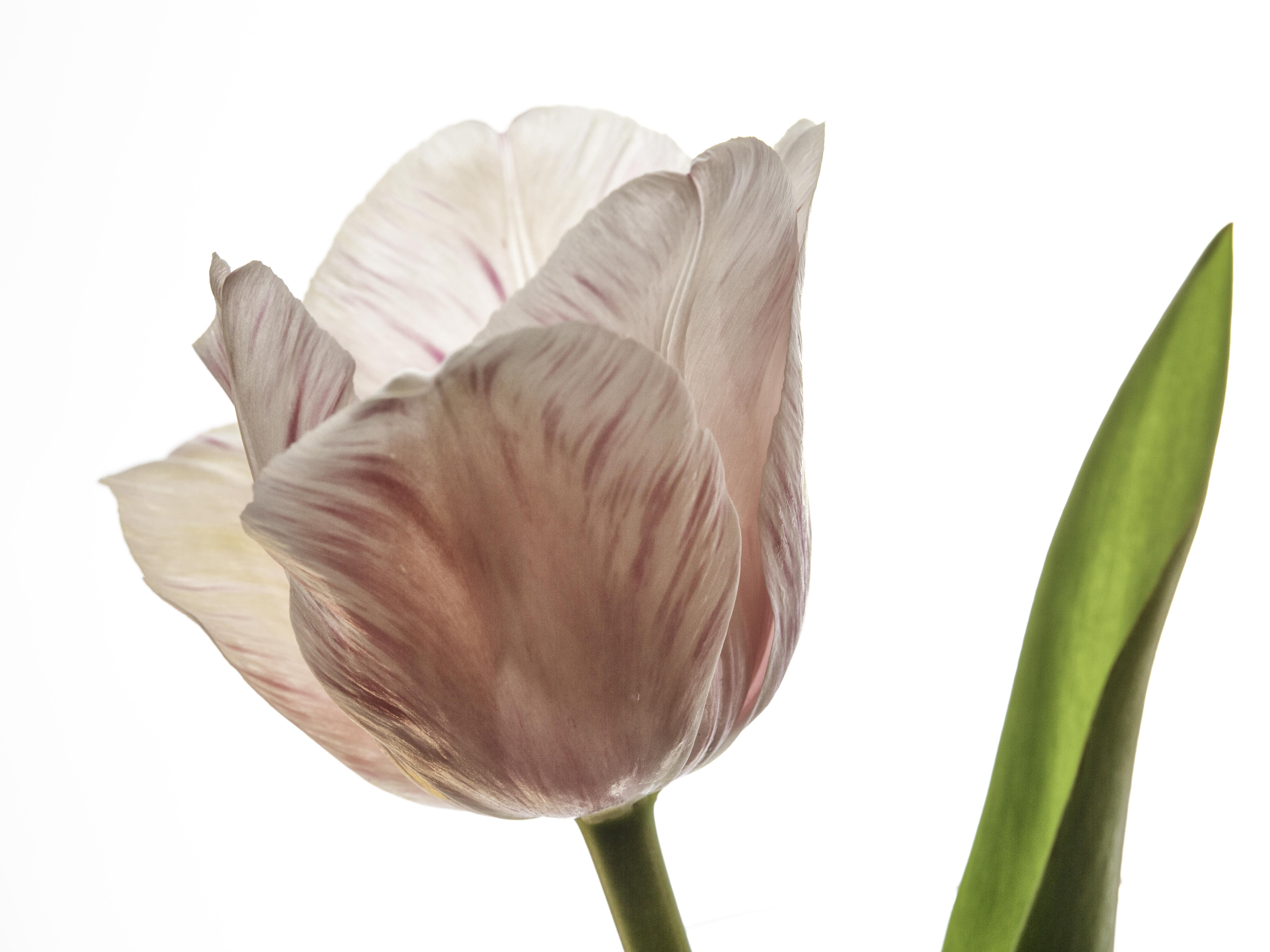
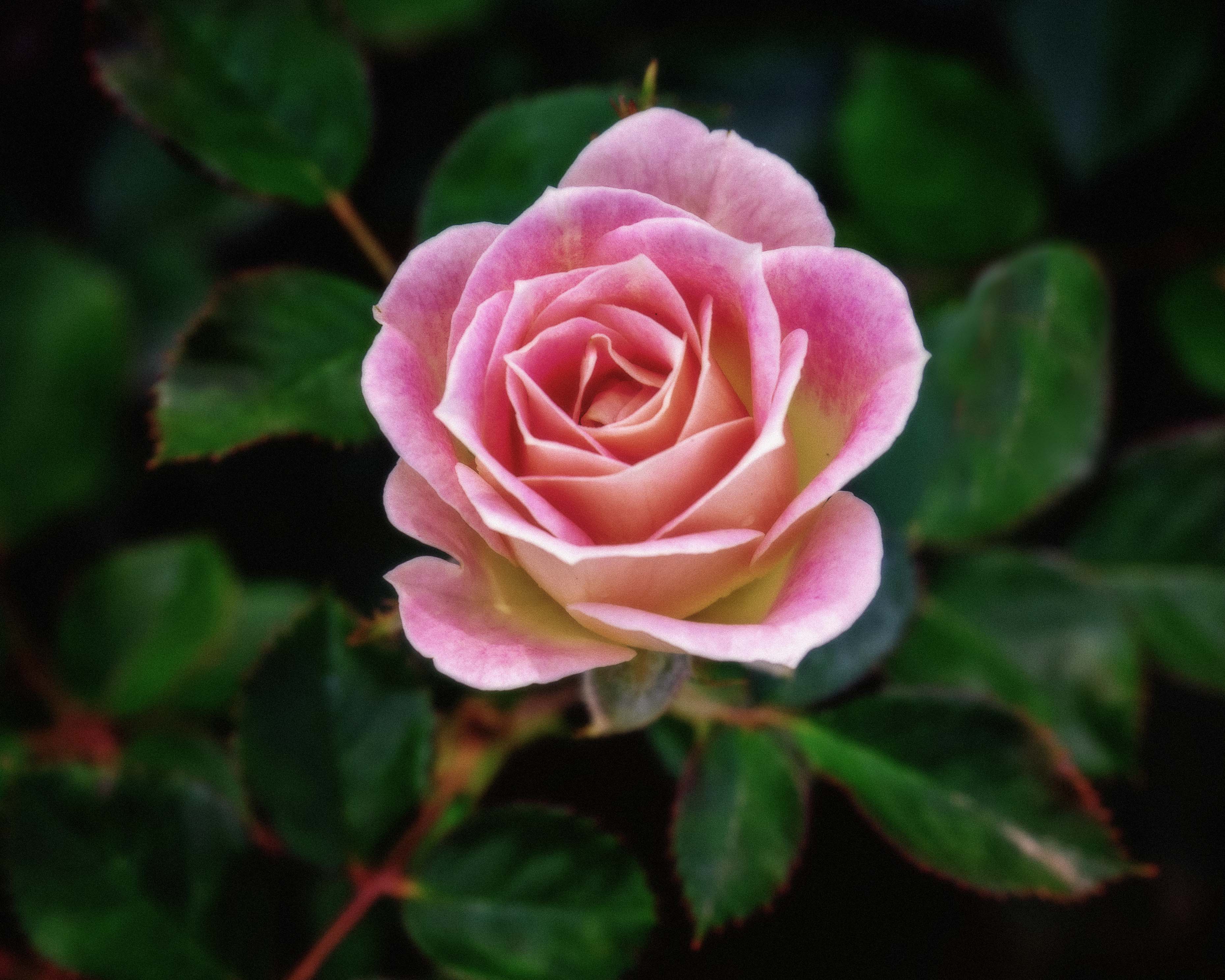
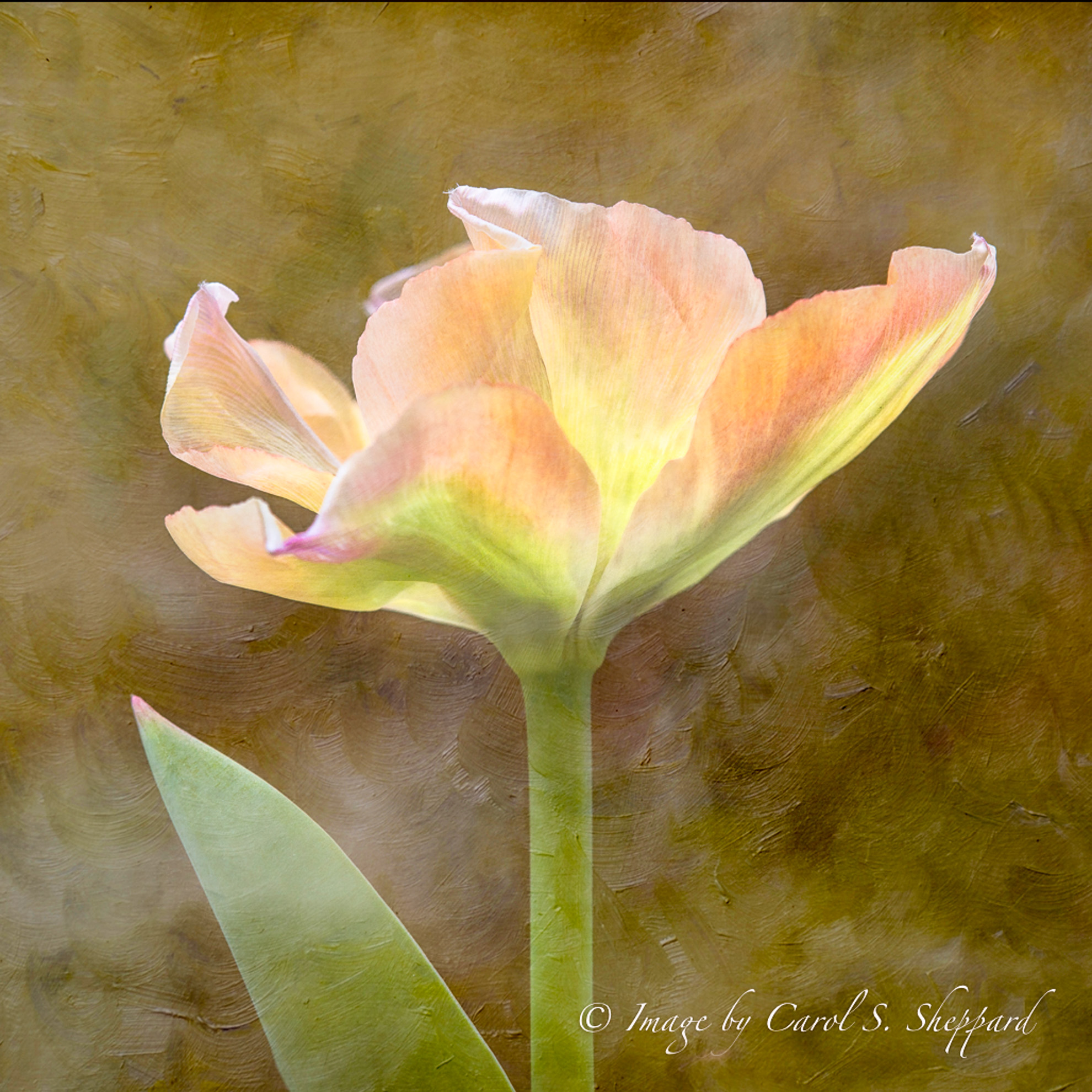
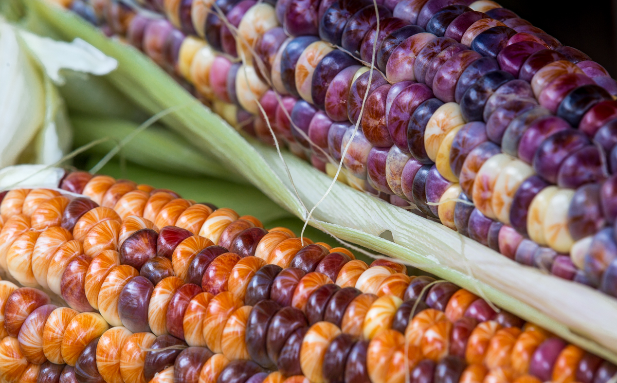
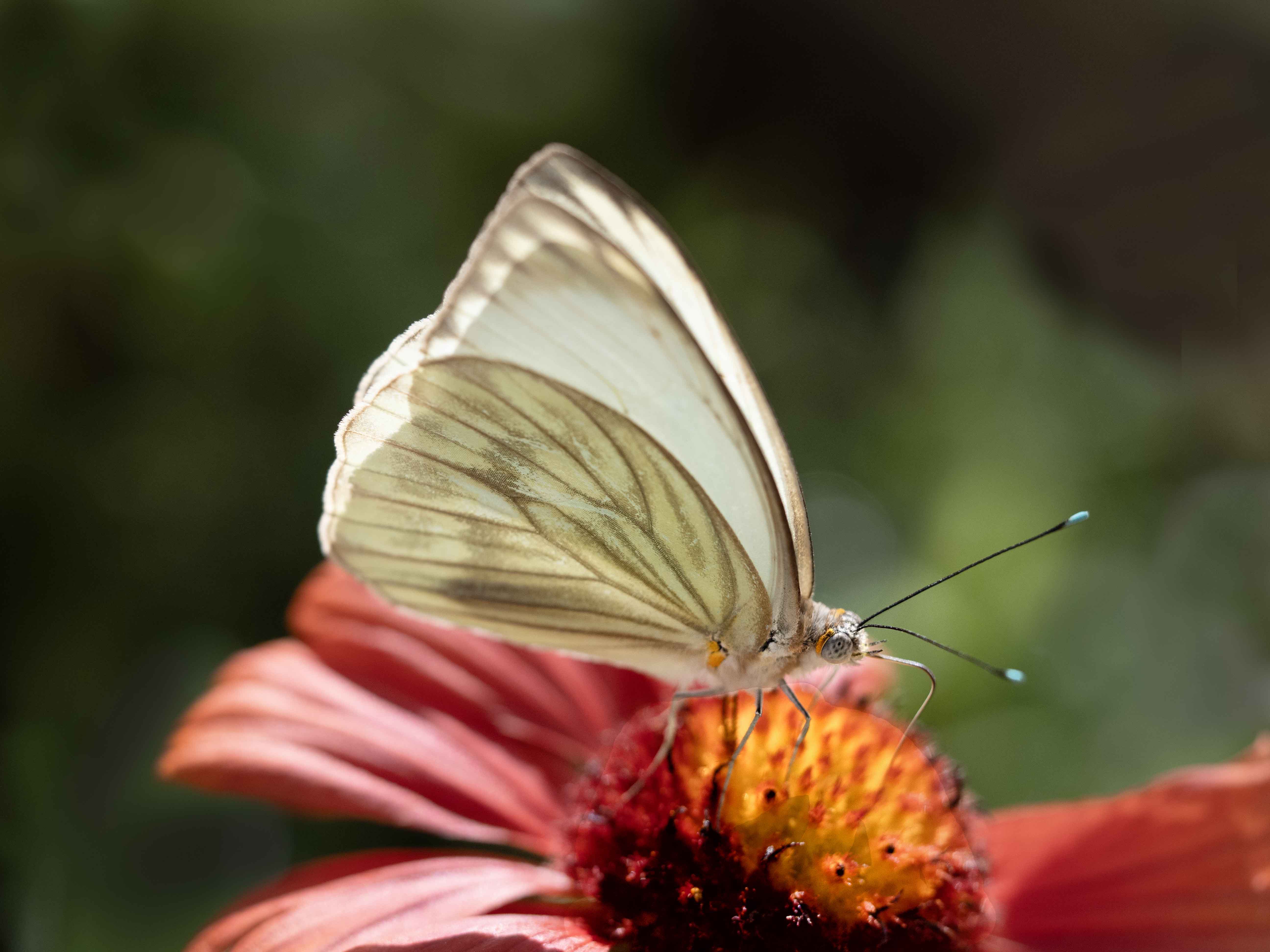
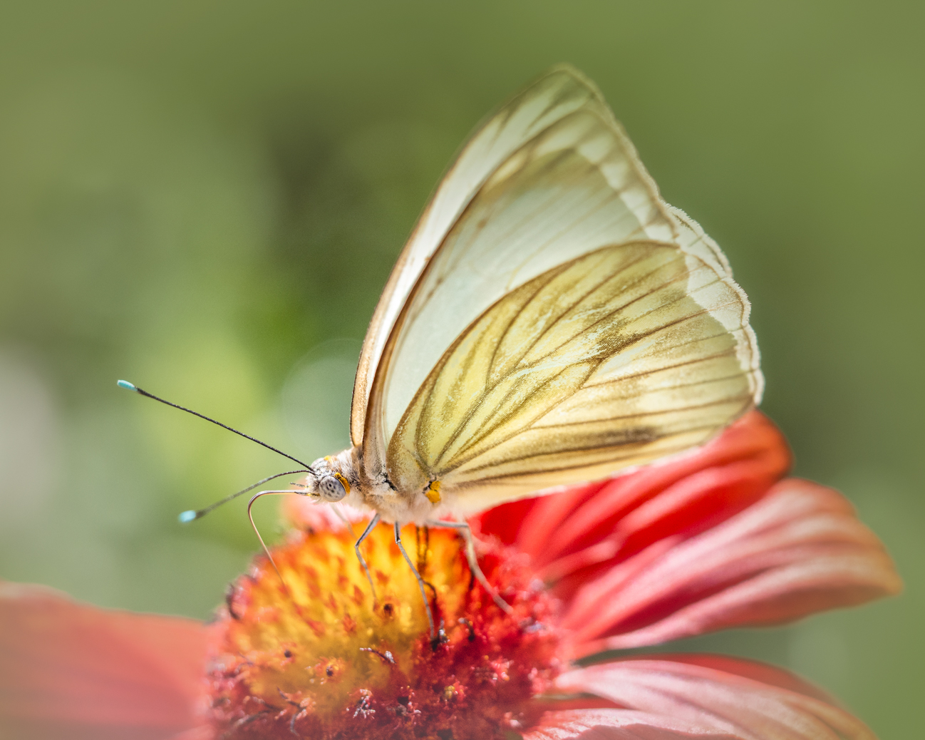
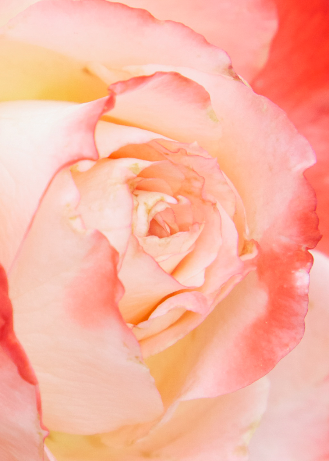
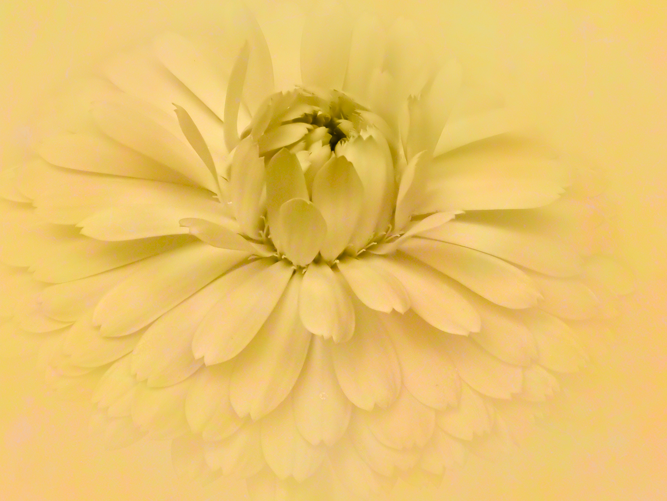
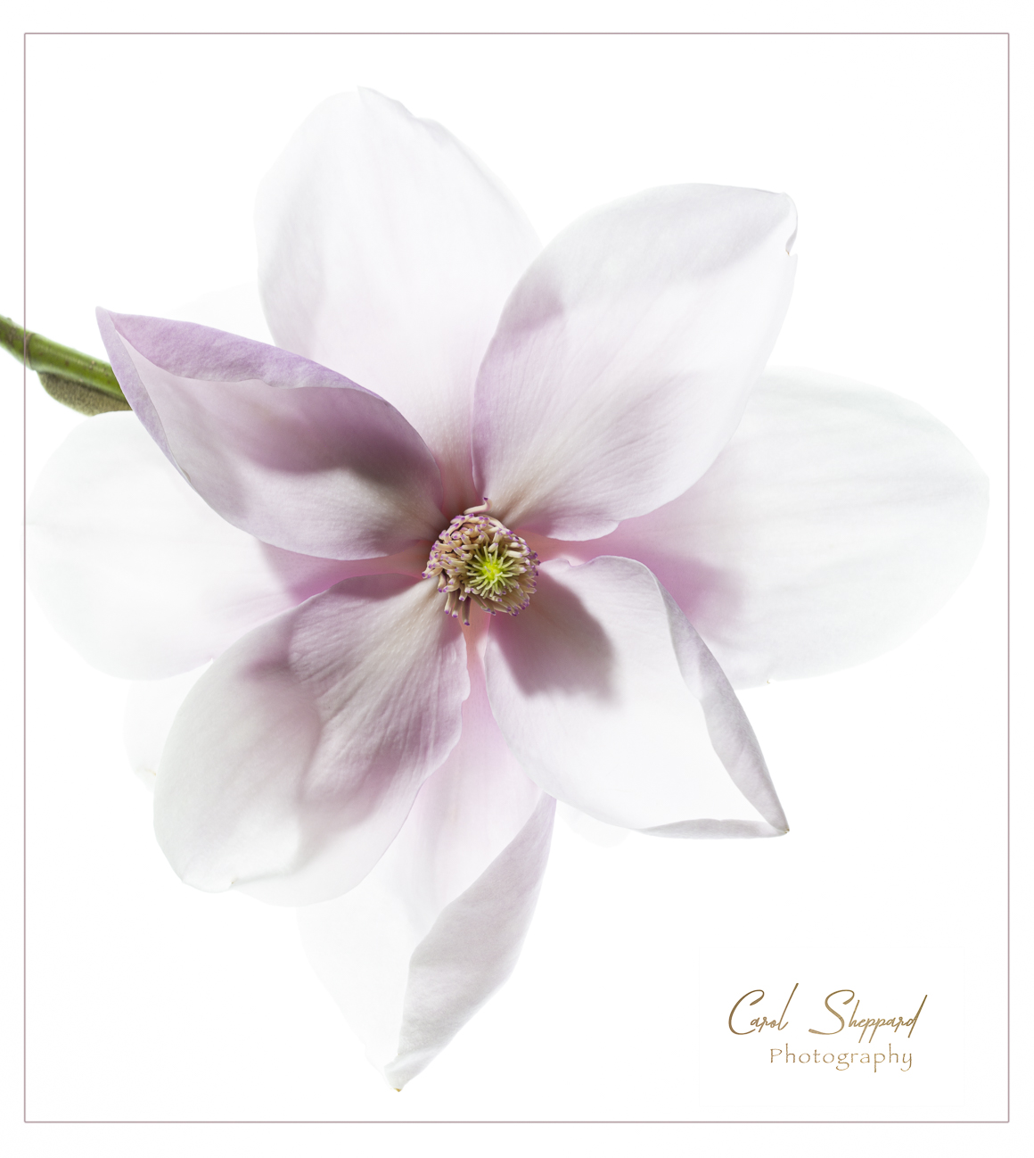
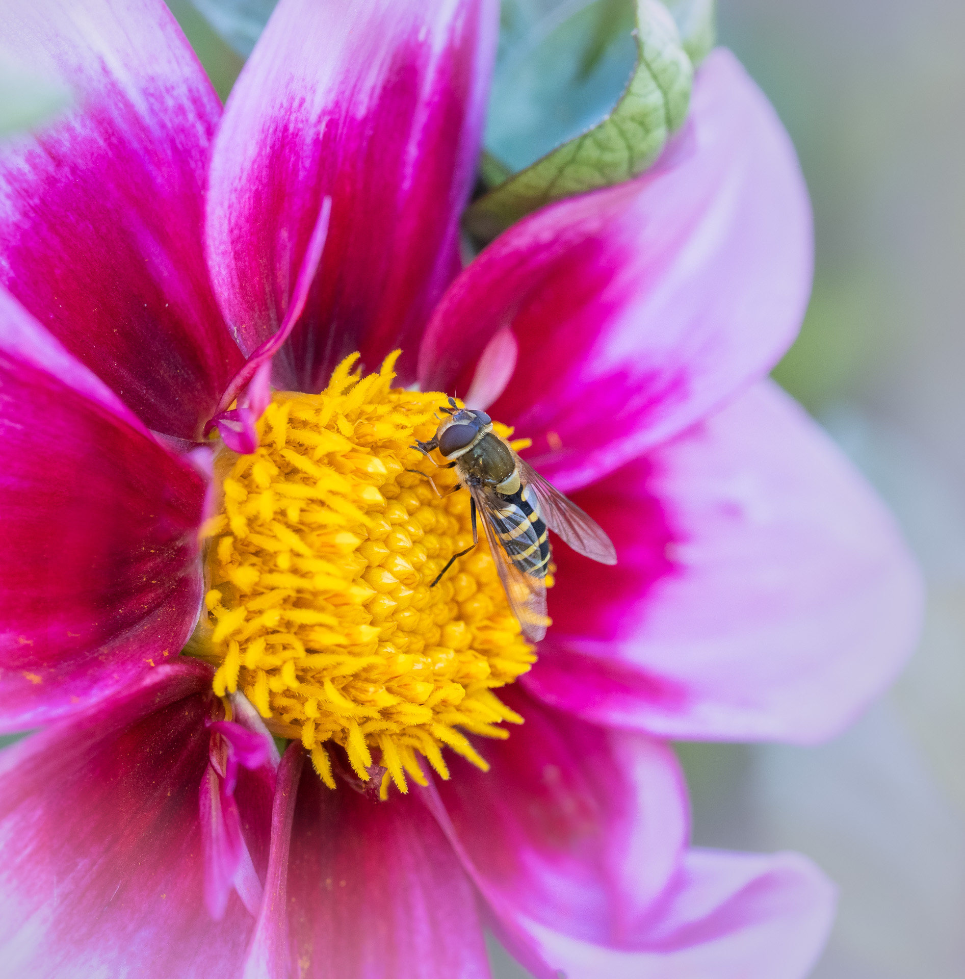
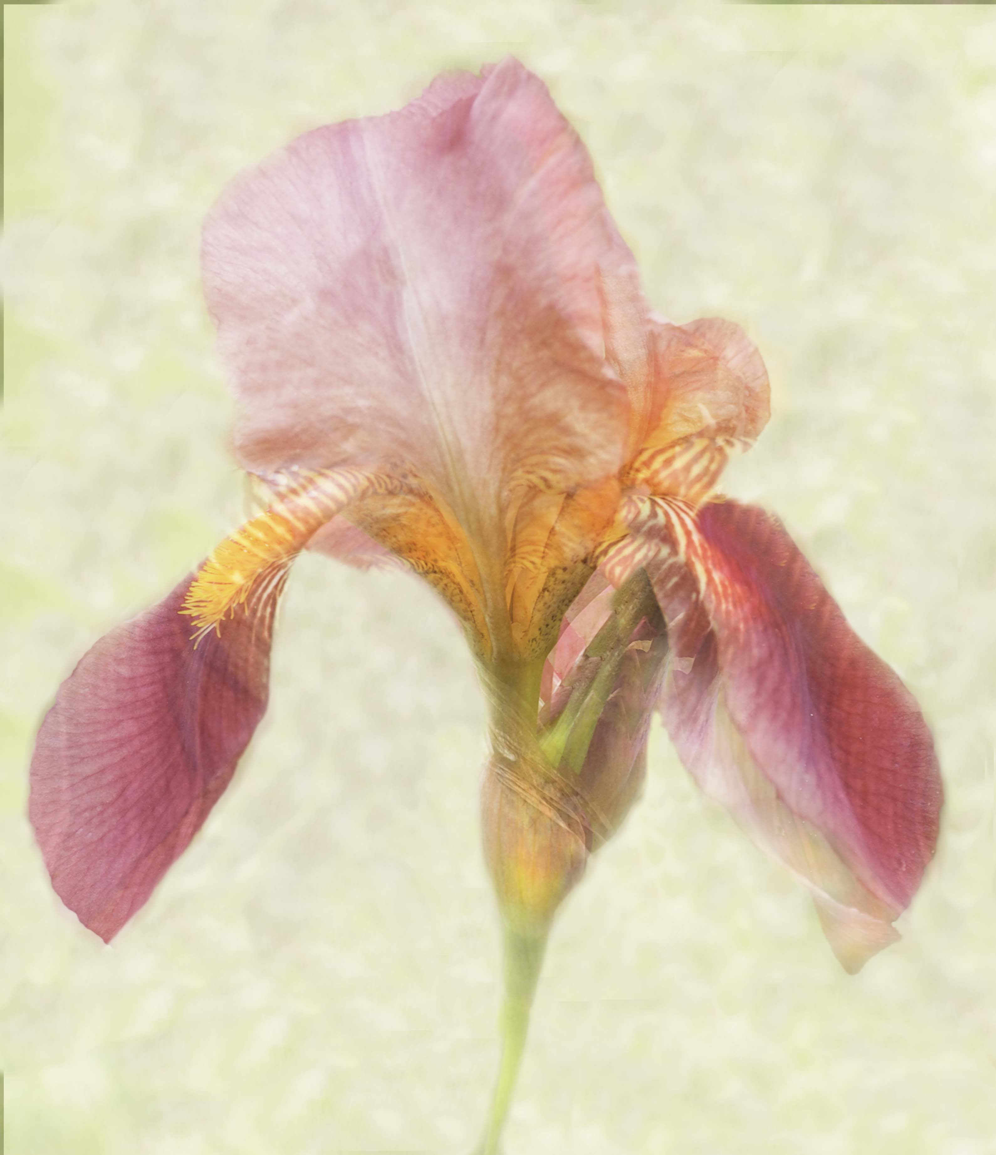
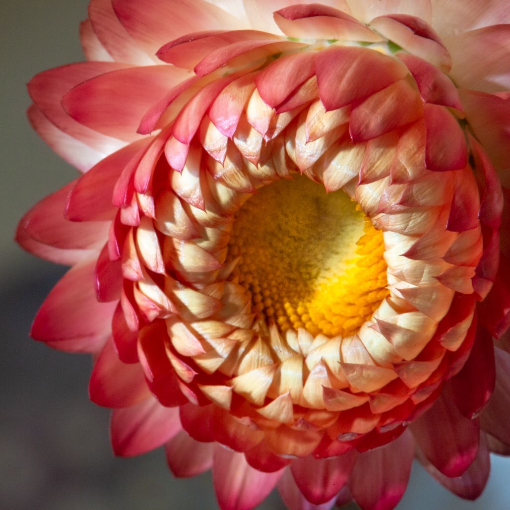
Good input! I didn't do anything to make this look like a watercolor--so couldn't do it again!! But I do like the different shades, as they helped create the watercolor effect. I would love to know who likes the yellow and who doesn't? The yellow can actually be minimized in post, so maybe I will play with it and see the difference. For me, roses can be hit or miss as macros, but I agree that a close-up of a rose is a totally different subject from a standard shot of any type on the same flower. |
Dec 9th |
| 95 |
Dec 23 |
Comment |
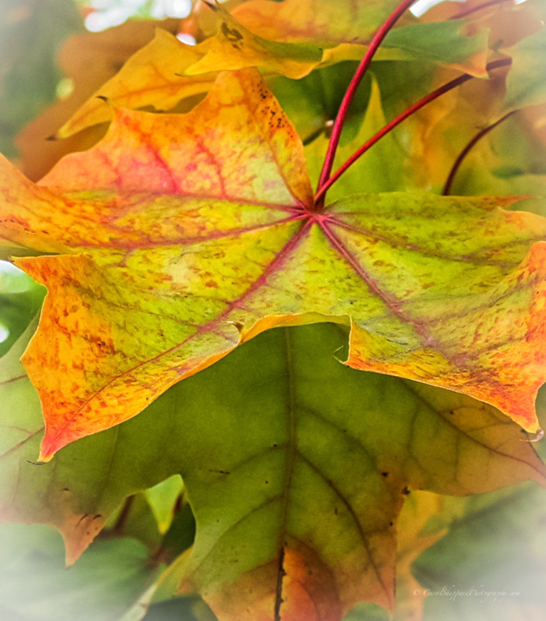
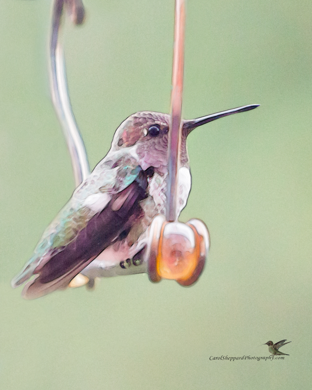
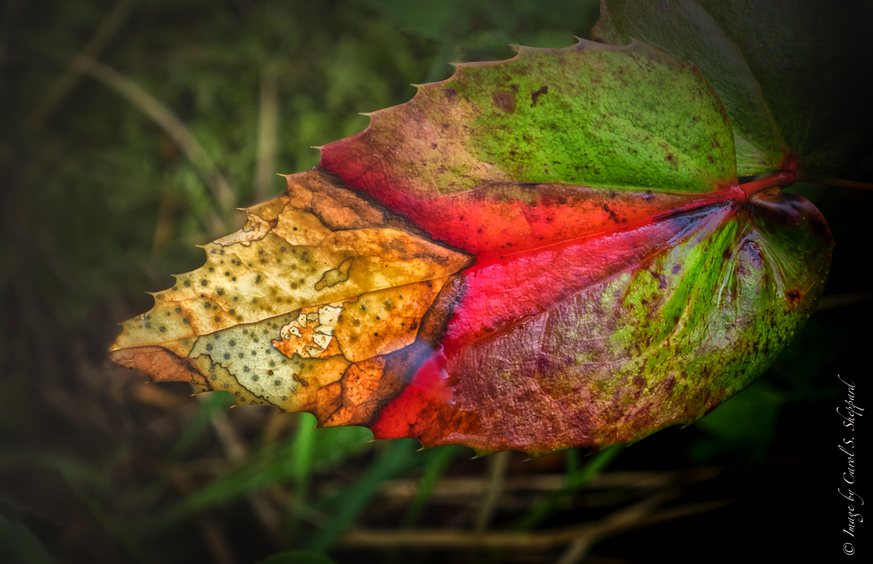
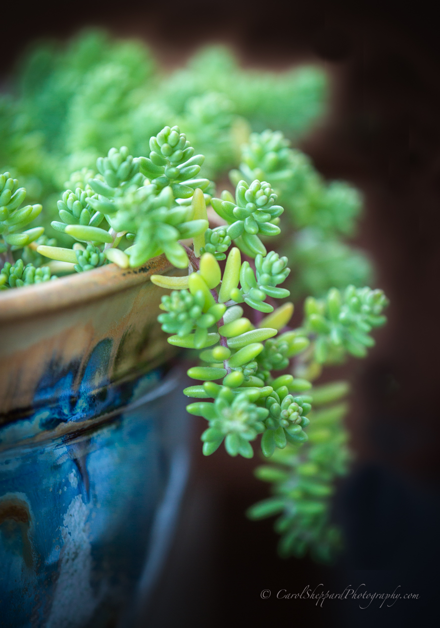
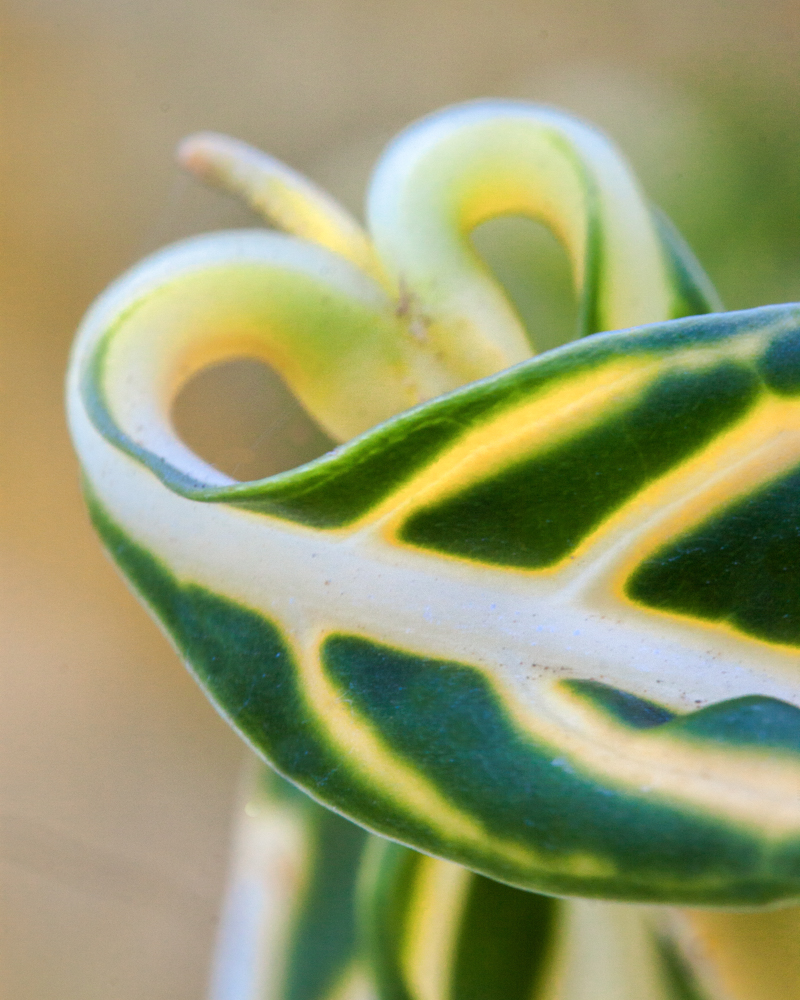
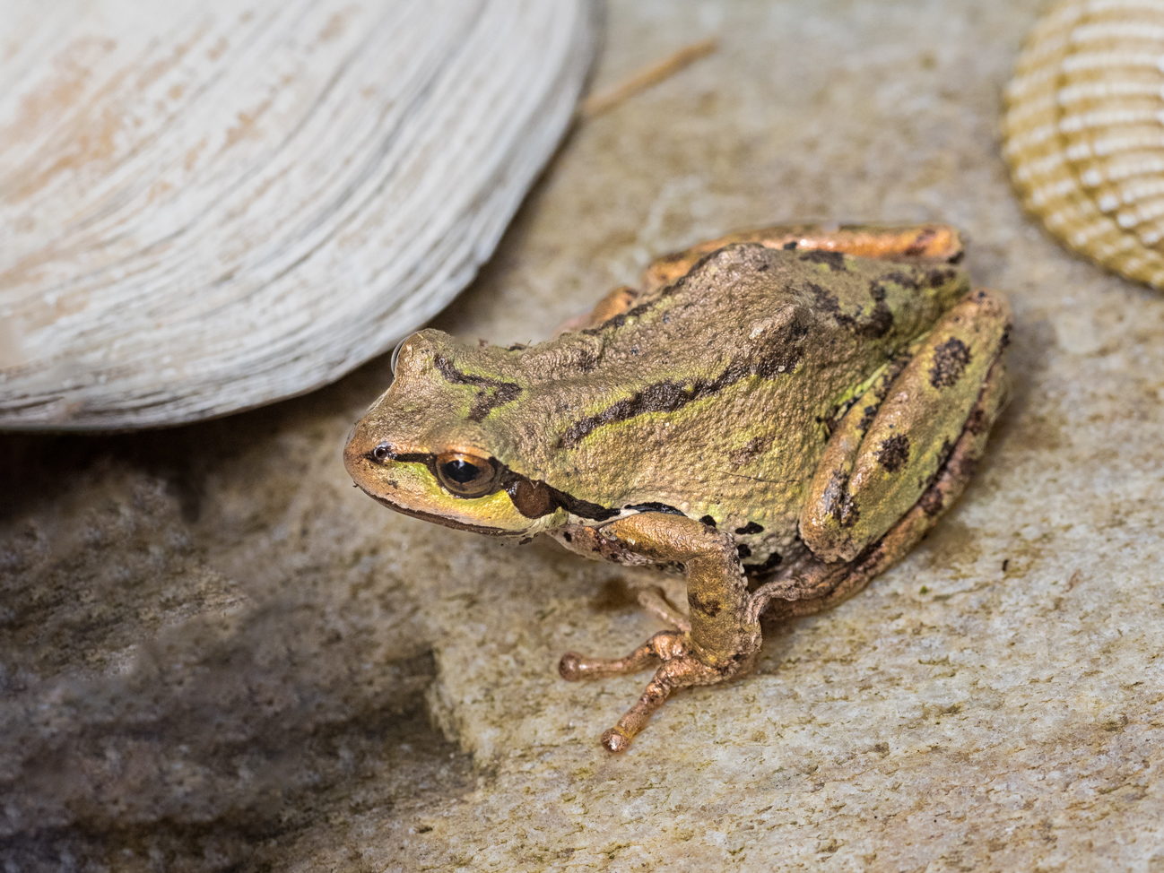
Keith, kudos on applying yourself to mastering focus stacking. What I was thinking is: did you need to focus stack for this subject? This leaf looks like it is on a pretty flat plane, so as Stuart had said, if you place the leaf perpendicular to your lens face (camera sensor), you should not have needed to focus stack--and 35 is just making it too hard on yourself. Many tripods will allow you to focus your camera straight down; a Platypod might also work on a tabletop. Your image is very, very sharp. The highlights are enhanced, but they were in the original, too. Natural light can still produce too much exposure; maybe bring your exposure down next time. If you used 2.5 secs, that was way too long, IMHO? I would suggest you try different perspectives, with less focus stacking and one or two with no focus stacking but aimed straight on to the subject, and then compare. |
Dec 9th |
| 95 |
Dec 23 |
Comment |
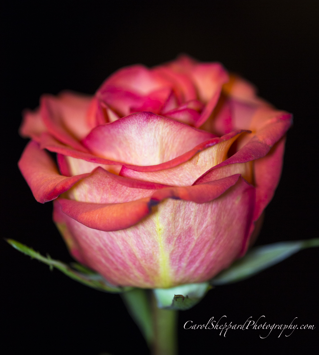
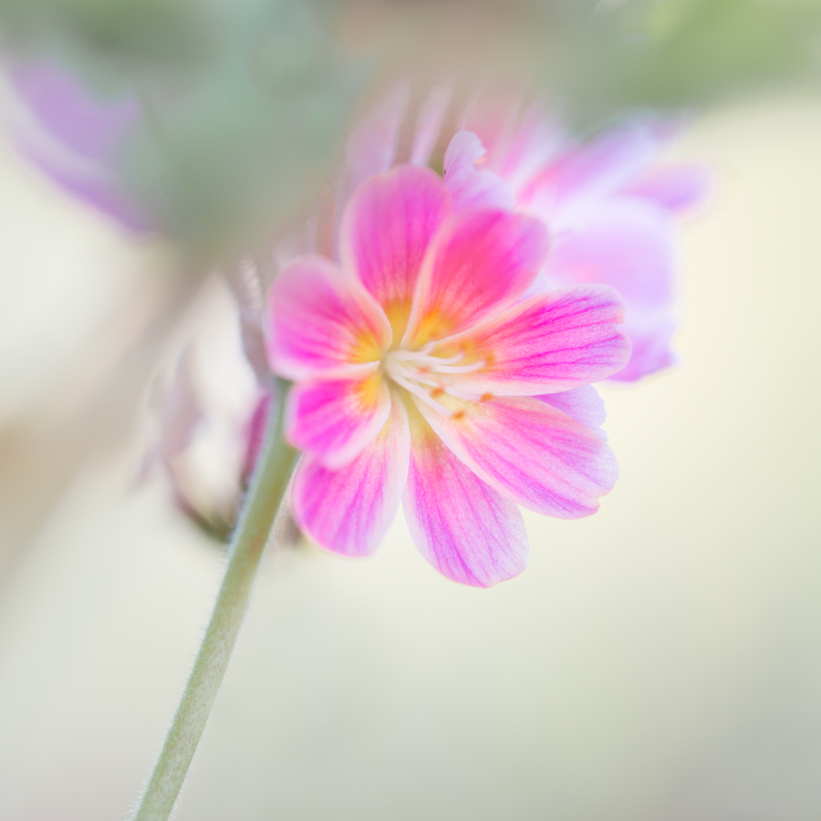
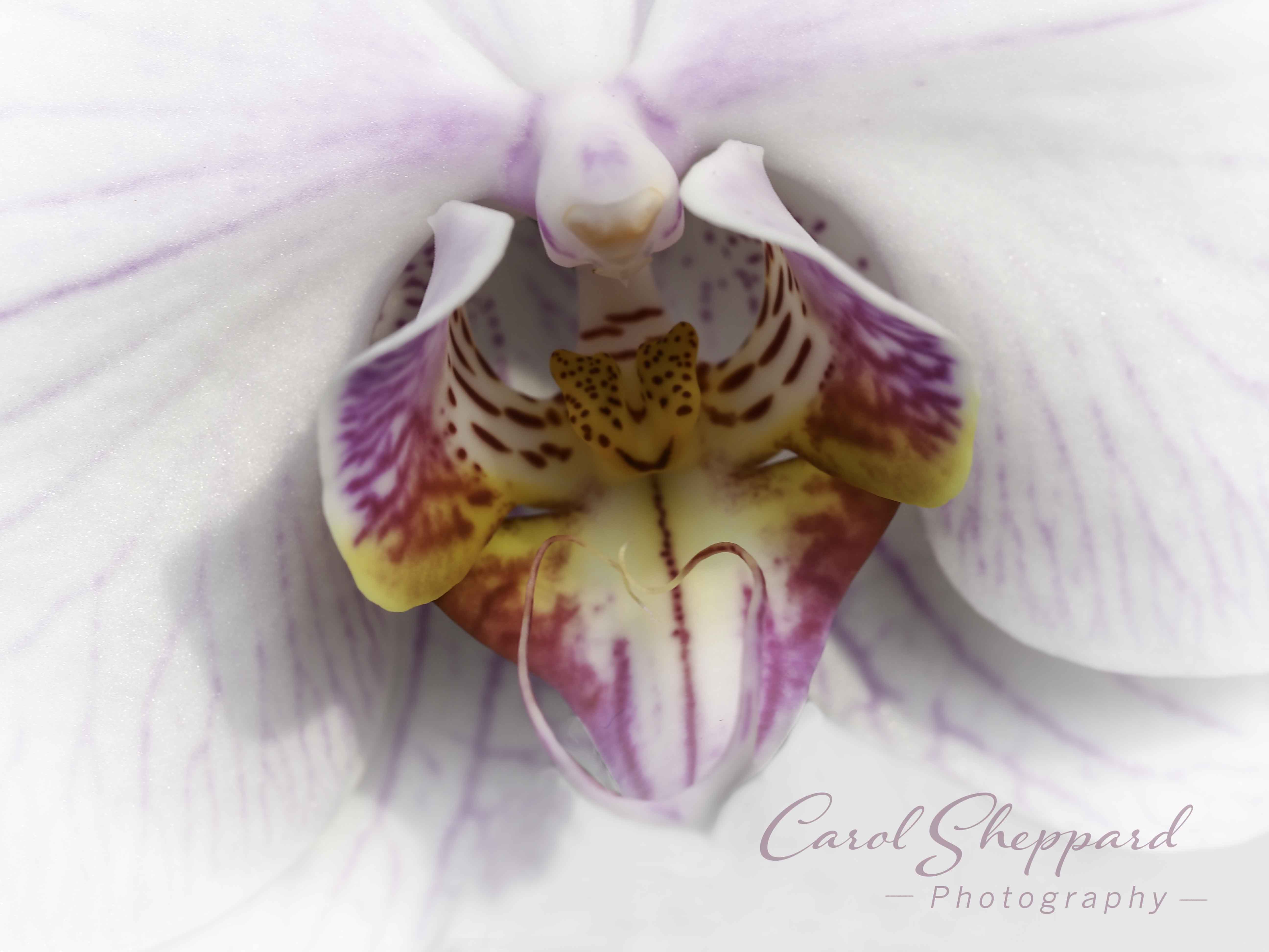
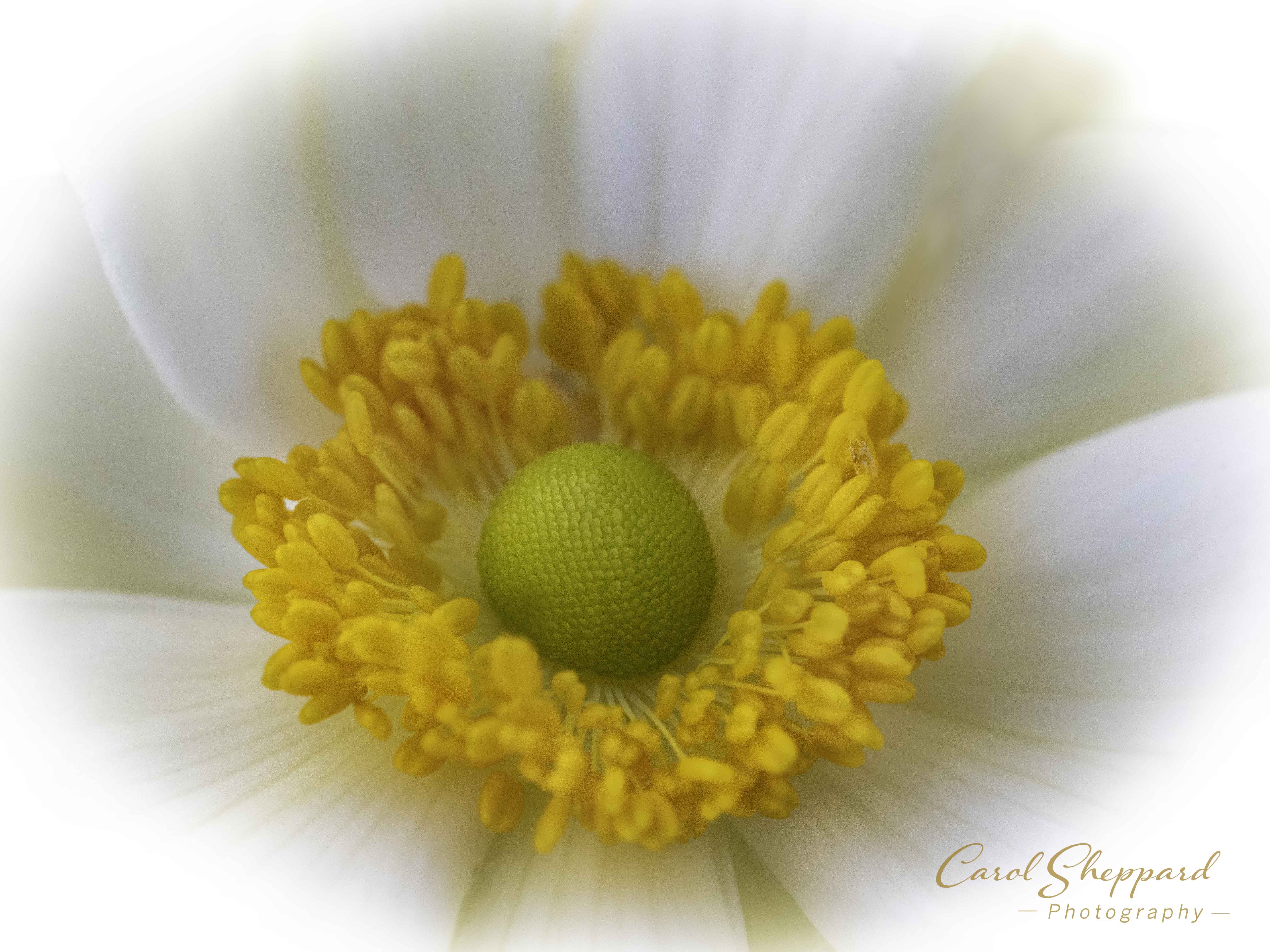
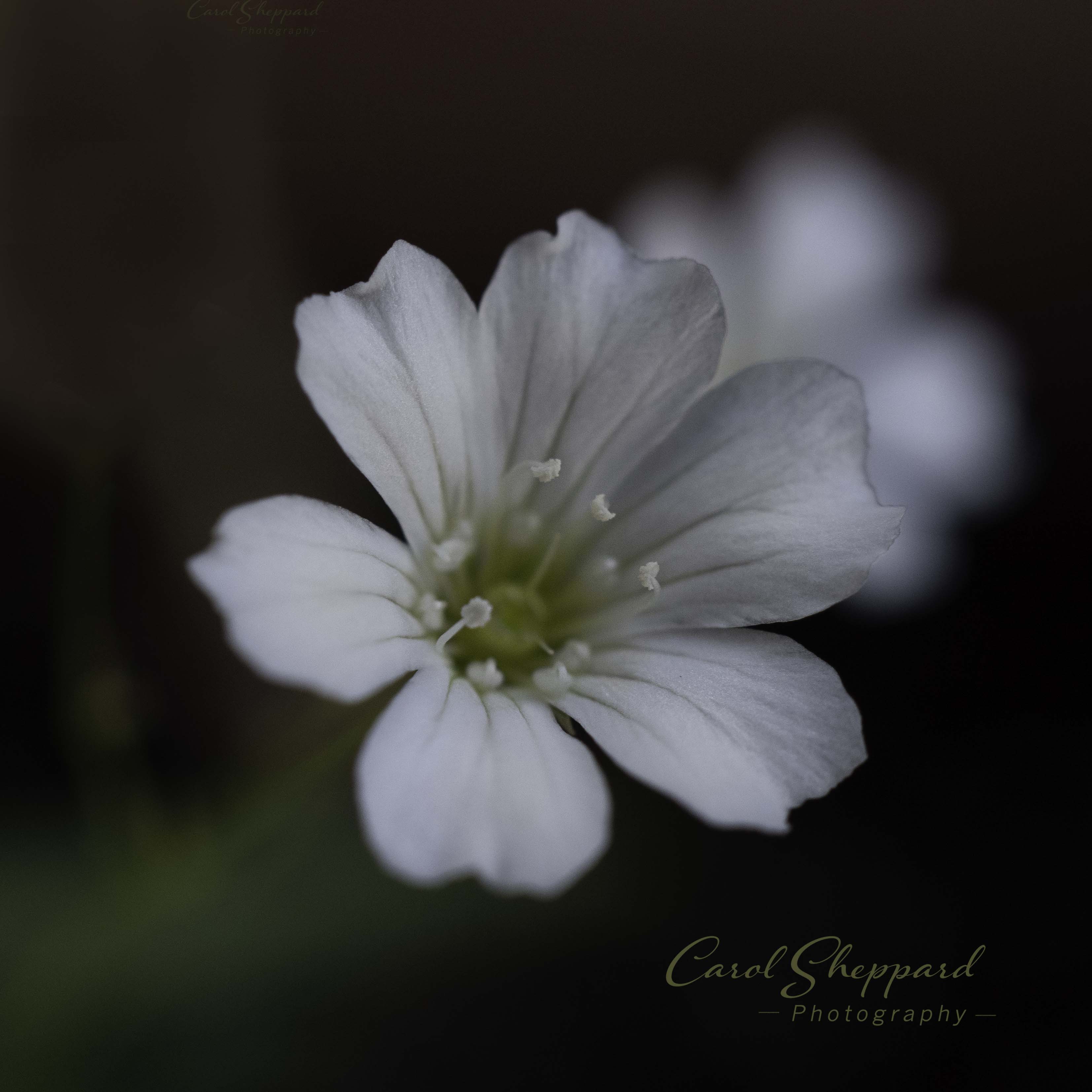
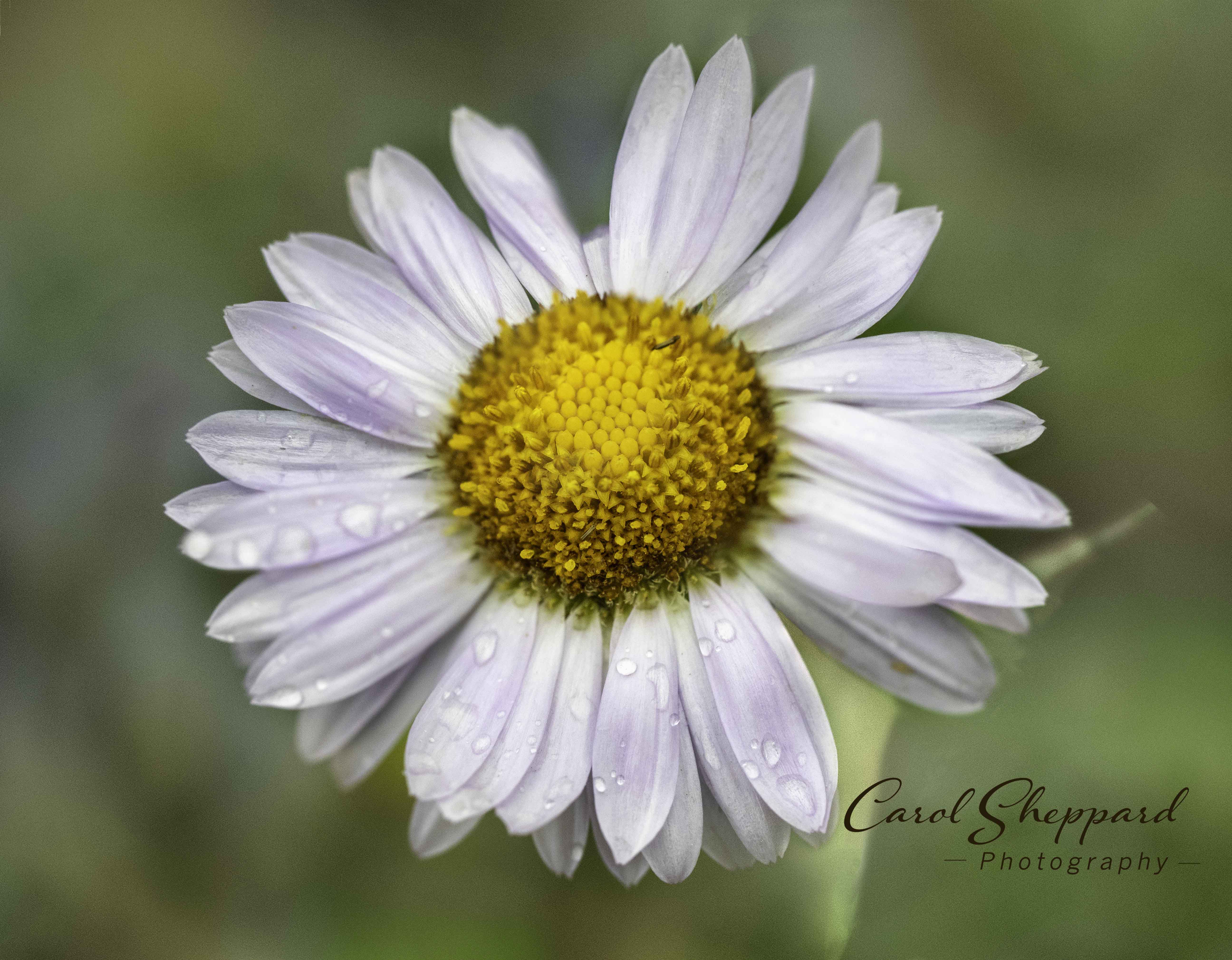
Stuart is our resident focus-stacking expert, but I agree that the lighter version works well. The difficult part for me is that, although the petals are very sharply captured, the center is looking soft (or maybe I need to get my eyes checked). I know it is only a small portion of the flower, but it is prominent enough that my eyes went automatically to it. The contrast with the dark background works well to set off your subject, though. I like the original background with the lighter flower. In the lighter version, the bright green spots are somewhat distracting for me, personally. |
Dec 9th |
| 95 |
Dec 23 |
Comment |
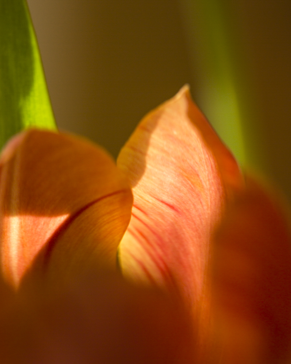
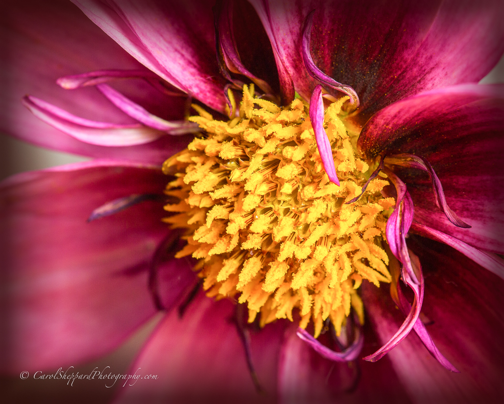
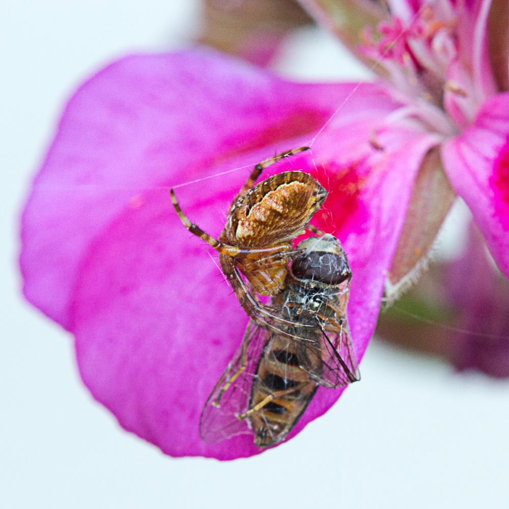
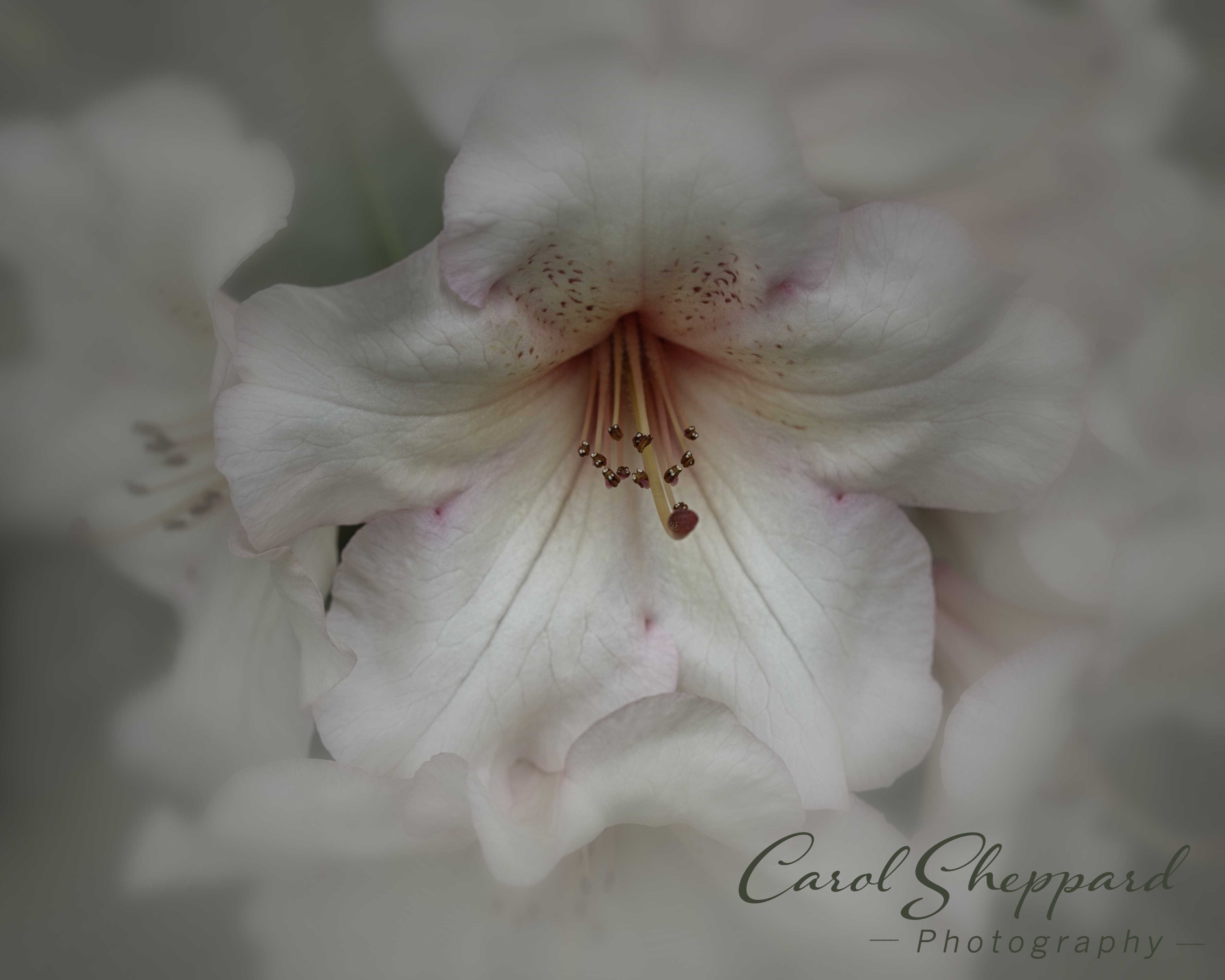
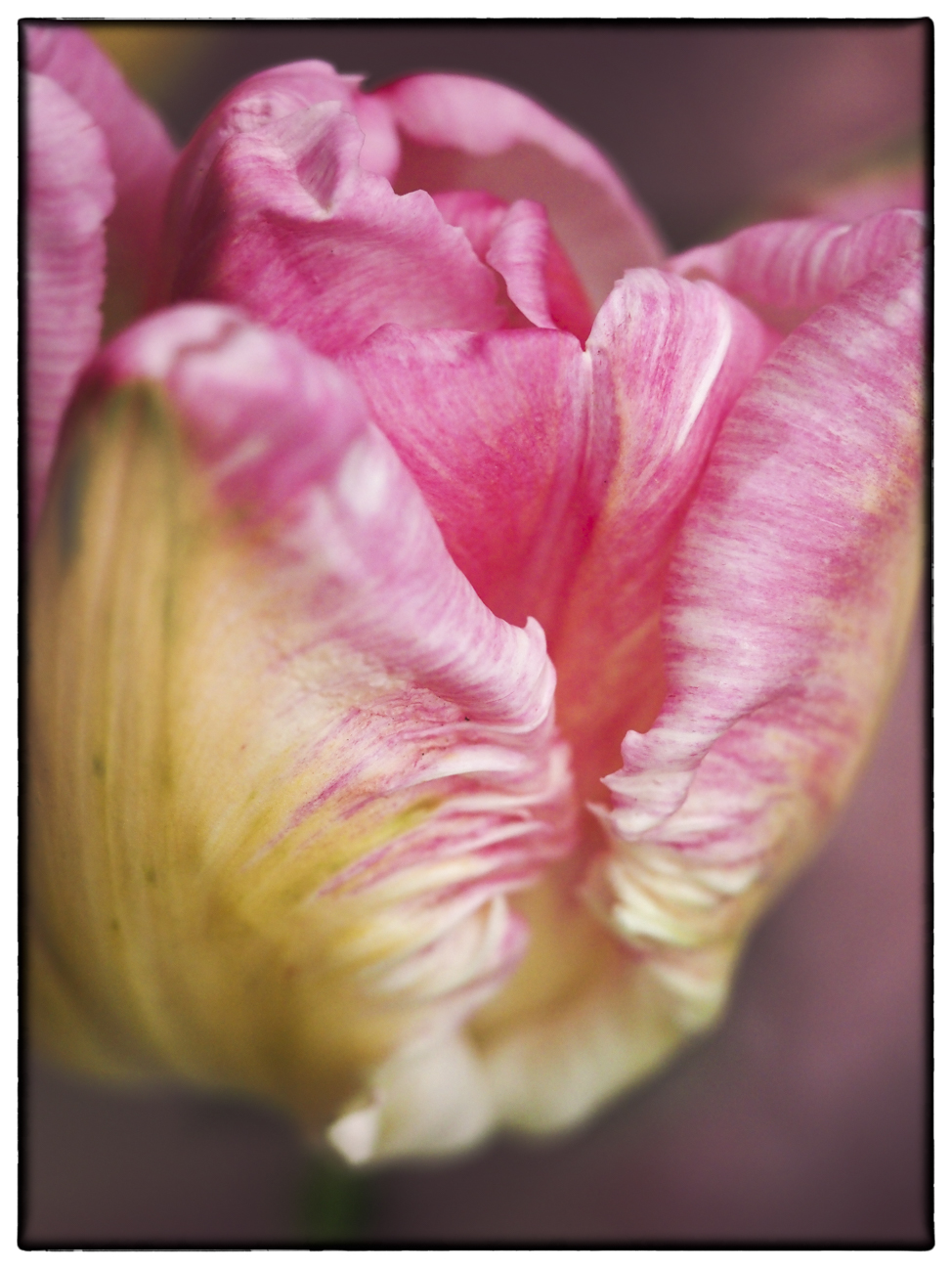
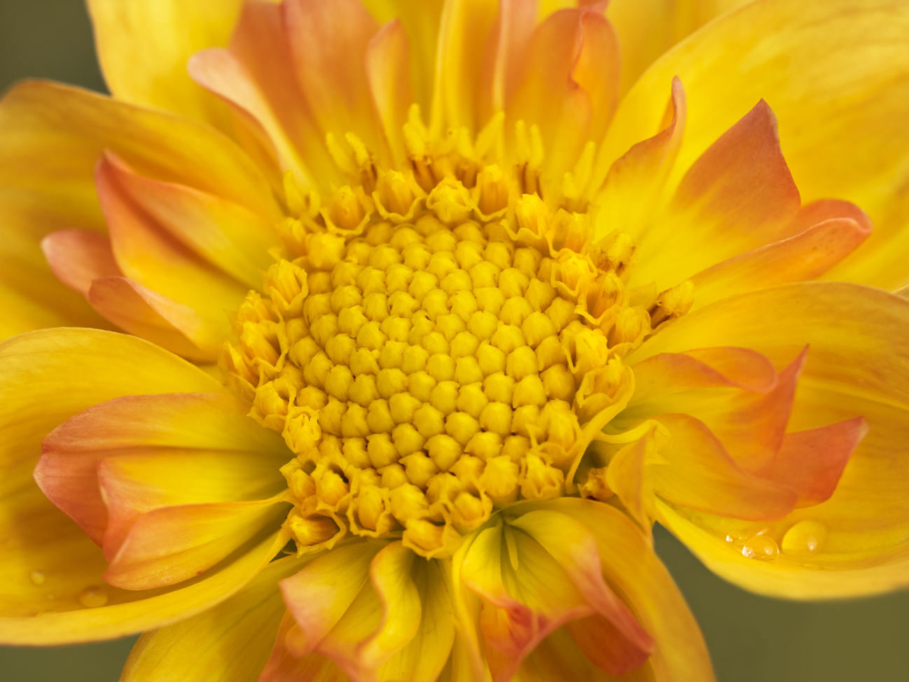
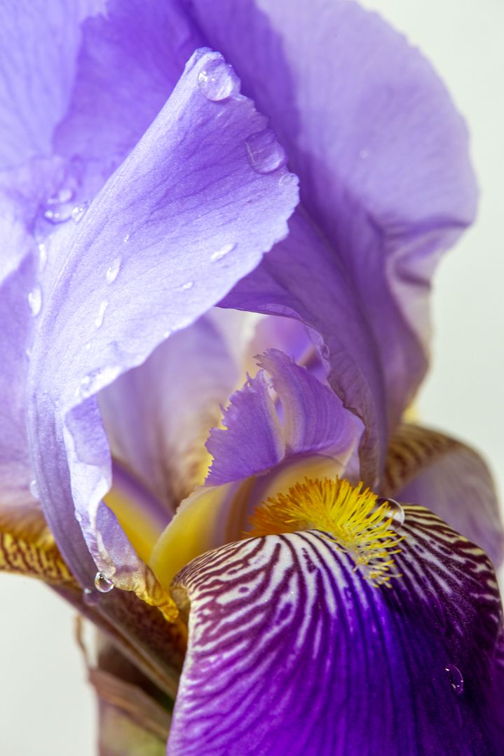
This image is very captivating, Pat. The colors, composition, and sharp areas are all very pleasing to me. I know that there are some who would say there are blurred areas between two sharp areas, but somehow it just works to my eye. The essential pieces are all sharp, placing the emphasis right there where it needs to be. I feel like I could reach out and caress those petals. Great image! |
Dec 9th |
| 95 |
Dec 23 |
Comment |
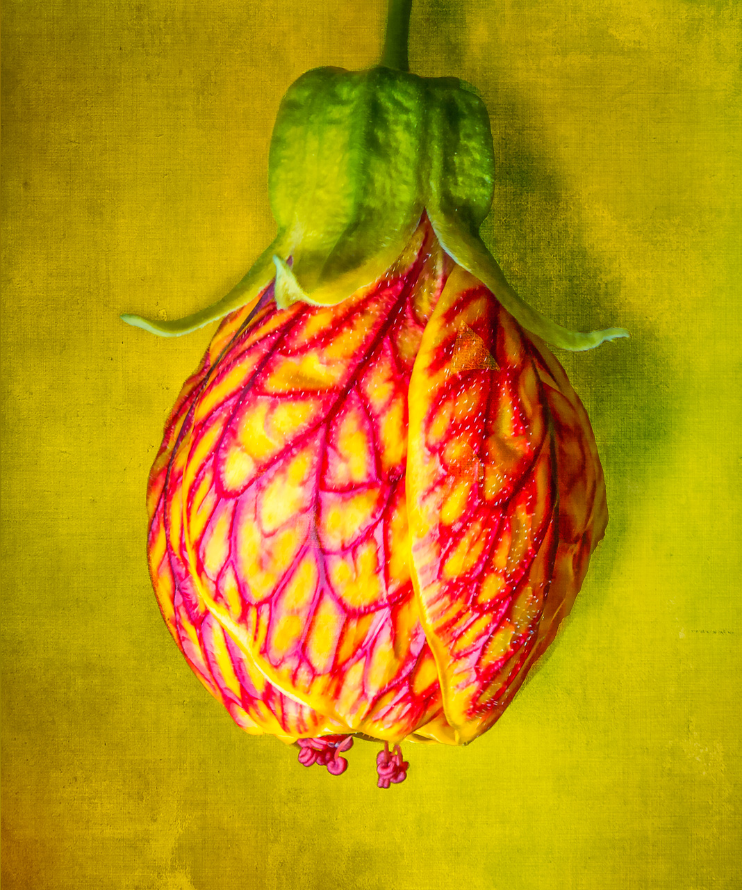
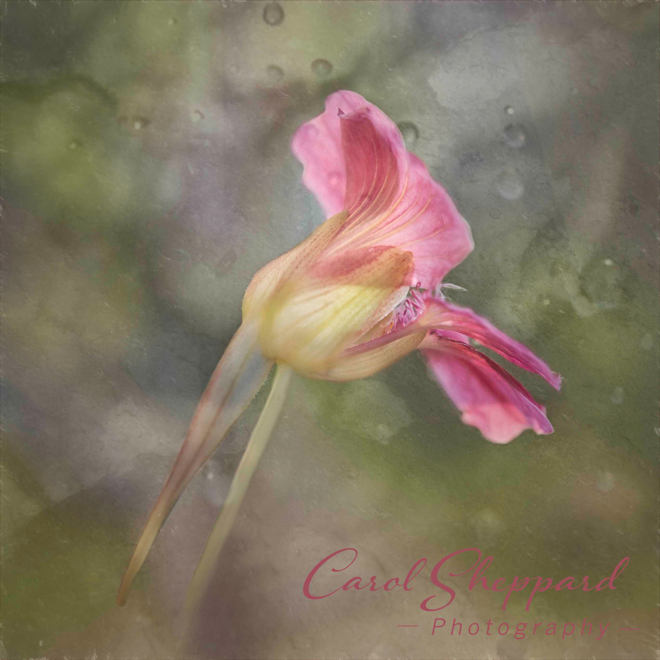
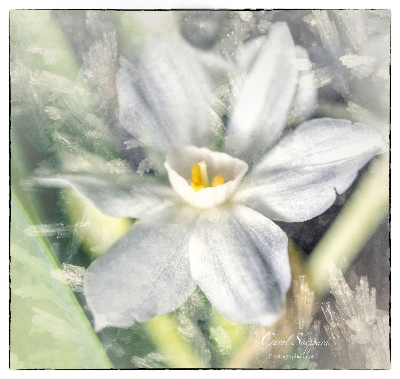
Ick, frost...we've had our share of it already, too. You've got the crystals nice and sharp, and the colors really pop. The composition isn't working as well for me, and I'm not sure why...what about flipping it horizontally? Or turning it into more of a diagonal? I think my distraction has to do with looking at the stem and then seeing the flower leaning so far horizontally. I don't know...I'd love to see the others' input. |
Dec 9th |
| 95 |
Dec 23 |
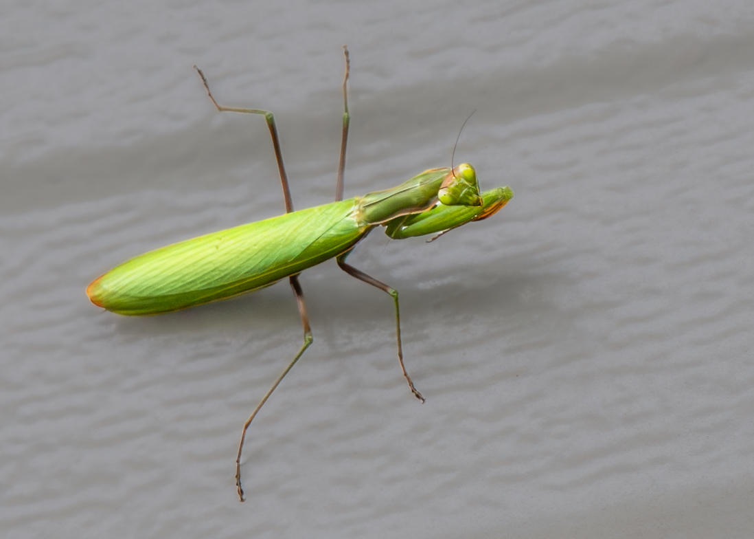
Comment |
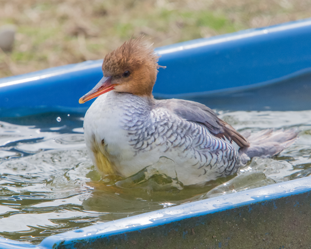
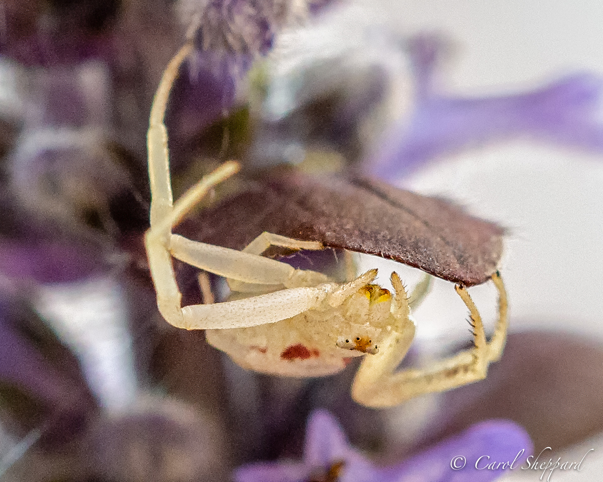
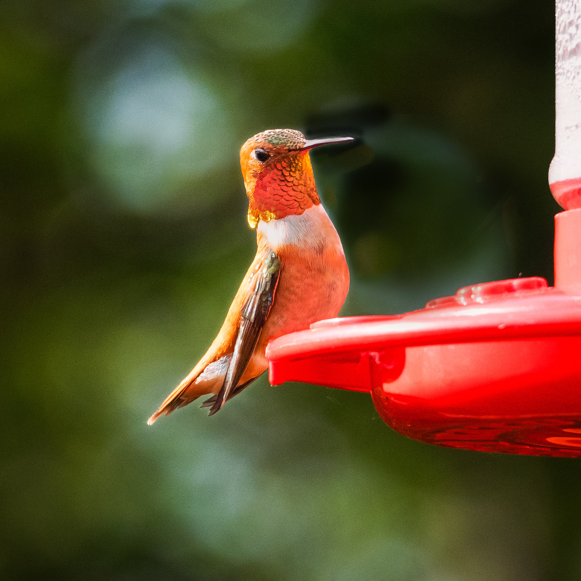
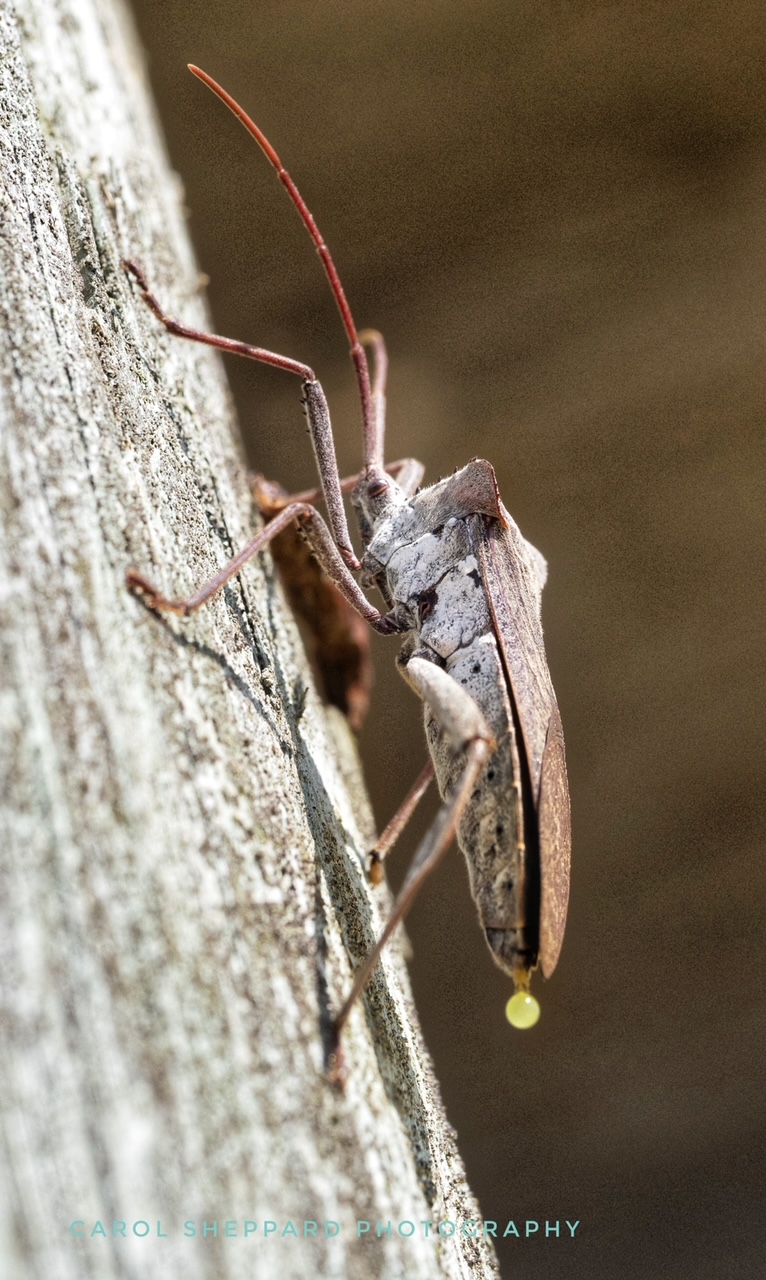
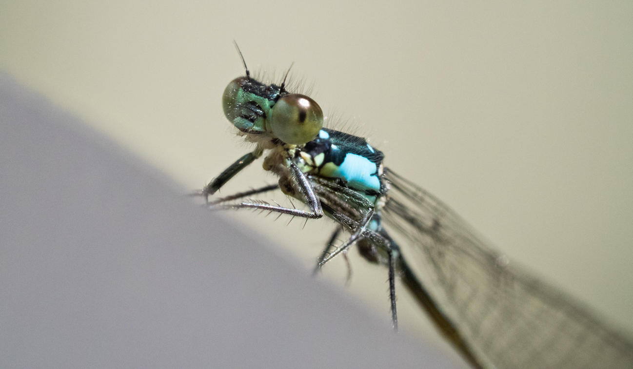
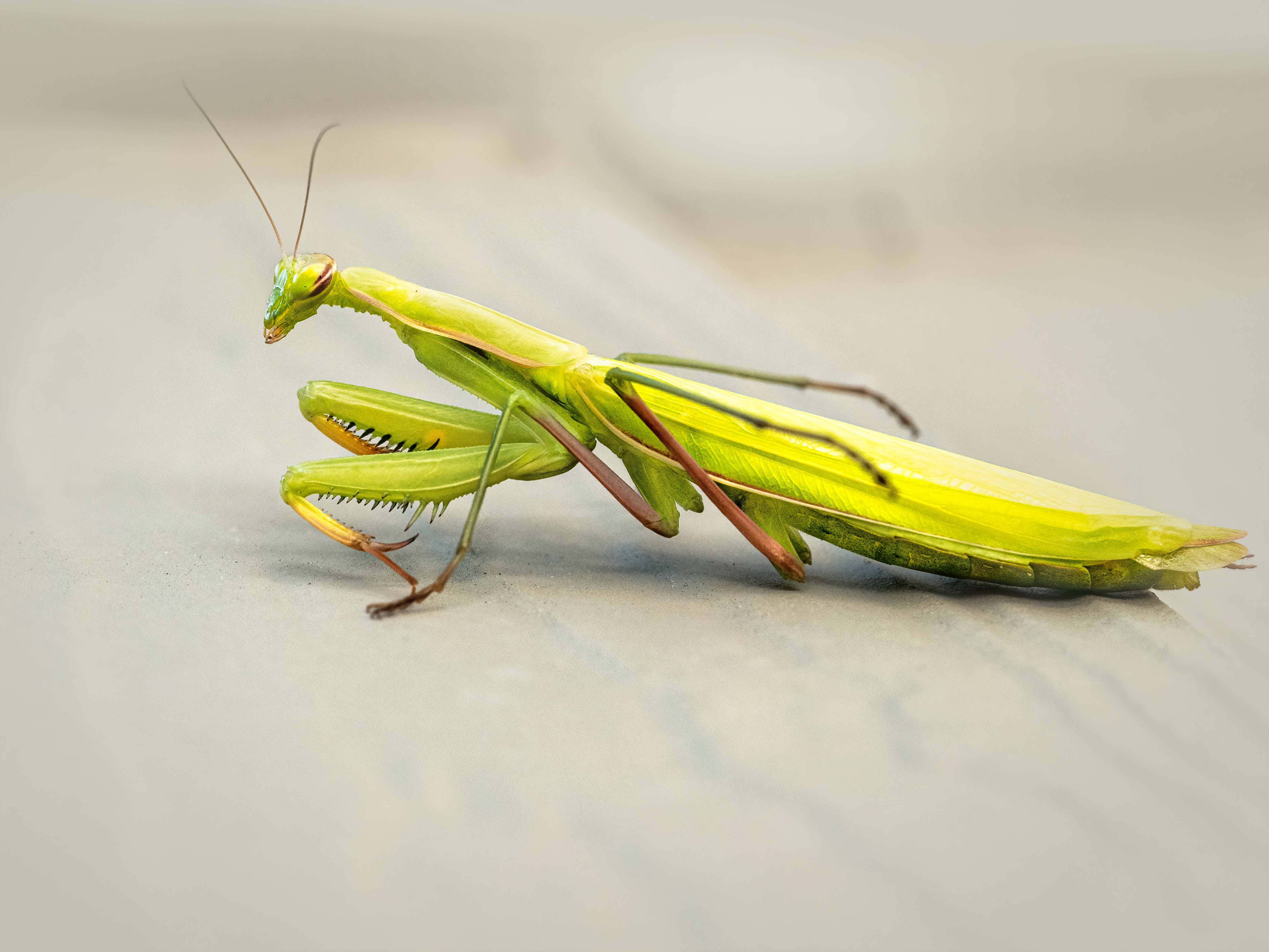
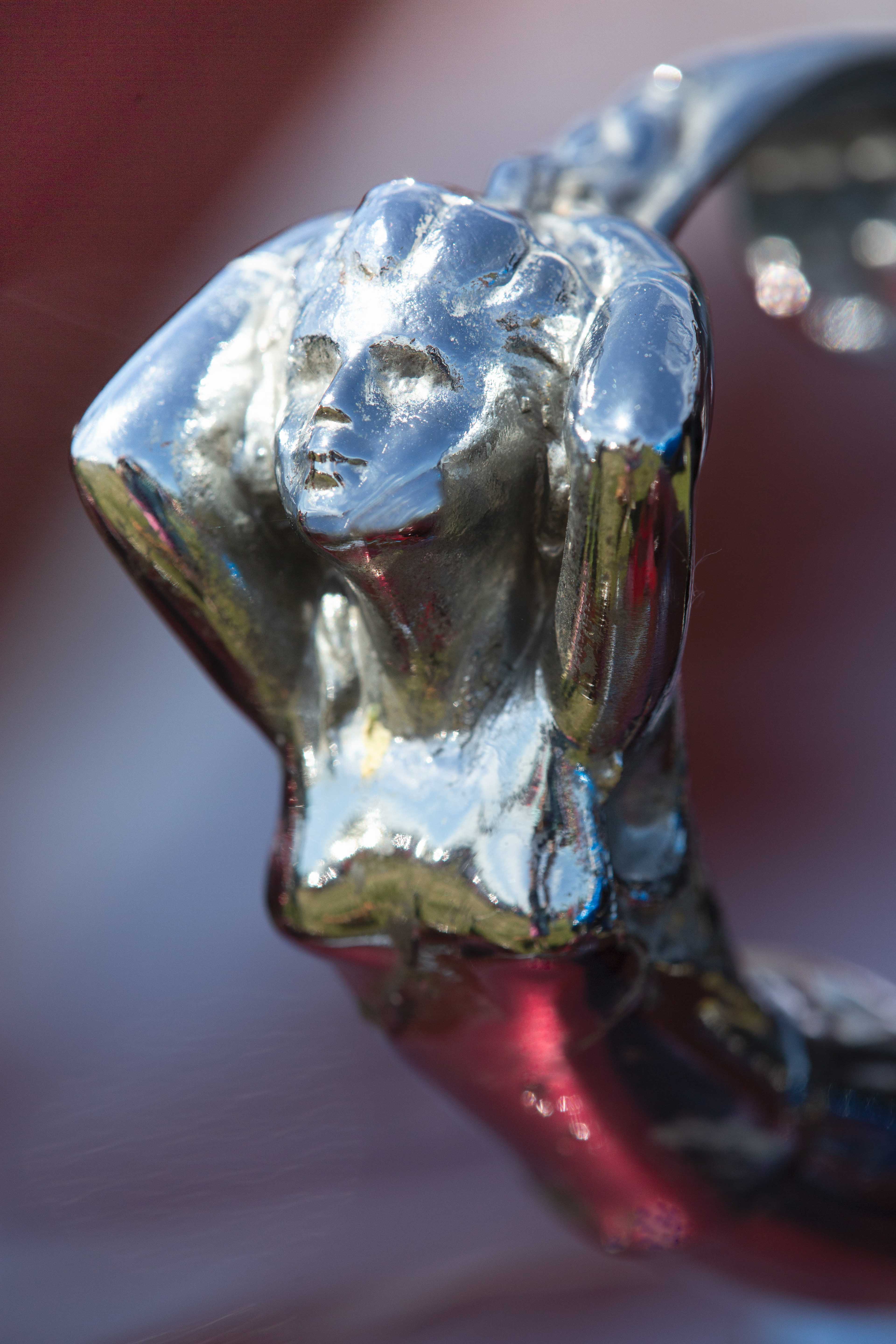
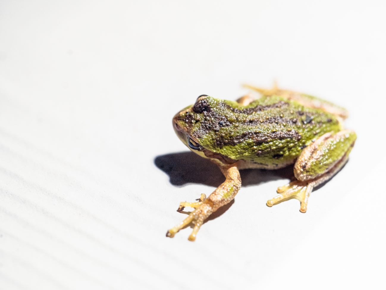
Without the strong sun, you wouldn't have gotten that nice clear shadow, which works well for this. It gives a sense of a grasshopper on a hot summer day and contrasts well with his body. I would maybe open the shadows on the Grasshopper's tummy area a bit....just very slightly. In LR, you could raise the luminance on the orange and yellow, which might give him pop overall AND raise the shadows some. Yes, spot metering would have helped in the capture--since the subject was the most important part of the image, and the background was secondary. But honestly, I really like this image! Very sharp little guy with a good amount of space around him; super capture with these circumstances! He even has a little catchlight...but I don't see any blown out areas on your subject. I guess you could also have tried to shield him with a diffuser between the sun and the grasshopper to soften the light overall--but you'd have to have three arms, lol |
Dec 9th |
| 95 |
Dec 23 |
Comment |
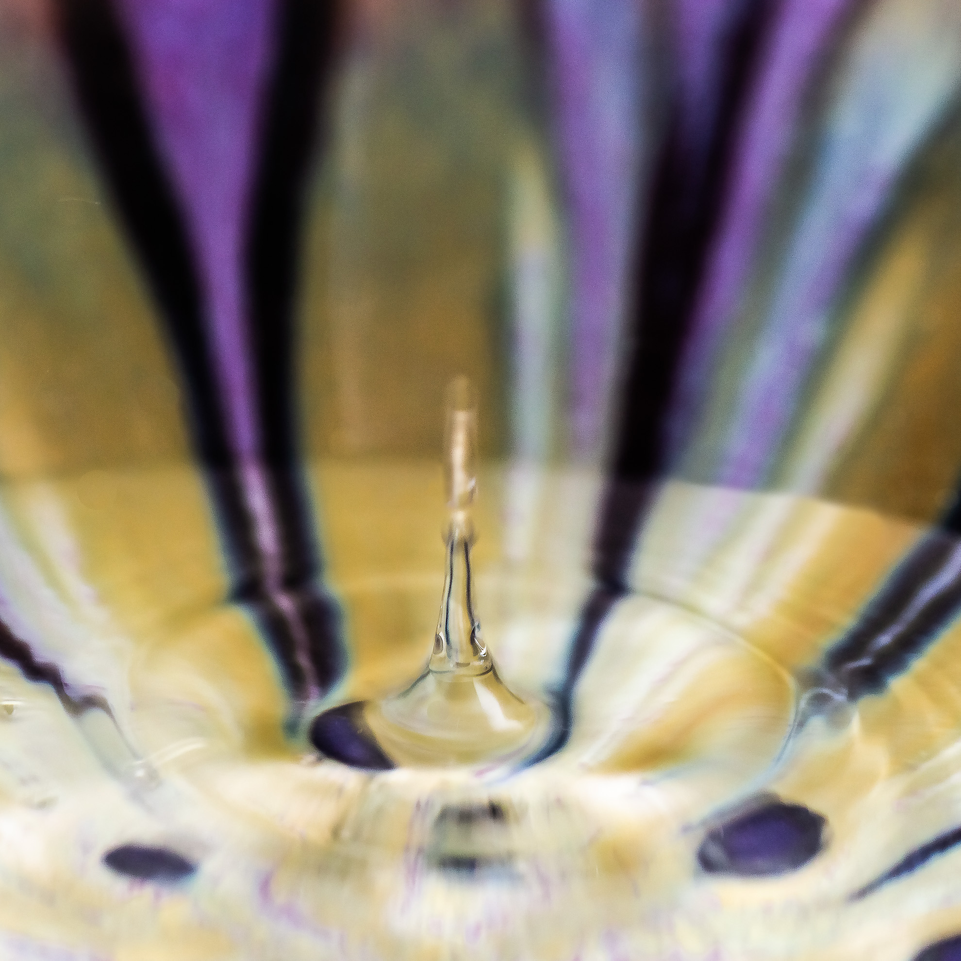
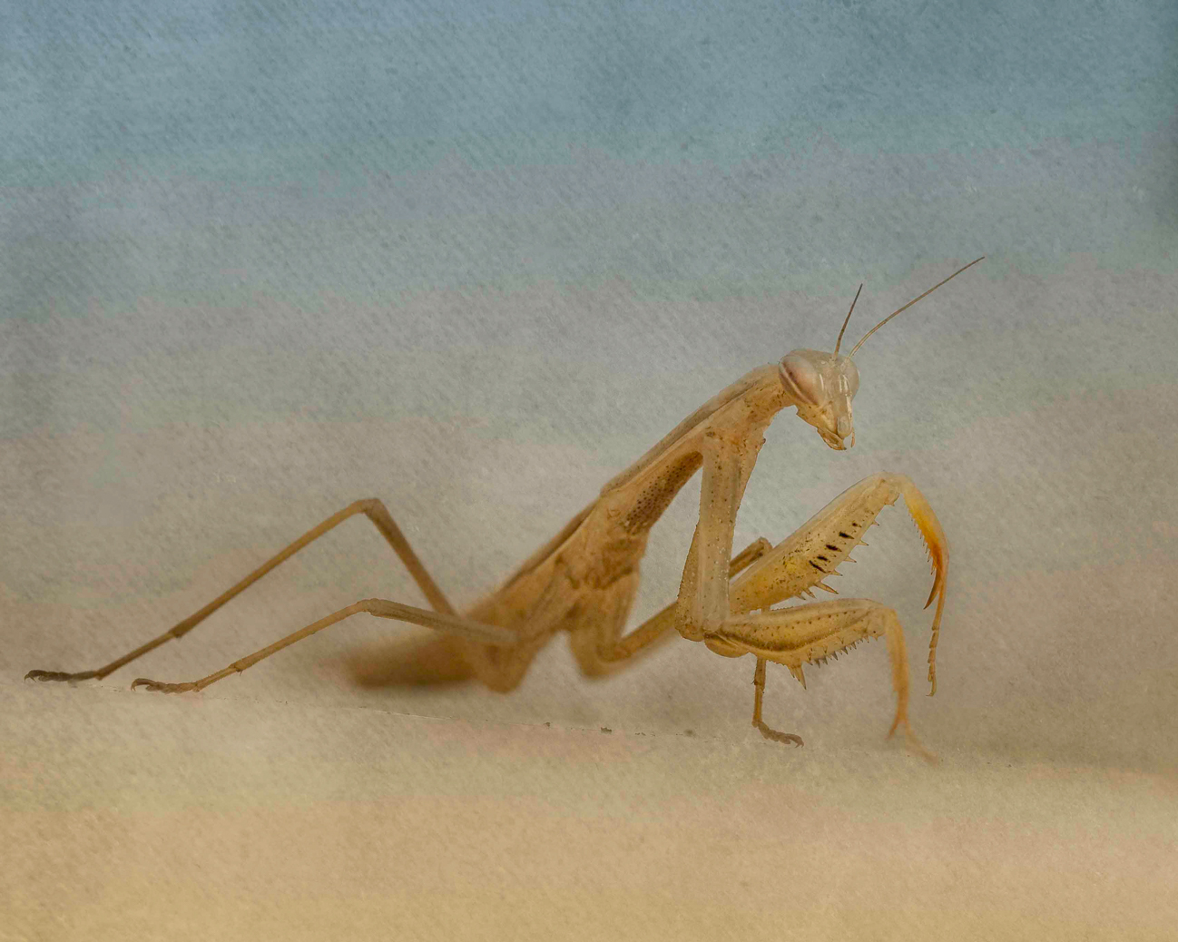
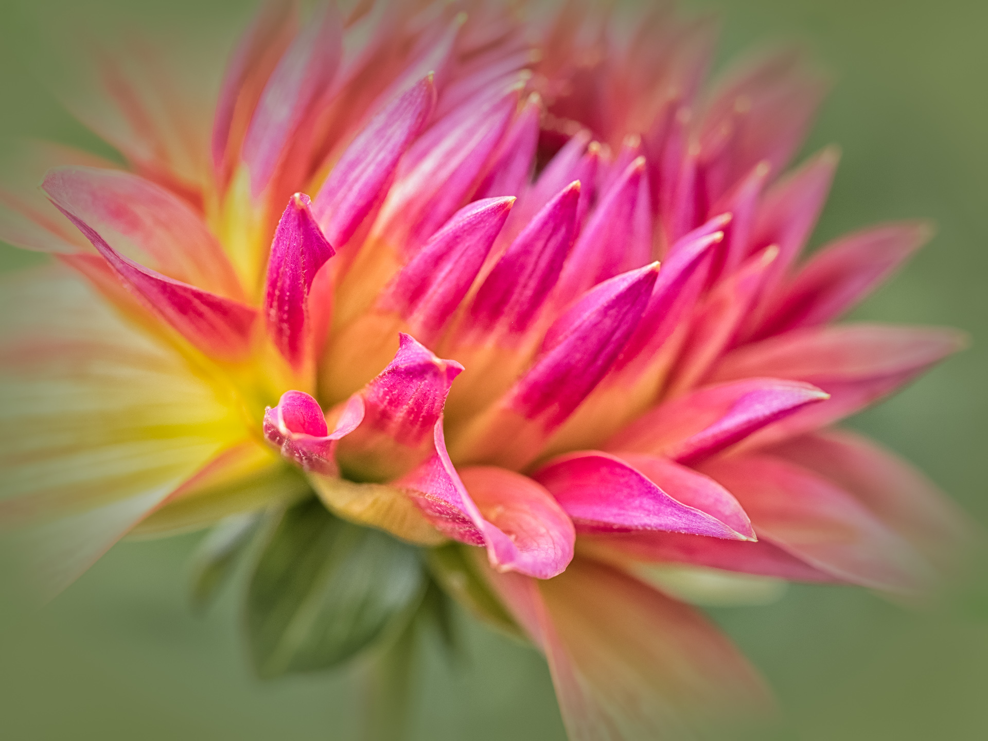
The diagonal presentation and the curving edges of the feathers make for a pleasing composition. I like the sharpness of the center area...did you consider a vertical crop where the only feathers were the yellow/black? I ask this because some of the edge feathers aren't as sharp and have a bit of white in their color. Still a nice composition. |
Dec 9th |
7 comments - 7 replies for Group 95
|
7 comments - 7 replies Total
|