|
| Group |
Round |
C/R |
Comment |
Date |
Image |
| 80 |
Feb 21 |
Reply |
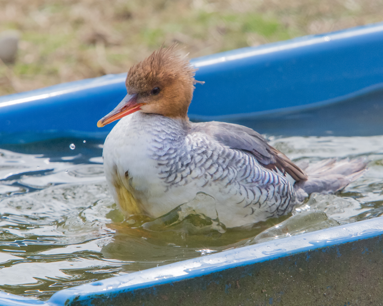
Yes, Karen, I see it now! Isn't it funny how we can look and look at an image, but it just takes fresh eyes sometimes! |
Feb 21st |
| 80 |
Feb 21 |
Reply |
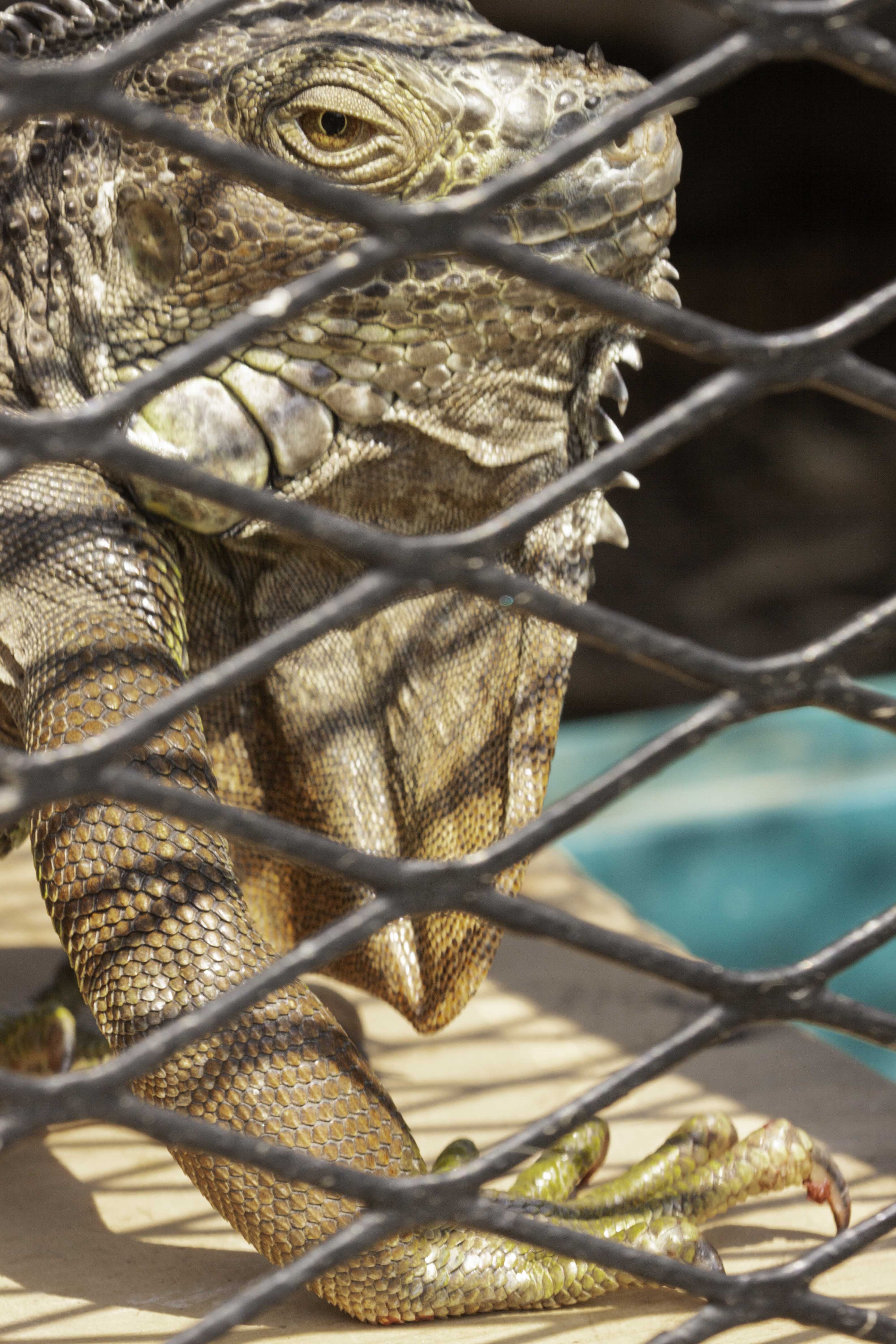
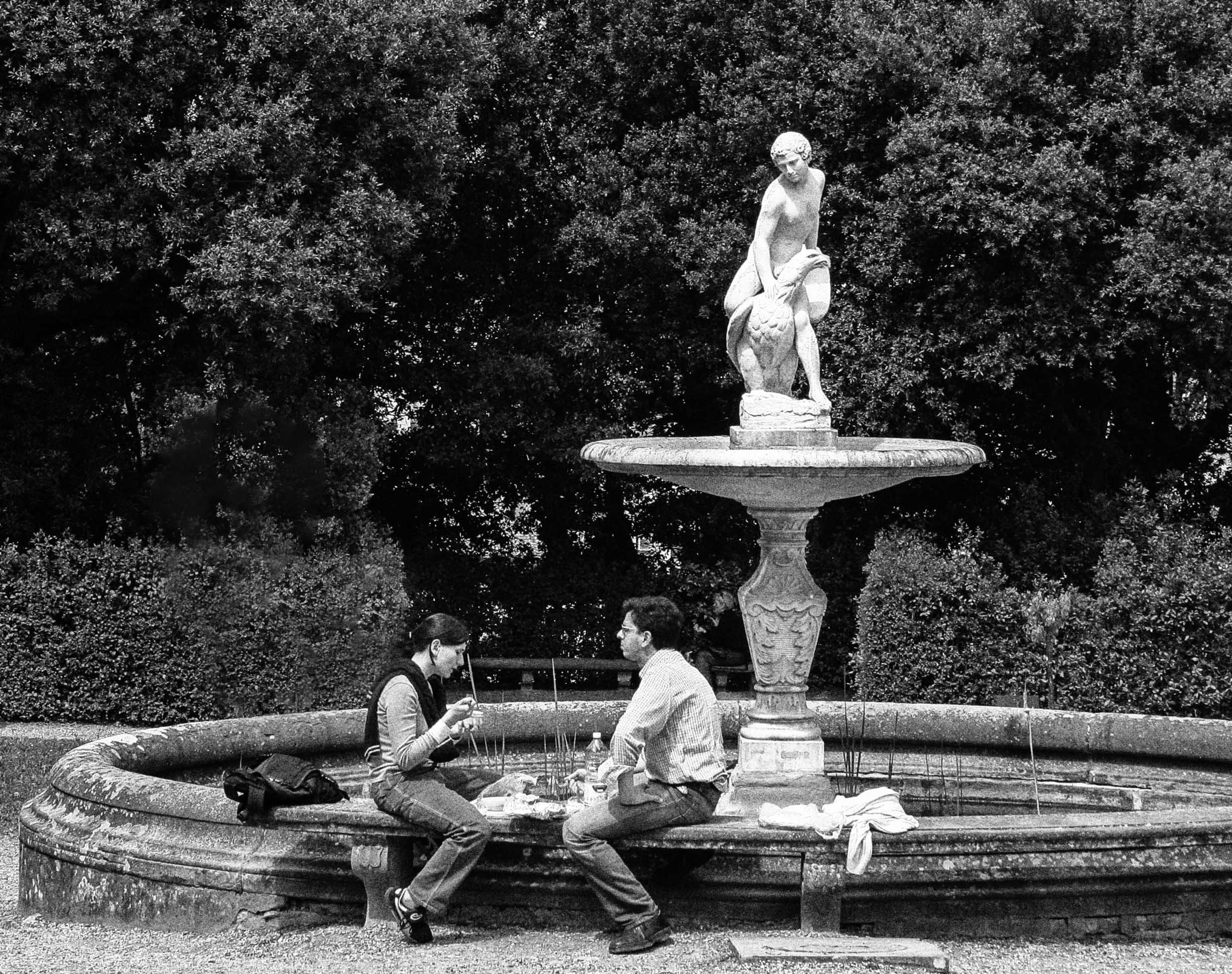
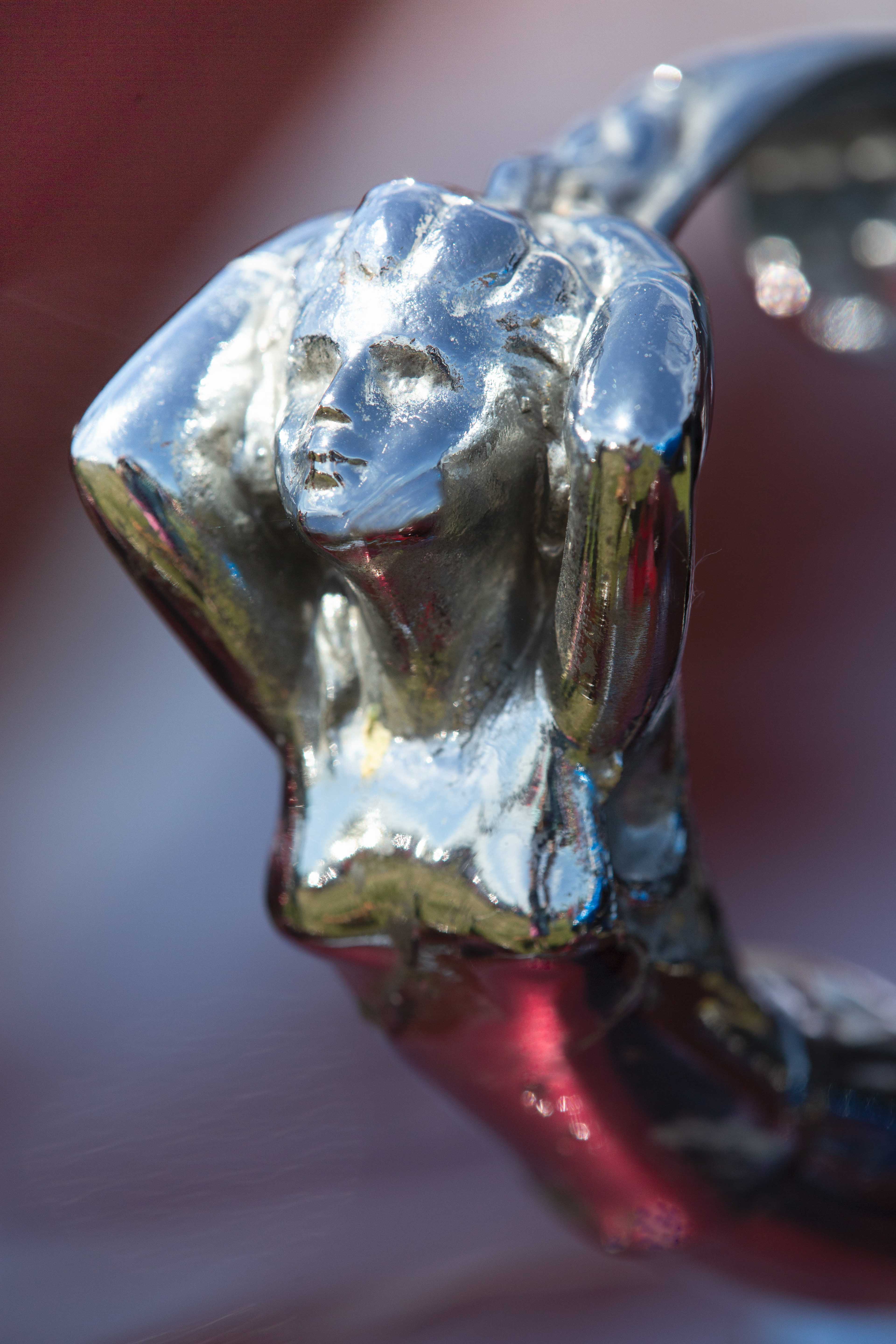
Victor, that is a great suggestion; I see exactly what you mean about the statue brightness. |
Feb 16th |
| 80 |
Feb 21 |
Comment |
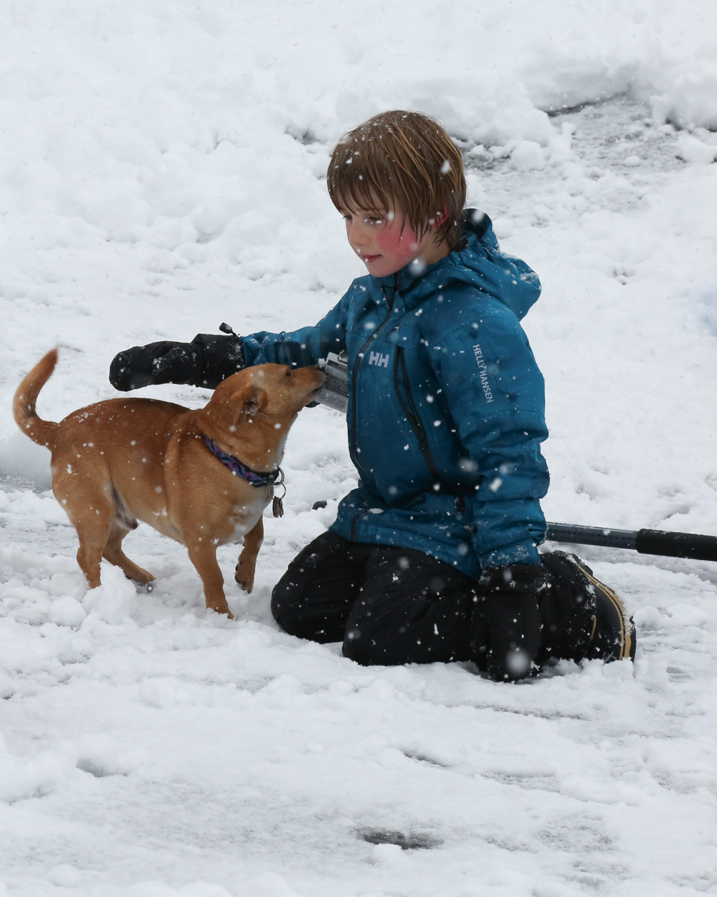
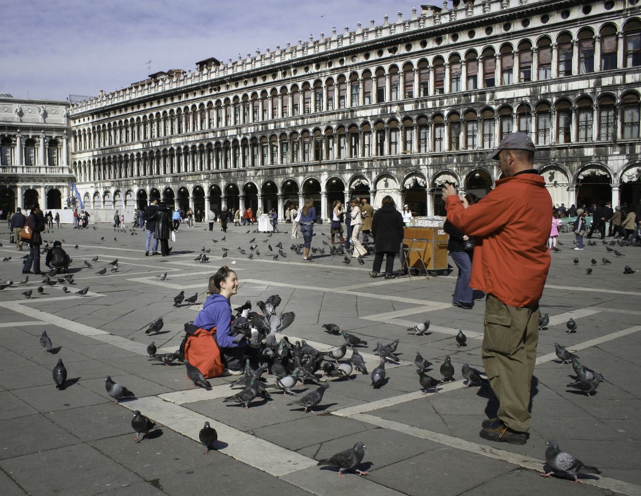
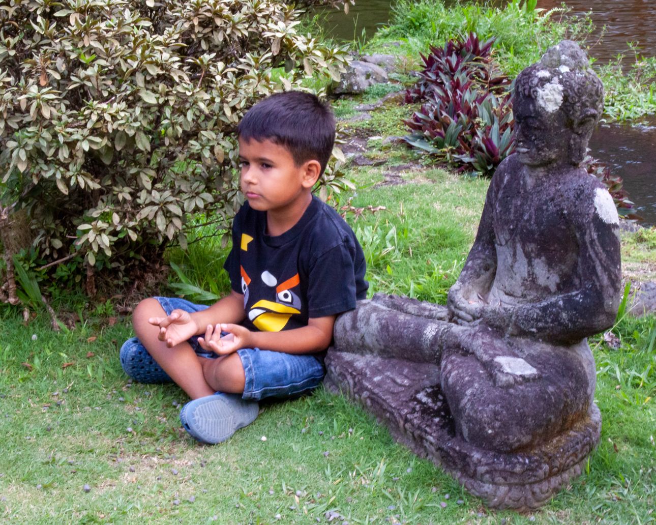
The image for me is all about the boy. You've captured a beautiful expression on his face. Personally, I do not see the story you are describing. The man behind doesn't look jaded to my eyes; he looks like a man waiting to be served. He has no connection to the boy. The boy appears to be sitting by a window of a restaurant, with no connection to the patron of the restaurant. Perhaps if the patron was looking down at the boy? Or if the boy was looking into the restaurant, so that you felt the boy might be hungry? Also, the boy's shirt is quite nice. And he doesn't look particularly emotional; he looks more puzzled than anything? |
Feb 15th |
| 80 |
Feb 21 |
Comment |
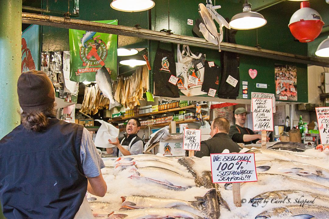
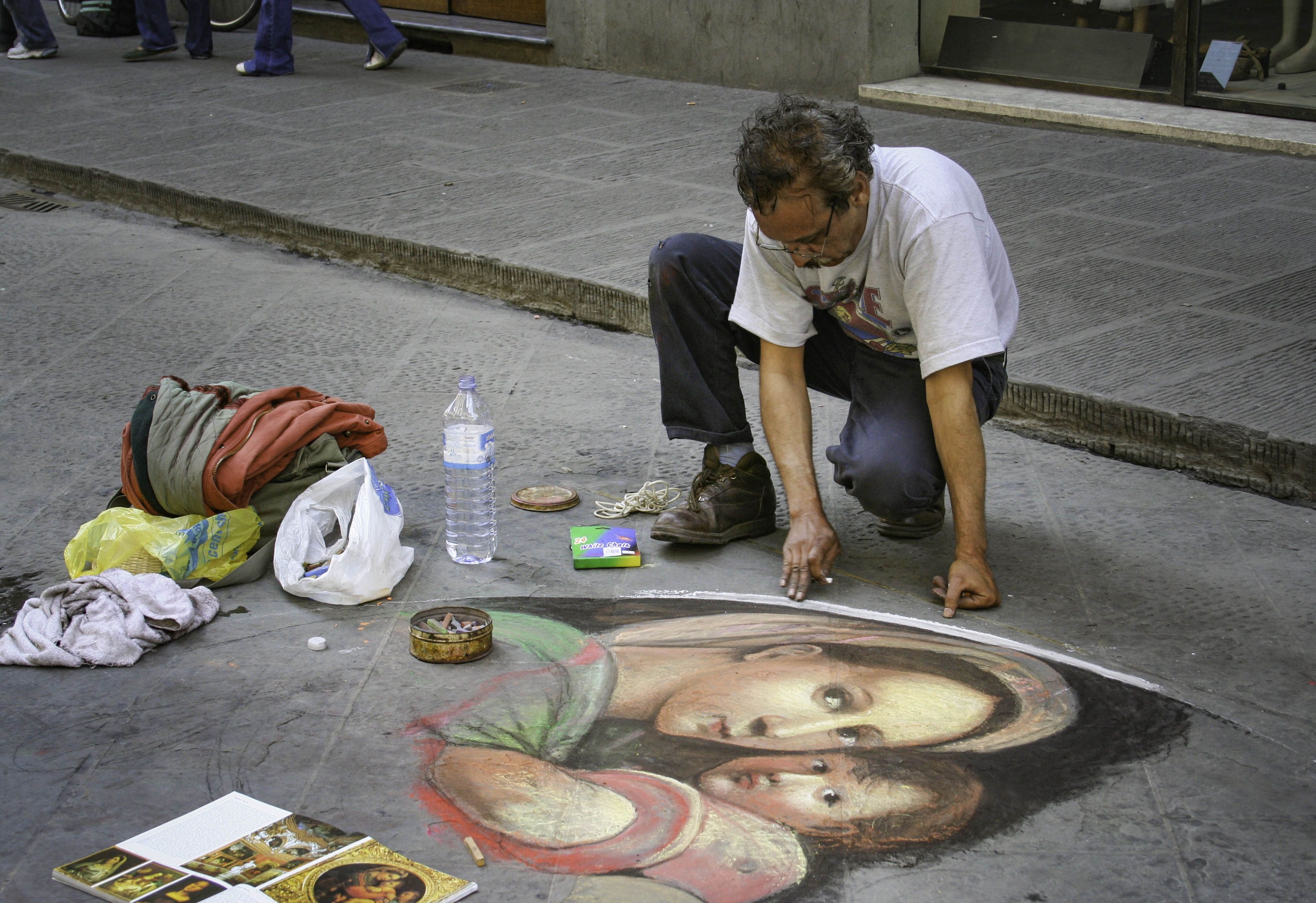
Bill, I nearly held off with my input, because I do believe my eyes are overtaxed this afternoon. But after viewing the other images, I feel that the fishmonger's face is soft. His eyes are not in focus so, although I feel your capture is great of the scene, I can't connect with it. I'd be a little afraid to eat any of that fish, even after cooking it, sorry! Great detail! |
Feb 15th |
| 80 |
Feb 21 |
Comment |
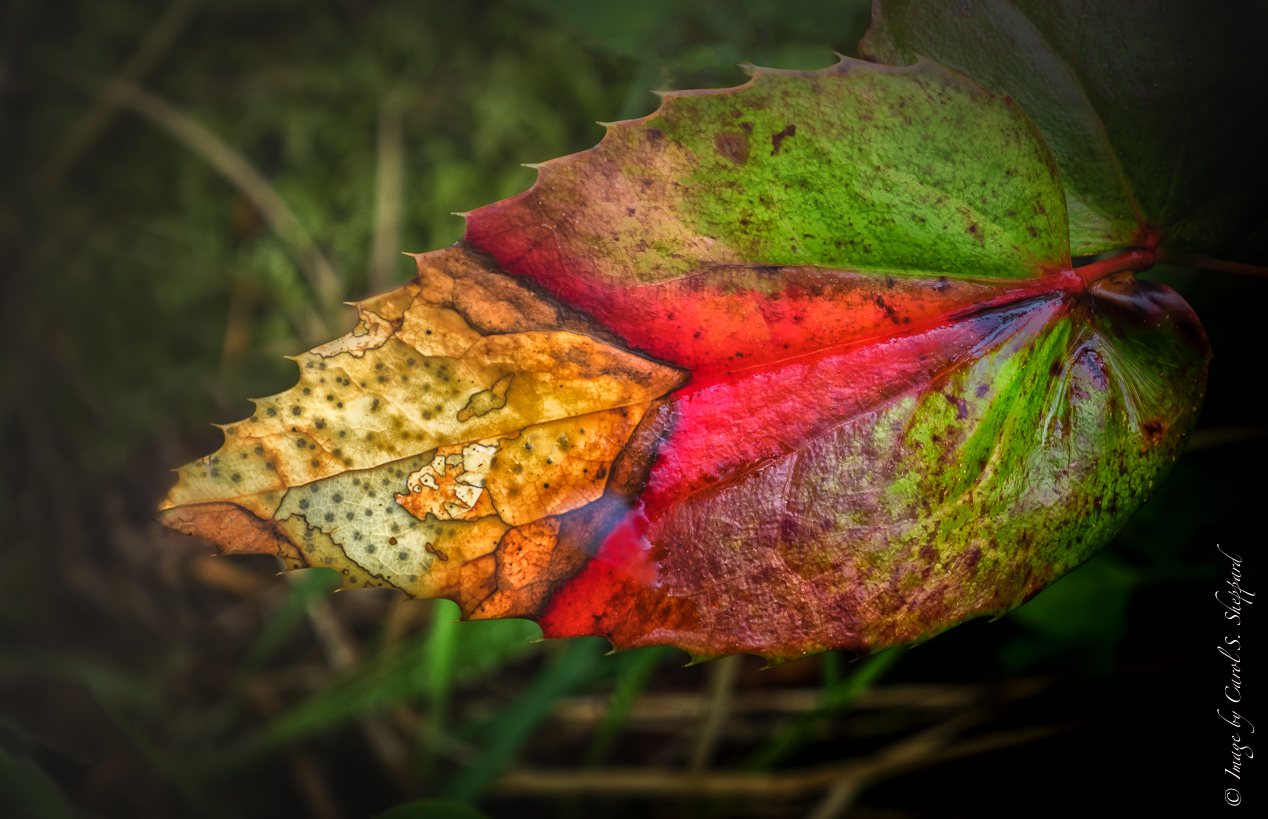
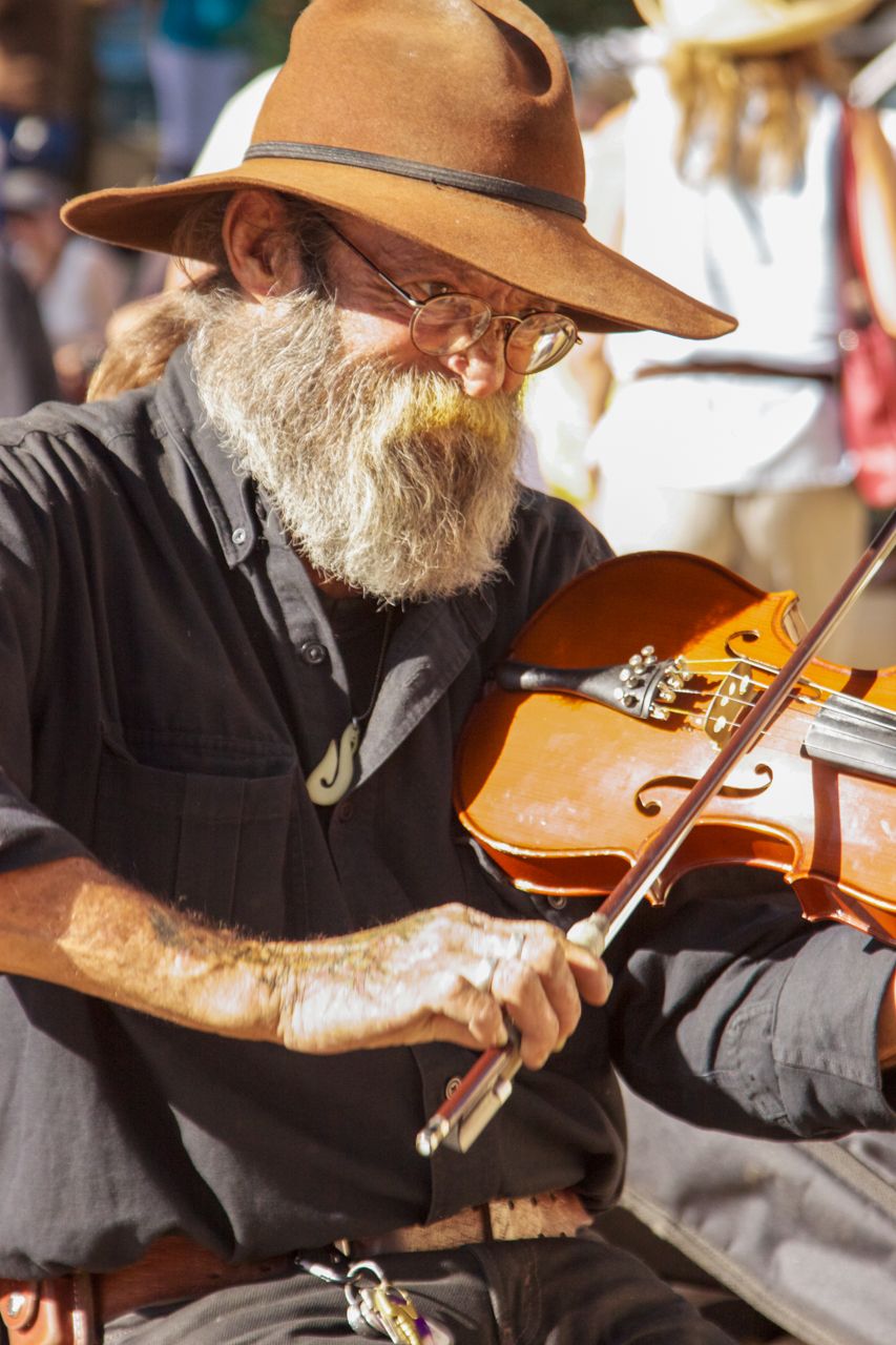
Hmmm, I like Original 2 best! The city skyline fits with his appearance. It looks like a painting, too. The greenery in the larger one makes it look like it was imposed, as it looks panned; also his skin on his face is too smooth. But the B&W one is also great--it looks the most like a street photograph and works so well with all the detail and texture called out on his clothing. However, in the B&W version, you definitely have a large and obvious area on his beard that has no detail.
I just want to make one more observation. In the paint-looking one, you haven't cleaned up all the green within the skyline; he has tree shadow on his pant leg, and the lower left corner has ivy that makes it apparent that this is a photoshopped image. Just things to be careful of. |
Feb 15th |
| 80 |
Feb 21 |
Comment |
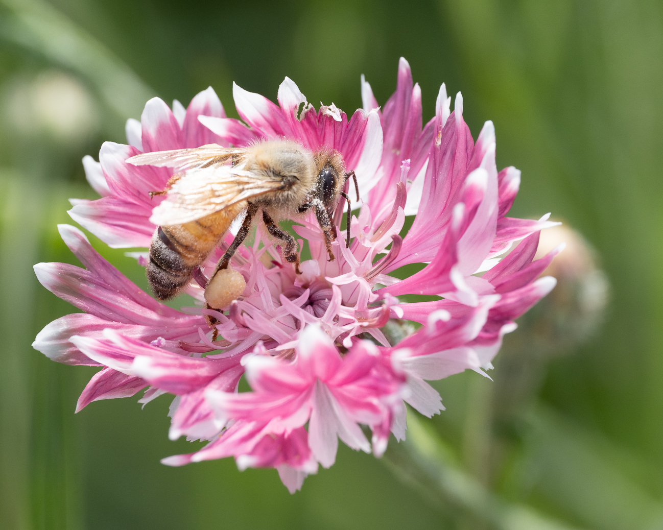
Karen, this is a wonderful capture of action and street. Although I do like the vignetting of Victor, I like your original treatment in B&W just as much. Your capture places him perfectly in this crop and for this composition, as well as capturing his expression beautifully. The leading lines and the angles of his arms and legs also work so well in this! Terrific job!
|
Feb 15th |
| 80 |
Feb 21 |
Comment |
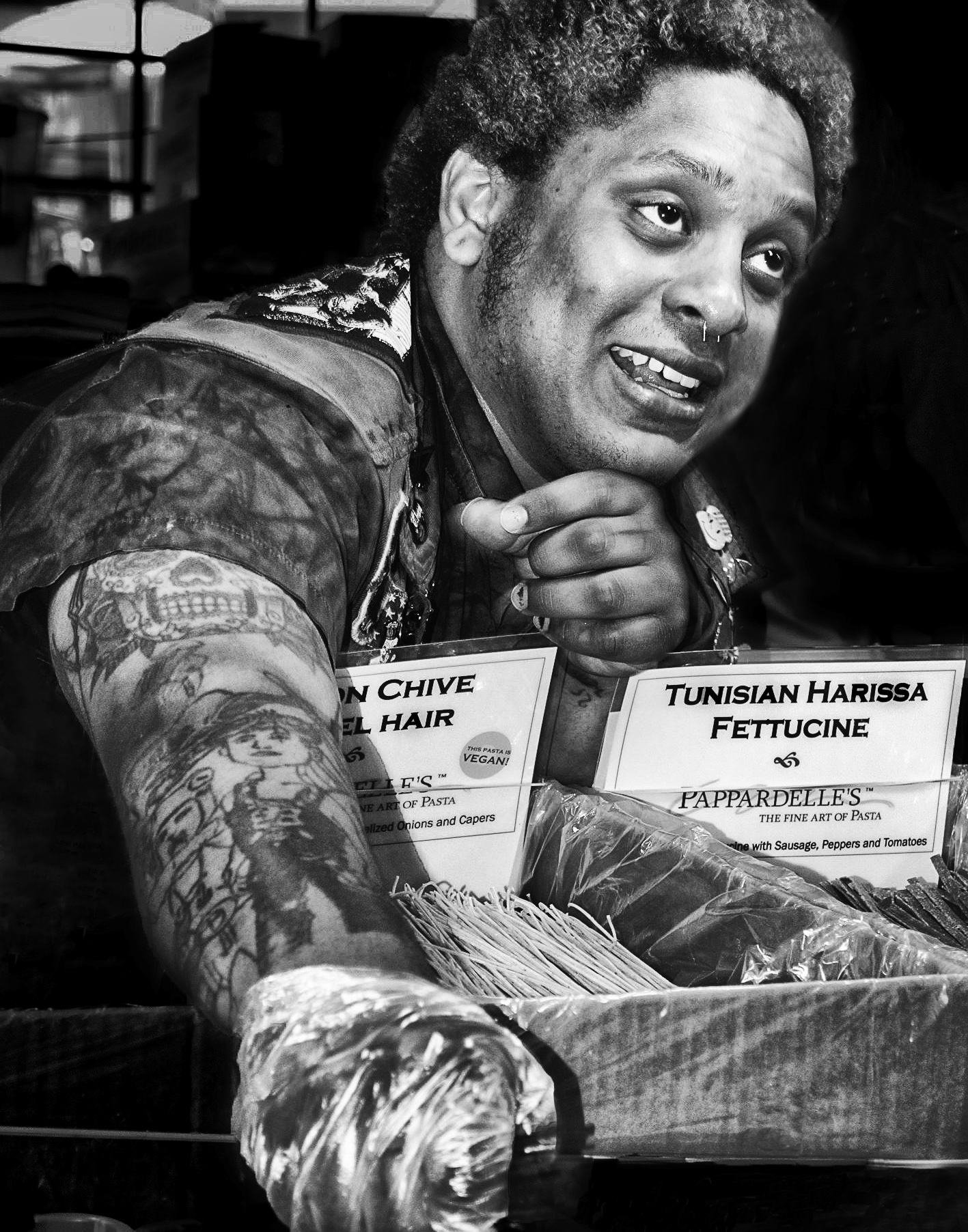
This is a show-stopper image! Ed, there isn't anything I would change about this, and I would enter it into a competition if I were you! The contrast and tonal range, the crop, the composition and the expressions on the faces--all fantastic! |
Feb 15th |
| 80 |
Feb 21 |
Reply |
Victor, that is a great suggestion; I see exactly what you mean about the statue brightness. |
Feb 11th |
5 comments - 3 replies for Group 80
|
| 95 |
Feb 21 |
Reply |
Yes, Tom, much better with your work on that corner. Thank you!
|
Feb 21st |
| 95 |
Feb 21 |
Reply |
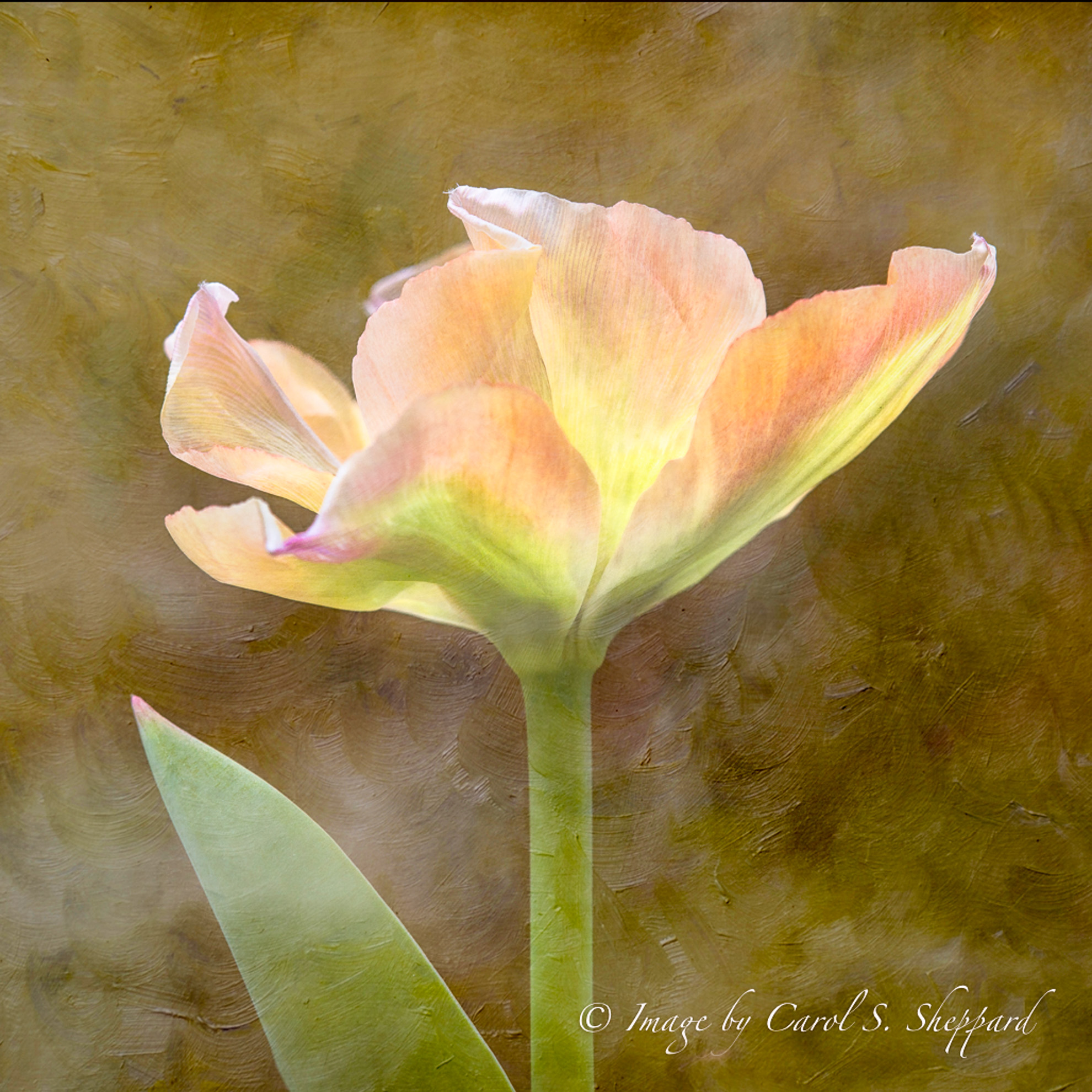
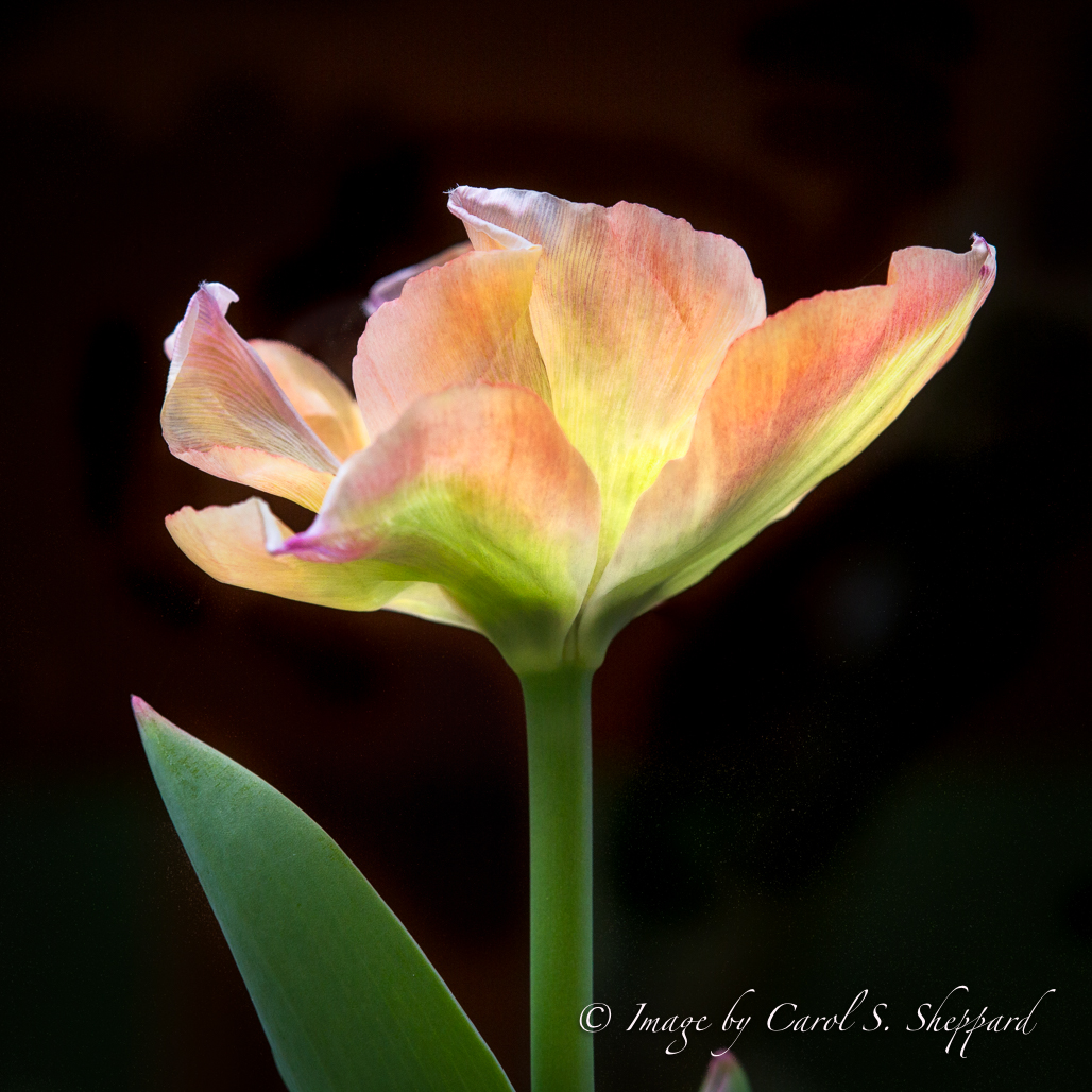
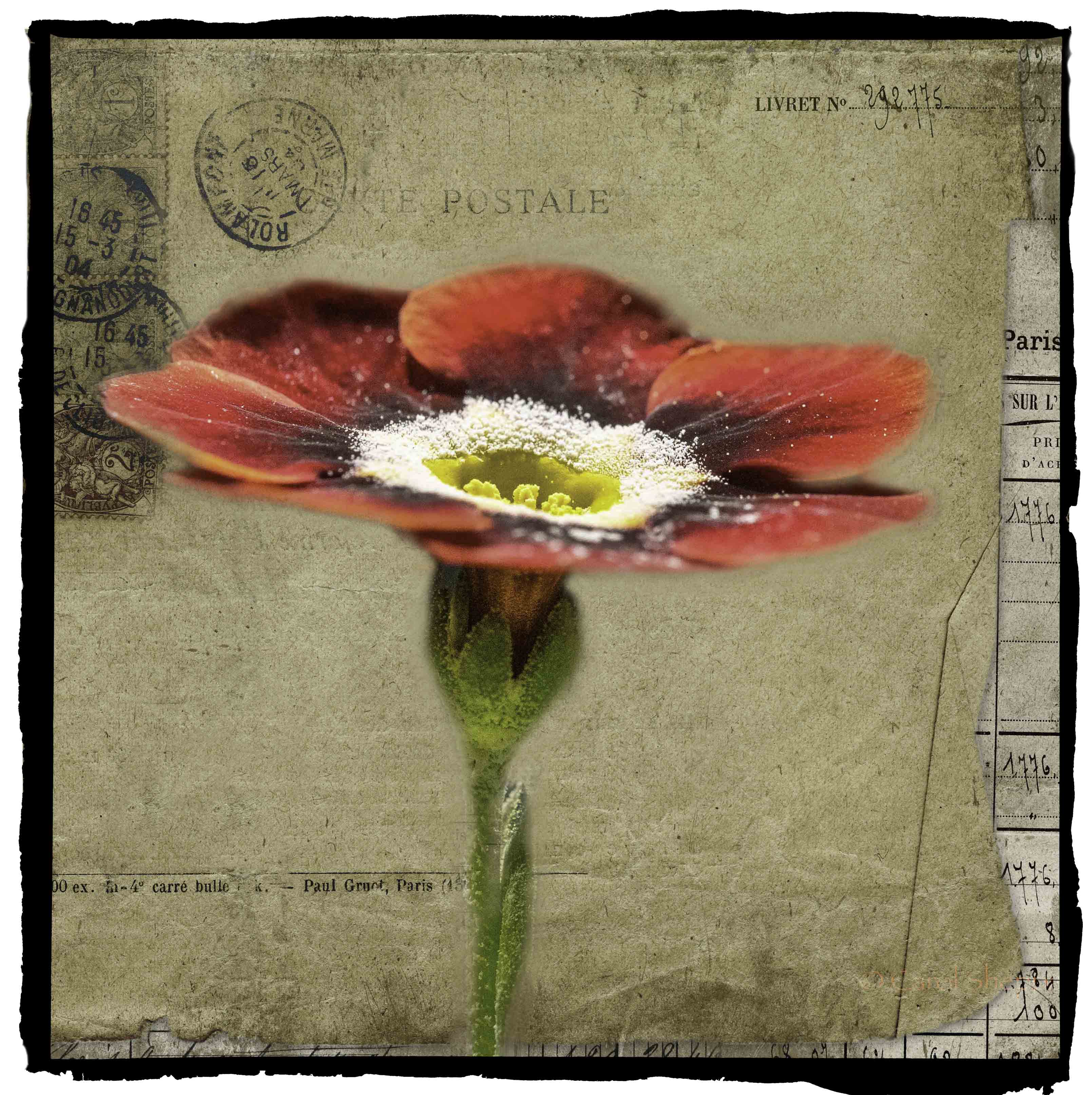
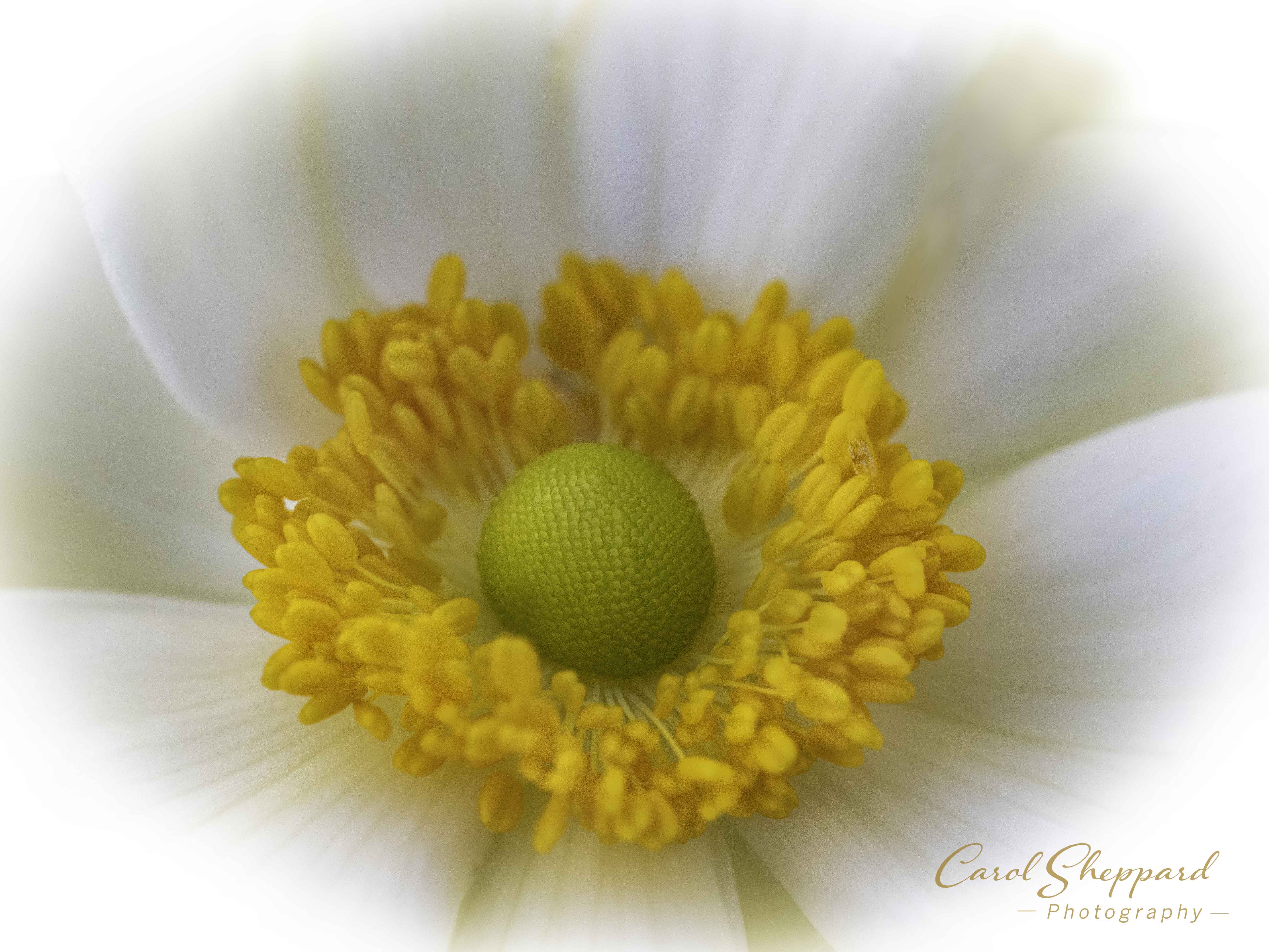
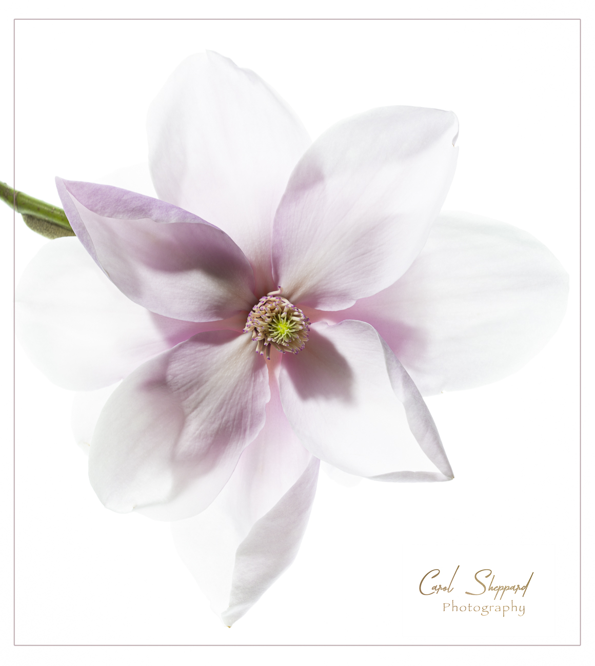
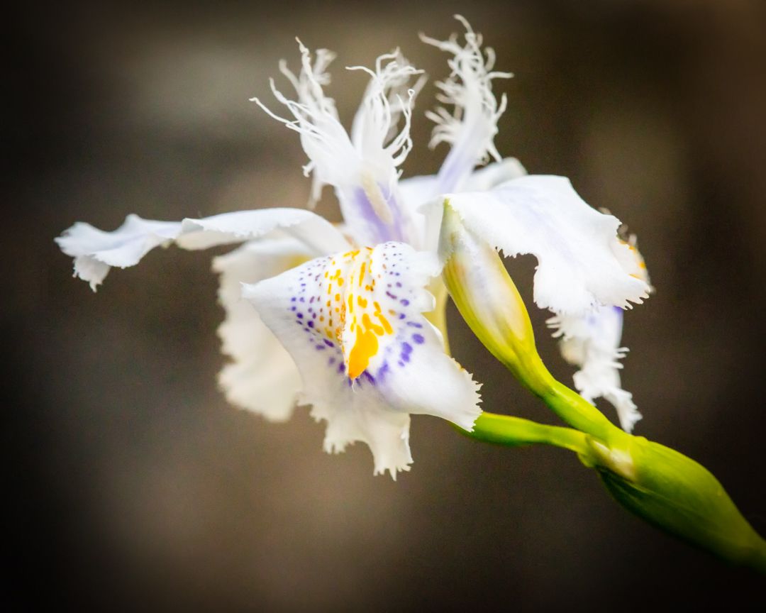
Thank you, Barbara! One of my favorite flowers of Spring! |
Feb 15th |
| 95 |
Feb 21 |
Reply |
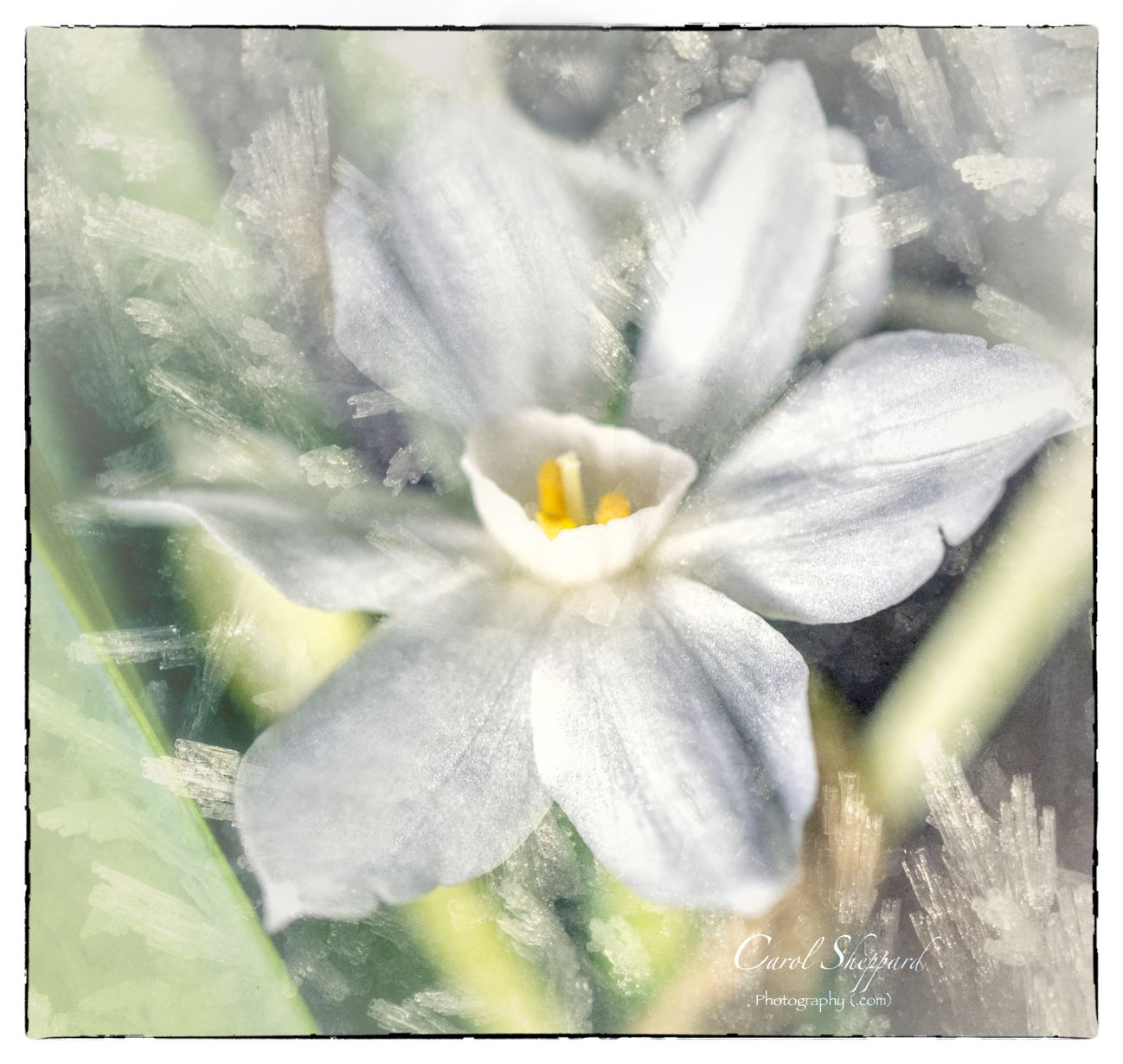
Thank you; I'm afraid even this looks a little blurry to me today :-( |
Feb 15th |
| 95 |
Feb 21 |
Reply |
Thanks, Bob, and so nice to see you! I think I have been either looking through my camera viewfinder, reading, or sitting in front of the computer too long today, but I can tell you I'm so ready for Spring and garden flowers again! Stay safe and warm! |
Feb 15th |
| 95 |
Feb 21 |
Comment |
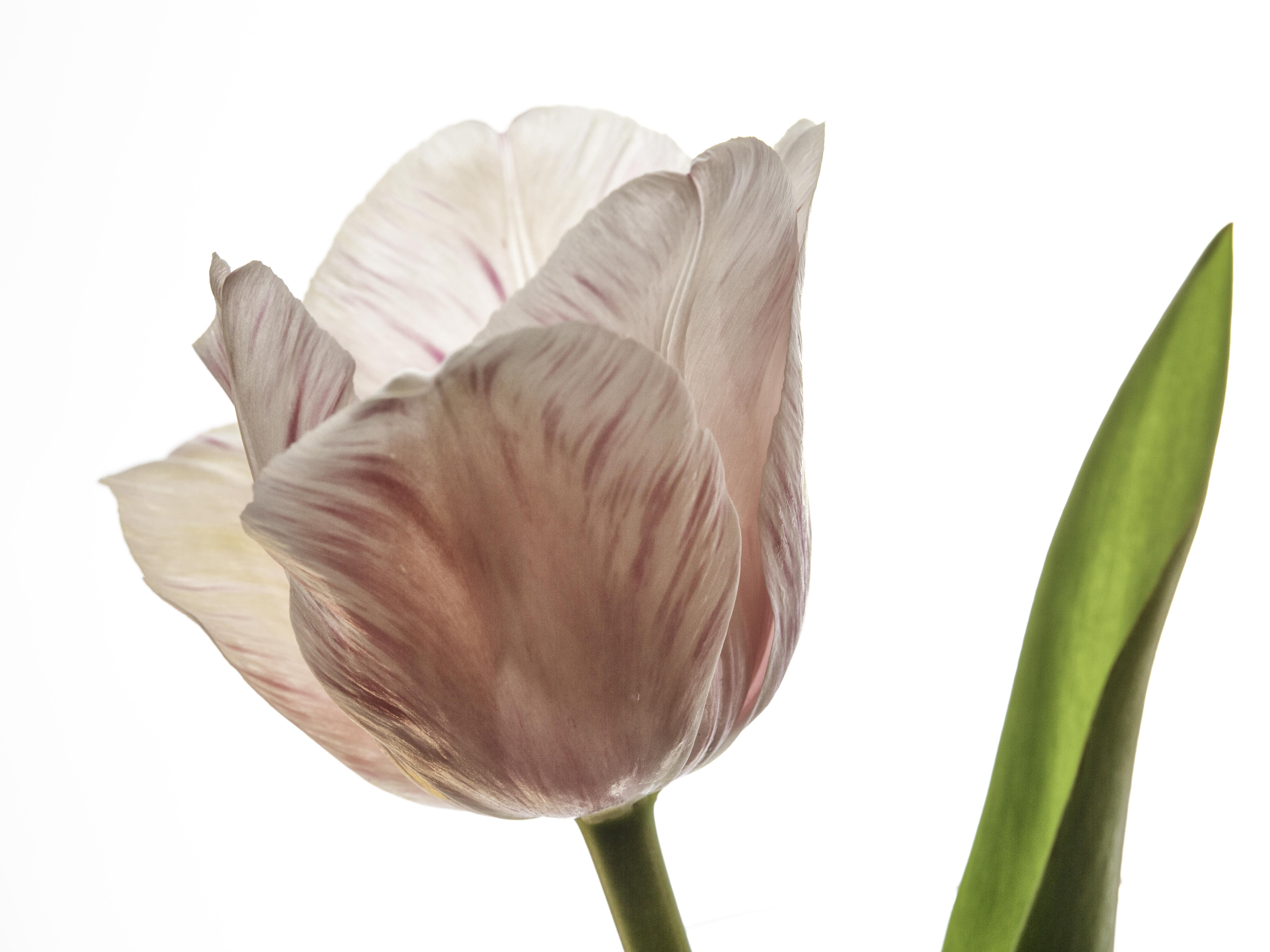
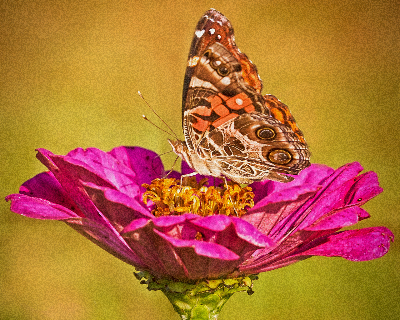
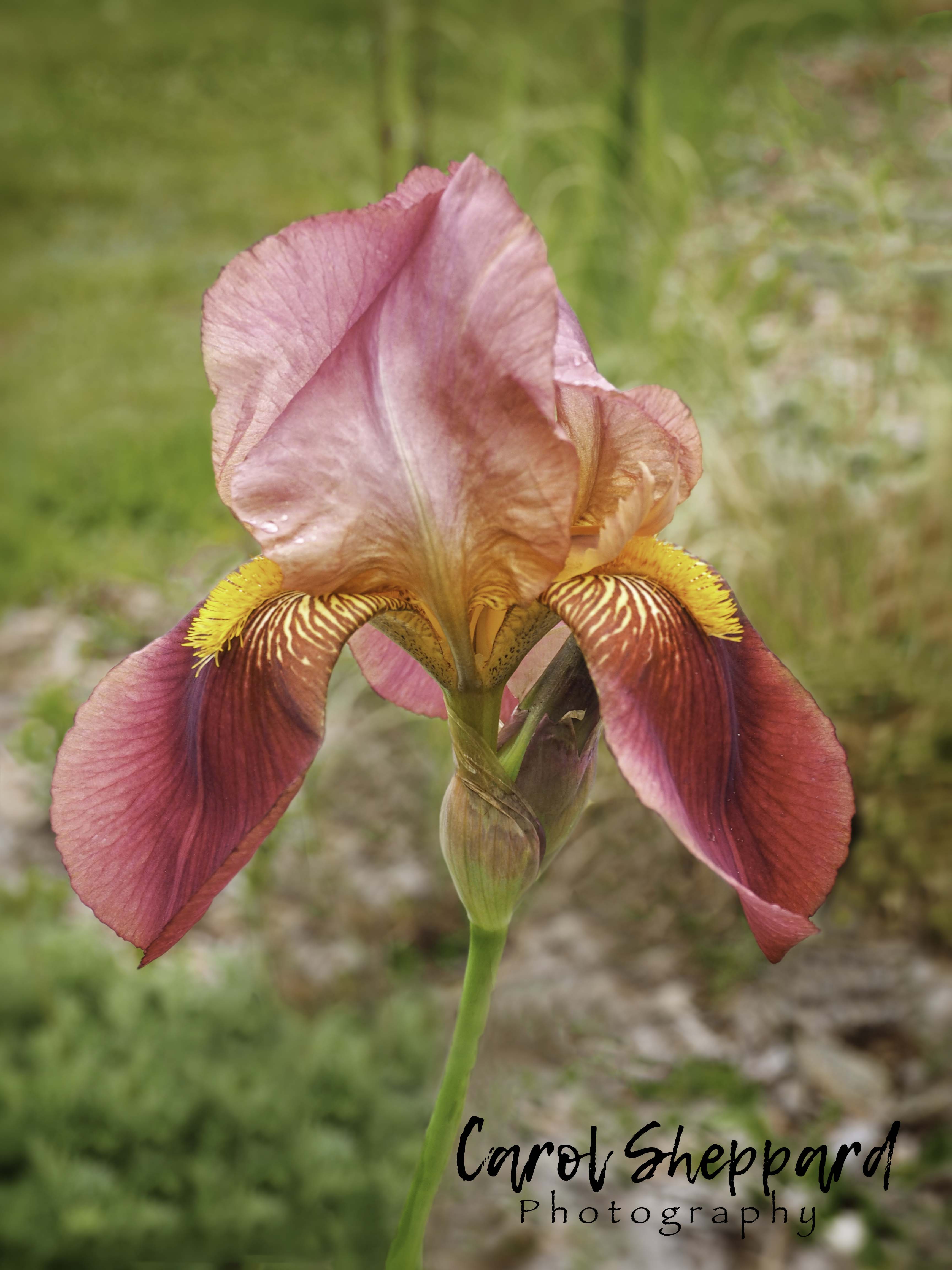
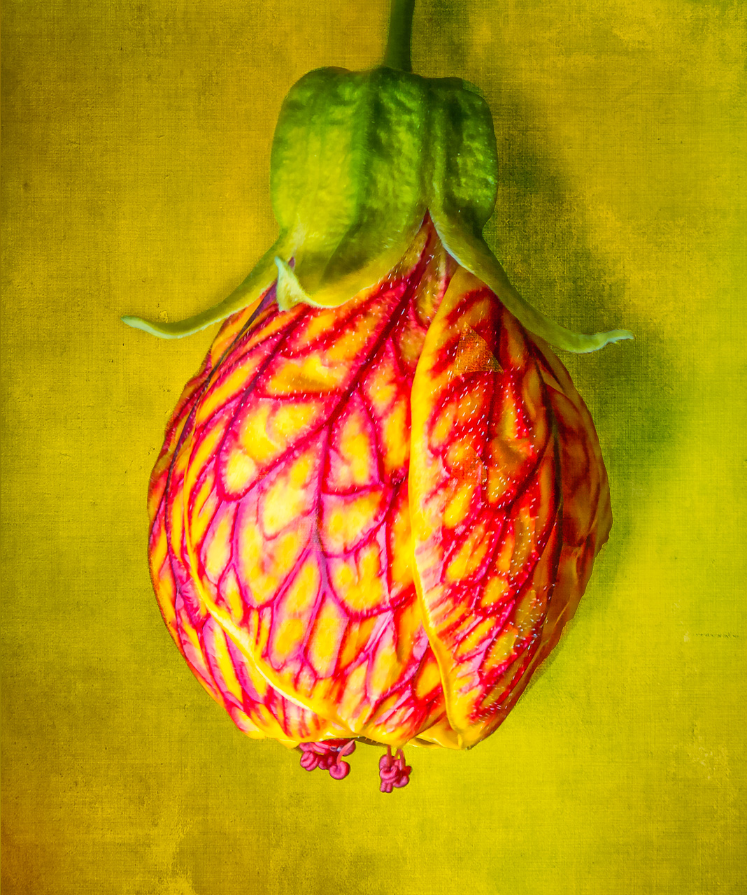
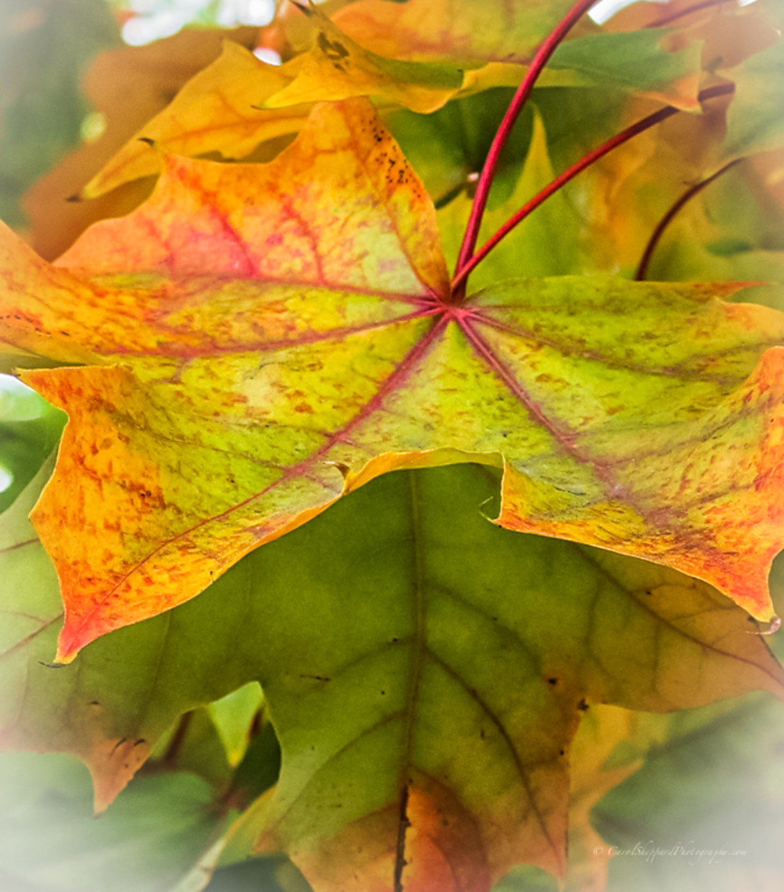
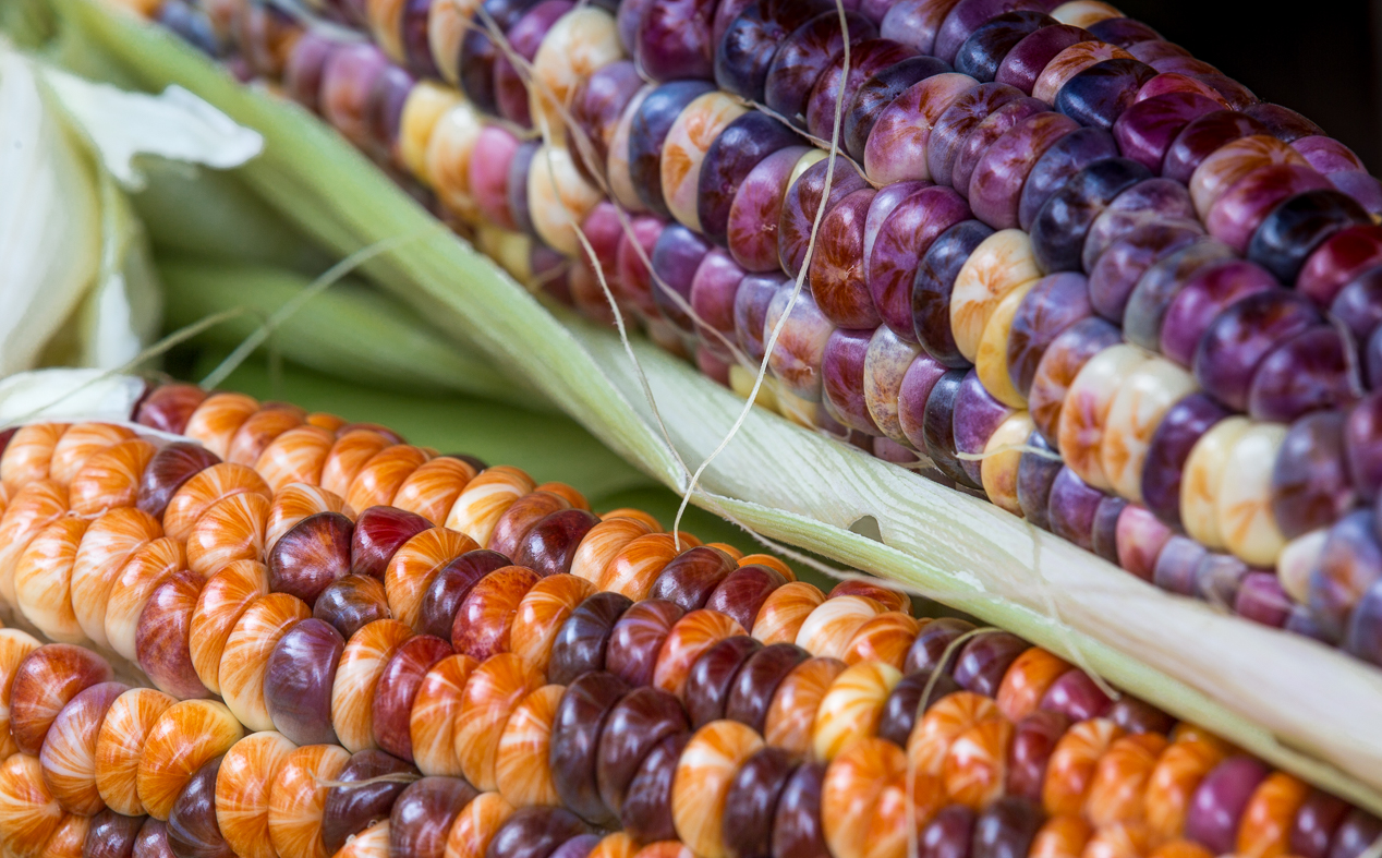
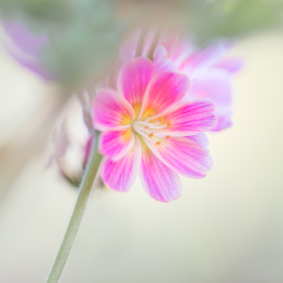
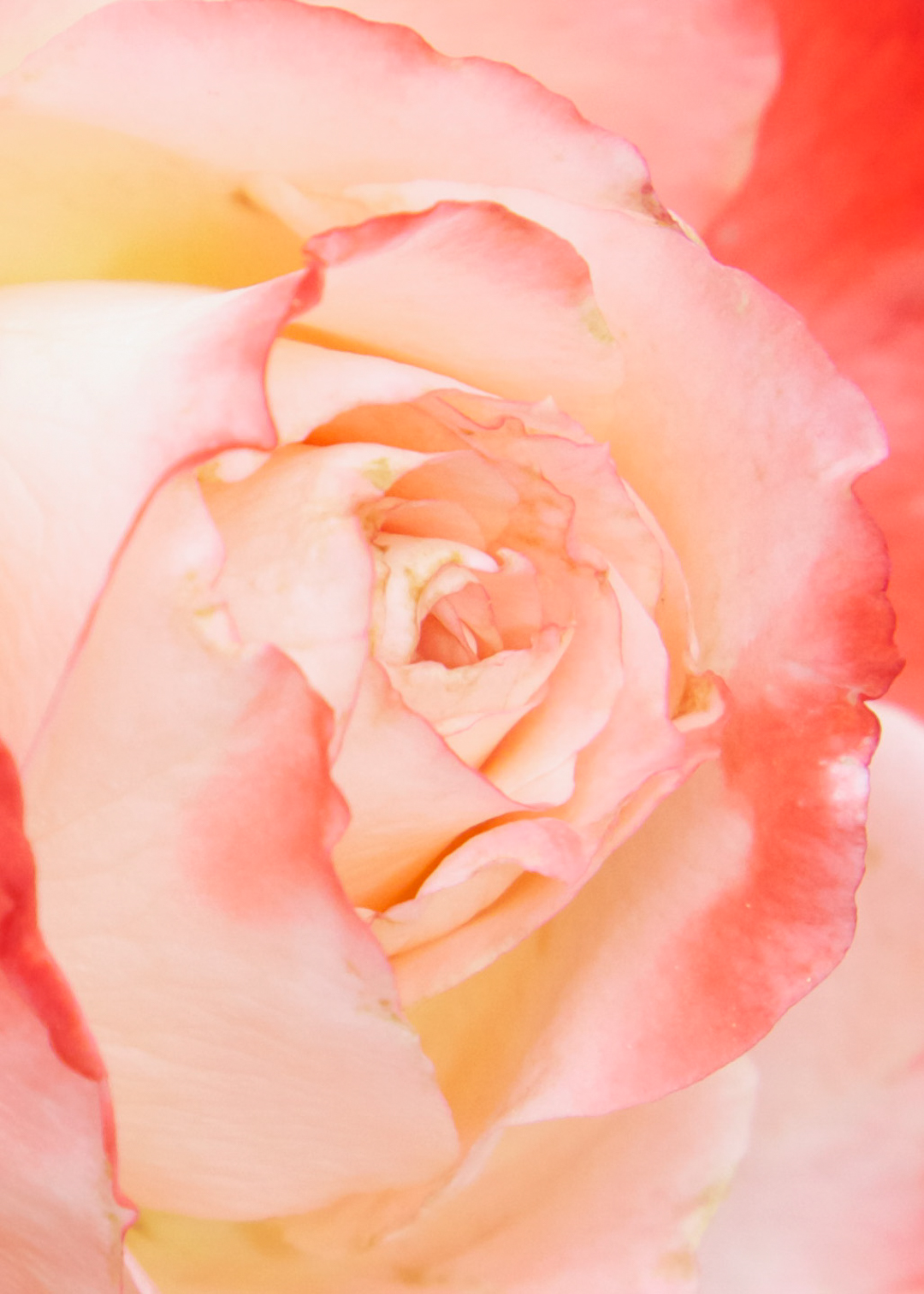
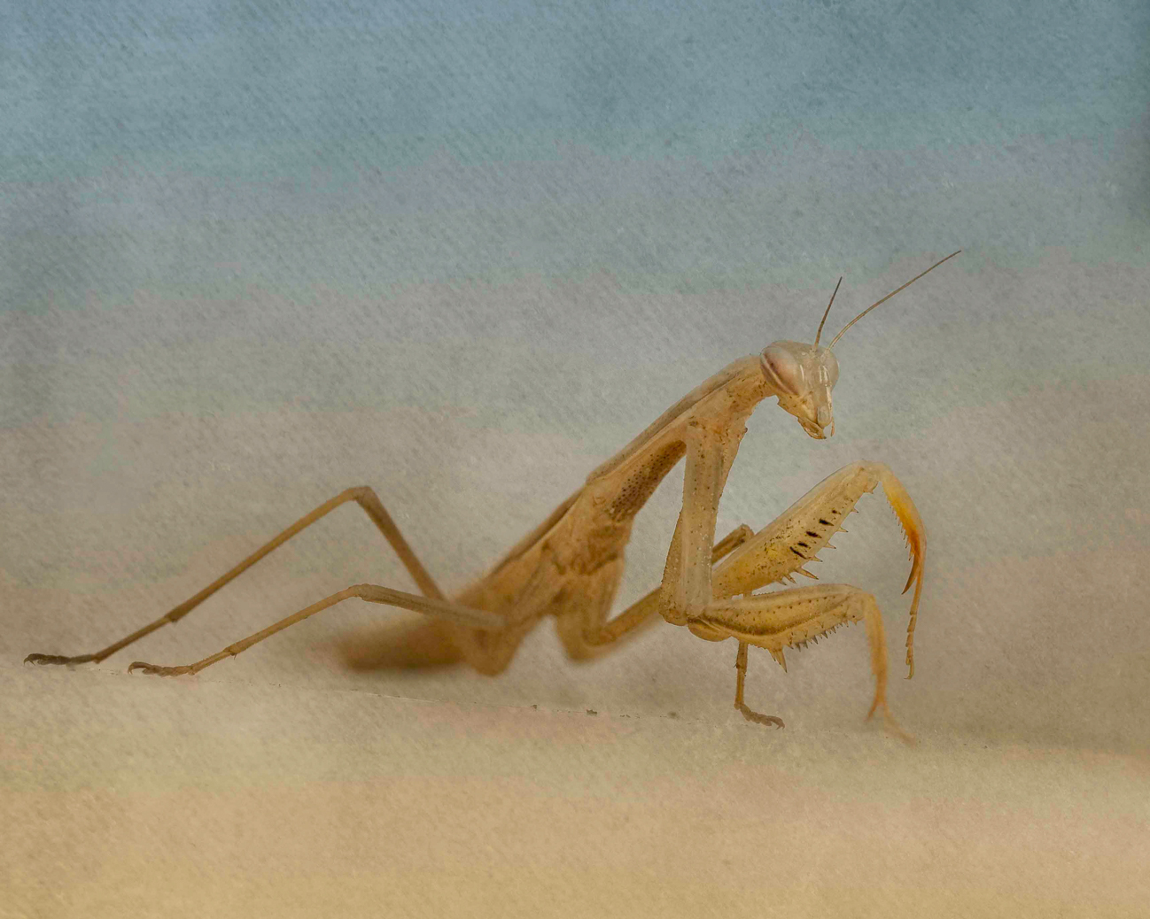
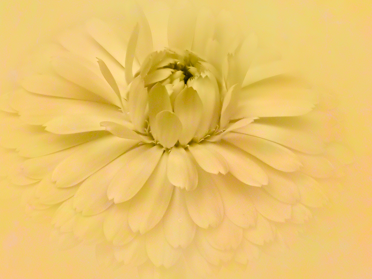
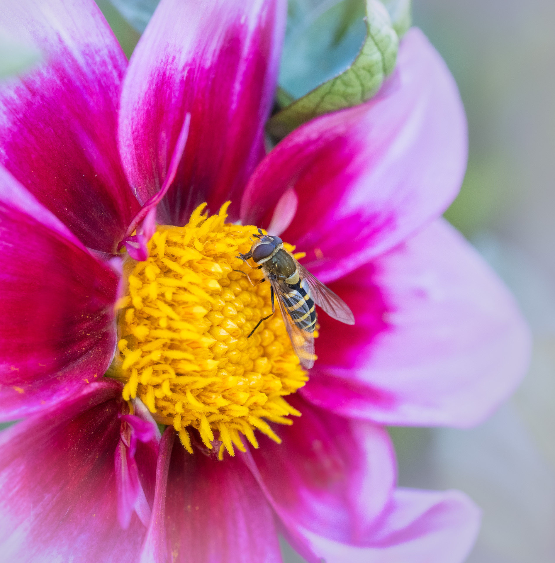
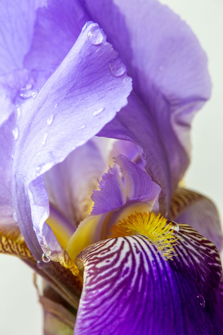
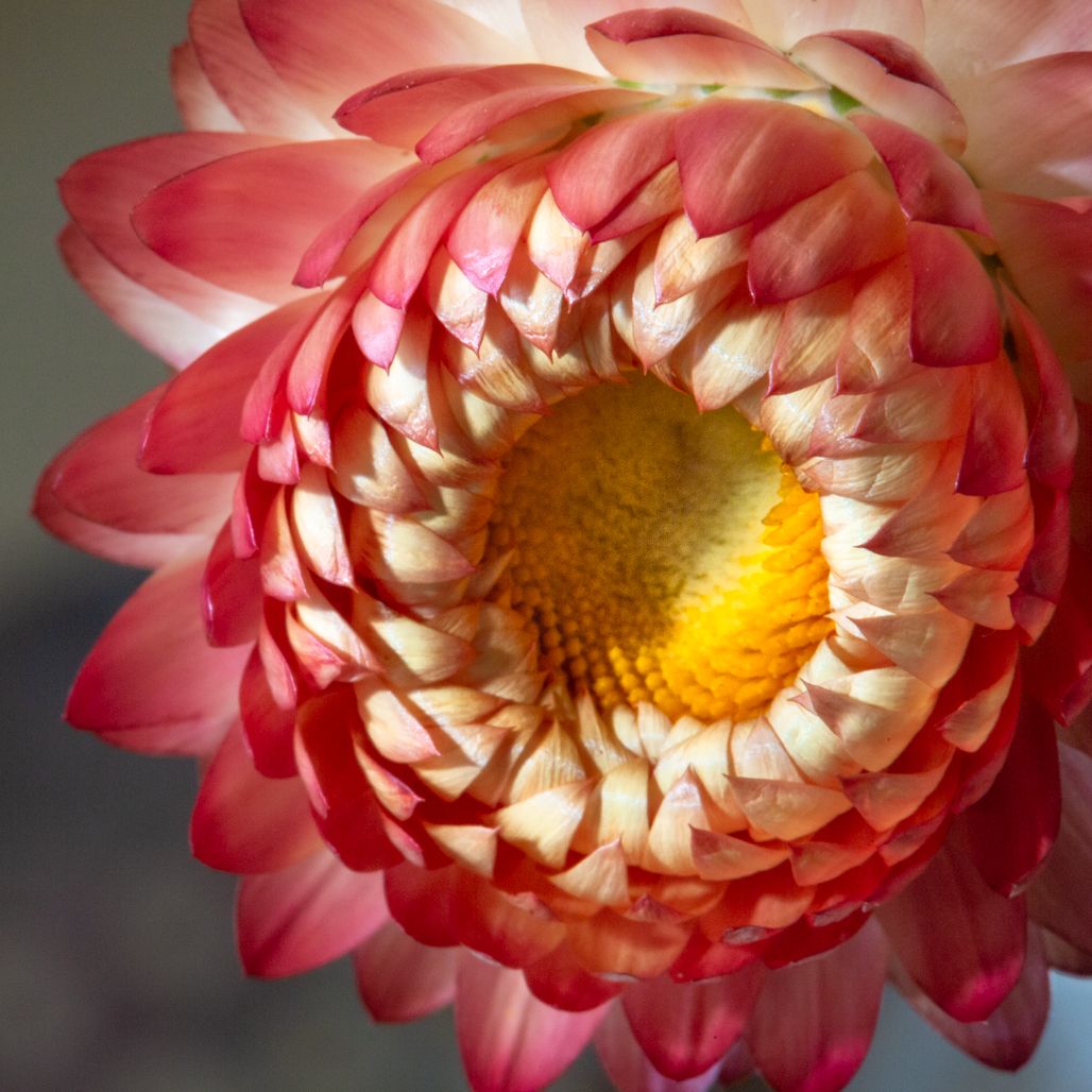
Barbara, the composition of this works so nicely, along with the colors--very complementary! I think maybe some soft or reflected light in the center of just that front flower would be of benefit to place attention more solidly there and bring out more texture and depth, but I think this has great "bones."
|
Feb 15th |
| 95 |
Feb 21 |
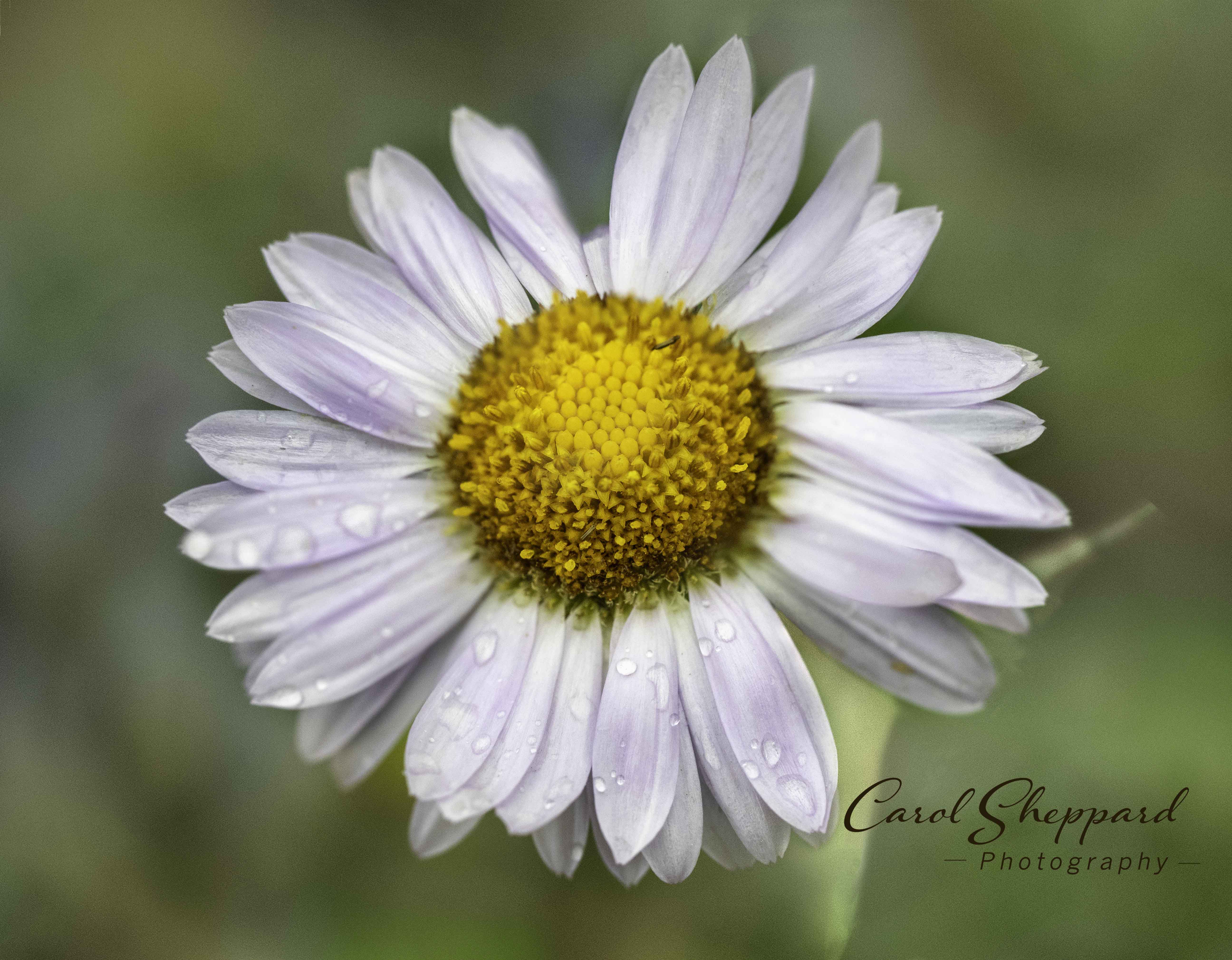
Comment |
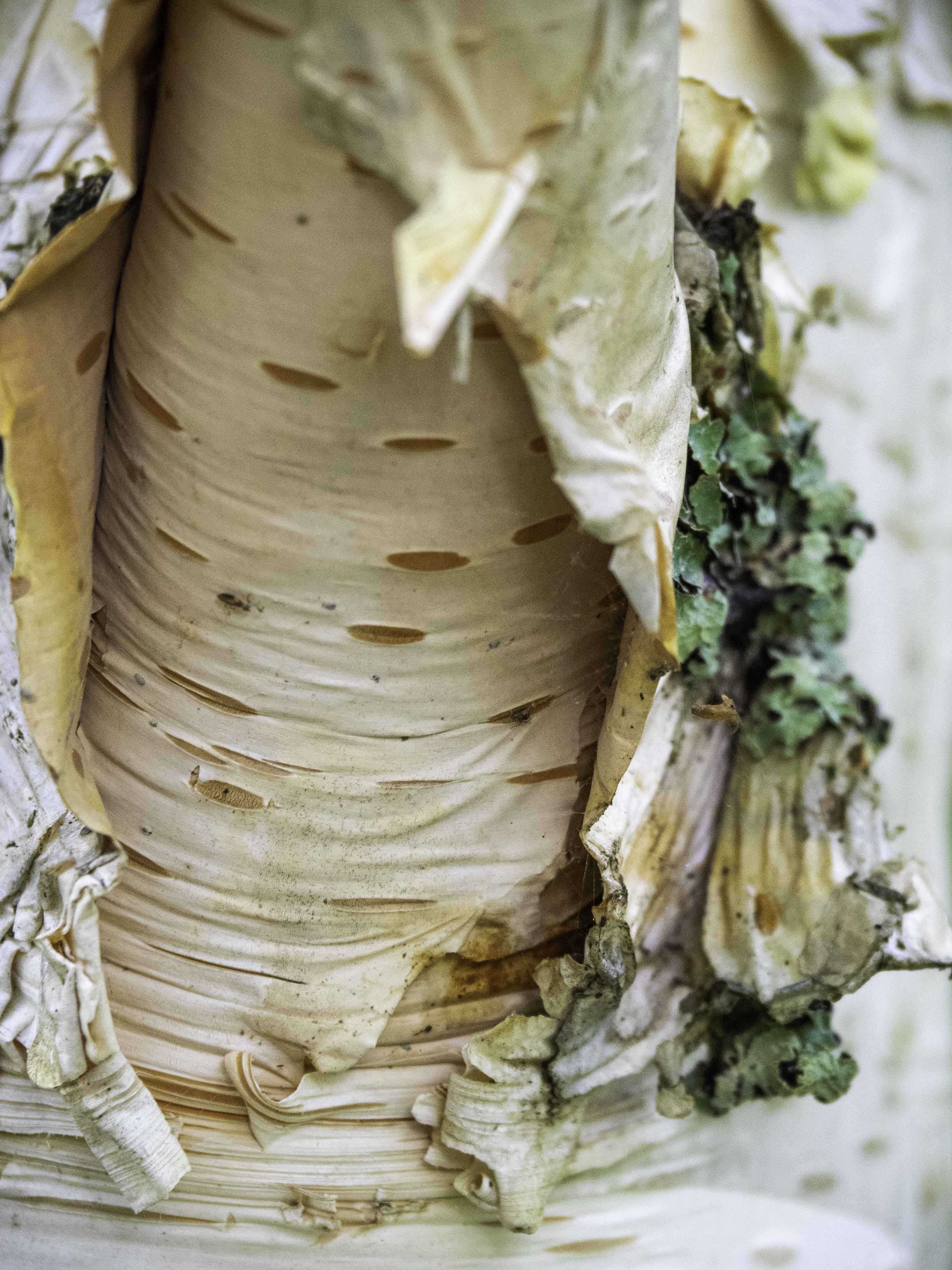
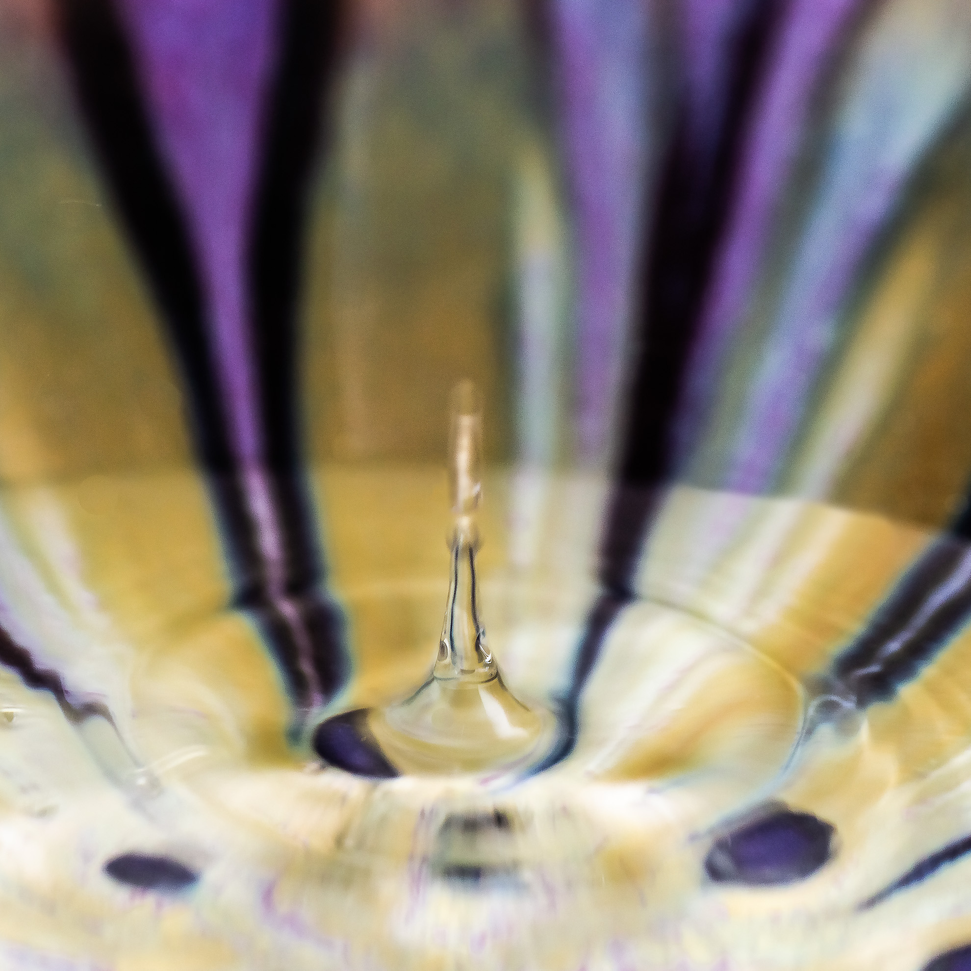
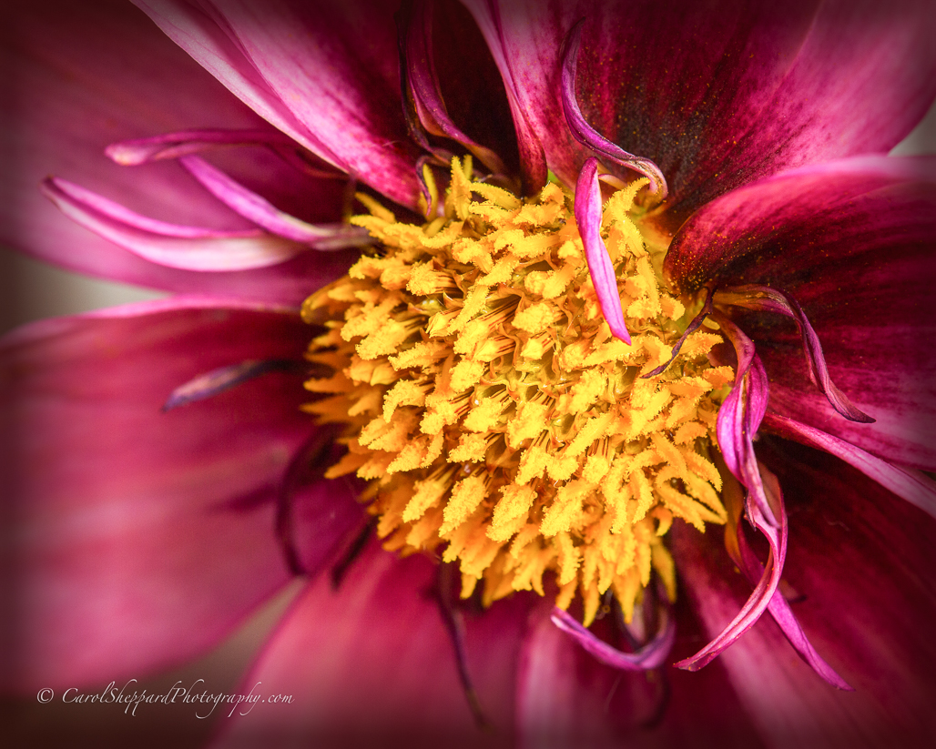
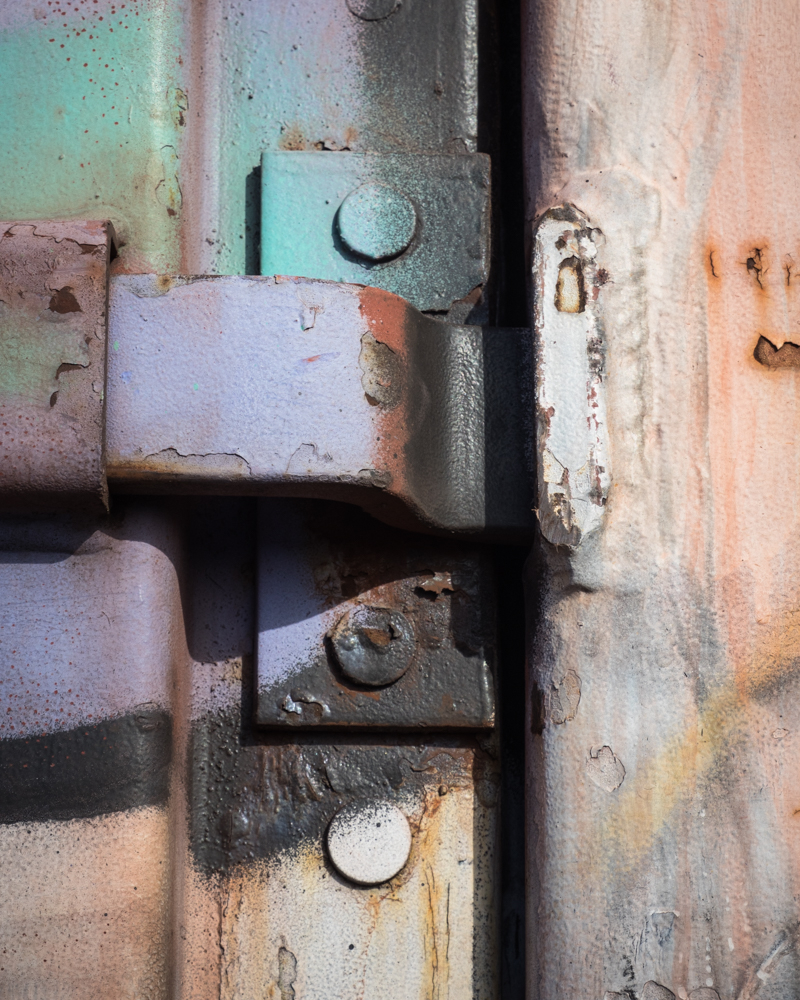
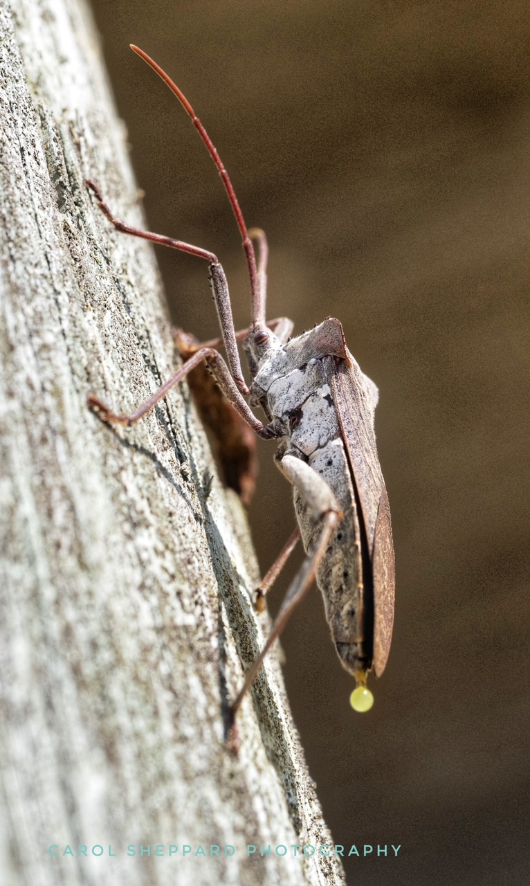
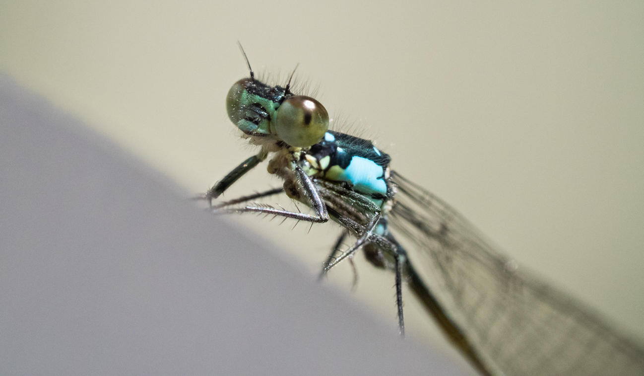
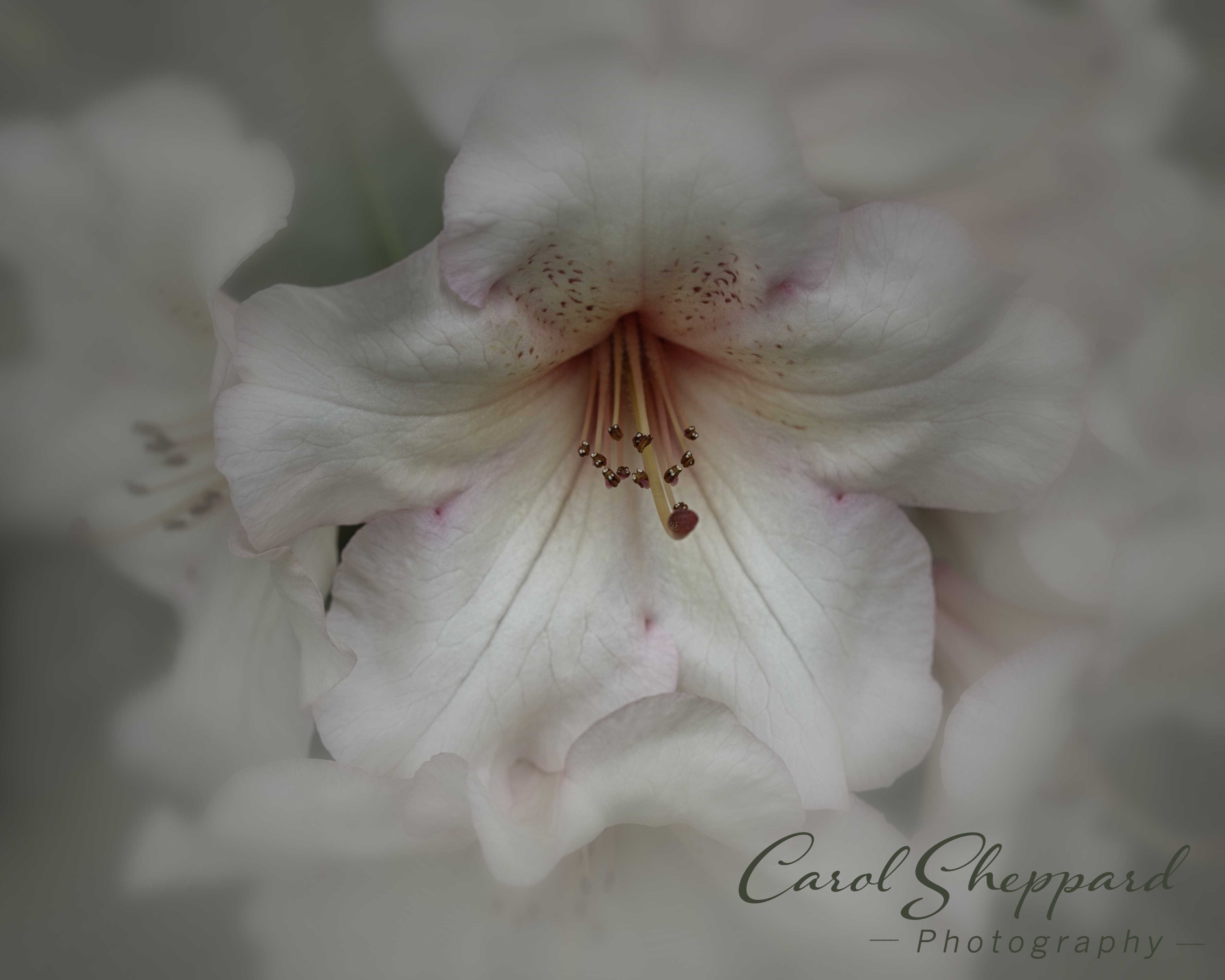
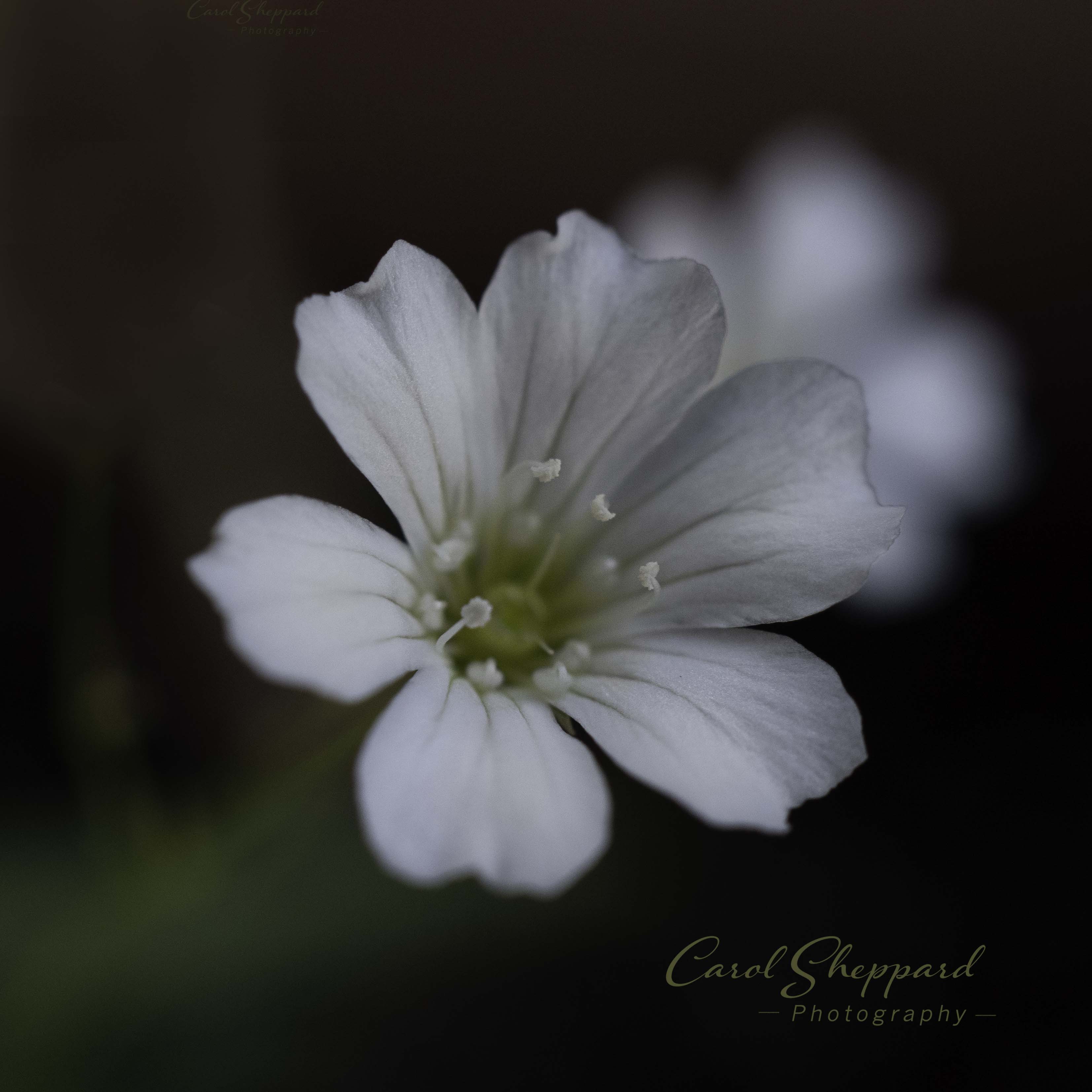
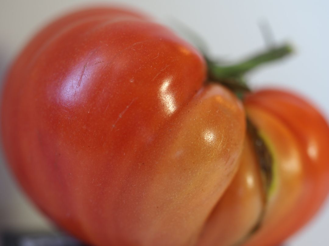
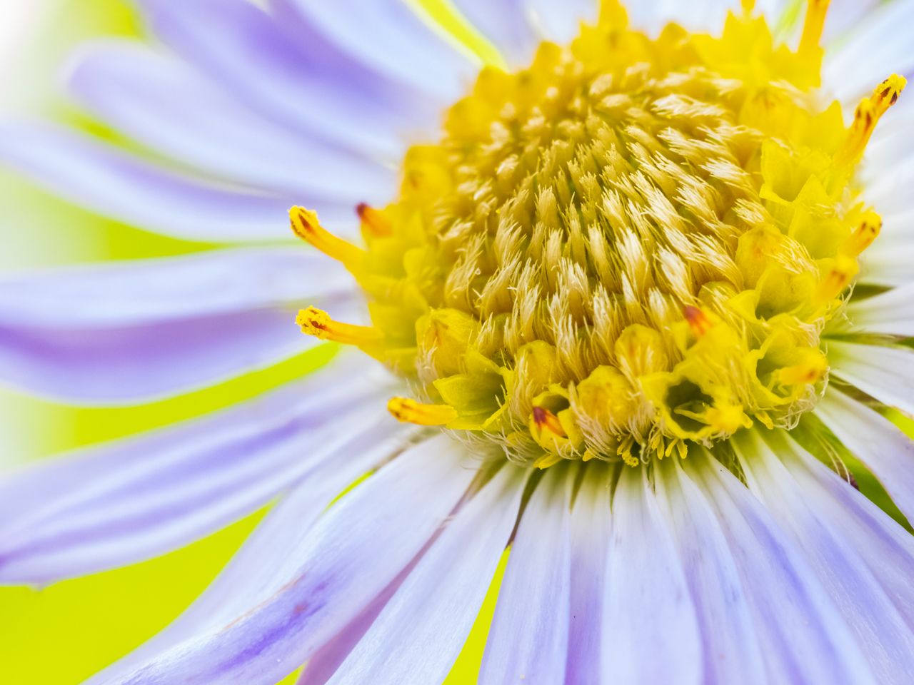
I like your crop, and the capture of lighting and texture. I've heard good things about those Laowa's. I am not an expert at focus stacking, but I feel that the front areas would be much more sharp after focus stacking that many images. I tried enlarging it and I may be imagining things or have been reading too long today. I will suggest that you eliminate that large white area on the upper left, but other than that, nice job! I look forward to seeing more from that lens! |
Feb 15th |
| 95 |
Feb 21 |
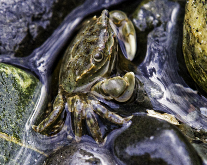
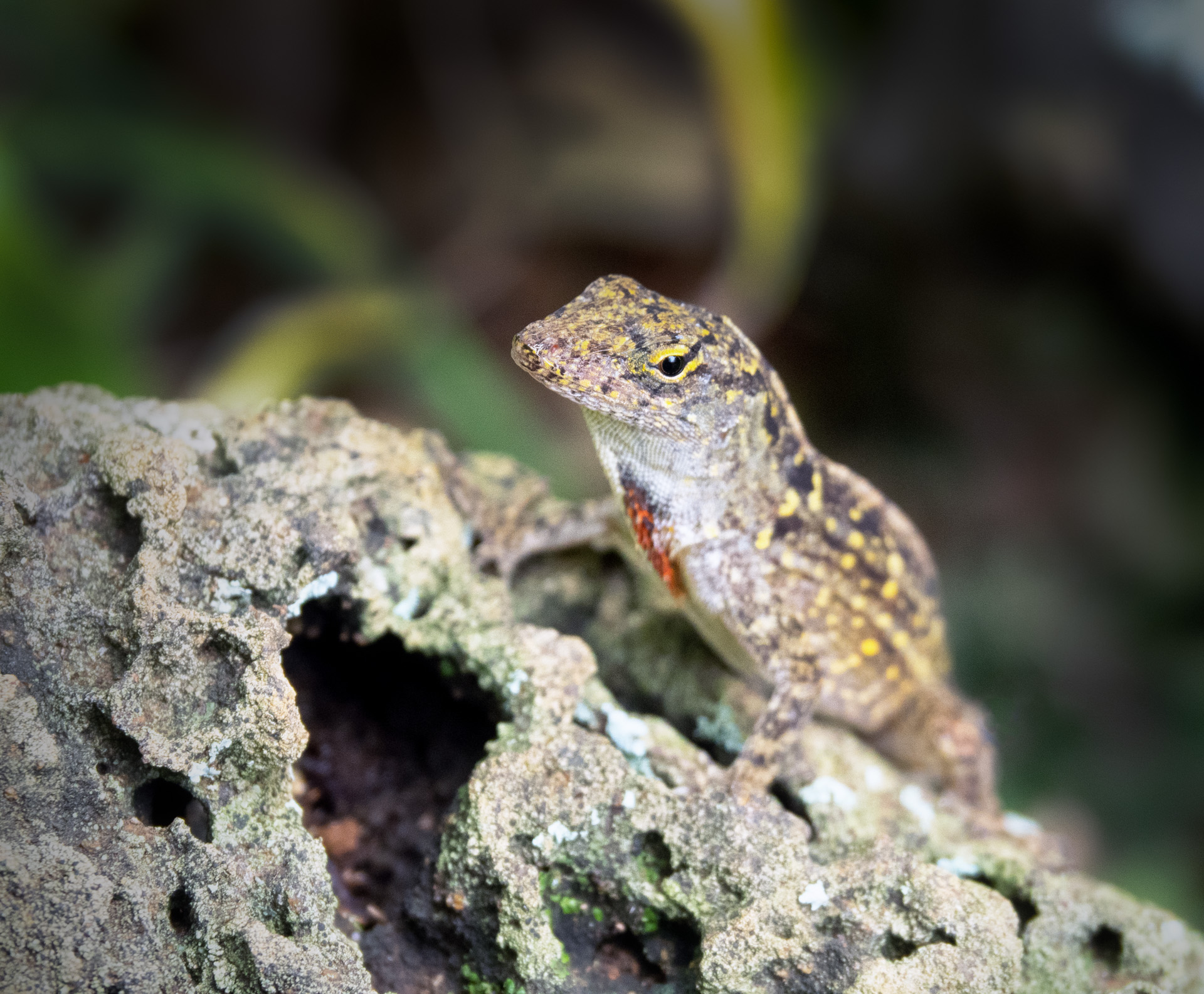
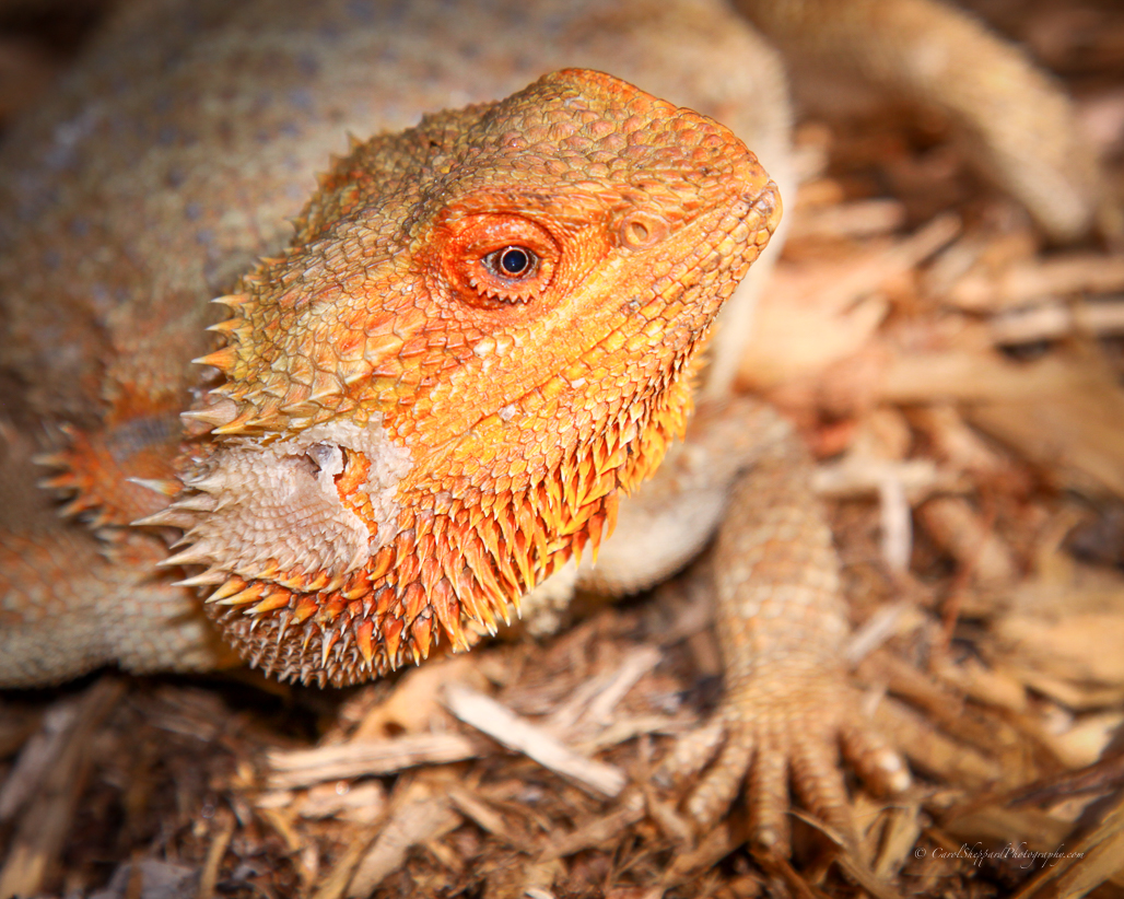
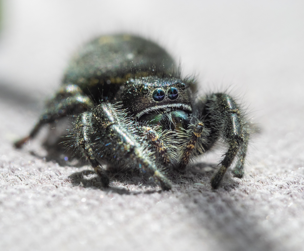
Comment |
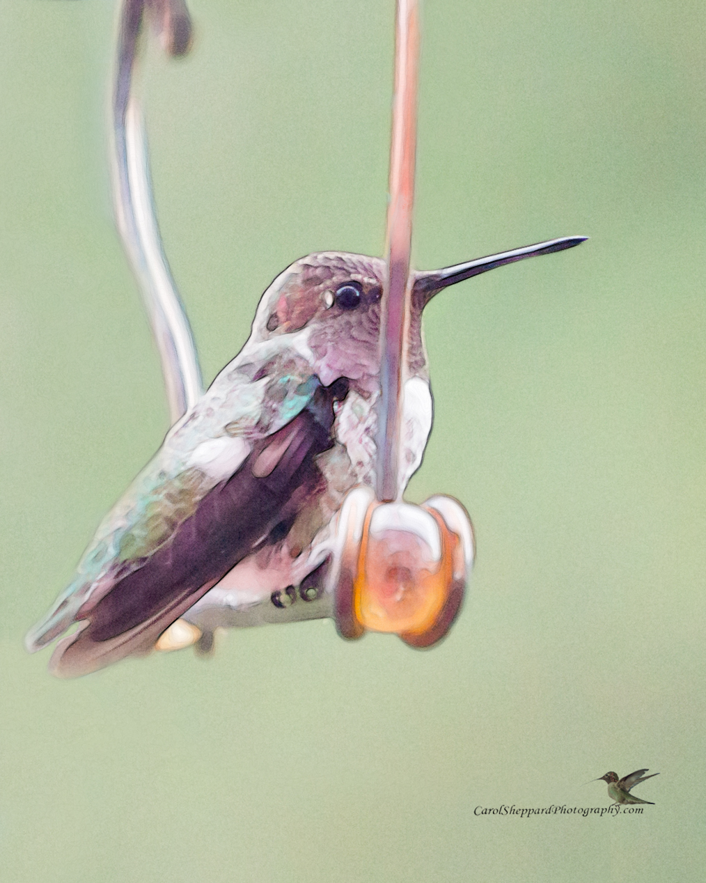
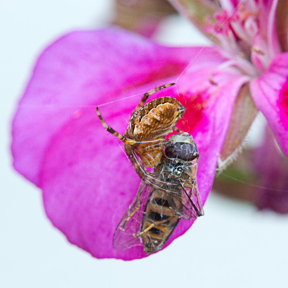
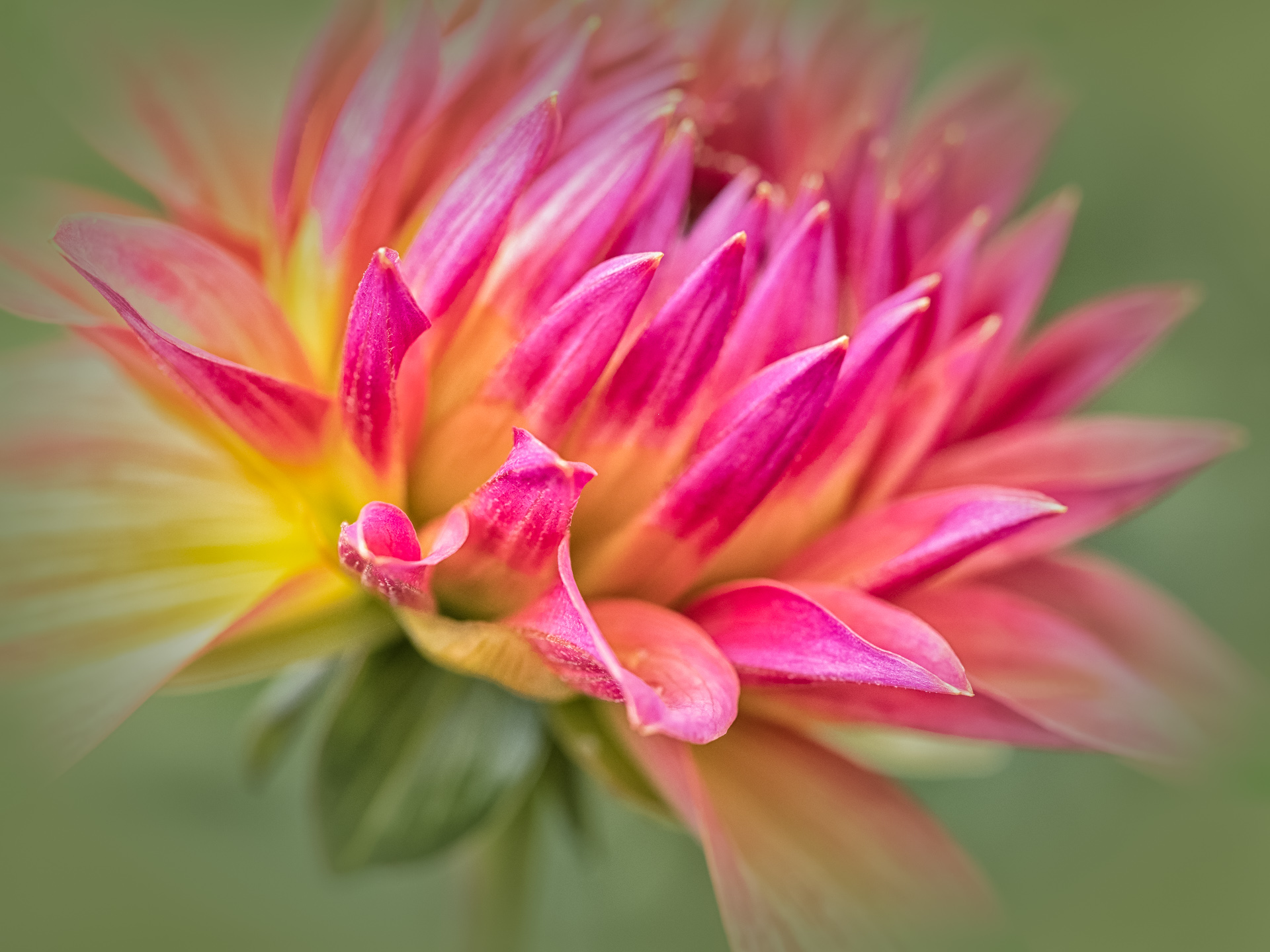
Your capture of the jumping spider feels perfect--his placement, the crop, the color combination, the contrast--even the balance and details of the shadows and midtones--all feel good to me as a viewer. I might have cloned out that large white area just above the spider, but other than that, it is beautiful as is! And those guys are so hard to catch!! |
Feb 15th |
| 95 |
Feb 21 |
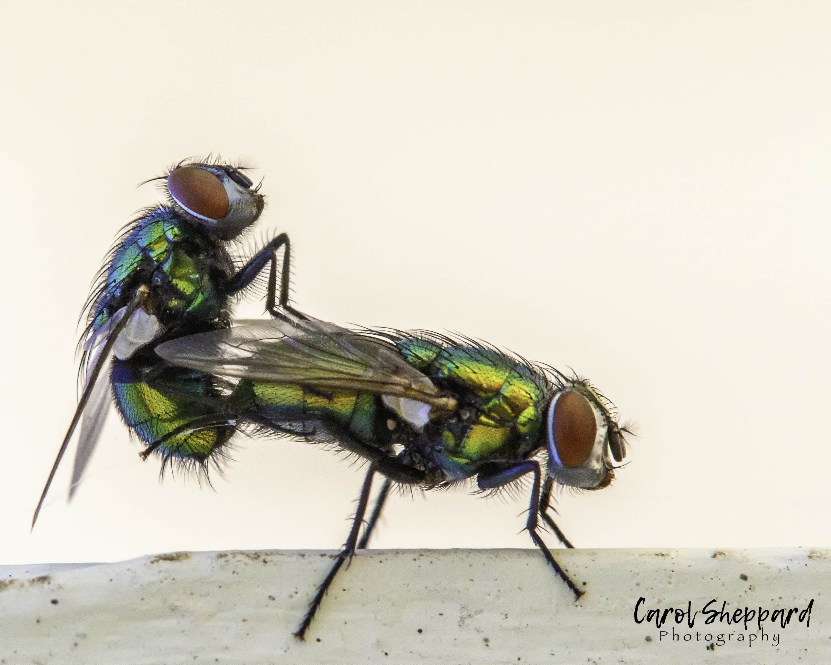
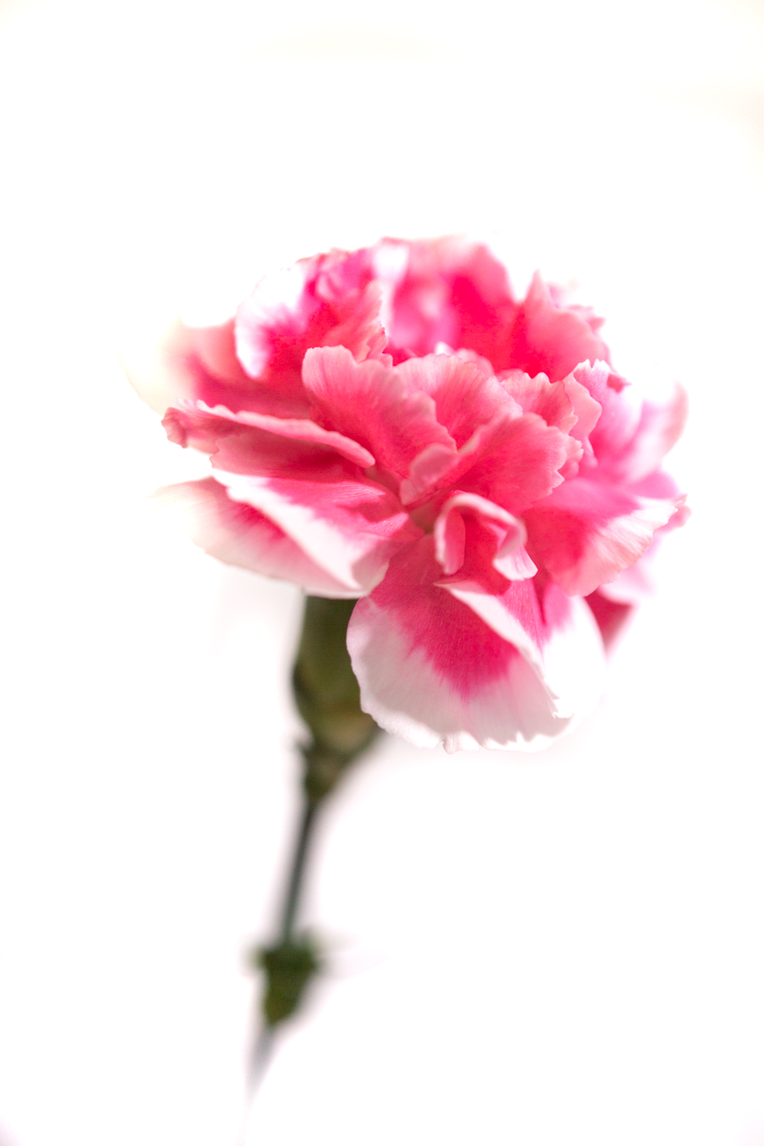
Comment |
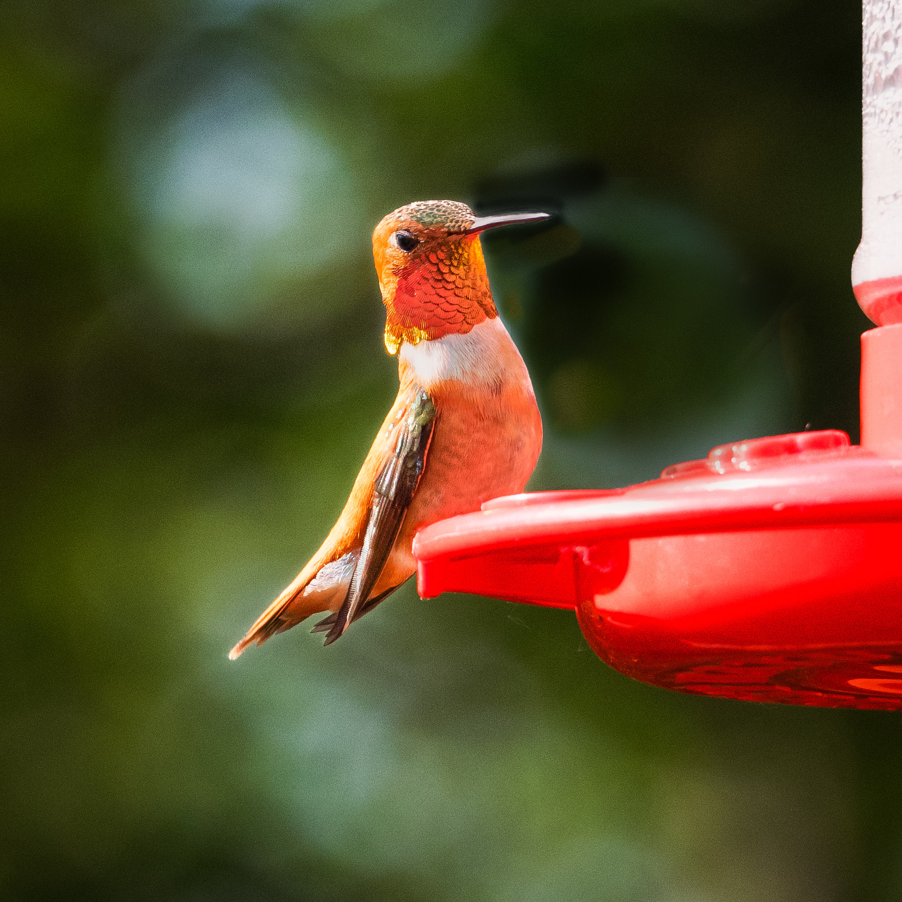
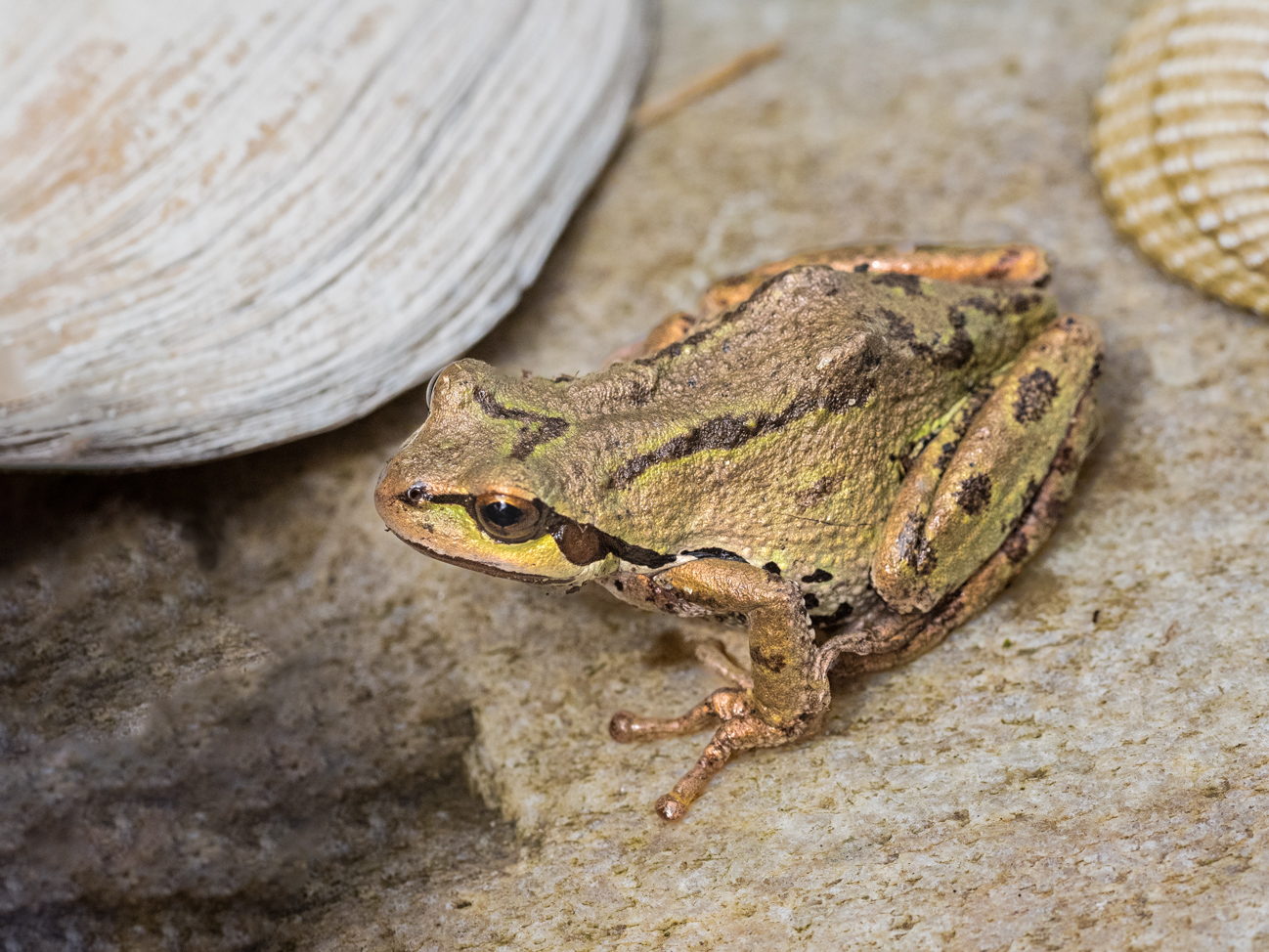
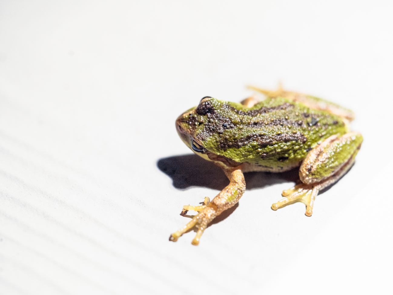
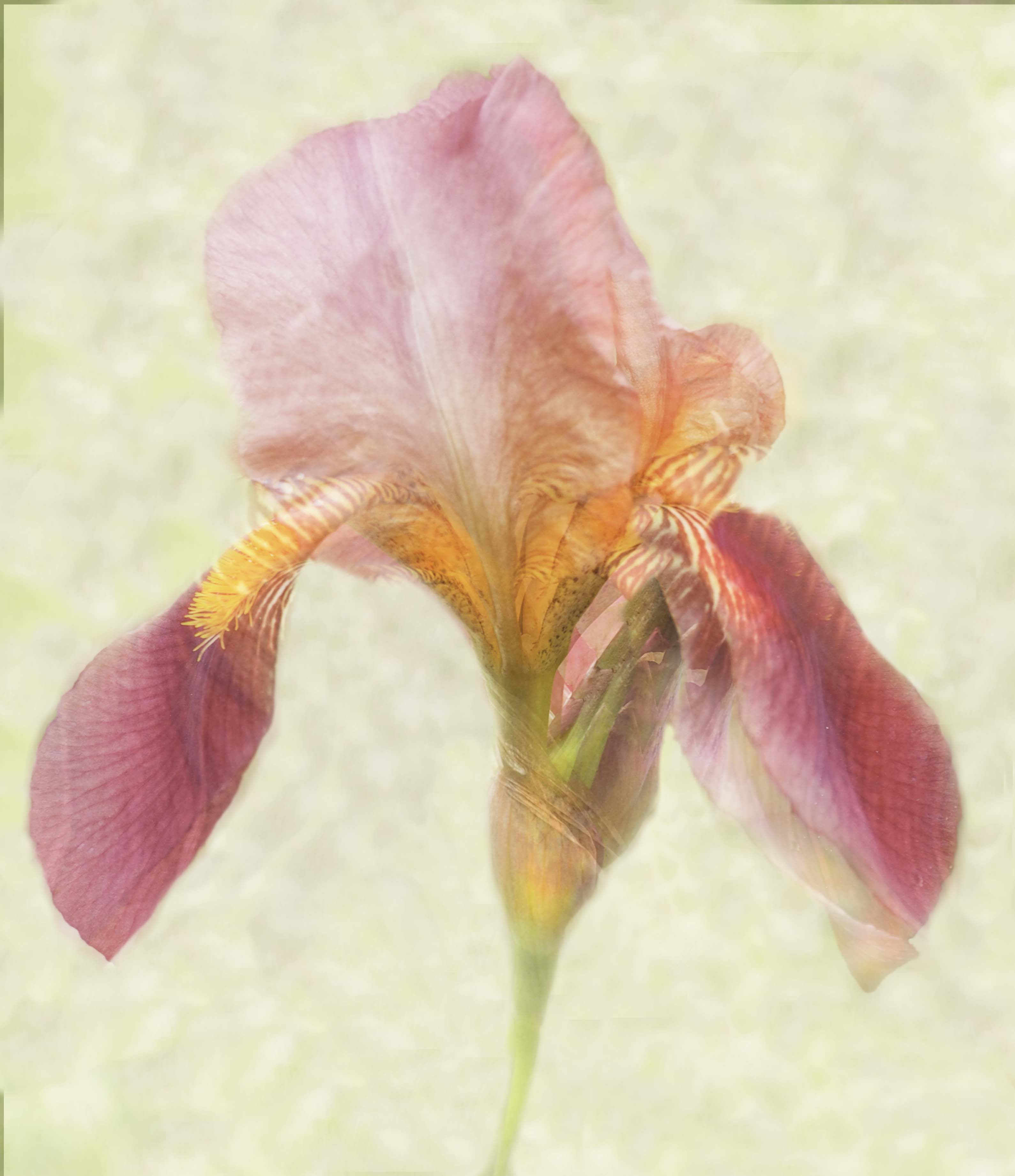
Stuart, have you adjusted the diopter on your camera viewfinder? The image looks blurry to me, but honestly, it could just be me. The coloring works so well, and the composition works fine, but for some reason, I just feel the 60mm might have moved a fraction during or just before capture? They are so very sensitive to the slightest movement. Your settings should have worked well. Again, perhaps its just me?
|
Feb 15th |
| 95 |
Feb 21 |
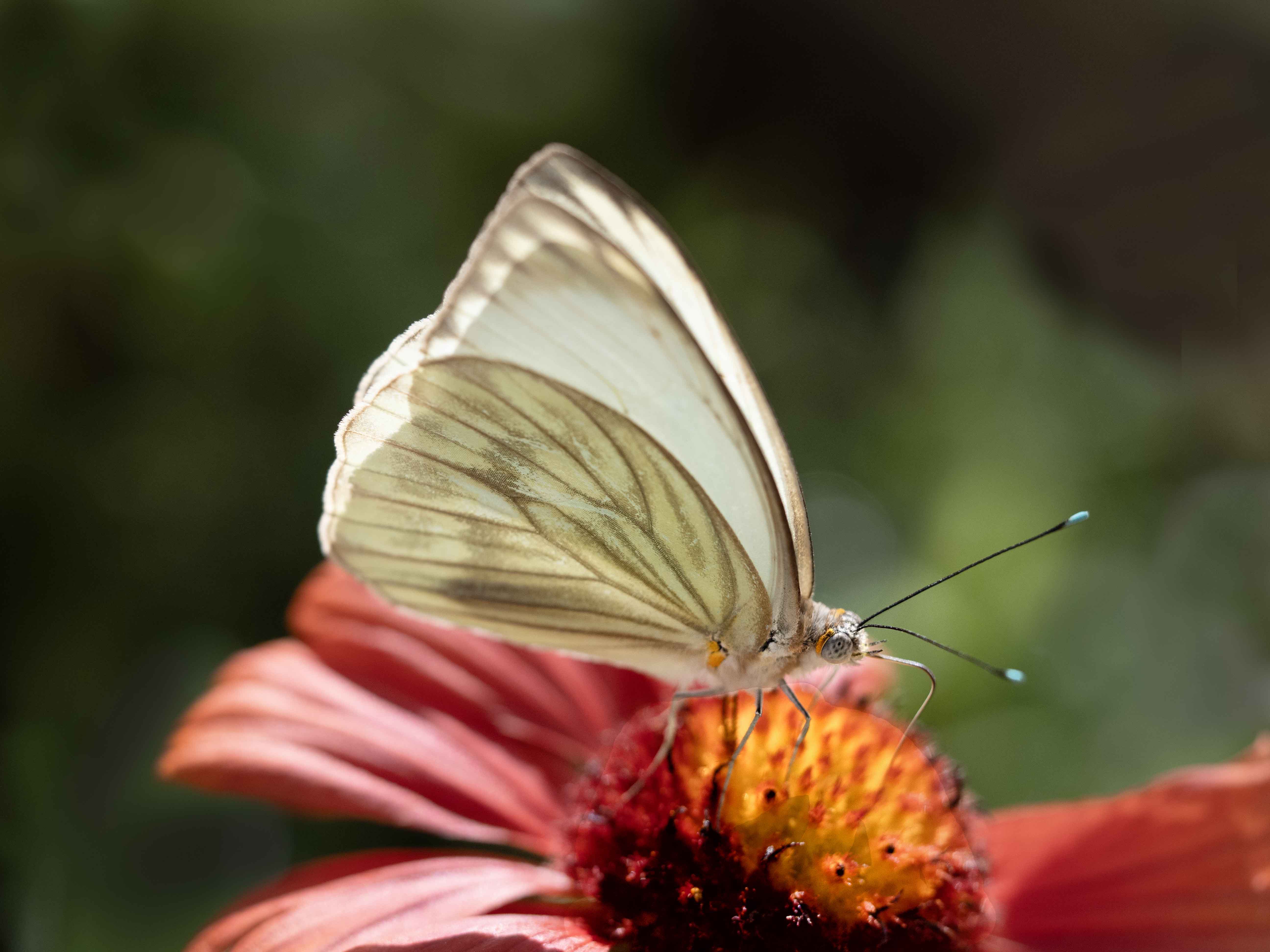
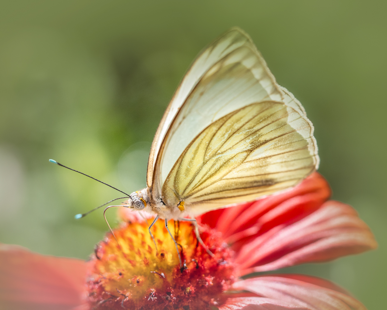
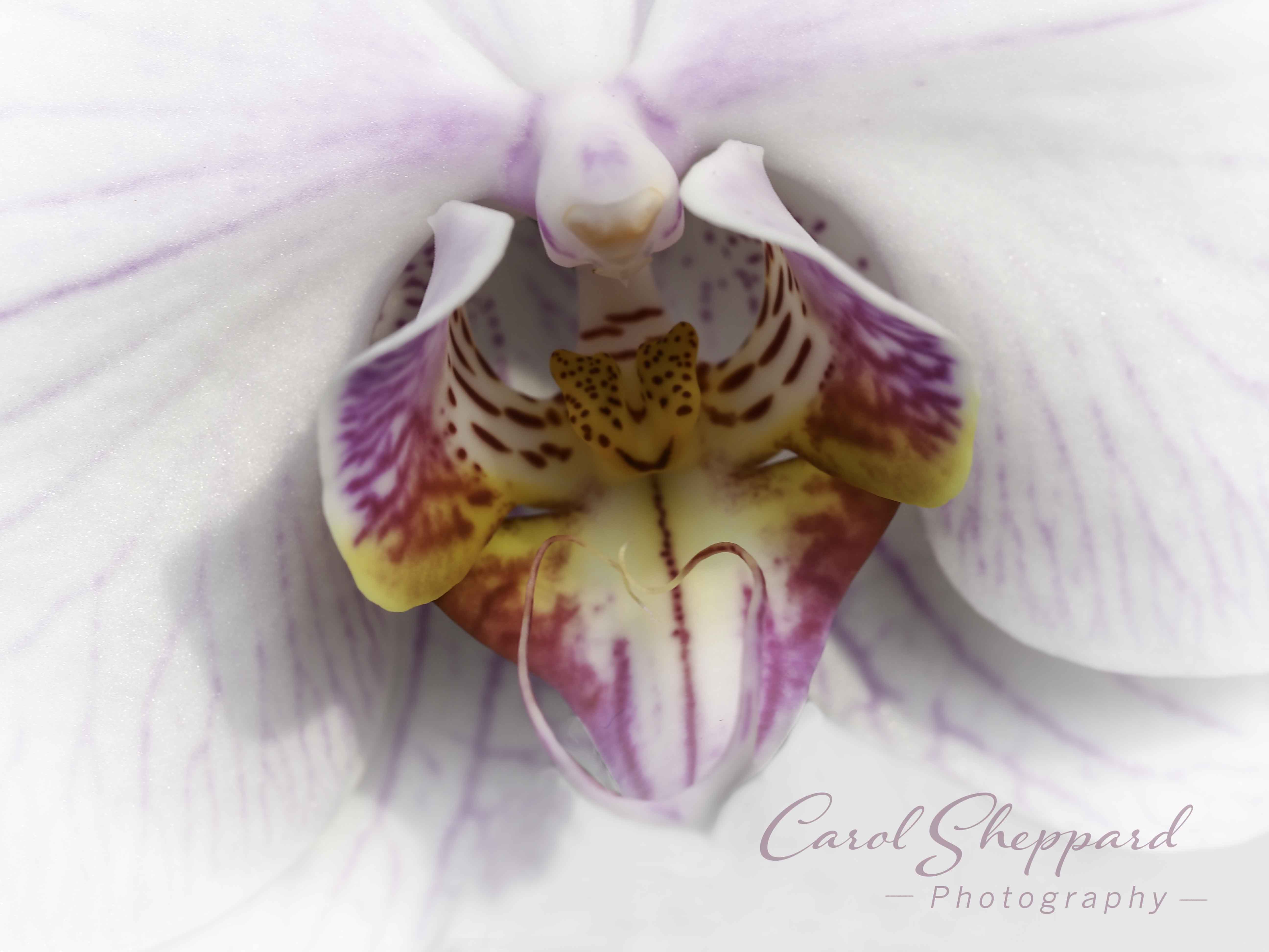
Comment |
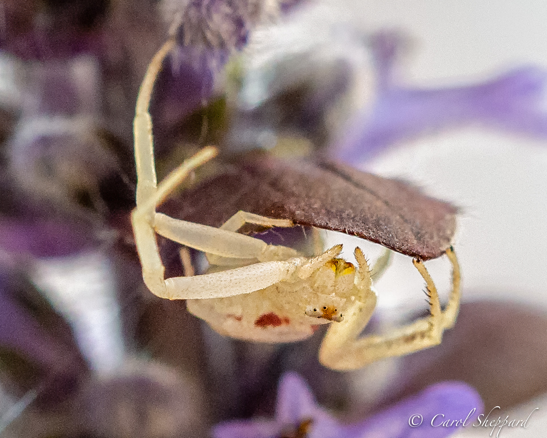
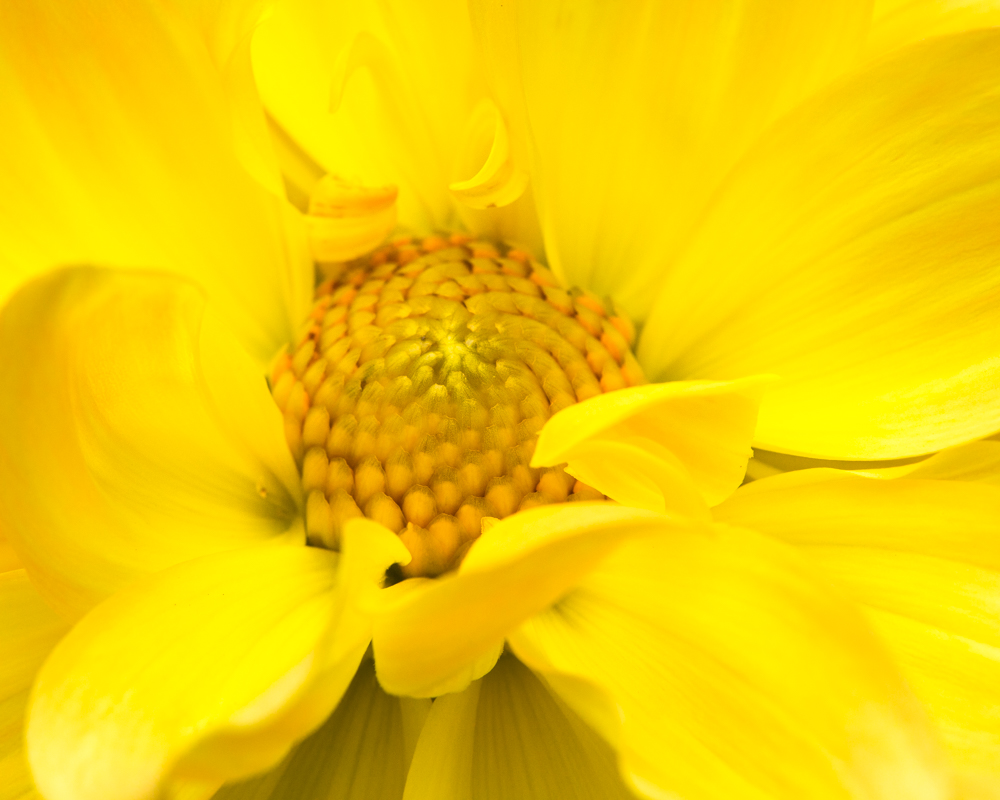
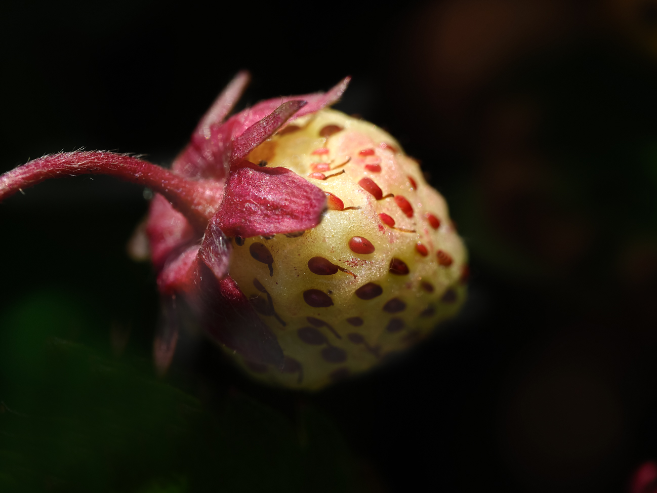
The detail feels very sharp, and the composition feels great. Because there was no flash, you don't have any inappropriate highlights, and I feel the color balance is just right. Might I suggest just one thing? I felt that it is somewhat dark overall, so maybe raise the exposure just a bit? Or maybe just the white point. Great job, though! |
Feb 15th |
5 comments - 4 replies for Group 95
|
10 comments - 7 replies Total
|