|
| Group |
Round |
C/R |
Comment |
Date |
Image |
| 80 |
Jan 21 |
Reply |
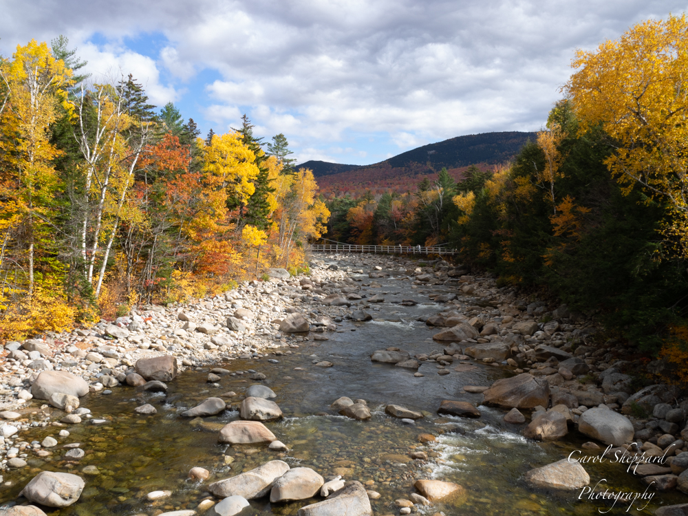
Bill, this is a place with a cheese name, maybe? I booked a 1/2 day "country" tour in Holland, and it was during their coldest temperatures in 90 years. The day before I left, I slipped on ice and sprained my knee. I put on a brave game face and tried to see everything I could, but I have to say that I felt miserable. Thank goodness for my stubbornness! |
Jan 18th |
| 80 |
Jan 21 |
Comment |
Congratulations Victor on a job well done! I love your image in the Member Showcase! |
Jan 18th |
| 80 |
Jan 21 |
Comment |
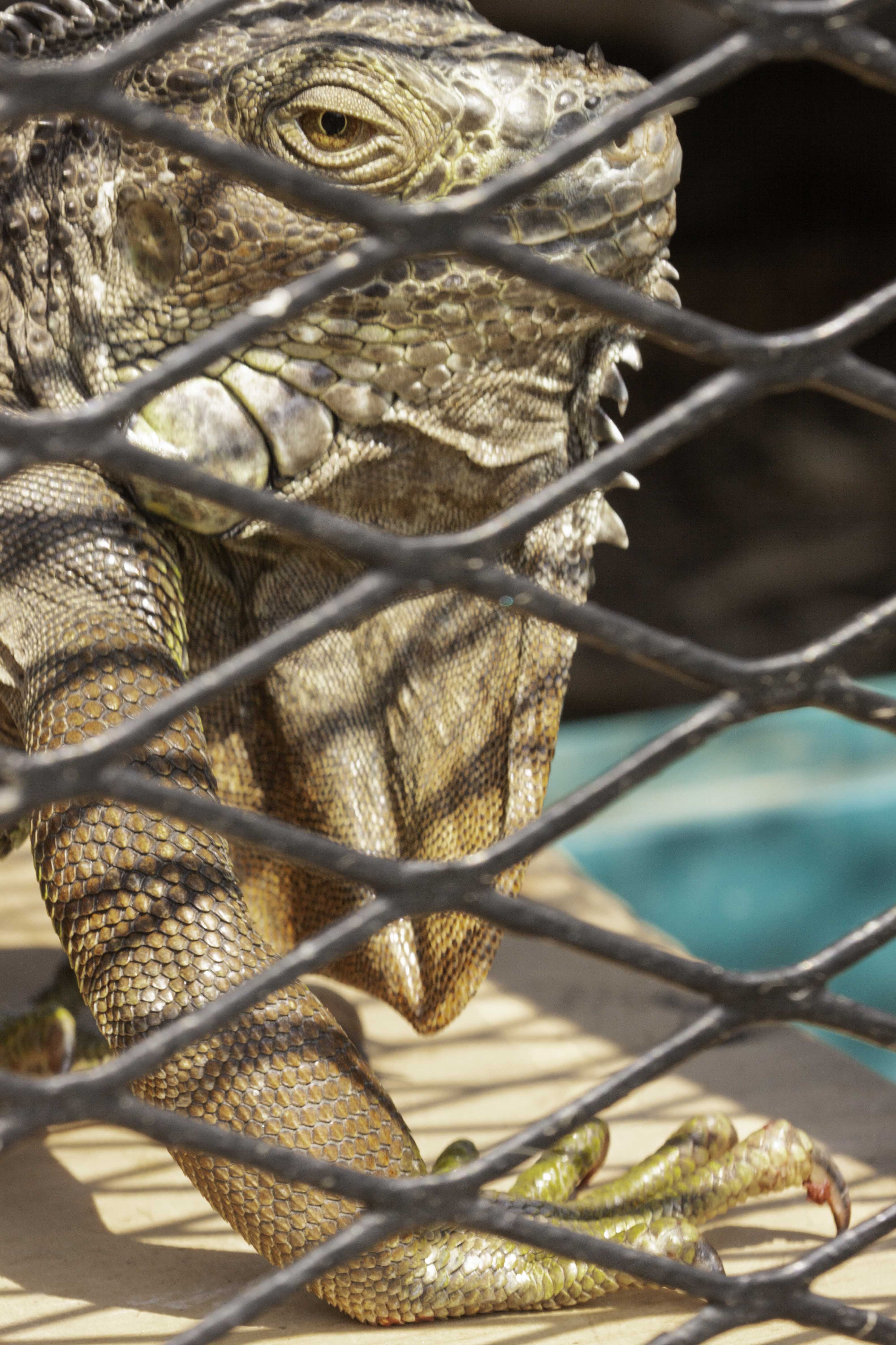
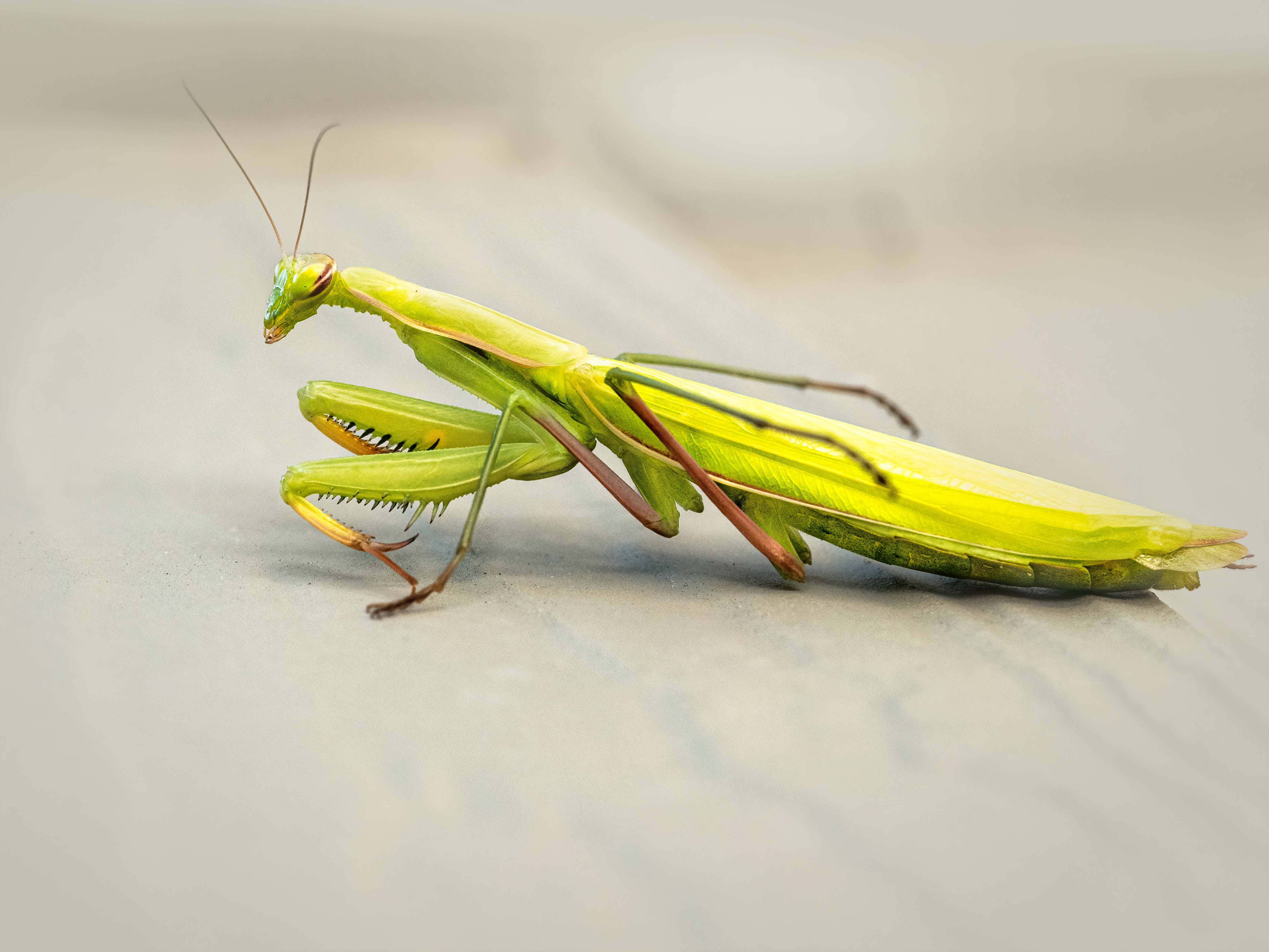
This is definitely a street image, but as with many street images, it can be hard to find the element that captivates or tells a cohesive story for me. Maybe if the woman in pink wasn't looking at you, but rather engaging with the woman in the leopard print, or maybe if there were less prominent background elements. There isn't any feeling of interaction between these two women, and their outrageously patterned coats aren't enough for me personally. Technically, I also have a hard time due to the many parallel lines, given that they are from different objects and overlapping randomly. Maybe a tighter crop? |
Jan 10th |
| 80 |
Jan 21 |
Comment |
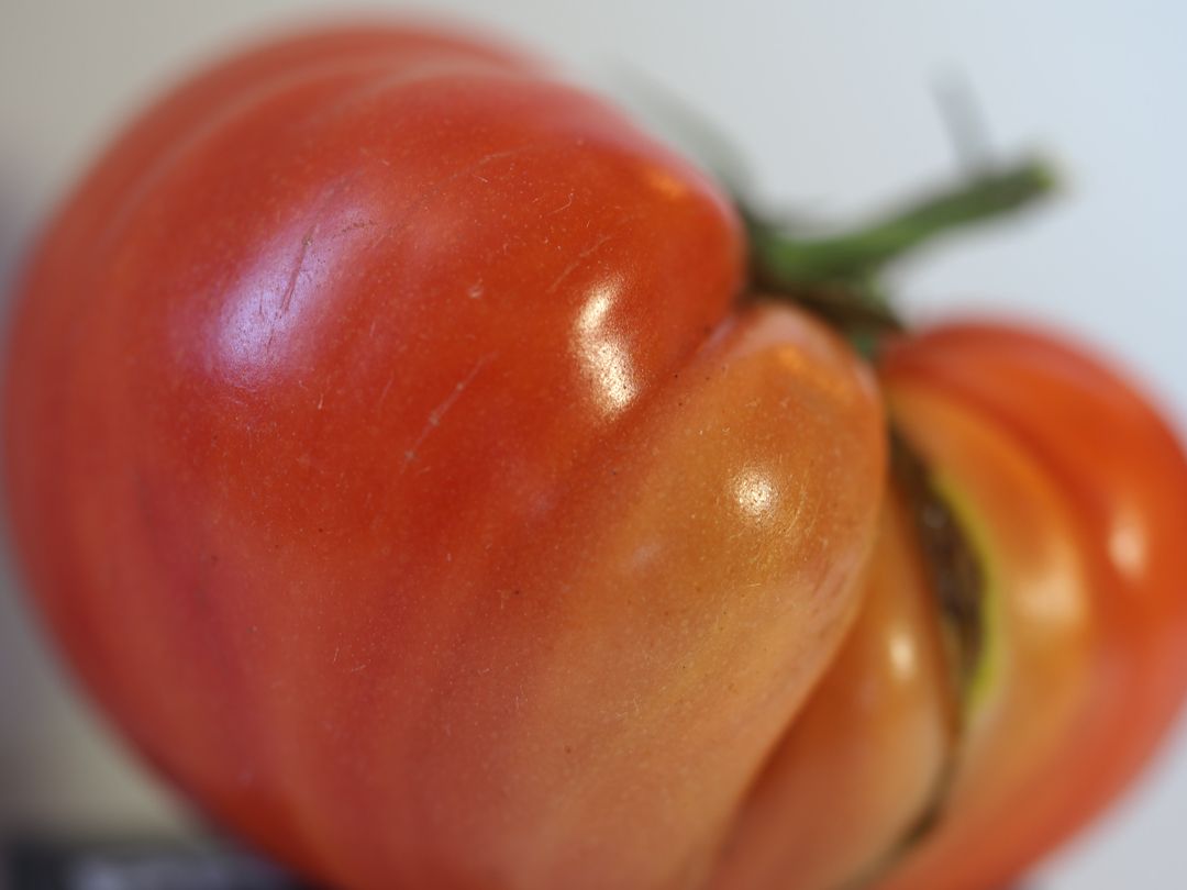
This has a nice compact story, great clarity and color, and a very balanced composition. There isn't anything I would change, except if you had been able to capture the batter's face, too. Which isn't always possible, as we can't be on two sides of a person at the same time! I must disagree with the comments about soil saturation and fence discontinuity. The background isn't distracting at all for me and sets the stage as well. |
Jan 10th |
| 80 |
Jan 21 |
Comment |
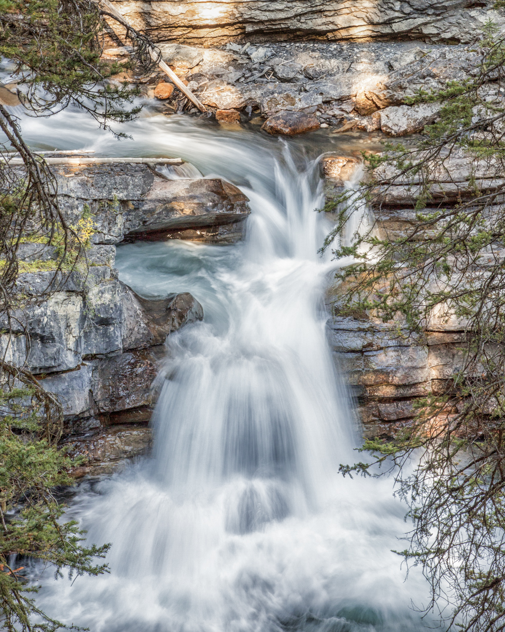
Interesting image, great long exposure. I do like both remakes better--I feel they have more clarity. Victor's also adds the lightening of the water and shadows, which makes the impact of this image wonderful, with the creamy water framed all around by the lights and the blue-hour feel. Great capture with your initial image, and very nice extra post-processing by Ed and Victor. |
Jan 10th |
| 80 |
Jan 21 |
Comment |
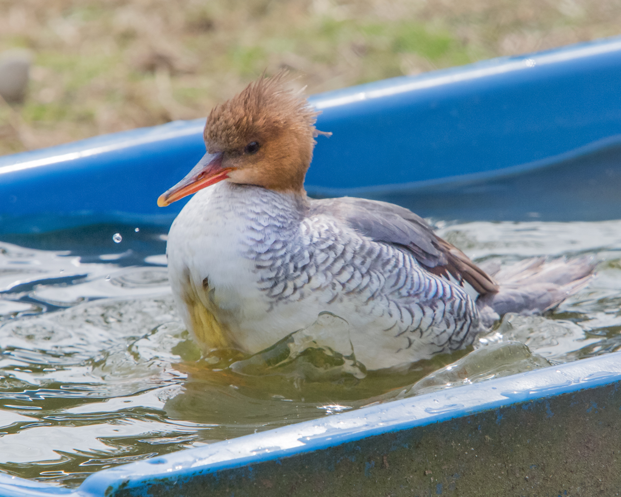
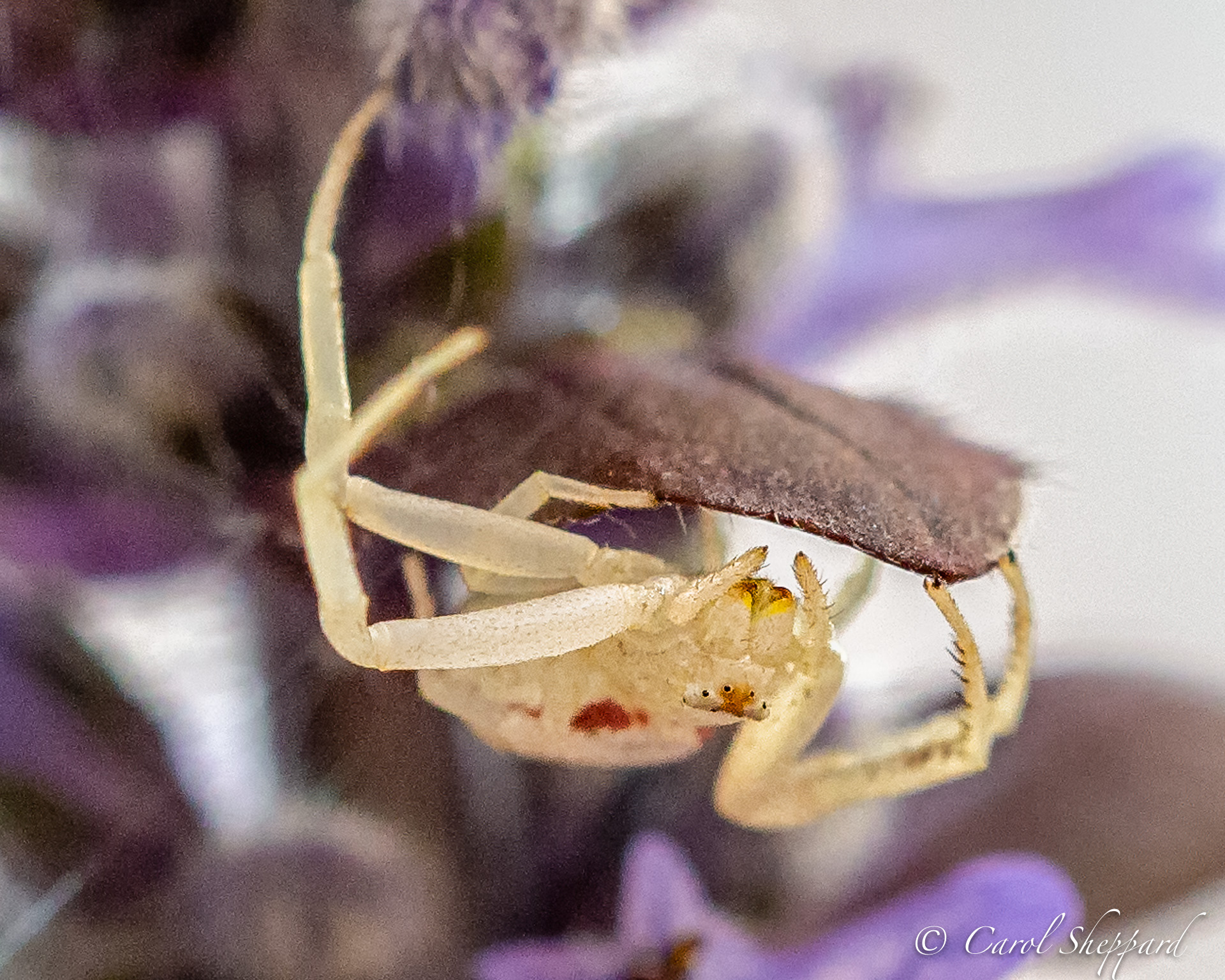
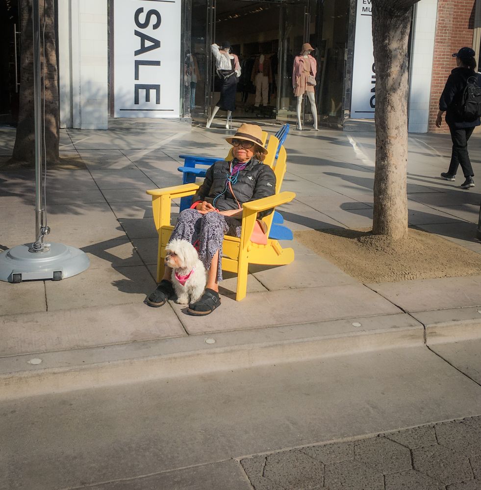
The Black and White treatment works perfectly for this image, and you've captured a great expression! Your title is so appropriate. I think what is bothering me is that her eyes have moved a bit to the left (our left) side of the dog during your capture, so that its almost like she's looking at something just outside of the image. But I think Victor's idea is a good one, to pull more emphasis toward the woman and the dog, and away from the scene as a whole? |
Jan 10th |
| 80 |
Jan 21 |
Comment |
The street scene really captures the enthrallment of the crowd with whatever they are looking at. Perhaps we could see more emphasis on the man who is walking through, as he is just dark enough to blend into the crowd itself? My eye was immediately pulled to the girl in the Lavender jacket, who I thought was the subject. |
Jan 10th |
| 80 |
Jan 21 |
Comment |
I appreciate your comments. The idea of the warming filter definitely appeals to me--and looks great. I also do now see the muddy area in the sky. That's the beauty of posting for critiques...I often find things that I missed after looking at my image ad nauseum, LOL!
|
Jan 10th |
7 comments - 1 reply for Group 80
|
| 95 |
Jan 21 |
Reply |
I think your addition of clarity did the trick for me!
|
Jan 18th |
| 95 |
Jan 21 |
Reply |
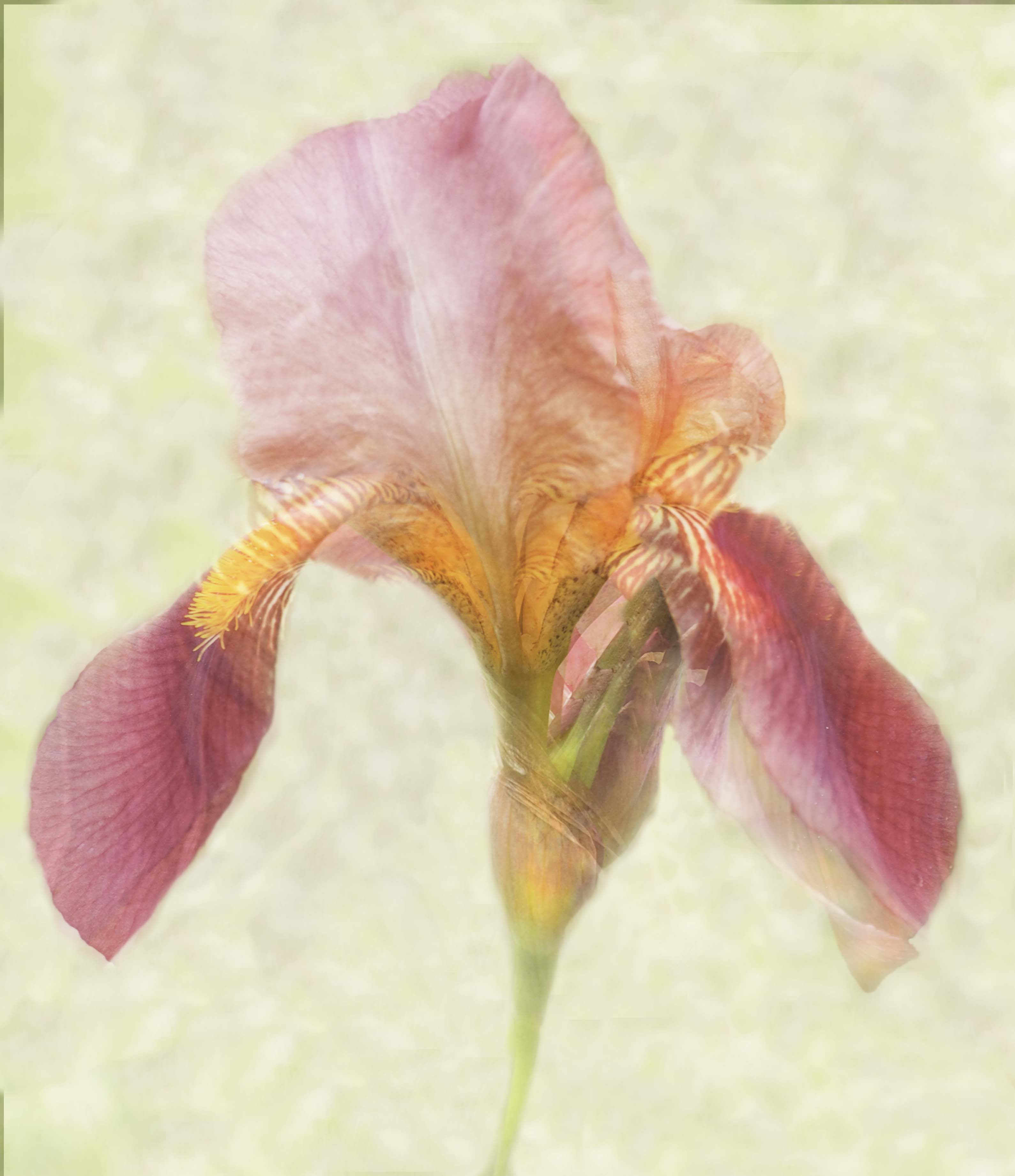
Thanks, Tom! I have been learned to use the various blends in blend mode in PS. I heard in something I watched that you want to focus on how the blend mode works all around your subject. For your subject, you need to maintain some of the "density" created by your blend image, so you ideally paint back in some of the subject, keeping the opacity adjusted to let the texture layer come through--otherwise the subject looks fake or inappropriate to its background. Does this help? |
Jan 18th |
| 95 |
Jan 21 |
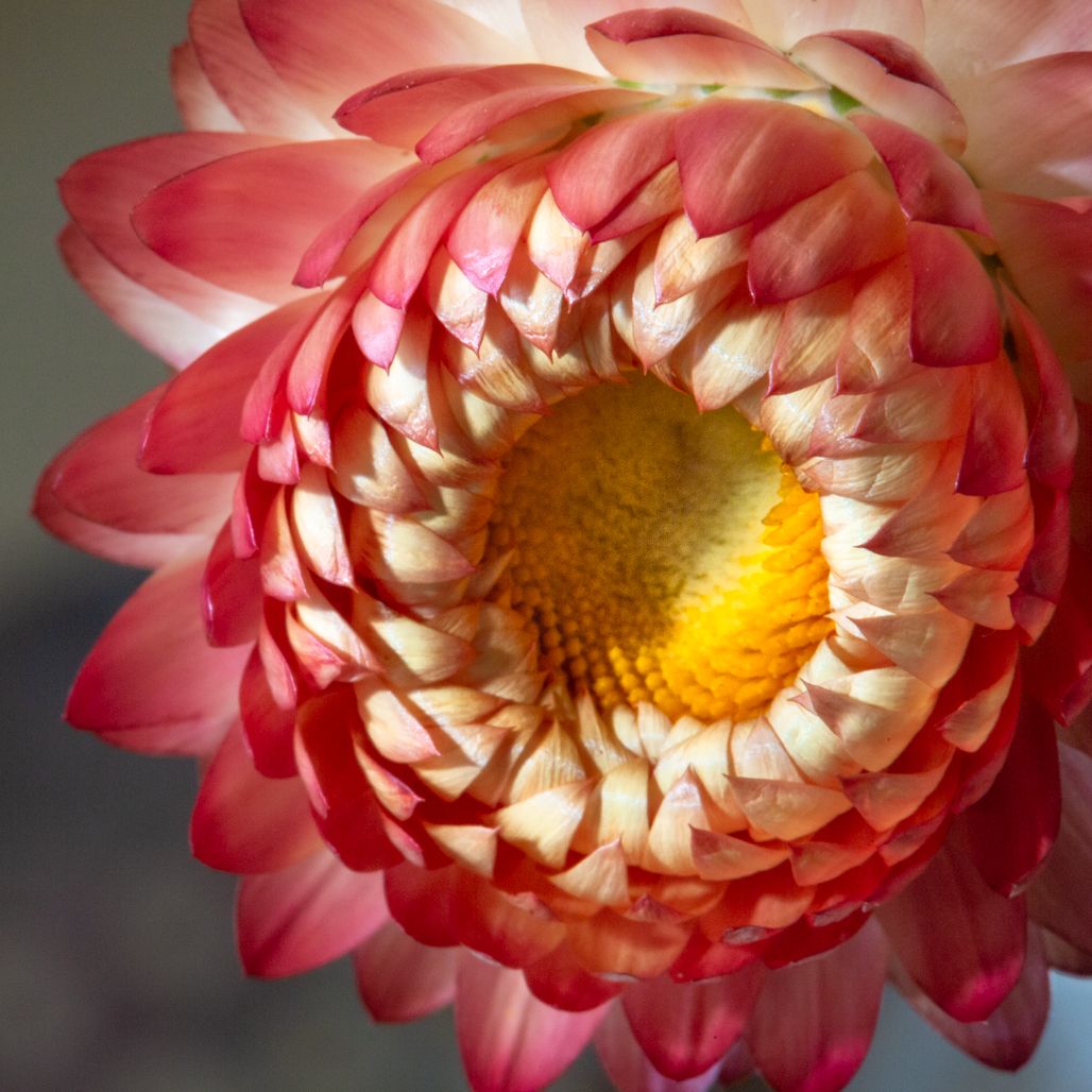
Reply |
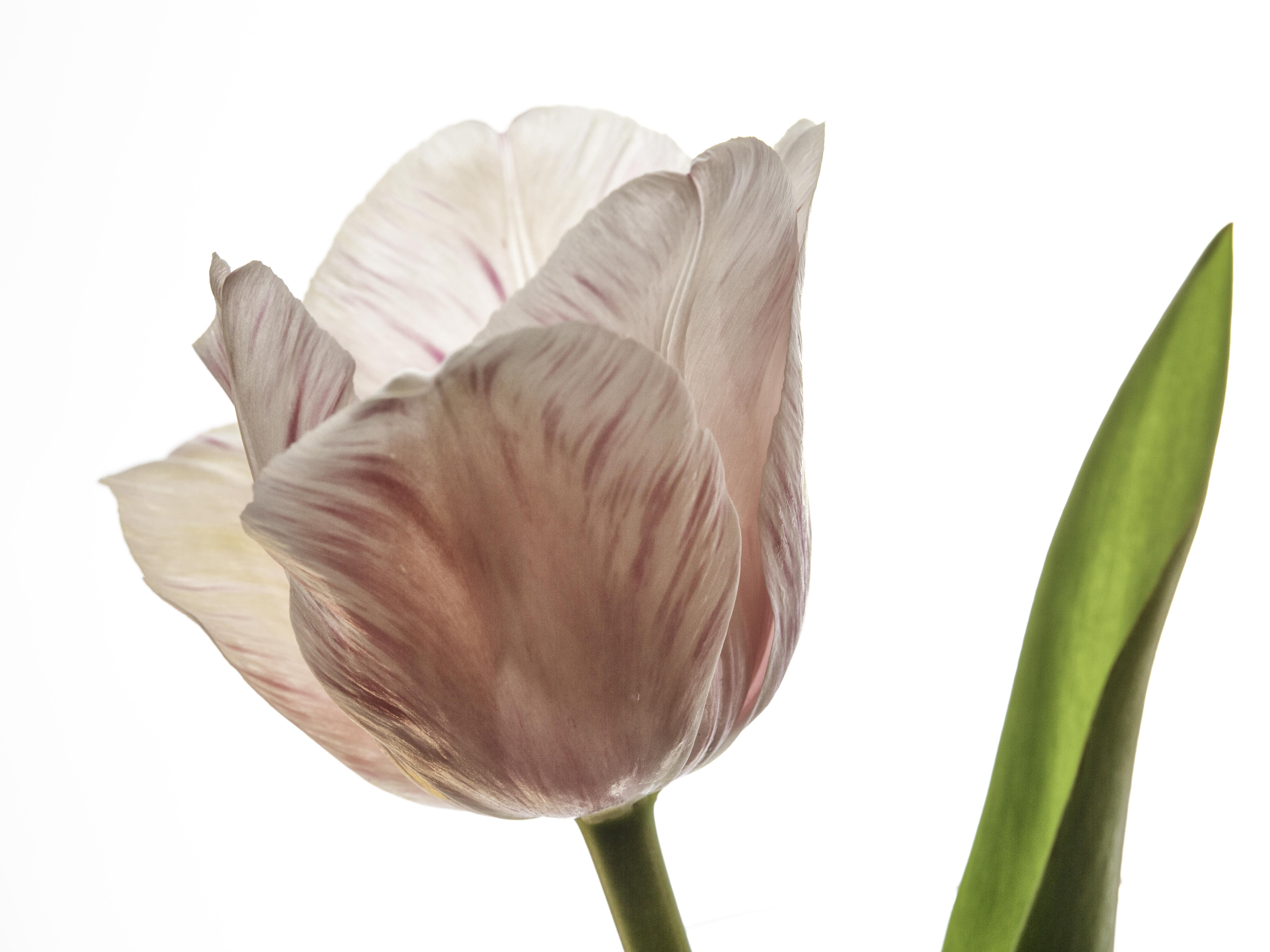
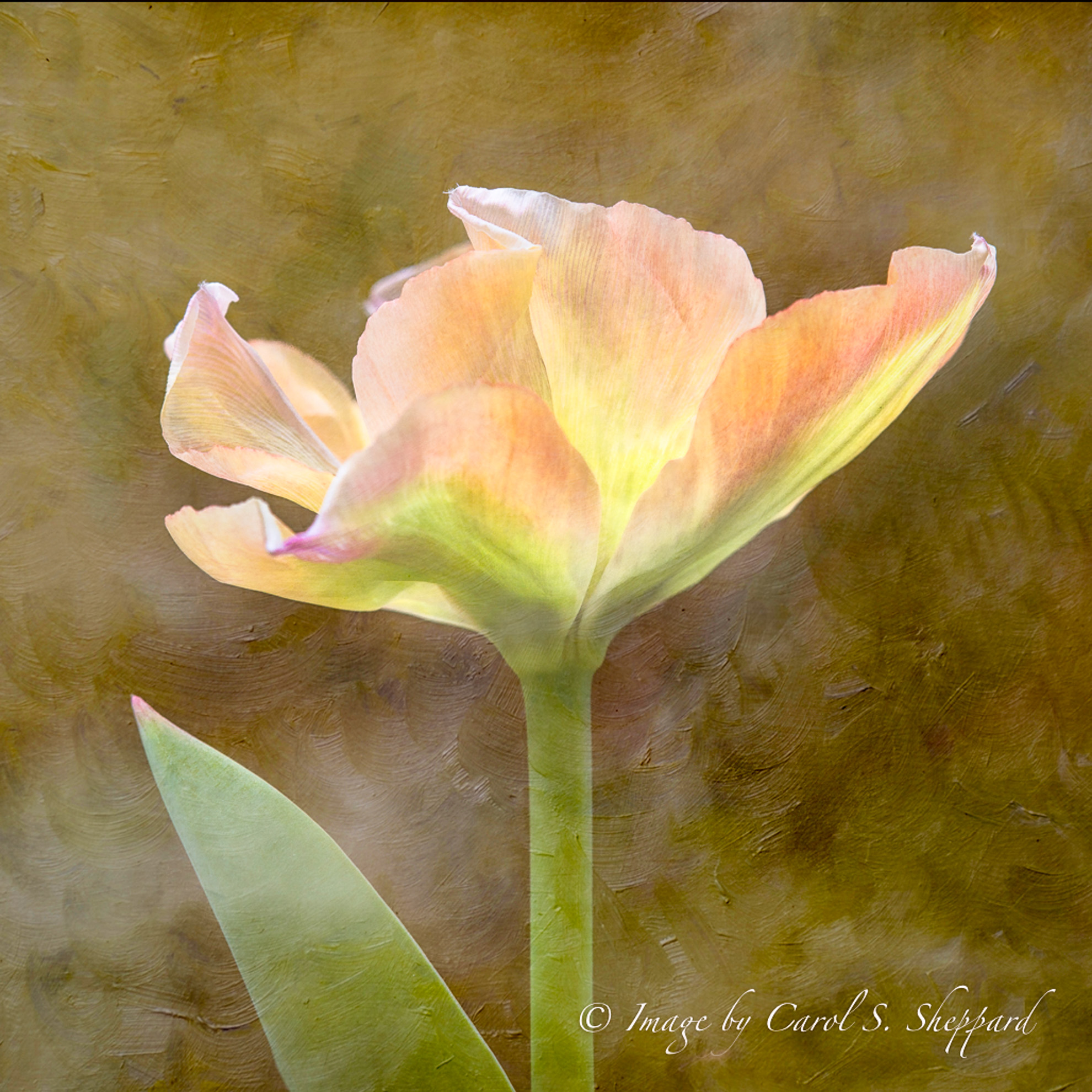
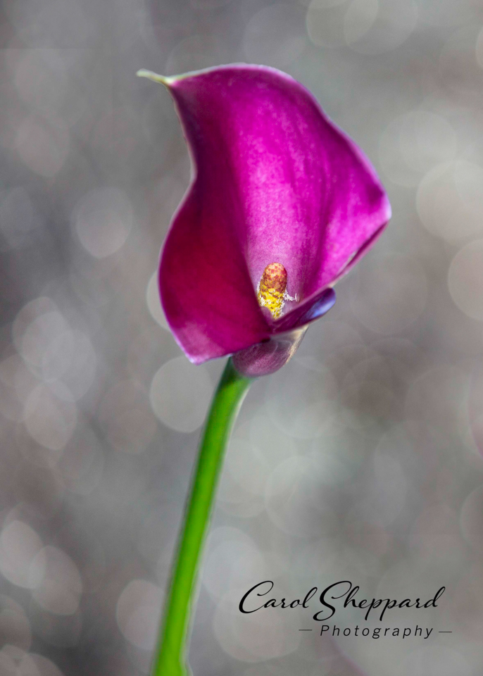
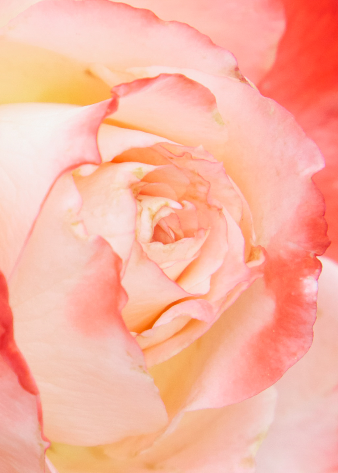
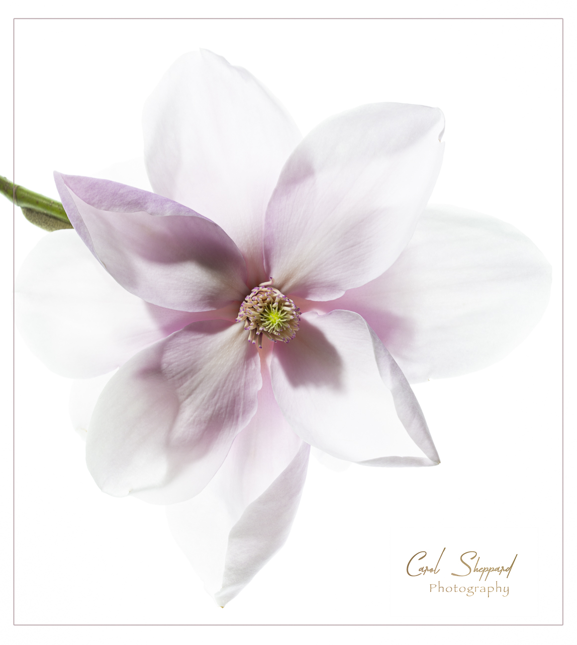
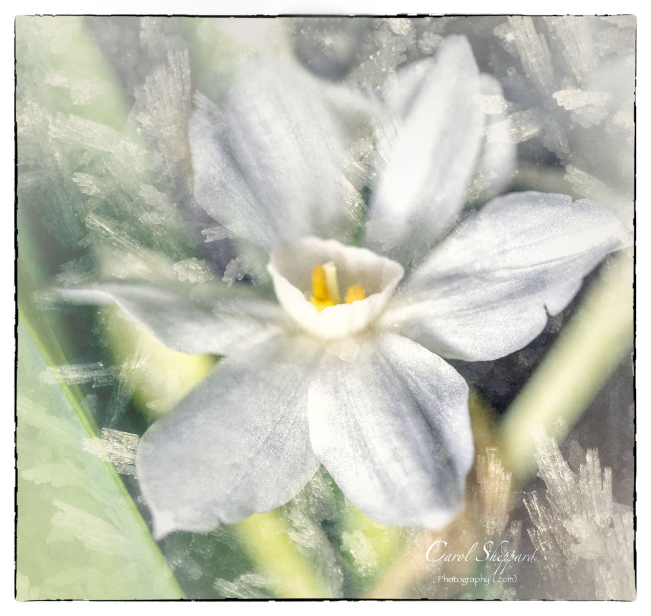
Thanks, Stuart. A paper white is one of those bulbs you can grow inside with very little light or fuss. The blooms aren't exactly flat, but they do put cheer into a winter-lit room. It isn't meant to be sharp, but both components of the composite are macro shots. The flower without an overlay would be sharper, but I'm working on retaining the density of the texture so that it isn't an "obvious" composite. Hope that info helps...I'm very new to this technique still, and feeling my way through it. So I sure appreciate your input! Oh! Incidentally, a paperwhite flower is teeny tiny, as are the ice crystals!
|
Jan 10th |
| 95 |
Jan 21 |
Comment |
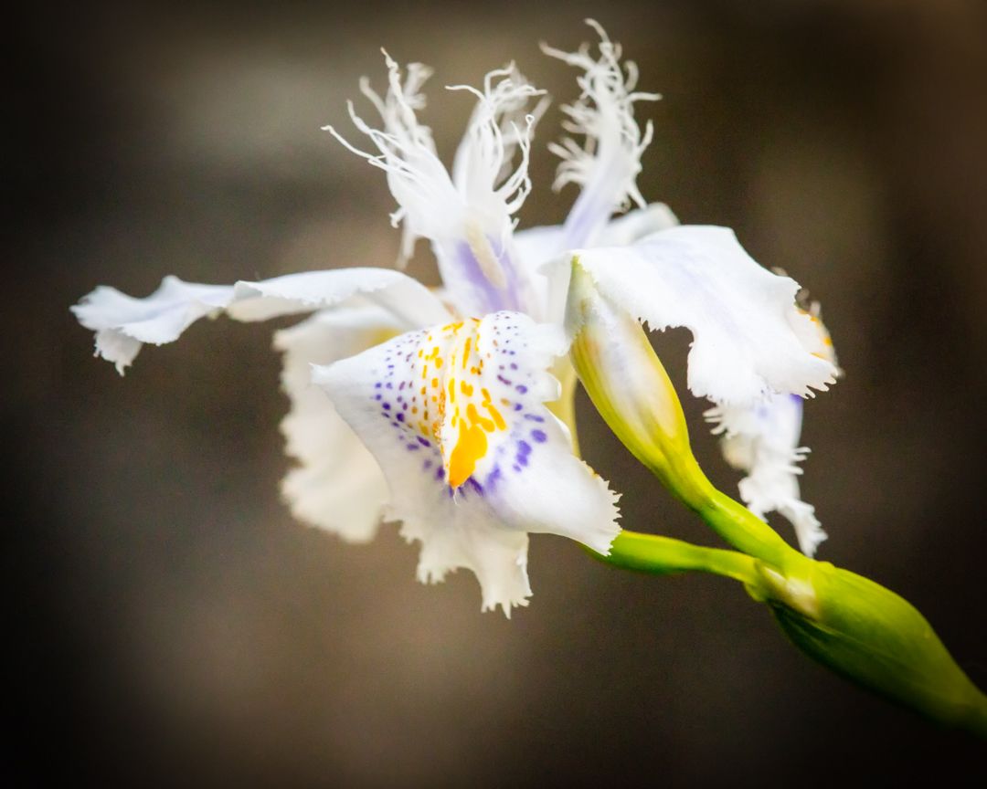
This image has immediate impact and appeal for me. I didn't find it noisy, but I did feel it was a little bit underexposed. If you have NIK Viveza, this is a perfect use of the brightness slider using control points for exacting placement. Your crop and the texture are perfect, and I think the brightening would bring out more of the texture on the petals and center. Great job! |
Jan 10th |
| 95 |
Jan 21 |
Comment |
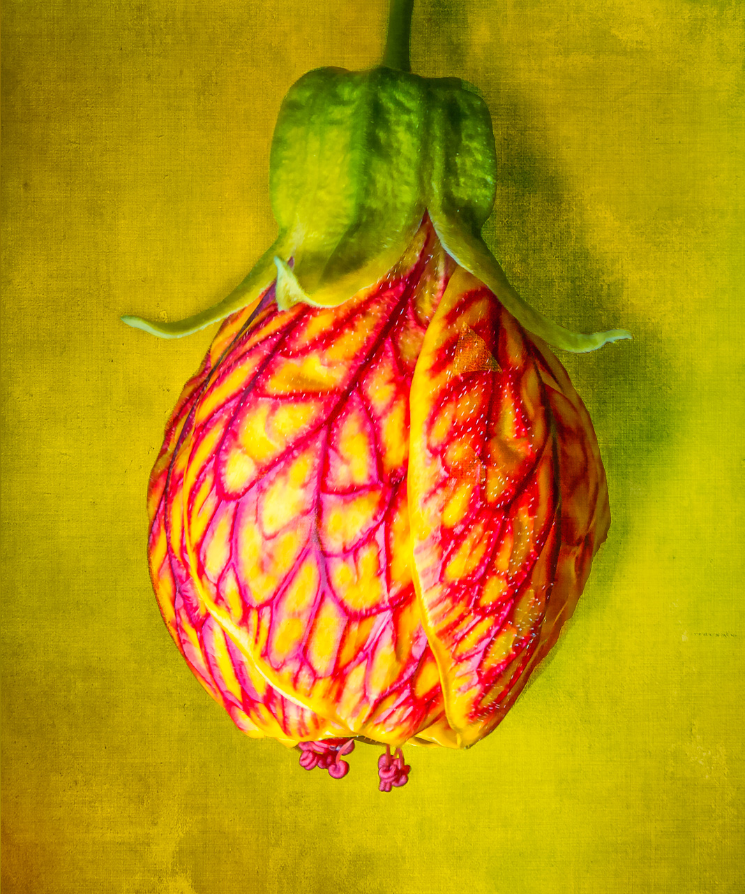
I never thought bread and was almost afraid to guess! ;-). As an abstract/macro, I like it. Particularly appealing to me is the gradations of hues of the same color. I also find the leading lines quite appealing. Not feeling the same on softness as the other comments, but maybe bring the highlights down a bit, esp. on the right-hand side. |
Jan 10th |
| 95 |
Jan 21 |
Comment |
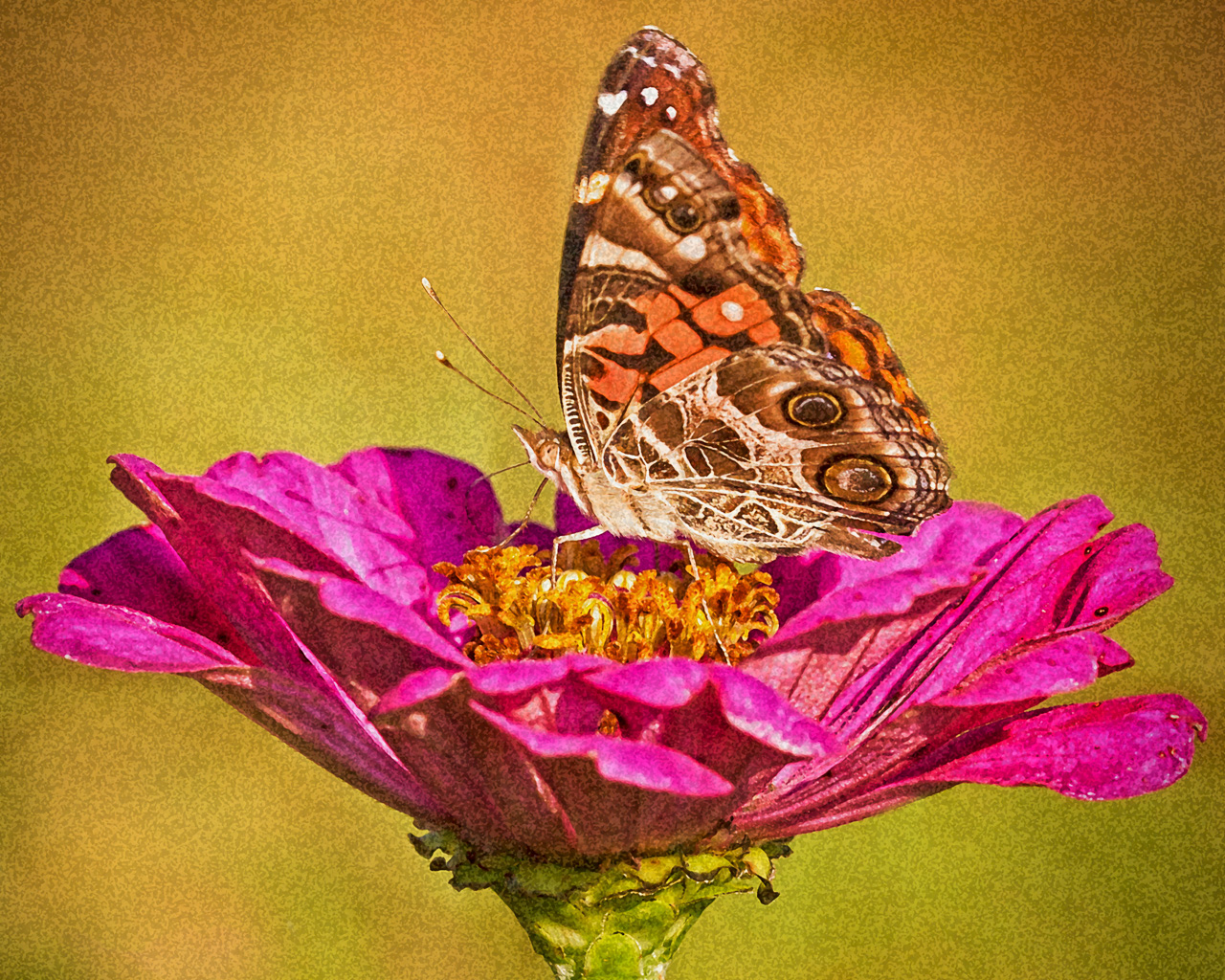
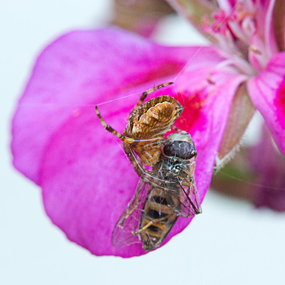
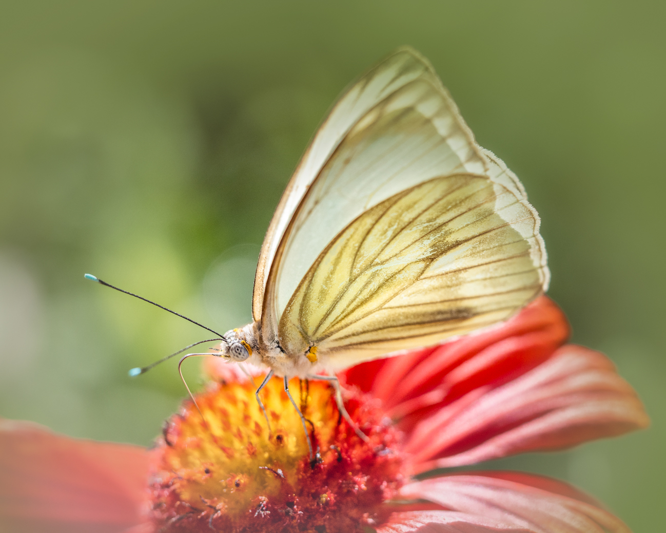
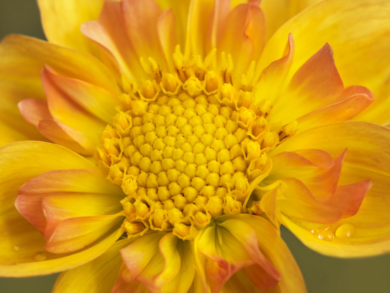
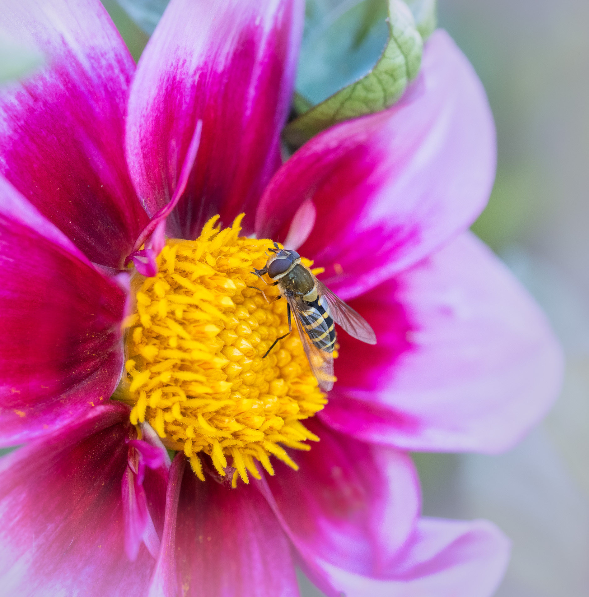
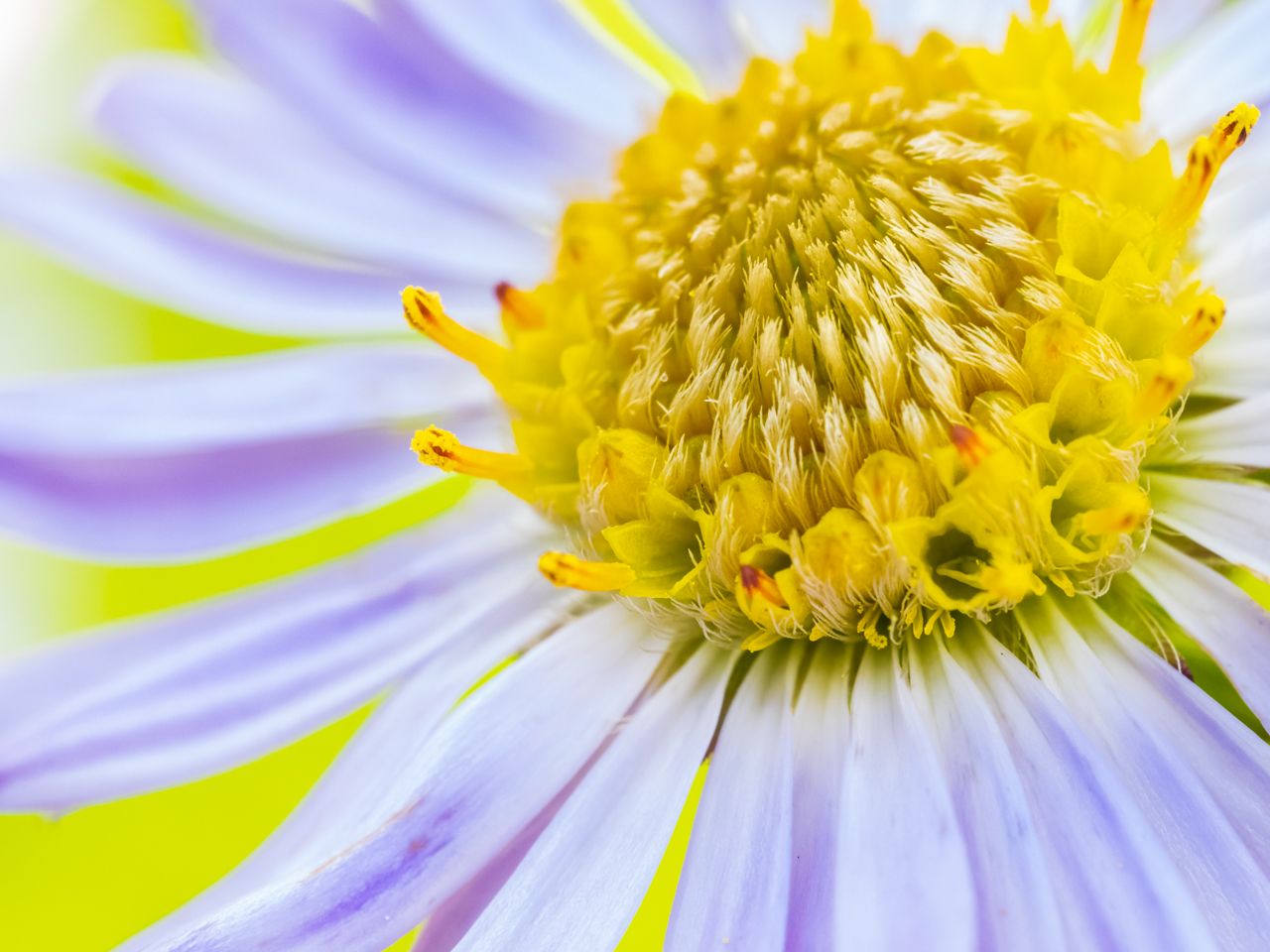
Great capture--your clarity is terrific, and I love the contrast, composition and color combination. The only suggestion I have is to TRY a crop that eliminates about 1/8th of the left side (it is blank space and out of focus anyway), to see if that improves the emphasis on your wonderful flower and bee. You did a fantastic job! |
Jan 10th |
| 95 |
Jan 21 |
Comment |
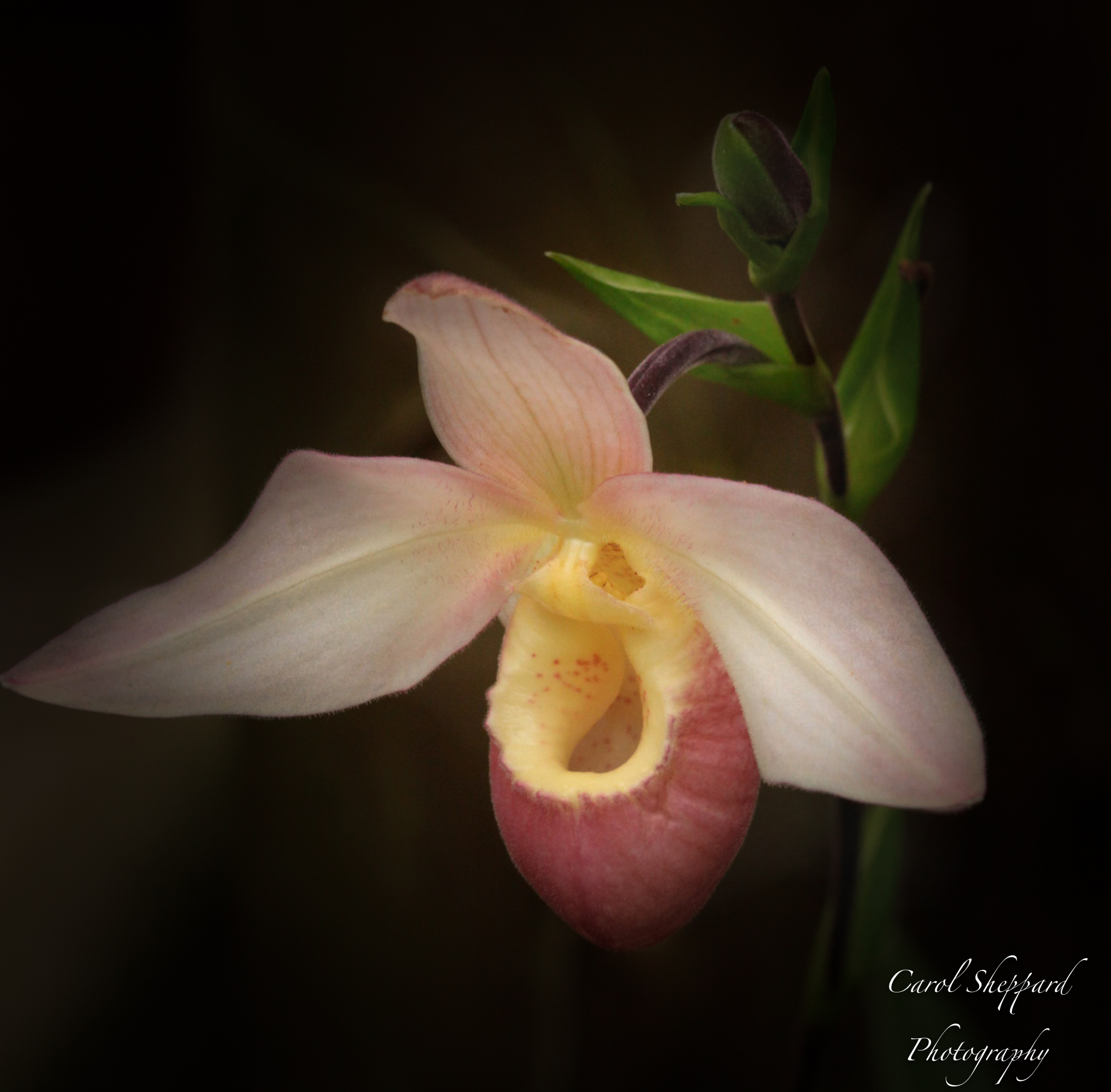
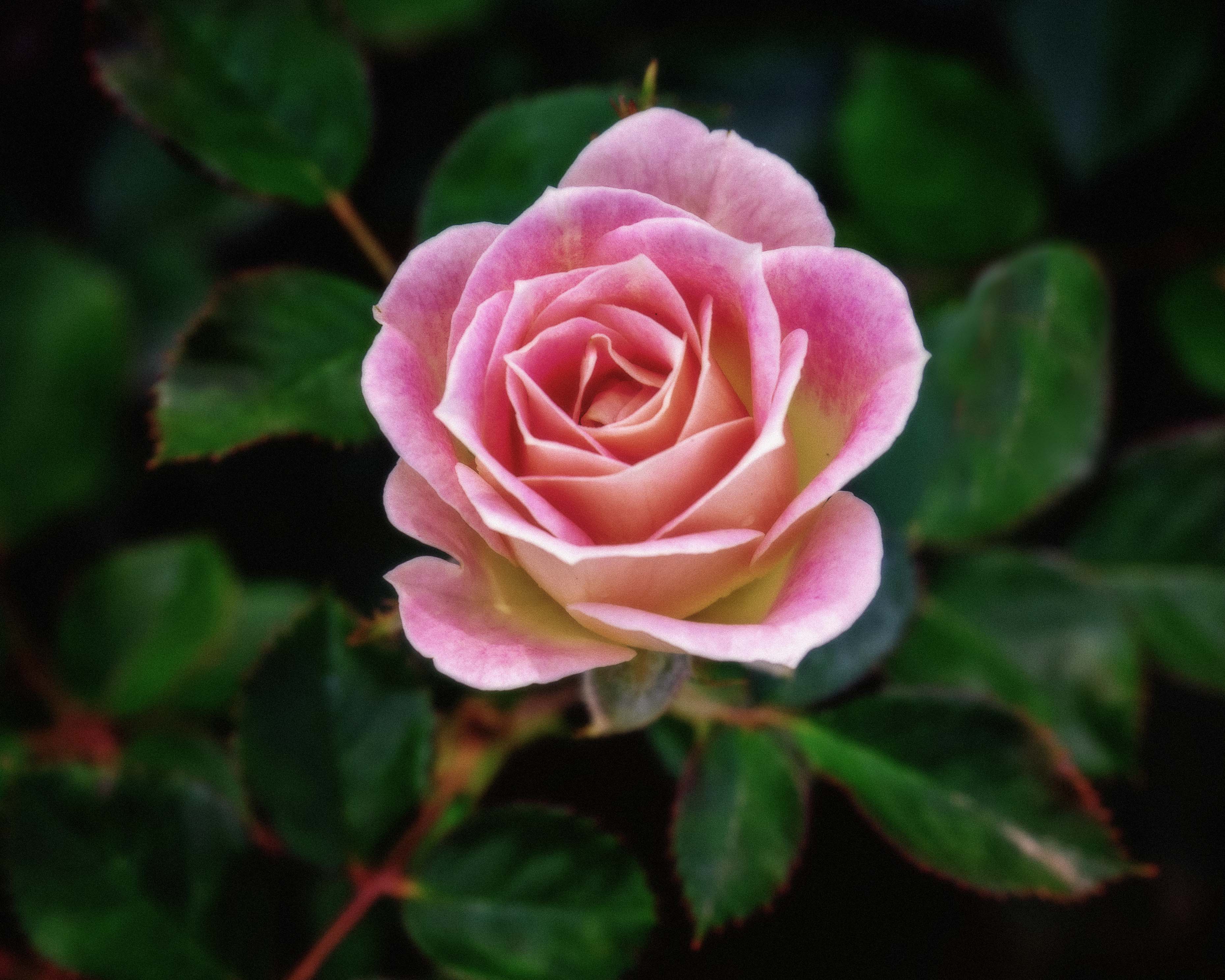
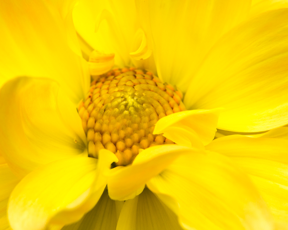
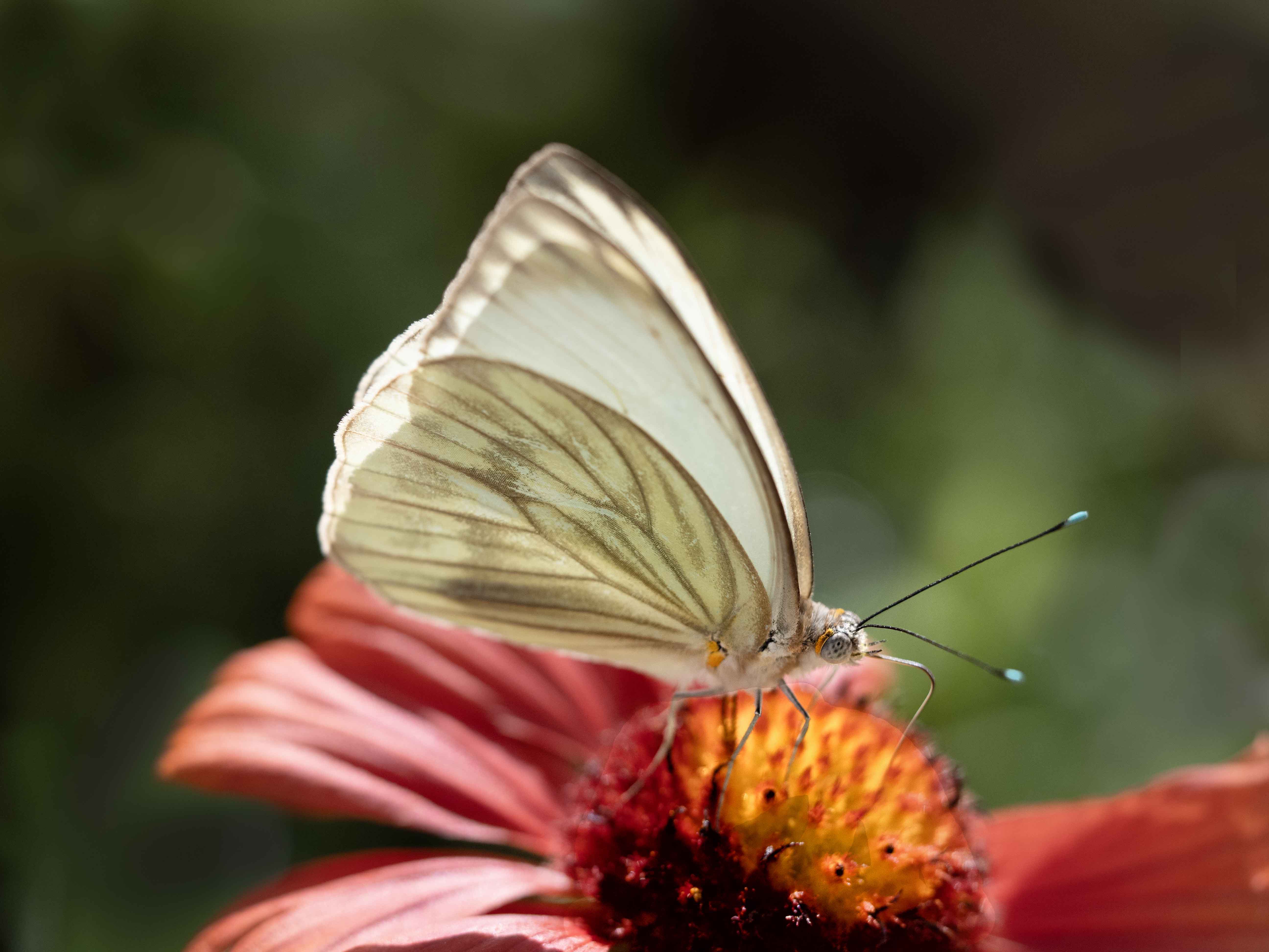
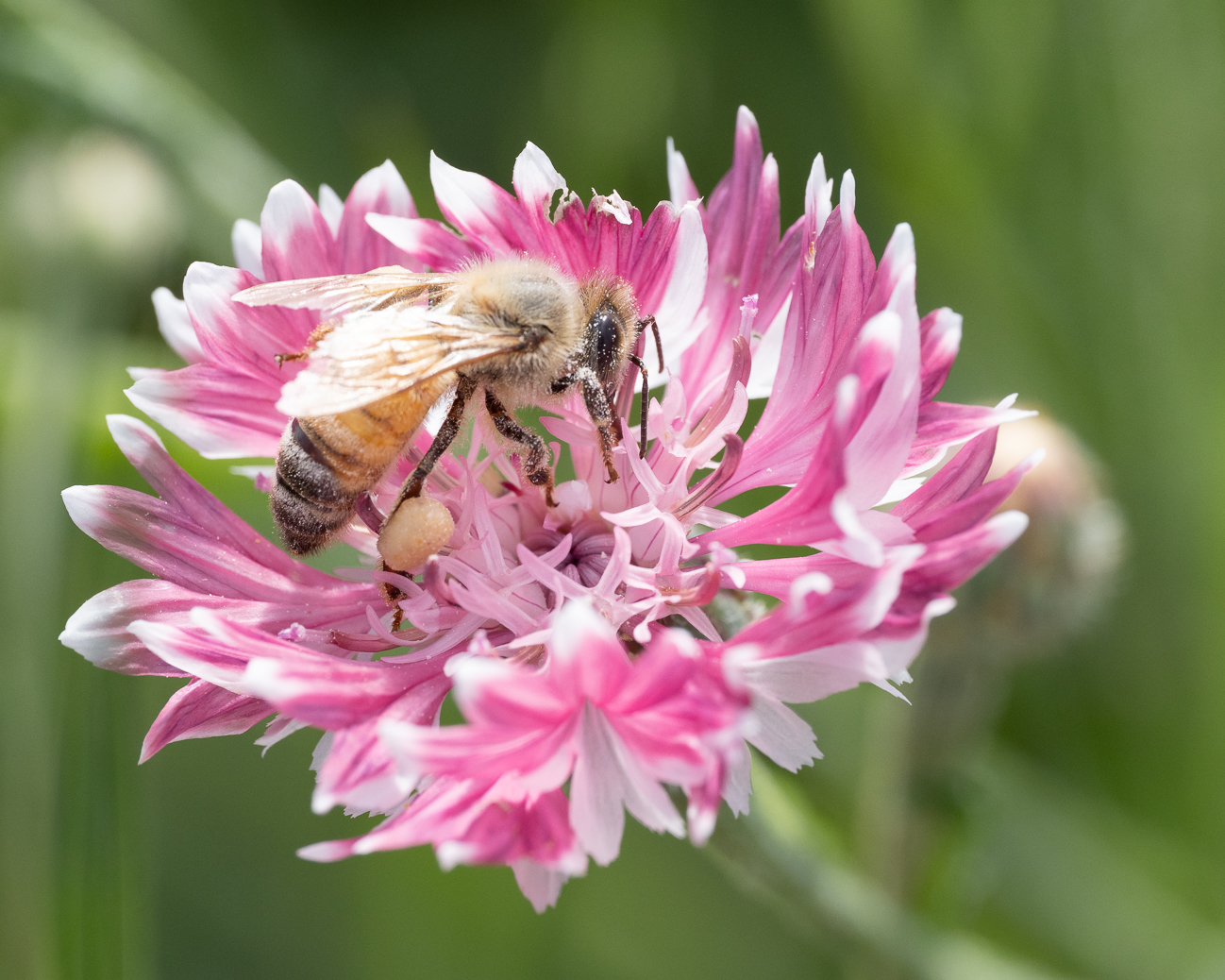
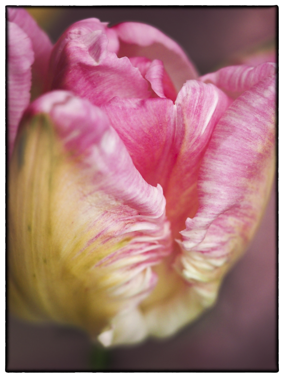
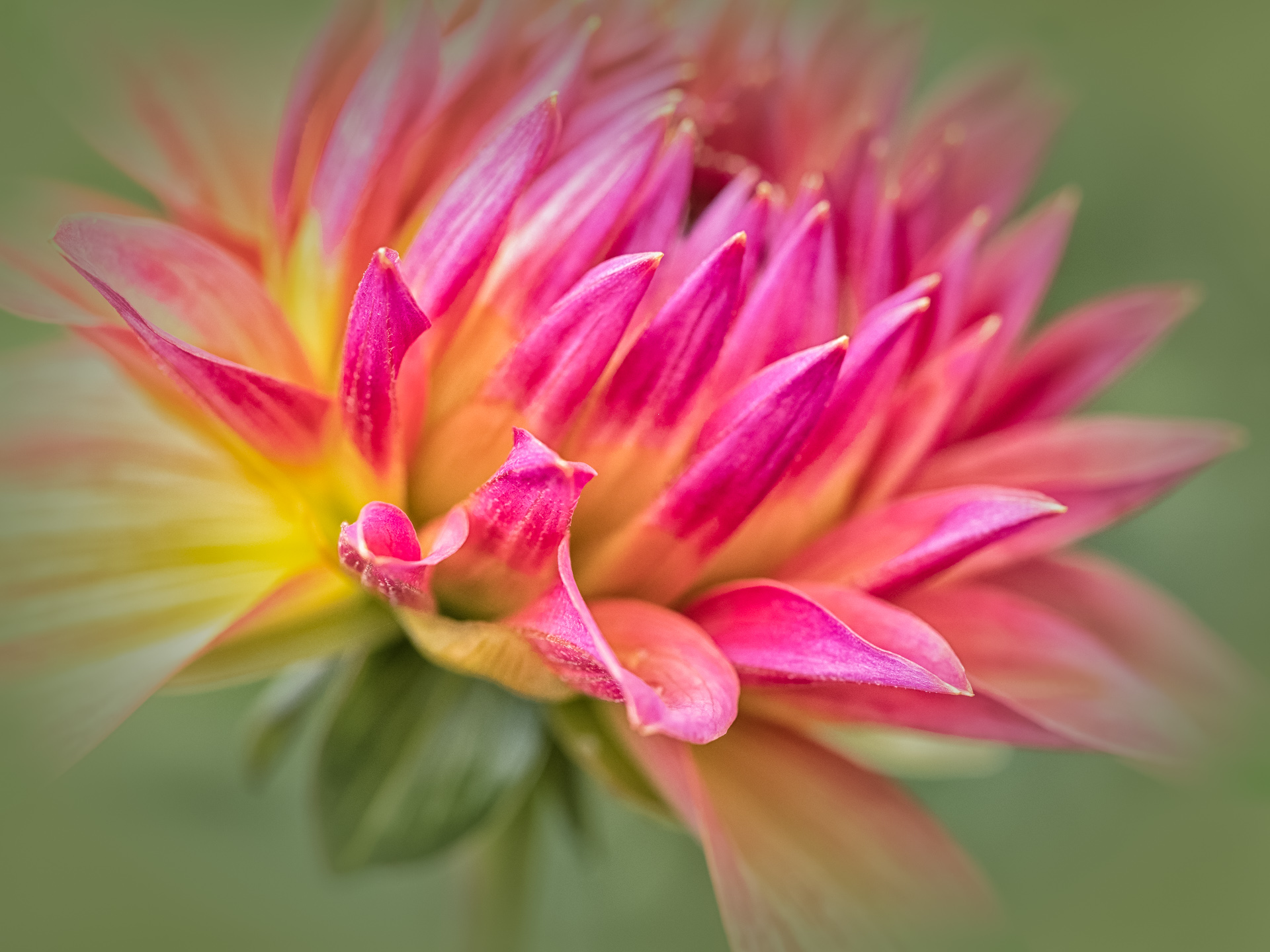
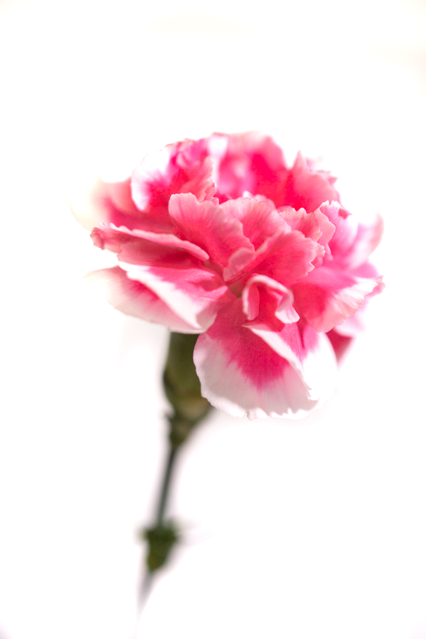
Aren't these the greatest flowers? Very hard to do justice in a photograph. You had a good depth of field at f16, but I have that same lens and camera, and I know you have to actually move back and forth slightly to get a sharp focus. The flower looks somewhat soft to my eye. Having said that, I also feel that the crop placing two large black spaces to the left and right at just off-center is not working for your flower's benefit. Can you look at a crop of just the upper part, leaving the bottom below the line off altogether?
|
Jan 10th |
| 95 |
Jan 21 |
Comment |
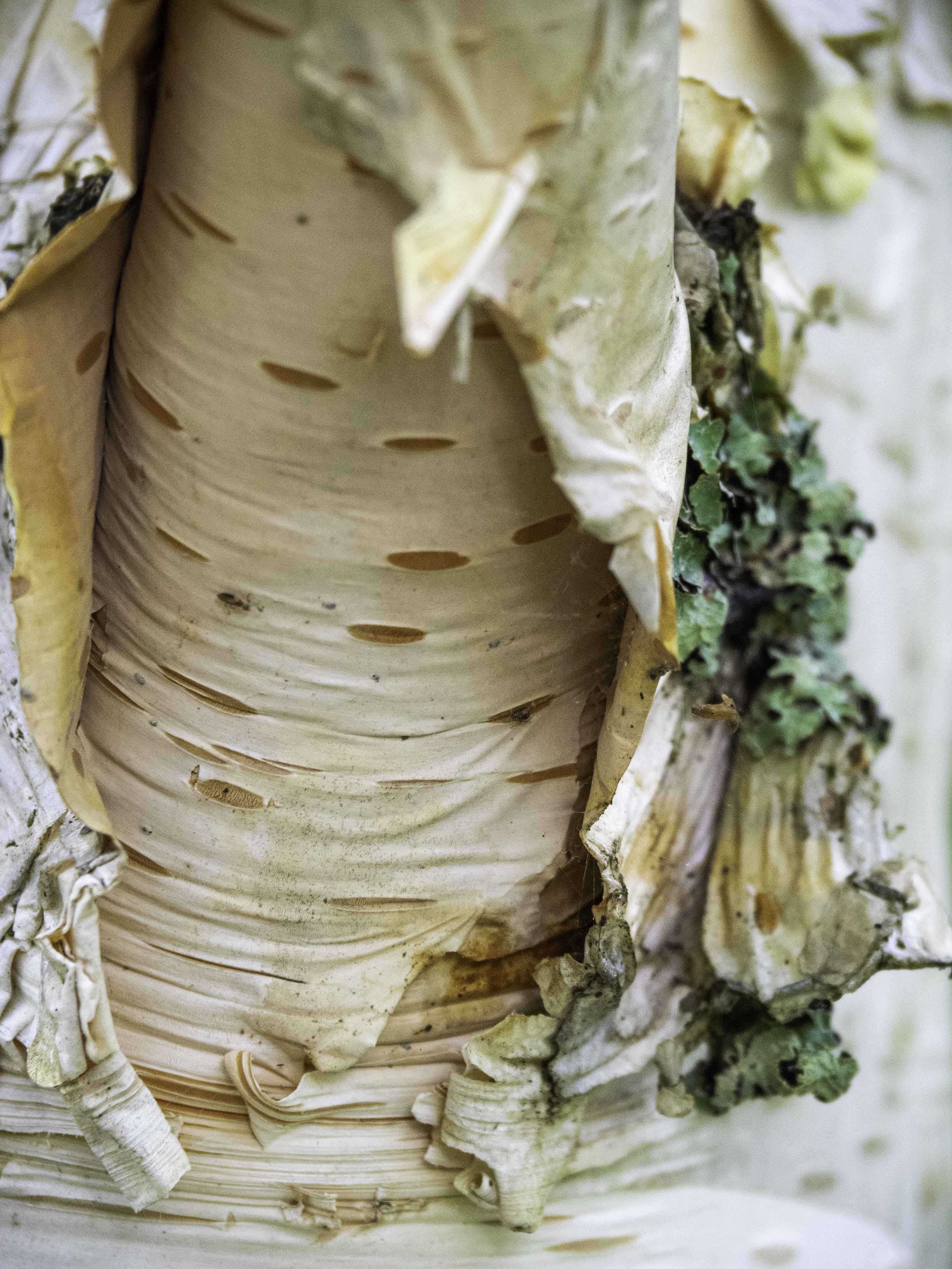
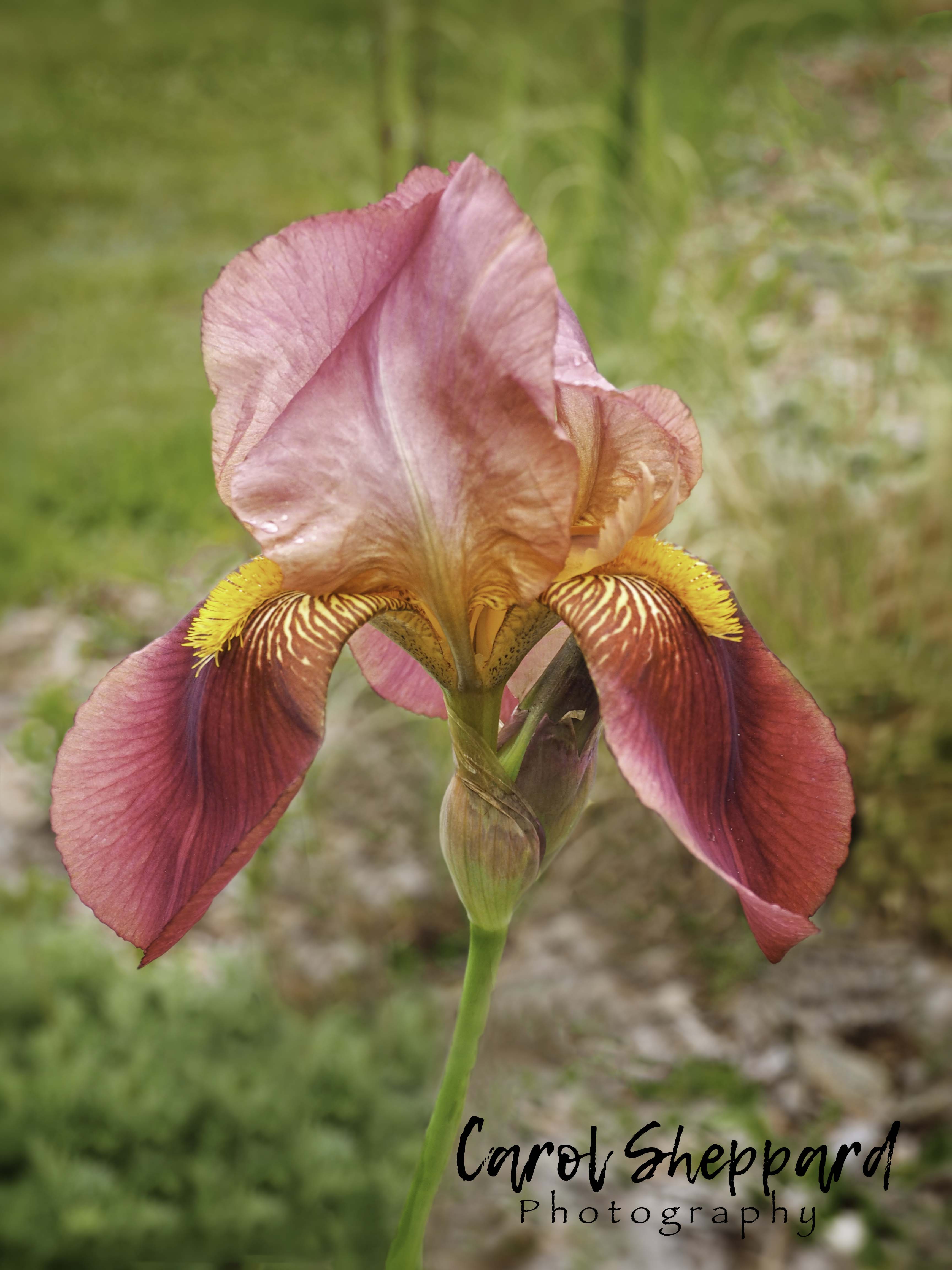
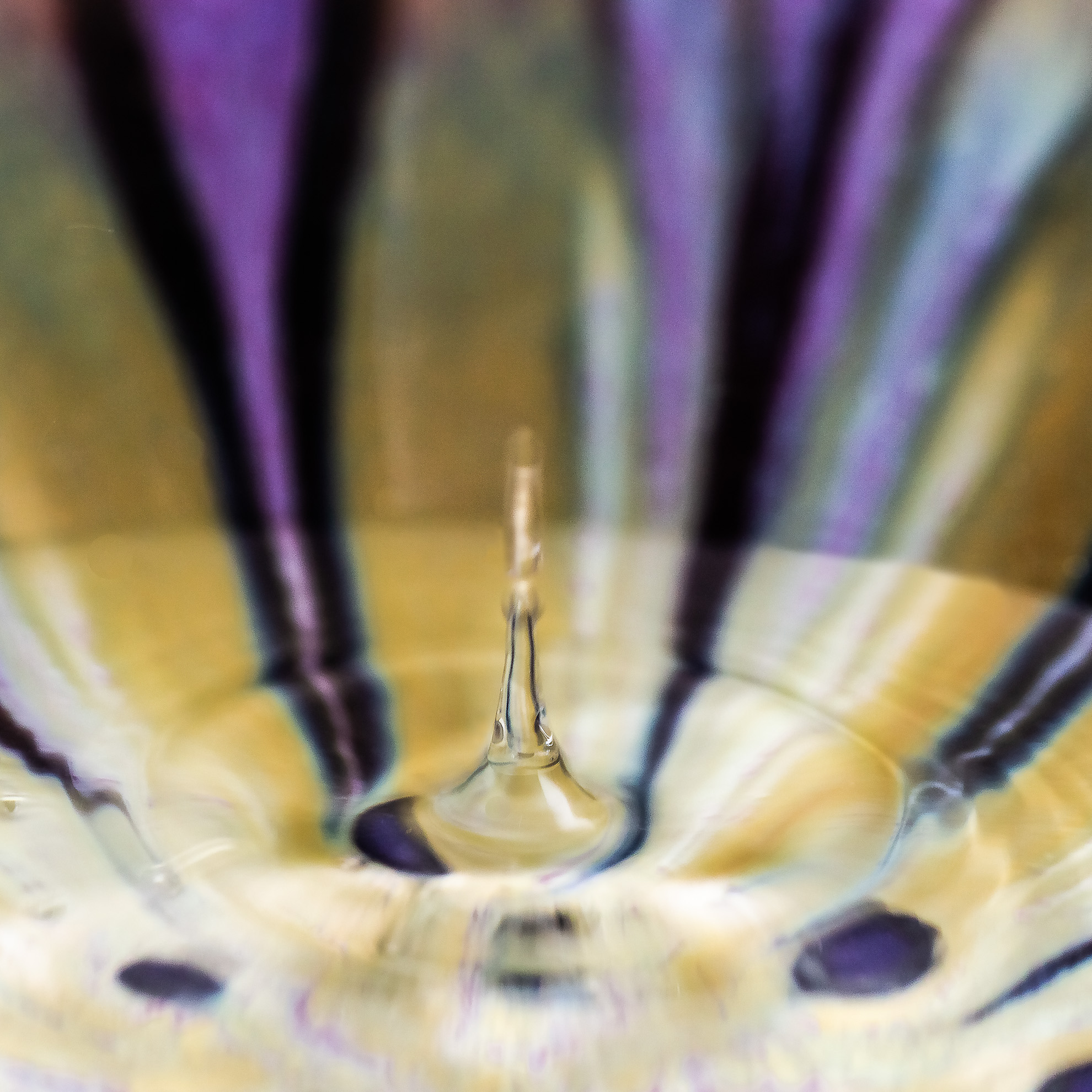
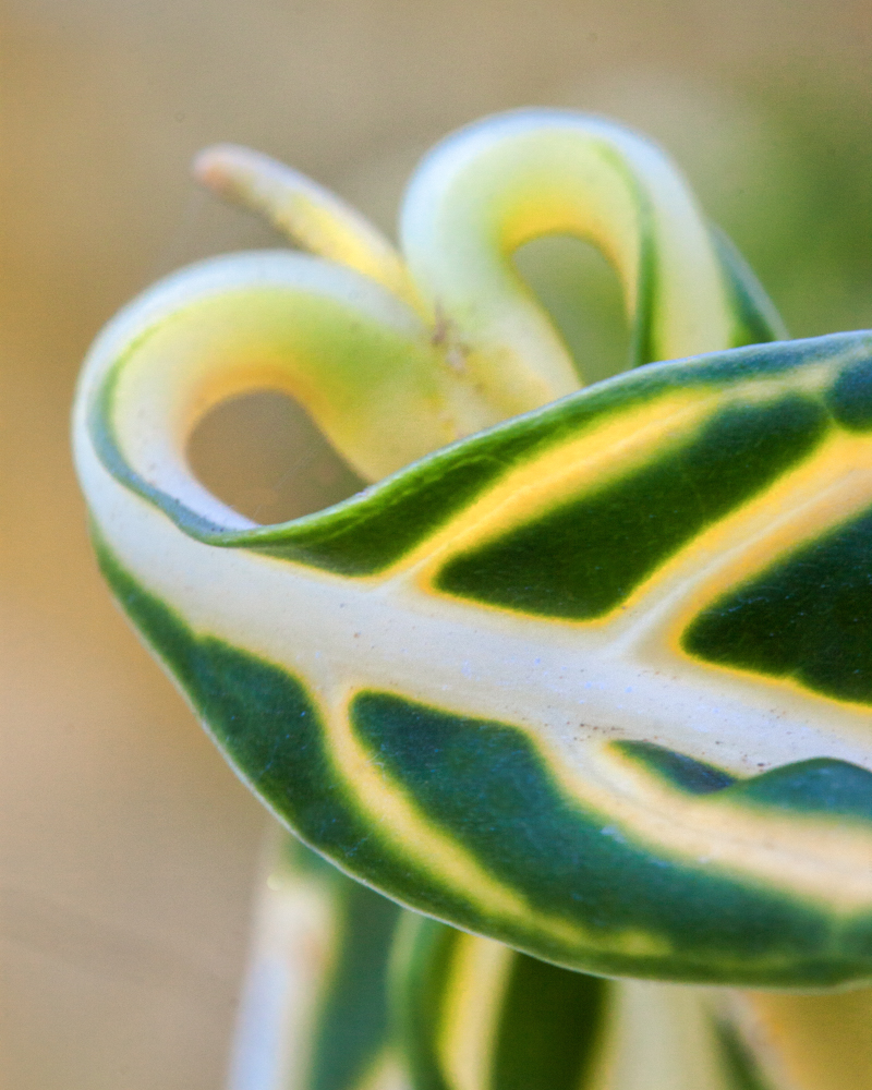
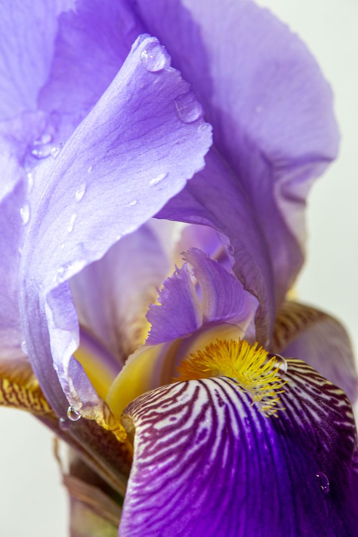
Triangles are great in this image, and could be emphasized with a little adjustment on the crop, I feel. The two (leaves?) could add a frame, but in this case, I didn't notice the one on the lower corner as much as the one on the upper left...and that one feels more like an occlusion to be as a viewer. Great lights and shadows, and I would just try to do more with the highlights on the stringy areas? I love that milkweed seed on the upper right-hand side and might suggest you try to do something to focus just on the one pod? |
Jan 10th |
5 comments - 3 replies for Group 95
|
12 comments - 4 replies Total
|