|
| Group |
Round |
C/R |
Comment |
Date |
Image |
| 60 |
Apr 20 |
Reply |
Nice to see you, Sharon! Hope all is well with you and Vic! |
Apr 28th |
| 60 |
Apr 20 |
Reply |
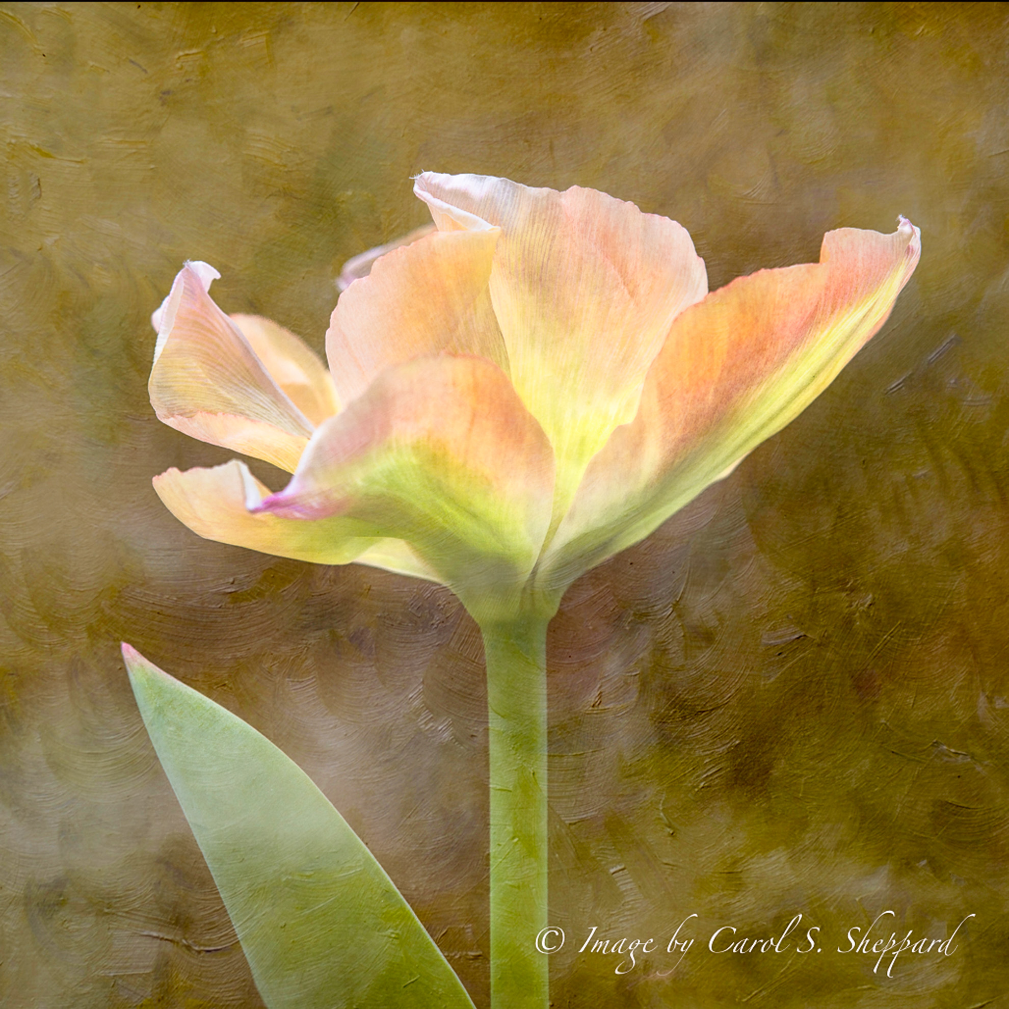
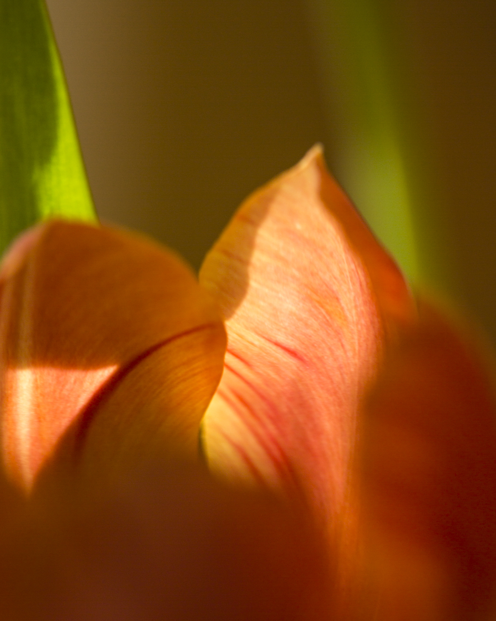
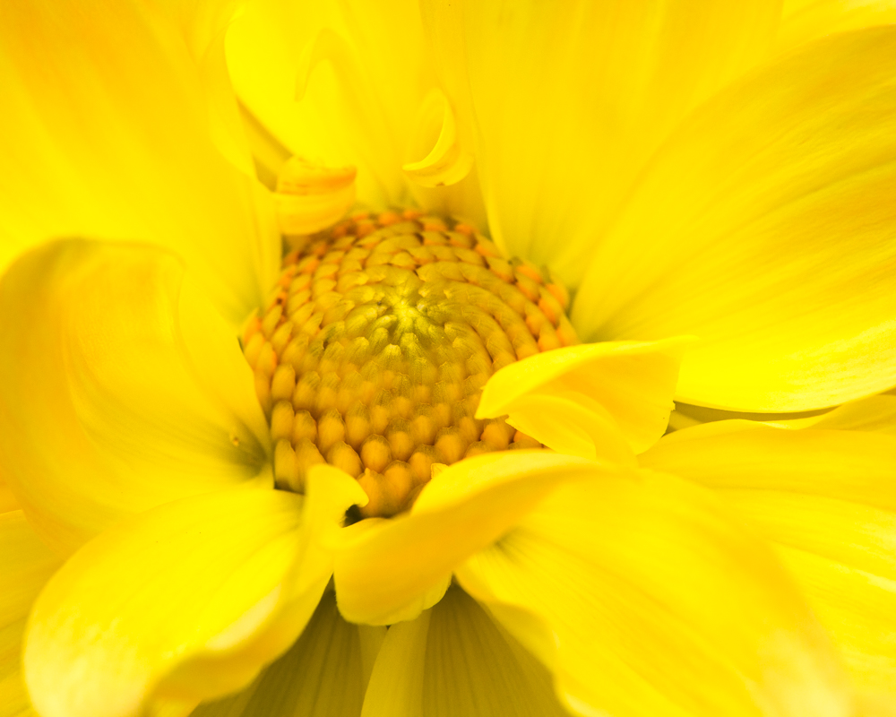
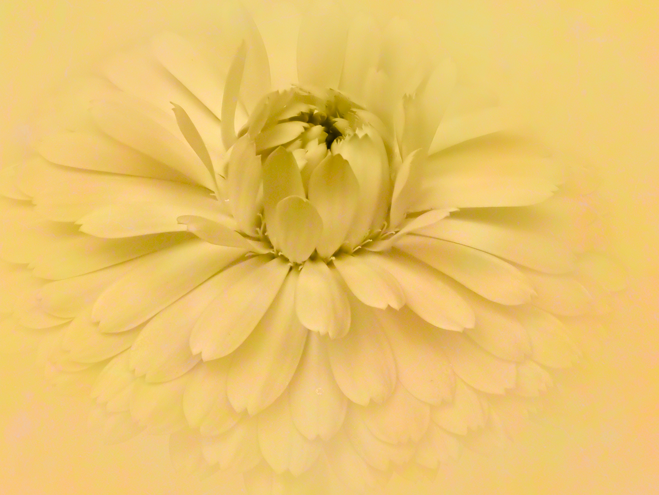
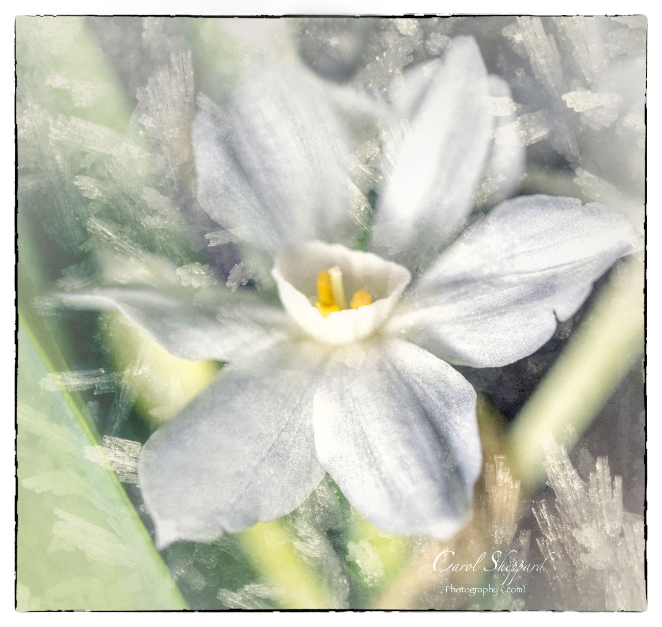
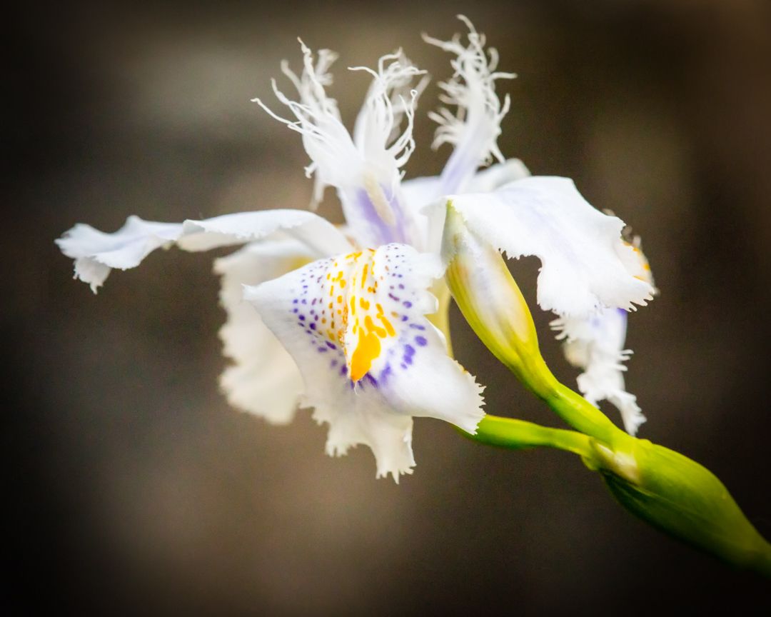
Yes, it could have had an aperture to capture more in focus. The iso should be fine at 1250. The ideal would be to have more in focus-and it was on a tripod. I think it was a fun experiment but not one of my best images. |
Apr 28th |
| 60 |
Apr 20 |
Comment |
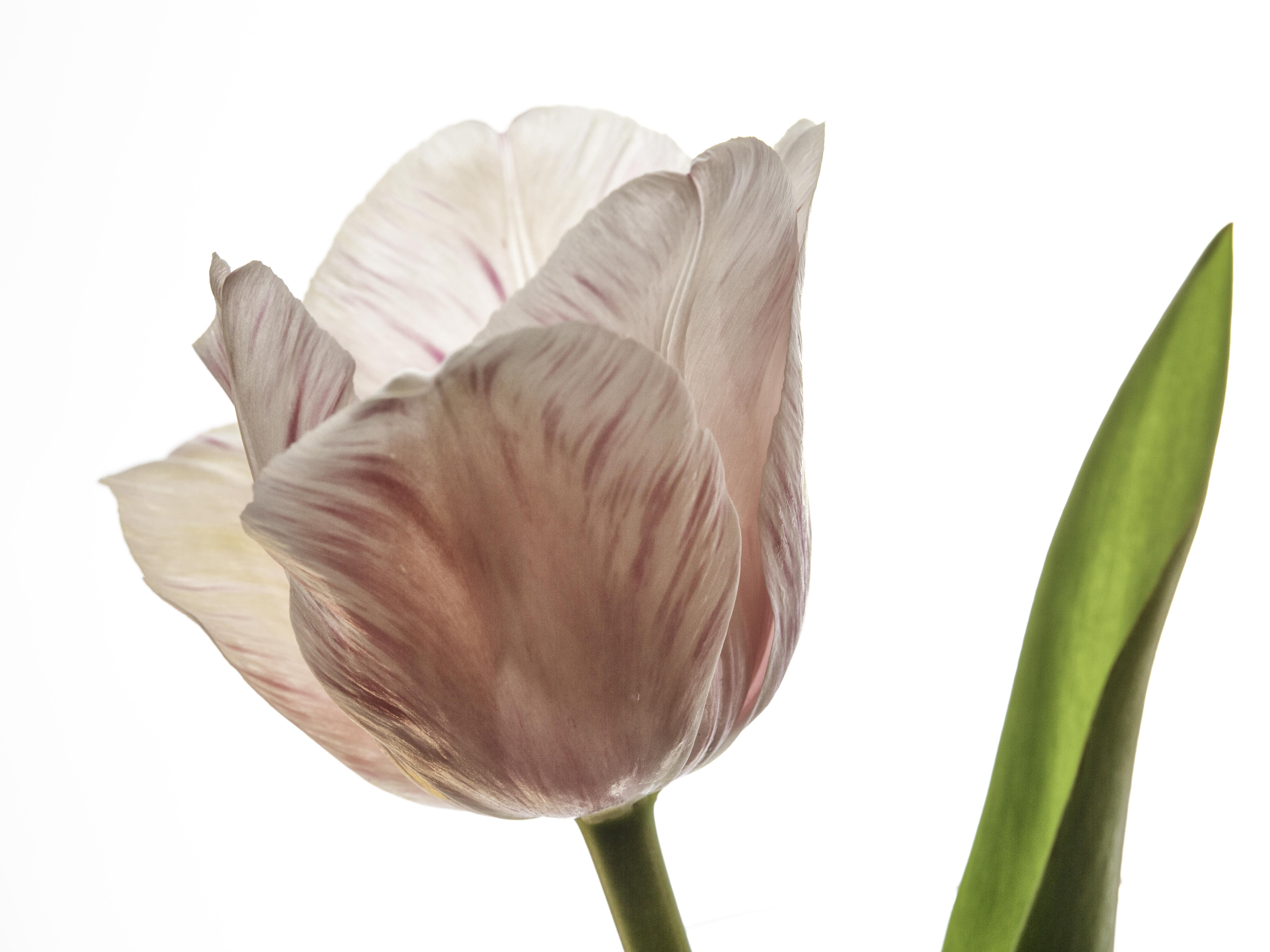
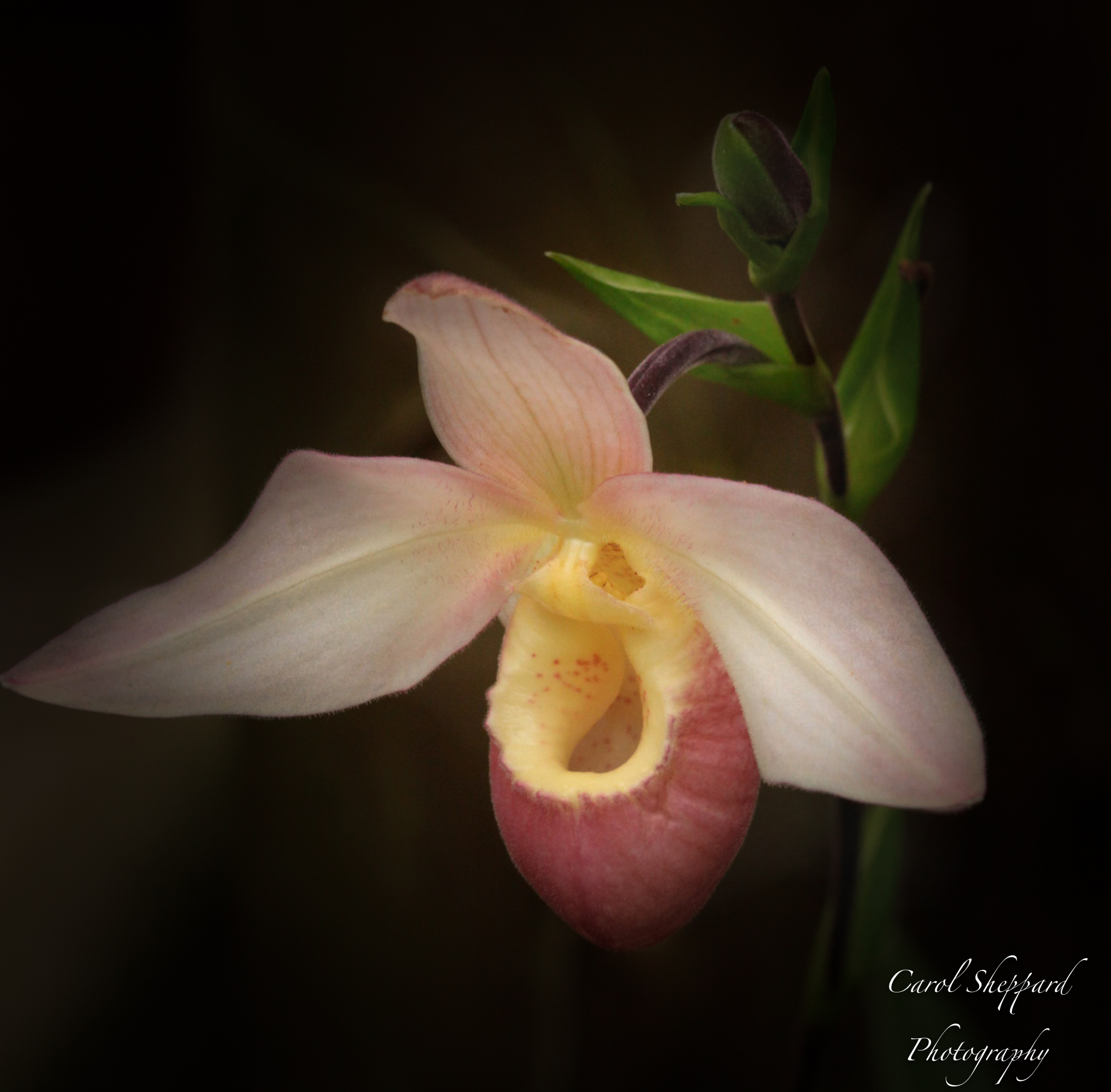
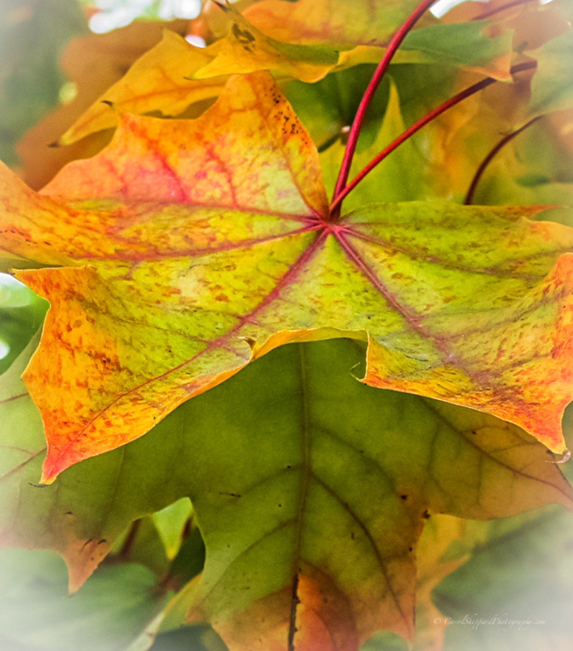
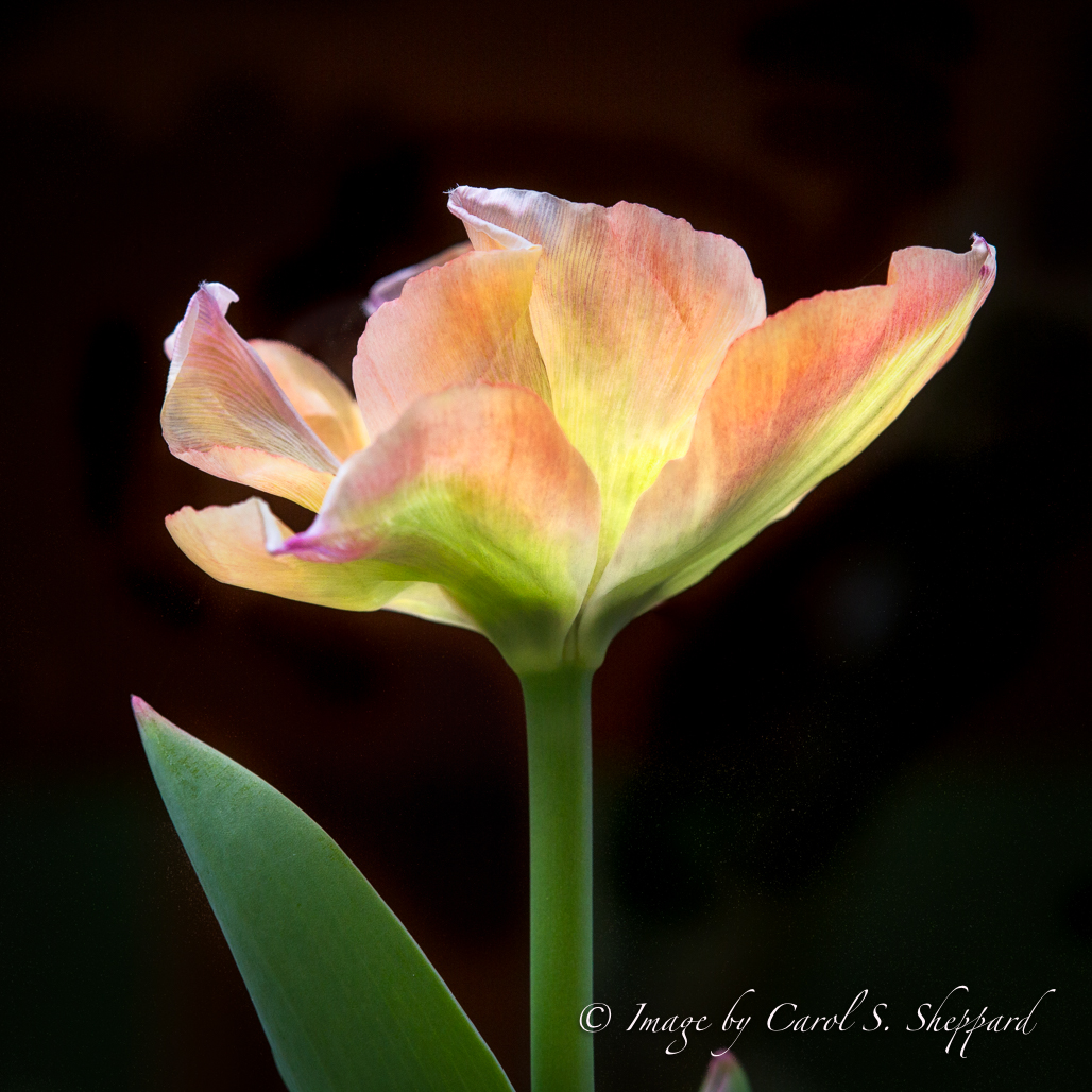
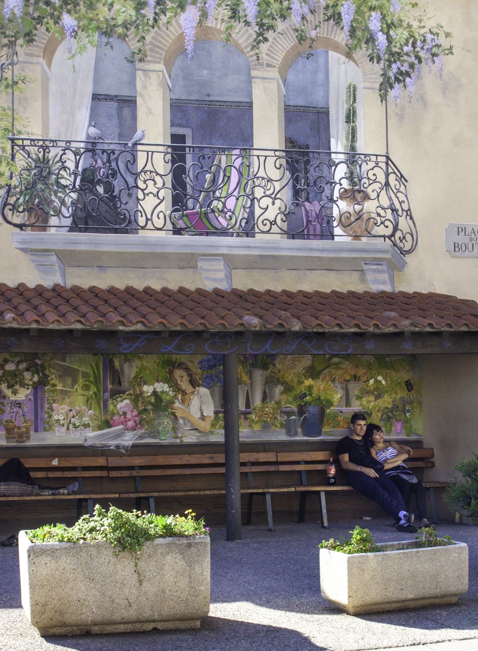
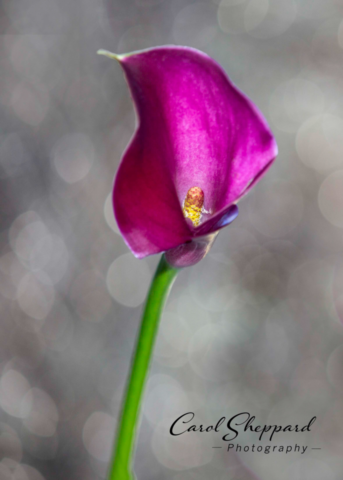
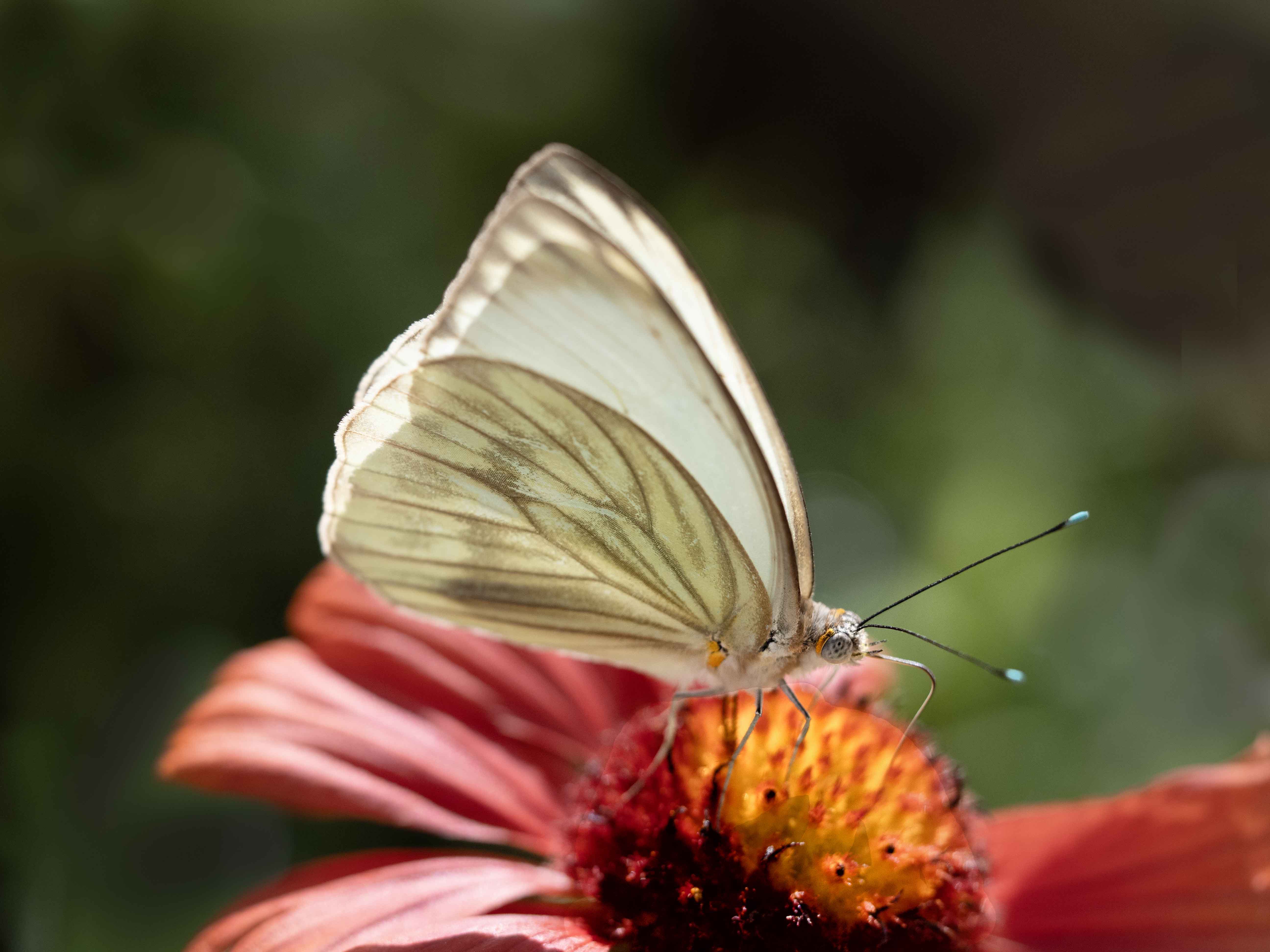
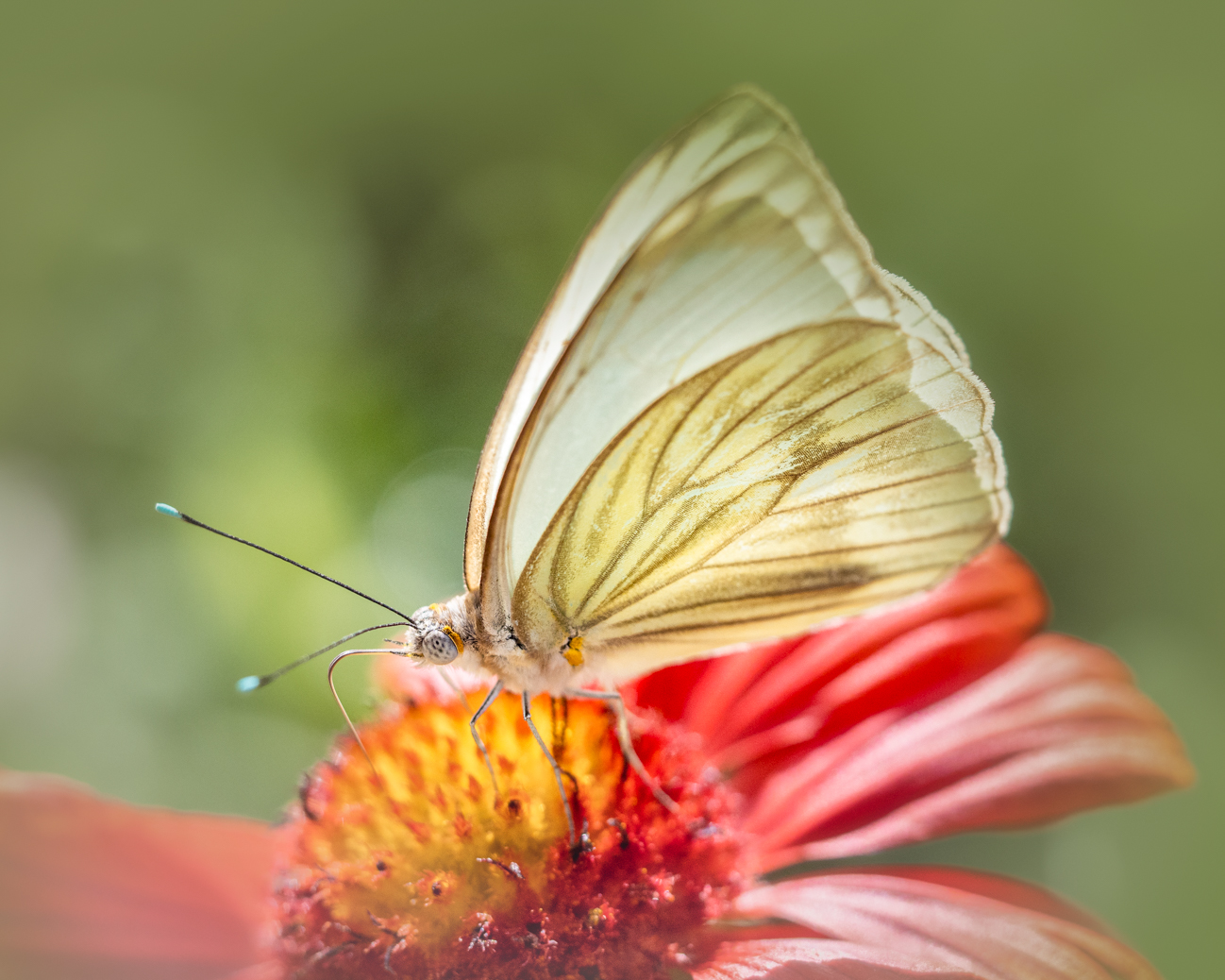
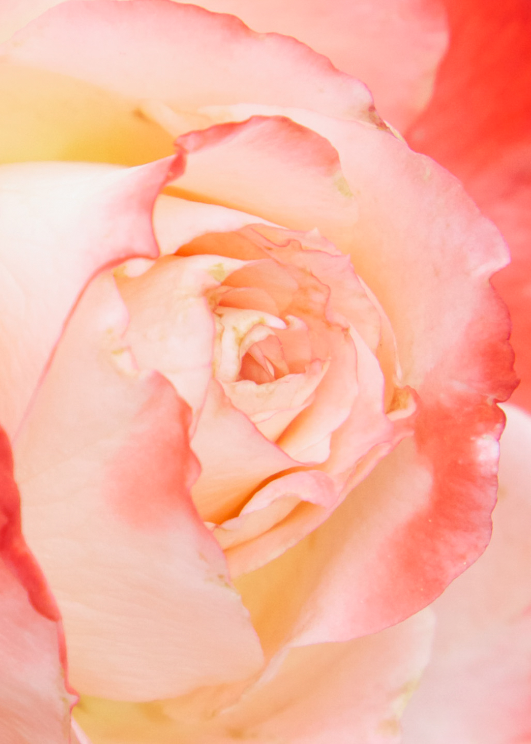
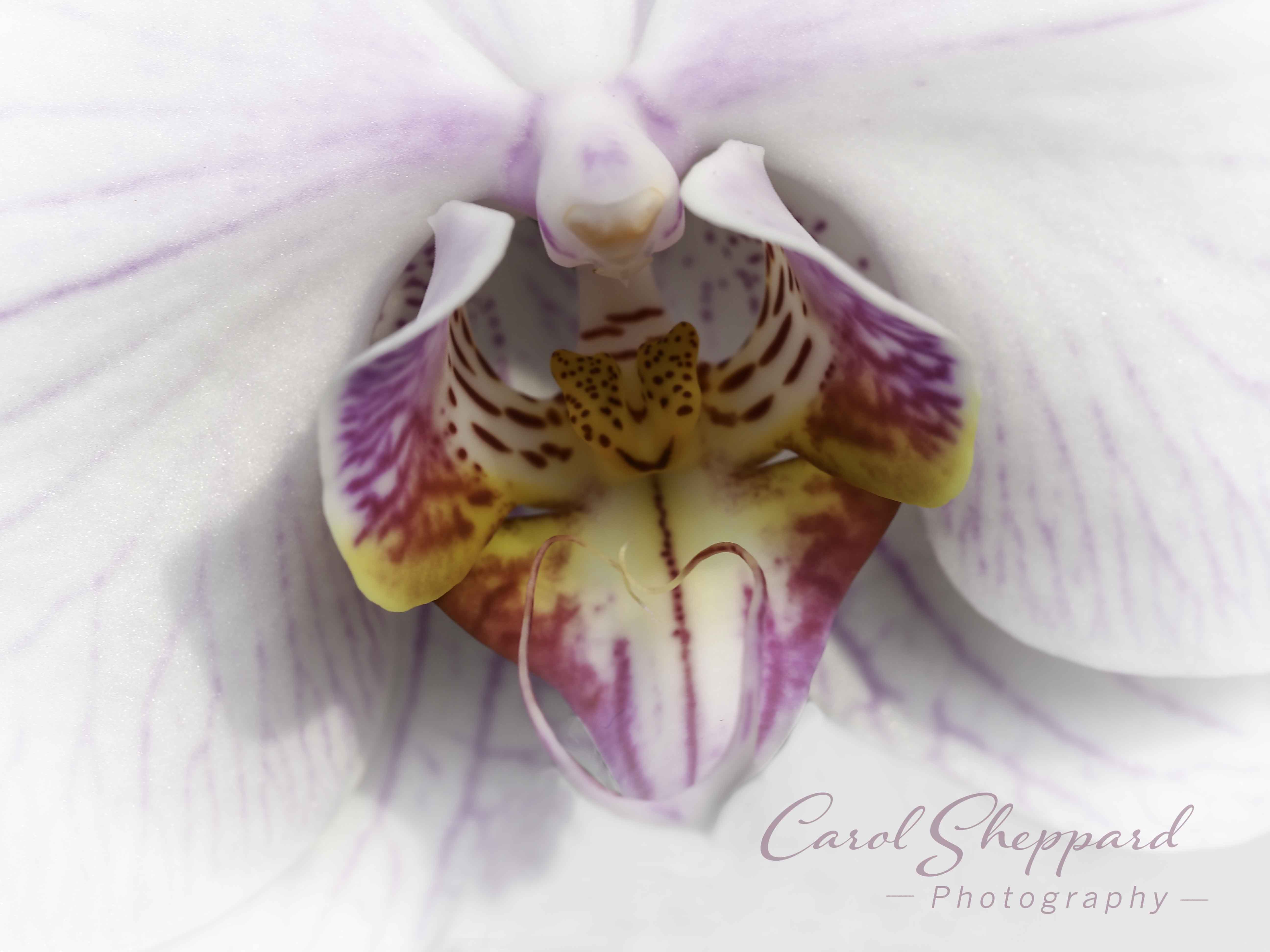
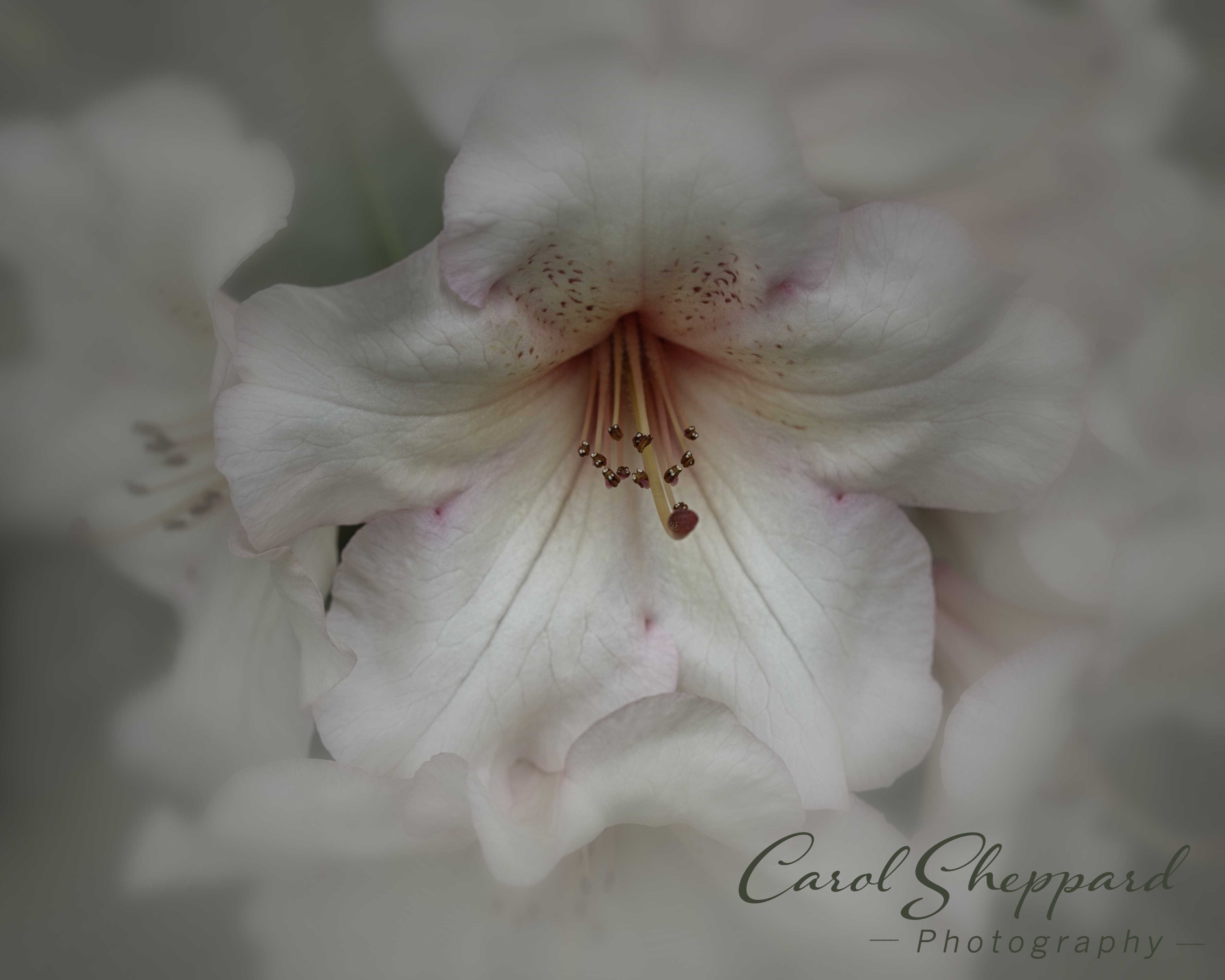
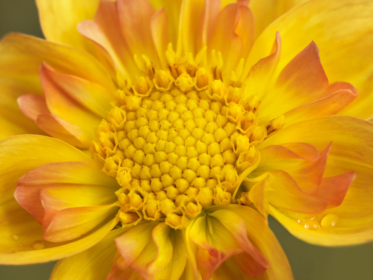
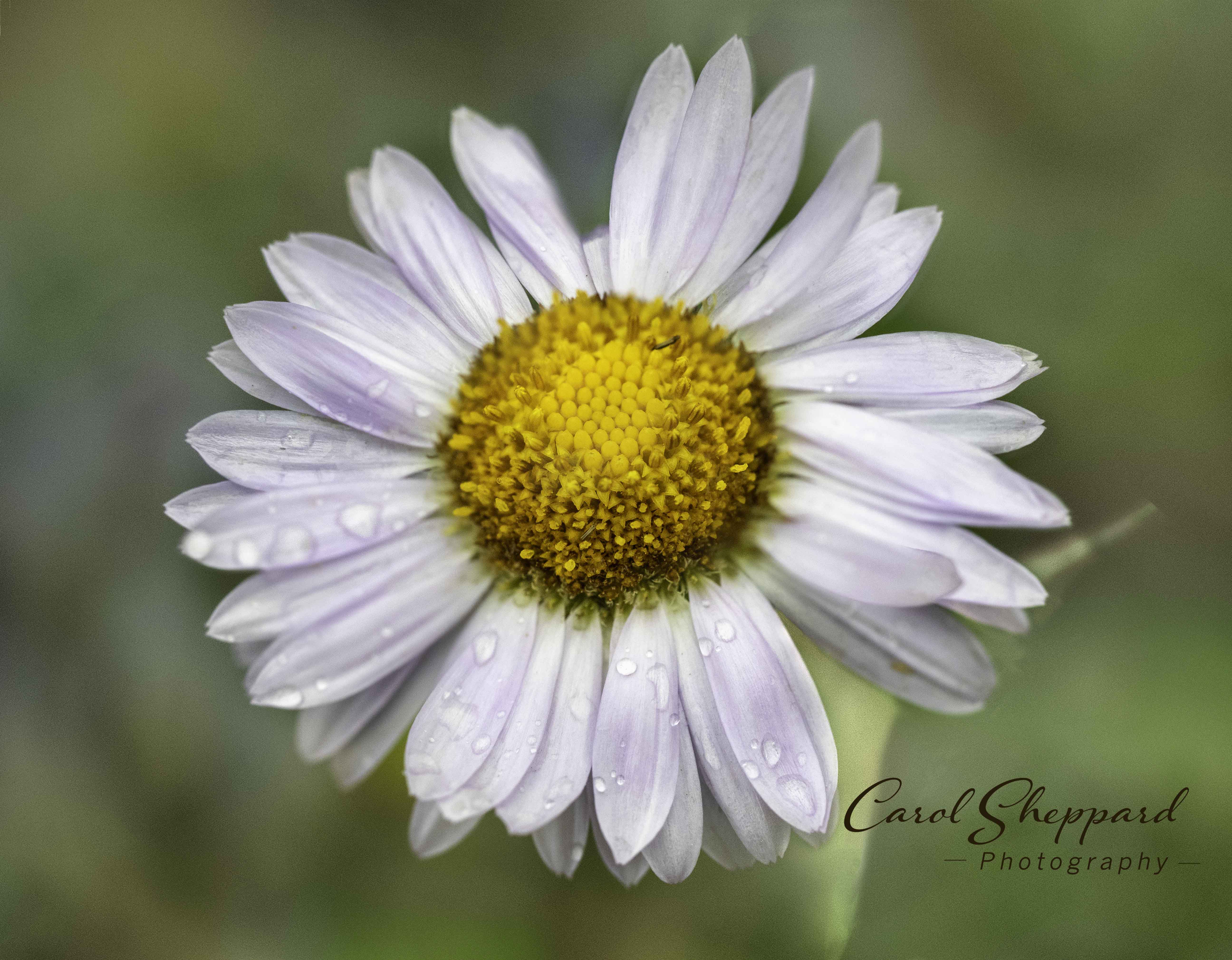
I always enjoy your florals, which have an ethereal overall feel. This has wonderful clarity of the flower, natural color balance, and fine details captured down to the little hairs on the stem. Given what you said your goal was, I would like to see the crop come in much more on the right, eliminating so much of the out-of-focus petals. As a viewer, I am personally bothered by ones that come toward me in the foreground of the image. Maybe try cropping just between the farthest petal and the next one in? It is a tough one!! But since you've cut off that side anyway, it gives you room to change the composition without doing anything more to your cropped right-hand side. |
Apr 10th |
| 60 |
Apr 20 |
Comment |
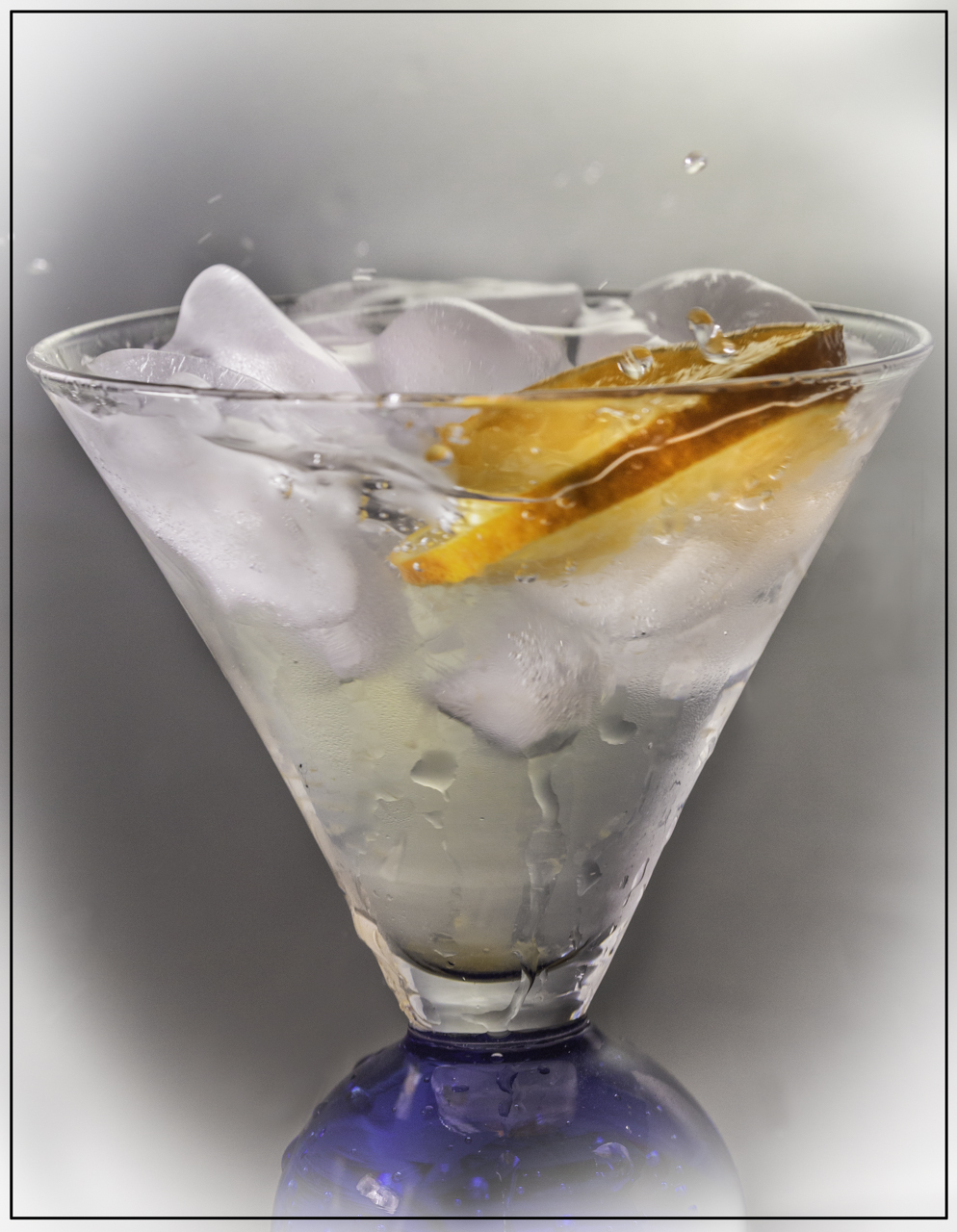
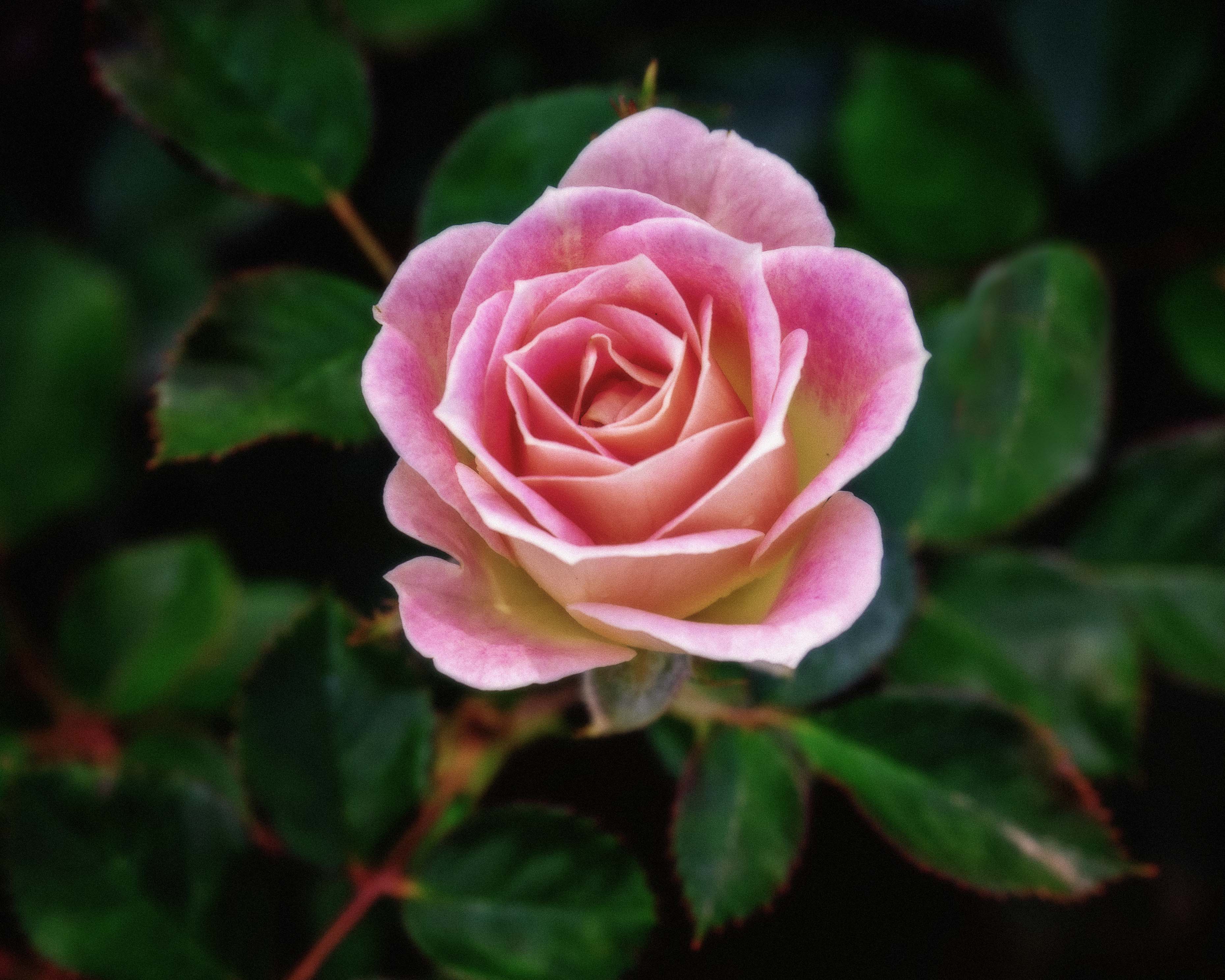
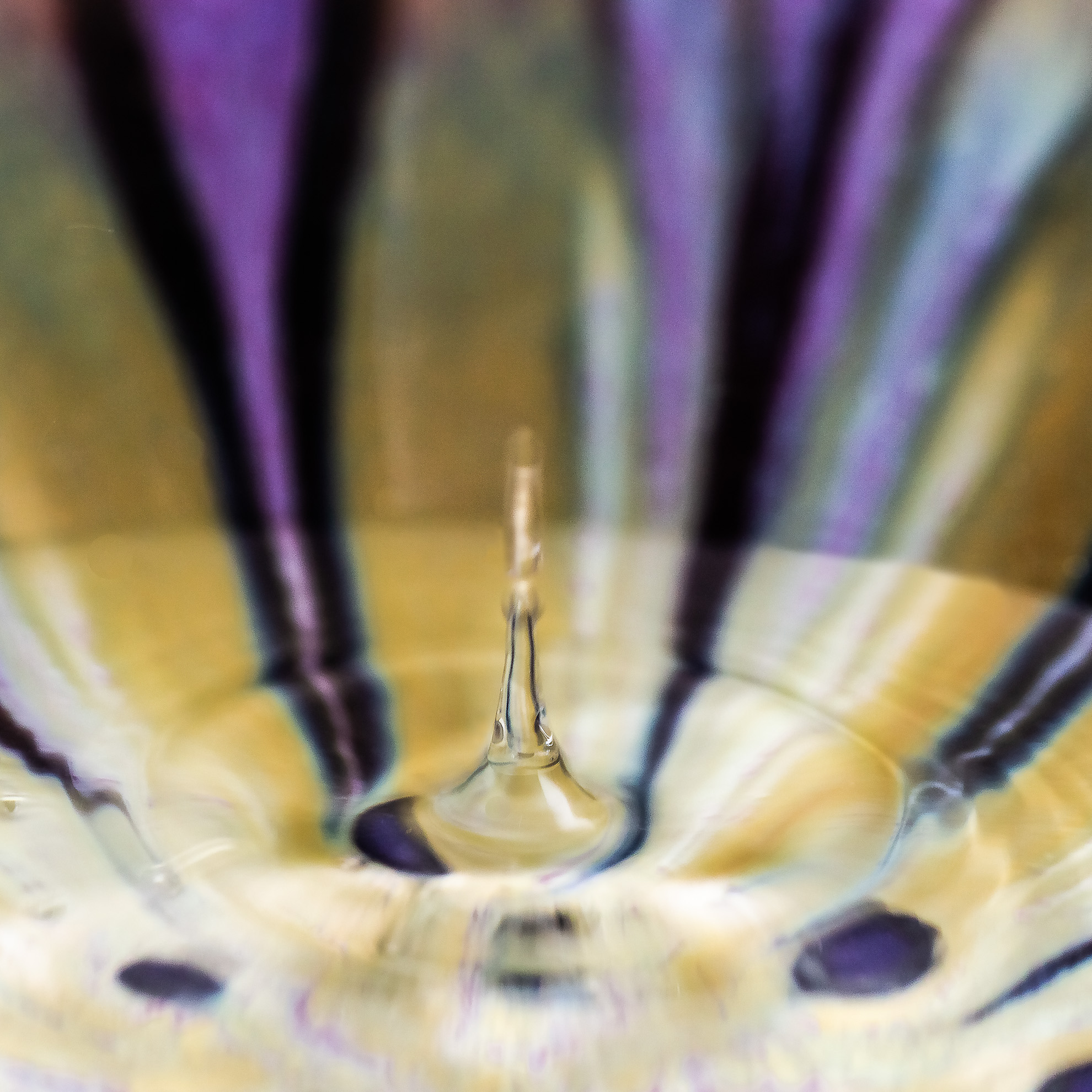
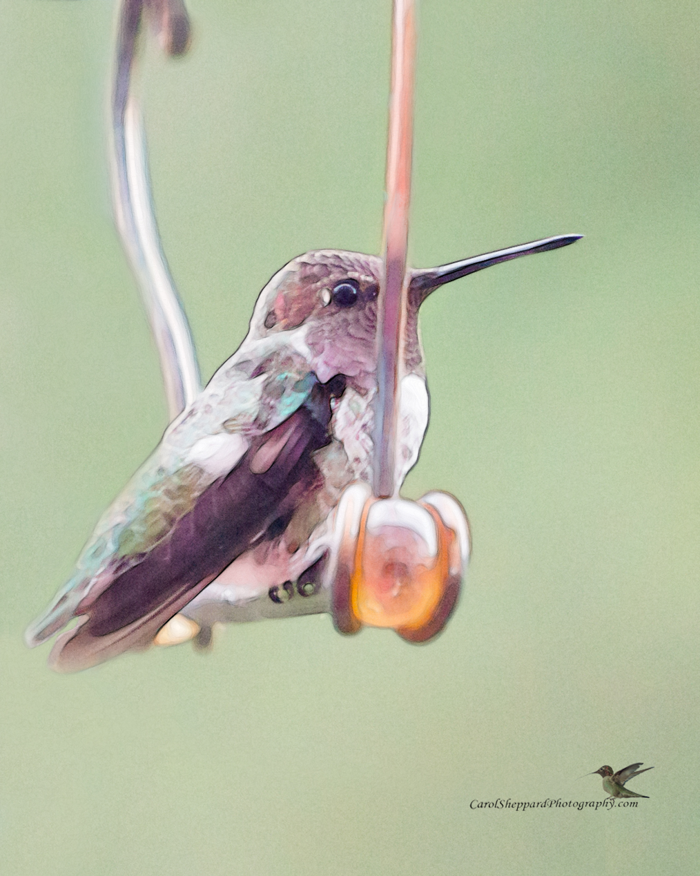
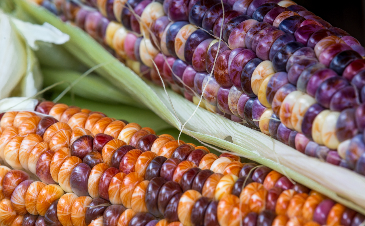
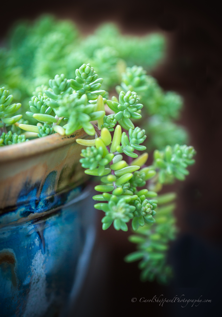
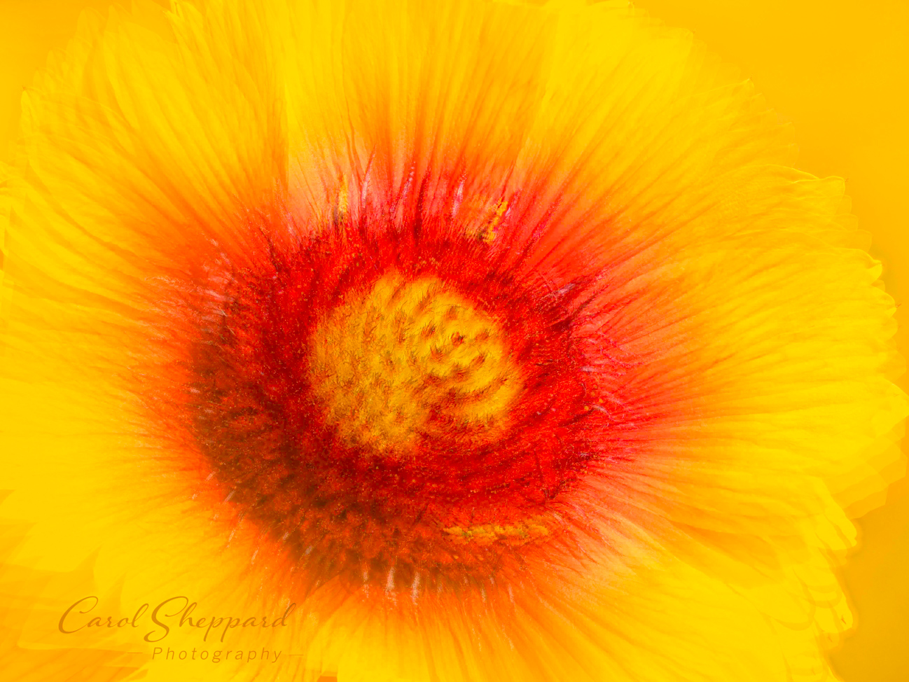
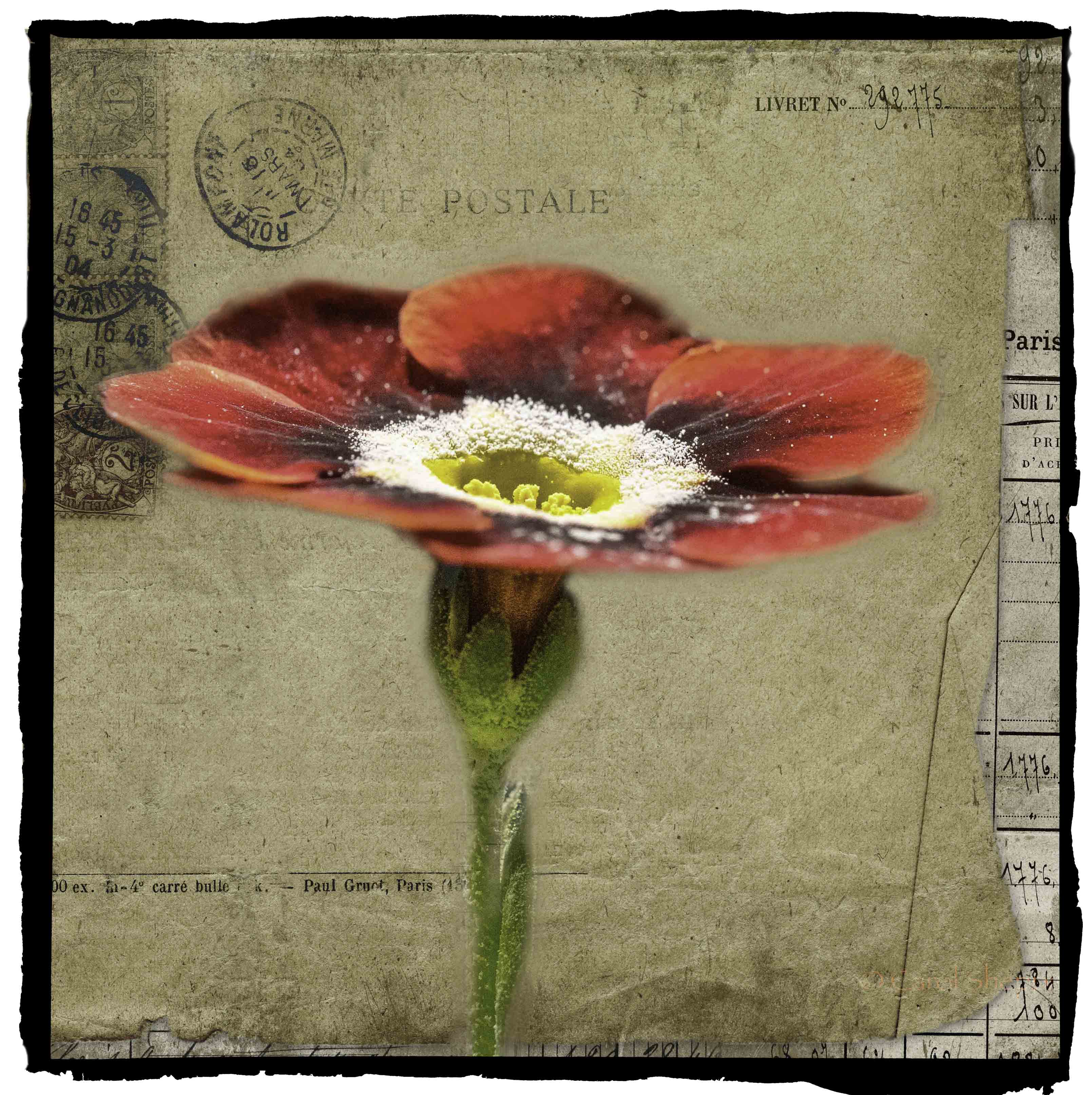
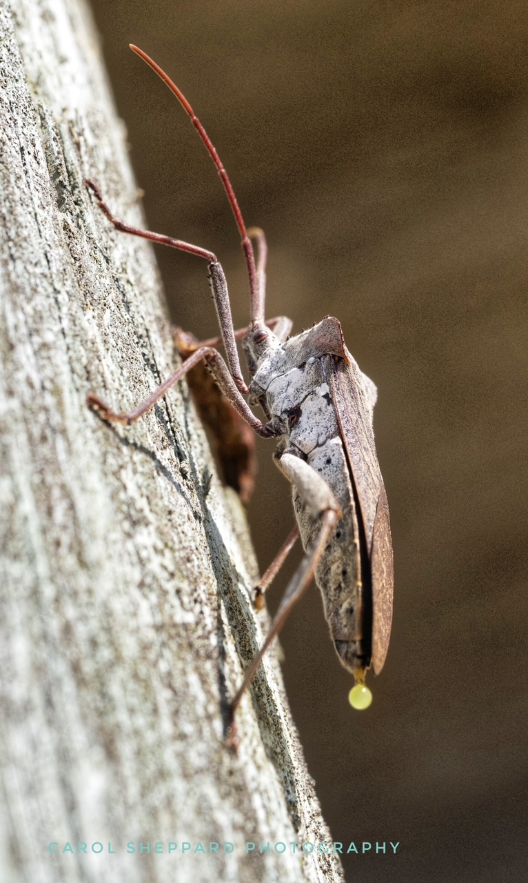
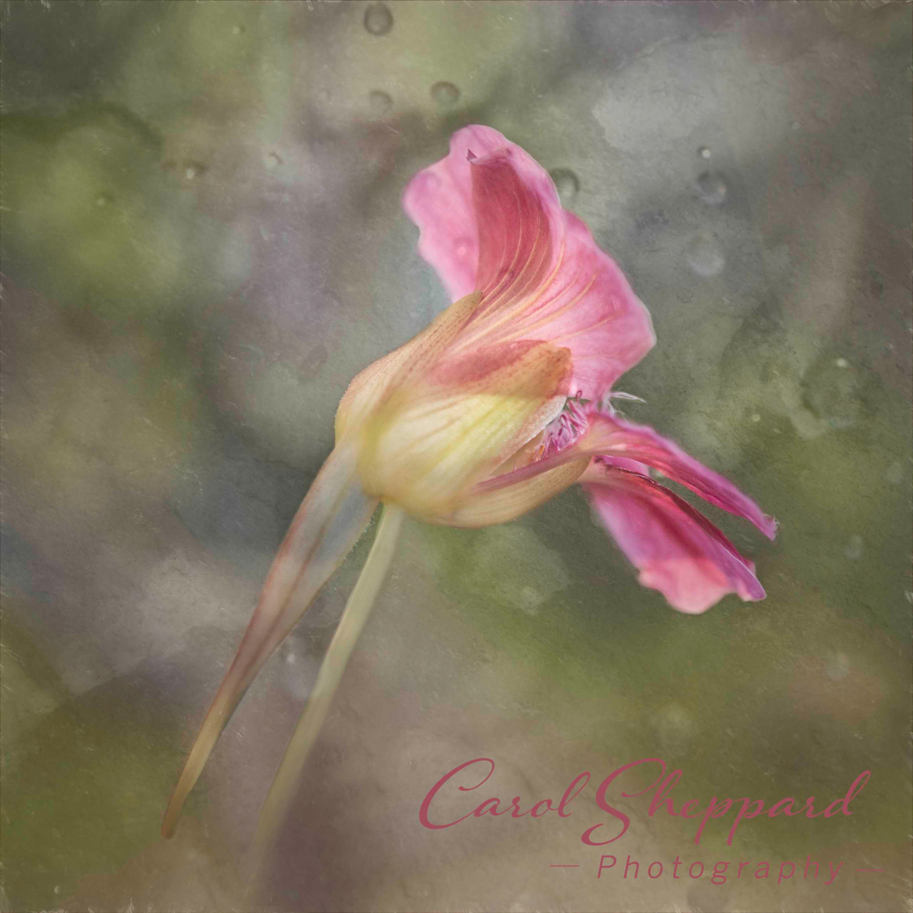
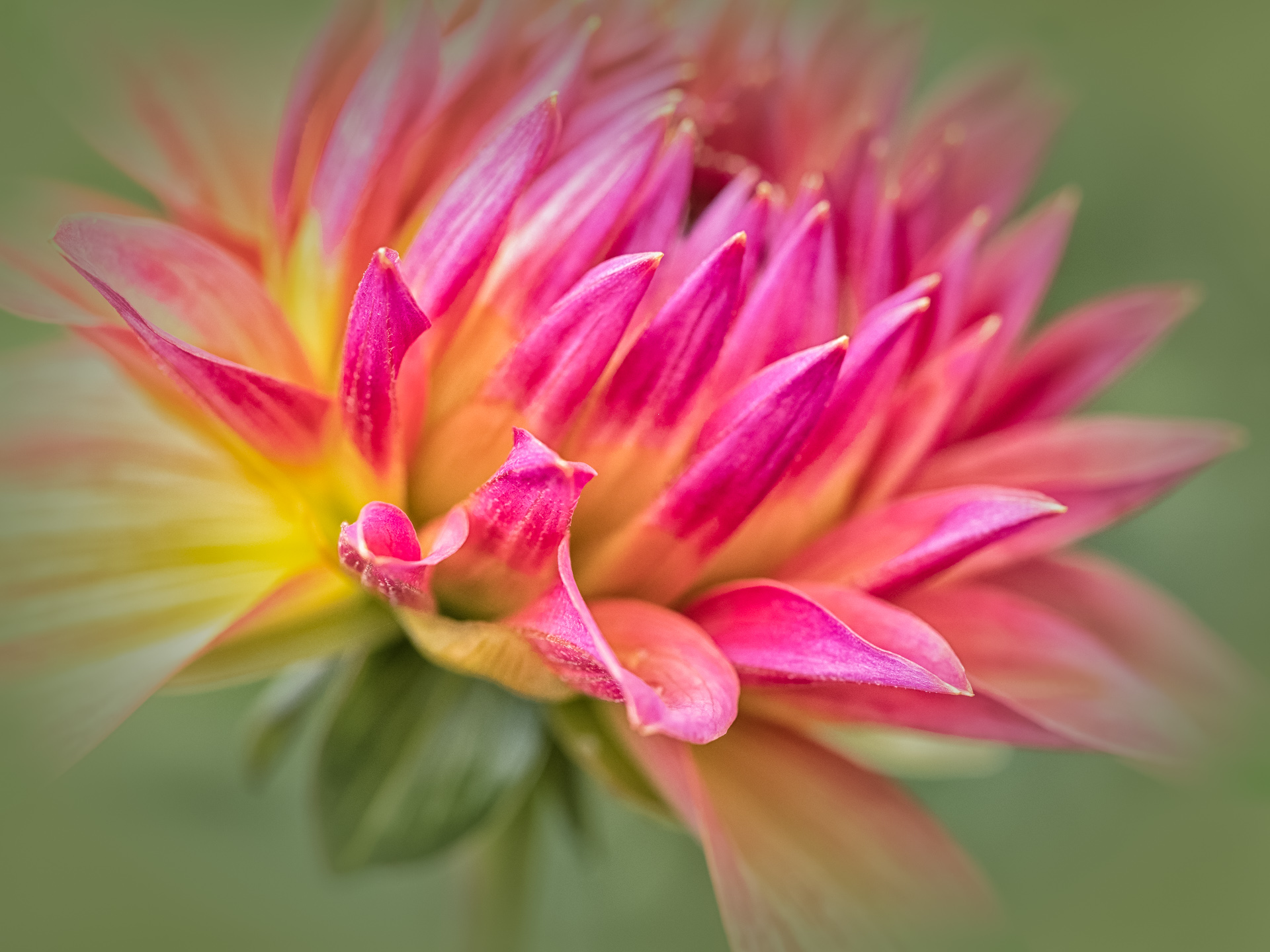
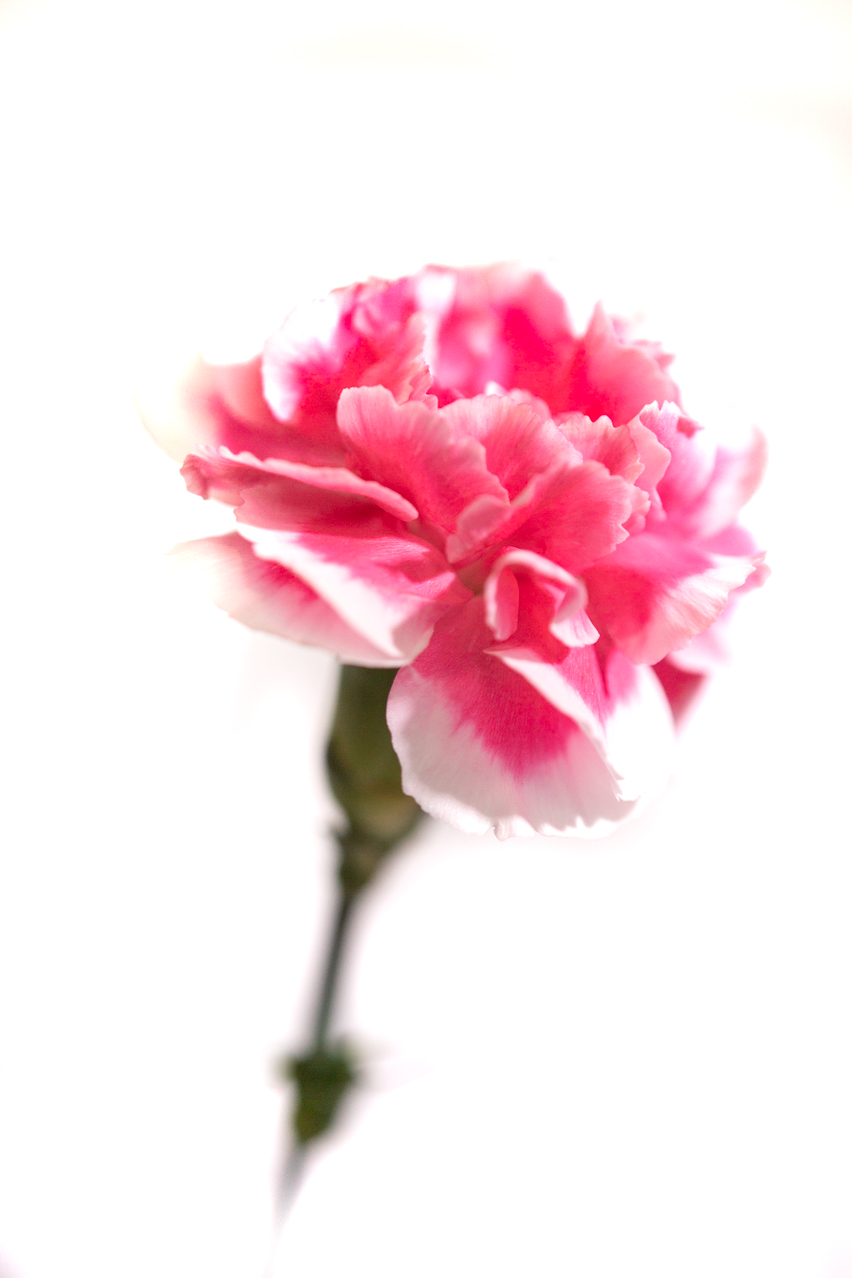
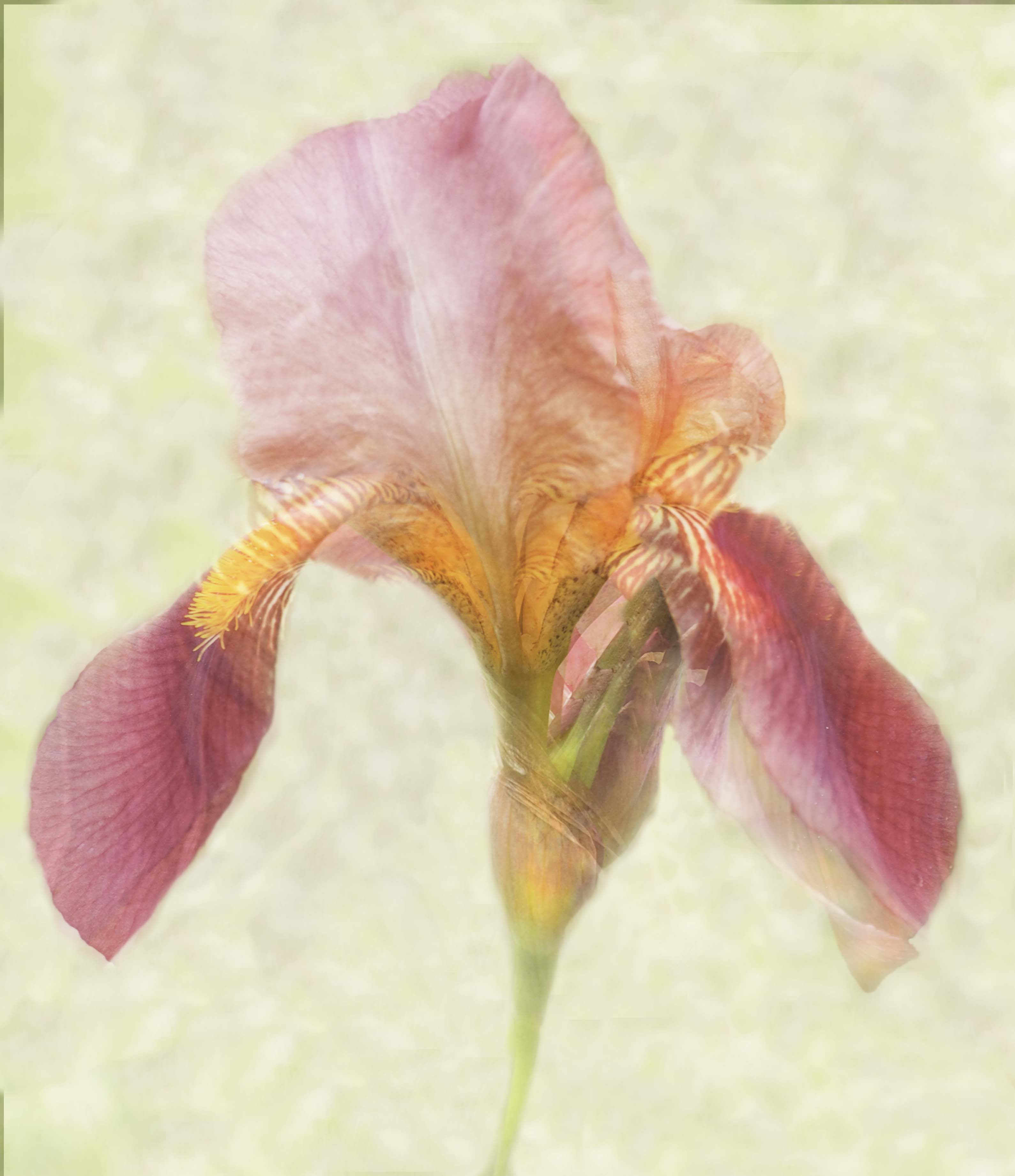
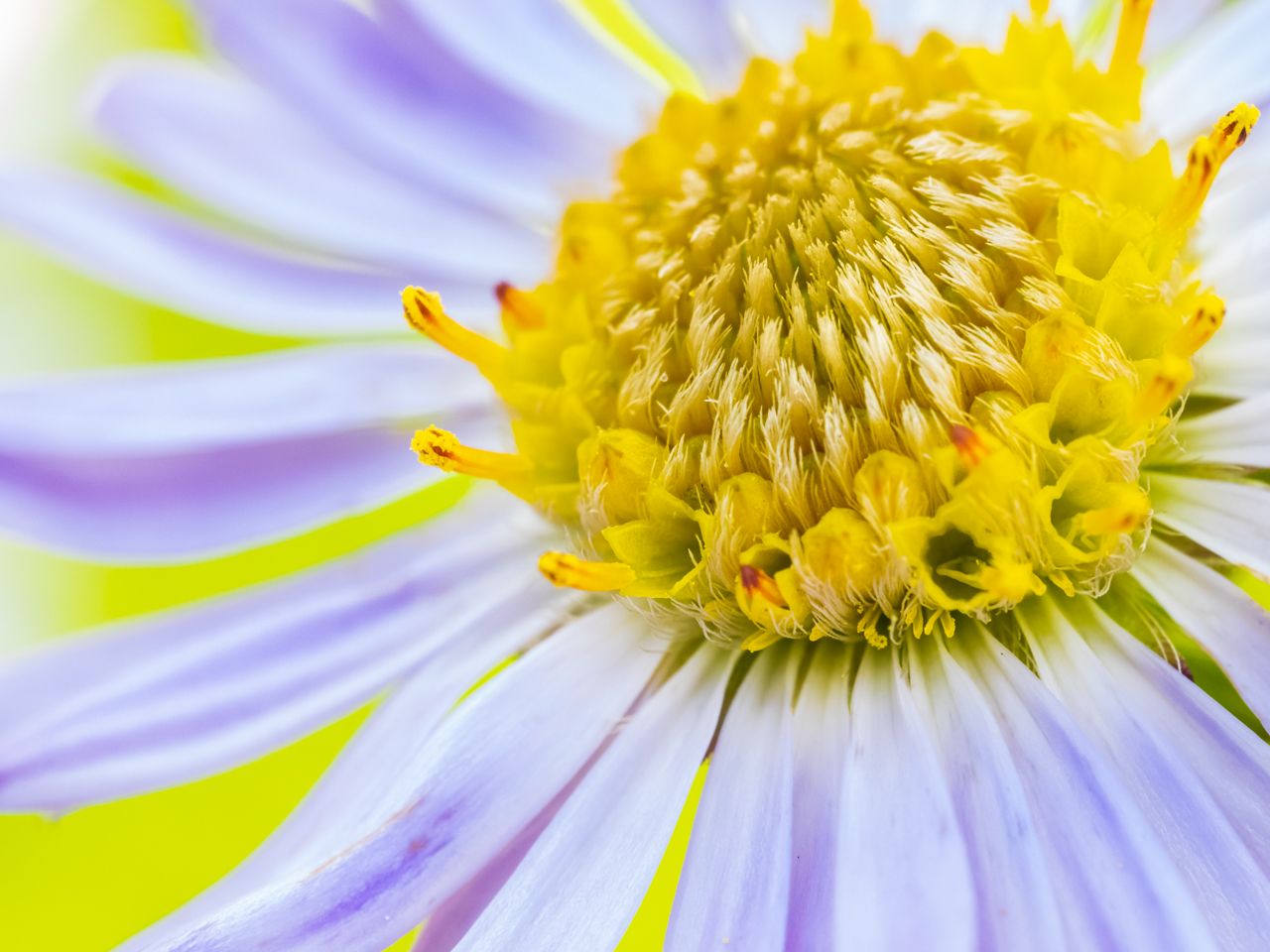
These are great subjects and I think you've done well. A diffuser between the flower and the light might have helped eliminate some of the larger hot spots. Your composition is strong, and the background of the leaves works well for popping the colors of the flower itself. I really think the only thing I find distracting are those washed out areas. I am wondering why the higher ISO, instead of increasing the shutter speed instead? I think I might try a different angle or a diffusion of some sort on this if taken again. If not, can you play with filters on it? |
Apr 10th |
| 60 |
Apr 20 |
Comment |
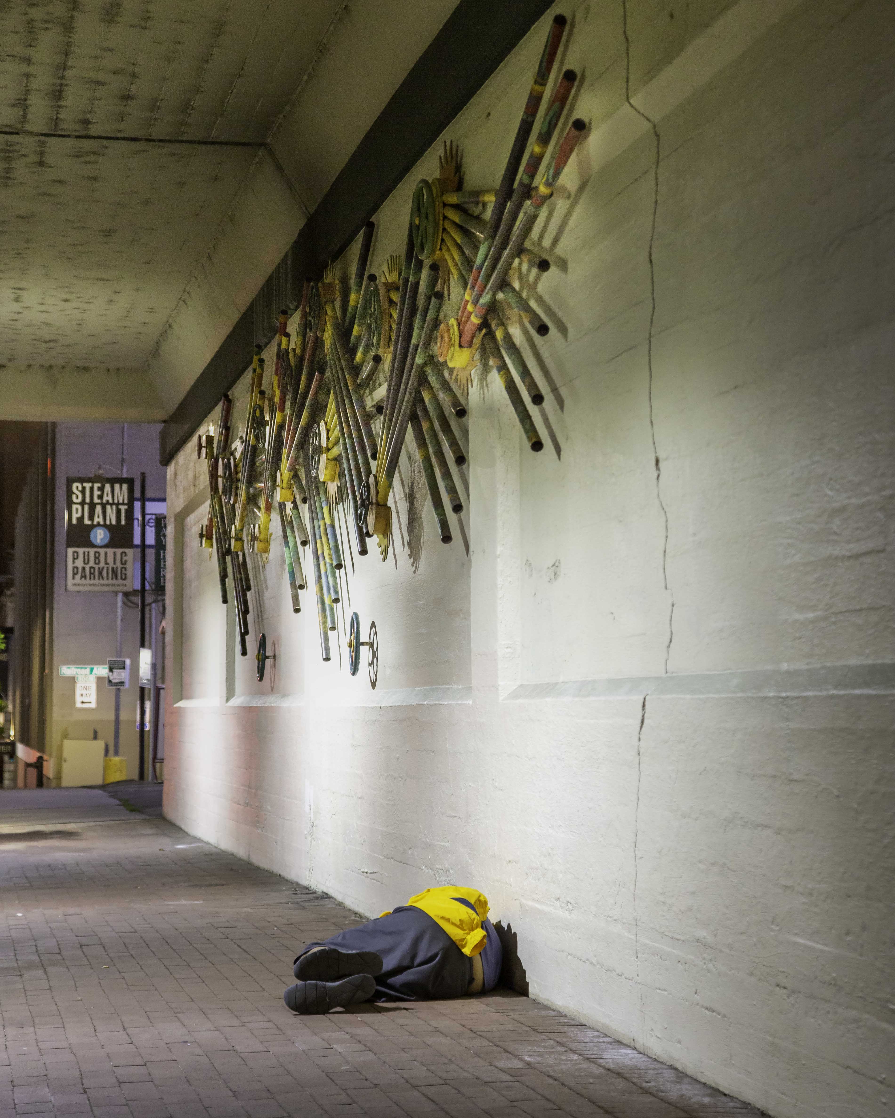
Bob, apologies for nearly missing this; its a wonderful, stirring image. That reflection, along with the name, gives it the story of "sinking" beneath the water. I think the darkness is perfect....after all, Davy Jones Locker isn't a light subject, is it? What a haunting image. The combination of light and dark works well in this, as well as your perfect sharpness in the original, fading out in the reflection in a downward line. Which, BTW, provides a nice leading line downward into the depths of the "ocean." Again, so creative and so well done! Competition worthy. |
Apr 10th |
| 60 |
Apr 20 |
Comment |
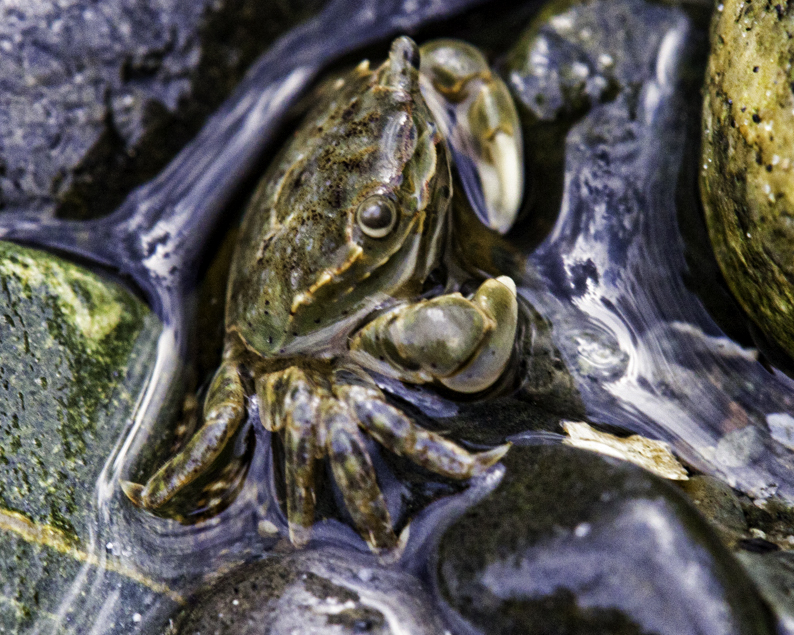
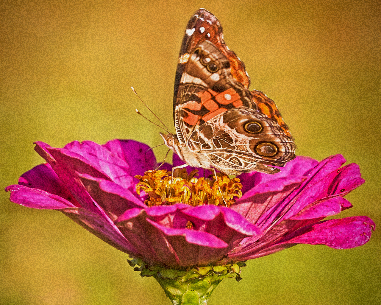
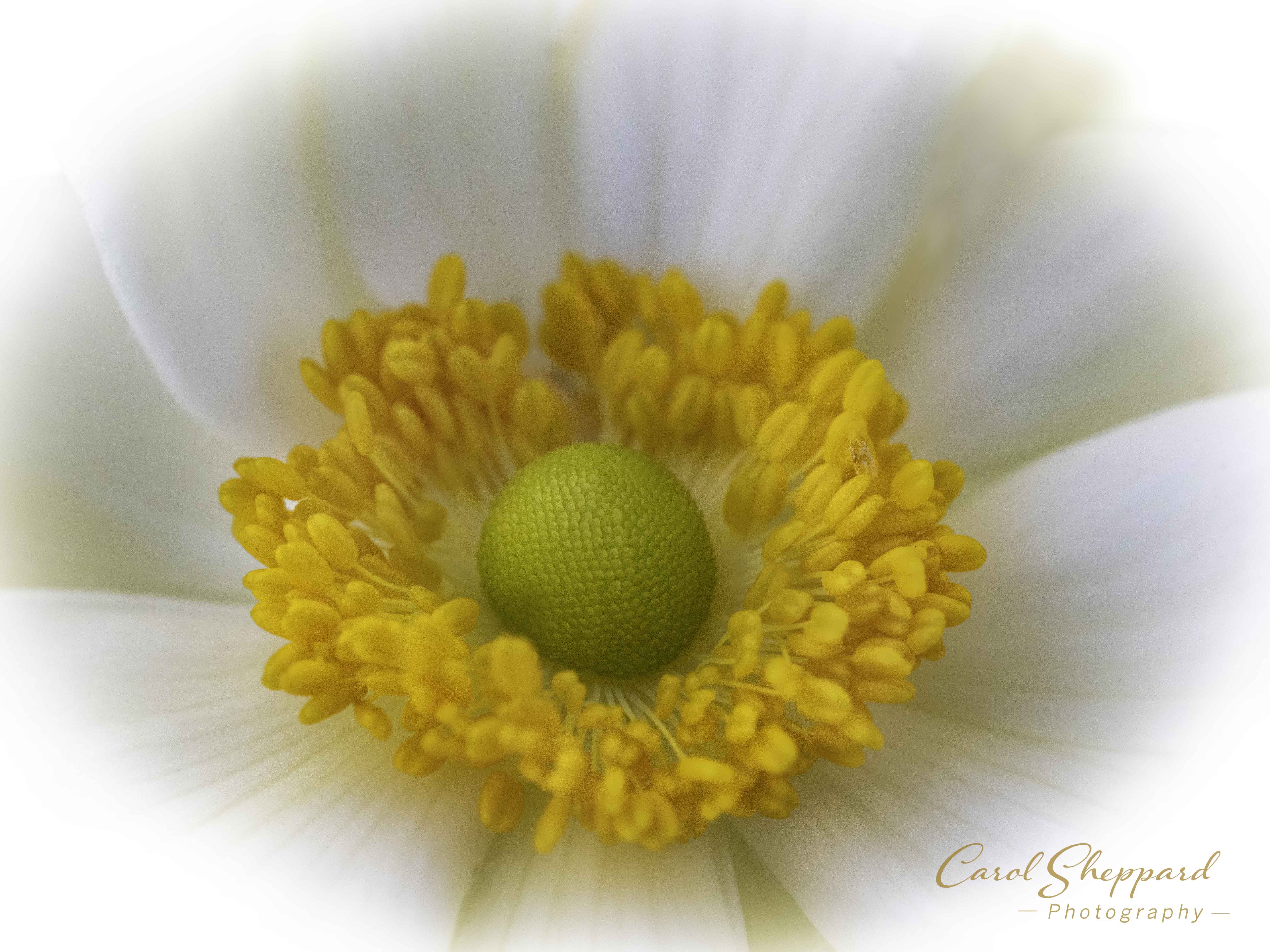
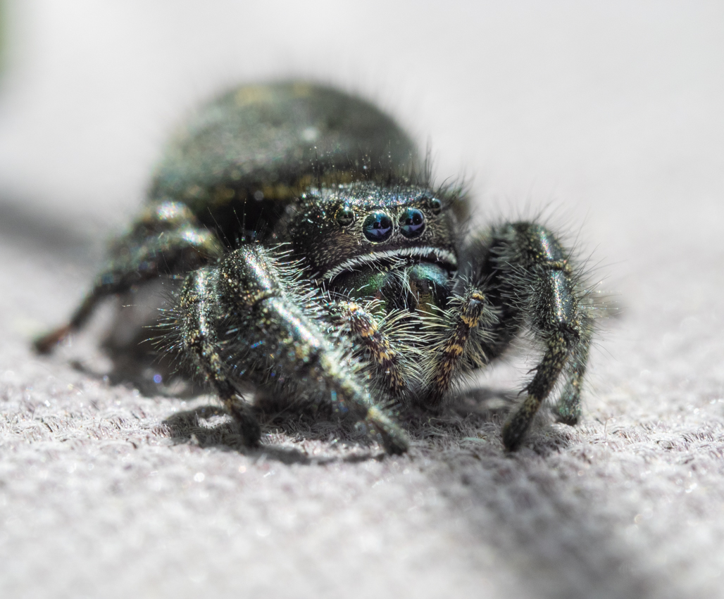
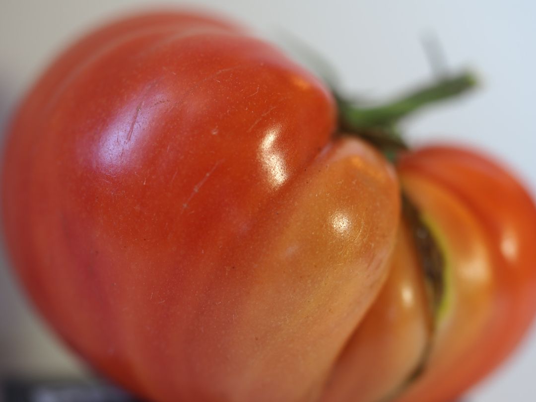
I love the creative find! Your lighting is spot-on, along with the strong texture and clarity. I did not see any observable noise, but I did note how well you caught even the smallest bits of texture with your light and shadow. I think you could even crop in more, to emphasize the center spot (the navel, I assume?). I think those white spots are on the orange itself, and I am a disciple of not worrying every little thing in post-processing--its part of the orange's character. Great job!!
|
Apr 10th |
| 60 |
Apr 20 |
Comment |
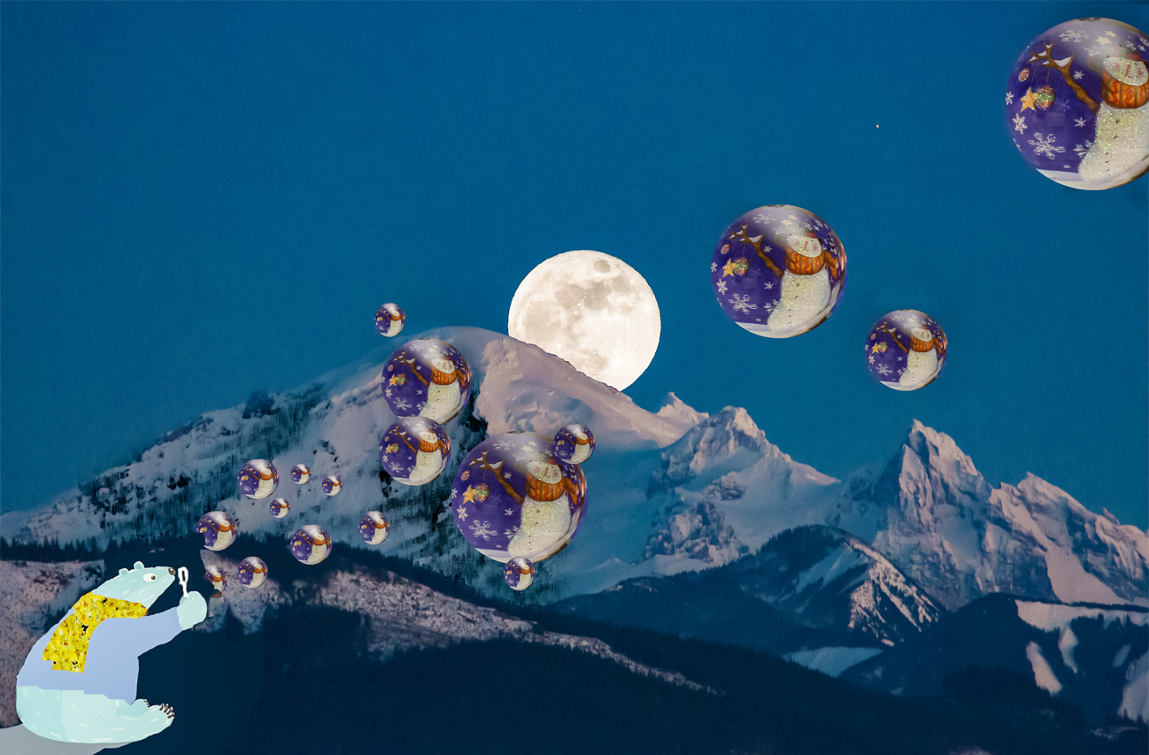
I absolutely love this: for the whimsey and the clever assemblage!
The composition also works so well, as does the color combination--nothing overpowering. The story can be seen immediately by the viewer.
Kudos!! Perhaps someday I will visit Ireland and dance on the moors, LOL. |
Apr 10th |
5 comments - 2 replies for Group 60
|
| 80 |
Apr 20 |
Reply |
Yes, I see what you mean; thanks!
|
Apr 17th |
| 80 |
Apr 20 |
Comment |
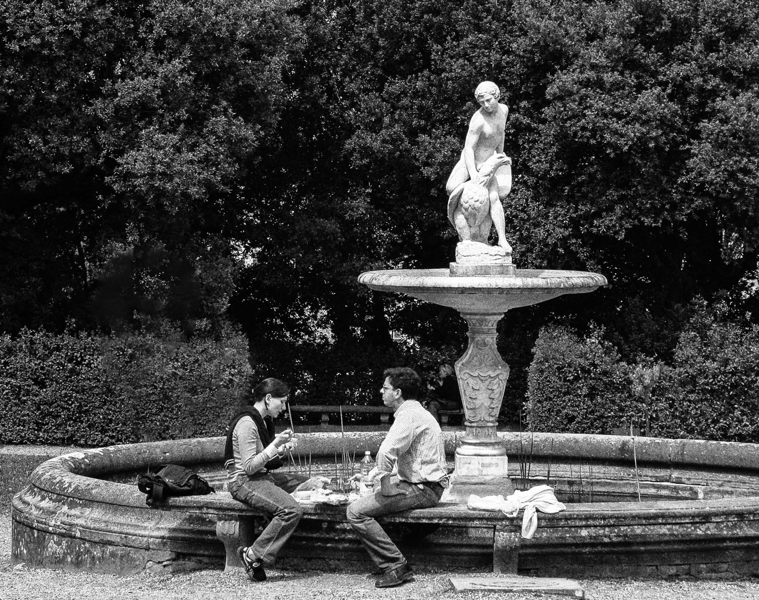
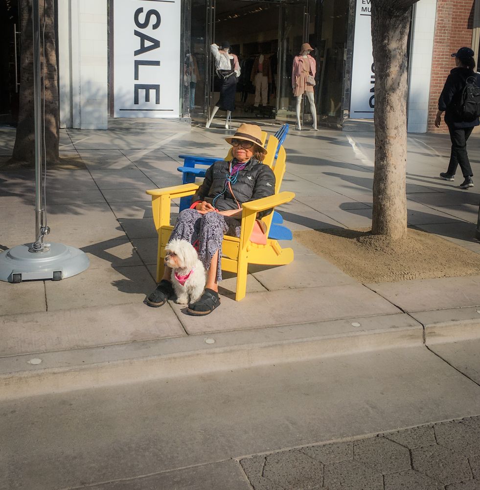
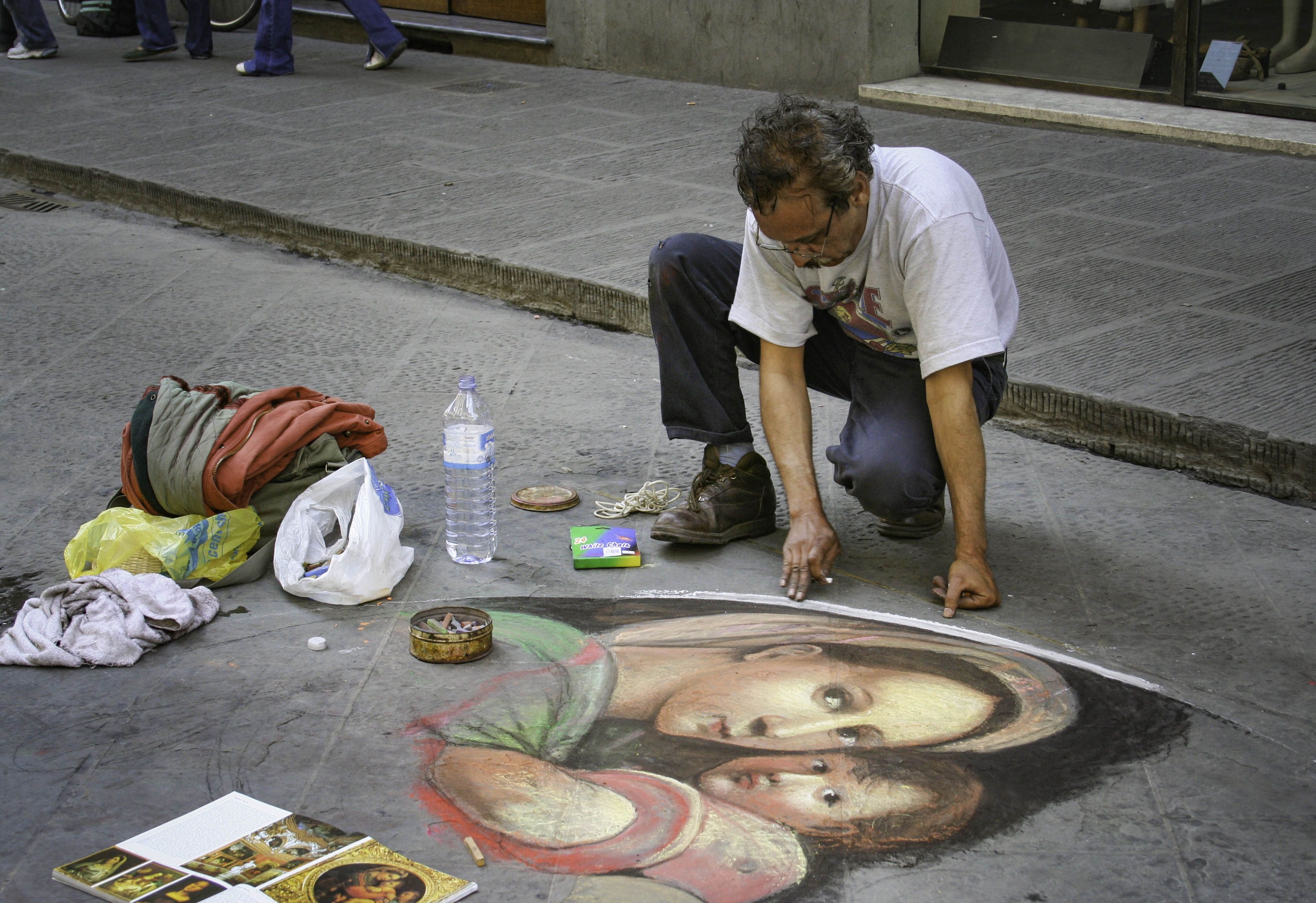
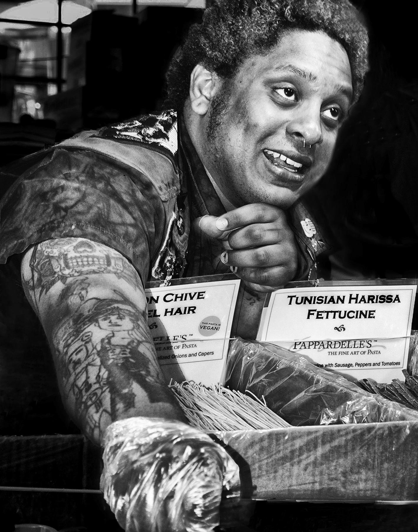
I like this image for its solitary feel. The sweep of the tables leads me right to the man, in addition to the fact that he is somewhat brighter with that head of white hair, LOL! Your composition is really working well for his placement, too. Your balance of lights and shadows are good, maybe could use a bit more for dramatics--the image feels slightly flat on my monitor. Maybe that is why the comment about contrast? The balance of the contrast is fine, so maybe more contrast for the image overall? Your image is great! |
Apr 10th |
| 80 |
Apr 20 |
Comment |
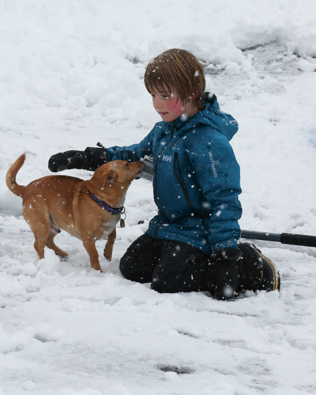
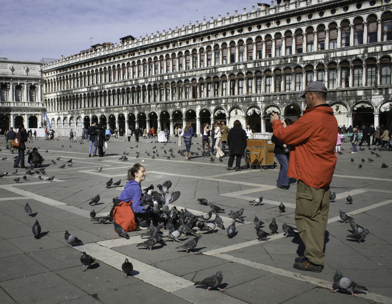
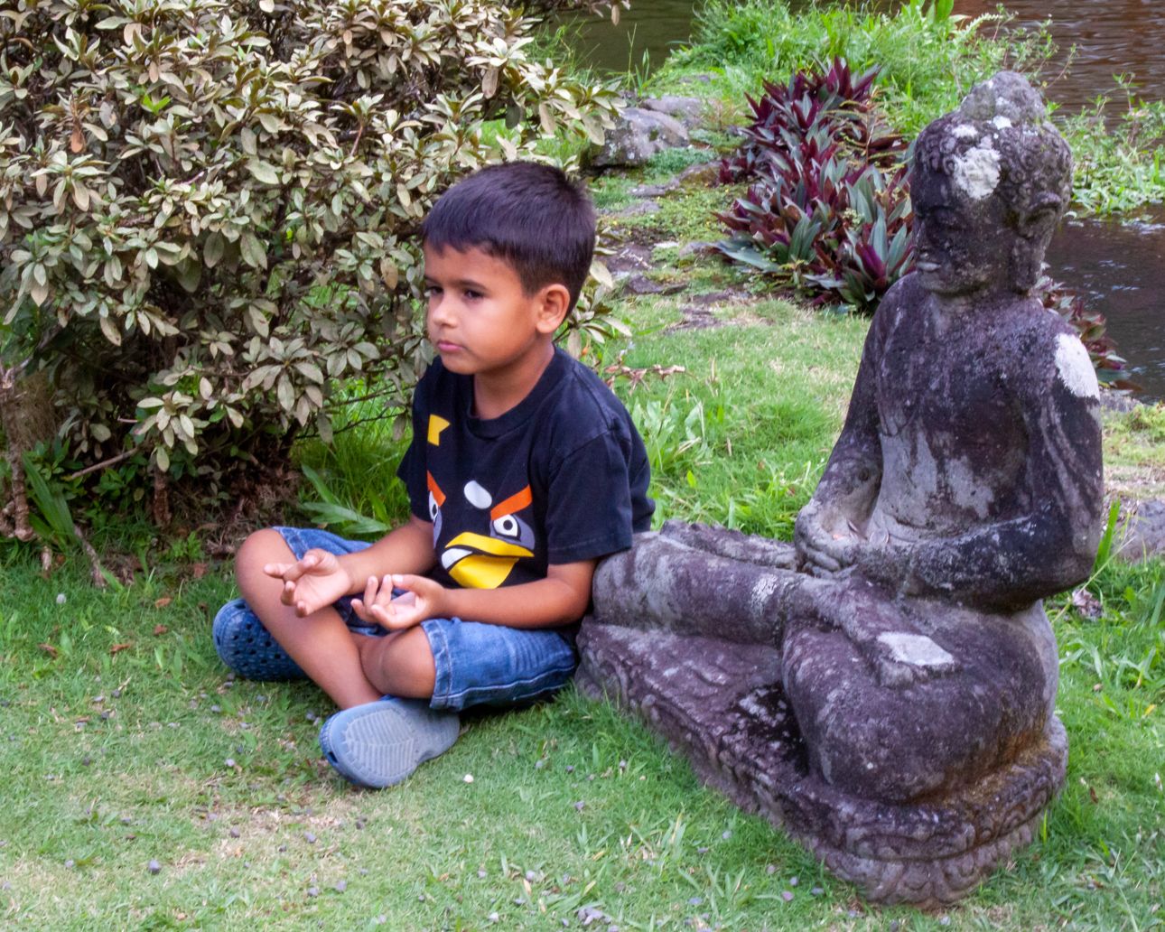
The black and white serves this image well. The story is strong, and the composition is pleasing. I like that there are three friends standing in the background, and that they aren't paying any attention to the camera. It puts the story squarely on the boy and his joy in feeding the pigeons. Great use of leading lines, too. I like the overall tonal range, and feel you could bring up the brightness a bit without blowing out any whites or introducing highlights or hot spots. |
Apr 10th |
| 80 |
Apr 20 |
Comment |
This is a great image, with wonderful clarity. My favorite part is the expressions! She is hunkered down, half-in and half-out from the supposed protection of the umbrella. He is nattering away, oblivious to her discomfort!! The umbrella is squarely over him! Very clever capture. I also think the fact that they are walking directly into the camera view works very, very well. It has an overall feel of grey, dismal, and wet weather. This image works very well!! |
Apr 7th |
| 80 |
Apr 20 |
Comment |
Nice image, beautiful to catch the domes in the background. The texture of the street and the structure work so well for this image. Your leading line of the crosswalk also works well to lead my eye to the structure from a point that is actually kind of far away.
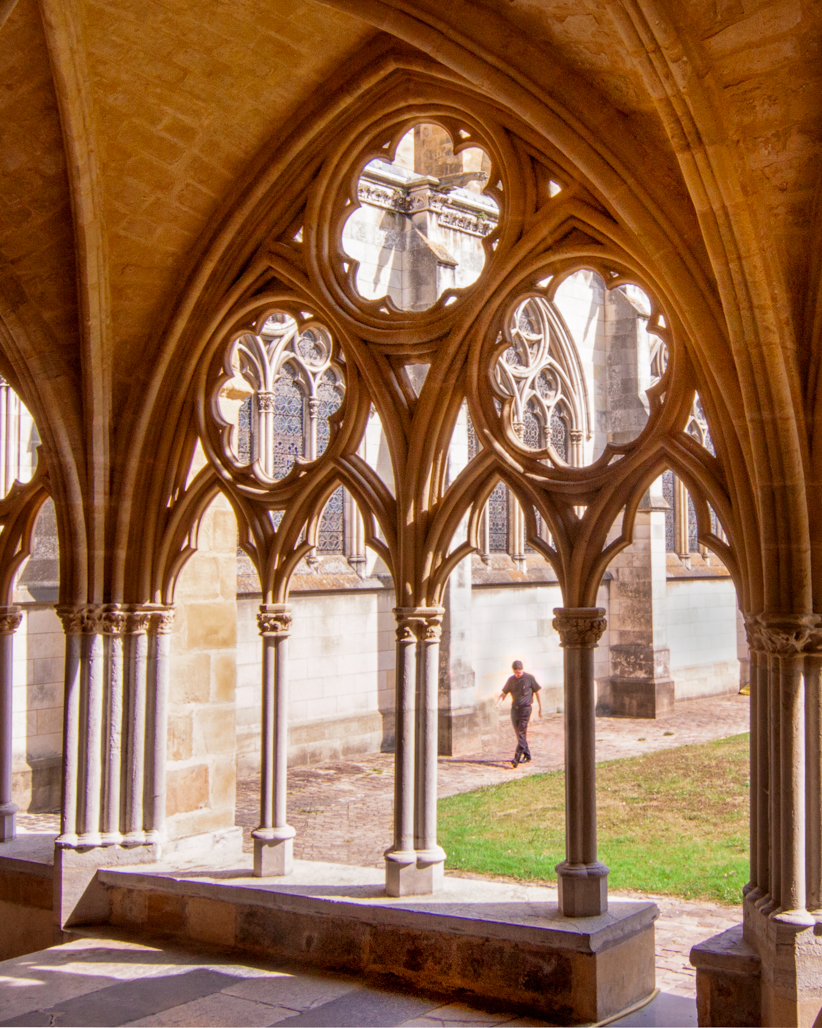
For me, its not about the people, just the basilica. I would like it better if the people, at least some of them, were looking at the structure. On the right, those two folks are turned completely away from it, looking at something beyond the frame, which disturbs me as a viewer. |
Apr 7th |
| 80 |
Apr 20 |
Comment |
I'm very torn on whether I like this better in monochrome. I love the image...great facial expression on the child. And in the monochrome, her eyes are no longer in shadow. However, one of things that really appealed to me were the colors of the living statue! Esp. as compared to the colorful palette of the child. Have you considered a bleach bypass effect? It would keep both to some extent.
The composition is great...a suggestion that you straighten the right edge and eliminate that small dark slice. You've already cut off the balloon, so a bit more won't hurt too much, I think. And actually, it would be a nicer cut than midst-hand. |
Apr 7th |
| 80 |
Apr 20 |
Comment |
I really like the story here. The arrangement of things haphazardly loaded atop her car definitely creates an emotion of despair....strong impact!
I agree with you that what detracts for me is how cut off the subject herself is, along with the softness from being taken on the move, so to speak. I feel like it makes the story about a bunch of stuff, not the individual. We can't really read her expression as I don't think she has much of one at this point. So while I think the intention was great, I don't know that this is more than a snap for me. |
Apr 7th |
6 comments - 1 reply for Group 80
|
11 comments - 3 replies Total
|