|
| Group |
Round |
C/R |
Comment |
Date |
Image |
| 60 |
Mar 20 |
Reply |
Thank you, Doug. And also for the steps to take--that is the MOST helpful to me as we share these dialogues. Knowing what to address and then how to address it is the way to go! |
Mar 24th |
| 60 |
Mar 20 |
Comment |
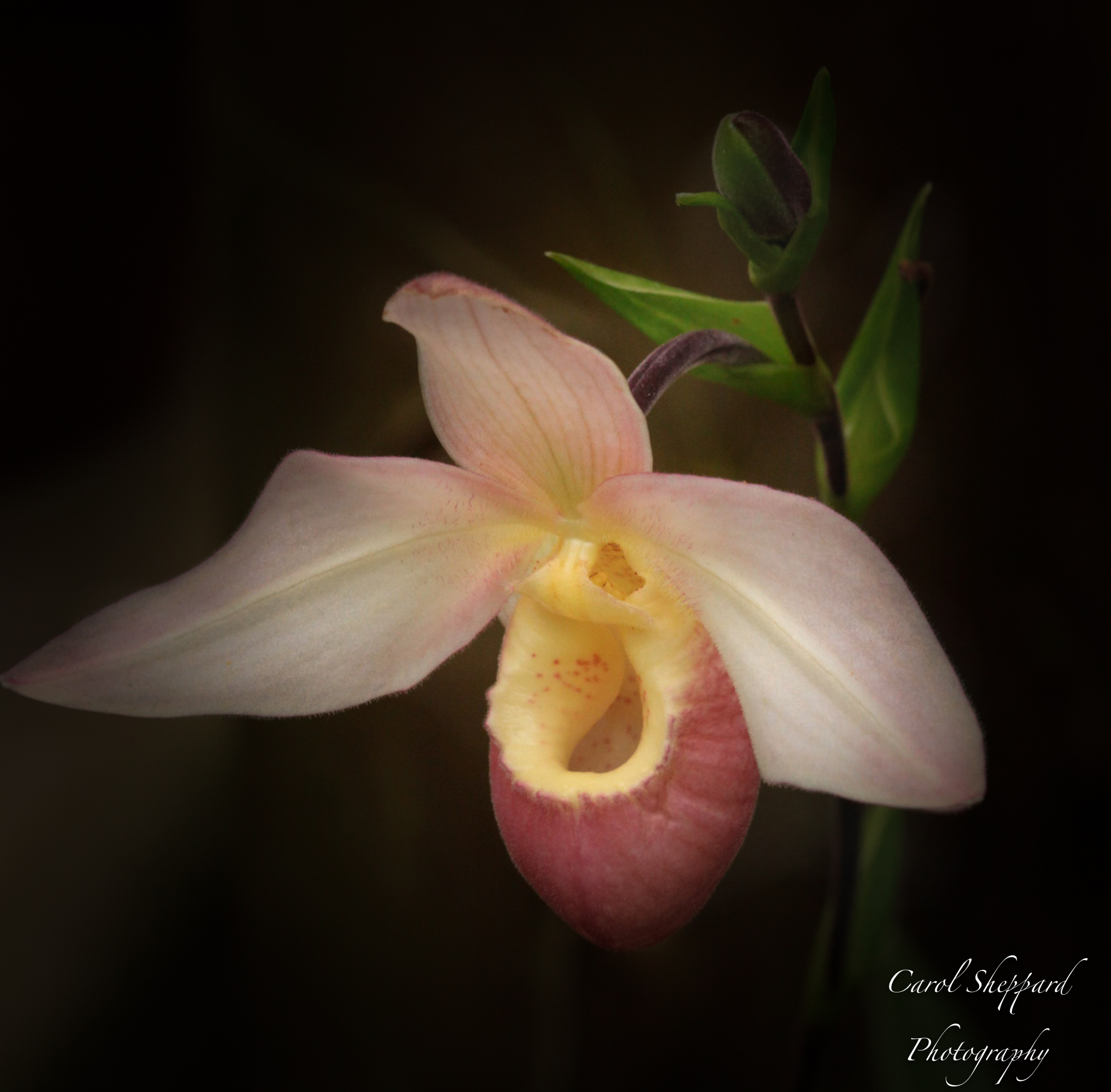
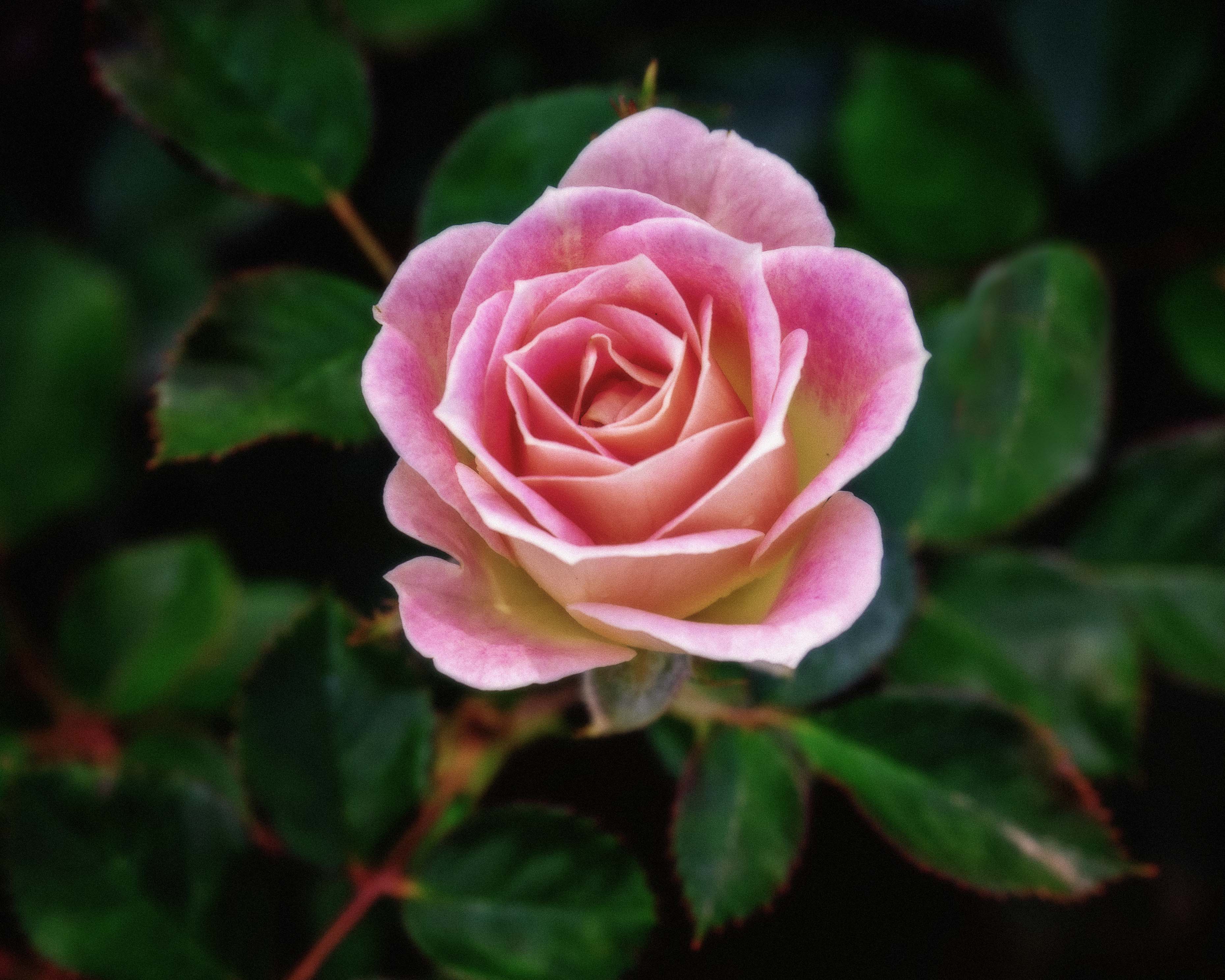
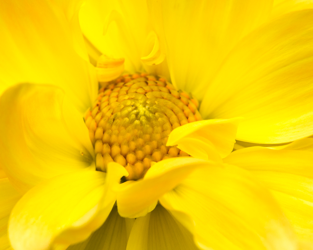
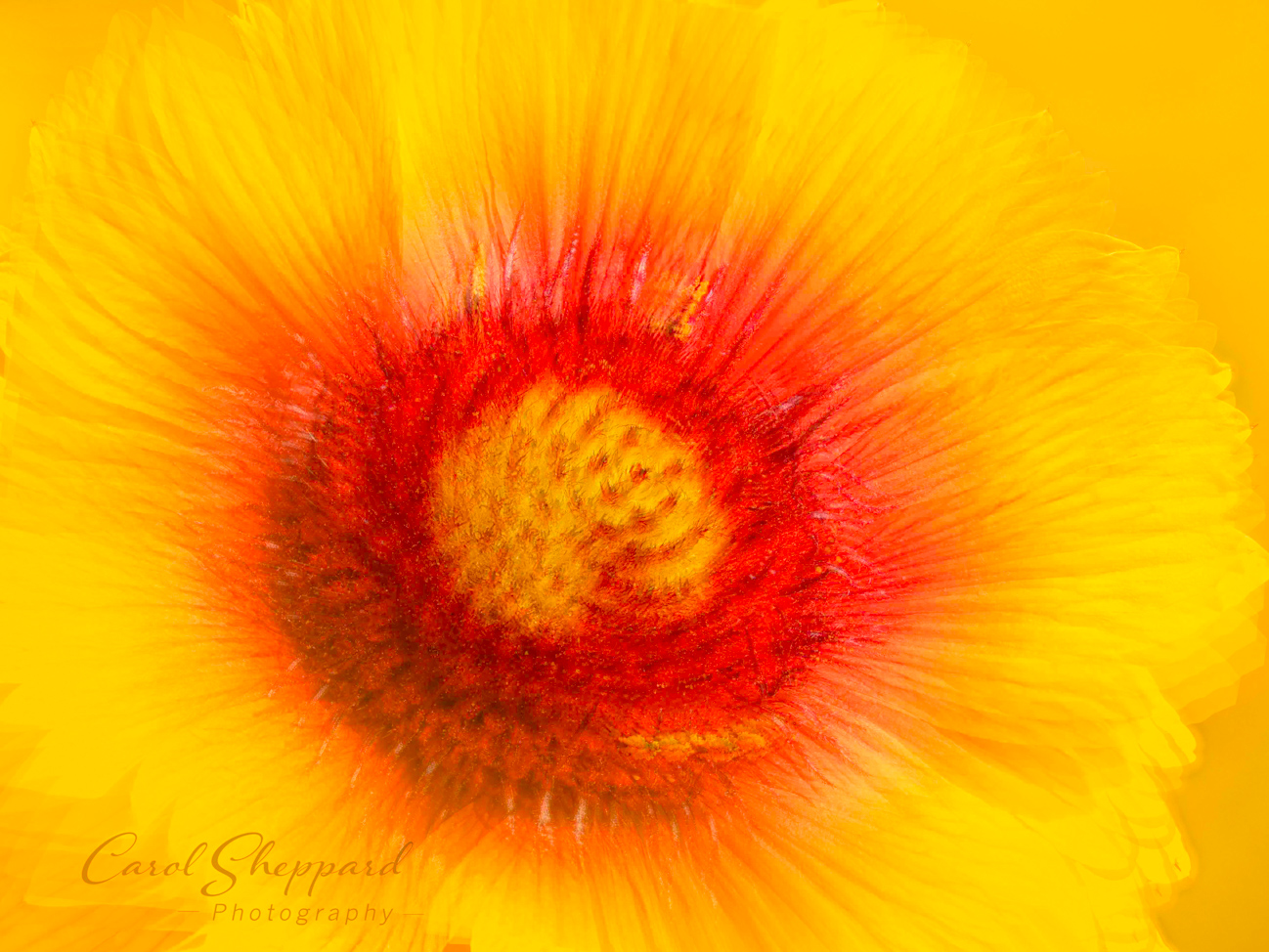
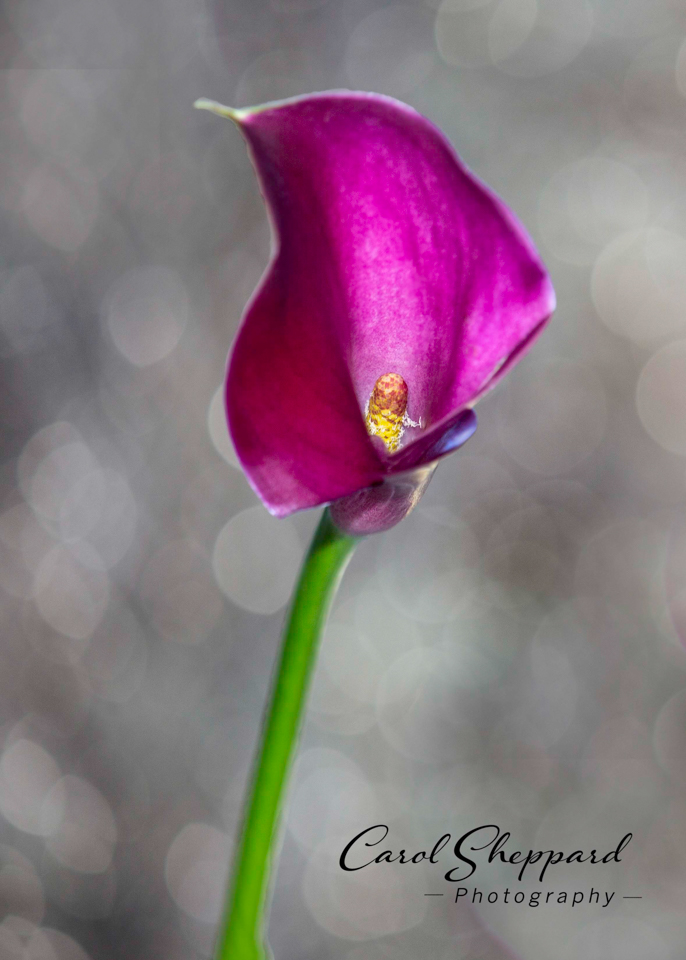
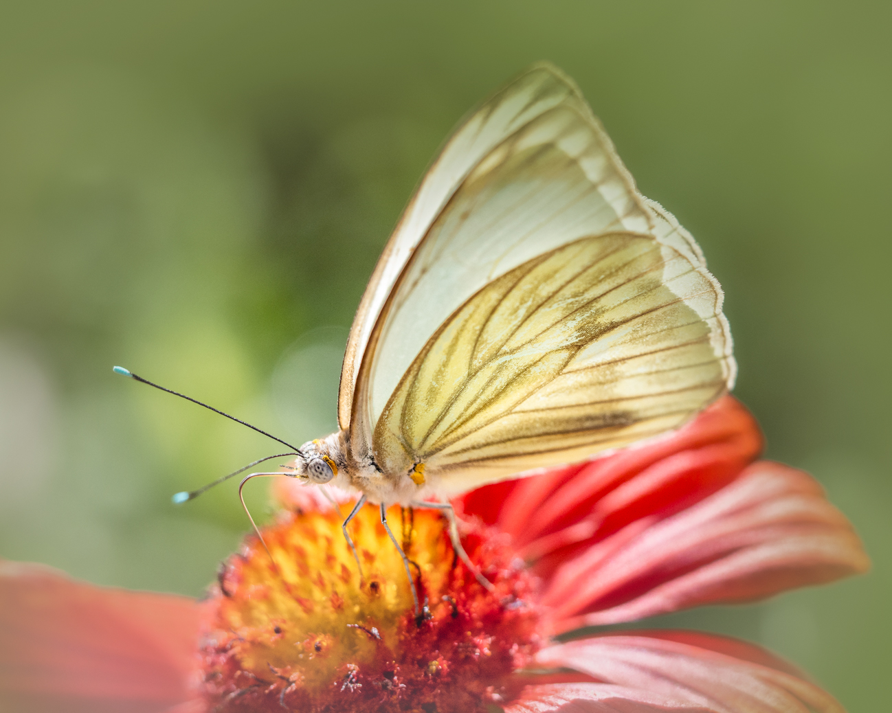
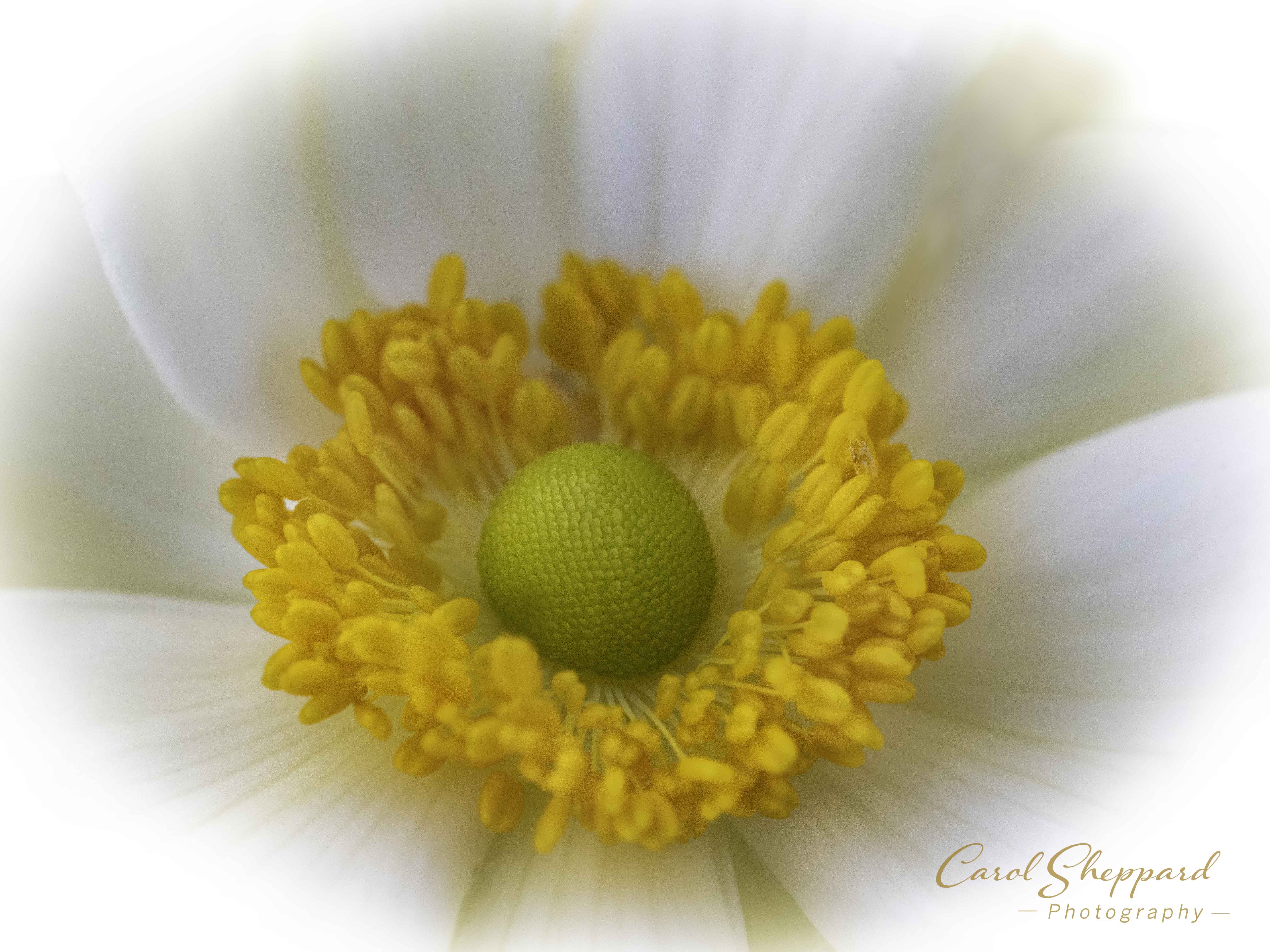
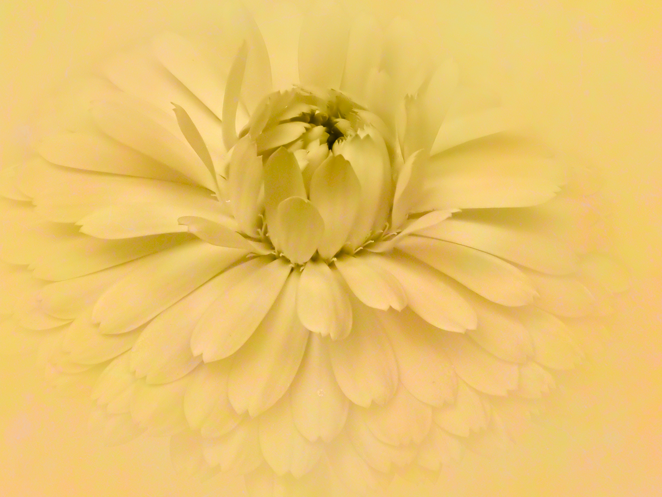
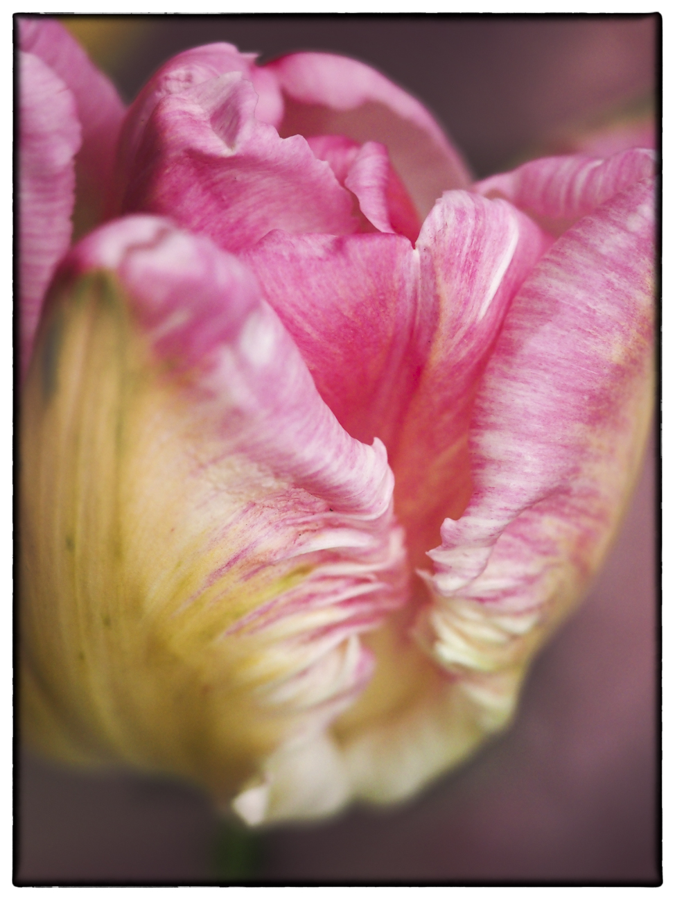
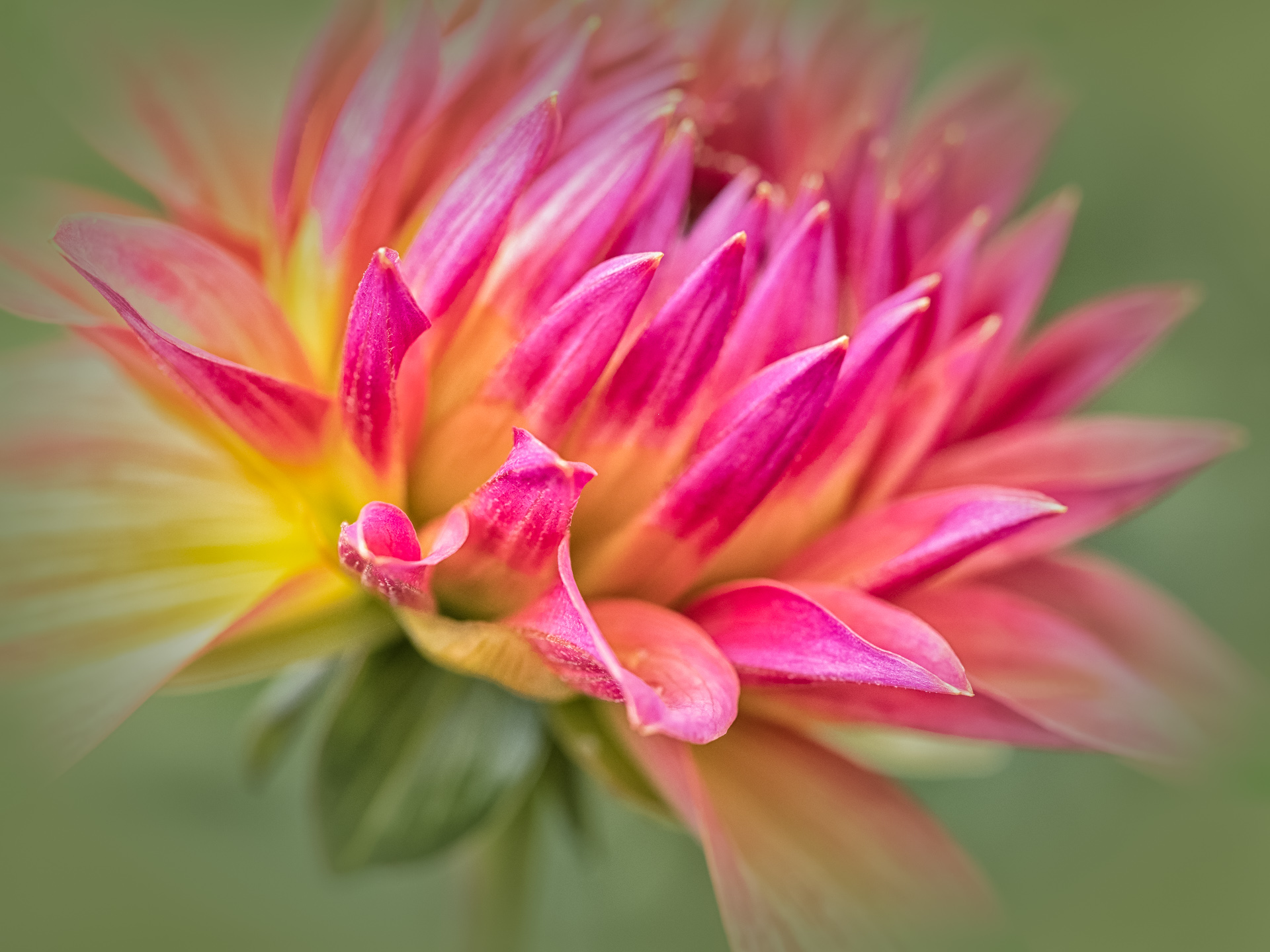
Denise, I want to add to what I said: This is an image that you have to view for awhile. The center begins to glow after the initial view--so kudos on that. Any brightening will have to be done carefully so as to keep that beautiful center effect you have achieved. |
Mar 22nd |
| 60 |
Mar 20 |
Comment |
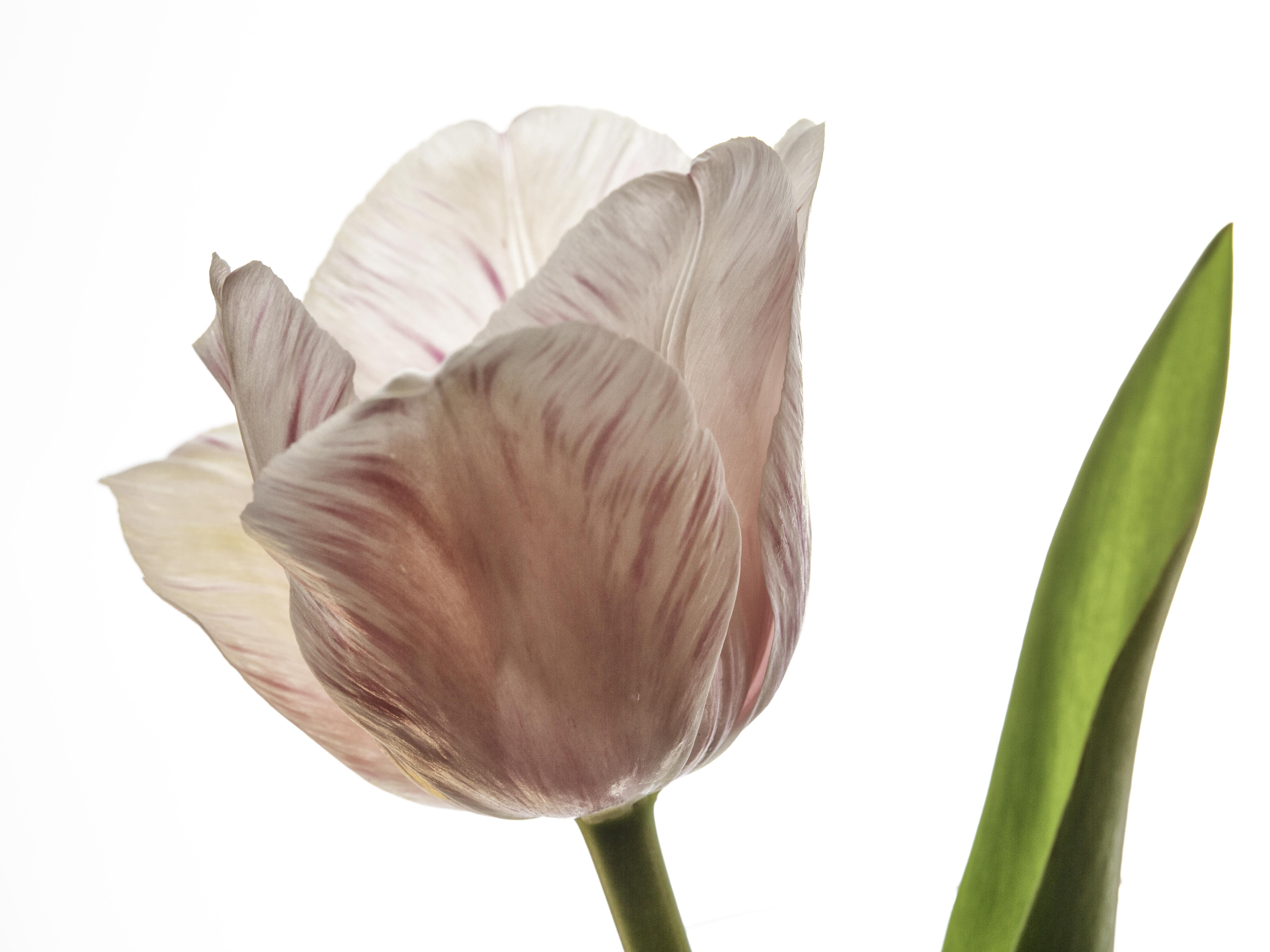
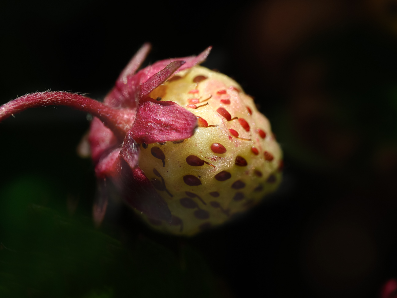
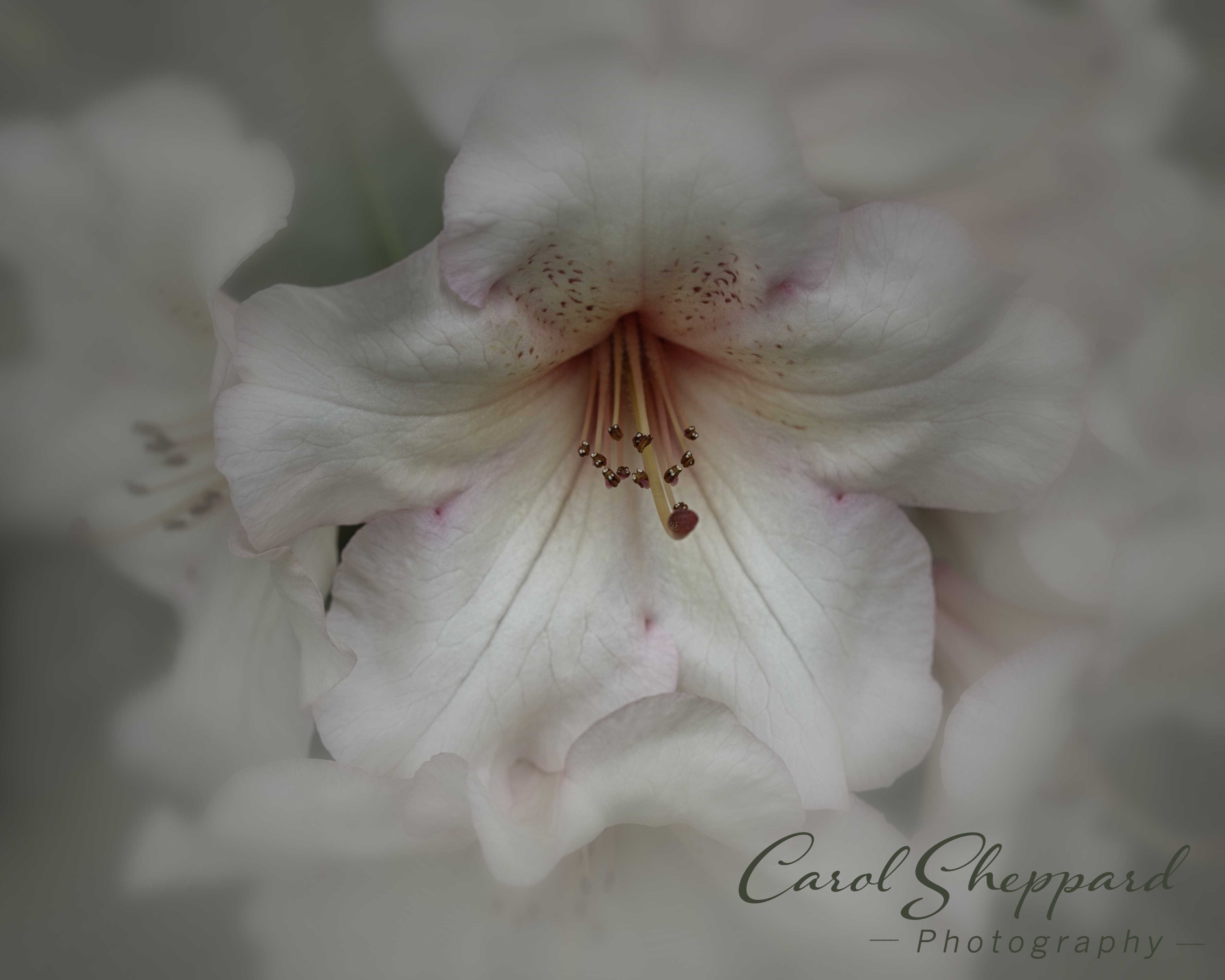
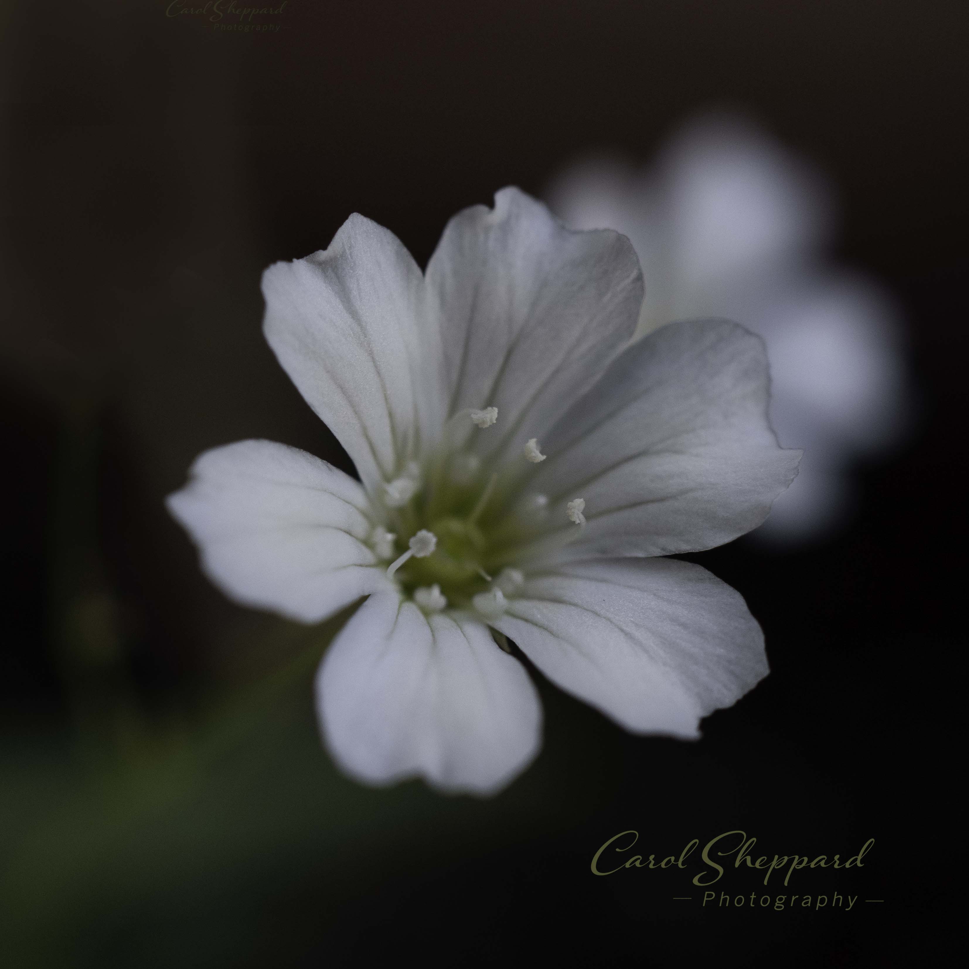
You have met your goal in this, from your description. It feels soft and airy, like falling into a big soft down comforter. The texture is a strong feature, which looks appropriately sharp for what you were trying to achieve. Overall, the image feels dark to me--and I've recently recalibrated my monitor. I feel a blue overtone, which I don't view comfortably on this one. That is very subjective to me, of course. The crop, the composition and the pink vignette all work very well for this image! |
Mar 22nd |
| 60 |
Mar 20 |
Comment |
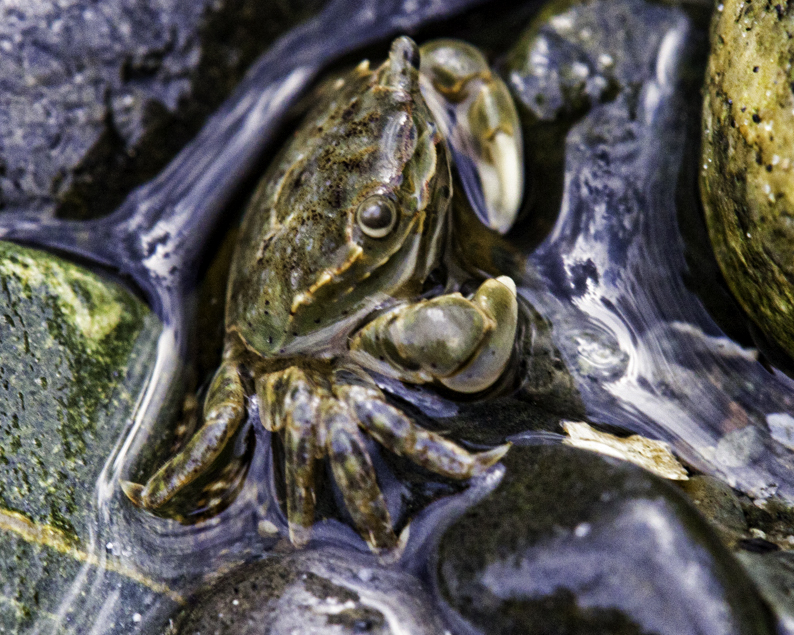
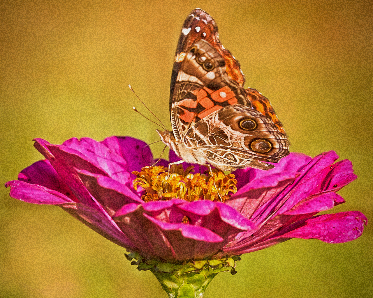
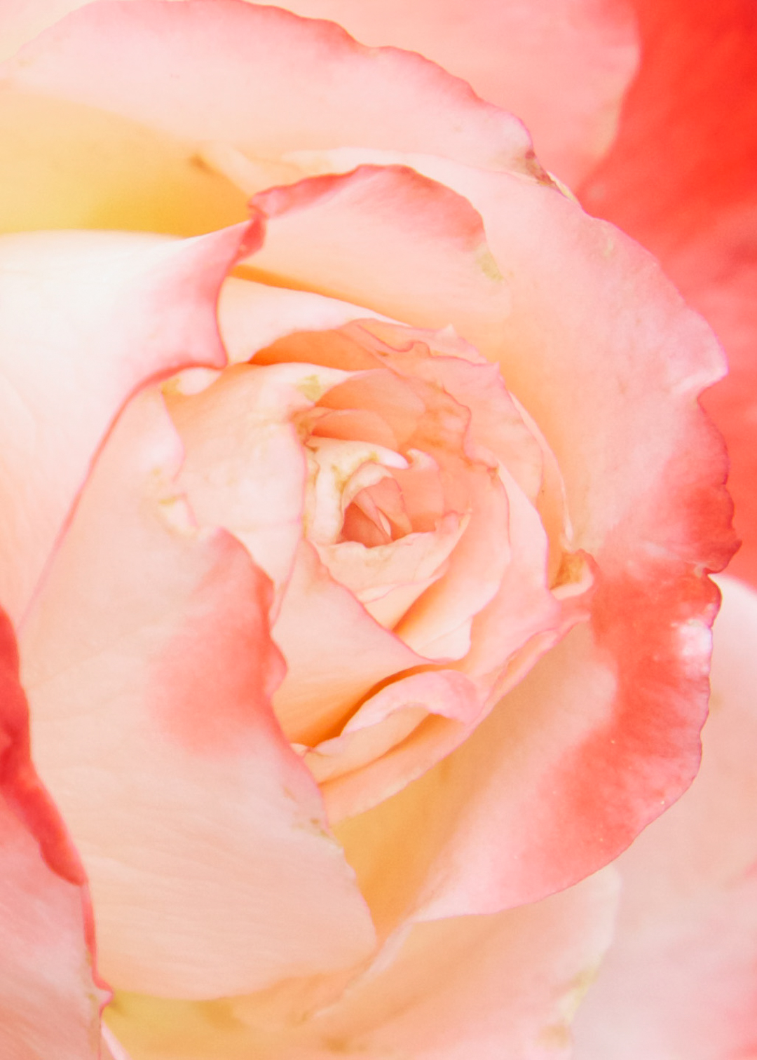
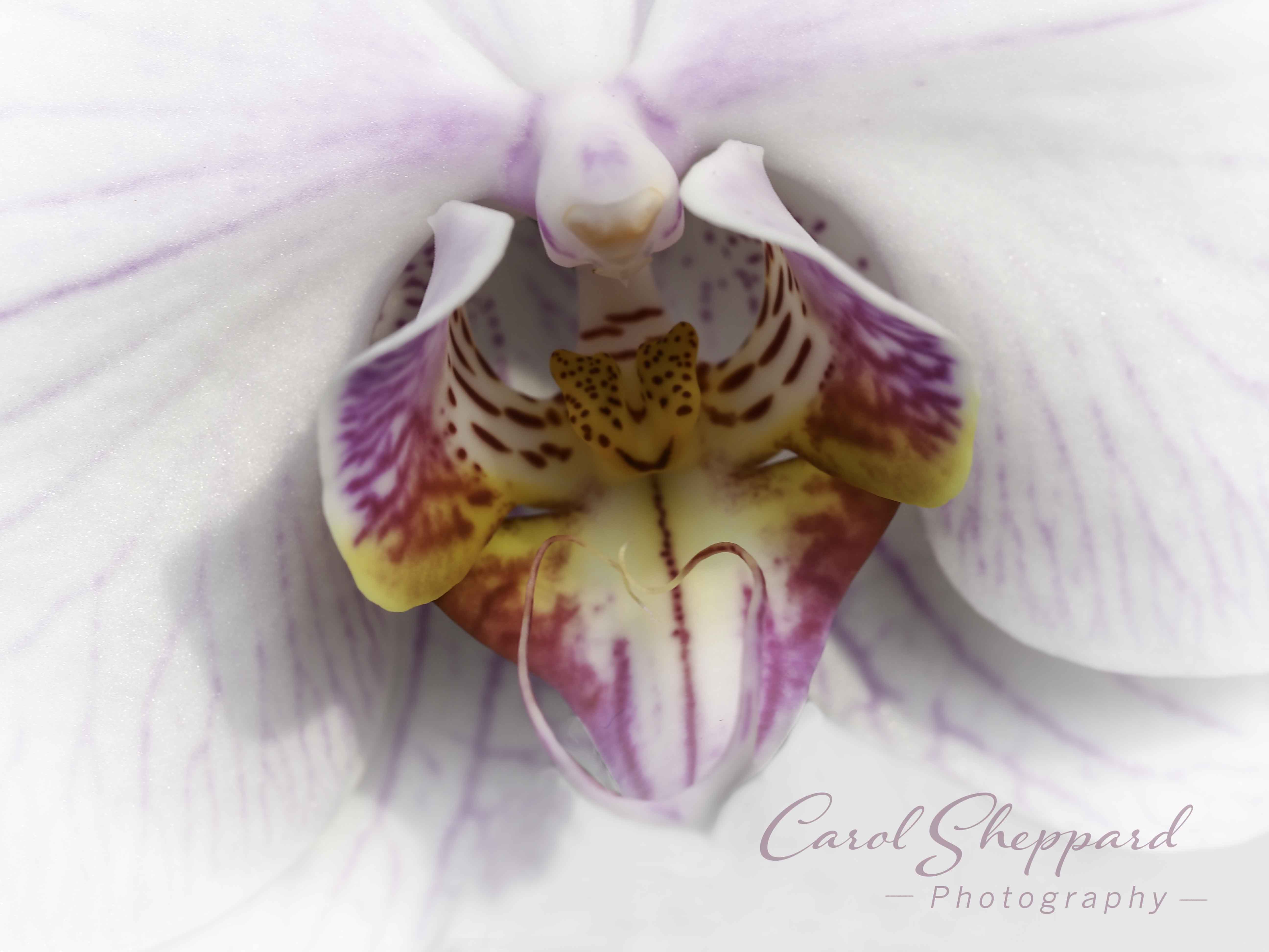
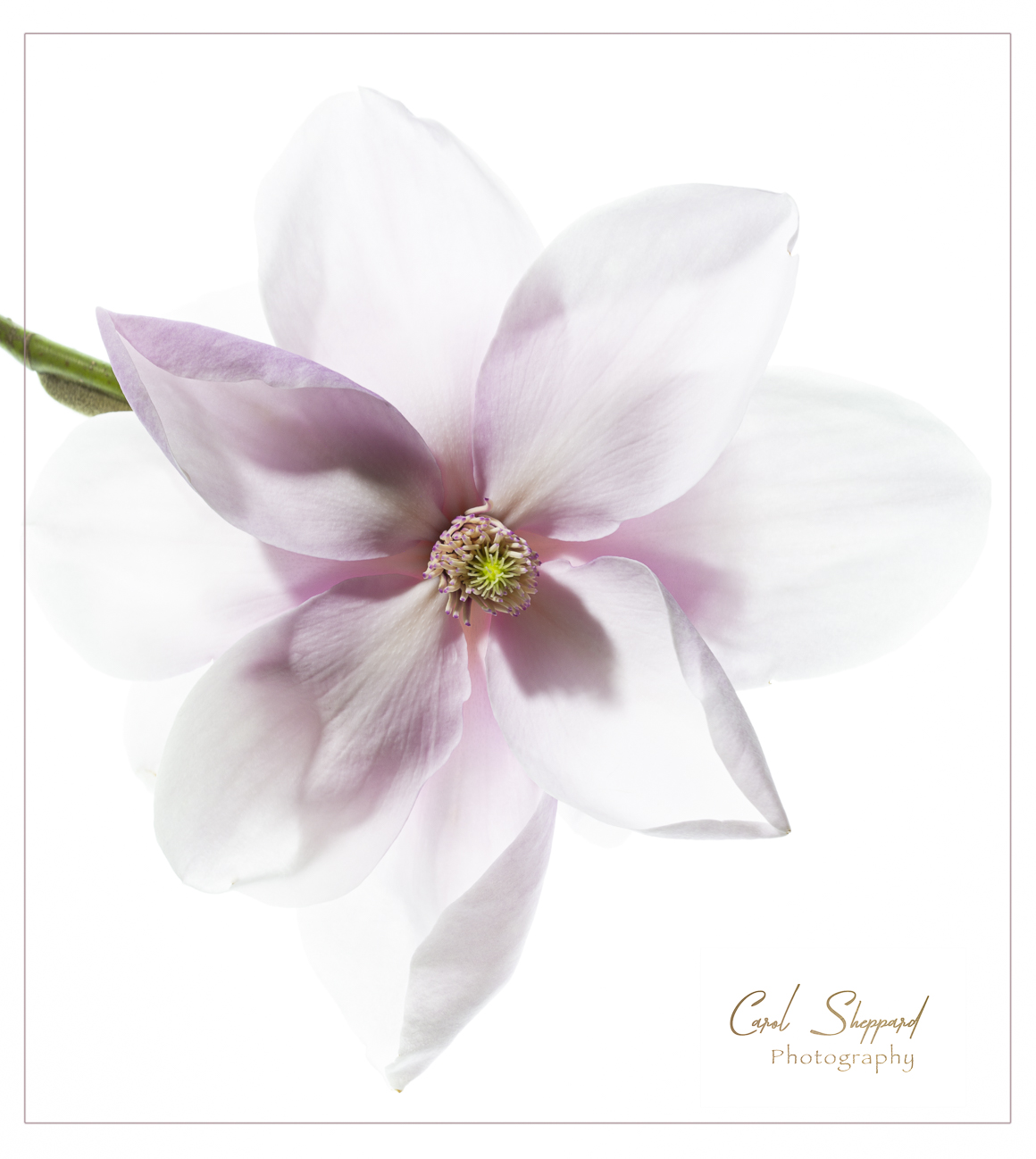
The curves and patterns work well in this. More softness and less competition from the background would make this work better for me personally. I find too much competition from the busy textures of the background. Another thing that is affecting my view are the two strong highlights, which I believe a diffuser or a bounce light could have prevented. I say bounce light because I feel that would also give some "pop" for me on the flower itself. I keep hearing about Longwood--perhaps one day I'll make it there!
|
Mar 22nd |
| 60 |
Mar 20 |
Comment |
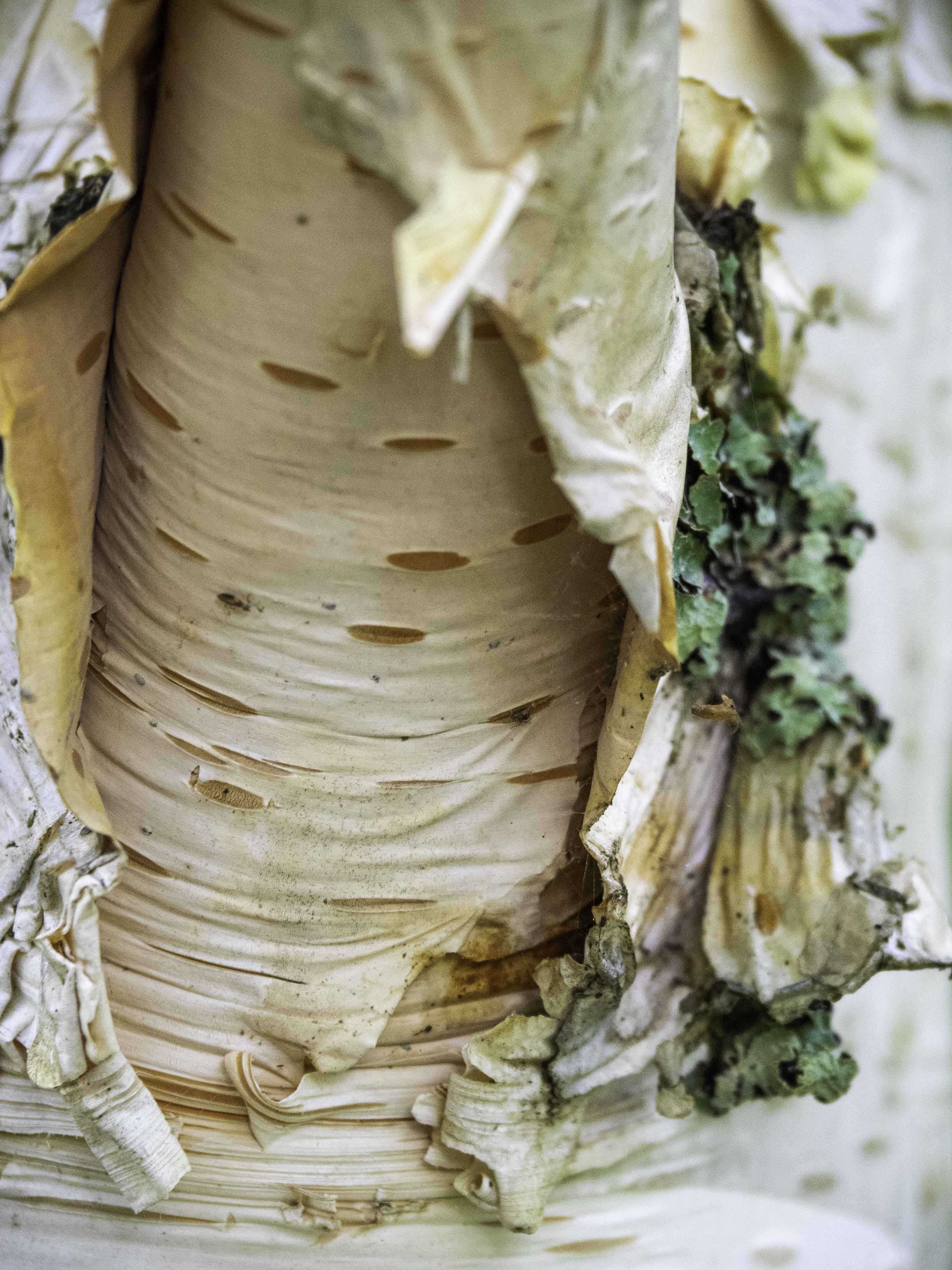
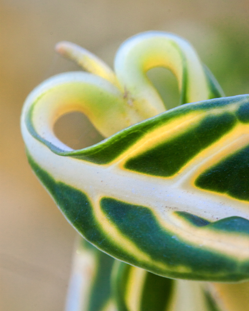
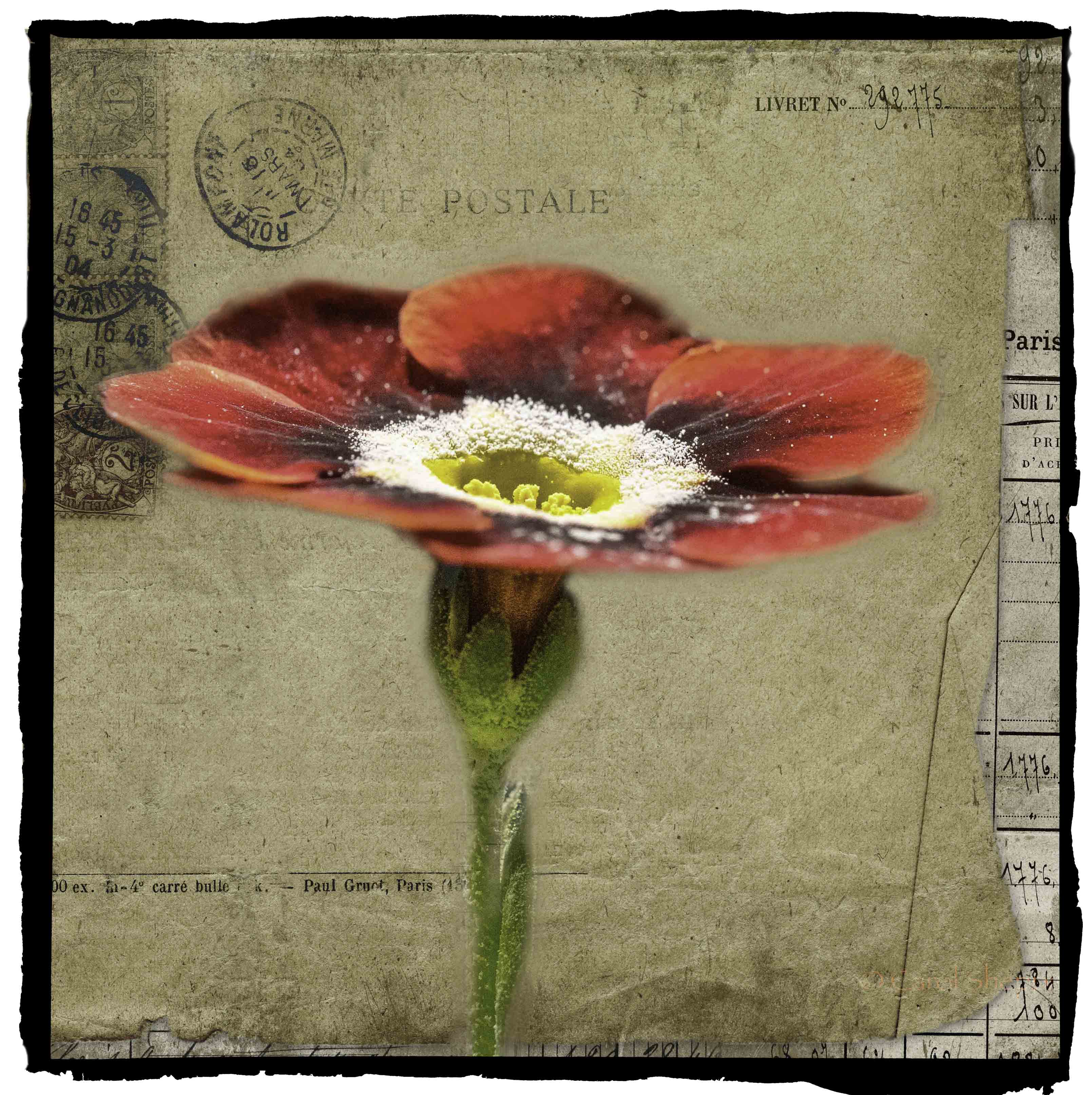
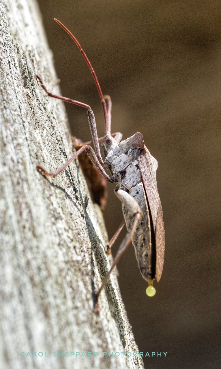
I wouldn't have guessed pine cone! The texture is such a strong part of the impact that I find more appeal for myself the monochrome version, emphasizing texture as it does. Alternatively, lessening the blue and maybe making it a uniform brown, but with the different tones, would do the same thing for bringing out more texture? Interesting treatment for viewing; I personally am not finding the blues add to what you've done. But technically, you did great with the depth. |
Mar 22nd |
| 60 |
Mar 20 |
Comment |
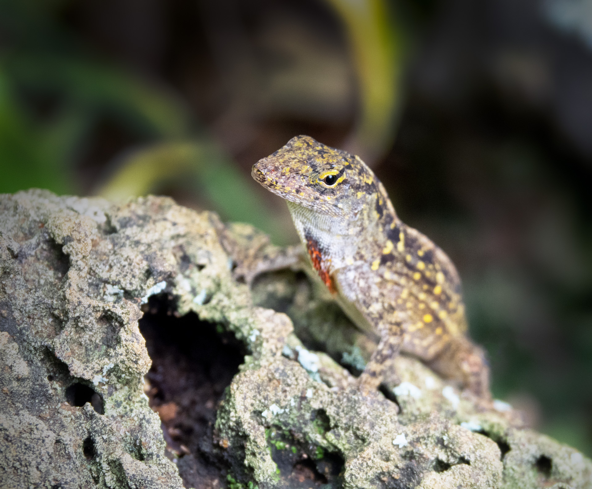
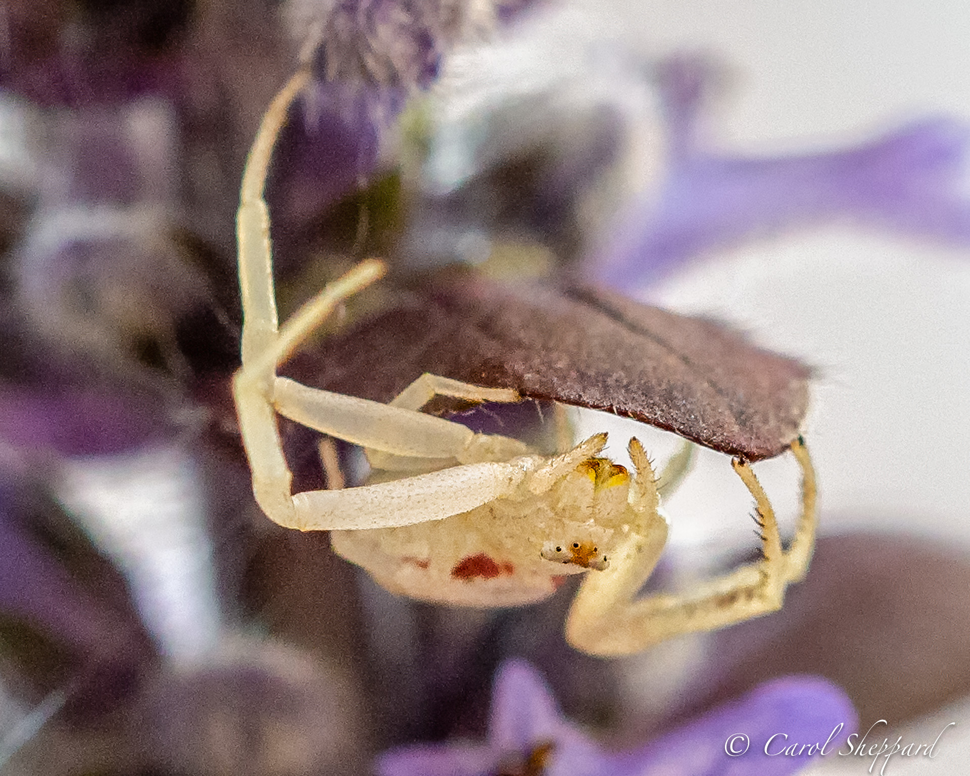
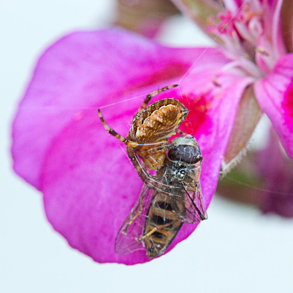
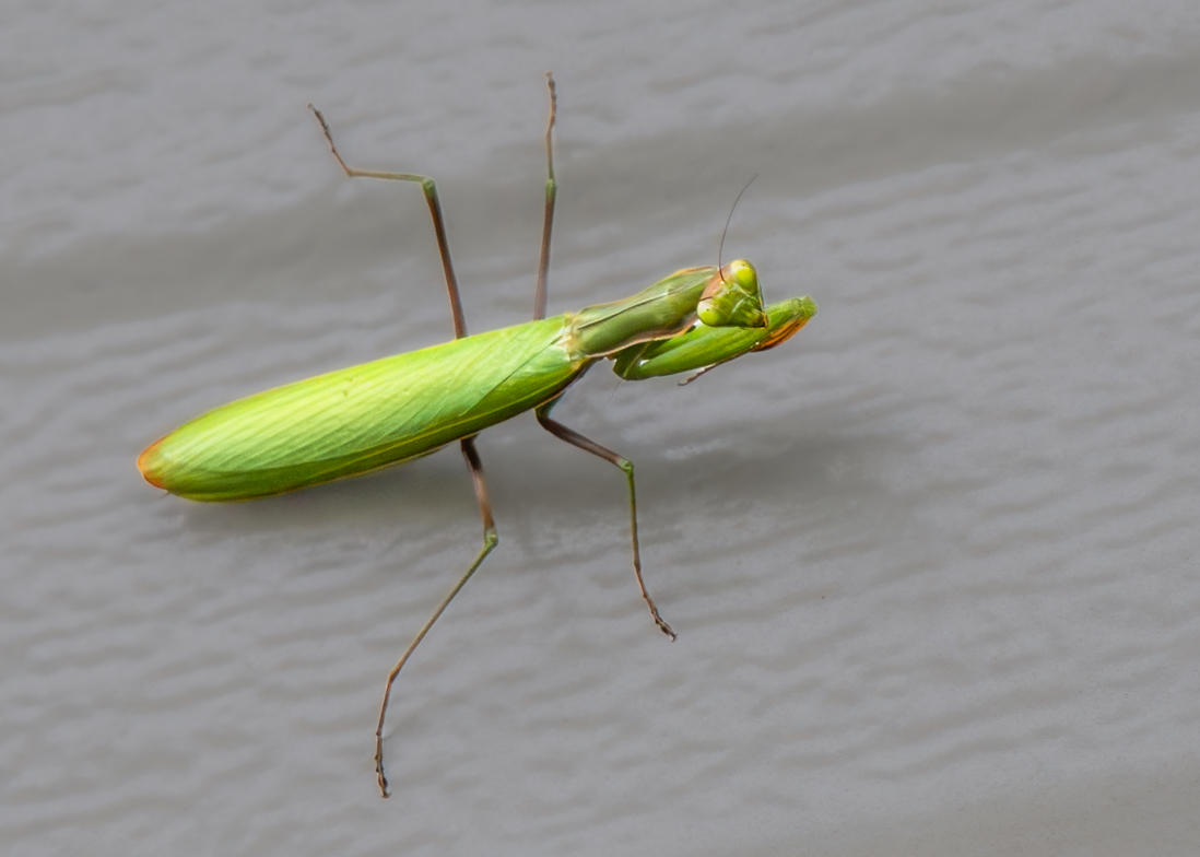
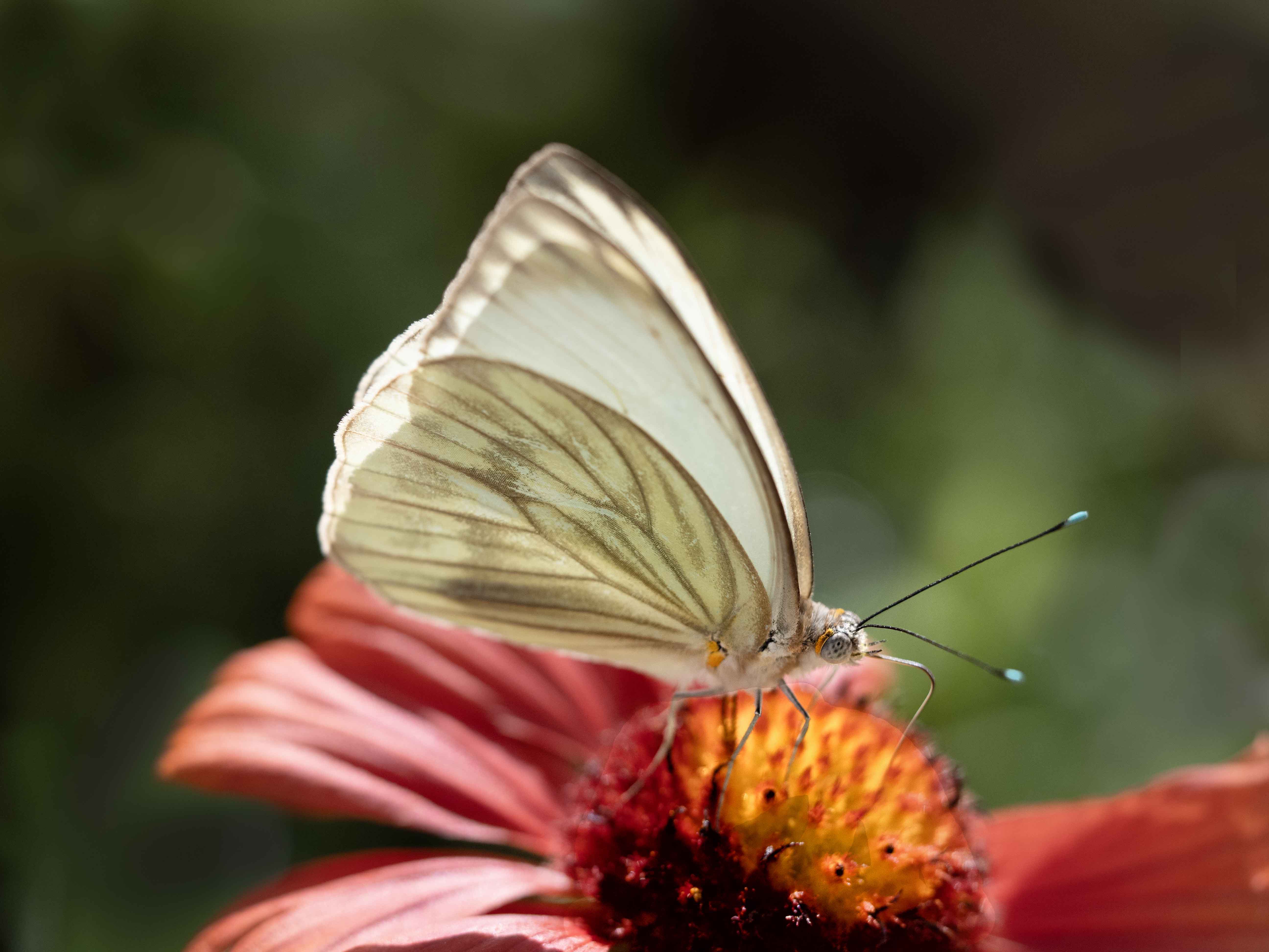
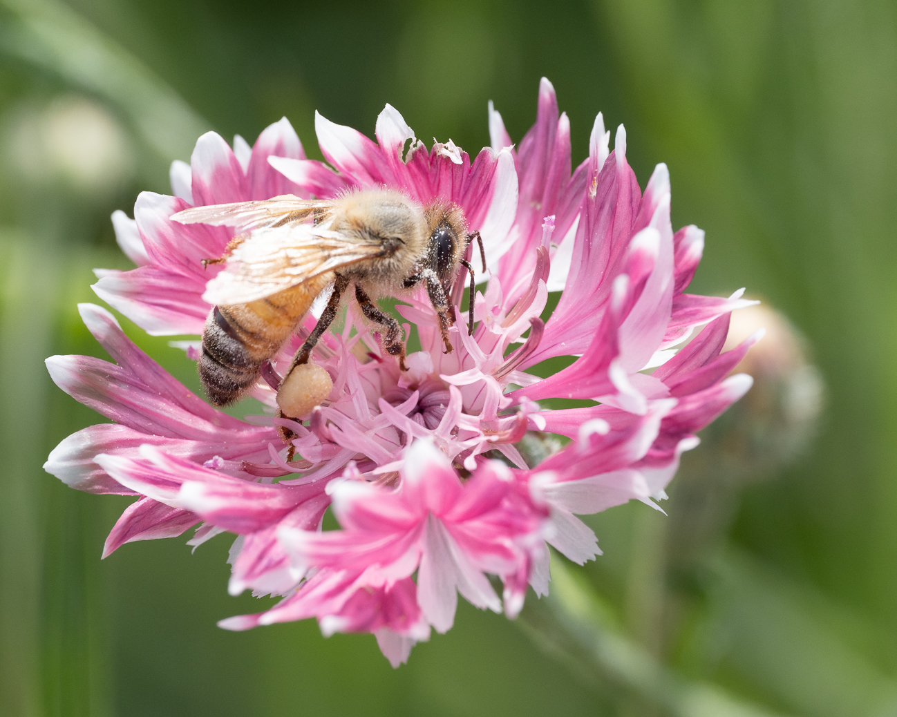
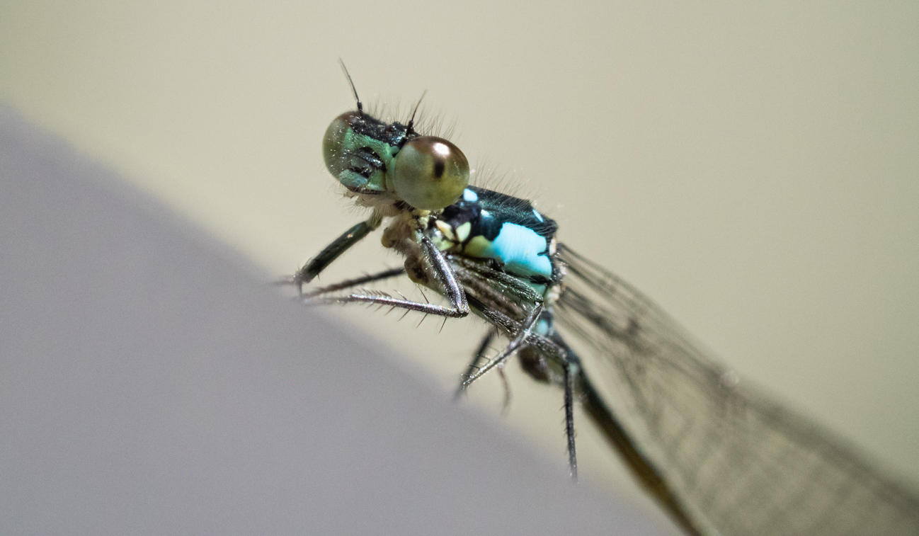
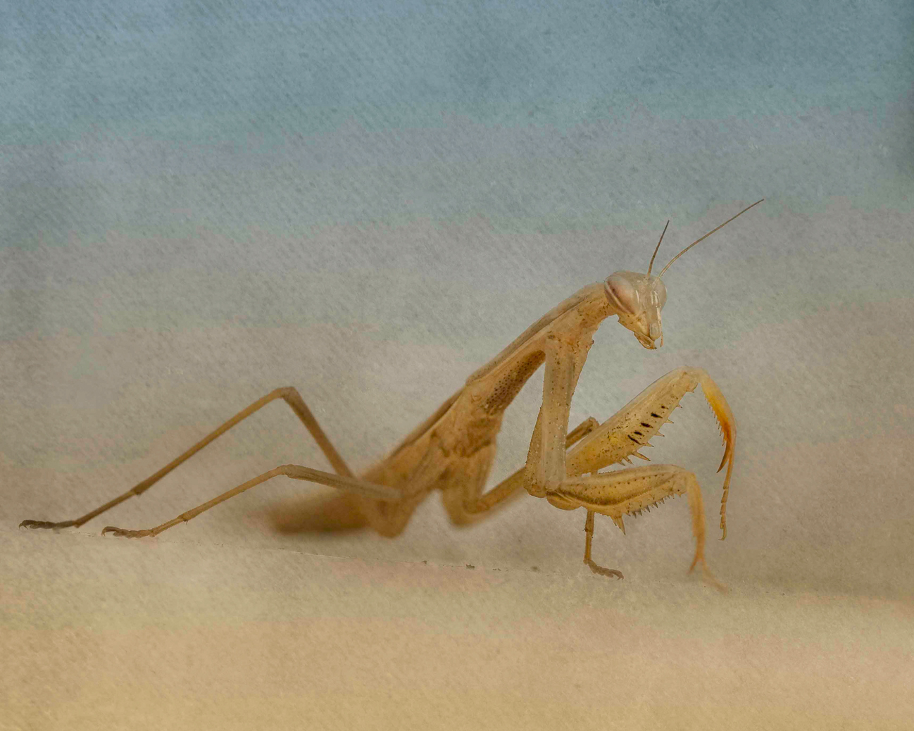
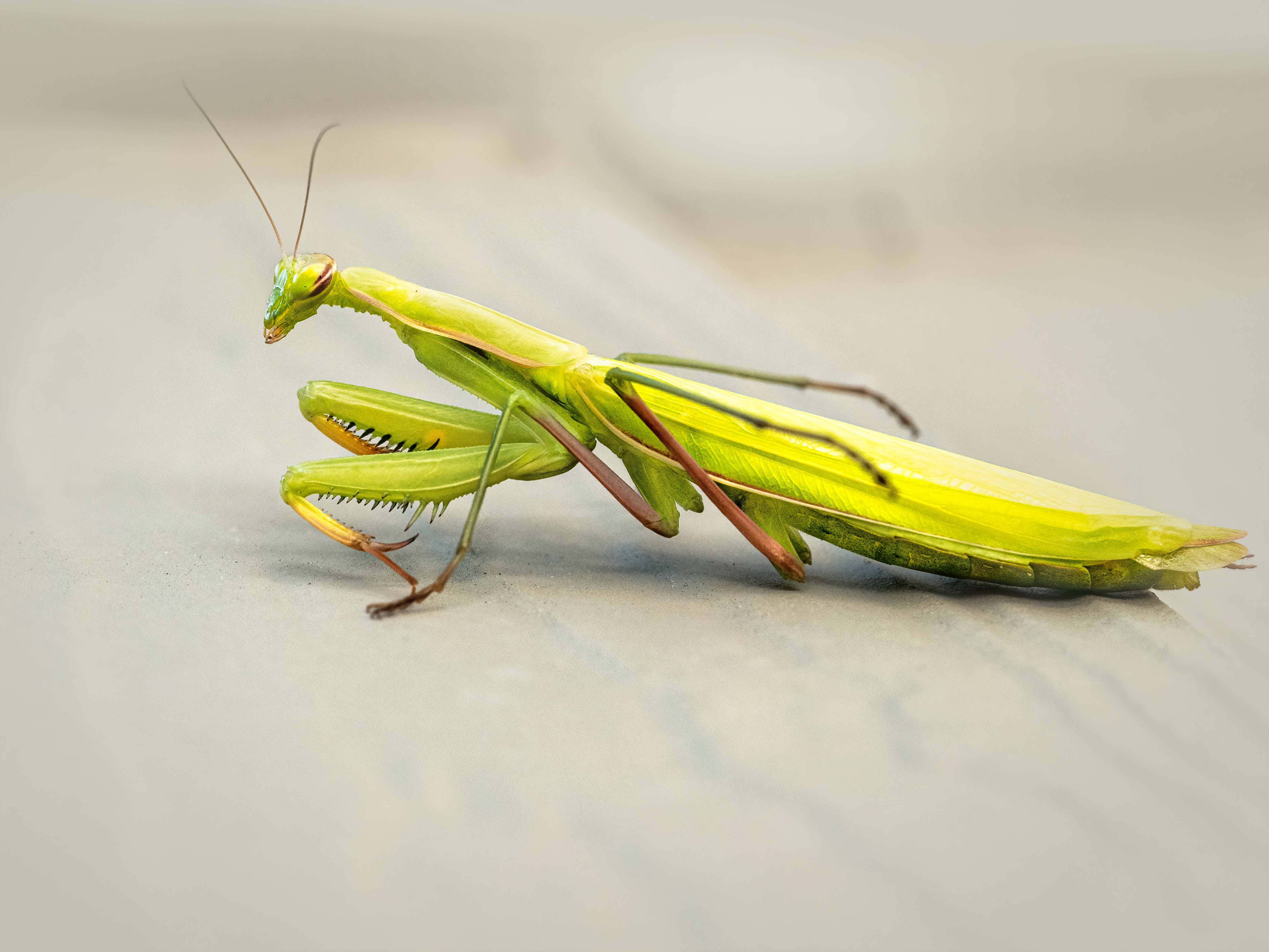
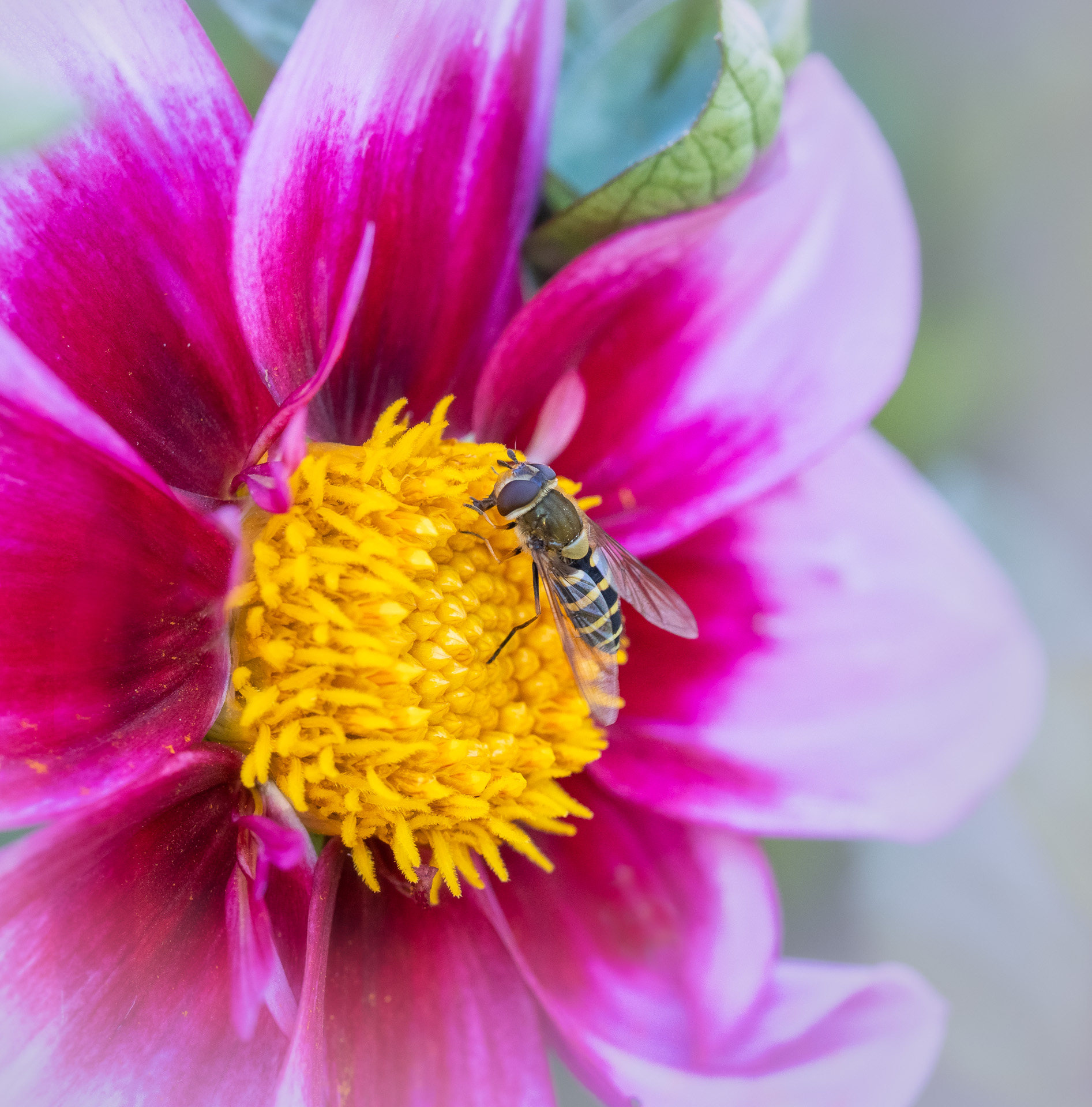
Hi Jennifer, I feel like your image is strong as is--although different cropping is personal preference. The context works well for me, especially since it is soft enough to let the strong pink color to give a lovely contrast to the greenery and the bug. In the 2nd crop shown, it bothers my eye to see the plant cut off where it is. But in your third crop, the crop works well. The insect's face is nicely sharp; his positioning to your camera really pulls me in. I think this is a great nature and macro image! |
Mar 22nd |
| 60 |
Mar 20 |
Reply |
Thanks, Everyone, for your input! I look forward to both our images and the input each month!! |
Mar 22nd |
| 60 |
Mar 20 |
Reply |
Yes, that green is moss, and that is it's natural kelly greenish color, but I will deepen the luminousity to make it less distracting. Thanks!
|
Mar 22nd |
5 comments - 3 replies for Group 60
|
| 80 |
Mar 20 |
Reply |
I prefer the Black and White, but like the car as it shows to what lengths they've gone to get that picture: they look like stalkers!! |
Mar 22nd |
| 80 |
Mar 20 |
Comment |
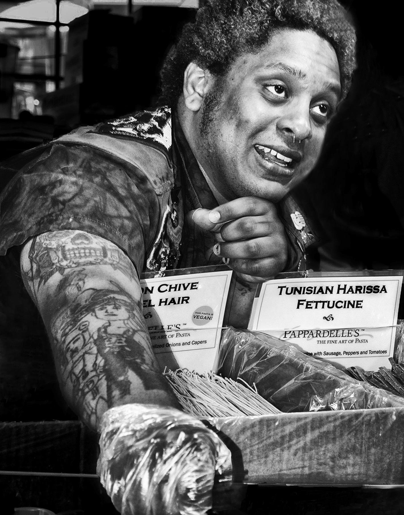
The capture of the couple is wonderful. It took me awhile to understand the wreath; it still didn't feel to me like they were poised to shoot through the wreath on a window. Perhaps their positioning? Without the wreath, its a great showing of a woman used as human tripod!! My eyes were drawn first to the words and then the wreath, finally to the man, and not to the woman until I read what you'd written in trying to find out why the wreath was hanging there. I would suggest lightening the area where the couple is, and darkening the letters at least, so that the first impression is of the couple. The area of the group across the street is light enough already to bring it into the story. |
Mar 22nd |
| 80 |
Mar 20 |
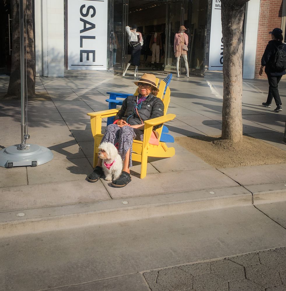
Comment |
I do that intentionally when I photograph someone on the street without permission. Although it is not my intent to sell, I feel like I'm invading their privacy a bit, so it has been my habit that unless I ask, I wait until their face is turned away somewhat. Not always, but generally. |
Mar 10th |
| 80 |
Mar 20 |
Comment |
Thanks, Victor! I've never tried that method so will try it! |
Mar 9th |
| 80 |
Mar 20 |
Comment |
Thanks, Victor! I've never tried that method so will try it! |
Mar 6th |
| 80 |
Mar 20 |
Comment |
|
Mar 6th |
| 80 |
Mar 20 |
Reply |
Much much better! Was the auto level adjustment in LR? Or photoshop? |
Mar 6th |
| 80 |
Mar 20 |
Comment |
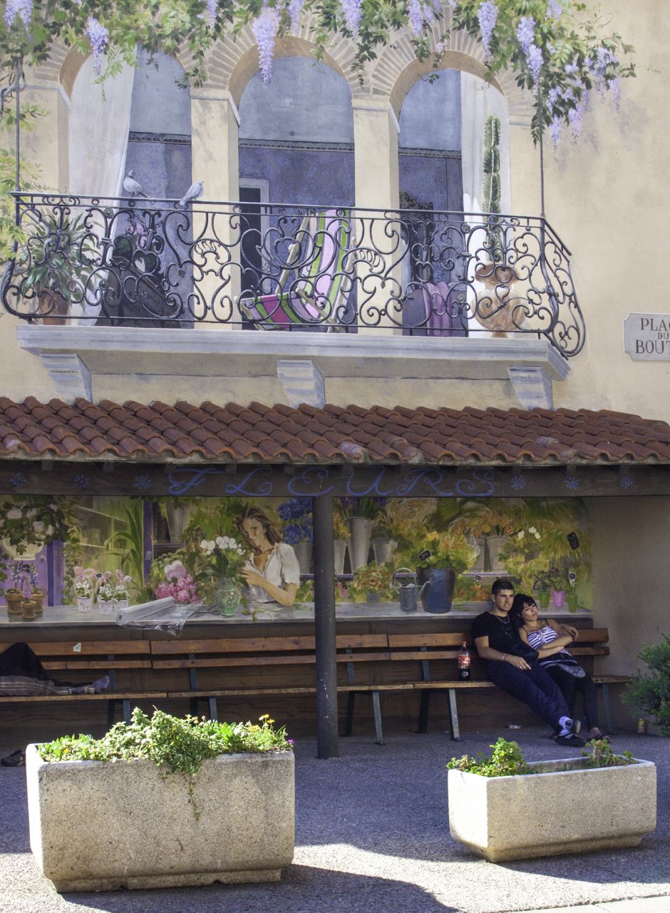
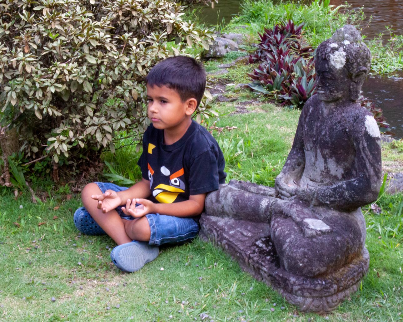
The strongest part of this, for me, is how you've used the fencelines and the bench lines to lead me into the subject, which I think are the individuals framed by the overhanging trees. And that is very strong. What caught my eye, initially, though, may be one of its weaker points, and that is the crooked perspective. I feel like I'm standing on a slant. Maybe if you brought down the right side somewhat? The other suggestion is to lighten the exposure generally. It feels dark, which puts it at odds with what I think of as a day of outdoors and exercise. Finally, while I understand that the benches are helpful in leading my eye, I would like to lose the bottom 1/4, bringing it all forward. The main subjects are so small and, for me, difficult to discern. You might be able to crop right before the benches or partway through them, which would make me feel I was an observer sitting on the bench?
|
Mar 2nd |
| 80 |
Mar 20 |
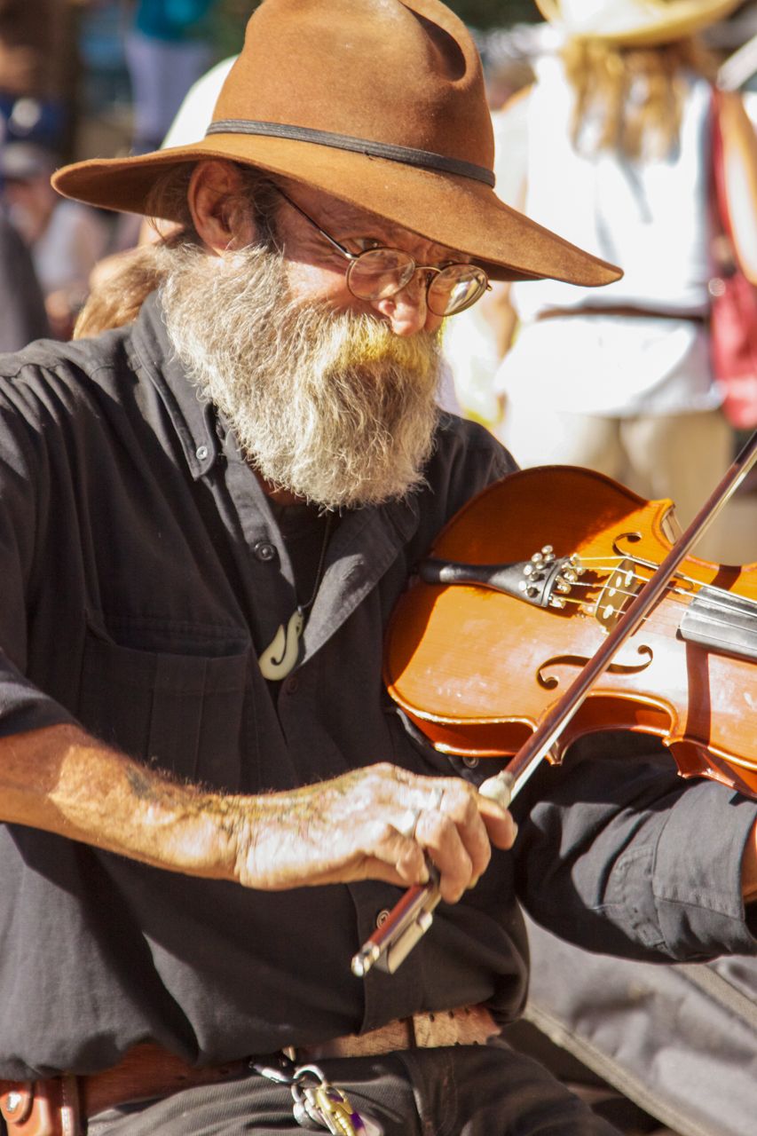
Comment |
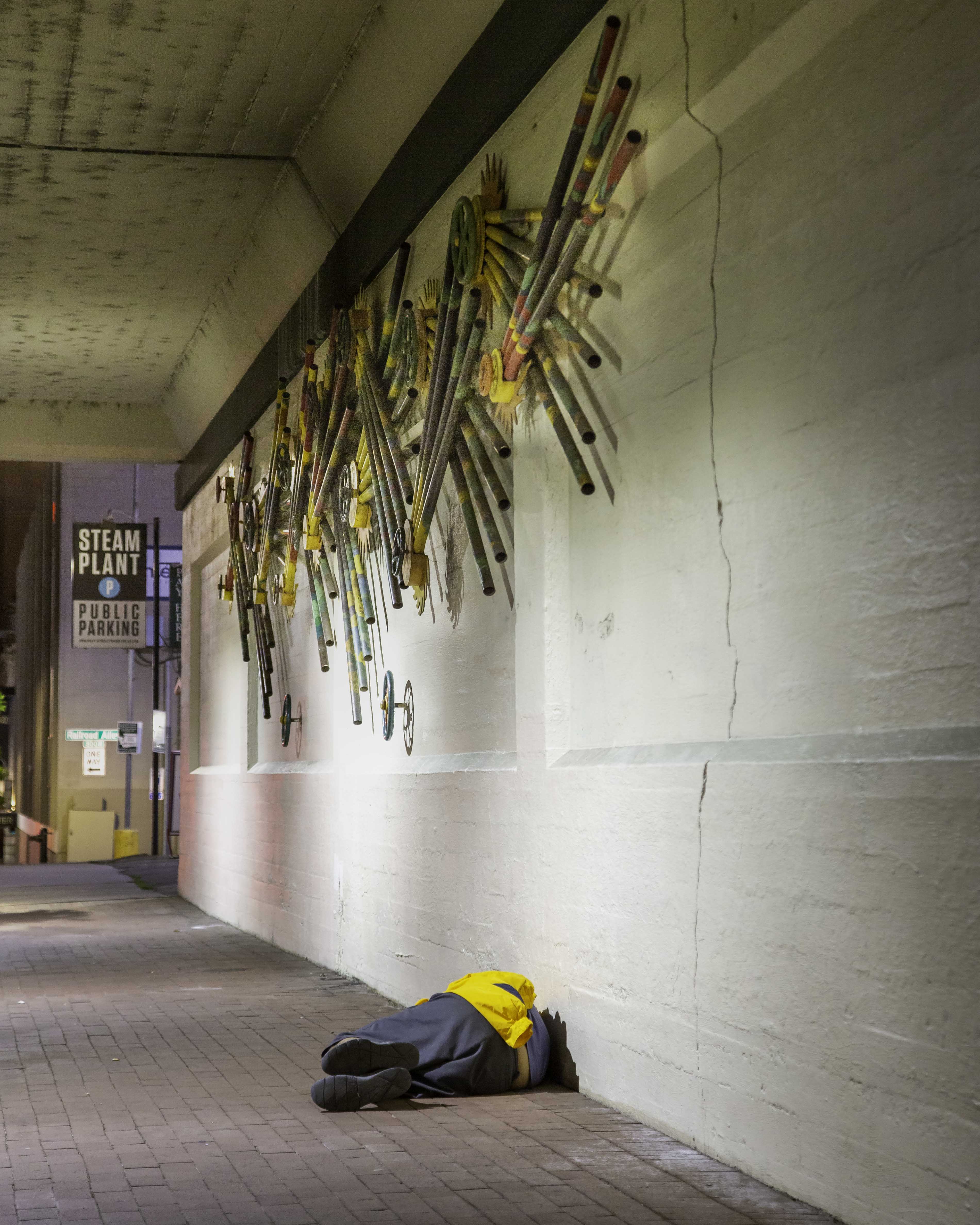
The mood created by your treatment of this is fantastic! Your composition leads my eyes right into the image and the alleyway. I love the tonal range. At first I thought he was carrying a sawed-off shotgun! Your capture of his posture and the set of his back makes this image! Great shot! |
Mar 2nd |
| 80 |
Mar 20 |
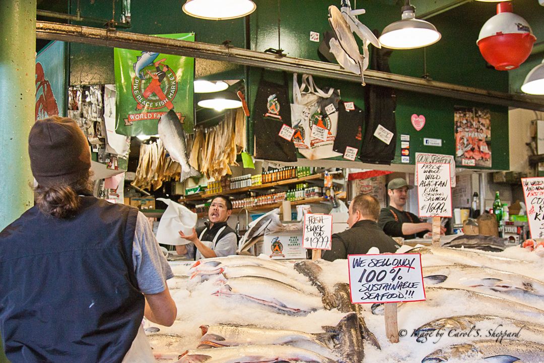
Comment |
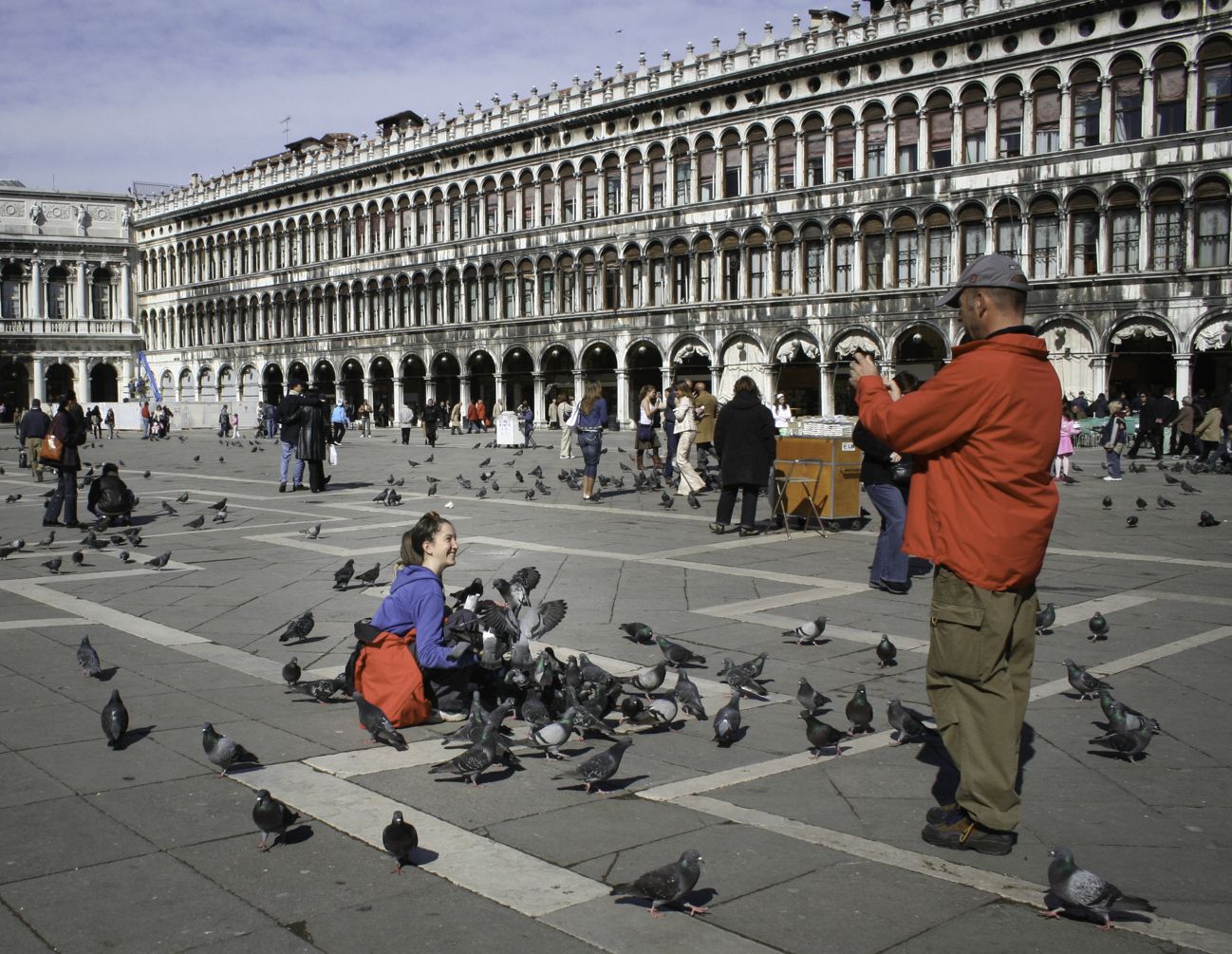
The placement of the individuals vis-a-vis the camera makes a great impact from their interaction. The surroundings of the fish contribute to setting the scene as well. It is sharp with great clarity of the individual components. How interesting that you got such clear background elements with that lens at that focal length. I wish I understood more about this, but I would have guessed it would have put the background in less clarity. Anybody know more about this? |
Mar 2nd |
| 80 |
Mar 20 |
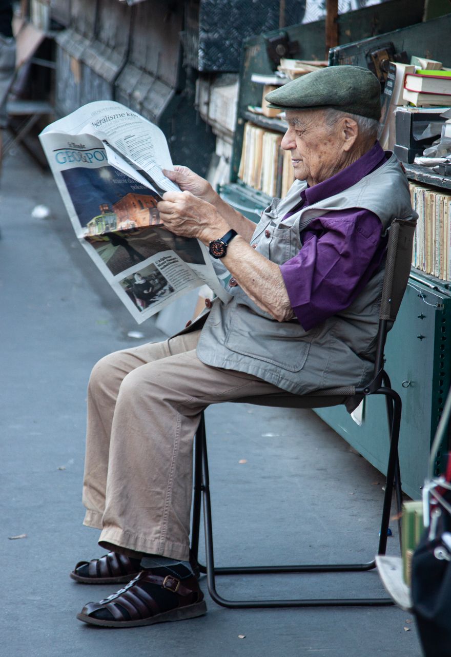
Comment |
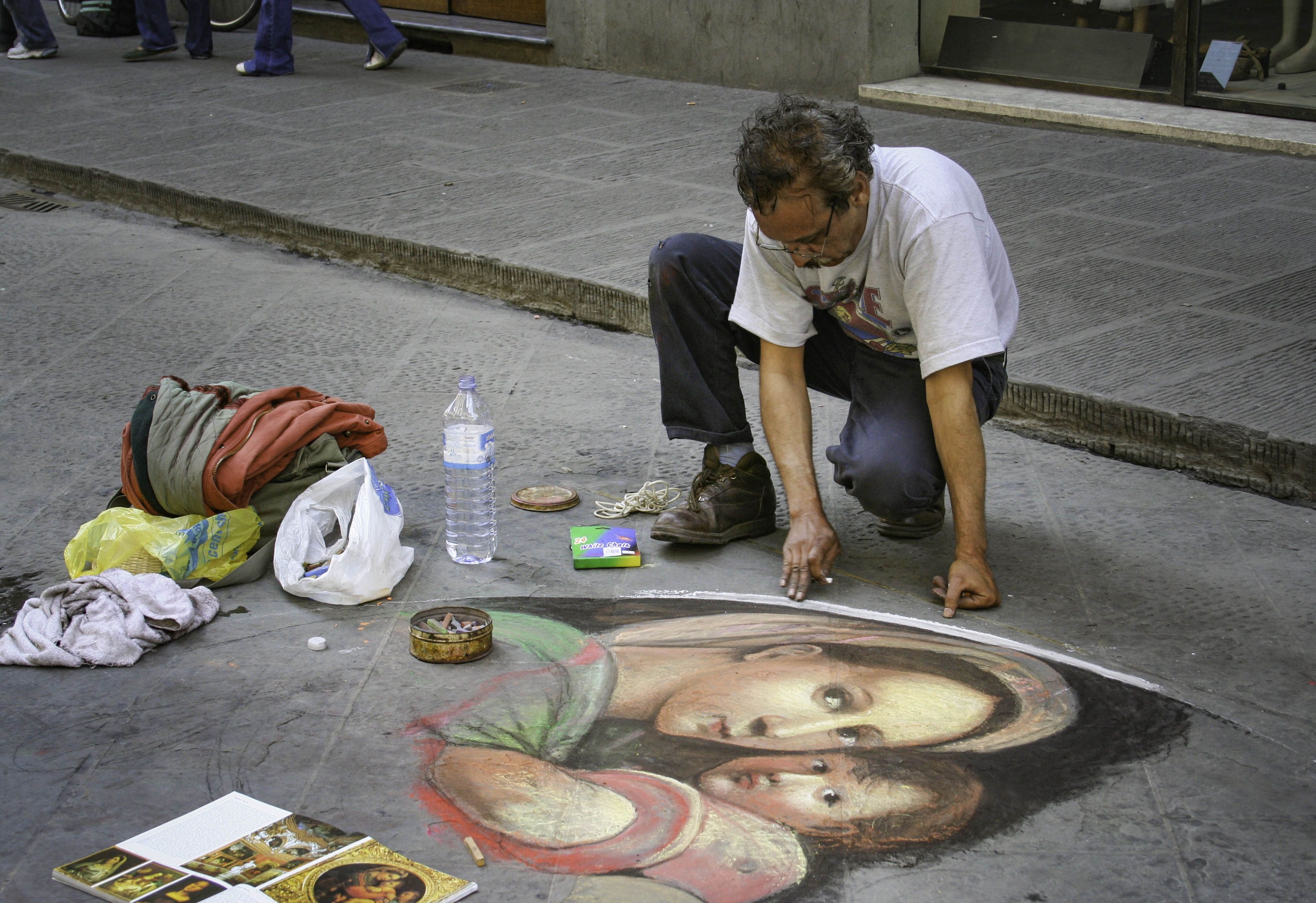
Yes, distracting to me, too. I tried the crop, but it was too tight. I could do it with Photoshop. Do you think I should or does that ruin the spirit of street photography?
|
Mar 2nd |
9 comments - 2 replies for Group 80
|
14 comments - 5 replies Total
|