|
| Group |
Round |
C/R |
Comment |
Date |
Image |
| 58 |
Feb 20 |
Comment |
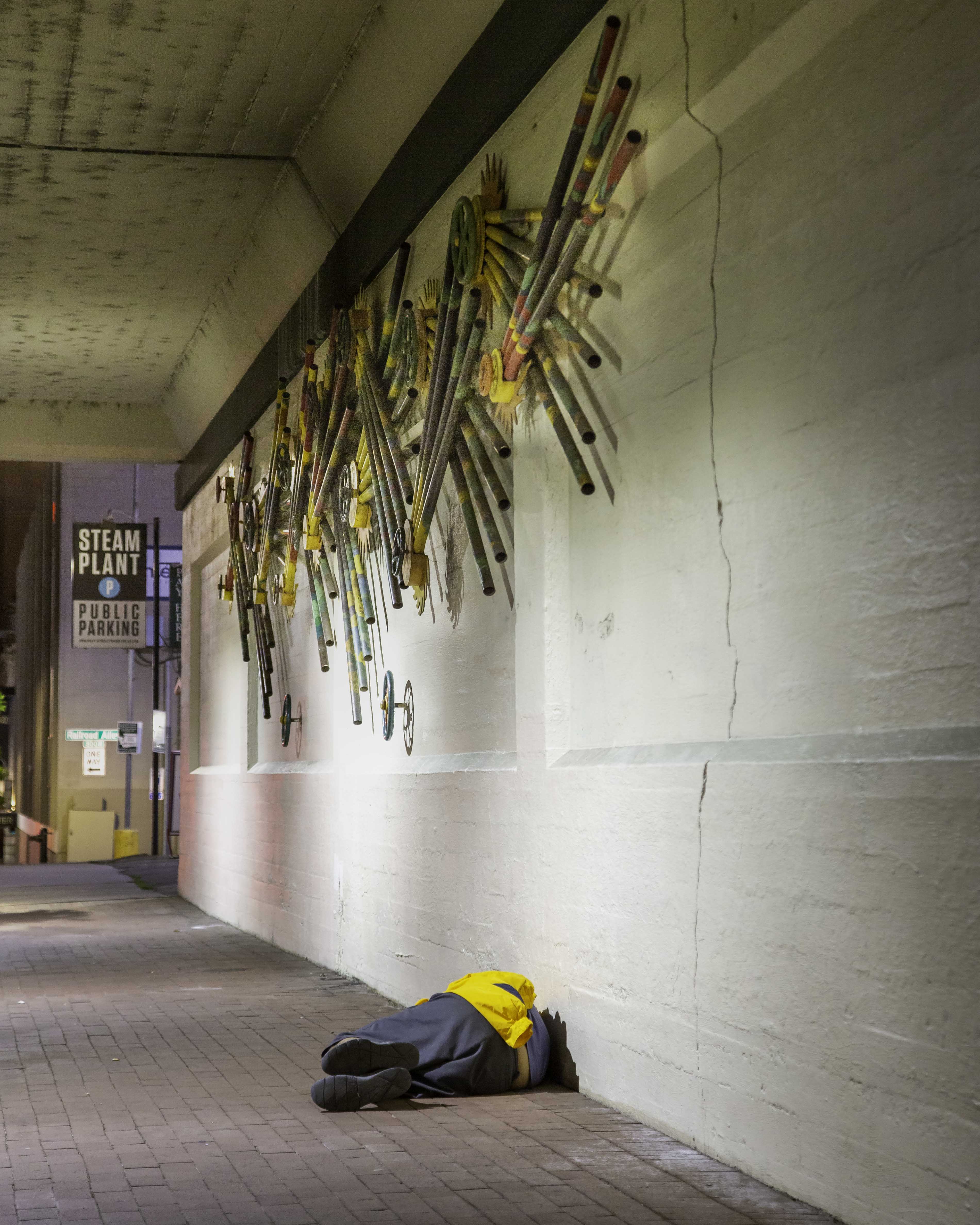
I am so glad to see this image; there's a story to be told in each of the three images about homelessness, uncomfortable though it may be. And I think if we treat it with sensitivity, it can have deep impact on the viewer. |
Feb 10th |
1 comment - 0 replies for Group 58
|
| 60 |
Feb 20 |
Comment |
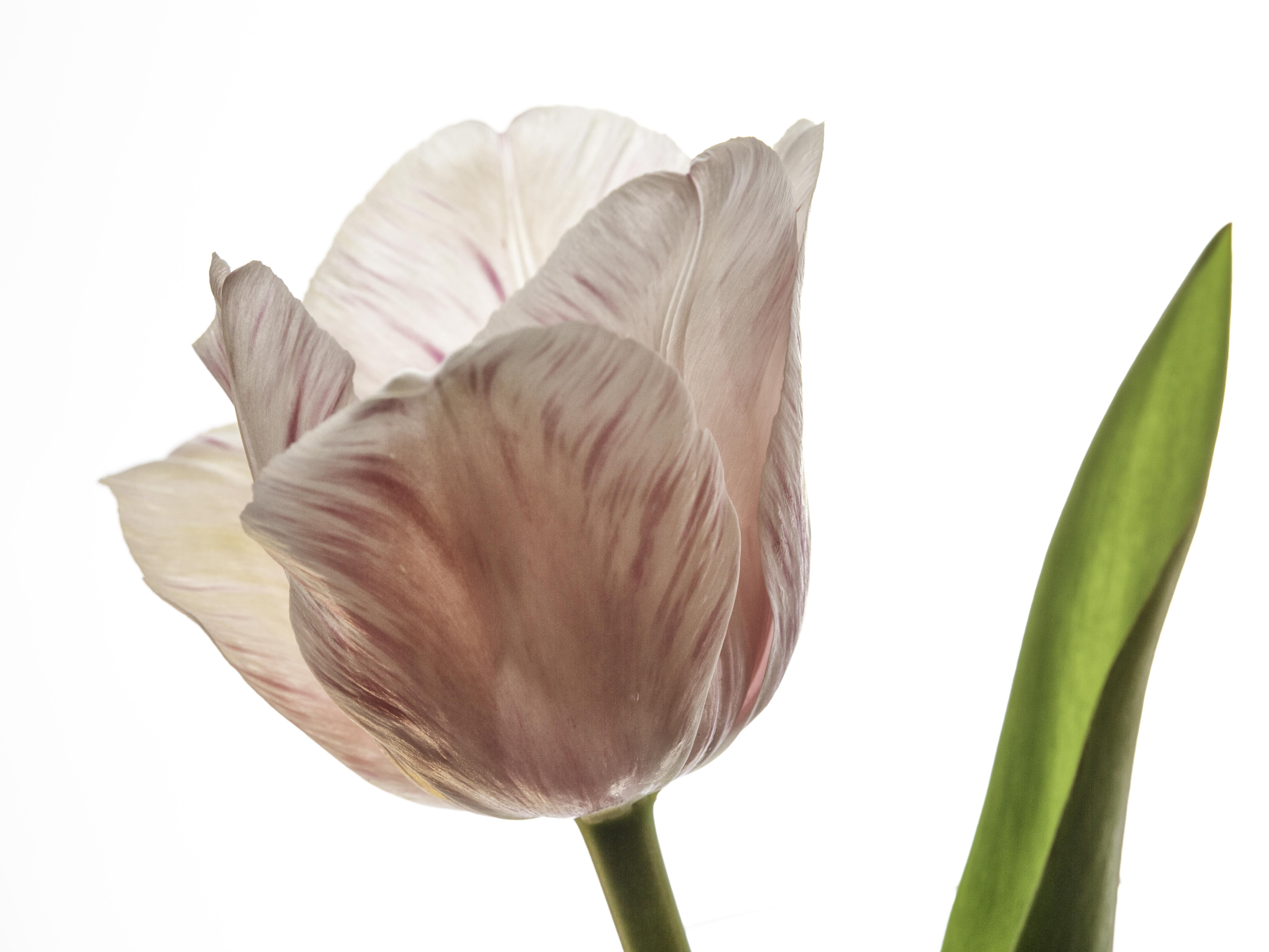
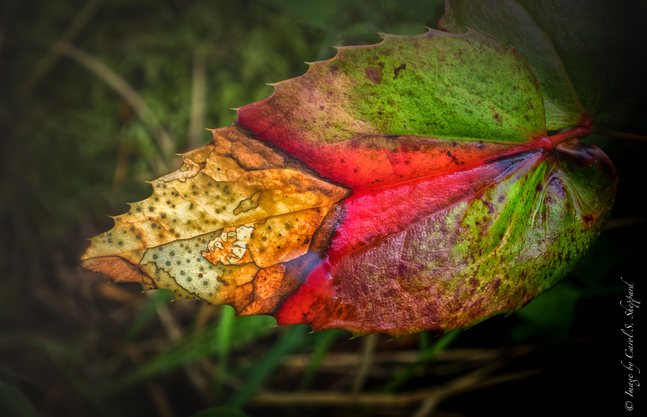
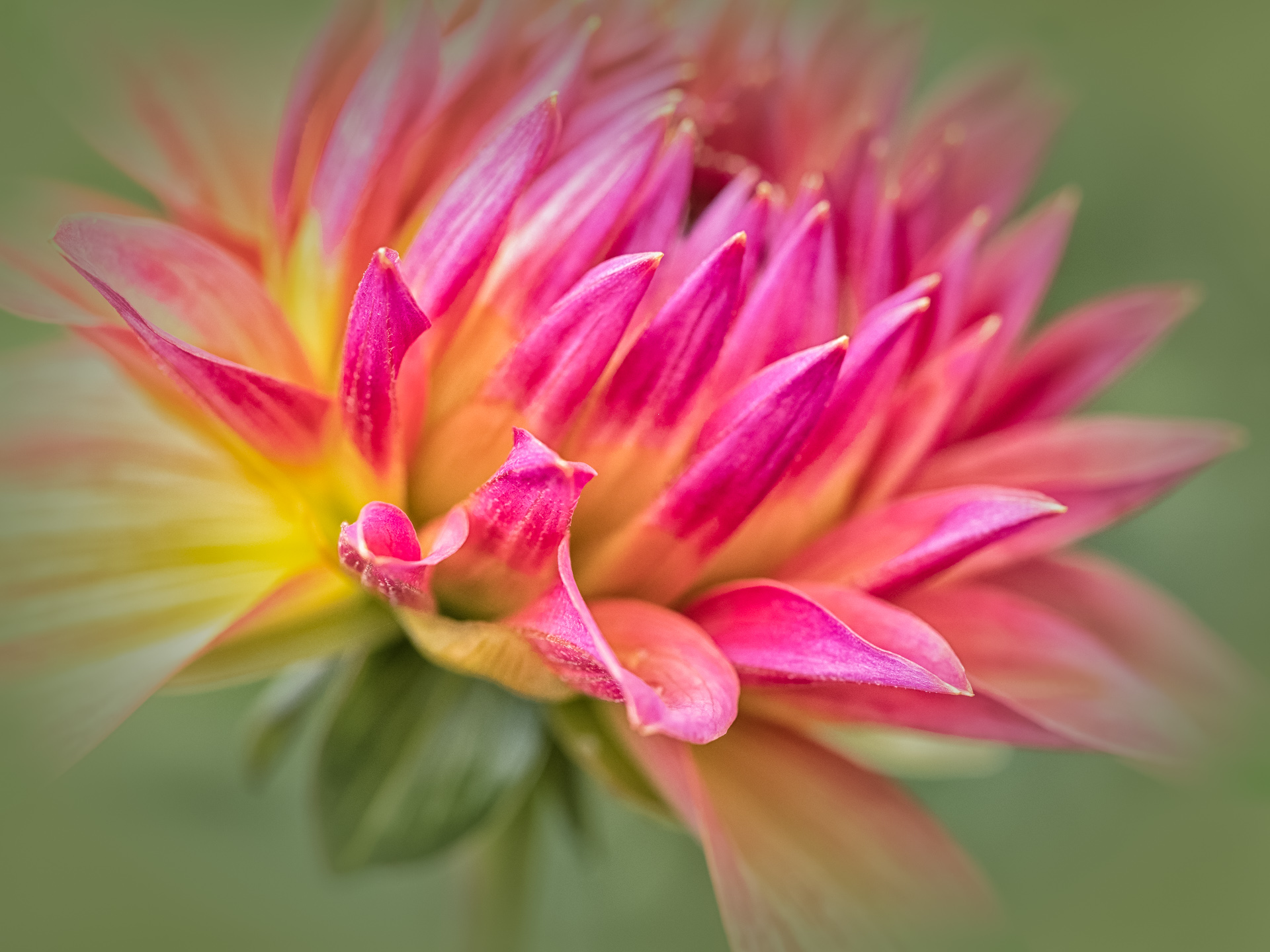
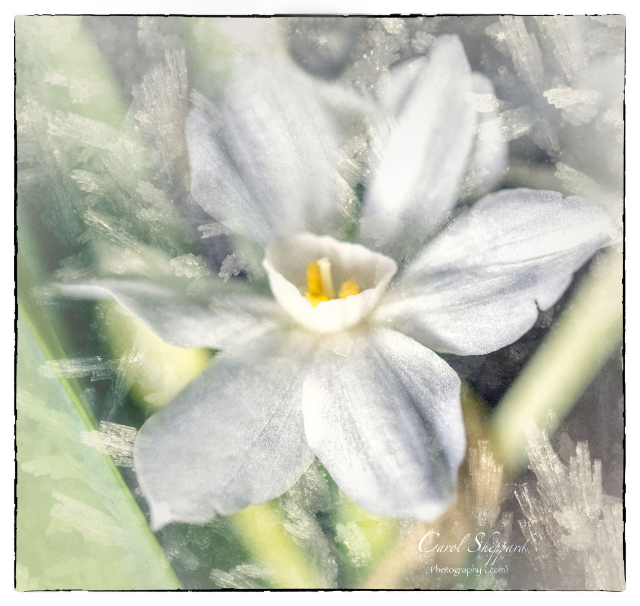
The title suits this well: it does look like a color explosion! Nice clarity, although I personally would like to see the shadows lightened just on the blue. Maybe use a luminousity slider in LR? Your colors are all very natural, which is hard with reds and yellows. A little bit flat to my eye, so I'm not sure if you might want to diffuse it less? Nice crop and leading lines into its center...An interesting image for me. |
Feb 8th |
| 60 |
Feb 20 |
Comment |
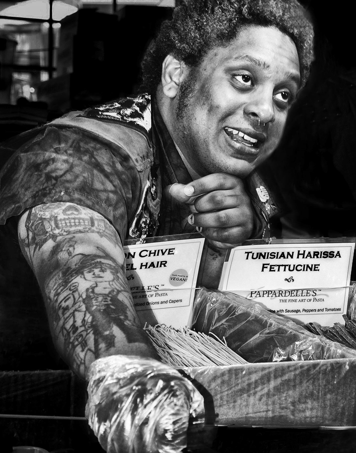
Well, a little education along with your submission! I didn't know any of this. Sharp and clear, with beautiful edging and detail. No real hotspots, which is amazing when photographing a coin, so kudos on your lighting. My only (and I mean, ONLY) suggestion would be to burn in some of the whitest areas where detail has been lost, mainly right in front of his face. On the other hand, it may be this sharp contrast that makes his profile so noble, as it gives him room to look out before him. Great shot! |
Feb 8th |
| 60 |
Feb 20 |
Comment |
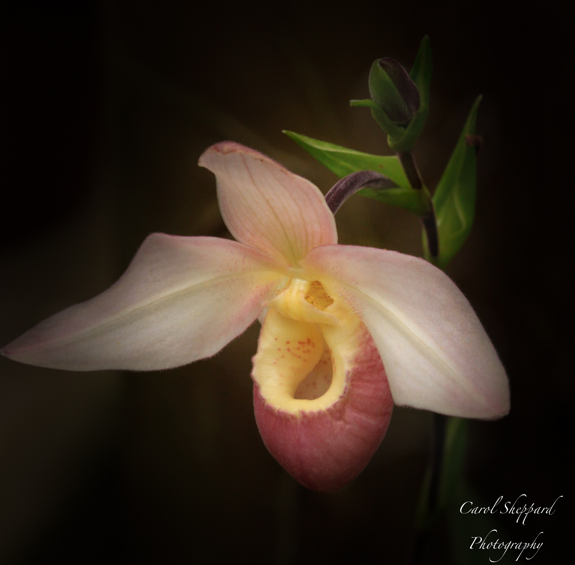
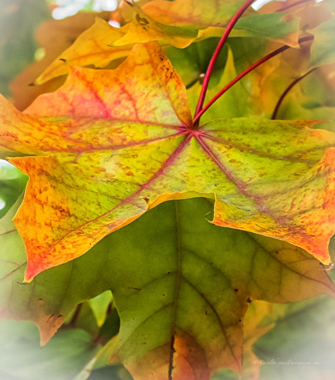
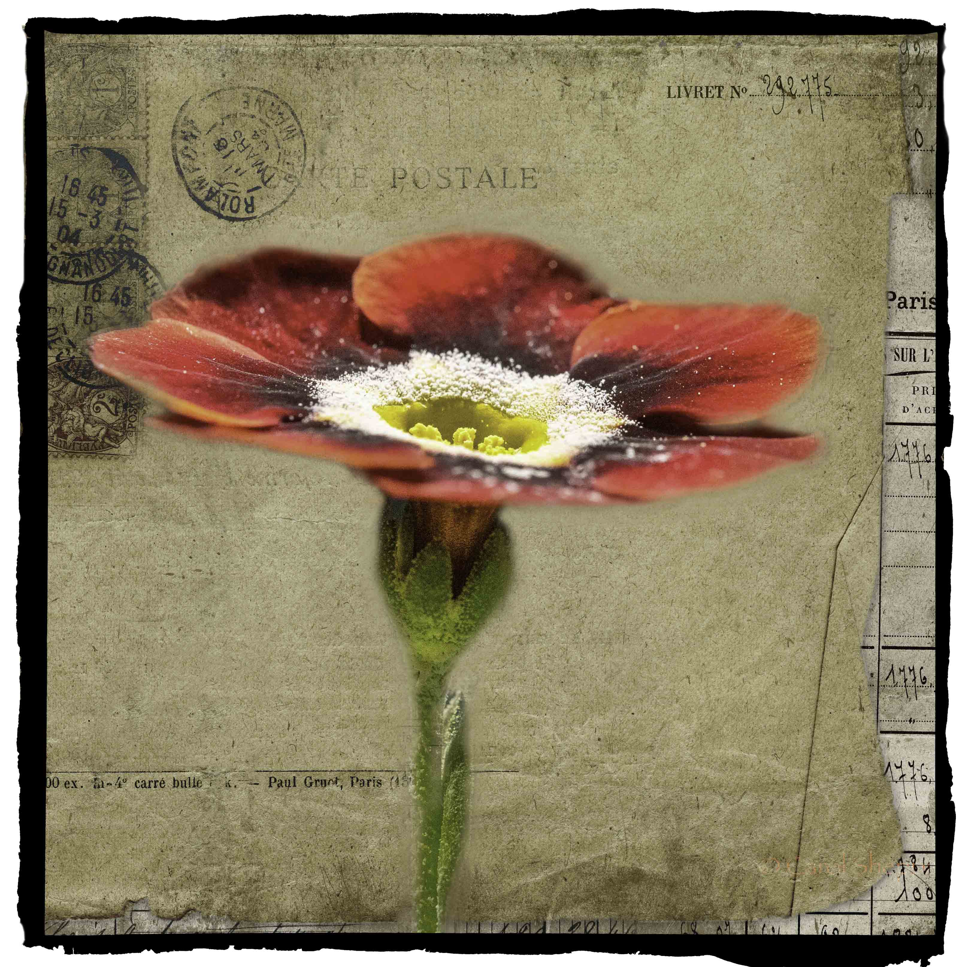
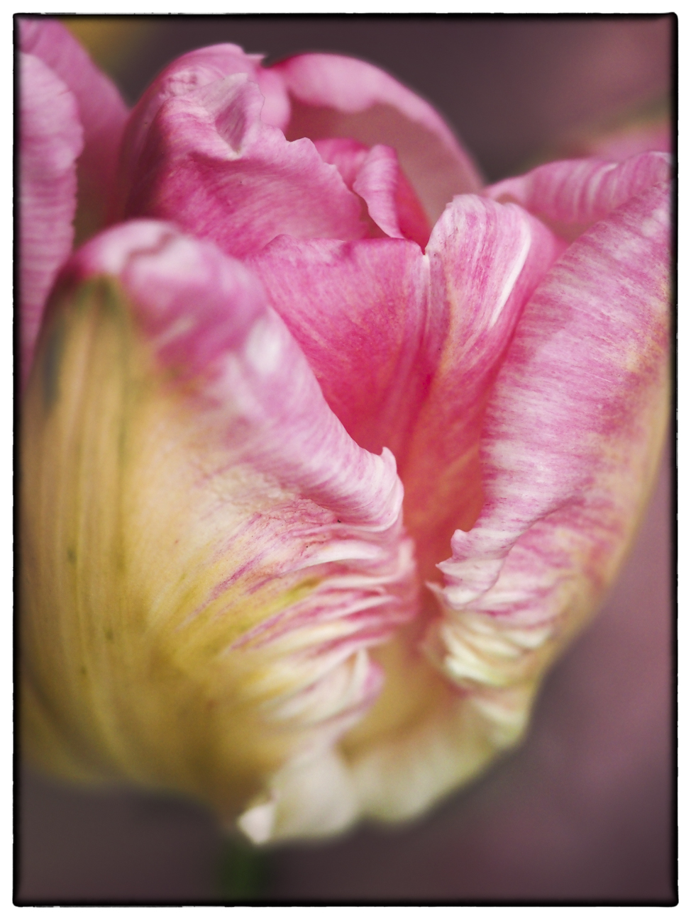
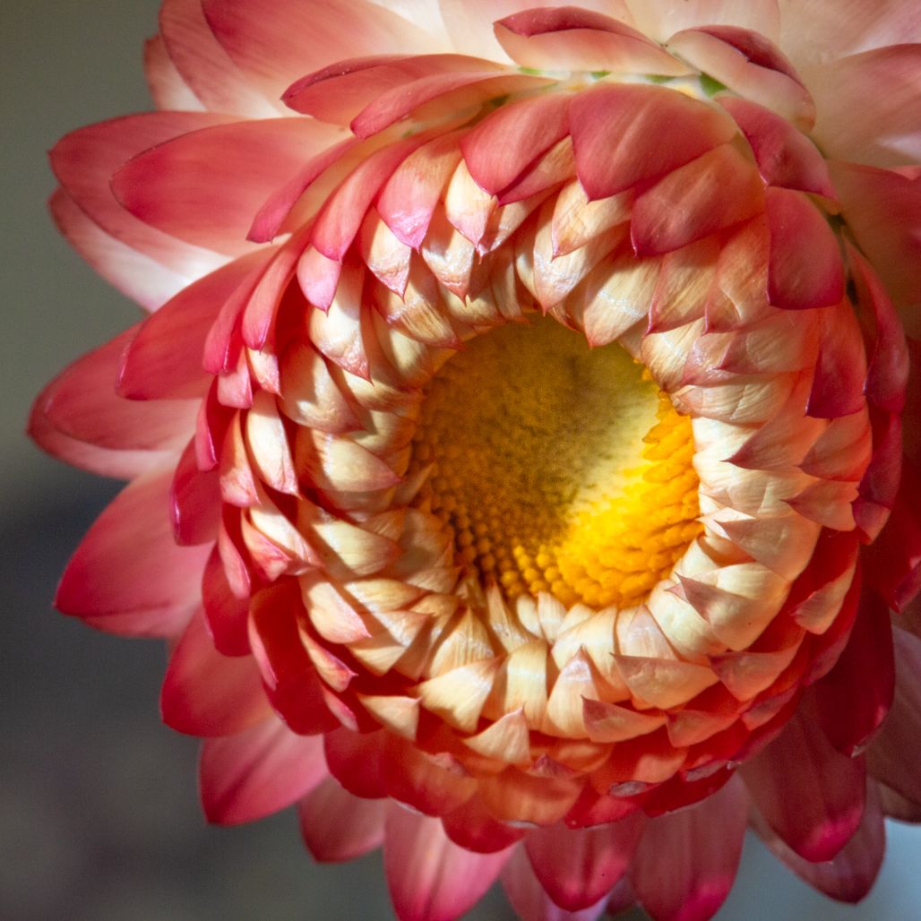
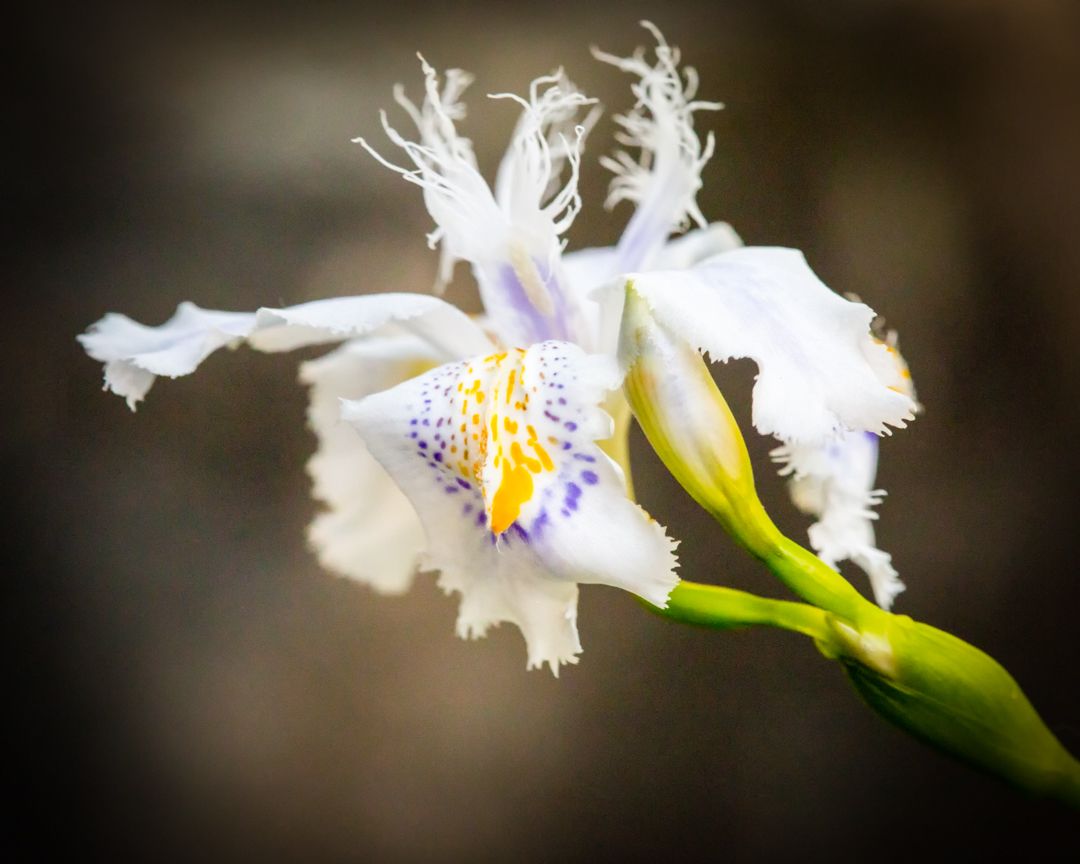
Another beautiful leaf, and it reminds me of a ballet dancer! Exquisite detail, sharpness and clarity, along with wonderful balance of the highlights and shadows. I love it in color!! This is a competition-worthy image and an incredible image! |
Feb 8th |
| 60 |
Feb 20 |
Comment |
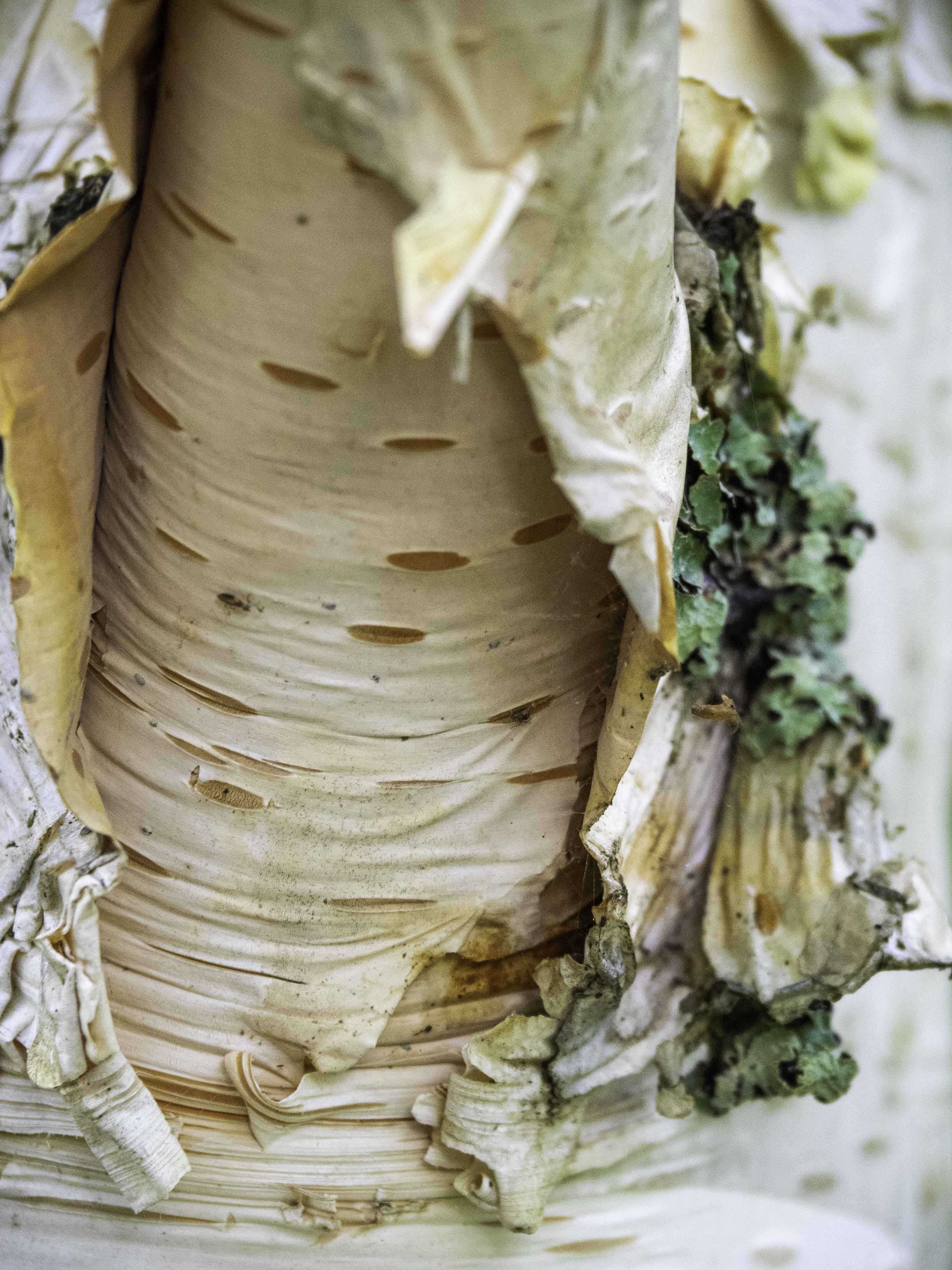
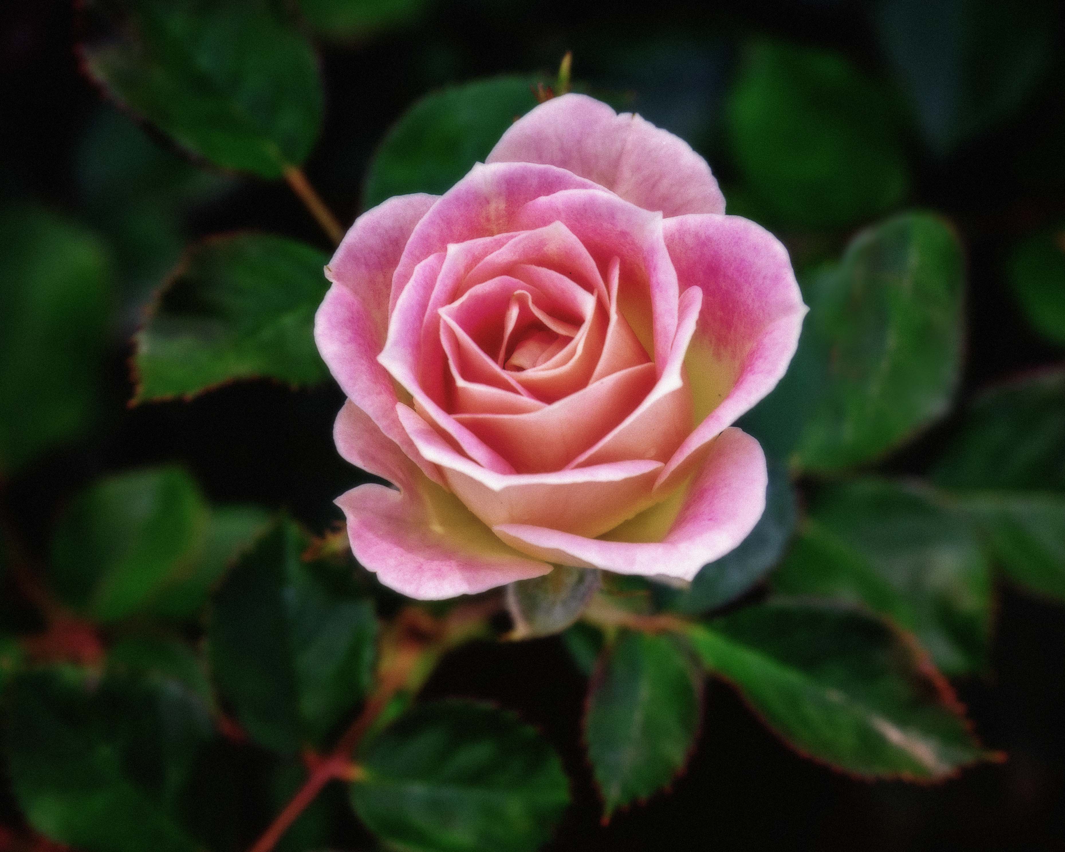
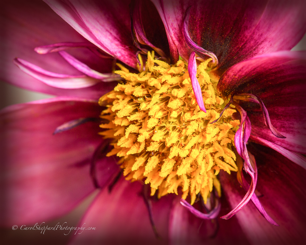
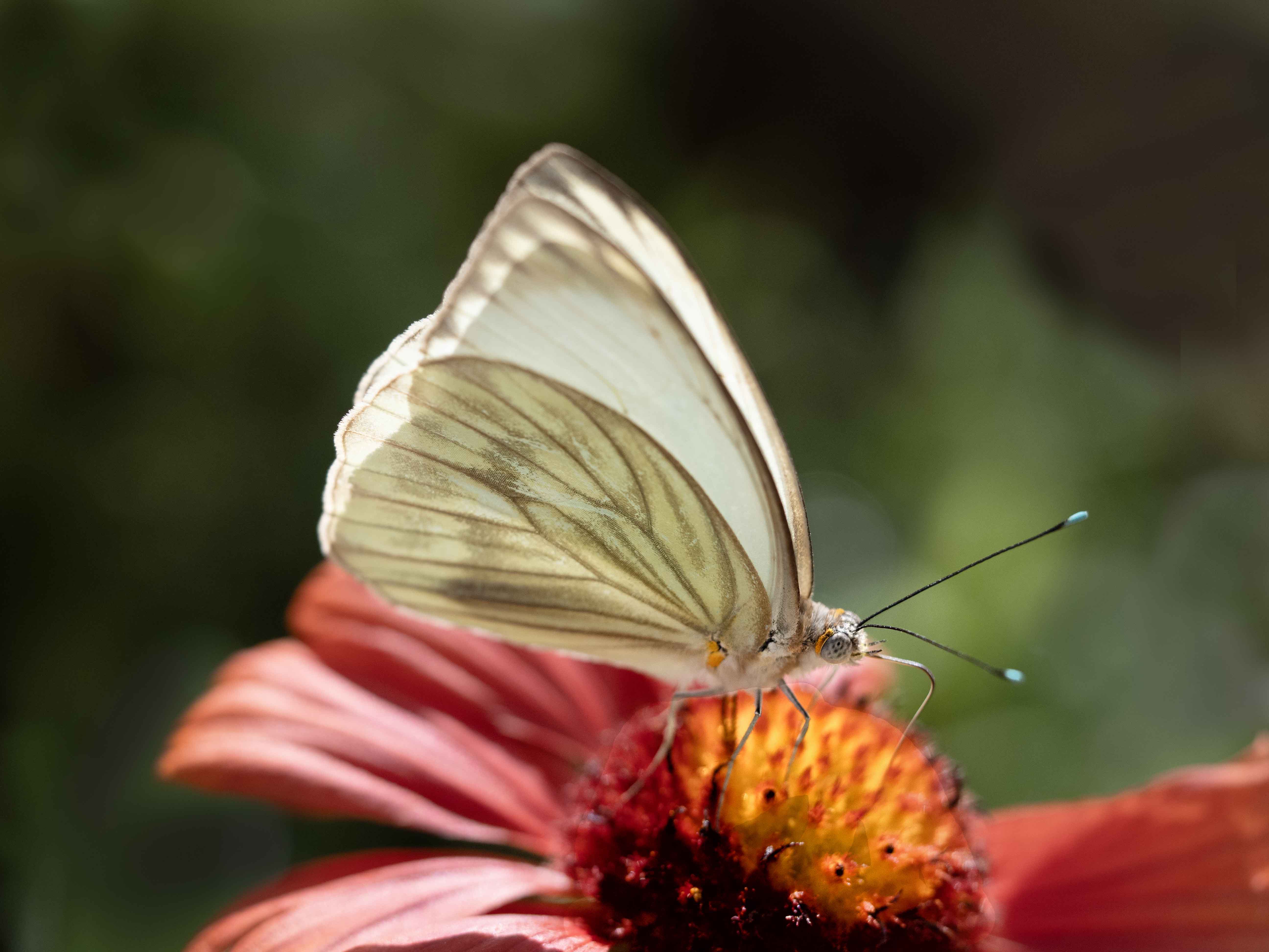
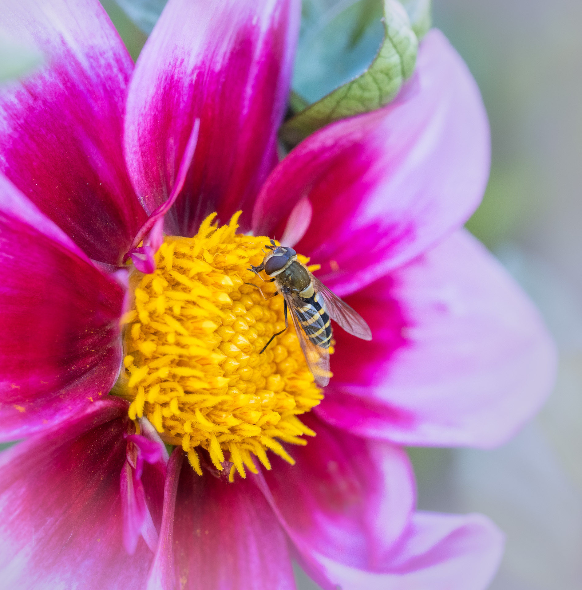
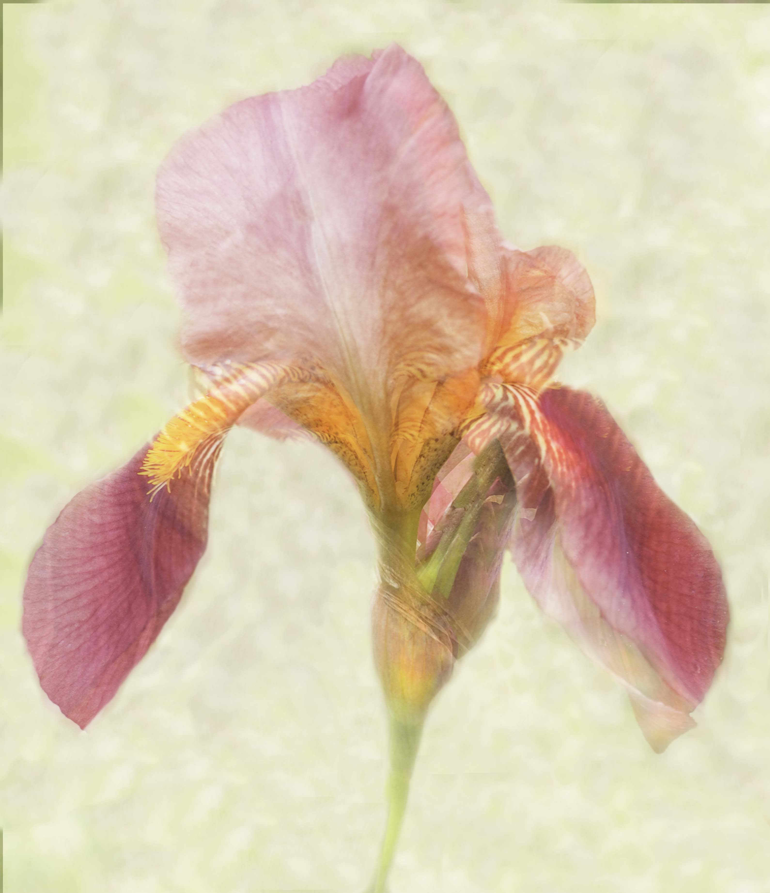
The strength for me of this image is in the complementary colors and the beautiful soft background. The background gives a feeling of gently waving in the wind while not actually moving the subject. How interesting that you took this with a macro lens--how far back were you standing from it? I'm also not sure about what you mean on removing color, but you can sometimes just use luminance or saturation sliders to remove or downplay a specific color. |
Feb 8th |
| 60 |
Feb 20 |
Comment |
Yes, I understand and appreciate your comments. If I had stepped back and straightened the lines, it wouldn't be about the bark, or being a macro, so much as a tree trunk, for me. But I agree with you both about the balance; I certainly could crop in on that right-hand side without affecting my original intent. Thank you! |
Feb 8th |
5 comments - 0 replies for Group 60
|
| 62 |
Feb 20 |
Reply |
Thank you, Oliver. I know it's a hard subject, but I think it is a very valid one in so long as the identity of the subject is protected, which has been done in both of these photos. |
Feb 10th |
0 comments - 1 reply for Group 62
|
| 80 |
Feb 20 |
Reply |
Agreed. I think how we say it is almost as important as what we say. Perhaps I will start visiting the other groups more often, too. I have found value in belonging to multiple groups. |
Feb 21st |
| 80 |
Feb 20 |
Reply |
Thank you. I appreciate the privacy factor; his anonymity was both a part of what made it poignant for me and at the same time what made it possible for me to photograph him. I would not photograph a homeless person without asking permission first if it were to invade his or her privacy as an individual. |
Feb 21st |
| 80 |
Feb 20 |
Reply |
Thank you for your great input. I do see what you are saying. |
Feb 21st |
| 80 |
Feb 20 |
Reply |
Thank you for the referral to the article; I did, in fact, read it. I don't agree with it, but I respect that it is one man's view. And I respect that you have voiced what is your personal view. But I will suggest that you take Jon Fishbein's course on Image Analysis. Your comments cut deeply not because you personally didn't like my image, but because of how you voiced it. And is this not about how I "voiced" my feelings about homelessness? I am entitled to my photographic treatment, so long as it is repectful (which is was) and affords privacy from indentity of the individual without his or her permission (which it did). We rely on photographers to bring us to the world outside of our realm. Why take one more photo of anything? Why take photos of war if not to highlight the degradation and harm from them. Would you have us undo the war coverage of Vietnam? I bet you willingly viewed those images of the children running down the streets, and how is that different from this? Sorry, a rant, I know, but be careful how you analyze others' work. |
Feb 10th |
| 80 |
Feb 20 |
Reply |
Thank you for bringing those other images to my attention, Stephen. I agree with you, and think both of those images are thought-provoking. I don't know that a street image has to answer a question if it raises one, and I hope that my image makes the viewer think about what they are seeing--the contradictions inherent in the scene. |
Feb 10th |
| 80 |
Feb 20 |
Comment |
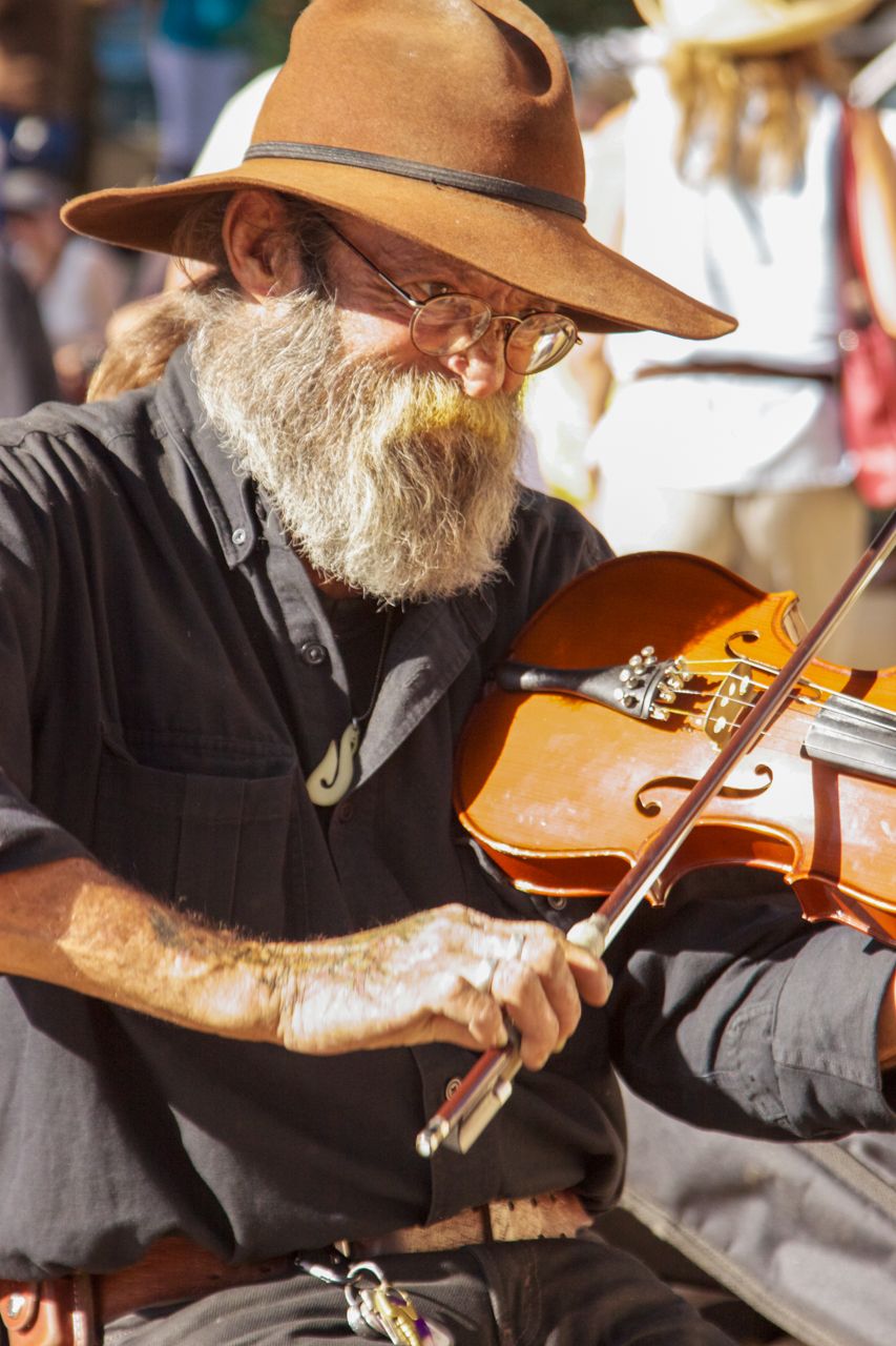
Very cool and artsy treatment! Your colors are complementary, and the arrangement of the artists' limbs and the subjects face and head work well together. What an interesting treatment...you said that you only enhanced color...what did you do exactly? It has a smoothness almost like an art treatment in photoshop. |
Feb 7th |
| 80 |
Feb 20 |
Comment |
I love the simplicity of the two legs/two feet, and the fact that they have brightly colored and patterned shoes makes it fun for me. The one foot in motion gives it a story-like feel, making it intriguing. I wasn't sure without your title that they were dancing or moving toward dancing, so I might tweak the title, but I love the composition and balance of this image. |
Feb 7th |
| 80 |
Feb 20 |
Comment |
I'm going to say that you and I have very different perspectives. With only the bicycle as the subject, the surrounding area feels very cluttered and busy to me, even in B&W. Perhaps if the one way sign were not so far from the bicycle, it might tie together for me, but my eye is actually drawn to the electrical box, graffiti and the pole on the right that then leads my eye right off the page instead of to the one way sign. The bicycle is an interesting subject, and the "treatment" that makes the image look sort of "old" are the strongest pieces for me. |
Feb 7th |
| 80 |
Feb 20 |
Comment |
This image works! I love your overall use of blues and greys to pull it all together. It is beautifully composed with the woman parallel to the one and gazing at the other straight ahead of her. Great use of leading lines and framing using the walls and floor to contain her. I love this image! |
Feb 7th |
| 80 |
Feb 20 |
Comment |
While the B&W is a great motion shot that tells a story in just one frame, I like the original that includes the child. However, I think some of the right-hand side of the original is extraneous. Maybe if you cropped it just beyond the door the man and child are running toward? I'm thinking if you include the window and leave it in landscape mode? B&W works well for me with this, but I think color would also work well. The movement of the individuals running for the train is captured very well. |
Feb 7th |
| 80 |
Feb 20 |
Reply |
Ouch. I was hoping that my title would help to explain what you are to draw from it, plus the fact that I said it is meant to be ironic. The angle is to preserve the privacy of the homeless individual. You were supposed to see that the homeless person is sleeping on the street where the city has installed custom art work. And, if you want to take it further, you were supposed to see that he is right next to a parking lot for the Steam Plant, which is not a plant but an upscale restaurant and brewery. If there was absolutely nothing else redeeming you could find in it, it does have leading lines, LOL. |
Feb 7th |
| 80 |
Feb 20 |
Reply |
I like the B&W version. And my intent was similar, which is why in my explanation I said it was meant to be ironic. He's sleeping under a custom art installation in a little-travelled underpass, which I'm sure cost the city some bucks. |
Feb 7th |
5 comments - 7 replies for Group 80
|
11 comments - 8 replies Total
|