|
| Group |
Round |
C/R |
Comment |
Date |
Image |
| 60 |
Dec 19 |
Reply |
Yes, I'm not so sure how I like it myself. But it was an experiment so the feedback is important; I appreciate your honesty! |
Dec 14th |
| 60 |
Dec 19 |
Comment |
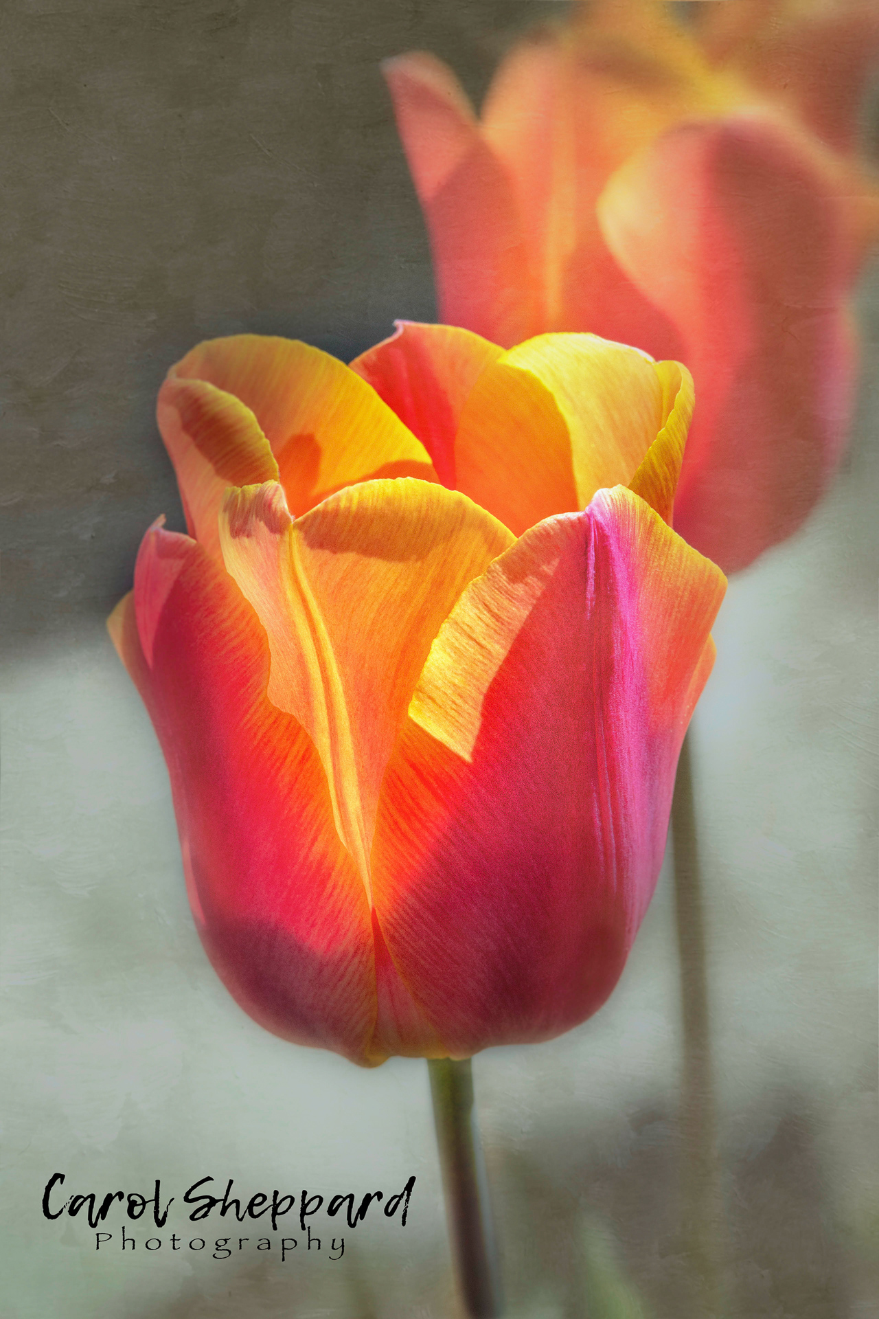
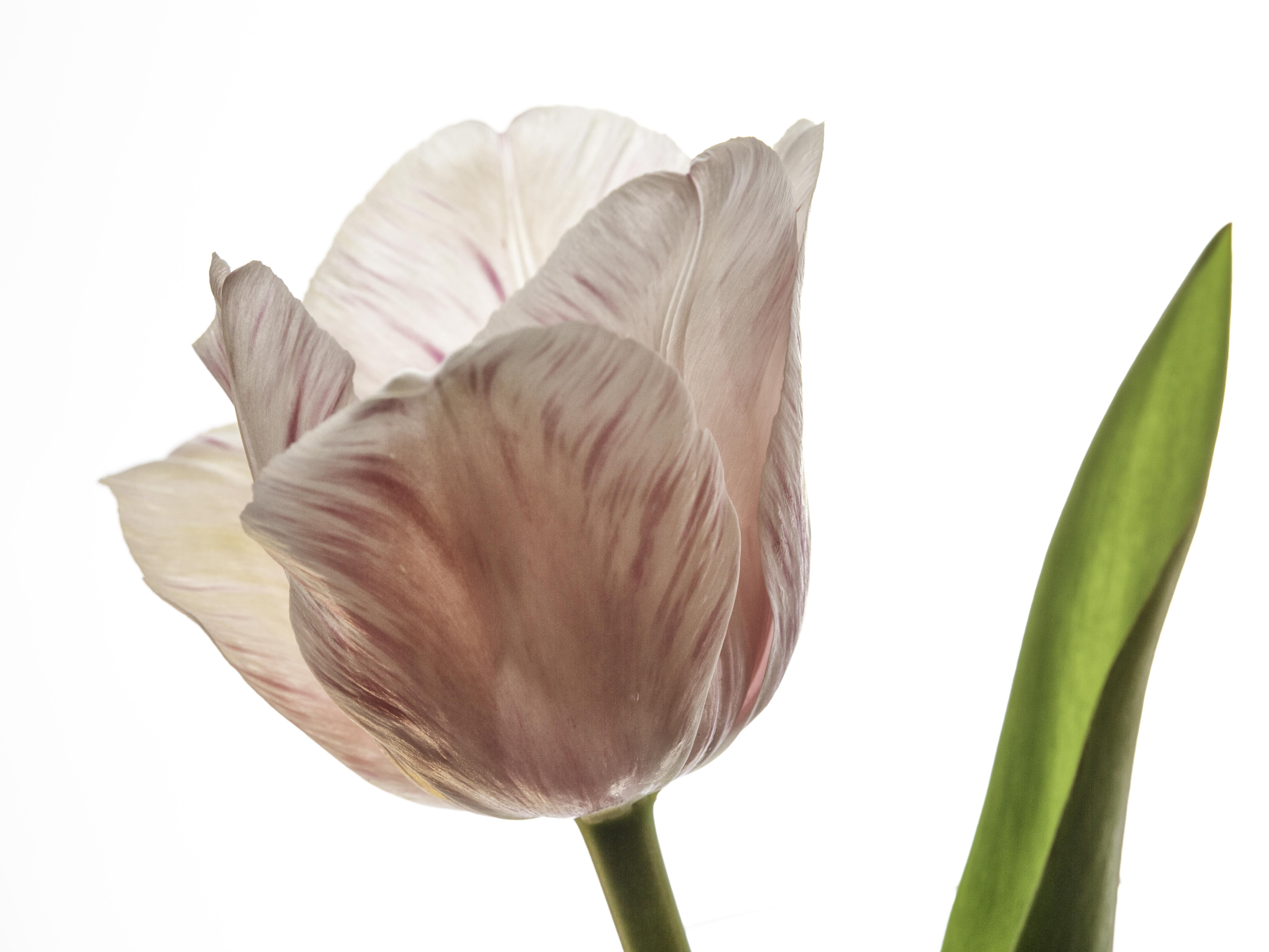
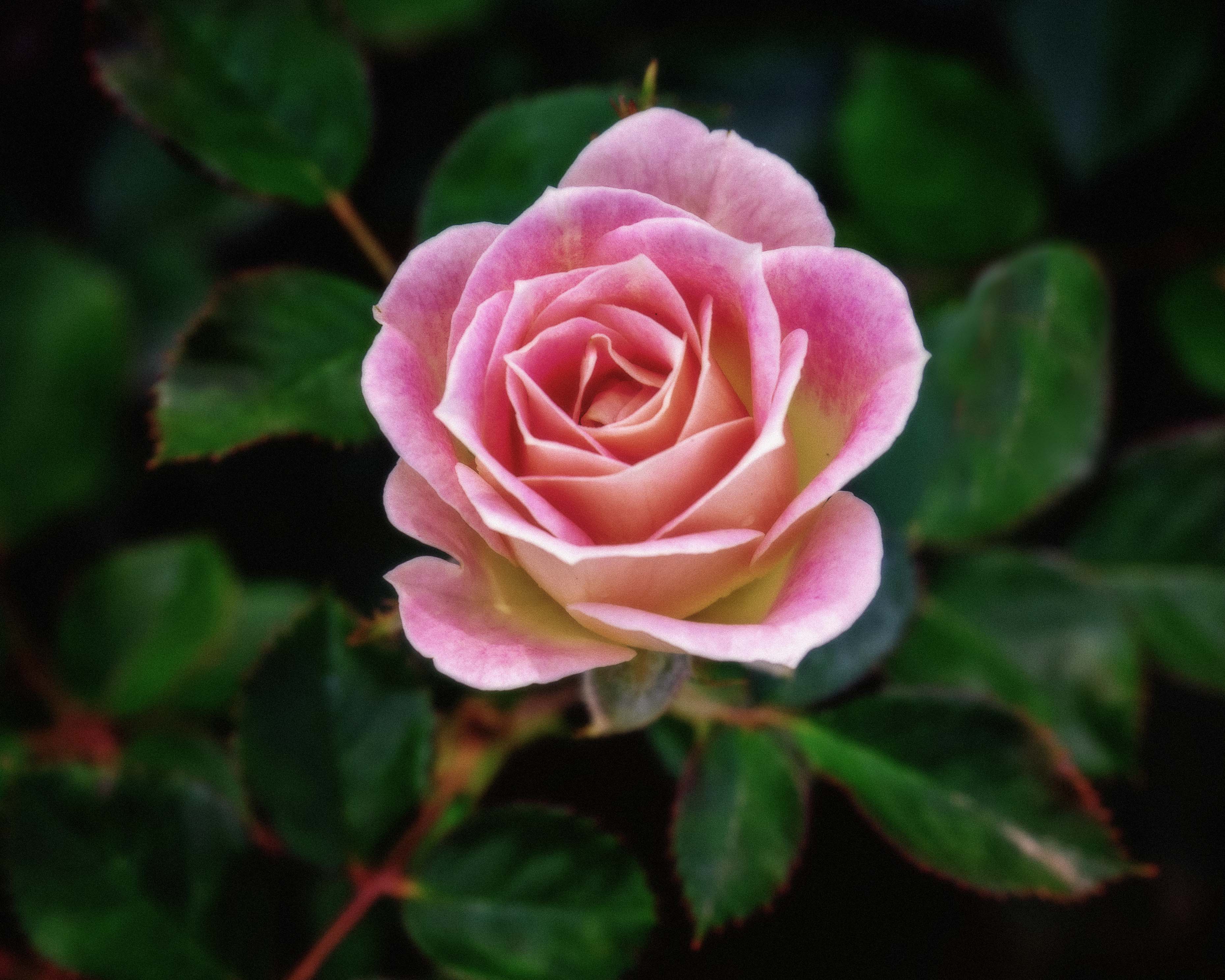
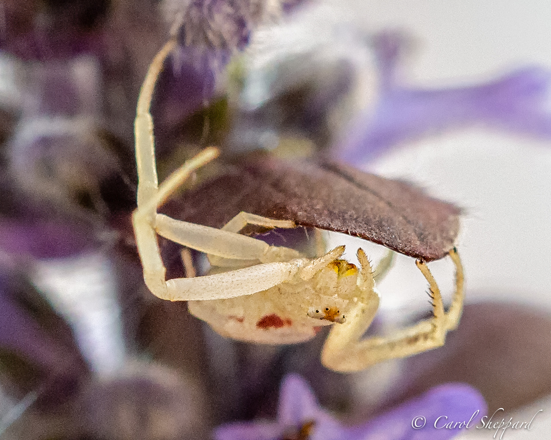
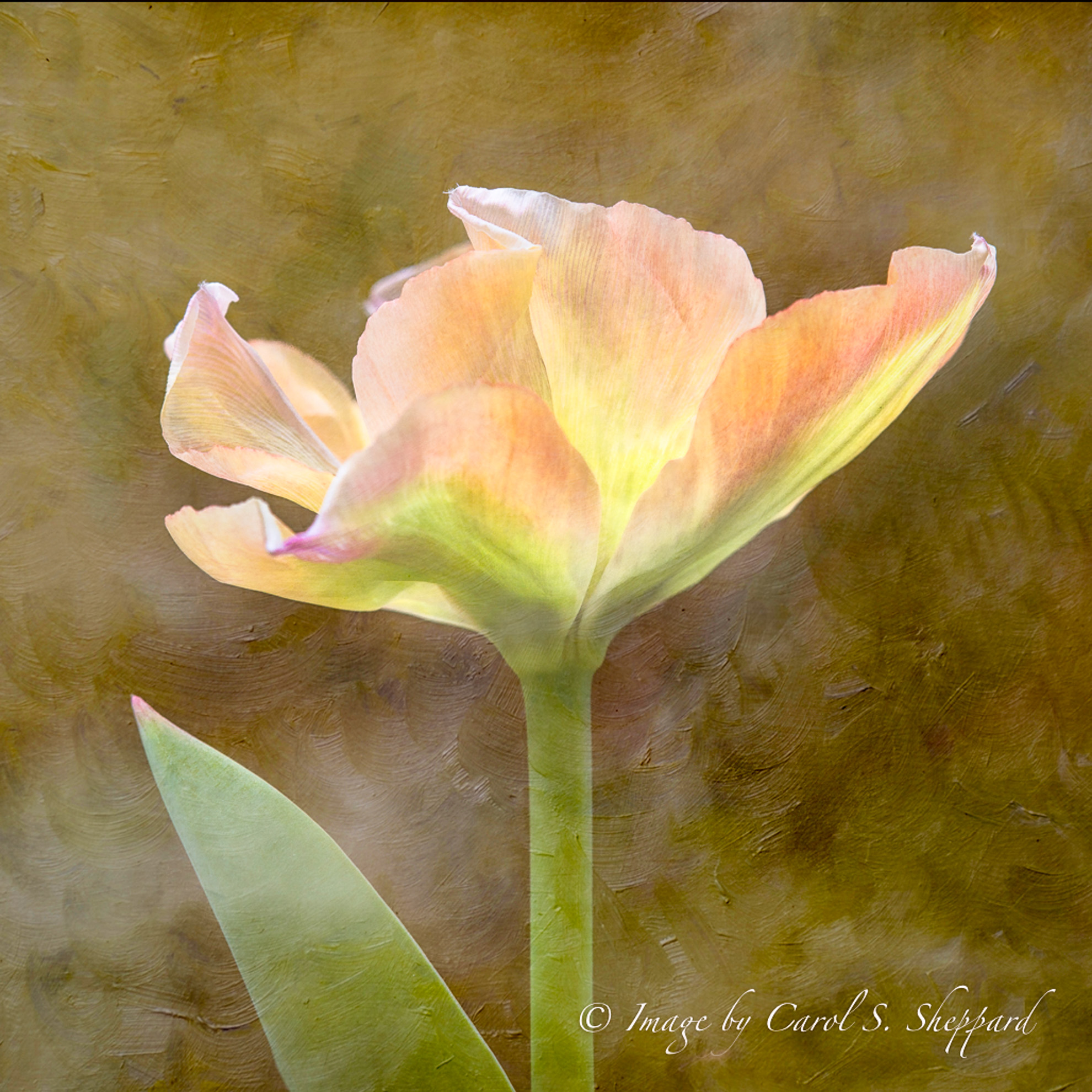
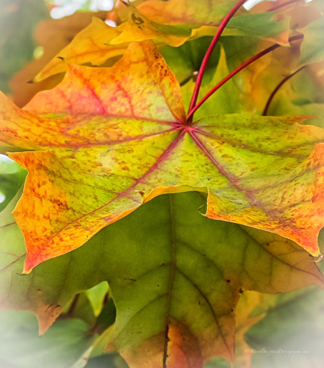
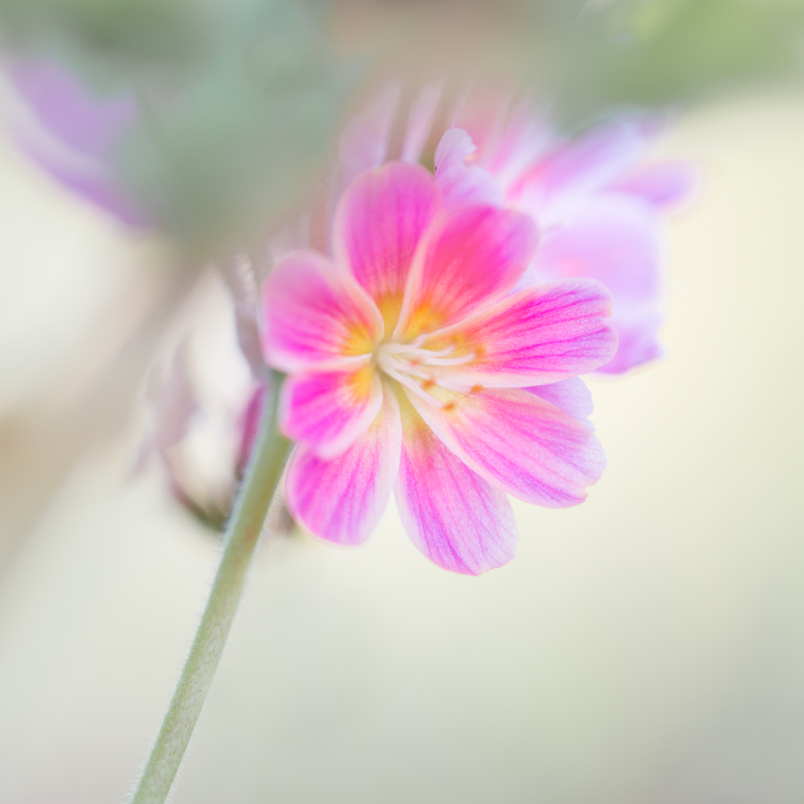
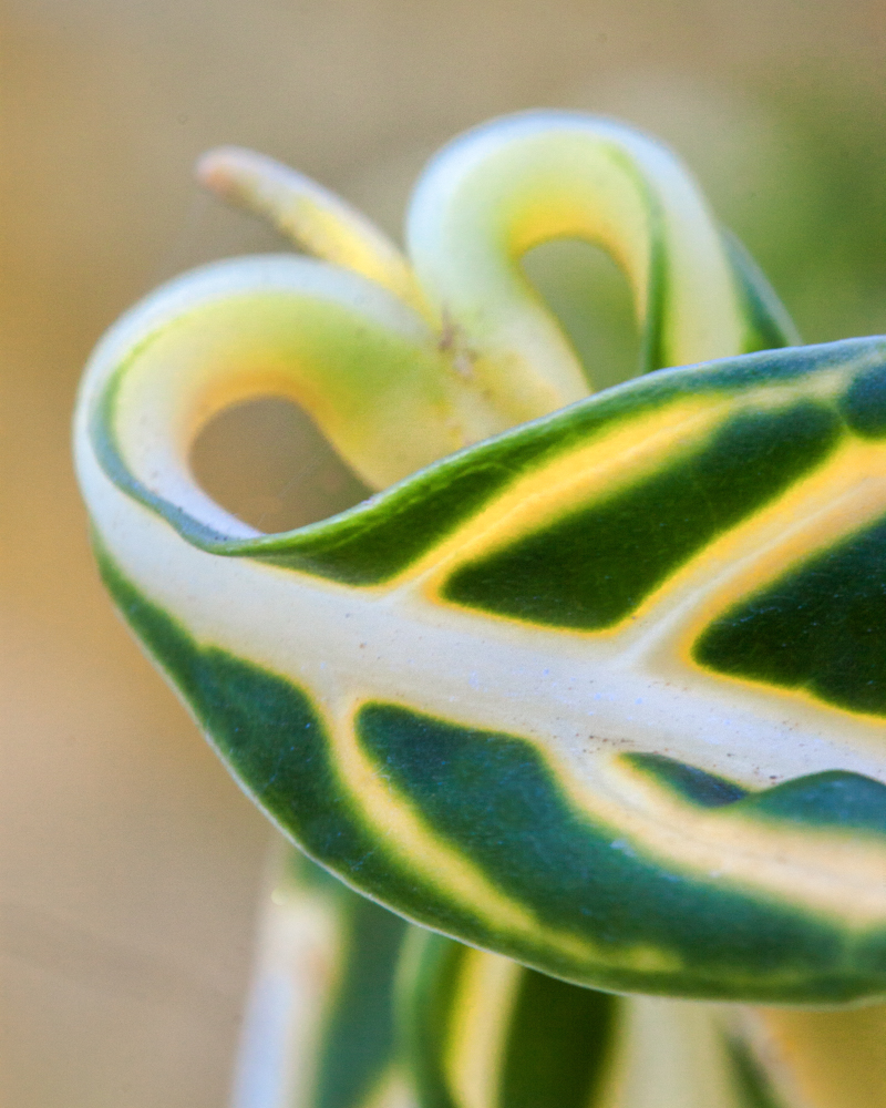
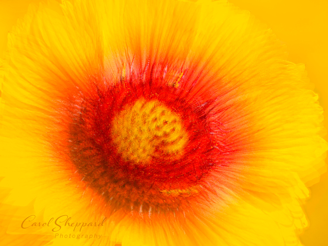
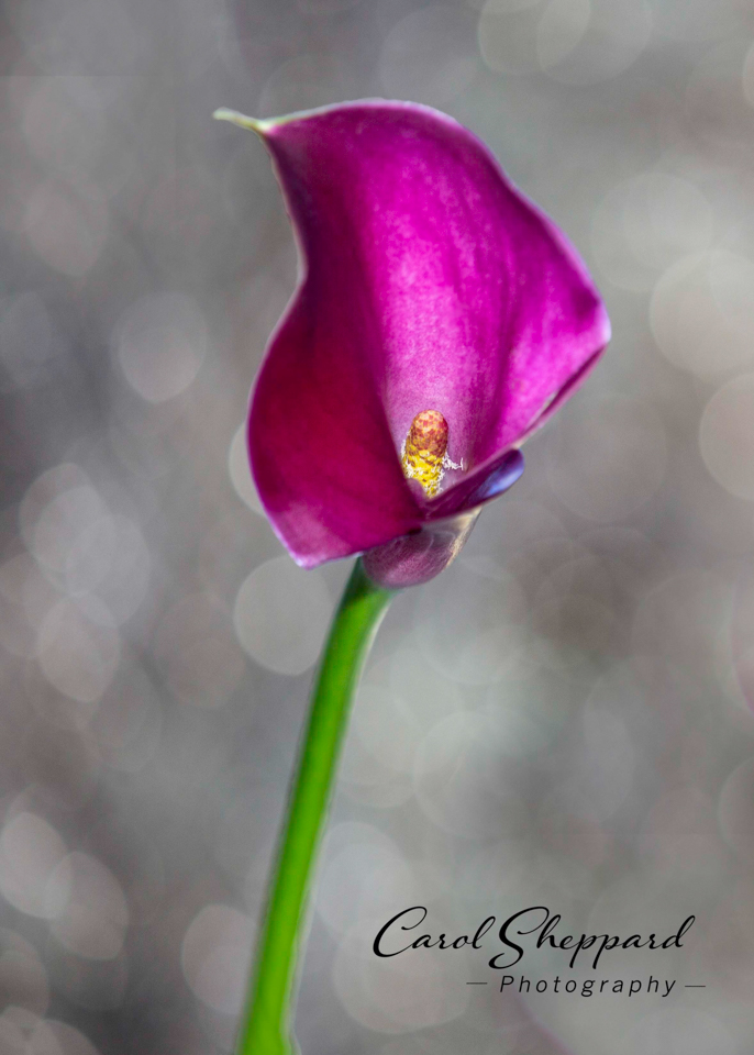
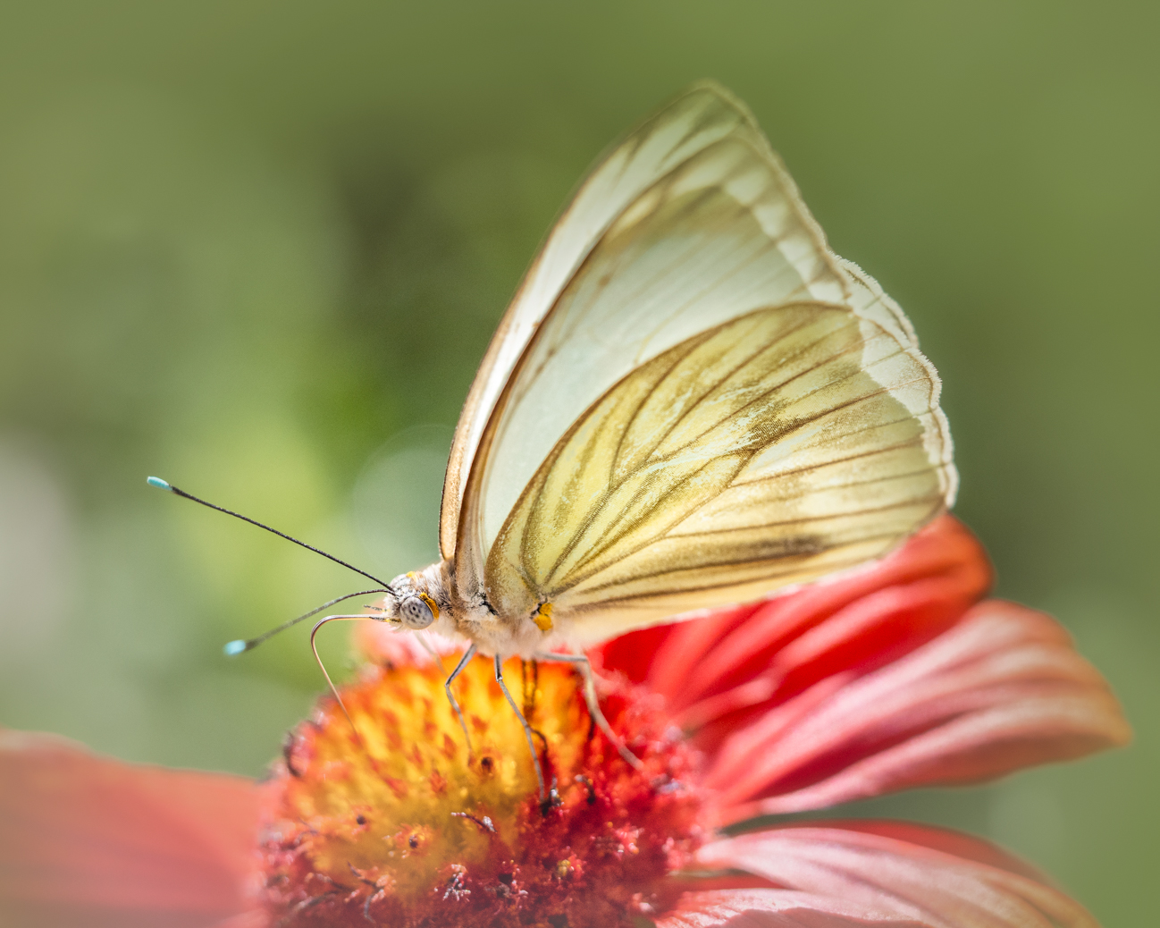
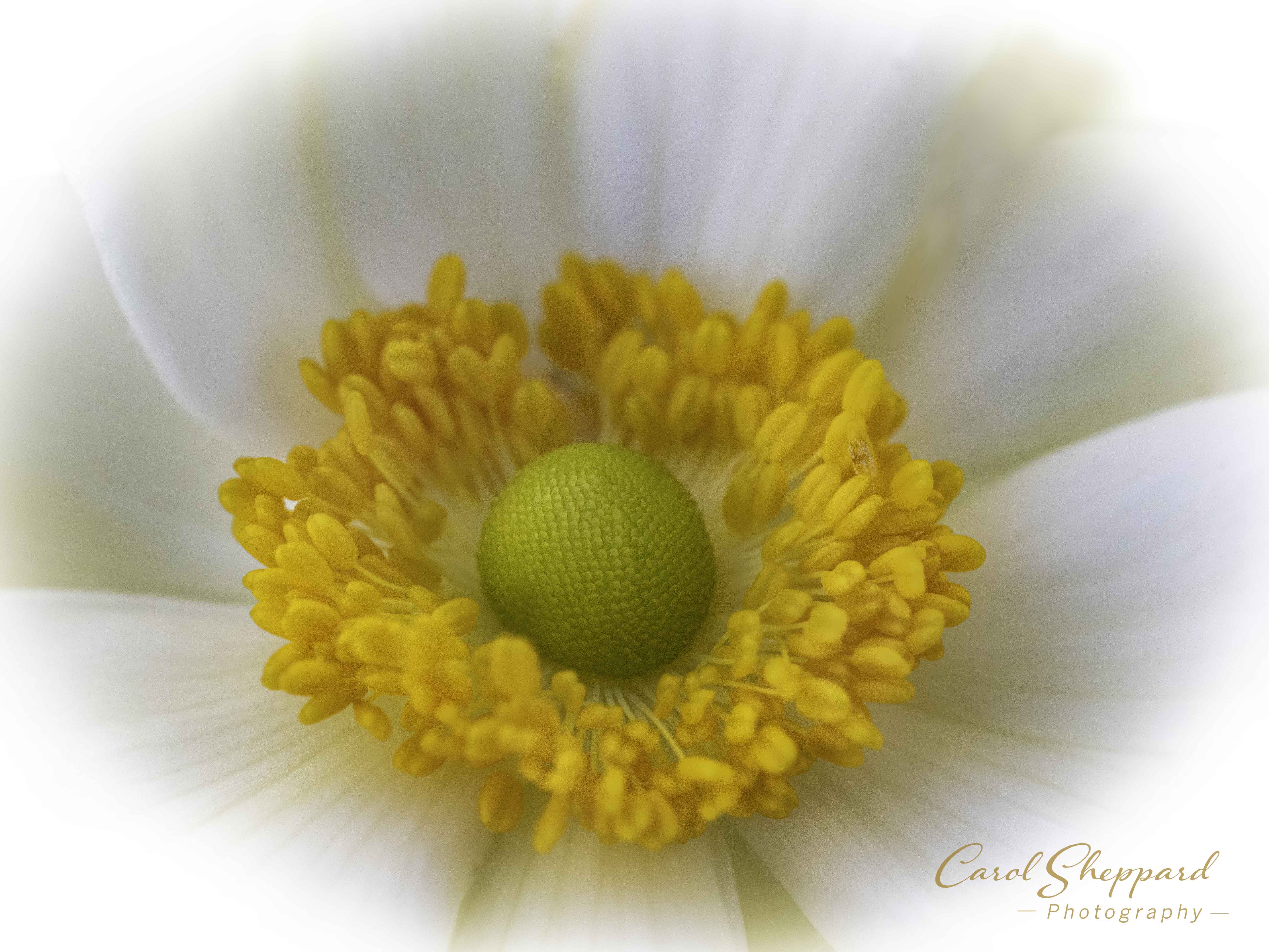
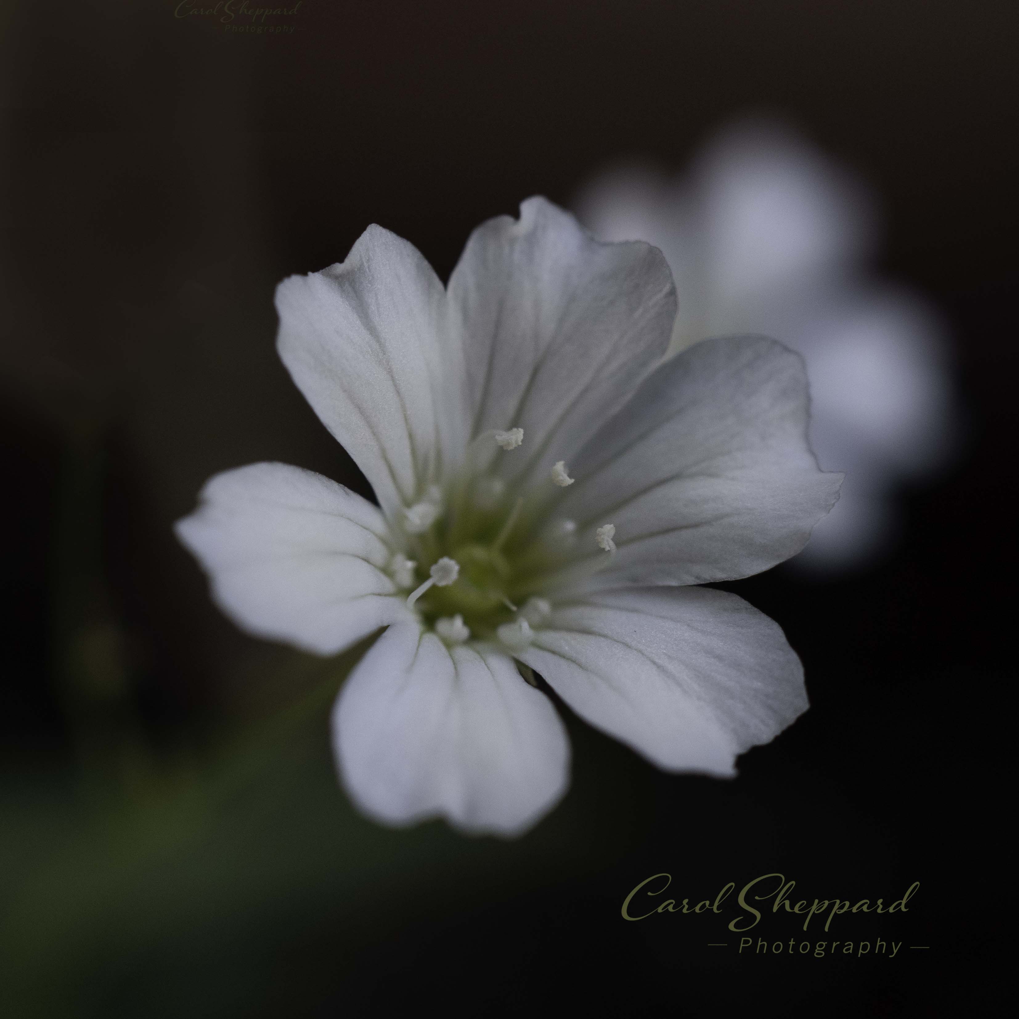
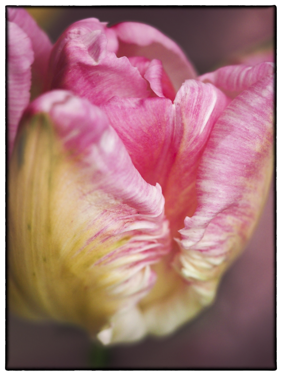
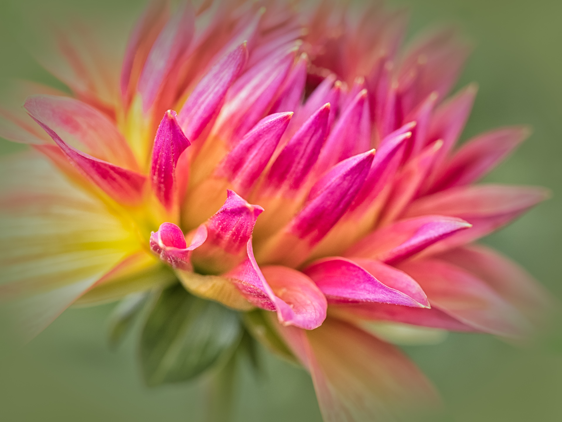
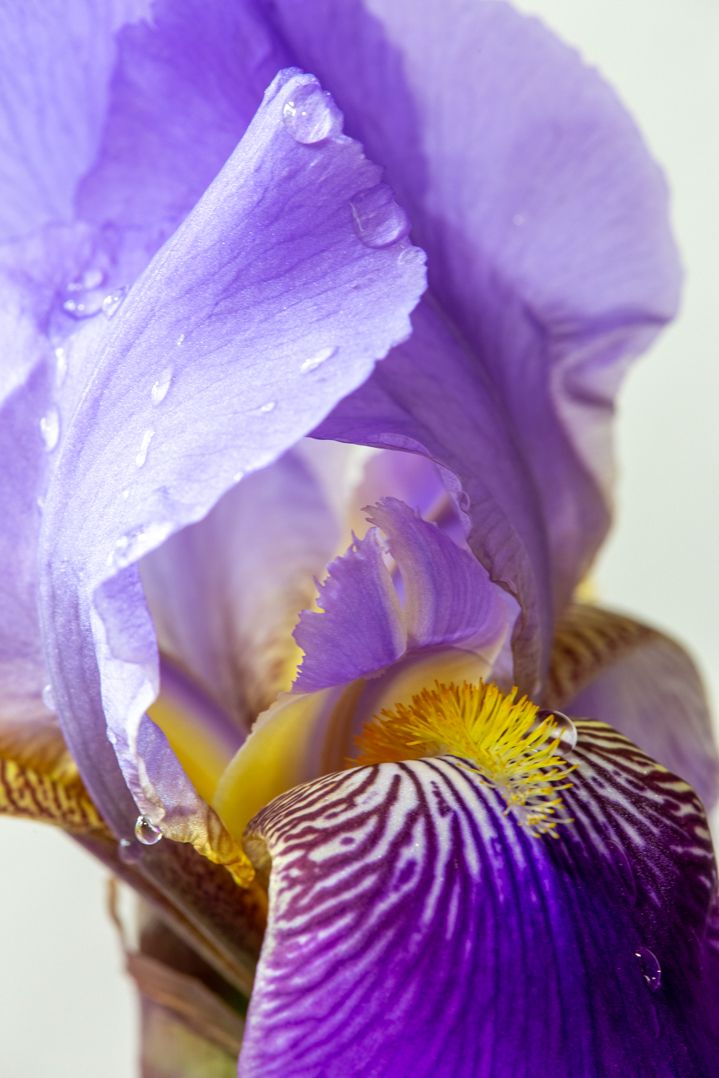
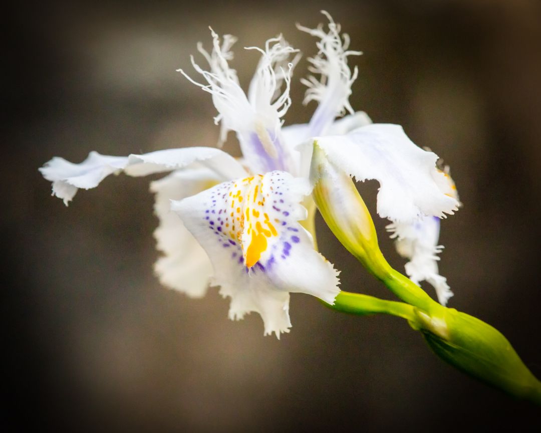
Those lensbabies are a lot of fun to experiment with! So, to my eye, it looks like the best focus landed slightly to the left of center. I am feeling a bit disturbed in my viewing by the focus in the center, which is increased by that sharp angle to the right of it. I do like the grey tint (not sure if that is intentional?) but it leans slightly toward blue. On a personal level, I would like to see it a bit warmer with the blues reduced slightly, but that is really just personal to me. I love that you can see some of the veining in the petals, even though it is very subtle. |
Dec 11th |
| 60 |
Dec 19 |
Comment |
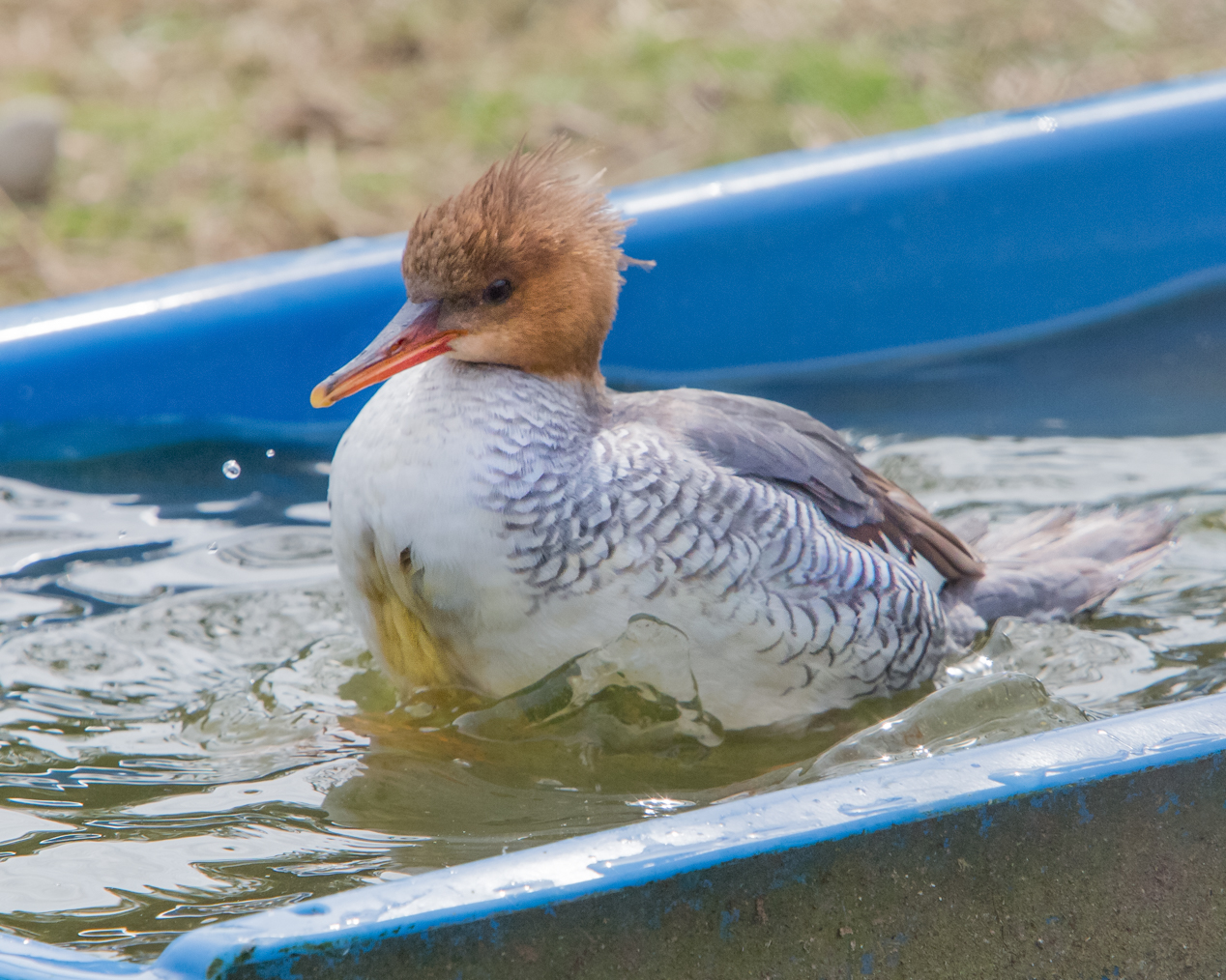
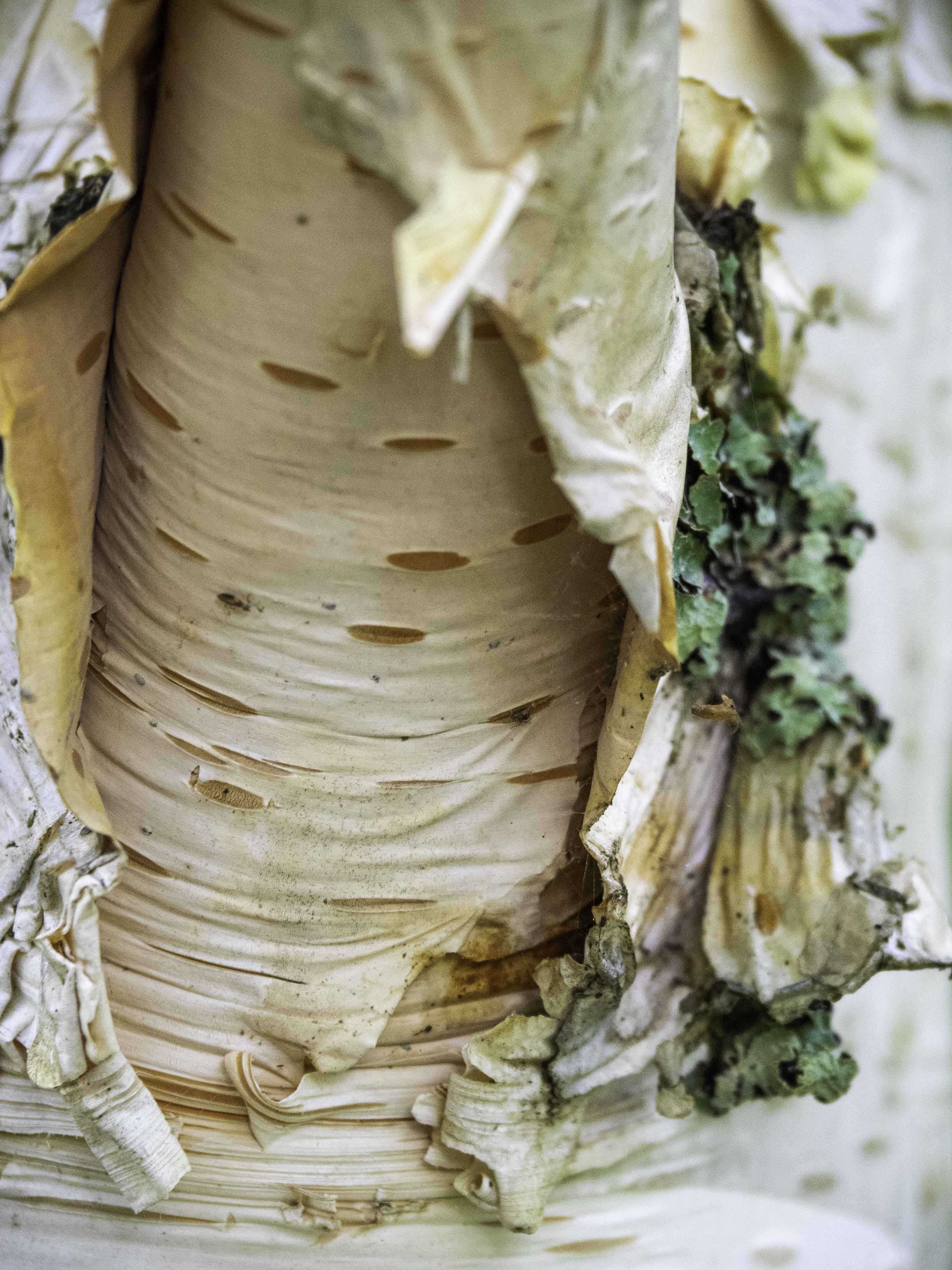
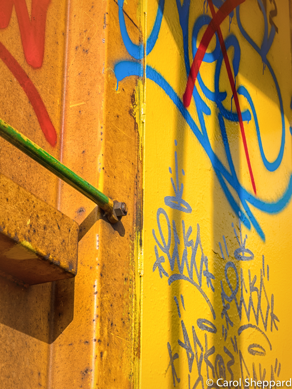
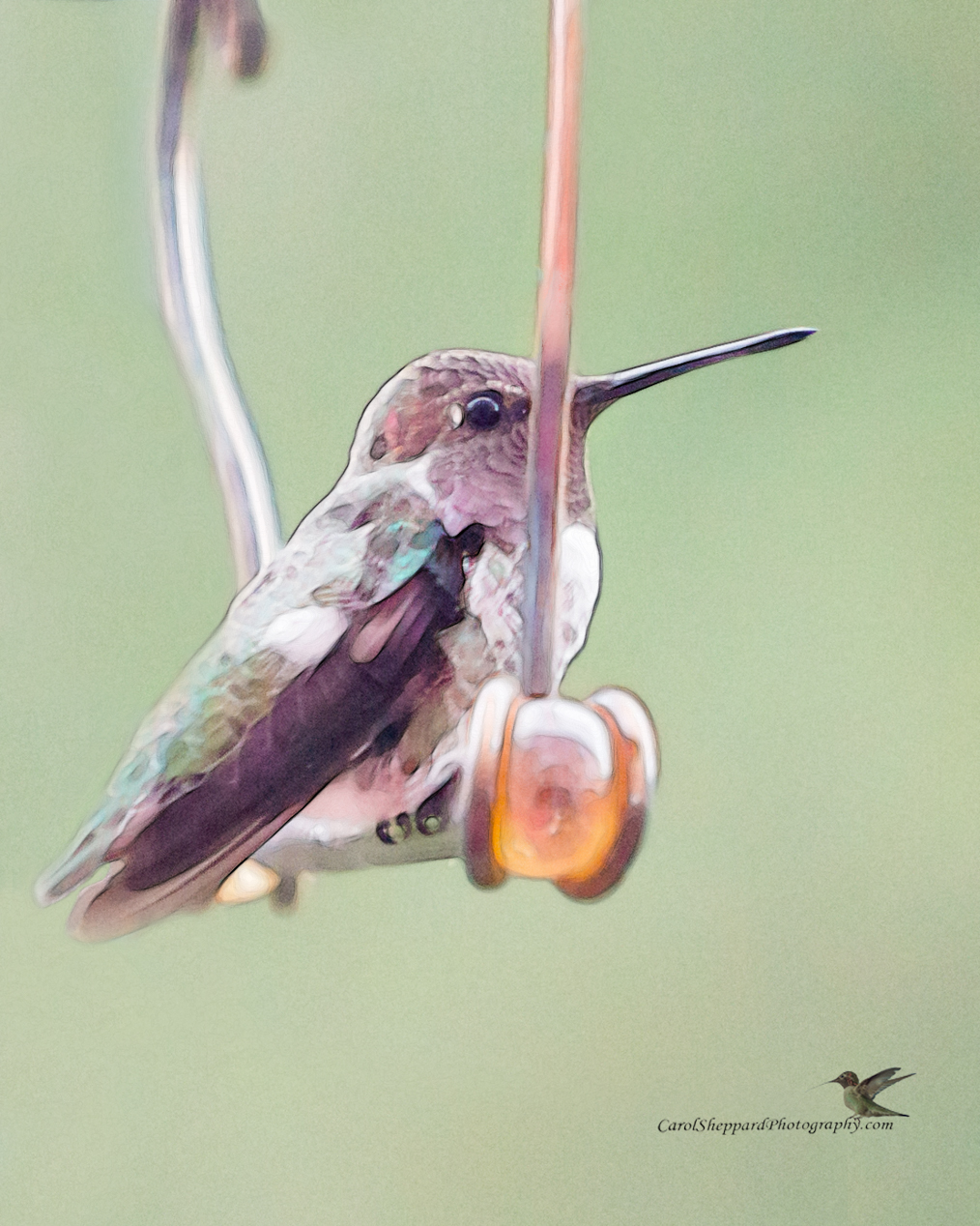
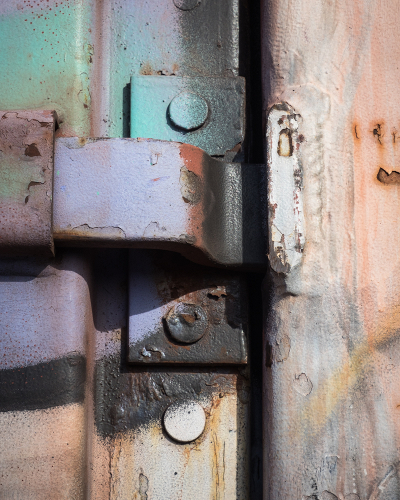
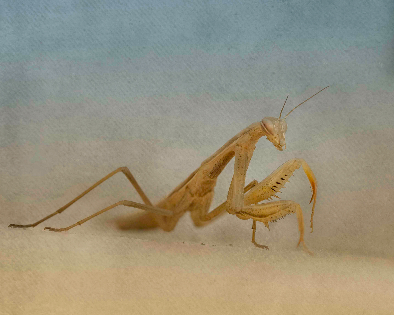
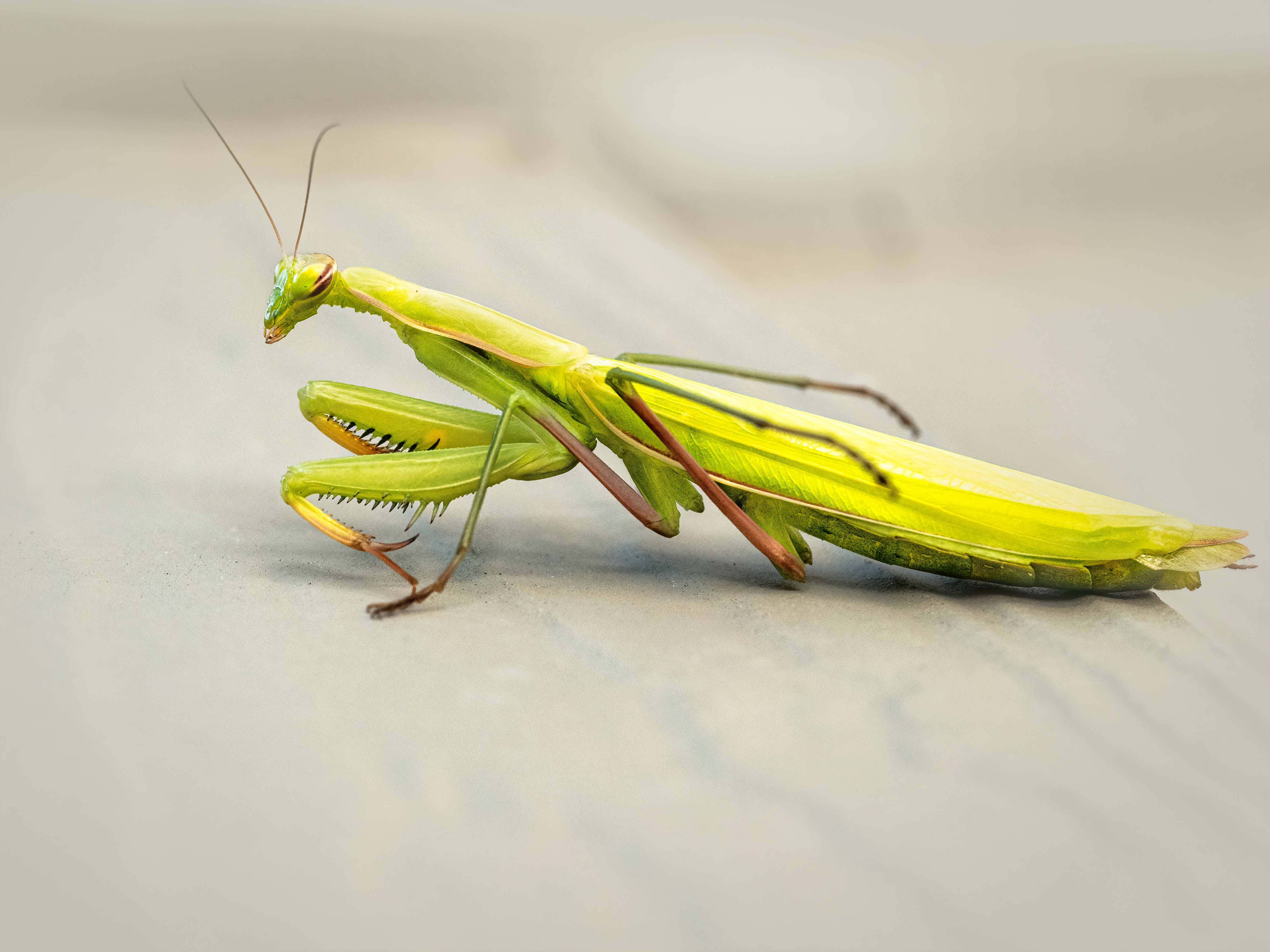
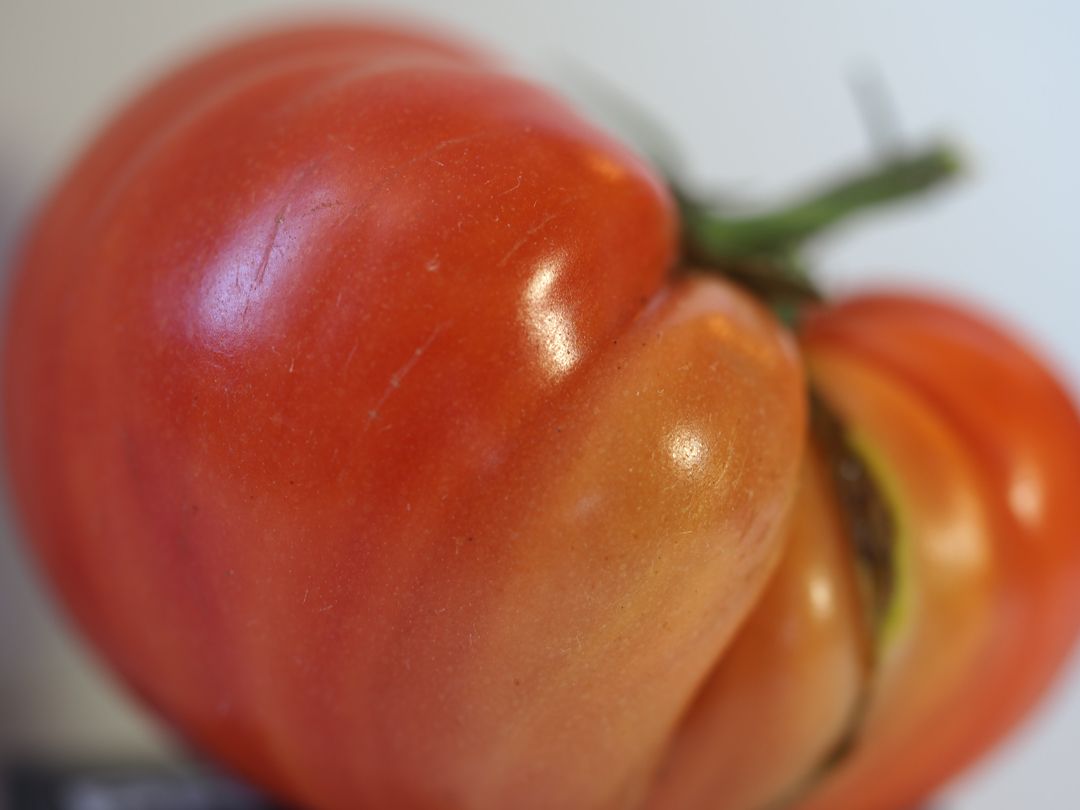
You know, Christmas Ornaments work well for Macro!! Nice even lighting, although I am trying to understand the bright area within the triangle by the back wheel? Your focus is nice and sharp, and the ornament fits well within your choice of composition. I also really like the way your background blurs behind the bike but not in front or underneath it. Honestly I didn't notice anything about the bike being shifted on its stand; it looks quite natural to me. I would try f18 next time; I wonder if it would eliminate any residual softness. I have been told that at its most narrow aperture, you get defraction on all lenses. |
Dec 11th |
| 60 |
Dec 19 |
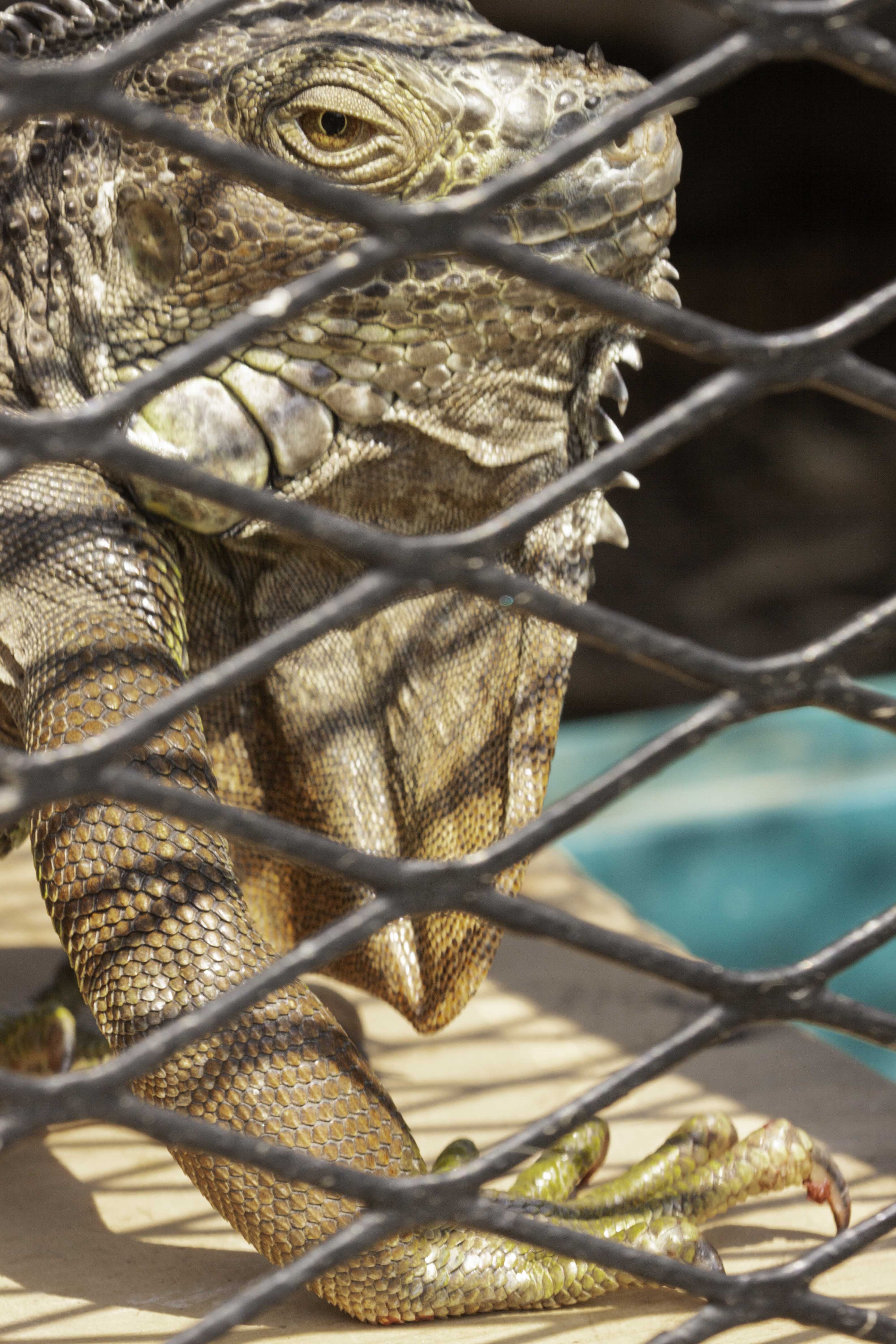
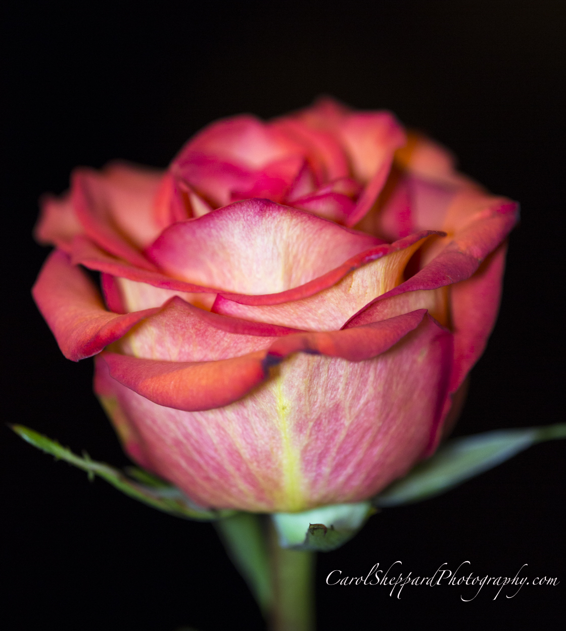
Comment |
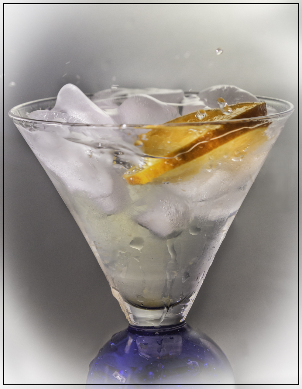
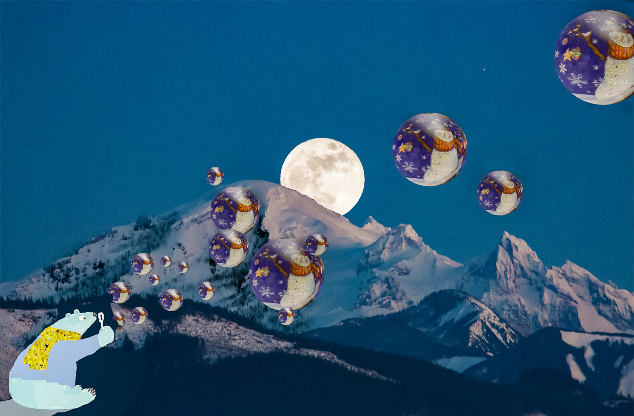
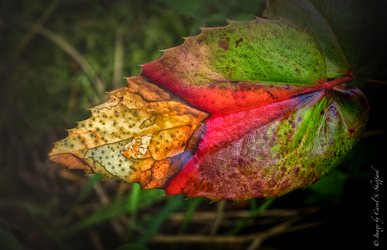
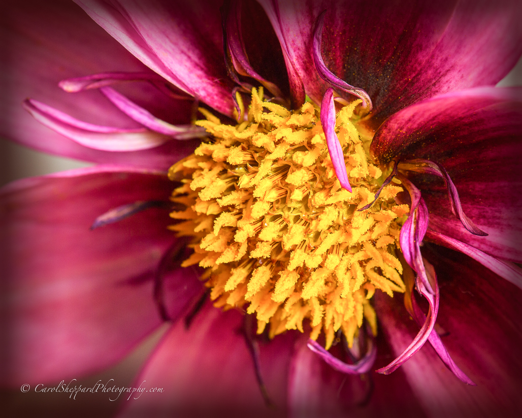
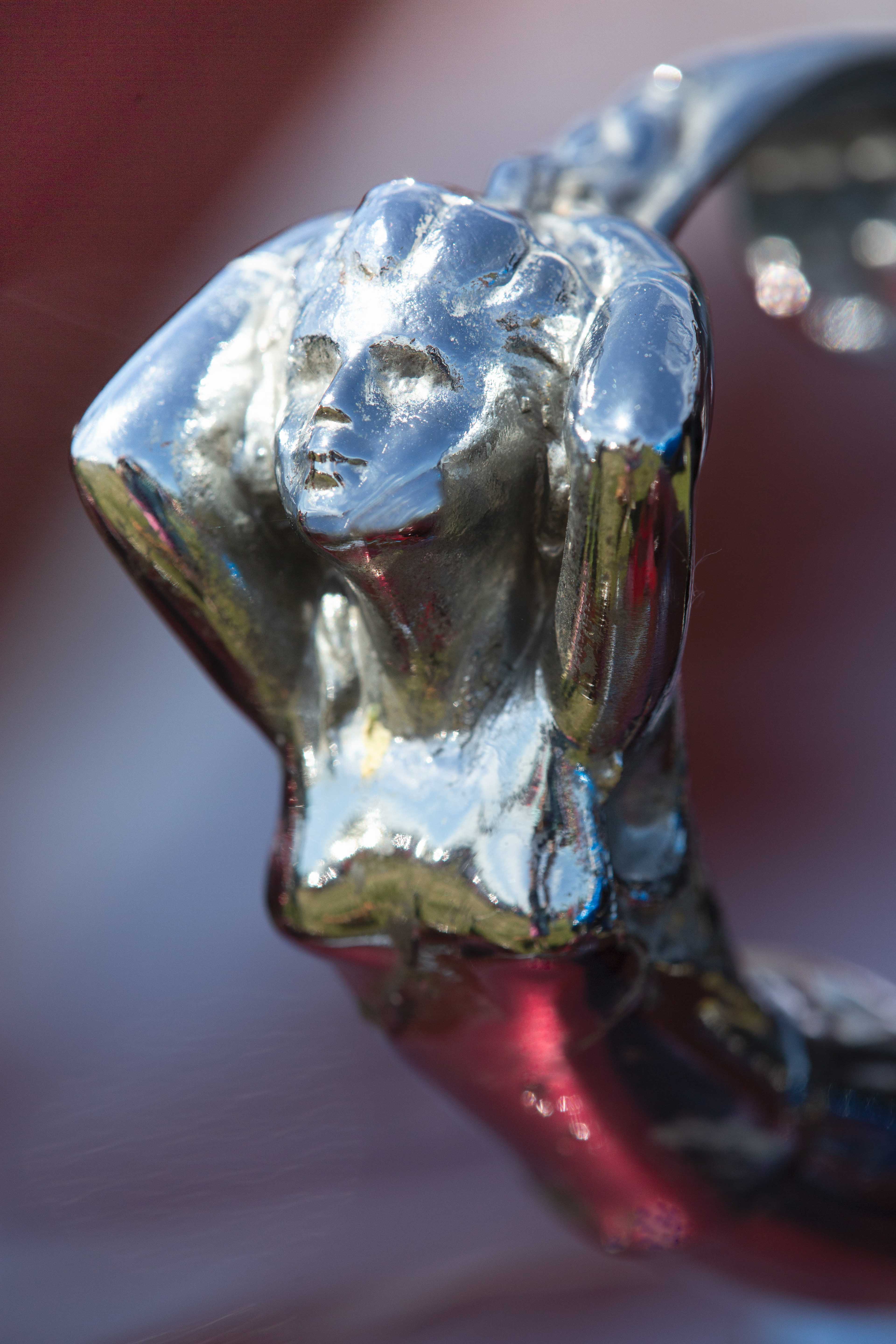
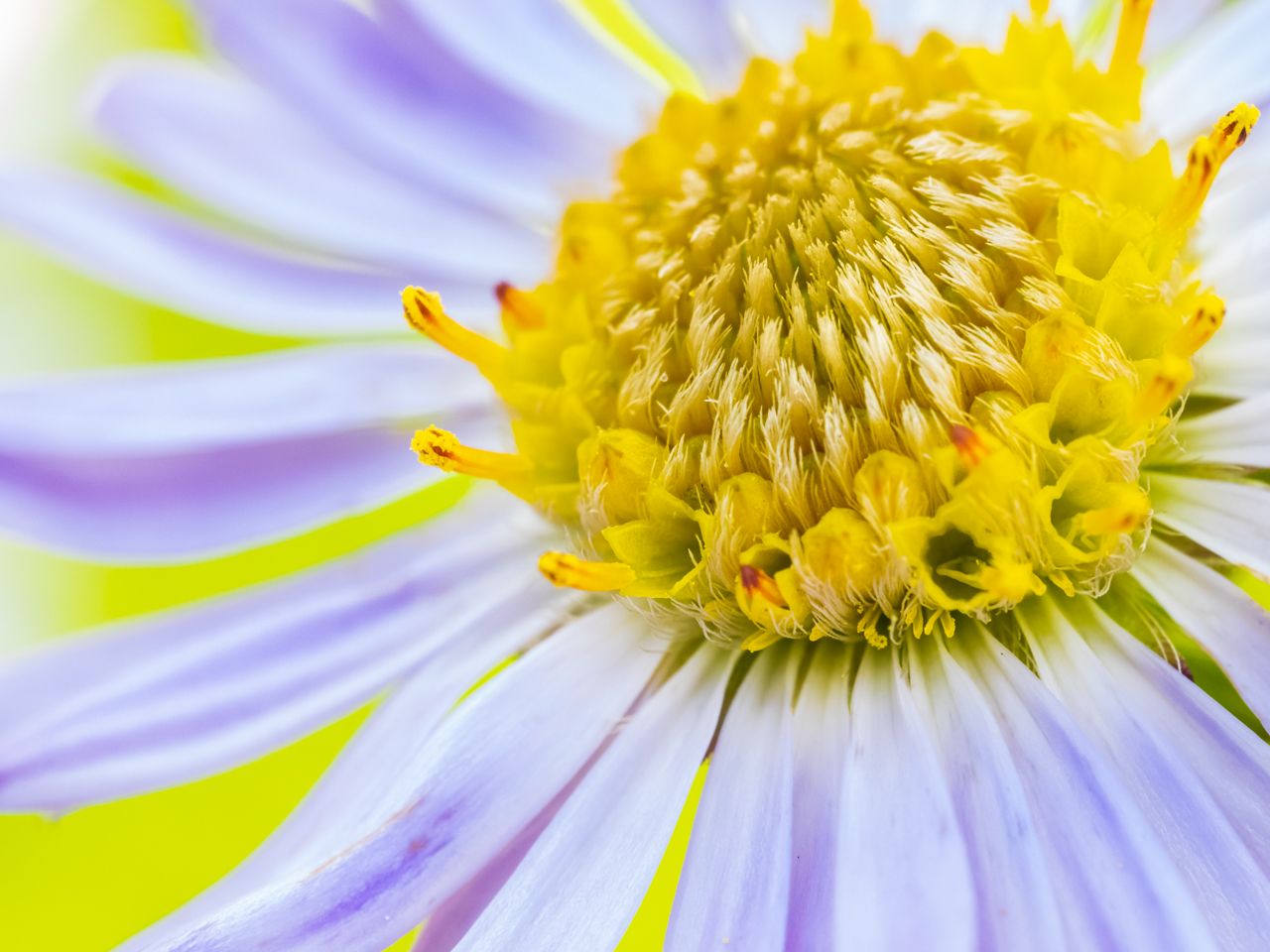
This is a stunner! The impact from the swirls and s is so pleasing, along with the color balance against a black background so that all the attention is on your subject. The composition and angle also work so well for this. The way the light falls on the surfaces that face directly to me is very pleasing. Great job! |
Dec 11th |
| 60 |
Dec 19 |
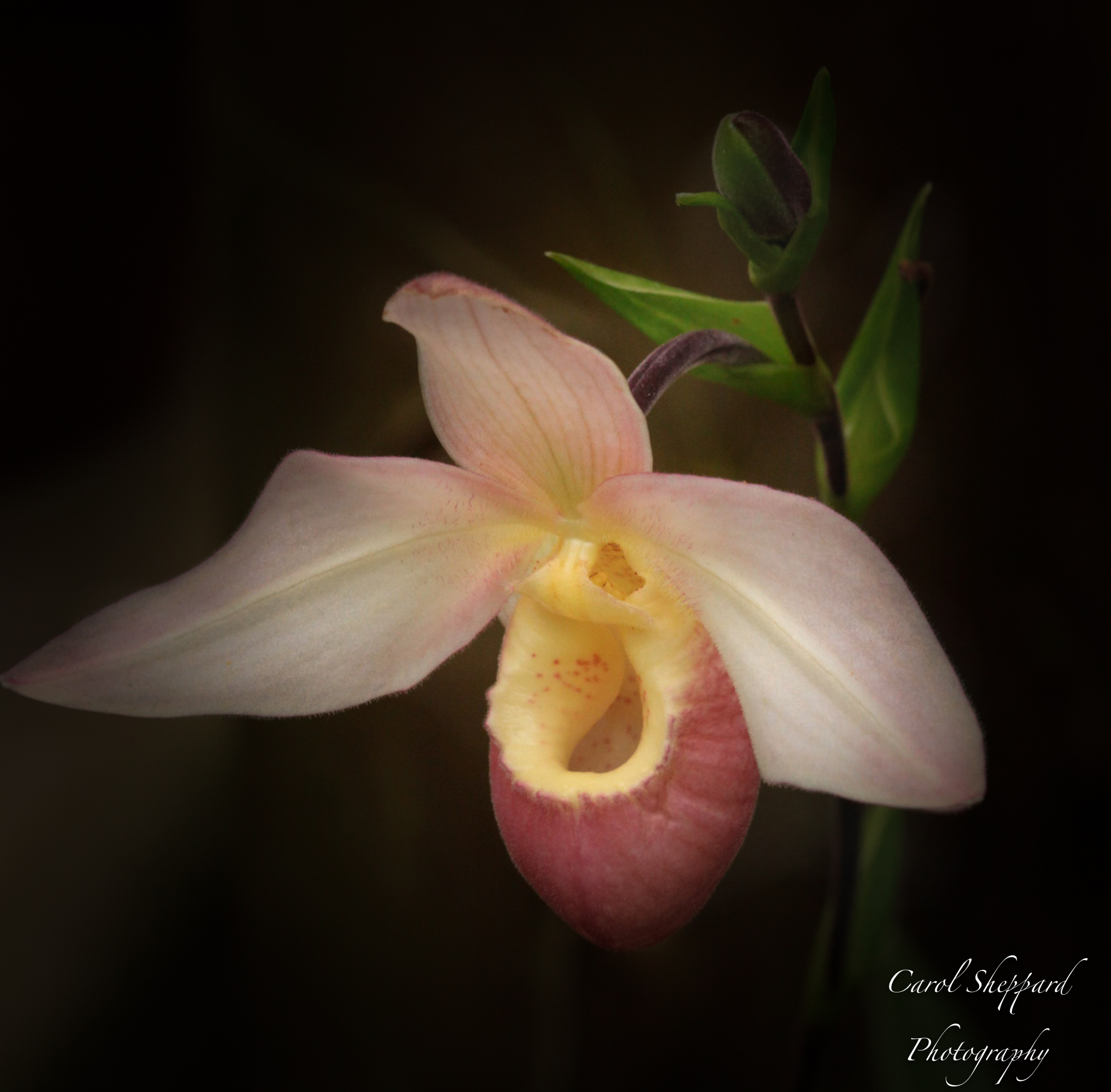
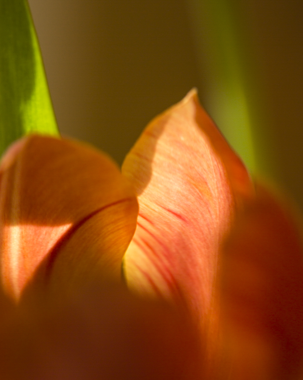
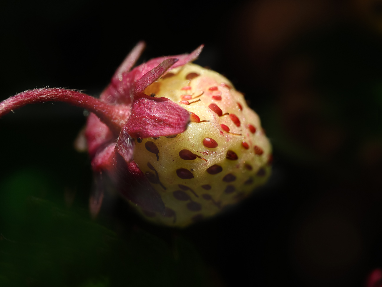
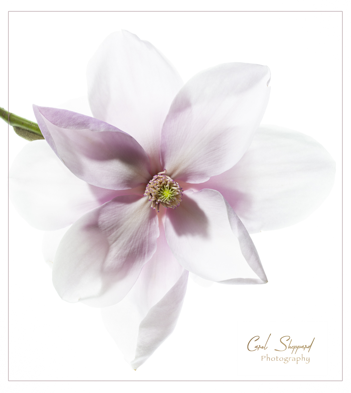
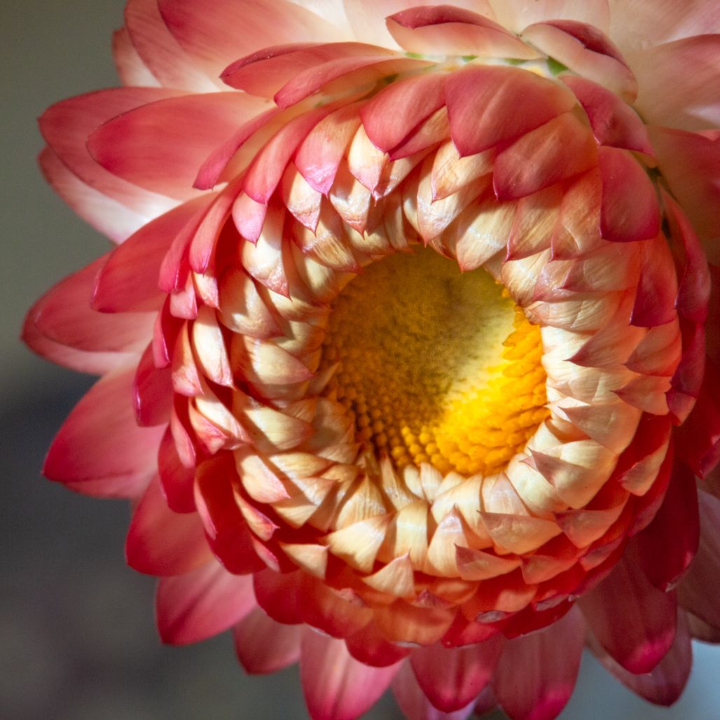
Comment |
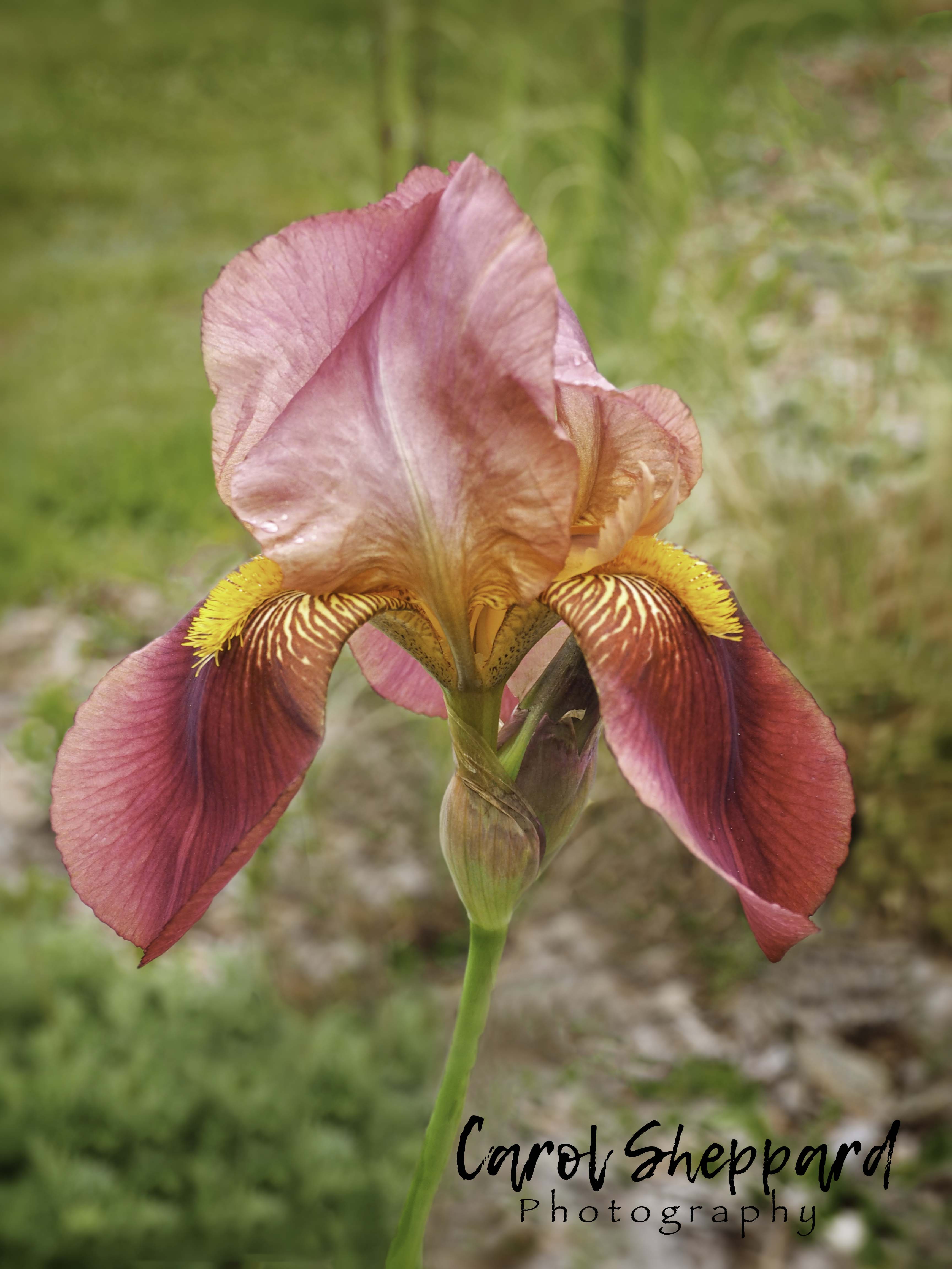
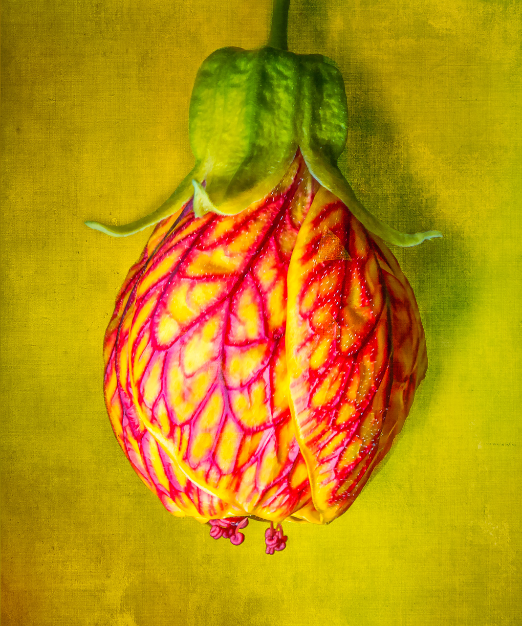
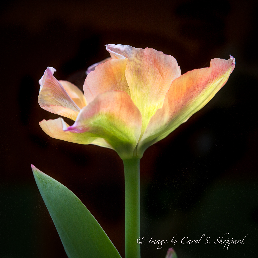
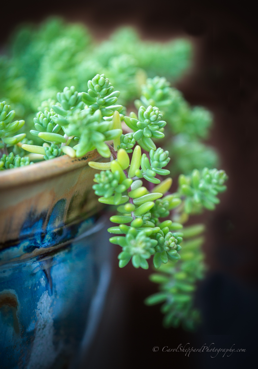
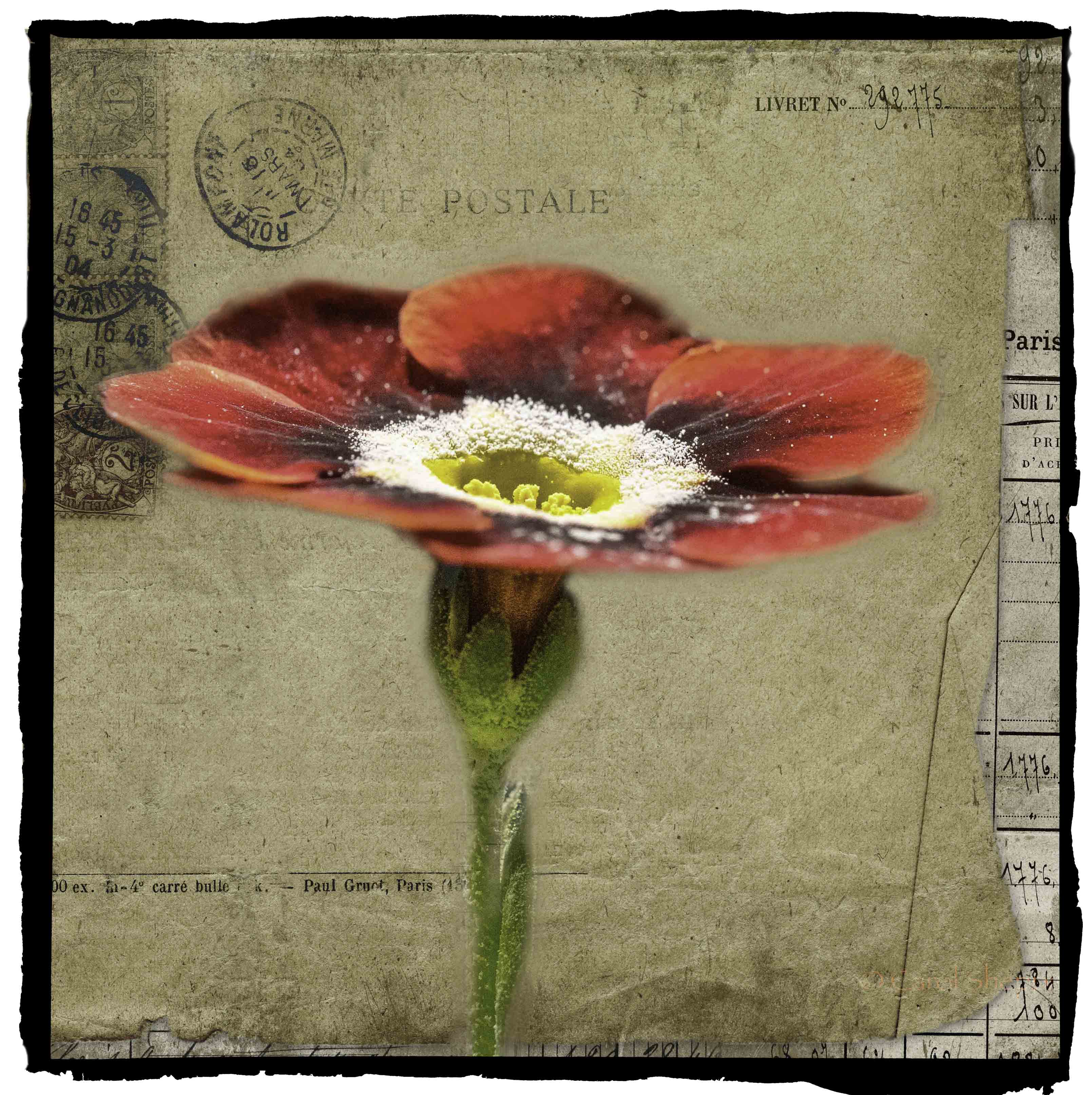
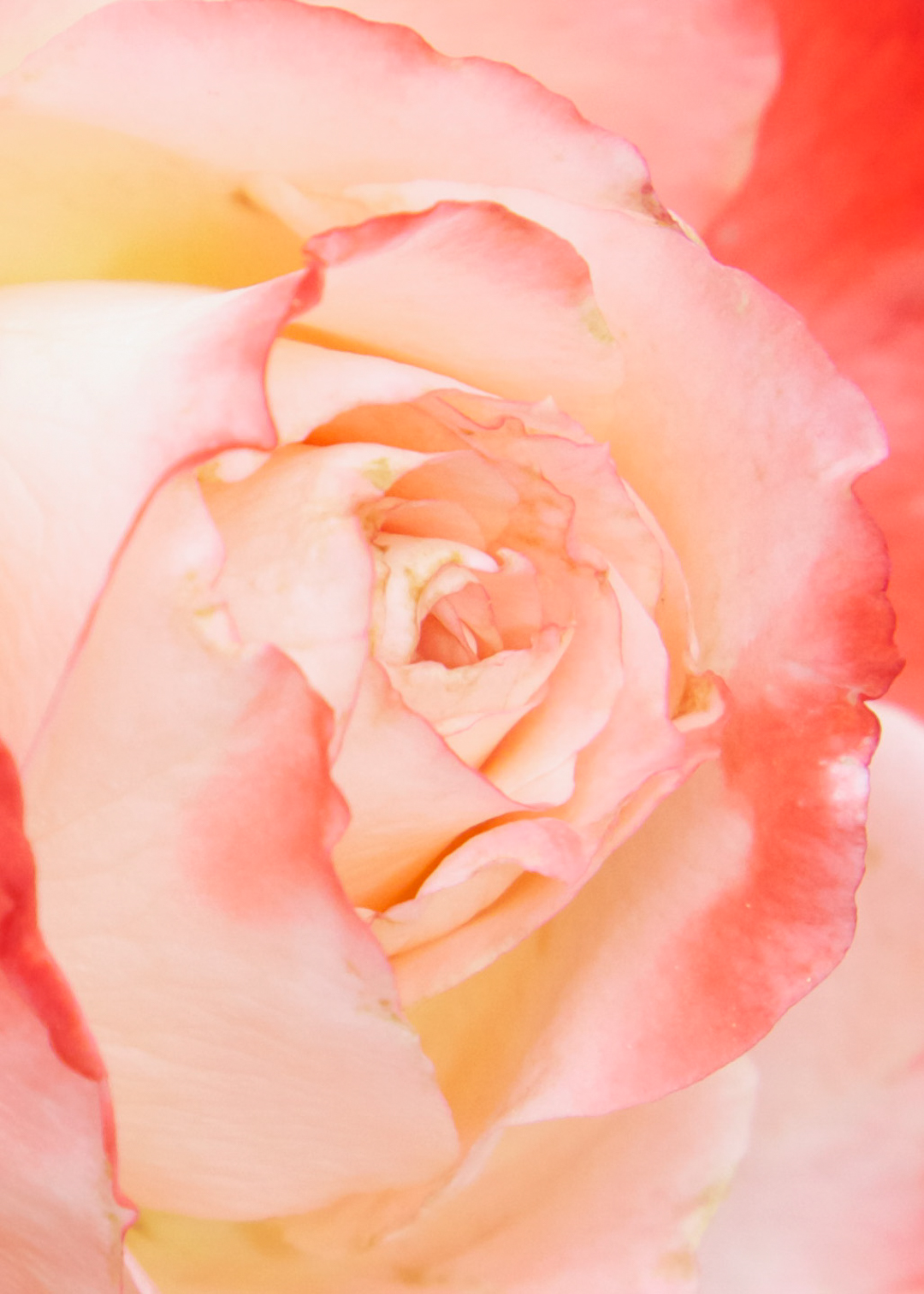
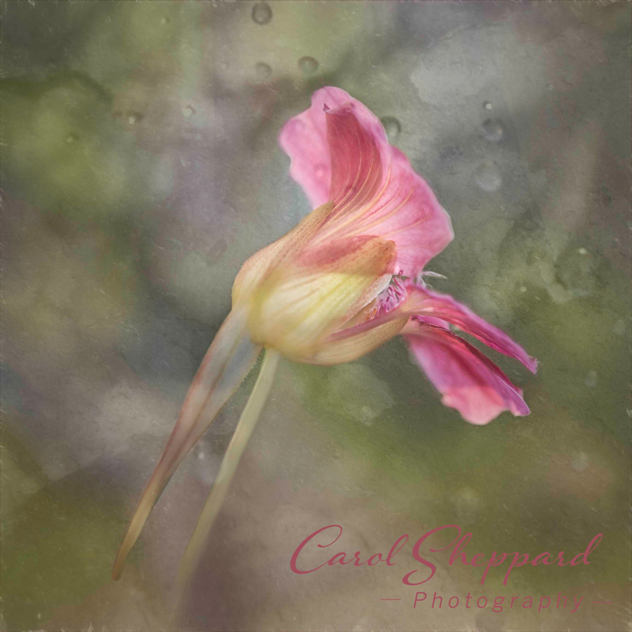
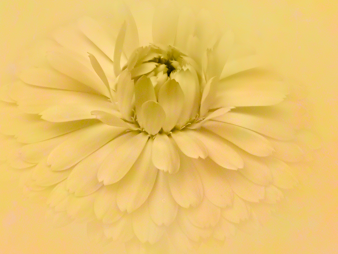
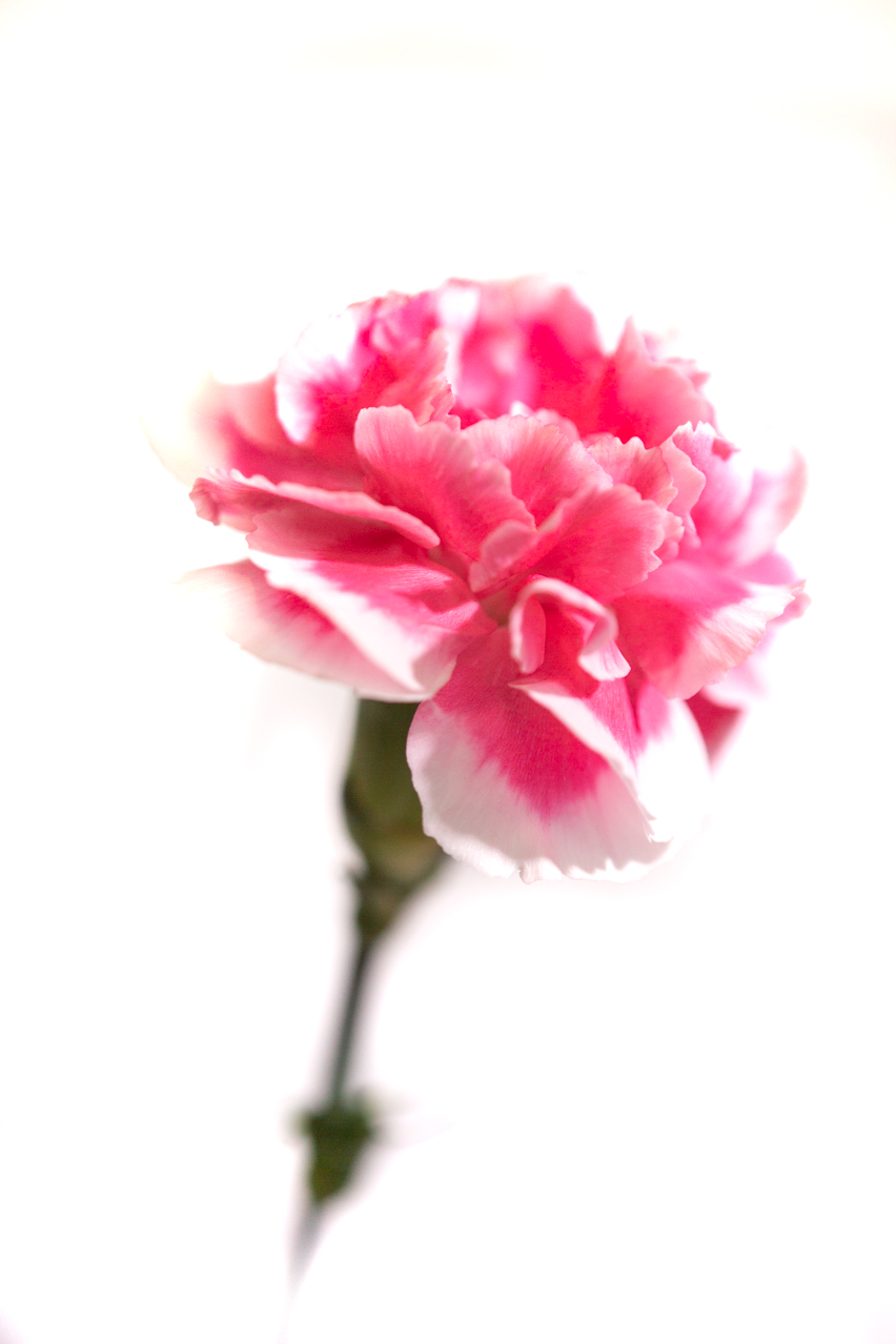
Soft and ethereal in impact; love the colors! Vignettes are easier to add in Lightroom IMHO. The lighting works well for this; I would suggest that you try to apply a gradient to the bottom third (so its gradual....maybe even 1/8th?) to raise the shadows just a bit....the stem disappears too much for my taste. The crop works quite well so that I don't feel at all crowded. |
Dec 11th |
4 comments - 1 reply for Group 60
|
| 80 |
Dec 19 |
Comment |
Oh, also I think you made a great choice with the gradient and how you applied it. |
Dec 11th |
| 80 |
Dec 19 |
Comment |
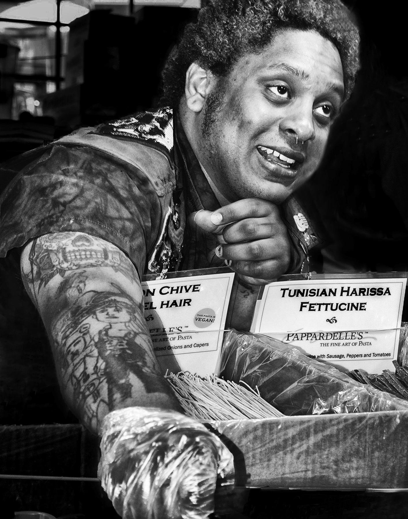
Great image! I like what you did with this. The background is soft and unobtrusive. I'm fine with the color you selected; its portrait-y looking but not overly so. I had to look closely to see what he was doing with the hand holding that tiny cup, but don't see how you could make it stand out any better than you did. He has a lot going on on his body; nothing you can do about that. Kudos! |
Dec 11th |
| 80 |
Dec 19 |
Comment |
This subject is wonderful! Its impact is poignant. You've captured the emotion on her face well, and the bond between her and the dogs in the relaxed posture of her pups. The composition and the leading lines all work favorably to bring my eyes directly to her and her flock, where they remain. What a great capture!
I agree that Ed has made an impact in having her stand out; I do feel, though, that it makes her appear less "street" than the original. The overall grey, toned down appearance in your version lend to the mood and the setting. In the redone version, she looks too healthy and scrubbed for my taste. Ed's version did draw more attention to the dirt under her nails, though, which increases the feeling of living on the street. |
Dec 3rd |
| 80 |
Dec 19 |
Comment |
What a fun image!! I love the pose because it looks like they are having a conversation about how they both purchased the same pair of boots!! Very strong impact in the color combination and the brightness and clarity of the boots themselves. I would take off a slice at the top to eliminate the yellow, if possible. Even without that, great image! |
Dec 3rd |
| 80 |
Dec 19 |
Comment |
The black and white works well in this, giving it a photojournalistic feel overall. There are two elements that I find distracting in a very minor way--the pen, which is so bright against everything so draws my eye, and the activity right in the center behind them. Because the table contents are also white, they draw my eye repeatedly. The only way to have gotten around this in camera would have been with an even wider aperture. But I do like this image. It shows her discomfort with having her caricature done very well! |
Dec 3rd |
| 80 |
Dec 19 |
Comment |
The image provides a mood and a mystery; it makes me want to know more about this man. The motion you captured is wonderful and lends well to the picture and the overall impact. I like the slight green cast, which I'm sure comes from the lights on the train to some extent and to the flourescent lights, which add to the story and its mood. Those lights give it the lonely, institutional feeling that is part of the mood. I wouldn't remove that color cast, personally. |
Dec 3rd |
| 80 |
Dec 19 |
Comment |
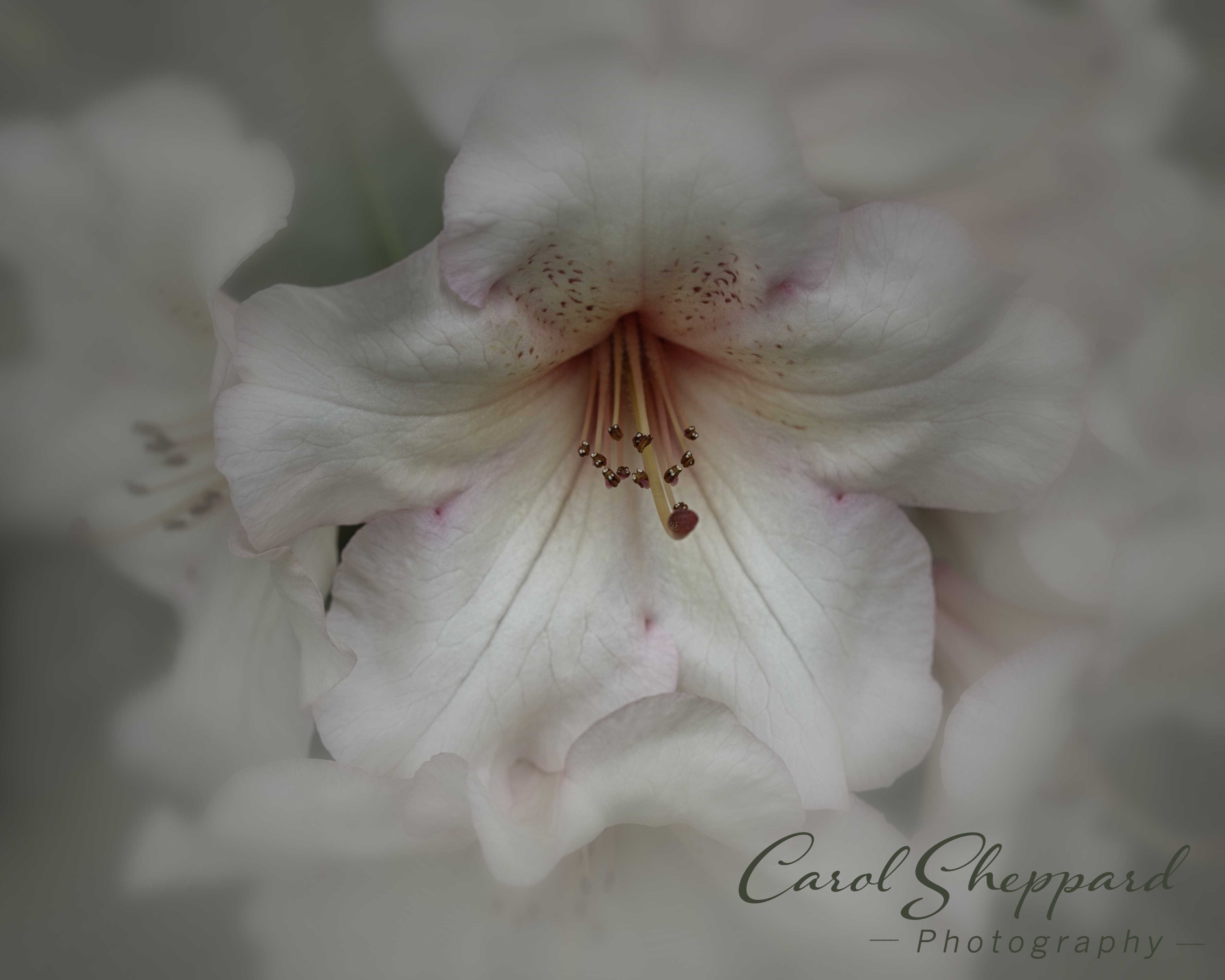
Hi Ed, and thanks for the input. To my eye, I can't really see any difference, but I do know what you are talking about. Even if I had applied a vignette, it would have been better for putting the focus on the main subject(s). I will keep that in mind. |
Dec 3rd |
7 comments - 0 replies for Group 80
|
11 comments - 1 reply Total
|