|
| Group |
Round |
C/R |
Comment |
Date |
Image |
| 52 |
Nov 19 |
Comment |
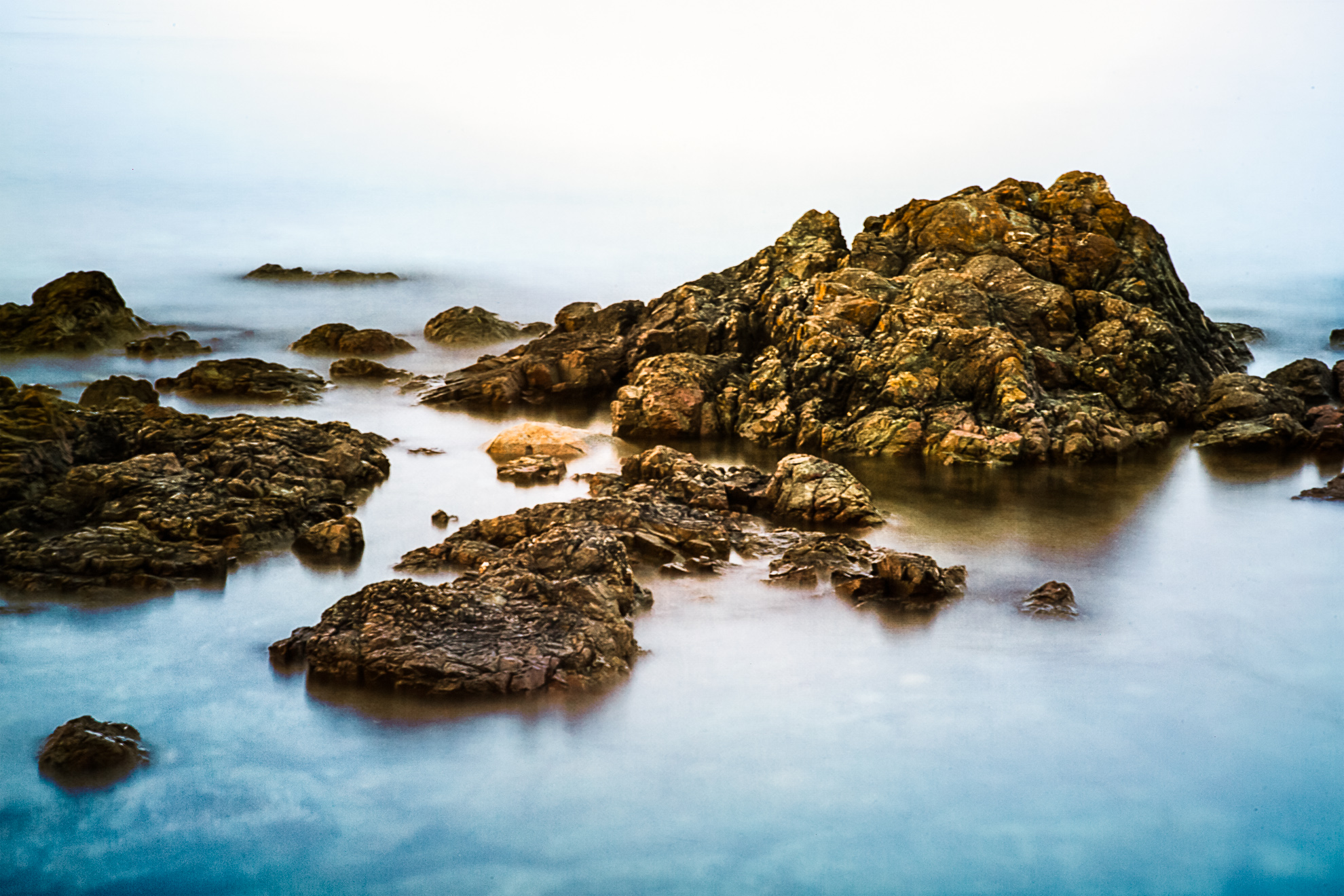
Interesting observation about the rocks--I will try it. |
Nov 12th |
| 52 |
Nov 19 |
Comment |
Thank you, Lisa. I am afraid I just took too much onto my plate between September and October, and my images are a mess!! I organized so carefully, but something has happened to them. So, hopefully everyone can just switch the images in their viewing!! |
Nov 10th |
| 52 |
Nov 19 |
Comment |
I do believe, the two got mixed up somehow. The original is posted as my finished product, while the one that shows on our site as original is the changed image. Oh well. |
Nov 10th |
| 52 |
Nov 19 |
Comment |
Totally agreed; not actually sure what happened! I didn't darken the shadows from the original, or reduce exposure. Not to mention the bridge being so tilted in the final pass. So not sure what produced the end result that got posted. Let me see if I can repost.
|
Nov 10th |
| 52 |
Nov 19 |
Comment |
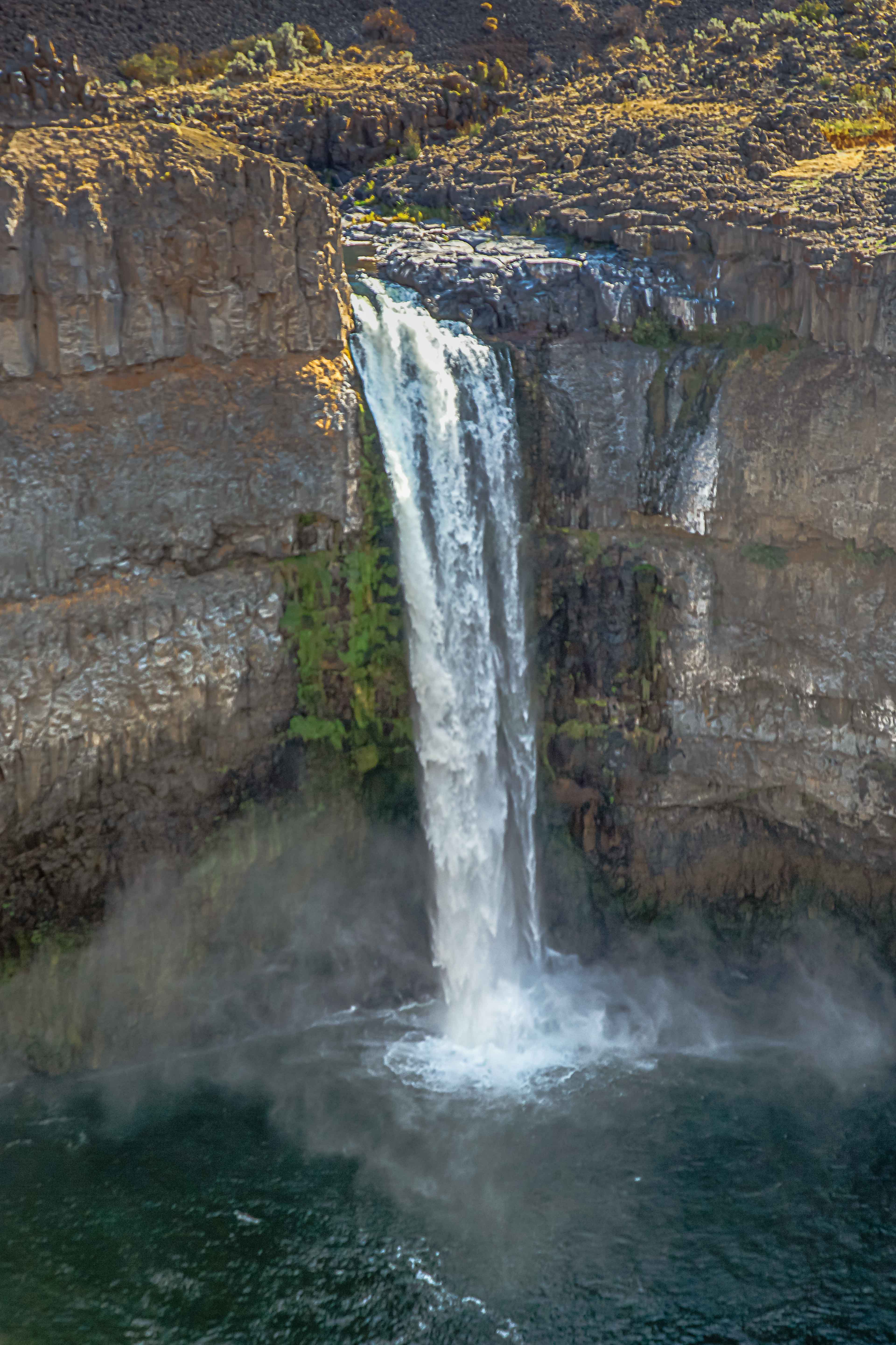
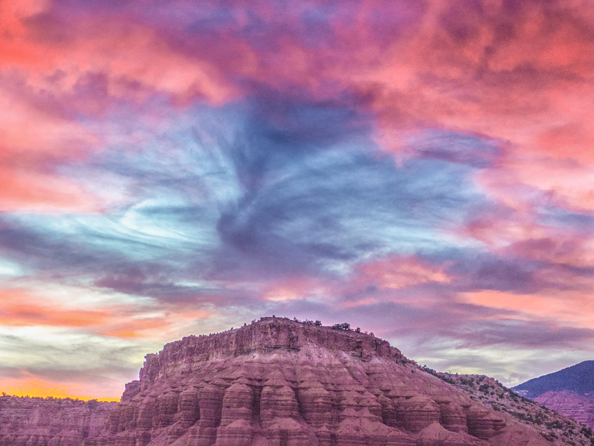
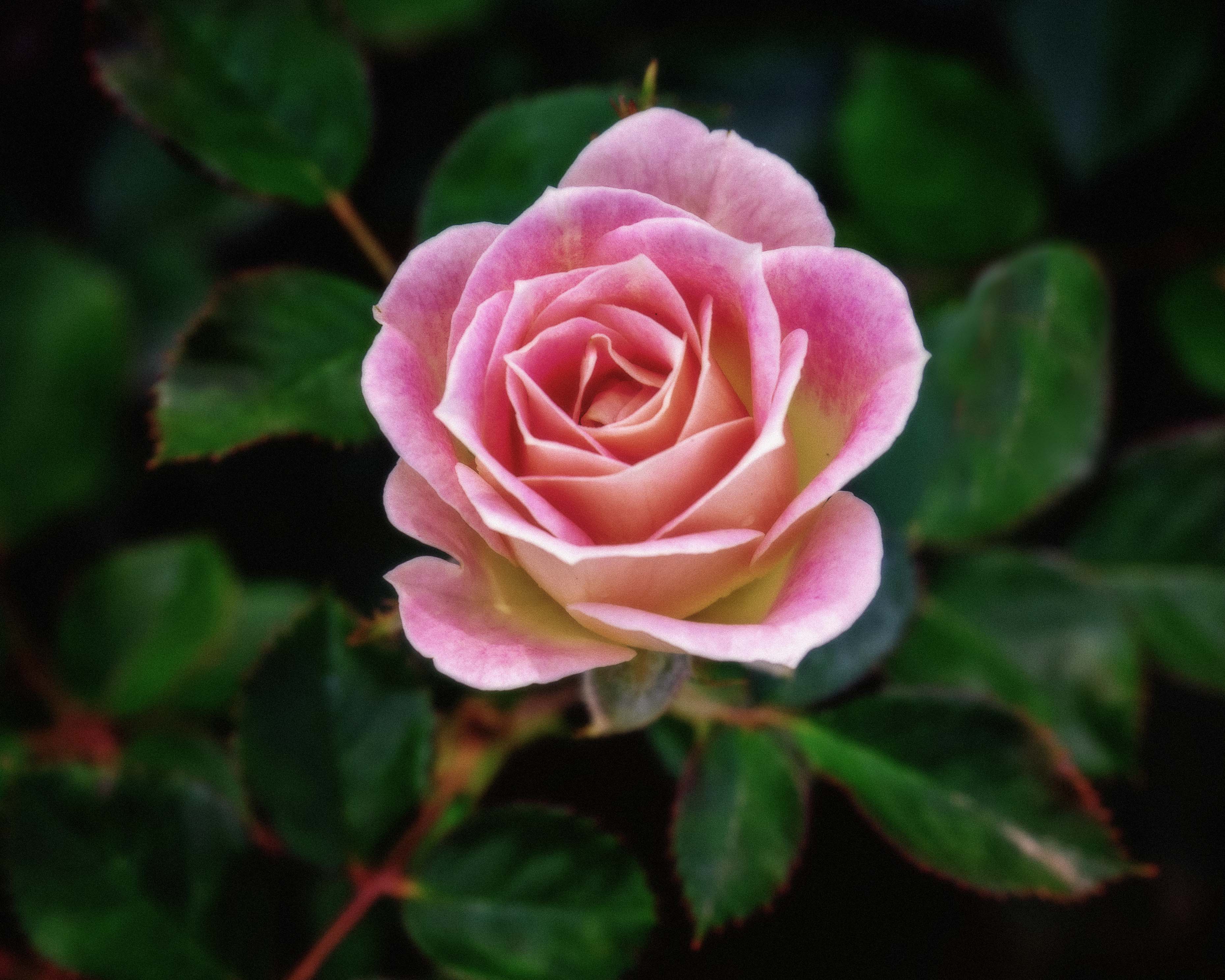
Beautiful and definitely competition-worthy. Having the reflection at that angle and in that spot in your composition works so well. It didn't feel overprocessed to me, and I wouldn't do anything differently with it, except, when I compare it to the original, I do find that you processed the heck out of that back right orange wall, that already had a lovely but natural glow on it. Maybe if you had backed down the processing a bit there. This is nature, after all. But I still think, as an image, it is beautiful. I know we differ quite a bit on our approach to nature and processing of our images, and this fits your vision and is a beautiful image on its own, to boot. |
Nov 10th |
| 52 |
Nov 19 |
Comment |
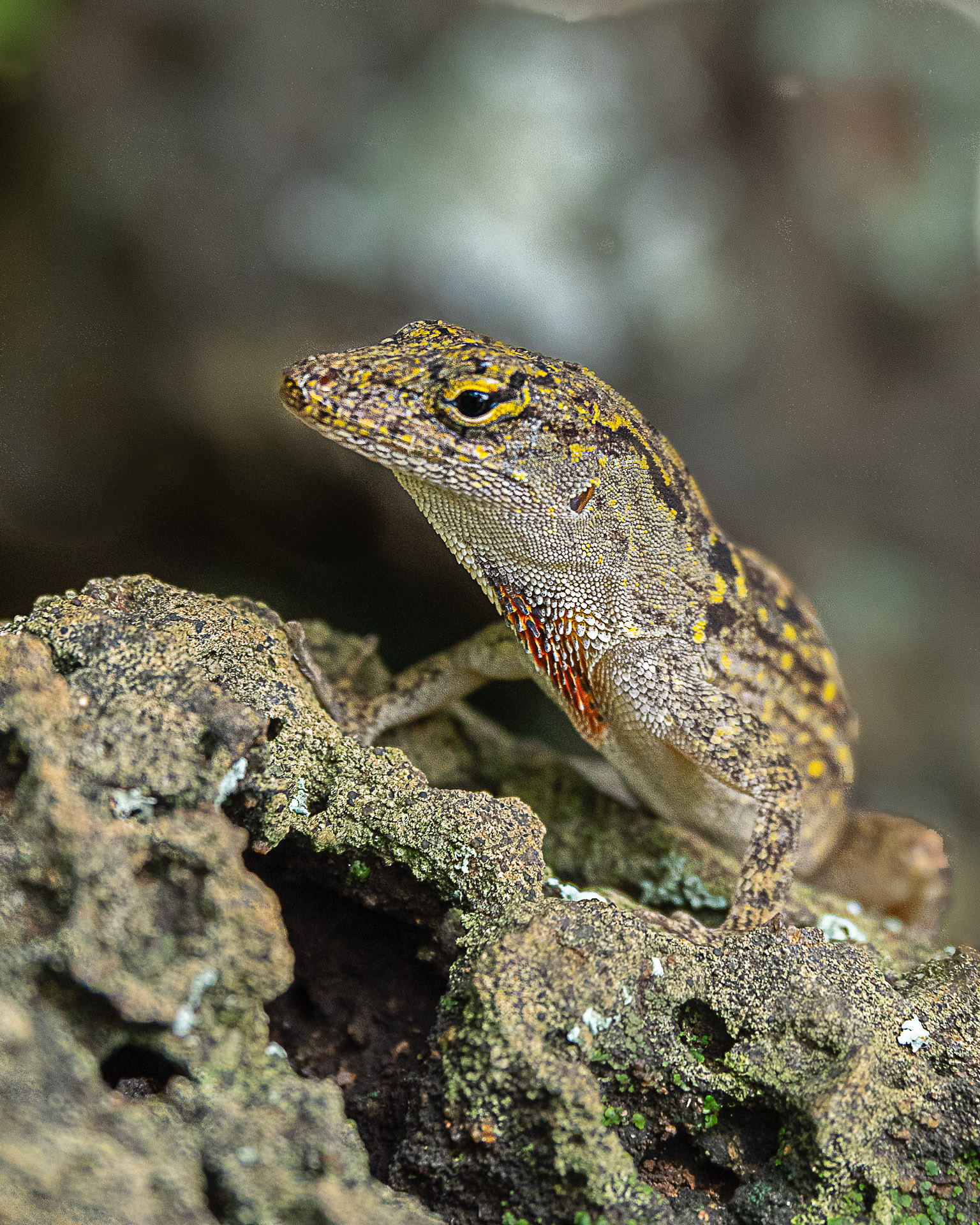
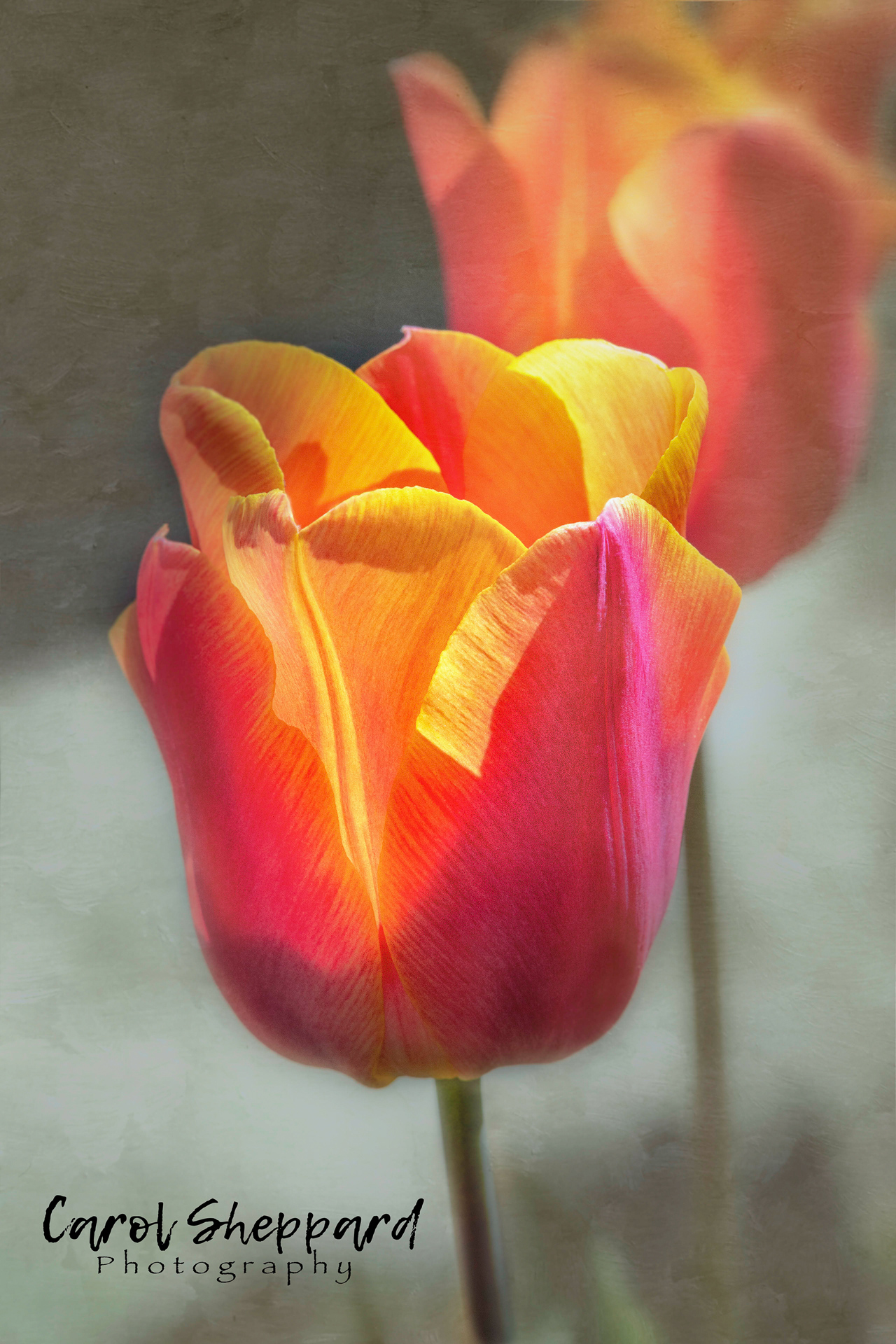
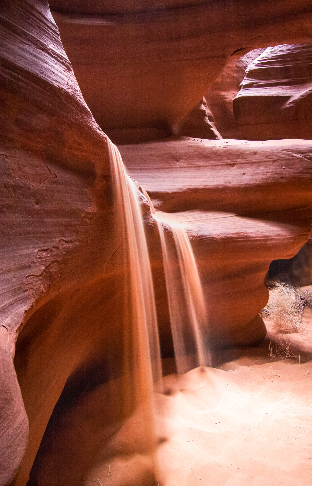
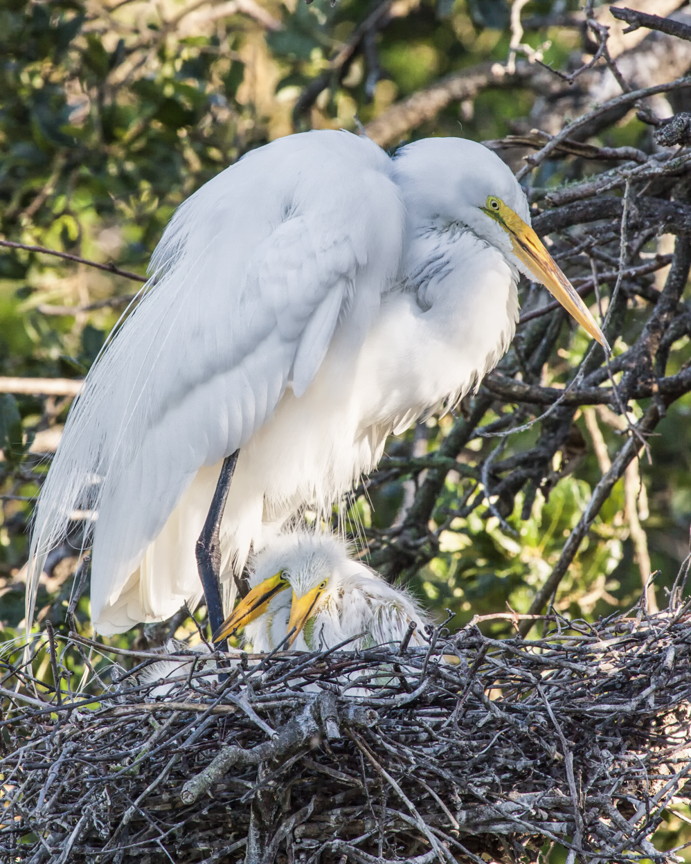
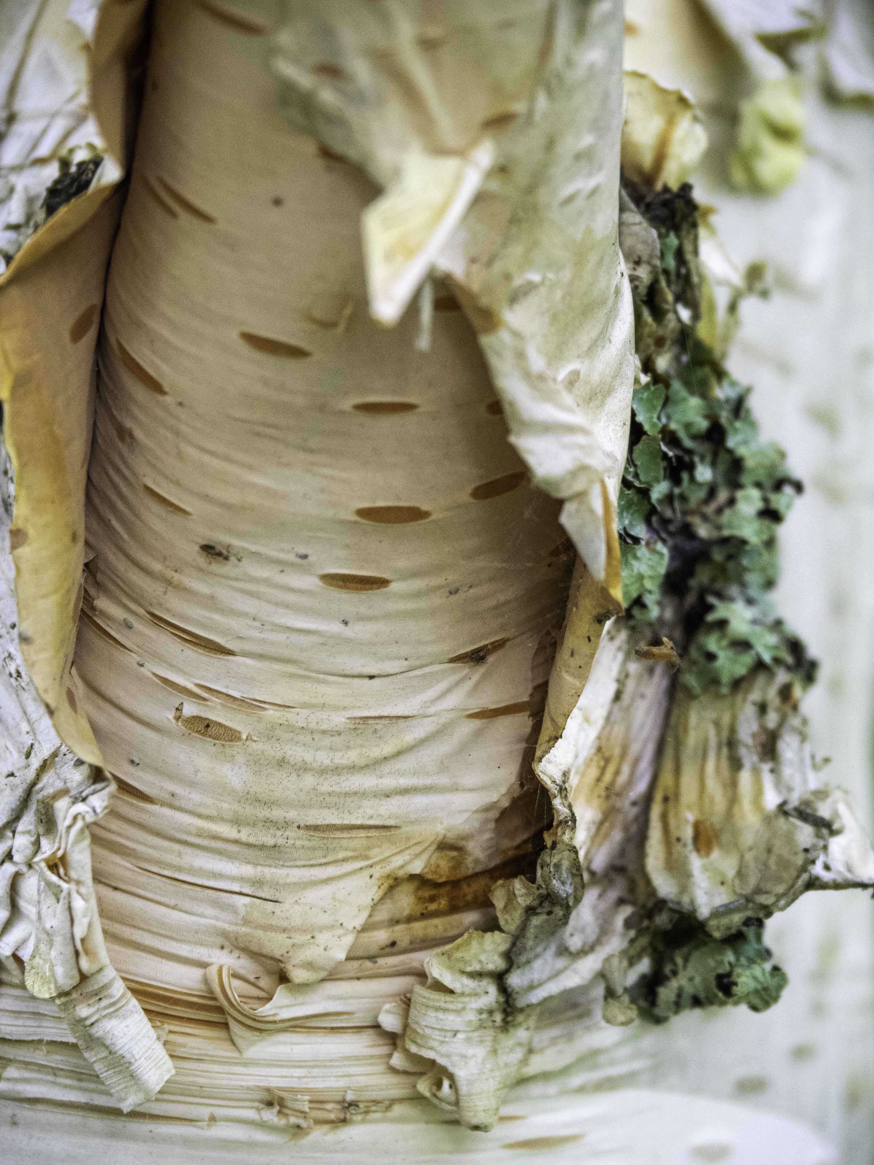
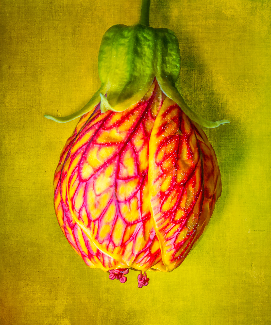
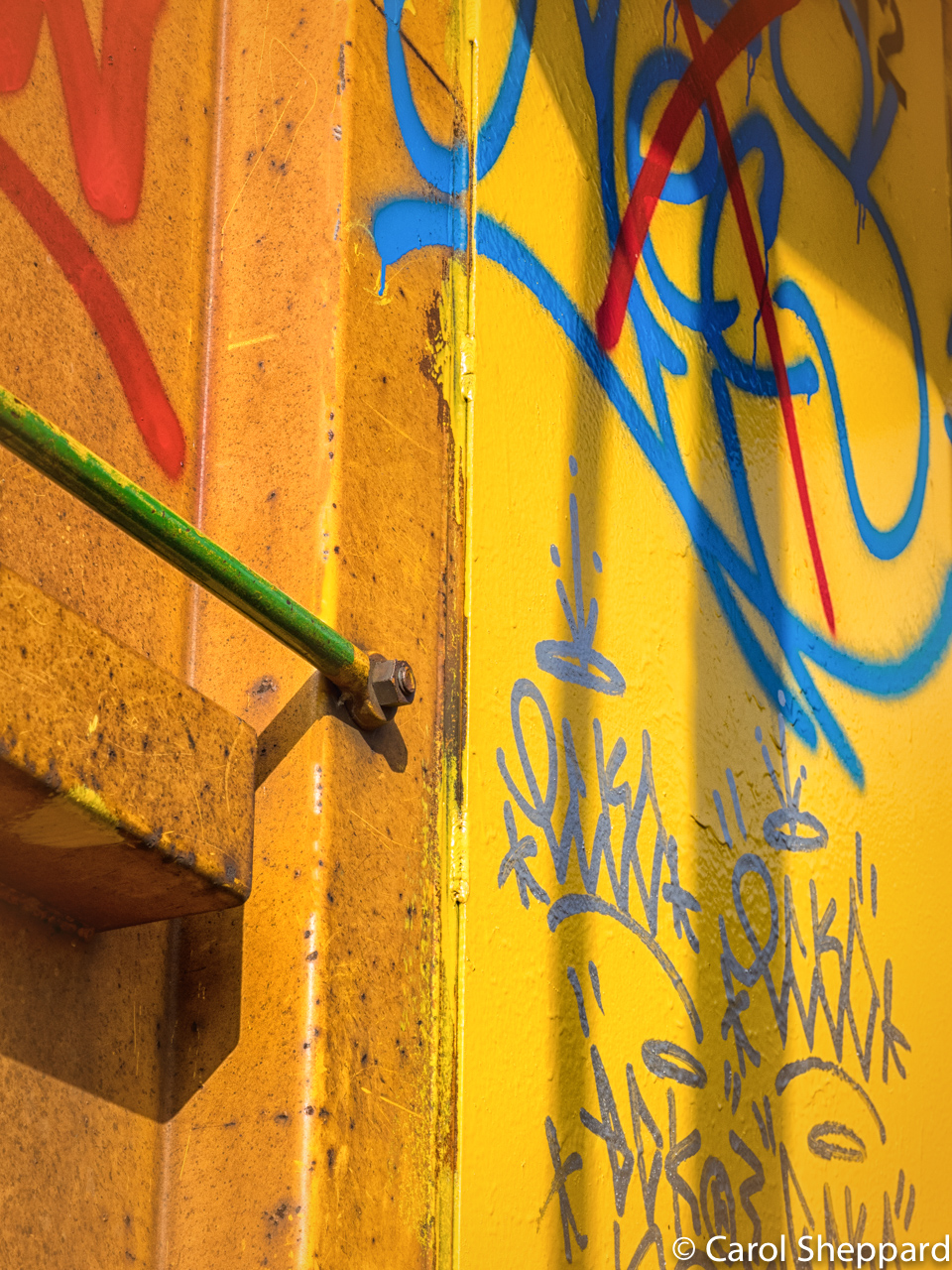
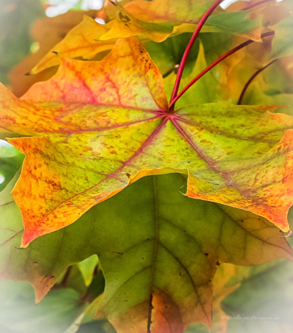
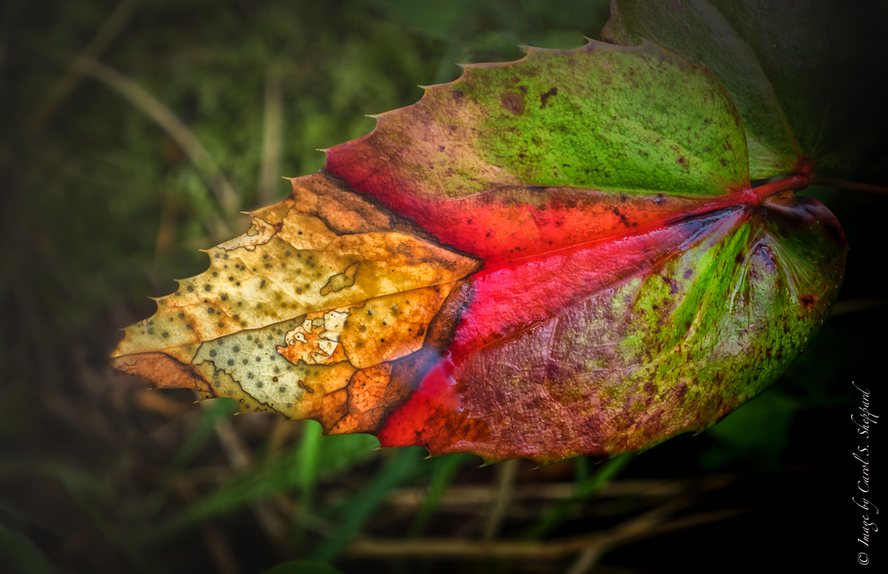
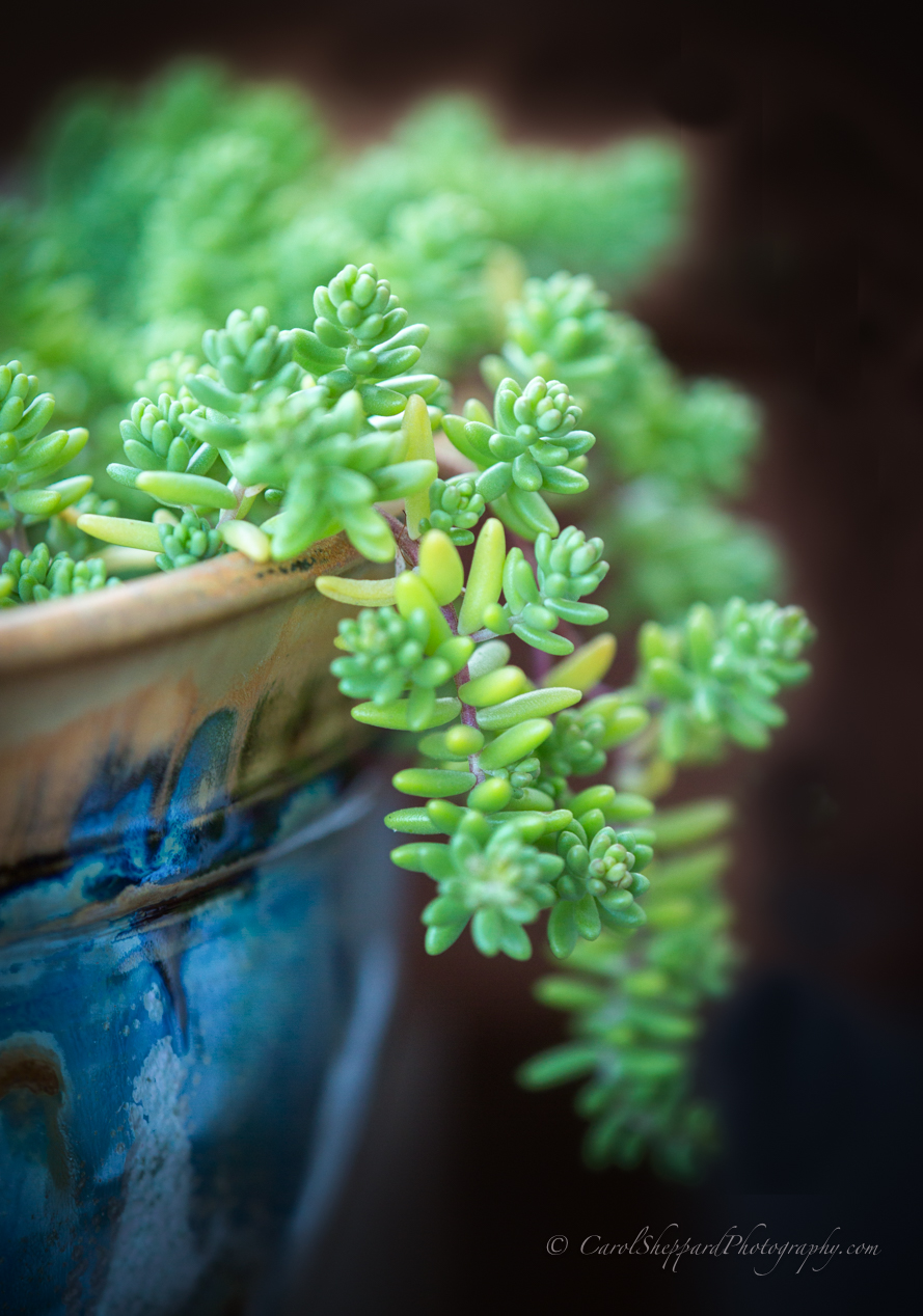
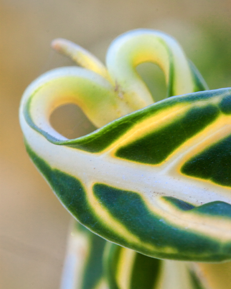
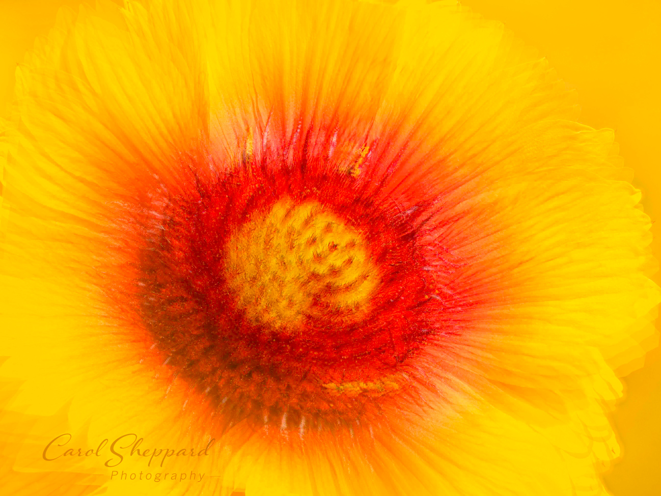
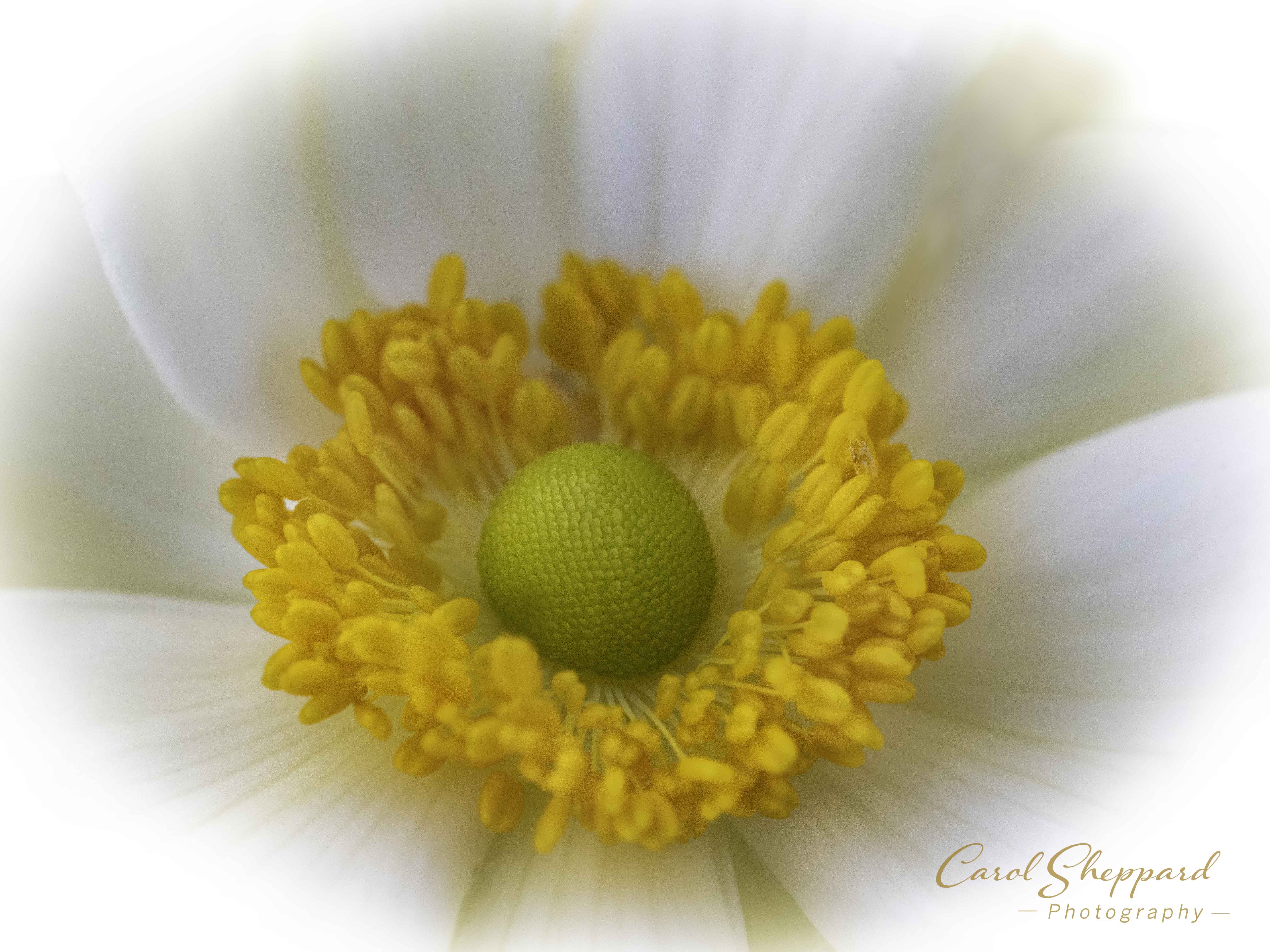
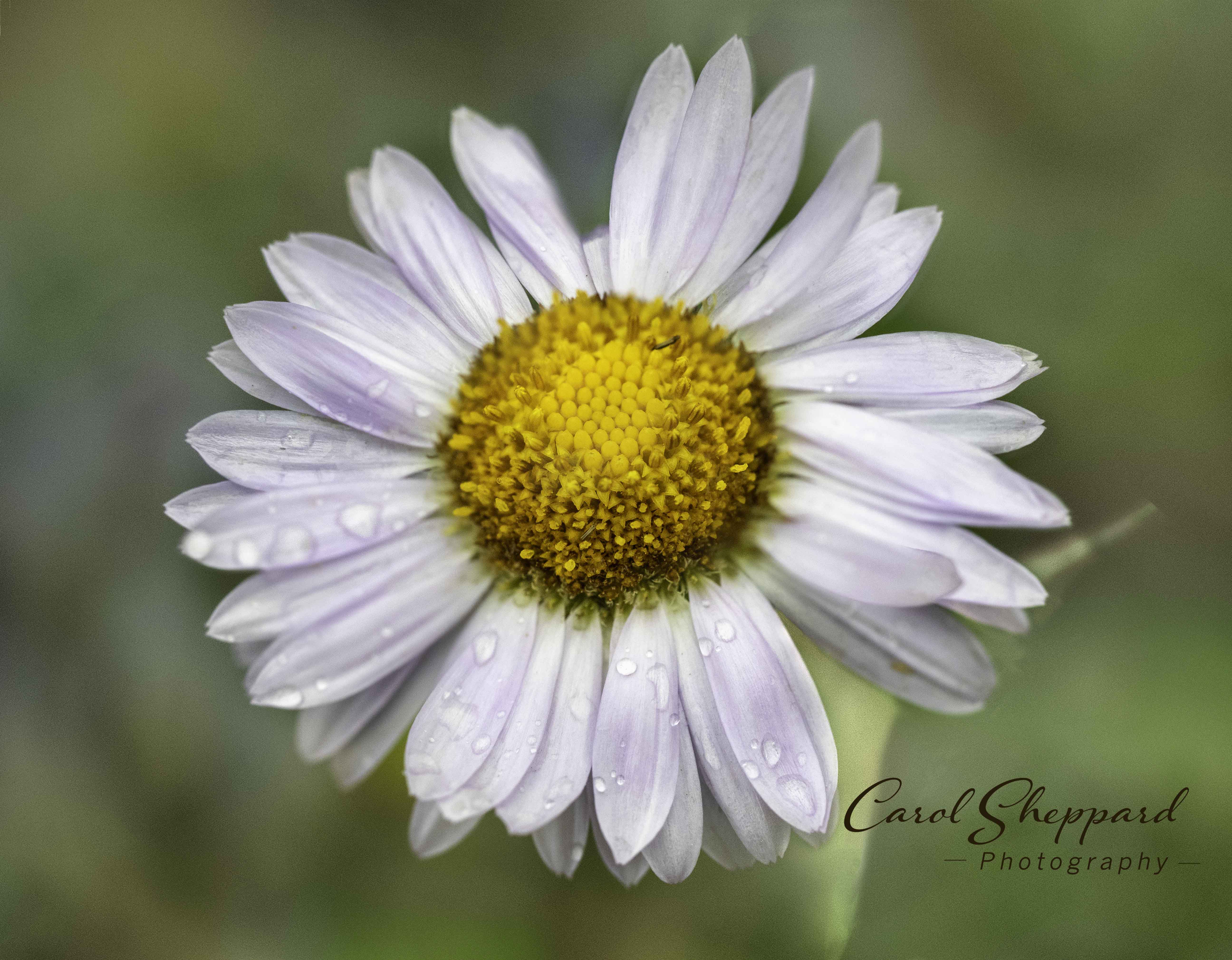
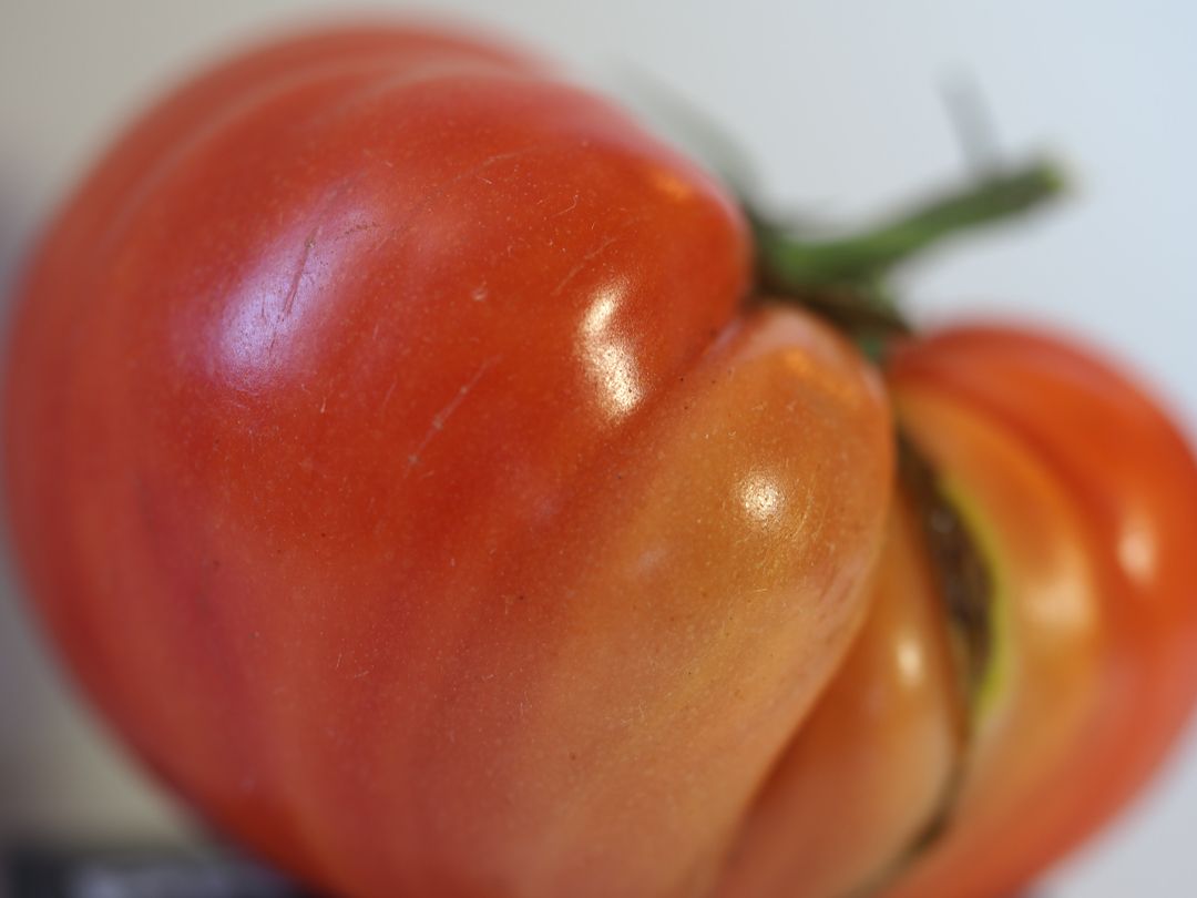
The composition of this is wonderful and really works! Technically, you've captured texture, the subtle gradations in color from greens to yellows, and incredible depth--it all works so well together, truly! That one sideways leaf is a bit of a distraction, but not enough to bring down the lovely impact of this image. Great capture! |
Nov 10th |
| 52 |
Nov 19 |
Comment |
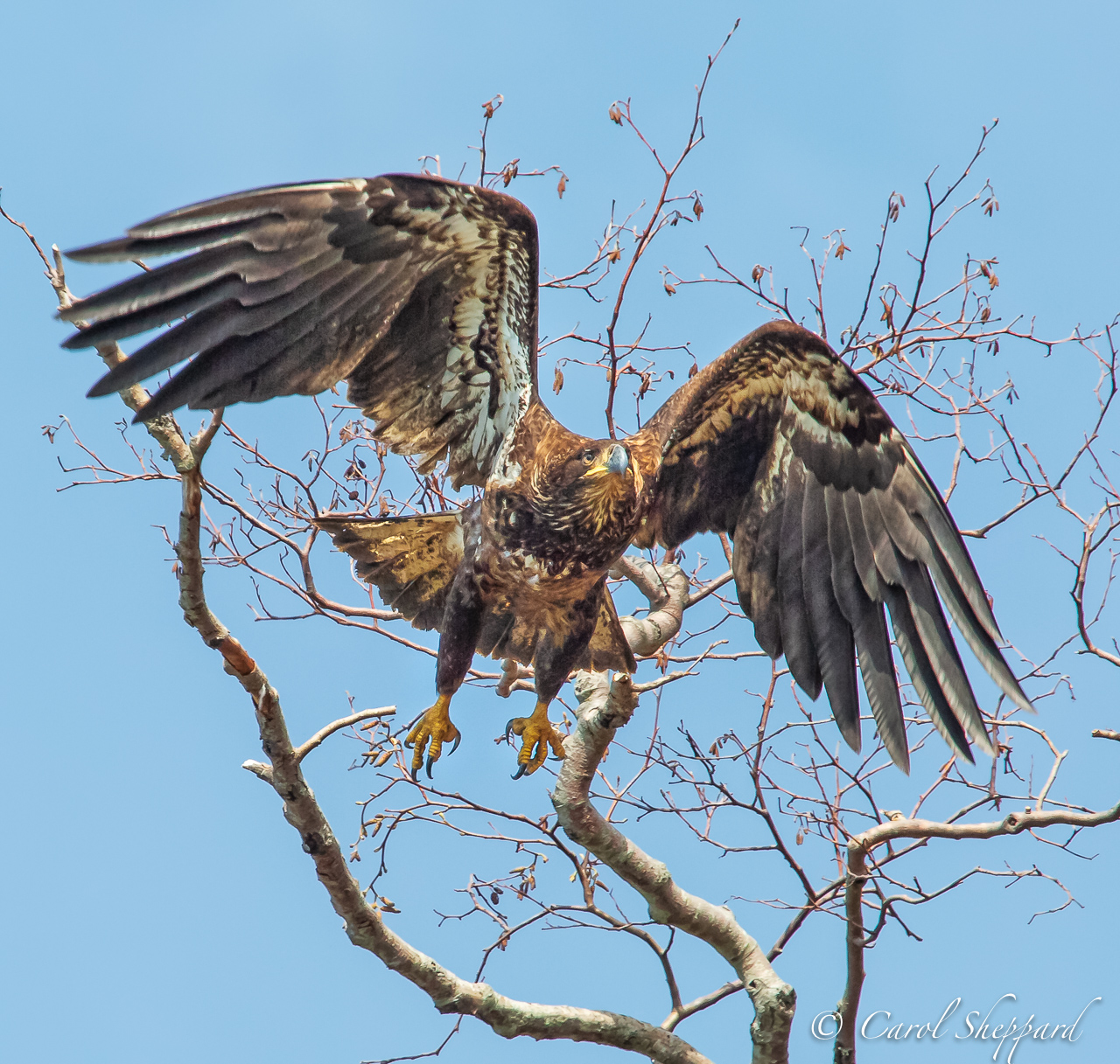
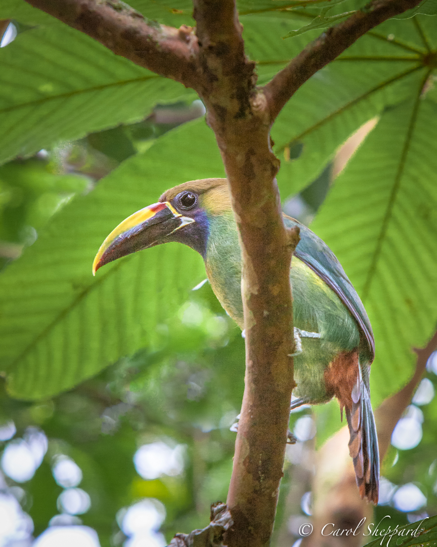
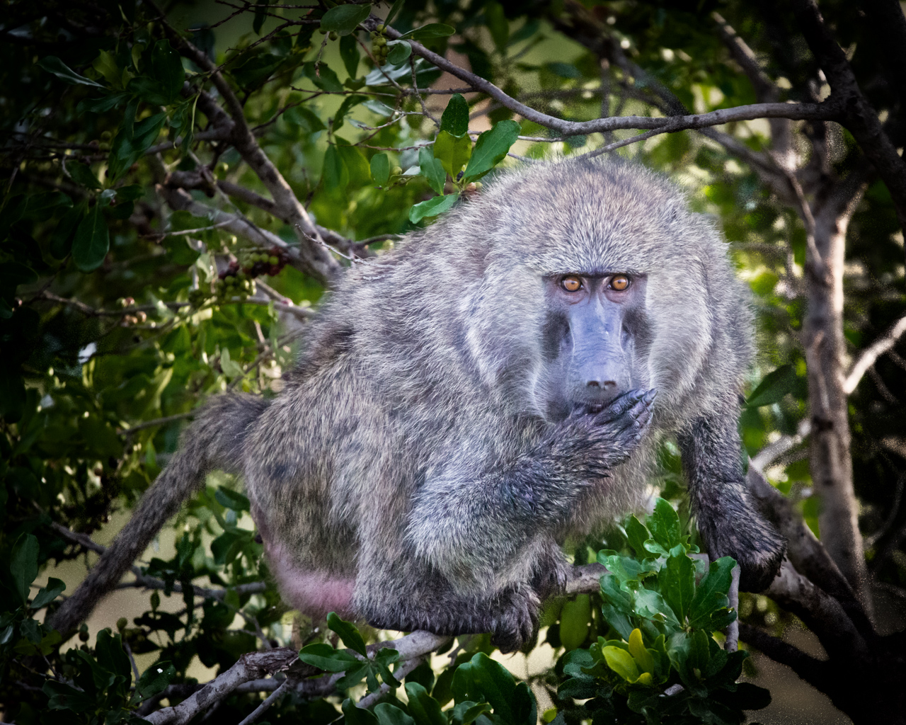
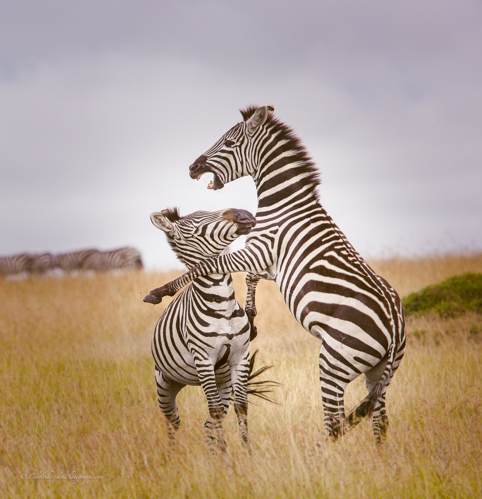
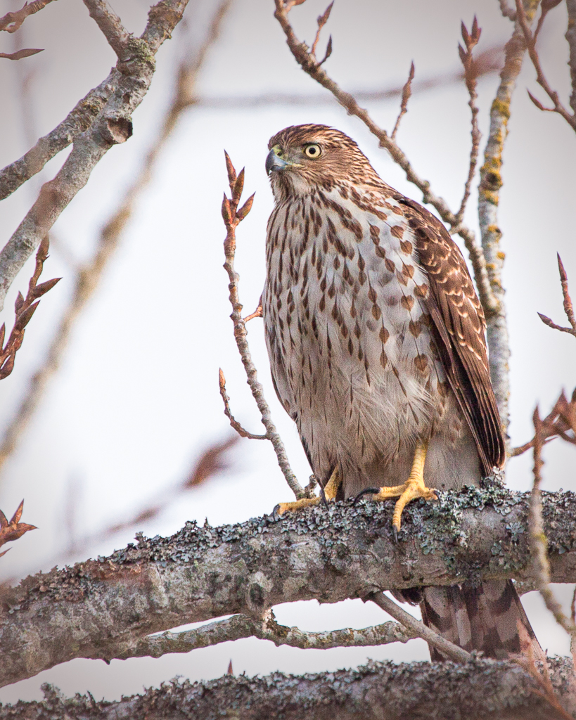
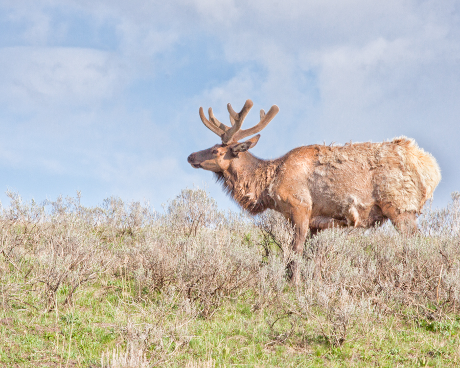
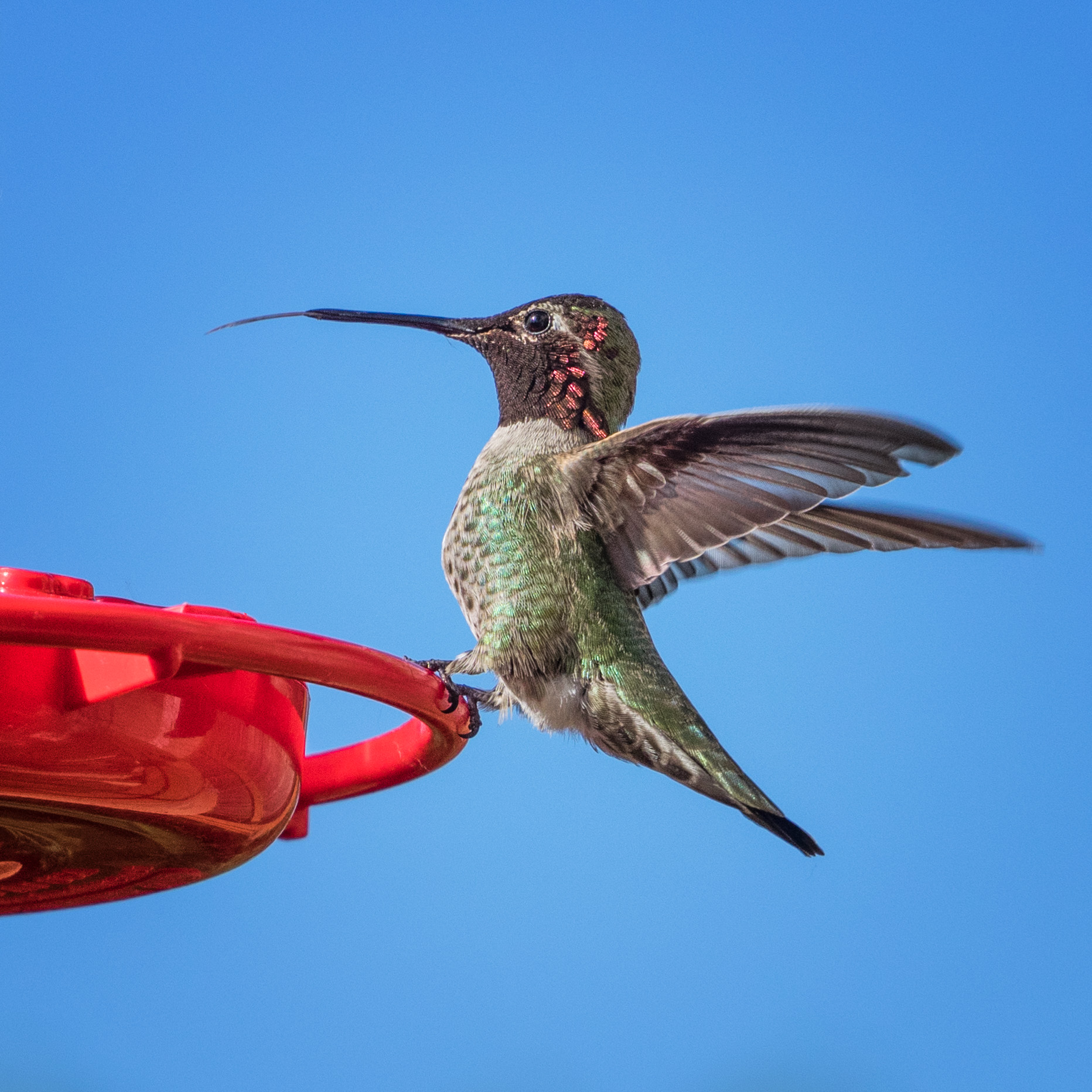
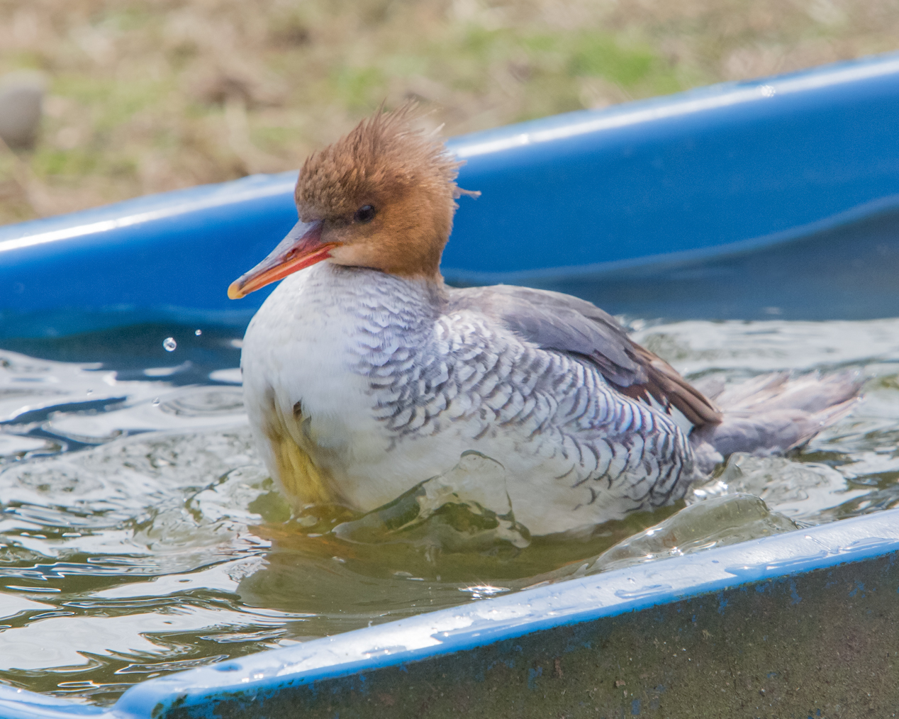
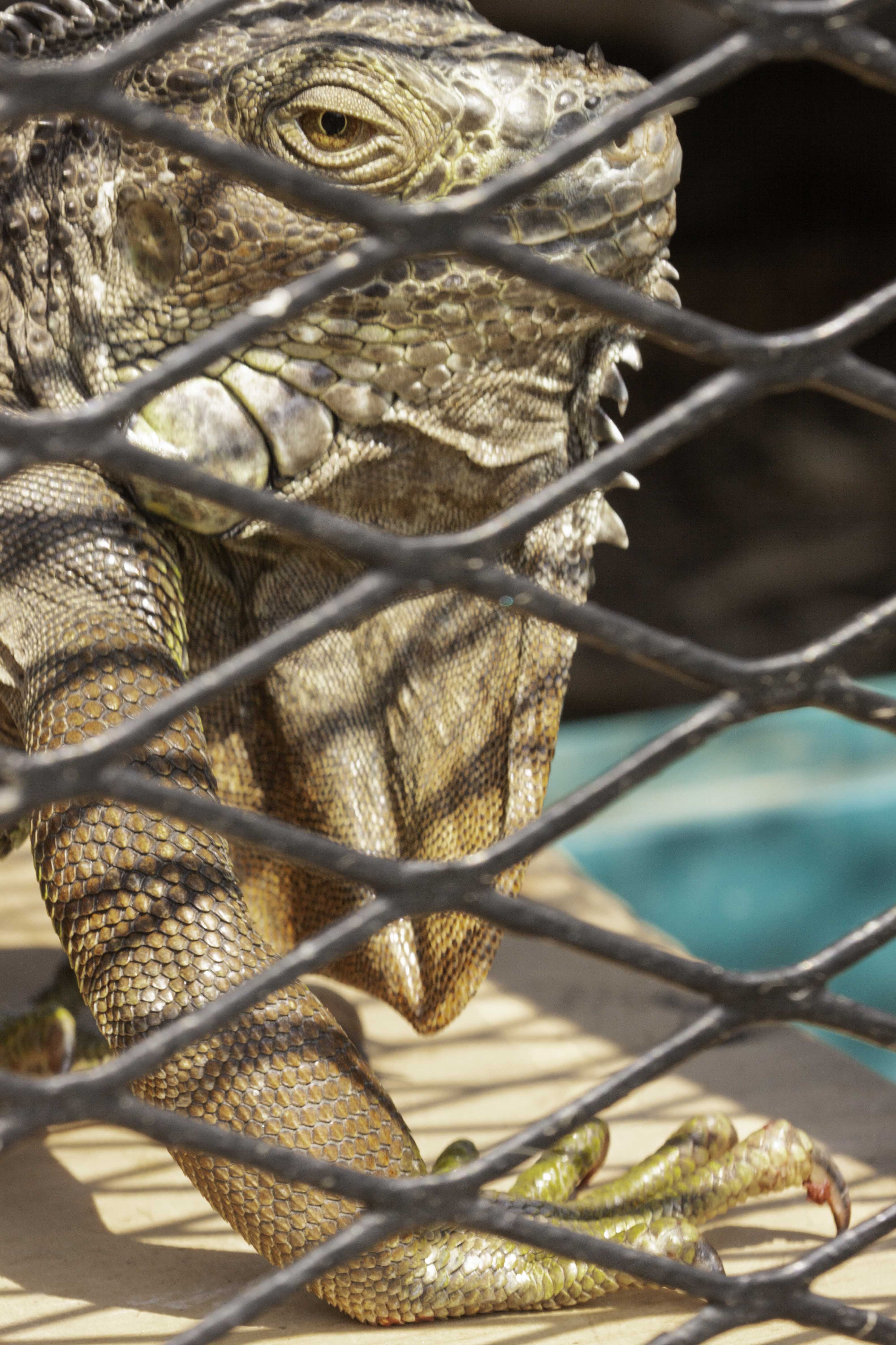
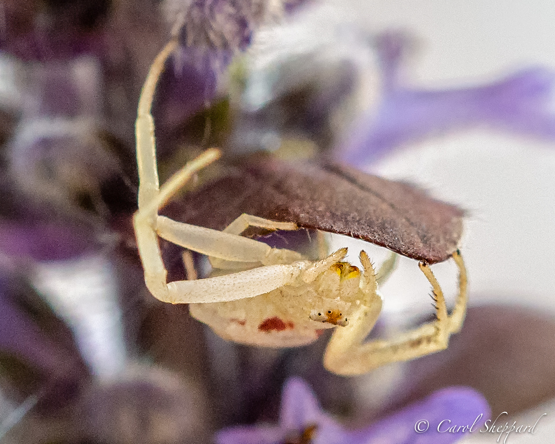
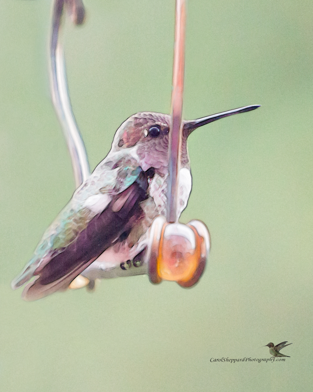
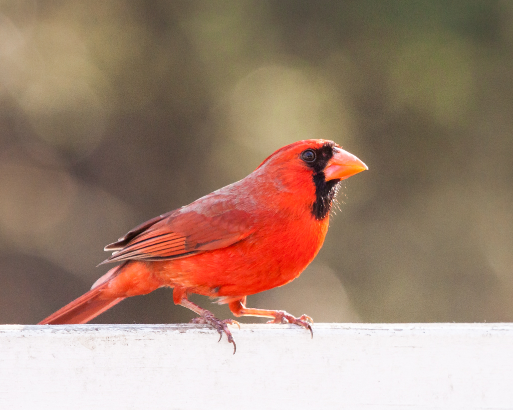
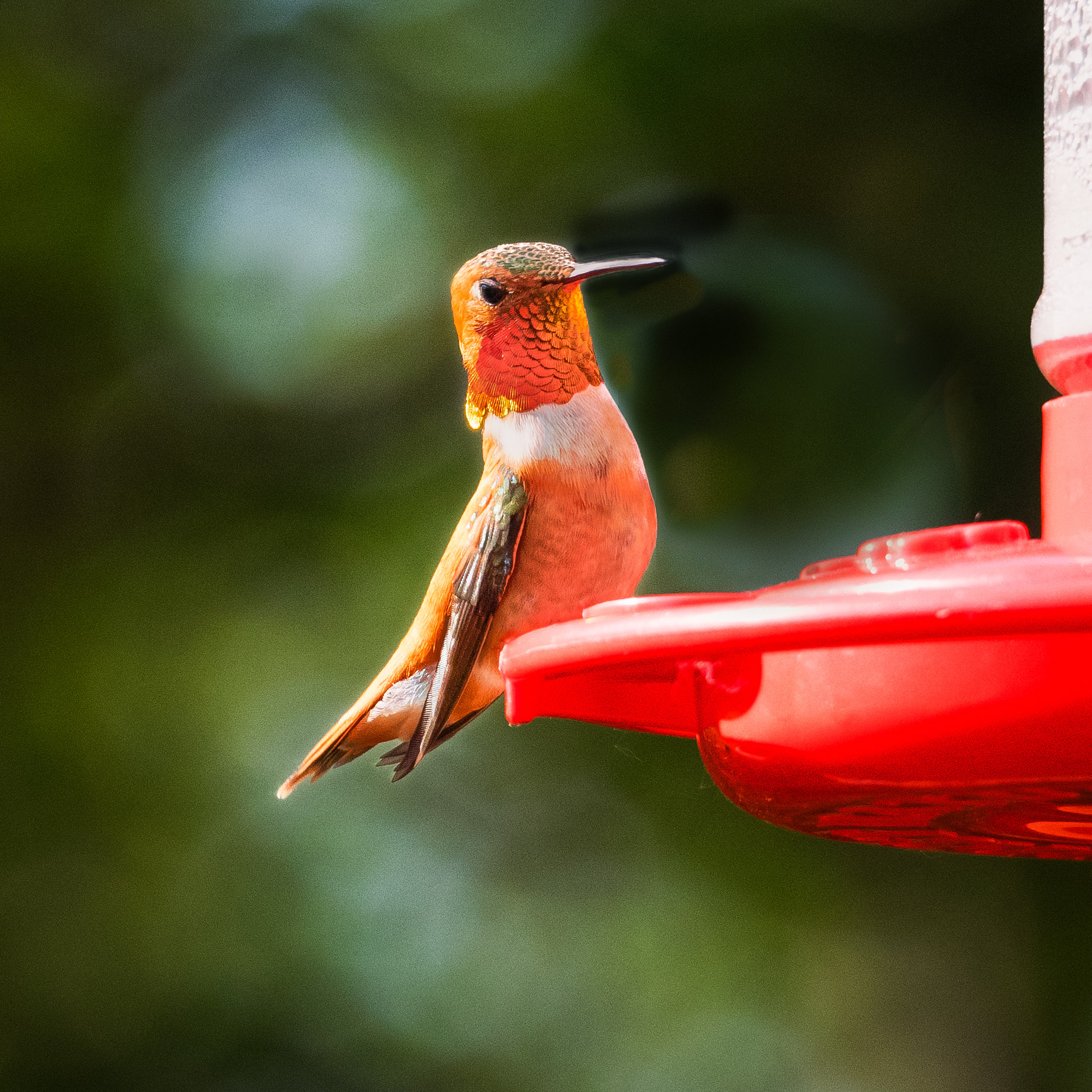
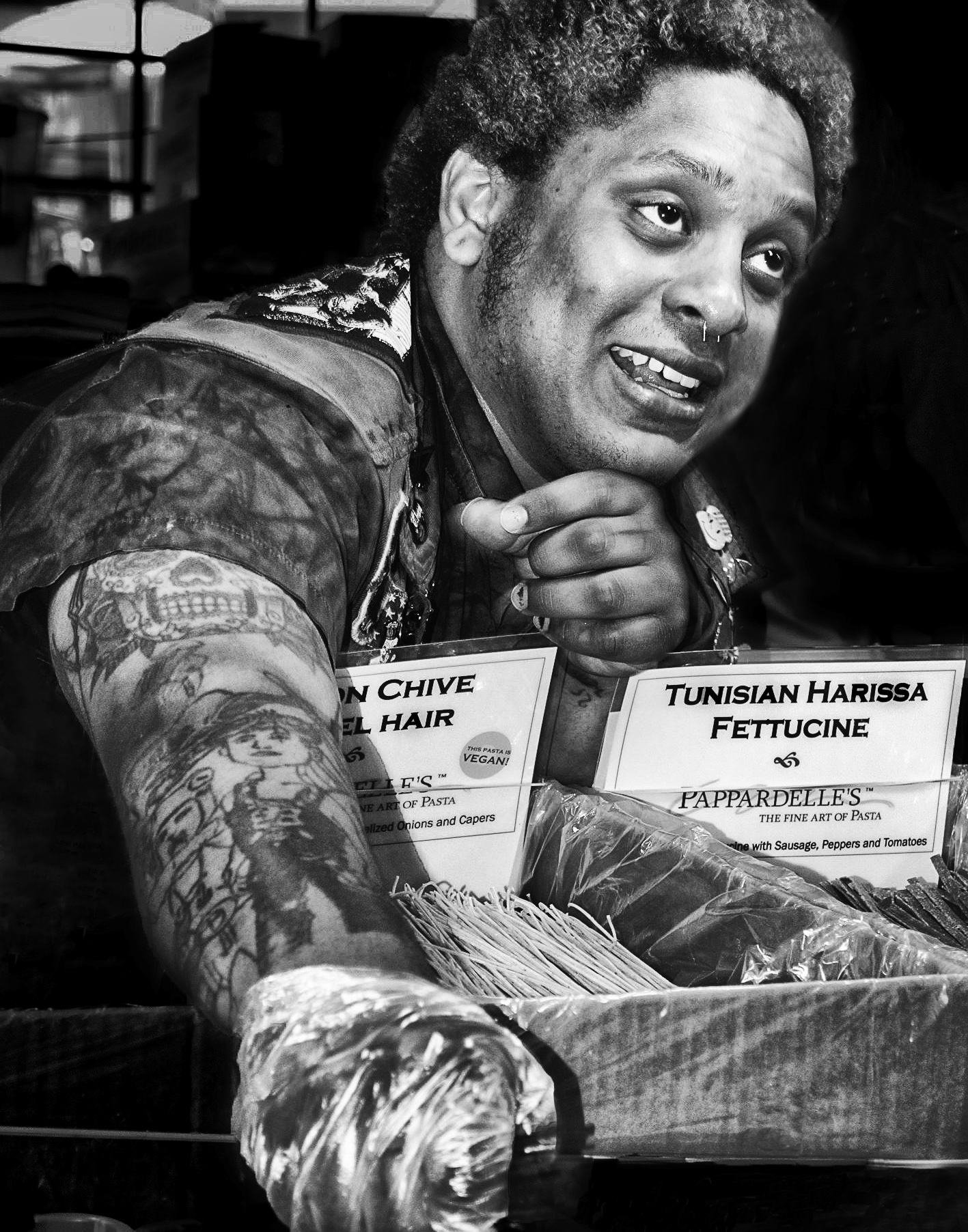
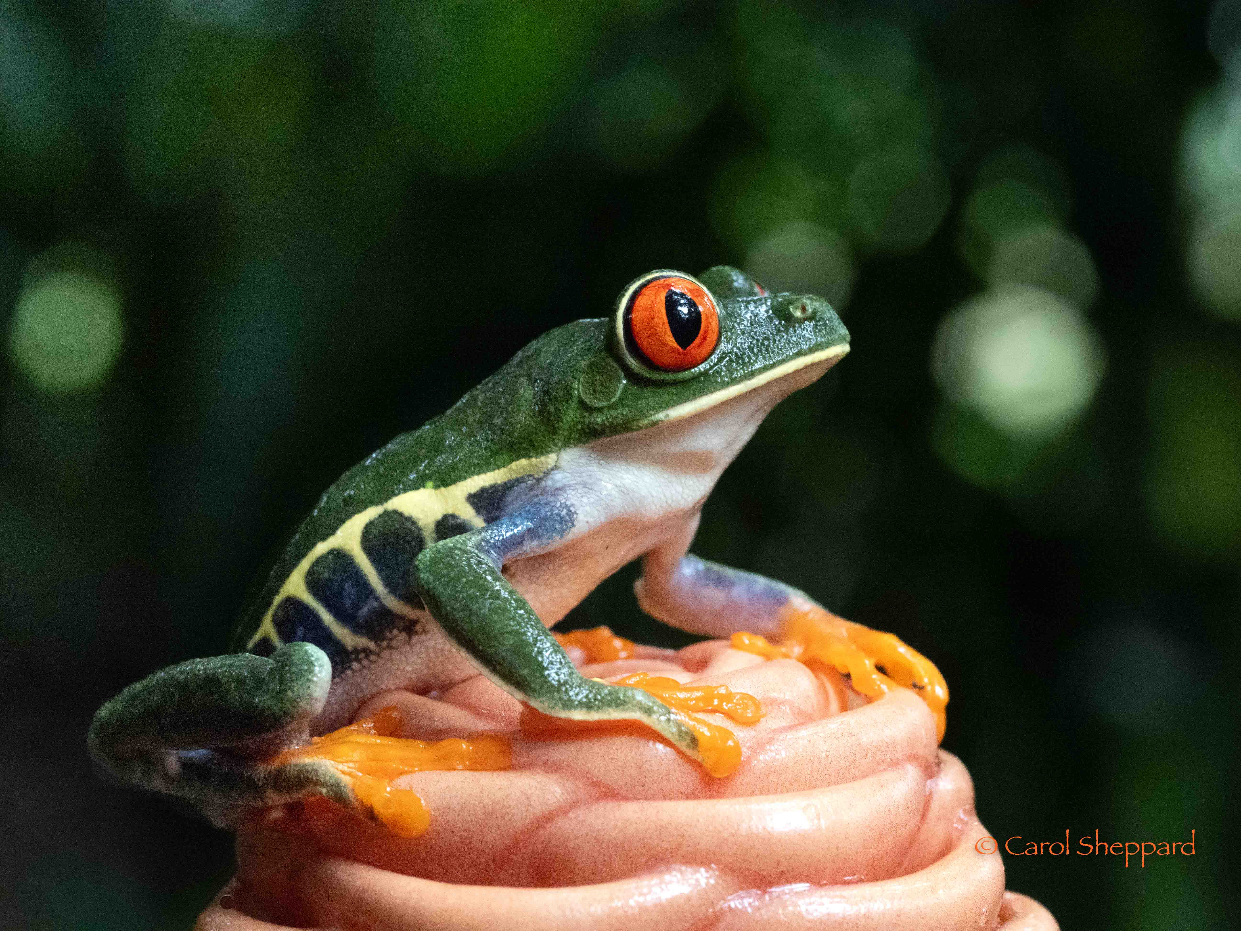
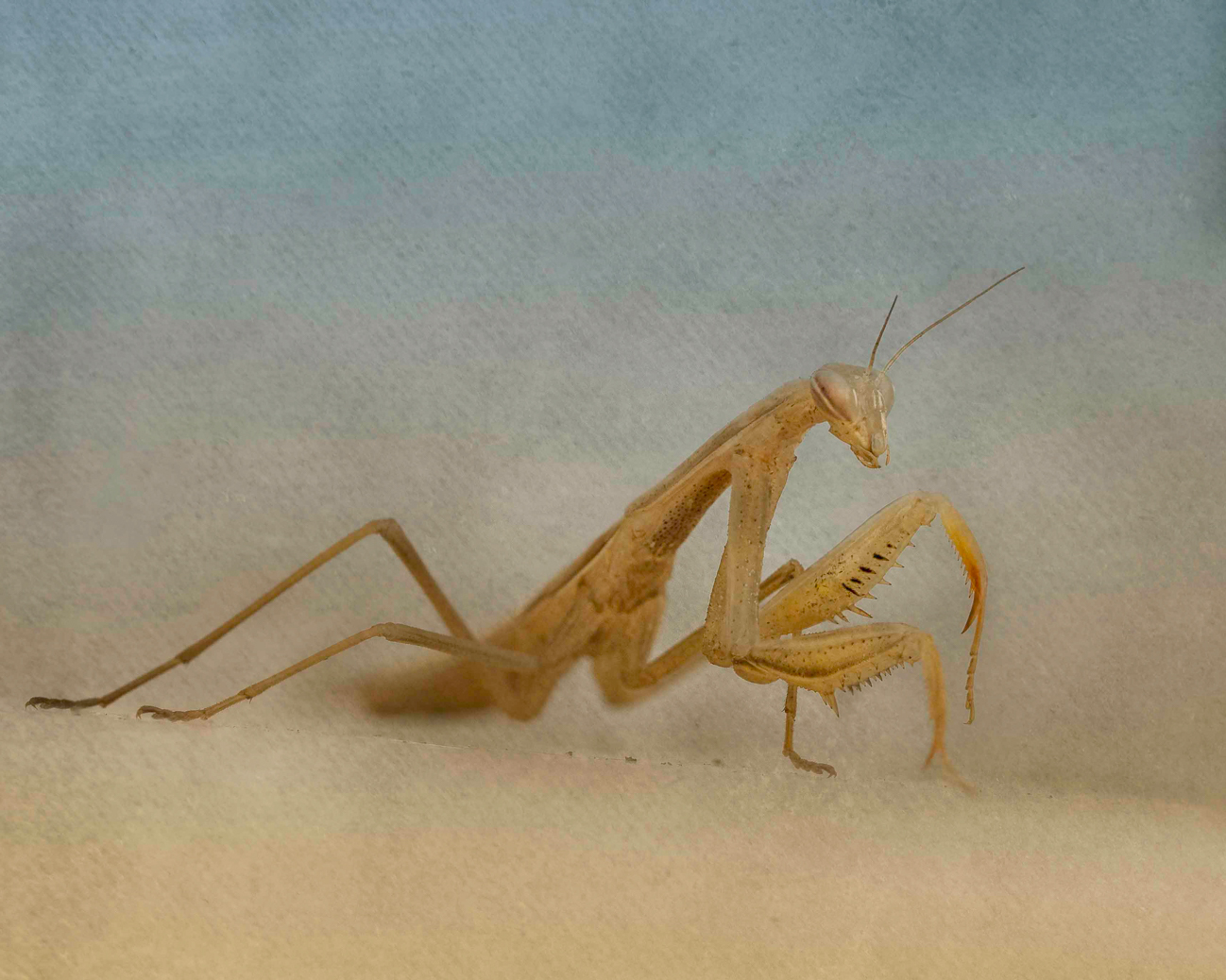
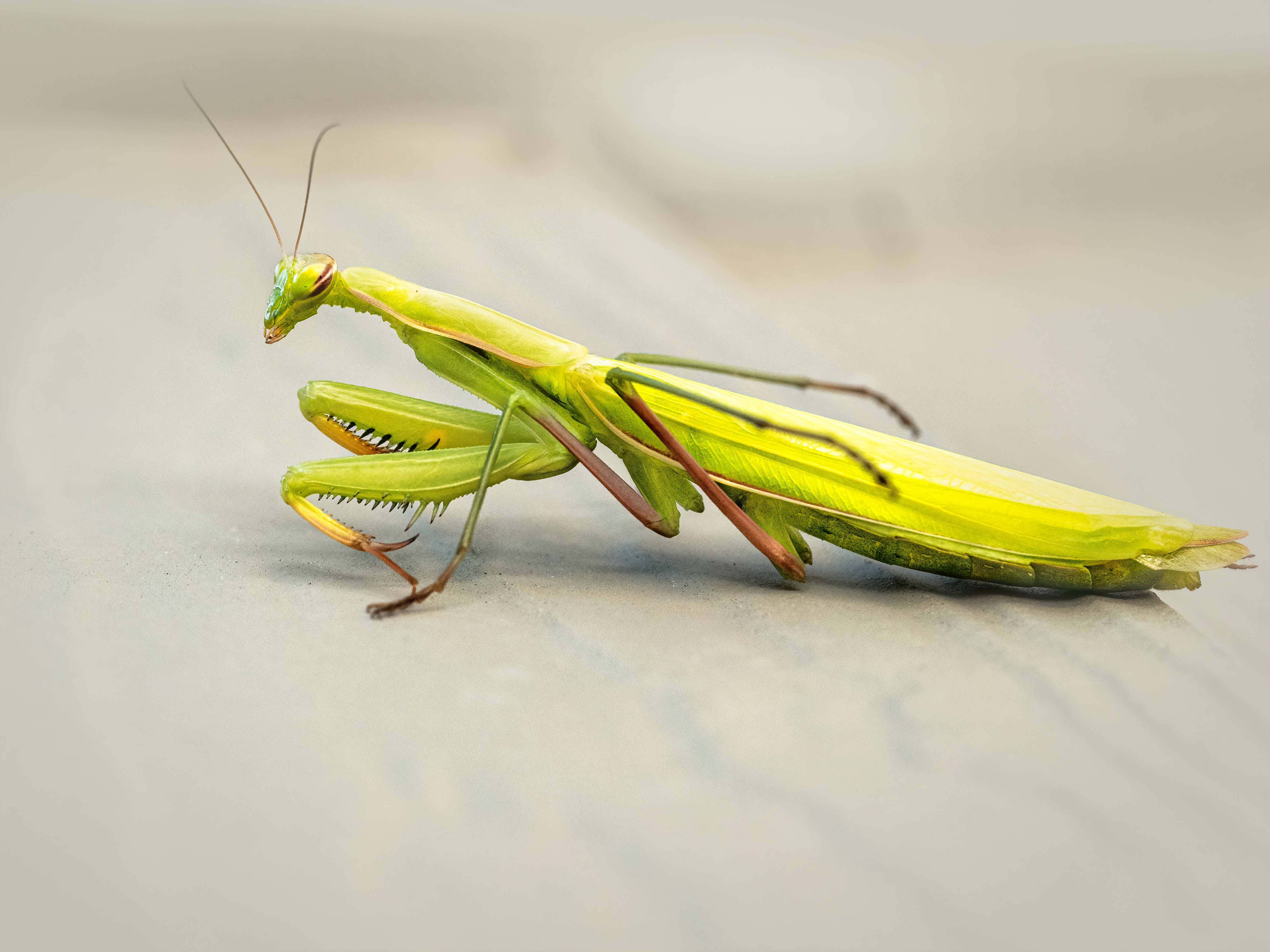
Beautiful juxtaposition of colors, and you've captured the feathers nice and sharp. His eye is more of a sideline than I would like to see, but in nature, we get what we get, right? This is a very artistic capture, with great lighting. Texture is wonderfully captured, too. Is there any way to bring out his eye just a bit? Maybe bring up exposure just in that one spot? I think that would make this a stunning image. |
Nov 10th |
| 52 |
Nov 19 |
Comment |
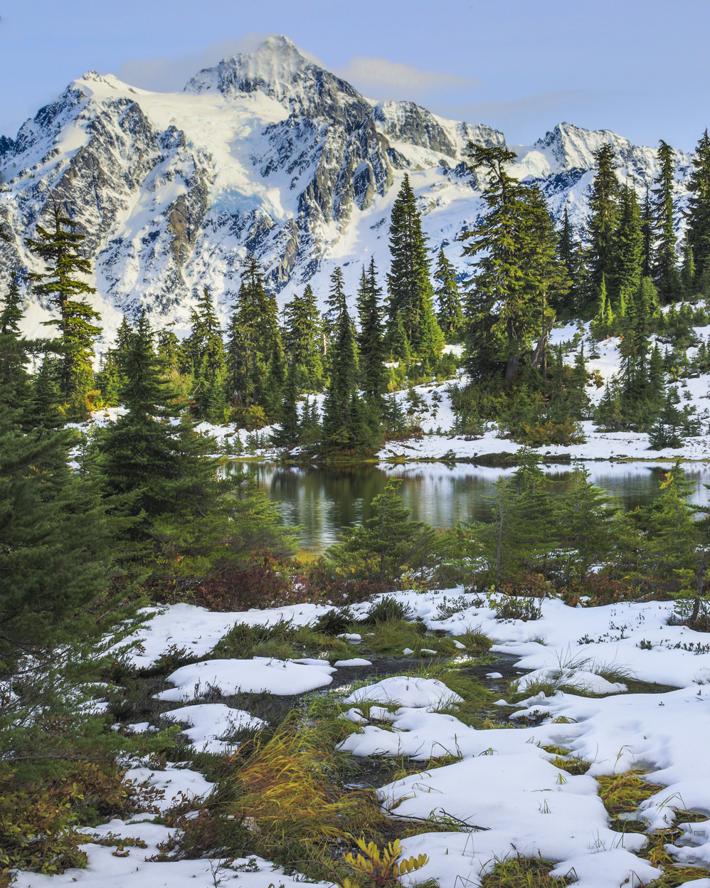
The interest in this for me comes from the criss-crossing lines of the trees; but I don't find it personally a strong enough subject to hold my interest. I do like the blue overall tone, as it increases that feeling of cold, cold snow. It also creates some nice shadowing and adds strength to the subtle shadows at the same time. Overall, I think it is a nice image. |
Nov 10th |
| 52 |
Nov 19 |
Comment |
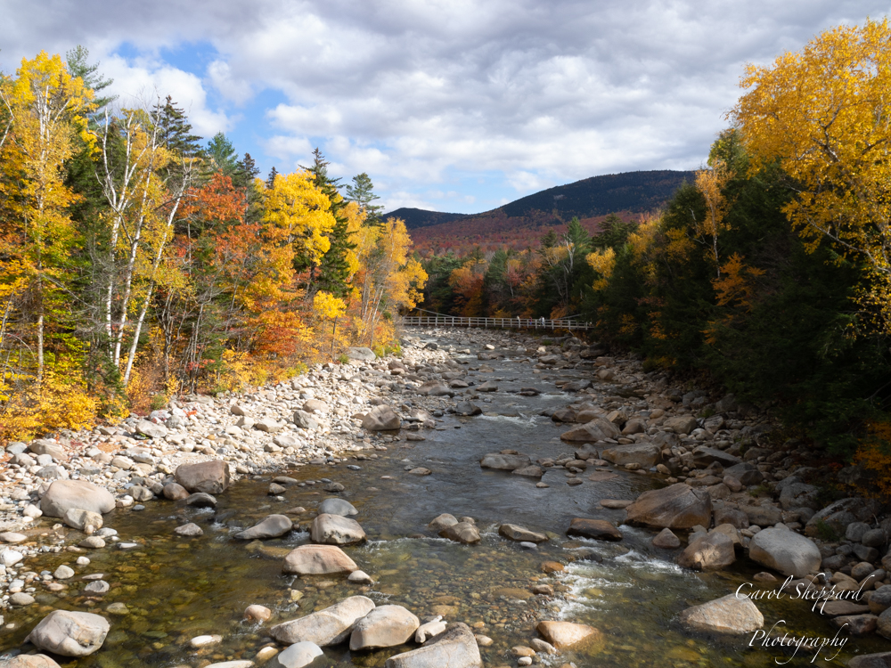
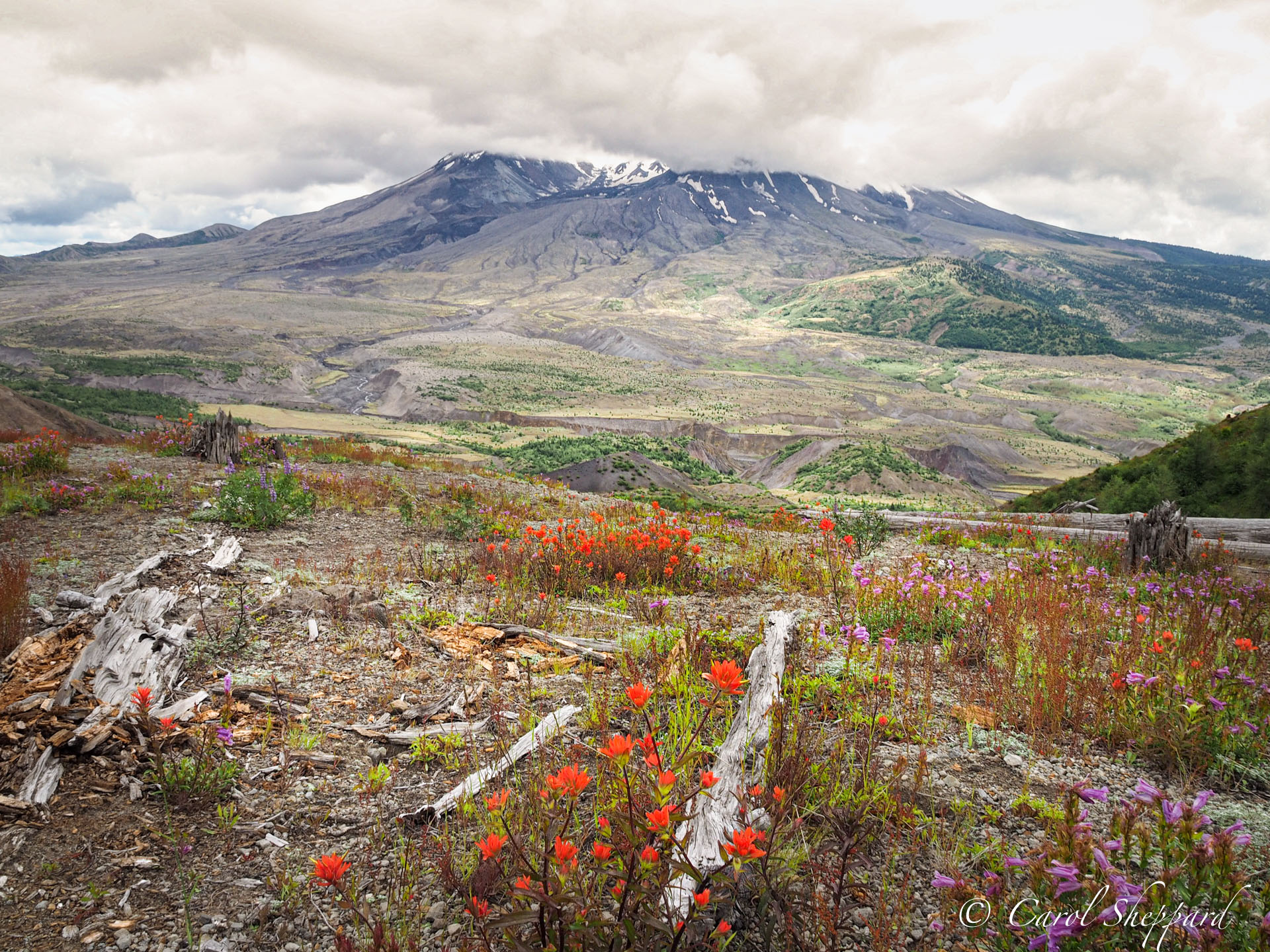
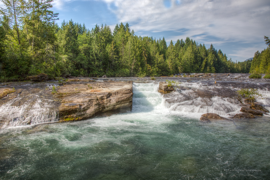
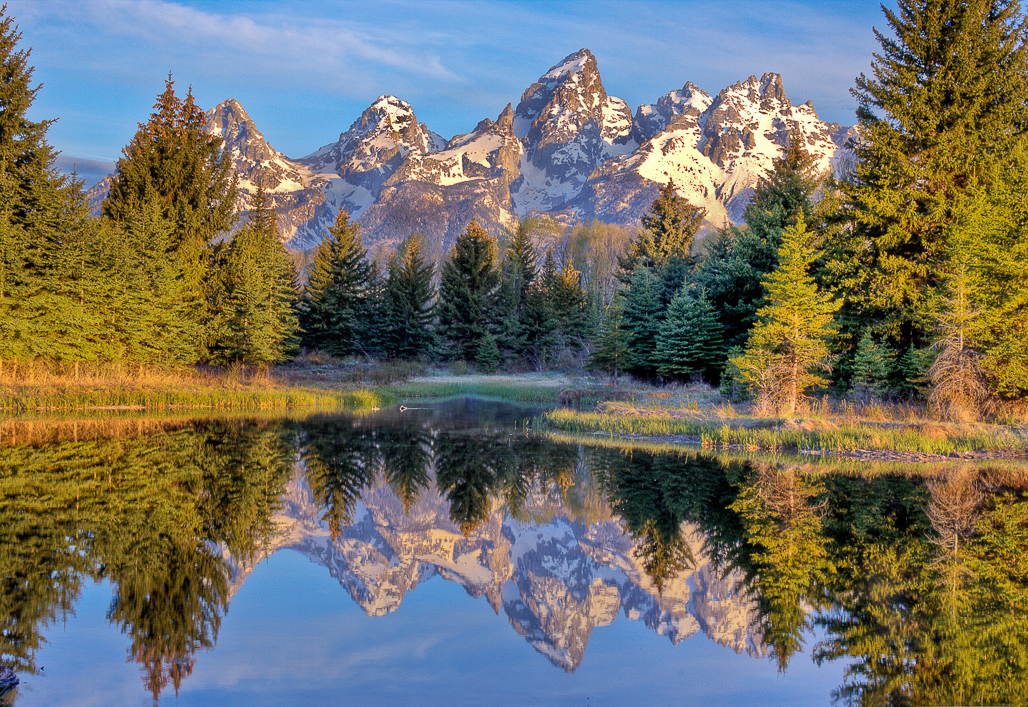
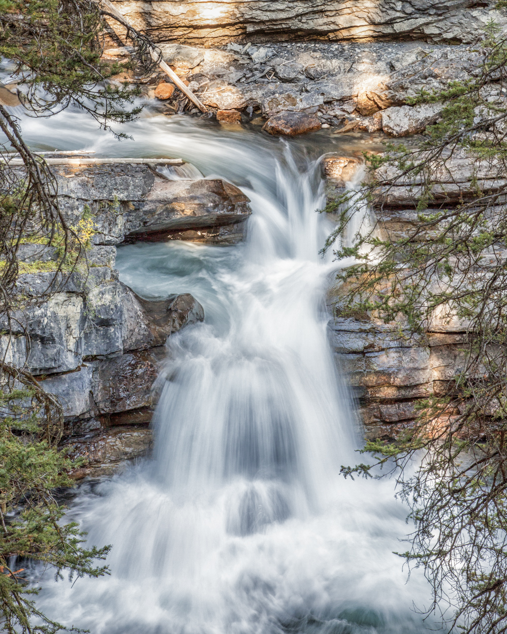
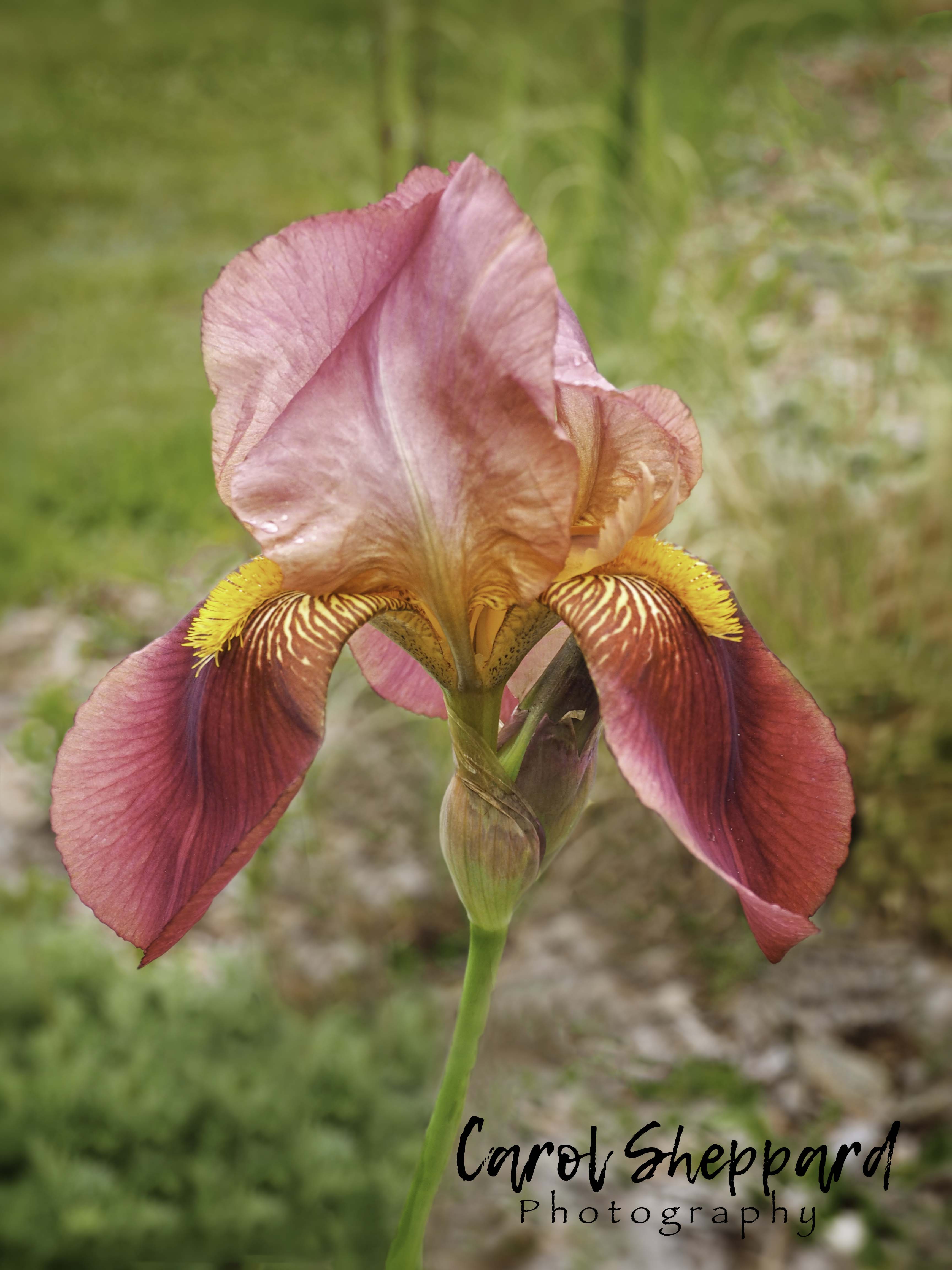
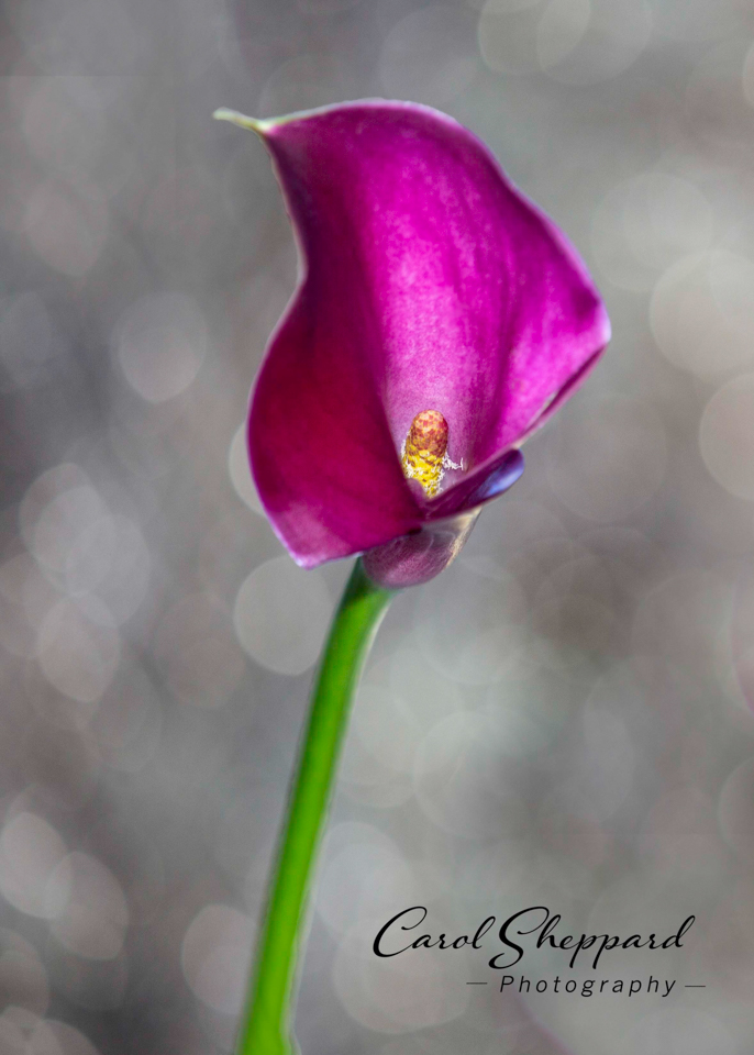
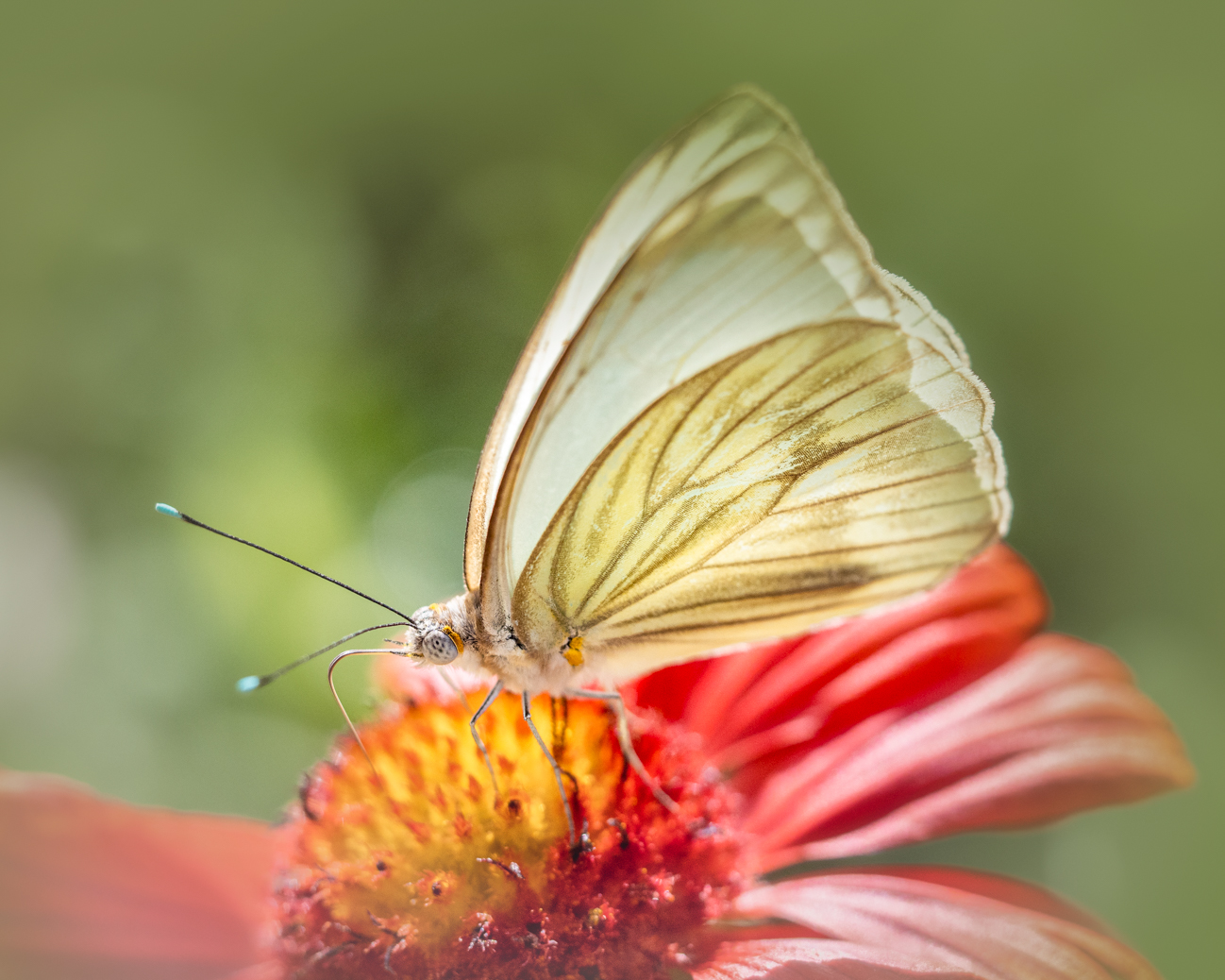
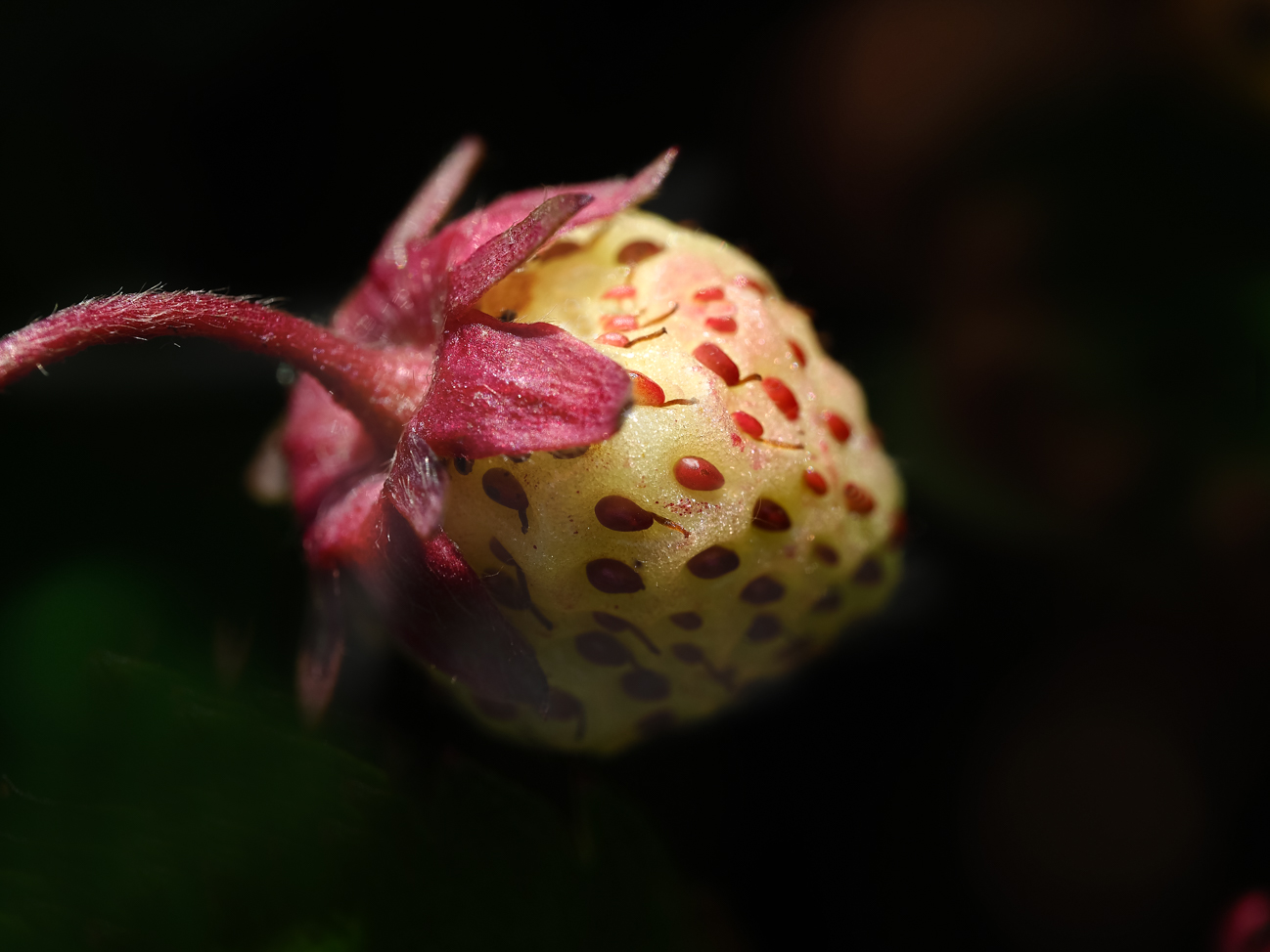
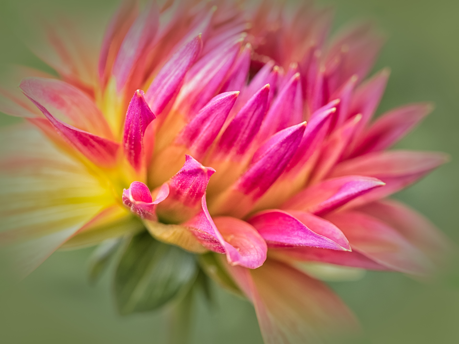
I like the way you captured this scene, Lisa--it provides interest and the hint of unexplored territory. Your use of the rocks in the foreground, along with the beautiful reflection of the hills and fall colors, really works well in this! The point the grass comes to in the foreground leads my eye right into the image. Bravo, this is a lovely image! |
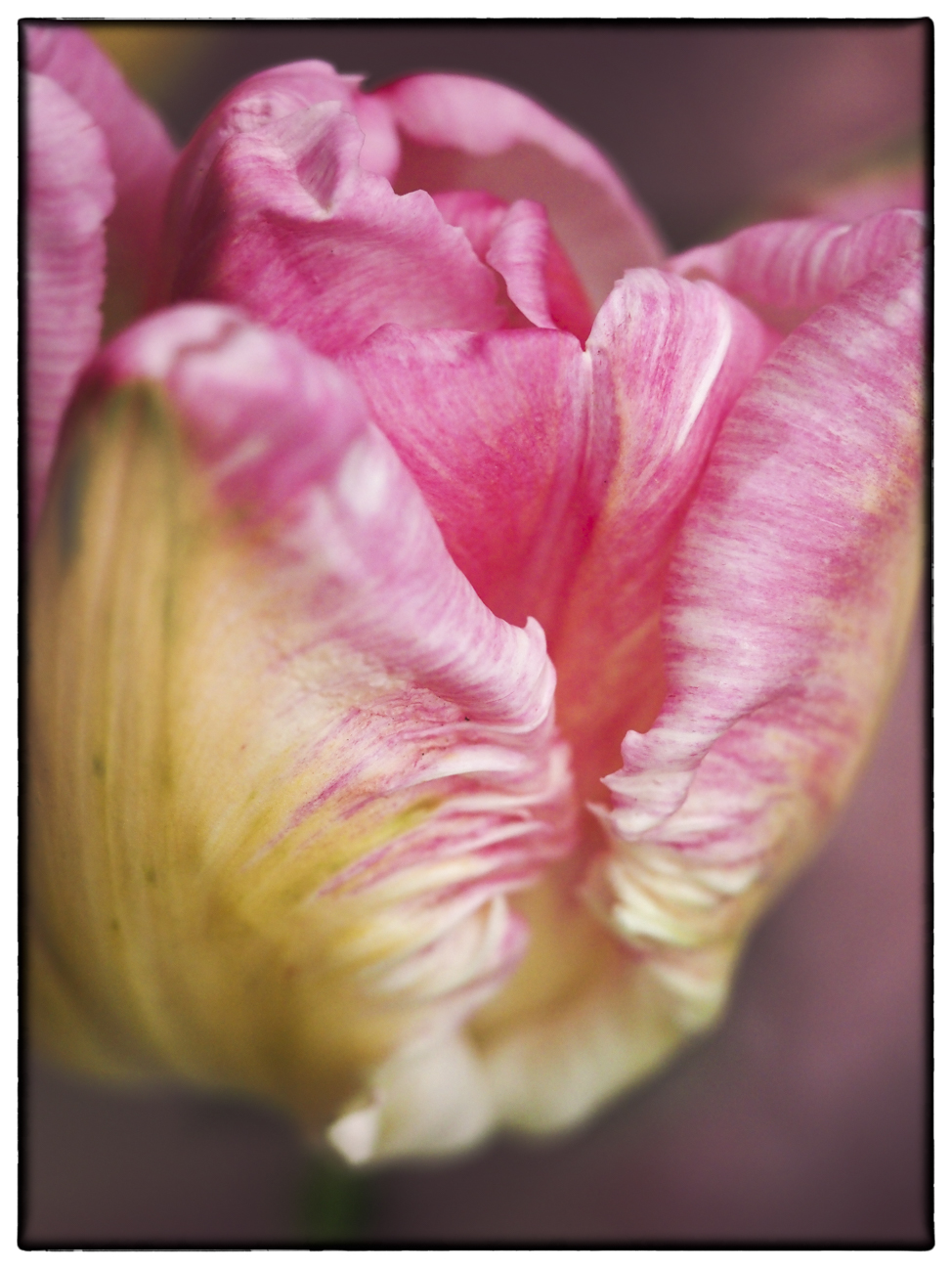
Nov 10th |
| 52 |
Nov 19 |
Comment |
The strengths of this are the path leading right into the "island/tufa" and the way the light plays over the grass. For me, though, this image doesn't work. It feels too sharp, too saturated, beginning at the tufa and proceeding backward. The foreground feels natural. Composition is also feeling uncomfortable for me--perhaps the way the lane winds out of the image then back in, all the way to one side? It feels unbalanced. This is, of course, only one person's opinion, and we all know how I feel about too high contrast and saturation on what is a naturally beautiful scene. But with composition also not working as well for me, I feel you have so many beautiful images, maybe another perspective of this same scene? |
Nov 10th |
10 comments - 0 replies for Group 52
|
| 60 |
Nov 19 |
Comment |
I was also thinking vignette as I read the comments, and like the effect of it now that I see it. Subtle but places emphasis squarely on your ladybug. |
Nov 24th |
| 60 |
Nov 19 |
Comment |
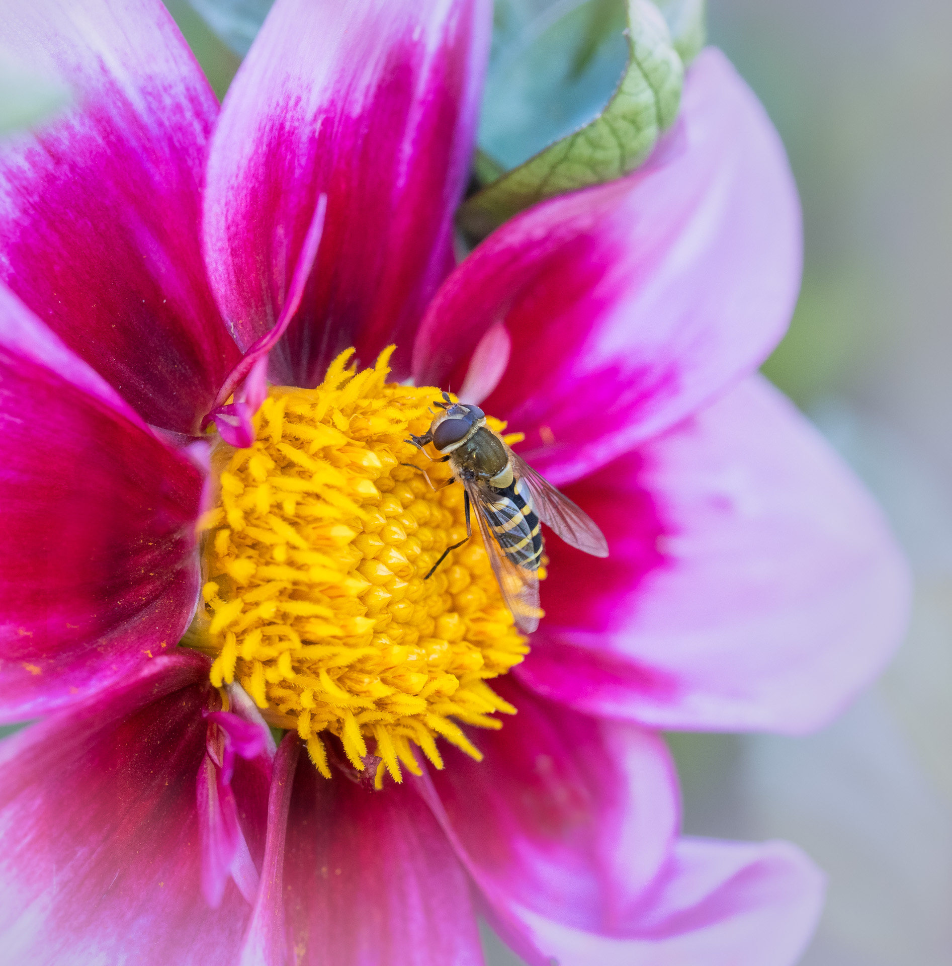
Very stunning image with powerful clarity and color. You have really mastered the art of pulling forth color without oversaturating or making colors seem unnatural. The composition is very pleasing, as is the lighting and balance of the light v. shadows between the red and the green leaves. I think this is another competition-worthy image, Denise! |
Nov 17th |
| 60 |
Nov 19 |
Comment |
Bob, the way the frost settled just around the edges creates a beautiful visual in this image. I'm not sure how you could have done the crop any differently than what you did. The color is vibrant without being overdone. The crystals of the ice are beautifully sharp and clear, and I think the color balance works well here. I wonder if there's any way to isolate the leaves and continue darkening the background, while also reducing the clarity behind these leaves? Just curiousity more than anything--I don't think that is a necessity for your image. |
Nov 17th |
| 60 |
Nov 19 |
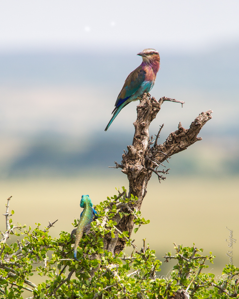
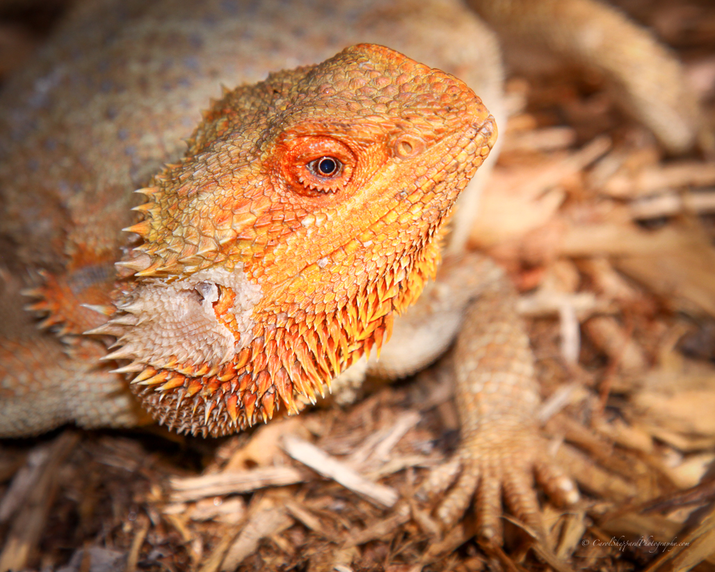
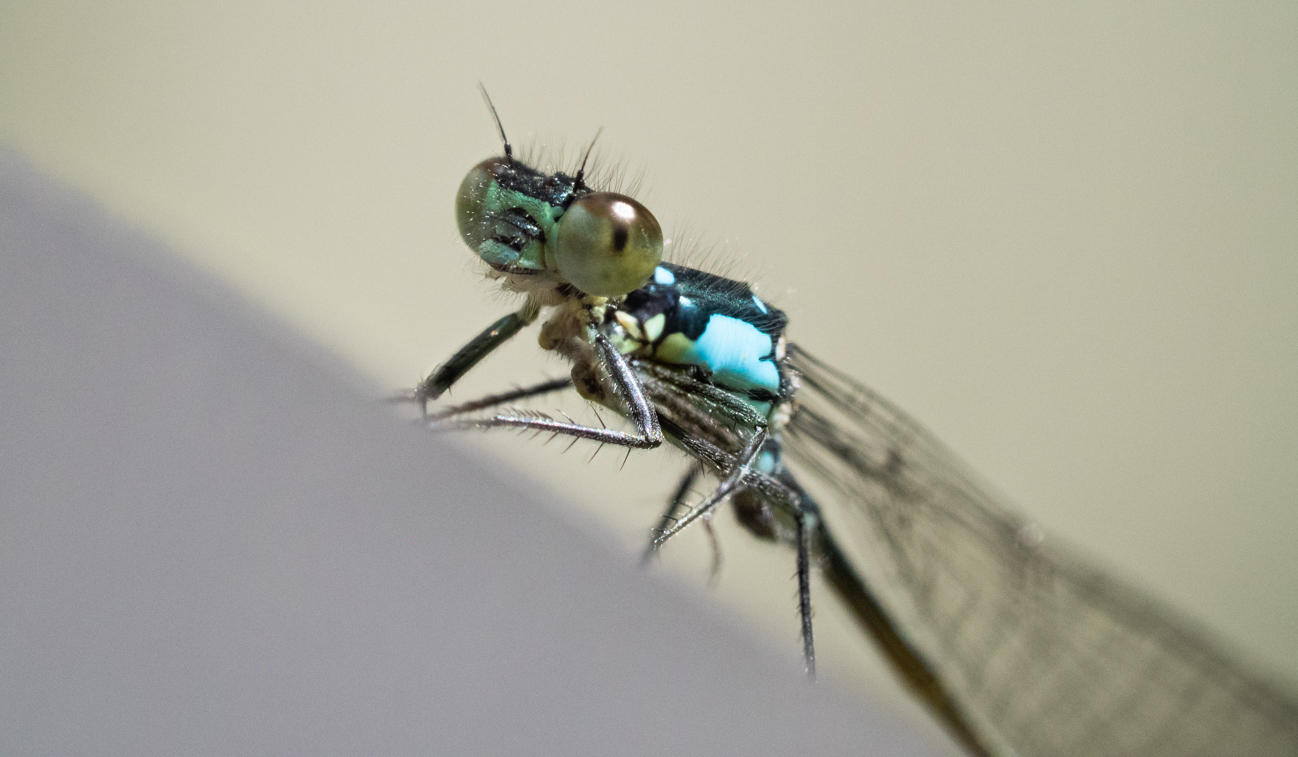
Comment |
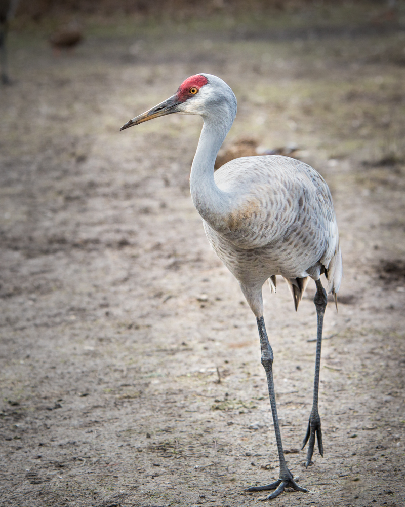
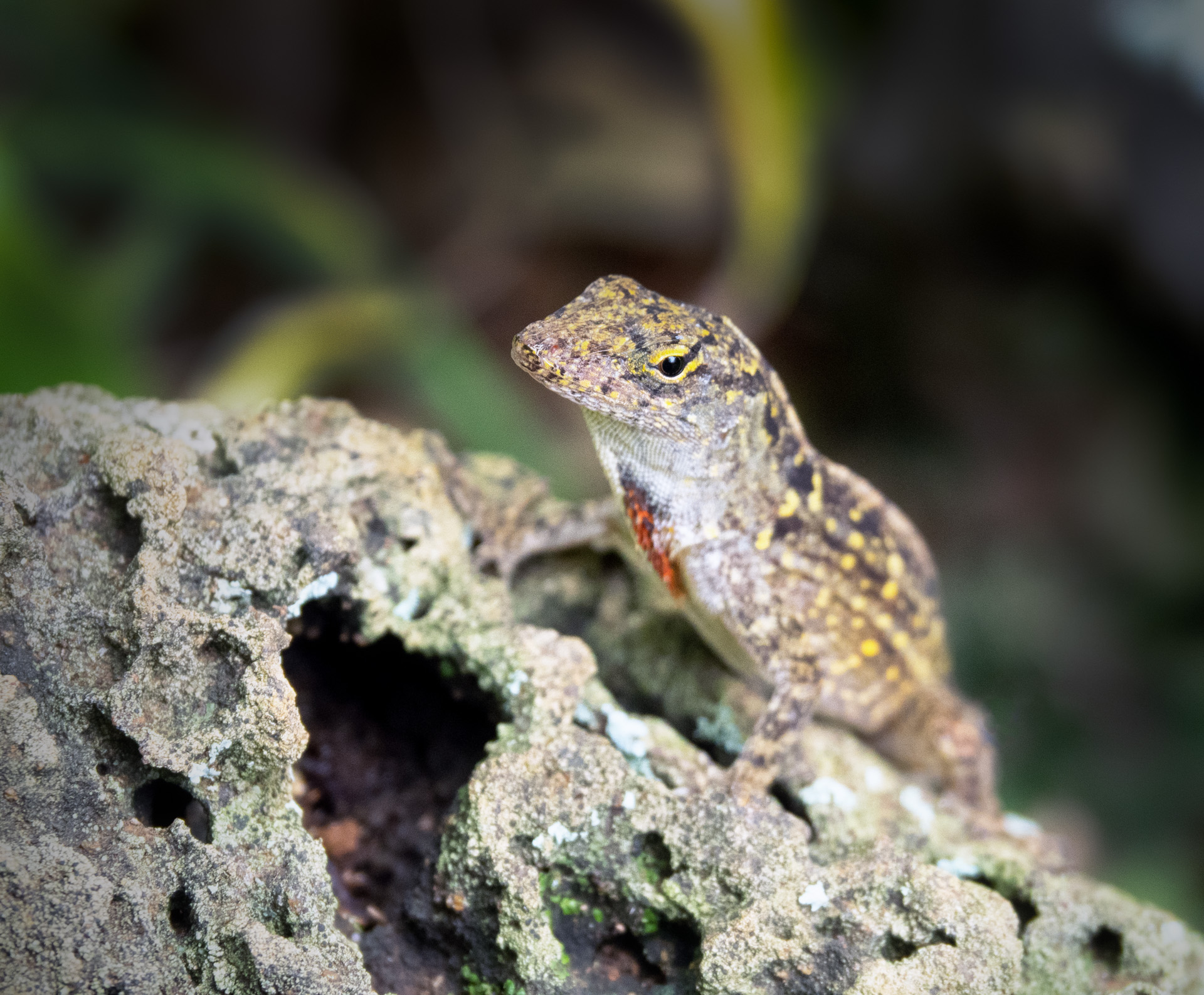
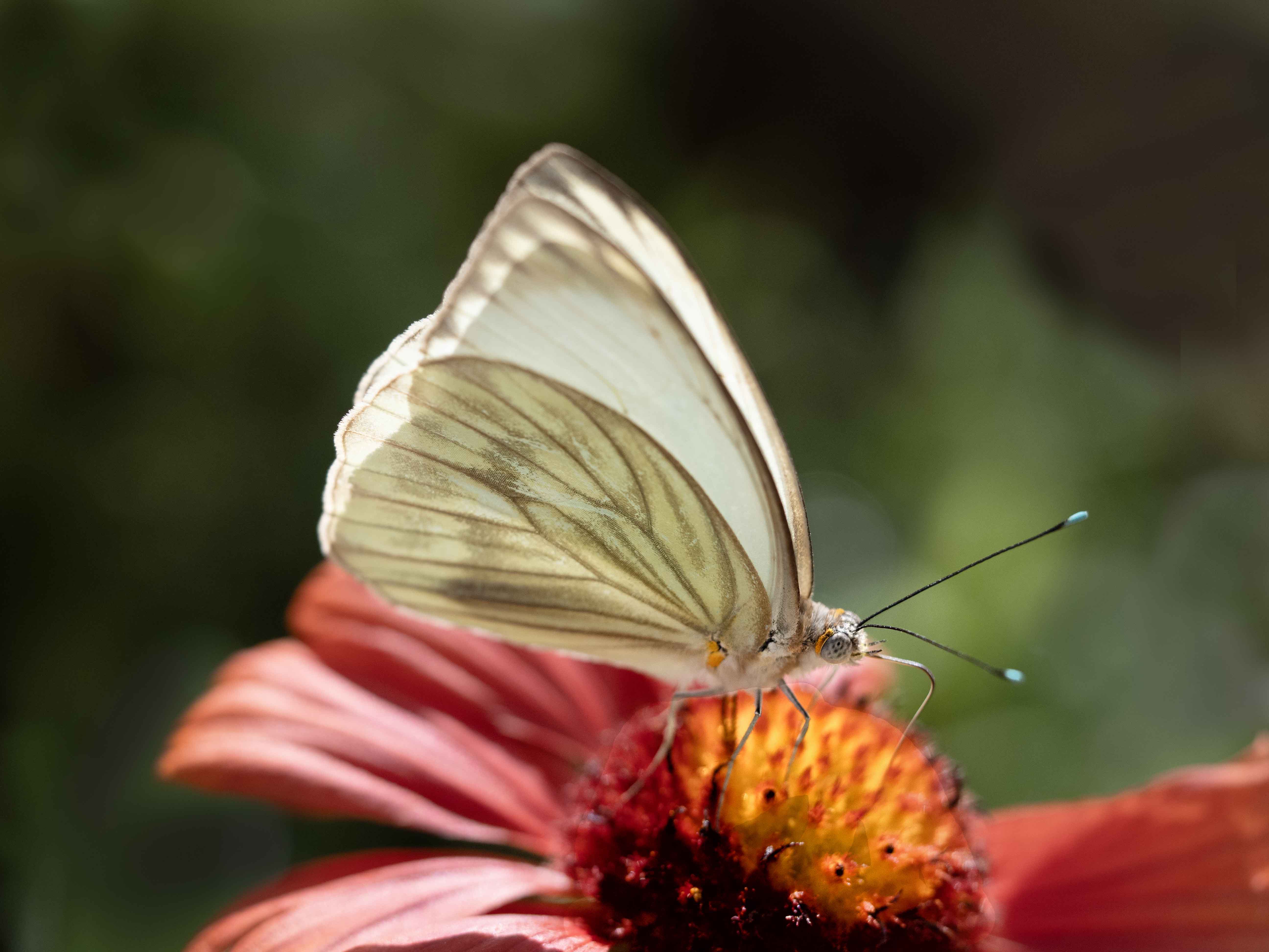
This is a great capture. Technically, it has great impact due to not only the composition but also the diagonal slant of its perch and the way you've caught its face straight on. The colors work well together and it looks very sharp. I was afraid there might be some slight pixelation in the head, but I believe that may be my computer. Wonderful job! |
Nov 17th |
4 comments - 0 replies for Group 60
|
14 comments - 0 replies Total
|