|
| Group |
Round |
C/R |
Comment |
Date |
Image |
| 52 |
Sep 19 |
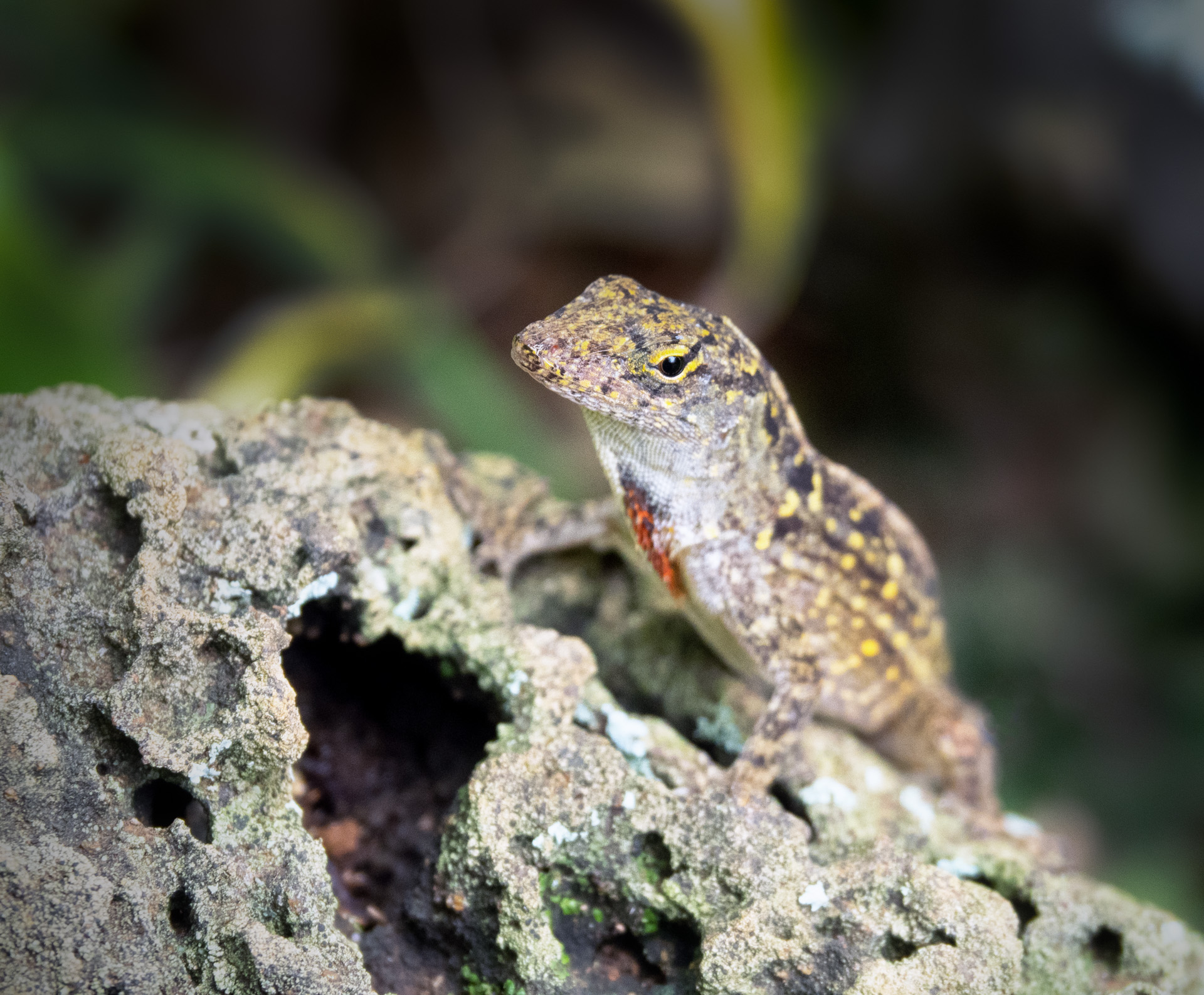
Comment |
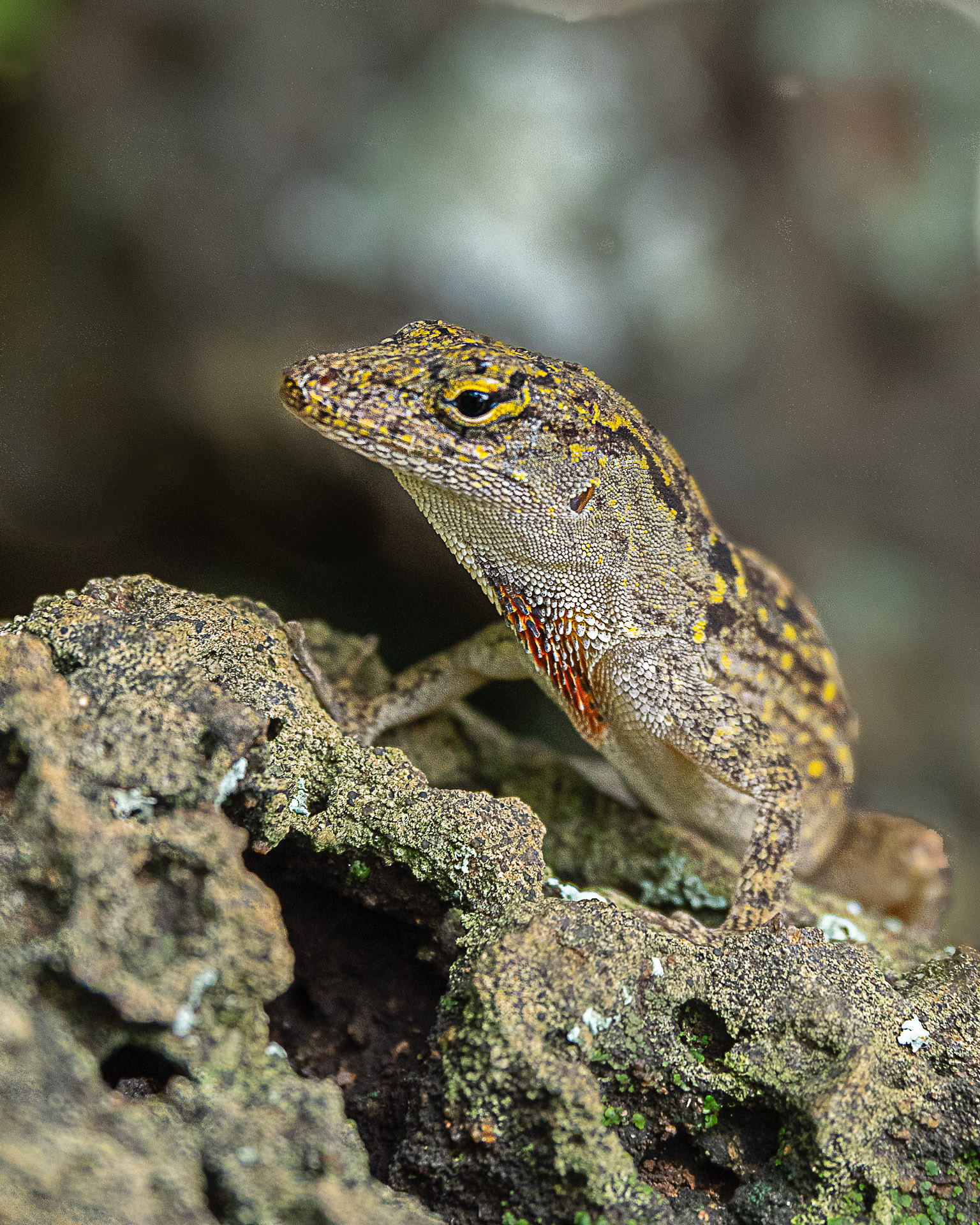
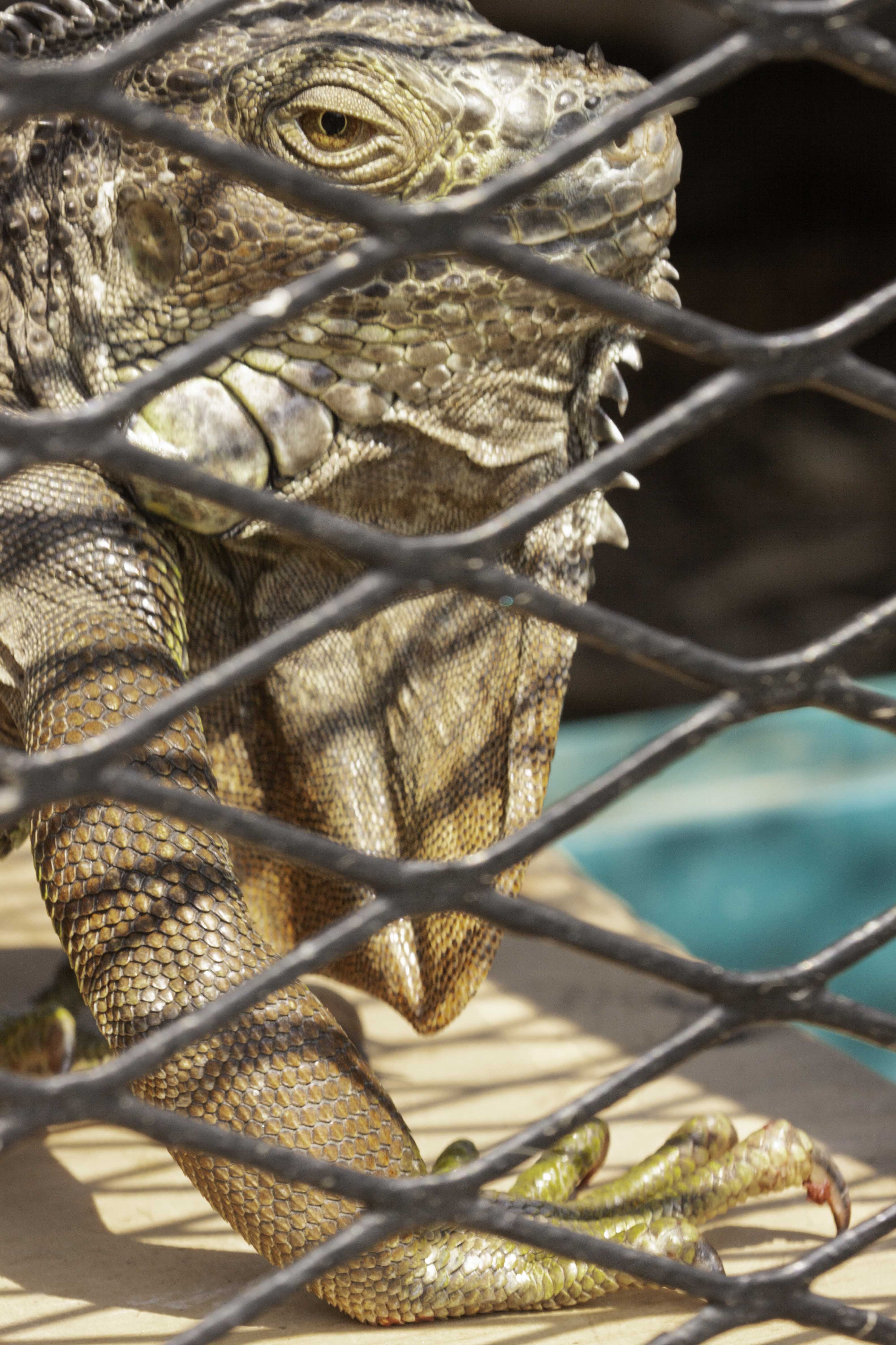
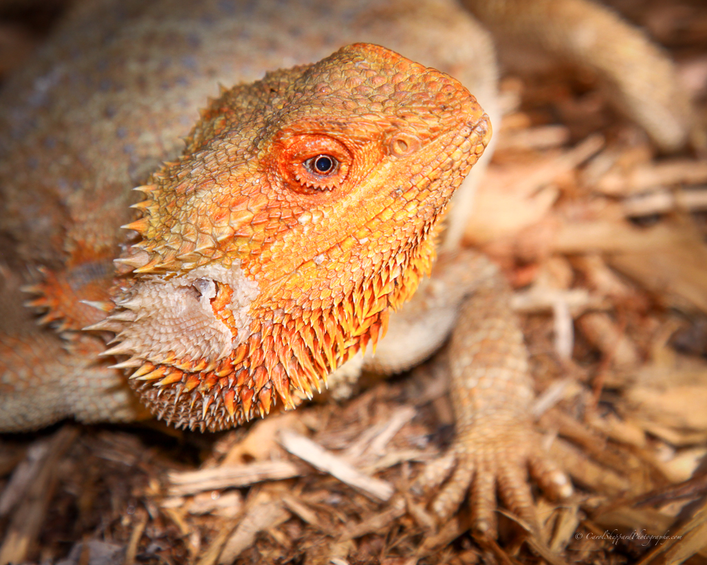
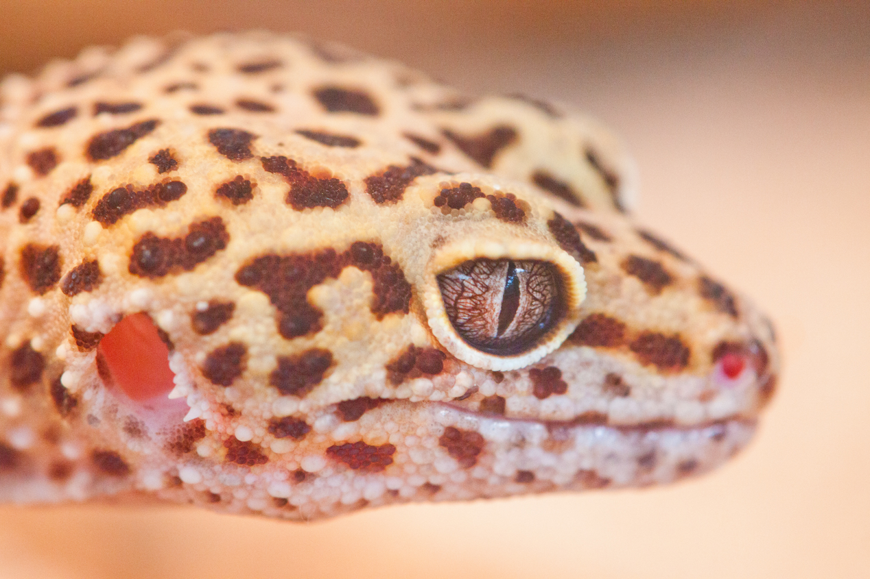
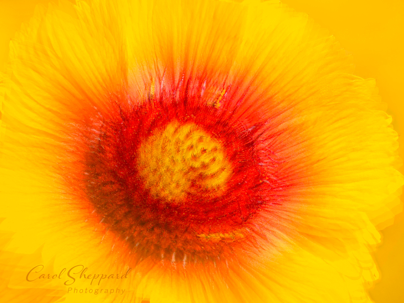
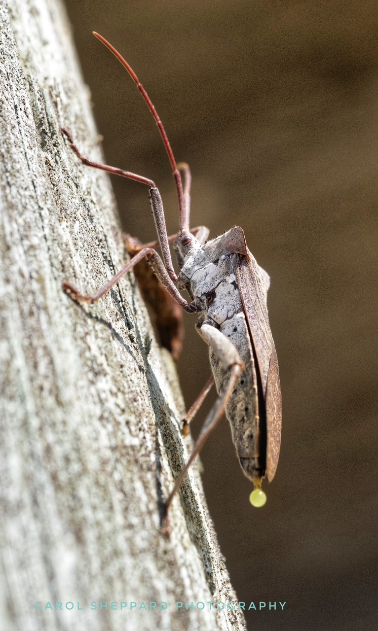
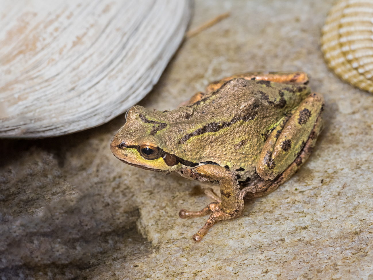
Yes, those highlights are definitely a distraction. Sometimes you have to get away from an image, step back and look at it with fresh eyes, to see some of that. I know I can darken those highlights more. As for the out-of-focus rocks, I don't know what I can do other than vignetting for that. The crop is too tight for me to eliminate it without wrecking my lizard. Mike's crop feels too tight for my taste--there isn't enough space in front of my little guy's face and he feels out-of-balance to me. So perhaps subtly de-emphasizing it while leaving it in is the way to go. |
Sep 15th |
| 52 |
Sep 19 |
Comment |
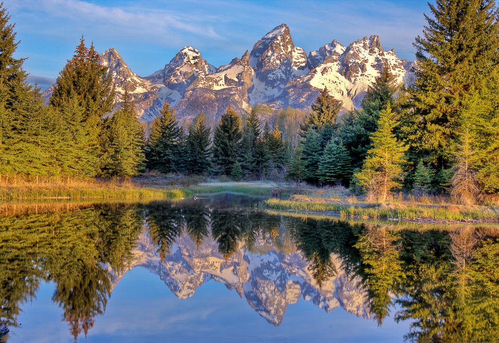
A beautiful shot! The composition is perfect, and I love the dream-quality and lighting. There isn't anything I would change about this one, Mike!
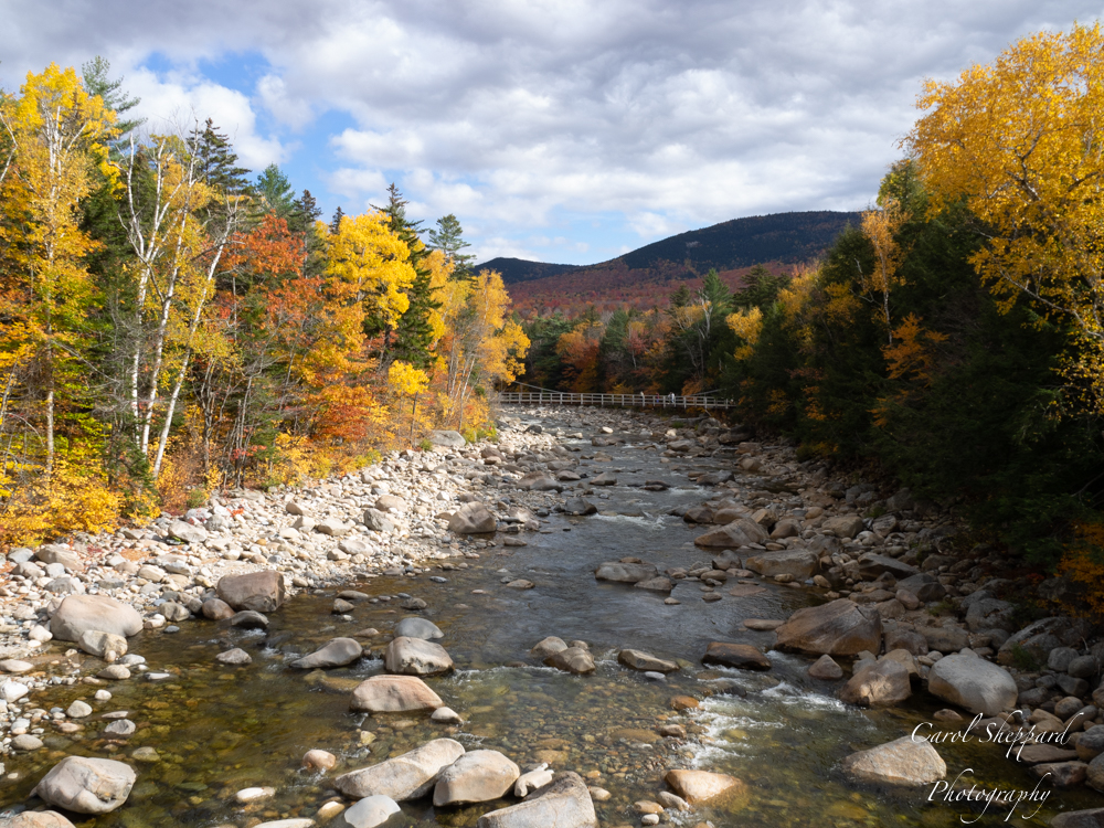
For myself, I wouldn't crop it at all; it looks terrific as is. If you crop the top, I will feel it is too tight to the treeline. And it will detract from the spectacular sky.
Great image! You have mastered the editing on this one. |
Sep 15th |
| 52 |
Sep 19 |
Comment |
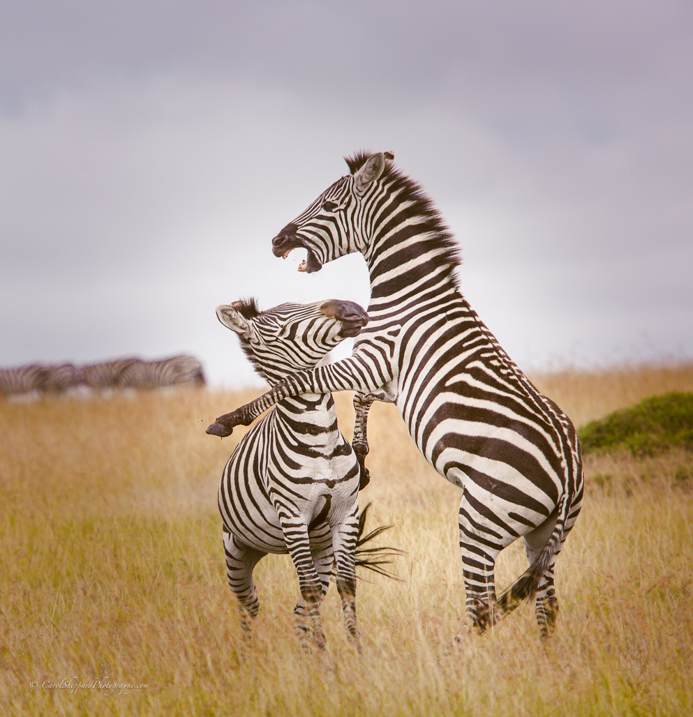
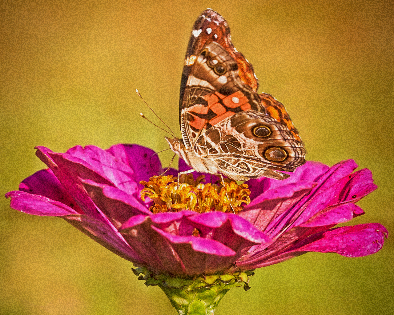
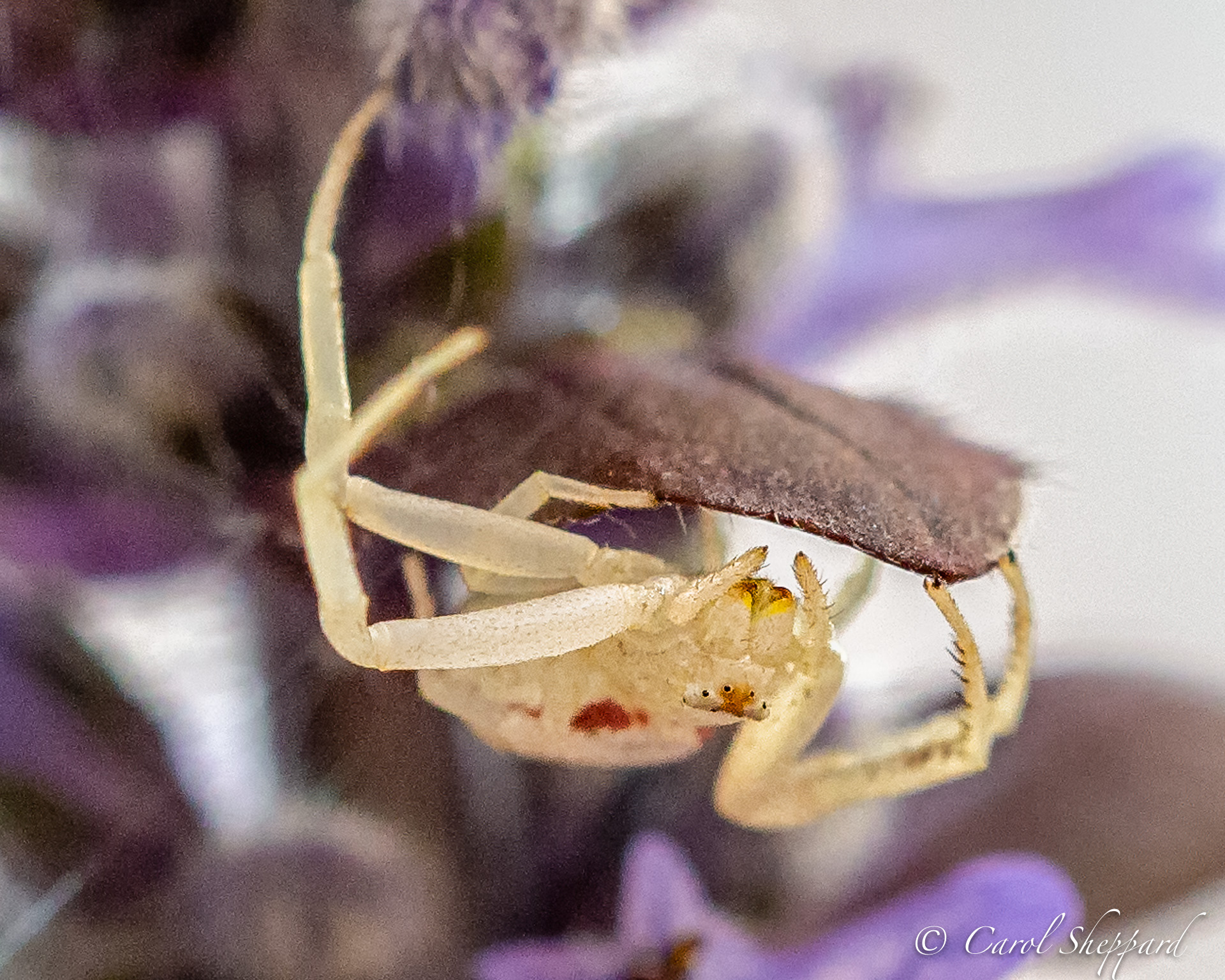
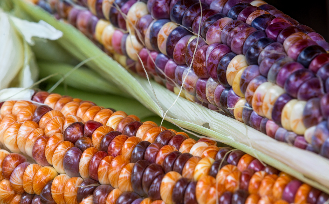
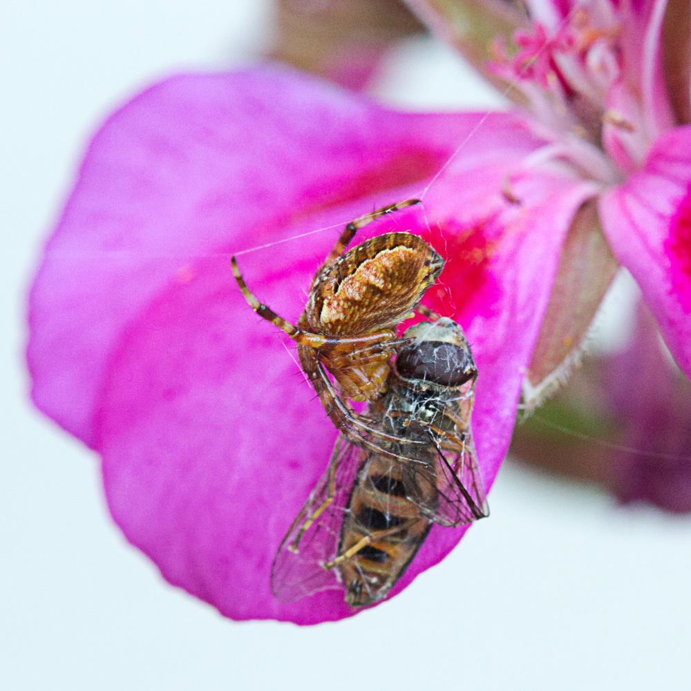
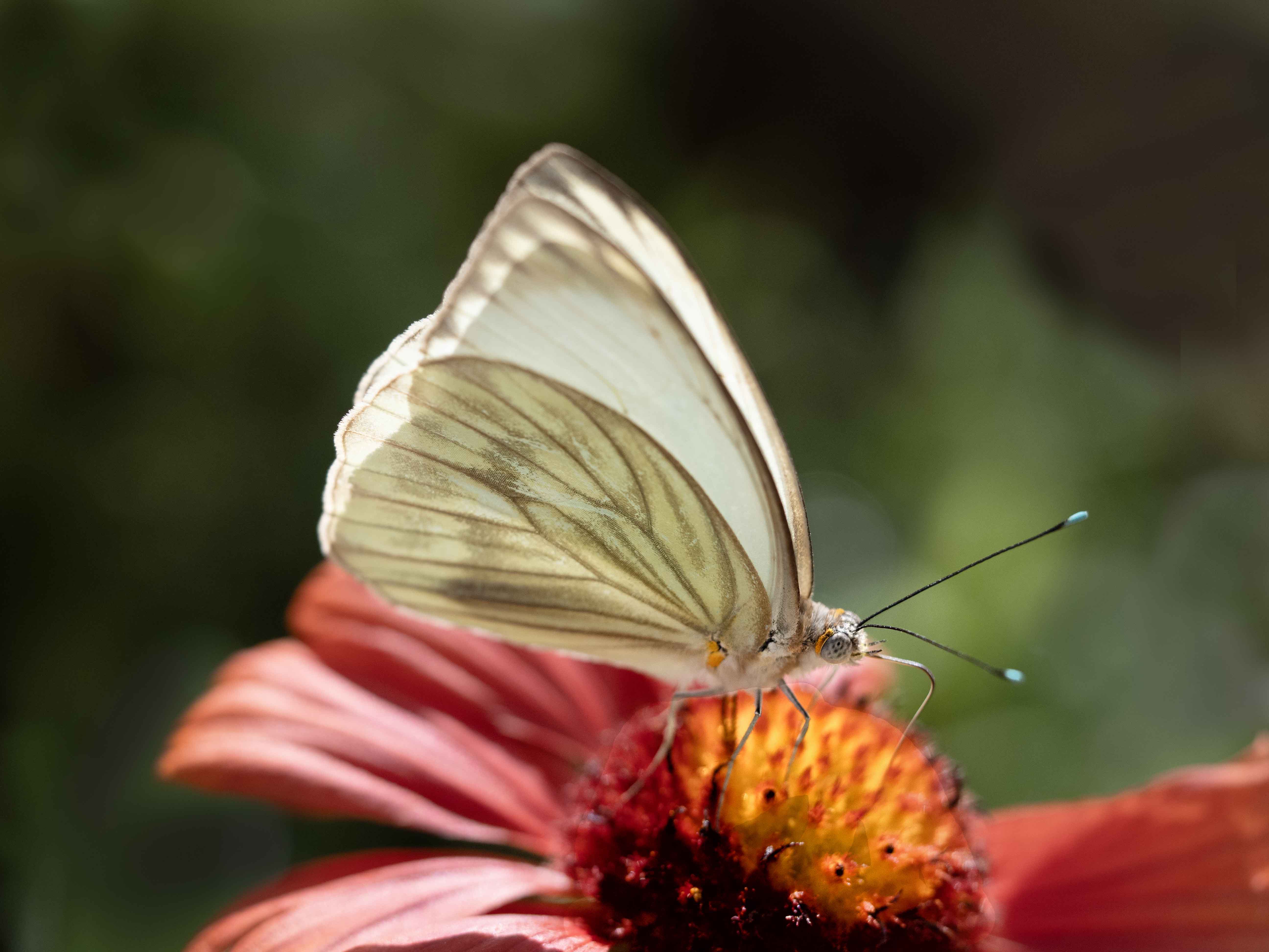
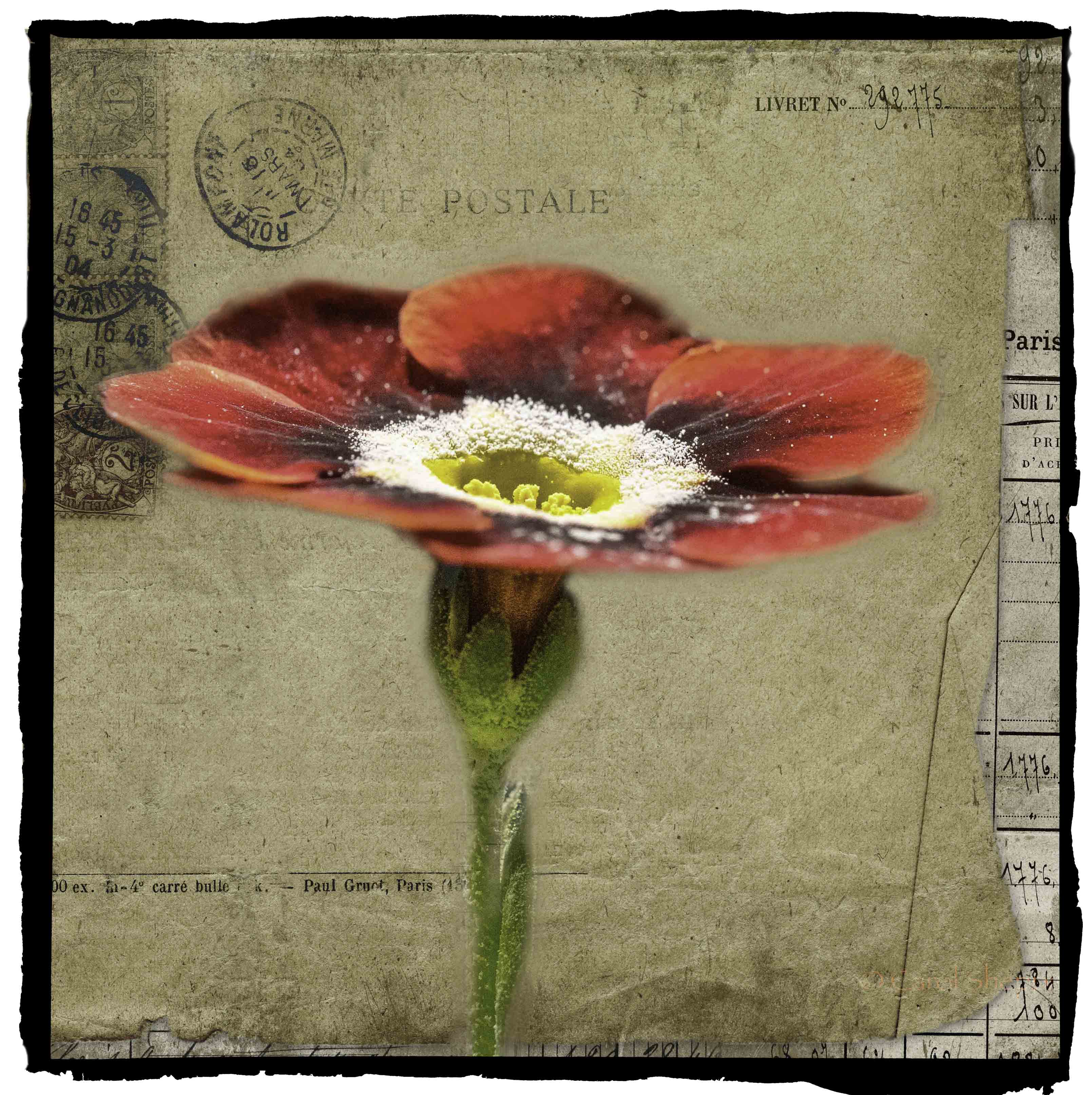
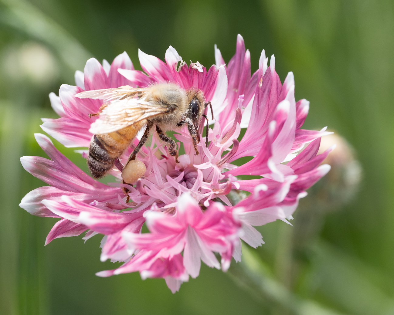
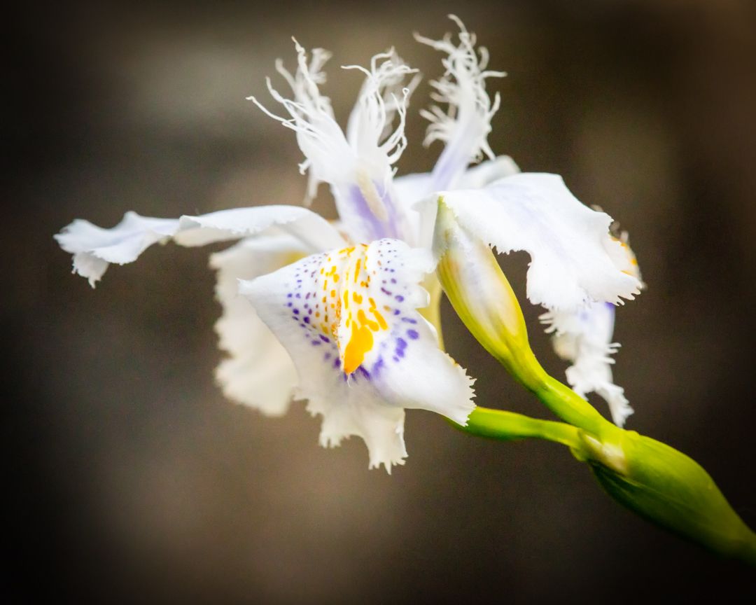
I like this; especially the lovely oranges running through the wing of the butterfly. In my humble opinion, your original pops more than the remake Mike did. However, having said that, I do find that a little bit of dodging was needed toward the back end of the wing/butterfly. I could see the lighting on the wing, but as I got into other areas of the butterfly, the light seemed much more subdued.
I still don't know what the fuss was about the stem, but it apparently didn't bother me! Also, Mike's crop feels too tight to me on the butterfly; yours felt fine to me as a viewer.
Good job! |
Sep 15th |
| 52 |
Sep 19 |
Comment |
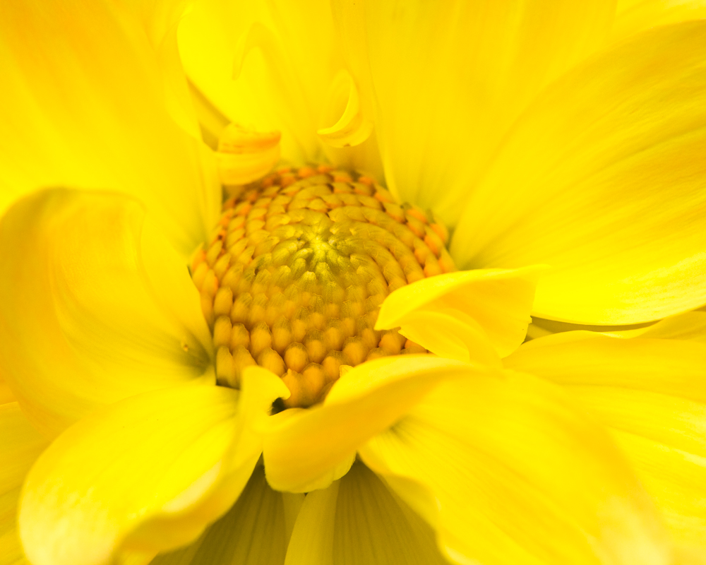
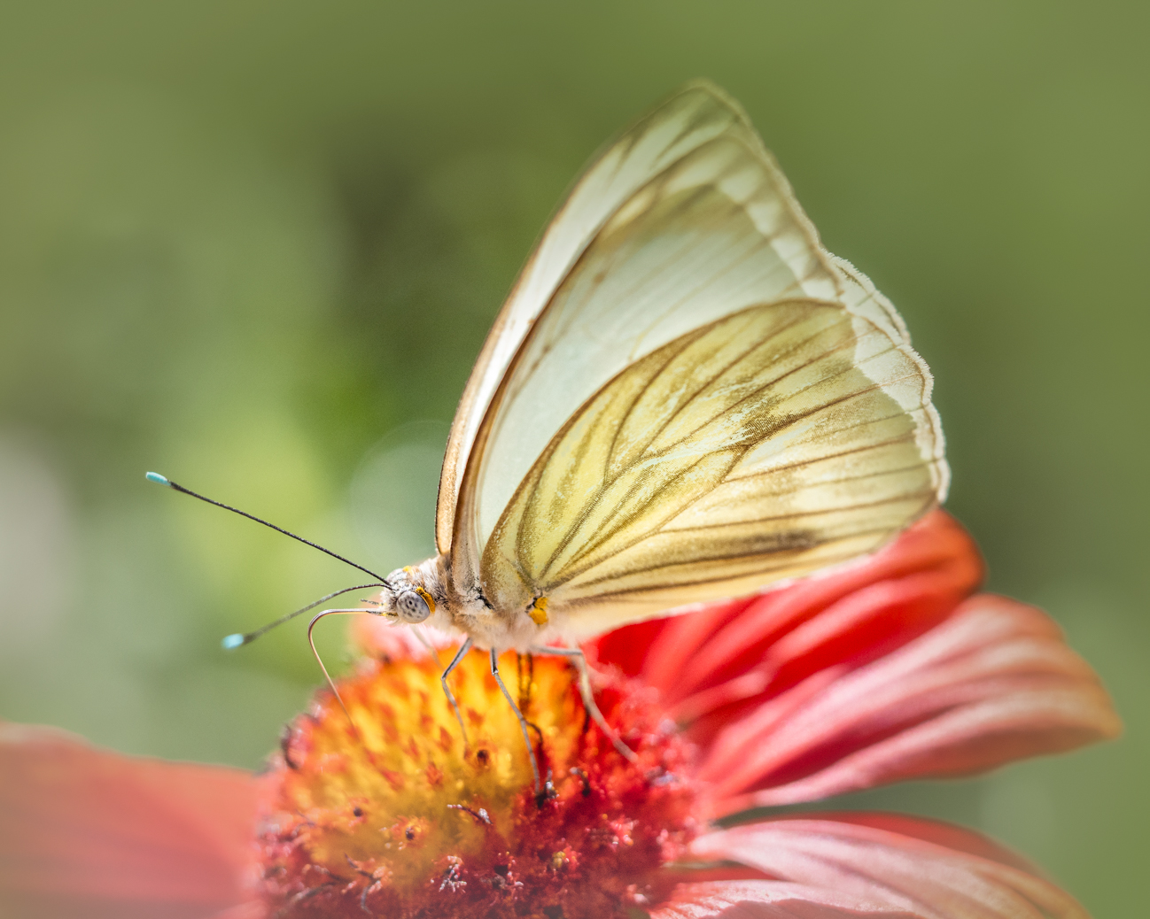
What a great image!
I think Mike's enhancement was very positive, although I would not have noted any horizon issue. The wing was definitely a bit shadowed, but it is just ultra-perfection to an already-beautiful image. Your color combination is stunning here, and I love the composition, with those plants in the background but not intrusive. You should enter this into a print competition. |
Sep 15th |
| 52 |
Sep 19 |
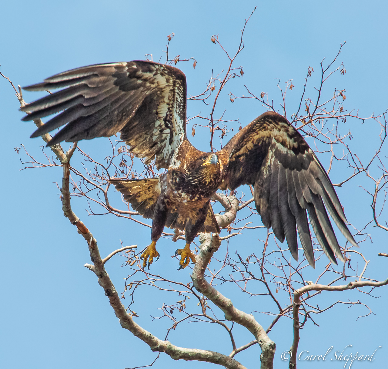
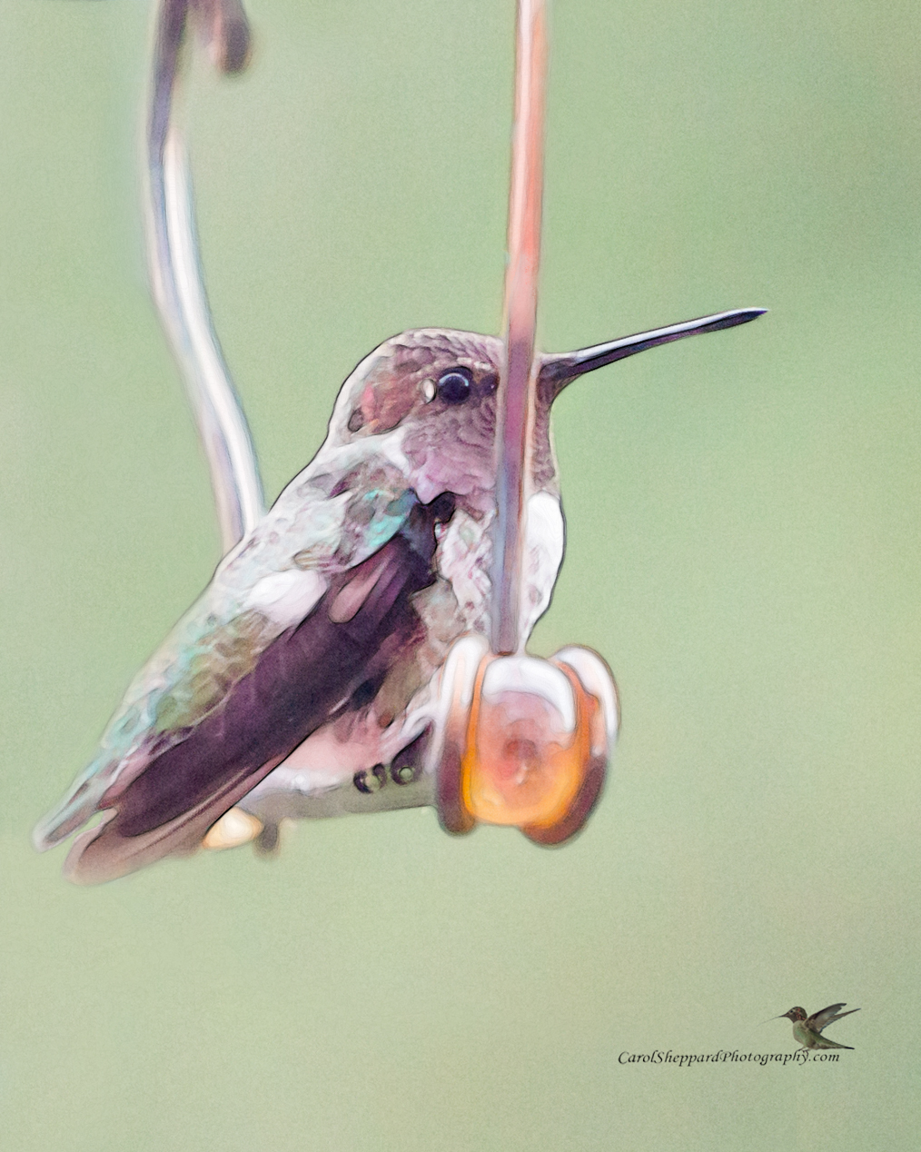
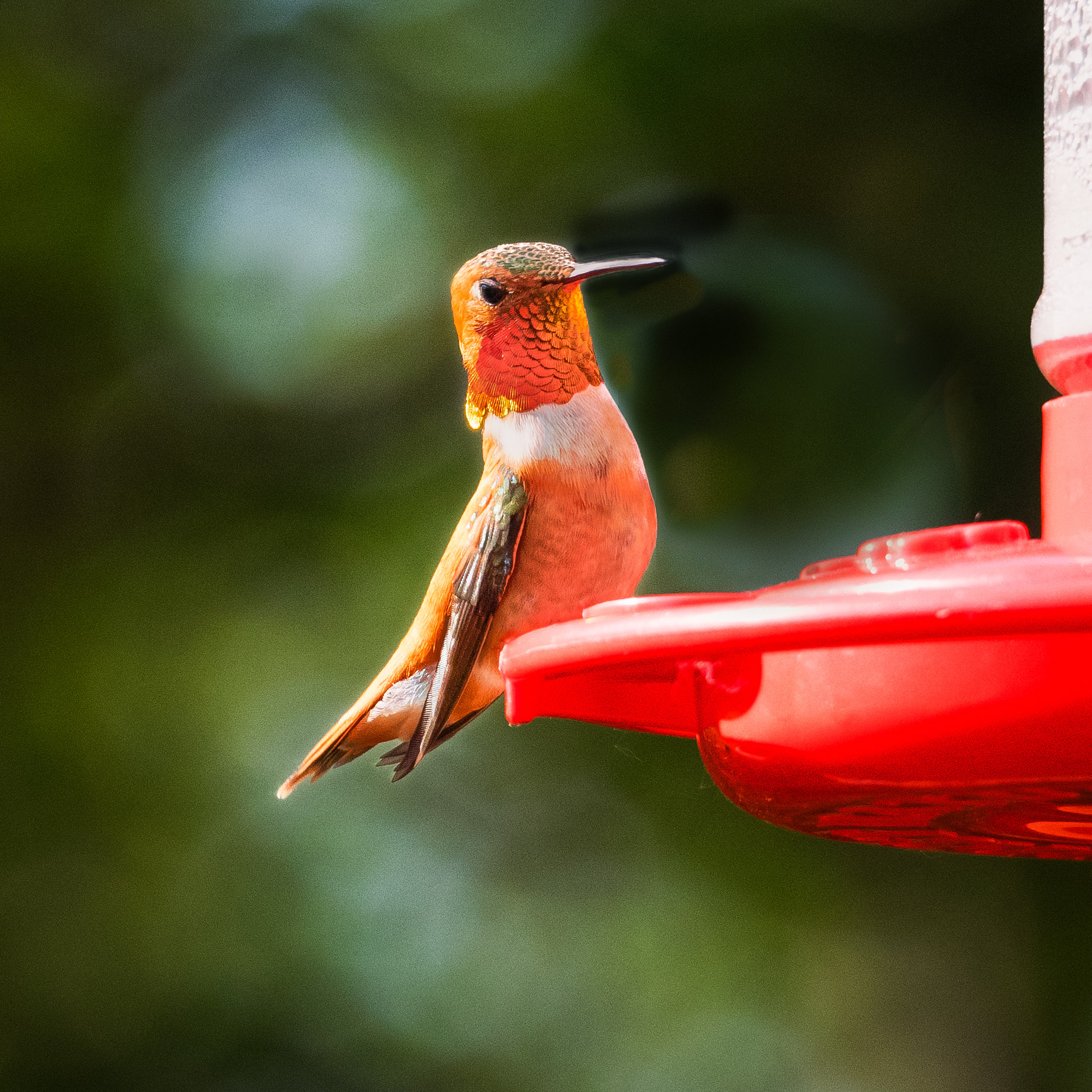
Comment |
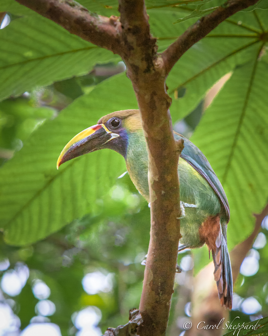
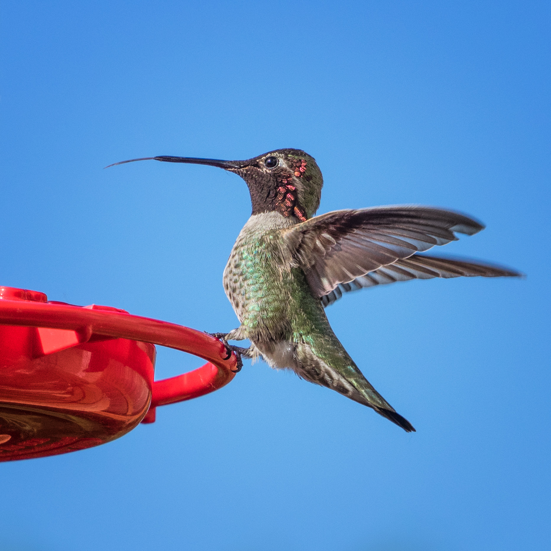
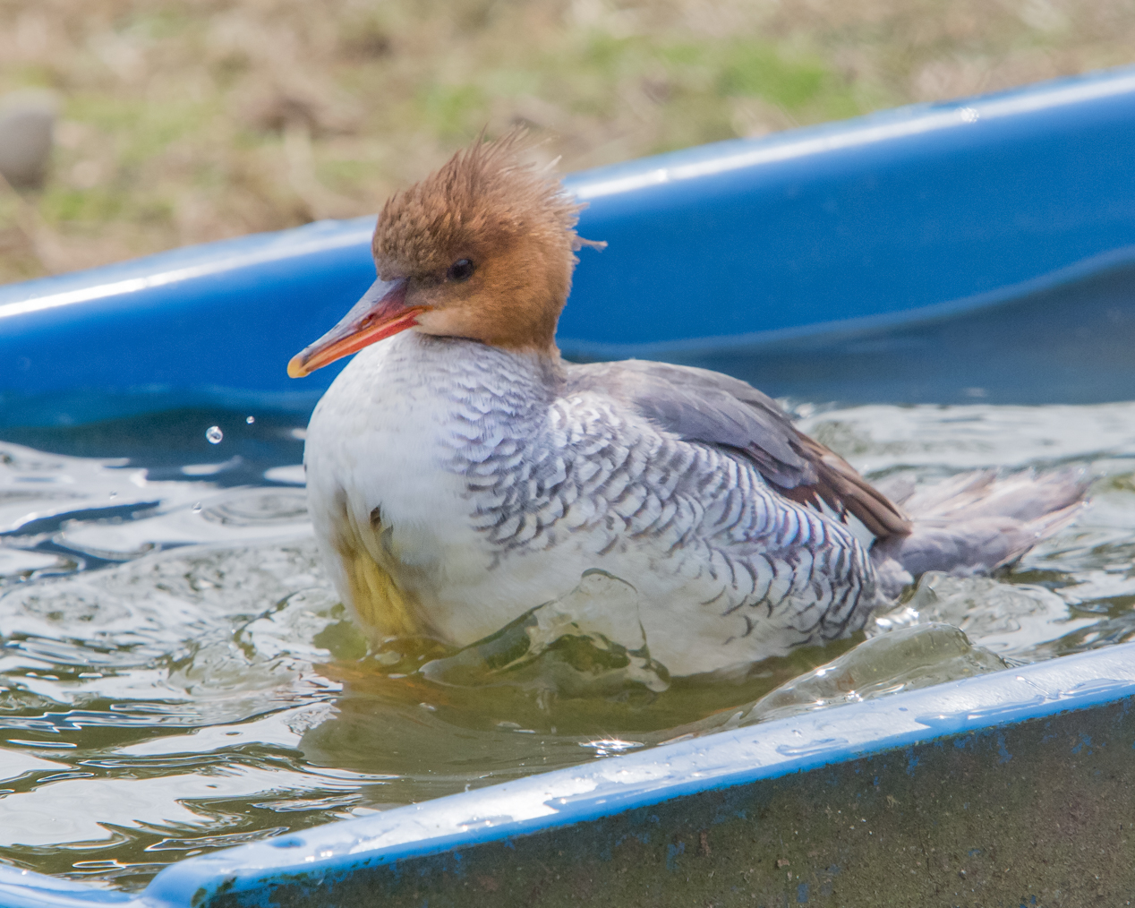
Wow, John!! Great image! I love the sharpness of the eye and the feather detail of the bird but also the detail you captured in the fish!
I wondered what would happen if you increased the lumiousity on the oranges just a bit. I am finding some lack of contrast between the bird and the background. Or even using a local exposure adjustment, very subtly applied, to draw the bird from the background?
This is an excellent shot! I definitely would play with it to address the pop factor, but other than that, it is beautifully done! |
Sep 15th |
| 52 |
Sep 19 |
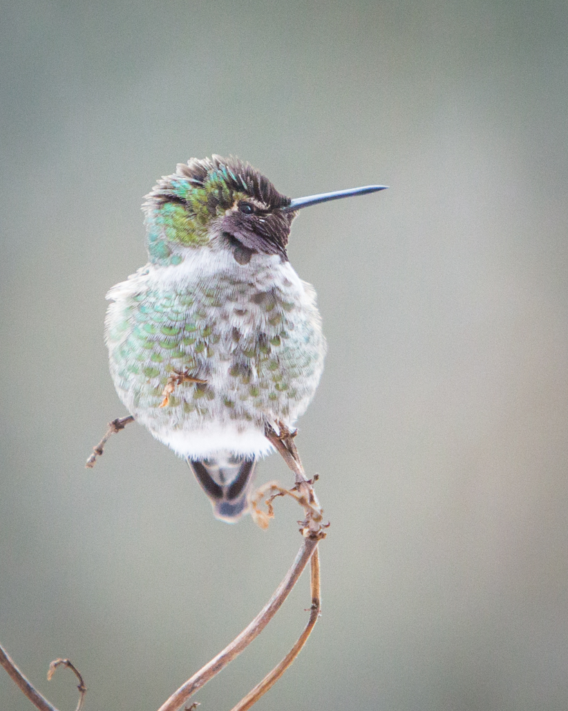
Comment |
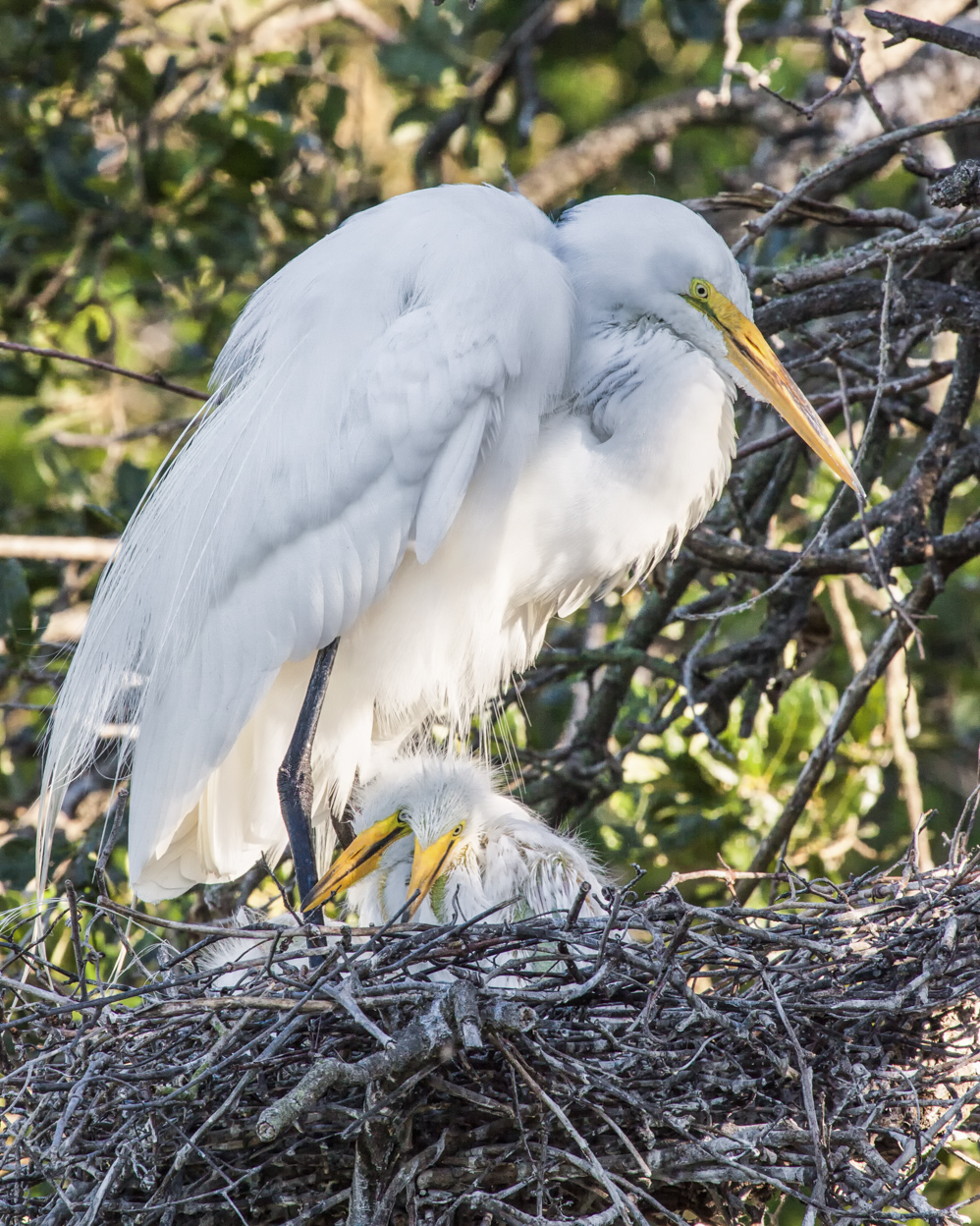
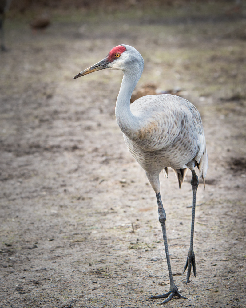
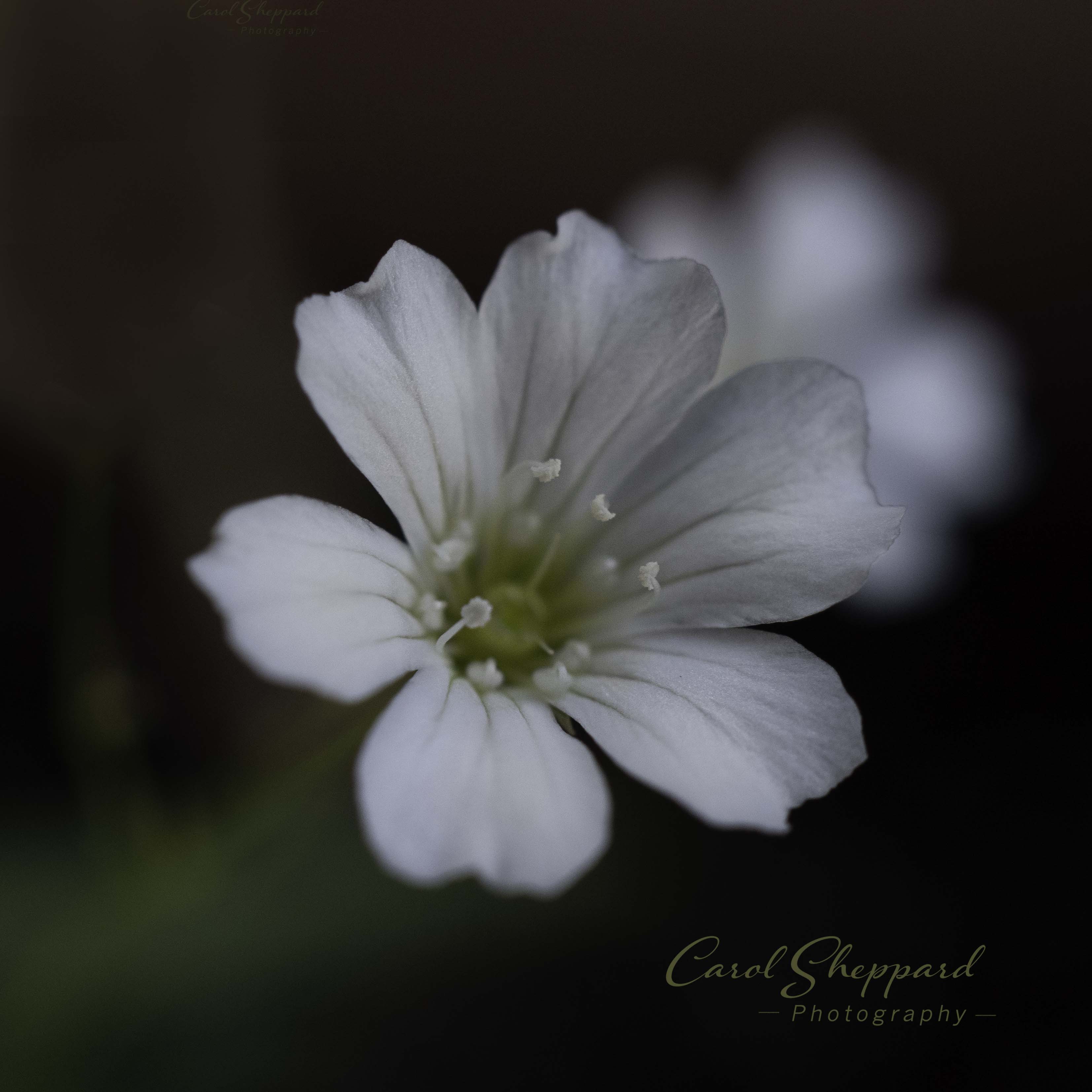
This is a beautiful image...and if you can't earn a star in Nature Photography, there's no hope for many of the rest of us!!
I like the crop as is, along with the contrast; the soft background is beautiful and soothing. And the subject is sharp without being oversharp. It looks natural. I think there's a tendency to put in contrast to the point where it no longer looks natural. The angle and space around it is also very pleasing--although I think there's an out-of-balance feel for me on the right. Maybe taking off just a slice on the right-hand side.
Other than that: perfect! Lovely capture, as always. You are a master, Sharon! |
Sep 15th |
6 comments - 0 replies for Group 52
|
| 60 |
Sep 19 |
Comment |
Bob, this is a fantastic image! The colors, white balance, and clarity are very pleasing. Looks like you nailed the focus stacking. The fact that it was a very "hairy" subject works well for this one. The composition is great, and your background makes it all pop forward without fighting it. Great job! |
Sep 20th |
| 60 |
Sep 19 |
Comment |
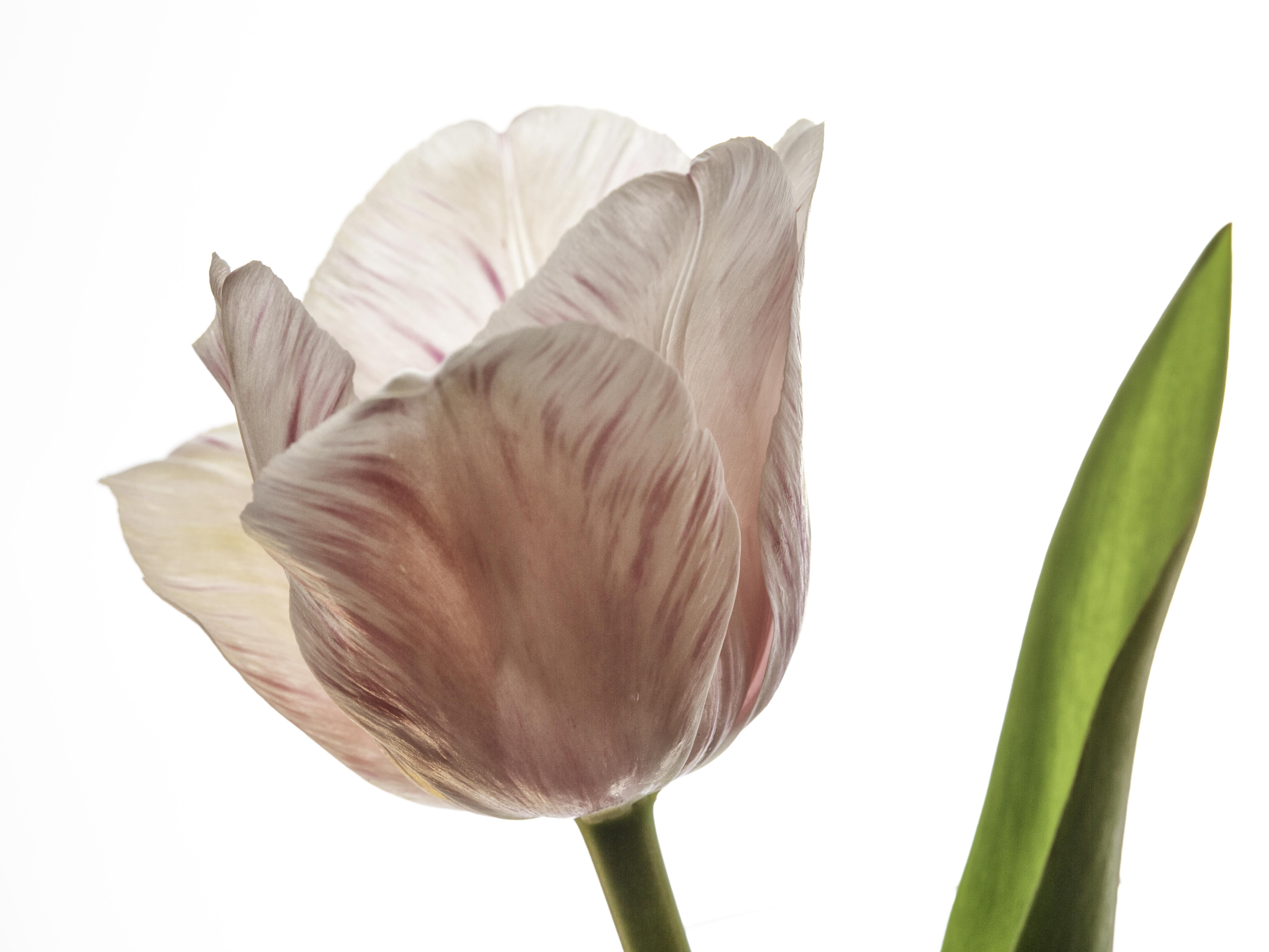
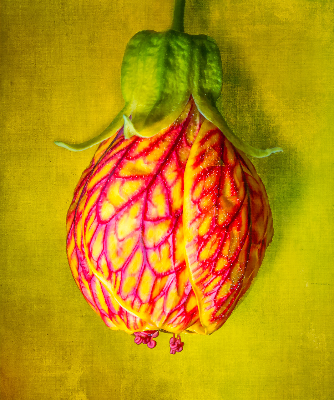
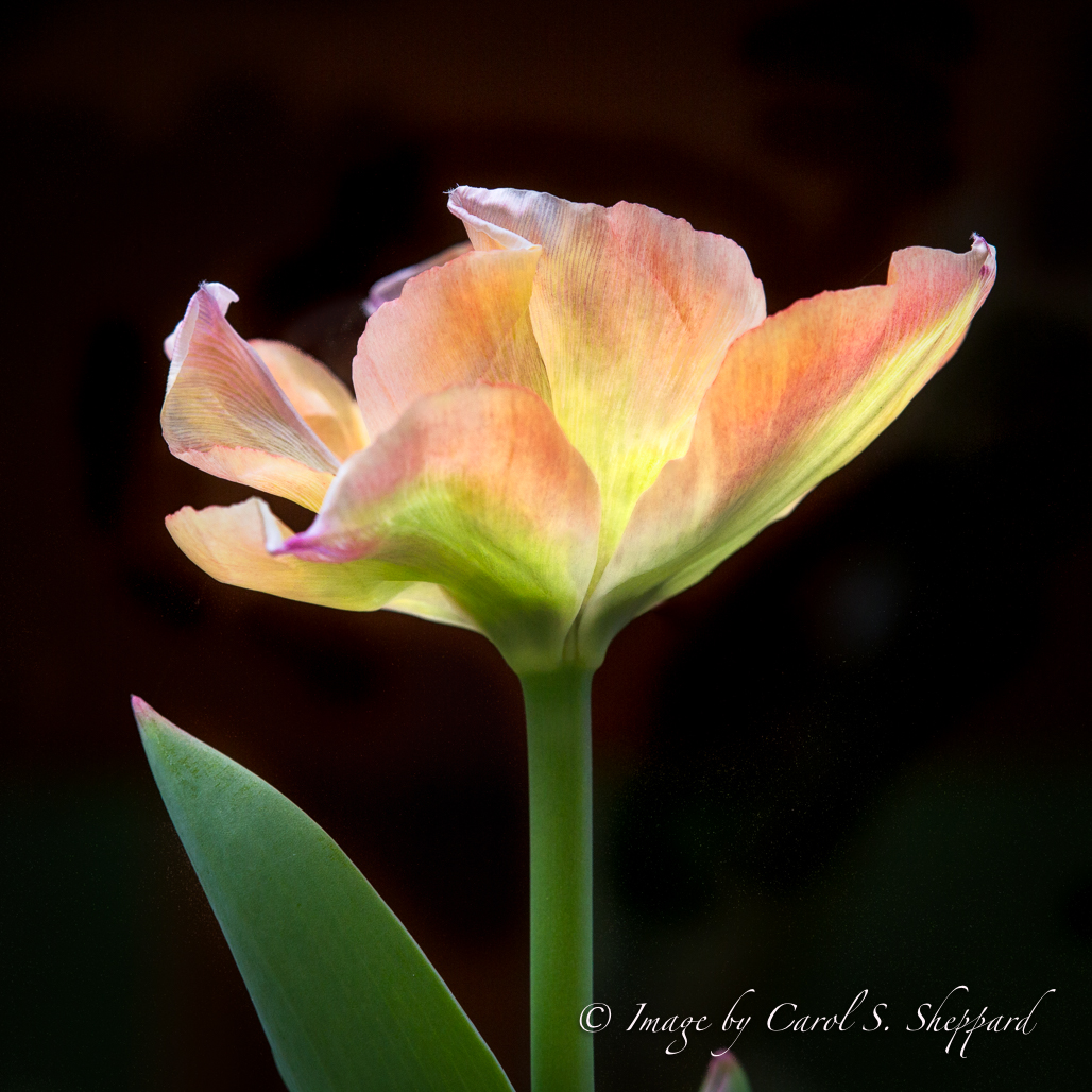
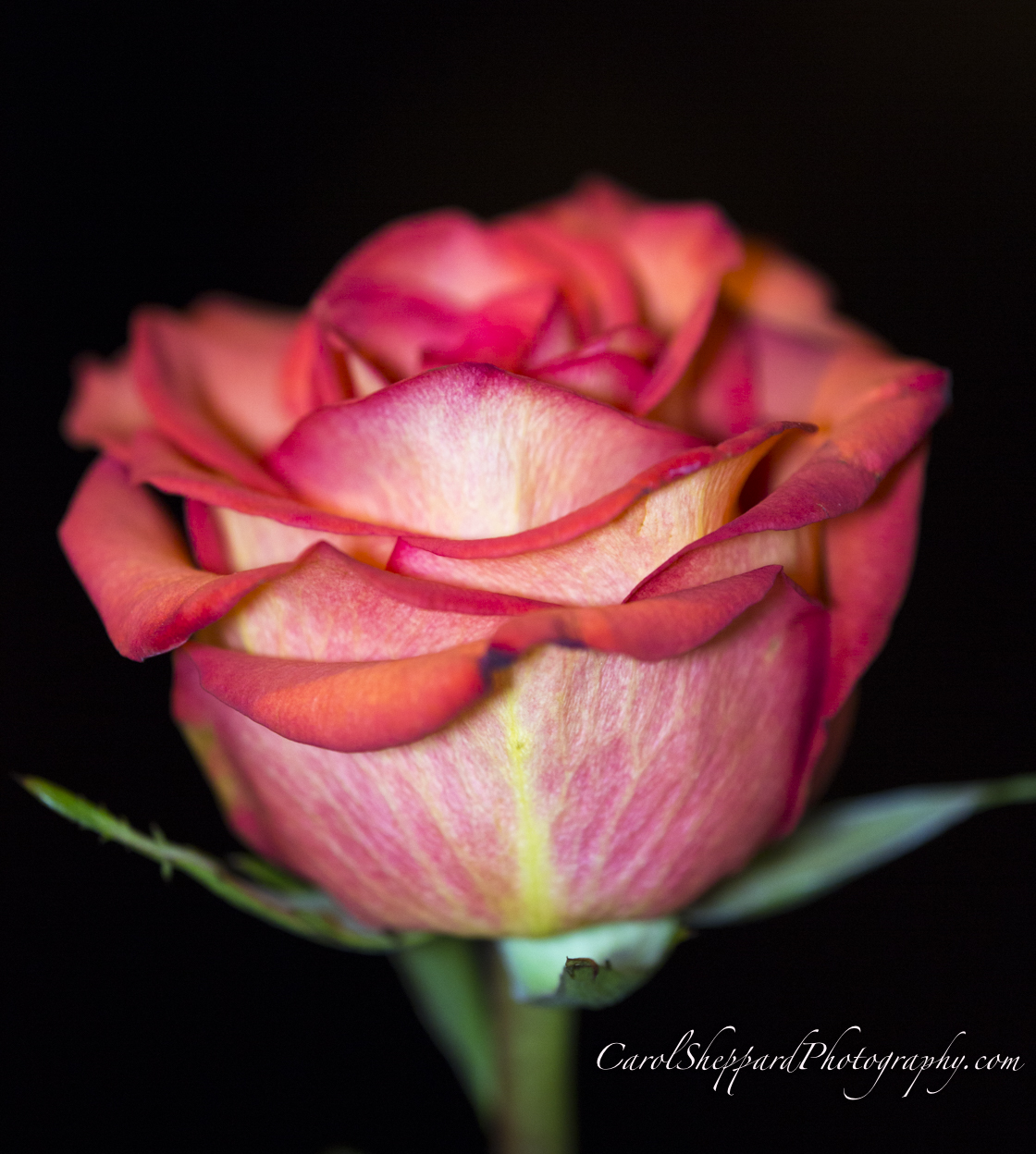
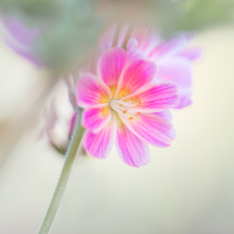
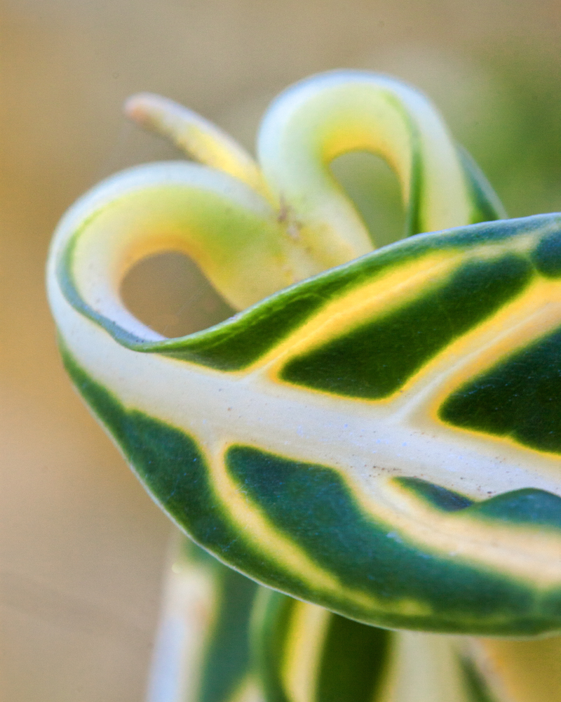
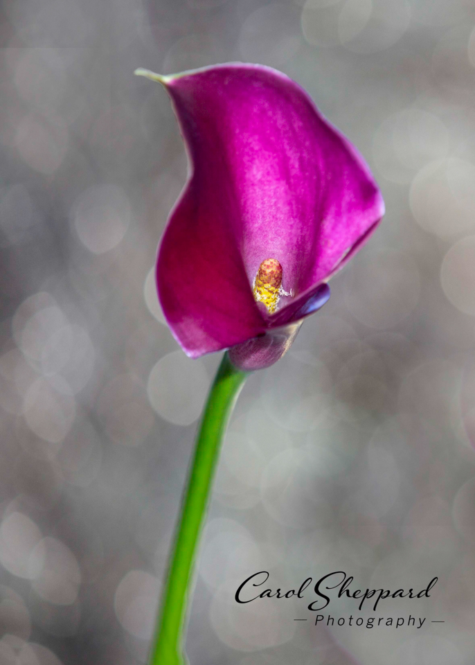
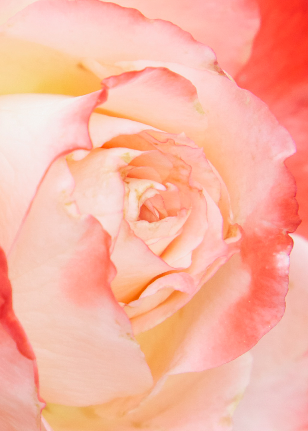
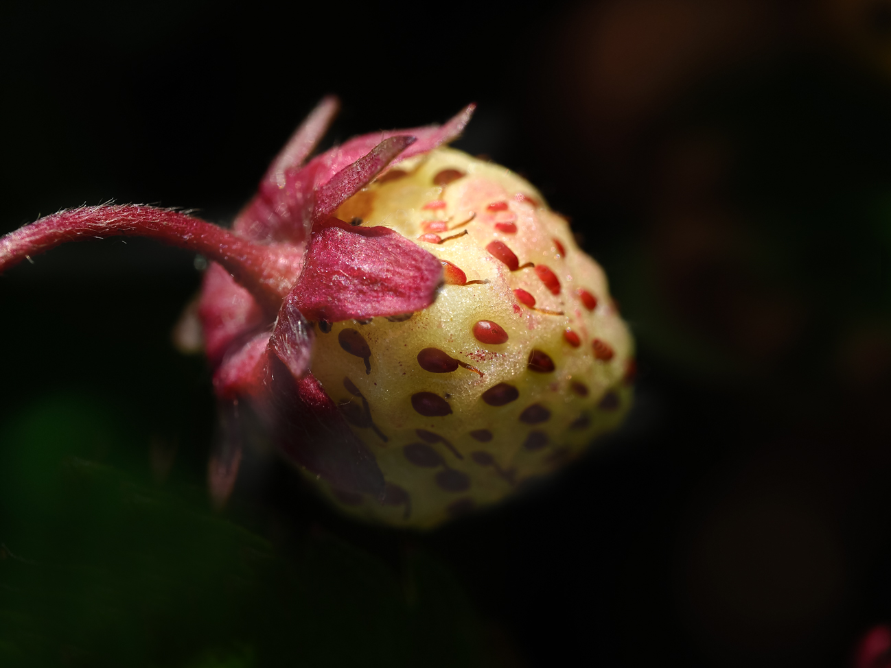
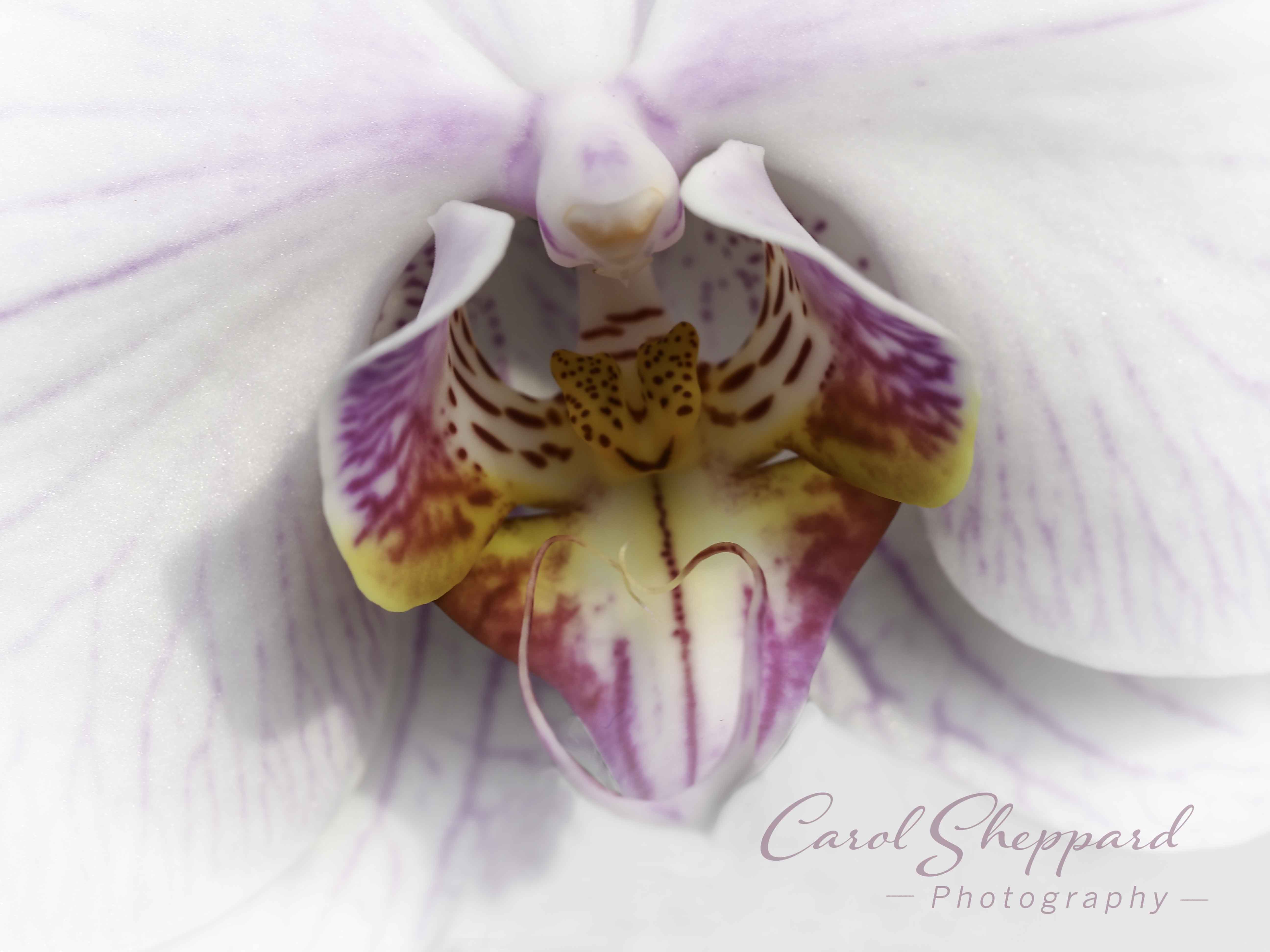
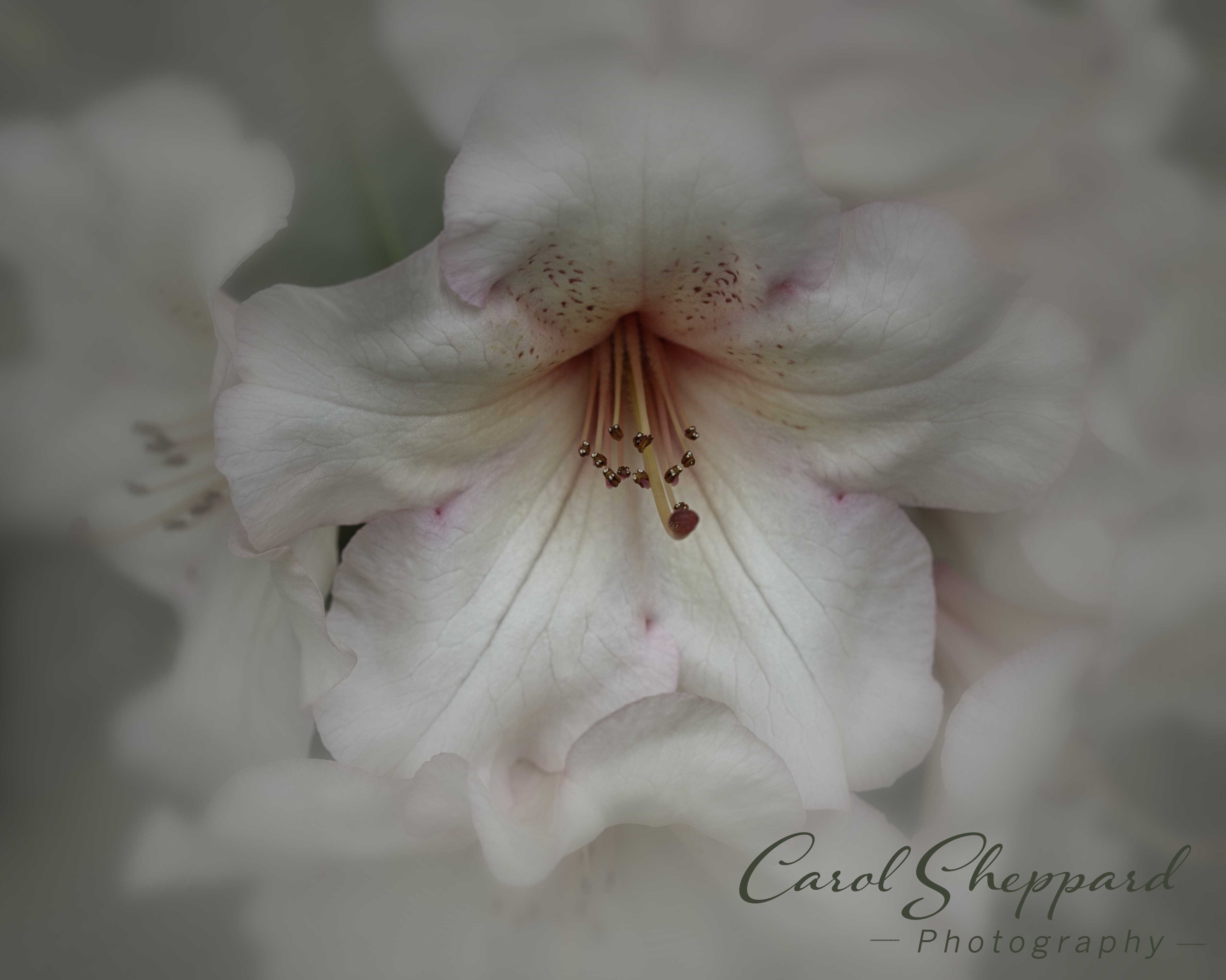
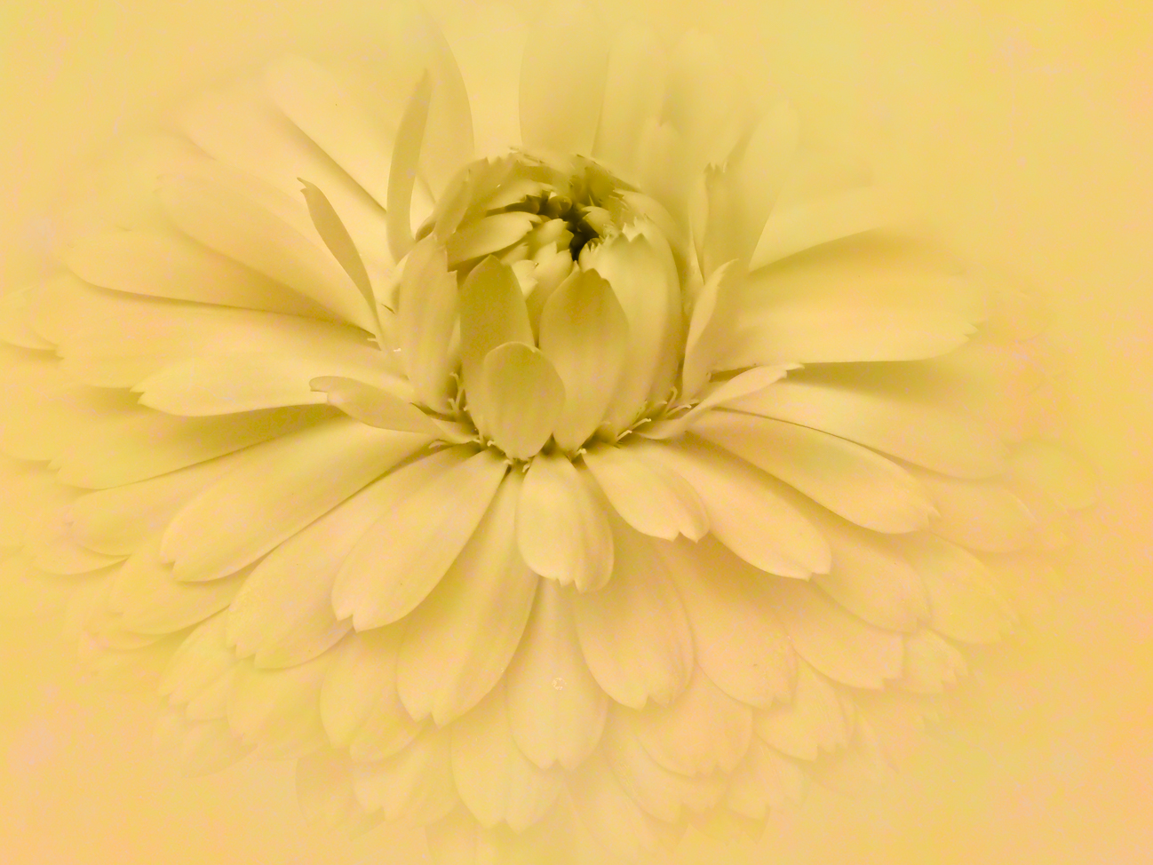
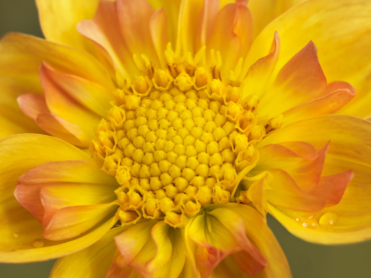
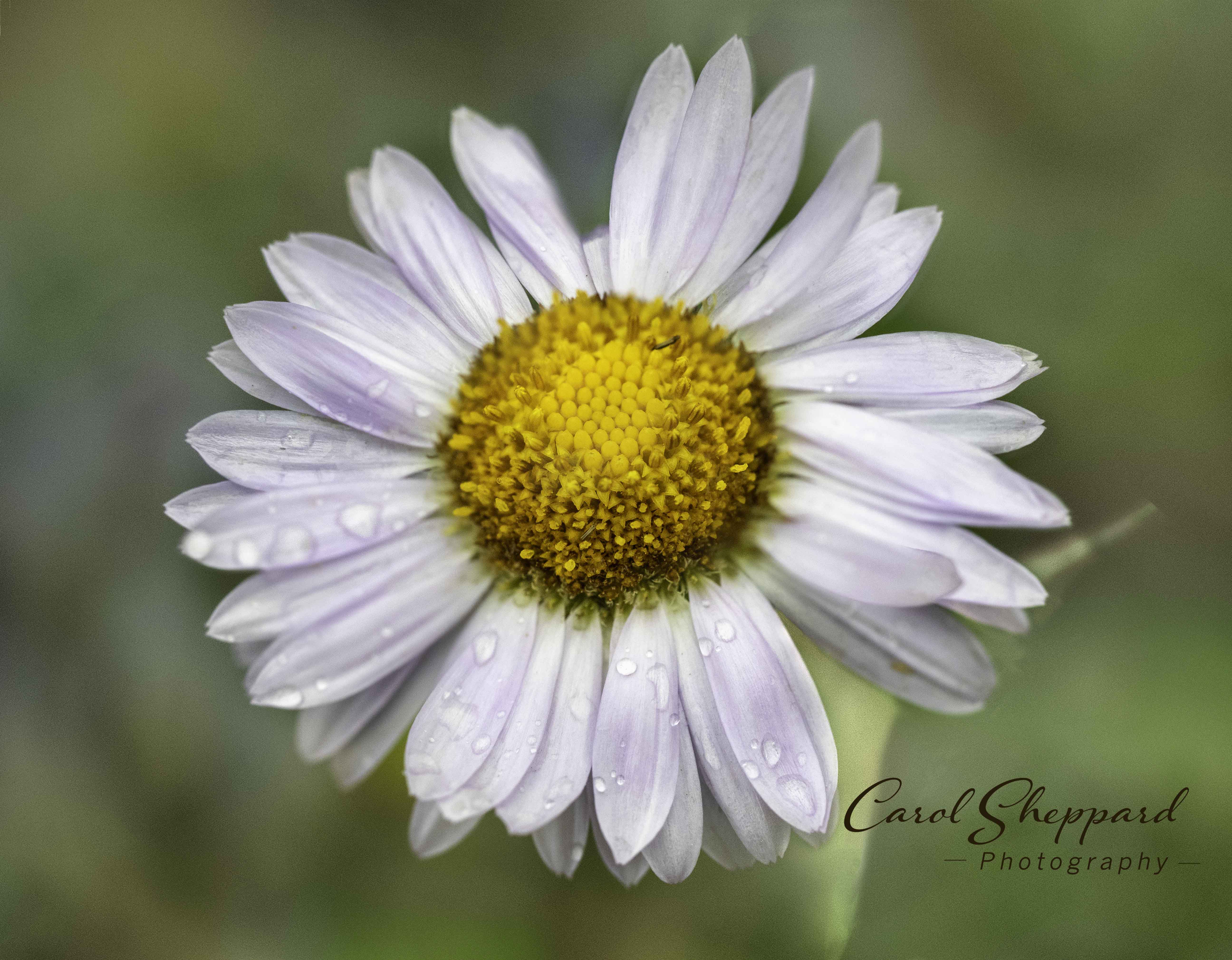
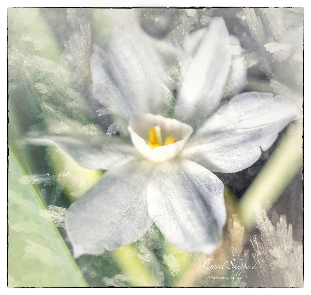
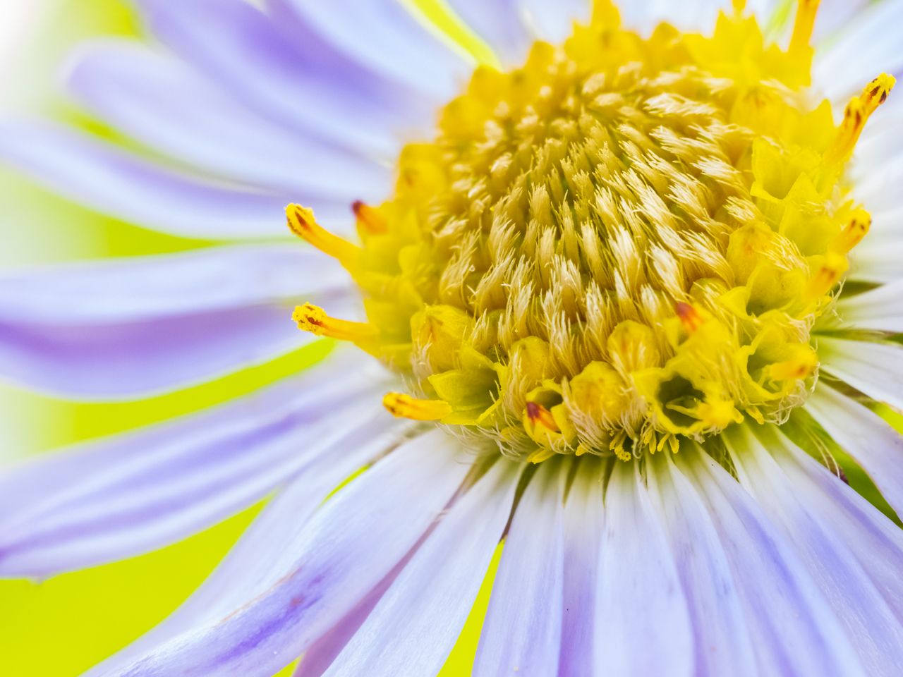
Hi Angie, I like the capture in the water drop; I did go from my IPAD to my laptop to try to blow it up some so I could see if the softness was planned or accidental.
What works well is the color combination; both really rich colors. The yellow center draws my eye immediately to the most important part of the subject. I like your square crop best, but there's a bright spot that isn't there in the final crop. The final crop has too much space above the flower, but the background seems cleaner and softer. So I would try taking the final crop, and cutting off about one-third from the top. I'm not sure if that what was done with the image inside the comments? But I miss the leaves--it is too soft to crop in that close on the main subject of the petals.
Nice capture of that water drop refraction! They are hard to do~!! |
Sep 15th |
| 60 |
Sep 19 |
Comment |
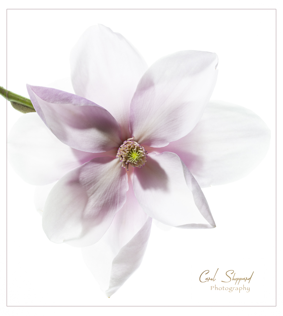
Okay, Denise, you are putting us all to shame!!
Another winner with a capital W.
From the lighting to the composition, this is gorgeous. It pleases me as a viewer inordinately!
Another competition-worthy floral macro! |
Sep 15th |
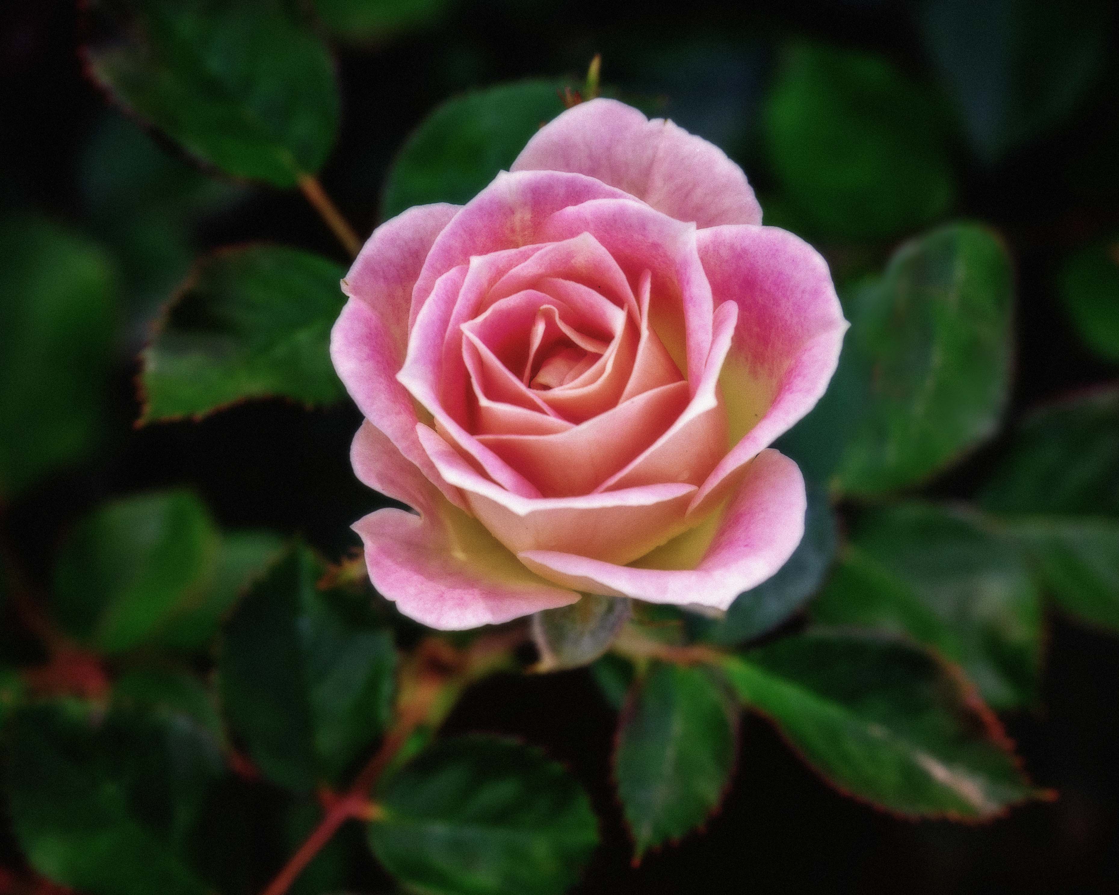
| 60 |
Sep 19 |
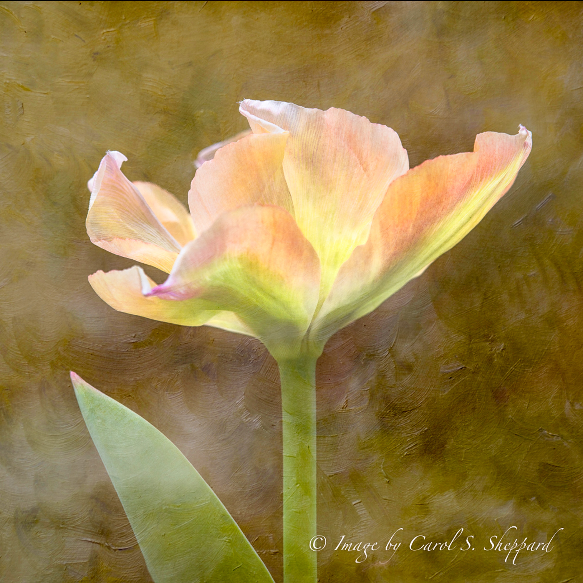
Comment |
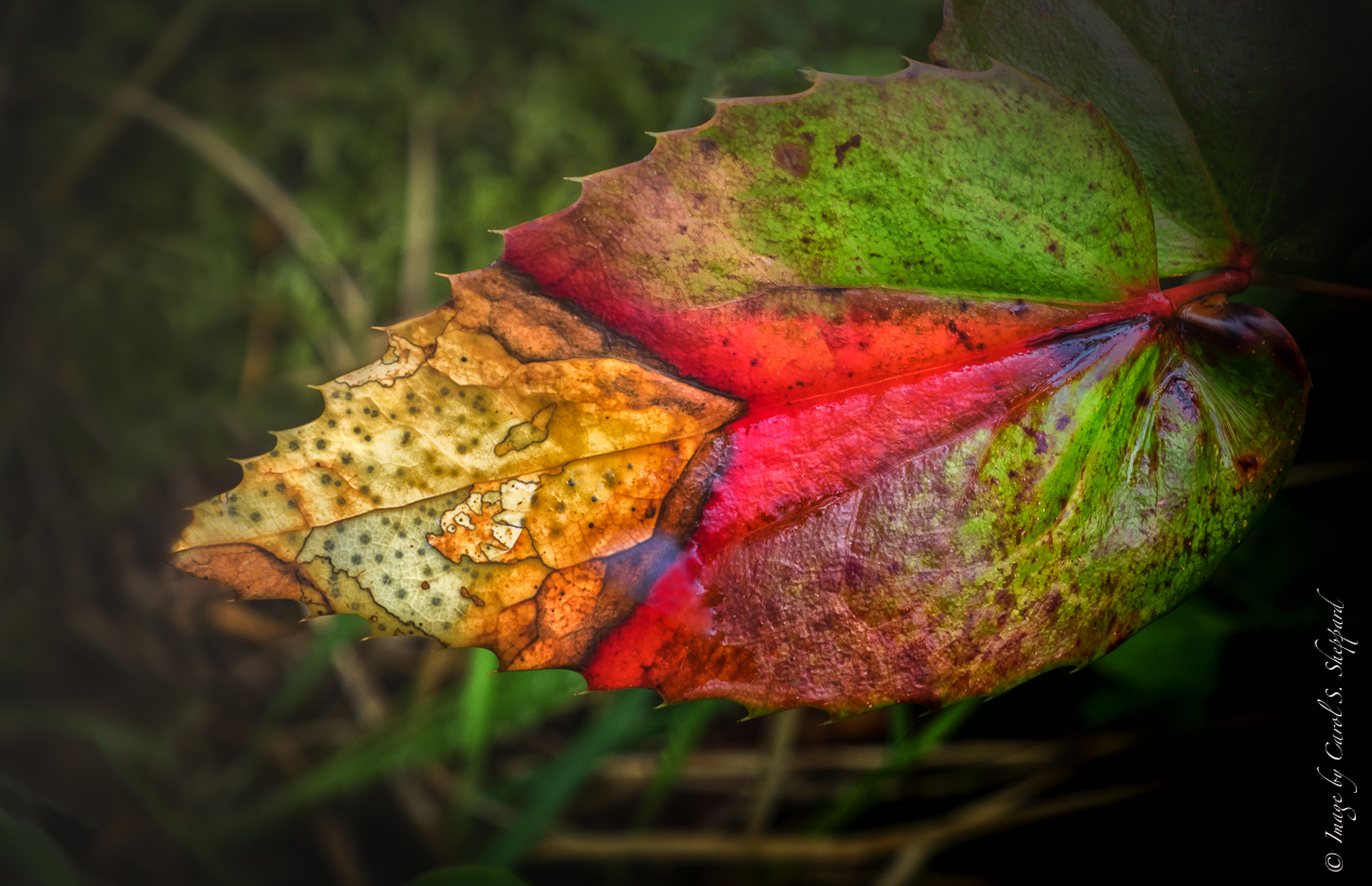
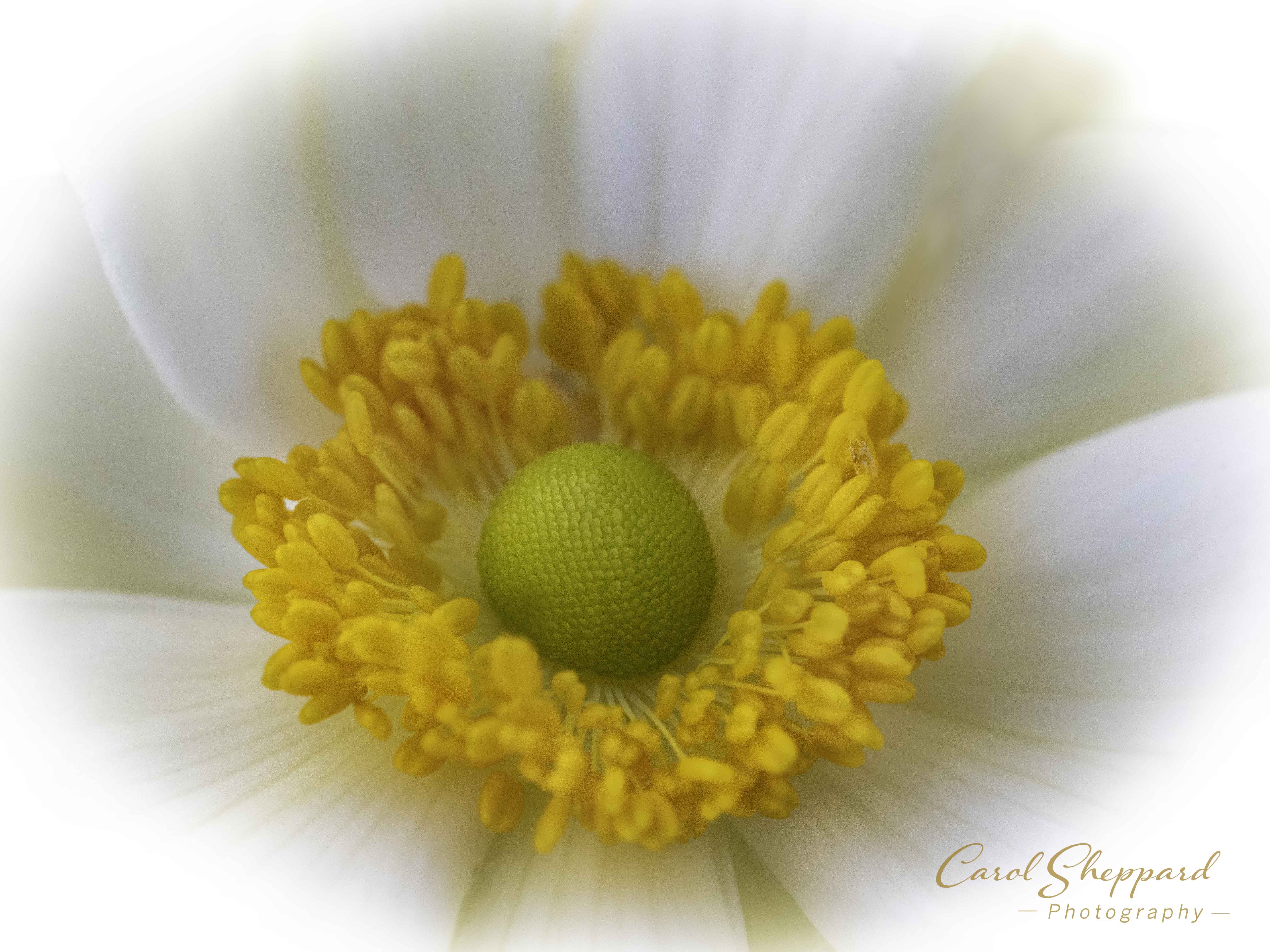
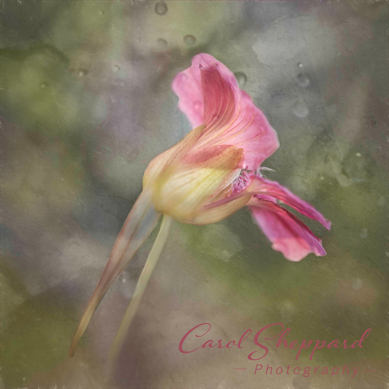
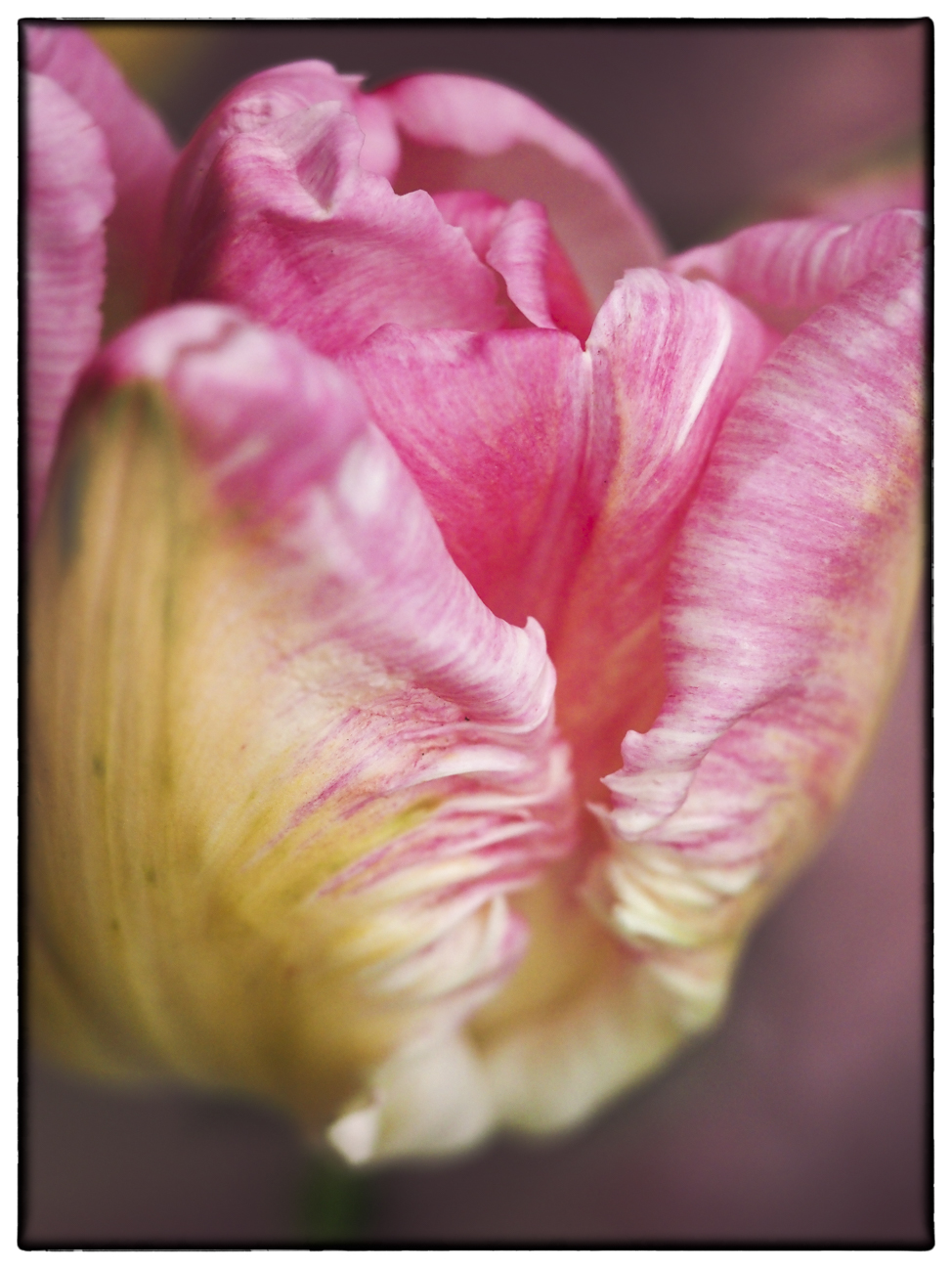
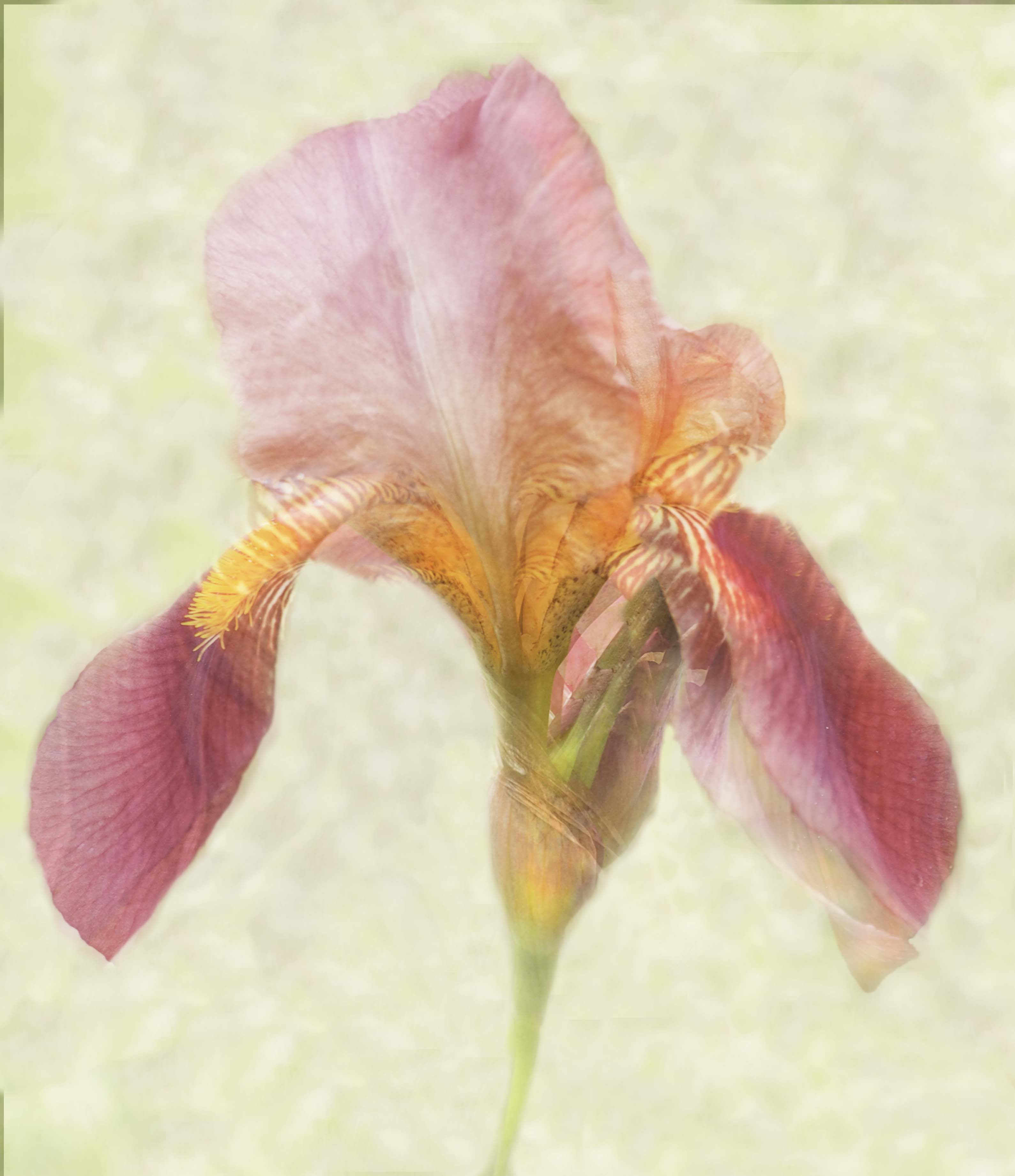
The stunningly rich purple of the flower against the dusty green of the leaves gives this great impact. My favorite area of the leaves is in the lower left corner where the light hits it.
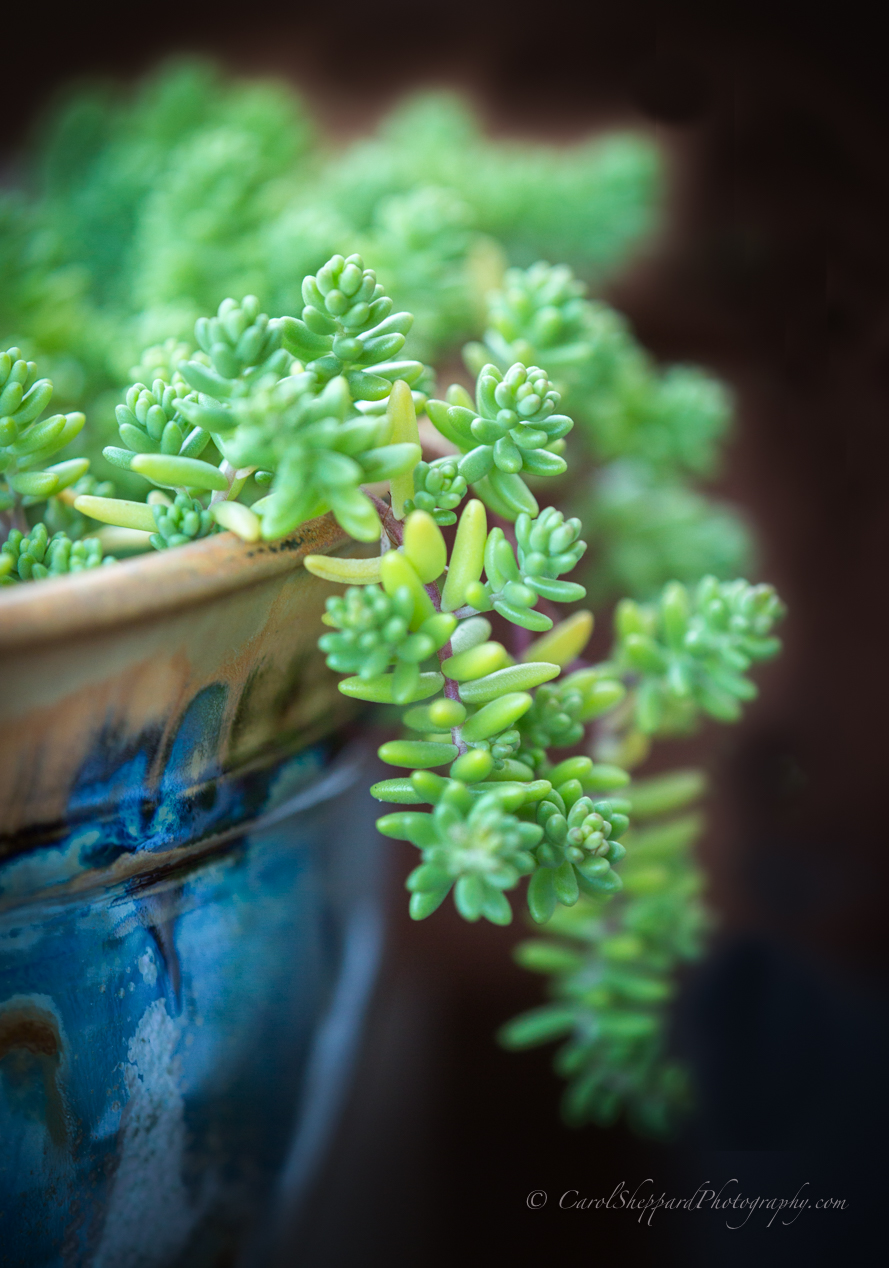
While much of the leaves work well for leading the eye, I find the speckles in the upper right hand corner distracting to me as a viewer. I don't know if it's the lightness, the softness or just the presence that draws my eye in a negative way.
I wonder if a close crop from the right would put more emphasis on your flower and that beautiful leaf on the left? Just a suggestion.
|
Sep 15th |
| 60 |
Sep 19 |
Comment |
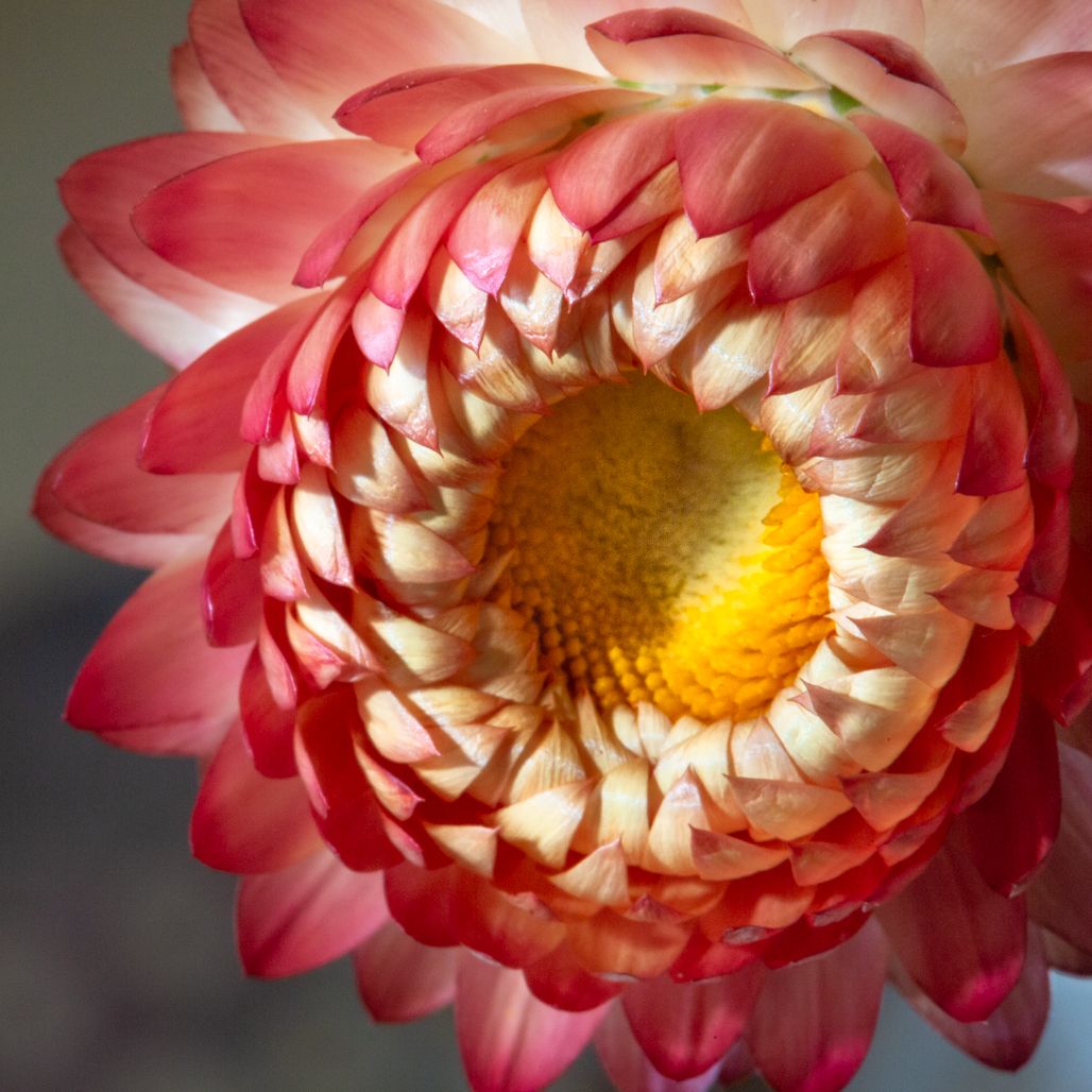
Great image-sharp, beautiful balance of light and shadow, pleasing composition. I love the soft feel without any true "softness" for me as a viewer. The water as background really sets it all off nicely.
I will be there, Bill, so will look for you. I'm a breakout speaker late on Wednesday afternoon. |
Sep 15th |
5 comments - 0 replies for Group 60
|
11 comments - 0 replies Total
|