|
| Group |
Round |
C/R |
Comment |
Date |
Image |
| 52 |
Mar 19 |
Comment |
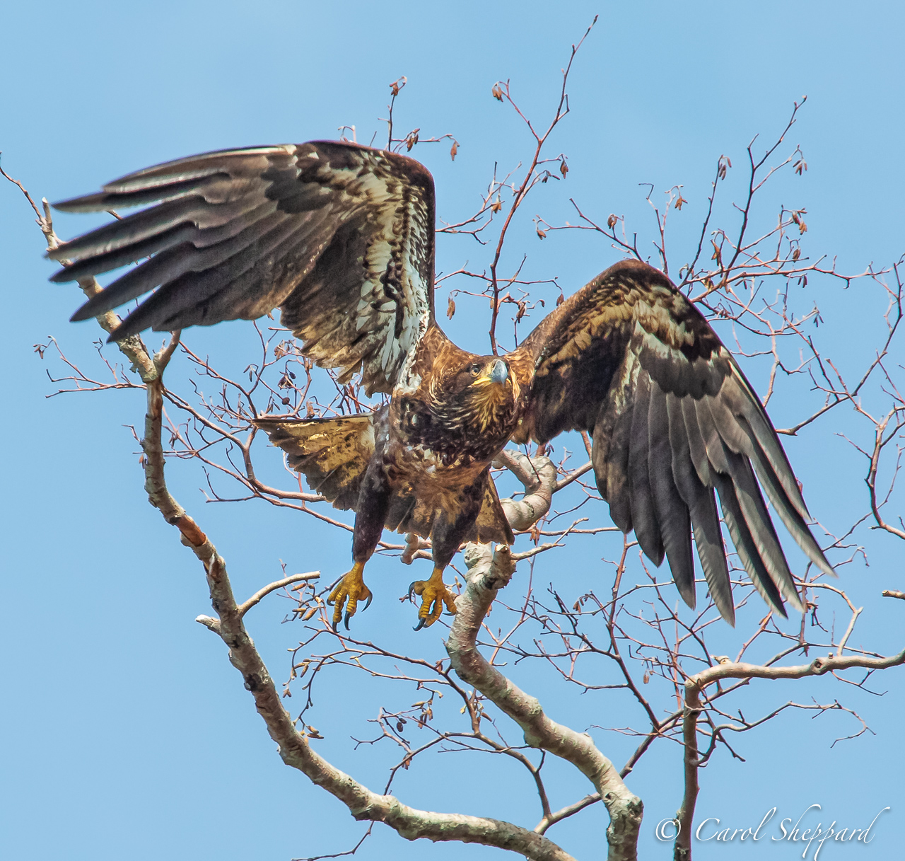
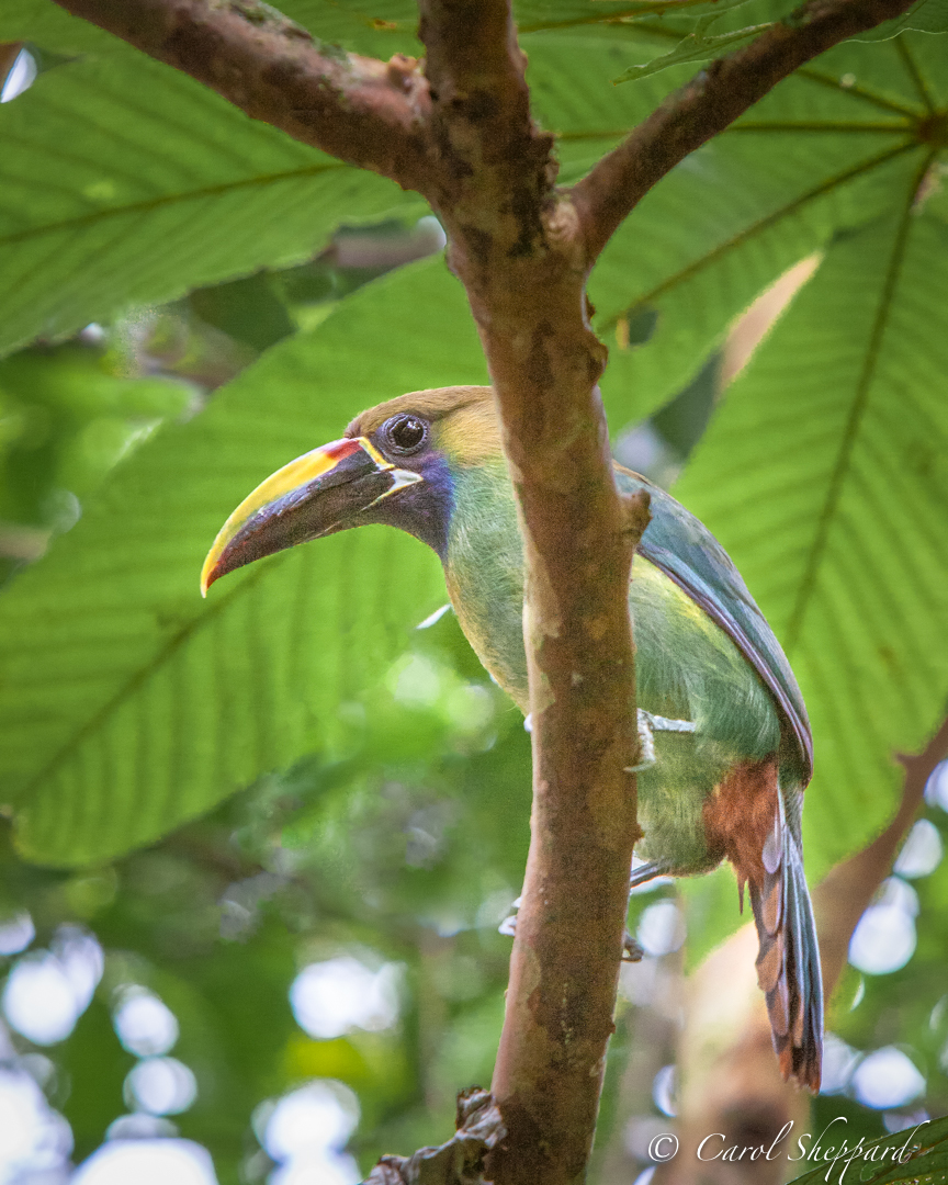
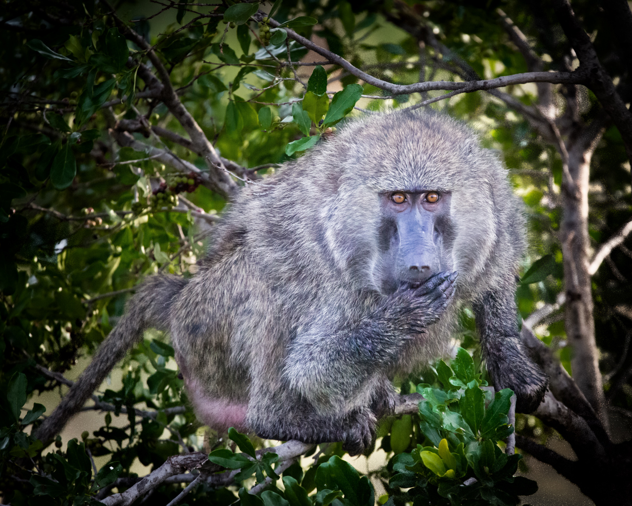
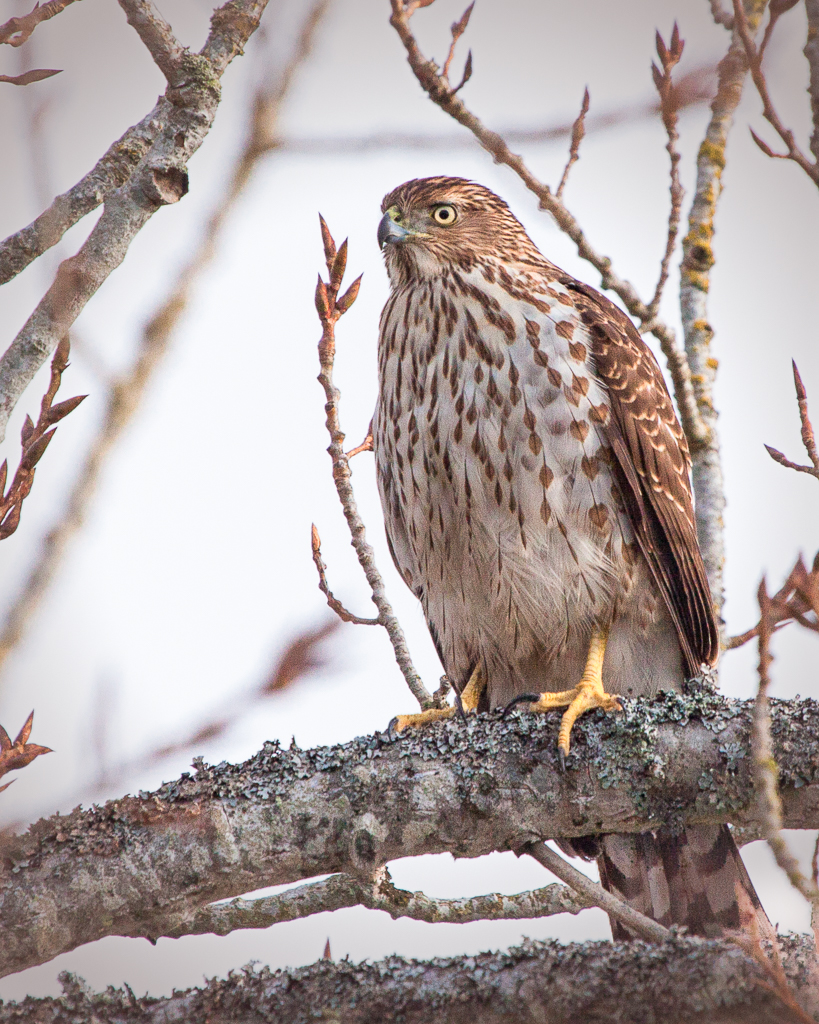
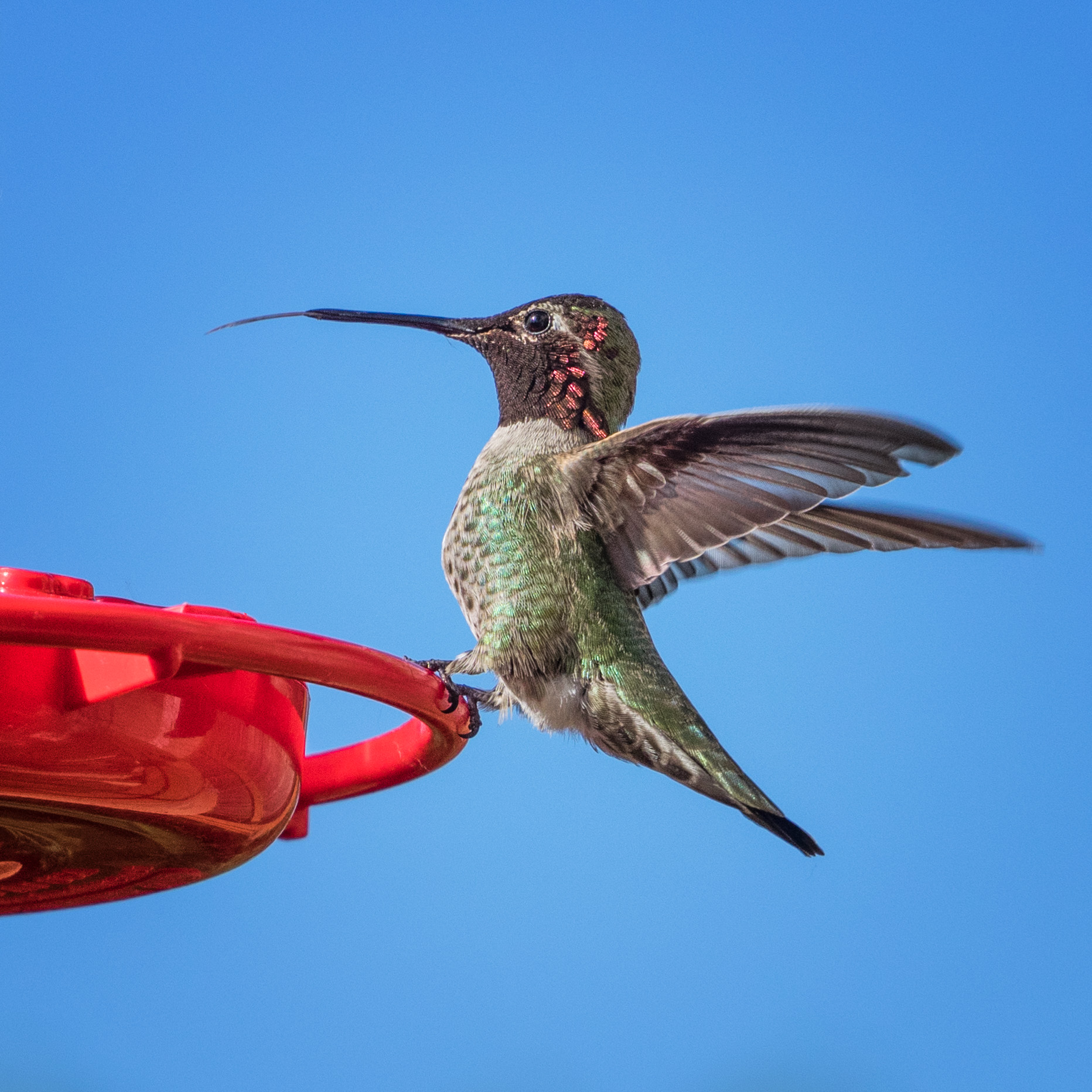
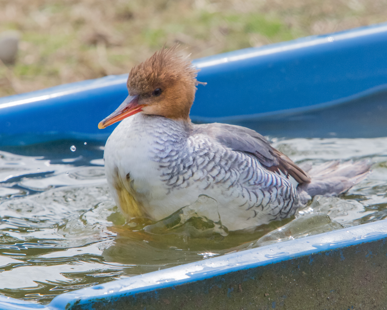
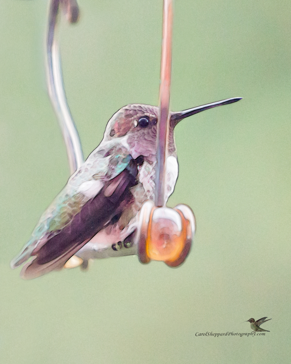
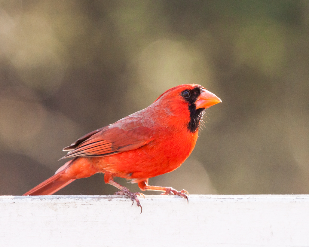
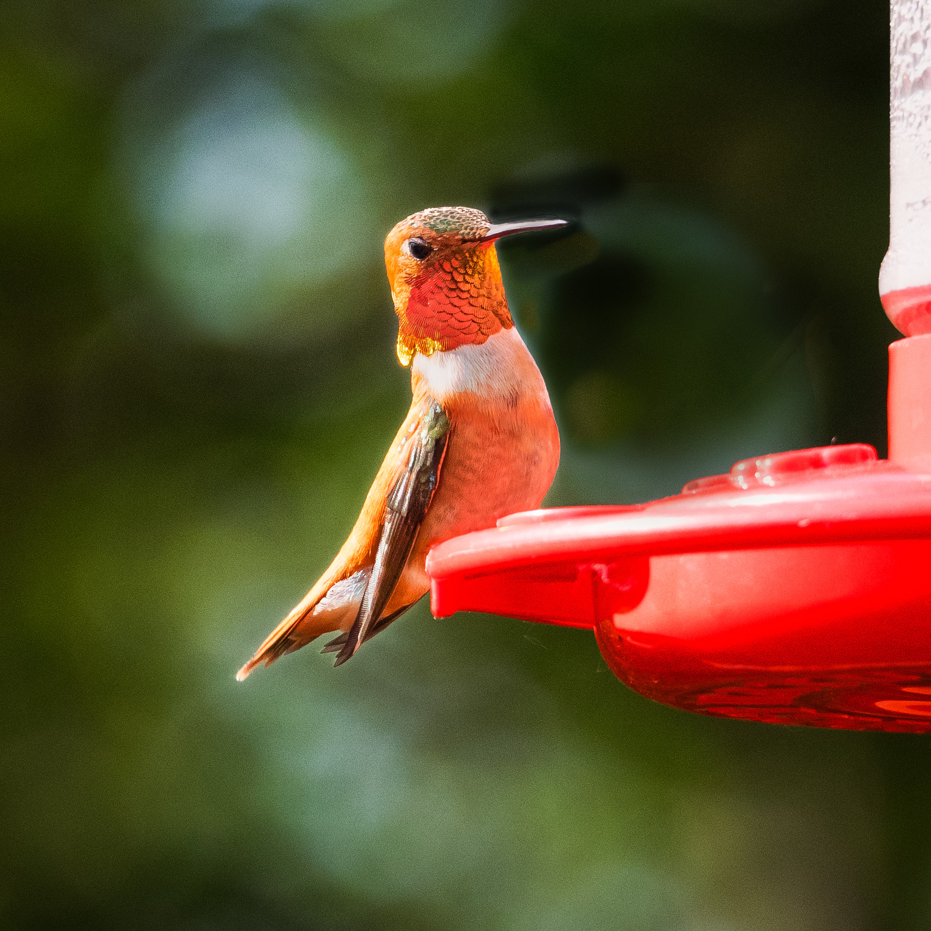
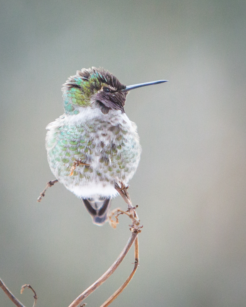
All very interesting comments. My personal taste leans toward soft; so long as the eyes are sharp and, with birds, the beak. Separation from the background will be my main focus now. I had a long conversation with someone when out shooting wild birds, and they said they took a course from some well-known bird photographer who said he used to worry about branches, but then stopped because, they are a part of nature. If birds always posed for us, would we be very talented photographers? This bird is hiding and it felt like part of the story to me. His expression says "I'm wary of you." Along with lack of separation between bird and background, the bottom quarter of the picture is definitely too busy, so I will address that. Thanks for all your feedback! |
Mar 20th |
| 52 |
Mar 19 |
Comment |
What an interesting image; its sharp, great action, and has beautiful detail in the bird, especially its upper back and neck. Still, something was bothering my eye--and I felt it was the background. Lisa's remake really fixed that feeling for me. It felt too dark, with a background that didn't have enough detail in the shadows to feel natural. This is a great shot! One thing I especially like in both the original and the remake is that there is a bit of light caught on the face and debris in the bird's mouth. It puts the emphasis right where it should be, so that while you see the entire image, you feel the activity! |
Mar 20th |
| 52 |
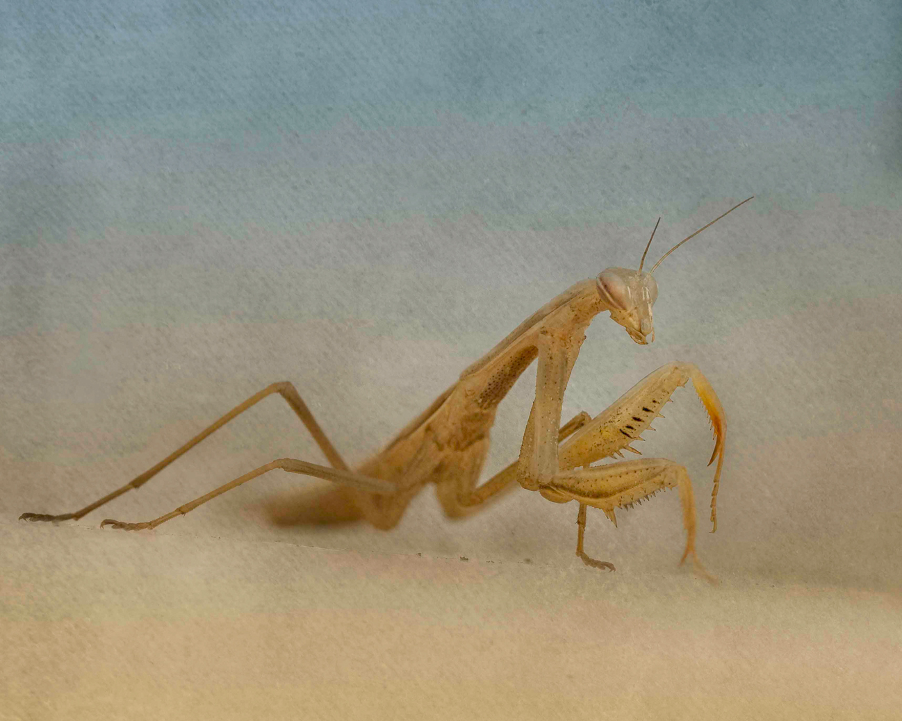
Mar 19 |
Comment |
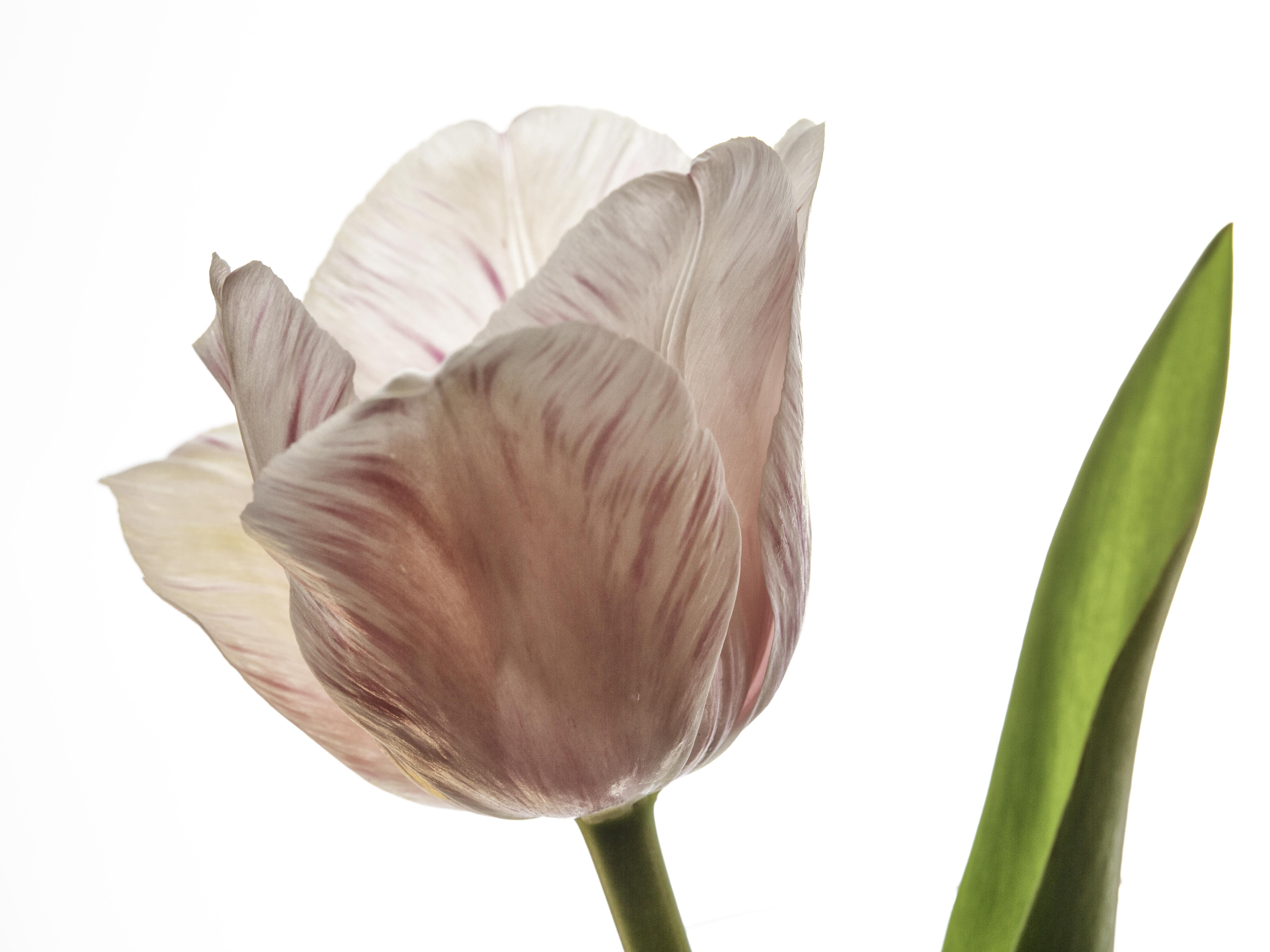
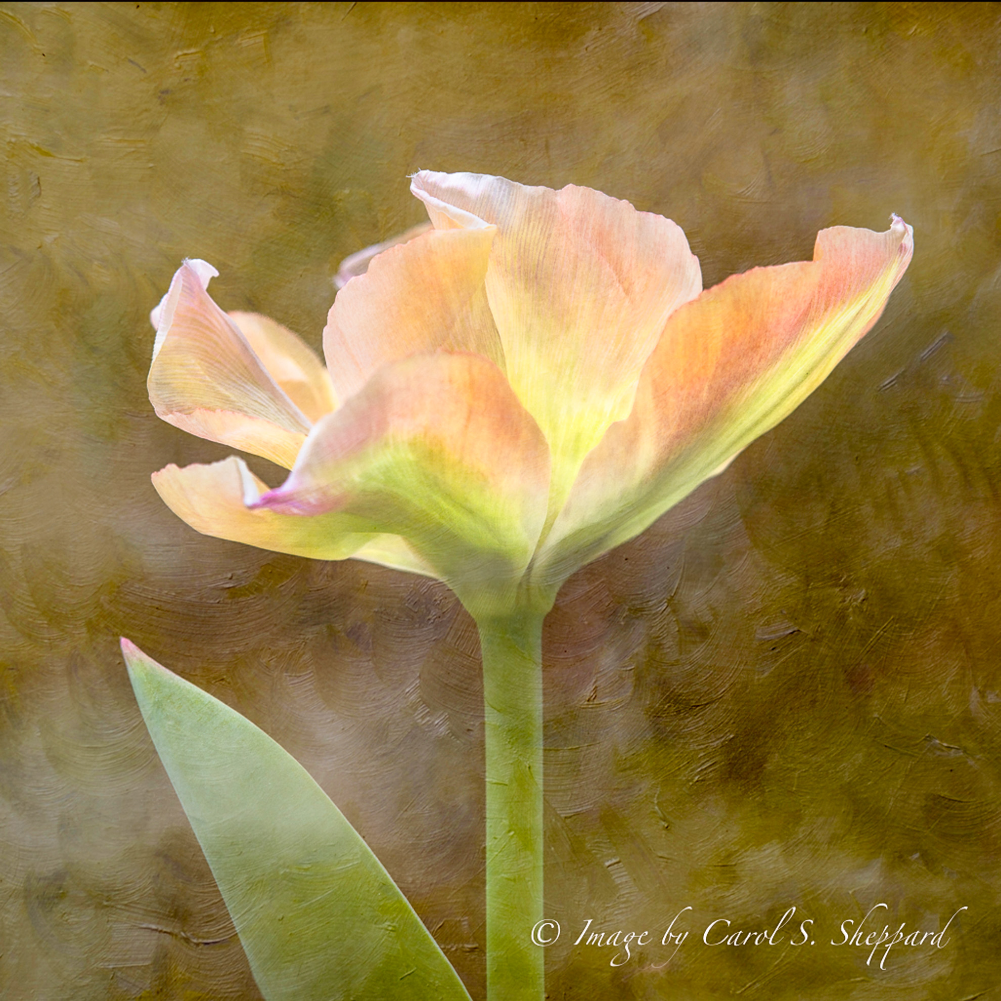
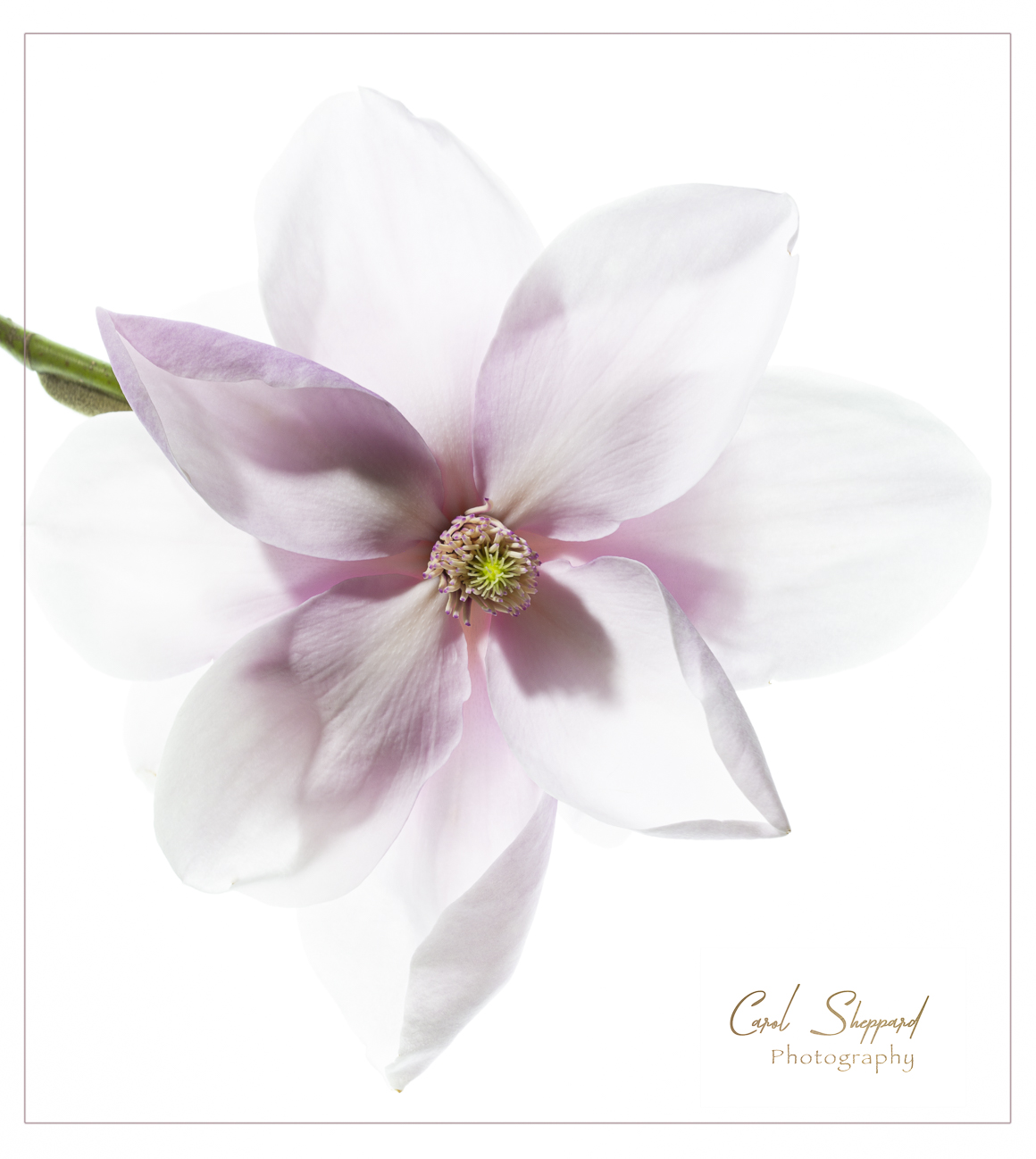
What an artistic image....it feels like a pen and ink work of fine art when I first view it. Personally, I wouldn't not sharpen it; there's an overall softness that contributes to the arty feeling. The simplicity is appealing, although I do like a square crop on it, letting your subject fill the frame better. The wing gives it the feel of movement, instead of a static moment of birds sitting. On Tom's remake, I am seeing pinks that look out of place, as well as the introduction of some kind of artifacts along the branch that I believe are created by sharpening. Love this as it is, with just a different crop! |
Mar 20th |
| 52 |
Mar 19 |
Comment |
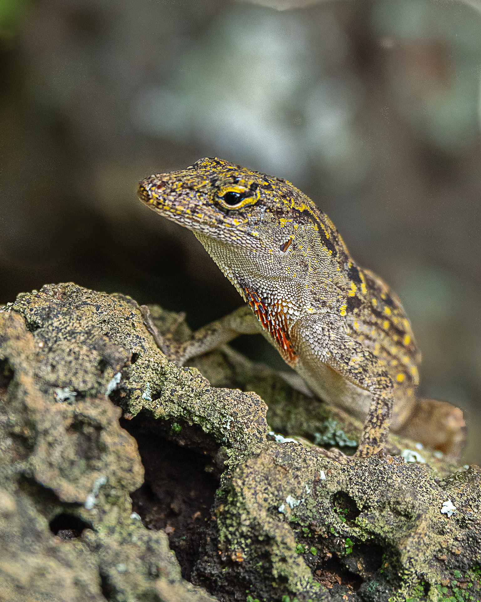
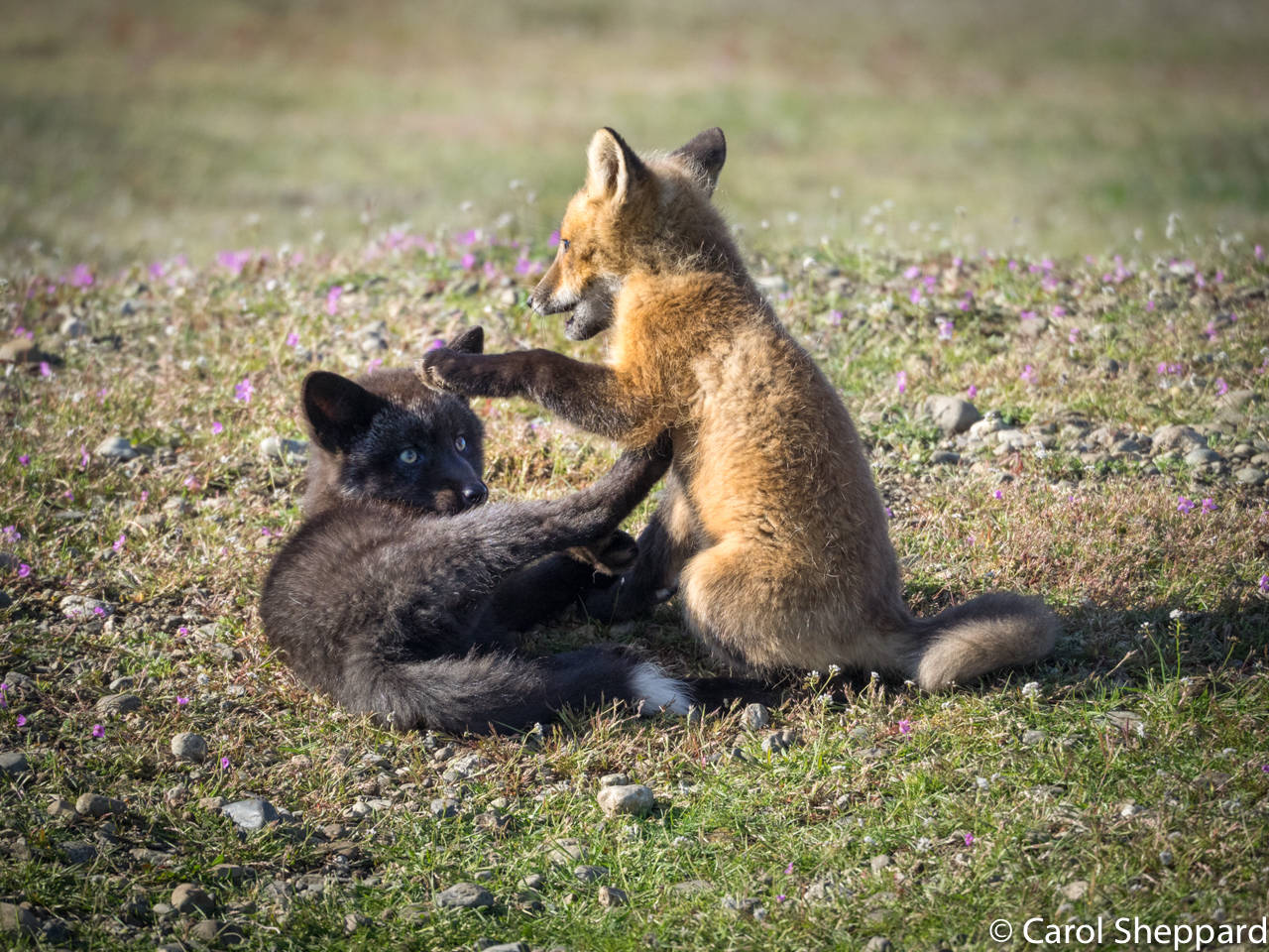
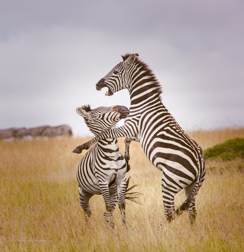
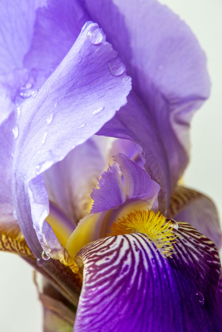
Wow, I'm in awe!! What a nice capture! The purple isn't as obvious to me as to the others, not to mention that there is a faint purple to these birds during mating season, I think. I would like to see the eye on the bird on my right side as I view it sharpened ever-so-slightly. But wouldn't change anything else about this!! |
Mar 20th |
| 52 |
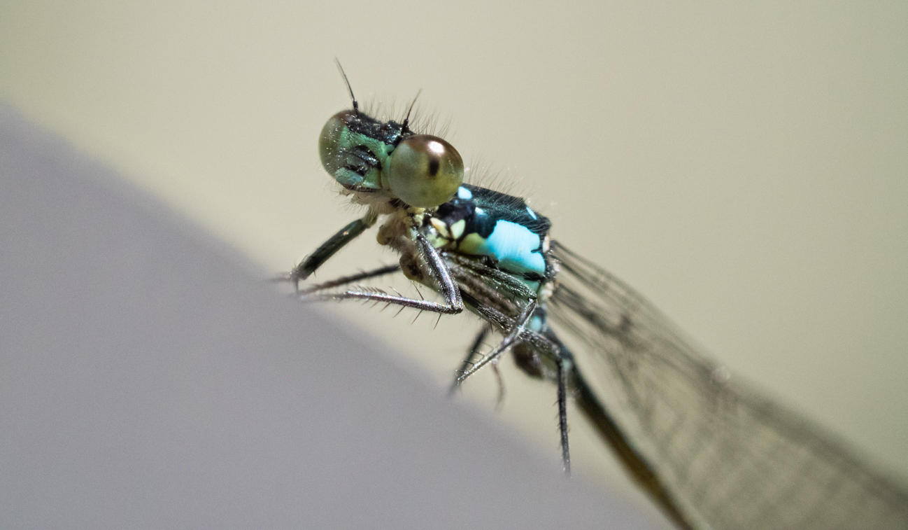
Mar 19 |
Comment |
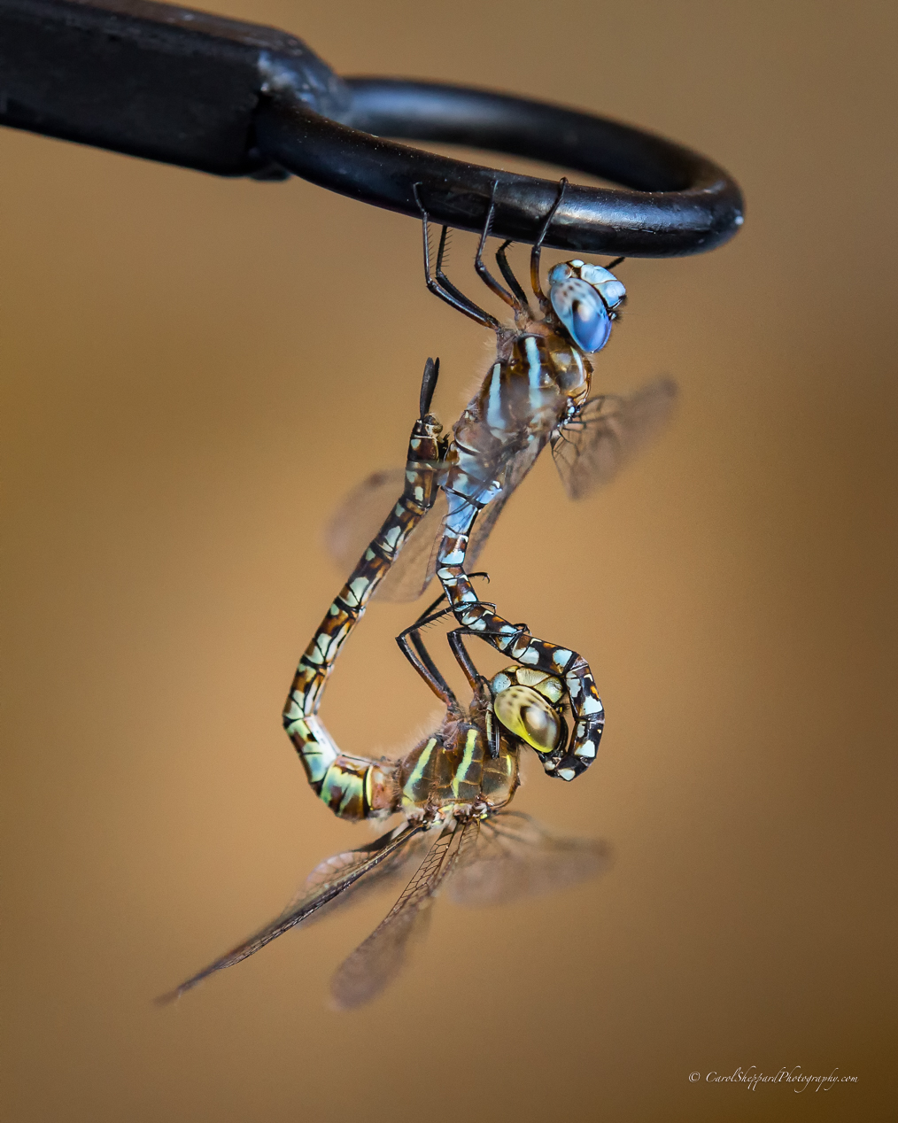
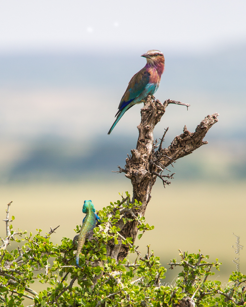
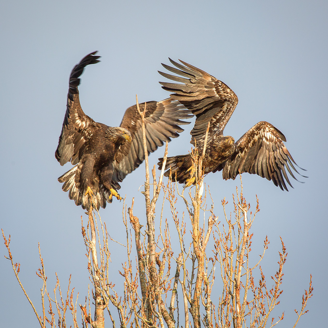
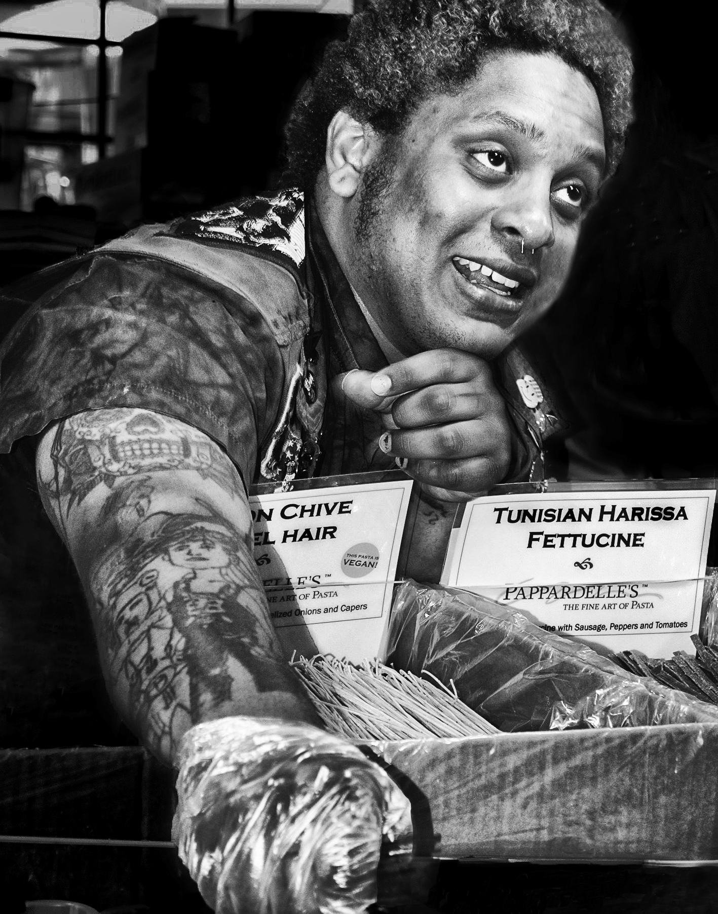
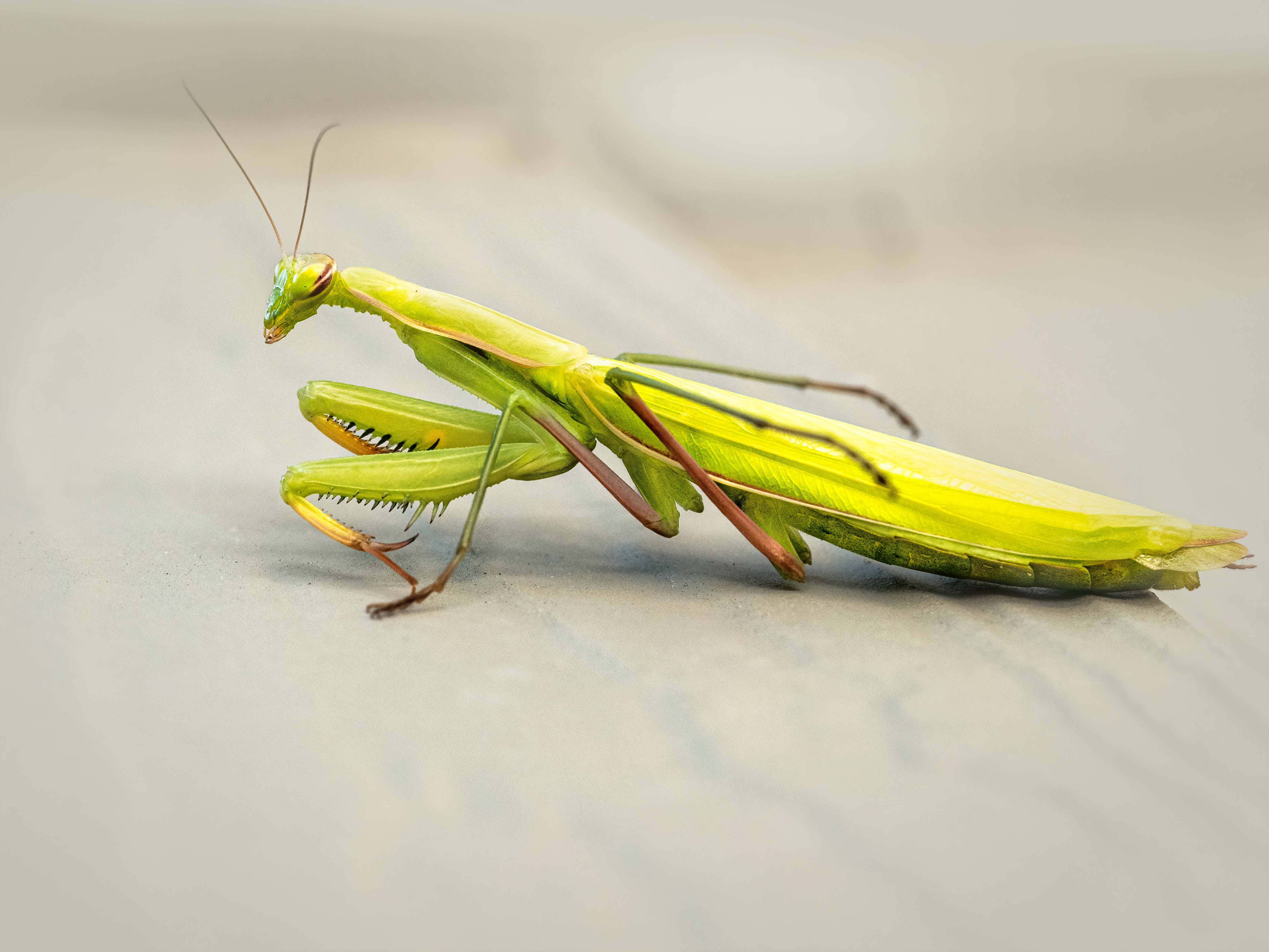
John, I really like this image--but did see artifacts almost immediately around the antennas and legs. The branches provide a nice framework, and the almost-bokeh of the background looks great. I did also notice a strong line in the background coming up right from the back third of the wing; if you can soften that, it would help. It goes from light on the left to dark on the right, so it is quite noticeable to me as a viewer. You did a great job in your remake; it's a wonderful image! I wouldn't remove the two branches; just fix that line of light to shadow so it looks less obvious. Good job! |
Mar 20th |
| 52 |
Mar 19 |
Comment |
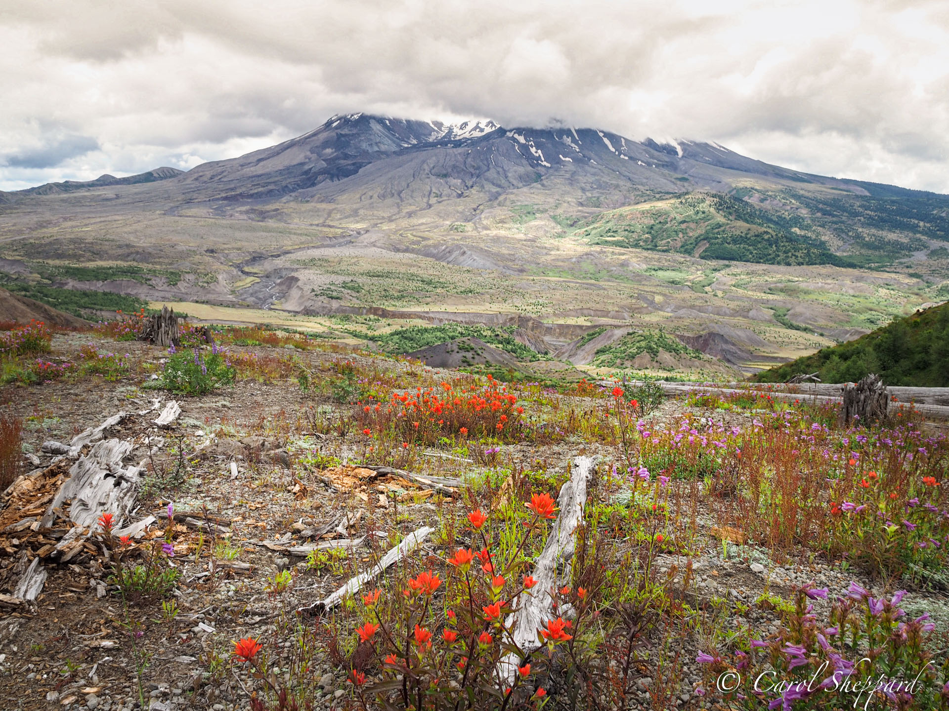
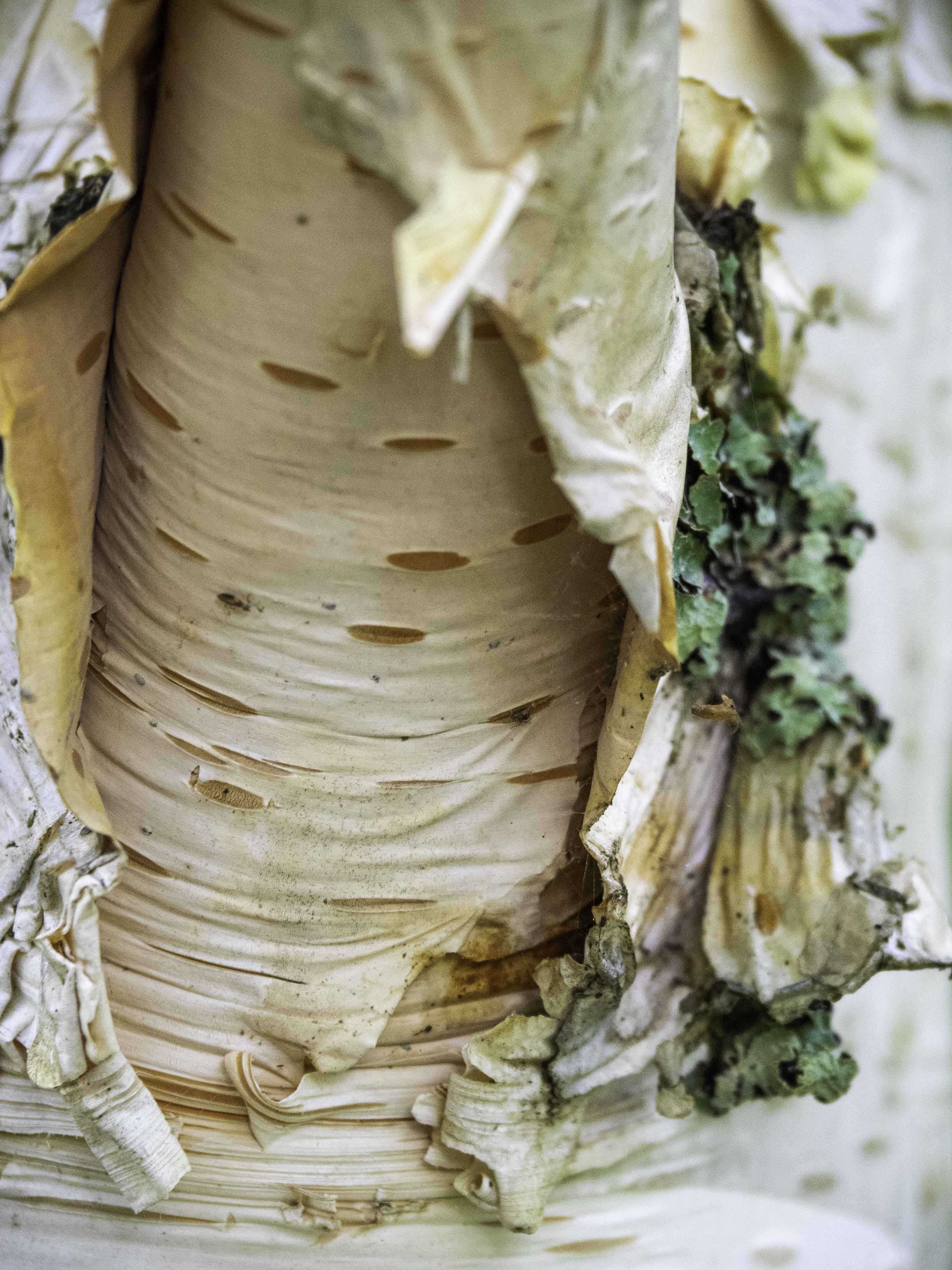
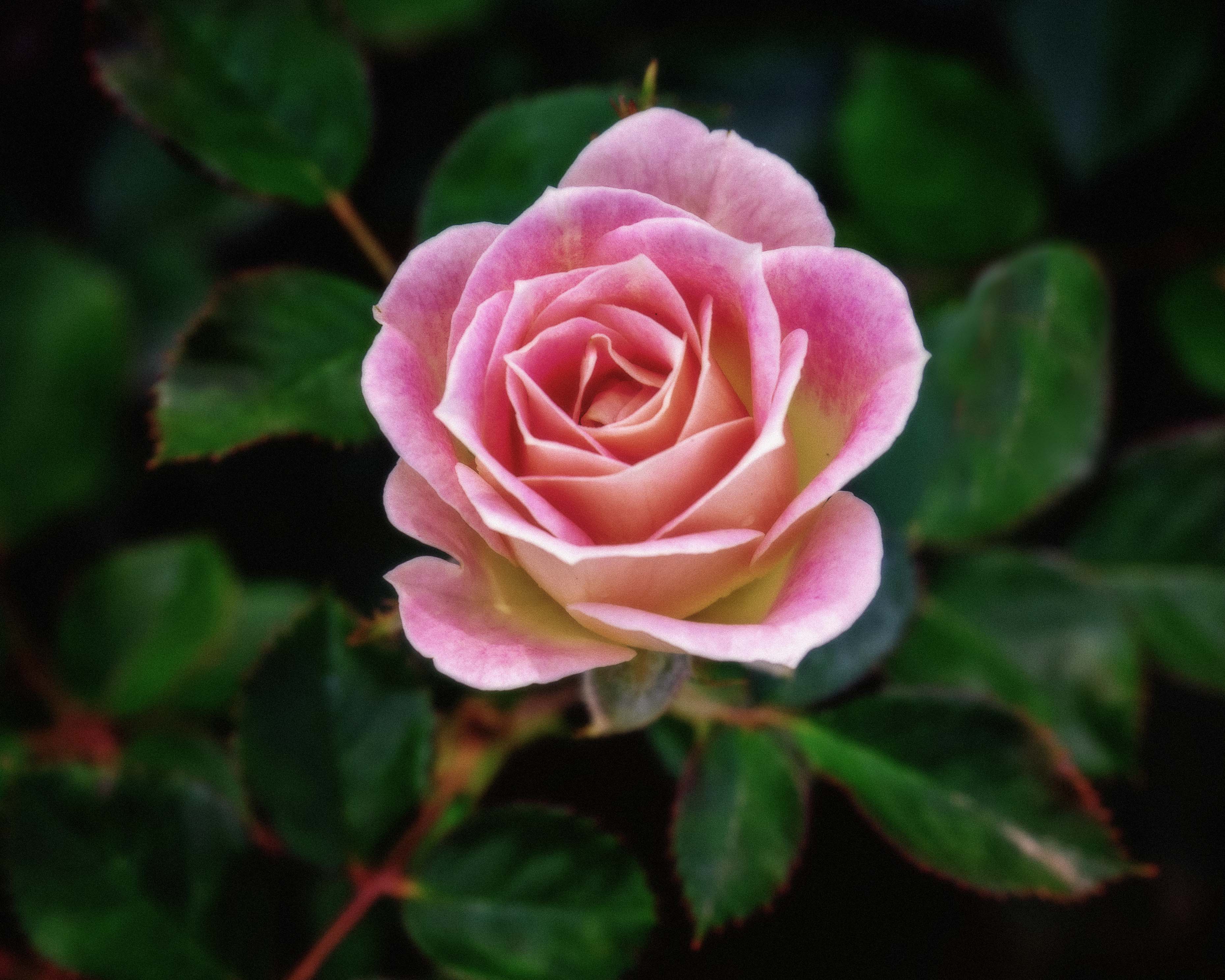
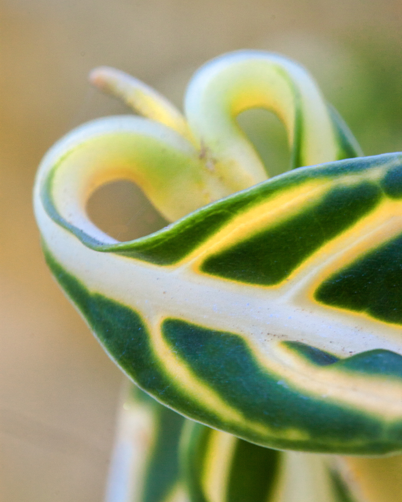
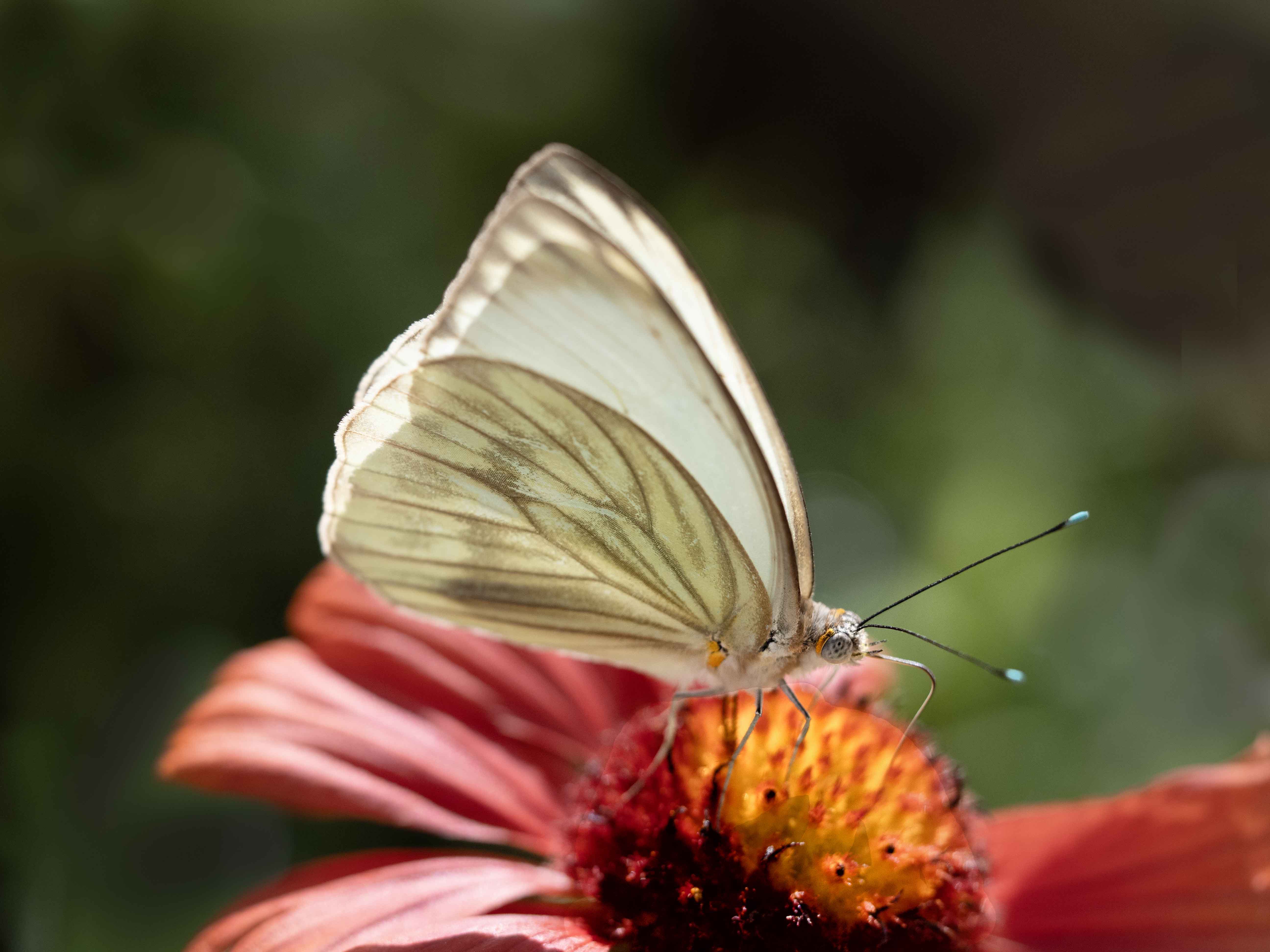
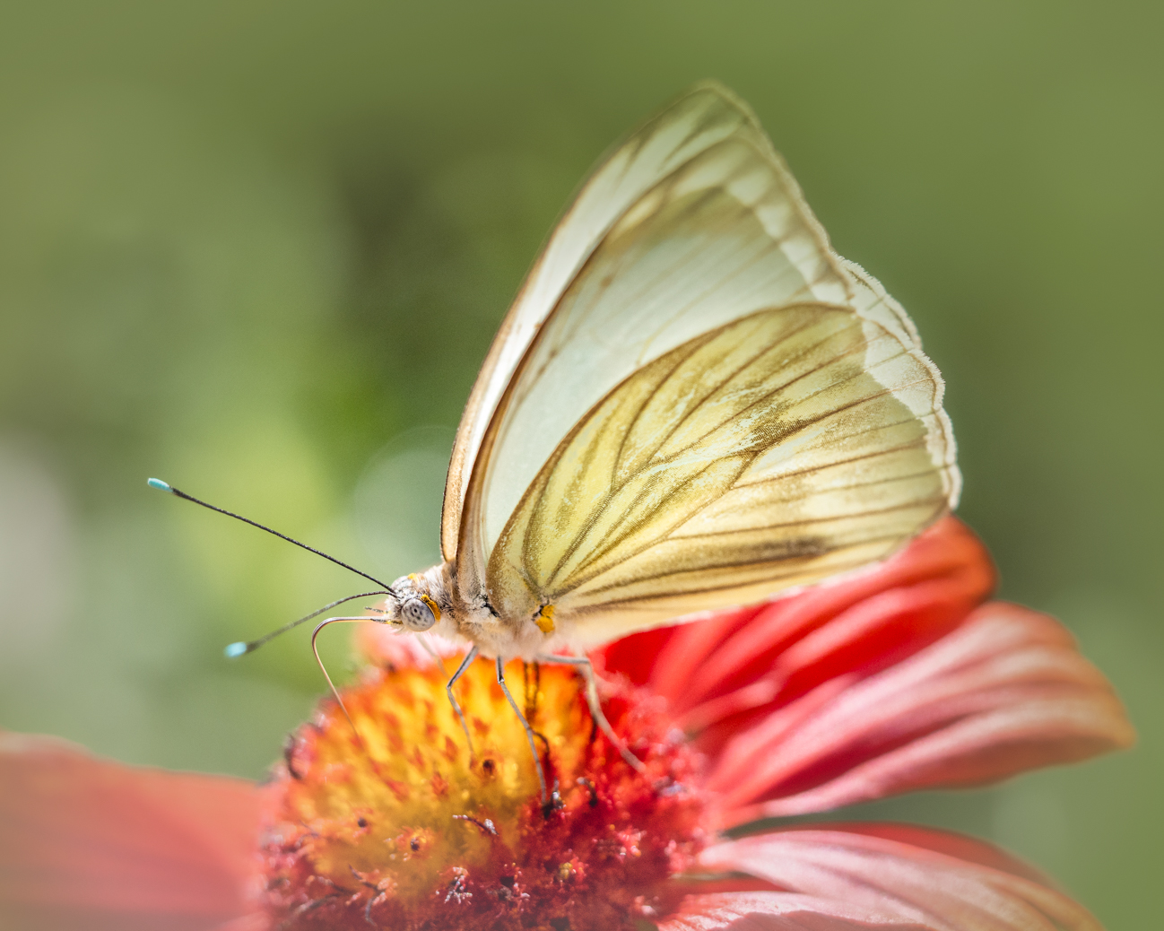
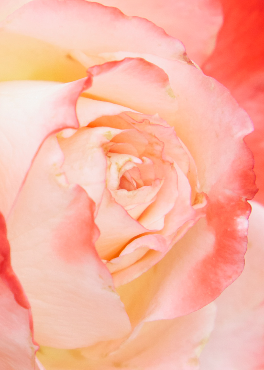
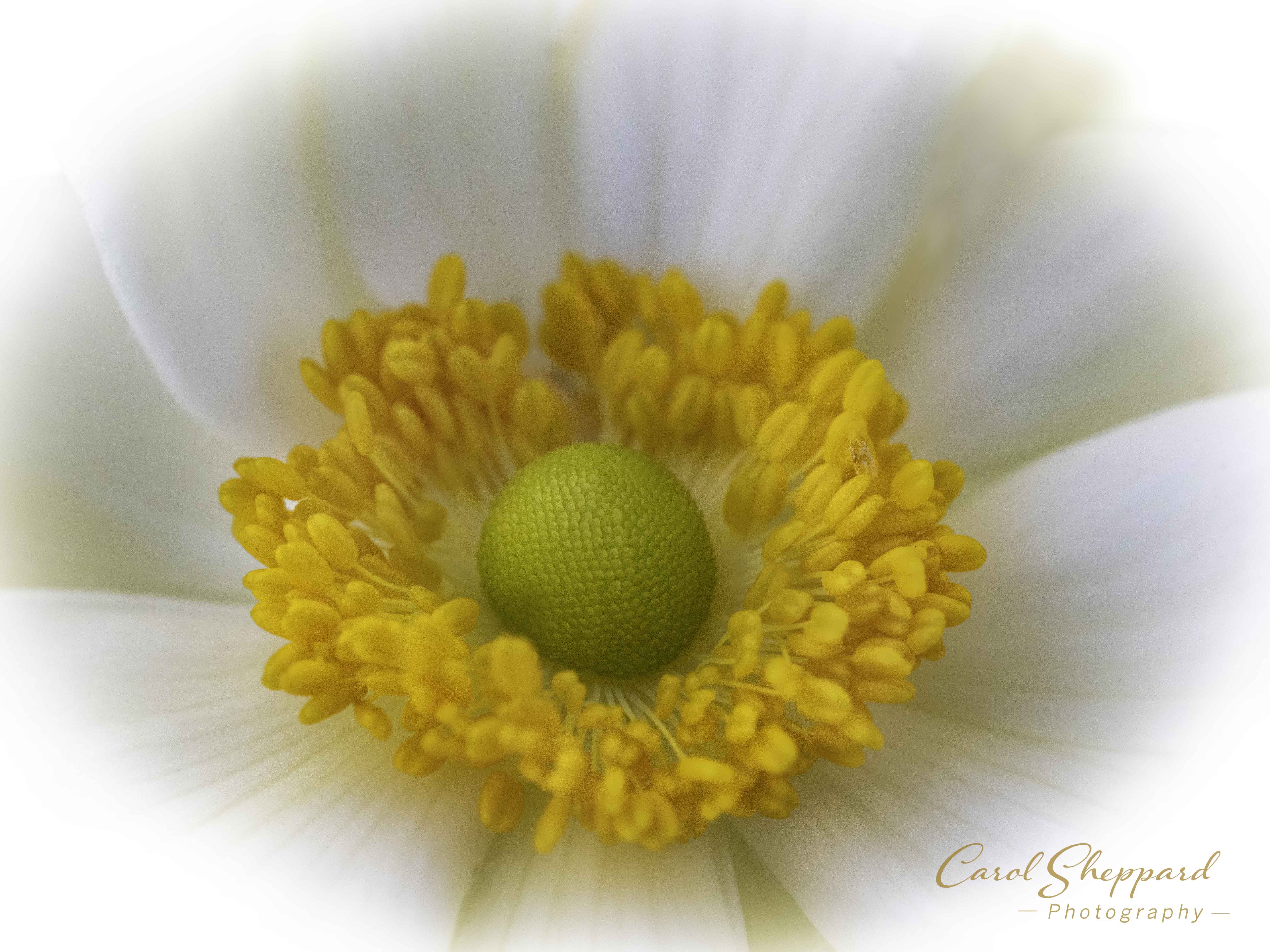
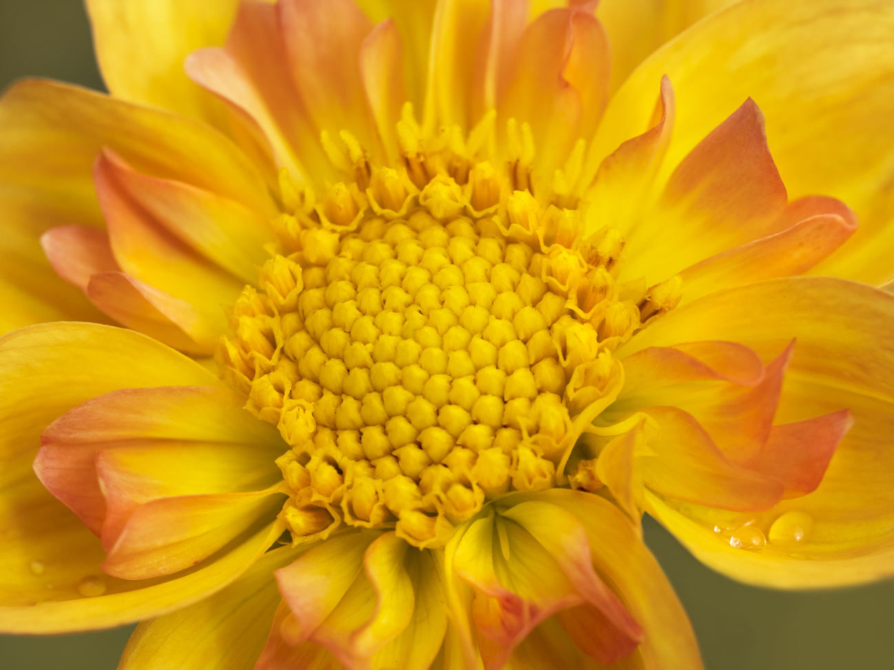
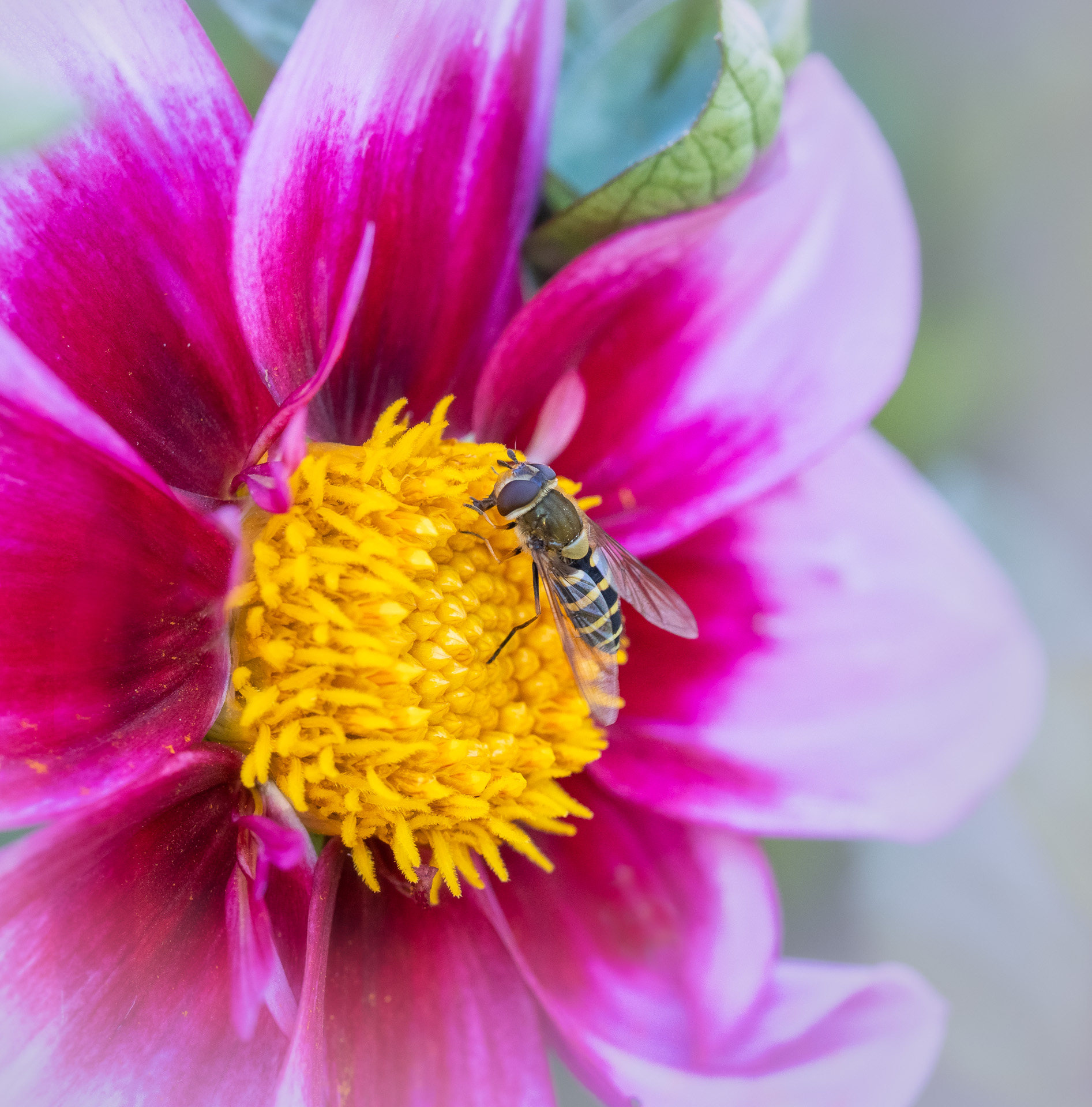
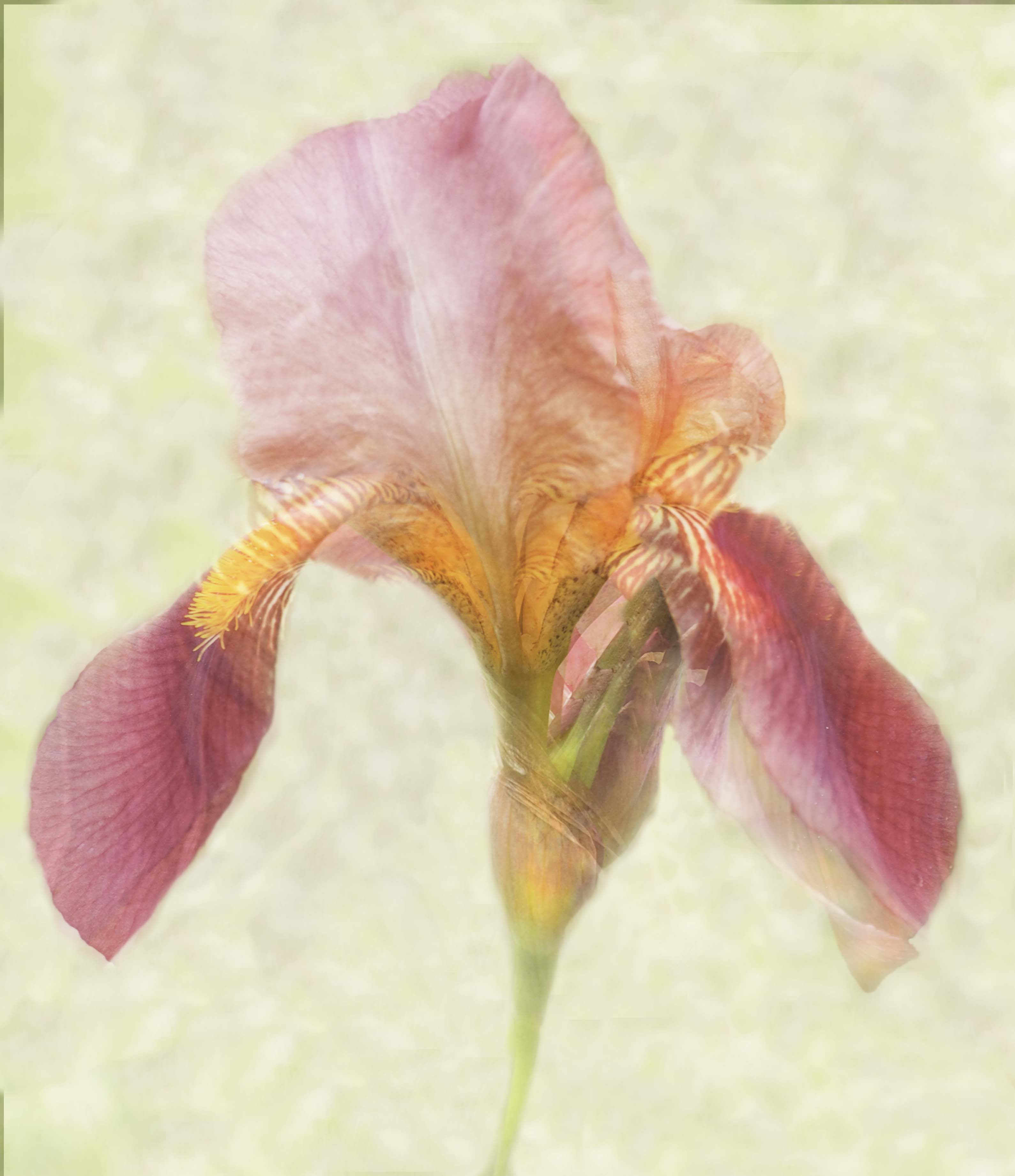
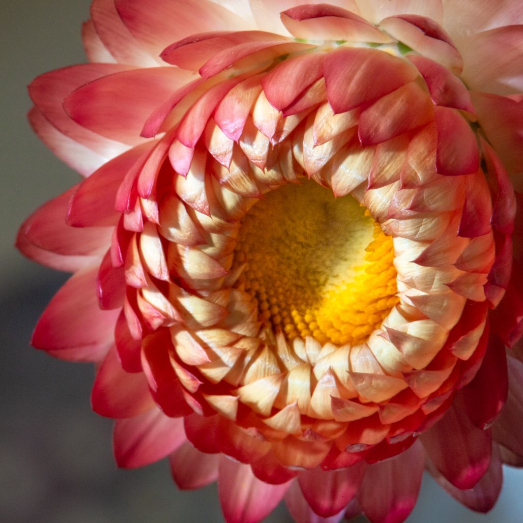
Your original crop works fine for this image--as do the sharpness and the vibrancy of the flowers. The detractor is the background; it fights with your beautiful flowers. I would try to use luminosity to lower the greens and browns, and use luminosity and saturation to raise the colors on the flower. Then overall, adjust your white point and I think you will see more pop of your main subject.
I recently learned how to do focus stacking and it is surprisingly easy once you understand what you are doing. But sometimes out-of-focus areas can be fine, too. Mike's version took it up an extra level, so I would follow his advice! |
Mar 20th |
| 52 |
Mar 19 |
Comment |
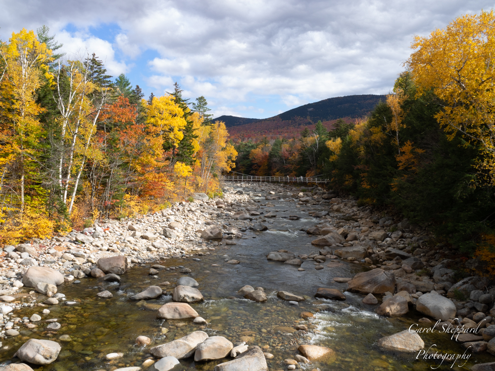
Sharon, I think this image has great impact via the colors, the clarity, and the wonderful background of the non-intrusive water as well as the partial reflection. You seem to have done a terrific job of adjusting all the tones as I look at your original. Also, I wouldn't have known you added to the canvas if I hadn't read your it in your notes. So, yes, this would make a beautiful print! |
Mar 20th |
7 comments - 0 replies for Group 52
|
| 60 |
Mar 19 |
Comment |
Thanks for your input. I recently took a workshop on focus stacking, which might have been a possibility for this image. Sometimes I like to see some areas out of focus, but this was more borne of the limitations of photography than an actual artistic choice. |
Mar 20th |
| 60 |
Mar 19 |
Comment |
Denise, the combination of your image and title are so perfect! The combination of soft and sharp works quite well for this image. This is definition a "mood" image. Did you handhold? The reason I ask is that I'm trying to figure out why your ISO was at 6400. Could you have used a slower exposure? Just curious more than anything. As far as intensity of the colors, this works just the way it is. I think increasing the saturation of anything would detract from its artistic, very haunting quality. |
Mar 20th |
| 60 |
Mar 19 |
Comment |
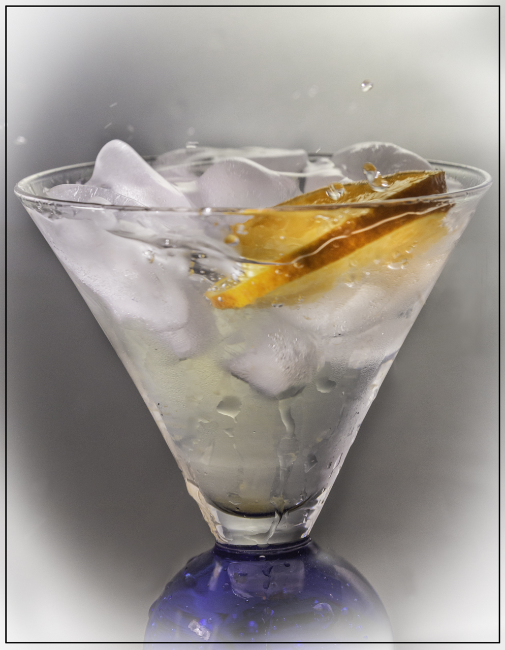
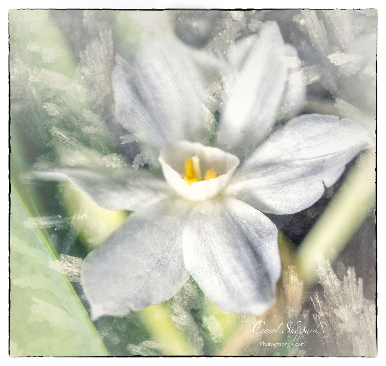
You have used the adjustments of brightness and vibrancy in the colors to great advantage with this, in addition to the interest added from the ice. The ice formation is very clear and your focus feels right to me. Finally, I think your adjustments rendered any highlights insignificant while still retaining a very natural feel of some light hitting the surface of the ice. Nice job! And I really like the crop; its perfect for this subject! |
Mar 20th |
| 60 |
Mar 19 |
Comment |
Oh, also, I meant to say that the leading lines really work well for this image, too! |
Mar 20th |
| 60 |
Mar 19 |
Comment |
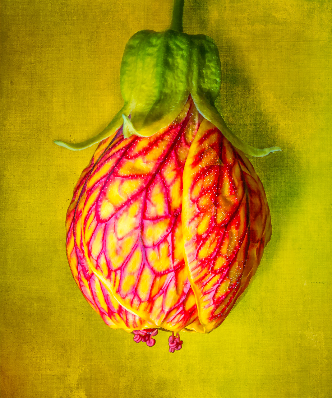
Bob, I like this image! The colors are so complementary and pleasing to the eye. You have captured it at a perfect sharpness and clarity, with an interesting crop that places the emphasis on the pattern in the leave. Kudos also for the texture layer for the background; this is something I find so interesting but see so few people using it. It looks very natural. Lovely image! |
Mar 20th |
| 60 |
Mar 19 |
Comment |
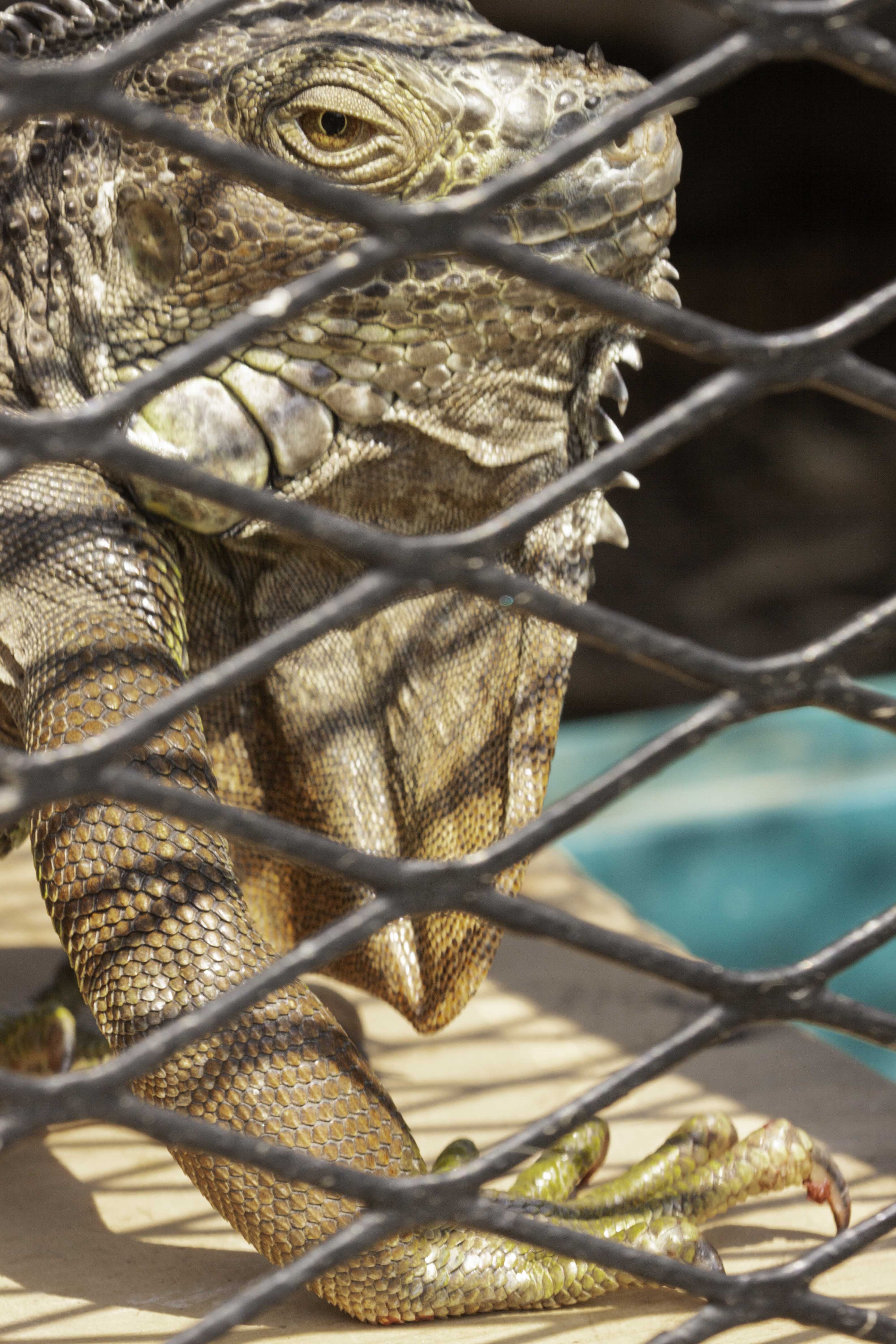
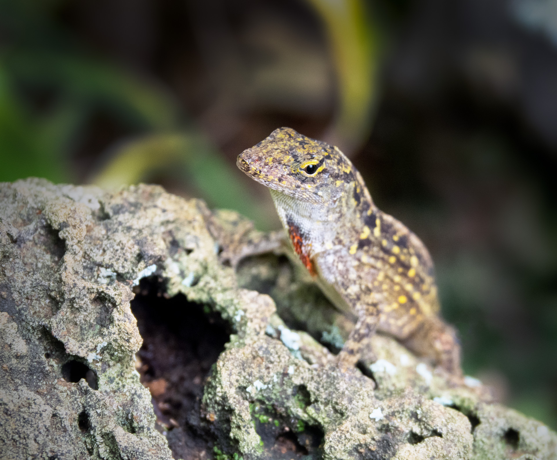
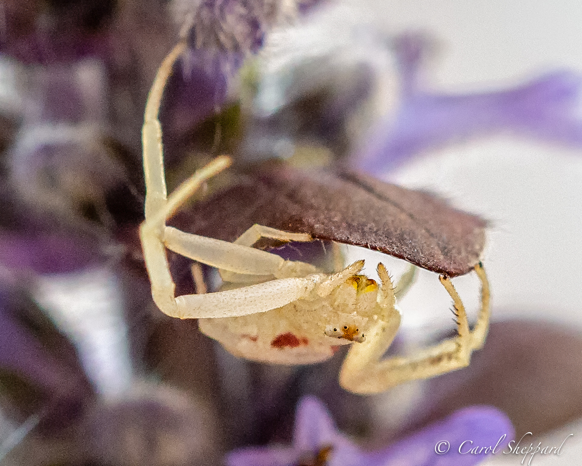
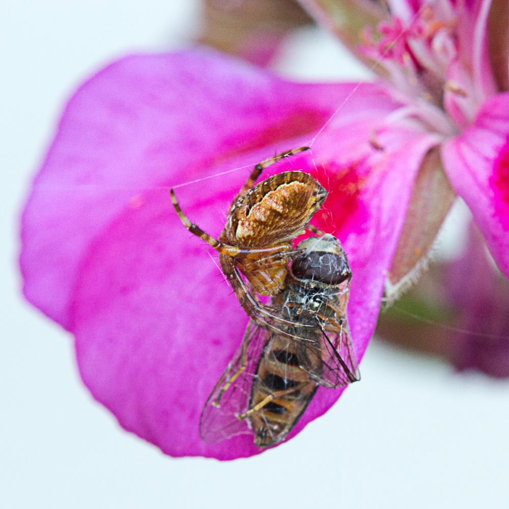
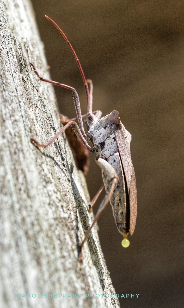
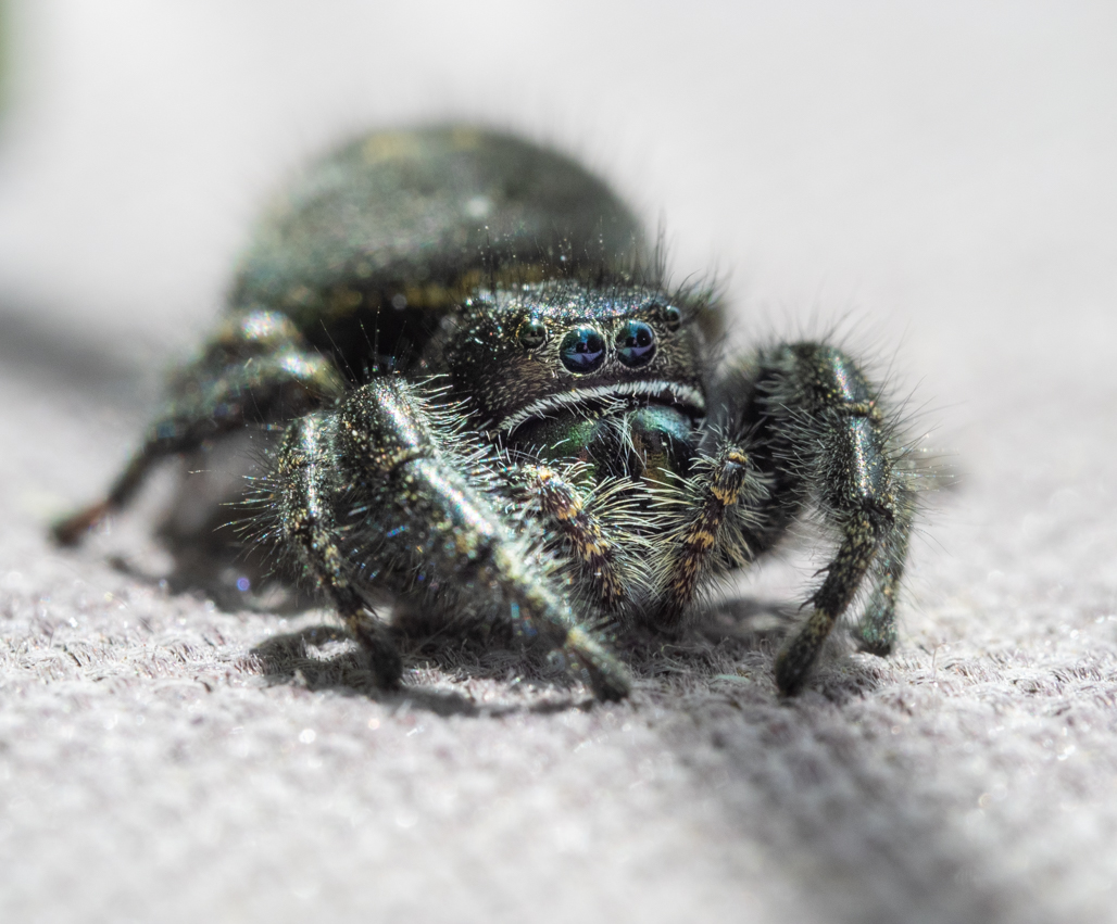
Your perspective makes your image very different from the usual spider-in-plant picture. Compositionally, I would like to see the entire spider, and Focus Stacking might have been a candidate for this capture. It is hard for me to know exactly what I am looking at (obviously, a spider!) and differentiating front from back, etc.
You have caught some parts with wonderful clarity; f3 is definitely not enough focal range, though. With an ISO of 50, you had lots of room to play with the aperture opening. |
Mar 20th |
| 60 |
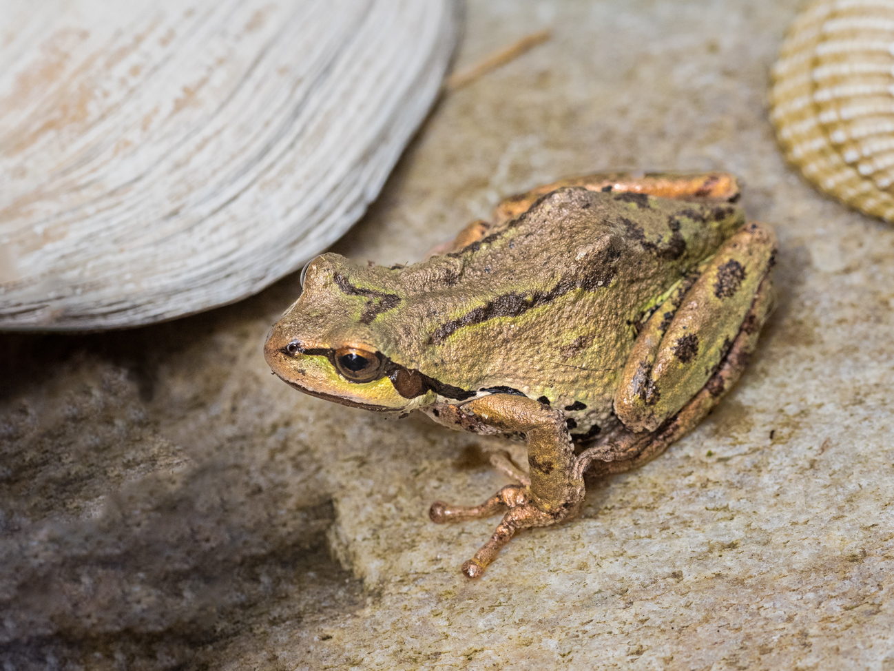
Mar 19 |
Comment |
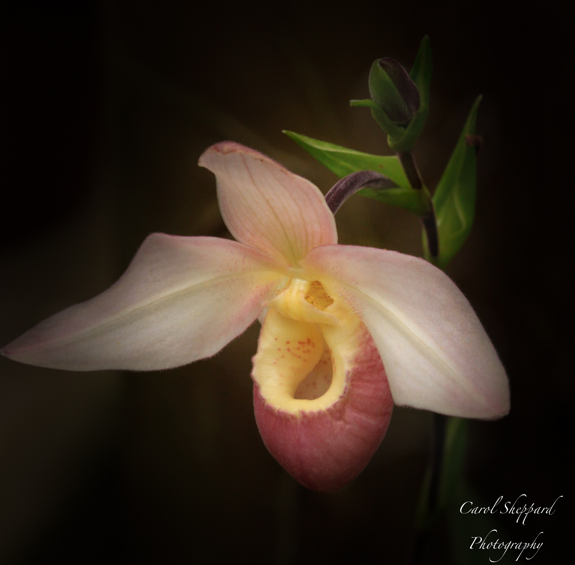
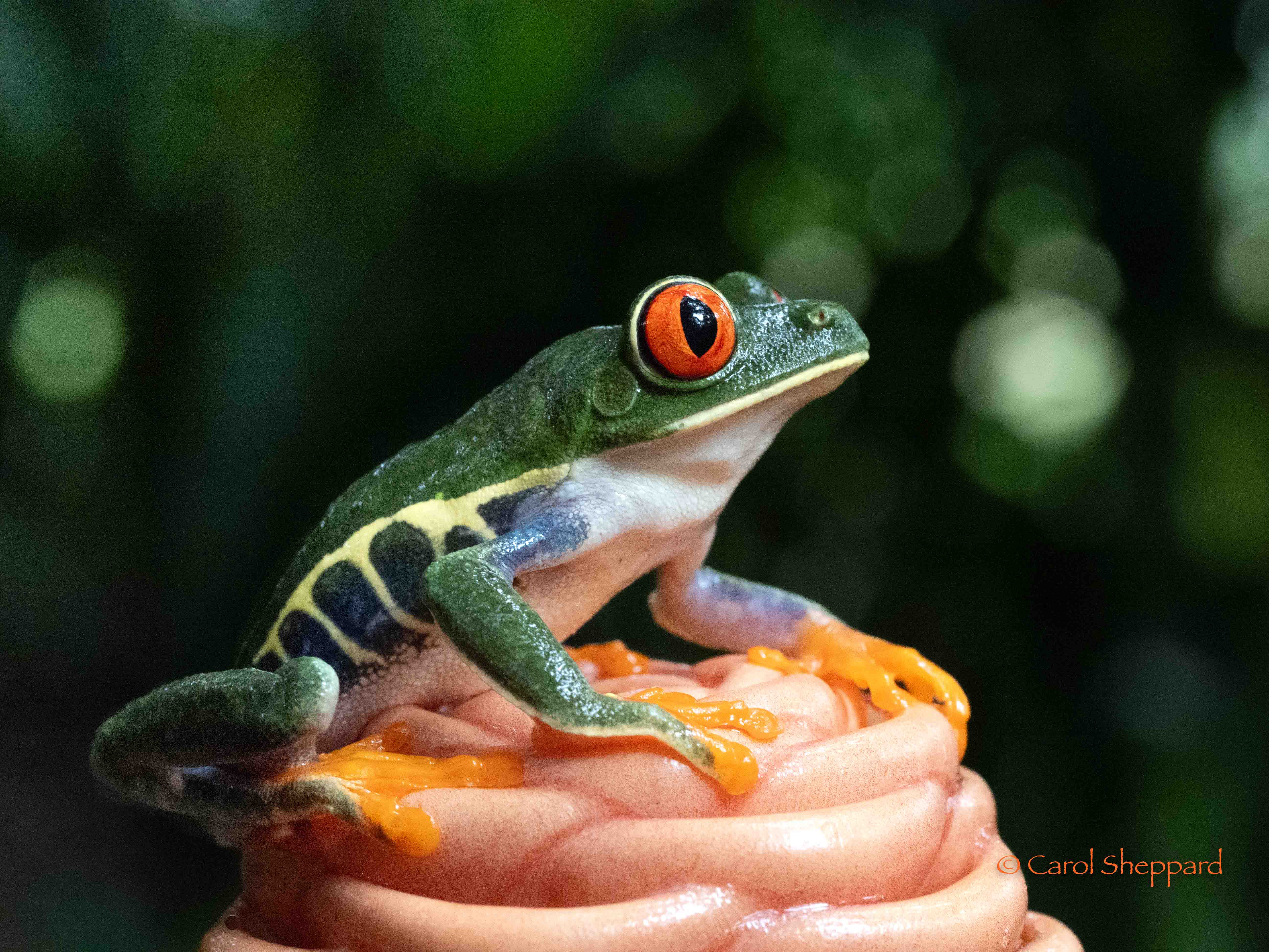
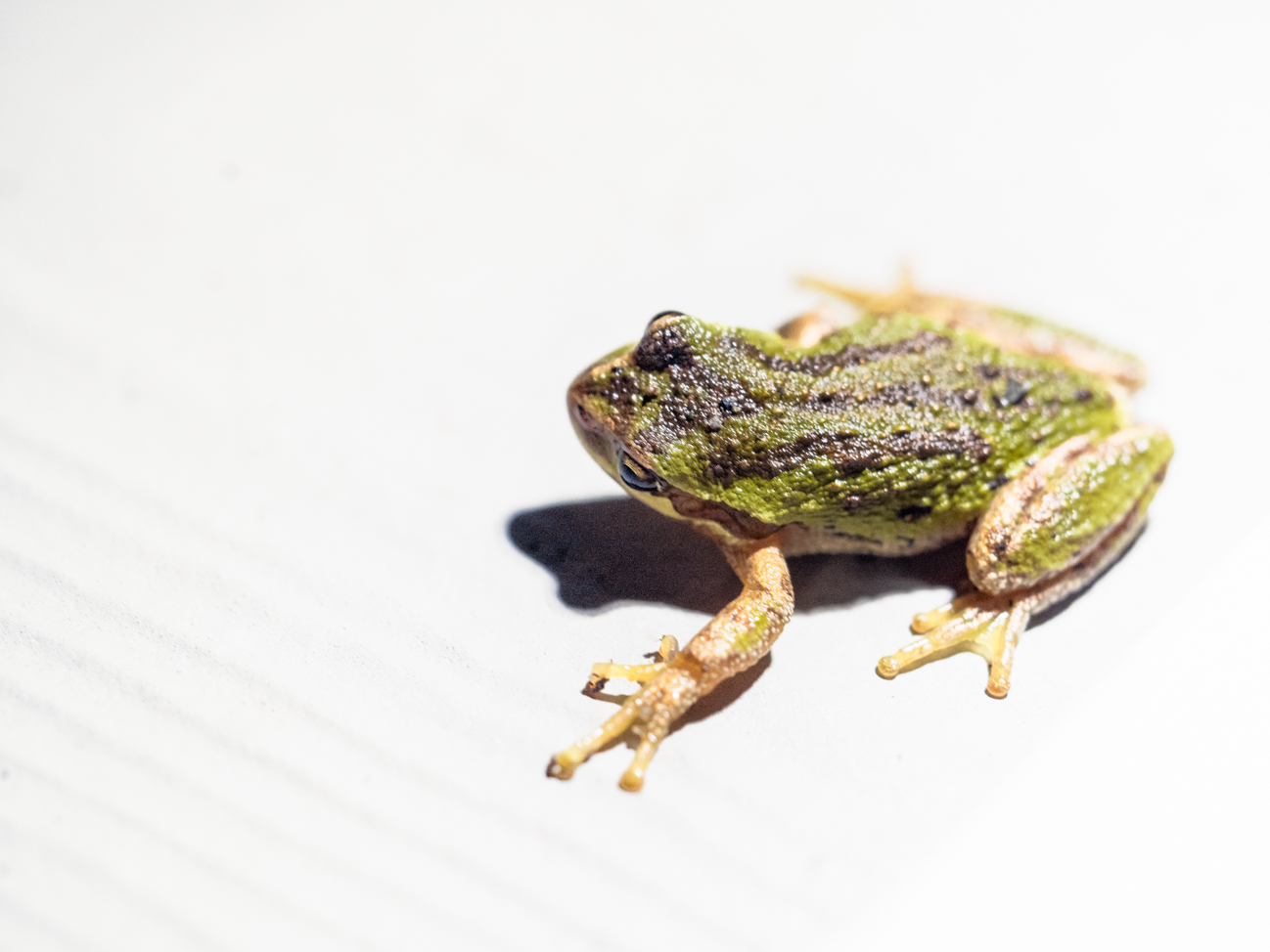
Bill, I like the crop; it definitely gives the image its impact.
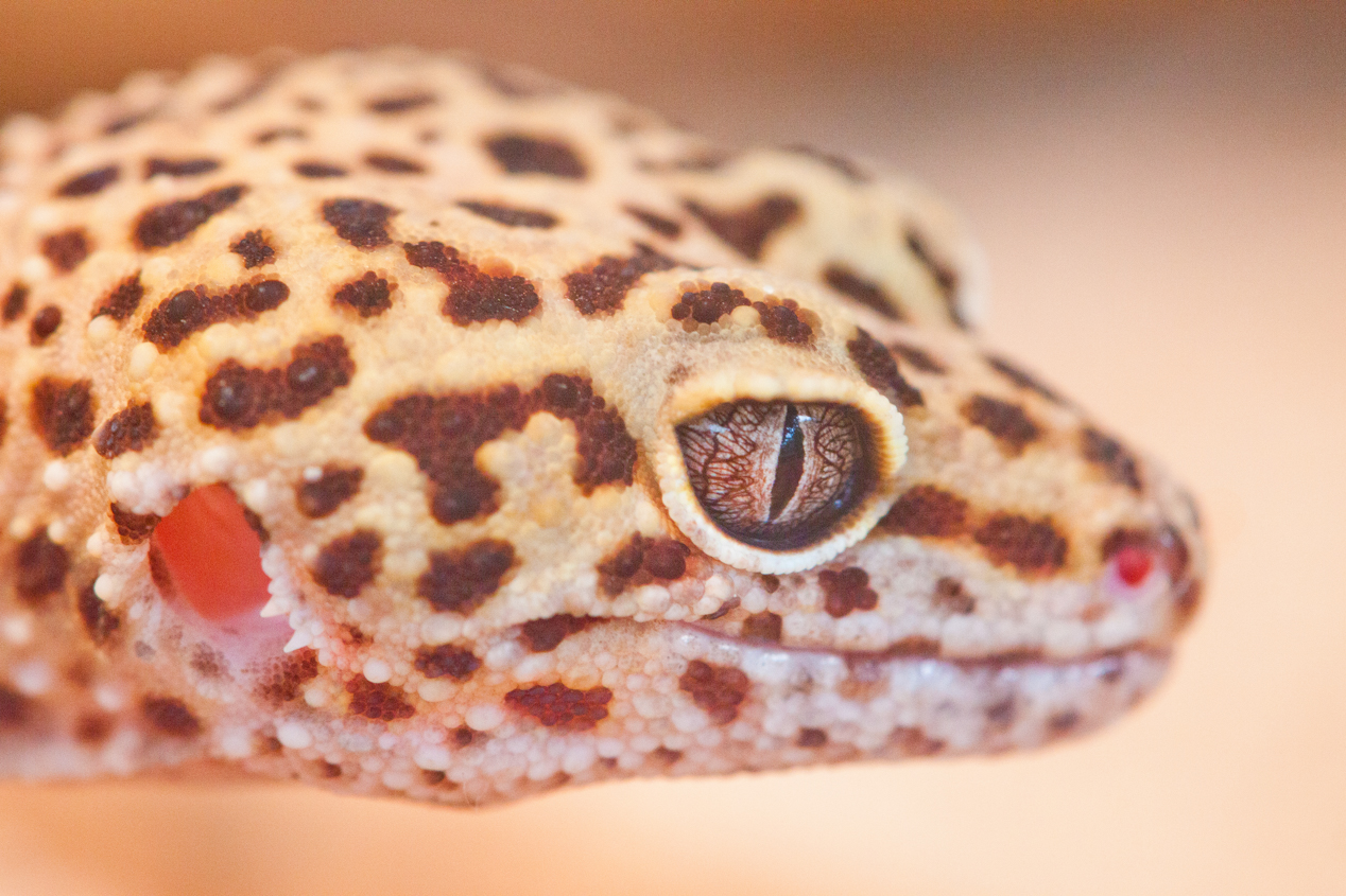
I feel that there should be work on the tonal range--the blacks are not very strong, but the definition is lost through the other areas not being very differentiated from the blacks. Bringing the shadows up, particularly in the "iris" area, while bringing out the subtle colors in the frogs skin area. Try using luminosity sliders for this. Is there yellow in there? Raising the yellow would be nice if there's something for you to work with there. |
Mar 20th |
7 comments - 0 replies for Group 60
|
14 comments - 0 replies Total
|