|
| Group |
Round |
C/R |
Comment |
Date |
Image |
| 52 |
Dec 18 |
Comment |
Oh, so sorry!! I have so many of these, and I thought I was working on one I hadn't submitted before! CRS....for those of you who know what that means. |
Dec 22nd |
| 52 |
Dec 18 |
Comment |
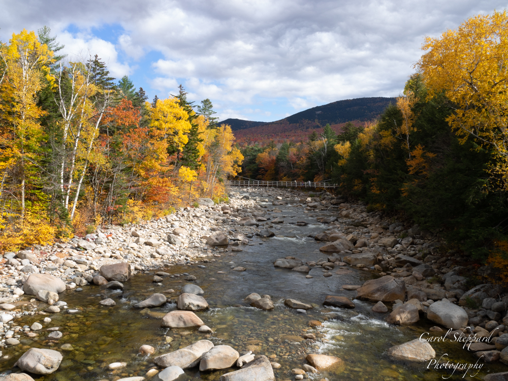
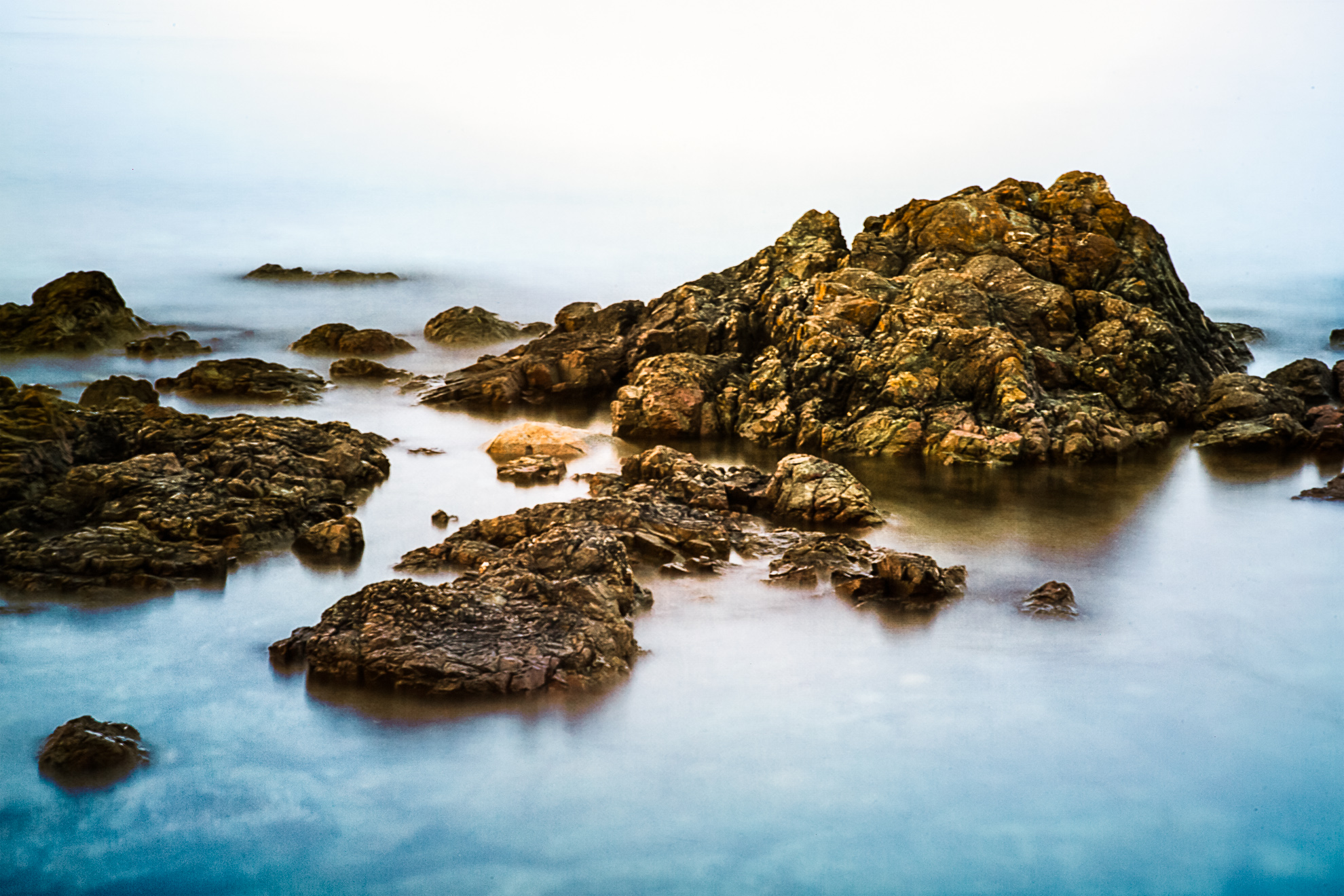
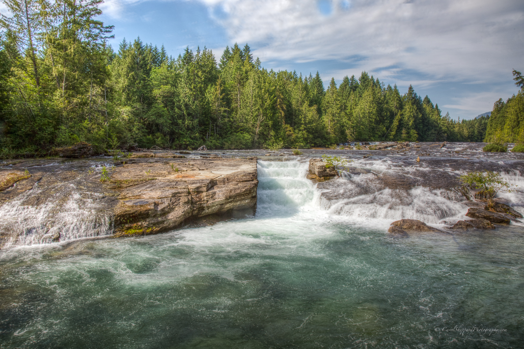
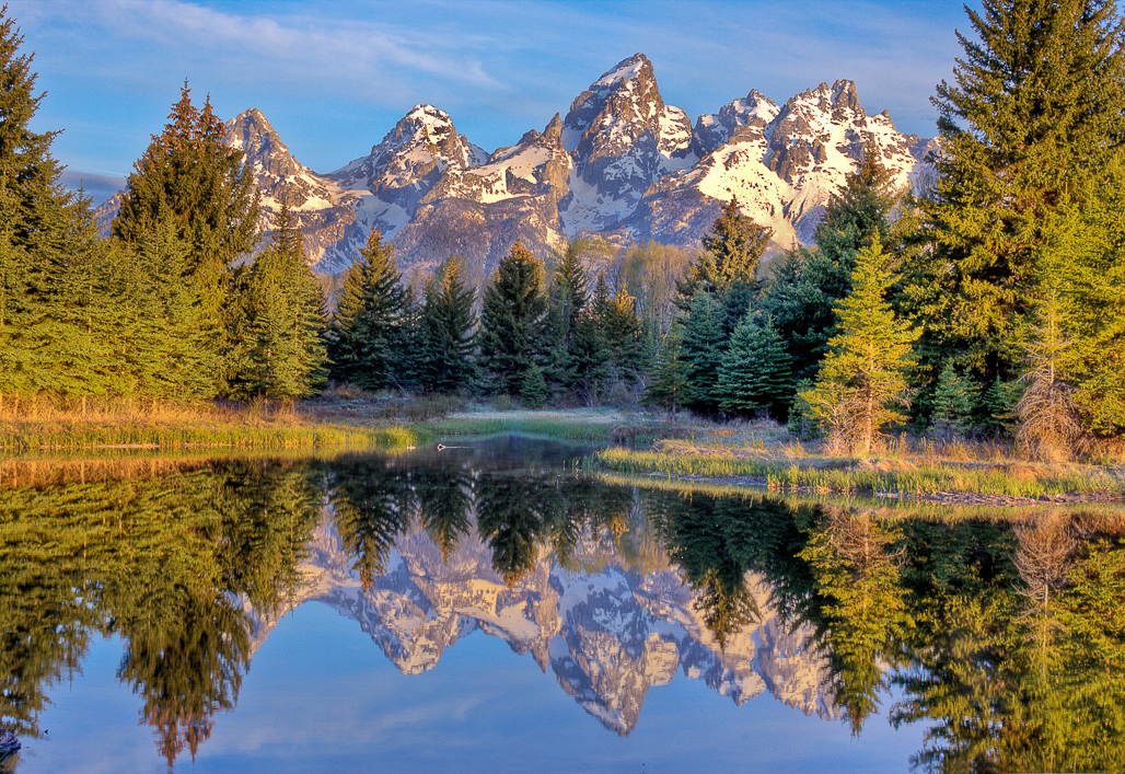
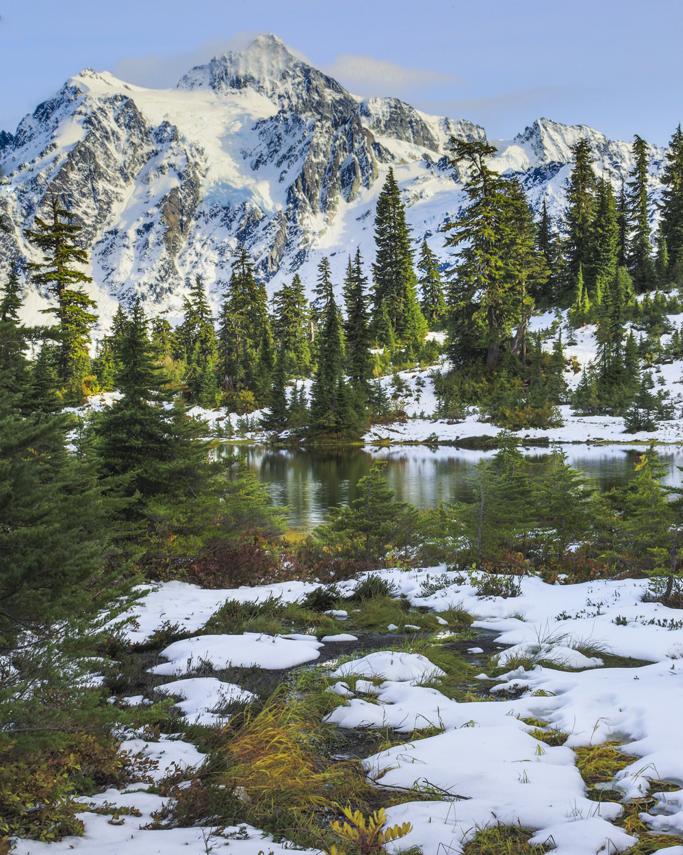
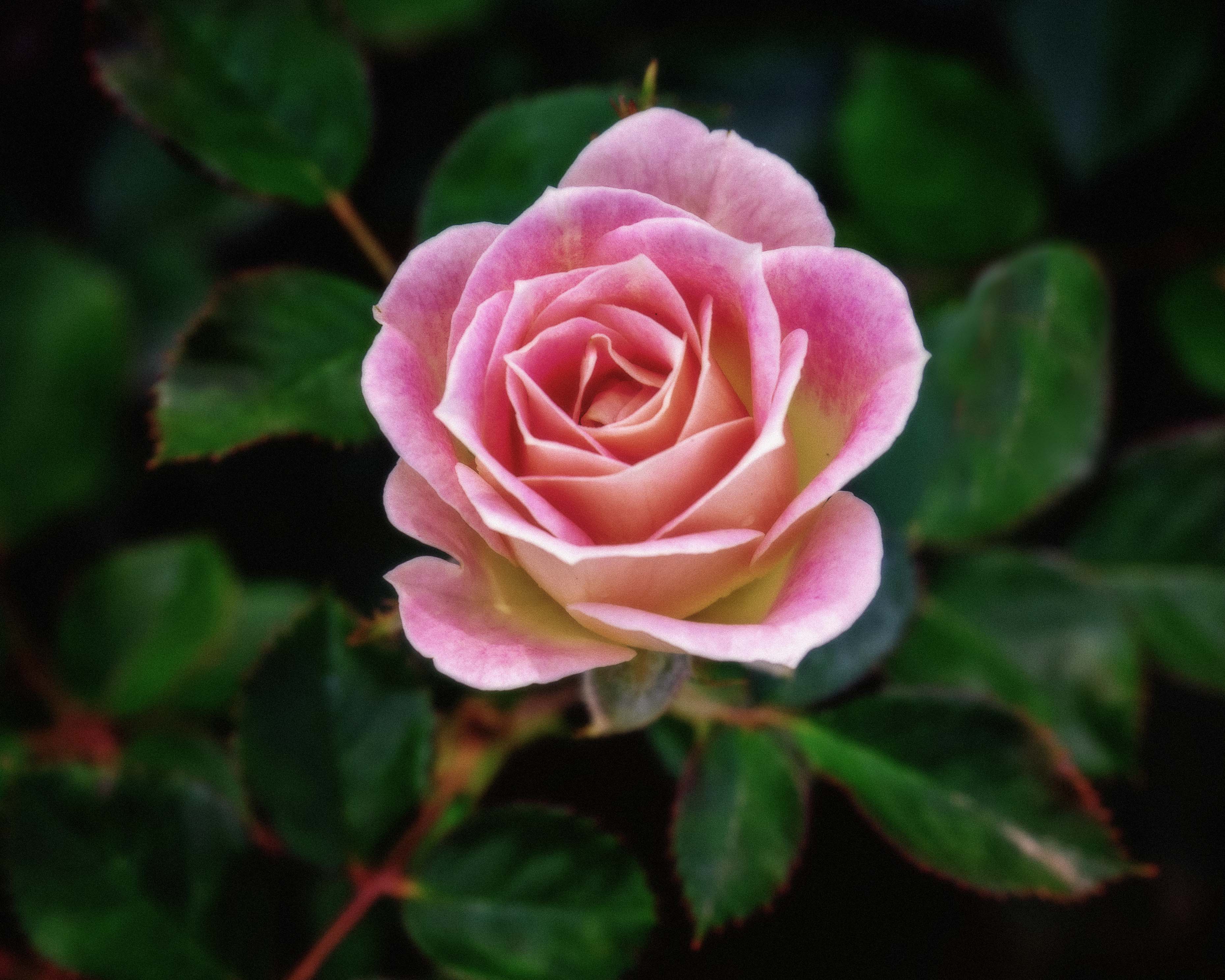
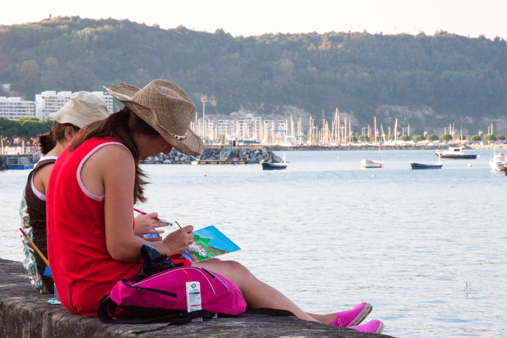
Another phenomenal image!! I love the balance of this, the layers, and the clarity in the water and shoreline. The composition is wonderful! My only suggestion would be that the sky is a little bit uneven, with a blank center and more intense edges, and the blue that is there feels too aqua to me. Could you even it out at all? I know in nature images, we have to be careful about that. I do love this image! |
Dec 22nd |
| 52 |
Dec 18 |
Comment |
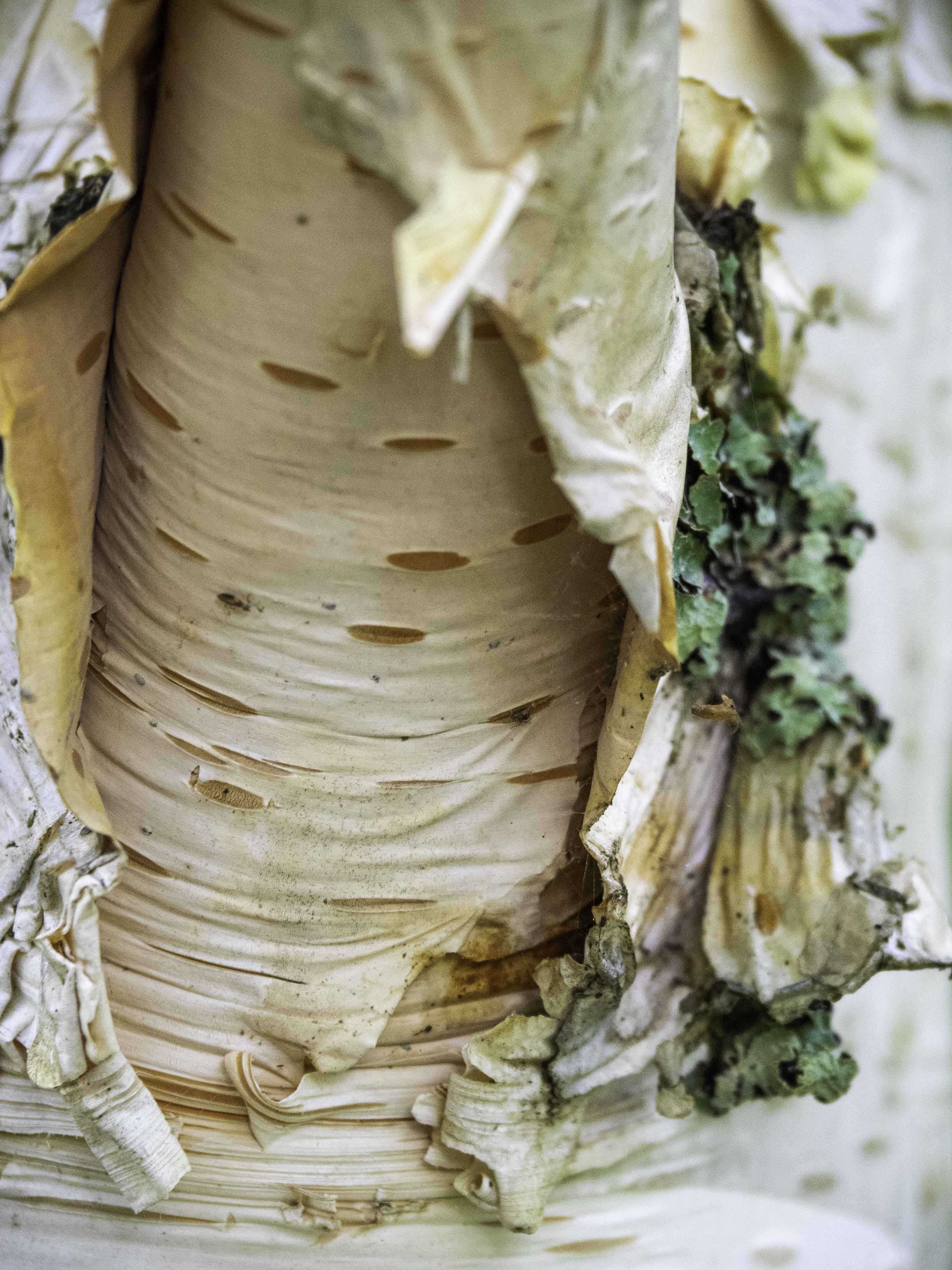
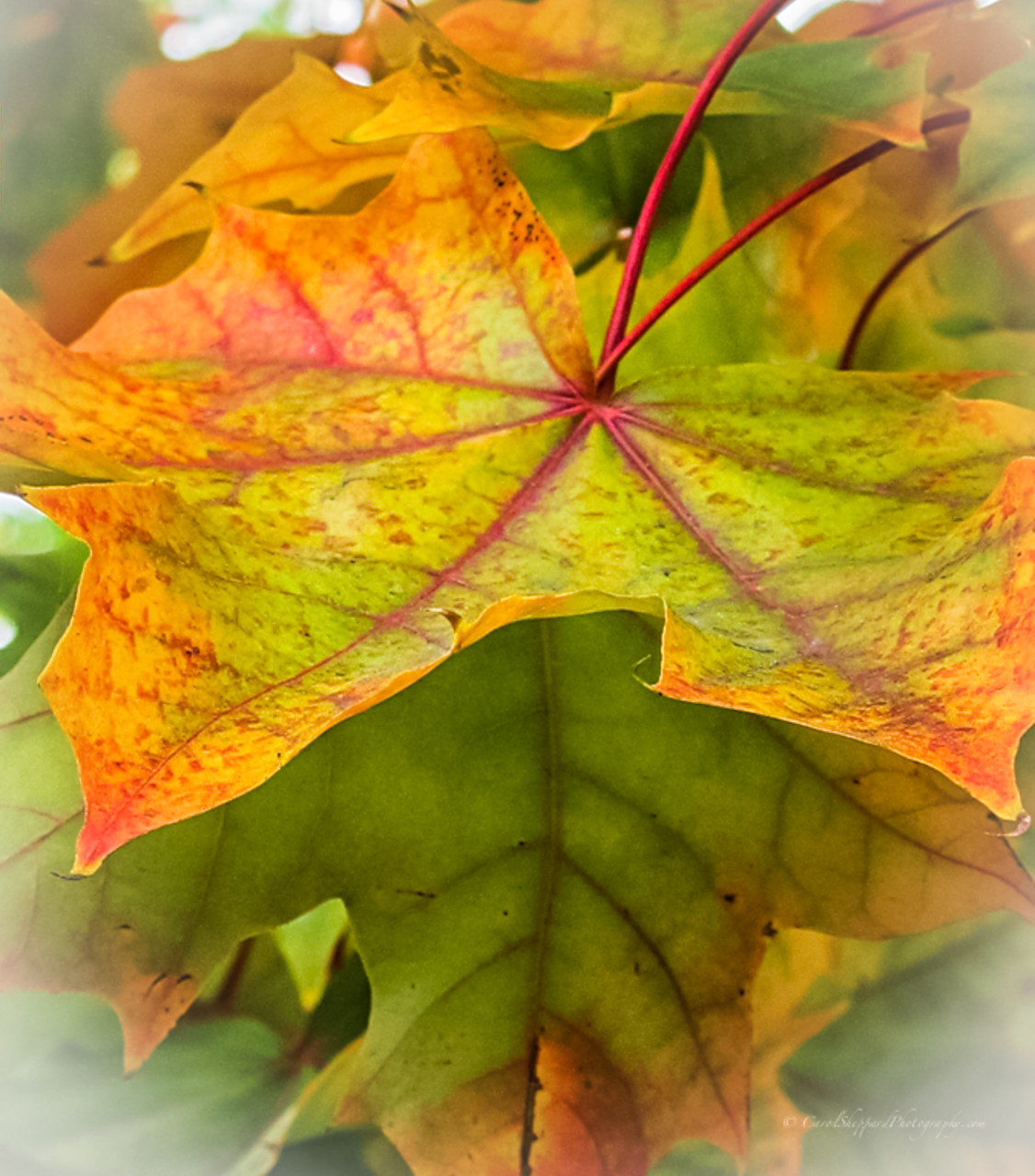
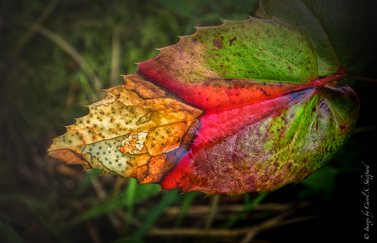
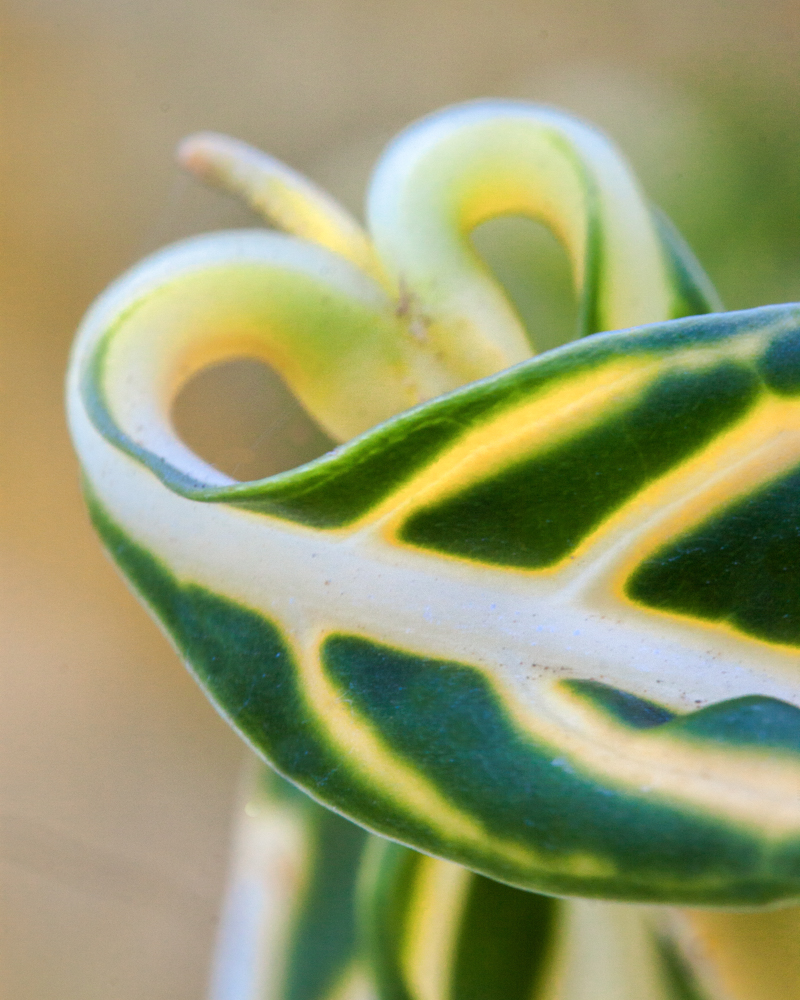
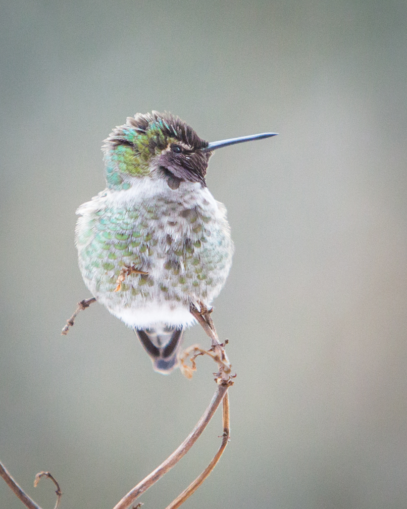
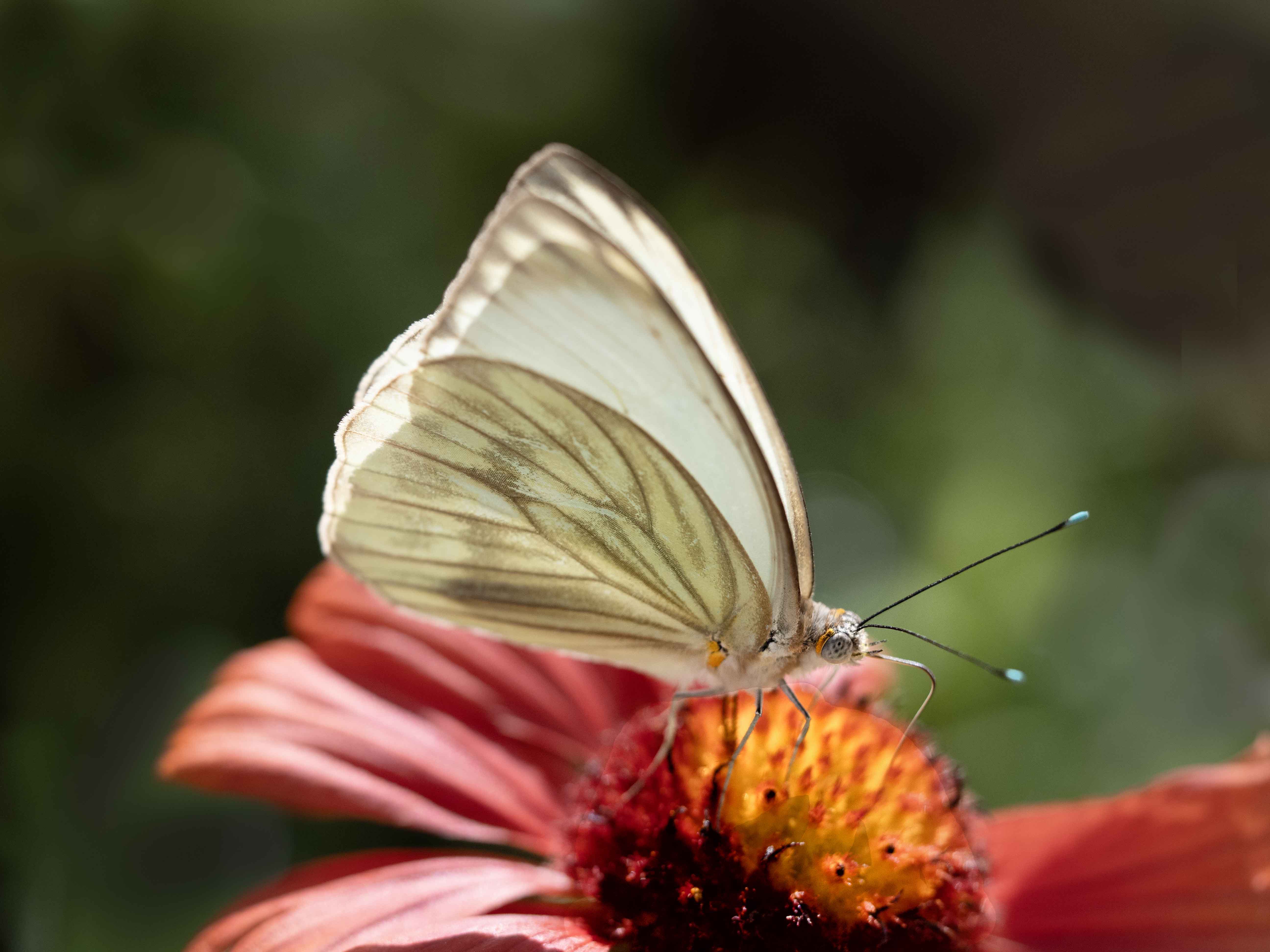
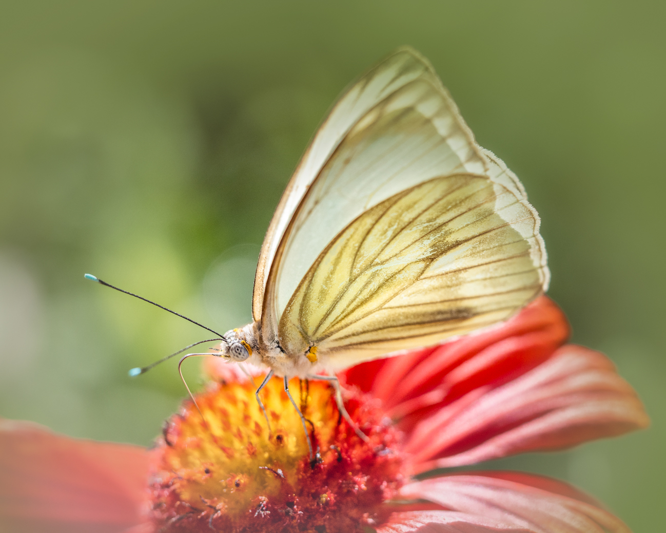
I like the minimal colors in this, along with the composition. It feels like it is flying along in the wind. The background is just perfect!! I love the bokeh you have achieved, and the softness of the background feels exactly right. The leave feels maybe just a tad flat? Can you add some whiteness or extra intensity to it so that it is brighter or more saturated than the background? The brown spots don't detract for me at all, but I feel like I'm looking more at the background than at the leaf. |
Dec 22nd |
| 52 |
Dec 18 |
Comment |
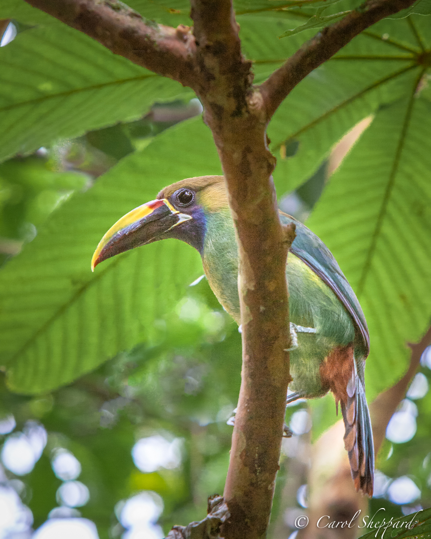
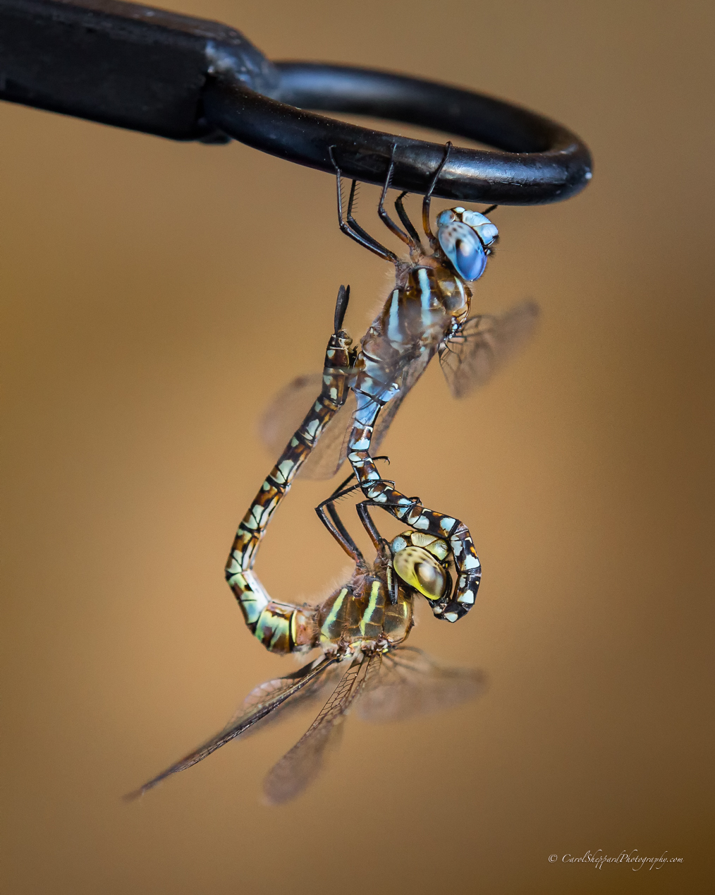
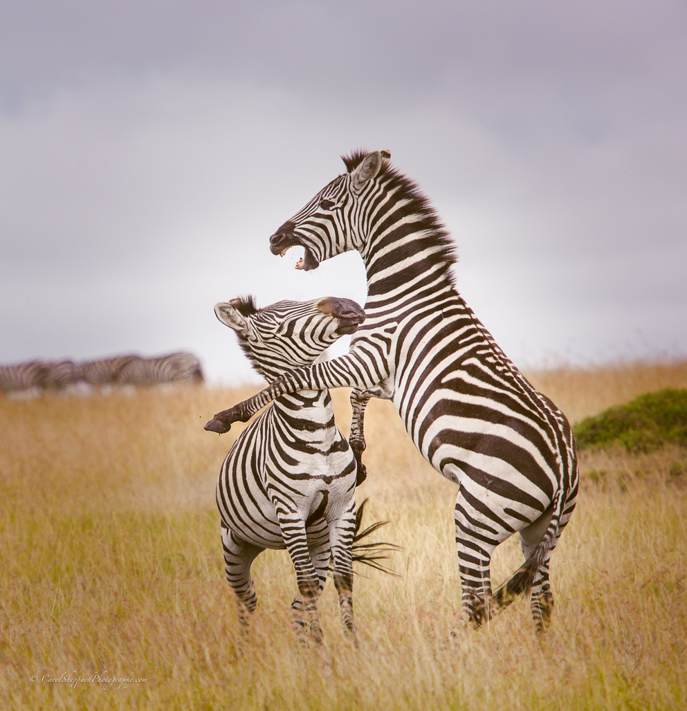
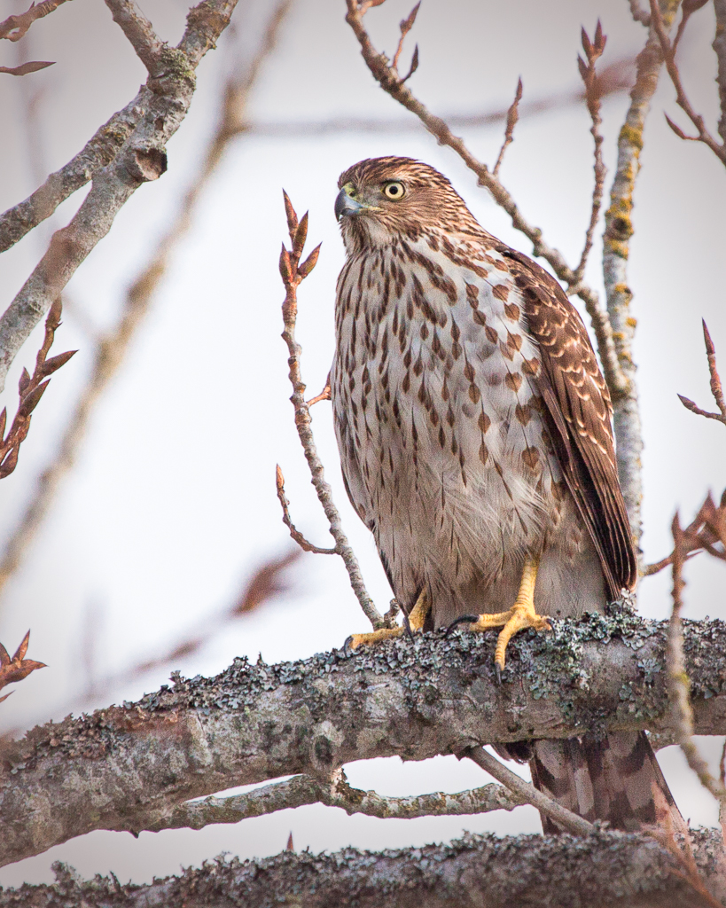
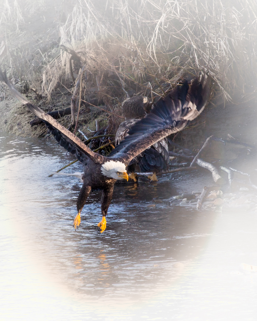
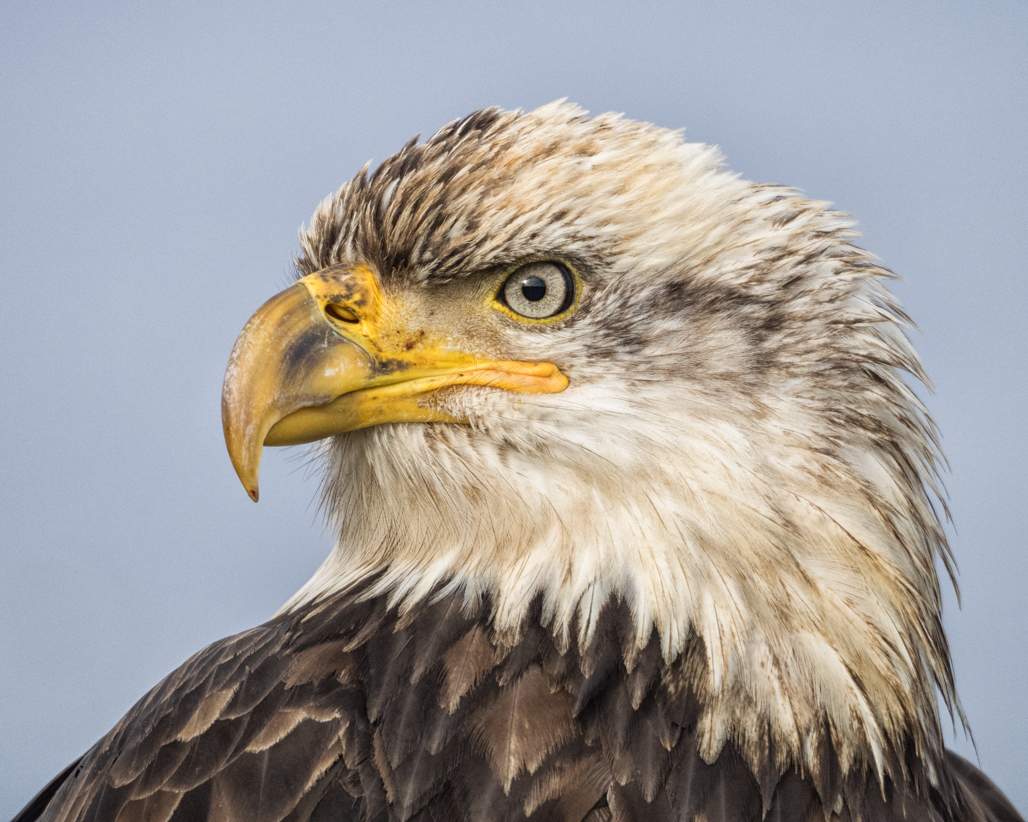
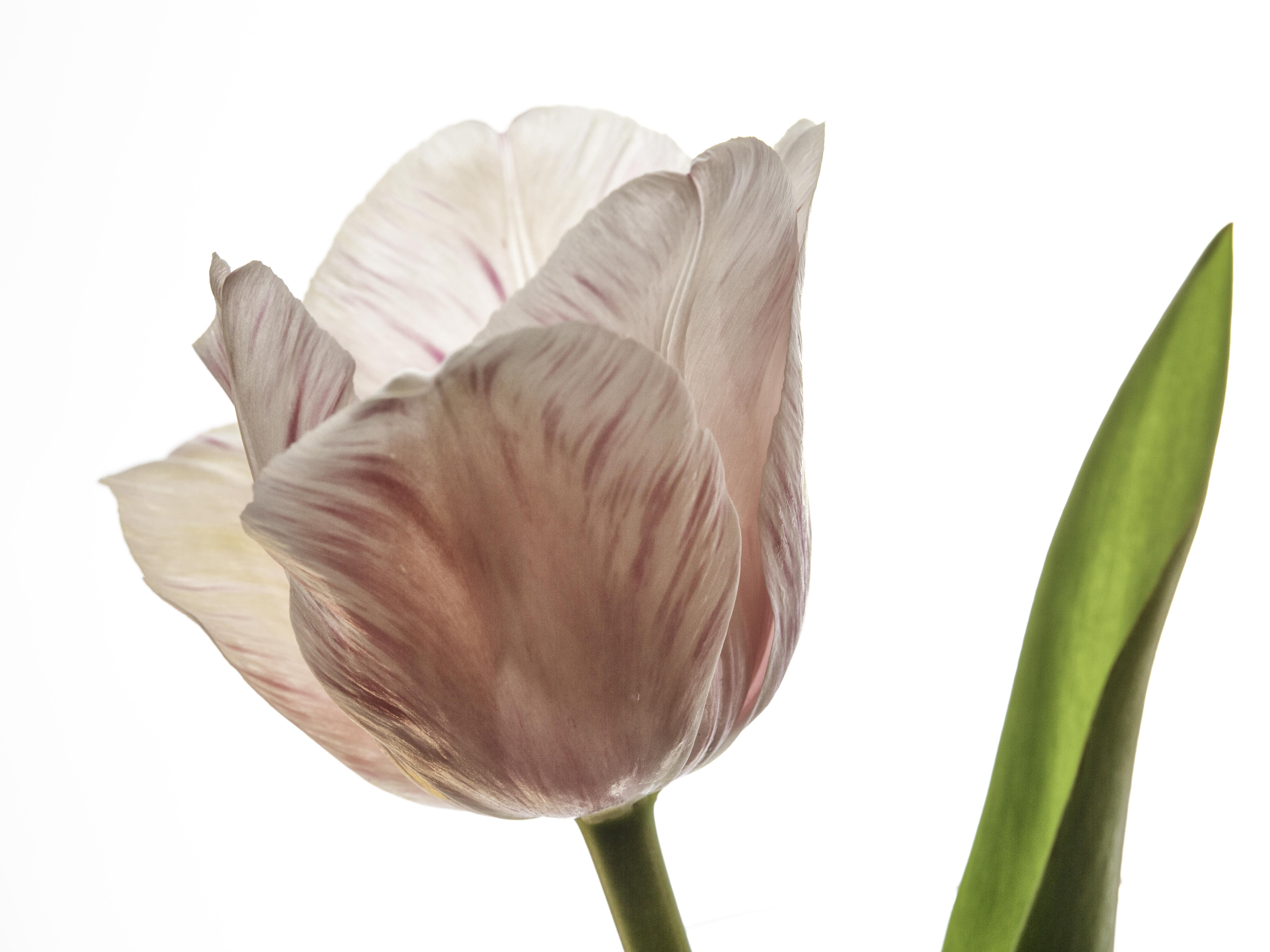
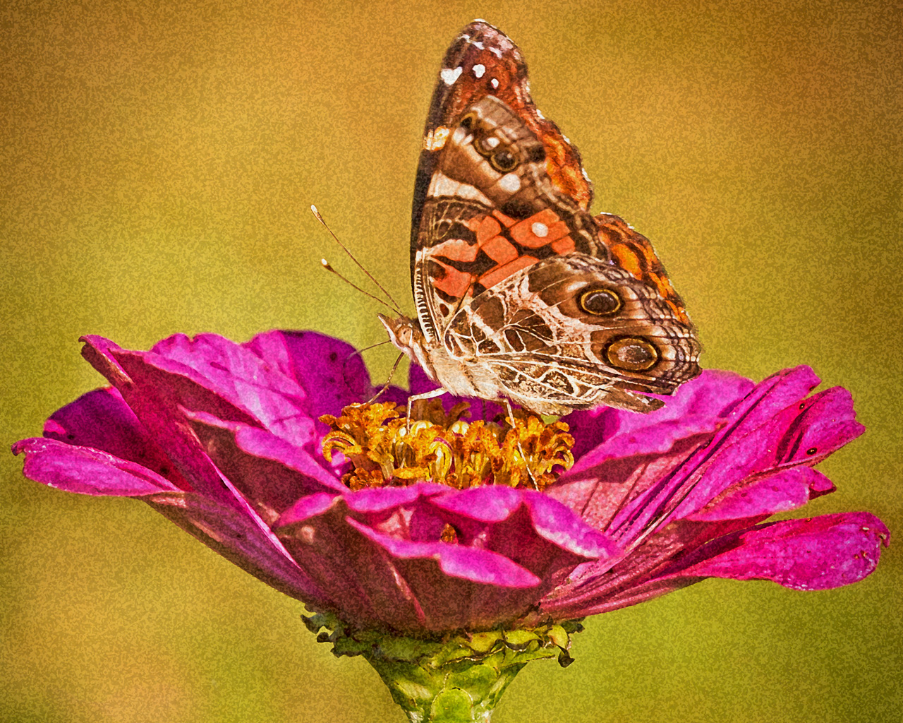
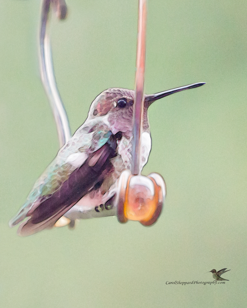
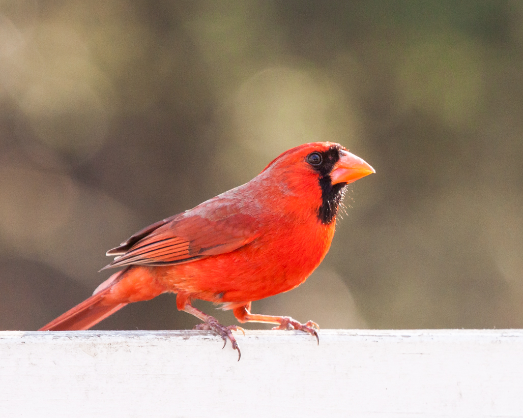
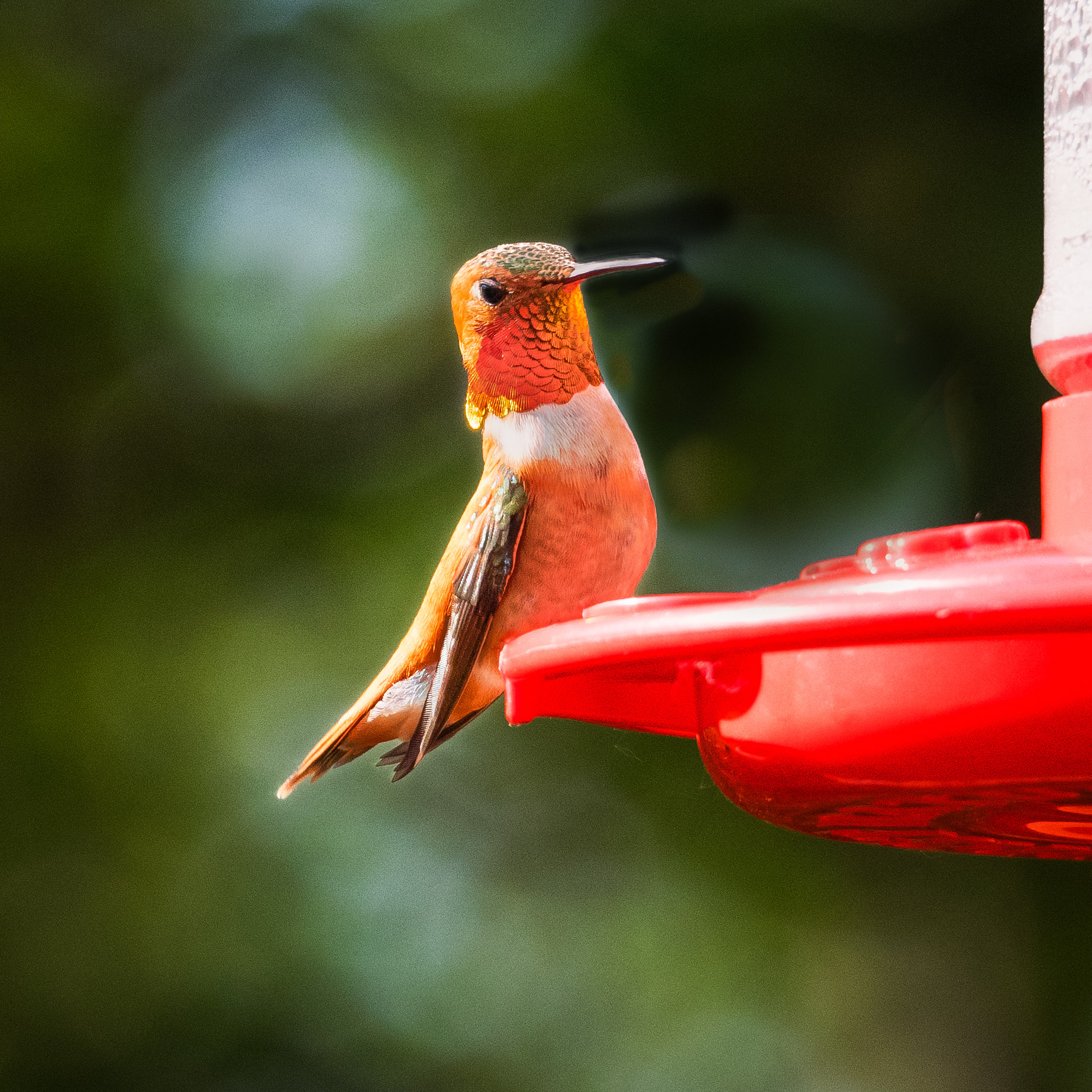
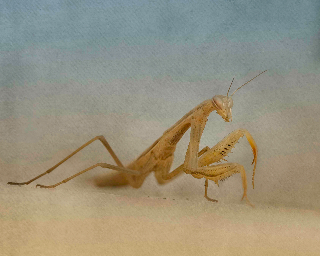
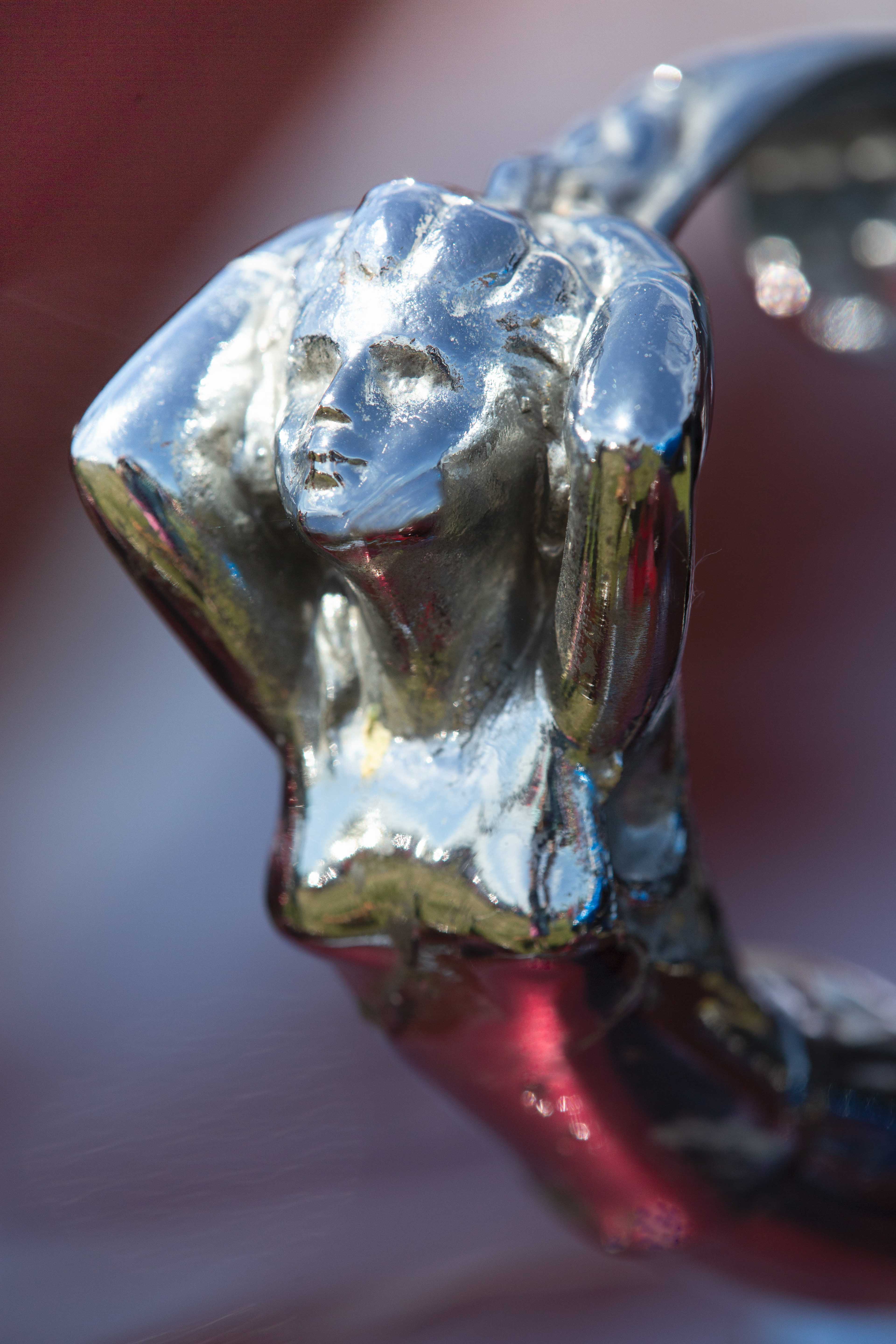
The composition and the sharpness and saturation give this strong and immediate impact! I really love how you've cropped it and angled it from the original. I wouldn't change anything about it! The one feather sticking out of the back of the head gives it just enough of an imperfection to make it real. |
Dec 22nd |
| 52 |
Dec 18 |
Comment |
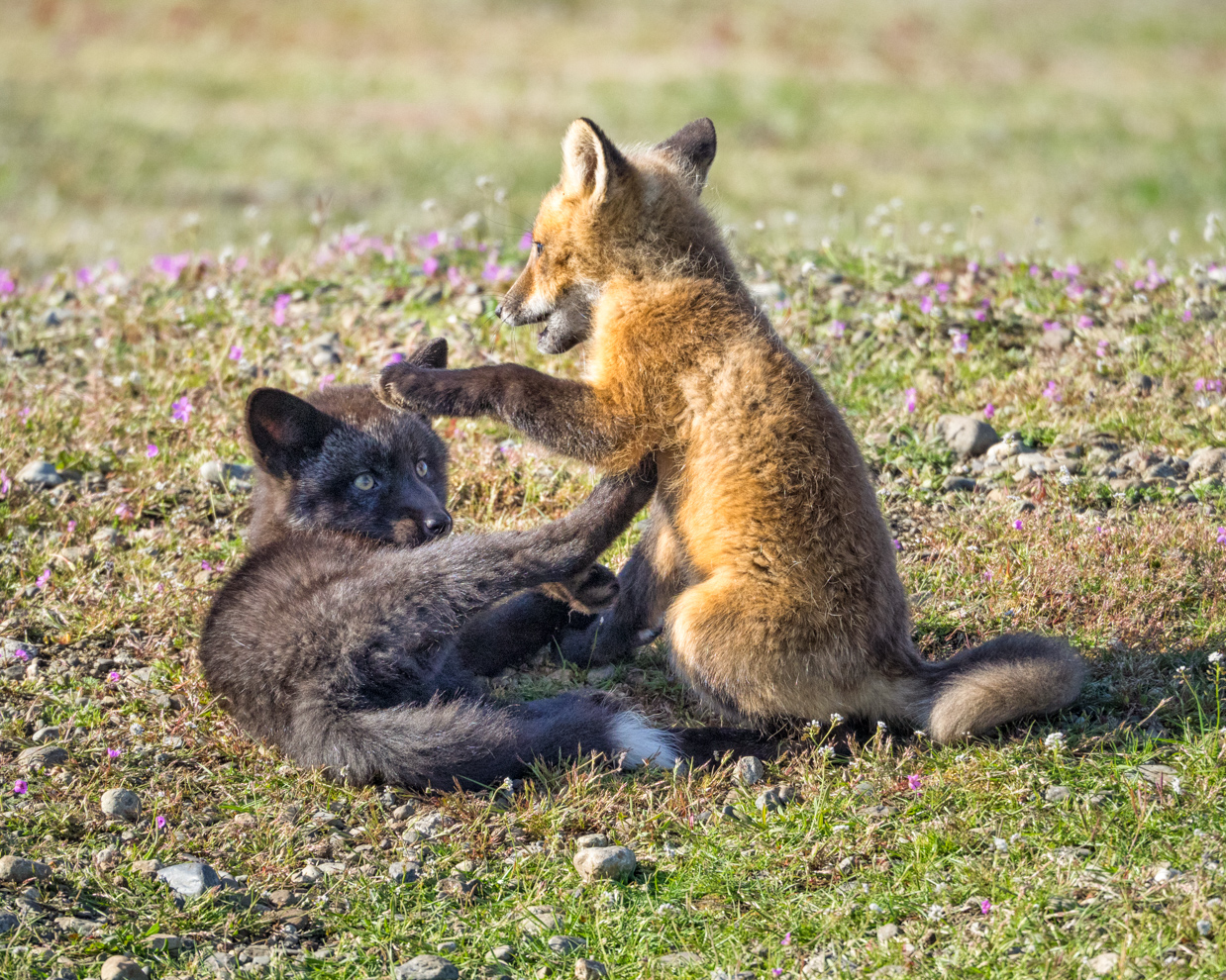
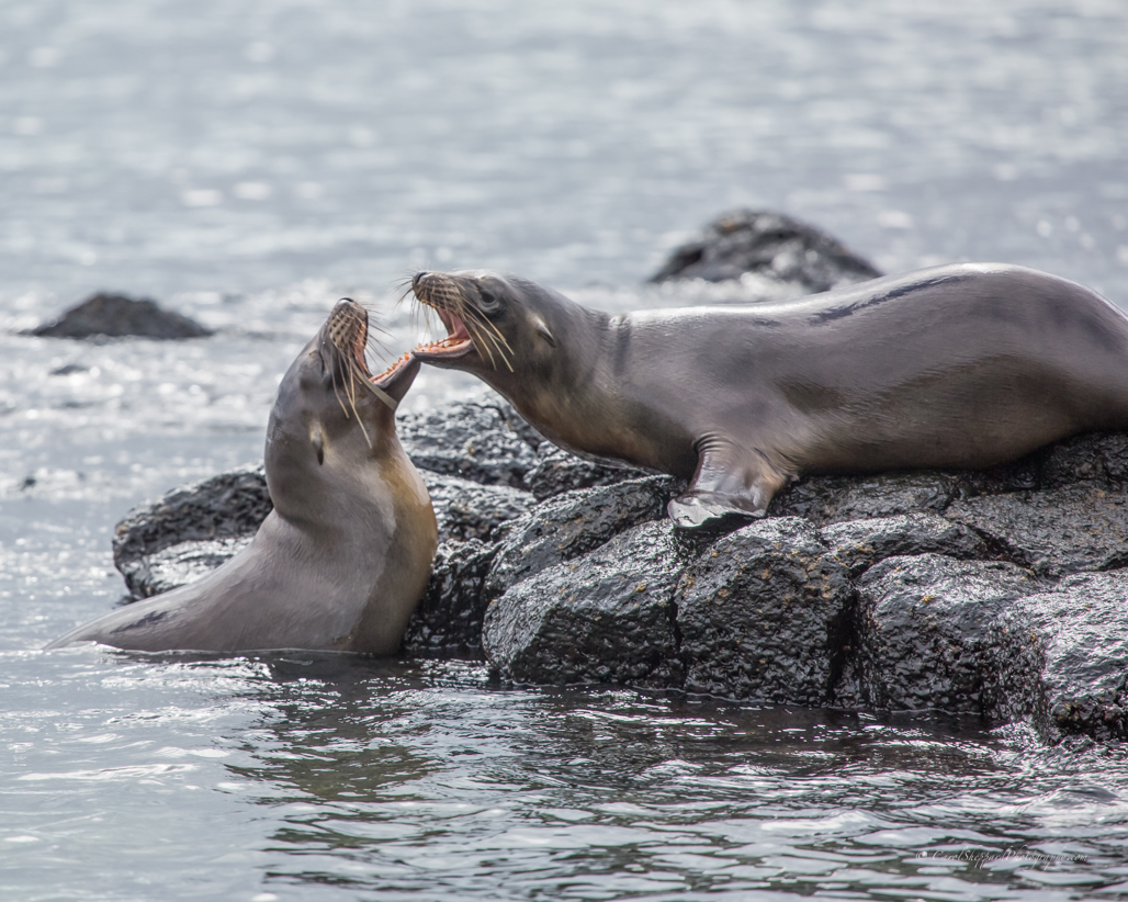
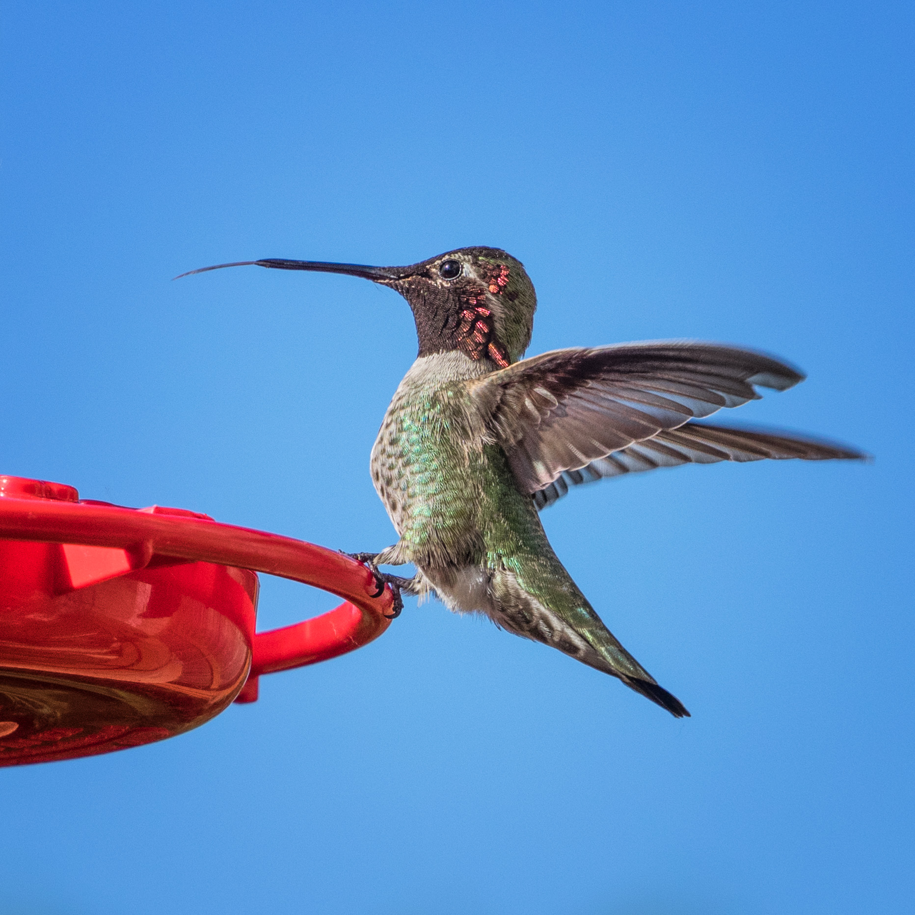
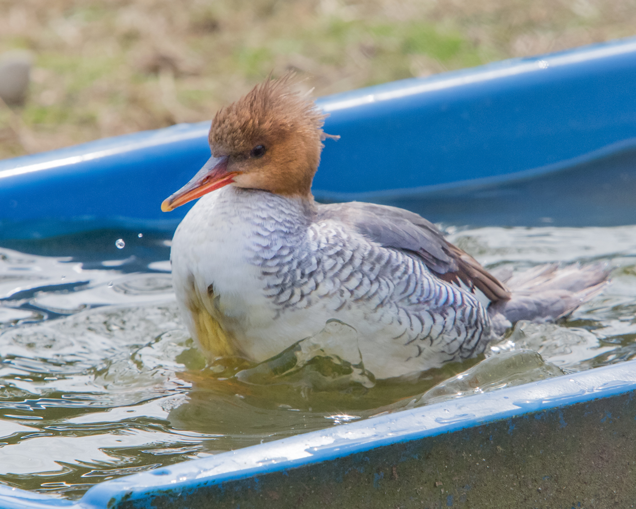
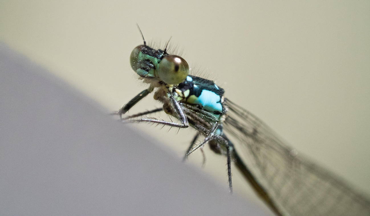
The composition with the lightness on the water leading my eye works quite well for this. His forward wing, with the light coming through, is sharp and has great clarity and balance. Overall, though, the bluish cast and the darkness, along with how close the subject's head is to the top edge of the image, creates some dissonance for me. Your capture of the water gives it great action. I feel I would like it more with just the one bird, I think. |
Dec 22nd |
| 52 |
Dec 18 |
Comment |
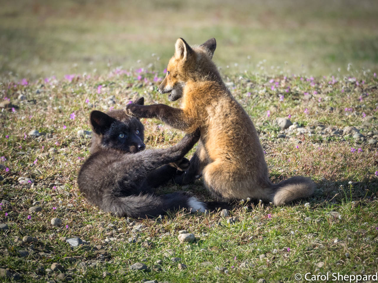
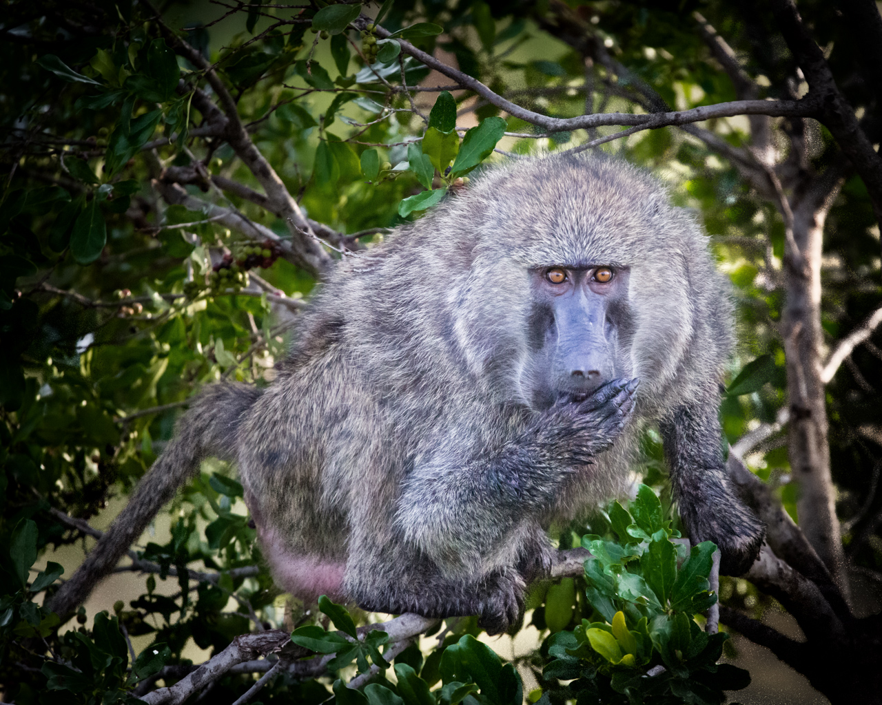
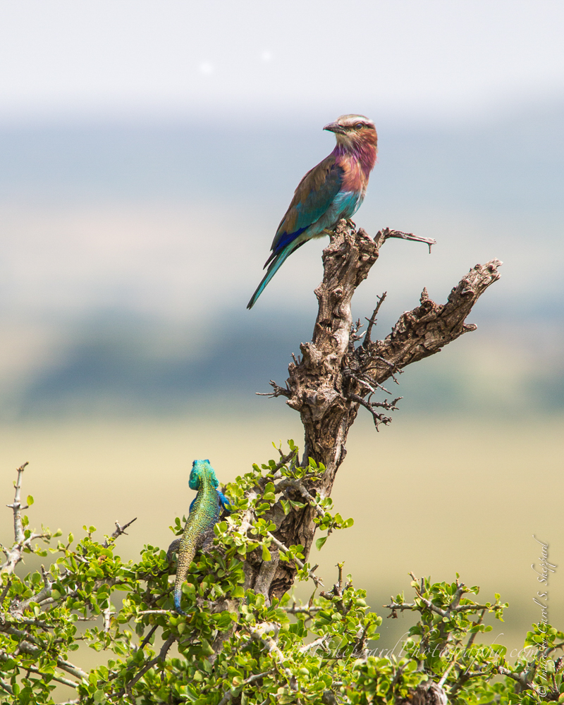
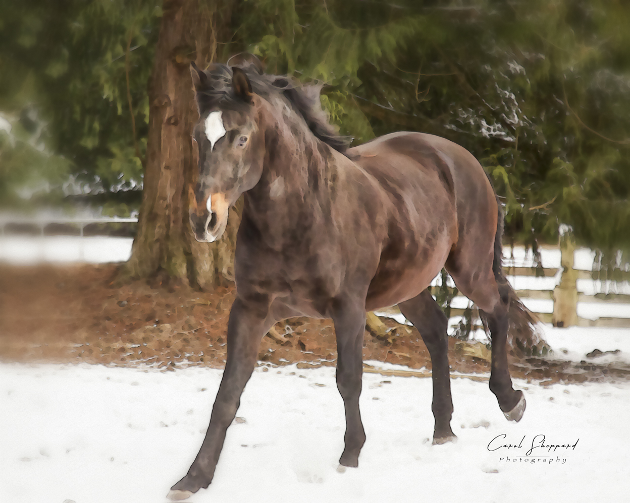
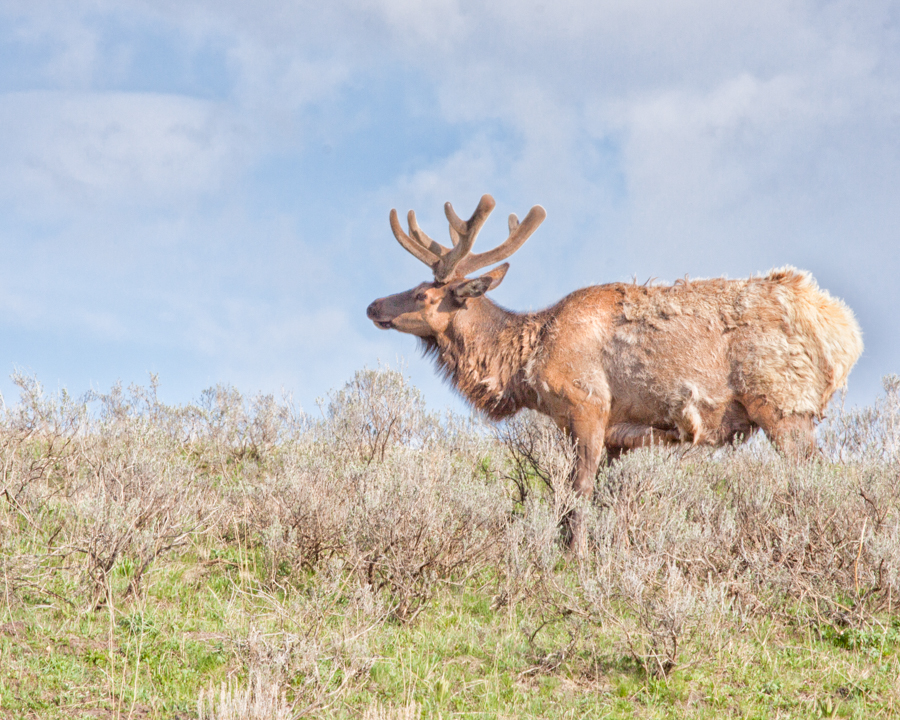
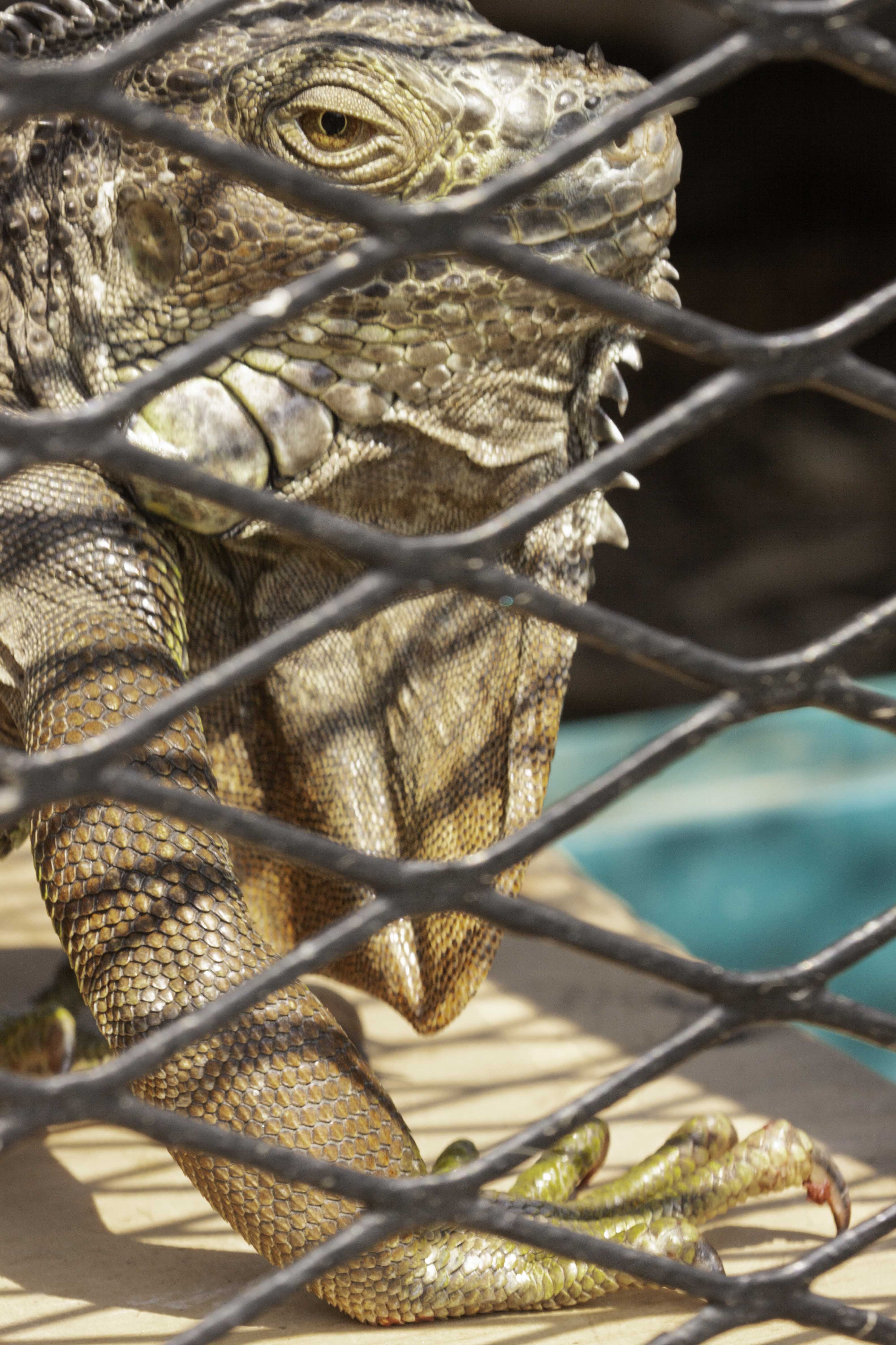
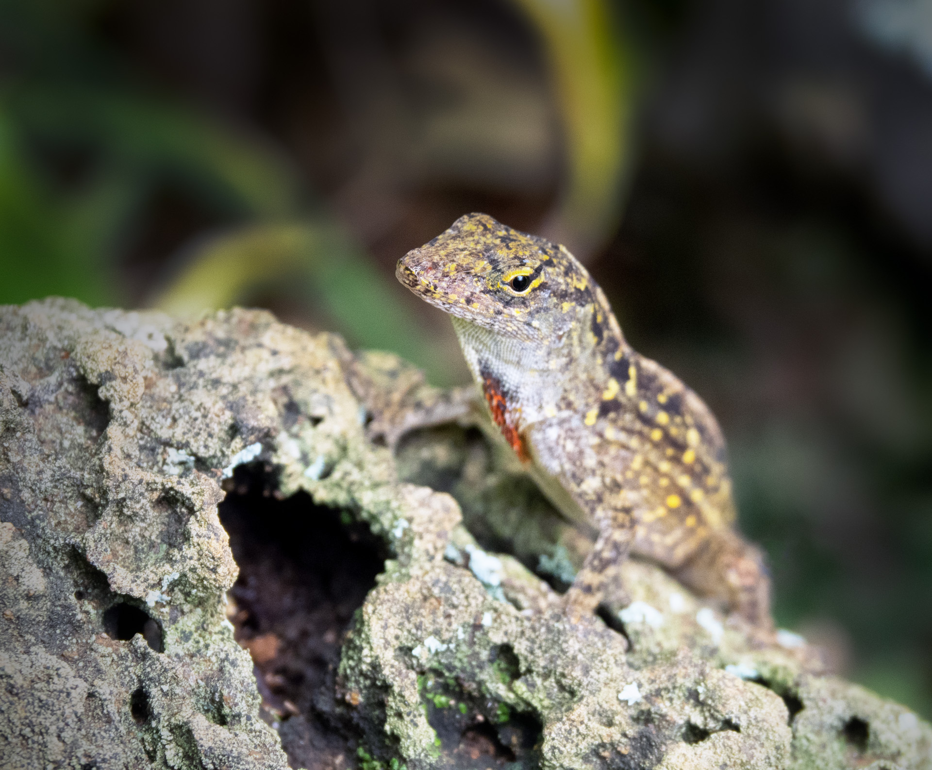
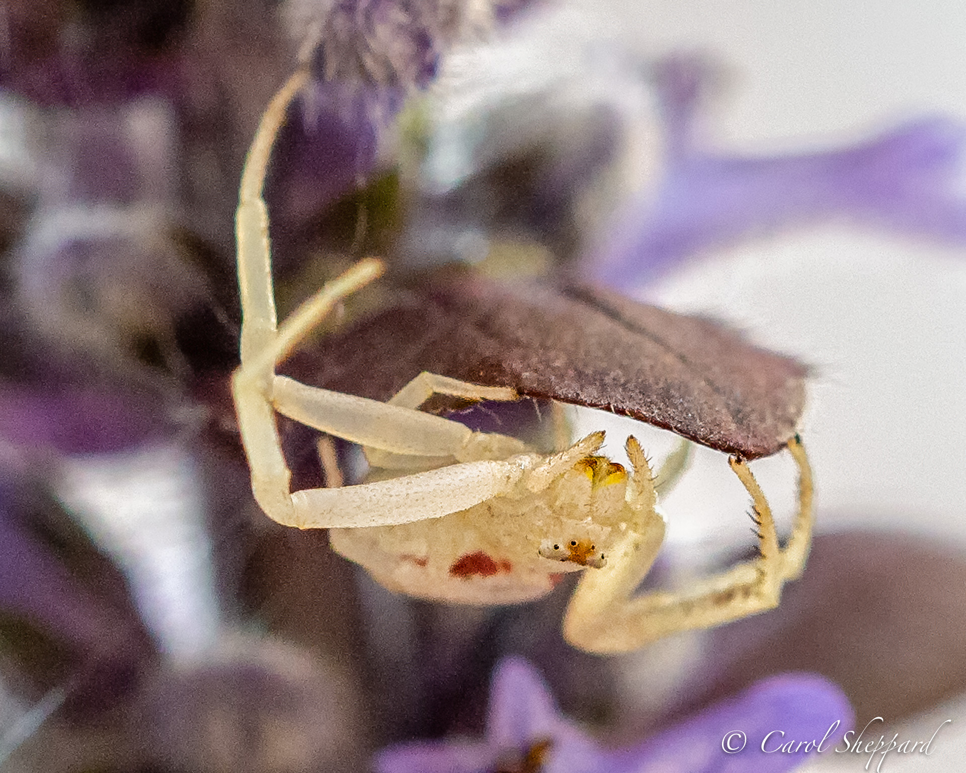
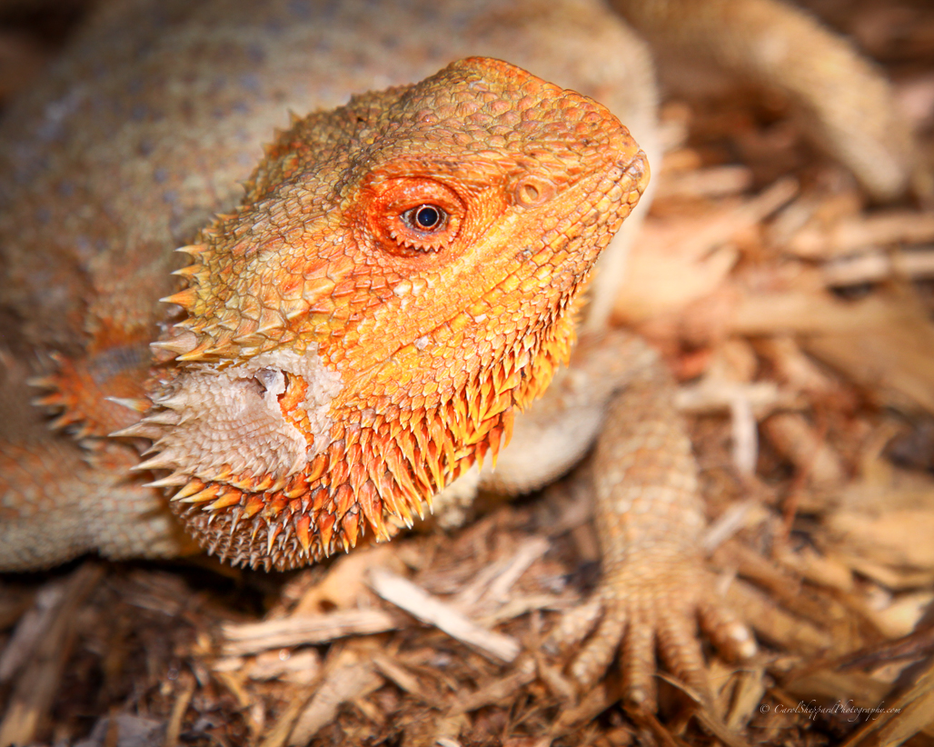
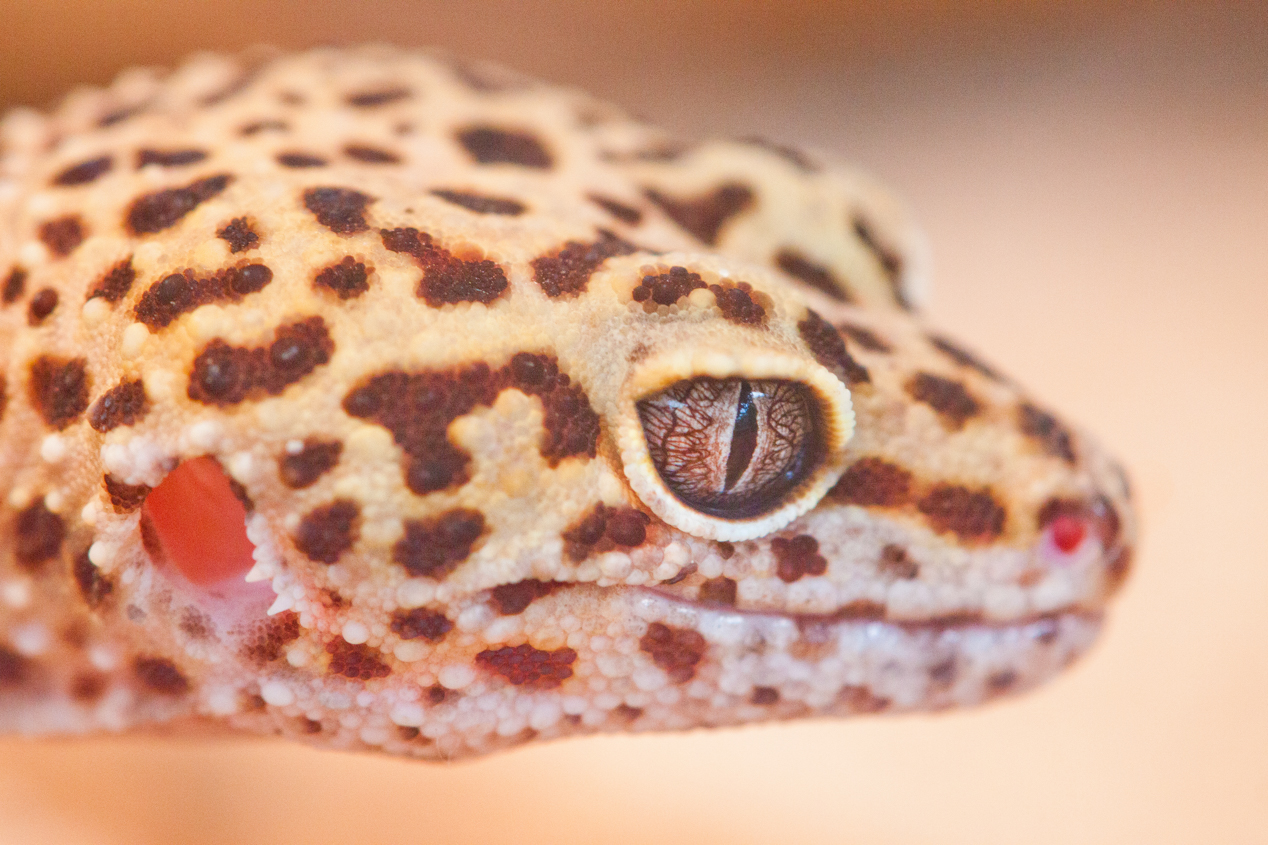
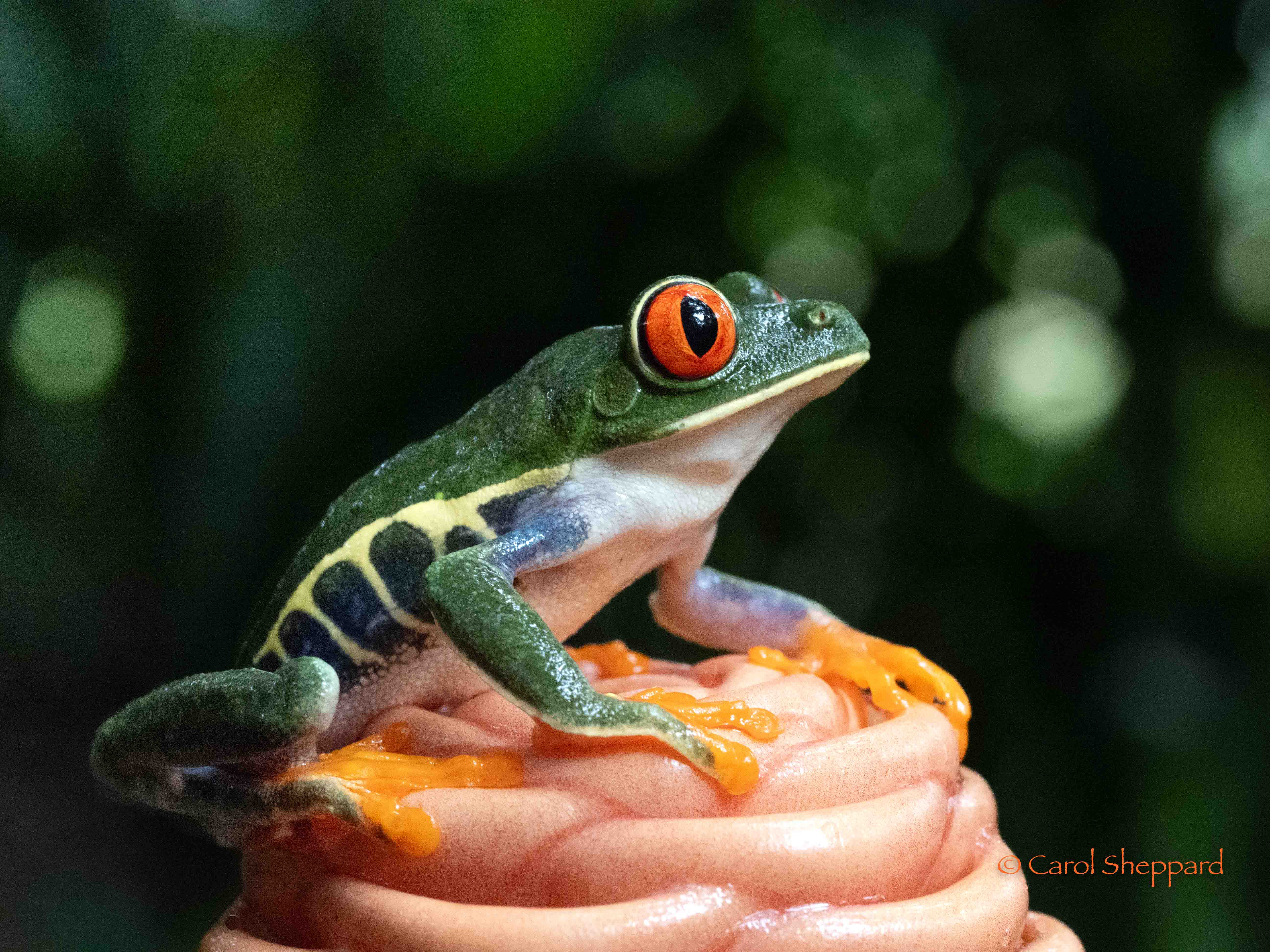
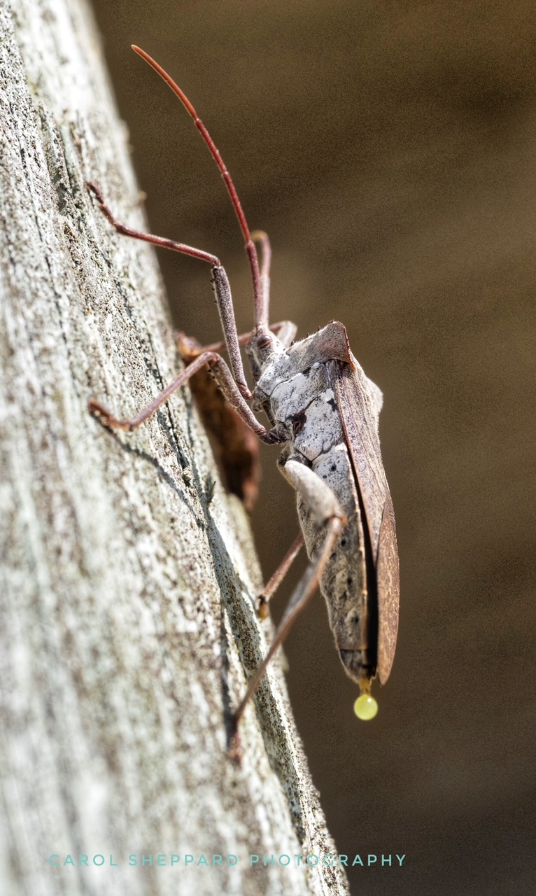
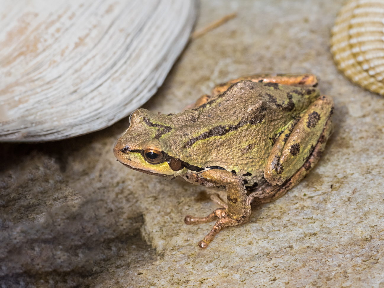
Although at first I thought it looked soft (that was noticeable to me immediately), I then felt that it gave it a certain art-like feeling. If only the animal was soft, I would say that it needed to be sharpened somehow. But because the background plants have the same level of softness, it feels intentional to me. I love his face; the eyes are captivating. So, I guess to sum it up, the softness feels right to me and I love the painting-like feeling you've captured. |
Dec 22nd |
| 52 |
Dec 18 |
Comment |
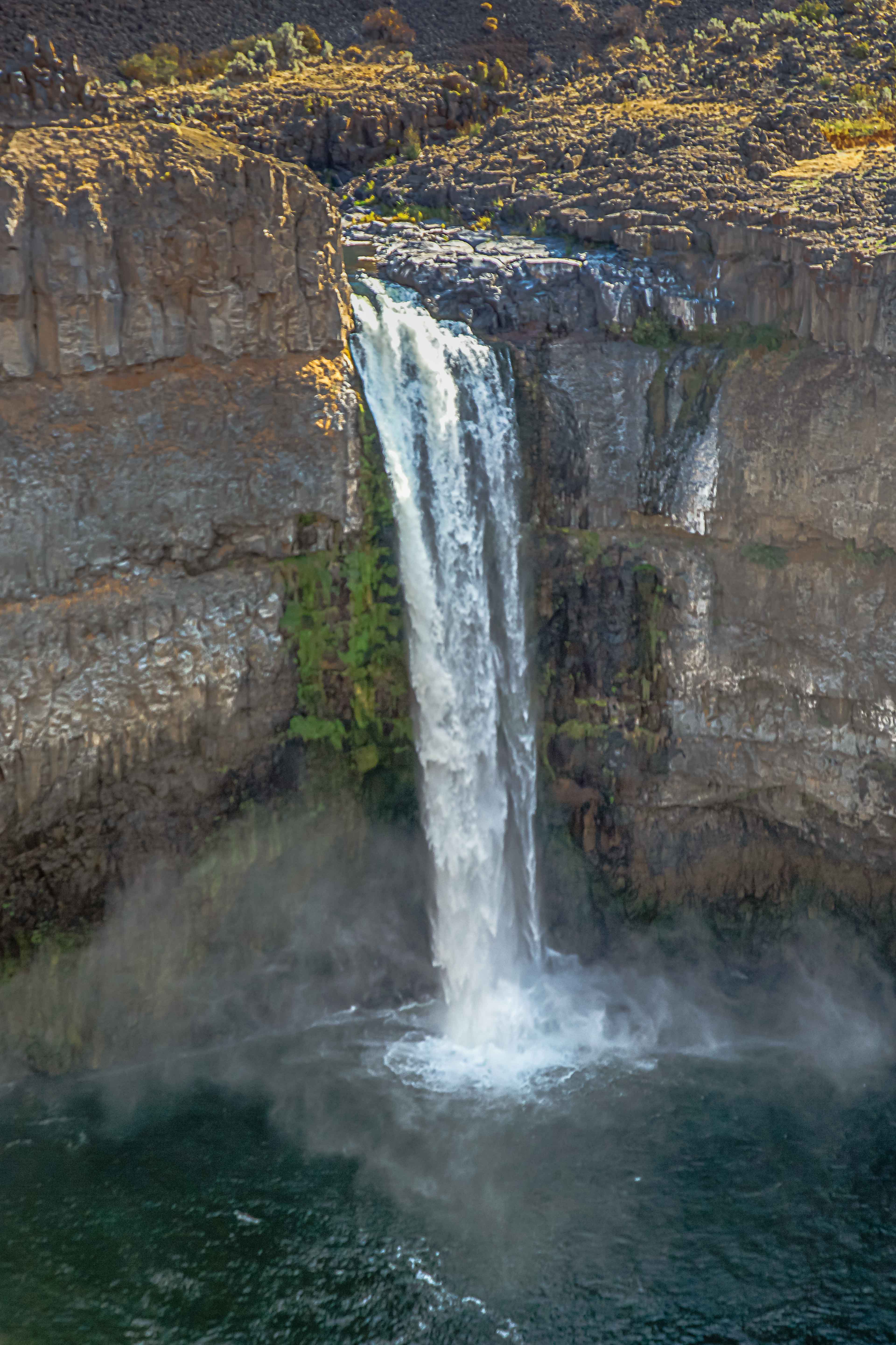
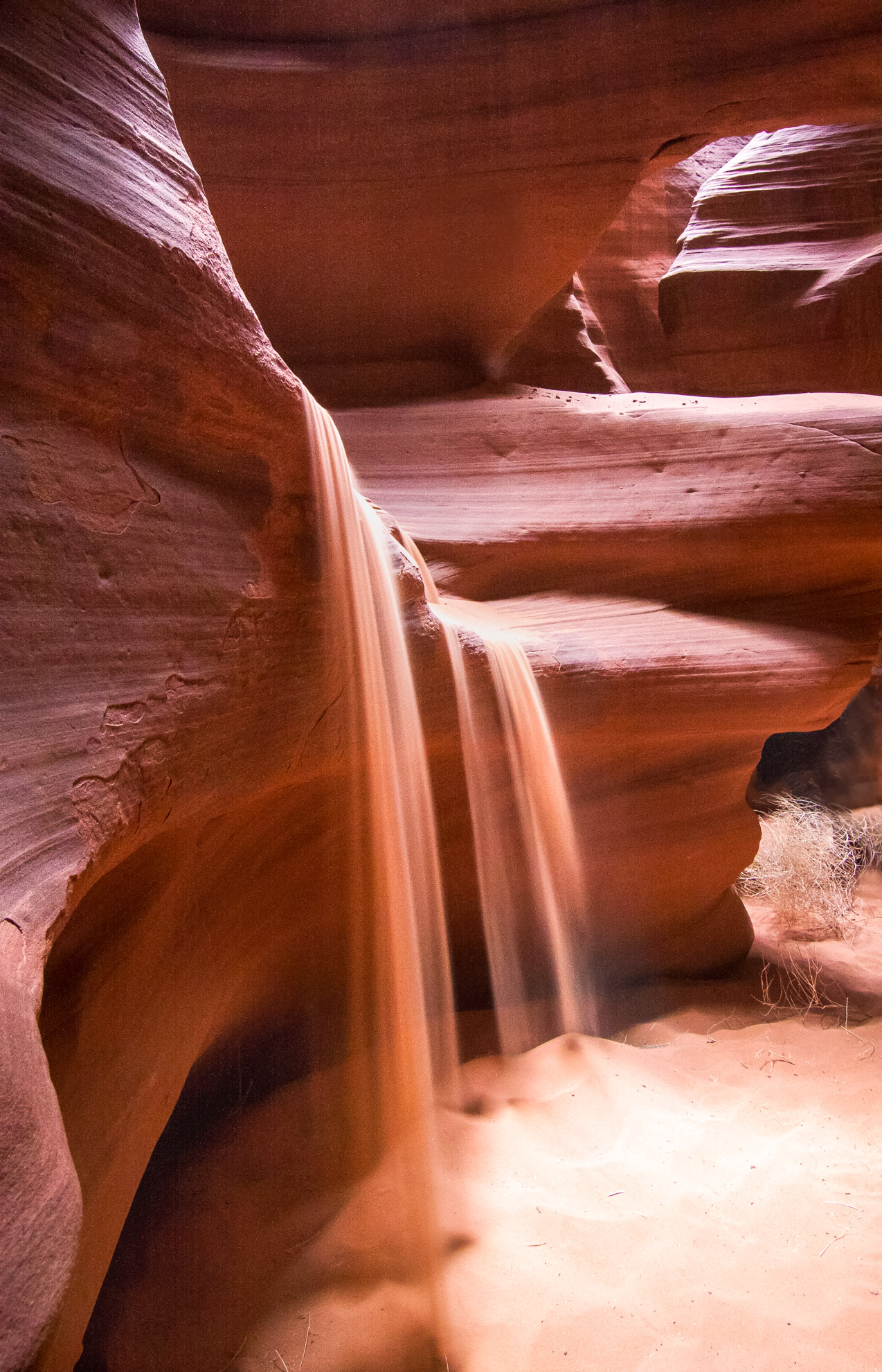
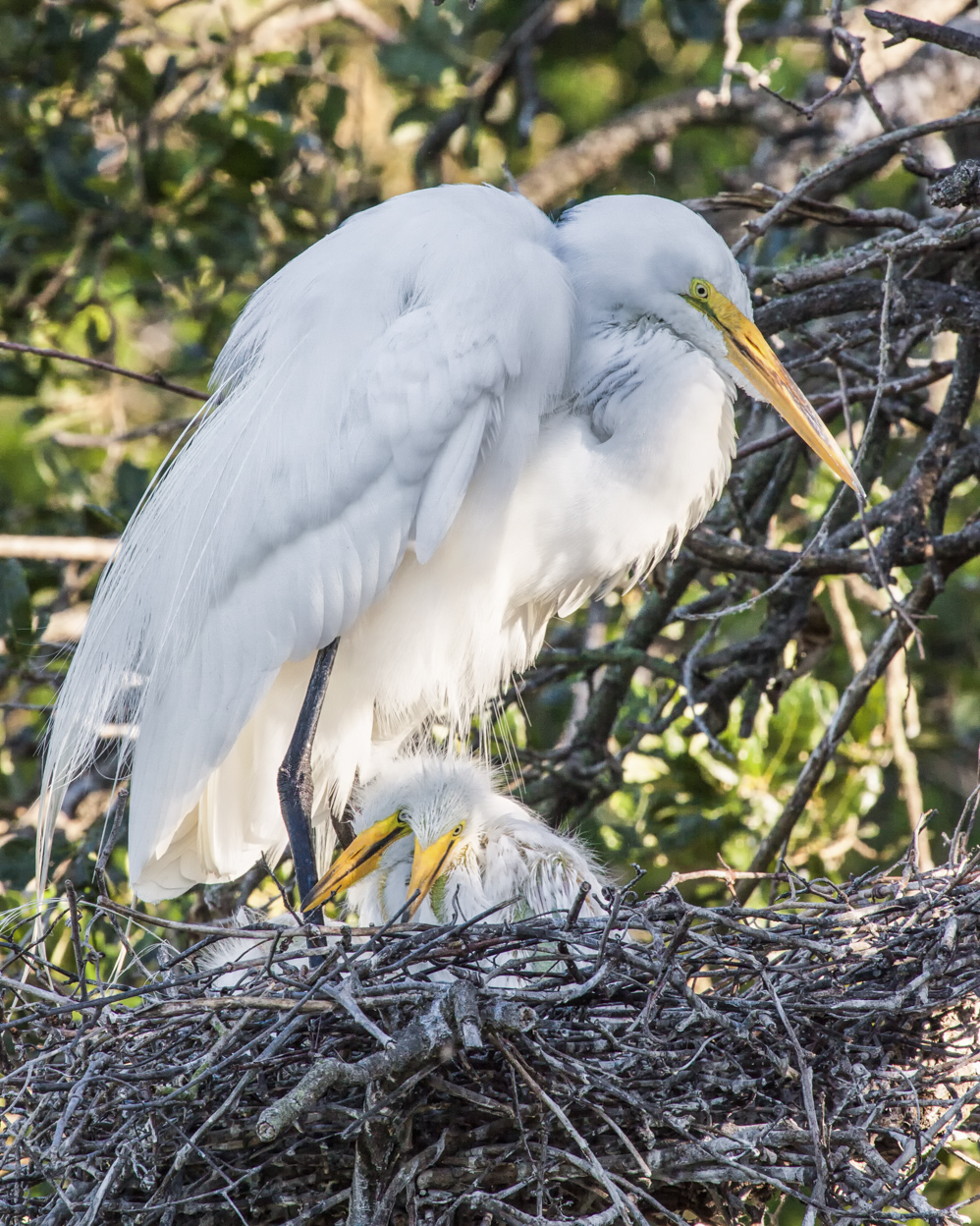
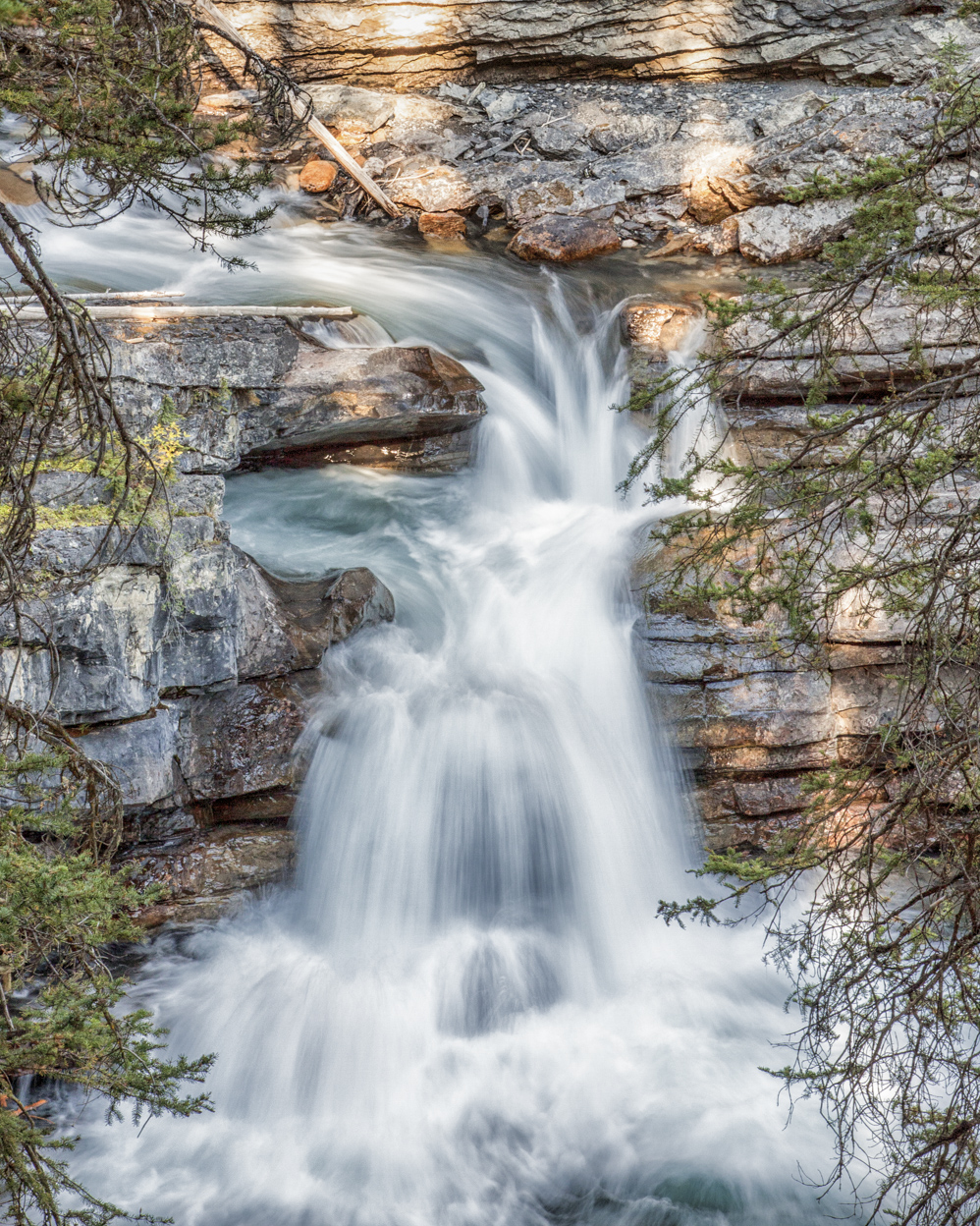
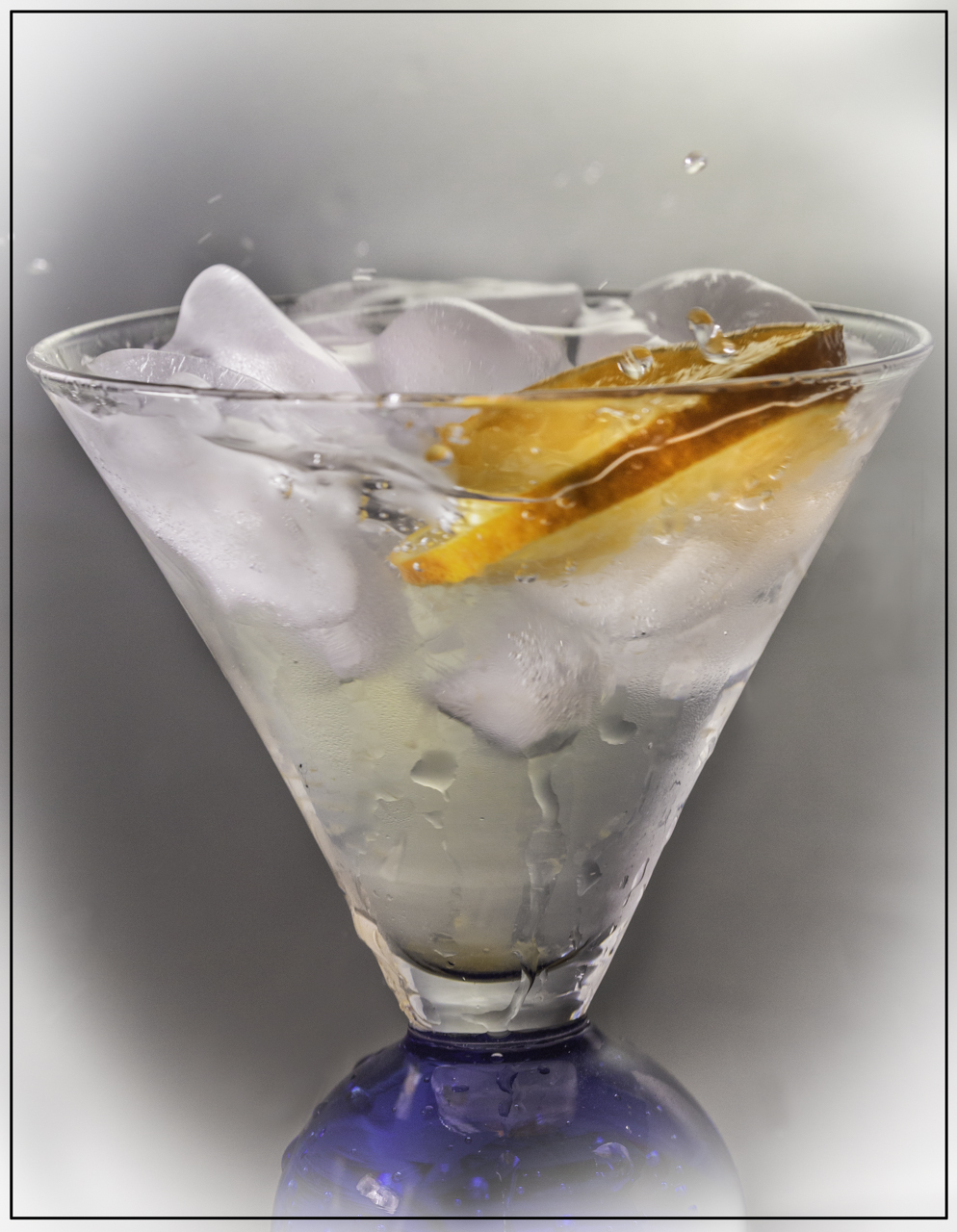
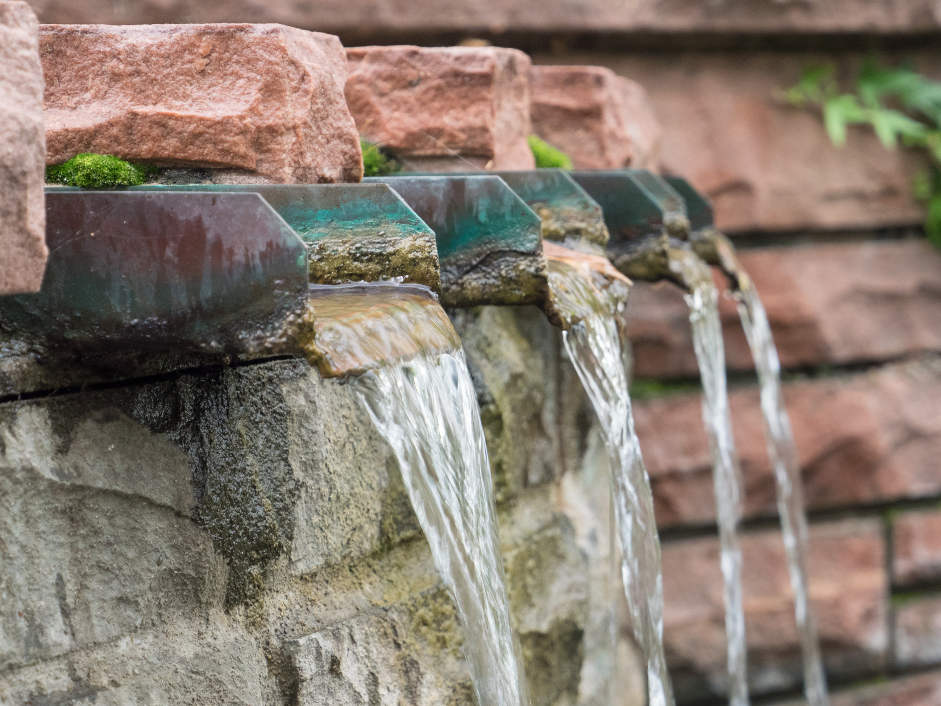
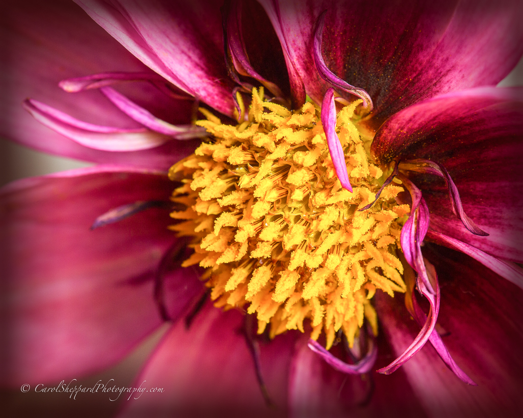
This is a wonderful image; it has great lighting, a nice mix of highlights and shadows, and nice contrast. You've done a beautiful job of capturing the water, and your composition tops it all off in a perfect way! You did a very good job with the HDR! |
Dec 22nd |
7 comments - 0 replies for Group 52
|
| 60 |
Dec 18 |
Comment |
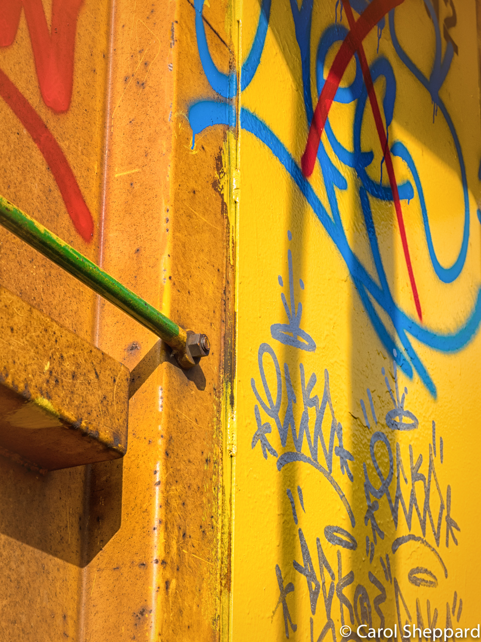
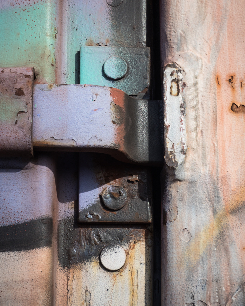
Interesting feedback! Thank you. I'm not sure what appealed to me but I also enjoy some of the graffiti. |
Dec 26th |
| 60 |
Dec 18 |
Comment |
Oh, and the way the spill comes forward from the side--very appealing in your composition! I like the crop; it really works. |
Dec 10th |
| 60 |
Dec 18 |
Comment |
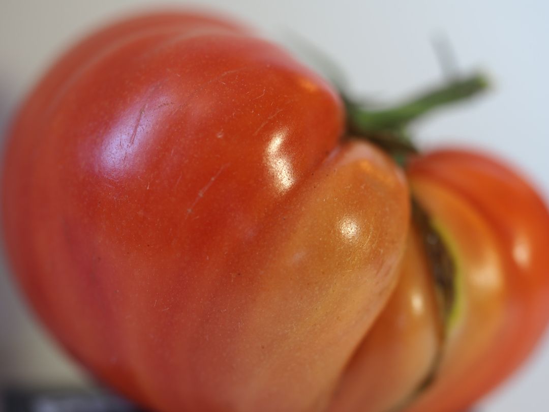
What a great shot!! This is a yummy, beautiful shot of food! Your placement of the DOF is perfect to my eyes as a viewer. I love the composition, with the little bits providing leading lines into the image. The placement, the colors, the lighting, all work wonderfully together. I think this is a competition-worthy image, personally! Great shot! |
Dec 10th |
| 60 |
Dec 18 |
Comment |
I do personally really like this image....the way the colorful bits are subtle but definitely there, the feeling you get of those shined-up auto parts; you've captured the texture very well. Can you bring out more detail in the top half of the image? The darkness did detract a little for me. Otherwise, I might crop at least a slice off the top to minimize it. And maybe just a bit of clarity or dehazing on the reflection in the wheel well. Beautiful! And yes, shocking--about as shocking as what we spend on camera gear!! |
Dec 10th |
| 60 |
Dec 18 |
Comment |
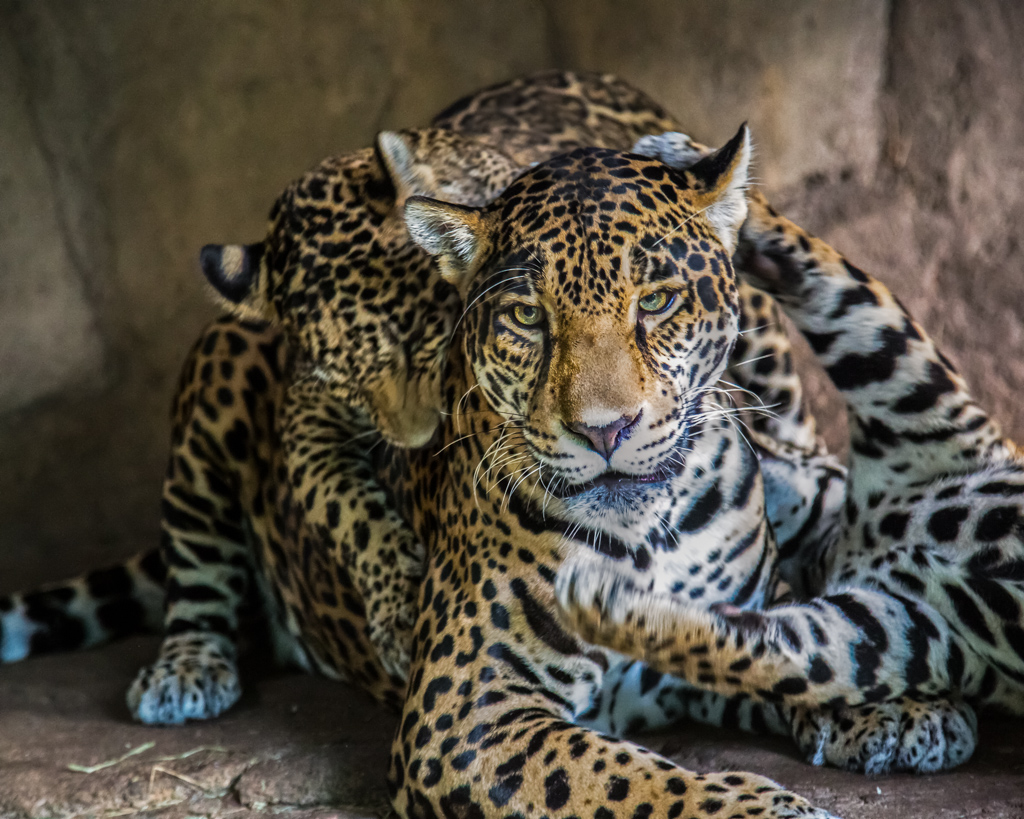
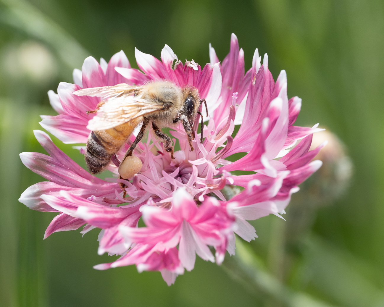
Very beautiful combination of colors, along with a great capture of detail and texture. The composition is also very pleasing, with my eye pulled into and around the image. You did a great job with a handheld shot, and your settings were obviously spot-on. Bet that was an incredible exhibit! |
Dec 10th |
| 60 |
Dec 18 |
Comment |
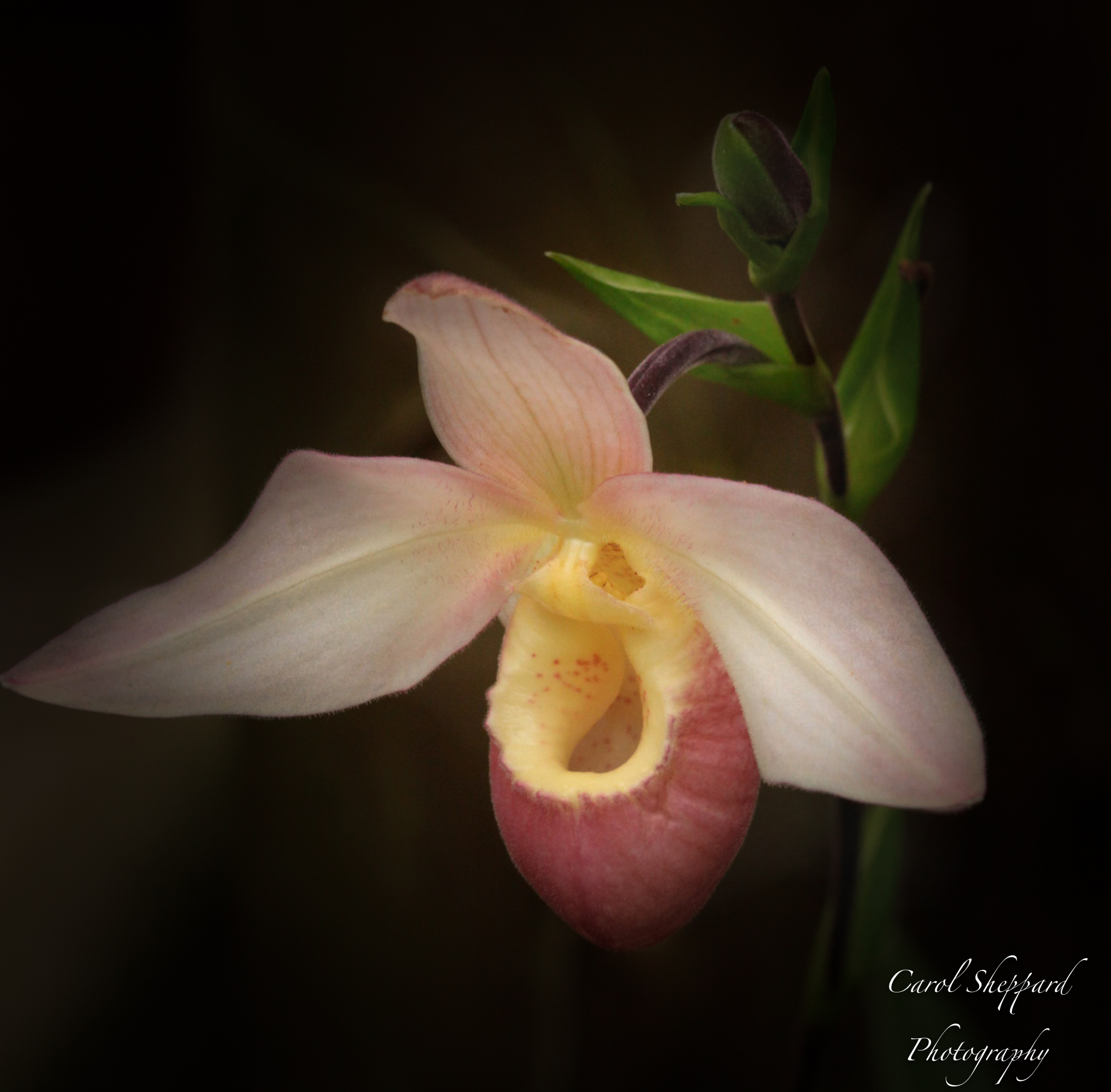
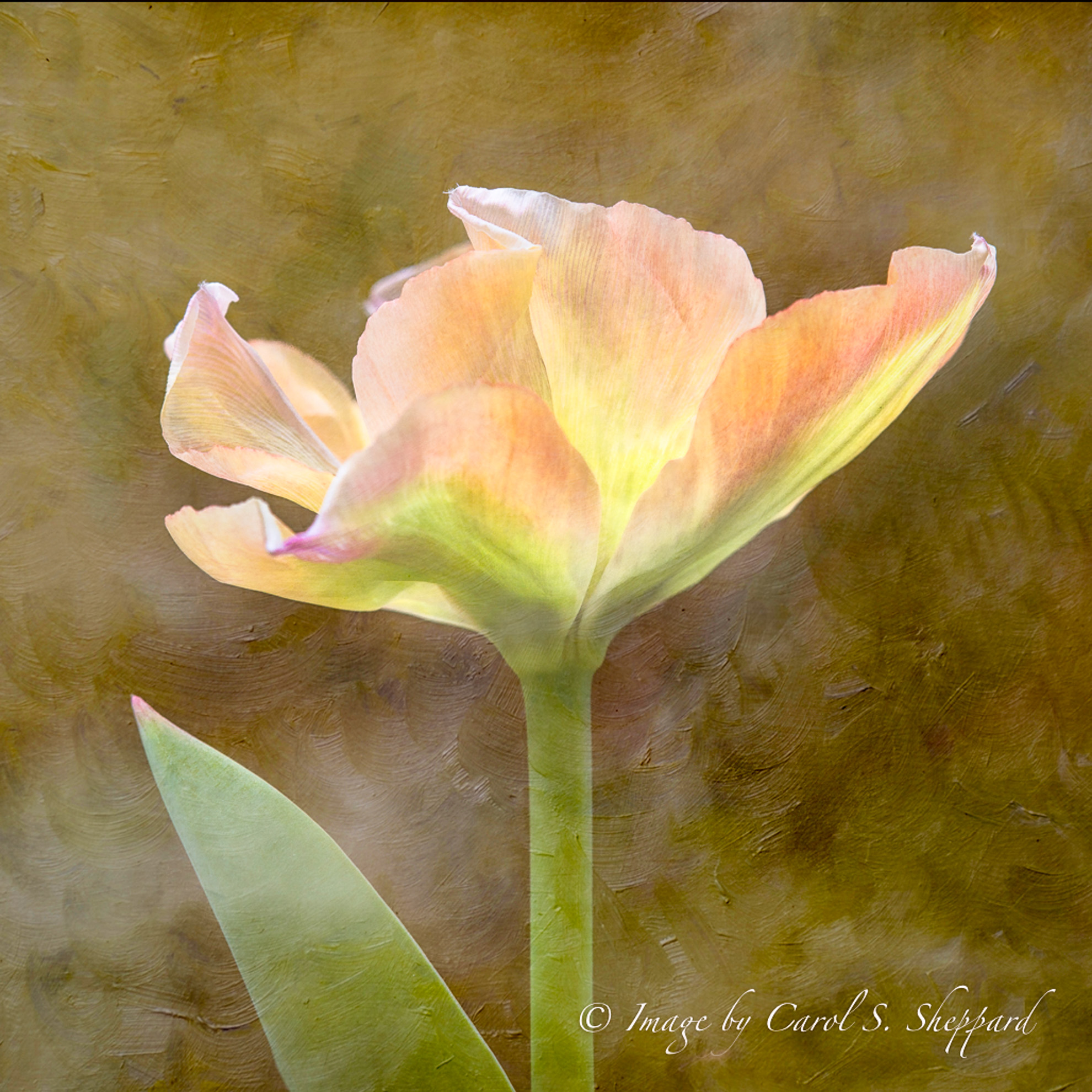
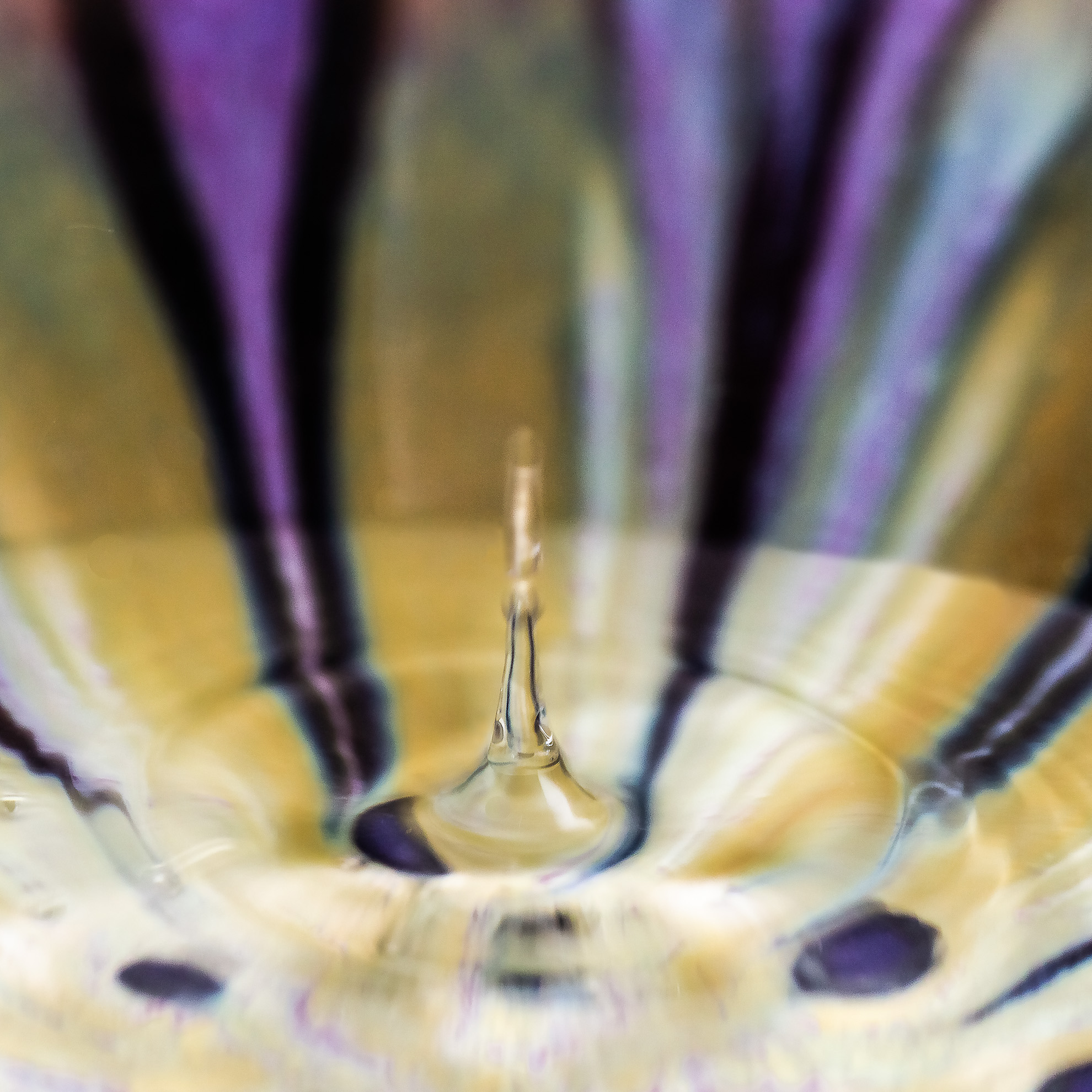
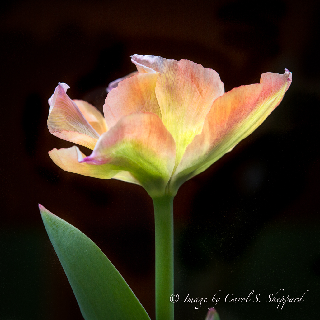
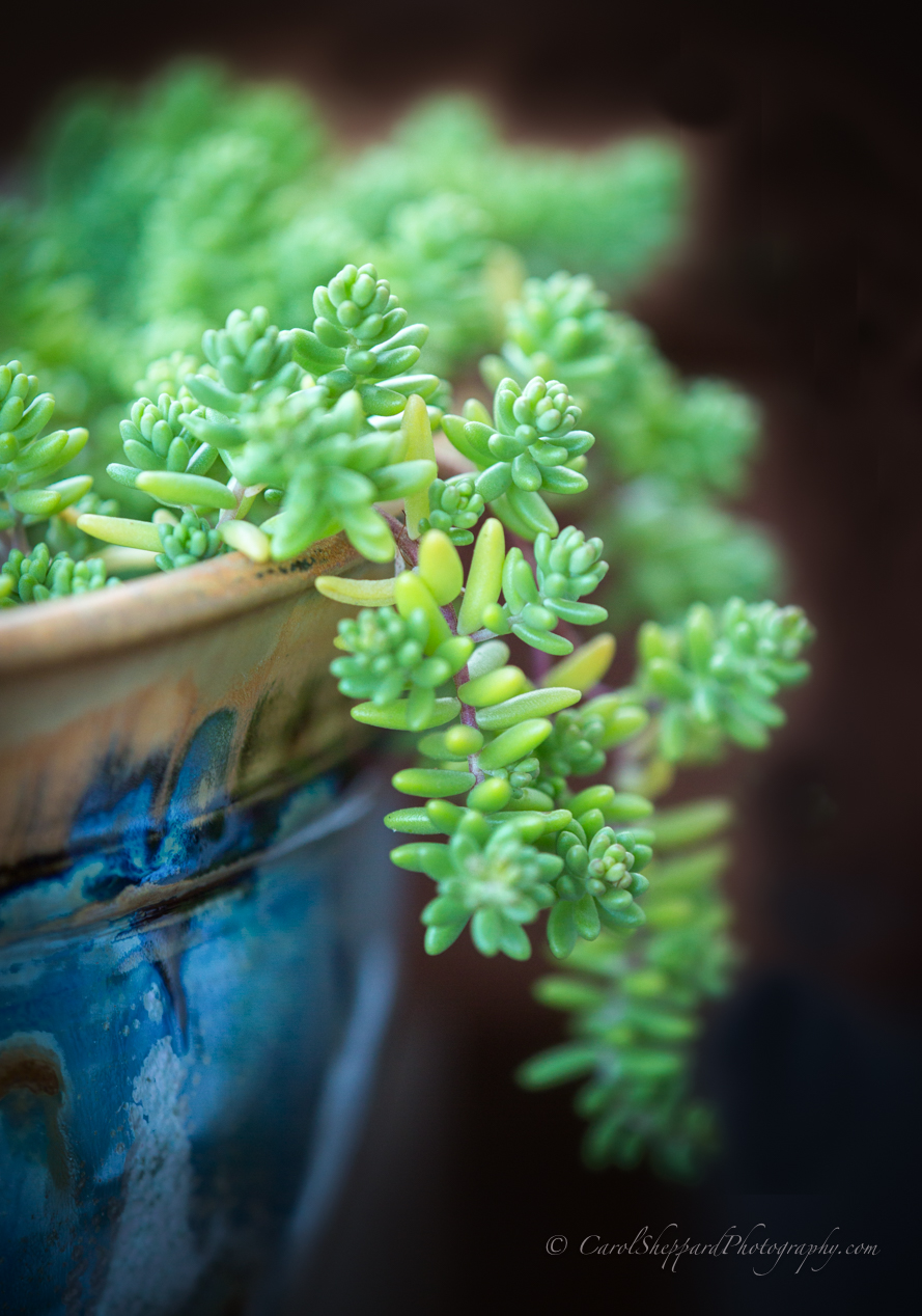
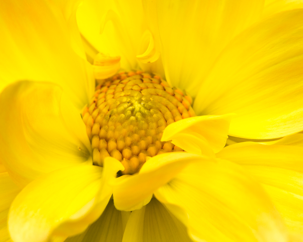
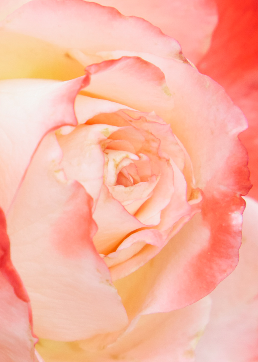
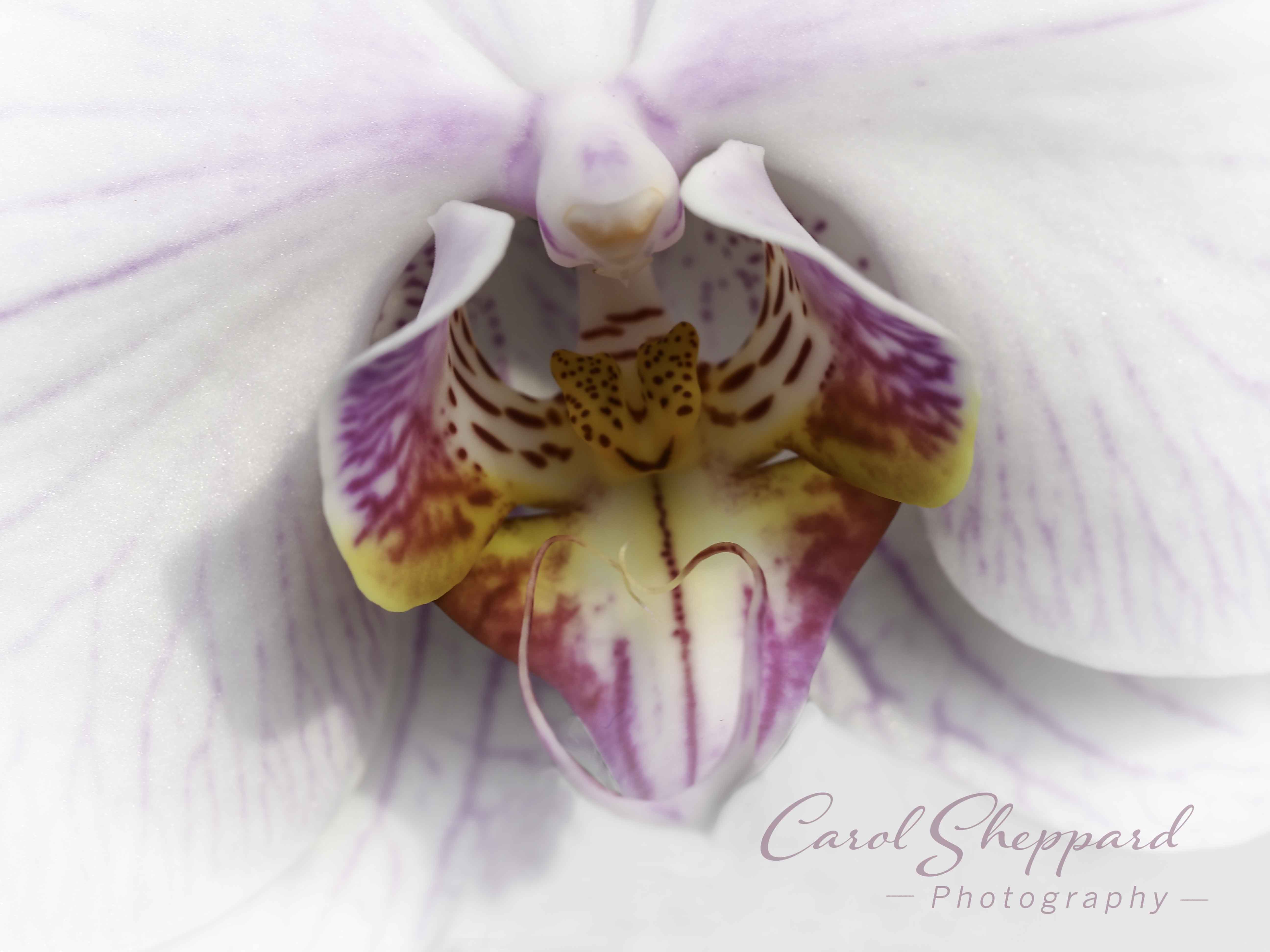
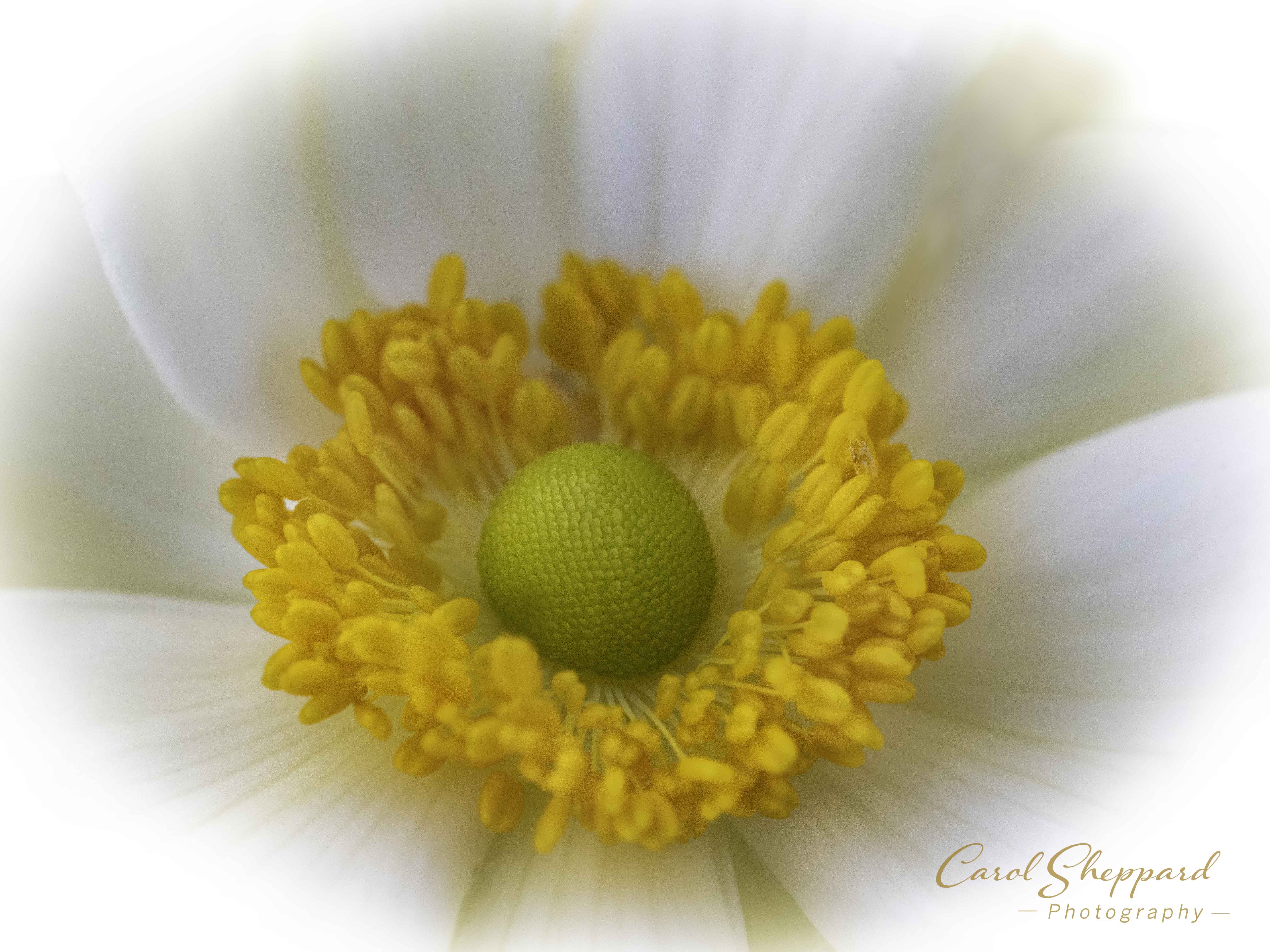
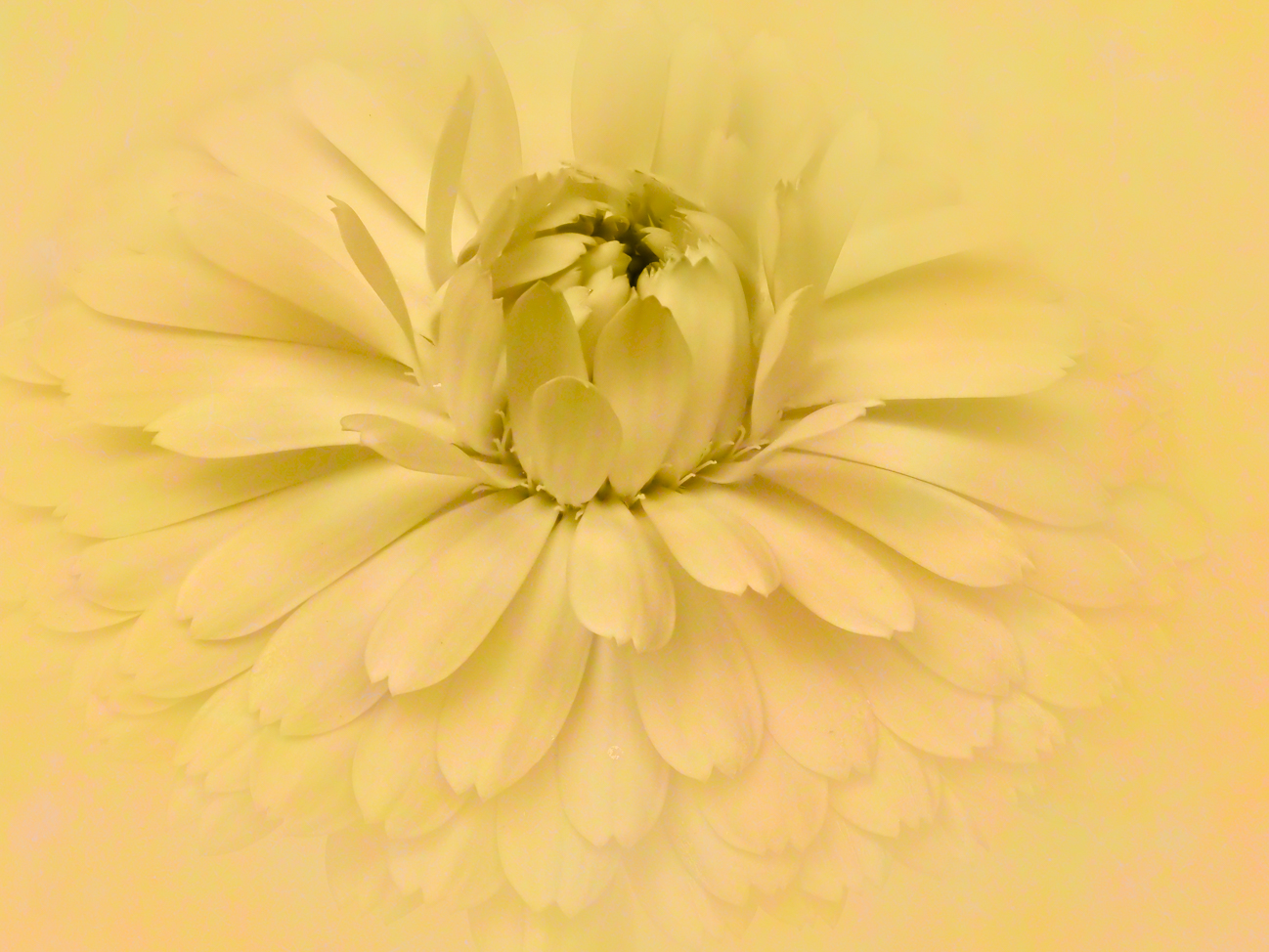
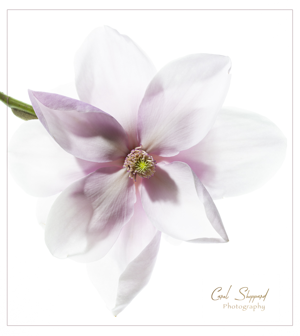
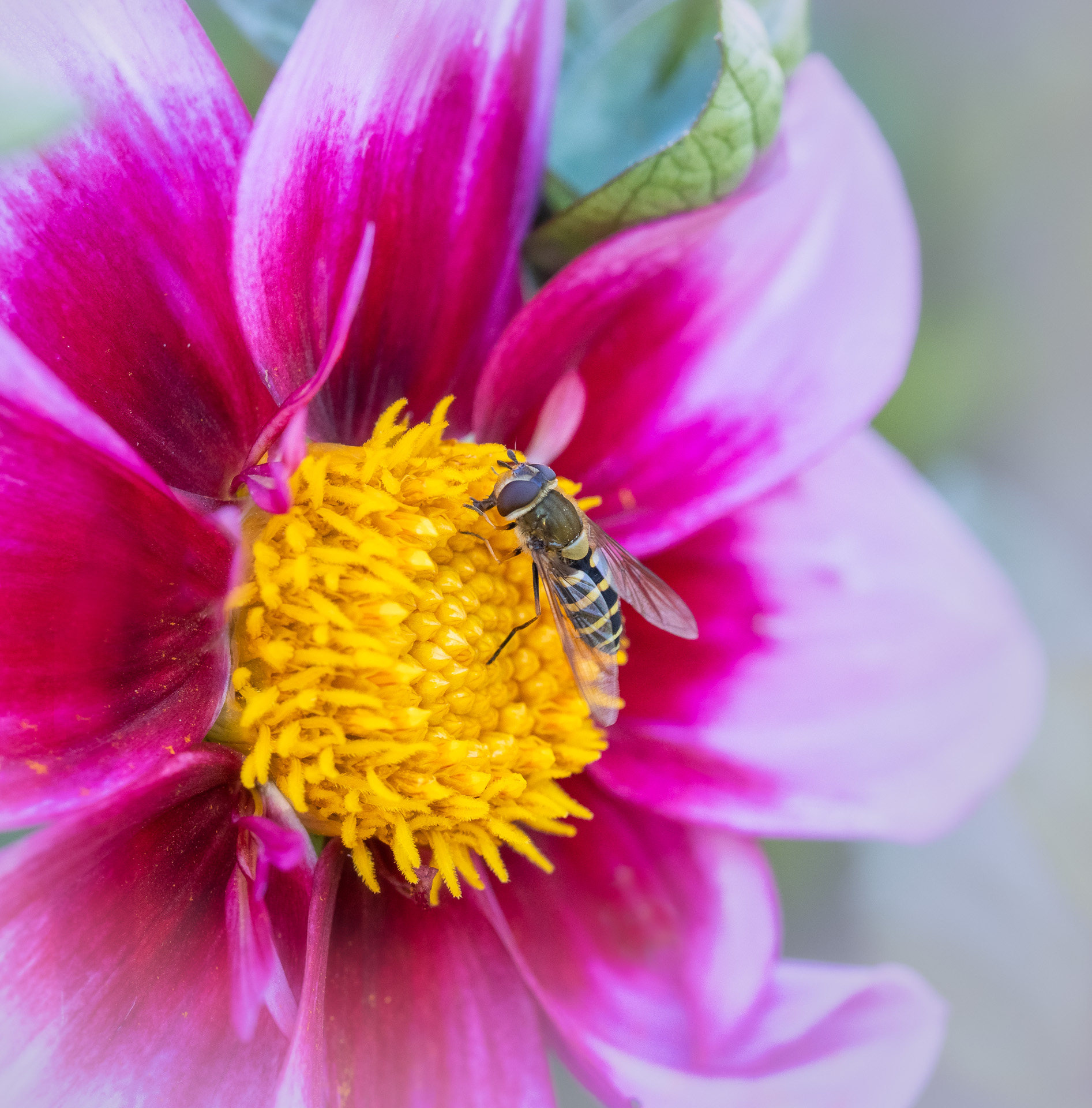
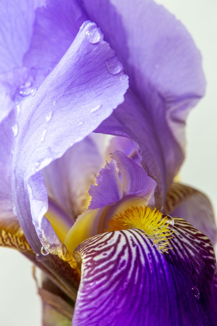
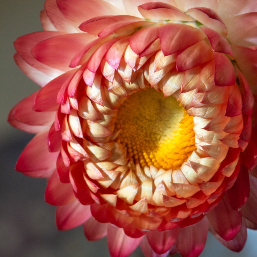
The image has an overall innocence that is appealing to me in viewing it. The focus is very sharp and clear on the stamen. The blur on the front petals is distracting, though, to me as a viewer--that large one right on dead center. Increasing the aperture is the easiest fix, and you have plenty of room to do it. Was it on a tripod? I think at 1/20 it had to be. So you could go much slower to compensate on that aperture. The black background and the limitation to a single bloom is very pleasing. |
Dec 10th |
| 60 |
Dec 18 |
Comment |
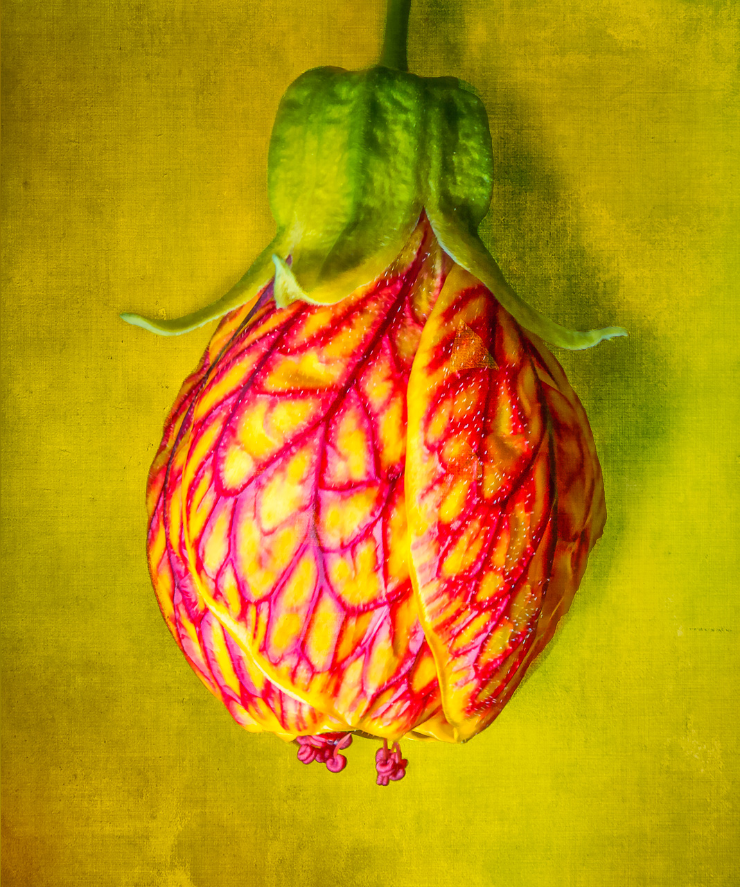
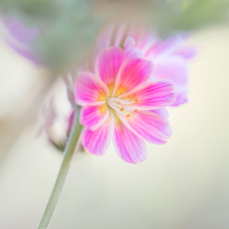
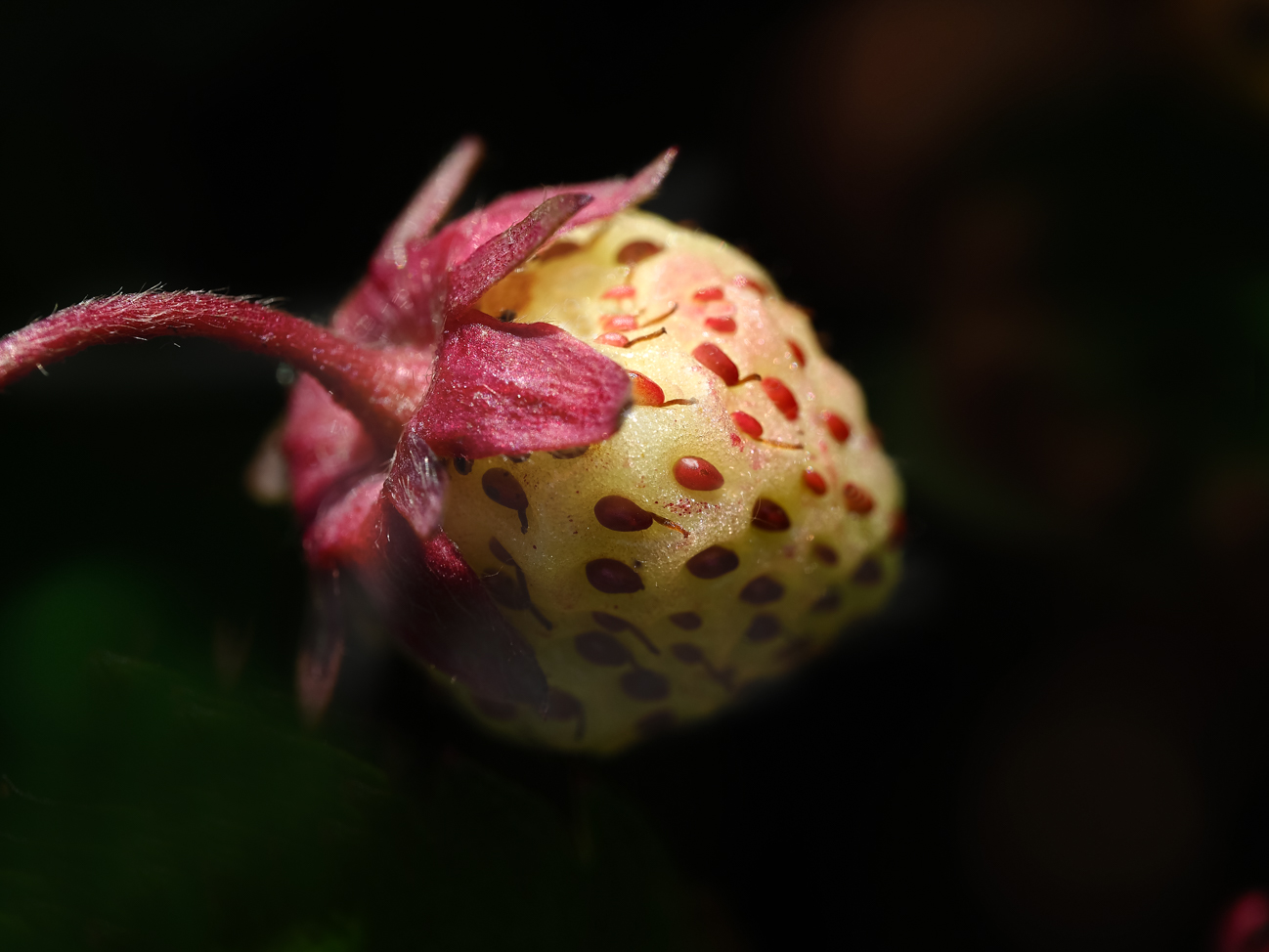
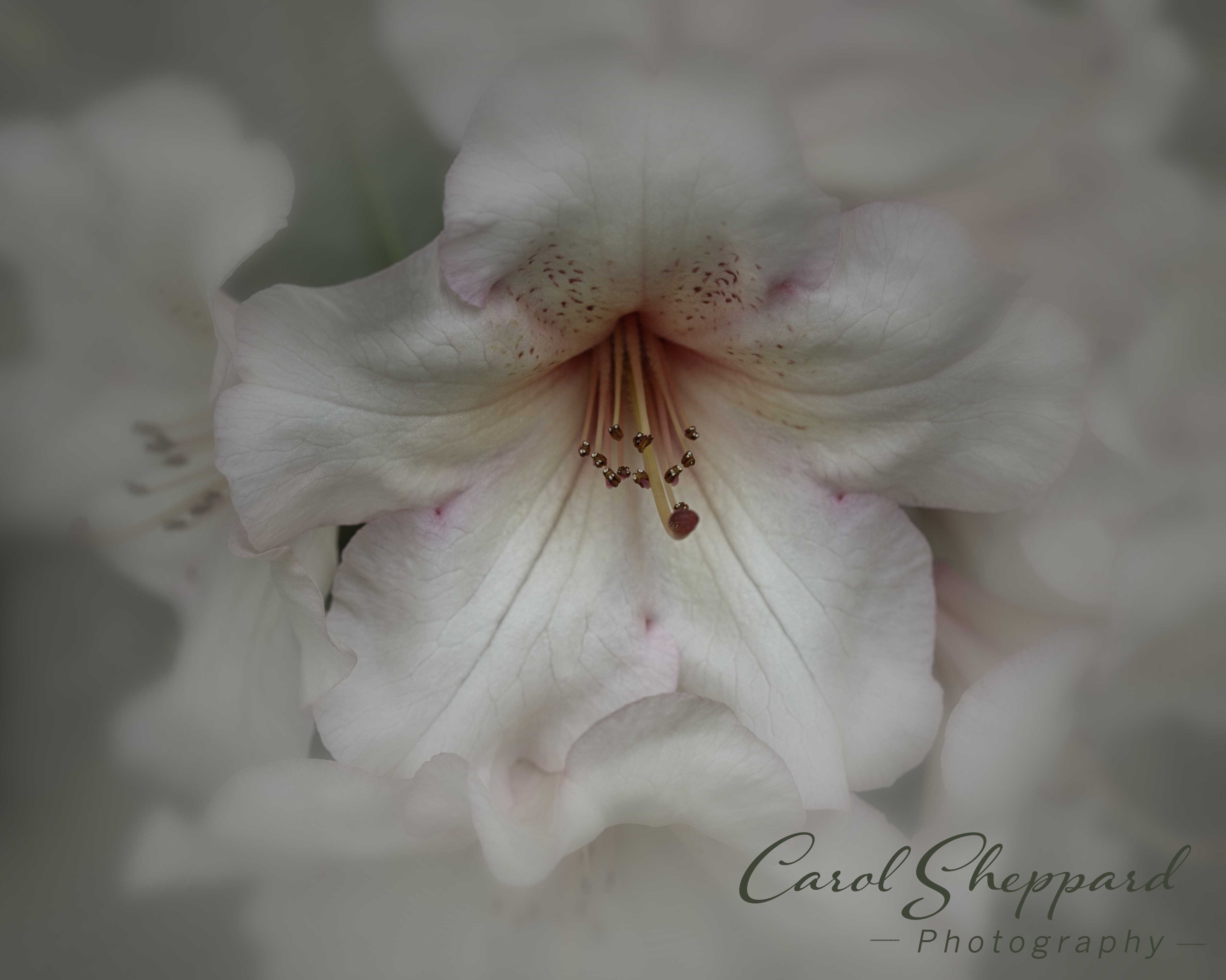
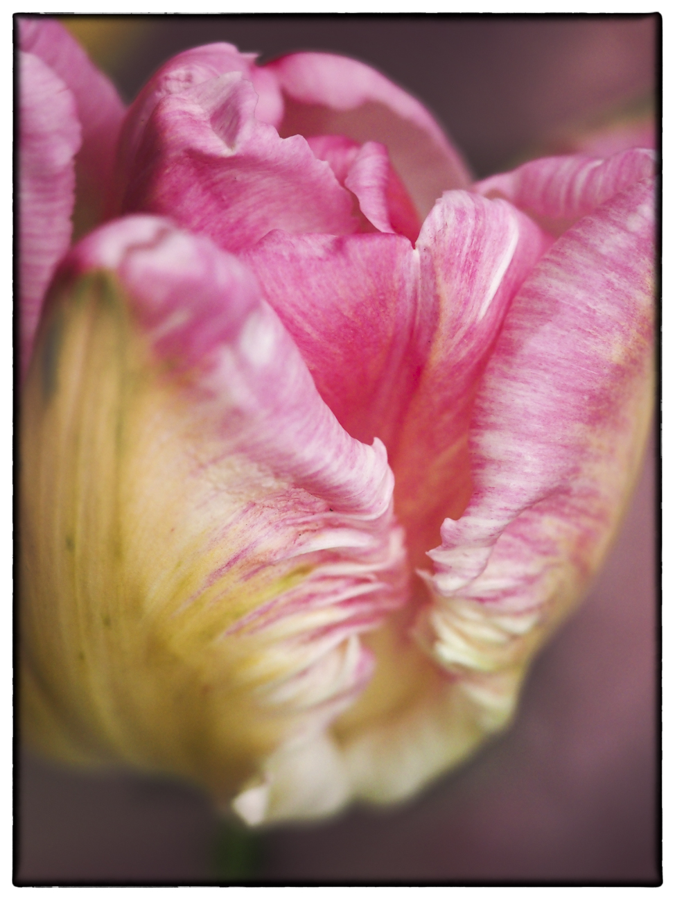
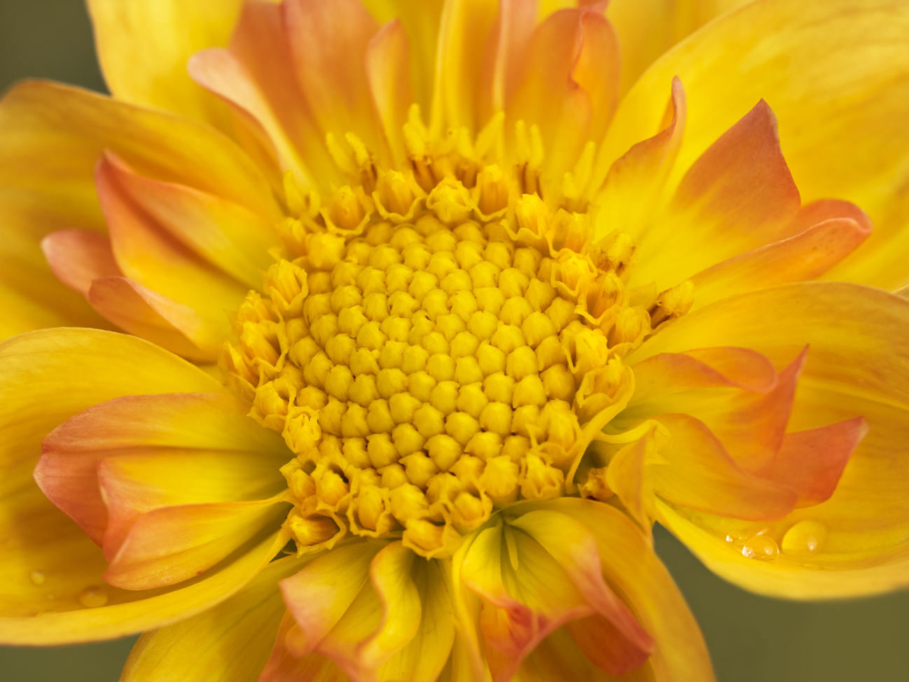
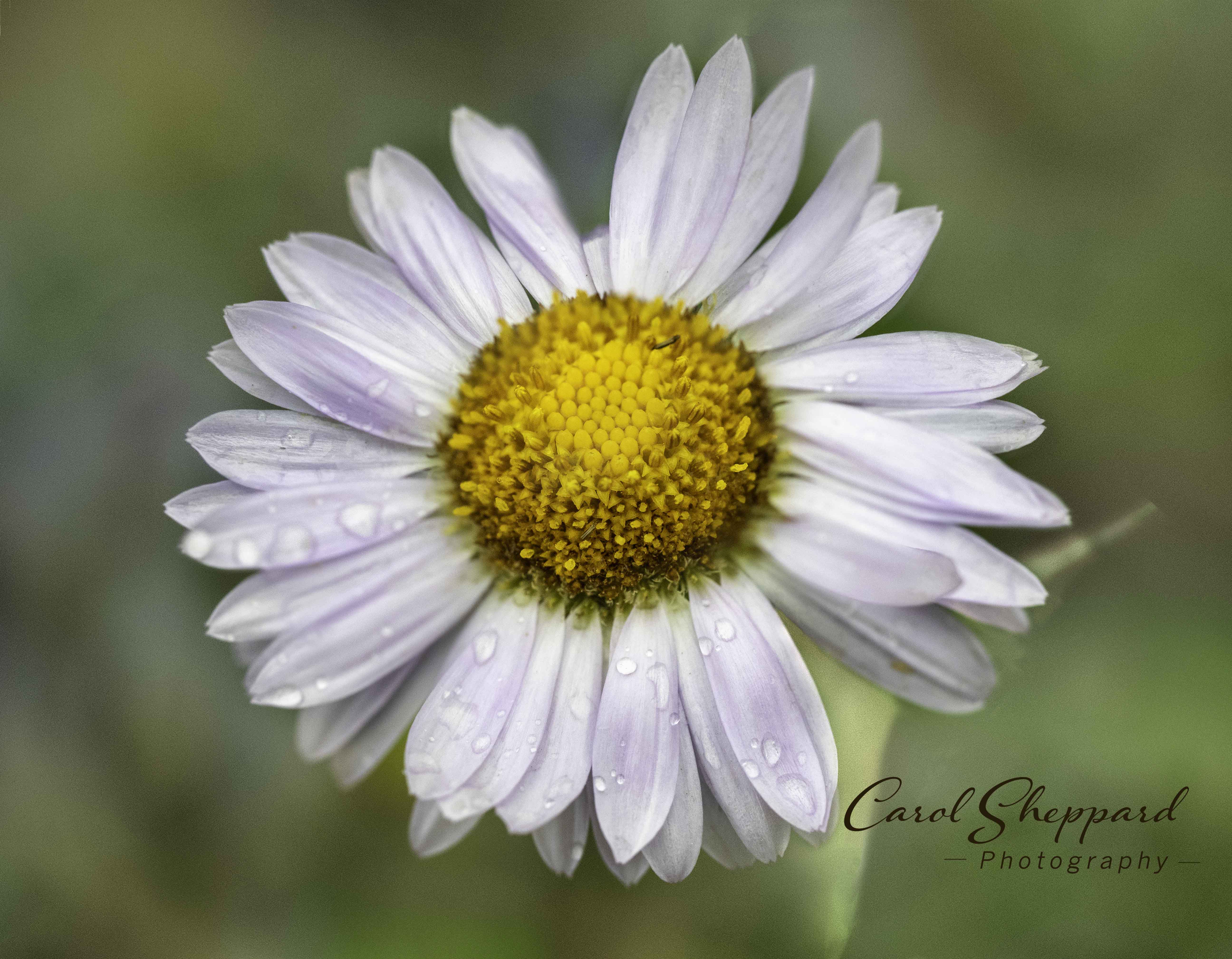
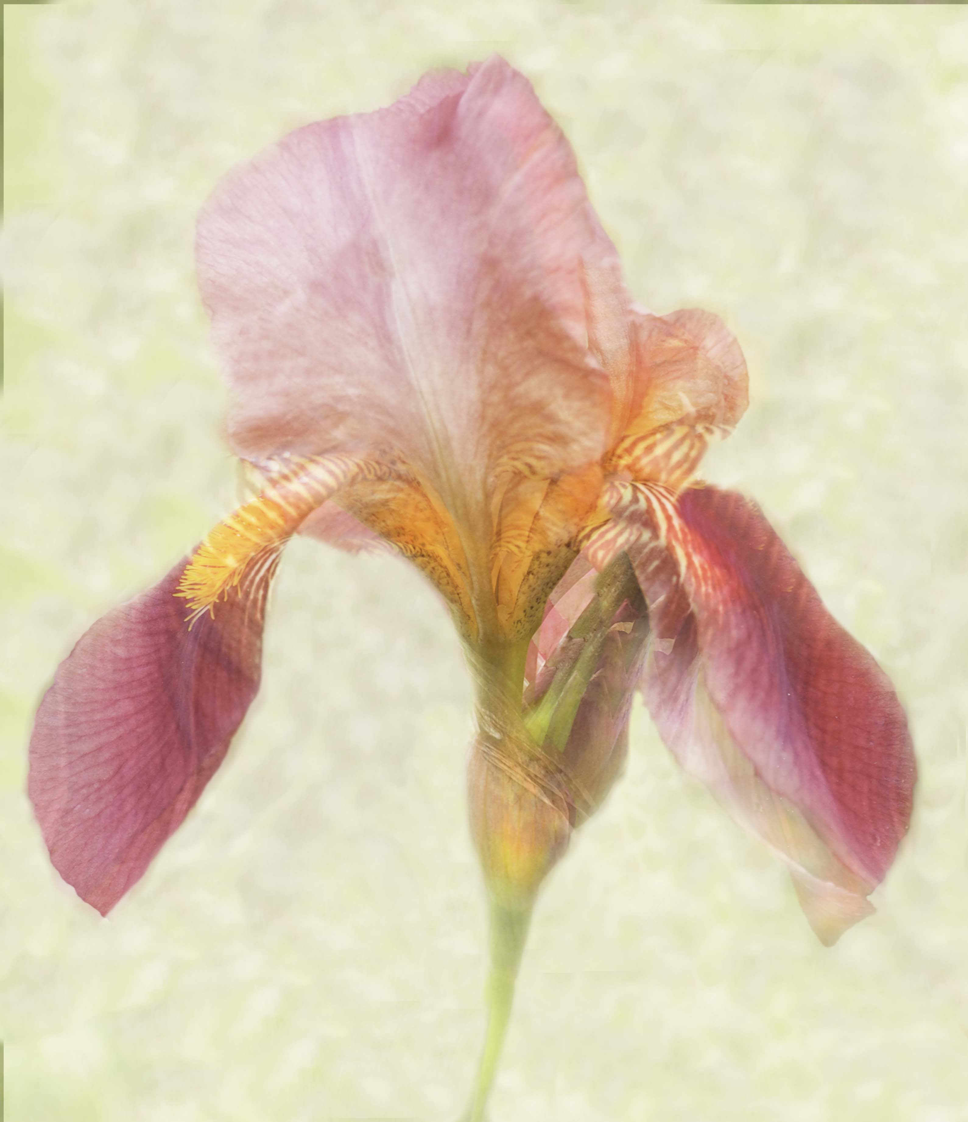
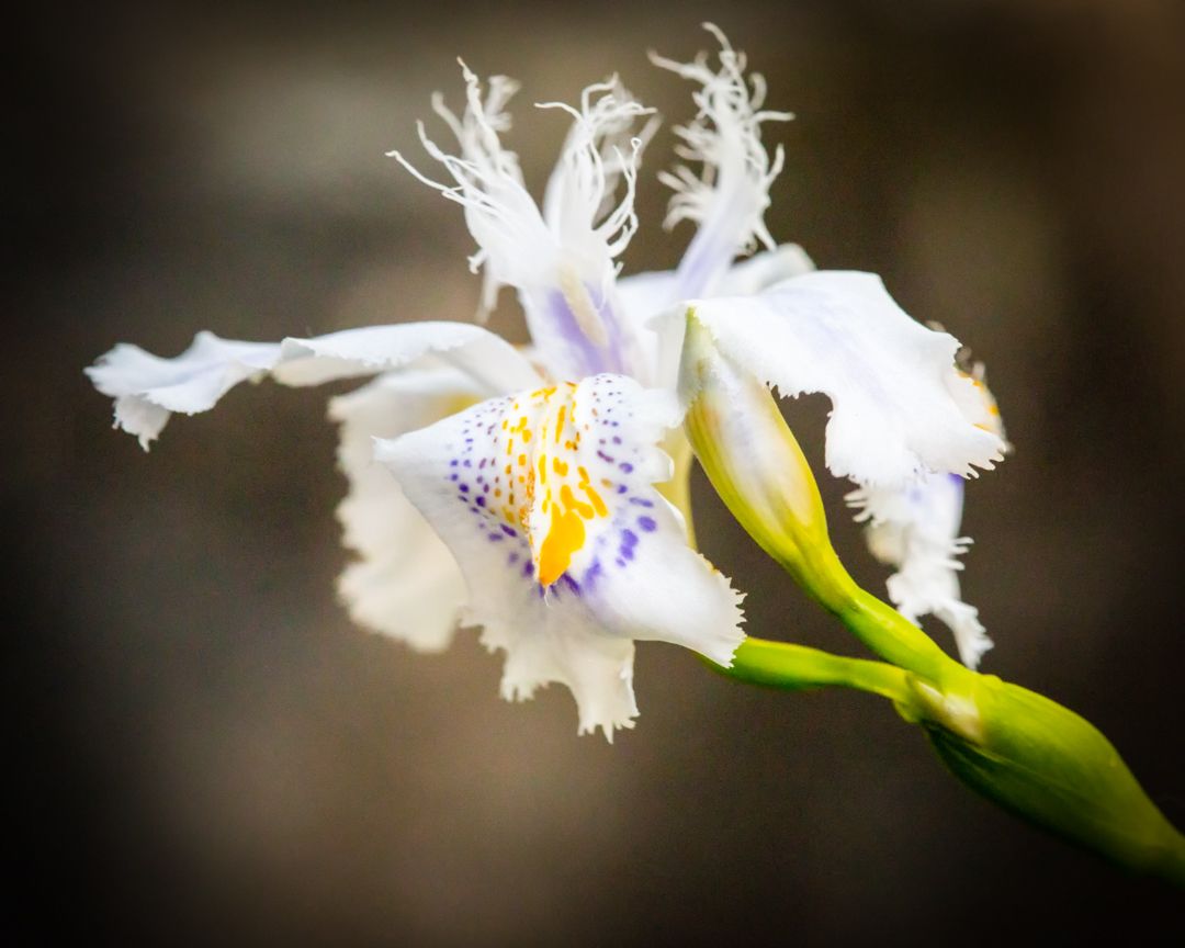
The composition of this works very well, and it is also very unique and appealing. I also found the combination of colors very pleasing, as well as the lines of the petals. On my system, there is a lot of out of focus pieces, along with some general overall softness. I have been very curious lately about focus stacking, so wonder how that would have affected this shot. Definitely increasing your aperture would be a necessity on this and you could accomplish that easily without affecting other things, given your use of a low ISO. However, handheld would have prevented you from lowering the shutter speed. Interesting--loads of potential!! |
Dec 10th |
| 60 |
Dec 18 |
Comment |
Yes, there is a lot going on there. It definitely isn't any kind of competition worthy picture, just something fun I did--photographing a train covered with graffiti. Your version and mine don't impact me any differently, but maybe someone else? Next month I go back to submitting normal macro images!! |
Dec 10th |
8 comments - 0 replies for Group 60
|
15 comments - 0 replies Total
|