|
| Group |
Round |
C/R |
Comment |
Date |
Image |
| 52 |
Sep 18 |
Comment |
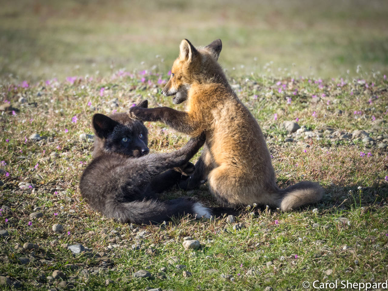
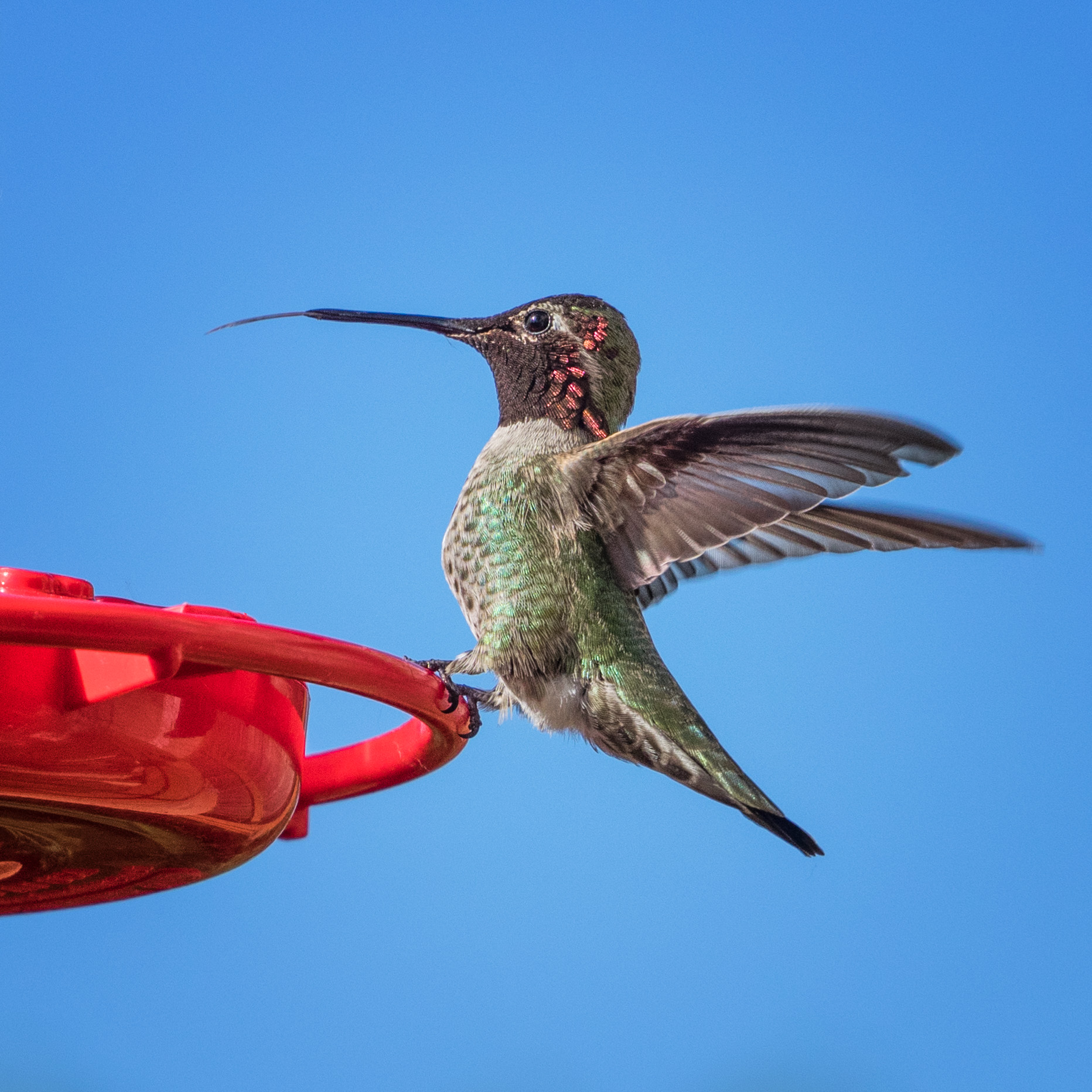
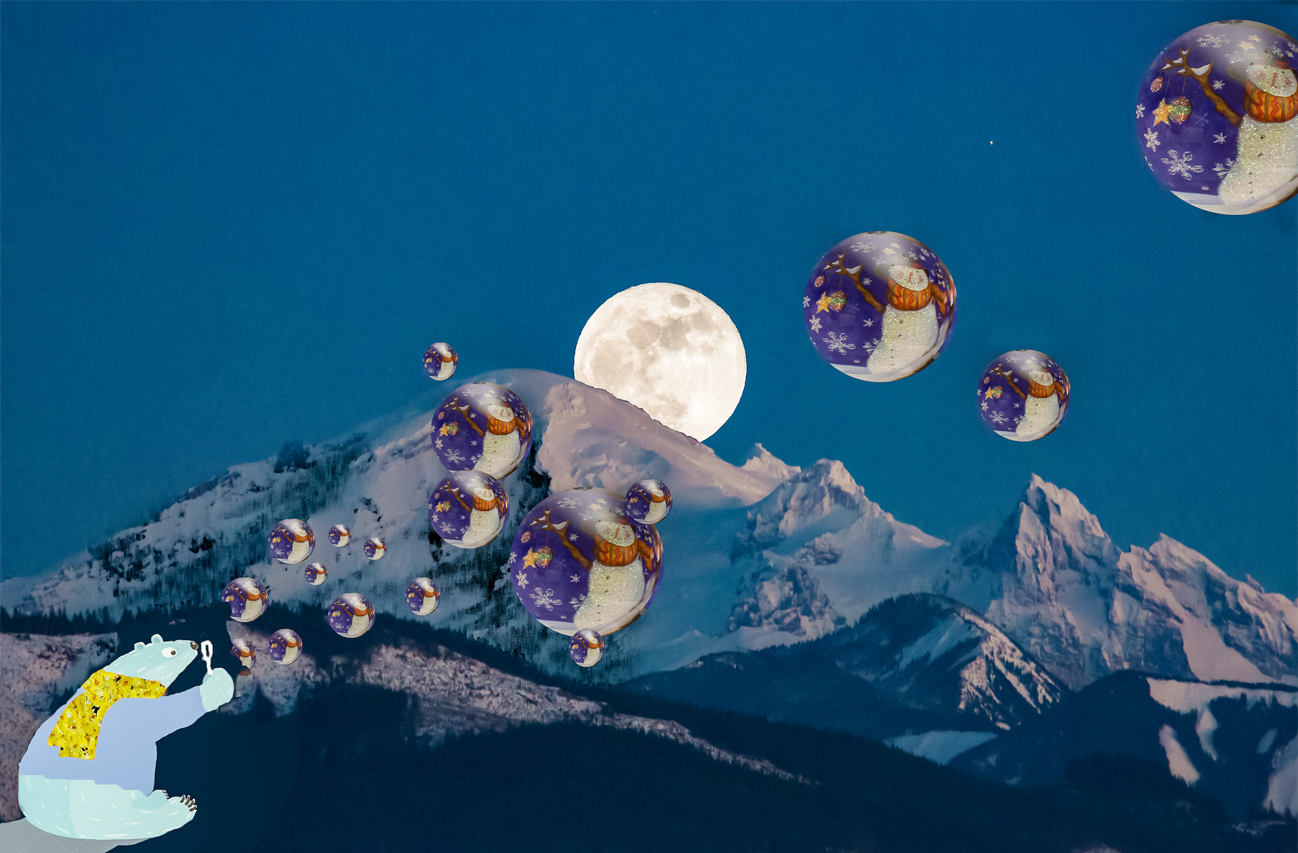
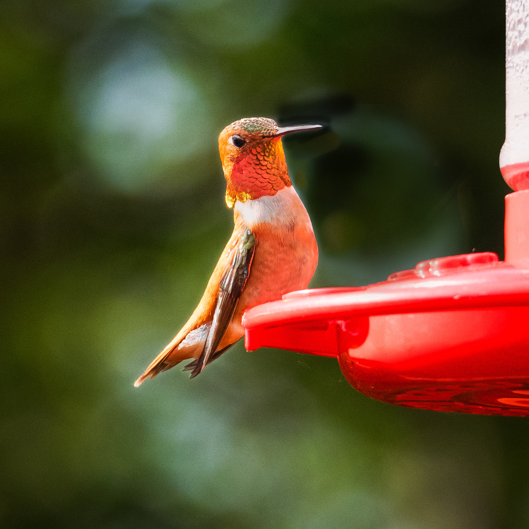
Thank you for the input! I think Tom's remake is the one that works best for me--all great suggestions, but I found that the first remake felt too "dark" for me. The sunlight was part of the beauty of the scene, the early morning crisp light after a rainy dark day, and the playfulness of the cubs that seemed to come from the sun after a storm. I absolutely can see that my version has too light of a background. That upper third should come down in brightness for sure. I will work on this! Sharon, what an interesting suggestion on the book; to be honest, I didn't even know about it being a thing at PSA. |
Sep 17th |
| 52 |
Sep 18 |
Comment |
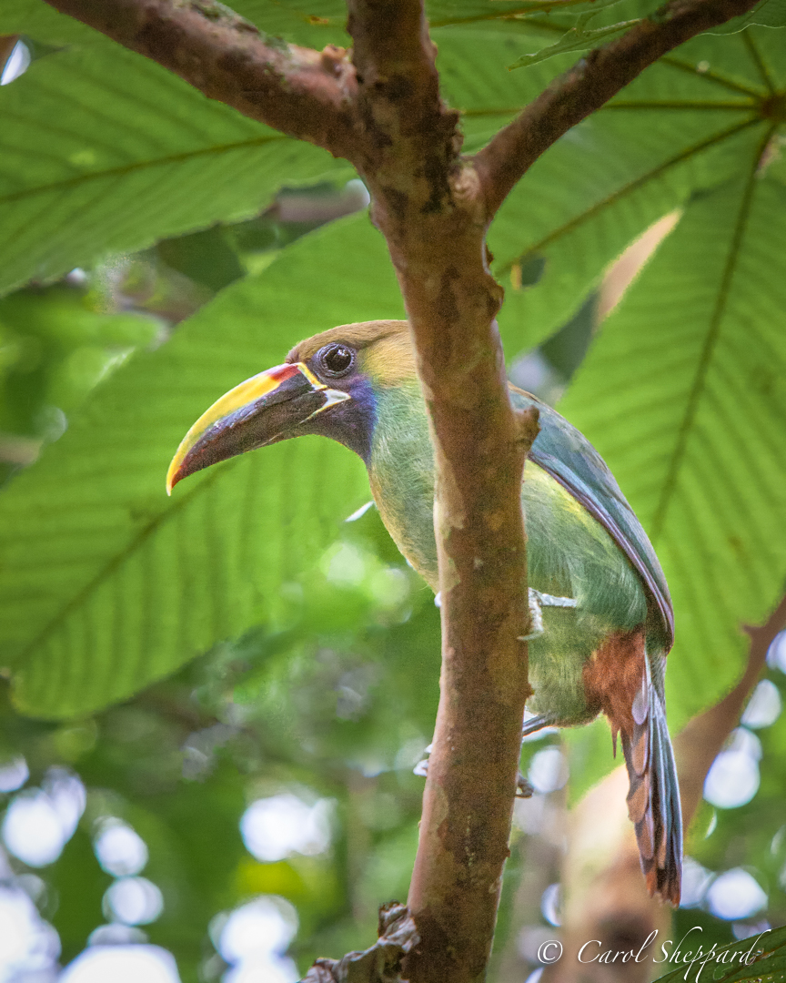
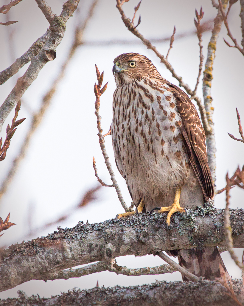
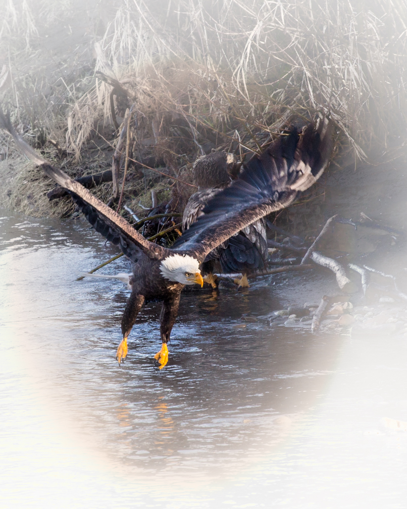
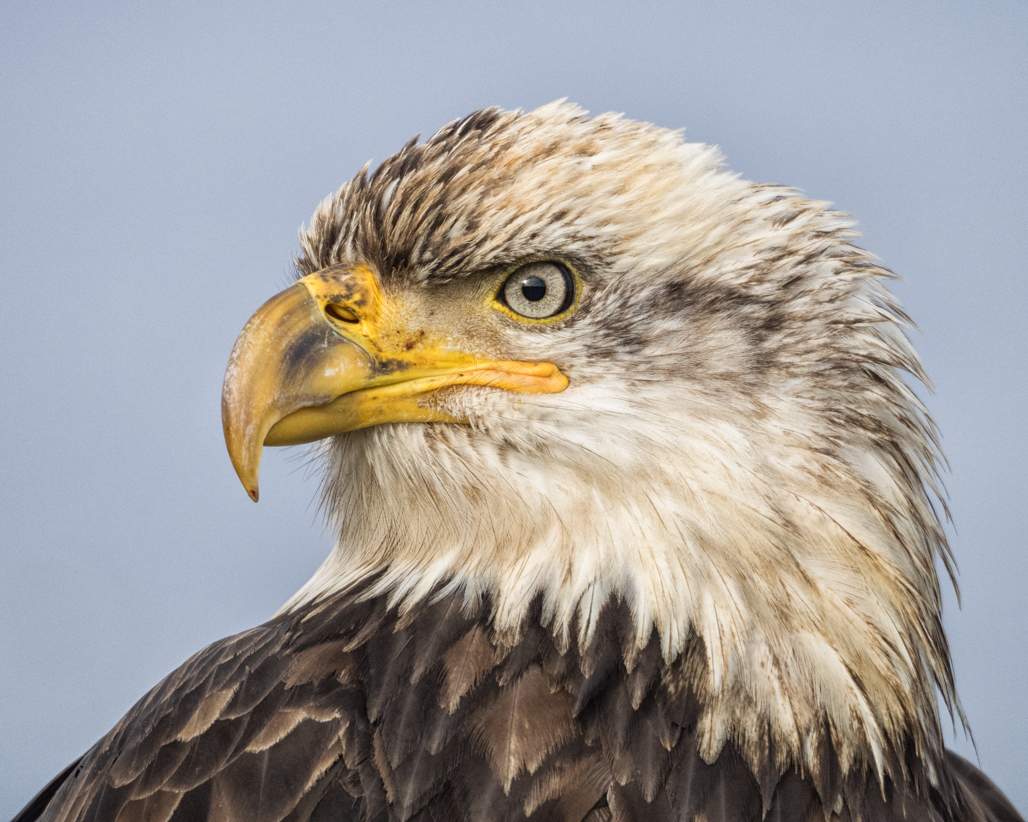
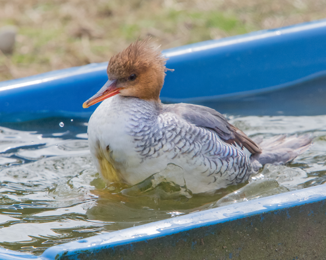
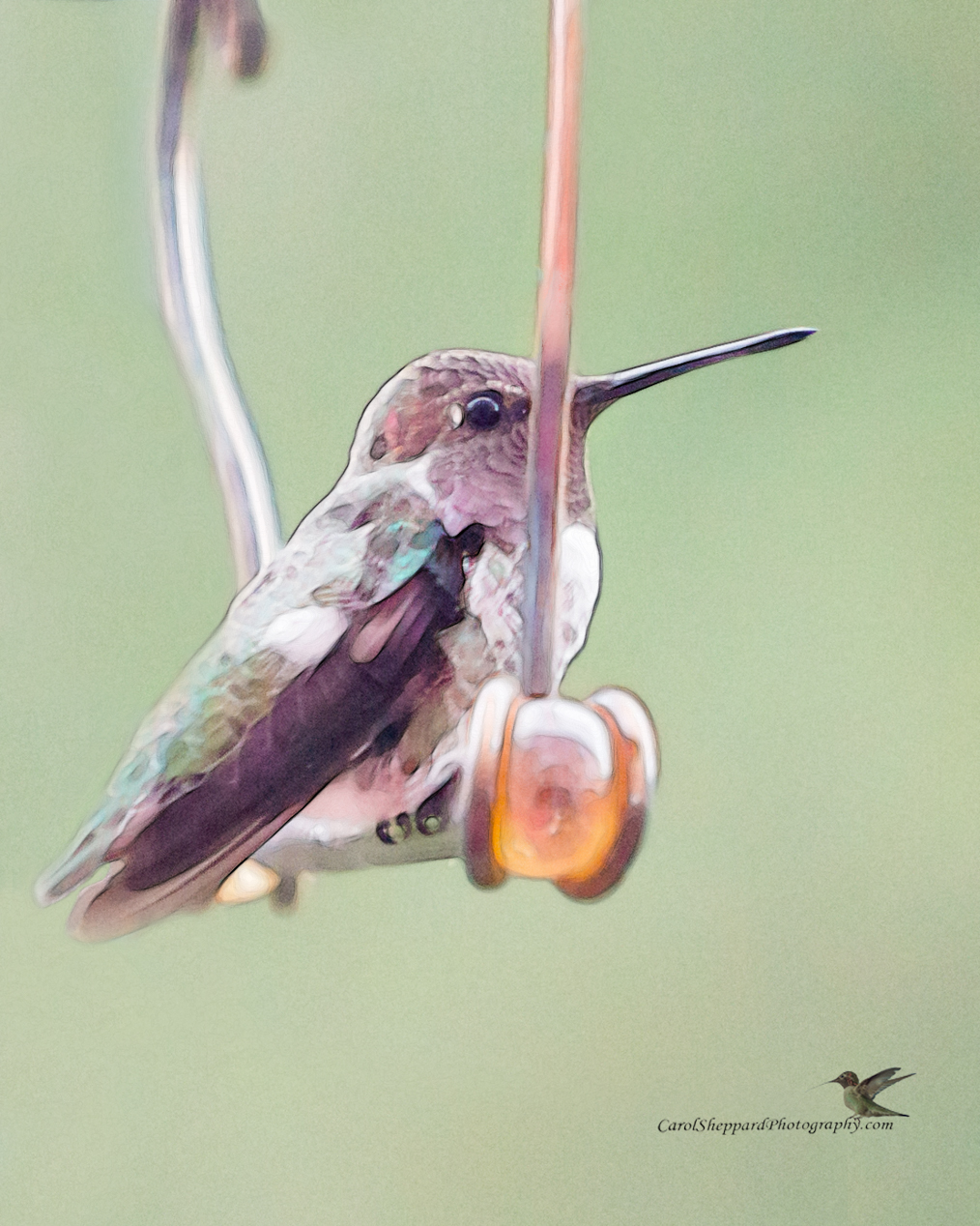
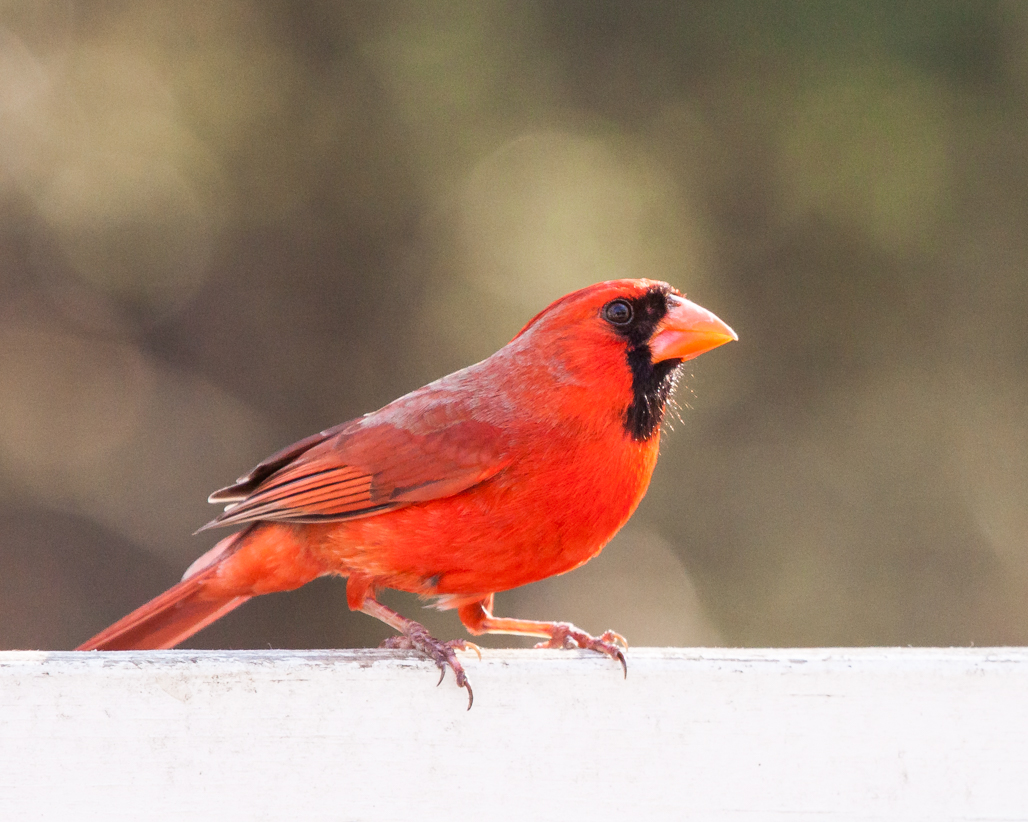
Mike, you are the king of catching the moment! Now, although I would like to see your image have more contrast and not be quite so light, I found the second version too dark, with much detail of the bird lost from his face and body. After studying it, I think the bird is exactly exposed correctly, and if you do a subtle darkening of that band across the top, maybe with graduated darkening of just the top third, you might bring out the bird more while not losing all of that beautiful detail. I do love this image! |
Sep 17th |
| 52 |
Sep 18 |
Comment |
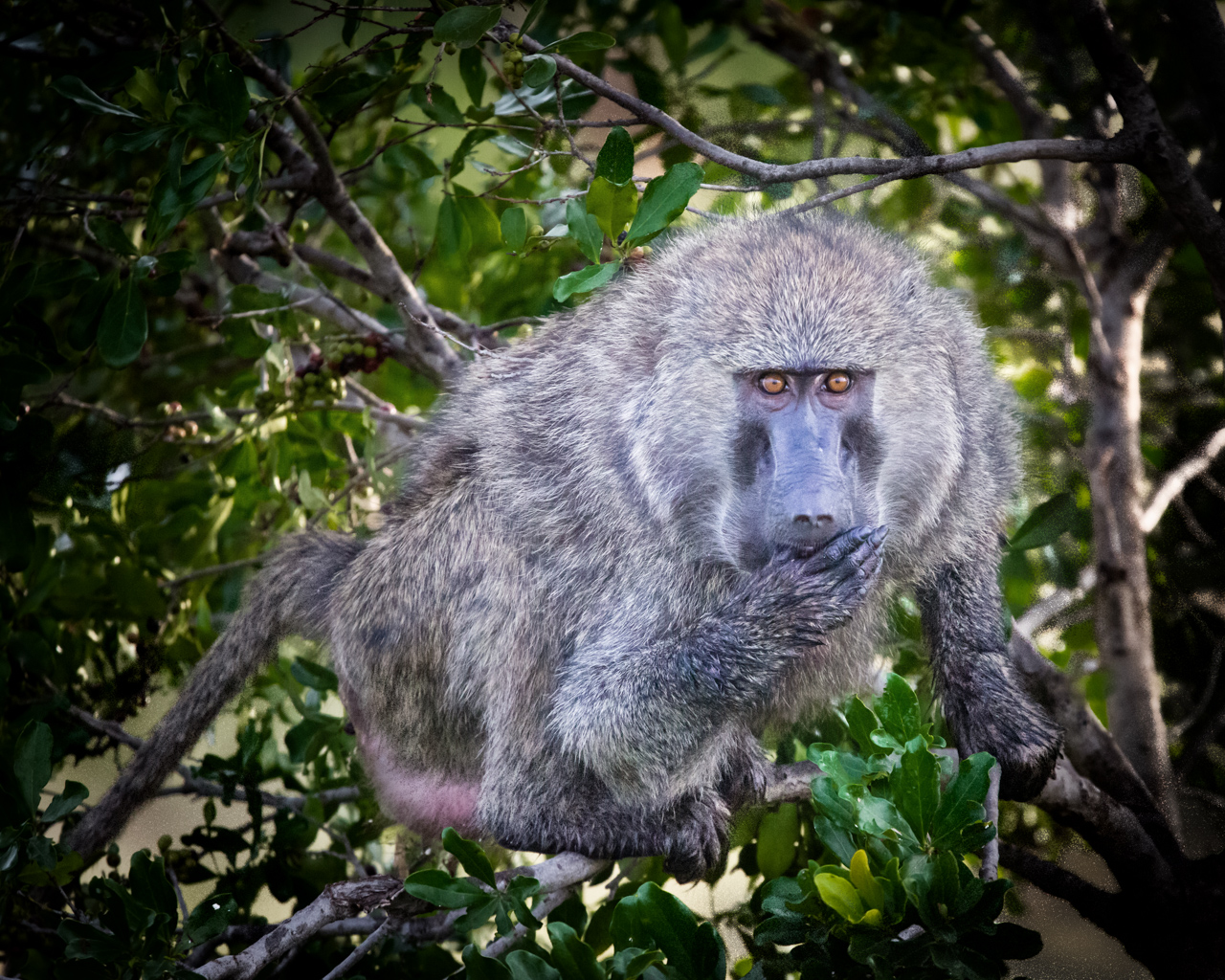
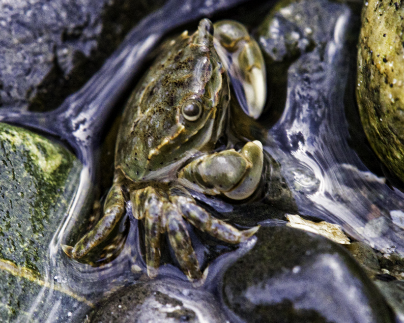
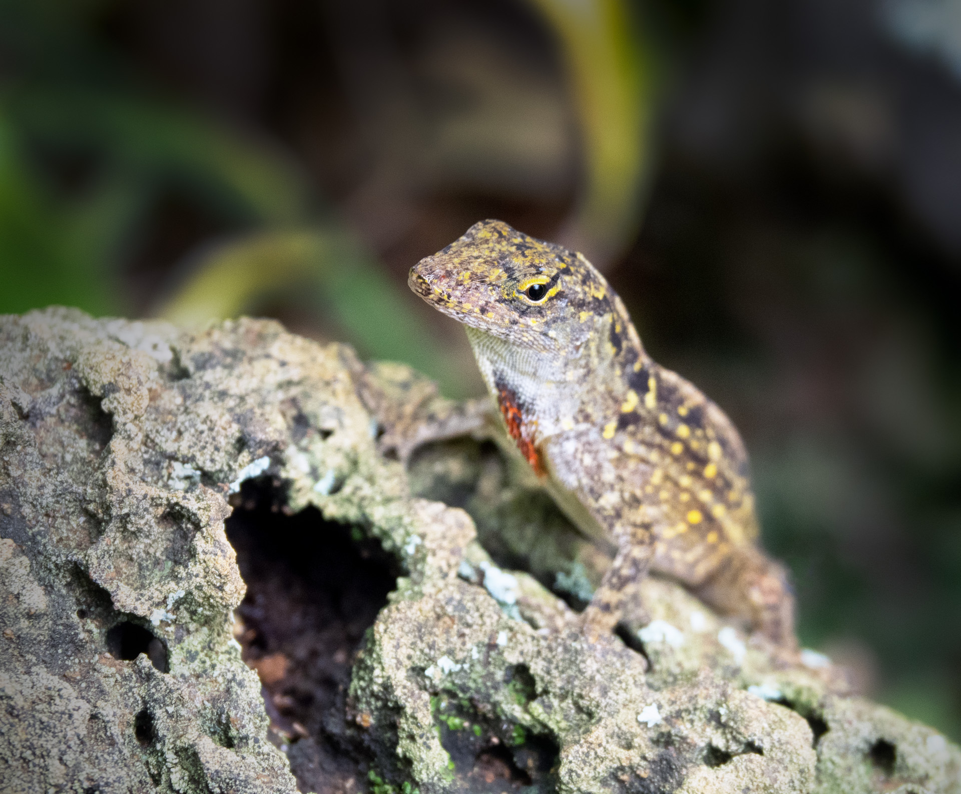
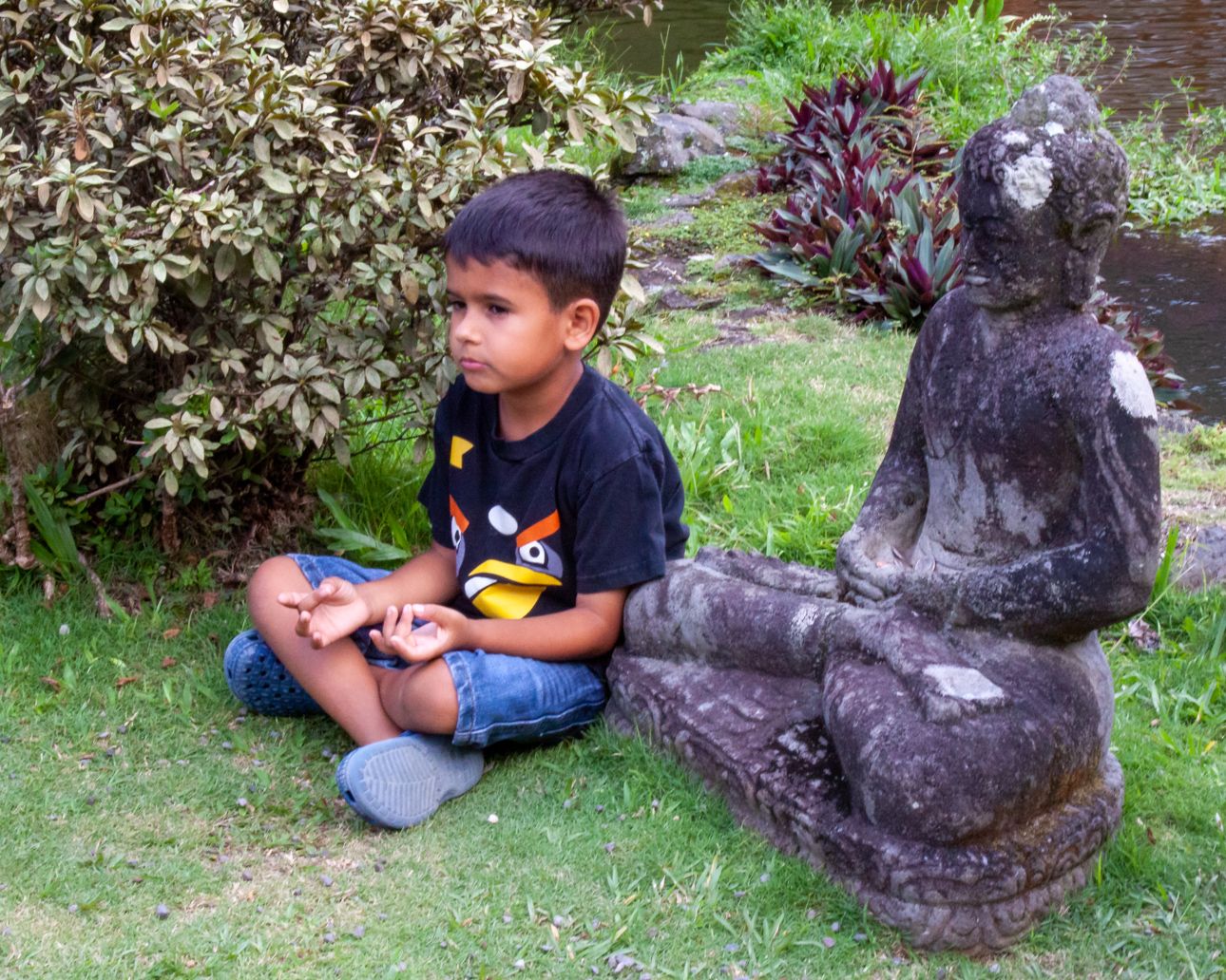
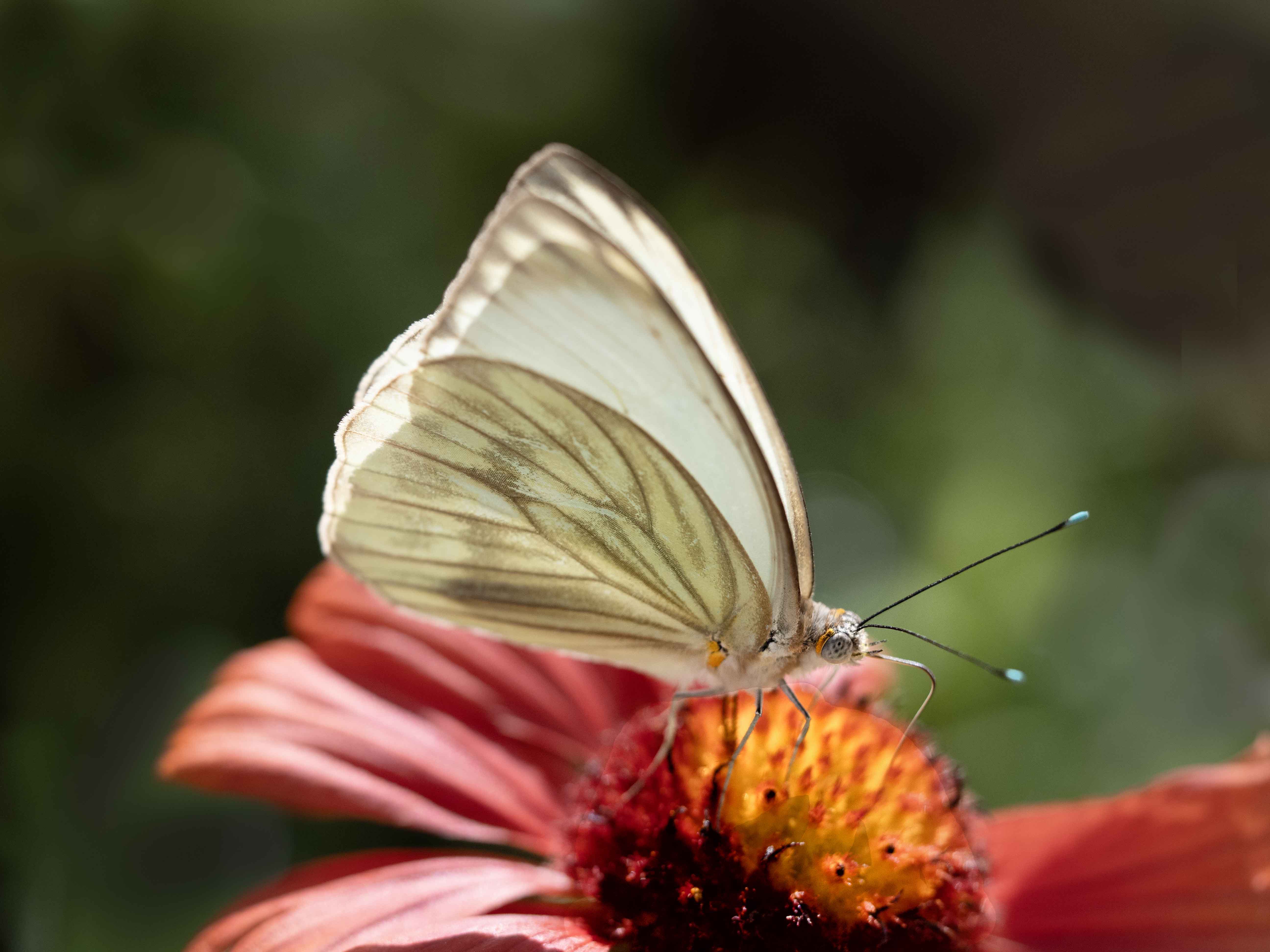
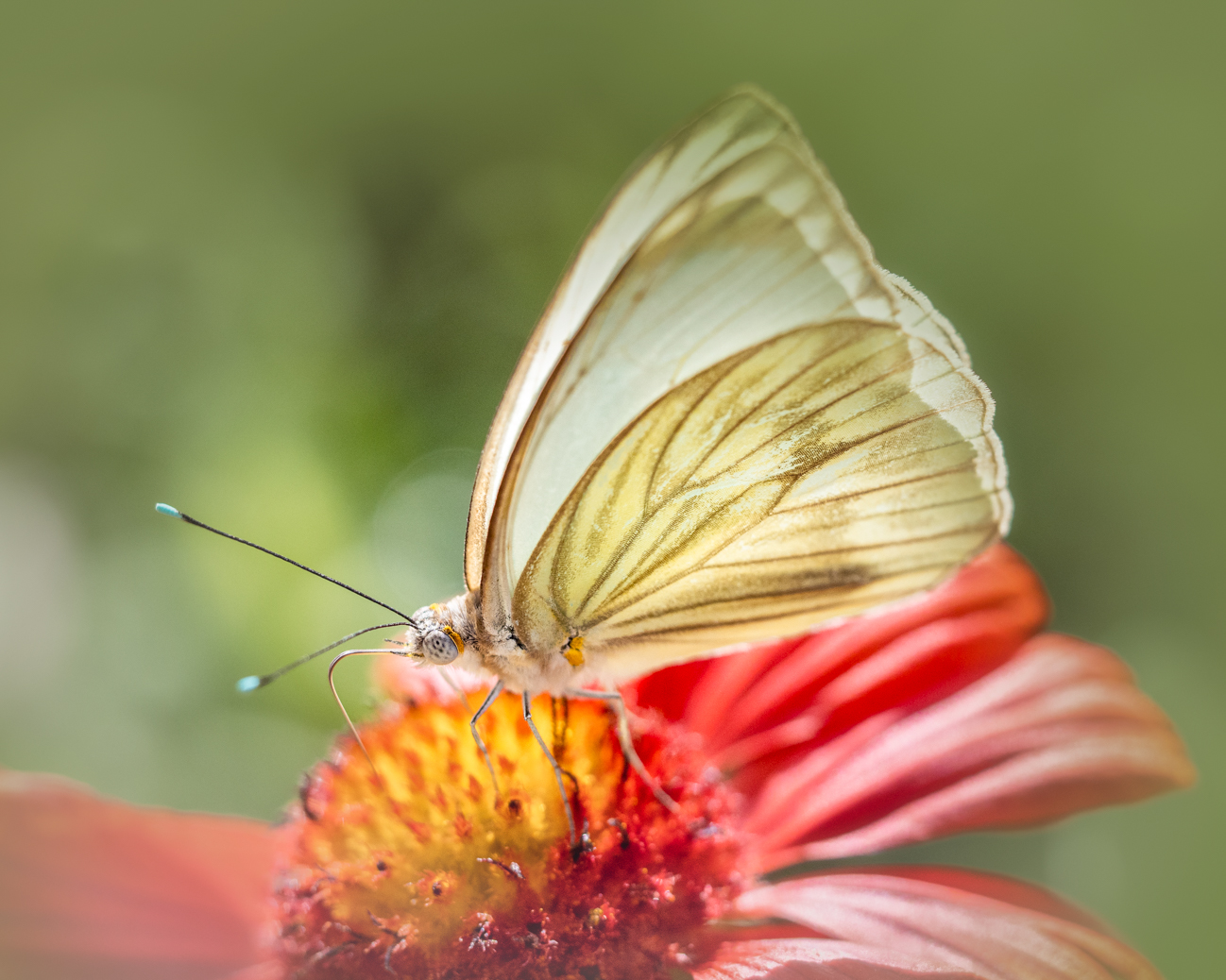
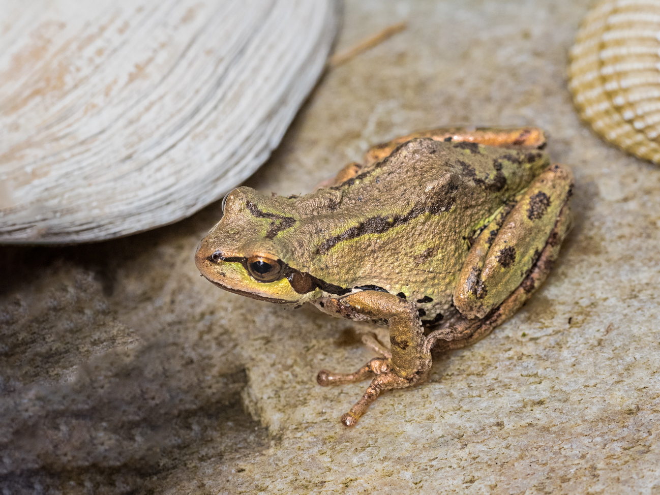
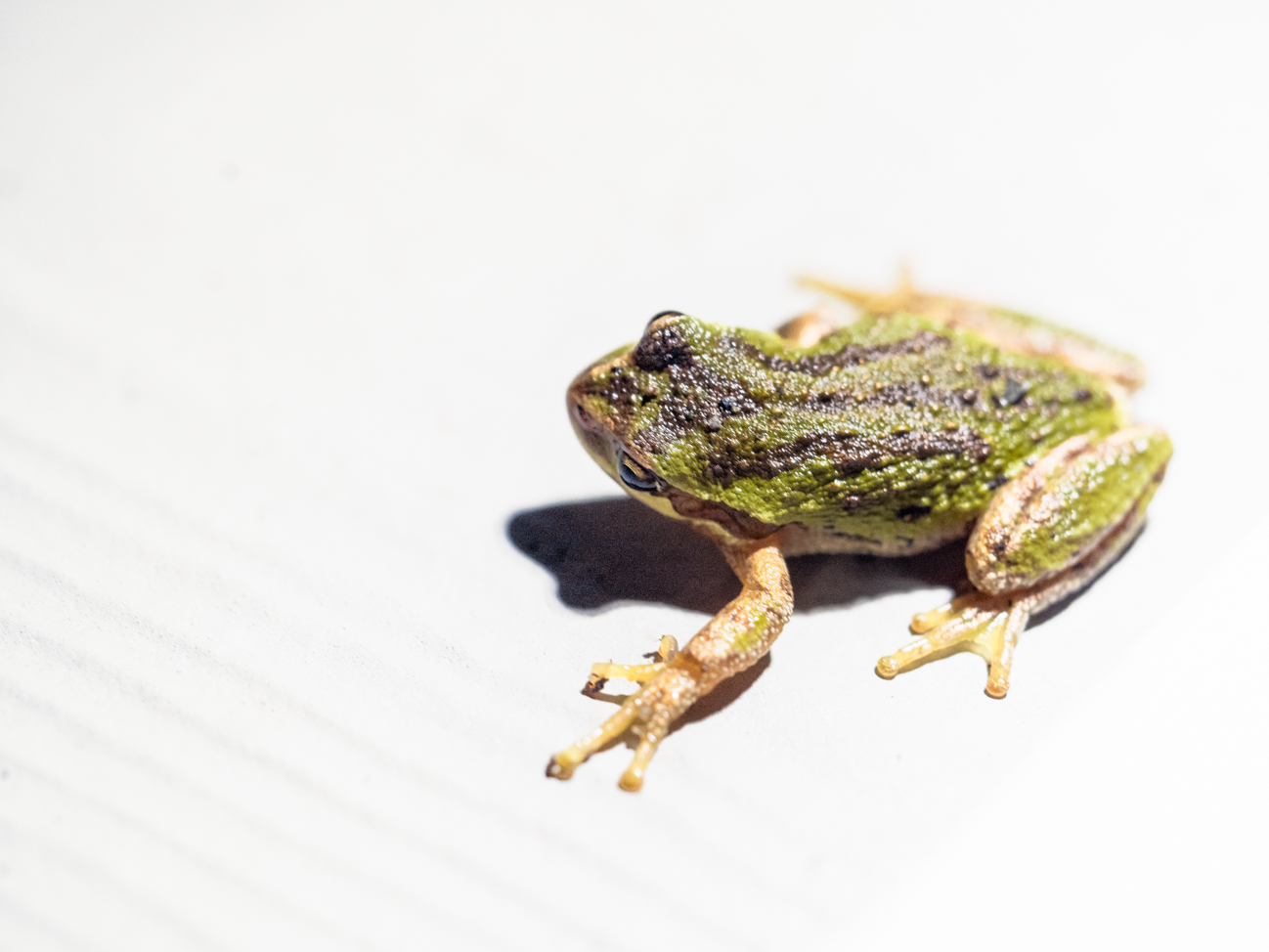
Judith, cool shot!!! It's like a frog portrait! While I like the adjustments, it created a totally different image and feel--not necessarily better but absolutely different. Personally, I like the feel of the first better. All of the emphasis is on the face and especially the eyes. The hands feel like they are folded intentionally into a pose--a great look and feel to me! Your version produces a texture of the face, while the second version balances that out and puts texture throughout the image, including the water area. I can't say I like it better; it's just different, artistically. Great image! |
Sep 17th |
| 52 |
Sep 18 |
Comment |
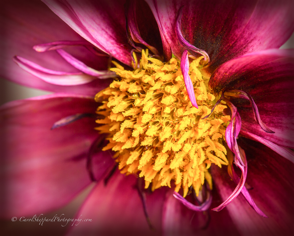
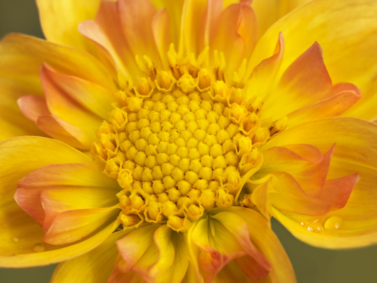
Your image has immediate impact and provides a "feel" from the way the light hits the background softly and very strategically and still touches the main subject. It is a very artsy image. The colors work well together, subtle but strong, with a great feeling of depth despite the soft background. Great image! |
Sep 17th |
| 52 |
Sep 18 |
Comment |
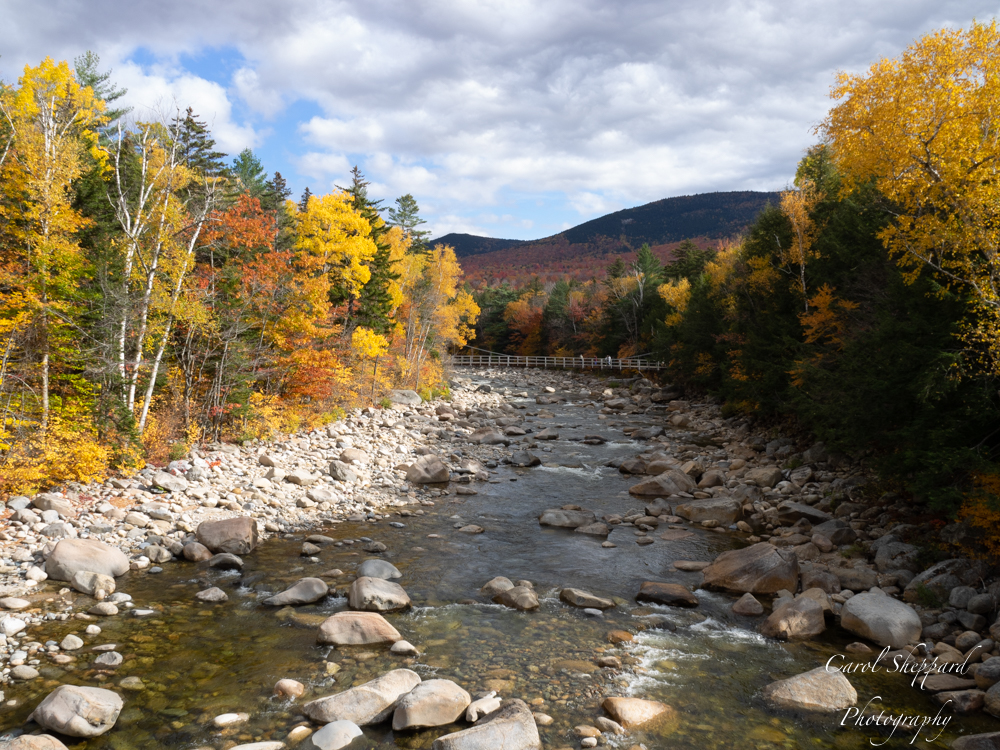
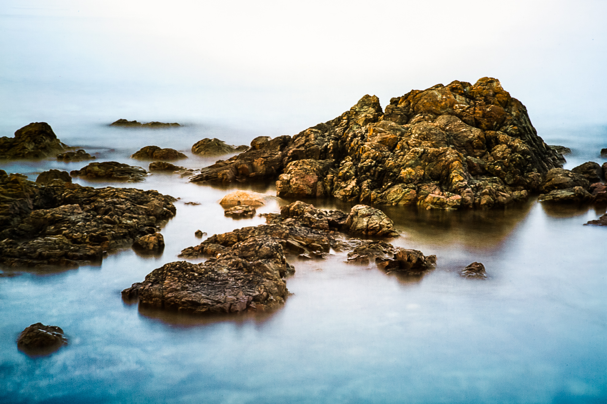
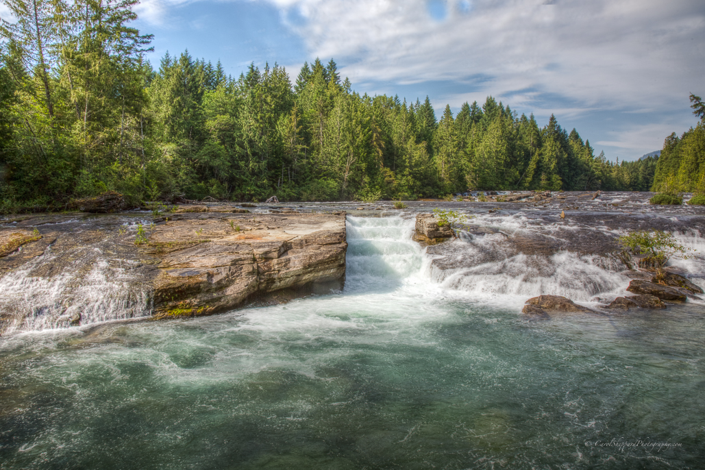
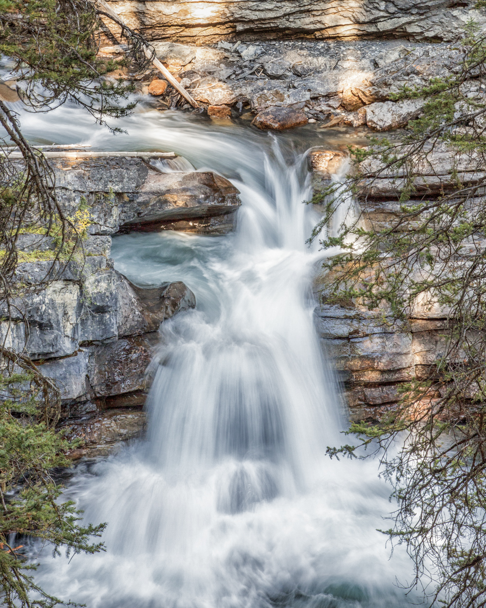
My favorite part of the image is how the light hits the rocks. Perhaps if you slowed the shutter speed down just a bit more, the rocks would become the true focal point? The reason I say this is because I feel the water's flow competes with those beautiful rocks. Although the lines of the water add to the composition and the leading lines, I feel that the rocks can stand on their own and become the true and only subject with support by the water. |
Sep 17th |
| 52 |
Sep 18 |
Comment |
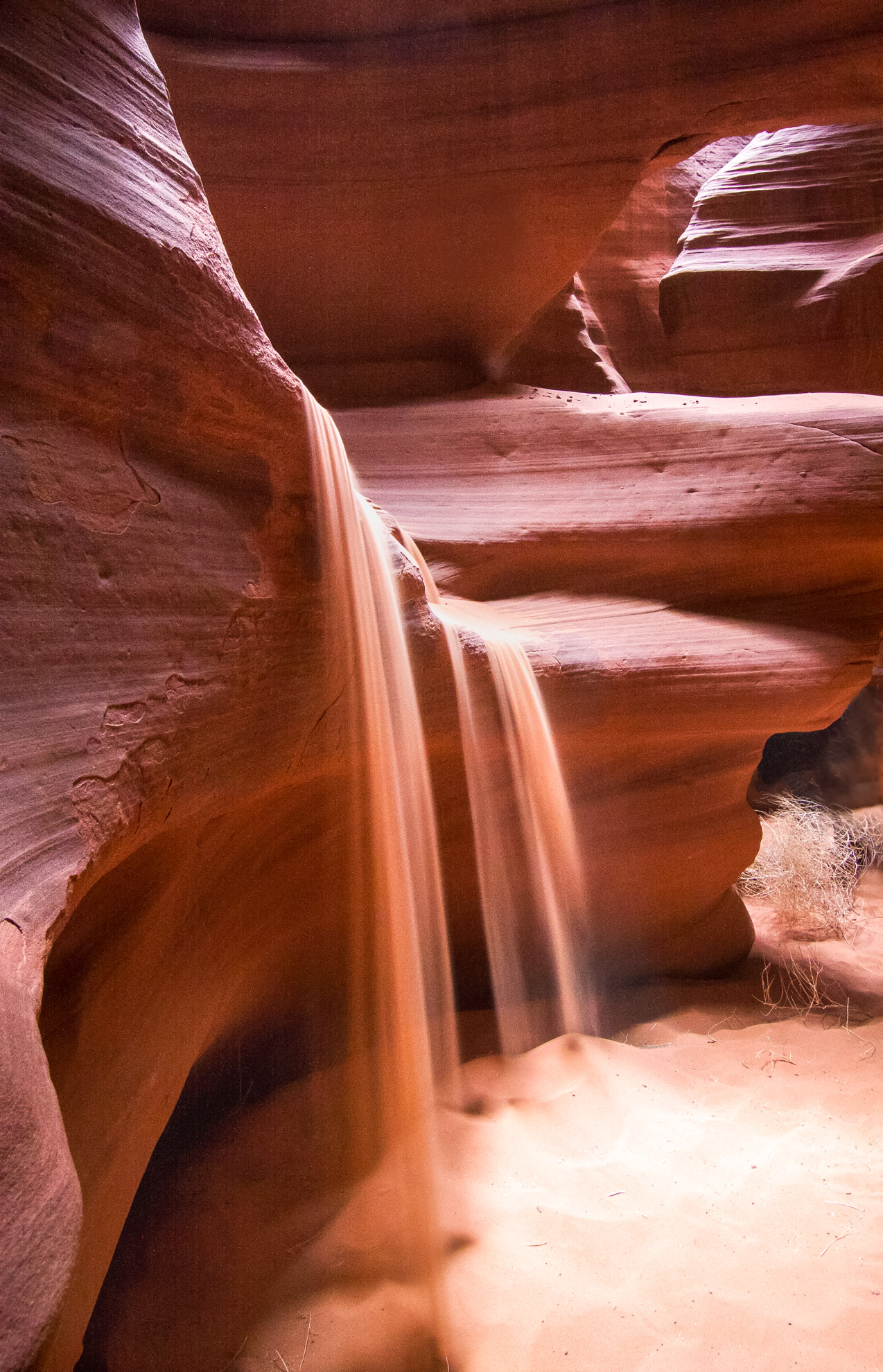
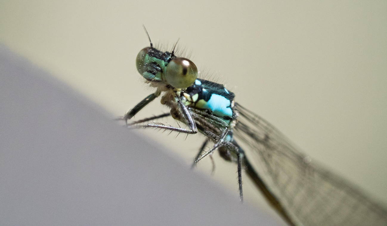
To me, the lighting is the strength in this image, and I like the extra pop provided by Tom's input. His head lacked some clarity, which the extra pop provided. Having said that, I love the composition, the lighting and the contrast! This is a beautiful image! |
Sep 17th |
| 52 |
Sep 18 |
Comment |
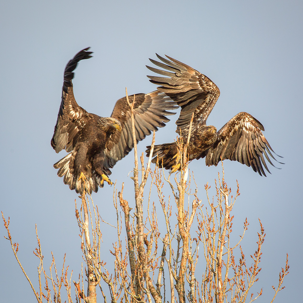
This really IS a killer image! All the elements are incredibly perfect. I'm in agreement that you not change anything about this. It's a winner! Don't remove anything, as it is nature and that teeny twig is not a distraction but reality for me. |
Sep 17th |
7 comments - 0 replies for Group 52
|
| 60 |
Sep 18 |
Comment |
Thanks for the input. It is not unusual for me to hear that white vignetting is an issue for many viewers. When I use black, though, it gives the overall image a "dark" feel for me. Maybe I will play with a darker vignette but make it very, very subtle. I've even tried using colors other than black as the vignette, but don't like the feel of those either. I guess there is always filling the frame with NO vignette. |
Sep 17th |
| 60 |
Sep 18 |
Comment |
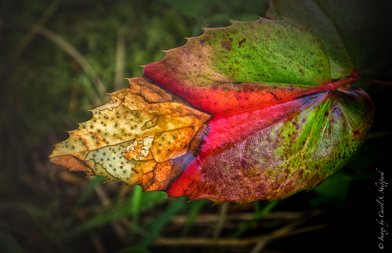
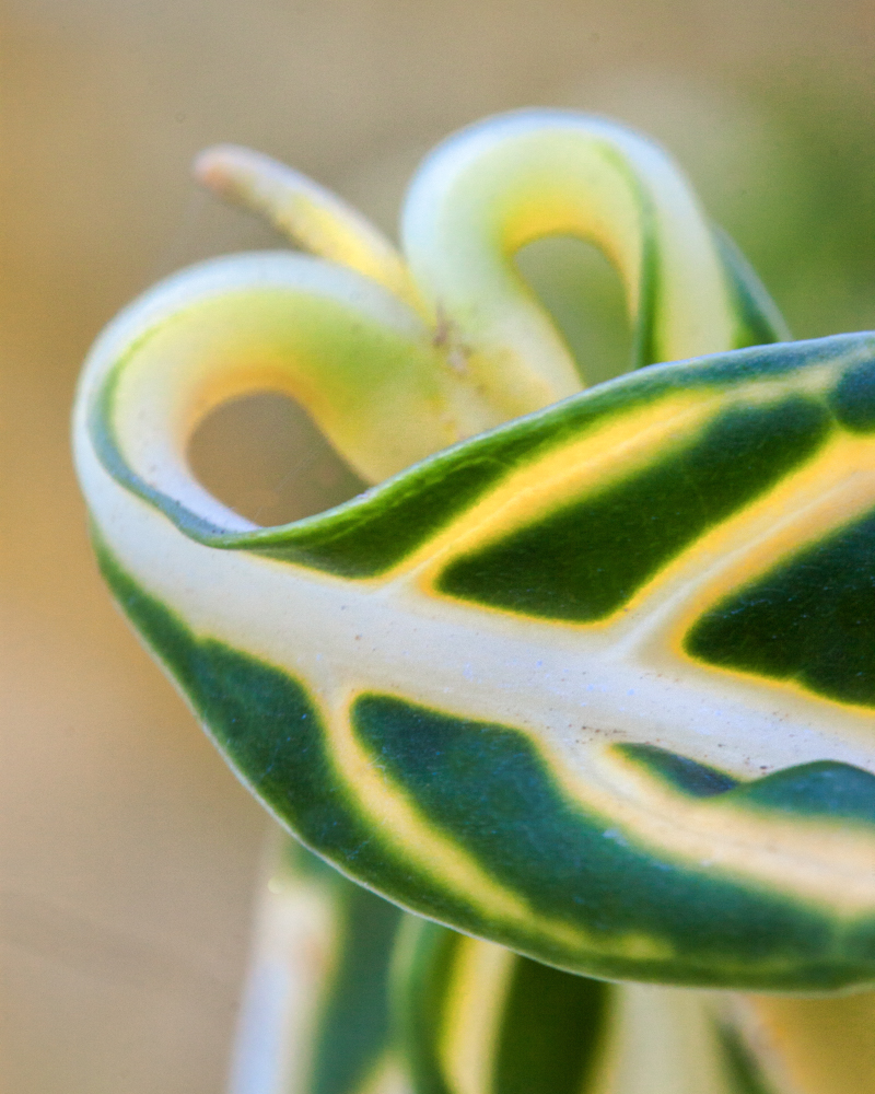
Hi Will, and welcome. I agree with you that the contrast is the strength of this image. Having said that, I do like the cropped version better, as I think the real subject is the darker leaf. The wider crop has a lot of activity for my eye. There are different schools of thought about out-of-focus elements being in the foreground, and I don't agree completely with either of them. However, for me, the large areas of out-of-focus leaf make the back leaf feel insignificant. That is why the crop works better for me. |
Sep 17th |
| 60 |
Sep 18 |
Comment |
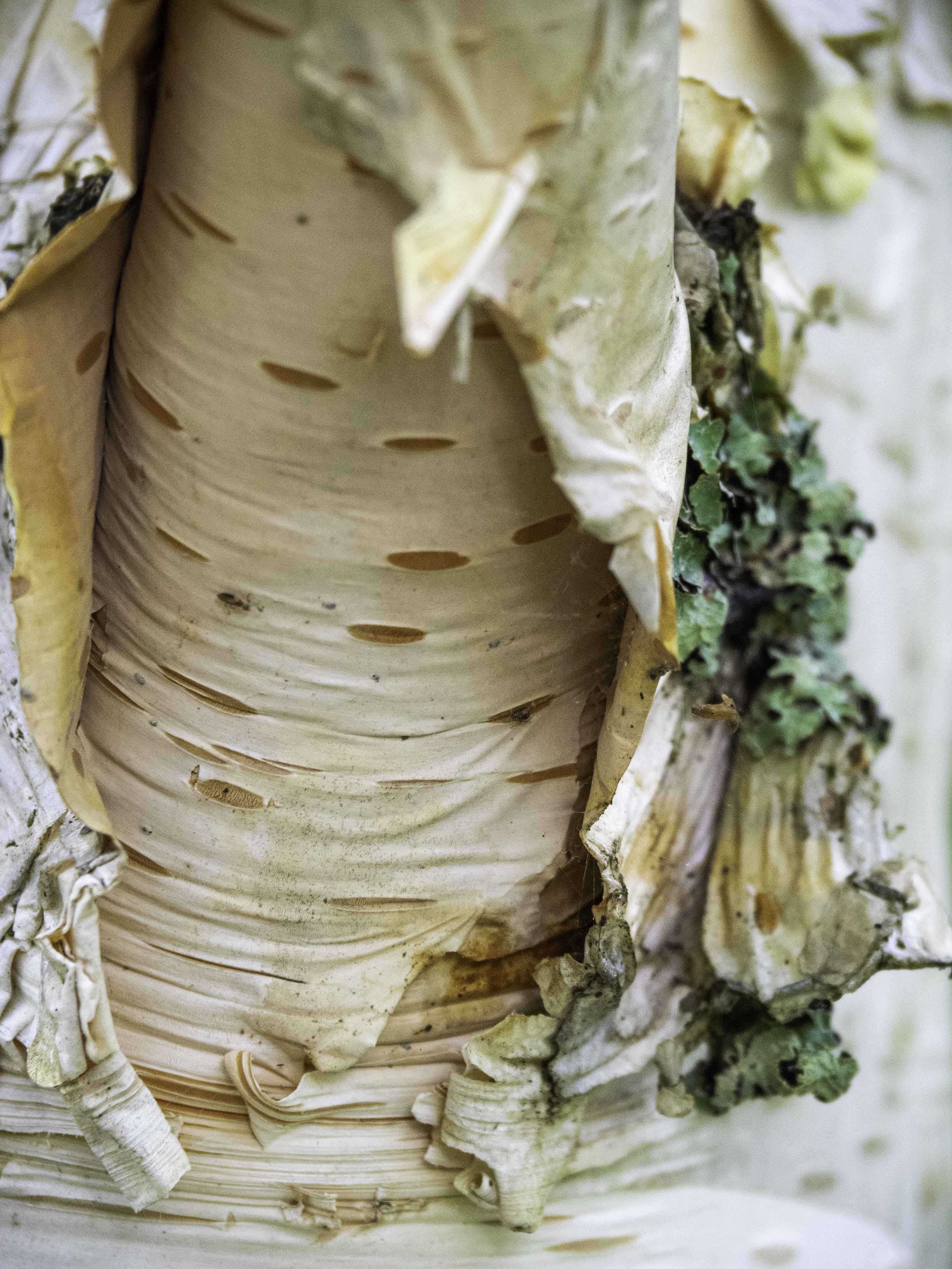
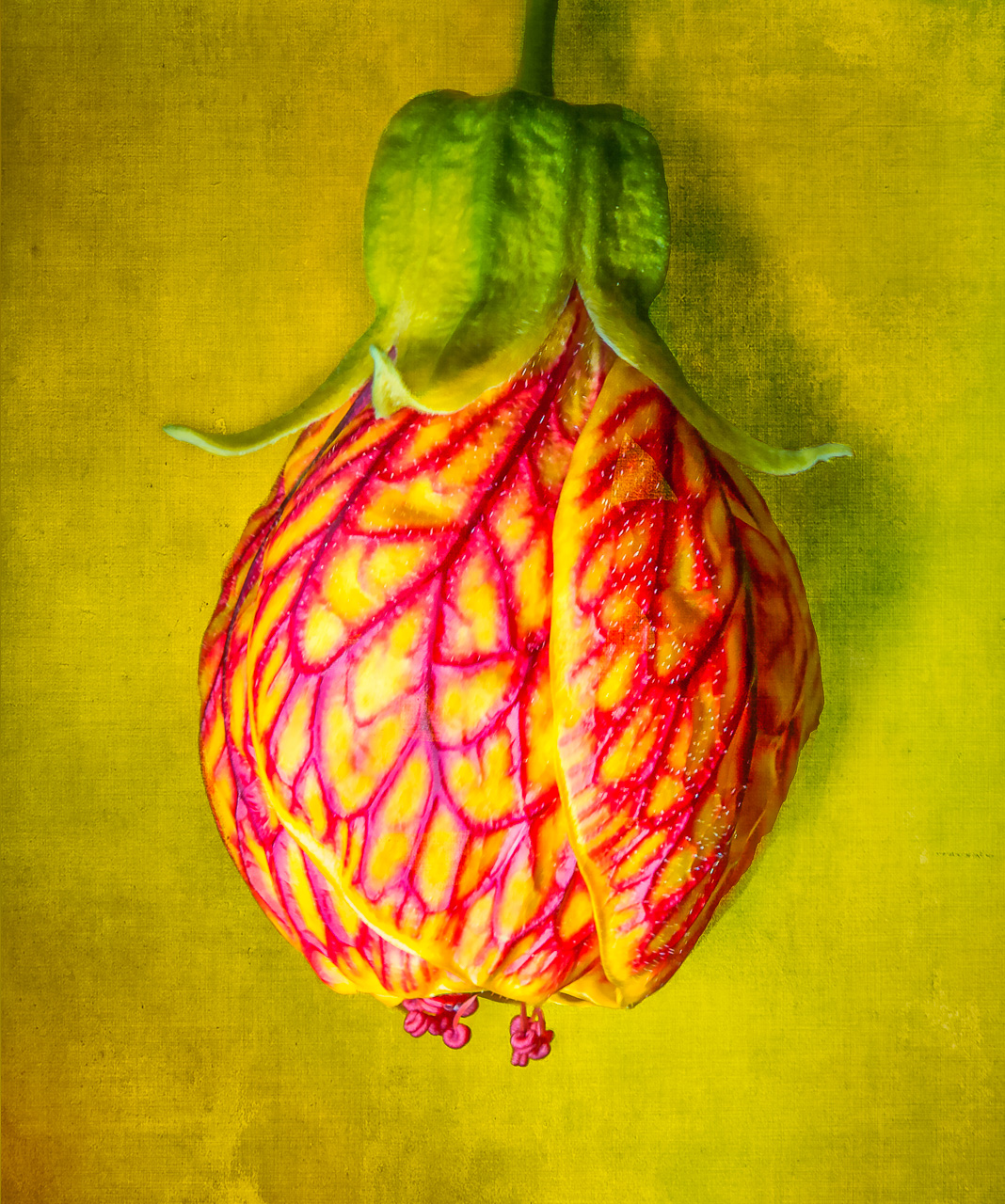
This is a very cool image, and doesn't need any changes to my perspective. I find the color to be just fine, as it doesn't immediately call to mind "cheese," but something more abstract and interesting. The location of the holes, the slight softness, and the very minute texture all works well on this. It's a beautiful shot and makes me hungry without knowing quite why, LOL!
|
Sep 17th |
| 60 |
Sep 18 |
Comment |
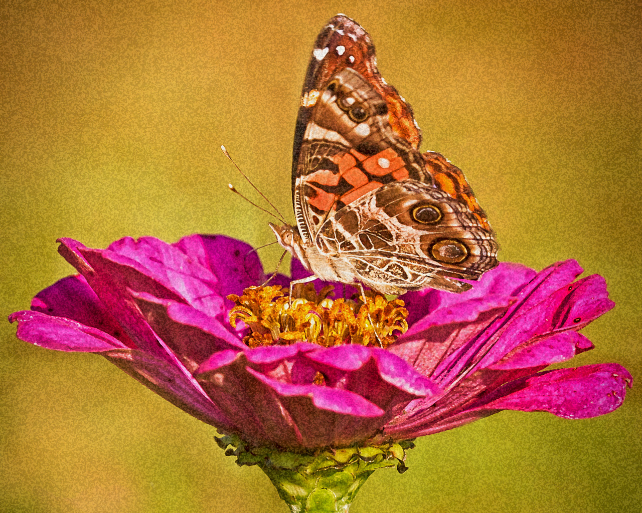
Nadia, there isn't anything I would change about this if it was my image. The lighting presents a bit of intrigue while keeping it real. Sometimes when highlights are small and really bother me, I enlarge the image and clone them out. It's tedious but it works. You have to leave a nice softness around your cloning brush so it isn't apparent in the final image. Personally, I think this is a wonderful image; great job! I love the composition and the capture!
|
Sep 17th |
| 60 |
Sep 18 |
Comment |
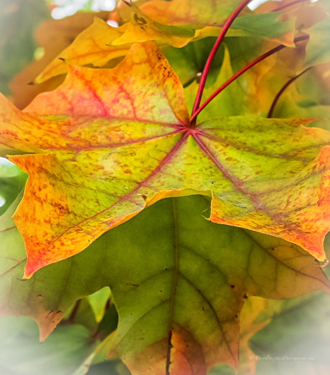
Bill, this image is very pleasing, with your crop and with the one submitted under Bob's reply. I can't say which crop I prefer, but in the vertical one, I am distracted by the way the long vein up the center of the front leaf cuts so close to the edge of the frame. However, I think it looks brighter on the background leave, which is nice. It brightens but still leaves the forward leaf with the stronger lighting. This is a lovely image! Sharp with great color balance, very natural saturation, and beautiful texture and clarity. |
Sep 17th |
5 comments - 0 replies for Group 60
|
12 comments - 0 replies Total
|