|
| Group |
Round |
C/R |
Comment |
Date |
Image |
| 52 |
Jul 18 |
Comment |
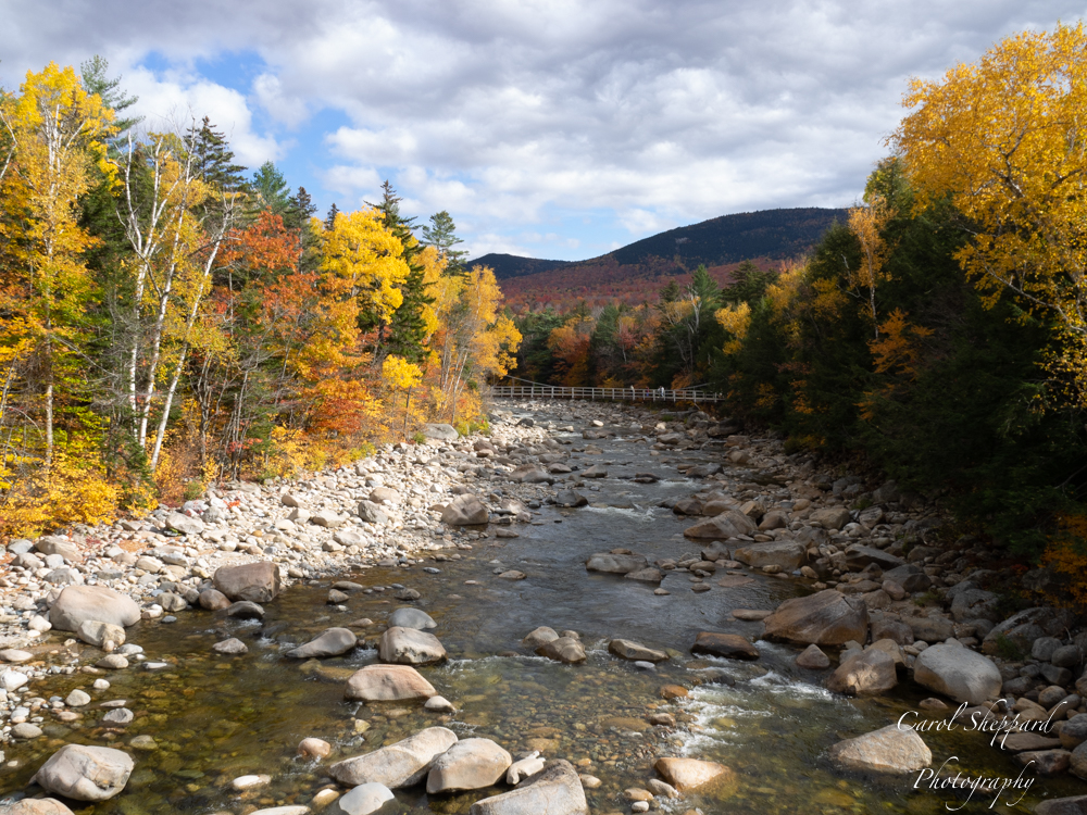
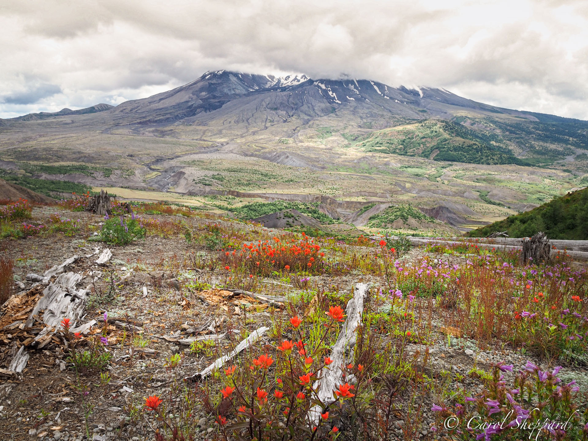
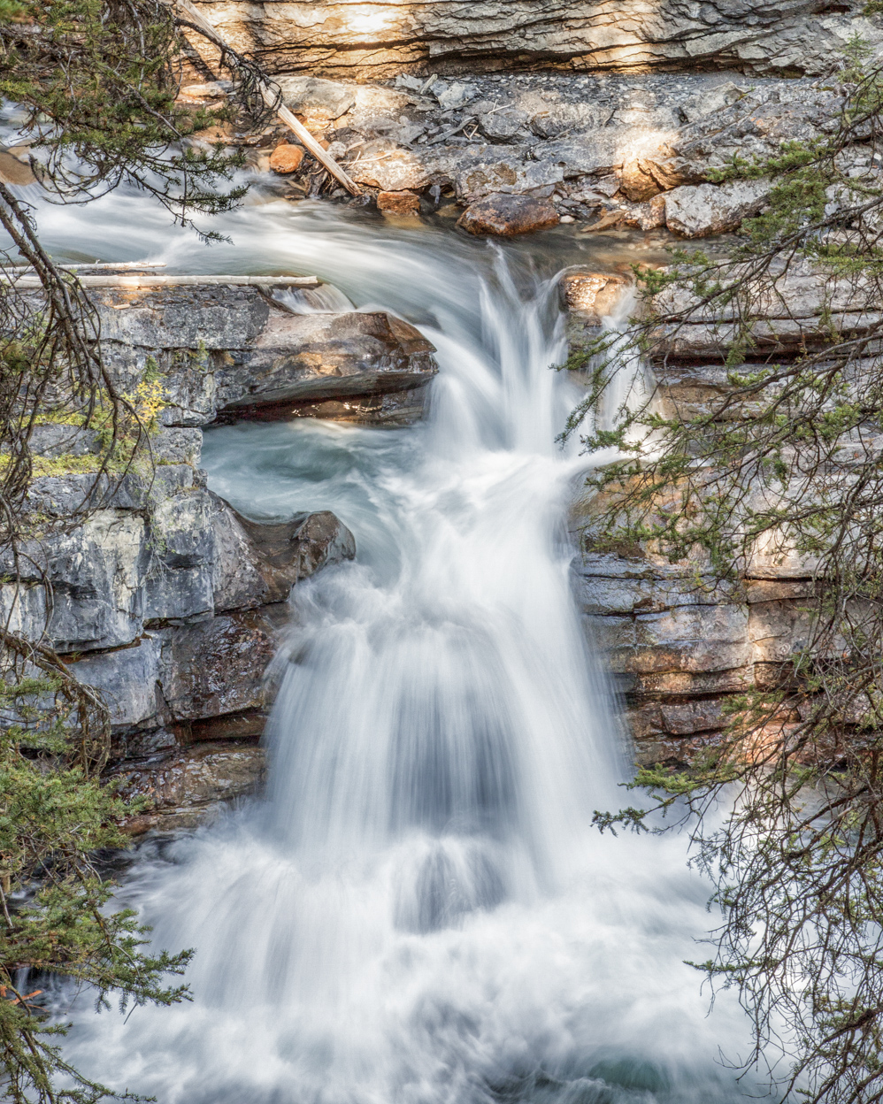
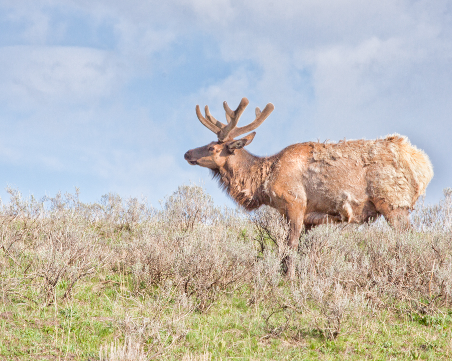
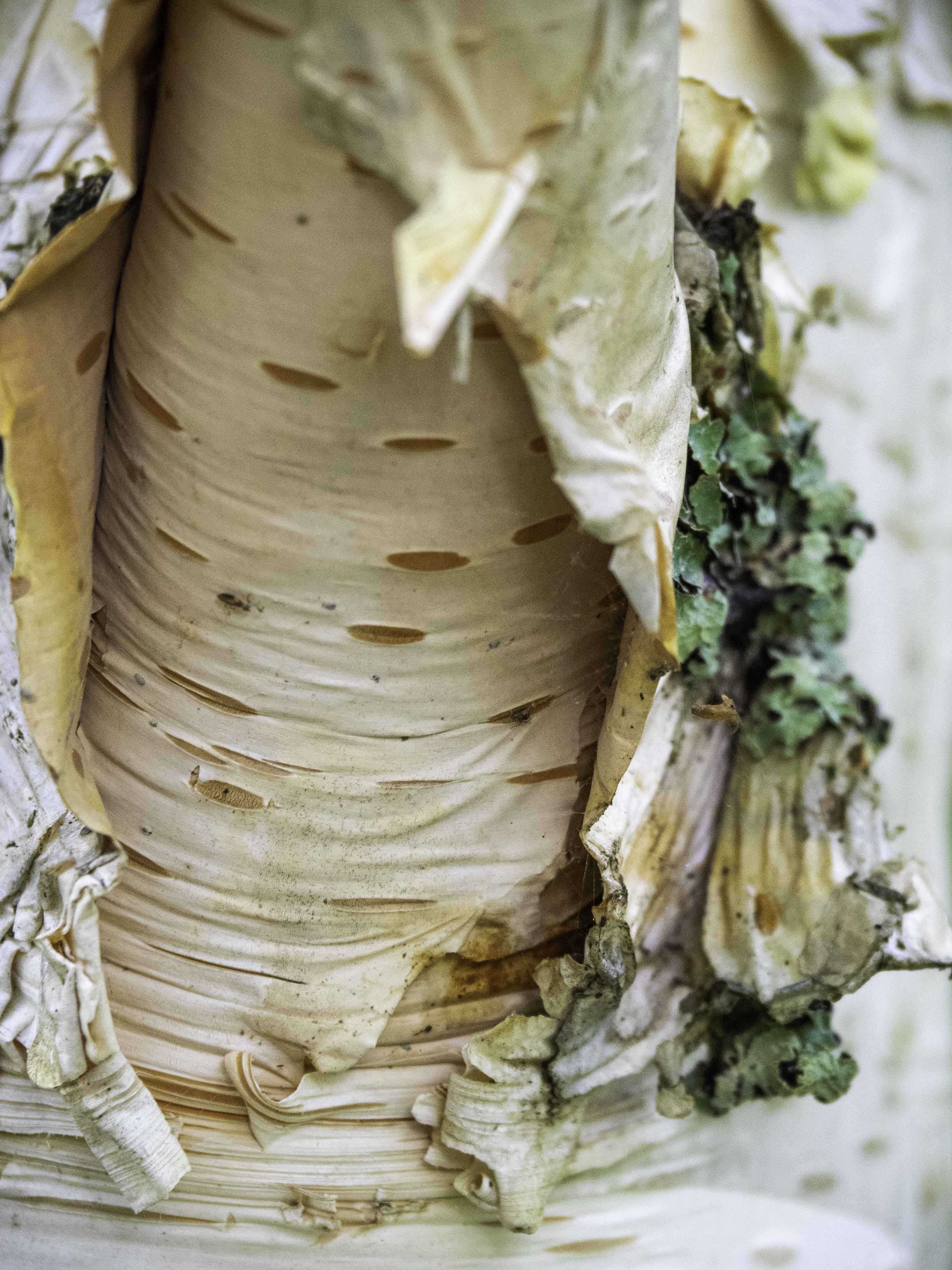
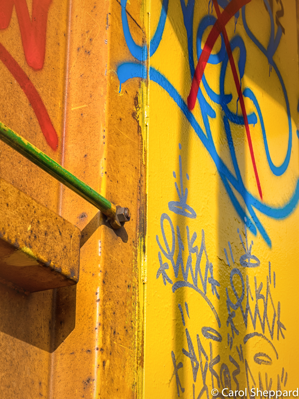
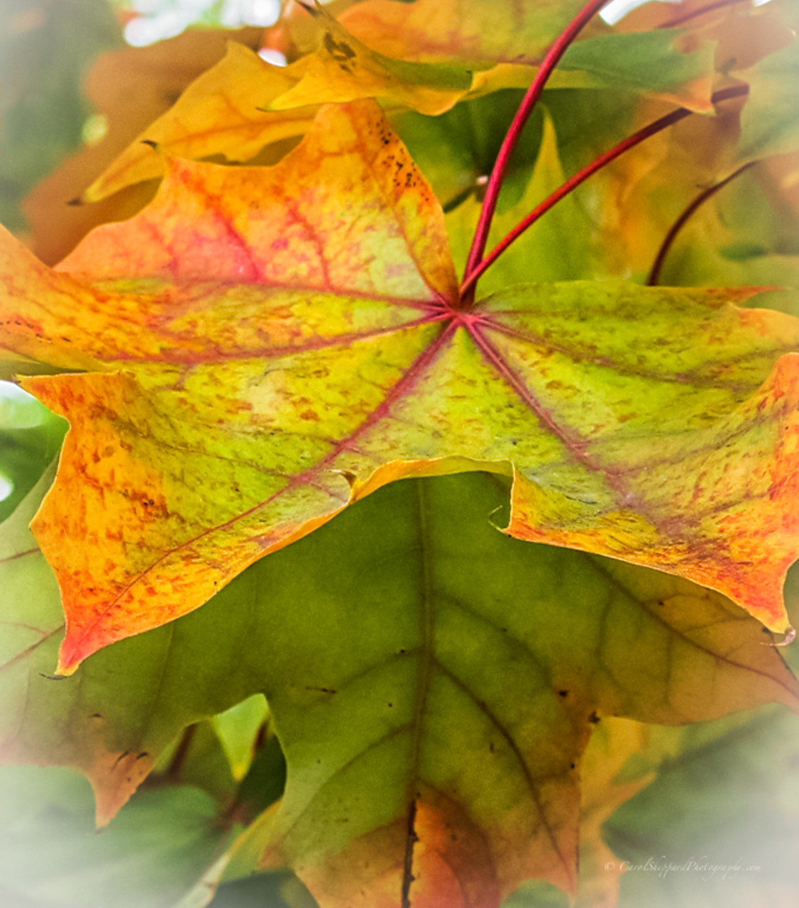
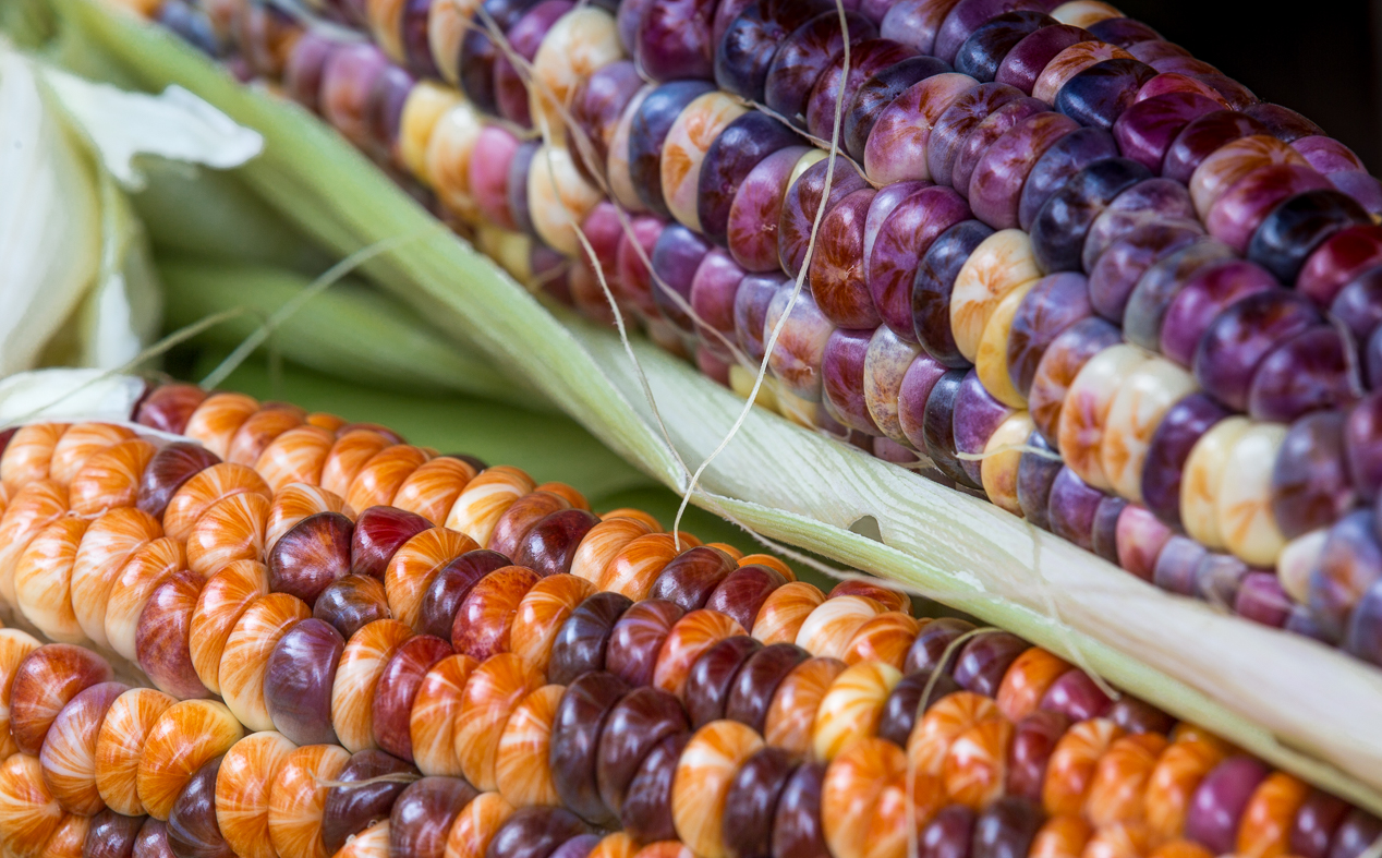
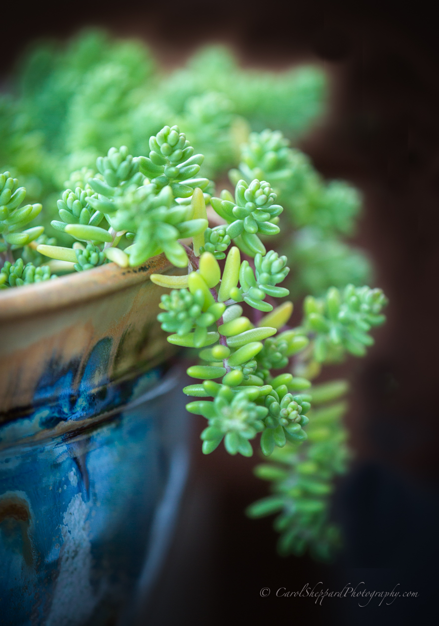
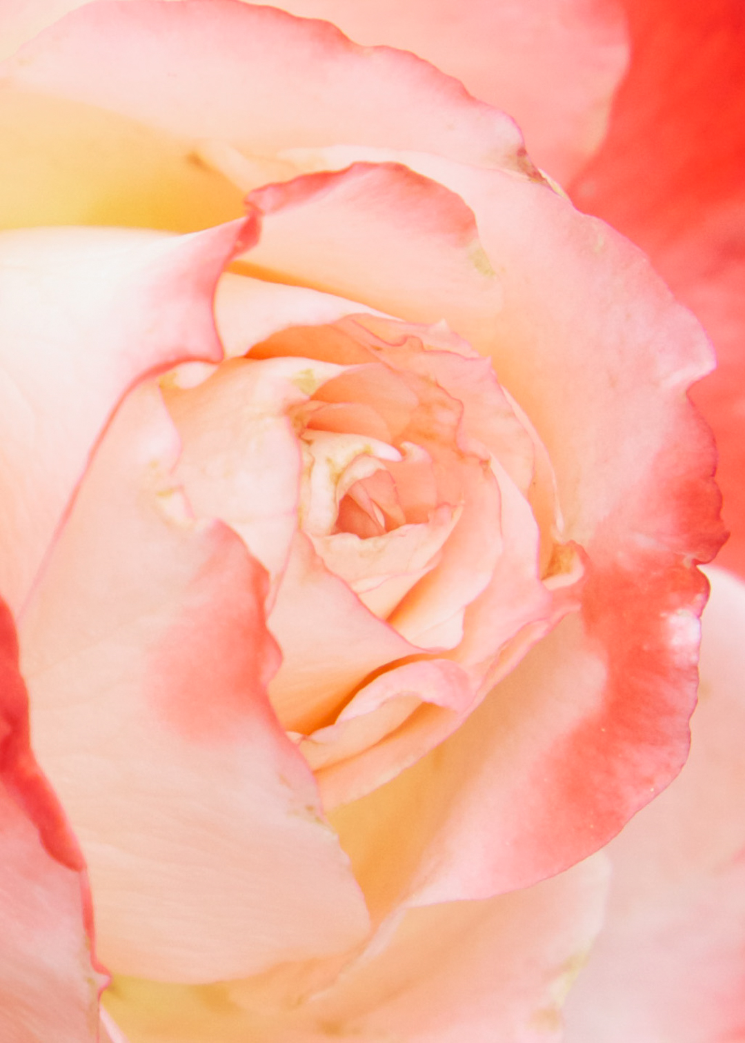
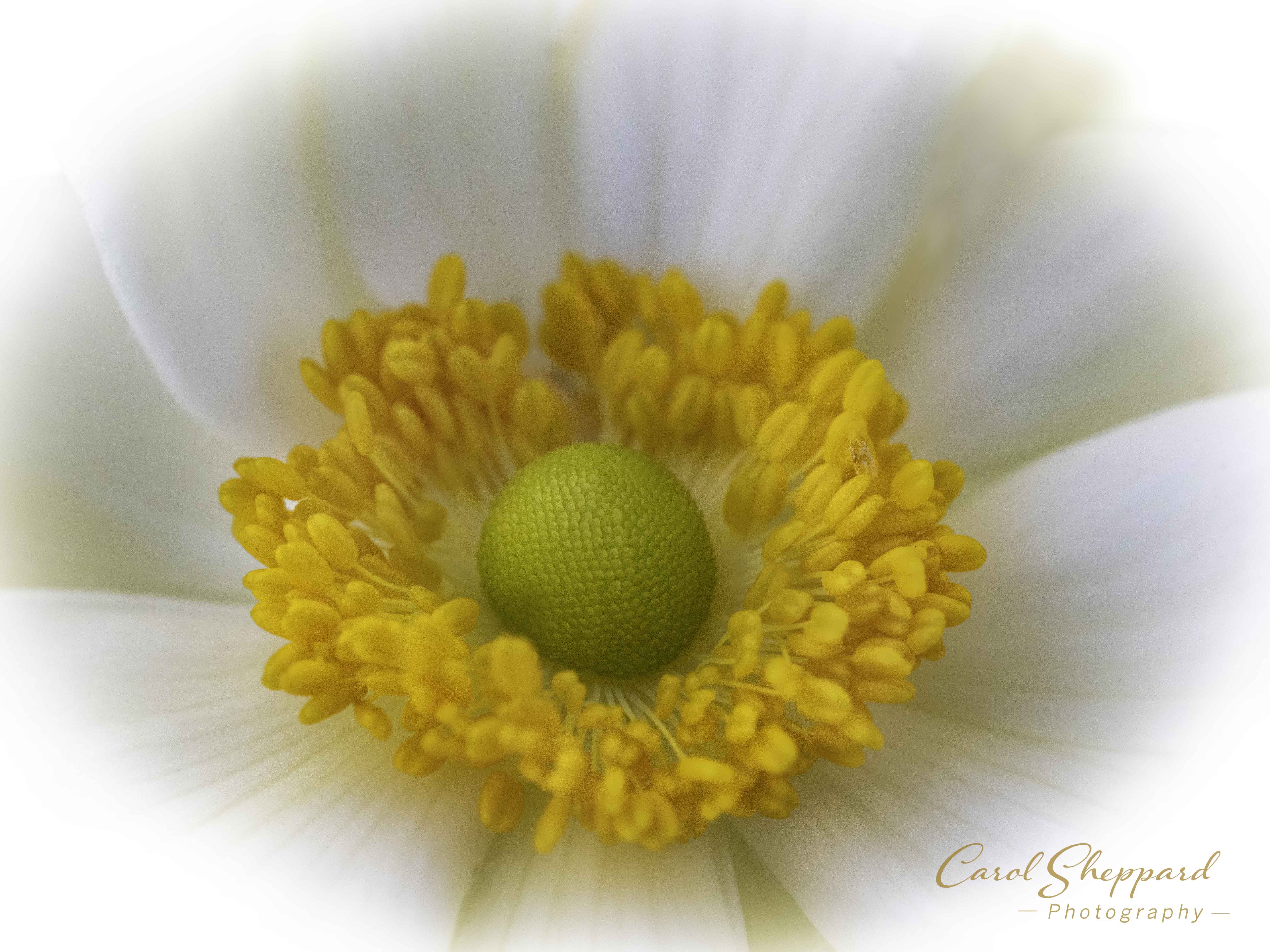
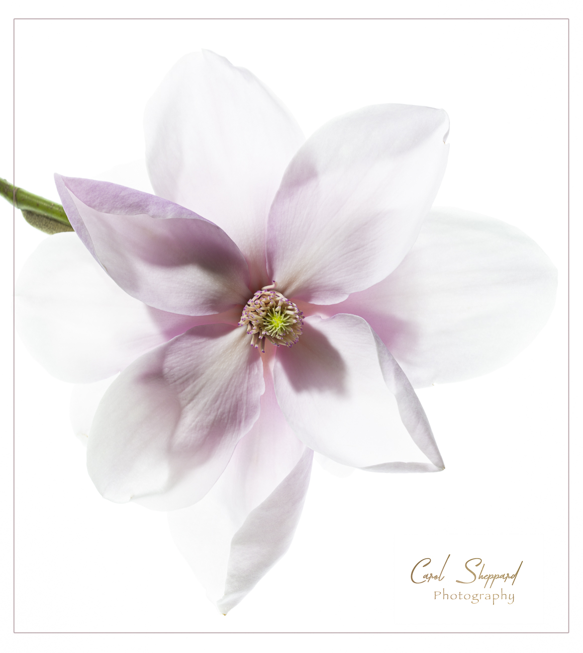
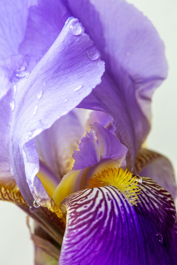
Hi all, I'm trying to make sure I understand the input. I think Mike is saying it feels too HDR, which usually indicates to me that there is too much tonal curve. But John, you felt it was flat. If I pop it much more, it will look fake, IMHO. Then Lisa, you were suggesting a crop on the right? What about cutting off those rocks on the right in a very awkward place? Any suggestions where you would crop it? There may be too much yellow in the trees, but in the original, the trees look flat and the olive grey was really not true to the colors I viewed. Is it too warm? |
Jul 15th |
| 52 |
Jul 18 |
Comment |
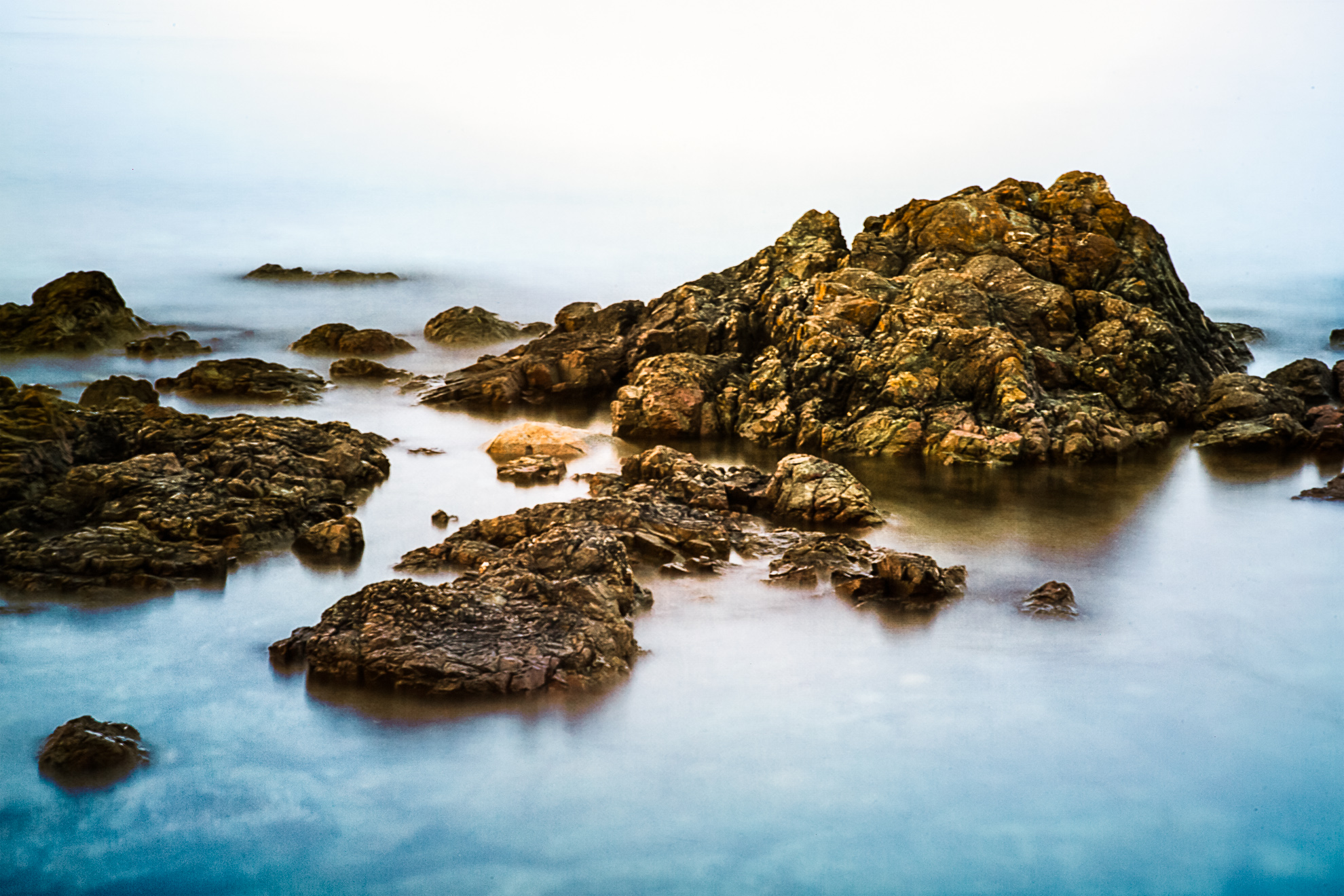
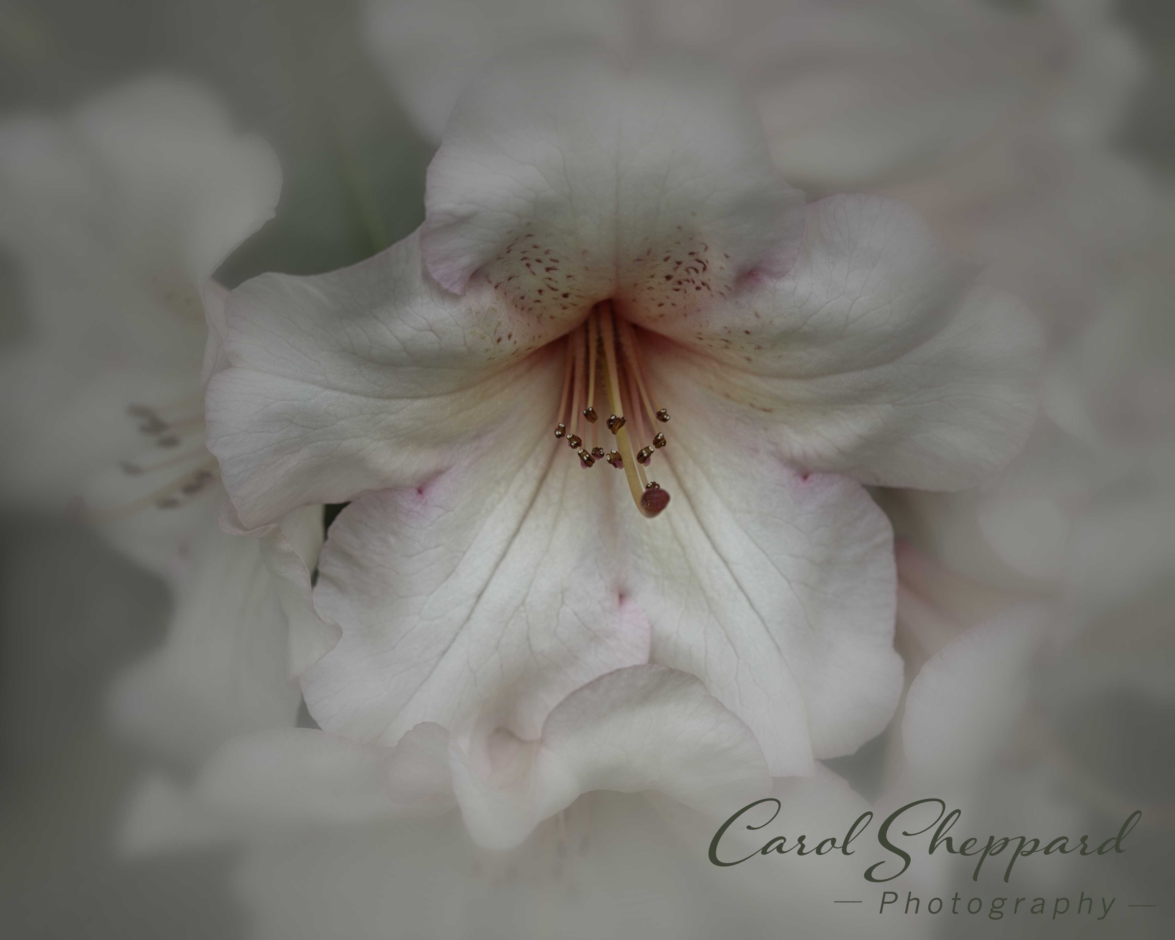
This sunset is stunning and you have placed the emphasis on it very well. I would love to see the foreground lightened enough to show some more detail....I actually didn't realize I was looking at a bench!! The bench invites me in and is an important part of the sunset now that I see it. I think you will retain the mystery even if you lighten the bench back shadows slightly, creating shape in lieu of just a linear bright area. I do love this image, and think you could really make it into a winner! |
Jul 15th |
| 52 |
Jul 18 |
Comment |
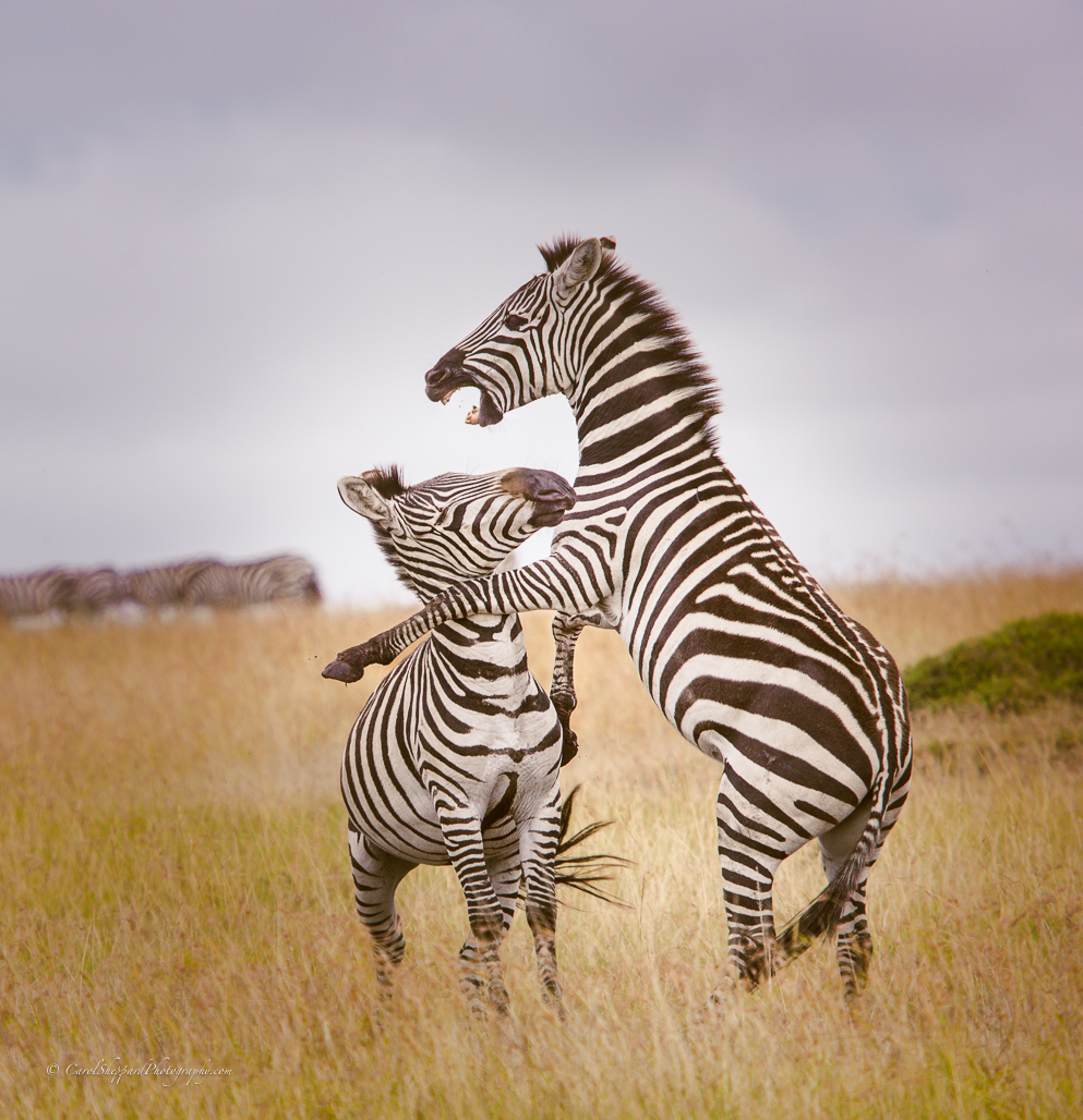
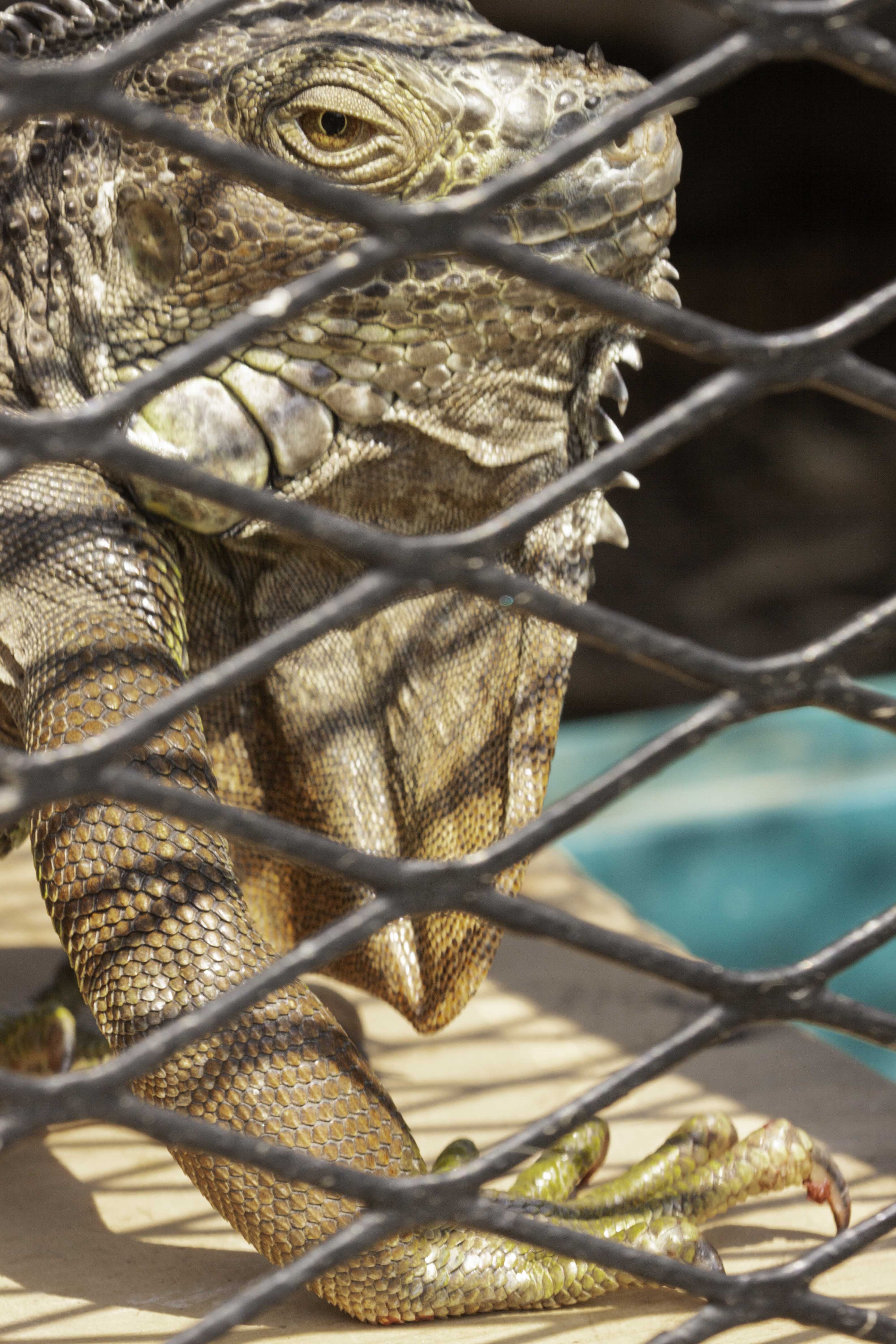
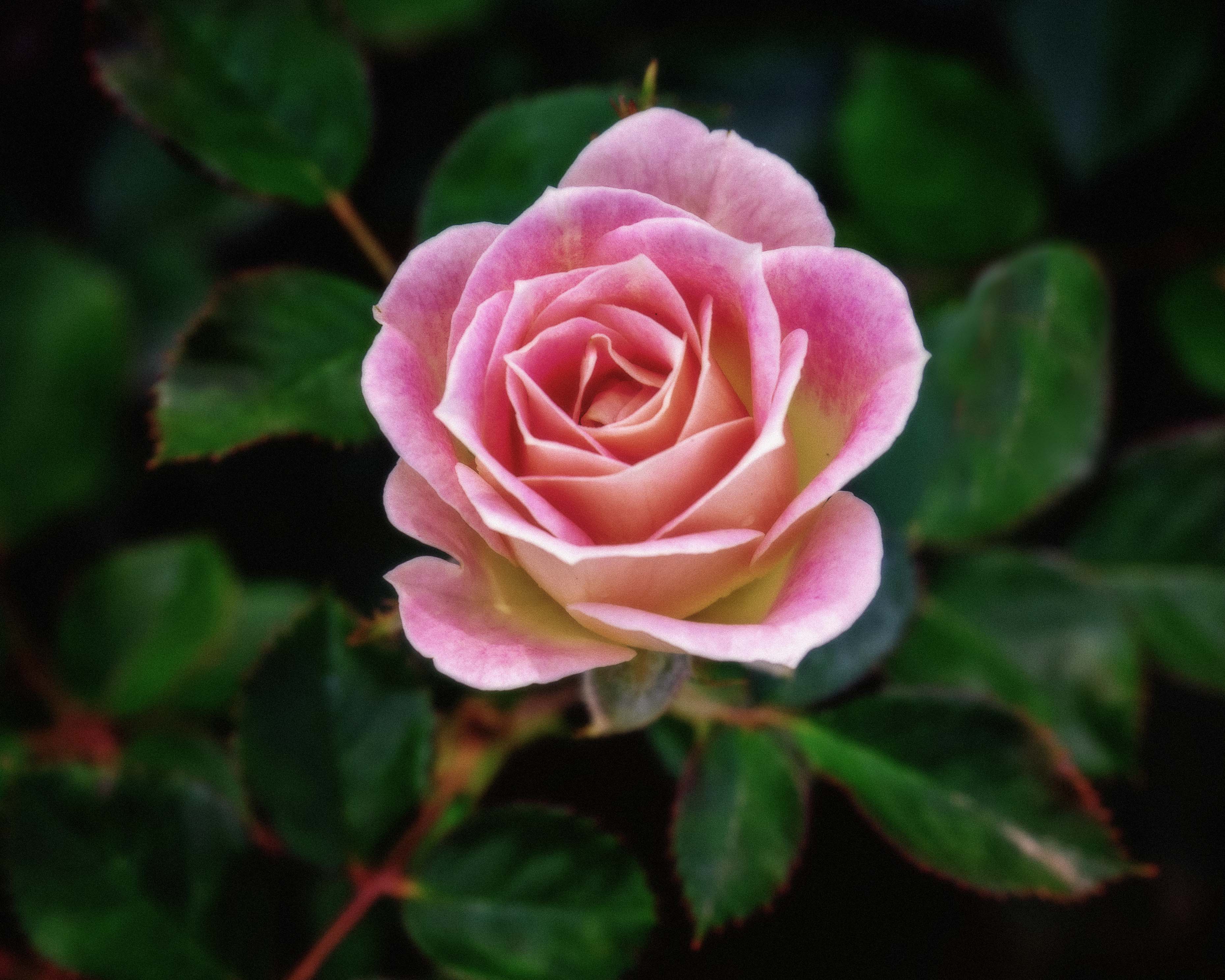
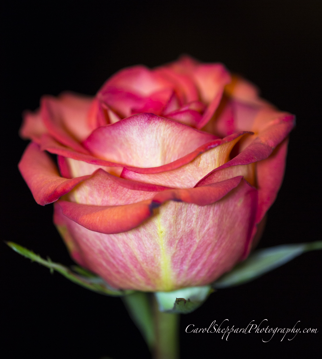
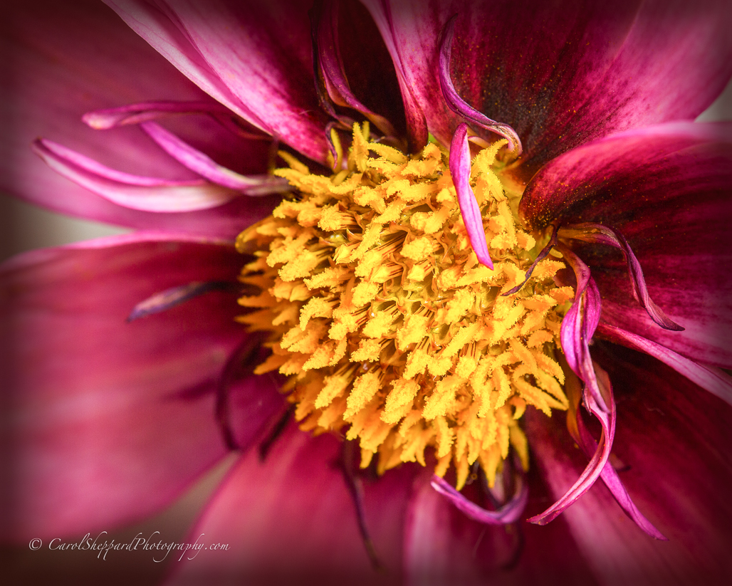
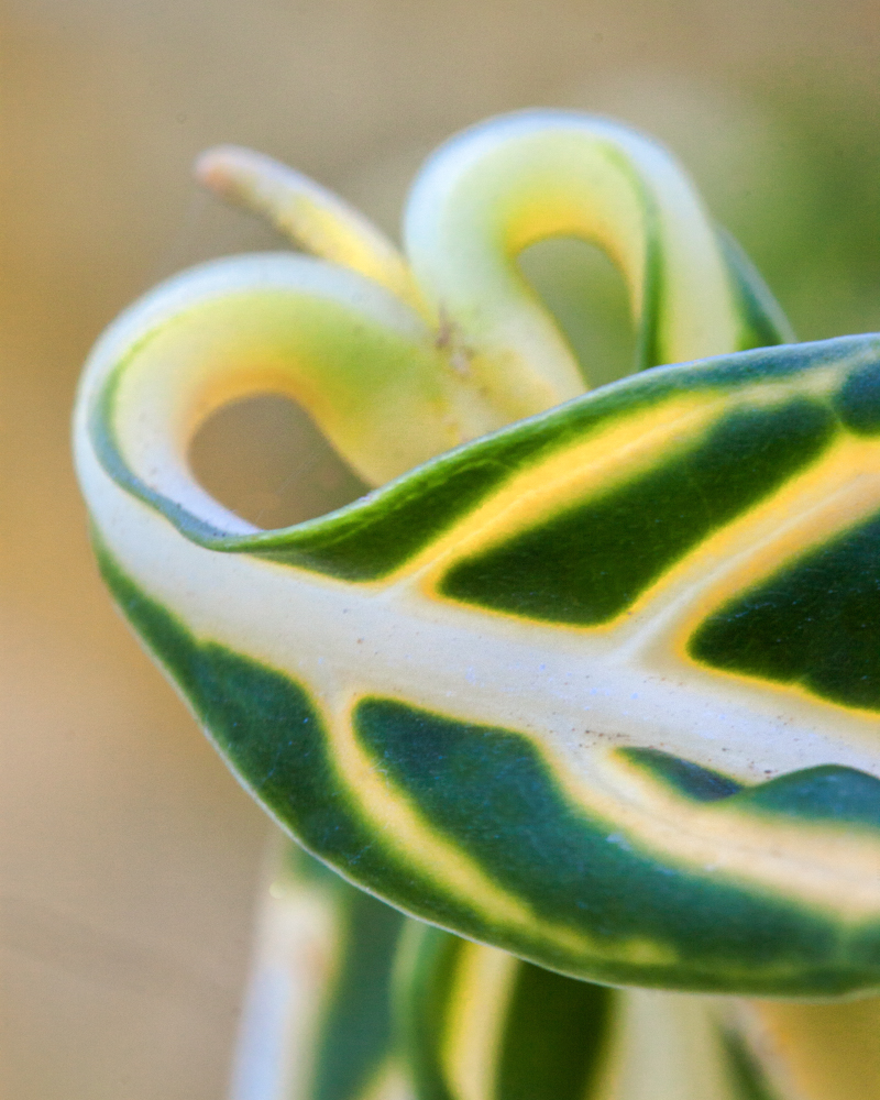
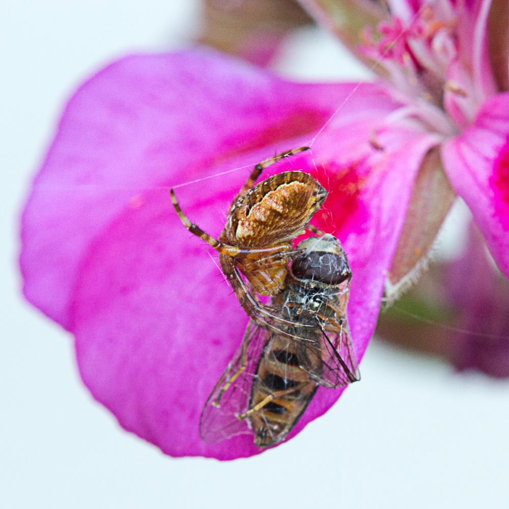
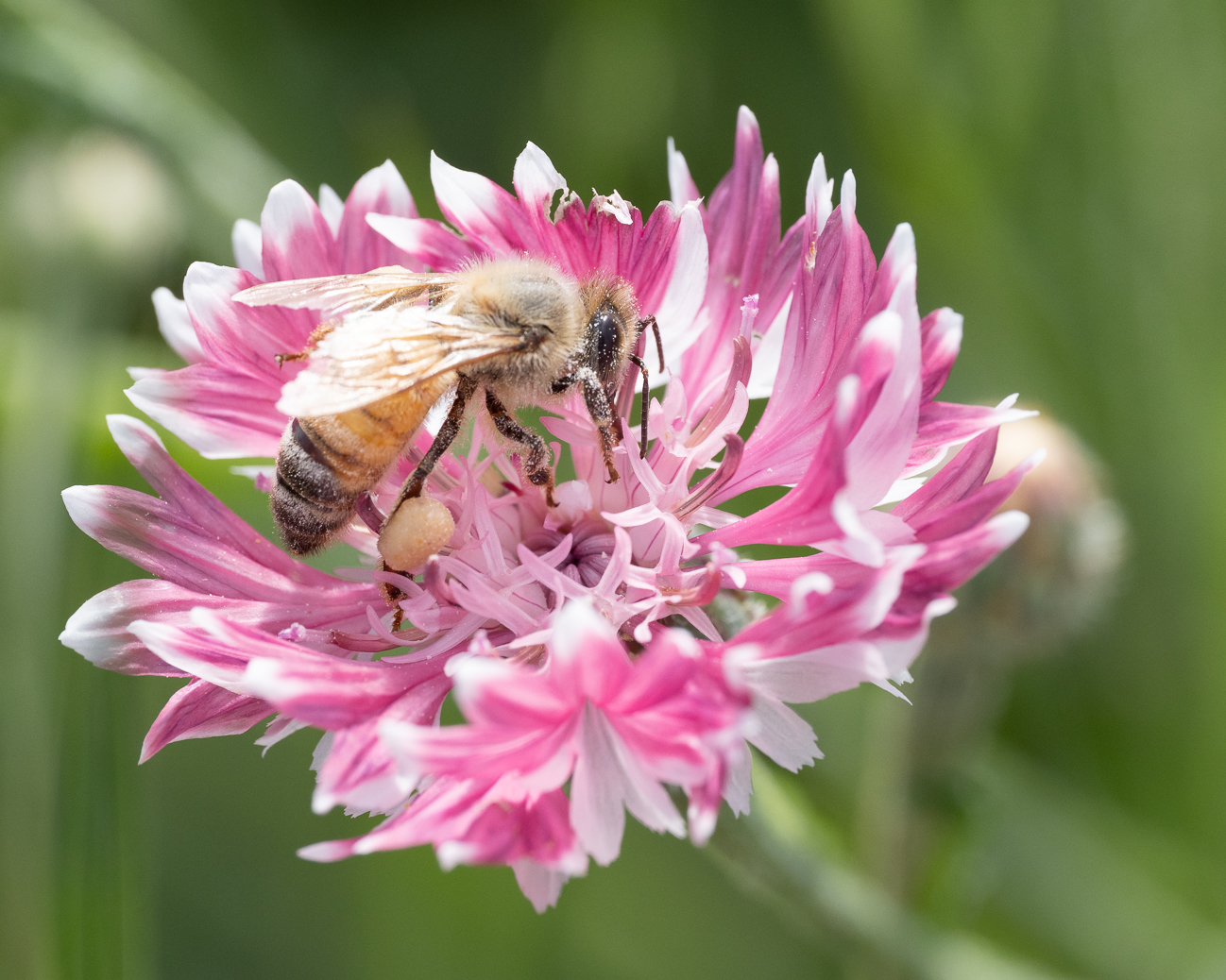
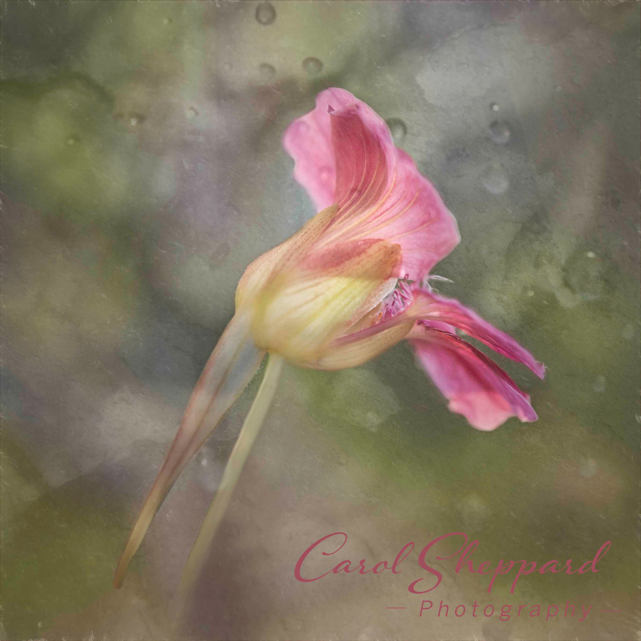
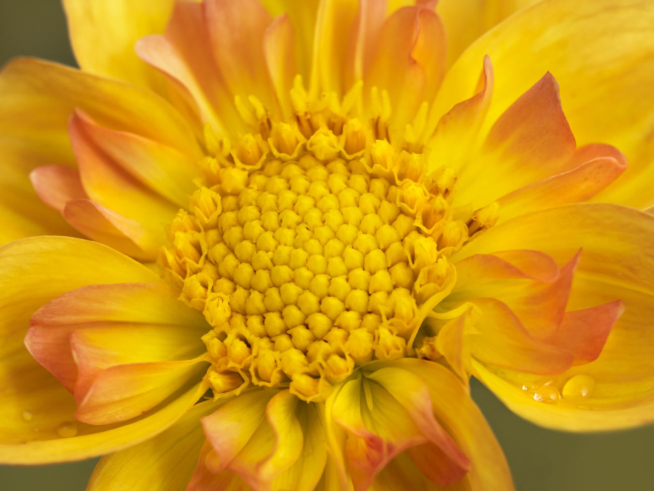
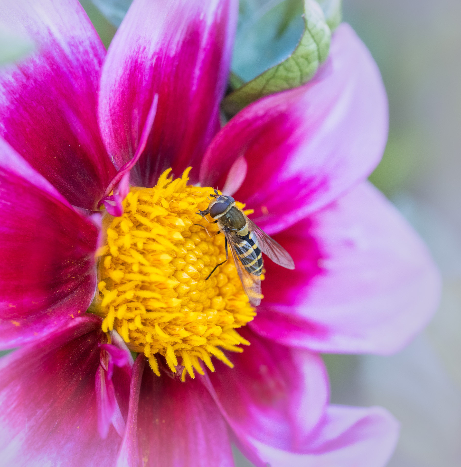
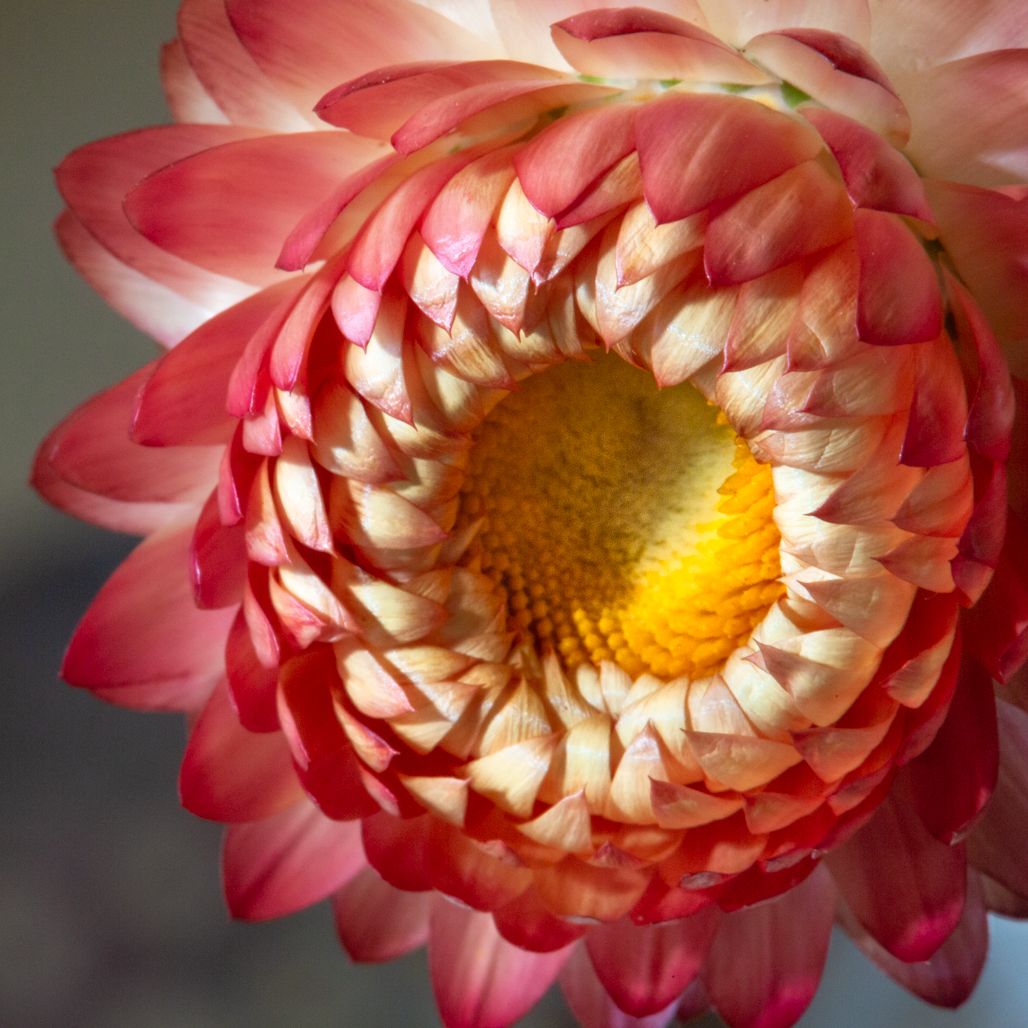
Great story, and lots of detail in its capture. The clarity of the bee is wonderful. There is an obvious artifact on the righthand side of the rose that detracts somewhat from the image, that purple line along its edge. Would there be a possibility of cropping out the green entirely? The green and its details (not a soft blur) are pulling from the details of the pink flower and yellow pollen and bee. The other thing I struggle with myself, but have no answer--the bee has its behind to me, and I can't feel any connection with it as a result. But alas, that is nature!!
|
Jul 15th |
| 52 |
Jul 18 |
Comment |
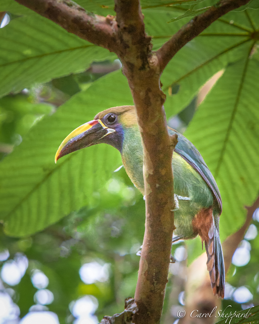
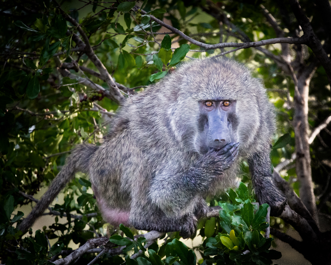
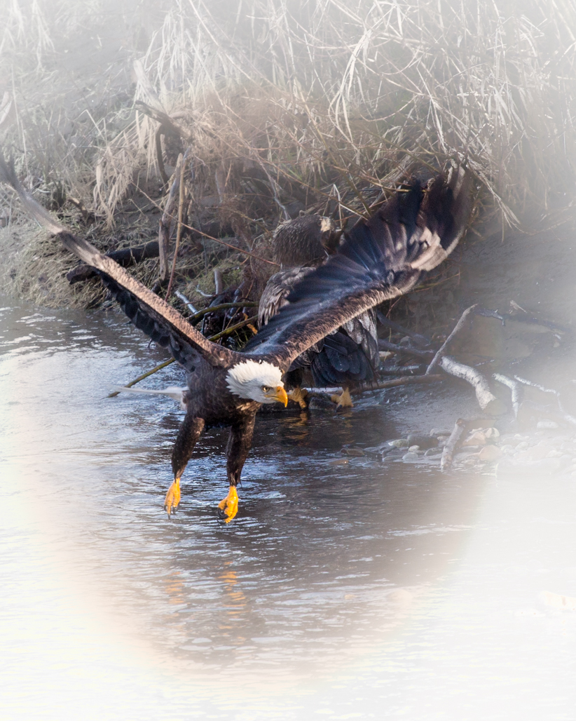
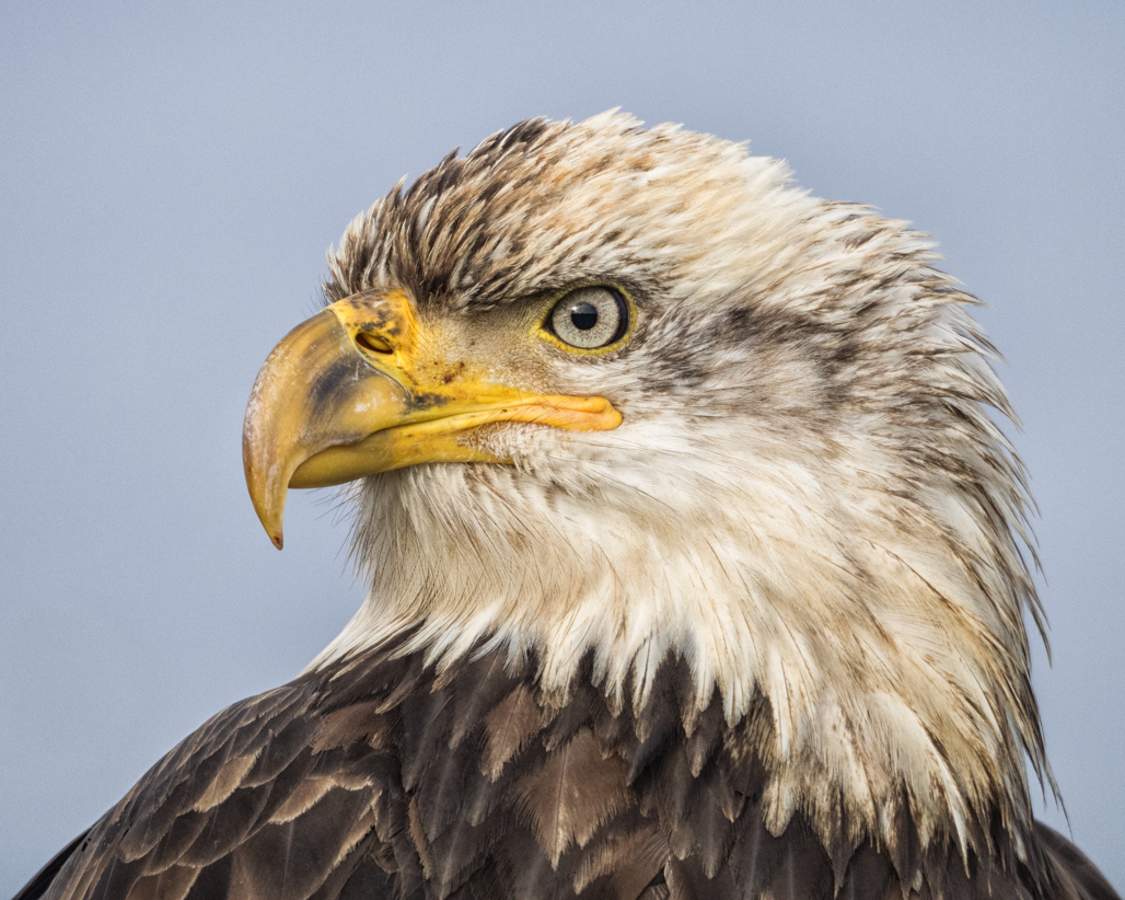
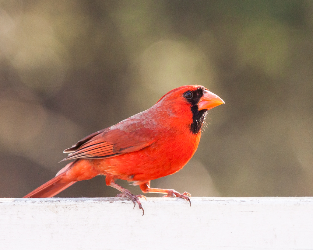
I do love the images that have a black background, and it works so well for this capture! Beautifully done. I wouldn't change a thing, except to add the most minute bit of brightness to the bird to bring it forward slightly from the background. With that one suggestion, I think this is a great image! |
Jul 15th |
| 52 |
Jul 18 |
Comment |
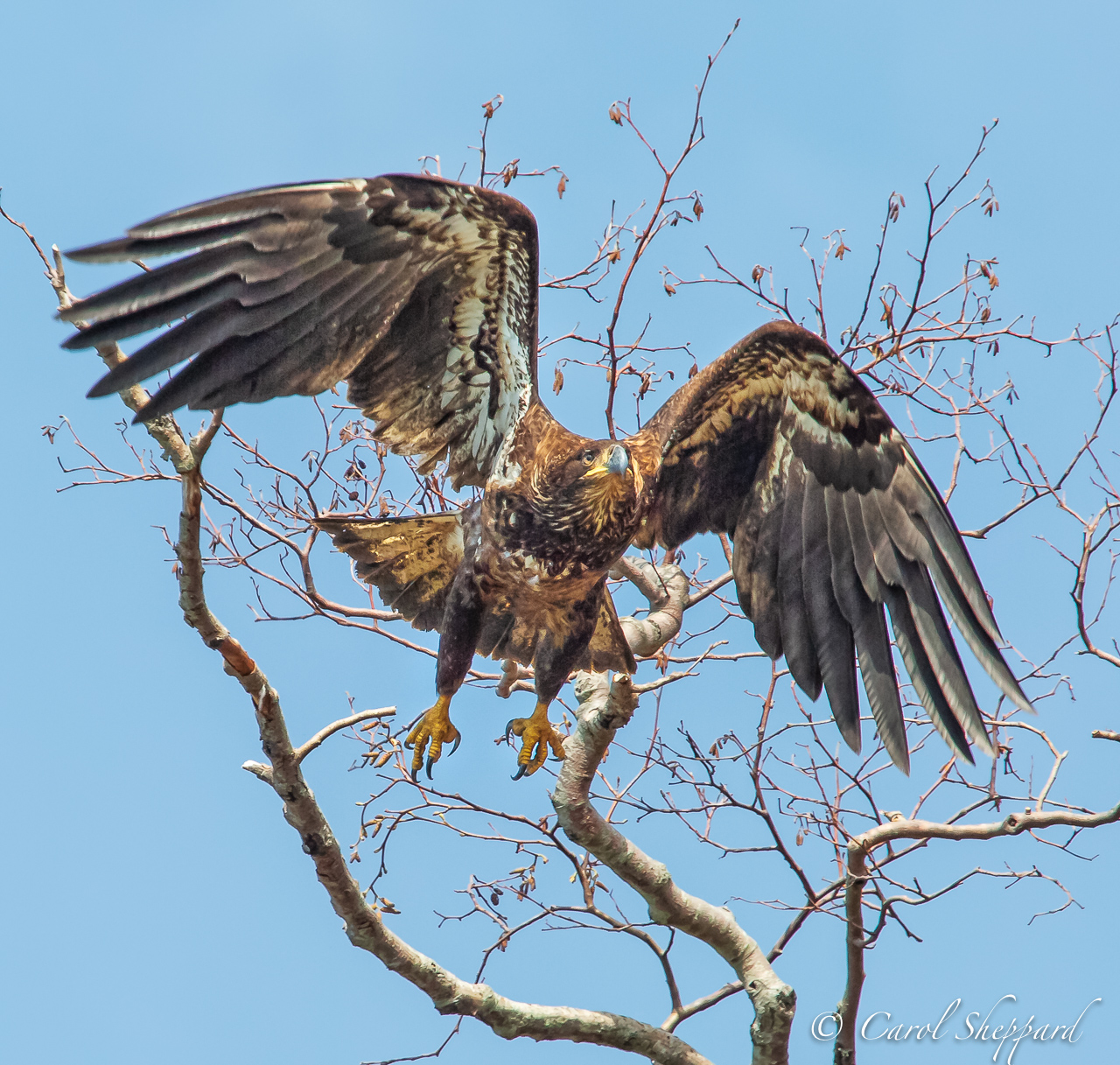
Okay, one more thing to add--I know what is bothering me! It feels to me like the eagle is flying into a blue wall. The transition between the "halo" and the rest of the sky doesn't feel natural to me and is distracting to my eye. |
Jul 15th |
| 52 |
Jul 18 |
Comment |
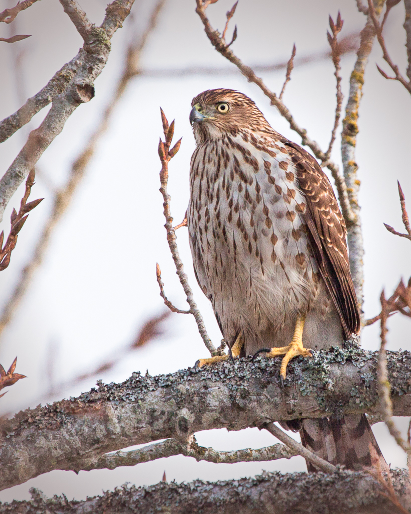
Interesting--wonderful capture and the clarity works very nicely. Since you tried a different effect, I will focus (haha) on that. It has a very yellow cast that I am not comfortable with. Maybe because of that, I also sense a white halo around the bird. On the plus side, it gives the bird great contrast against the sky. On the other hand, I sense a lack of ??? command over the image from the eagle. I do think this is one that is subjective to an individual's tastes.
|
Jul 15th |
| 52 |
Jul 18 |
Comment |
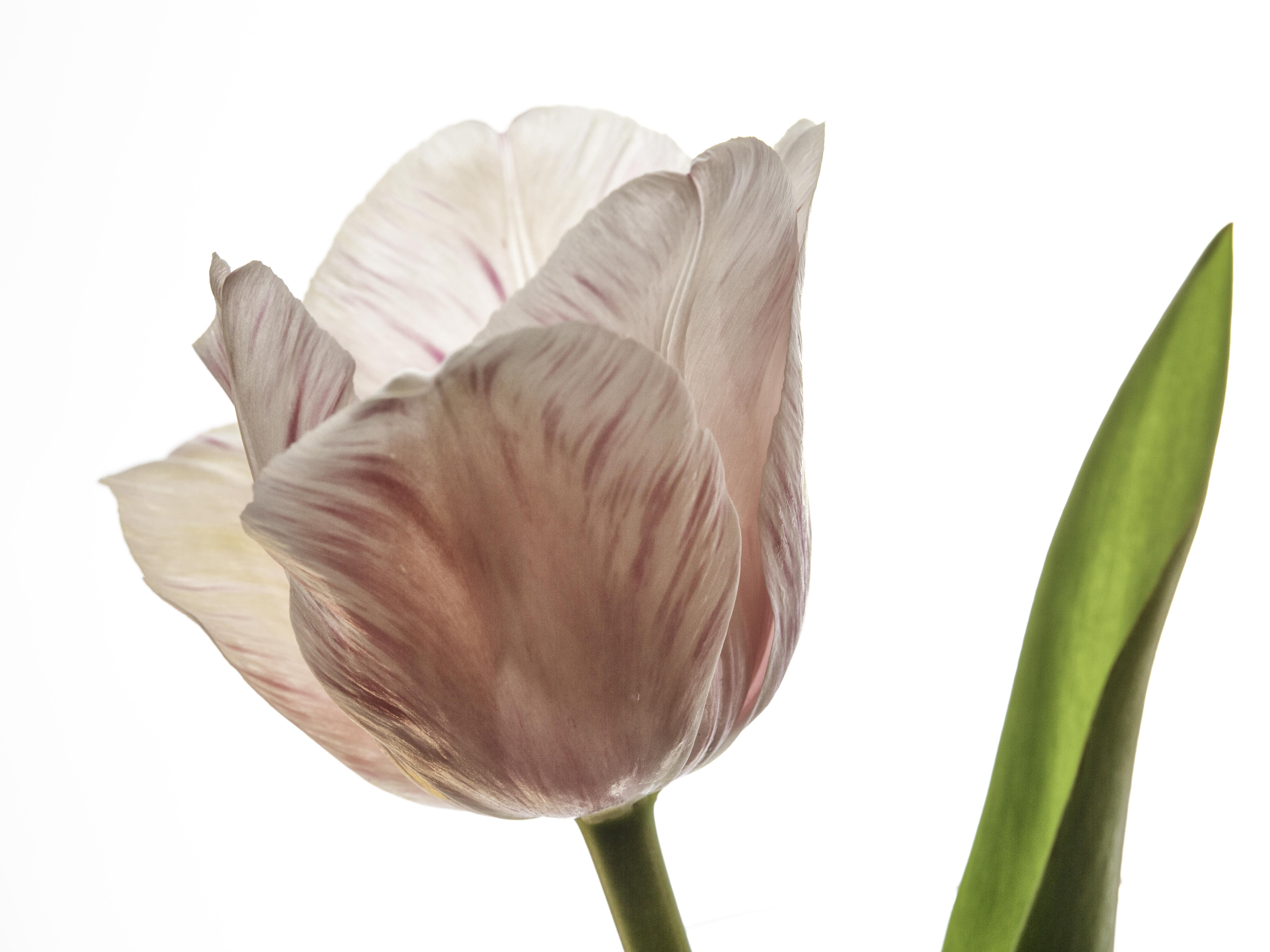
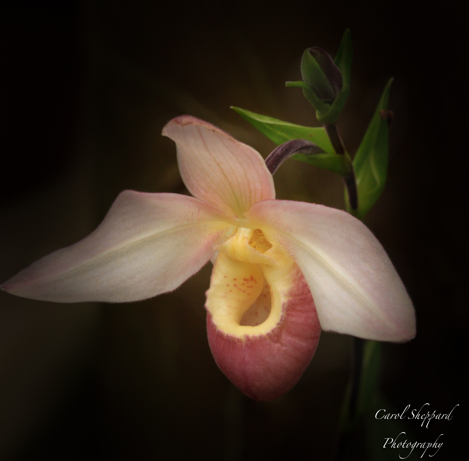
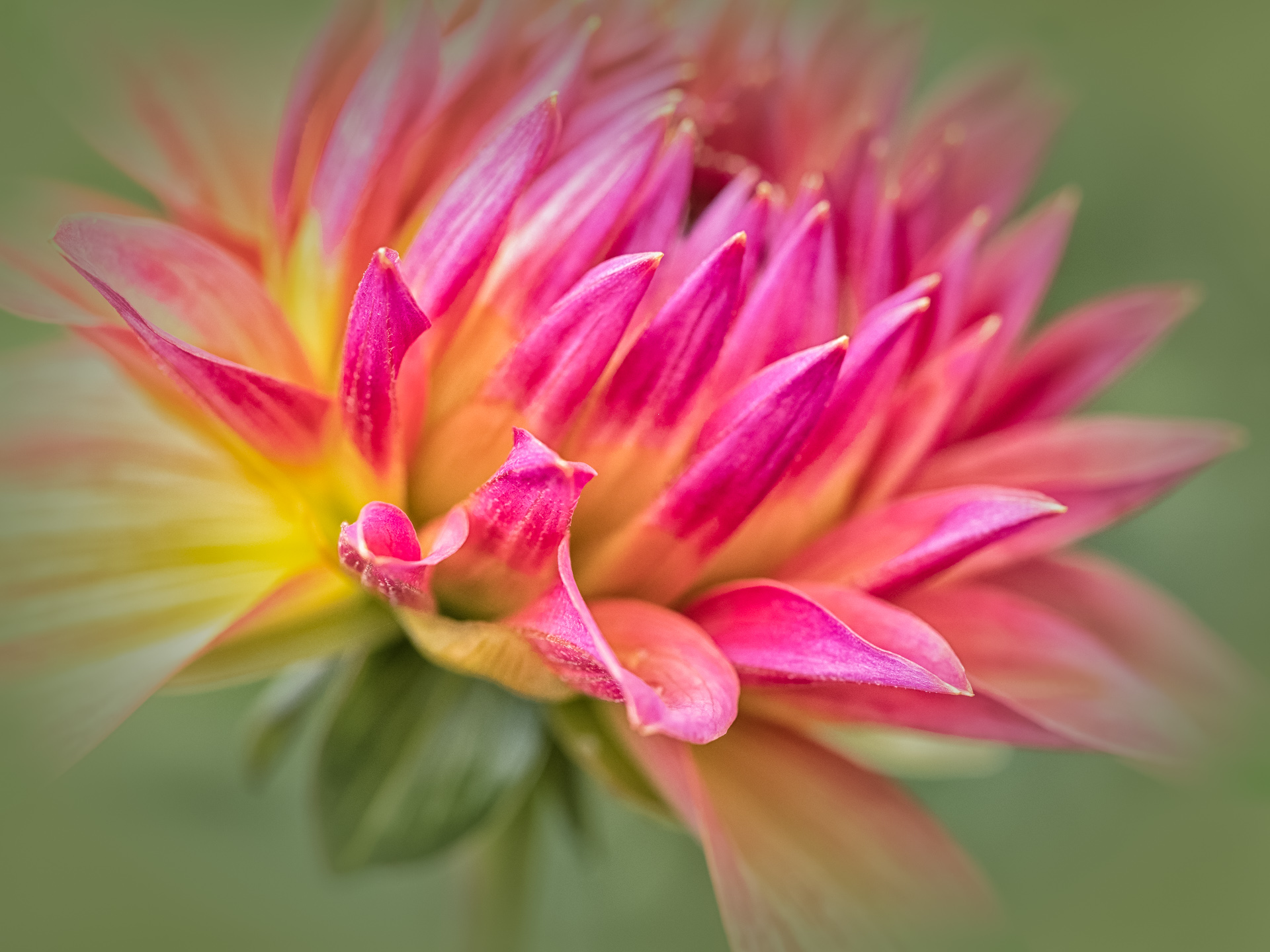
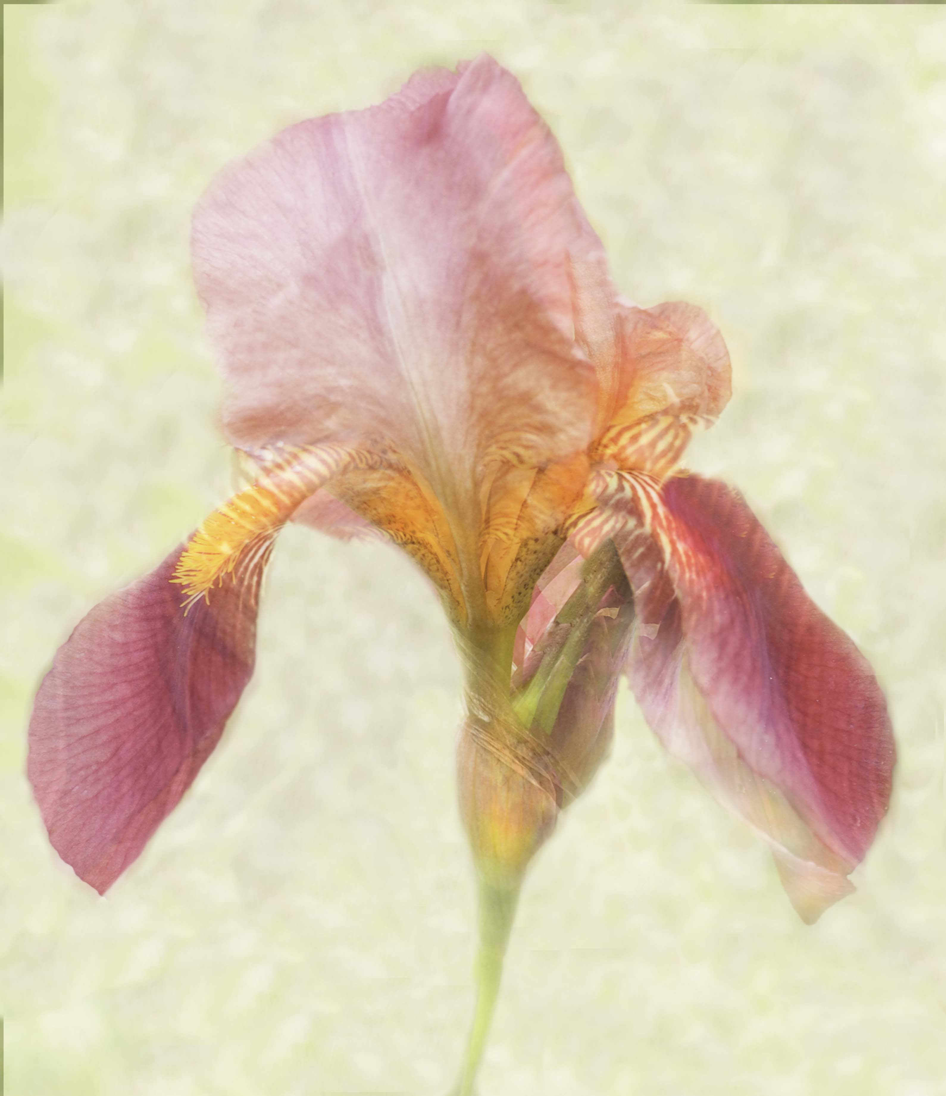
Lisa, this is not only very artsy, but a really beautiful image of your Peony. Tack sharp and I can feel the texture! The composition, lights and shadows and balance of all works very well; great job, I wouldn't change anything.
|
Jul 15th |
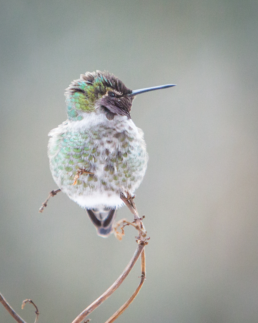
| 52 |
Jul 18 |
Comment |
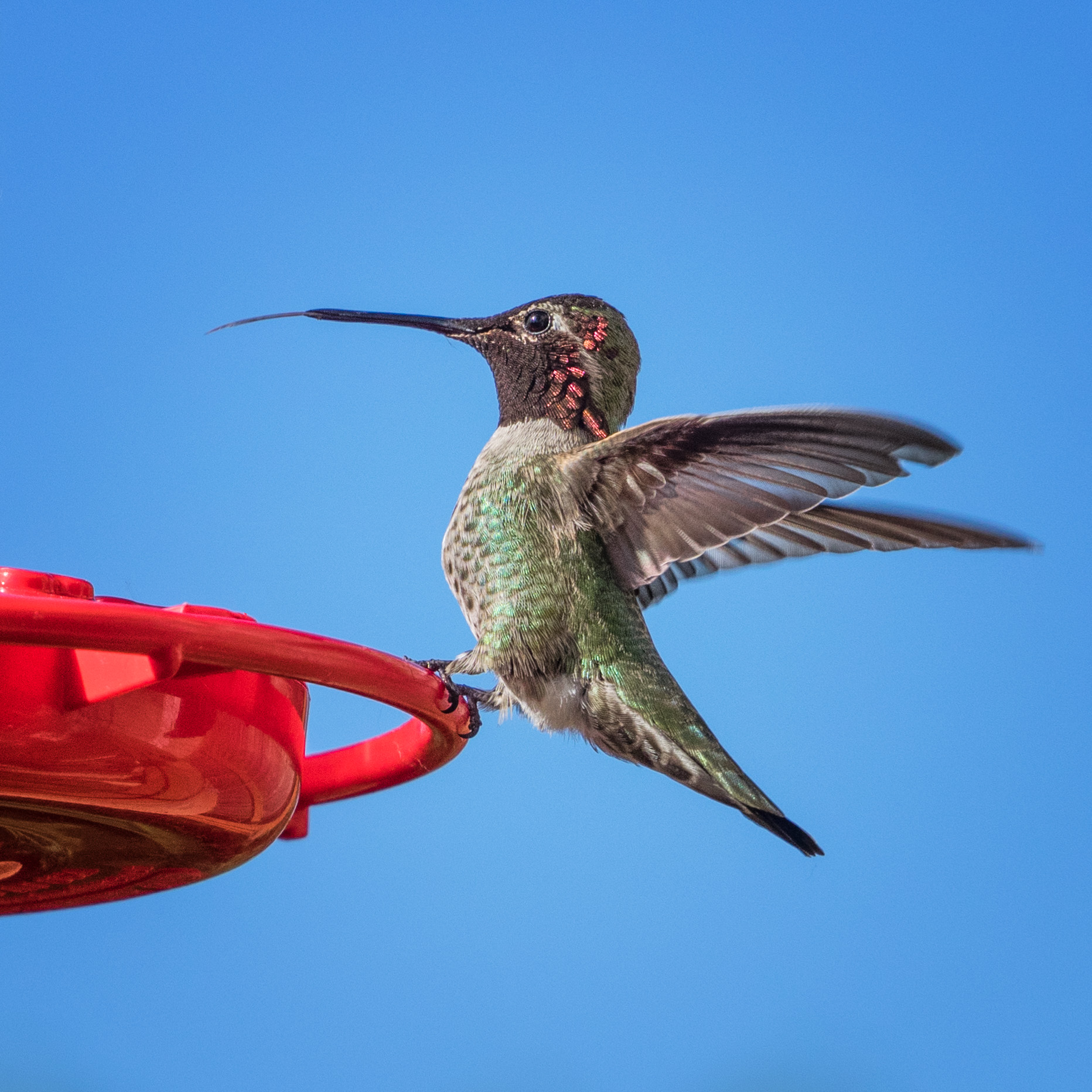
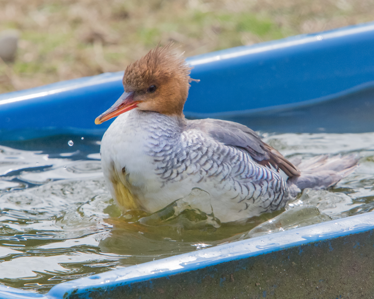
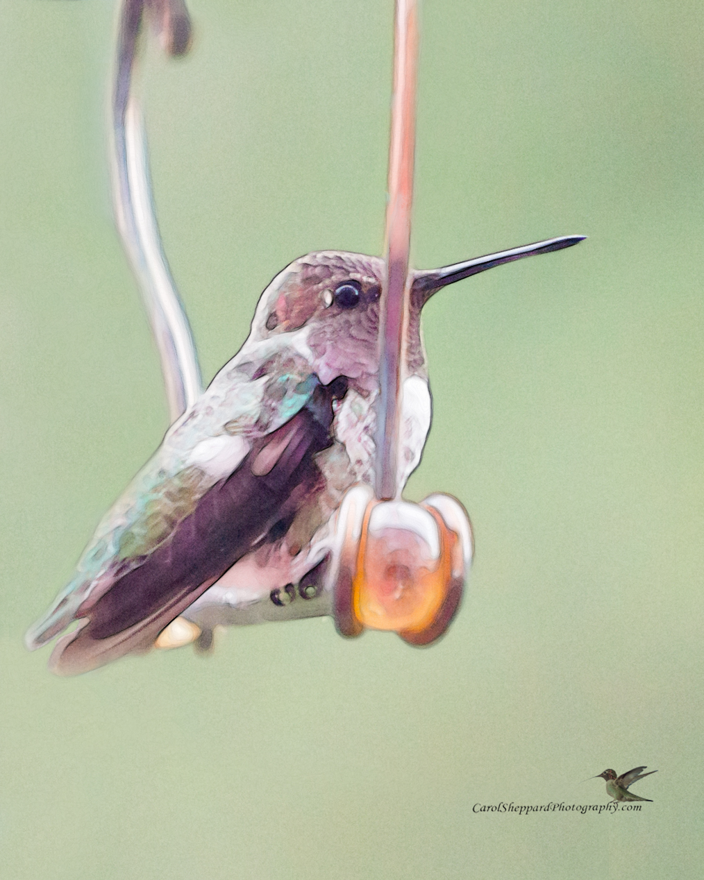
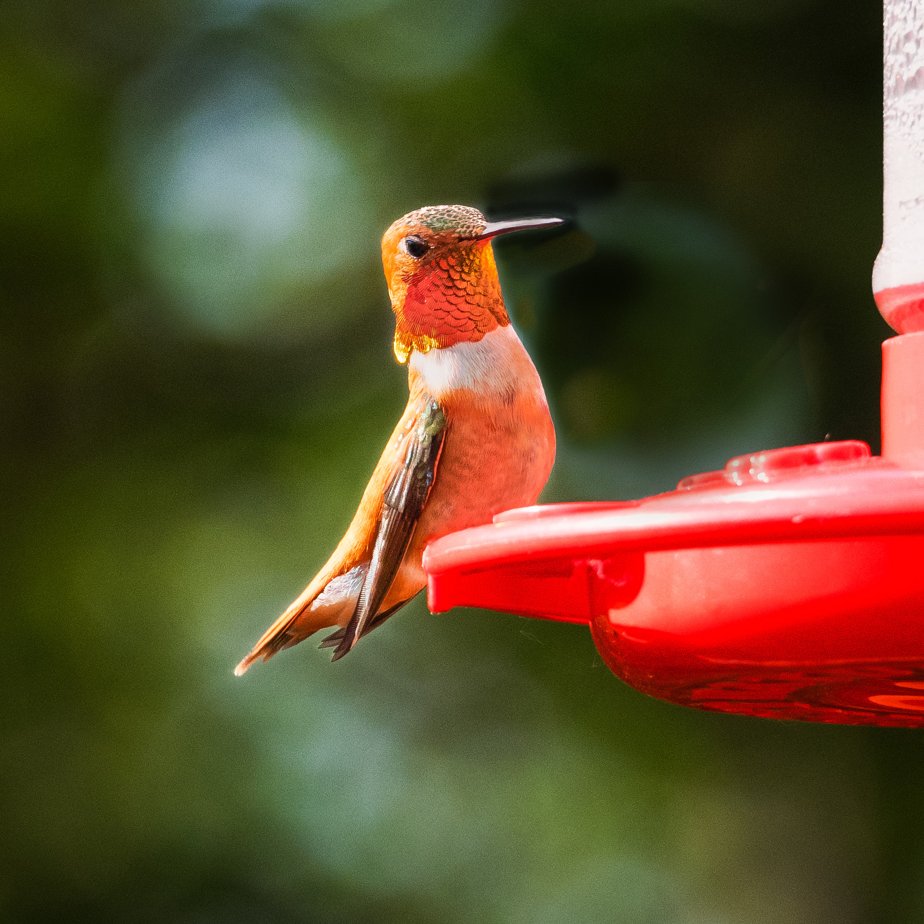
Sharon, this is a beautiful image...and I know my hummingbirds, so I love how you captured it. The second one is definitely an improvement for bringing up the shadows and putting some pop into it. The composition and simplicity works very well, as do the simple background and your impeccable focus of the subject. The branch is a nice change from the usual bird at flower images. Great job! |
Jul 15th |
8 comments - 0 replies for Group 52
|
| 60 |
Jul 18 |
Comment |
What a very cool image! It feels very fine-art to me, and the BW treatment works quite well for this subject. You've done a terrific job with the focus, the tonal range, and the overall composition and cleanliness. Great image! |
Jul 14th |
| 60 |
Jul 18 |
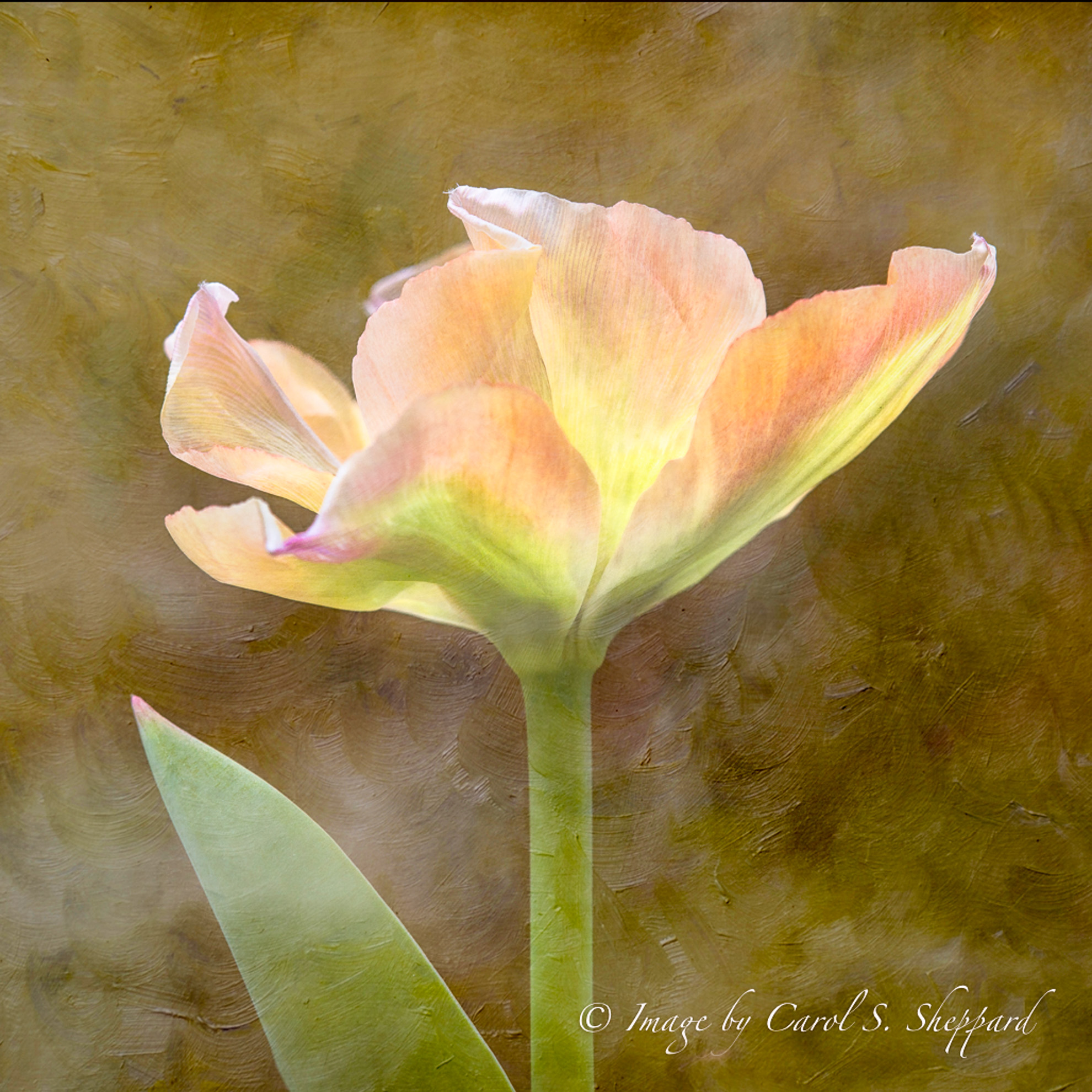
Comment |
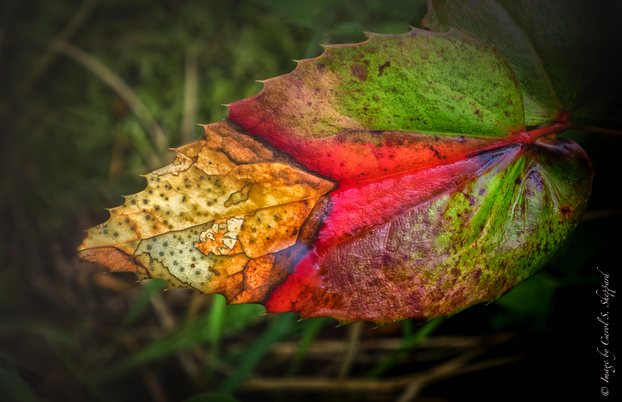
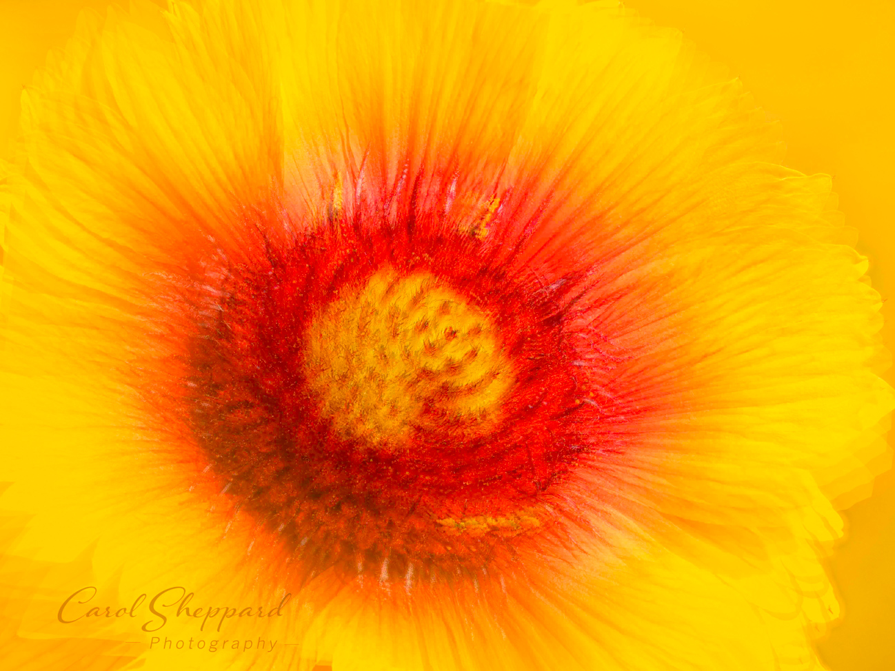
The colors of this image are stunning, and I don't like to see them lost in the busyness of the image. What would happen if you cropped off the left side, cloning out that bit of leaf that intrudes close to your smoke plant? Your focus and sharpness feel good, and yet I also have trouble focusing on the real subject. I would also try to raise the White Point after cropping, to give it some brightness without over-exposing it. It has wonderful potential...I just would bring the focus to the plant itself by eliminating outside elements? |
Jul 14th |
| 60 |
Jul 18 |
Comment |
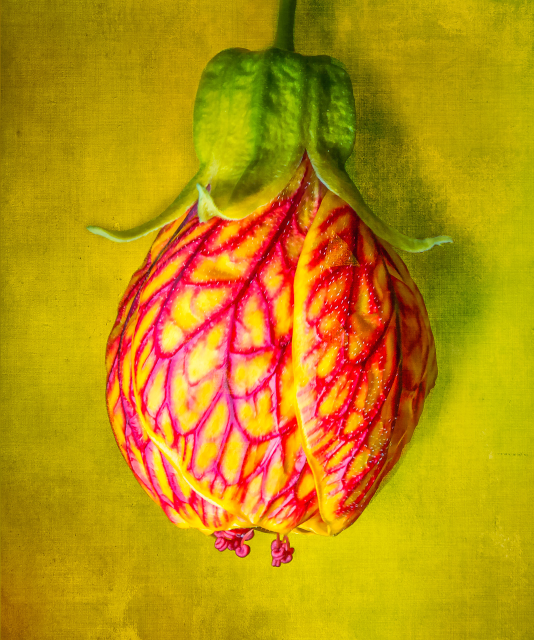
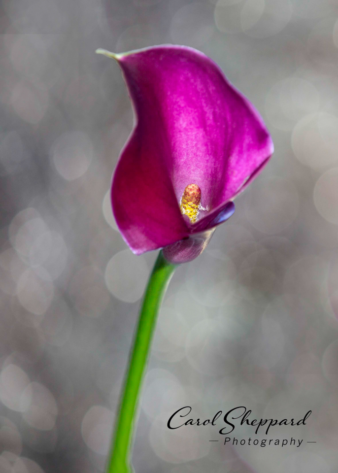
This is an image with high impact--you have the white balance absolutely perfect against the black background! What also works well for me is how you have the focus on that very specific part, without making the rest too out-of-focus. Compositionally and balance are terrific. The emotion for me is one of something emerging from the background with all of its subtle color intensities and light/dark variations. Beautiful!! |
Jul 14th |
| 60 |
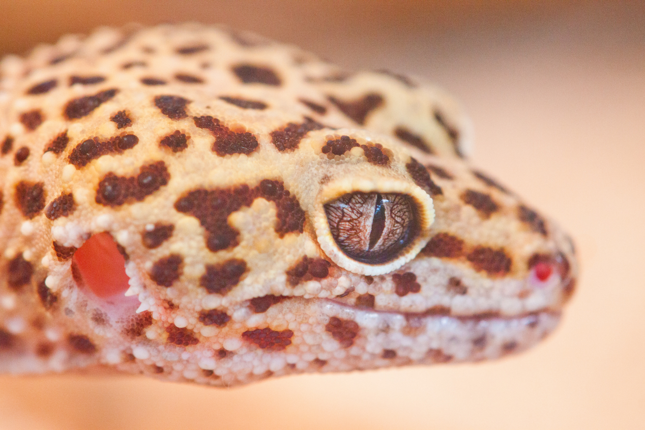
Jul 18 |
Comment |
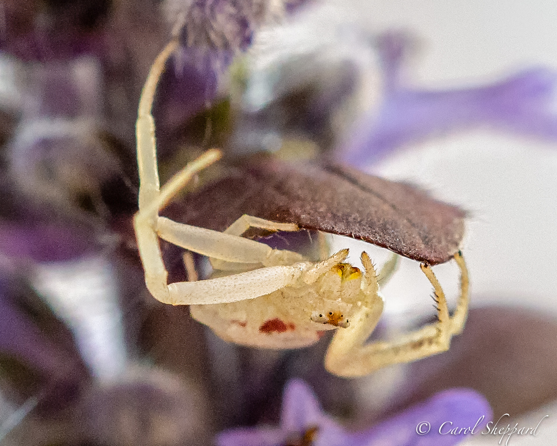
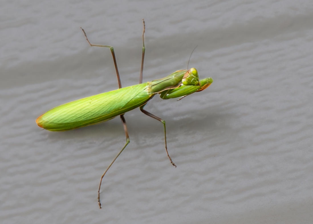
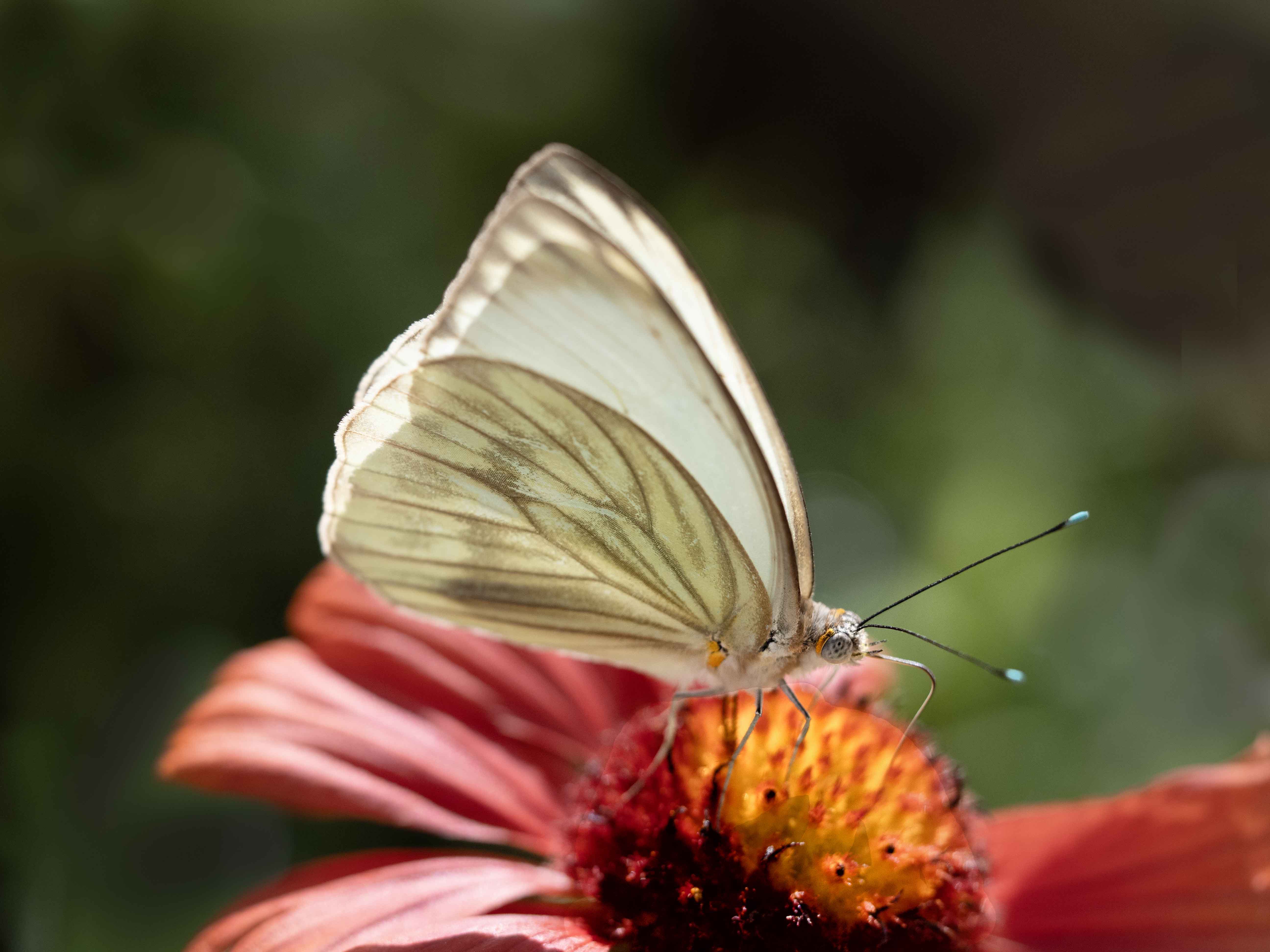
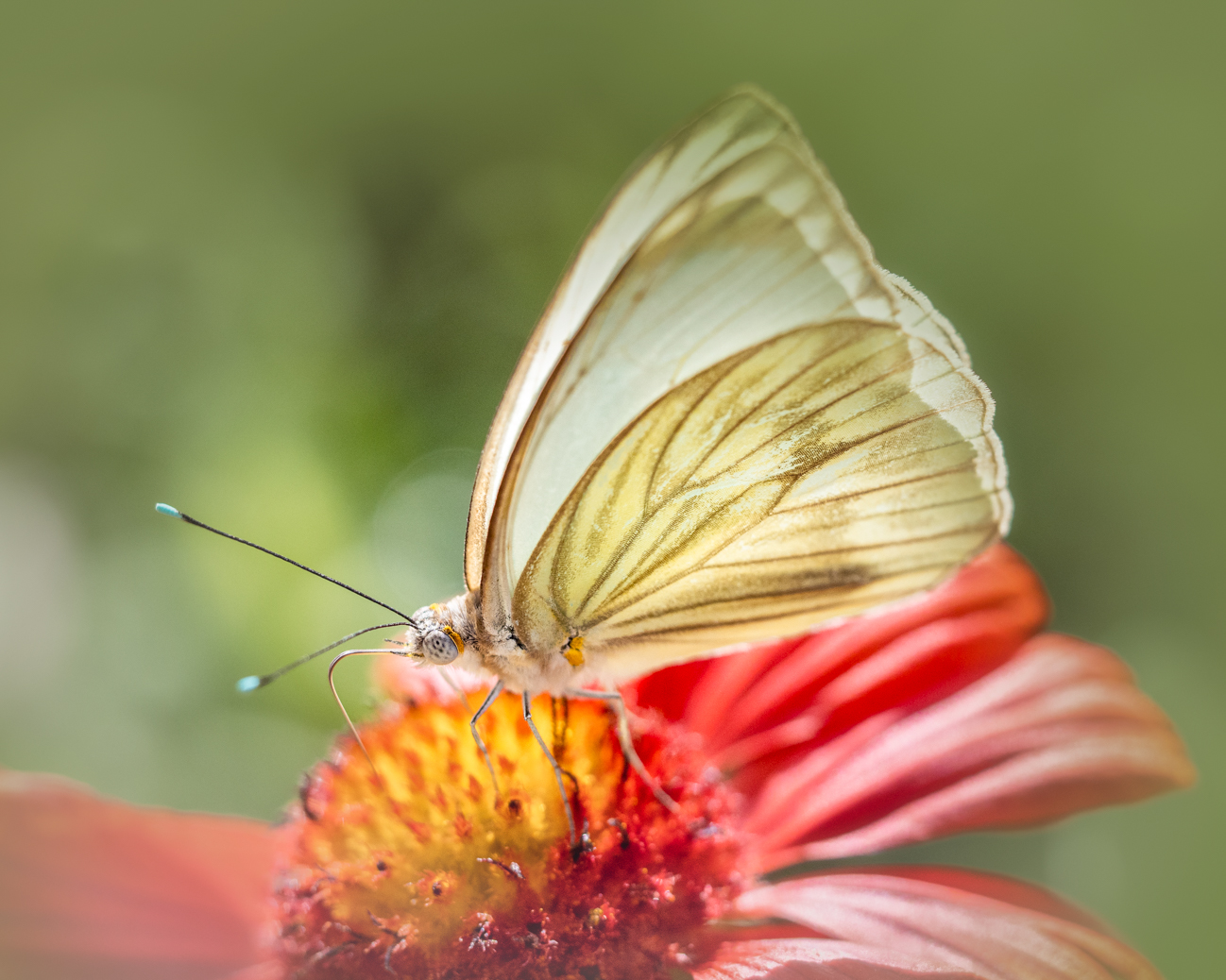
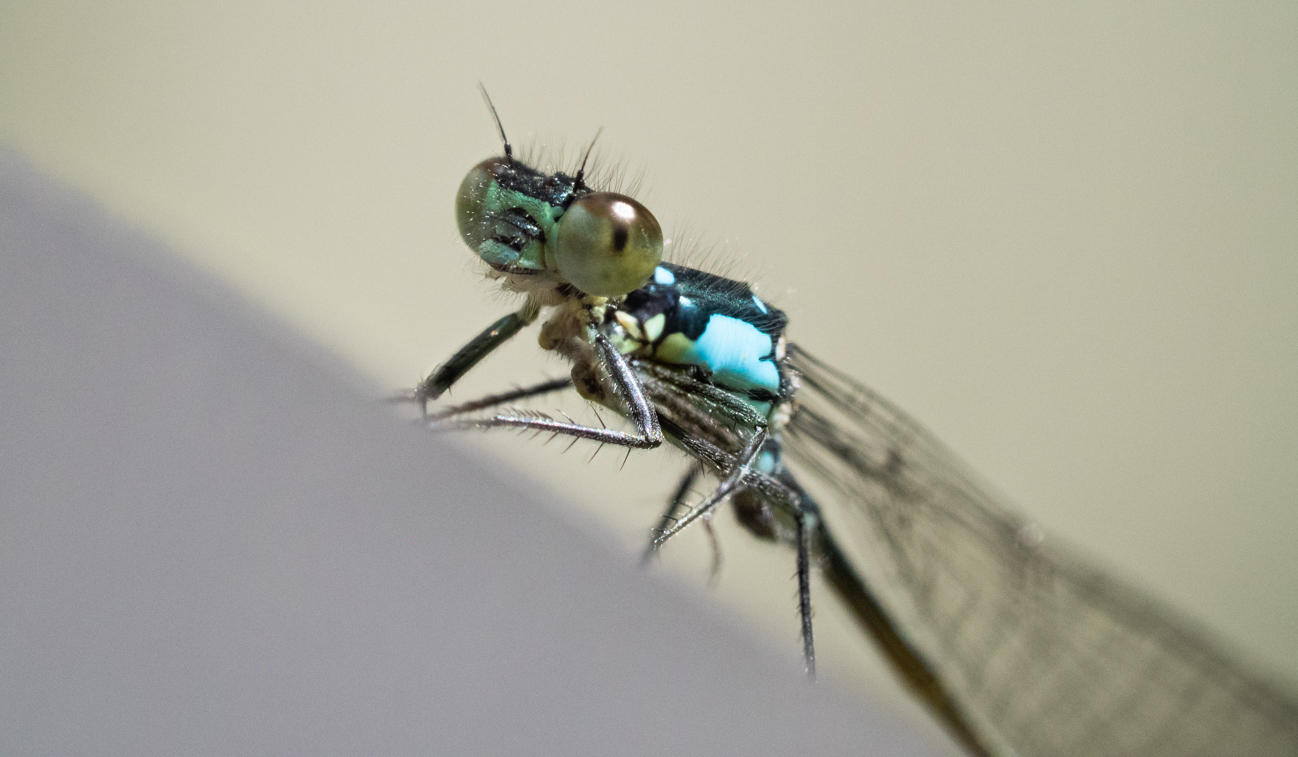
A wonderful image!! Especially strong for me is the story that is told in the single image. Technically, the color combination works quite well and I find it to be a very sharp image. I do understand the comments about "softness" and it is so subtle as to almost be non-existent. If there is a way to sharpen just the area where the one full eye is, that's what I would suggest. I also might try to crop in very slightly on the top and right edges, so the antennae comes more from the corner area; the rest seems unecessary, but not sure until I see it. Otherwise, awesome capture!! |
Jul 14th |
| 60 |
Jul 18 |
Comment |
Thank you for your insights! I often feel like I miss the distracting elements after staring for so long at an image! I will darken that bright area and lighten the right-hand side, as suggested!
|
Jul 14th |
5 comments - 0 replies for Group 60
|
13 comments - 0 replies Total
|