|
| Group |
Round |
C/R |
Comment |
Date |
Image |
| 52 |
Feb 18 |
Comment |
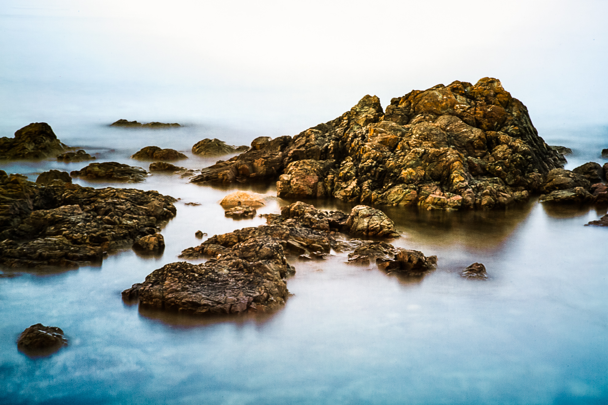
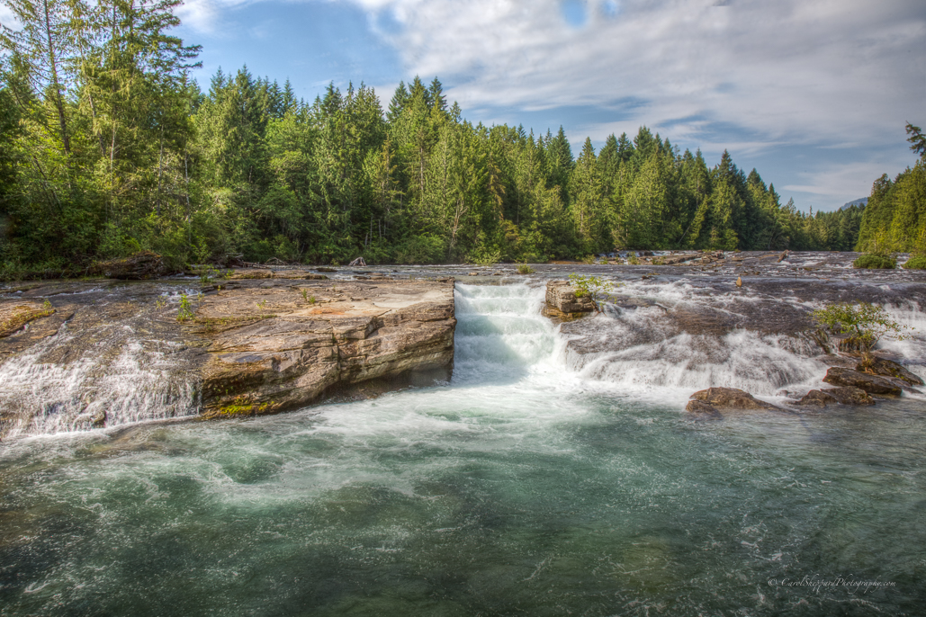
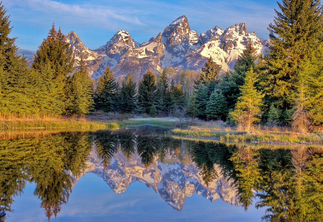
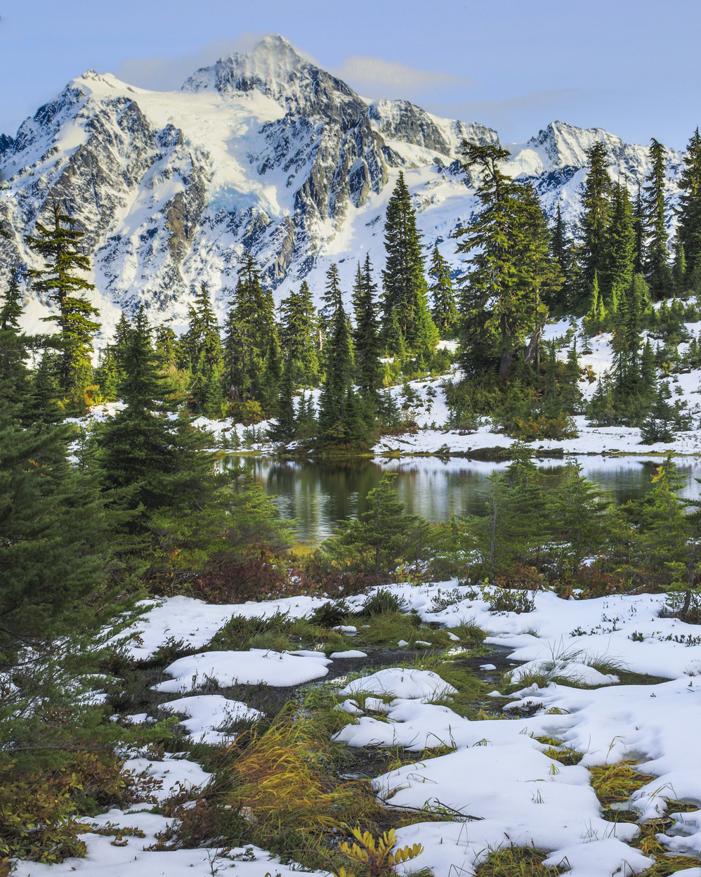
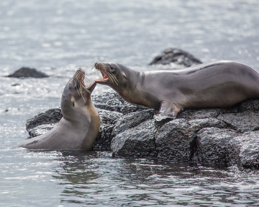
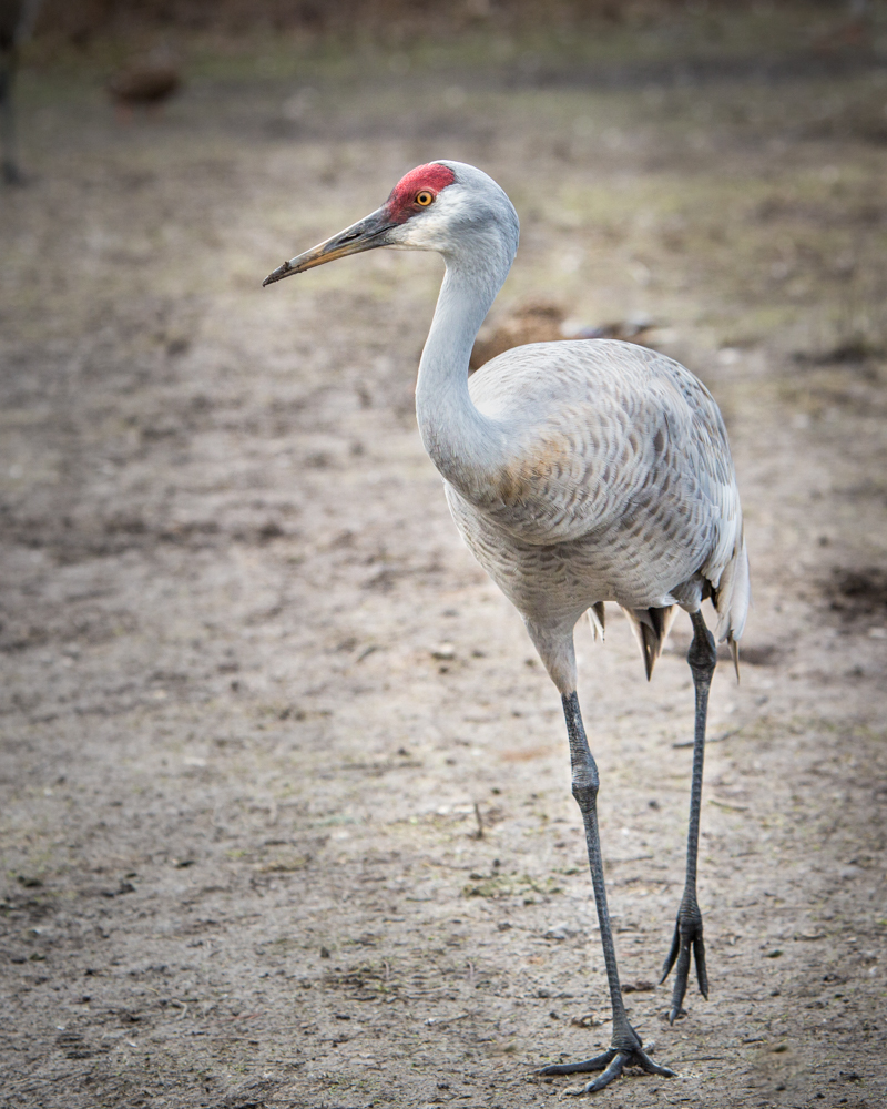
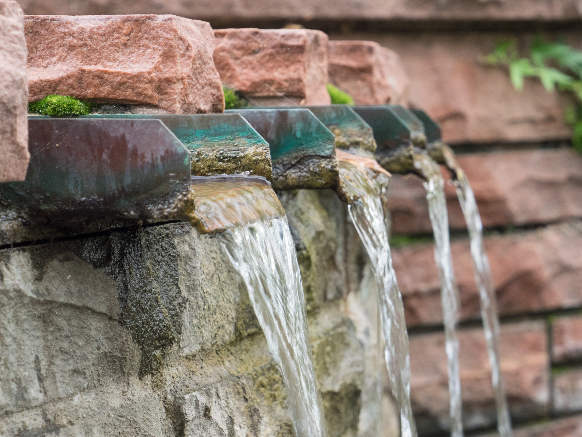
So, to answer some questions posed....this was in Canada, near Canmore. The water actually is aqua, so even after I warmed globally for the rocks, etc., the water stayed as is (aqua). I love vignettes, but sometimes find they make the overall image darker.
My workflow is to always do Photomatix Pro HDR before anything else--so I take the raw to DNG files, merge them, and then only do my work on the HDR result. For some reason, I have a terrible time with darker images. My antelope canyon images were the worst--HDR really unusable in my opinion. Lots of magenta (?) noise. I welcome any suggestions anyone has or input as to what I might be doing wrong. I never have any other problems with HDR--just the one circumstance.
|
Feb 14th |
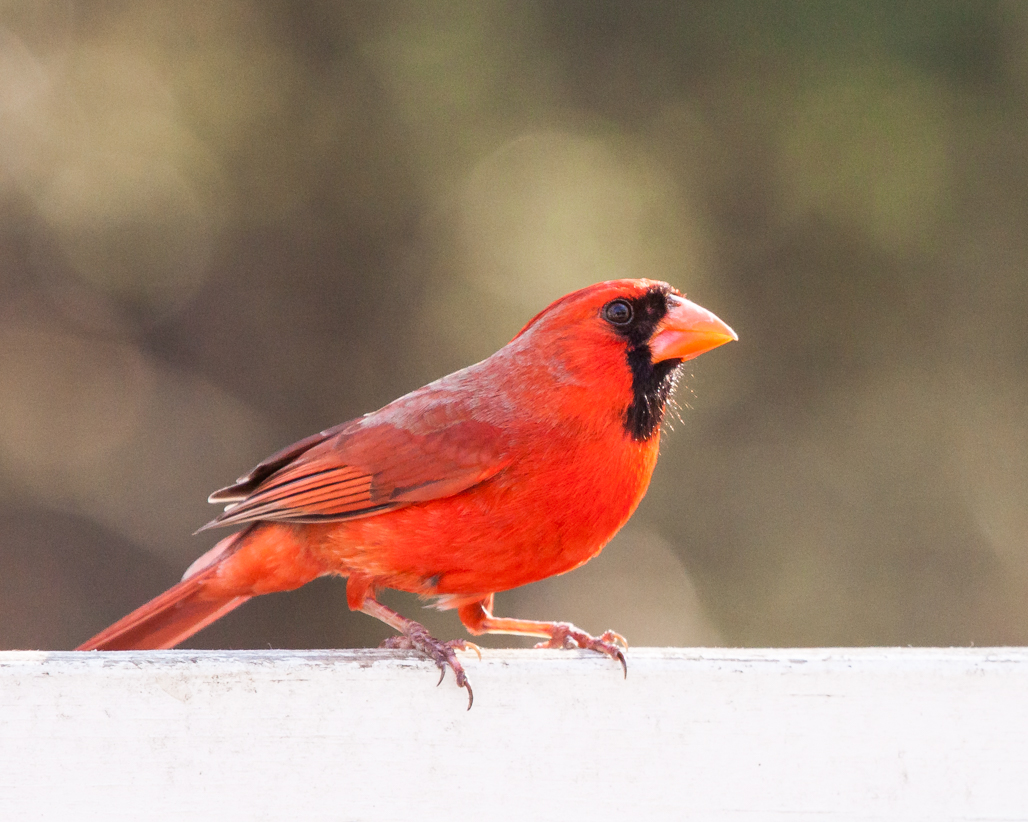
| 52 |
Feb 18 |
Comment |
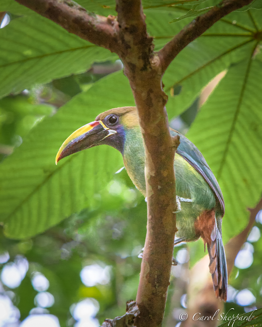
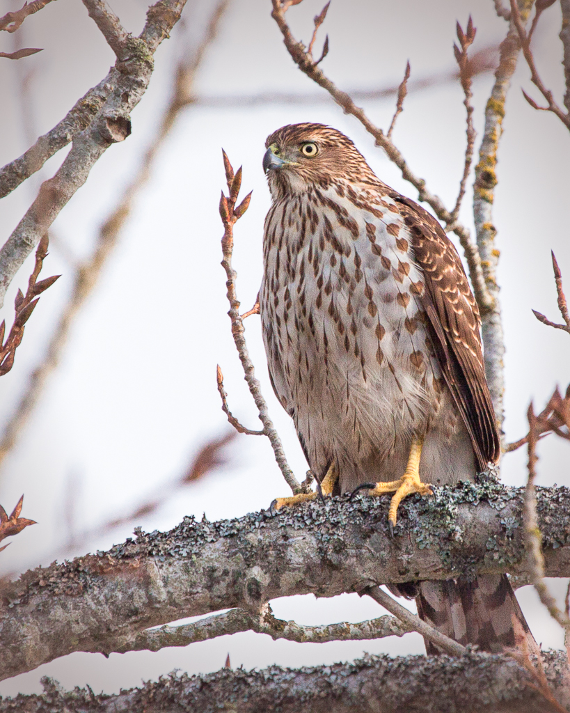
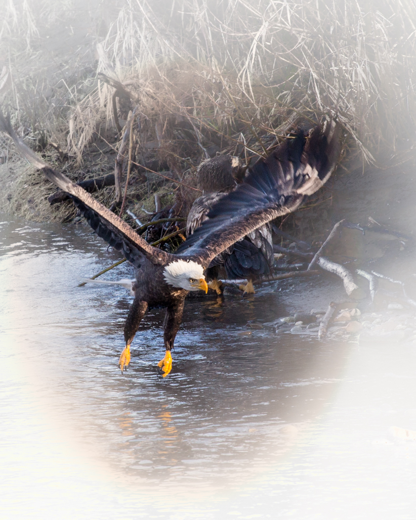
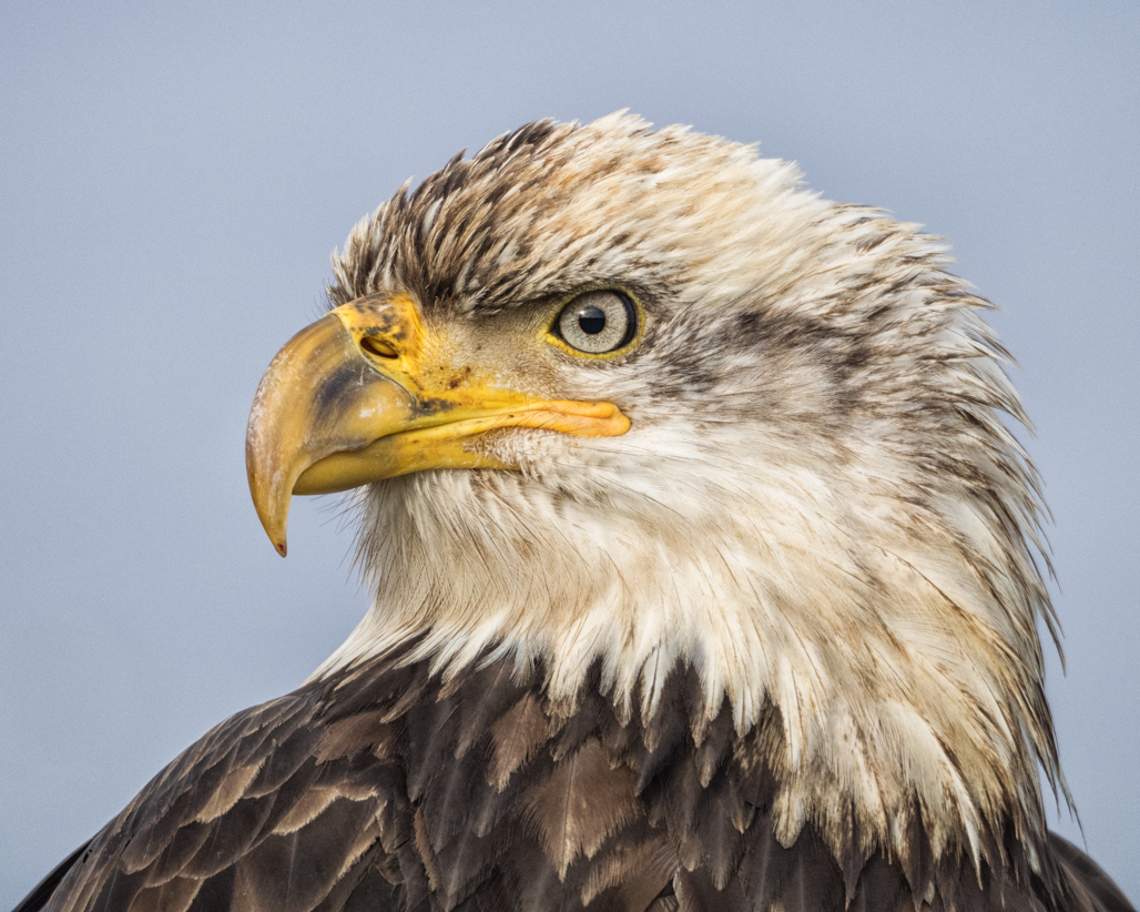
This is an image that brings magic to an ordinary movement. Part of it feels like the balance, part the sharpness, and part the perfect clarity and blend of lights and darks. It is very easy on the eyes! I think the simplicity of background and sky lend itself to putting the focus fully on the bird. It is a wonderful image, no suggestions! |
Feb 9th |
| 52 |
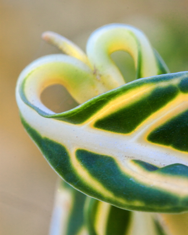
Feb 18 |
Comment |
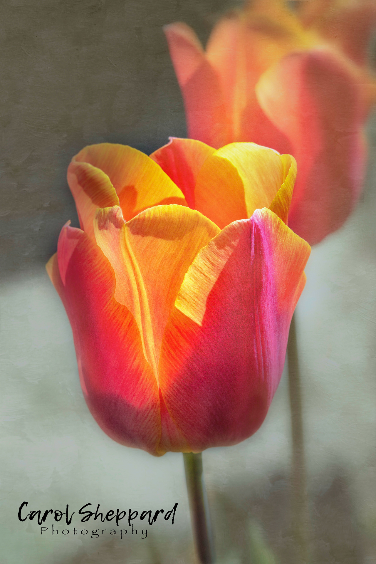
The main impact from this image comes from the colors, for me. The composition is beautiful for the subject, with the lines of the bricks leading the eye into and away from the plant. It is a very artistic image. You have also captured the intense lighting without it being overwhelming...hard to do with an IPhone! So kudos on this shot! |
Feb 9th |
| 52 |
Feb 18 |
Comment |
This is a nice action shot with the story spelled out clearly in your composition. I don't think I would change anything, but if you have the patience, can you direct a little more light onto the osprey's face and underarm part of the front wing? My eye went directly to the "catch," but it didn't quite land on the osprey's face. I think brightening the beak and maybe popping his eye color a little bit will take care of this. Other than that, perfect!!!! |
Feb 9th |
| 52 |
Feb 18 |
Comment |
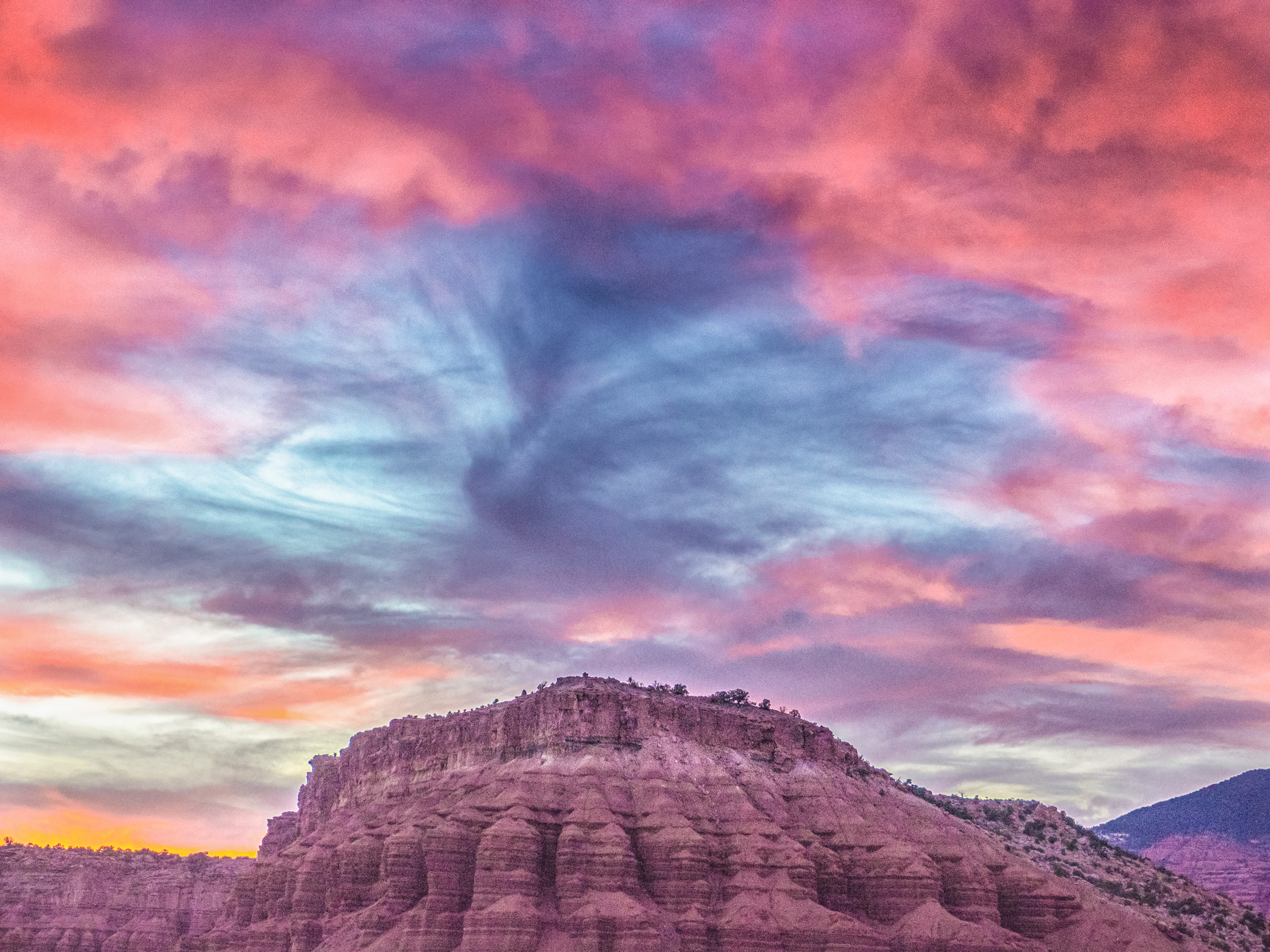
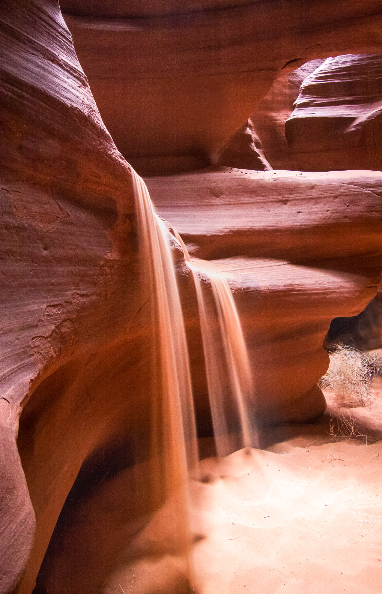
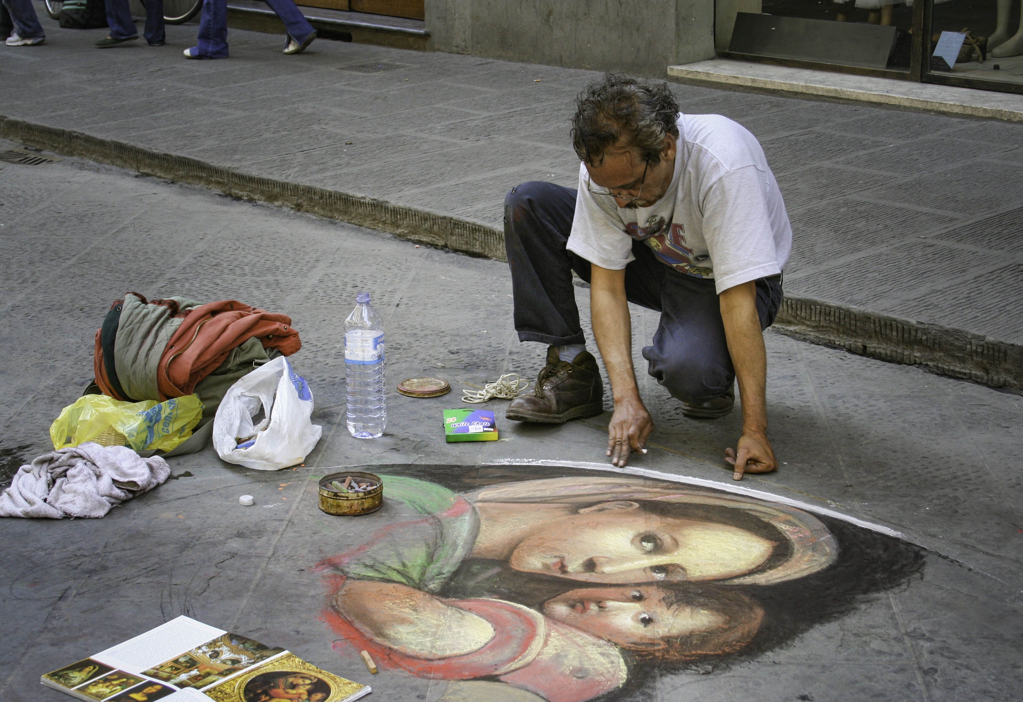
John, this is a beautiful image with great composition, leading lines, and crispness. My eye, however, is drawn immediately to the variations in the sky. I know that happens when using HDR, and Aurora is the highest rated HDR package. Saturation and contrast are fighting, to my eye. While I find the contrast perfect, I find the saturation or clarity a little overdone with respect to the color of the sky and foreground rock. You have a wonderful image to work with here, though! |
Feb 9th |
| 52 |
Feb 18 |
Comment |
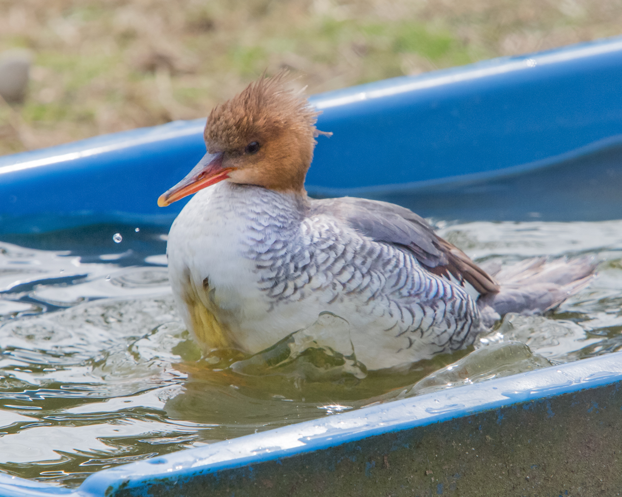
I will first weigh in on the lens....go with the 70-200, f2.8. You will use it more, and get better images. I tried the 150-600 and returned it after one time in the field. It requires a heavier tripod, and it really needs a special head for stability and proper balance. Every little vibration rocked into softness. As for the image, I find the image very appealing for subject, impact, action, and composition. To my eye, it is a bit soft and has artifacting, which detracts a little for me as a viewer. I think a higher shutter speed, even if you had to raise the ISO, would have eliminated this? Finally, I think shooting at 300mm contributed to the softness. I have always heard it said to try to stay in the mid-range where possible, or at least back down slightly from the max focal length for that lens. So hard when you want that shot!!!
|
Feb 9th |
| 52 |
Feb 18 |
Comment |
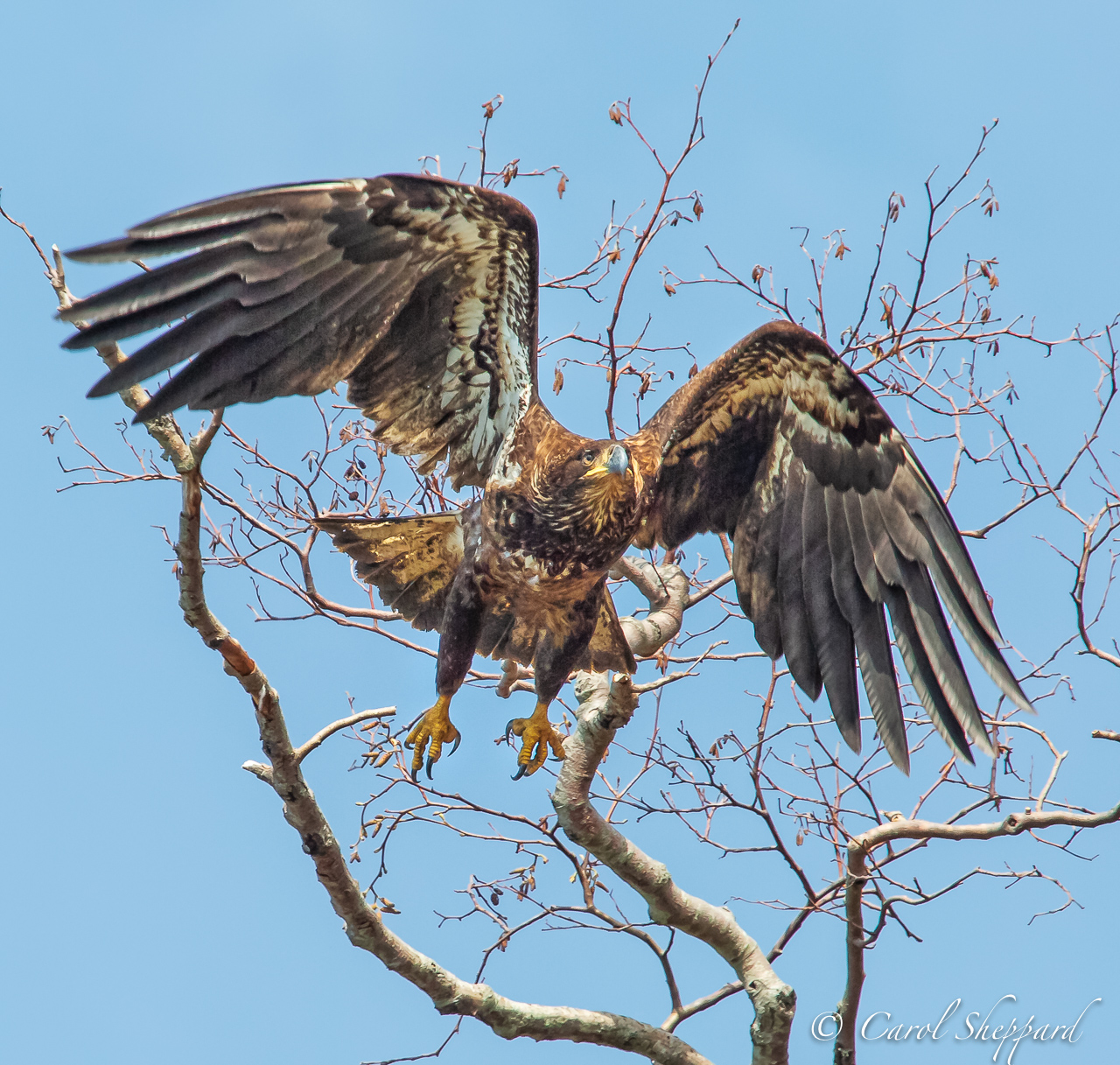
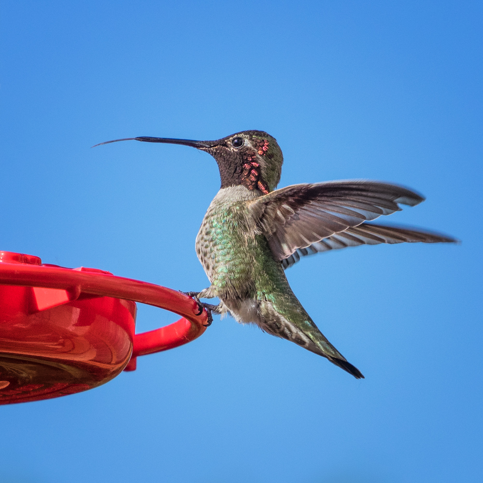
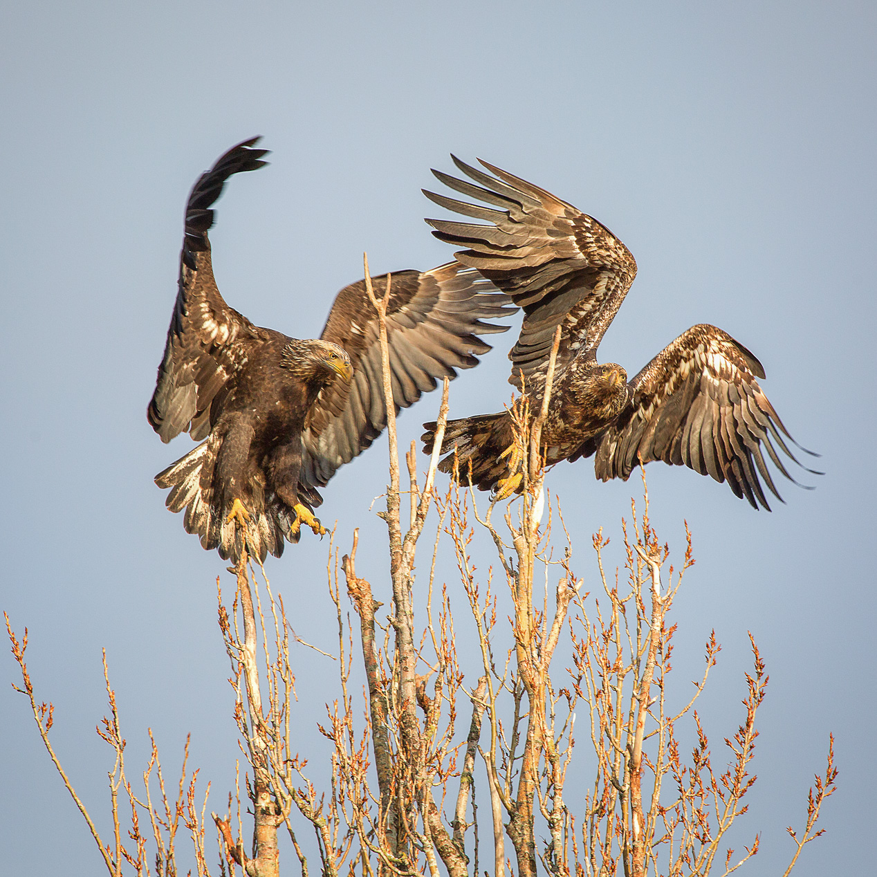
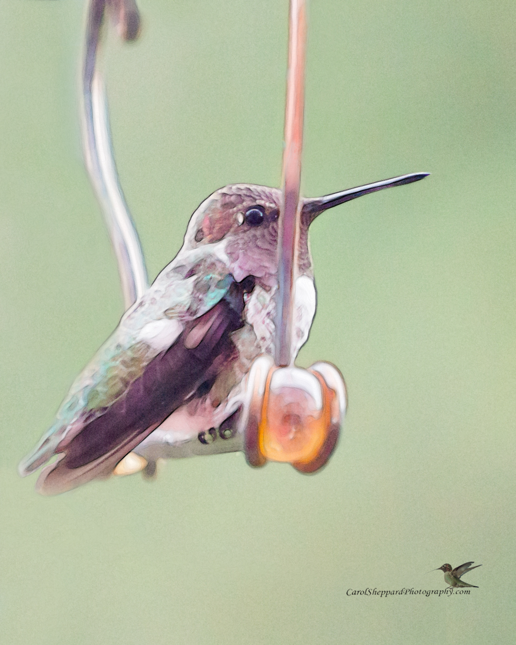
Oops, I thought those were rocks in the foreground! However, they did not distract me. I feel that the only change I would support would be working on the face/eyes, to bring them out more. His little head kind of disappears as I view the magnificence you have caught in his wing movement. It is a great capture, so just try to bring out the facial features on the main subject? |
Feb 9th |
| 52 |
Feb 18 |
Reply |
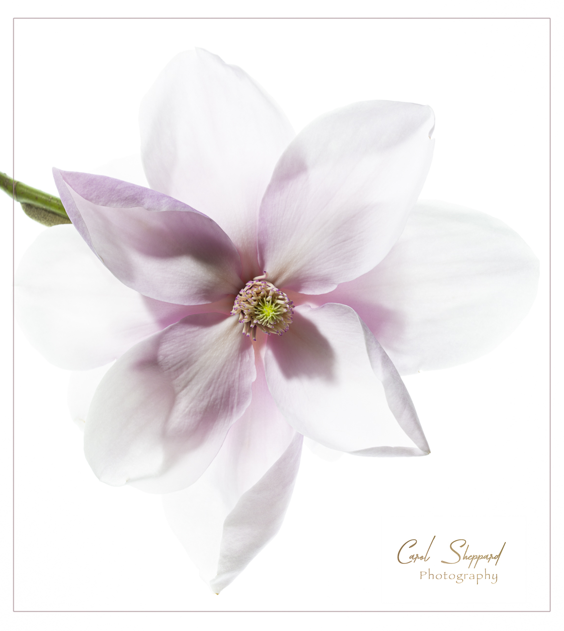
Mike, first, Congratulations! Great article and images!! 2nd, I'm not in a hurry, but CarolSheppardPhotography@gmail.com is my email, when you get a chance. Thanks! |
Feb 9th |
7 comments - 1 reply for Group 52
|
| 60 |
Feb 18 |
Comment |
I apologize, this was supposed to be posted after the 25th, for the next round. I think I'm trying to do too many things at once~! |
Feb 22nd |
| 60 |
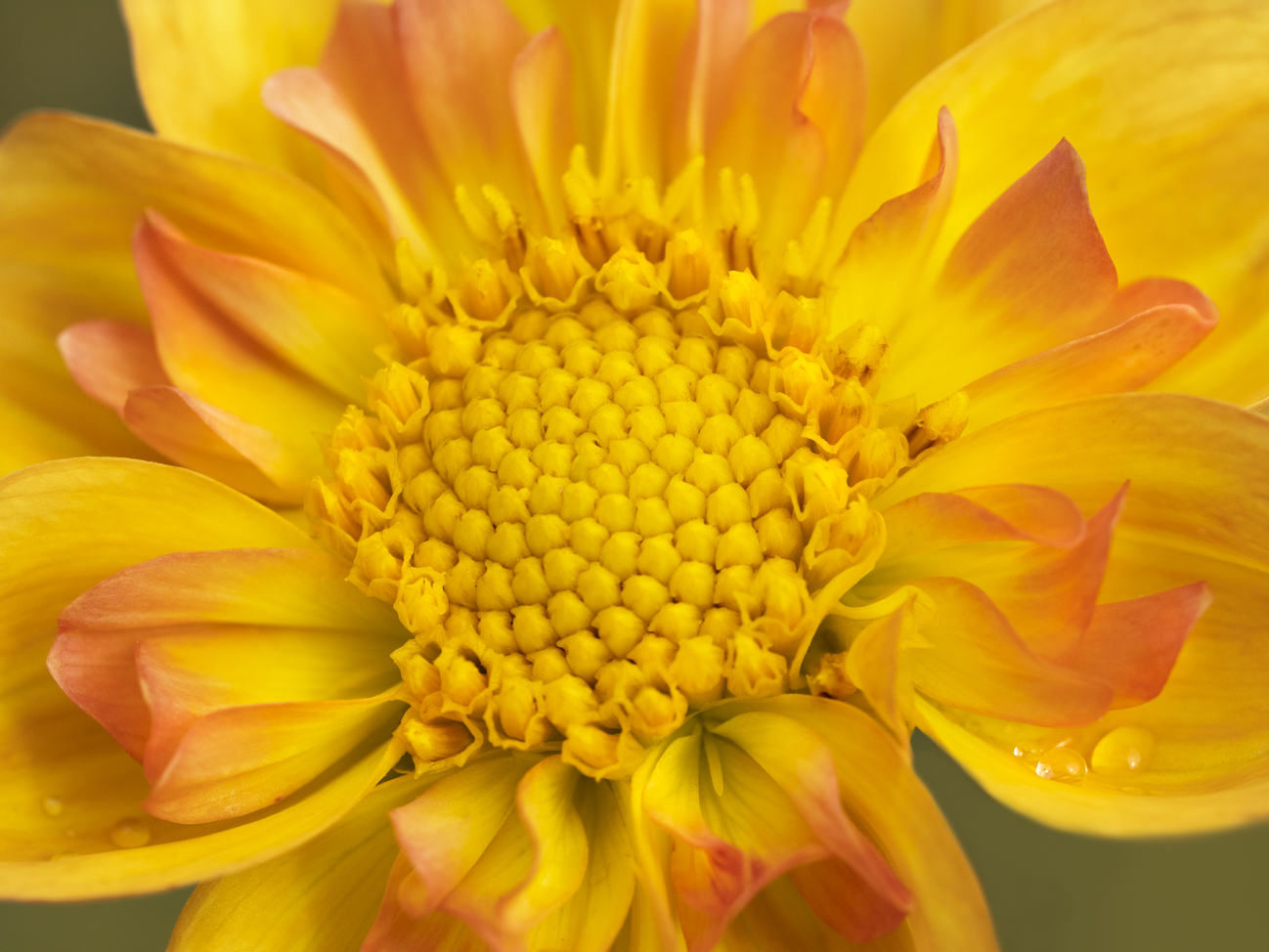
Feb 18 |
Comment |
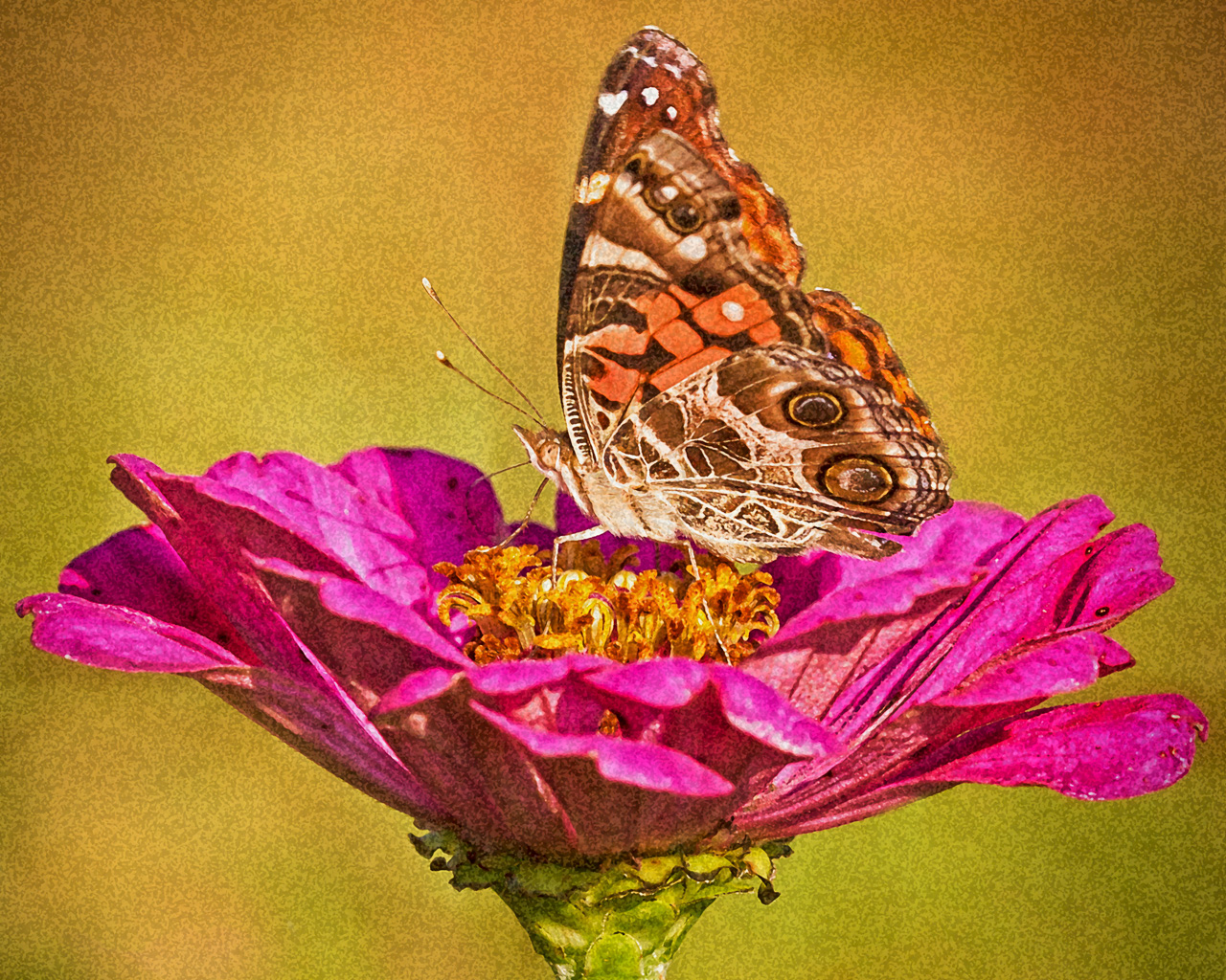
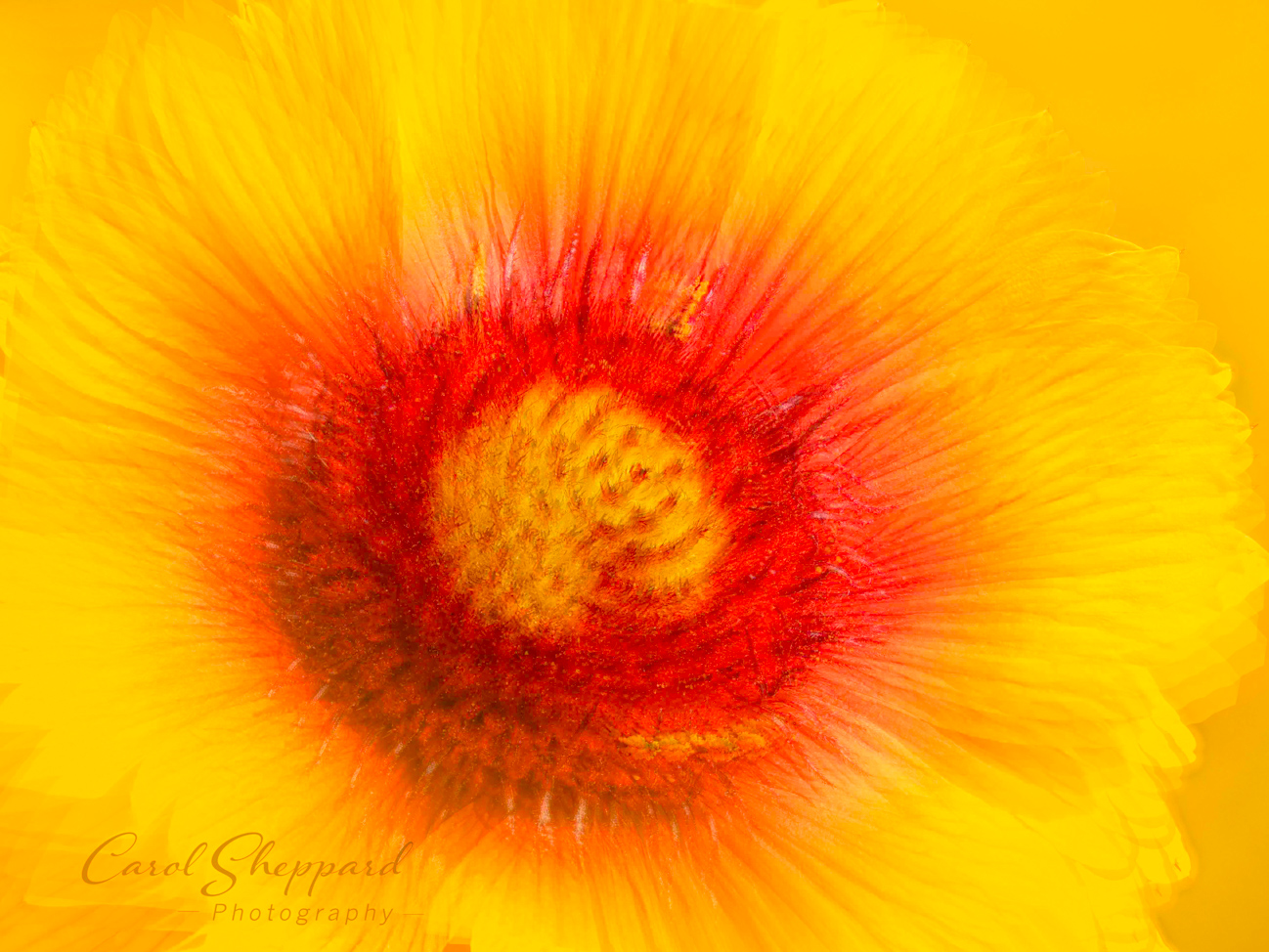
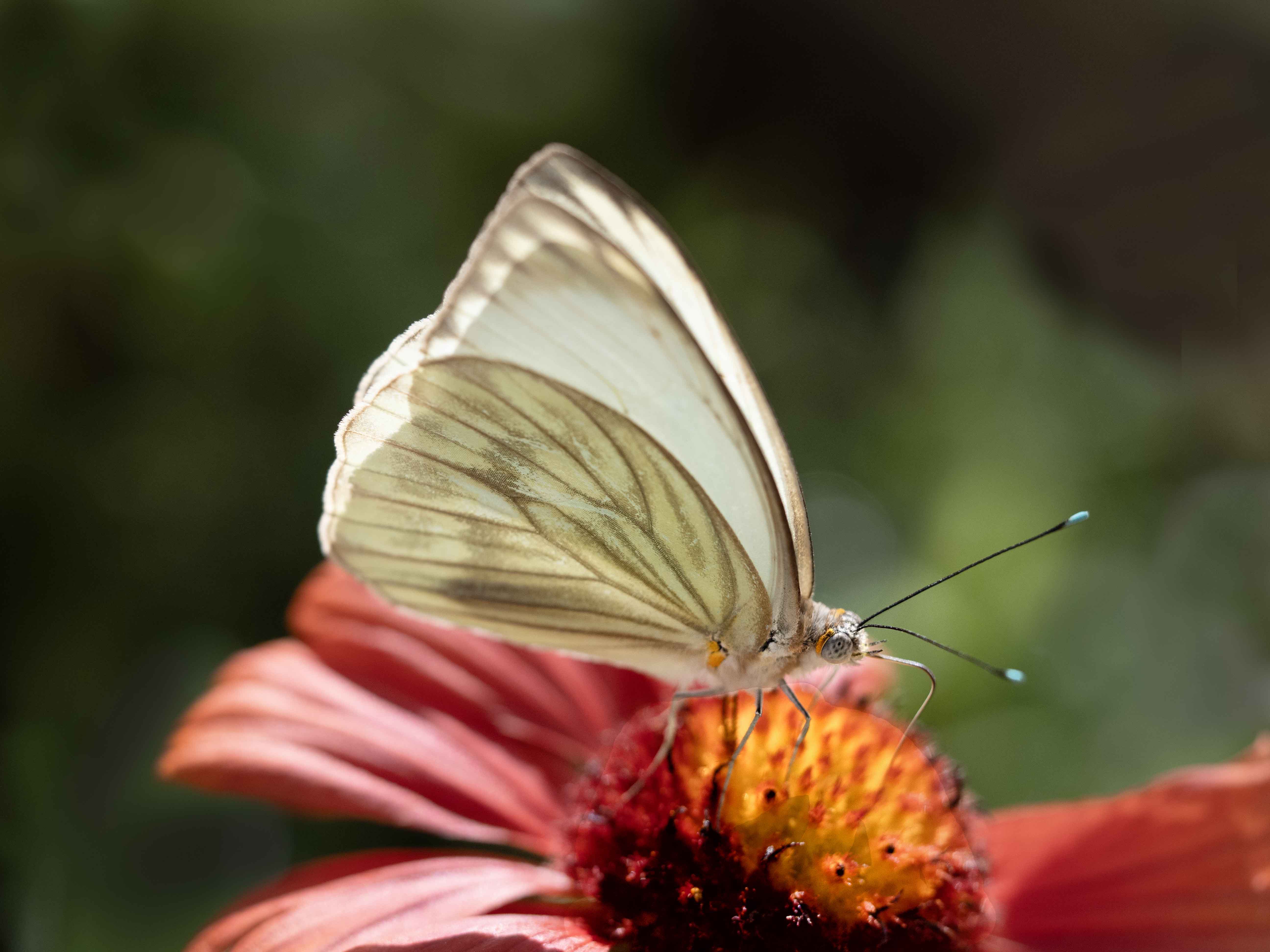
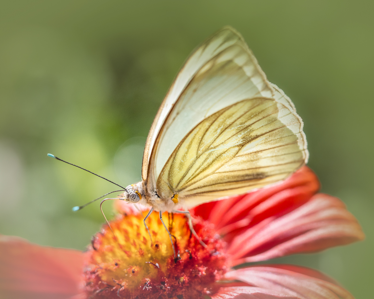
The impact of this is stunning for me as a viewer; it has sharp focus in the face, (chest?) and flower, the background is soft and complementary, and the composition works wonderfully for this subject. Your colors are pleasing, and the light v. shadow is subtle but definitely there.
If there is any way to place some (even artificial) light on the butterfly face through post processing, it would add interest and impact, but I might even suggest you try using Luminence in LR just on the certain colors like orange to bring up small design elements on the face and wings?
Beautiful image!! I think your focus is fine. |
Feb 19th |
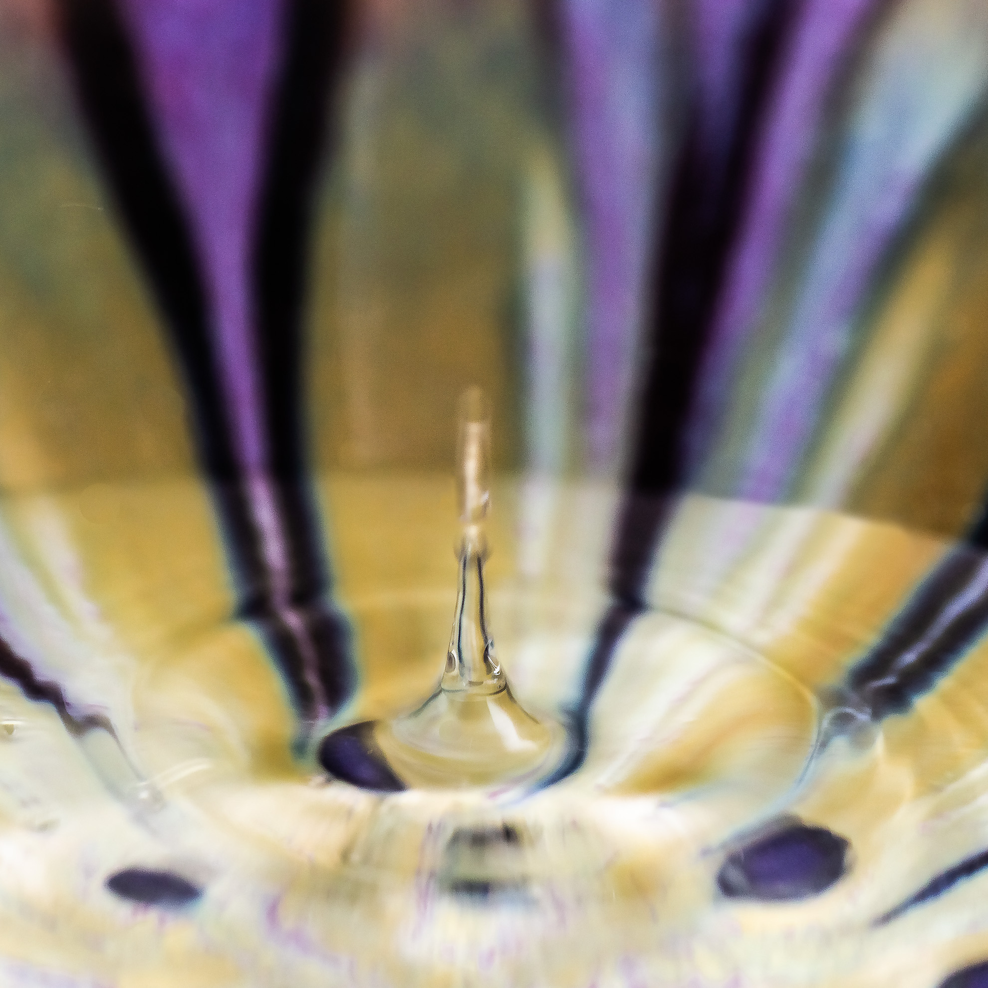
| 60 |
Feb 18 |
Comment |
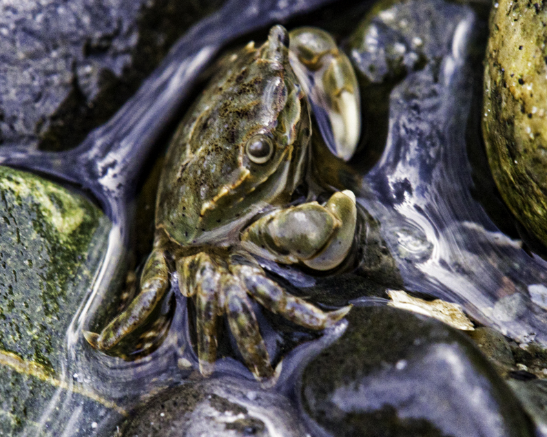
I don't think there is anything technically wrong with your capture or how you set your camera, as the capture is sharp, clear, and with excellent color balance.
Composition is troubling for me as a viewer. I am not certain what I am looking at because of the half of the image that is dark but has an element running through one corner. I would like to see the Sea Fan be more central to the image so that it is clearly the subject. Or crop out the background entirely and focus in on just the Sea Fan itself?
This one is hard for me as a viewer, and I know I'm not being very helpful. |
Feb 19th |
| 60 |
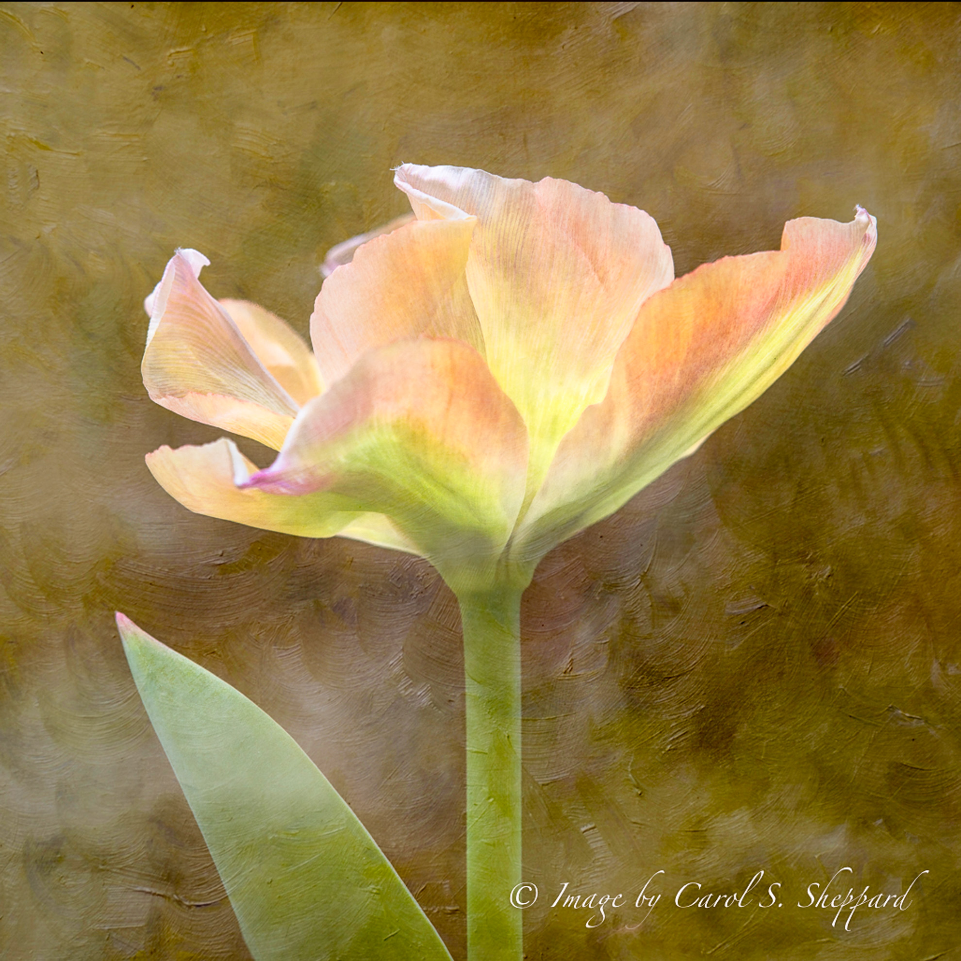
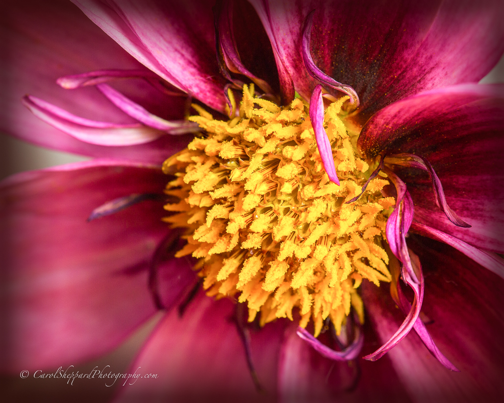
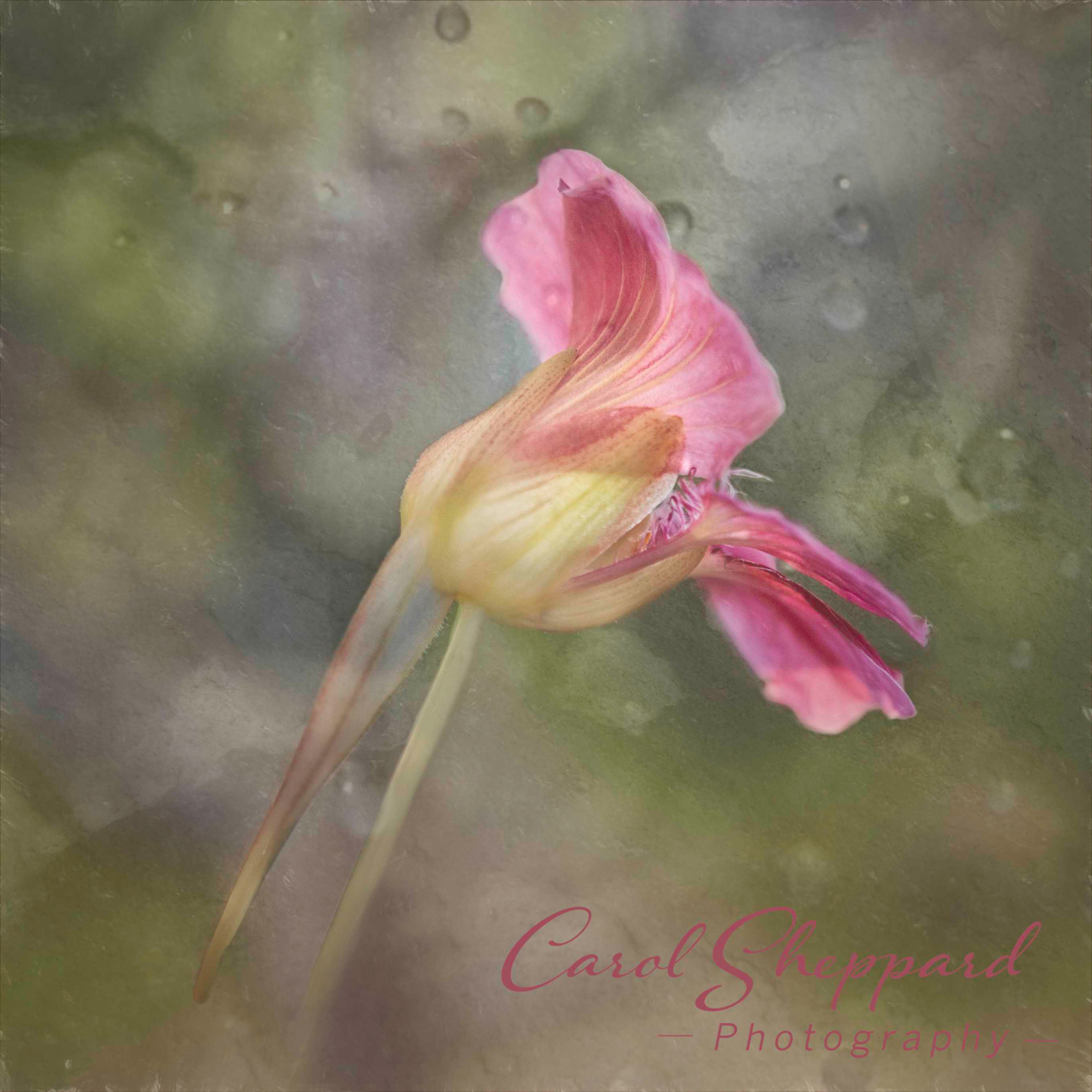
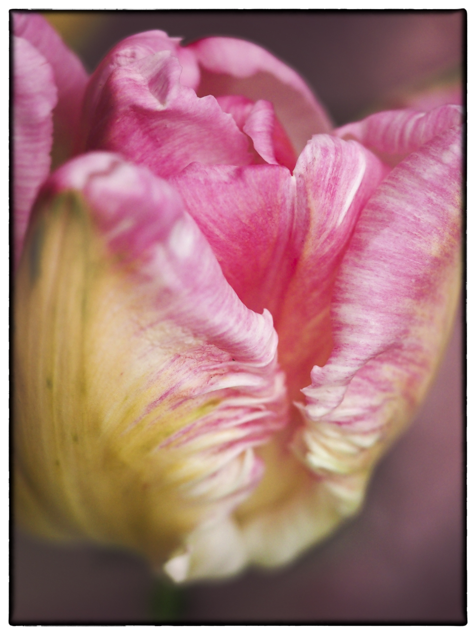
Feb 18 |
Comment |
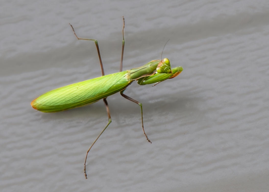
Ha ha, did you ever see the Everybody Loves Raymond episode where his mom takes a sculpting class?
First of all, I love the positioning of this, and the composition. It is sharp and crisp in focus. I especially enjoy how you've captured the detail of the green/white part.
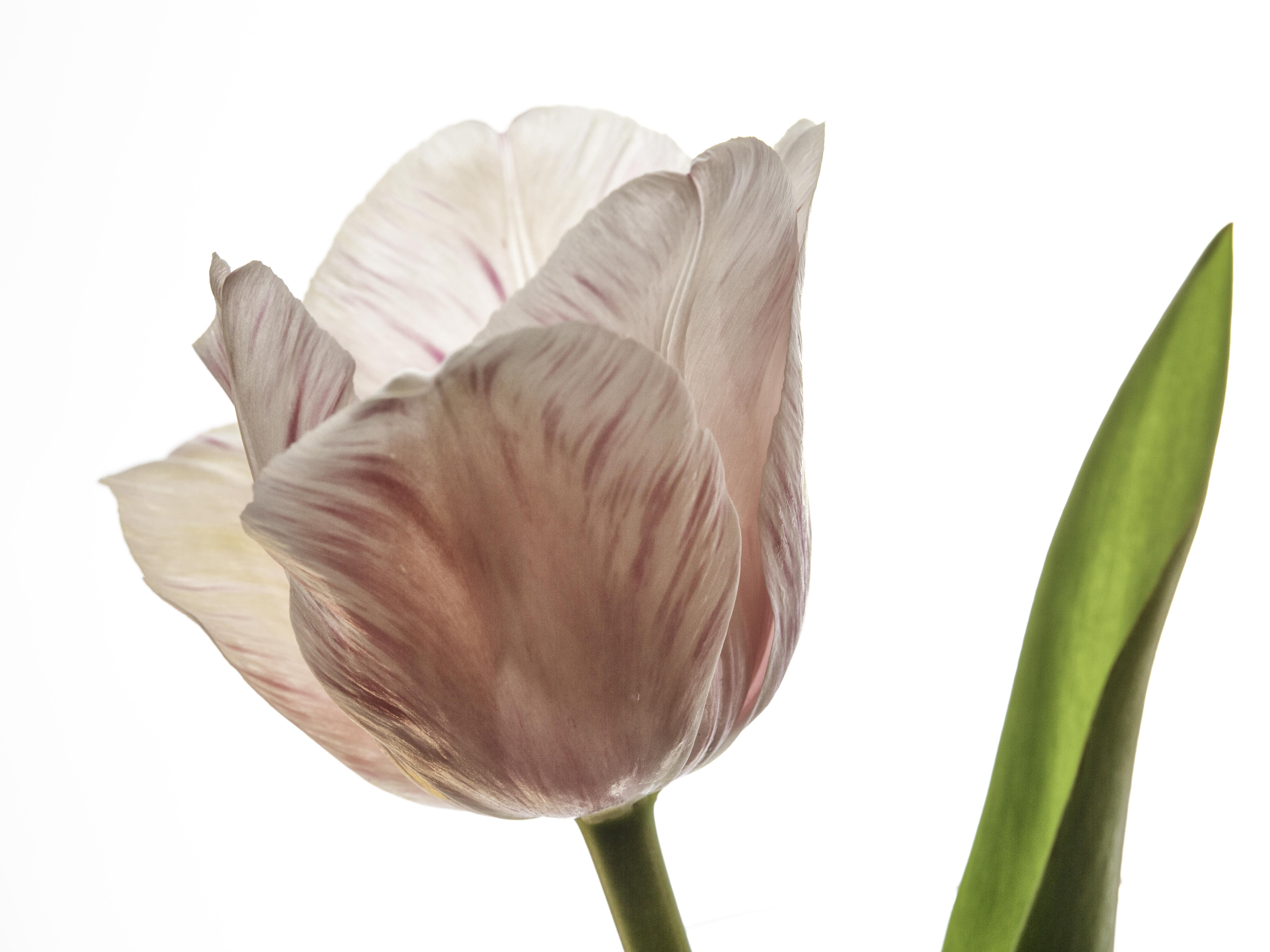
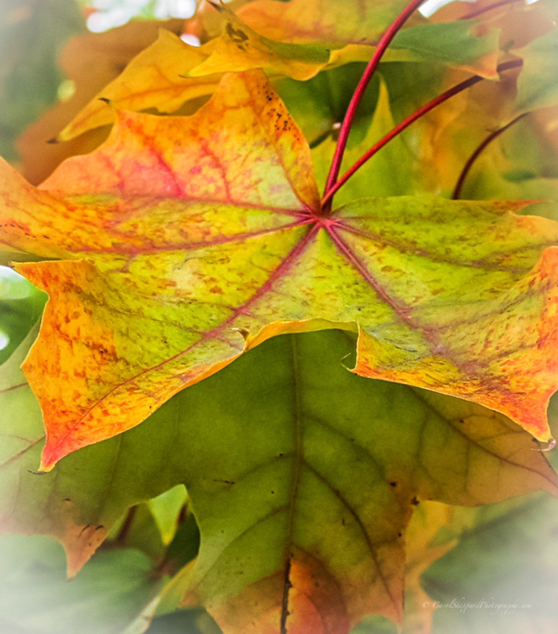
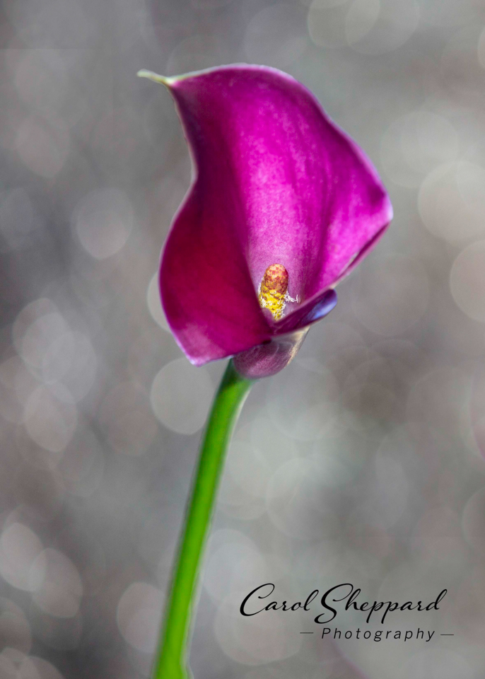
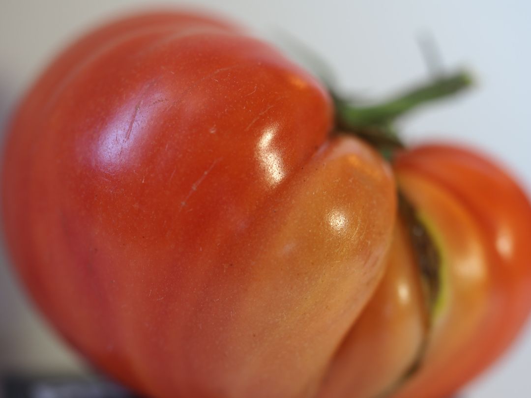
The background color is fighting with me, along with the strength of it. Can you possibly use Clarity/Sharpness decreased to do something about the background? I also think it would make your plant "pop" more. I see you noted that the brightness shifted. At first glance, it looks a bit dark and the colors lack brightness. I think, though, that this is an excellent image....with great possibilities with minor fixes. Great capture! |
Feb 19th |
| 60 |
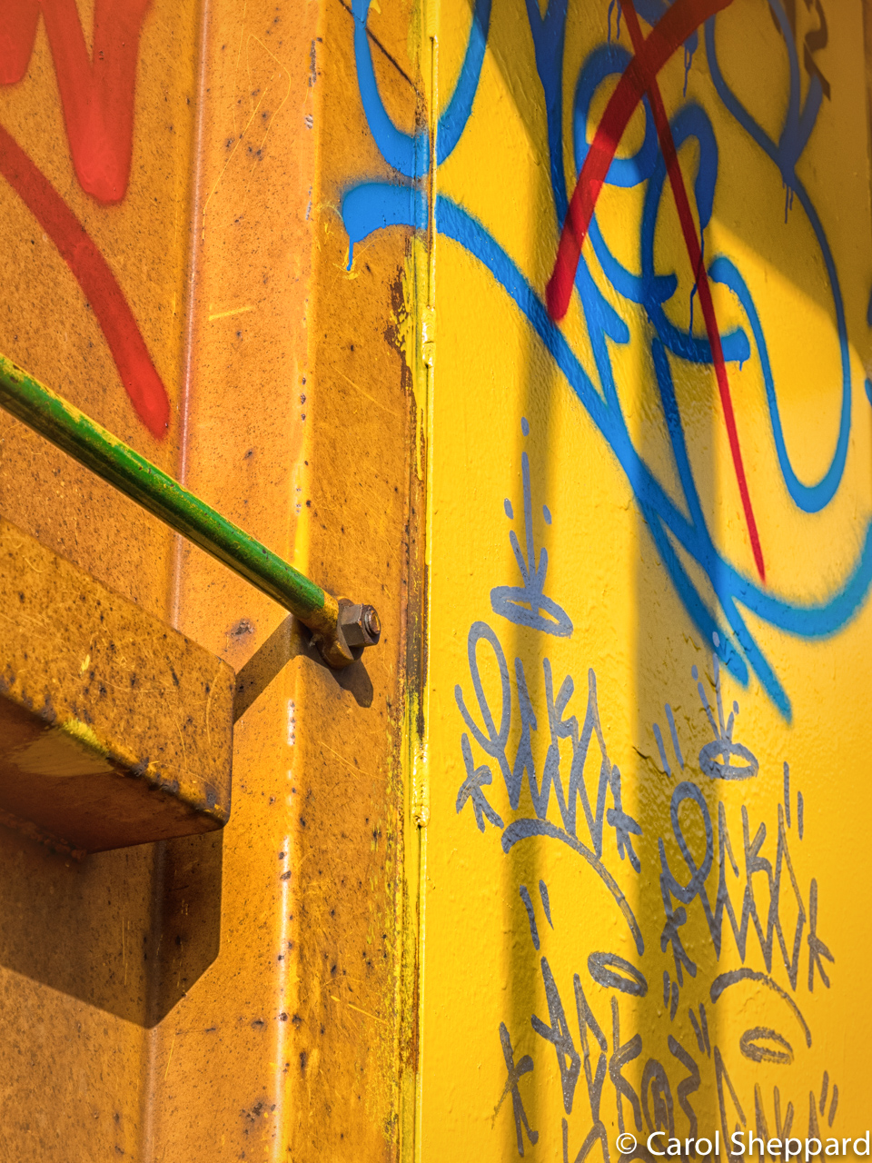
Feb 18 |
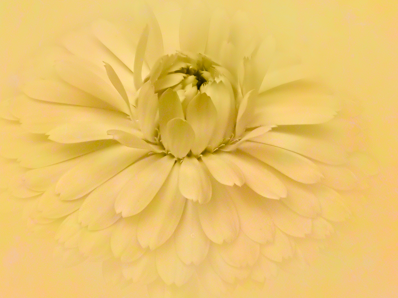
Comment |
This has immediate impact due to the contrast in colors and the beautifully executed watercolor effect.
The diagonal really works well in this, as does the fact that you haven't used equally spaced rows. I am a little distracted by the yellow for its extra softness in focus, but I don't know that I would remove it.
Yes, this works beautifully as an abstract. Good job and very creative! |
Feb 19th |
5 comments - 0 replies for Group 60
|
12 comments - 1 reply Total
|