|
| Group |
Round |
C/R |
Comment |
Date |
Image |
| 52 |
Nov 17 |
Comment |
Thank you, all. I will try the suggestions. My greatest worry is always that I will clone something out and then decide I need it for one reason or other and it seems unfair to present photos where a lot of cloning out has been done. |
Nov 16th |
| 52 |
Nov 17 |
Comment |
Agreed!
|
Nov 10th |
| 52 |
Nov 17 |
Comment |
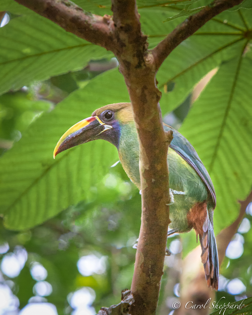
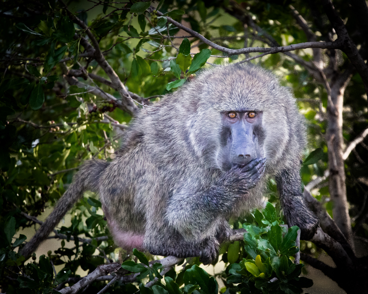
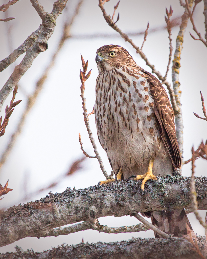
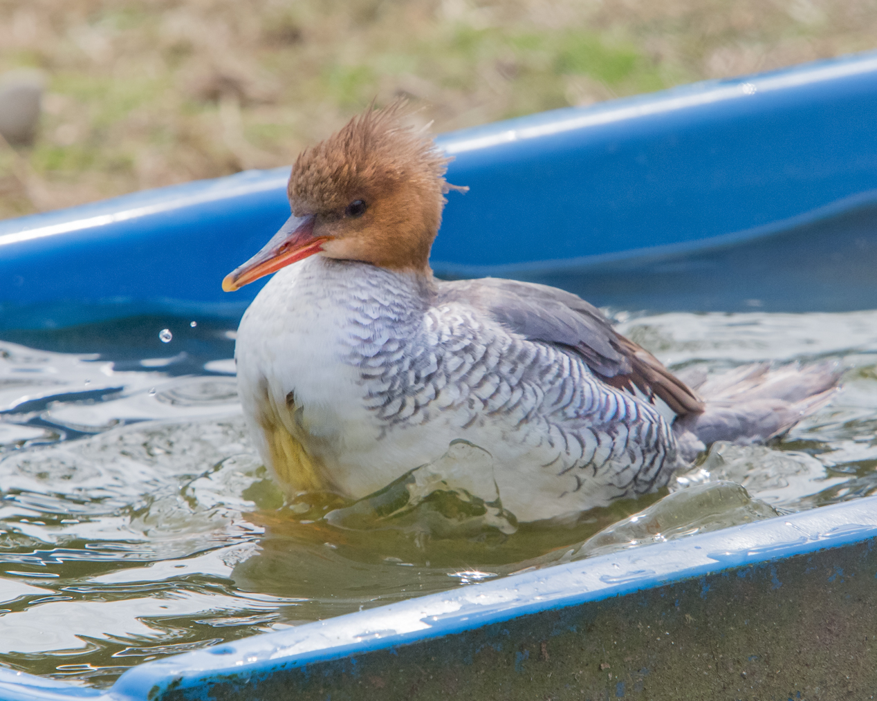
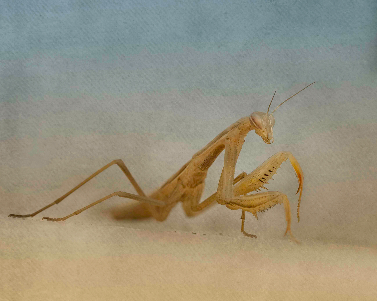
I believe it is a Cooper's Hawk, but I am not the greatest at identifying them. The branch right next to it can be removed fairly easily; the others were my attempt to "frame" the bird. Maybe if I remove the smaller branches? I will see what I can do. This is always my dilemma--to show the natural setting and amazing ability of nature to camoflage, or to remove things that are naturally occurring. |
Nov 9th |
| 52 |
Nov 17 |
Comment |
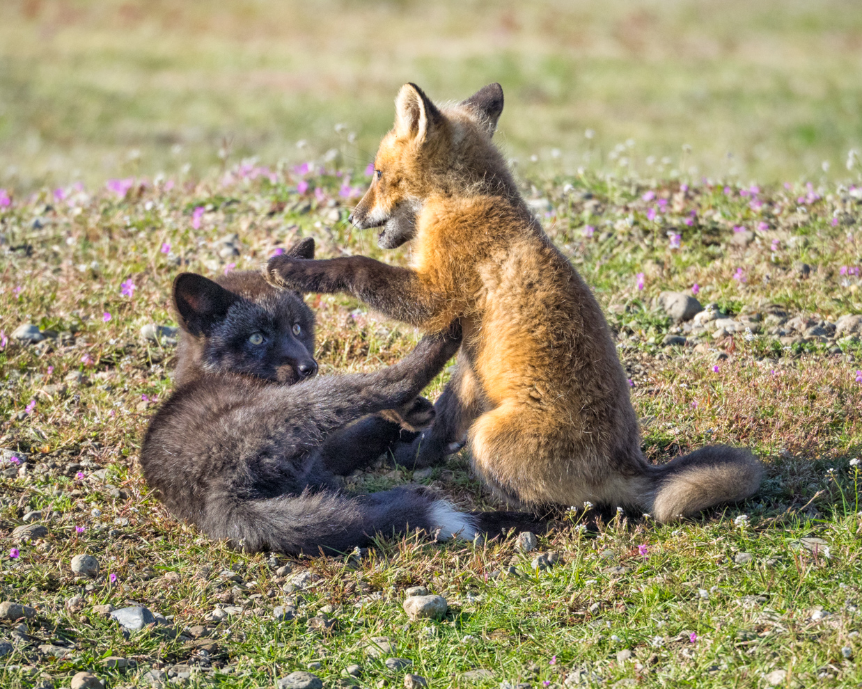
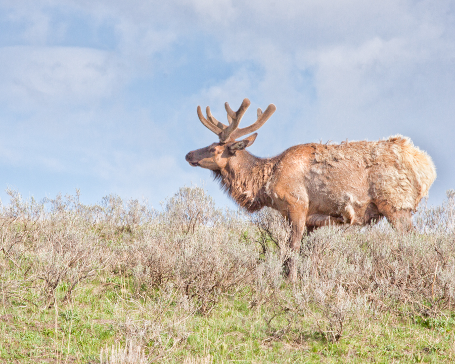
Hmmm. Okay, speaking honestly, I had to stop for a moment to figure out if he had his back leg up like my dog does. And looking right at his anatomy, my eye doesn't automatically jump back to the whole deer. I think you captured the deer beautifully from a technical standpoint. But for me, he could pop more from his background, and I just don't know about that very private view of his back end being so .... prominent.... in the image? |
Nov 9th |
| 52 |
Nov 17 |
Comment |
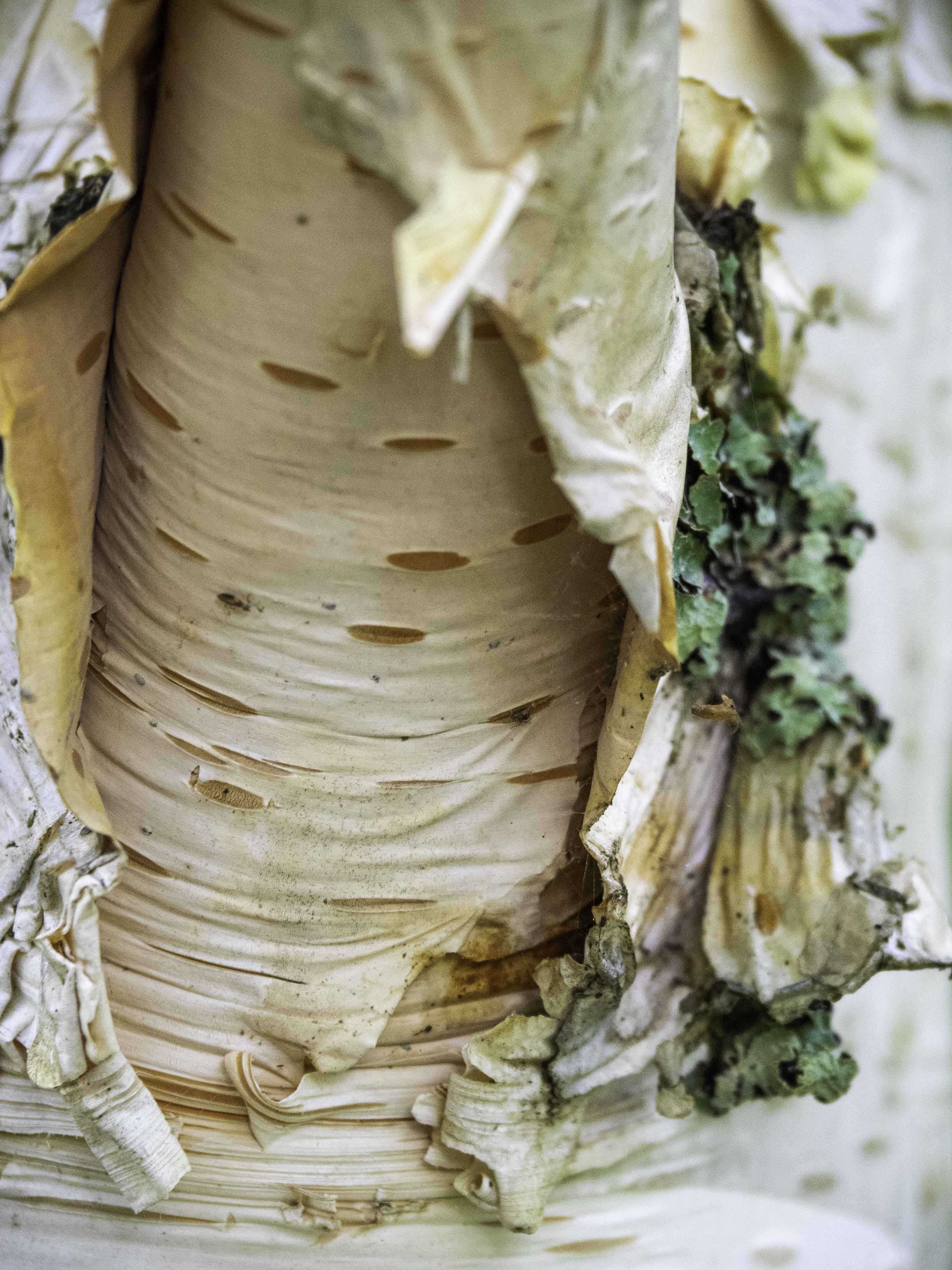
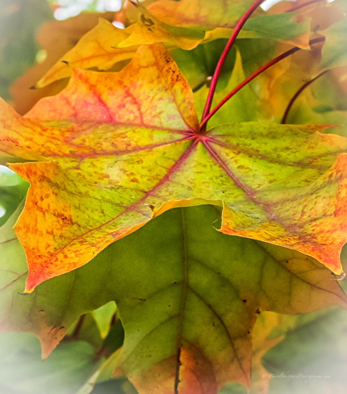
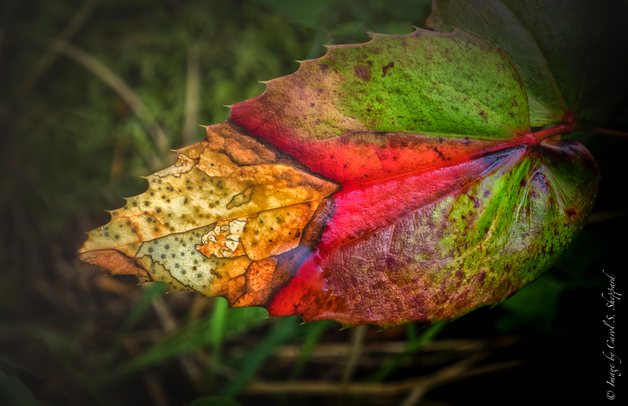
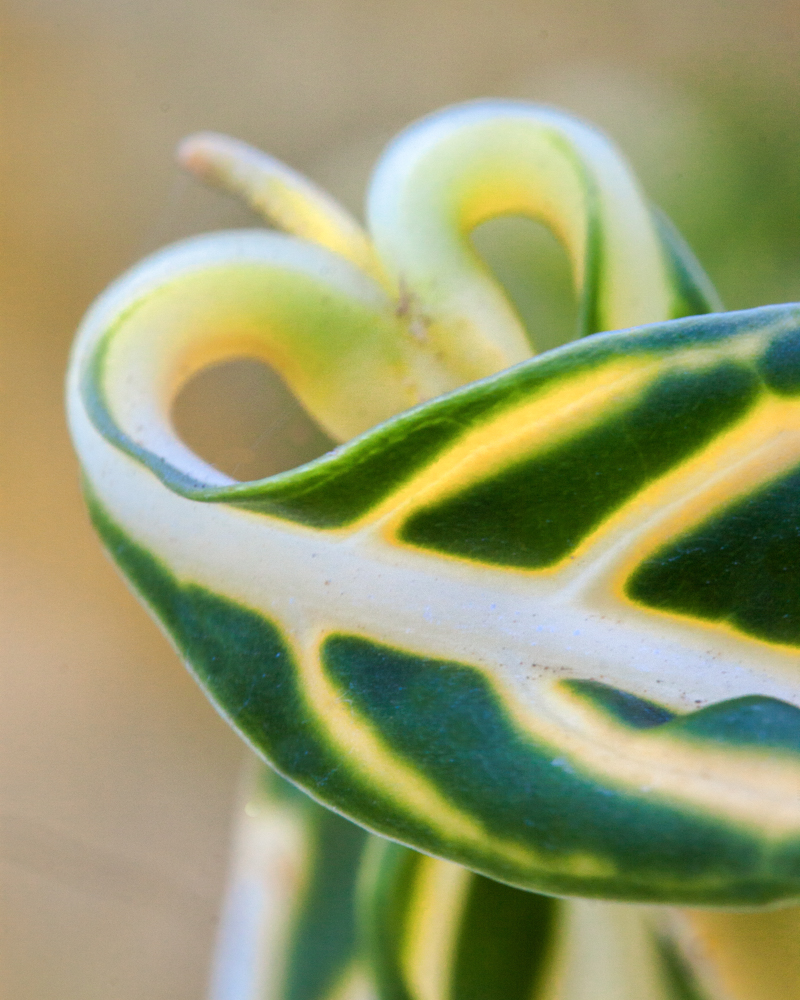
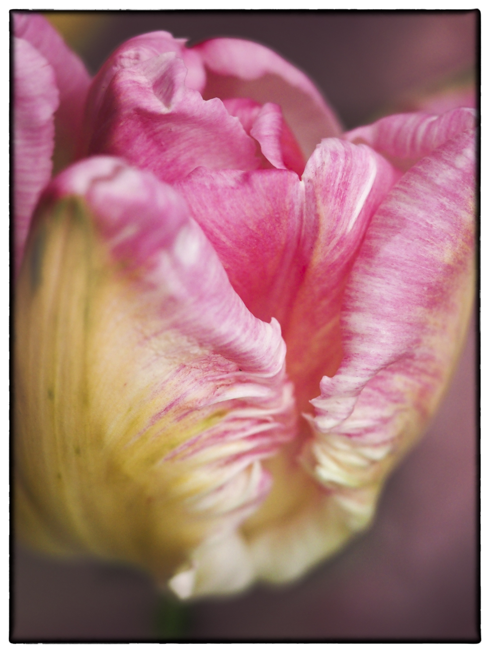
Leaves are always so intriguing in their shape and nuances. I love the contrast you have created here. The light coming through the majority of the leaf is beautiful, without being overwhelming. Perhaps I would have tried a little bit larger aperture, so that the points of the leaf were not out-of-focus--that is troubling to my eyes as a viewer. I do like the almost-bokeh of the background, though, and the way the dark lines lead my eye into the leaf.
|
Nov 9th |
| 52 |
Nov 17 |
Comment |
I immediately noted the sky with all its character, then down to the back edge of the water. Compositionally, this has wonderful impact, along with the depth and texture you have captured in the clouds and trees. The colors are pleasing as well. I would happily hang this in my house and feel very settled when I look at it. Beautiful!
|
Nov 9th |
| 52 |
Nov 17 |
Comment |
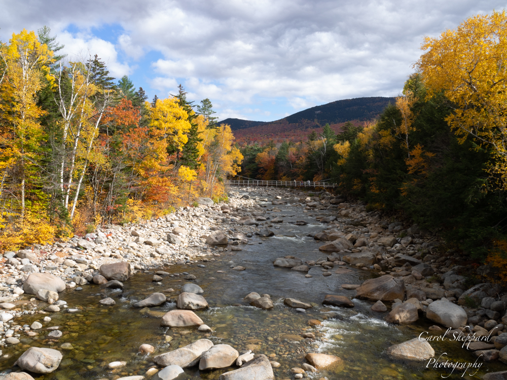
Lovely autumn image--it definitely evokes the feel of autumn for me. I am seeking a main subject or place to land my eye, though. The water and the trees are not enough to pull me anywhere in particular. And when I follow the shoreline from the lower left corner, it leads me across and out of the picture on the right-hand side. Technically, I think you did a great job on the colors of the foliage. Not sure what it needs, but some sort of specific focal point would help me as a viewer? |
Nov 9th |
| 52 |
Nov 17 |
Comment |
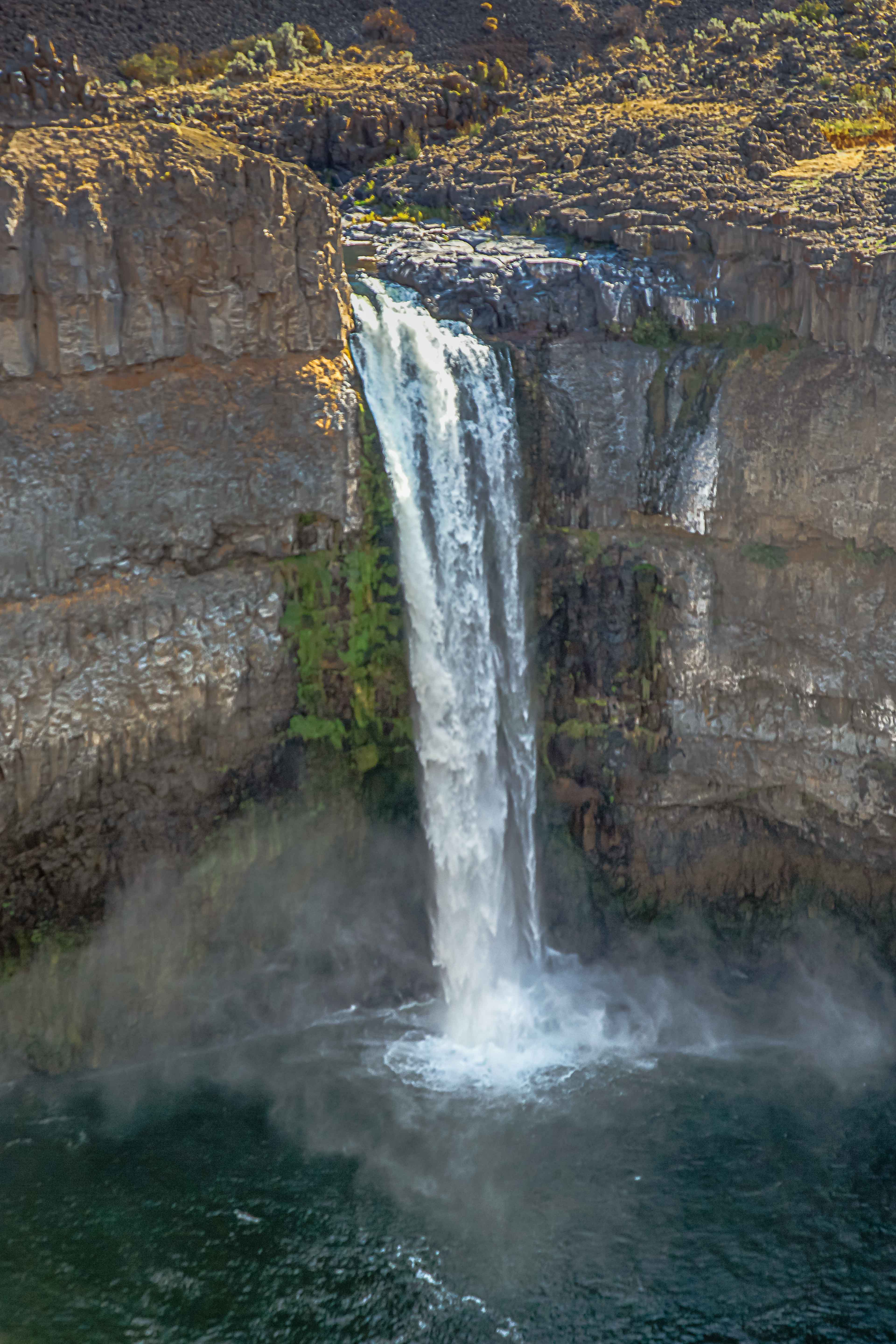
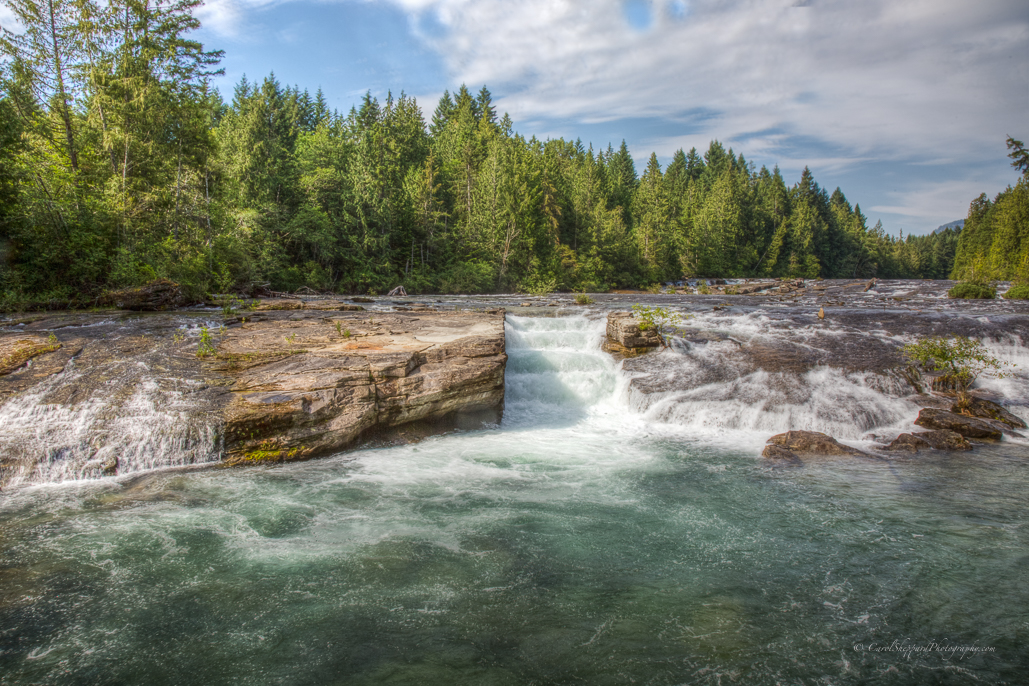
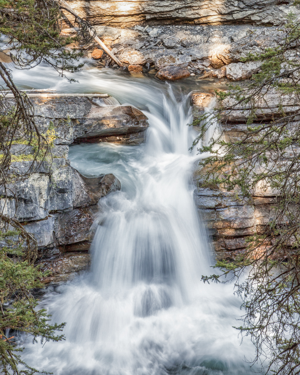
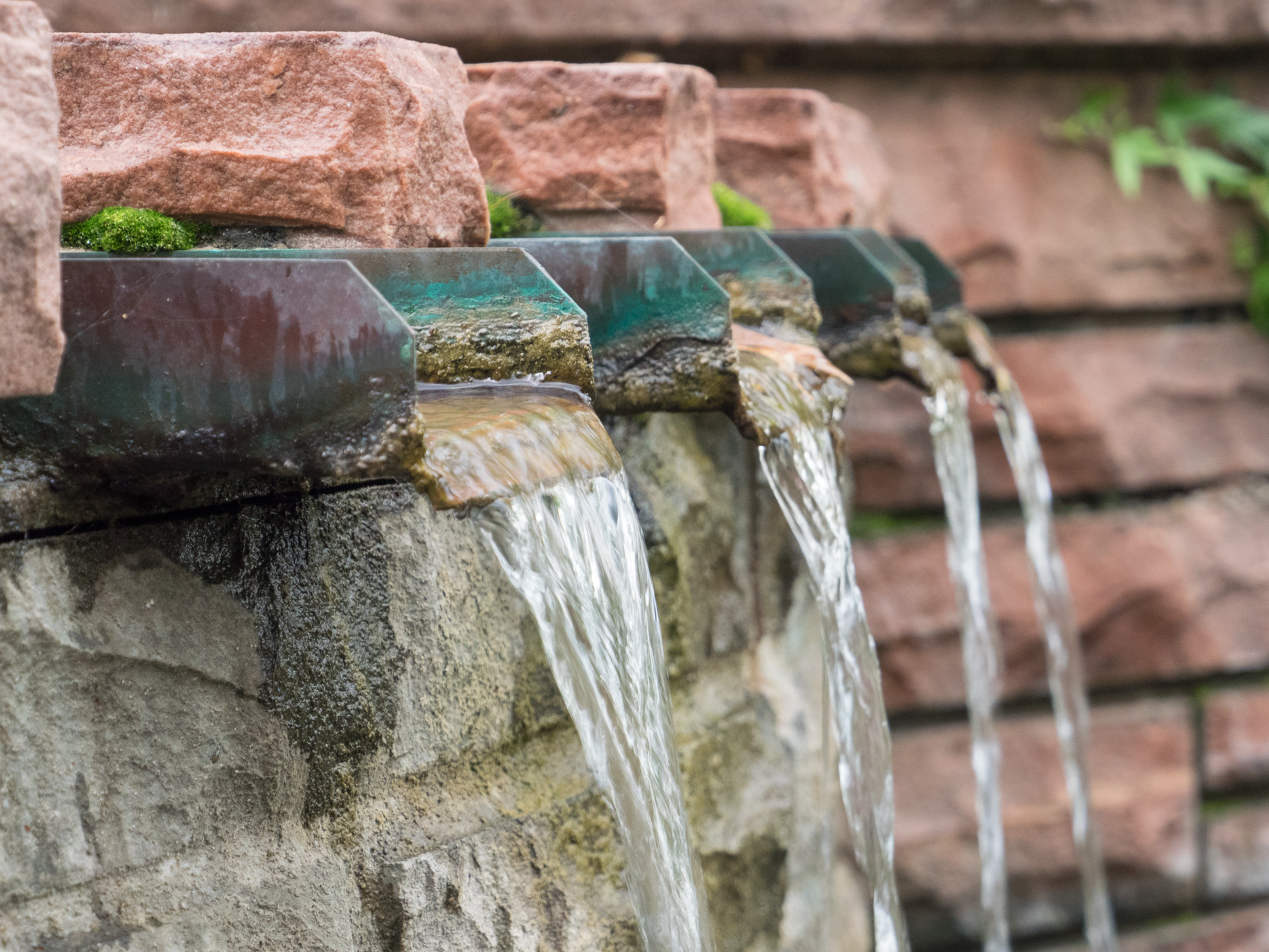
This is an image with first-rate impact! You technically captured the waterfall perfect, and the composition is incredible, with the eye being stepped into the waterfall, then up. I am troubled by the color cast--and I know from reading when it was shot, how hard it is to eliminate those strong orange tones while still capturing the sense of the hour. However, if you focus on the white of the waterfall, and then the trees above the waterfall, perhaps slightly less on the soil up there, and remove further orange cast just in those areas, I think this has enormous competition potential! |
Nov 9th |
9 comments - 0 replies for Group 52
|
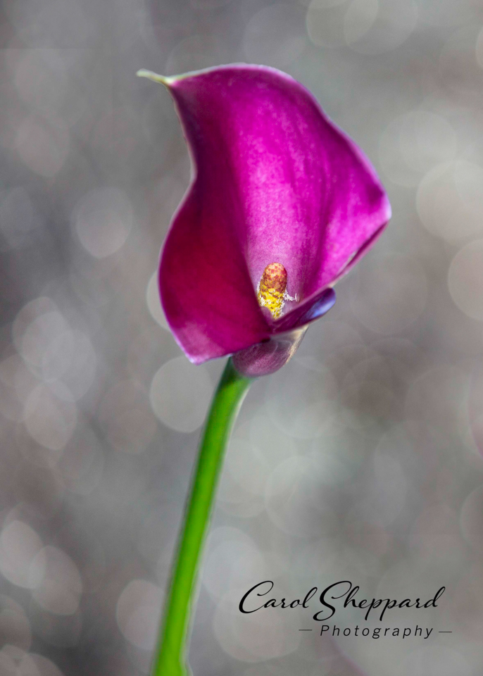
| 60 |
Nov 17 |
Comment |
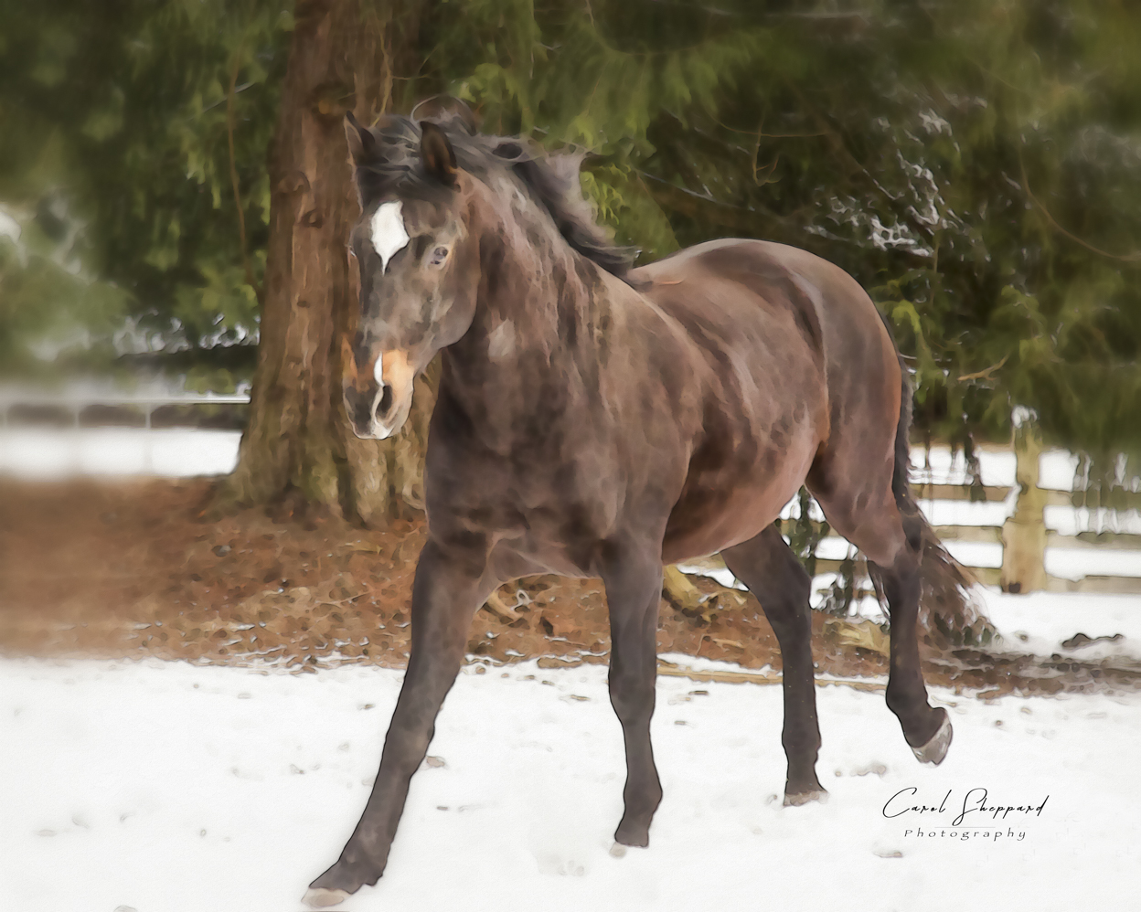
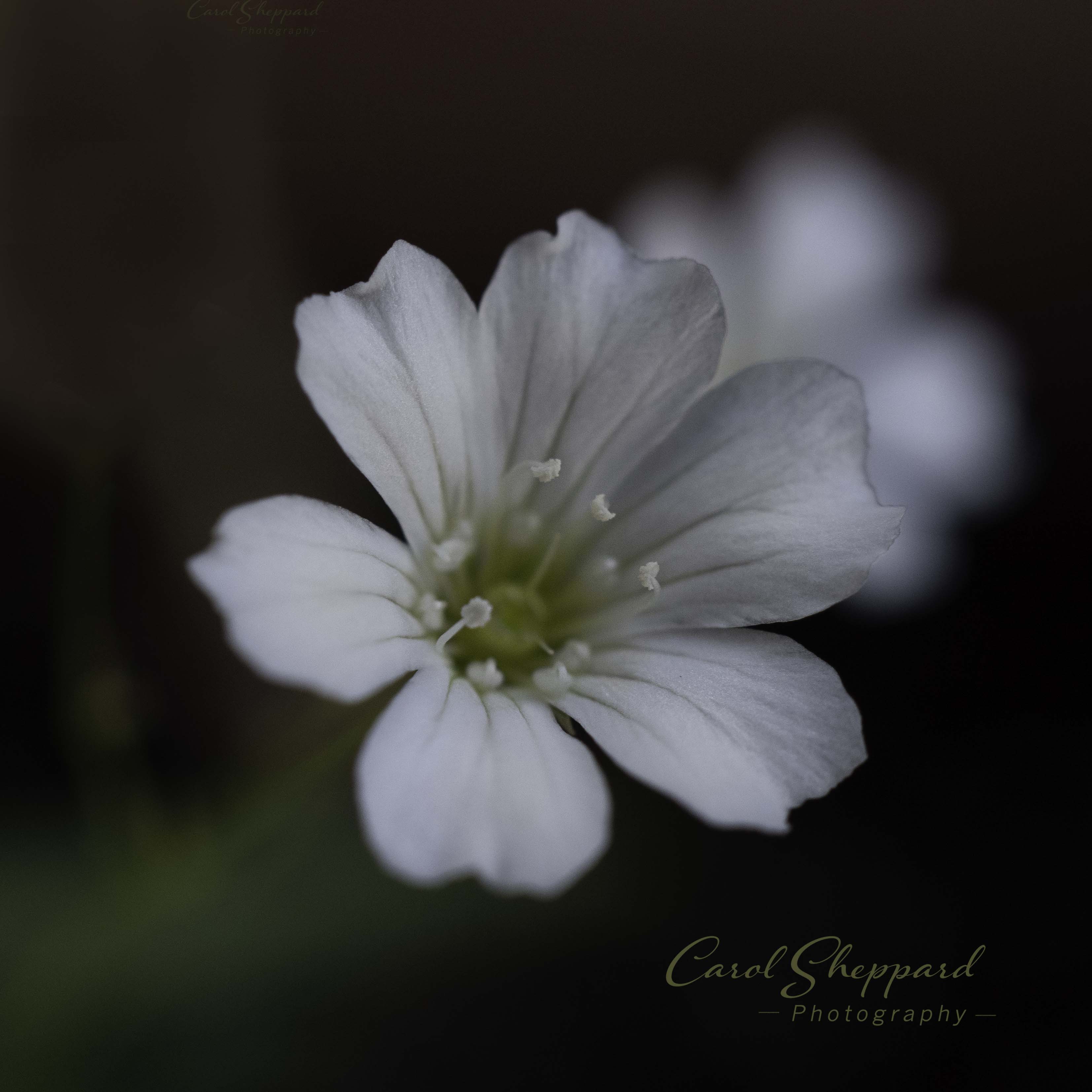
Ah, interesting comments. I did try to darken the background, thinking I was doing it a favor. But maybe the original was better, as the background wasn't so harsh--I just felt it was very light in color. I will go back to the original image and put more work into it.
Thanks!
Carol |
Nov 22nd |
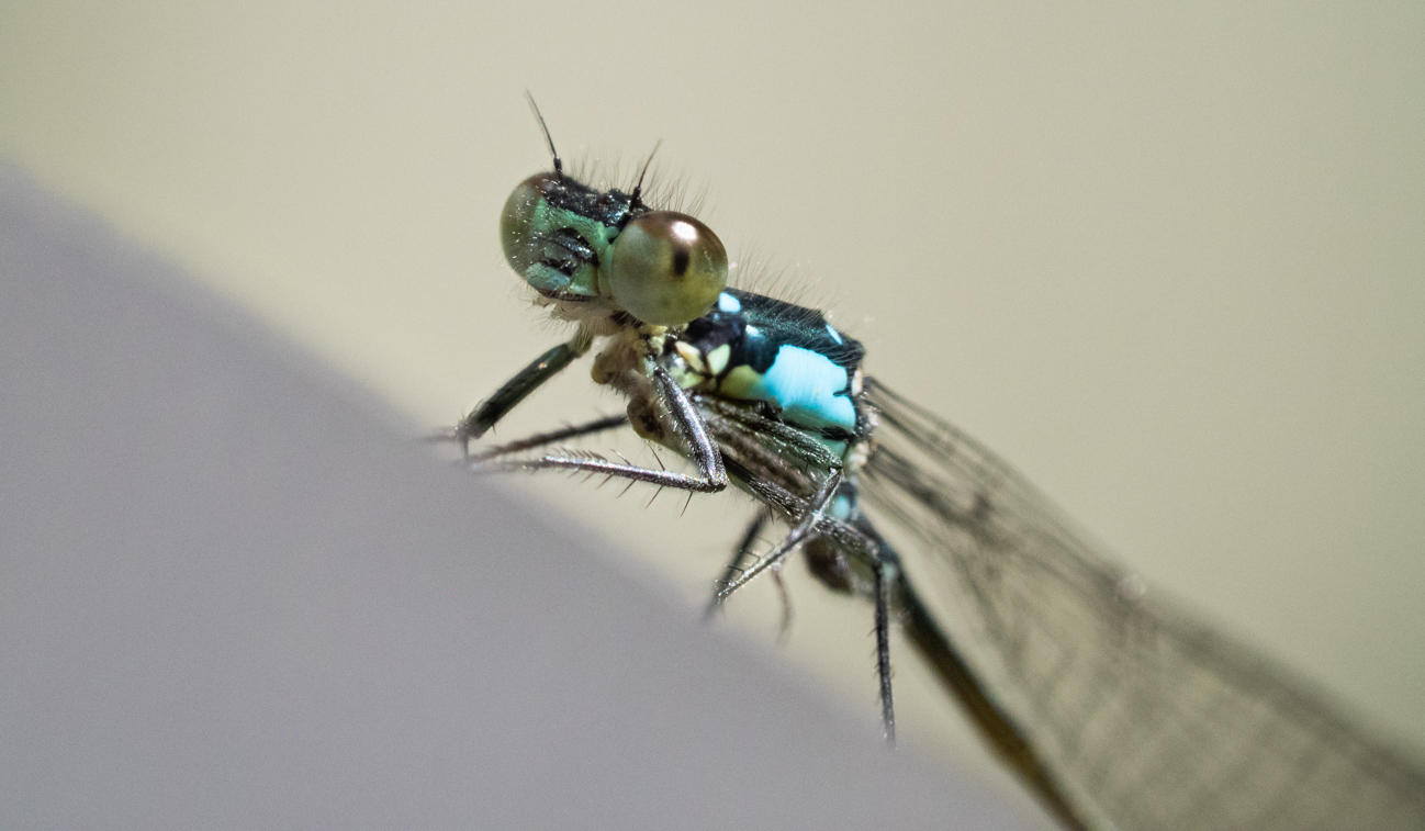
| 60 |
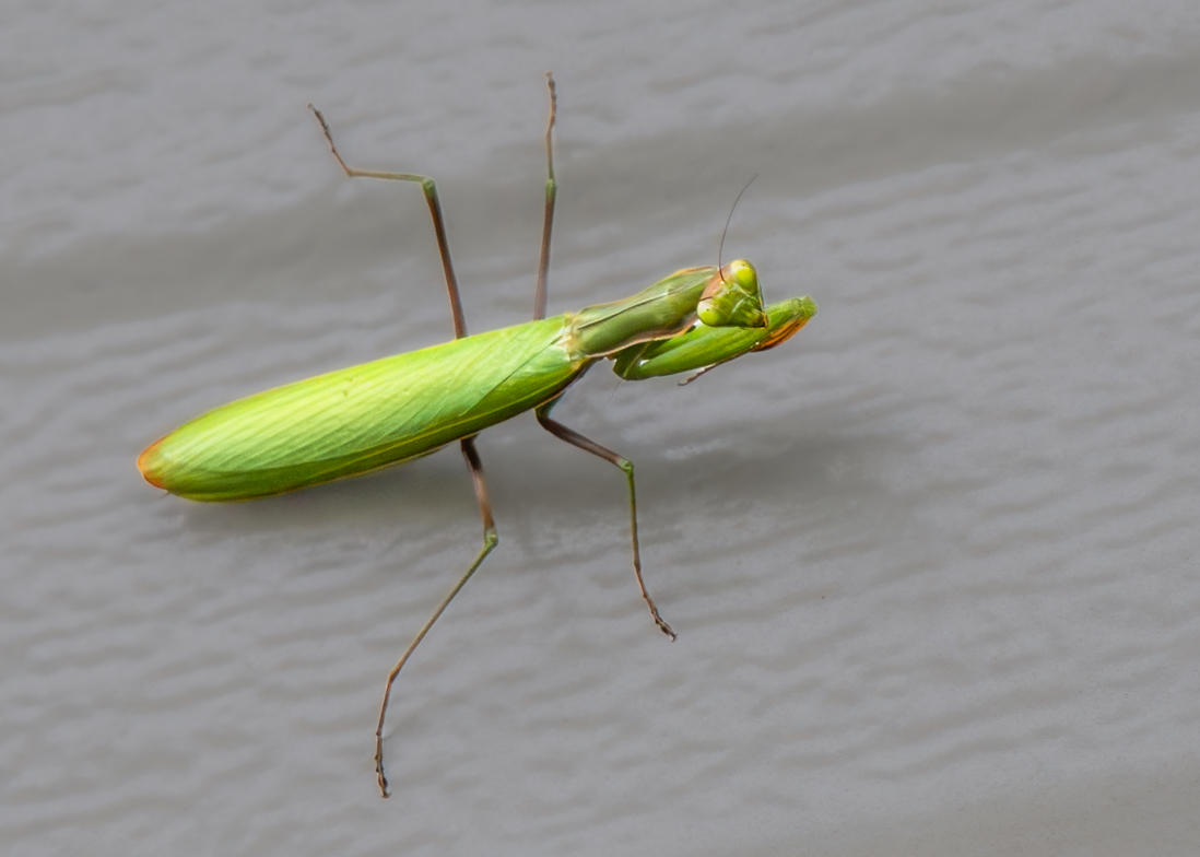
Nov 17 |
Comment |
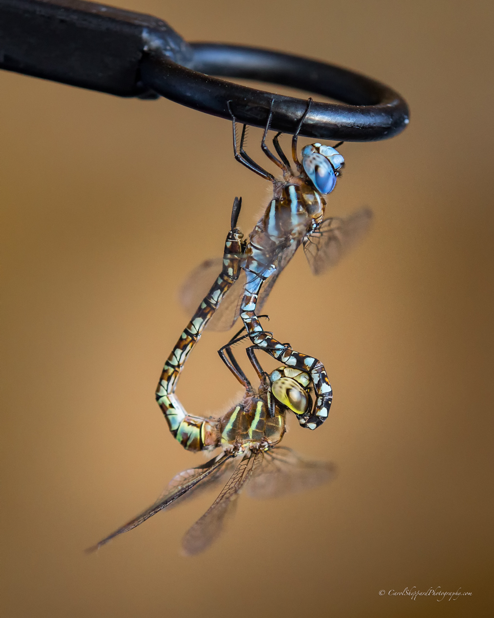
Lou, this is a wonderful shot of a hard subject! I am impressed! I think you could have even got away with less sharpening and still had a great shot! Nice balance and colors, including contrast and saturation. In an ideal world, I would like to see more in front of the dragonfly, and if necessary, less at the back end. I think you could easily crop in on the wings (since the tips aren't there), but not as far as the body, and give it a more intentional feeling on the close-up?
Anyway, terrific capture! Very impressive!
|
Nov 13th |
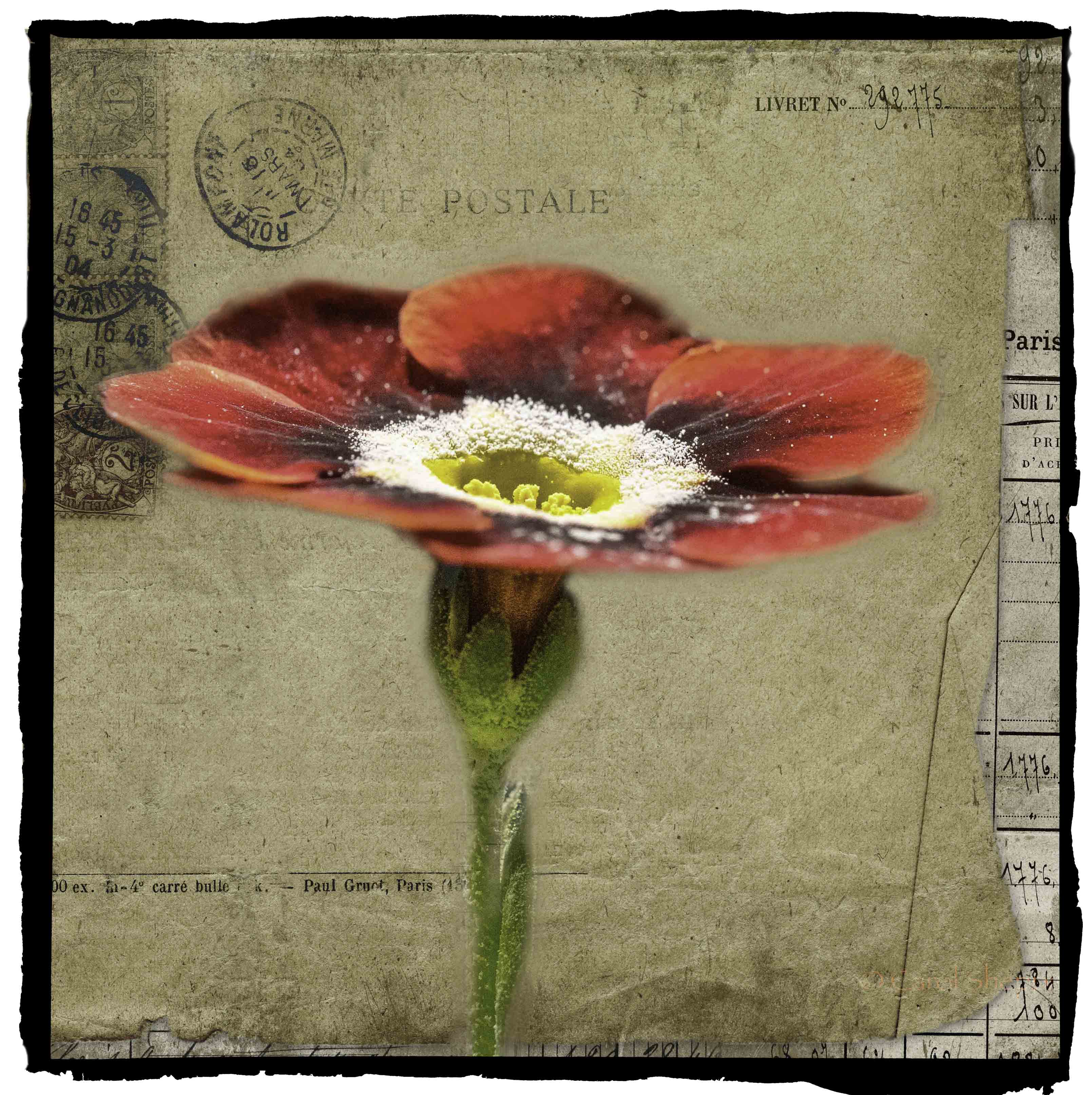
| 60 |
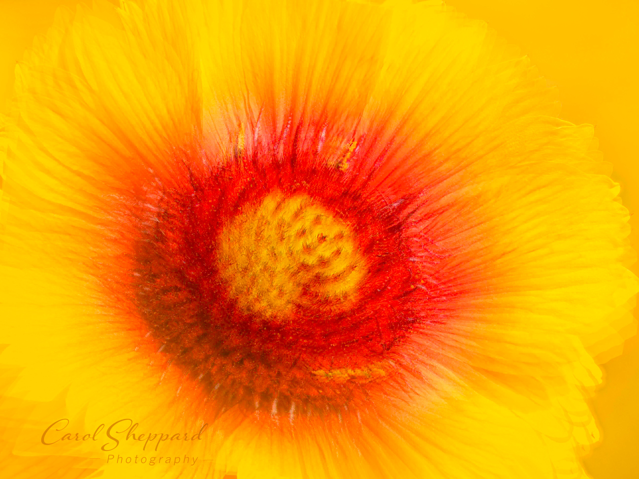
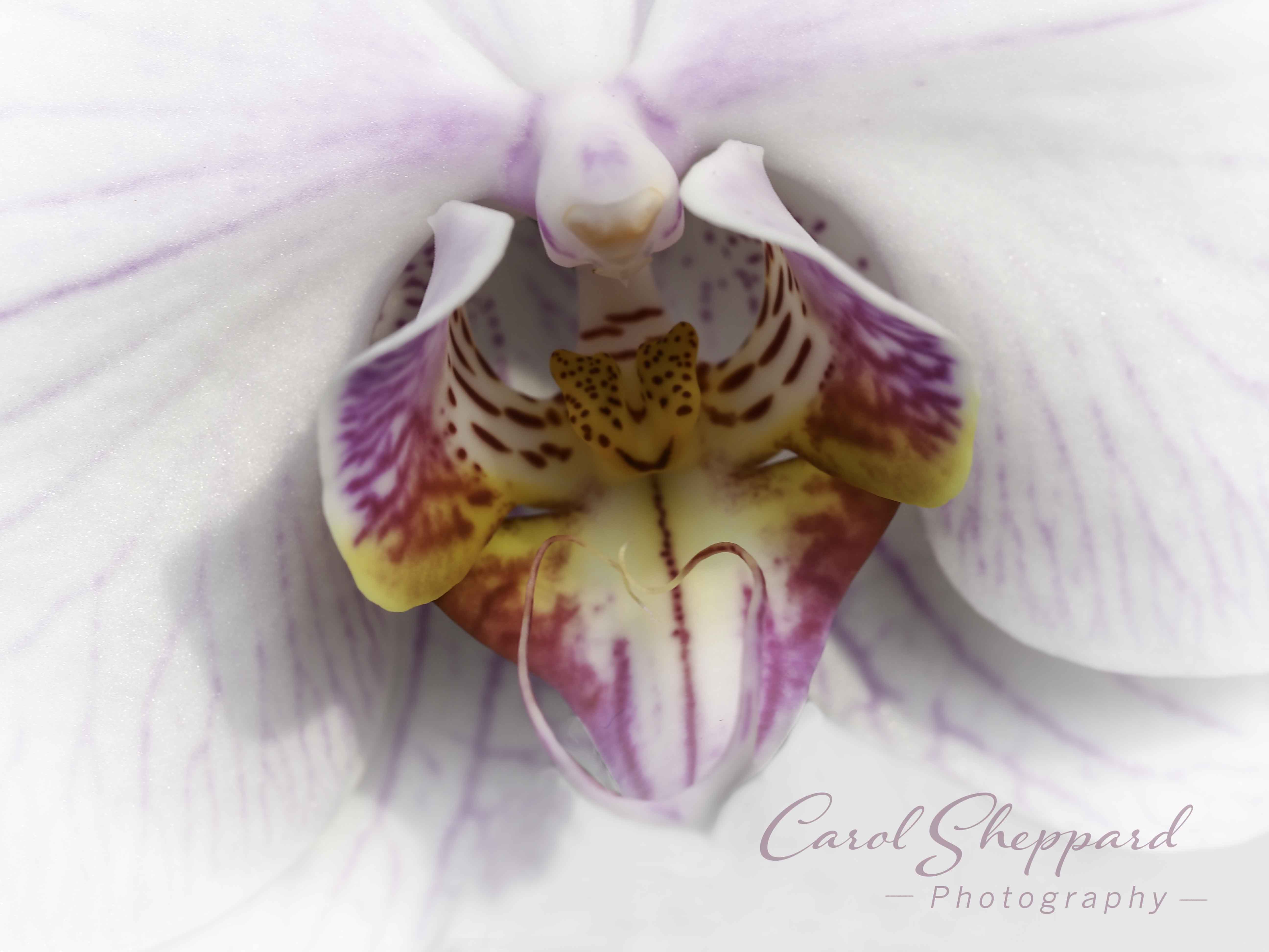
Nov 17 |
Comment |
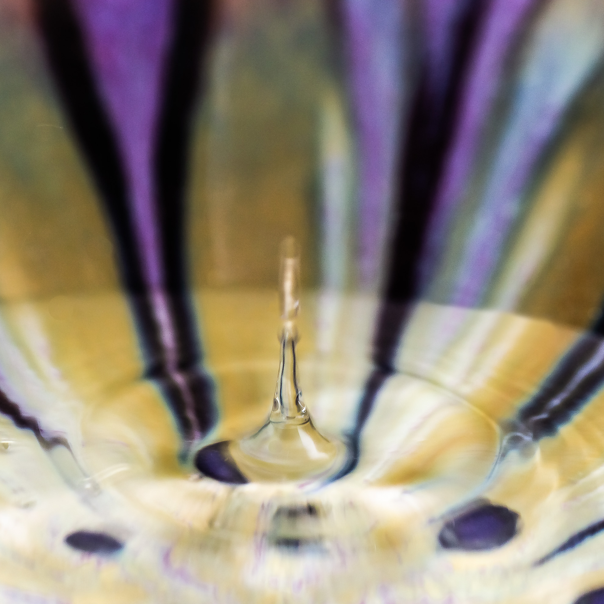
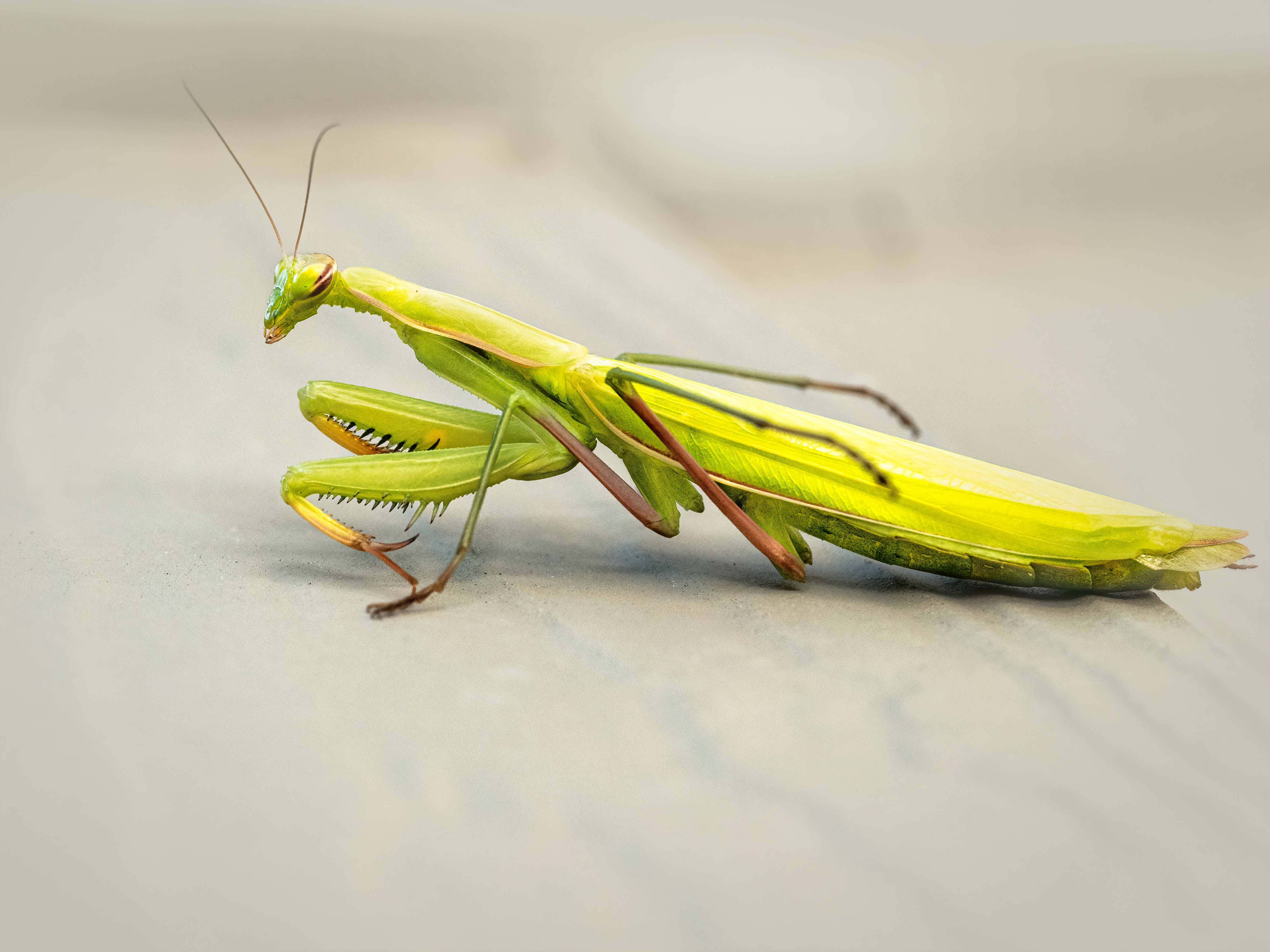
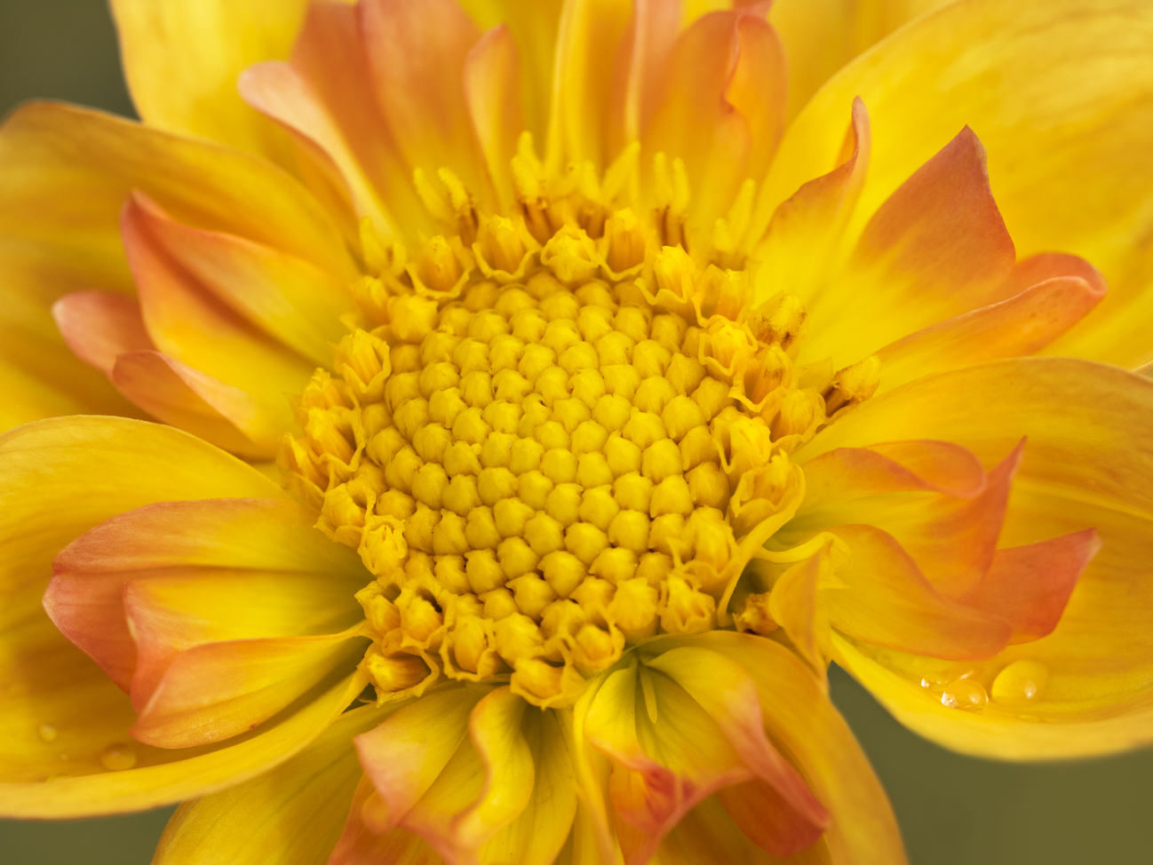
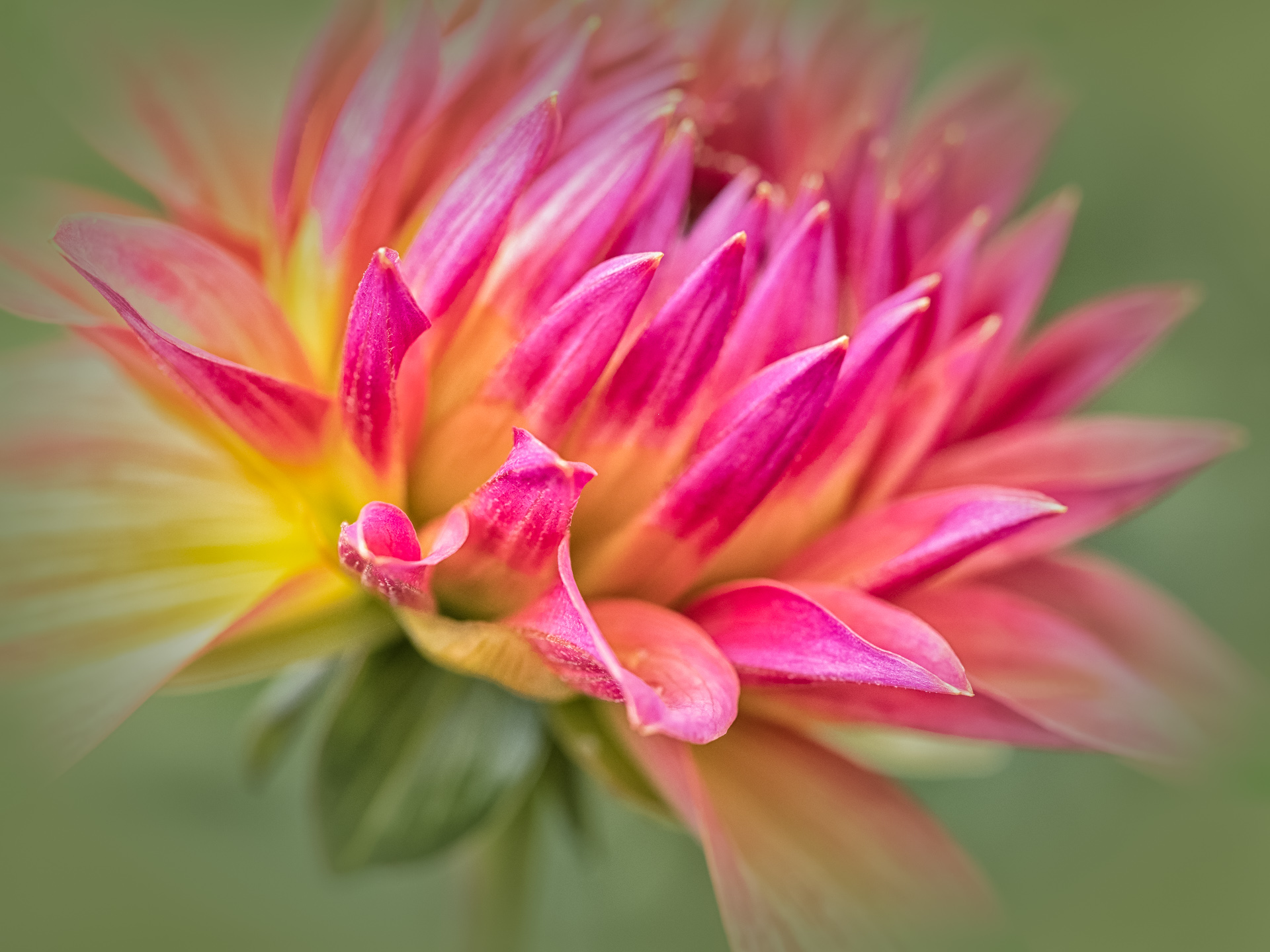
This woks well as an abstract. You have captured colors that are true with two colors I find extremely hard. Have you ever attempted Focus Stacking? Honestly, I find these shots impossible!! But two things I just heard from George Lepp at our recent conference: Focus Stacking, and going in to find the "design elements" of a flower. I would love to hear if anyone in our group has done Focus Stacking. |
Nov 13th |
| 60 |
Nov 17 |
Comment |
What a great picture, Ginger! The strong jewel colors, the repeating shapes, all work together to produce an image with super first moment impact. It is sharp, has a nice balance to it. I particularly like the subtle leading lines that bring you into the cubes and then lead your eyes around the image. Fantastic; certainly competition worthy!
|
Nov 13th |
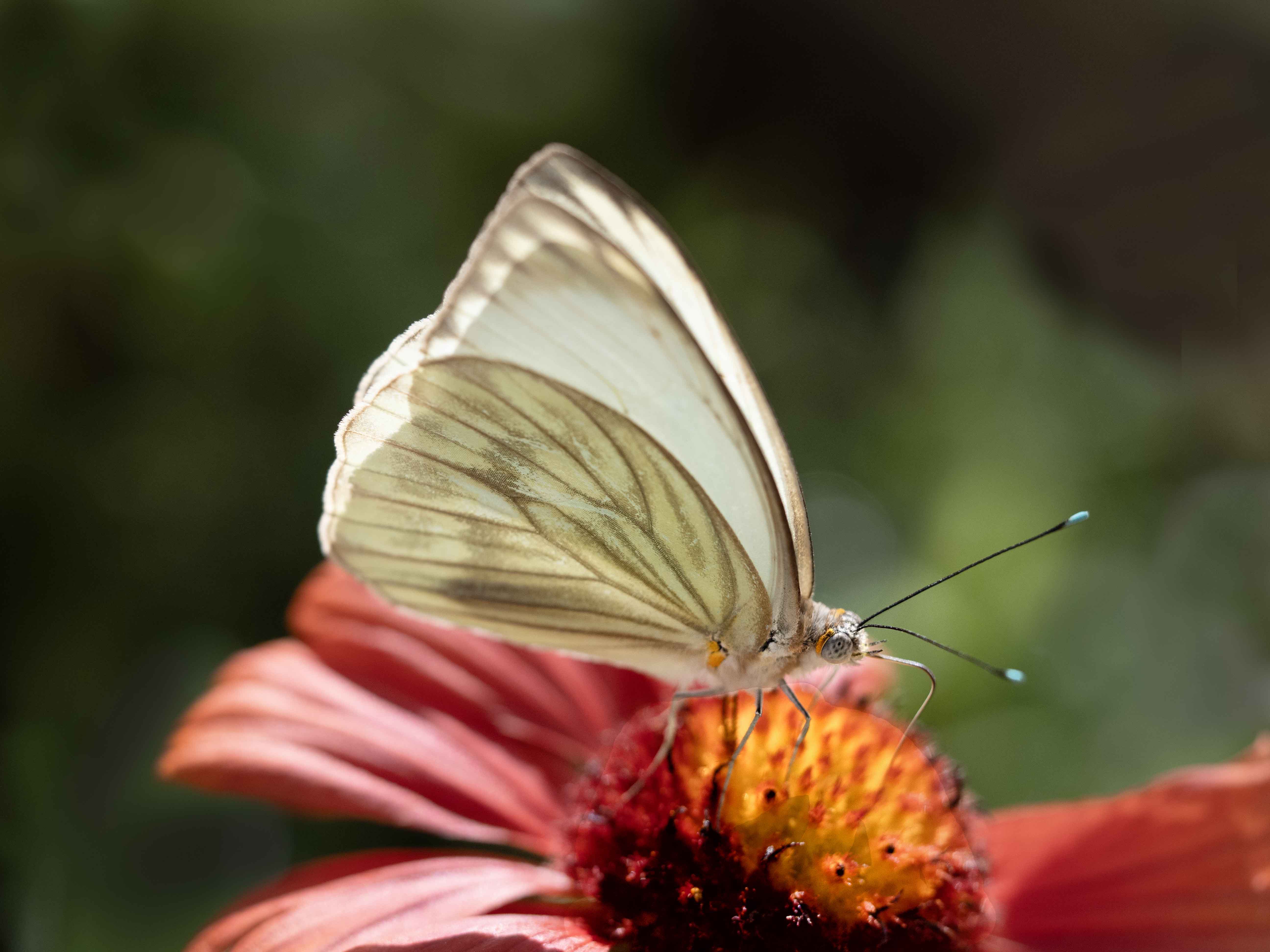
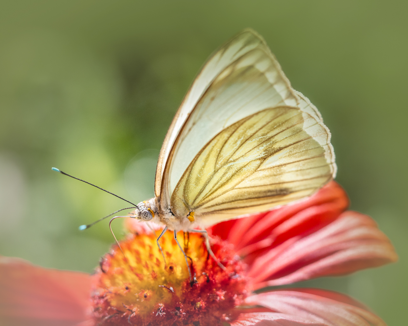
| 60 |
Nov 17 |
Comment |
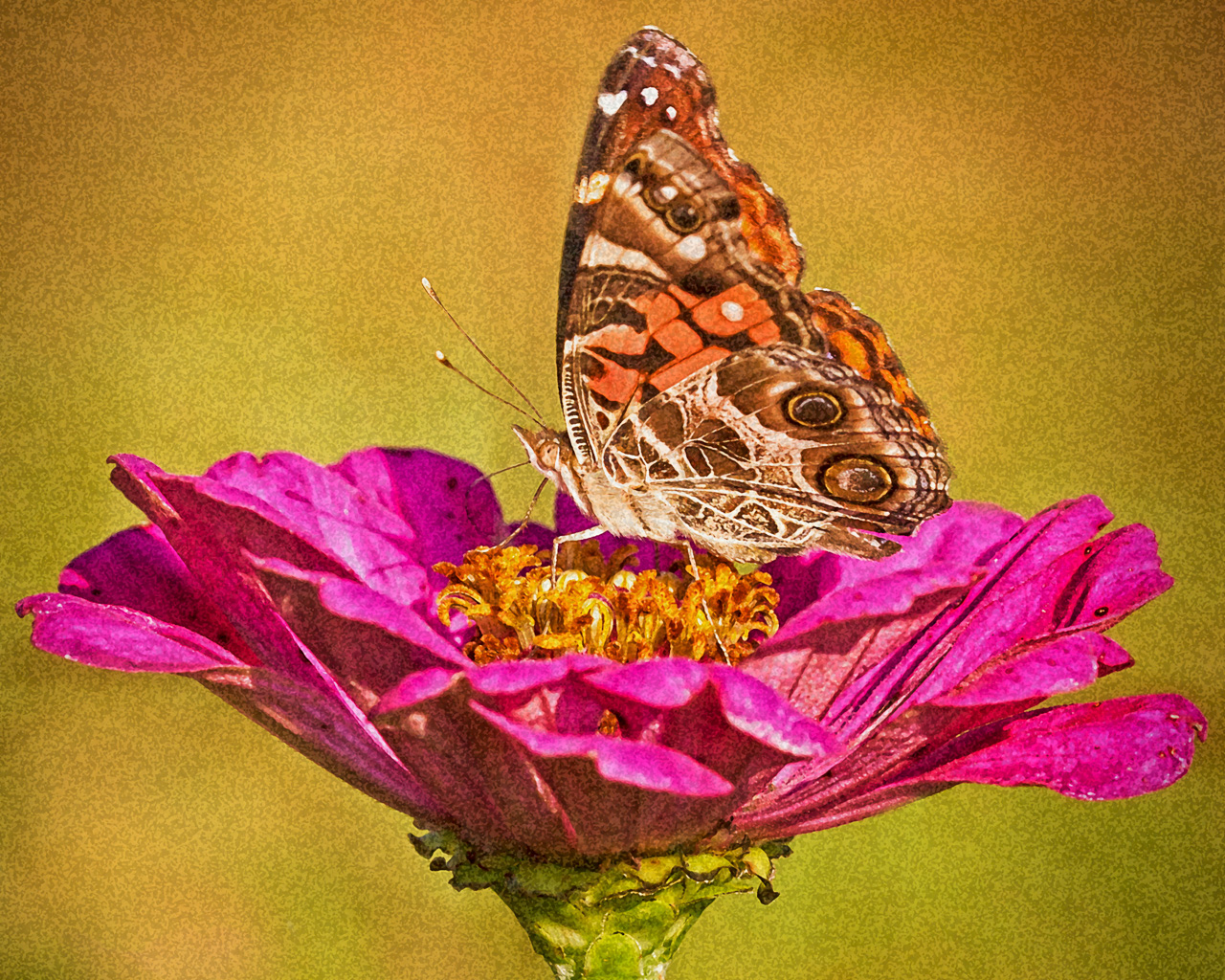
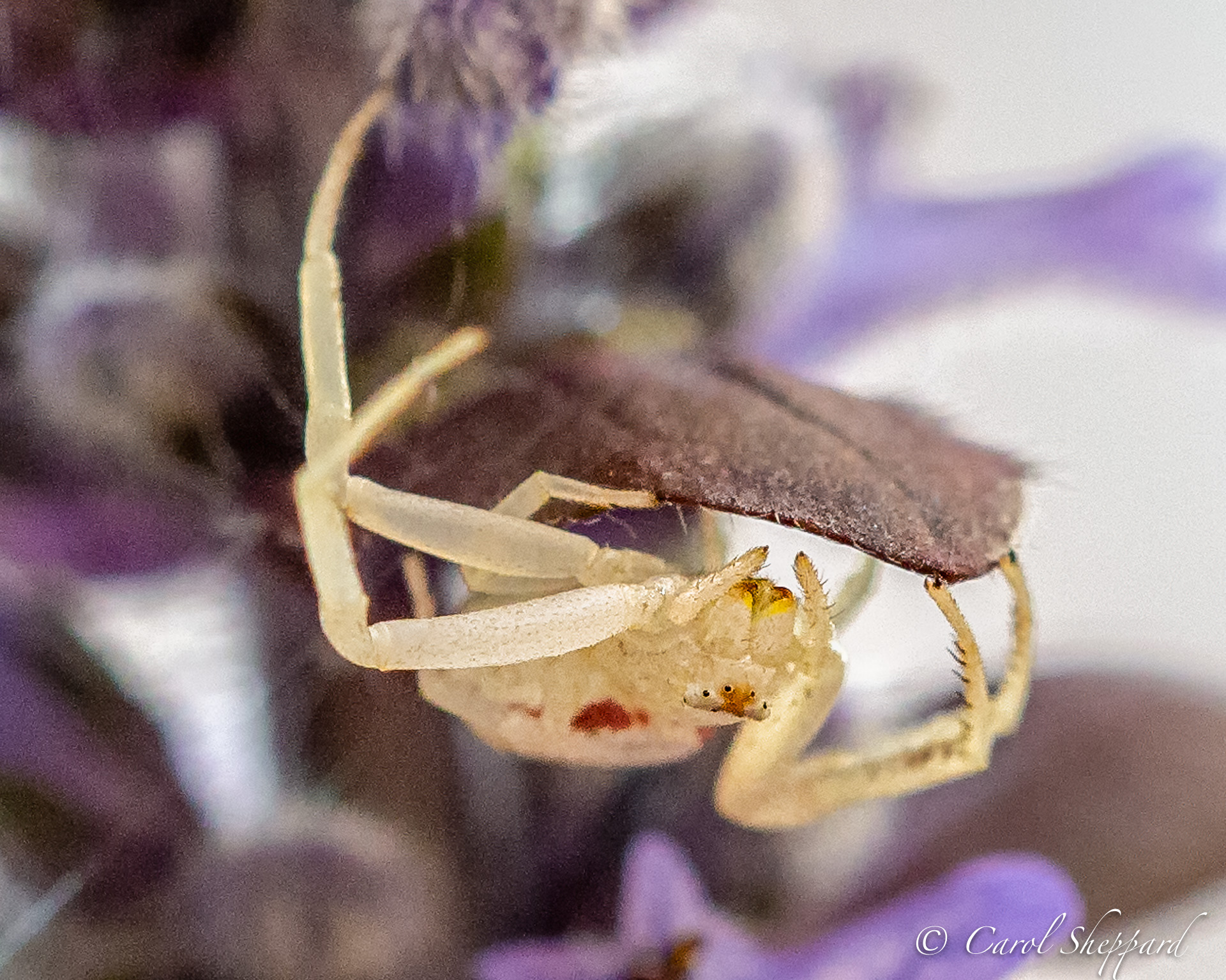
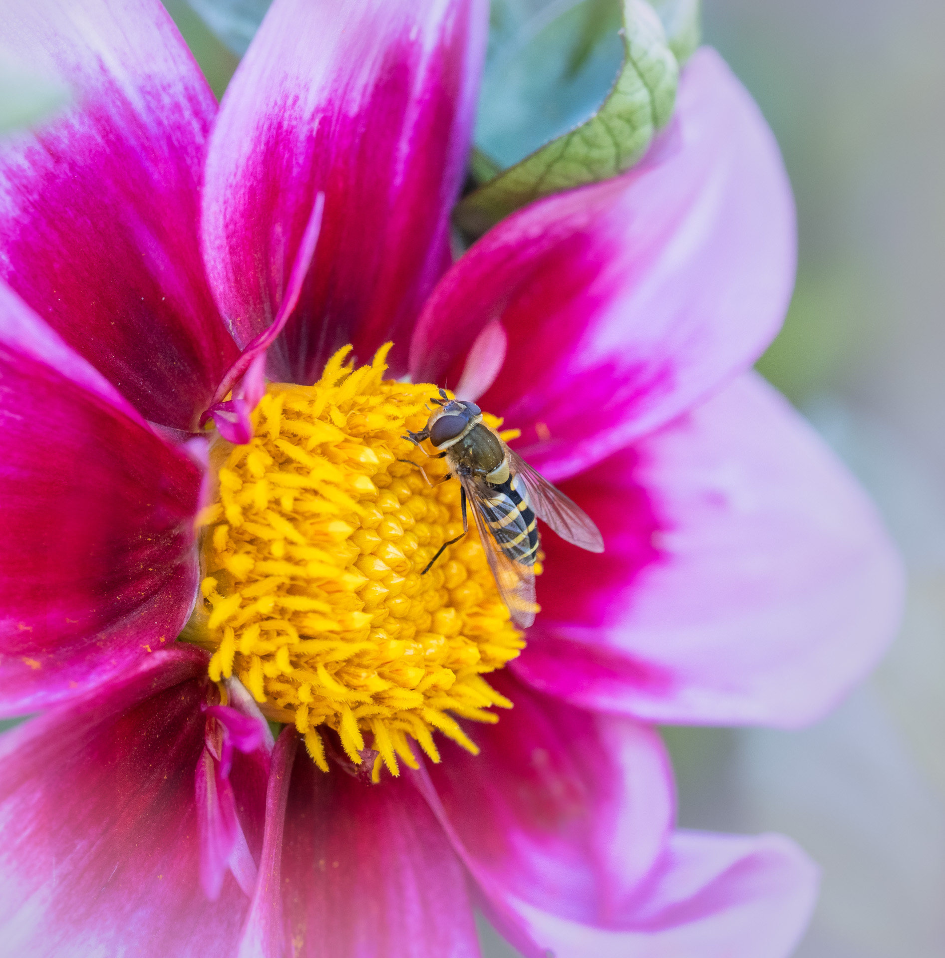
This is a lovely composition, with a wonderful capture. You didn't indicate any sharpening, post-processing, but there are artifacts along some edges. However, I only looked after reading the other comments. So, it might be just fine! Obviously I didn't notice it the first time I looked! Your background is nice and soft, and also gives nice contrast for your butterfly. Great job!
|
Nov 13th |
5 comments - 0 replies for Group 60
|
14 comments - 0 replies Total
|